By Phil Hecken
Follow @PhilHecken
Greetings and good Saturday morning, Uni Watch readers. I hope everyone has had a good week and you’re all staying safe and sound.
As you may be aware, during the early stages of the pandemic, when there was almost no uniform news to report, I had many readers send me uniform concepts. I believe I ran all that were sent to me directly, but a few weeks ago, Gregory Kohn contacted me with this message: “Hi Phil, I had sent this in over the summer when I was first quarantining and had a lot of free time…” and attached was an e-mail he’d sent to the Uniwatching e-mail last year, which read:
Dear Paul, Phil, or to whom it may concern:
I’ve been a reader for probably 10 years now. Because of quarantine, I had some free time to work on a uniform project I had in mind for a while. I grew up in South Florida, and when the Heat came out with their Miami Vice jerseys, I always wanted to see them on a baseball uniform. Then, I thought, what if the entire MLB was named after TV shows that had cities or states in their names?
So, that’s what’s attached to this email: home and away uniforms for an entire bizarro MLB. Hope you enjoy and thanks for keeping this blog going!
-Greg
Now, most things that get sent to that address which are of the uni tweak/concept variety get forwarded to me, but in this instance, this must have slipped through the cracks. So, what I have for today’s main post will be a look at his “bizarro” concepts (some of which I think are really quite good looking uniforms) — I like a bunch of the designs, with many of them evoking an ‘old school’ or what is now “retro” feel and in some cases, I really love the color combinations.
After Paul spent an incredible week doing some deep diving, I had actually hoped to run a potential “uni mystery solved” piece today, but it didn’t quite come to fruition in time — and if all works out, I think you’ll really enjoy it — but that will have to wait for next week. So, without further ado, I now present to you Greg’s pandemic uni creations. Delayed, but not forgotten. Enjoy!
Bizarro Baseball Concepts
by Gregory Kohn
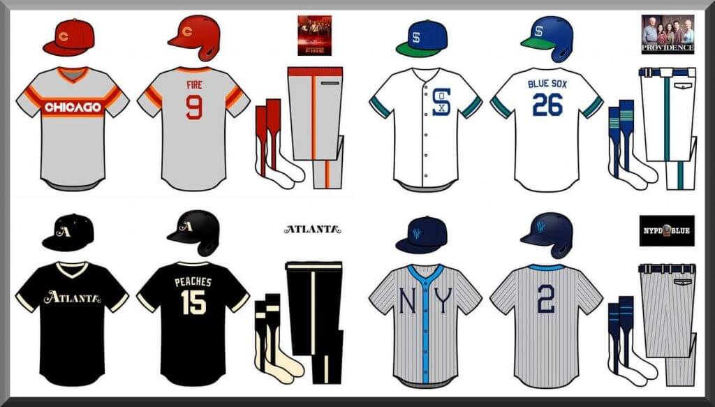
Atlanta Peaches
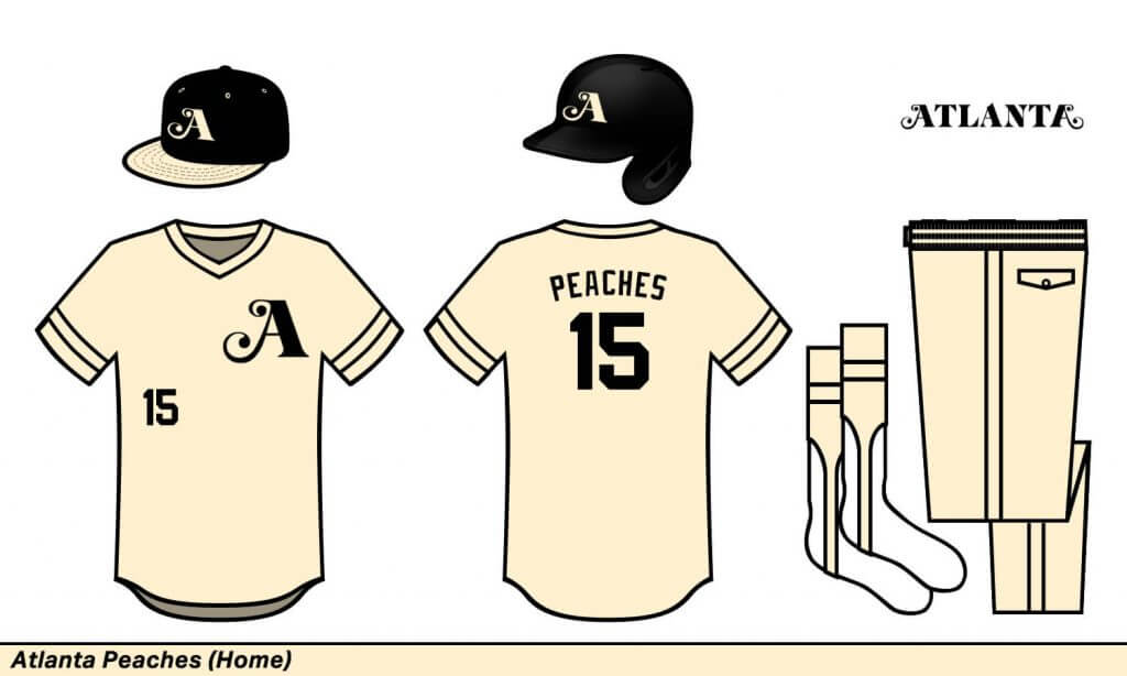
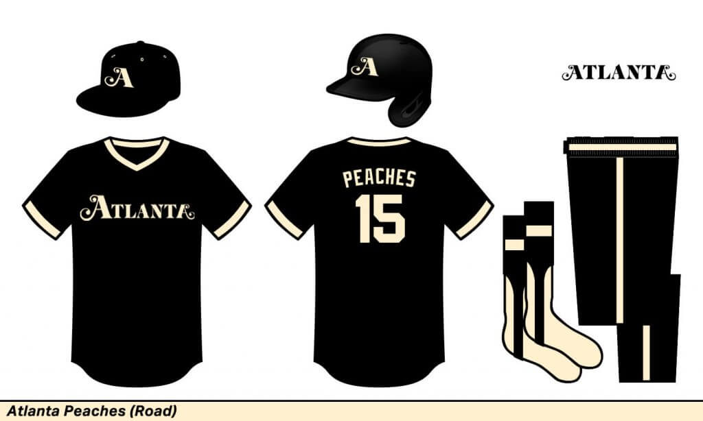
Atlanta Peaches
The Peaches nickname is pretty self-explanatory for a fake Atlanta team. I went all cream for the designs because, well… peaches and cream.
Austin Citizens
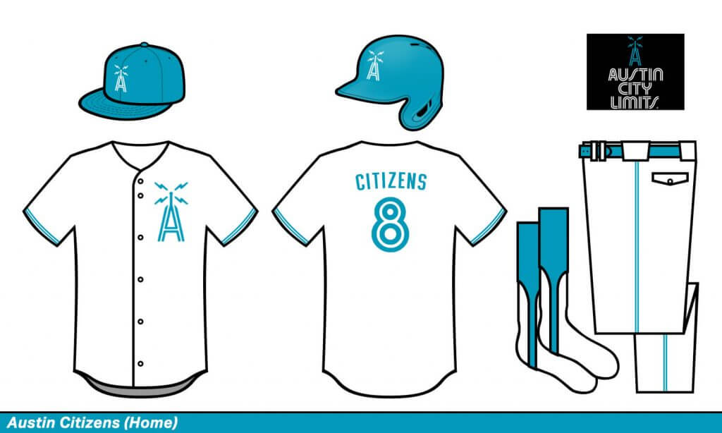
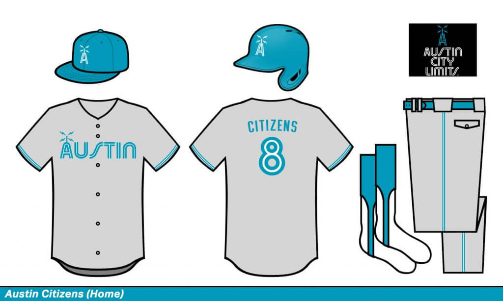
Austin Citizens
The show’s logo, color, and title font are all incredible. It matched up perfectly with the Blue Jays’ numbering.
Beverly Hills Zips
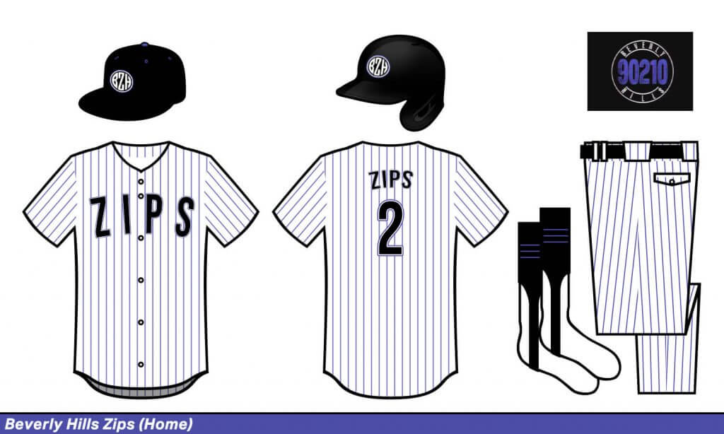
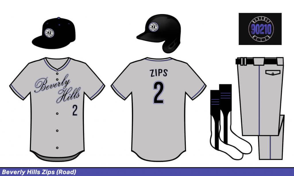
Beverly Hills Zips
The show’s visual theme is very 90s but also surprisingly bland. That kinda matched perfectly with a Rockies feel.
Boston Schoolers

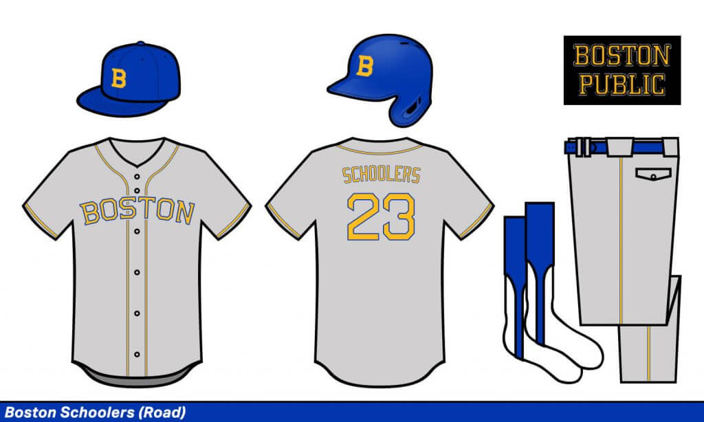
Boston Schoolers
A Boston baseball team has to look old-school. They also aren’t a Boston team without that number font.
Brooklyn Niners
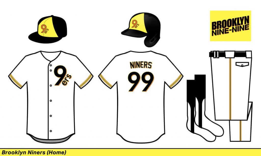
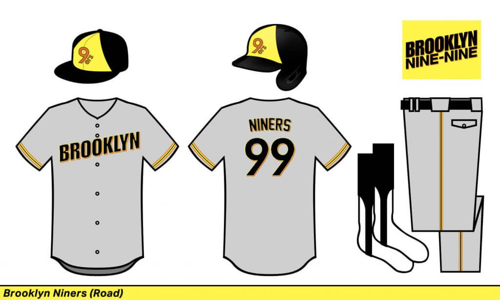
Brooklyn Niners
There was something faux-back 1970s to me about the show’s title, so I leaned into that a la the Rays.
California Patrol
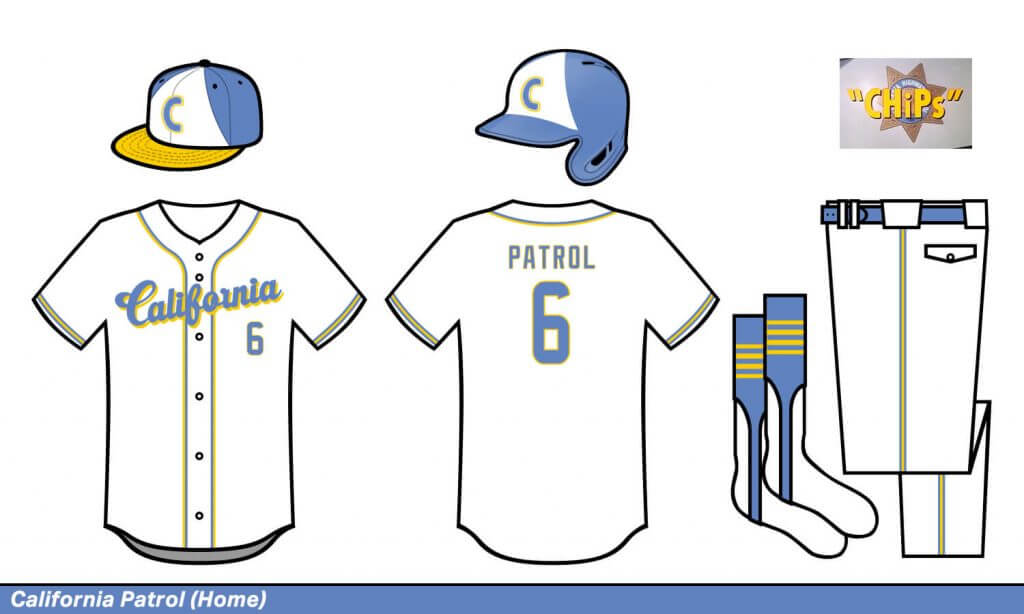
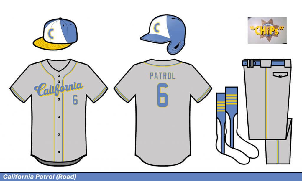
California Patrol
Probably the most obvious design I made. I kept the colors and tried to make the hat look like the old California Highway Patrol helmet.
Chicago Fire
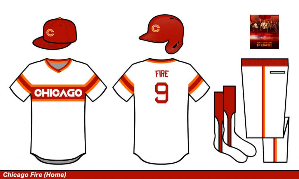
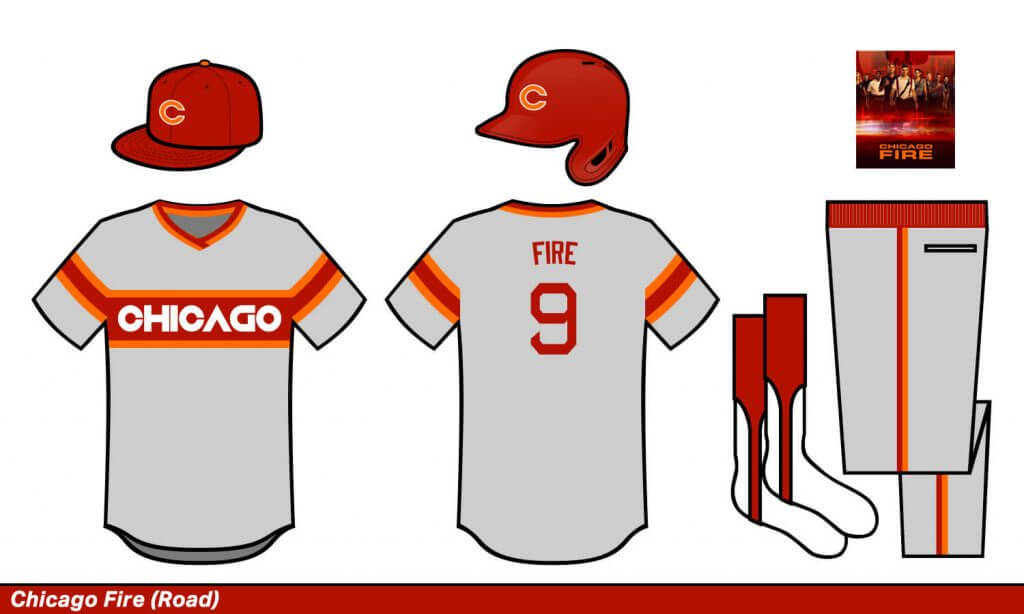
Chicago Fire
I went crazy with a Cubs, White Sox, Flames mash up here.
Chicago Hope
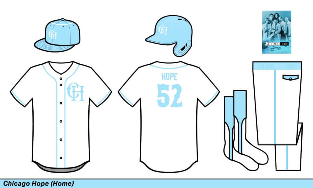
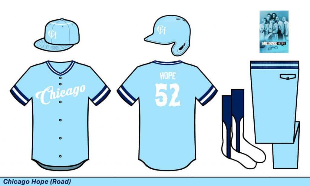
Chicago Hope
Another mash-up; I mixed the show’s UNC blue and the old Angels halo cap.
Cincinnati Waves
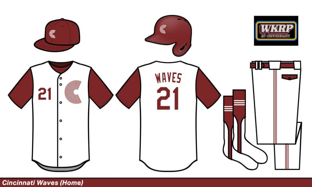
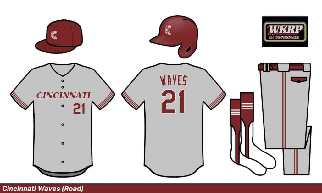
Cincinnati Waves
The show’s logo and font matched perfectly with the vibe of the Big Red Machine era.
Cleveland Heaters
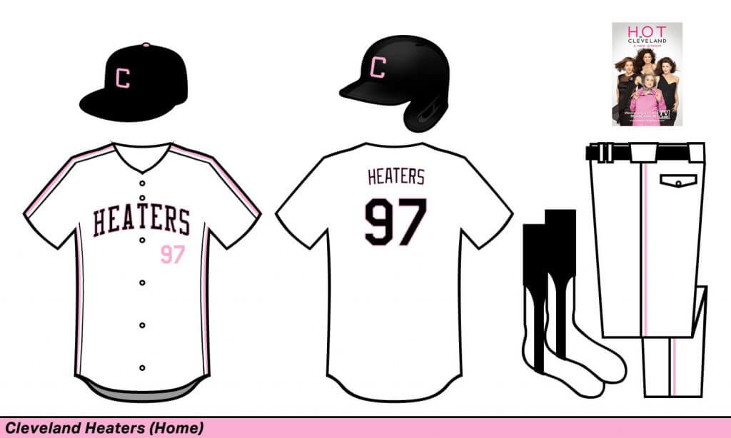
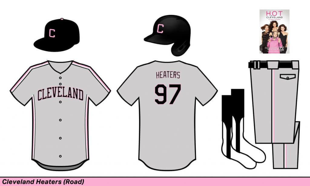
Cleveland Heaters
As a native South Floridian and soccer fan, more pink in sports uniforms please! This look worked really well with the “Major League”-era uni for the Cleveland Baseball Team. Also, the Heaters is another movie shout-out to “The Sandlot.”
Dallas Oilers
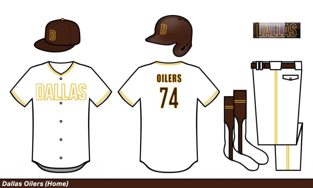
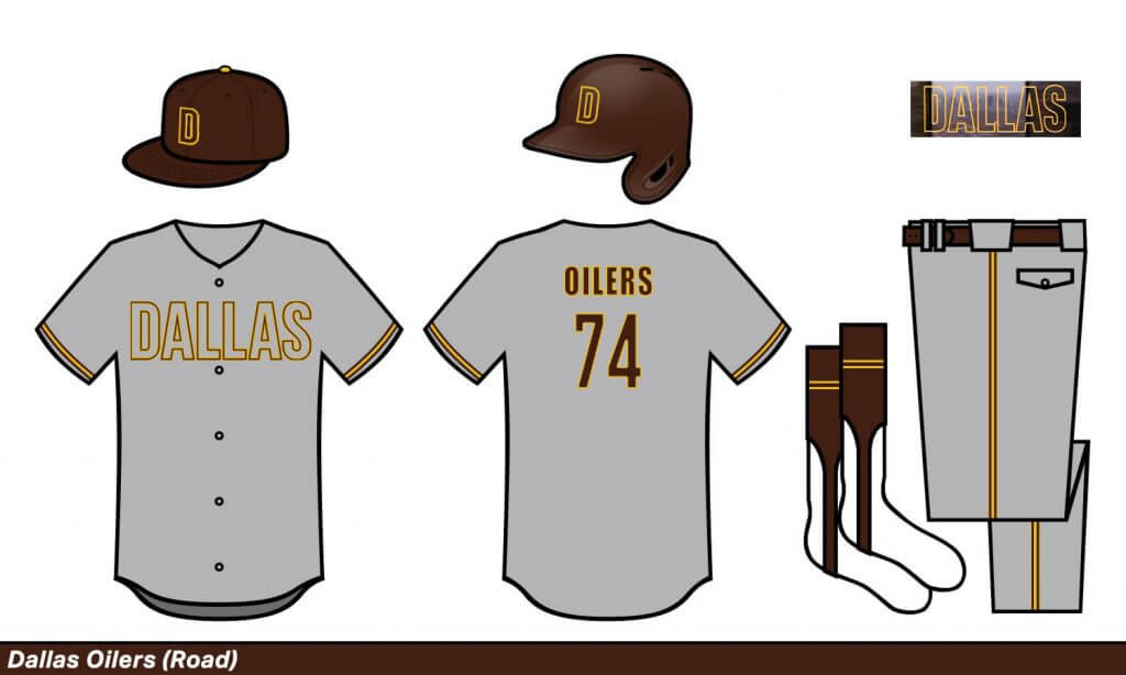
Dallas Oilers
I love the concept of an outline-only wordmark.
Denver Dinos
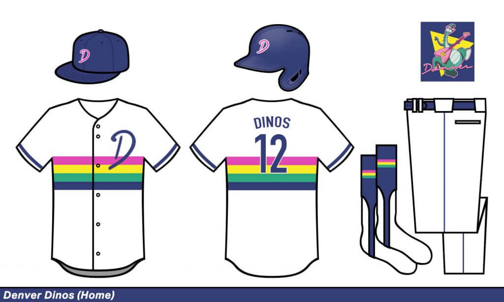
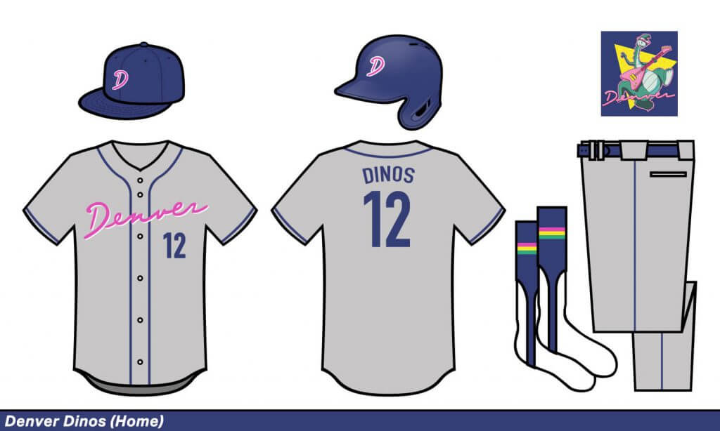
Denver Dinos
This had to be the Denver team for alliterative purposes. But then it all worked so well as an homage to the Nuggets’ rainbow unis with a bit of tequila sunrise mixed in.
Detroit 187s
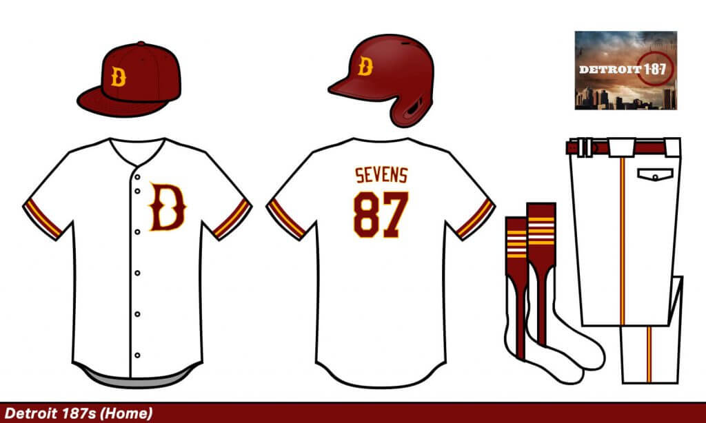
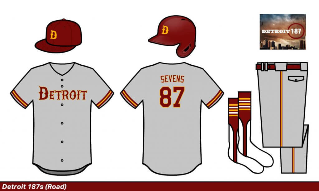
Detroit 187s
This was such a short-lived show that I pretty much just made this one up entirely. I do love the USC colors.
Hawaii Five-Os
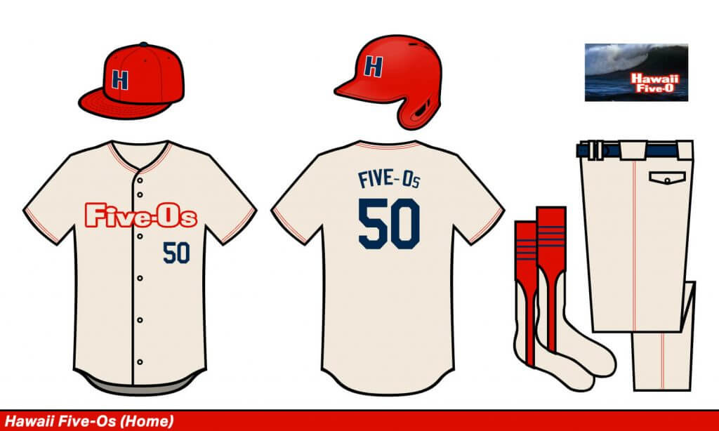
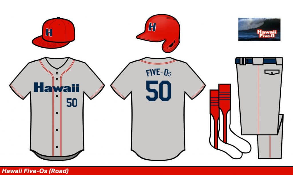
Hawaii Five-Os
A simple copy of the show’s title screen to a baseball uniform.
LA Lawyers
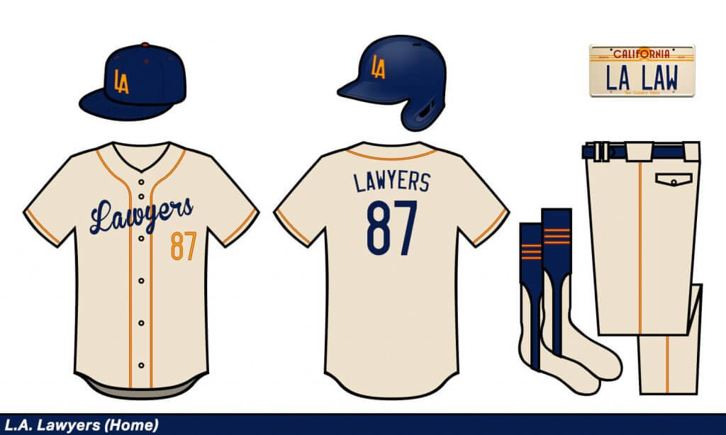
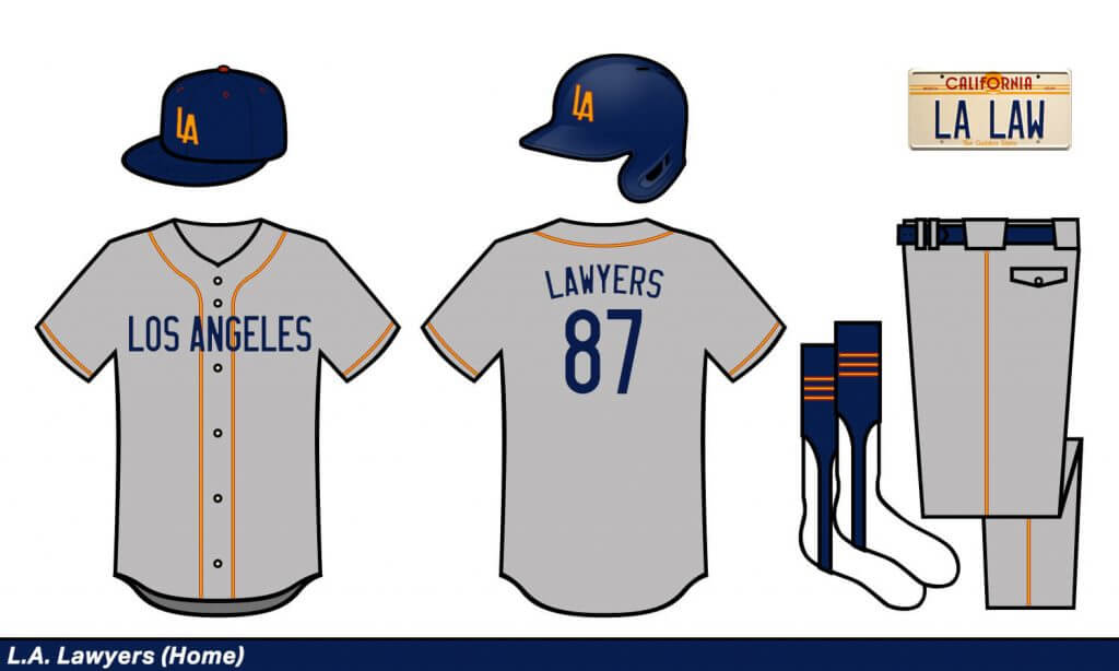
LA Lawyers
I love this show’s logo! I just went with the 1980s California license plate theme and it worked great.
Memphis Beat
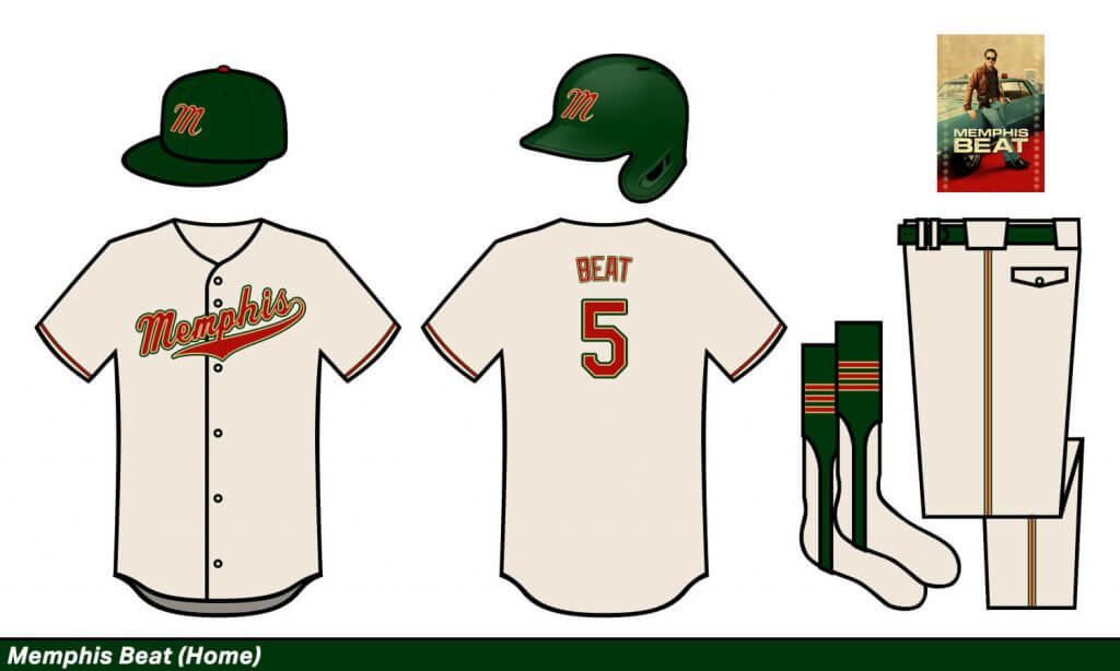
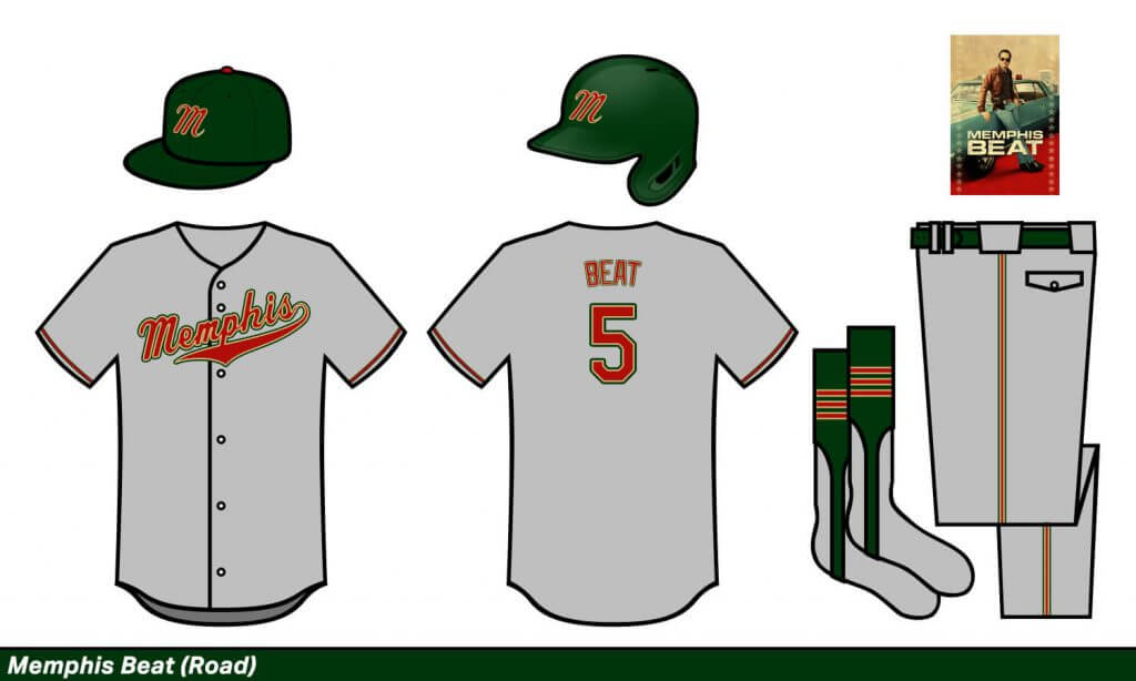
Memphis Beat
I didn’t even know this show existed, so I just used the color scheme on the poster and went from there. There’s definitely a Minnesota Wild thing happening here.
Miami Vices
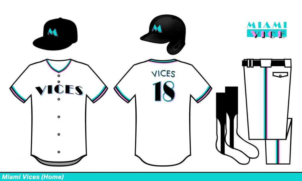
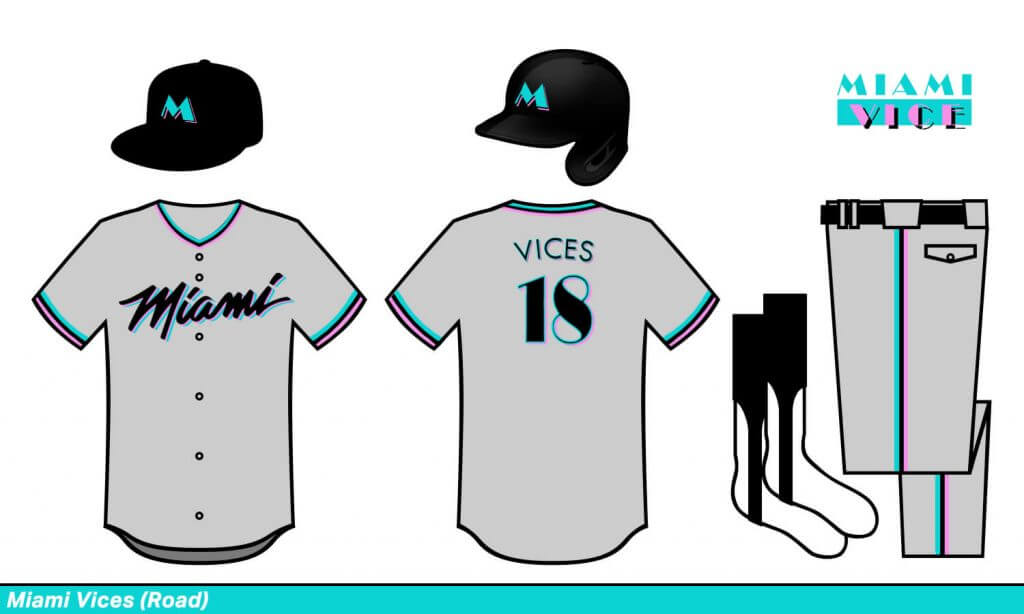
Miami Vices
Do I even need to explain this one?
Nashville Opries
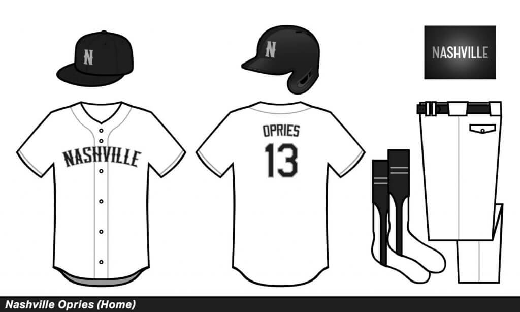
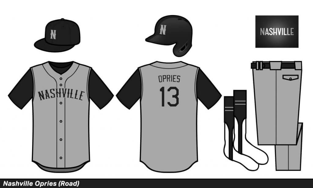
Nashville Opries
Simplicity was the thing here. Why don’t more sports teams use silver and black?
New York Blues
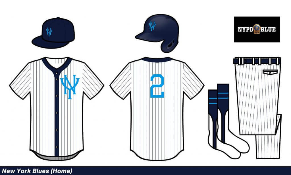
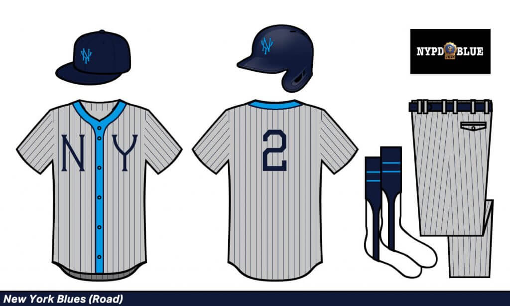
New York Blues
A fake New York team has to at least kind of look like the Yankees. I can’t bear the show’s title font, so I just went with a 19th-century vibe.
OC Tycoons
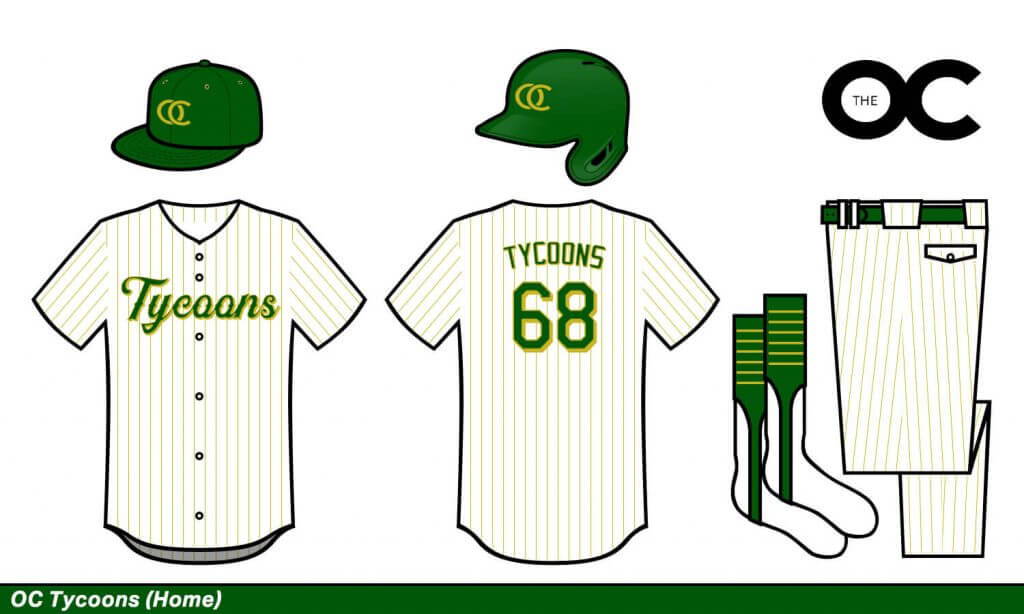
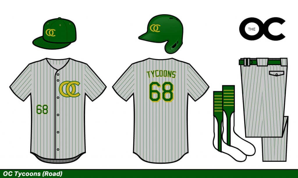
OC Tycoons
Green like money and gold like gold. These are the rich villains of my fake TV-show-baseball league.
Philadelphia Sunnies
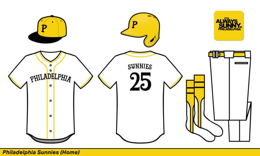
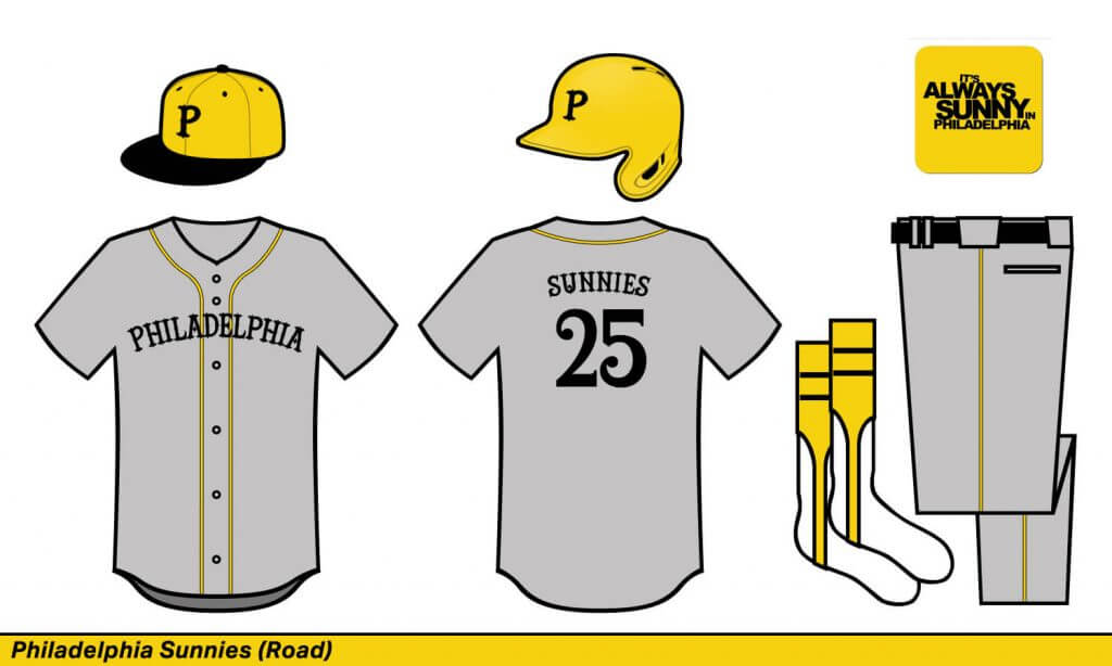
Philadelphia Sunnies
I liked giving the Philly team the color scheme of Pittsburgh. A yellow primary seemed obvious given the team nickname.
Portland Birds
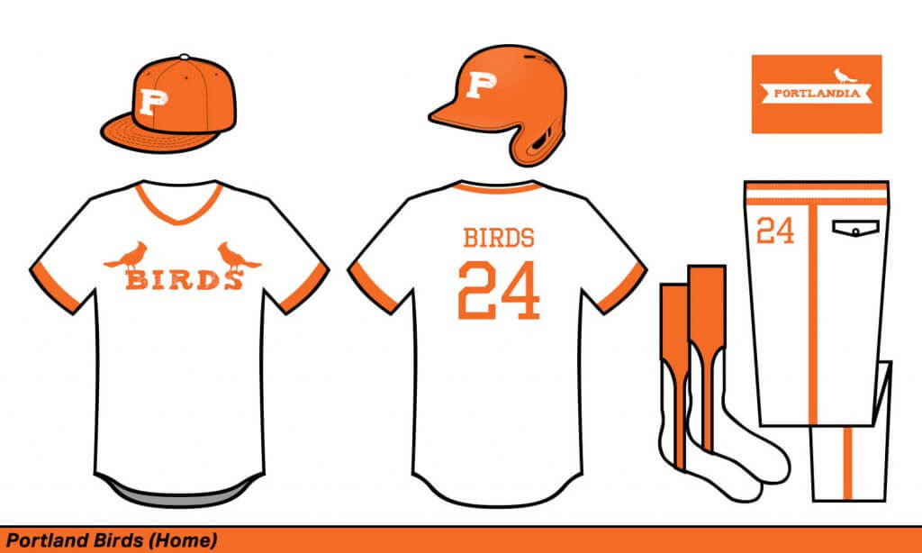
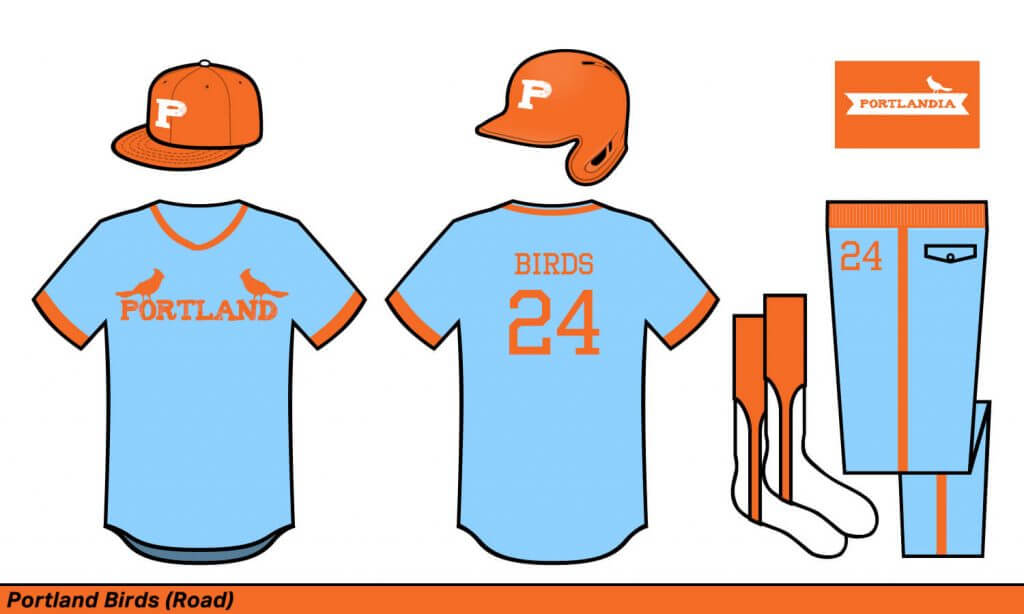
Portland Birds
Probably my favorite design of the bunch. In this case, I put two birds on it to mimic the Cardinals’ iconic chest logo. More importantly, can we bring back elastic waist bands? What about powder blue away unis? Pant numbering? What is happening to society?
Providence Blue Sox
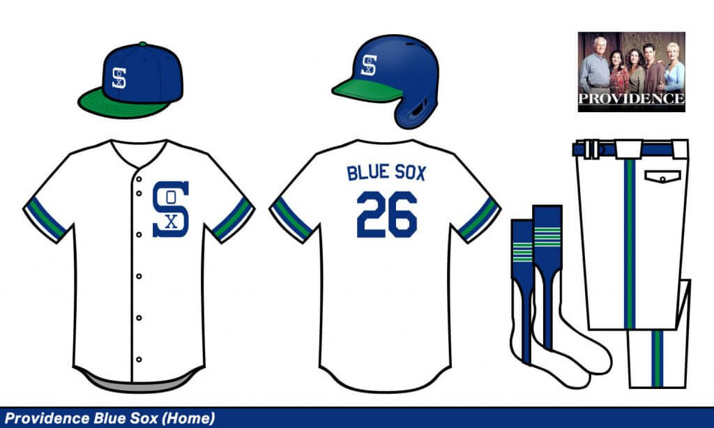
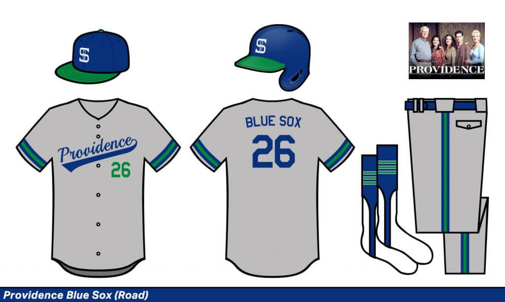
Providence Blue Sox
Another show without an identifying visual theme, so I invented one. I went very New England, mixing the Red Sox and the Whalers. An amazing color combo that is sadly missing from pro sports.
Queens Kings
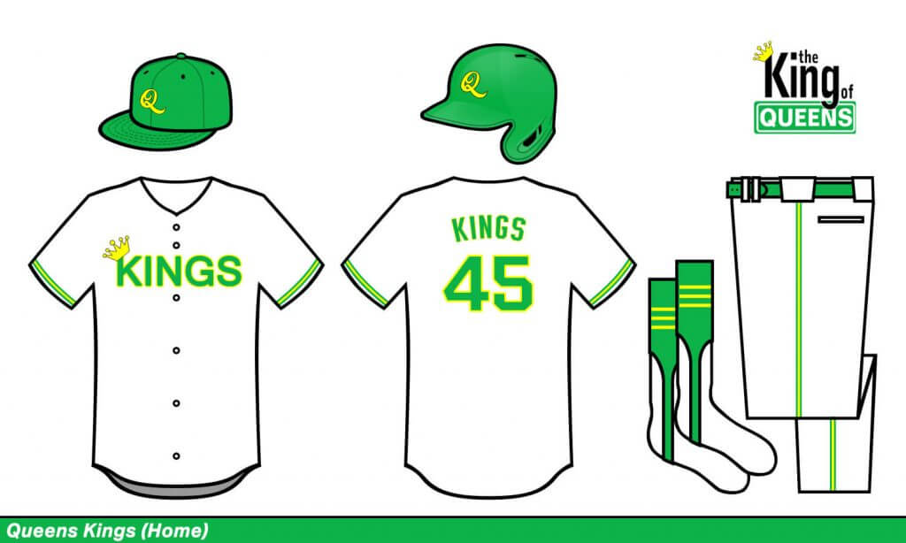
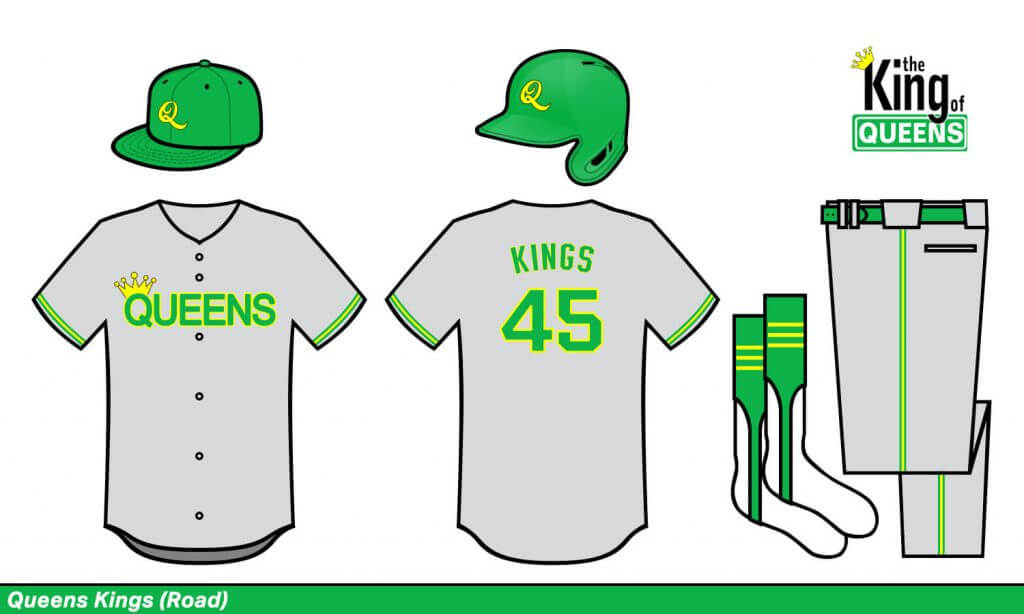
Queens Kings
My favorite nickname by far! I don’t even care about this jersey design, I just want the Mets to rebrand.
Reno Deputies
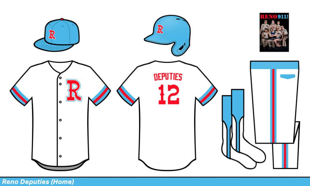
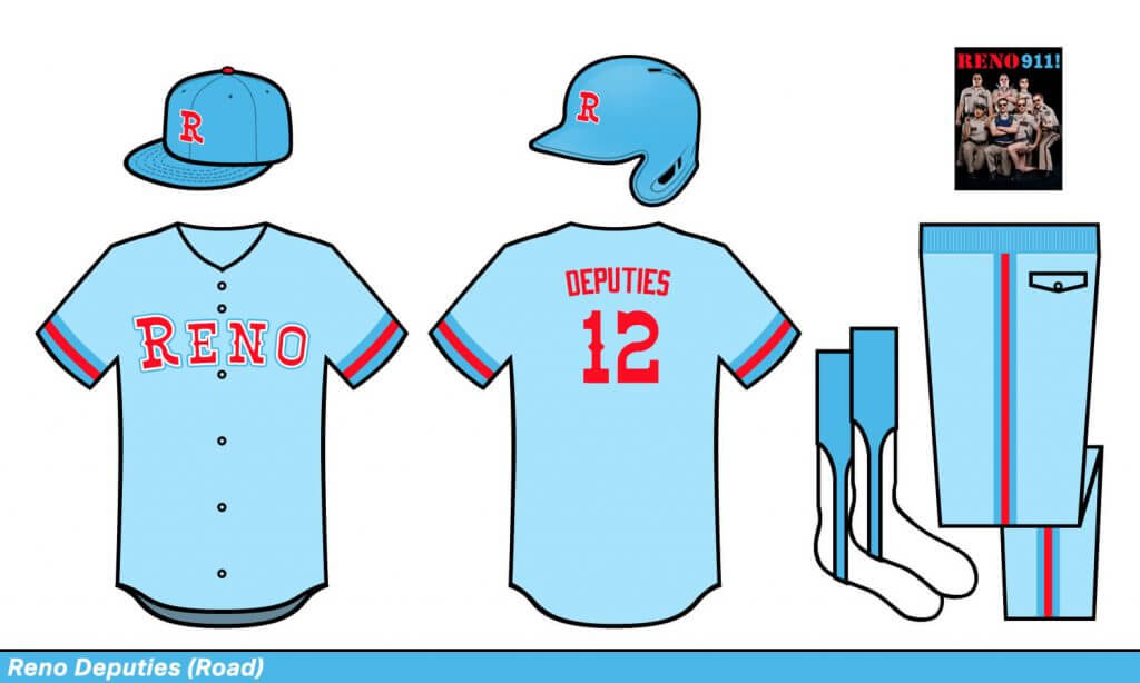
Reno Deputies
Man, I miss the old Houston Oilers colors. It’d look great on a baseball field too.
San Francisco Streets
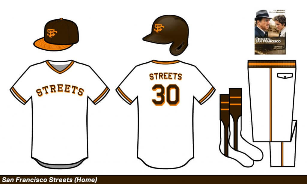
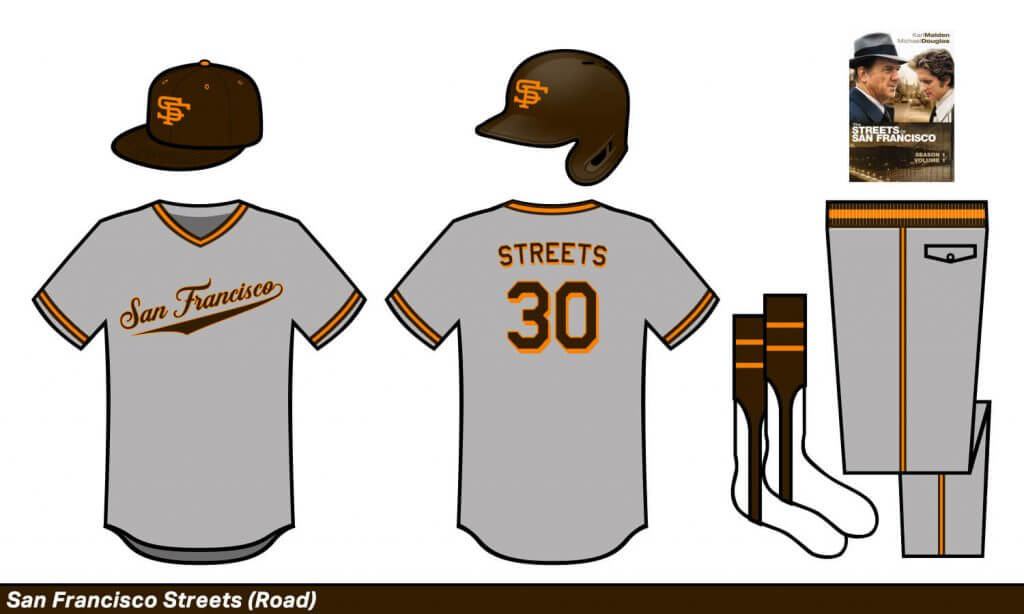
San Francisco Streets
Another fave. It’s basically a bizarro Giants uniform, but I gotta say, I think brown and orange beats black and orange. I also love the NY Rangers block-shadow number font on a baseball jersey.
Silicon Valley Devs
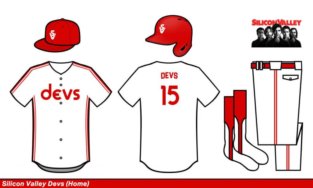
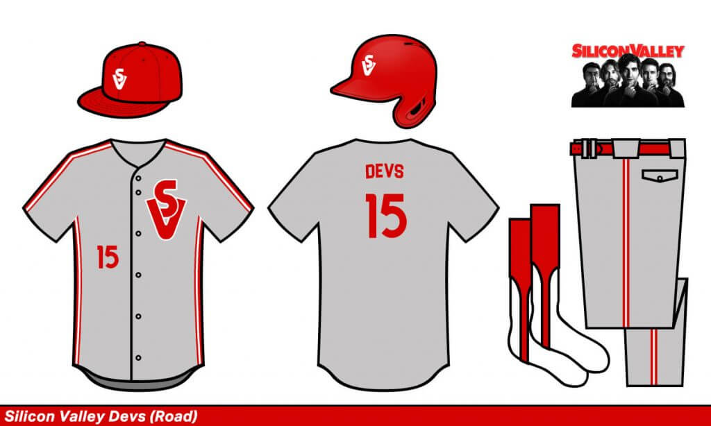
Silicon Valley Devs
I tried to make this feel late-70s/early-80s modern, because to Silicon Valley, the world didn’t exist before then.
Tacoma Bravest
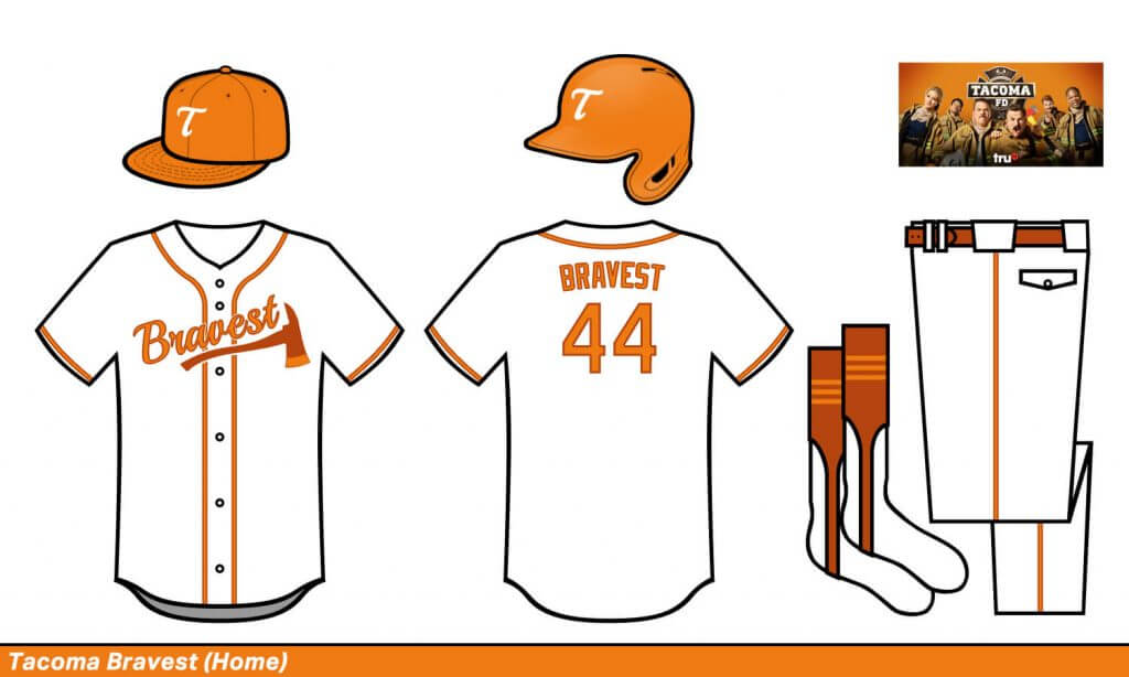
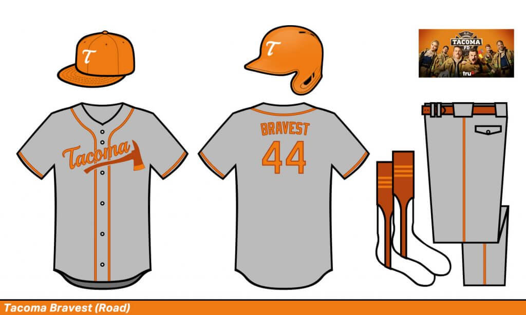
Tacoma Bravest
The Braves meet the Bucs’ creamsicles. I’m not sure it works though.
Texas Wheelers
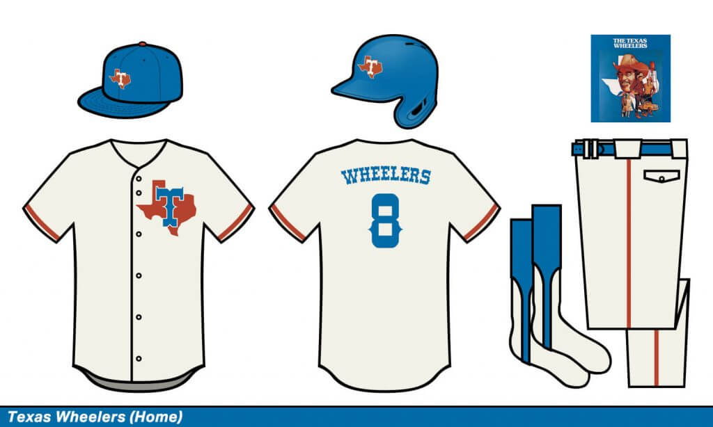
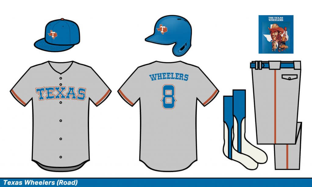
Texas Wheelers
I kept this similar to the current Rangers set cause that just feels so Texas
Thanks, Greg! Fun stuff (and great TV Show names!). OK, readers — what did you think? Any designs/color schemes/names stand out to you? Do the names “work” with the teams? Love to hear your thoughts.


Guess The Game…
from the scoreboard
Today’s scoreboard comes from Satacoy Steele.
The premise of the game (GTGFTS) is simple: I’ll post a scoreboard and you guys simply identify the game depicted. In the past, I don’t know if I’ve ever completely stumped you (some are easier than others).
Here’s the Scoreboard. In the comments below, try to identify the game (date & location, as well as final score). If anything noteworthy occurred during the game, please add that in (and if you were AT the game, well bonus points for you!):
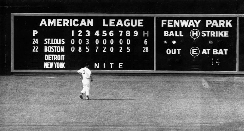
Please continue sending these in! You’re welcome to send me any scoreboard photos (with answers please), and I’ll keep running them.
The “BEST OF” Kreindler’s Korner
Hey guys & gals. You’ve enjoyed Kreindler’s Korner for several years now, mostly on the weekends, on Uni Watch, but with the recent coronavirus outbreak, Graig’s time is just too precious and he needs to tend to other things besides coming up with a new writeup each weekend.
So, going forward, for as long as the COVID-19 situation is bad in New York, I’m going to run a few “Best of’s” until Graig returns.
Here’s today’s offering:
Title: “Larry Doby, 1946” (color study)
Subject: Larry Doby, 1946
Medium: Oil on linen mounted to board
Size: 5” x 7”Larry Doby was born to a prosperous family in Camden, SC in 1923. He and his mother moved up to Paterson, NJ four years after his dad drowned in a fishing accident when the boy was eight. Considered rather quiet and introspective as a result of a lack of a father and his mother’s devotion to church, Doby would letter in baseball at Paterson Eastside High School, along with three other sports. Though he had thoughts of becoming a coach or a physical education teacher, by the time he was on the tail-end of his high school tenure, he was already playing second base under an assumed name for the Newark Eagles. Between being a senior and starting college, the club offered him $300 for his services.
World War II interrupted his stint in the Negro Leagues, as Doby spent the mid-1940s at Various naval bases on the west coast, keeping fit at each one by playing both baseball and basketball, as well as being a physical education instructor. Larry was stationed on the atoll of Ulithi when he heard about the signing of Jackie Robinson (with the Montreal Royals) over the Armed Forces Radio – he would later note that that was the first time he had truly felt there was a future to be had as an African-American in baseball.
Discharged in 1946, Doby returned to the Eagles to bat .360, lead the NNL in triples, and make the All-Star team. More importantly, he joined a club featuring Biz Mackey, Monte Irvin and Johnny Davis that would go on to win the Negro World Series against Satchel Paige and the Monarchs. During the series, he hit .272, with one homer, five RBIs and three stolen bases.
Having his eyes on integration ever since 1942, Cleveland Indians owner and team president Bill Veeck took an interest in Doby. He ended up formulating a plan, adding him to the Indians’ roster after the All-Star break in ‘47. Larry, who would play with Newark for the first half of the campaign, was bought for $15,000 – $10,000 for the rights from the club, and the other amount after Doby had spent 30 days with the Indians. Eagles owner Effa Manley is reported to have told Veeck: “If Larry Doby were white and a free agent, you’d give him $100,000 to sign as a bonus.”
Here’s Larry with the Newark Eagles in 1946. This is one of 200+ such paintings of mine that were on display at the Negro Leagues Baseball Museum in the spring of 2020.
Thanks, Graig! You can (and should!) follow Graig on Twitter.
The Ticker
By Anthony Emerson

Baseball News: Kurt Rozek noticed that a backstop advertisement at New Tigers Stadium uses the British spelling of “judgment”, spelling it as “judgement“. … The Durham Bulls, Triple-A affiliates of the Rays, will celebrate Bull Durham Night later this month, wearing jerseys designed to look like the satin jackets worn in the film. … The Arkansas Travelers, Double-A affiliates of the Mariners, wore tequila sunrise unis that included the number “501” on the front, a nod to the 501 area code that covers central Arkansas. … The Pioneer League has unveiled new logos (from Kary Klismet). … Also from Kary, the American Association’s Winnipeg Goldeyes will play in Jackson, Tenn., for the foreseeable future due to the ongoing closure of the US/Canada border during the pandemic. … NIU have gone and done their own version of the tequila sunrise unis (from Chuck O’Connor). … The wind was so bad in South Bend during the Notre Dame/Florida State game that FSU pitcher Parker Messick had his cap blown clear off his head (from James Gilbert). … University of Hartford softball players have blacked out the school’s name on their uniforms in protest of the school’s decision to move from Division I athletics to Division III athletics by 2025. And yes, they played the game that way (from @willchitty4 and Ben Whitehead).

Pro Football News: The Packers have revealed their rookie uniform numbers (from Andrew W. Greenwood). … The Dolphins have also revealed a whole bunch of new uniform numbers, for rookies and free agent signings (from Preston Feiler). … The Browns have little two-bar helmet logos of some of their 2021 opponents on their website, matching their 75th anniversary patch. Unfortunately the helmets have modern logos instead of throwbacks (from Joseph A. Bailey). … The Berlin Thunder of the soon-to-launch European League of Football have unveiled their logo (from Wade Heidt). … Absolutely BRUTAL striping/nameplate combo for the Sea Lions of The Spring league. “Reminds me more of a runners bib than a nameplate,” says Rocky De La Rosa.

Hockey News: The Blackhawks have revealed some pretty nice warmup sweaters for this Sunday’s One Community Night (from Seth Hagen). … The QMJHL’s Quebec Remparts have introduced a 25th anniversary logo (from Wade Heidt). … Also from Wade, the OJHL’s Whitby Fury are relocating to Minden, On., this summer, and will be called the Haliburton County Huskies.

Soccer News: At the 1982 World Cup, Argentina assigned their kit numbers alphabetically by last name, so midfielder Osvaldo Ardiles got No. 1, instead of a keeper. The only exception was Diego Maradona, who asked for and received No. 10 (from Ursus Maije). … The USL Championship’s New Mexico United has a new shirt ad, for New Mexico’s tourism advertising campaign (from Ty Ortega). … USL League One side FC Tucson have unveiled some pretty sharp new home kits (thanks, Phil). … Forest Green Rovers of England’s League Two have drawn headlines for being among the UK’s most environmentally and politically conscious clubs. Their latest effort is a public call for the ban of gambling ads, something which the British government is currently reviewing (from Shawn Hairston). … Ahead of the recent special election for the UK Parliament constituency of Hartlepool, Prime Minister Boris Johnson paid a visit in support of the Conservative Party’s candidate Jill Mortimer. They, along with mayor Ben Houchen, visited the local football club, Hartlepool United, and each received a jersey. Mortimer and Houchen got their last names, but Johnson’s was first name on back (from Mark Britten). … Serie A team Spezia Calcio wore a special badge on the right side of their jersey to commemorate their victory in the unofficial 1943-44 Upper Italian championship. The badge is different from the “scudetto” badge worn by the winner of the Serie A title (from Graham Clayton).

Grab Bag: Antarctica didn’t have a flag until a journalist created one, hoping to bring attention to the impact of climate change on the continent (from Wolfie Browender). … South High School in Bakersfield, Ca., has changed their mascot from Rebels to Spartans. They had previously used a “Johnny Reb” mascot (from Derek May). … Windows 10 still has some Windows 95-era icons deep in there, but those will be gone come the latest update (thanks, Brinke). … The UMaine College Republicans have a new logo that’s so bad one local reporter wondered if the College Democrats had designed it for them.
Uni Tweet of the Day
THE FISHERMAN!
Uni reveals sure have come a long way since the 1990s, eh?
'I like the Islanders' new uniforms' me and you both pal. pic.twitter.com/9FxEMMxtQv
— Slapshot Vintage 🏒 (@slapshotvintage) May 4, 2021
And finally… that will do it for today — big thanks to Greg for sharing his “Bizarro” uniform concepts. Hope you enjoyed them as much as I did.
You guys have a great Saturday and I’ll catch you back here tomorrow for Mother’s Day.
Peace,
PH
Greg, very well done with the TV series-based unis. I love the fact there isn’t a “softball top” in the bunch. My personal favorite is the sky-blue road uniform of the Reno Deputies. And despite your misgivings, I think you’re on to something with the Tacoma Bravest color scheme. I also commend you on the mono black road unis for the Atlanta Peaches.
One suggestion — the halos on the Chicago Hope caps might be extended to the batting helmets. I’m old enough to remember seeing the Angels back in their halo days and observing how much nicer the round halos looked on the helmets than on the cloth caps, where they’d tend to get kind of scrunched up.
Scoreboard….June 8 1950 Red Sox lambaste the Browns 29-4
Gregory, I LOVE pretty much all of the concept unis. I think I’m gonna take a stab at recreating a couple in MLB The Show, starting with Atlanta and Memphis!
Love the TV-themed unis! BTW, the Queens Kings were a MiLB team briefly (they were kind of a temp for one year before the Brooklyn Cyclones) but they could’ve used that green and gold color scheme.
Forgot to mention in my review below: I wasn’t a huge fan of the show but I love this concept.
The Las Vegas Shooters name seems incredibly tone deaf after 60 people died by gunfire at that music festival a few years ago.
This.
Very true, but on the whole it was a very fun exercise in concepting.
Assuming there will be pressure on the Rangers to change their name someday, they couldn’t go wrong with using “Deputies” instead of “Wheelers.”
As for the others:
Atlanta…stick with the A. Spelling out the whole name in that font makes it almost unreadable.
Beverly Hills Zips
The show’s visual theme is very 90s but also surprisingly bland. That kinda matched perfectly with a Rockies feel.
Something involving Beverly Hills HAS to include gold, no?
California Patrol
Probably the most obvious design I made. I kept the colors and tried to make the hat look like the old California Highway Patrol helmet.
The road grays should have been khaki instead of gray. Otherwise, great idea.
I liked giving the Philly team the color scheme of Pittsburgh. A yellow primary seemed obvious given the team nickname.
No no no no no…Using yellow is great, but never give a Philly team Pittsburgh colors. Philly’s flag is yellow and sky blue, which is perfect for an “It’s Always Sunny In Philadelphia ” look.
As for Providence, I’ve always advocated for a Blue Sox team, but only if they wear blue *sanitary* socks. Don’t be like Boston used to be and Chicago is now. Wear the same color socks as your name or change your name.
Again, this was a very fun exercise. Thanks for sharing!
Based on the feedback received, I’ve removed this from the concepts. I agree that the name is inappropriate under the circumstances. Apologies.
My bad. Wasn’t intentional everyone.
Hey, at least Phil didn’t delete the “Detroit 187’s”.
A lot of these would probably trigger some people with the various references to the police, the homeless problem in San Francisco (“Streets”), and who knows what else.
I loved the majority of your concepts. Don’t forget that the Rays stole their fauxbacks from the Padres originals. Also, Chicago has a pretty successful MLS team called the Fire. They had a jersey design they basically ripped off the White Sox as well….the “beach blanket” design. So give credit to them as well as the others on that design.
My biggest beef (read it a day late and did not even see the Las Vegas team) is the Providence team…. you attributed the Sox design to the stinkin Red Sawx…. boo. That was a WHITE SOX design many times over… 1939-41, 43-46, and 47-48…with the blocky design. They used the curved design many other times for longer periods as well. My favorite White Sox logo.
The Chicago Hope is another old White Sox rip off. They used to be a “pepsi” team and changed alot…colors too.
The Reno design looked like the 70’s Rangers.
And the Memphis team looked like a Miami Hurricanes uniform to me, not the Minnesota Wild.
Pretty cool across the board though. Definitely one of the best redesign/reimagined sets of uniforms I have seen on here in the past few years. AND THEY ALL CAME WITH REAL STIRRUPS!!! THANK YOU VERY MUCH!!!
It seems easy enough to recognize that the name is a reference to playing dice, not firing guns. I don’t see why it needs to be offensive to anyone. Words often have multiple meanings. Why confuse them on purpose?
Anyway, on a potentially more interesting note…
The band Thousand Foot Krutch released a song in 2016 called “A Different Kind Of Dynamite”. In that song is the line “Like shots fired in the middle of Vegas”. It’s an odd lyric that doesn’t really fit the overall message of the song. The Las Vegas shooting happened about 16 months later, and I’ve always wondered if there was some kind of connection (since we still don’t really know what the shooter’s motives were). I’m not suggesting that the band somehow predicted the shooting, but maybe the shooter was a fan of that song and it put an idea in his head.
Anyway, just thought I’d toss that out there in case anyone was interested. TFK is a pretty obscure band, so I can’t imagine very many people have ever noticed that before.
Planet Fitness (Detroit backstop ad) always uses “Judgement” as the spelling.
A bit more on the 25th-anniversary logo for the Quebec Remparts. There have been many more QMJHL seasons featuring the Remparts than 25. They are celebrating the 25th for the revived, version 2 of the team. The Beauport Harfangs relocated and became the Remparts in 1997.
The original Quebec Remparts played in the QMJHL from 1969-85. Fans may remember some prominent NHL players from the original Remparts such as Guy Lafleur and Michel Goulet to name a couple.
link
link
Townsend’s True South flag is an excellent design, but it’s neither the first Antarctic flag nor is it official. It is being used by many Antarctic stations, so it’s developing de facto status as a continental flag, but two previous flags also had similar shared use in prior years. So if the True South flag is considered to be adopted by dint of use, then so to must those prior flags be considered to have been adopted. And one of them, the flag of the Antarctic Treaty, actually does have official status, though it’s the flag of the treaty system, not the continent itself.
I like the thought that went into the TV-themed bizarro teams. Dallas especially shows a really innovative lettering treatment that I would t expect to work but it does. I could see that approach on a real team! And both the Austin and Cincy teams should come to live as Gregory designed them.
Some friendly criticism: The Vegas team could use a different name. Not so much to avoid any mention of words that might be associated with gun violence, but because the specific name is already in common use as a name for a notorious mass murderer. However good a reason one might have for it, a team named for example the “Night Stalkers” just won’t work. The public already has a very clear and firm association with the name. Same deal here.
And come on, no Coach or Mary Tyler Moore themed uniform for Minnesota? Also, while I dig the Five-O reference, I’d prefer to think that the Five-O’s relocated but then the expansion Magnums came to Hawaii, and I want to see Gregory’s take on uniforms that use the distinctive visual identity of the 1980s PI show.
The Minnesota Marys would just be a plain purple jersey, right?
Maybe some soap bubbles for sleeve stripes?
I like where you’re going with the Magnum idea, but please, no Hawaiian shirt jersey. If anything, use TC’s chopper as the inspiration.
How about a zipper-front Pittsburgh Neighbors for Mr. Rogers (Fred, not RS) ?
California Patrol is amazing! Love the show and love the unis!
No Minneapolis Mary Tyler Moores? Minnesota Mary’s? Nothing?! C’mon man!
Think of the great design concepts from the opening sequence title!
1. Love the stirrups on the Florida St. pitcher.
2. Did any of the new Packers get No. 12?
Can we get the Lt. Jim Dangle version of the Reno Deputies uniform? (Hunter Pence, eat your heart out.)
Thanks for the FCS coverage a few weeks ago! We’re down to the final four college football teams to play this season and it happens today!
Regarding Northern Iowa’s Adidas retro uniform tops.
Louisville has also started wearing Rainbow Guts this week in a win over Vanderbilt.
The NIU pictured was Northern Illinois University, not University of Northern Iowa.
As far as I can tell, this blog has a love/hate relationship with the University of Northern Iowa, since they tend to go by “UNI” but also prominently feature the color purple.
Fun stuff, Greg! Thanks for sharing these designs! I really like several of them and appreciate your general sense of classicism. It feels like you keep the designs just simple enough to allow the featured elements to stand out and not get lost in the visual clutter that so many contemporary designs do.
The Browns have little two-bar helmet logos of some of their 2021 opponents on their website, matching their 75th anniversary patch. Unfortunately the helmets have modern logos instead of throwbacks
Well, the Ravens and Texans weren’t around in the two-bar era, so that’s allowed. Plus, the Broncos logo looks better with the two-bar…but still inferior to the horse-in-the-D logo.
I am smitten by this move by the Browns. Genius. The modern logos are even better than the throwbacks. Juxtaposition at its finest.
Lest we forget, the Ravens *were* around in the 2 bar era as they *were* the Cleveland Browns.
No, the Ravens were never a part of the two bar era. While Art Modell moved his franchise to Baltimore, the Browns name, colors, records and history stayed in Cleveland. They are two separate franchises who shared one greedy, backstabbing, lousy businessman owner.
Now if you want to say the Tennessee Titans played in the two bar era as the Houston Oilers that would be accurate as the team’s name, colors, records and history moved with them.
“Serie A team Spezia Calcio wore a special badge on the right side of their jersey to commemorate their victory in the unofficial 1943-44 Upper Italian championship.”
Upper Italy = the Mussolini puppet state created by the Nazis after his people overthrew him? Which waged war on liberated Italy?
Yeah, I can see why that’s not been recognized. I wonder when the blowback occurs.
The Tacoma FD inspired set reminds me of something that appeared often on the show. During season 2, when they had scenes in the kitchen of the firehouse, there was a giant Toronto Blue Jays script “T” from the graphite “Black Jays” era placed on the refrigerator.
“Beverly Hillbillies” is the clear choice…disappointed that 90210 got the nod.
But fun concepts, all around!
So many great designs! Well done. I love the WKRP reference, and the Patrol is so fun. However, the 187’s feels inappropriate. Naming a team after the code for murder – and one that has been referenced in pop culture to specifically referencing killing police – doesn’t sit right. I’m sure that wasn’t the designer’s intent, though. Overall, great job on a fun project.
The WKRP uni should have had a carp on it. Or a turkey lol. But I did appreciate the radio signal C logo too.
Is there a way to view the Las Vegas uni since it was deleted here? I’m wondering if it was in the vein of the Robert Urich show.