Good morning! April 15 — just 11 days from now — is Jackie Robinson Day. It’s also the 75th anniversary of Jackie breaking the big league color barrier and the 25th anniversary of No. 42 being retired on an MLB-wide basis, so I’ve been wondering if they’d be doing something different this time around. And based on the newly released MLB The Show 22 video game, it looks like things will indeed be a bit different on Jackie Day this year.
The first hint that something new might be in the works came on Saturday night, when Twitter-er @JGbaseball98 posted a screen shot showing a list of new features in this year’s edition of the video game, including “new 2022 Jackie Robinson AL and NL uniforms” (for all remaining images in this post, you can click to enlarge):
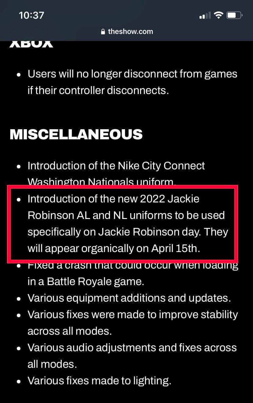
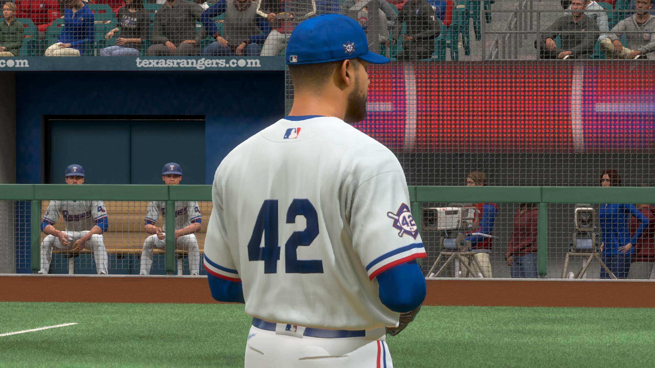
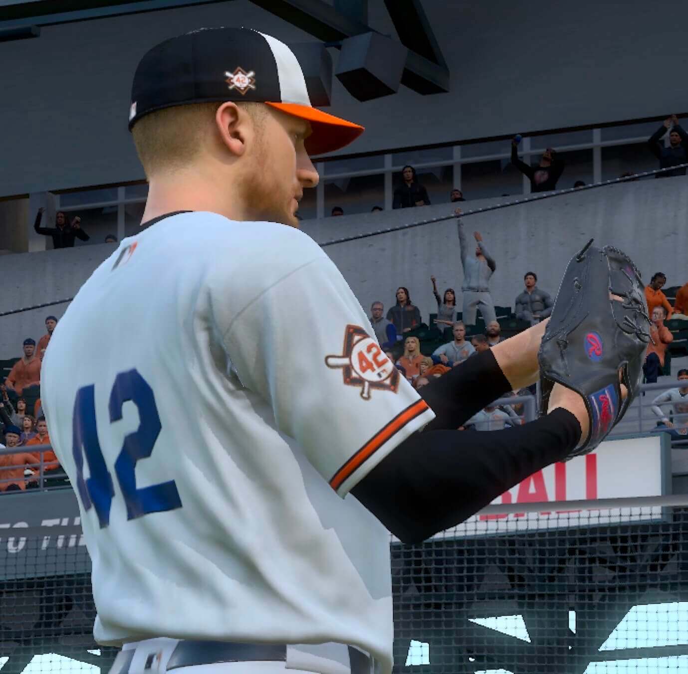
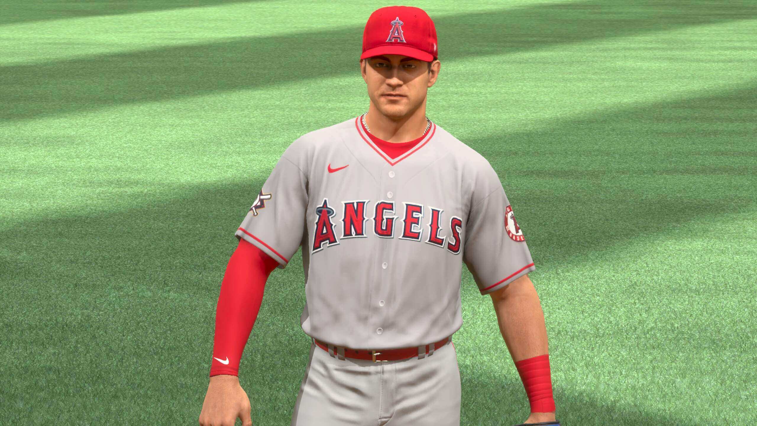
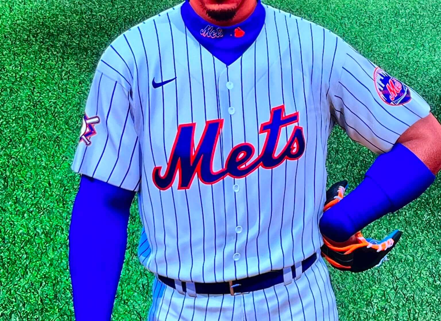
Phil had that note in yesterday’s Ticker. At first it wasn’t clear if the note was heralding the arrival of a new uniform design/format/etc., or if they were just referring to the 2022 versions of the usual 42-clad jerseys. Some clarity arrived yesterday, when Uni Watch readers Justin Walker and Johnny Williamson both sent me screen shots showing that the rear-jersey uni numbers for all teams this year are being rendered in blue and in the Brooklyn Dodgers’ old number font. This isn’t so bad for teams that already have blue in their color schemes, like the Rangers, Mets, and Yankees:
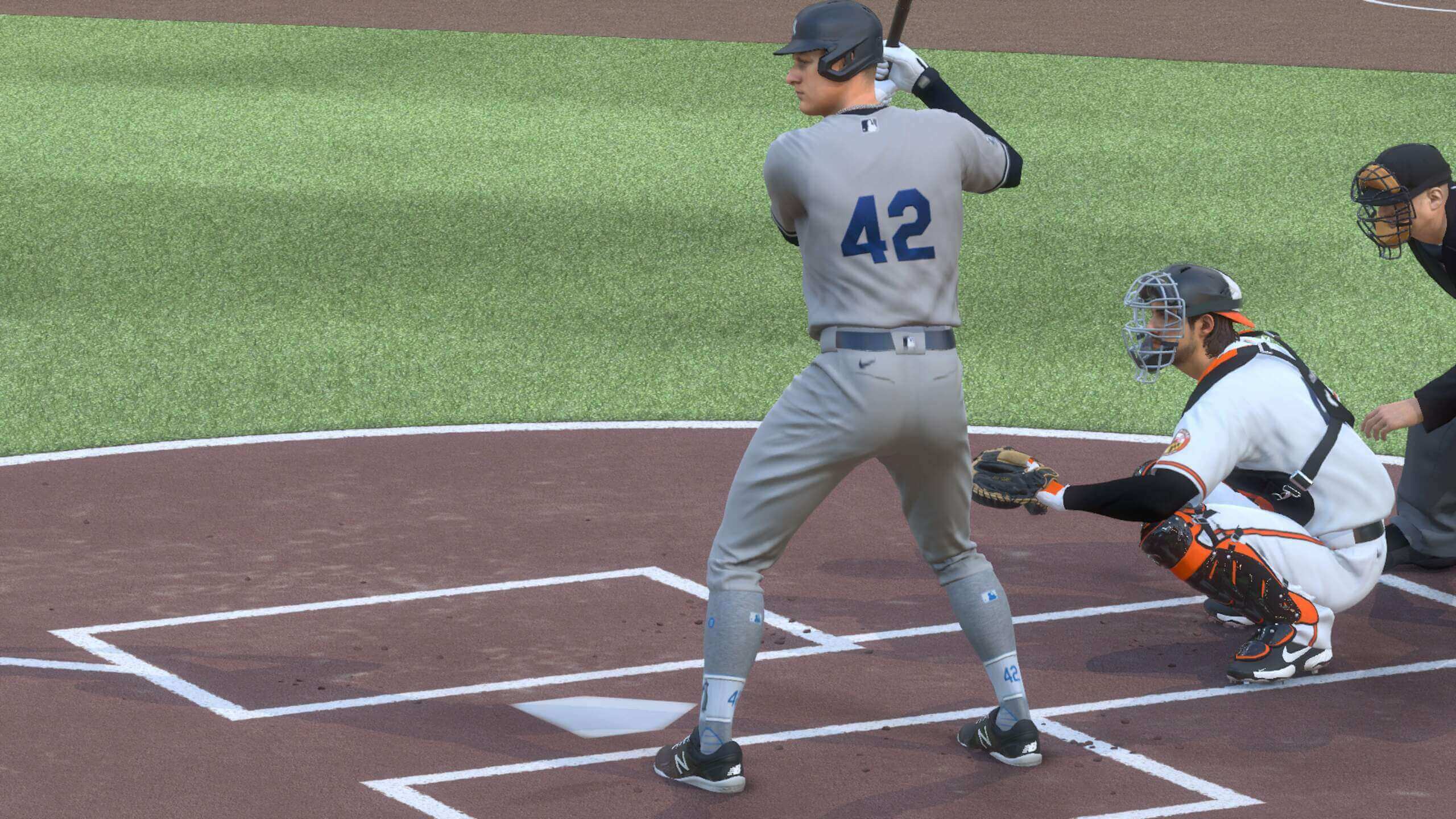
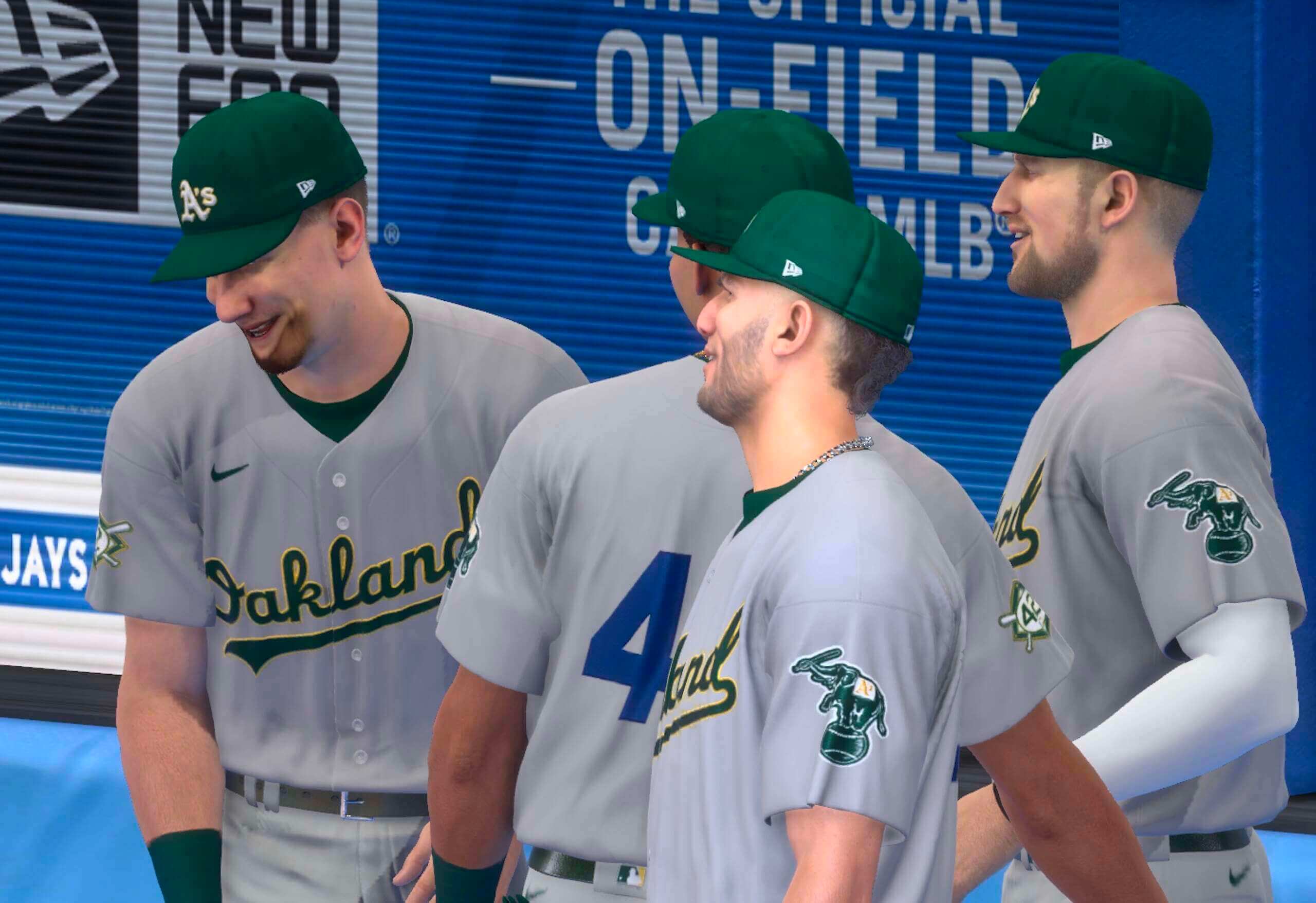
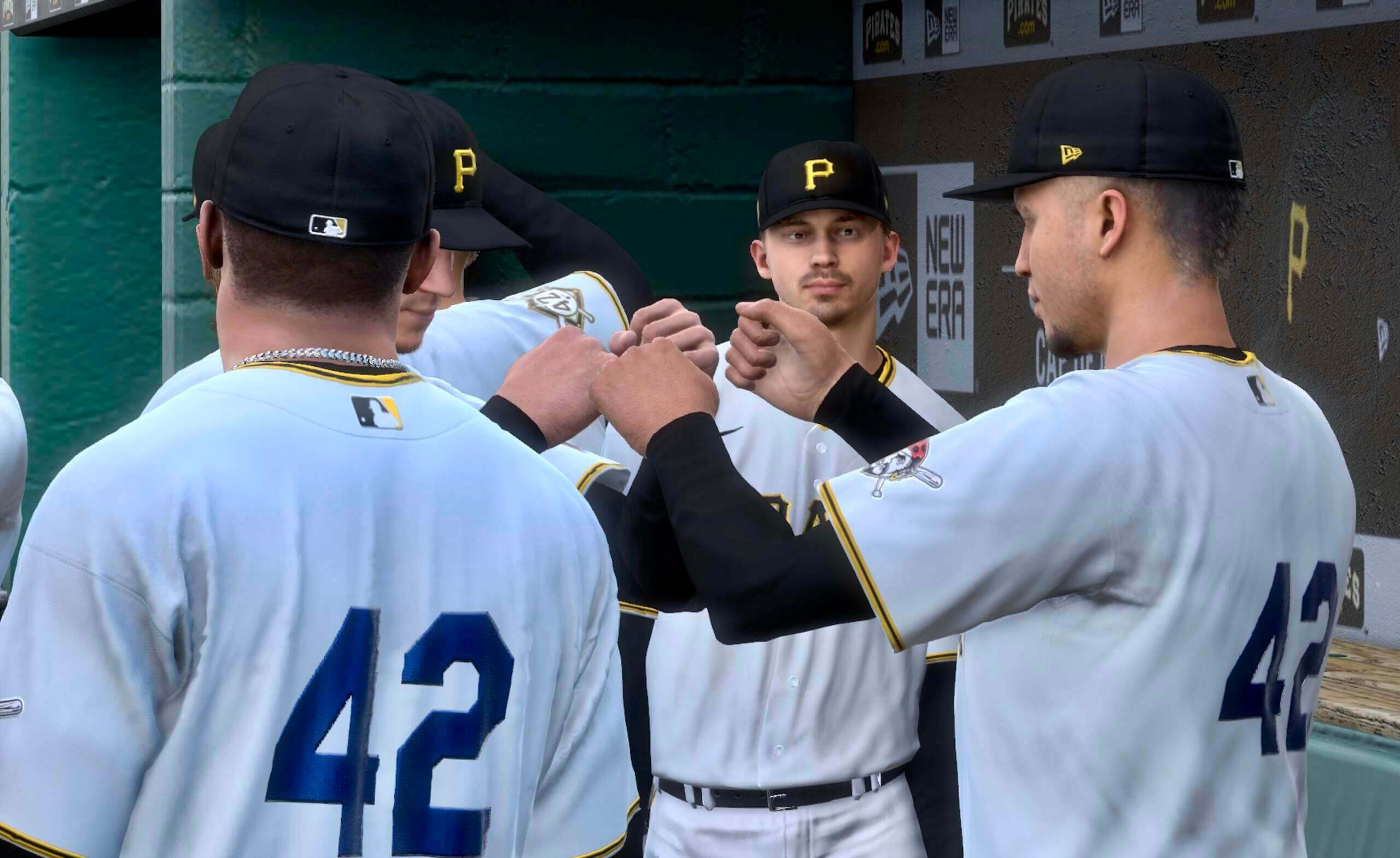
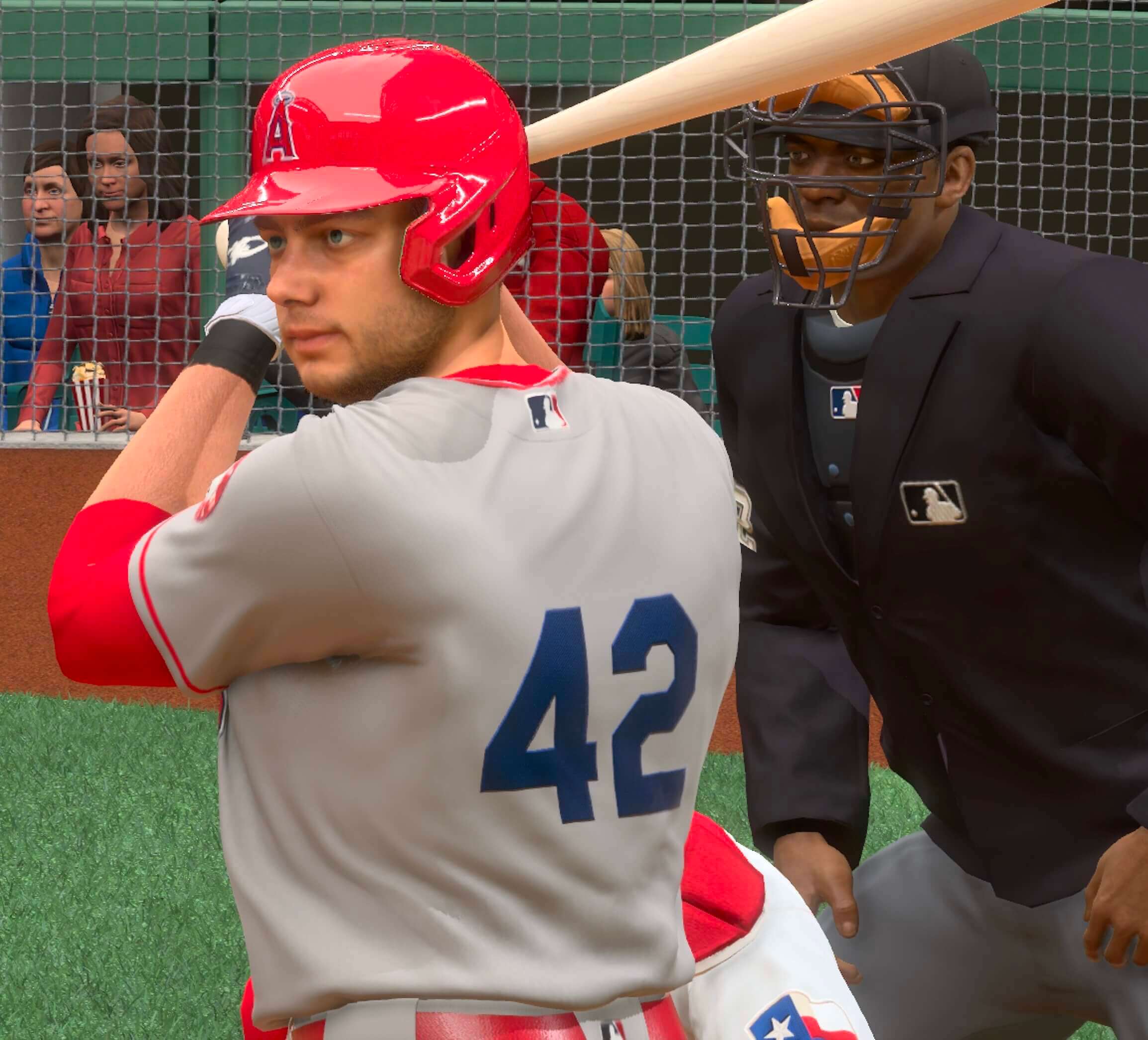
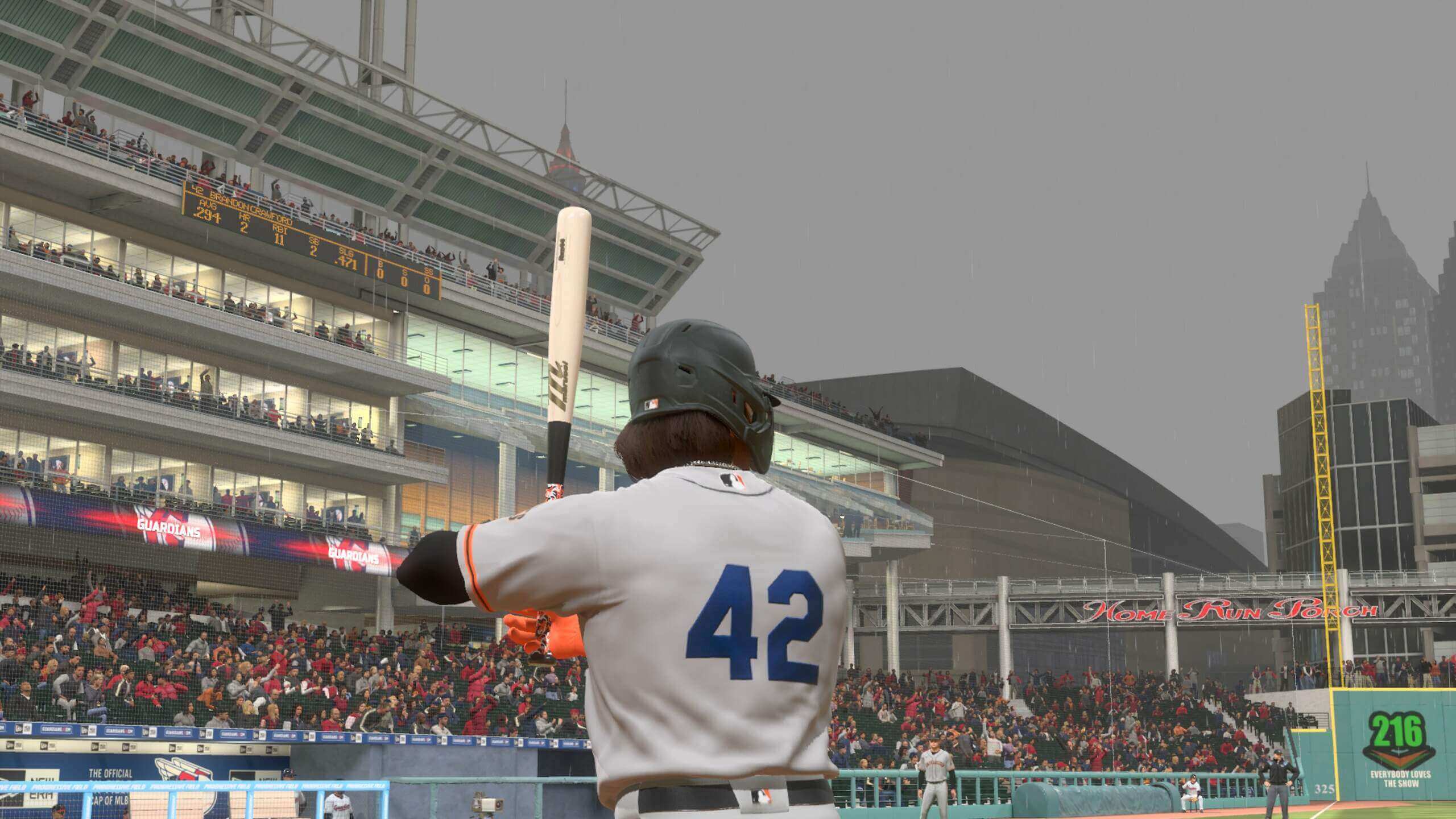
But as you’d expect, it looks a lot more jarring for teams that don’t normally wear blue, like the A’s, Pirates, Angels, Orioles, and Giants:
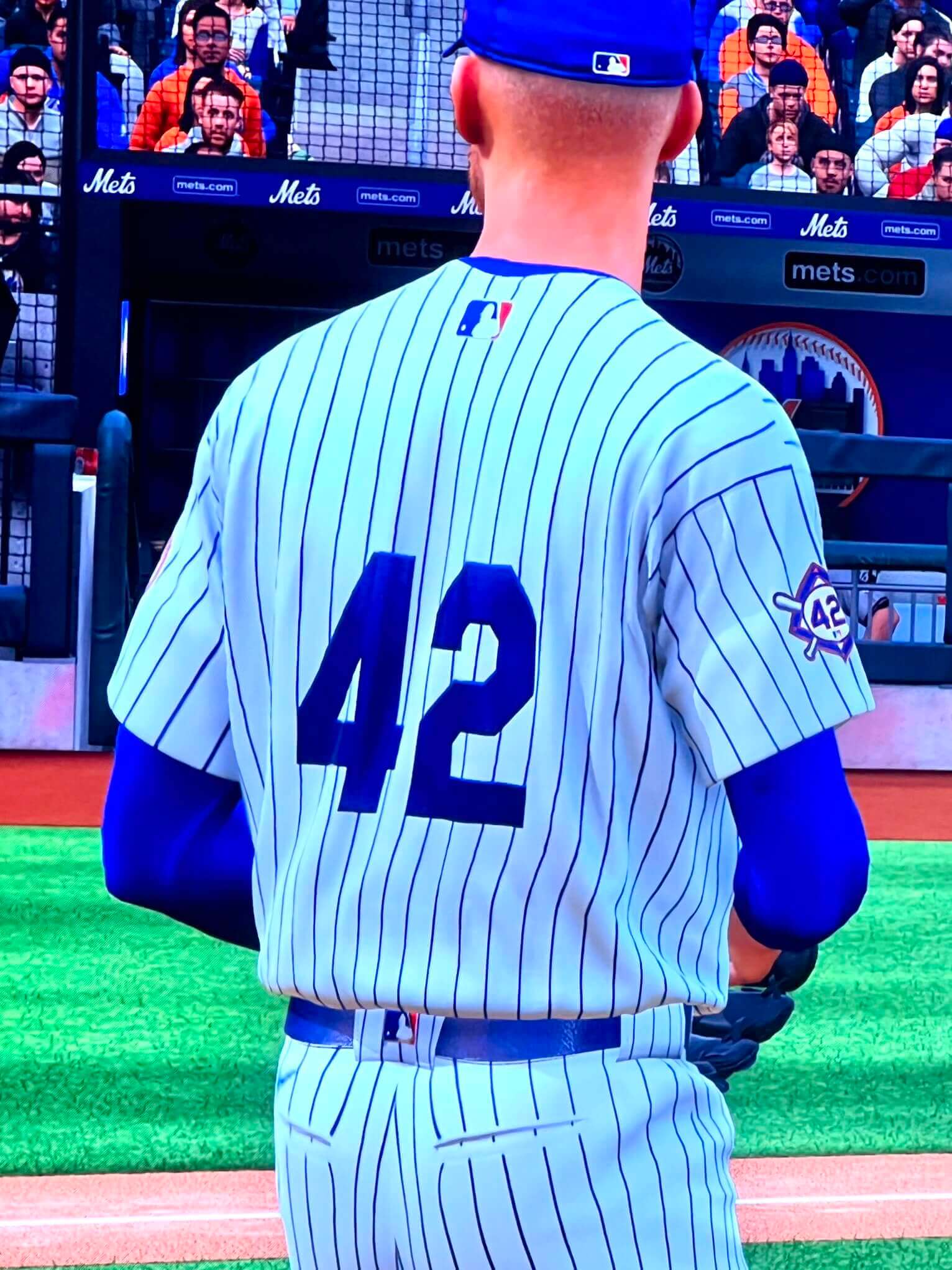
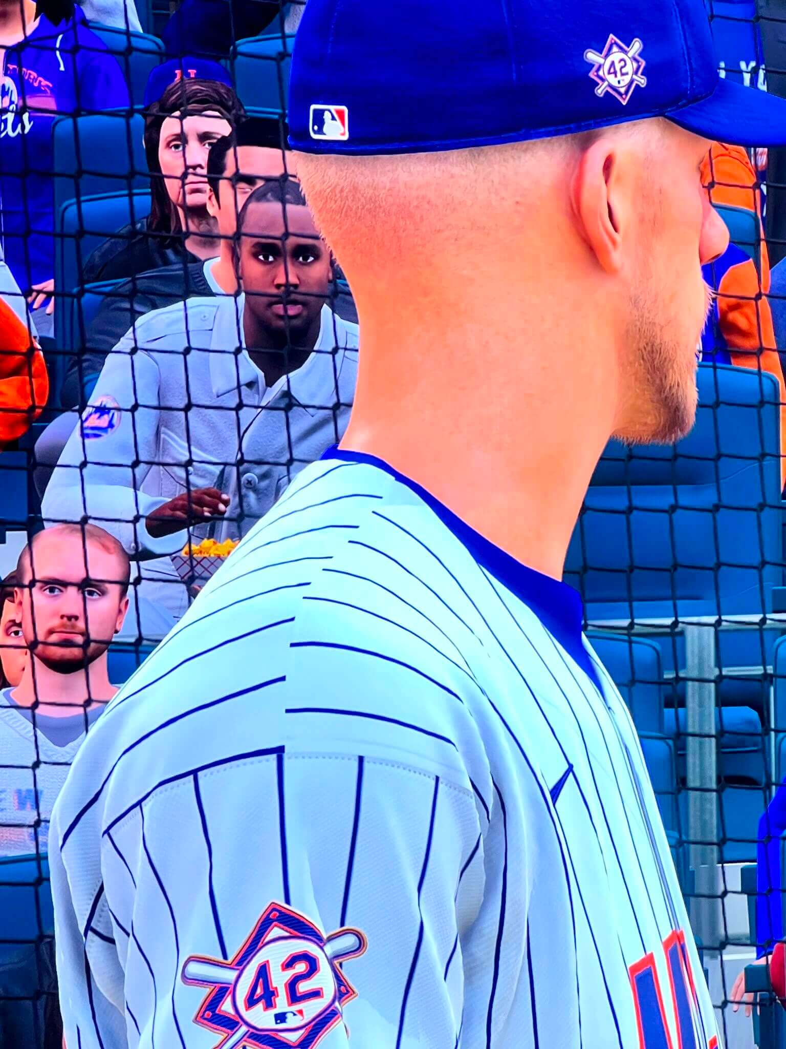
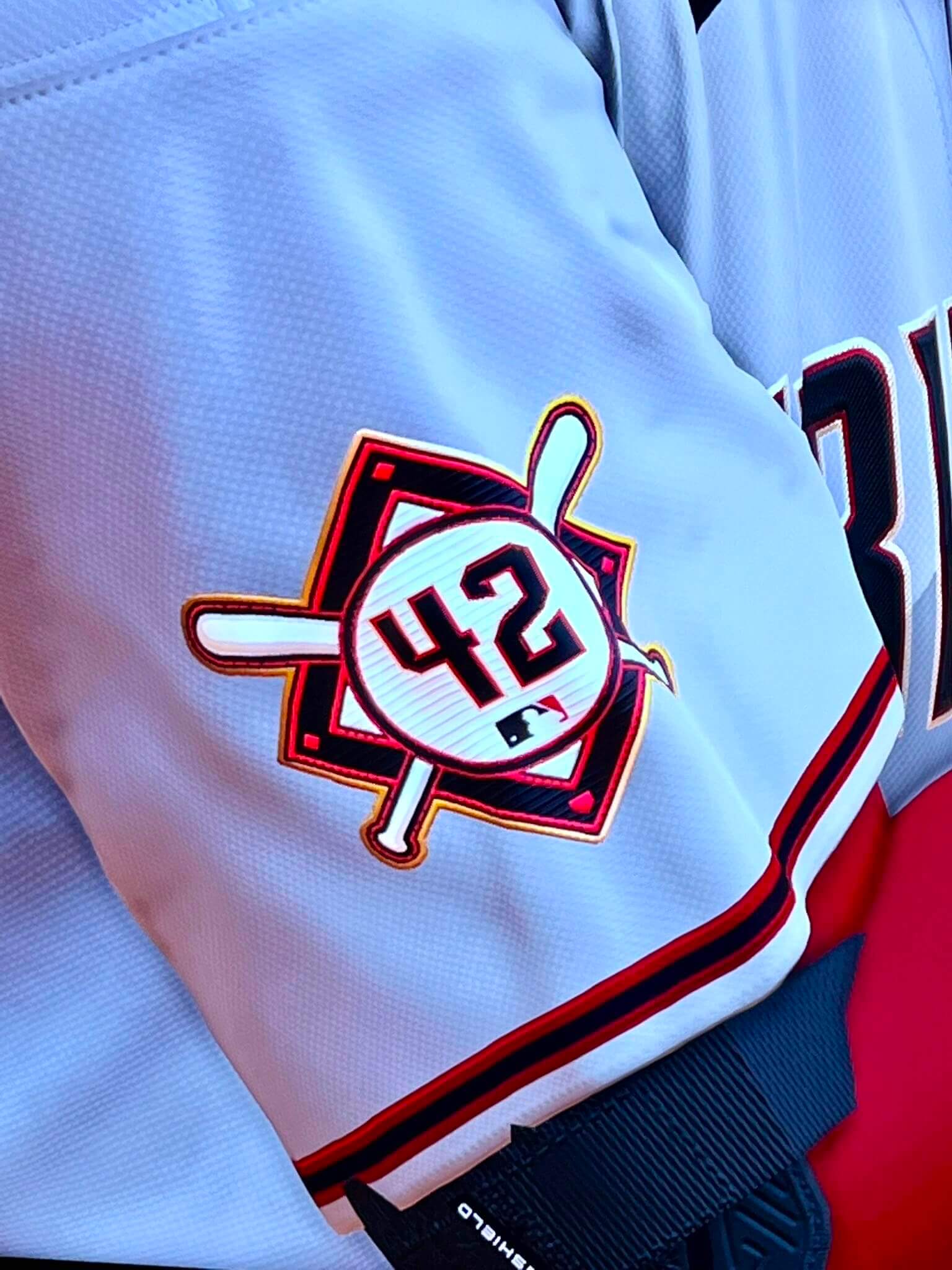
As you may have noticed in a few of those screen shots, while the rear-jersey 42s are all blue/Dodgers-style, the 42s on the various sleeve and cap patches are rendered in the teams’ usual colors and number fonts. Here are some closer views of that, for the Mets and Diamondbacks:
In addition — and this is the most puzzling choice, at least to me — it appears that teams that normally have front uni numbers will not have them for Jackie Day:
———
Now, is it 100% guaranteed that what we’ll see on the field in 11 days will match these screen shots? No. But MLB The Show leaks have proven to be very accurate in recent years, so I think it’s highly probable that this is indeed what we’ll end up seeing. (Also, I look forward to longtime reader/commenter Mark in Shiga critiquing the size and/or positioning of the rear-jersey 42s. Go for it, Mark!)
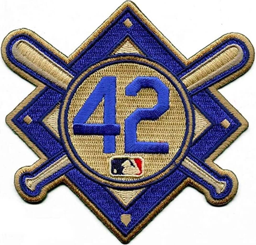
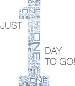
Meanwhile, there’s a new Jackie Day logo this year, designed by Uni Watch pal/ally Todd Radom:
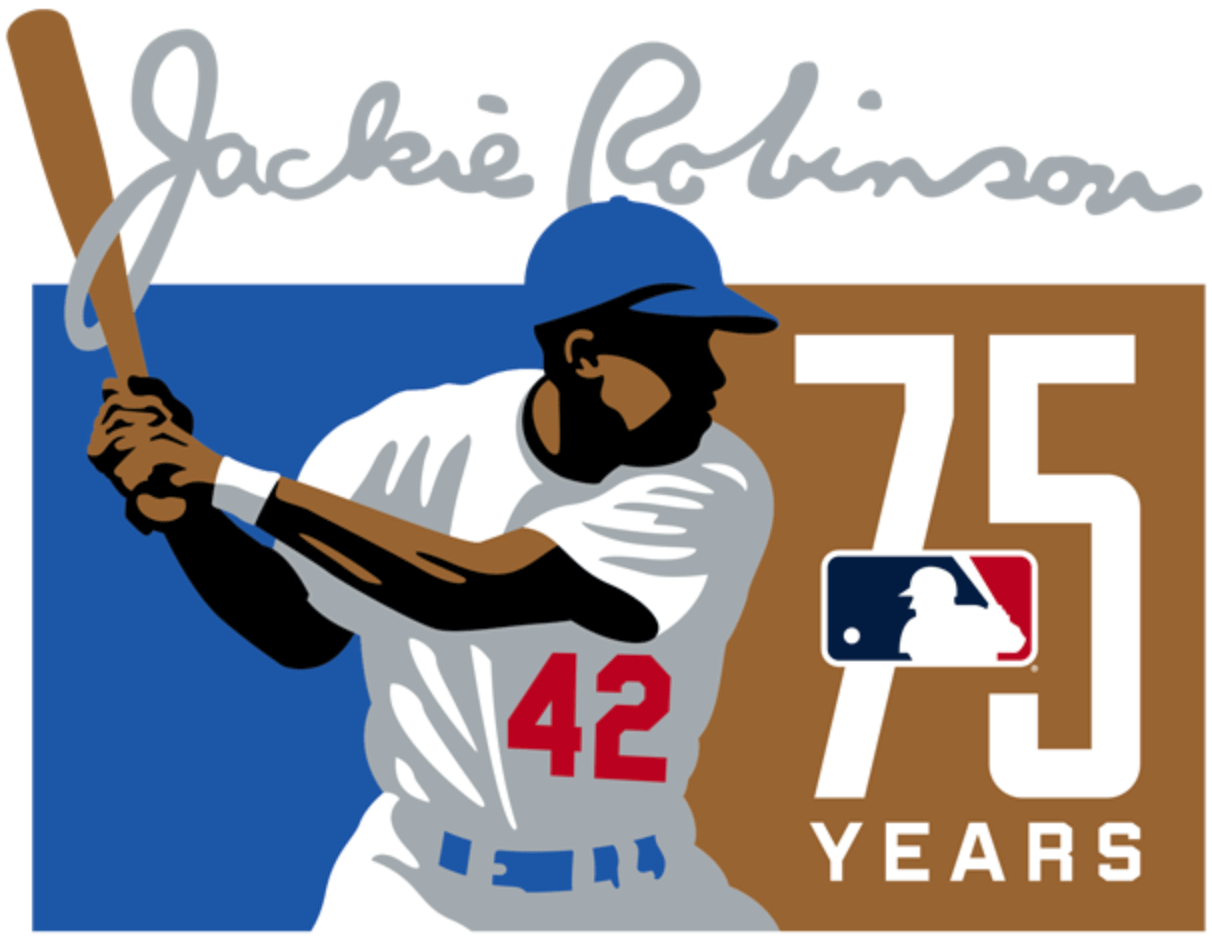
This logo will not be worn on jerseys or caps but will be used in other marketing contexts. SportsLogos.net has the full story behind the logo’s development here.
(Big thanks to @JGbaseball98, Justin Walker, and Johnny Williamson for making today’s post possible.)
MLB Season Preview preview: The 24th annual Uni Watch MLB Season Preview will be published tomorrow morning, and I don’t mind saying it’s by far the biggest, most thorough, most obsessively info-packed edition yet. Clocking in at a whopping 7,000+ words and featuring dozens of photos, it has all the news on this season’s new uniforms, logos, and patches, along with tons of deep-cut info on uni numbers, individual player quirks, new stadium details, new equipment, and even a uni-related tattoo update. Some of the individual team entries could qualify as articles by themselves!
All my past season previews were published by other media outlets, so I had to deliver the copy three or four days in advance and then fret over how many last-minute changes, additions, and adjustments I could ask for without pissing off my editor. Similarly, I had to coordinate the photos and other visuals with the photo editor. But now that I’m publishing the season previews on Bulletin, I can make as many updates as I want, right up to the last moment, without making anyone crazy but myself (and maybe the Tugboat Captain, who’s sick of hearing me say, “This preview is gonna be so epic!”). The result is endless hours of fine-tuning the text for me and an excellent reading experience for you. Trust me.
The MLB Preview will be available to my Premium Subscribers tomorrow morning. So if you haven’t subscribed yet but have been waiting for the “right time” to do so, I strongly encourage you to get on board now (you’ll need a Facebook account in order to pay), because the MLB Preview is a doozy! Don’t have or want a Facebook account? Email me for info on workarounds. Thanks.
Click to enlarge
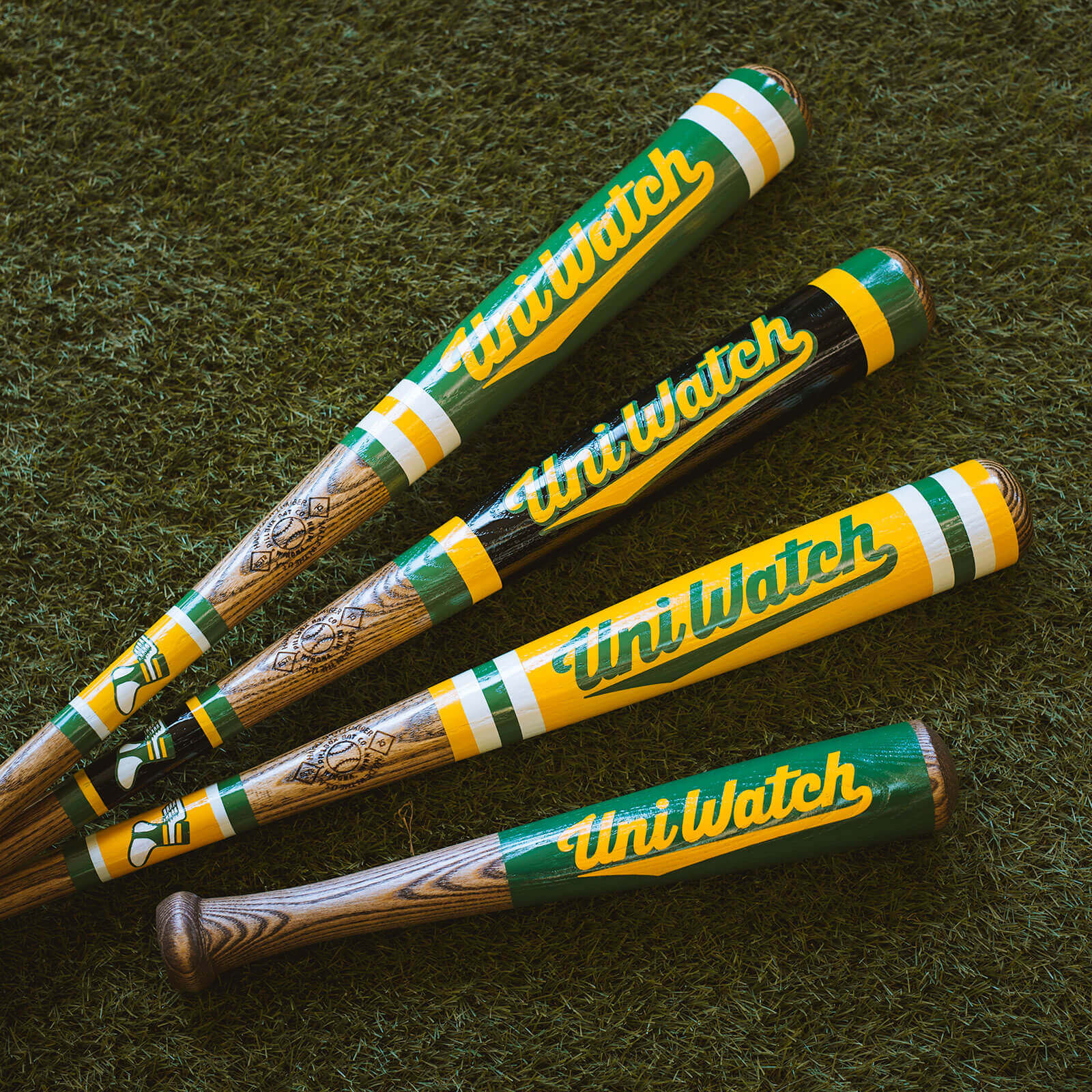
ITEM! Uni Watch bats in the works: For years I’ve been featuring the Pillbox Bat Co. in my annual Uni Watch gift guides, but it never occurred to me to partner with them for a line of Uni Watch bats until Pillbox prexy Zak Fellman recently got in touch to suggest doing just that. Such a fun idea!
The four designs shown above (including BFBS, which looks surprisingly good!) are prototypes. Here are some additional pics:
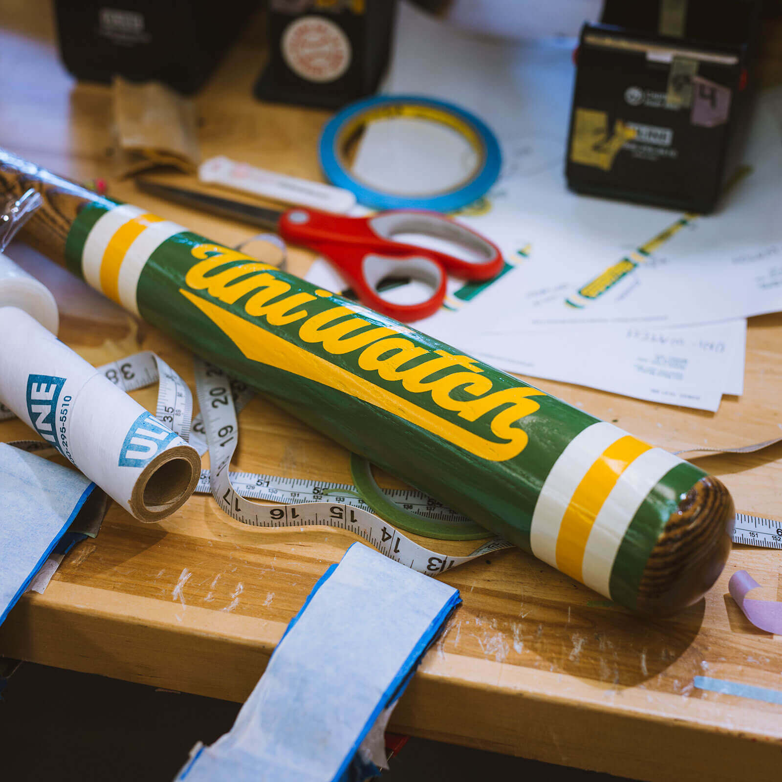
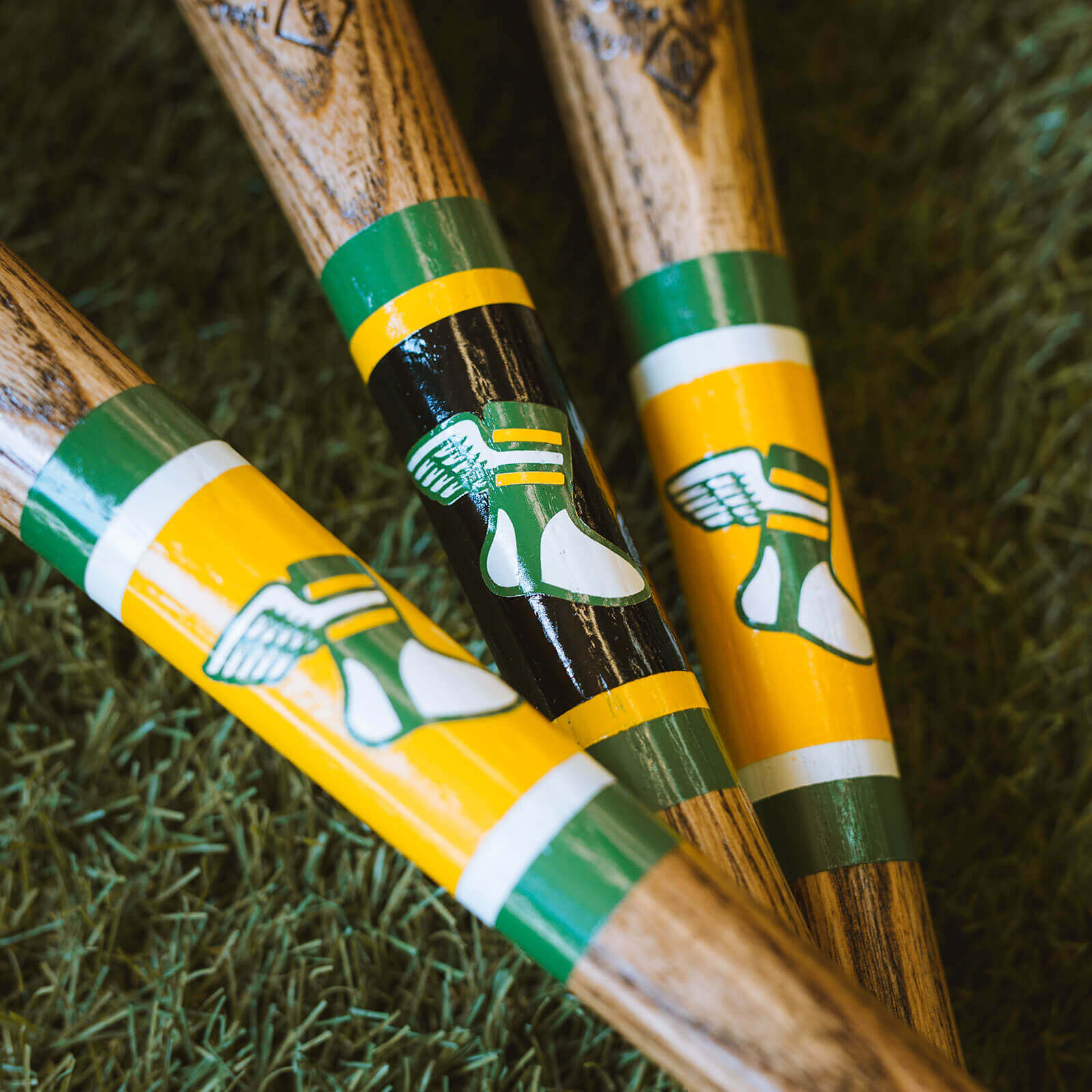
A couple of the prototypes are currently on their way to Uni Watch HQ, so I’ll share more photos once I receive them. We hope to make these available for purchase later this month — stay tuned.
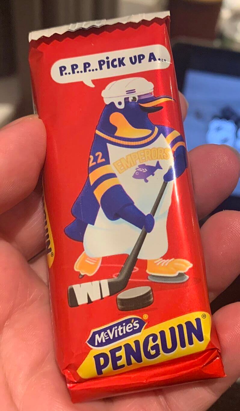
Too good for the Ticker: What’s better than a chocolate bar with an emperor penguin on the wrapper? A chocolate bar with an emperor penguin wearing an Emperors hockey jersey on the wrapper!
(Thanks to Trevor Williams for this one.)
Click to enlarge
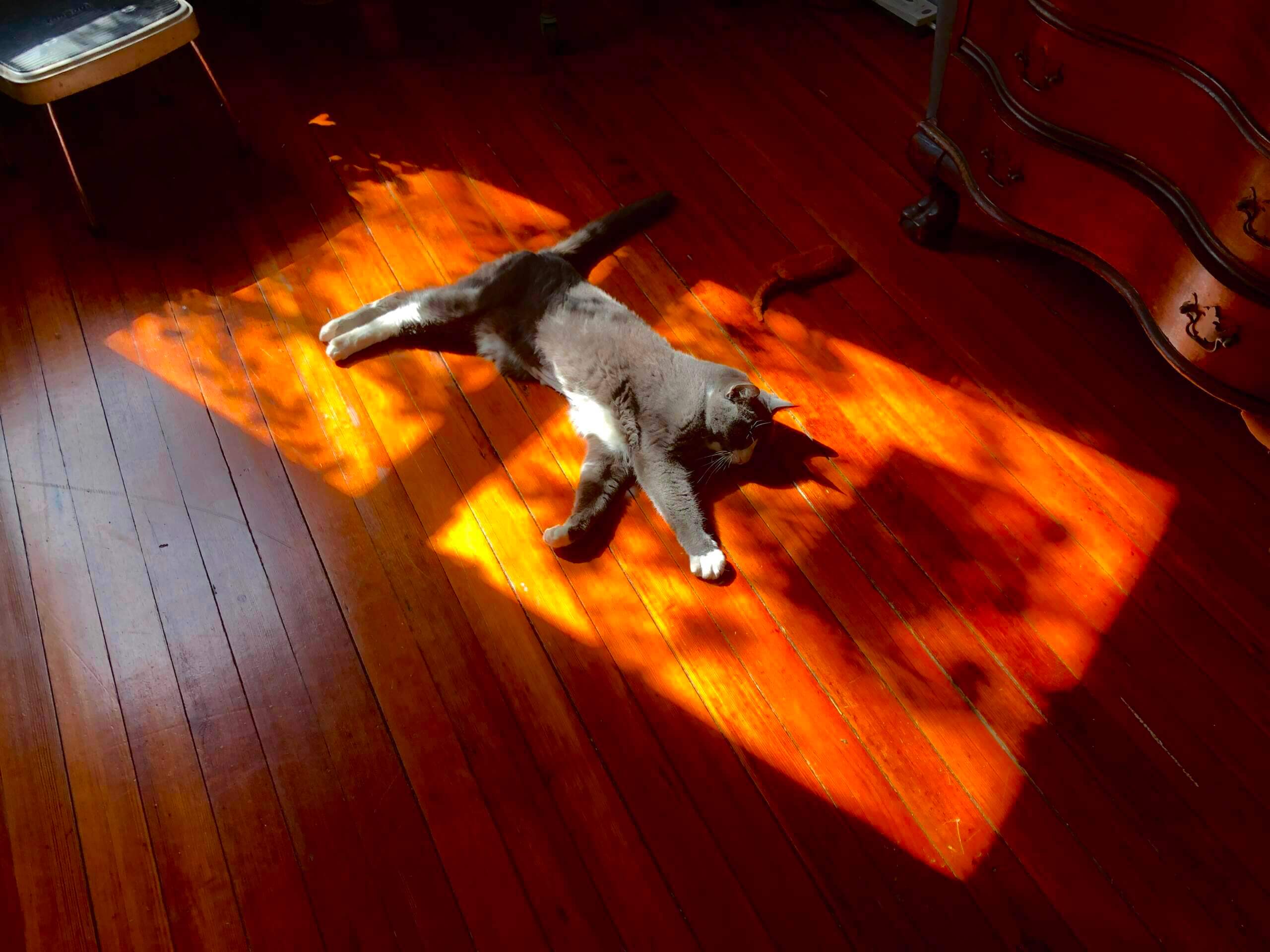
Sun worshiper: As I’ve mentioned before, Uni Watch girl mascot Caitlin is particularly fond of any shafts of sunlight that are available here at Uni Watch HQ. I know, I know — cats like sun, it’s nothing new. But sometimes I can’t resist photographing her.
Incidentally, see that shadow to the right of Caitlin’s head? That’s the bird feeder-turned-nest. Everything seems to be fine there, with Mama Dove and Papa Dove continuing to trade off egg-sitting duties. We look forward to the grand opening!
The Ticker
By Jamie Rathjen

Baseball News: Troy wore flag-themed accents yesterday (from @TrojanWallF5). … Grambling State wore various Negro League throwbacks last weekend (from Kary Klismet).

Football News: Ohio State QB C.J. Stroud has apparently switched to the Riddell Axiom helmet model in spring practice (from Drake Jesse).

Hockey News: All Chicago players wore a jersey patch yesterday for C Jonathan Toews’s 1,000th NHL game (from multiple readers). … The Ducks turned all the ads on their boards into a promotion for the Children’s Hospital of Orange County (from Charles Pannunzio). … The Jets wore orange warm-up jerseys on Saturday for a promotion for the Winnipeg Aboriginal Sport Achievement Centre (from Wade Heidt). … Also from Wade: The Canucks wore Canucks Autism Network helmet decals yesterday. … The Twitter user @NHLhistorygirl posted this picture of Japanese goalie Teiji Honma at the 1936 Winter Olympics, where he was one of the first goalies to wear a mask (from multiple readers). … A Toledo Walleye/Kalamazoo Wings ECHL game yesterday was color vs. color (from @Mr__Jeremy).

Basketball News: Heat PG Kyle Lowry was wearing the wrong version of the team’s white jersey yesterday, because it had a red Nike logo instead of the diamond/crystal version (from Andrew Eisenberg). … ABC’s graphics for yesterday’s Lakers/Nuggets game used a picture of the Lakers’ Avery Bradley wearing No. 11, which he wore with the team in 2020 before leaving and coming back, instead of his No. 20. He was on the other end of the graphic from the current occupant of No. 11, Malik Monk (from Eric Bangeman). … Reader Timmy Donahue sent us this article about women’s college players who make statements through their hair colors, such as Connecticut’s Aaliyah Edwards, who honors Kobe Bryant. … Edward Waters University, which is transitioning to Division II from the NAIA, has a new court “which was unveiled on April Fool’s Day but by all accounts is legitimate,” says Kary Klismet.

Soccer News: Saturday’s Bundesliga game between Freiburg and Bayern Munich featured a bizarre number-related moment resulting in Bayern briefly having 12 players in the game. A substitution was made with No. 29 listed as coming off, which Bayern don’t have, instead of winger Kingsley Coman’s No. 11, so Coman was unaware he was supposed to leave. … The Scottish Women’s Cup has a new naming rights ad as of this weekend’s quarterfinals. … English club Morecambe added a new mascot, based on that of its shirt advertiser, to its already-existing cat mascot. Fans sang “We want our cat back” at the new mascot on Saturday (from Trevor Williams). … Here’s an infographic showing the kits worn by South American teams for World Cup qualifying matches (from Everard Santamarina). … The next four are from Kary Klismet: Argentine club Lanús’s men’s team wore a one-off shirt this weekend for the 40th anniversary of the Falklands War. More pictures here. … English club Chester F.C. are holding a vote for members on next season’s first shirt. I will point out that option C is very similar to a white and blue version of Crystal Palace’s current first shirt. … Brazil’s Botafogo are temporarily wearing a shirt without a maker’s mark. … The USL Championship’s Sacramento Republic revealed renderings of their proposed new stadium.

Grab Bag: Athletes Unlimited volleyball players wore warm-up shirts encouraging voter participation on Saturday. … The NLL’s Colorado Mammoth wore beige with camouflage accents on Saturday (from Wade Heidt). … The Duke/Virginia women’s lacrosse game on Saturday supported Morgan’s Message, a mental health charity for college student-athletes. Duke wore a sleeve patch of the charity’s logo, while Virginia wore warm-up shirts. … One of the U.S. team members at the men’s world curling championship was missing his NOB (from L.J. Sparvero). … “Military uniform enthusiasts are up in arms about the out-of-order ribbons on the uniforms shown in the trailer for the new Top Gun sequel,” says Kary Klismet. … Also from Kary: First-time Masters participant Talor Gooch didn’t realize that nobody is allowed to wear shorts at Augusta National and was quickly given some pants to put over them while practicing yesterday.
Tomorrow: The MLB Season Preview!
My favorite detail on that Emperor bar, and it has so many great details, is how the tape wrapped on the blade of the stick spells out WI. Which, and I just checked, the tape on the blade of the hockey version of University of Wisconsin’s Bucky Badger logo does not.
I liked Jackie Robinson day when teams just wore the patch. Now it’s jumping the shark.
No, that would be every team becomes the Dodgers for a day, with every player wearing number 42. We can’t honor Jackie Robinson enough for his courage and everything that he had to endure just for being a black man. But speaking strictly as a uniform enthusiast, c’mon man! Is this really necessary?
It bugs me when I see numbers sewn too low on a NNOB jersey, as if they want to put a name up there…but haven’t gotten around to it yet. I see it all the time in the Minors, but now it’s in video games? C’mon man!
I completely agree. I think all this gimmicky stuff just cheapens what should be a dignified day.
But alas, marketing people don’t know the meaning of the word class. Or restraint. Or dignity.
Re: Chester FC, the inability to put the numbers over stripes really limits the possibilities for good striped jerseys.
Those numberless jersey fronts look great. Can we go about scrapping front numbers for good?
For MLB teams that don’t wear blue. I guess we call it Blue for Jackie Robinson’s Sake?
MLB The Show does a wonderful job with small details (see the Dodger Stadium batter’s boxes) but one major gripe I have is with their placement of rear numbers on jerseys with NNOB.
They seem to treat every jersey as one with NOB & don’t move the numbers up when the NOB goes away.
I assume I’m in the right group to air that grievance. :) It annoys me greatly when playing the game!
I have long thought the exact same thing — thank you for the shout-out, Paul! — and they’re much worse than the real-life NNOB jerseys where the number is just a bit too low. In MLB The Show they do what you describe: treat all jerseys as NOB style with a gigantic blank spot where other jerseys would have a name.
It’s not just when a NOB team suddenly has NNOB like with Jackie Robinson Day; it happens even to jerseys that were never supposed to have names on them.
It looks so, so terrible. And they’ve had something like fifteen years to fix it. This is a video game series that gets things like batting glove manufacturers correct but can’t be bothered to correctly position something as important as jersey numbers! How is this even possible?
The problem with Jackie Robinson Day is for years they had the perfect tribute, but now they find themselves trying to improve on perfection.
Agreed, you hit the nail on the head. Everyone on every team wearing the same number for a day is a striking and powerful tribute.
I’m not sure I can find the right words for this idea, but it feels to me like every team wearing 42 in their own font and colors is not just obviously better aesthetically, but also actually a more powerful tribute. The point of all this is to acknowledge how important Jackie Robinson was to all of baseball.
Well put.
I like the bat idea. That is all.
The Dodgers should wear the Brooklyn “B” and throwbacks to the year Jackie came up. That Dodger Jersey did not have a number on the front.
Watching housecats enjoying the sun is one of the simple pleasures of life.
Like the Lillies of the Field. (…they want not, they toil not, etc……ours definitely toils not….but she wants ALOT ! )
The Doves seem Lovey, the cat is content, and all is right with their universe.
Kind of a weird tweet here from PFF with four guys photoshopped into their new team’s uniform, while leaving two guys unphotoshopped in their previous one:
link
How great did those Grambling State uniforms look?
And the members of Augusta National really need to take the sticks out of their heinies.