By Phil Hecken
Follow @PhilHecken
Good Sunday morning, Uni Watch readers! Spring starts today (at 11:33 EDT in fact), which means our founder’s birthday is tomorrow (more on that below). Aside from turning the clocks ahead, the vernal equinox may be my favorite day of the year.
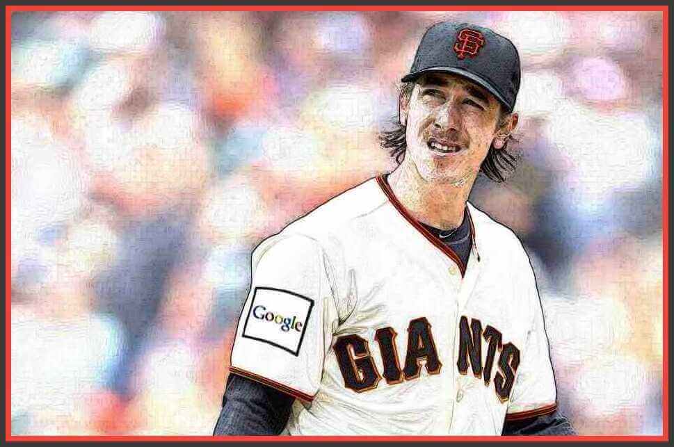
While spring training is (finally) underway, with all the good feelings that brings, it probably won’t be too long before we start seeing advertisements on MLB uniforms (agreed to as part of the new CBA). According to that article, “(a)dvertisements will appear via patches on jerseys and decals on batting helmets,” although no additional specifics were given. While this will obviously be a blight on the uni-landscape, as Paul (and others) have pointed out, MLB has featured helmet and jersey ads in several “international” games, beginning as far back as 2000. As Paul wrote in his Bulletin piece:
From 2000 through 2019, there were 16 MLB games that featured third-party ads on jersey sleeves, on batting helmets, or both. All of these were neutral-site games that took place outside of MLB’s USA/Canada base market — some in Japan, some in Mexico, and some in England. But these weren’t exhibitions; they were legit regular season games that counted in the standings and the statistical records. And they all had uni ads.
So far, ads have only appeared on jersey sleeves and helmets; never on caps and never on the front of the jersey. If past is precedent, that’s likely what we can expect going forward, although nothing is set in stone. Spring training jerseys and helmets have been mercifully ad-free so far, but that’s only because teams haven’t (apparently) inked any deals yet. How long they remain so is likely dependent only upon finalizing ad deals.
I won’t go through every ad that has appeared on MLB helmets and jerseys, but Paul had a very good rundown back in 2019 (as well as his Bulletin article, for those of you who are subscribers).
Most recently, the Reds and Cardinals, and the Astros and Angels played in 2019 in Monterey, Mexico. All four teams sported a giant car company ad which was probably visible from the seats.
Following that, the Yankees and Red Sox played a two-game series in London, and they too had helmet ads — not quite as garish, but still pretty obnoxious:
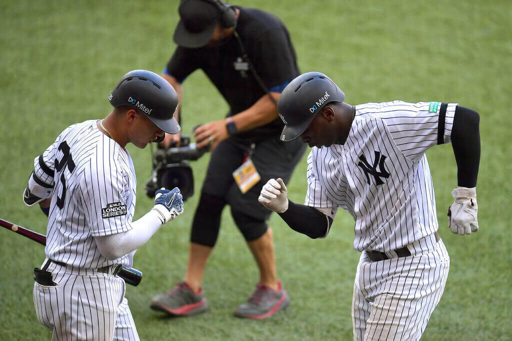
Again, and based on precedent, I’d expect to see something similar on MLB helmets going forward. If you refer back to Paul’s 2019 article, you’ll note similar helmet ad treatments in prior years.
Now, to “answer” the question I posed as the title of this article: Are some uni ads “better” than others? The short answer is, “NO” because any ad is bad, and I’d expect potential advertisers to want to maximize revenue by getting the biggest and boldest ad they can splashed on the helmet. But the longer answer, especially if we’re talking about jersey ads, is “no, but some uni ads are even worse than others.”
The first sets of jersey ads in 2000 and 2004 were particularly noxious as they were fairly large square patches sewn onto the jersey sleeves. There was no attempt made at adapting ad colors to jersey color, and they looked particularly bad on uniforms with pinstripes or were colored (softball) tops. Of course, the point of the ad is to “get noticed,” and to that end, they succeeded. Aesthetically, however they looked awful.
Later jersey ads, in 2008 and 2012 were slightly smaller, and rectangular in shape. These were also bad, but perhaps not as bad as the big square patches.
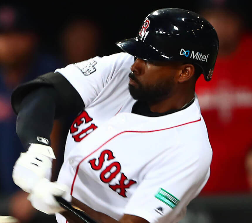
Both the Reds/Cardinals and Astros/Angels series in Mexico did not feature sleeve ads, but the Yankees/Red Sox London series did. Those ads were the “smallest” yet (it was the same ad for both teams):
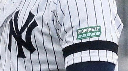
Of all the MLB uni ads we’ve seen so far, this might be the least noxious. If this is what we can expect, it’s not the worst possible ad size/placement. Of course, ads might not be exclusive to the sleeve. We can only hope the ads don’t get placed on the front of the jersey (which some believe would be a very slippery slope leading first to this and then to this).
But just because the most recent jersey ad was the least “bad,” that still doesn’t make it good. The green patch stands out quite a bit on the sleeve, and of course, will look particularly awful on pinstriped or colored jerseys. So, what might be “better”? Two things would at least aesthetically improve the look, and to that we can turn to the NBA, which has quite a bit of experience in uni ads.
As we’ve seen, those ads run the gamut from mostly rectangular patches to smaller screened, color-blocked ads. To me, those are the least worse of all the ads.
It’s not wise to “rank” ads based on how “bad” they look, but clearly — at least to me — the worst kind of ad is one that is large and not rendered in team colors (whether a patch or not). Even if the advertiser has “local” roots, that doesn’t lessen the visual impact.
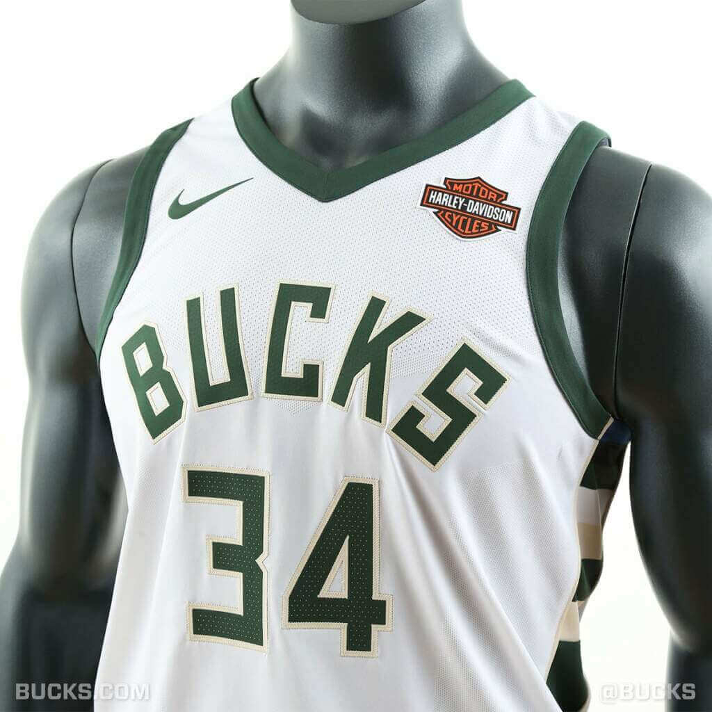
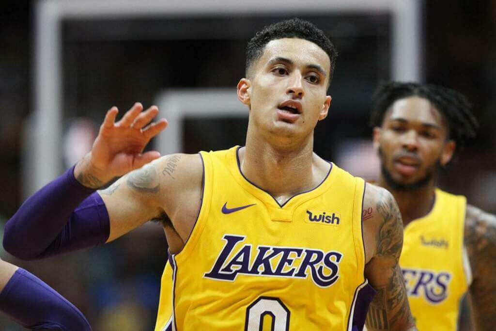
A “better” ad would at least match jersey color (obviously, in MLB, most home jerseys are white, and most road jerseys are gray — but patches or screened ads can be in these colors too). The Celtics have used this style. MLB teams should make every attempt to at least have ads that match their own color scheme. Hopefully, MLB ads will take a cue from that worn by the Lakers, which while bad, is at least color blocked and in team colors.
I’m not looking forward to MLB uni ads. But given the different possibilities, some ads would definitely be worse than others. Let’s hope for the best.


Guess The Game…
from the scoreboard
Today’s scoreboard comes from Phyl Lapin.
The premise of the game (GTGFTS) is simple: I’ll post a scoreboard and you guys simply identify the game depicted. In the past, I don’t know if I’ve ever completely stumped you (some are easier than others).
Here’s the Scoreboard. In the comments below, try to identify the game (date & location, as well as final score). If anything noteworthy occurred during the game, please add that in (and if you were AT the game, well bonus points for you!):
Please continue sending these in! You’re welcome to send me any scoreboard photos (with answers please), and I’ll keep running them.

Uni Concepts & Tweaks
Time for more Uni Tweaks from the UW readership.
I hope you guys like this feature and will want to continue to submit your concepts and tweaks to me. If you do, Shoot me an E-mail (Phil (dot) Hecken (at) gmail (dot) com).
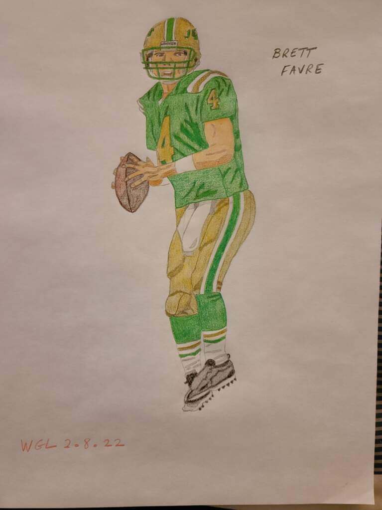
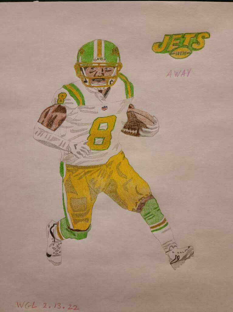
Today’s concepts come from Greg Lamm:
Hi Phil,
I have never been in favor of the Jets adding black to their color palette. I think that if a franchise is using another color besides white, they should choose a light color (such as silver, gold, yellow, orange) to pair with a dark color. The Jets already had green so black was not a color that I would have chosen.
My redesign is based on the original New York Titans uniforms/colors. I swapped out the original blue for green and added the current helmet logo. With the abolition of the the one-shell rule, the helmets can be changed to avoid a color clash as needed.
Greg
OK readers (and concepters). If you have some tweaks or concepts, shoot ’em my way with a brief description of your creation and I’ll run ’em here.
Happy Early Birthday Paul!
As most of you are probably aware, tomorrow is the birthday of one of my best friends, and the guy who founded this place, brought together a “family,” and is just one of the best people there is in this crazy, mixed-up world. That is of course, the one and only Paul Lukas.
Words alone cannot express how grateful I am to Paul for all his great friendship and support, and he’s particularly been a steady friend and spiritual guru for well over a decade (and for bringing us Uni Watch for over 20 years). You may not realize it, but Paul’s last two “special” days were both “COVID birthdays,” but tomorrow, that all changes! For the first time since 2019, he hopefully gets a regular old, normal birthday.
Of course, I’m sure Paul will regale us with his “rain on your birthday” story (which is awesome), so I feel a tinge of sadness in reporting Monday’s weather should be seasonably gorgeous. Sorry buddy!
Enjoy your special day tomorrow Paul, even if a little rain doesn’t fall on your parade. And readers, be sure to wish Paul a Happy Birthday tomorrow!
On a side note, another happy early birthday to UW stalwart Kenny Ocker, whose special day is Tuesday.
Uni Watch News Ticker
By Phil

Baseball News: Reader Rob Cortiglia is a big fan of Div III RPI’s baseball uniforms. … The Colorado Rockies wore green hats for St. Patrick’s Day (from Kary Klismet). … Here’s a cool story — with some great old photos — of Roosevelt Stadium, a defunct minor league ballfield in Hoboken, N.J., that hosted the Brooklyn Dodgers for several games in 1956 & ’57 (also from Kary Klismet). … You know it’s spring training when you spot not one but two players wearing #94 (from Steve Sher). … The great Kevin Cearfoss has done it again, this time with some Atlanta Braves wall art. … New high tops for Gabe Kapler (from Tony). … Professional baseballer Johnny Dickshot declared himself in the early 1940s to be the ‘ugliest man in baseball’. Yes, that’s a real name, and the 12-year-old in me chuckled (from James Gilbert). … We see this every spring, but here’s your annual red jersey vs. red jersey spring training game (from Nicklaus Wallmeyer). … Not everyone likes the new Spring Training caps (from Andrew Cosentino).

Football News: There is a Pittsburgh Steelers uniform stripe pattern painted outside the locker room of their practice facility (from John Dankosky). … Looks like Mizzou has some new gold jerseys (from Jacob Bogage). Here’s another look (from MIZdirection). … Here’s a cool collection of Arkansas Razorbacks helmets (from Helmet Archeology).

Hockey News: Florida Panthers goalie Spencer Knight has debuted a helmet honoring the 10th-grader who died after suffering injuries in a CT hockey game. … The Calgary Hitmen and Edmonton Oil Kings both wore mismatched socks while playing each other on Friday. Wade Heidt explains they were “Doing this to raise awareness and support Canadian Down Syndrome Society. World Down Syndrome Day is March 21.” … Also from Wade: Here are the special uniforms worn by the QMJHL’s Cape Breton Eagles on Friday for Heritage Night. … Weird number stacking on this St. Louis Blues helmet from 1991 (from Brayden Teeter). … Pretty cool color vs. color WHL action on Friday night: Swift Current with green alternates at home. Medicine Hat in black (from Wade Heidt). … Check out this artist’s rendering of uniforms for Miami Screaming Eagles, charter WHA member that never played a game (from Gregg Inkpen). … Ugh. The Columbus Blue Jackets have announced terms with a new jersey advertiser. … The Tampa Bay Lightning Bolts wore their Stadium Series uniforms inside last night (from Wade Heidt). … Also from Wade: the Seattle Kraken wore special Women of Hockey warmups last evening.

NBA/College/Basketball News: The LA Lakers “showtime” years are featured in an HBO Special, “Winning Time: The Rise of the Lakers Dynasty,” which airs on Sundays at 9:00 on HBO, and there was quite a bit of uniform research done for the special (from Kenn Tomasch). … This story goes in-depth on the Providence Friars’ costumed mascot (from Kary Klismet). … Oops! When photoshops go horribly wrong (from Chris Mykoskie). … It’s gotta be the shoes, right? (from Hog Flashbacks). … OCDers and uni perfectionists will rejoyce: UNC had players wearing #1, #2, #3, #4 and #5 on court at the same time (from The Poop). … Holy Shit! Check out these pajamas warm up pants for Seton Catholic (Binghamton) at the NY state basketball tournament (from Collin Wright). … It was a color-vs-color game for the Elmhurst vs. Randolph-Macon D3 Basketball National Championship (from Zac Snyder).

Soccer News: Sign of the times? It looks like Barcalona’s new jerseys fill feature changing ads (via Paul). … Ed Żelaski hasn’t seen an official release, but new kits for Dinamo Minsk.

Grab Bag: The first three items here are all from Kary Klismet: New logo for Pella (Iowa) High School. … Just in time for a month after the Winter Olympics ended (d’oh!), here are two stories Kary just spotted about the evolution of figure skating outfits. … The Cape Henlopen (Del.) High School girls’ field hockey team received rings for winning the 2021 state championship (thanks, Kary). … Ole TD writes, “As a child of the 80s I’m not sure how comfortable I am with the logo appropriation on this porta-potty.” … Check out miniature artist Tatsuya Tanaka with a hole punch goal and the left of paper looking like it could be Argentina with confetti on the field (from Jeremy Brahm). … Jordan Dawson yesterday became only the fourth Adelaide FC player to wear jumper No 12 in 31 years in the AFL (from David Burtenshaw).
Uni Tweet of the Day
I’m not sure if this is the best or worst colored ice gimmick…
Royals warming up on the green ice in the St. Patties uniforms #Royals @FlyersKnitty pic.twitter.com/8nfcCnuUPS
— Joseph Borek (Retweets do not Equal Endorsement) (@jjborek26) March 19, 2022
And finally… that’s it for today and for me for this weekend. Next weekend, I’m competing in a curling bonspiel (a/k/a tournament) so Paul has graciously given me that time off, so I will catch you guys and gals back here in two weeks.
Everyone have a great Sunday, enjoy the first day of Spring, and I’ll see you soon. Till then,
Peace,
PH
In hockey “Cool color vs color WHA action”
should be WHL no WHA
Fixed
WHL should be “colour vs colour”
If we have a Canada vs. U.S. team, I like to type it as colour vs. color.
All ads on uniforms are bad. At least in the EPL you don’t have commercials so I can get behind that. But the NBA still has commercials. It just looks tacky.
+1
Soccer jersey ads are less about commercials and more about the teams being mostly independent organizations that financially sink or swim independent of the league. It’s arguable whether they “need” ads (but it’s why teams from countries with lower team revenue have a ton of ads), but franchise based league should really “need” ads except hey, more money.
I’ve been struck in the past few years at the strange blend of Premier League kit and team sponsors. So many offshore gambling and foreign exchange firms of dubious origin. I would think the Premier League, and NBA, being one of the few world wide known sports leagues you would have major Fortune 500 firms ie Coca Cola begging to sponsor.
Roosevelt Stadium was in Jersey City, next to Hoboken.
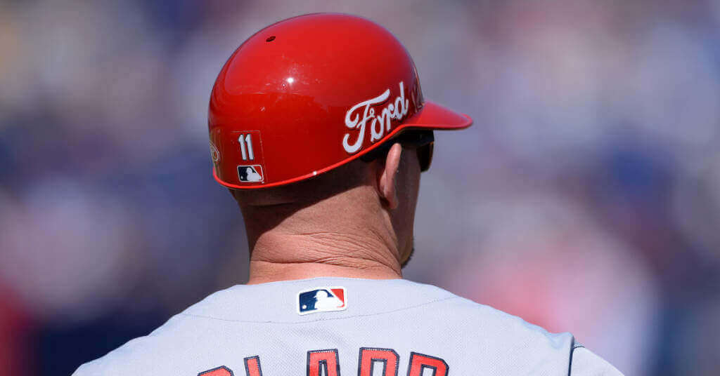
I guess a bad ad is one that doesn’t help the product or company that is doing the advertising. I don’t know how a well known company like “Ford” helps it’s brand by being on a baseball uniform? Nobody sees this ad and thinks…”I should buy a Ford pickup truck.” And in fact, they might see it and think…”I don’t want to support that company that has ruined my favorite team’s uniform.” Maybe a uniform ad works when you see an ad and wonder who this company is? I had no idea who “Wish” was until seeing it on a Lakers uniform, and then looking it up online. Maybe a company could do goodwill and increase their demand for their products by paying a team to not put an ad on their uniform. They could have a commercial that says something like…”The Ford Motor Company, the company that has kept the Yankees uniform free of advertisements.”
“The Cape Henlopen (Del.) High School girls’ field hockey team received rings for winning winning the 2021 state championship (thanks, Kary).”
– Yeah, Kary, thanks for using the word “winning” twice. Who do you think you are, Charlie Sheen?
That’s my bad on proofreading. Now fixed.
In my opinion all jersey advertising is inherently bad. Adjudging some to be better than others only serves to foster overall acceptance of this grotesque practice. I feel the same about naming rights for venues and it’s why I feel so gross when people lament how “Pacific Bell Park” flowed nicely off the tongue, or mourn the end of “Staples Center,” etc.
Greg Lamm went to the trouble of hand-drawing his contributions to the Uni-Watch community; hey Greg! Welcome to the club!
Naturally, a green&gold NFL team is going to draw comparisons to the Packers, so it is well that you took pains not to copy the Green Bay trademarks. I like the old Titans’ uniforms (a lot more than the current Titans’ uniforms) and I’m glad you chose a yellow numeral for the dark jerseys. The Packers have never had two-color numbers so that would be an elegant way to stand apart. A green helmet, though, is essential.
Always enjoy the hand drawn ideas, great stuff Greg.
Johnny Dickshot handed the UMIB crown over to Don Mossi in the 1950’s.
Andy Etchebarren for the win.
Why was the Houston-Illinois game color on color? Shouldn’t the Illini be in white being the higher seed?
Is there one fan of The Office submitting these GTGFTS images? Yesterday we had one from Tod Packer (Todd Packer was a traveling salesperson on the show), today’s is from a Phyl Lapin (perhaps borrowing from the maiden name of Phyllis Lapin Vance, another salesperson on the show).
I wonder if any MLB team would be ballsy enough to proclaim: “No ‘sponsor’s’ logo will darken our cherished jersey.” With all that’s been going on in our world, the timing is right for some “good” news.
Not Likely…
As evil as jersey advertising is, there are definitely degrees of evil:
– In team colors or not in team colors
– Local advertiser or generic corporation (within this: does the local advertiser’s name include the name of the city or otherwise fit well with the team’s city name or nickname?)
– Consists of only a symbol, versus containing words. I think this is even bigger than anything about color (because there are often anniversary or commemorative patches that have odd colors). Within this category, how *big* is the word? If it’s bigger than the name of the team, link, it reaches a new level of obnoxiousness.
In soccer, Japan’s J-League started off requiring that jersey advertisers have close connections to the locales of the teams they advertise with. So, for example, Kyoto Purple Sanga has a well-known video game company, a ceramics/technology company (whose name includes the city name), and a local underwear producer. These companies at least employ many local people who are likely to be fans of the team.
Still, advertising is disgusting. And it should at least be called what it is: not “sponsorship”. It’s not like the team couldn’t exist without the advertiser.