By Phil Hecken
Follow @PhilHecken
Greetings fellow Uni Watchers, and a good Saturday morning to all. I hope everyone has had a good week and you’re all staying safe and healthy.
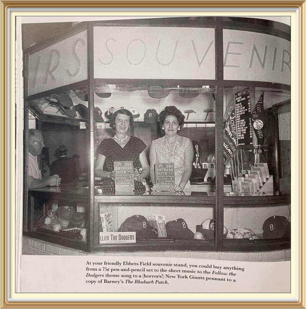
I have a great lede for you guys today. My buddy, Jimmy Parker, whose work has been featured on here before, was struck by a photograph (see splash photo, above) that appeared on Uni Watch a few weeks ago, which featured a Brooklyn Dodgers souvenir stand showing (among other things), what was believed to be one of the earliest documented instances of “fan caps” for sale. If you don’t remember the piece, Jimmy has referenced it below. He was so struck by the other items in the photo that he has tried to track down their provenance. What follows is Jimmy’s amazing sleuthing. Enjoy!
Ebbets Field Souvenir Stand Items
by Jimmy Parker
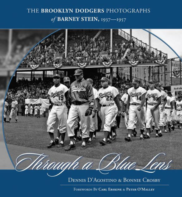
A few weeks ago, in response to a Uni Watch article about promotional videos of the 1950s Milwaukee Braves, a reader submitted a photo of an Ebbets Field souvenir stand from 1954. The photo is from the book Through a Blue Lens, a collection of photos by longtime Dodgers photographer Barney Stein.
While the image was originally meant to illustrate that caps were in fact sold to the public in the 1950s, I was immediately drawn to the wide variety of souvenirs being sold at the time. I began to try to identify as many of the items as I could and what I found was a great peek into the past.
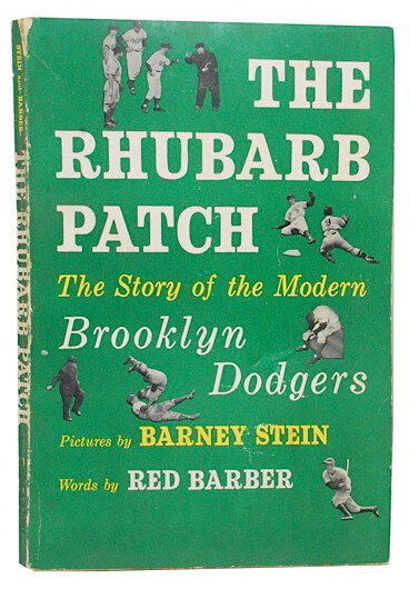
The first item that caught my eye was the book that the souvenir stand workers are holding. The book, The Rhubarb Patch: The Story of the Modern Brooklyn Dodgers, was published in 1954 and features photos by Stein and was written by longtime Dodgers radio announcer Red Barber. The book focuses on the team’s more successful history of the previous 15 years. What’s interesting to note is that the book was published the year Barber left the Dodgers broadcast booth to move across town and join Mel Allen in the New York Yankees radio booth. I can only assume that the book was already in the works when Barber departed and the team still had a need to promote a publication they most likely had a hand in producing.
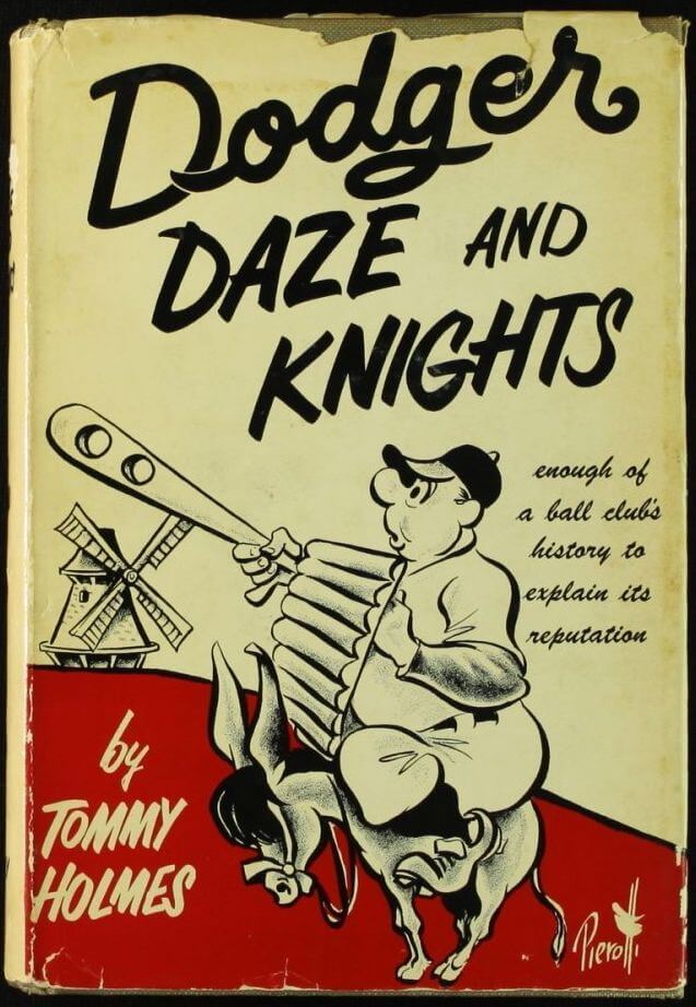
Just below the ladies in the photo, we see a display case filled with various items and the first that I noticed is another book, Dodger Daze and Knights by Tommy Holmes. The book, published in 1953, is a look into the history of the team. The cover features a whimsical illustration by New York Post cartoonist John Pierotti.
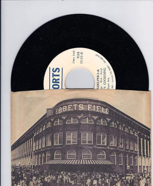
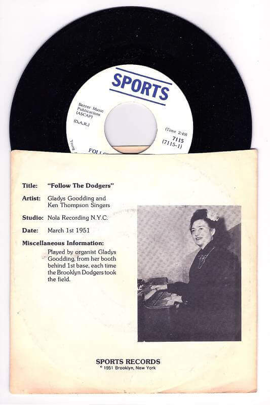
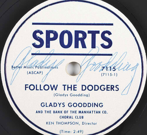
Just in front of that book we see a sign promoting “Follow the Dodgers” by Gladys Goodding. Goodding was the organist for the Brooklyn Dodgers and often played the song in stadium. Although the photo’s caption mentions the availability of the sheet music for the song, I wasn’t able to find an image. However, I was able to find a few shots of a promotional recording of the song released by Goodding.
As we move through the display case we see a few stacks of Dodgers caps featuring the famous white squatchee as well as a hat that may best be described as some type of beach hat. Unfortunately I was unable to find any images of the “beach hat” nor any images that I could verify as retail hats from this period.
We also see a couple of balls that appear to be autographed by several players. I know that teams today sell souvenir balls featuring facsimile autographs printed on them but I wasn’t aware that the practice dated back as far as the ’50s. I was only able to find balls that were touted as featuring authentic autographs so I’m curious if the balls being sold were authentic or if few of these facsimile souvenirs remain.
Nestled in between stacks of Dodgers caps we see what appears to be the 75 cent pen and pencil set mentioned in the photo’s caption. I wasn’t able to find an image that seemed to match the set as shown in the photo, with what appears to be copy of some kind printed between the pen and pencil on a die-cut backing card. I was however able to find an image verifying that the Dodgers had issued Louisville Slugger branded pen and pencil sets while in Brooklyn.
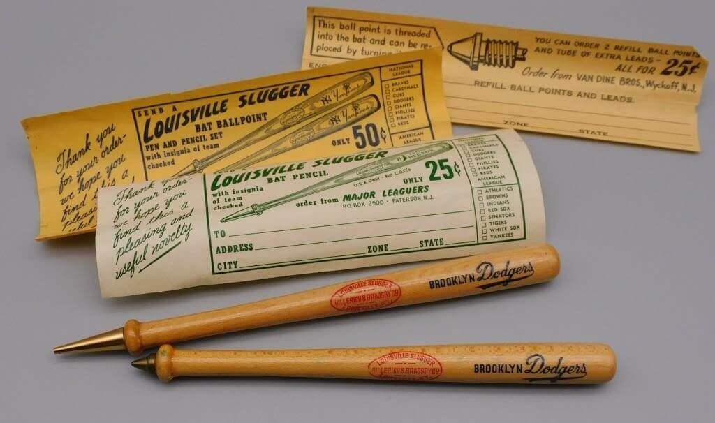
I also found images verifying that Louisville Slugger pen and pencil sets had been sold on cards with a top die-cut in the shape of a baseball including after the team moved to LA. Is this enough evidence to conclude that the photo shows a Louisville Slugger Pen & Pencil set?
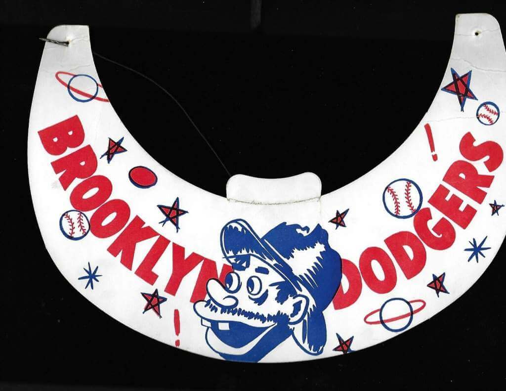
Further right in the display case we find what I consider one of the more interesting items in the photo. Sitting behind an autographed ball, just to the left of a stack of caps, I noticed what appeared to be the face of the beloved Brooklyn Dodgers “Bum” character of the era. Owing to the prevalence of the character at the time, doing an online image search for “Dodgers Bum” brings up hundreds of hits, most of them dating back to artist Willard Mullin’s original depiction of the character. Luckily, I stumbled upon this Brooklyn Dodgers visor featuring the face of the beloved Bum, albeit not Mullin’s depiction. The illustration and type, as well as the stars, planets and other visual elements, appear to match what we can see in the souvenir stand photo. I think it’s safe to assume that the Dodgers most likely sold this as a less expensive alternative to ball caps.
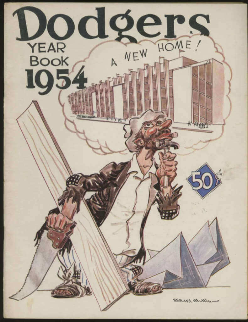
As we move out of the display case and to the right of the two ladies in the photo, we see a stand of baseball yearbooks. All of the publications in the right side are 1954 Dodgers Yearbooks, featuring a cover illustration by Willard Mullin.
The left hand side of the display features a variety of different covers, with a 1954 Giants Yearbook, also featuring a Mullin illustration in the front. The other books are harder to identify but searching team yearbooks from 1954 shows the Philadelphia Phillies (top), New York Yankees (2nd from top) and Pittsburgh Pirates (3rd from top) as likely matches given what little we can see in the way of design elements. Although we can’t positively identify the yearbooks it is interesting to think that the Dodgers sold books of other teams.
Above the yearbooks we see a display of a variety of pennants. From what is visible it appears that all pennants are NL teams but positive matches are made difficult by the lack of color and the angle at which the pennants are displayed. Oddly enough, the one pennant that I haven’t been able to find a close match to is the Dodgers pennant, as the one in the photo appears to have a thinner script and the underscore also appears to be much thinner than what I’ve seen in my searches. On the far right is this New York Giants pennant.
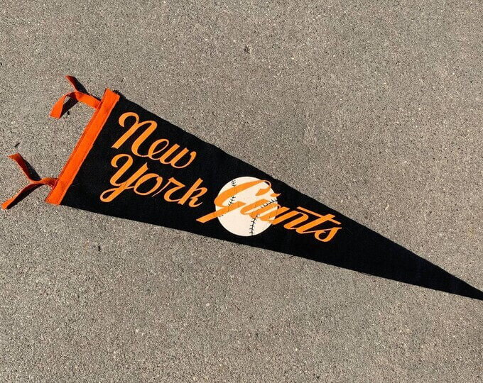
Much like the Dodgers, I found several designs that were very similar but I believe the letterforms in “New York” make this one a match. Beneath the Dodgers is what appears to be this Cincinnati Reds pennant.
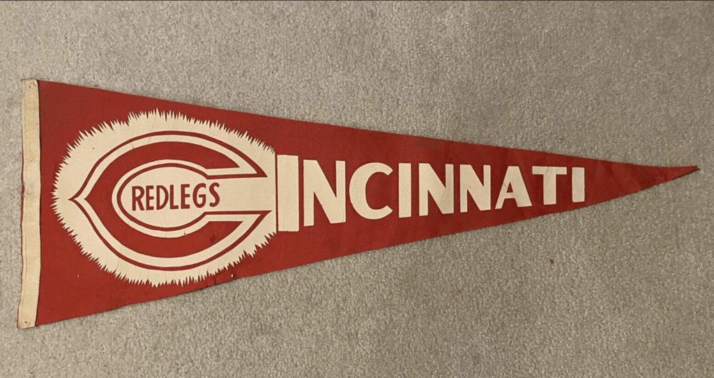
Again, several similar styles were found but I believe the letterforms in the city name as well as the point of the “Wishbone C“ make this a match. Based on the outlined letterforms visible, it appears that a full-sized version of this Chicago Cubs mini pennant is beneath the Reds one. Behind the Cubs pennant appears to be this St. Louis Cardinals pennant.
As with others, several similar styles were found but the shape and thickness of the letterforms seem to match this one. There is very little of the bottom pennant visible, but it appears to read “R A T” and possibly a corner of an uppercase “E”, which leads me to wonder if it is similar to this Pittsburgh Pirates pennant, as those letters are very similar in typographic style.
From my research it appears that during this era pennant styles varied greatly in design and production styles and there was a lack of cohesive branding among teams as we know it today. I welcome any and all feedback from those who may be more familiar with pennant history and styles.
In the background, between the stand attendants and the pennants we see a display of what is commonly referred to as PM10 Pins.
These were pin-back buttons sold in a variety of styles in stadiums over a number of years in the mid-1900s. Hundreds of these player pins were created and were often sold with a red, white and blue ribbon as well as a brass chain and small glove, bat or baseball charm. The photo resolution makes positive identification extremely difficult but it does appear that these pins featured the ribbon and the topmost pin appears to have a charm as well.
Photos like this one can often show us little vignettes of daily life in a bygone era and trying to find images of the pieces shown was an interesting challenge. With today’s vast array of merchandise only a click away, it’s humbling to try and recall a quainter time when a ballpark stand was one of the few ways fans could acquire team souvenirs.
Thanks, Jimmy! Great, great stuff. If you don’t already, you can follow Jimmy on Twitter and on Instagram (“@beautyofagame”).


Guess The Game…
from the scoreboard
Today’s scoreboard comes from Chris Hickey.
The premise of the game (GTGFTS) is simple: I’ll post a scoreboard and you guys simply identify the game depicted. In the past, I don’t know if I’ve ever completely stumped you (some are easier than others).
Here’s the Scoreboard. In the comments below, try to identify the game (date & location, as well as final score). If anything noteworthy occurred during the game, please add that in (and if you were AT the game, well bonus points for you!):
Please continue sending these in! You’re welcome to send me any scoreboard photos (with answers please), and I’ll keep running them.

Uni Concepts & Tweaks
Time for more Uni Tweaks from the UW readership.
I hope you guys like this feature and will want to continue to submit your concepts and tweaks to me. If you do, Shoot me an E-mail (Phil (dot) Hecken (at) gmail (dot) com).
Today’s concepts come from Greg Lamm:
Hi Phil,
I’m not a Cowboys fan but I came up with something for their blue jersey. This is not an alternate but a replacement for the current blue jersey.
I think that the Cowboys have all the ingredients for a great uniform. They used to have great unis, back in the ‘70s and 80s. Now they have too many shades of blue. Are they a navy blue team or royal blue? Plus, their home pants, which used to be silver, seem to get bluer every year. If they are going to stick with the metallic powder blue pants, I think they should ditch the navy and go with royal blue because it pairs better with the pants. My uniform concept is turning the metallic powder blue into a jersey and wearing it over white pants. Basically the alternate pants they now have but replacing the middle silver stripe with a metallic powder blue stripe. This would basically be the inverse of the current home uniform (which is good if they get rid of the navy elements) to wear on the road.
I hope that your Mom is doing fine. Thanks and keep up the great work,
Greg
OK readers (and concepters). If you have some tweaks or concepts, shoot ’em my way with a brief description of your creation and I’ll run ’em here.

Threads of our Game…
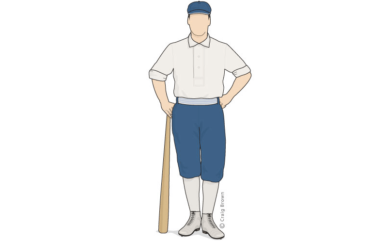
Got an e-mail yesterday from the great Craig Brown, who runs the fantastic Threads Of Our Game website. If you’re not familiar with it, the primary focus is on pre-1900 baseball uniforms and related ephemera.
He wrote:
Knee-breeches in New Jersey, a year before Cincinnati
Hello baseball historians,
There is no doubt of the profound influence the Cincinnati Red Stockings had on baseball. In fashion, their short pants and exposed red stockings, first worn on June 15, 1867, were a sea-change — a look that was quickly legitimized by their open professionalism and gigantic winning streak. But (breaking news) Cincinnati was not the first to wear knickers.
One year earlier, in 1866, on a scorching July day in New Jersey, the Liberty club of New Brunswick faced the Nationals of Washington. The New York Clipper remarked that the pants that day were “somewhat of a novelty.”
Read more and see the uniform here.
Thank you for your time,
Craig
Threads Of Our Game
Thanks, Craig! Great work (as always) on this!
The Ticker
By Anthony Emerson

Baseball News: The Yates County History Center in Penn Yan, N.Y., has a new exhibit on the history of baseball and softball in the area that includes plenty of uni-notable items (from Kary Klismet).

Hockey News: Maple Leafs G Petr Mrazek’s Heritage Classic mask and pad game are completely on point (from Wade Heidt).

NBA News: Passengers on Princess cruise ships can now have their guest medallions (essentially digital passports that allow access to various onboard amenities) customized with NBA or WNBA team logos (from Kary Klismet).

College/High School Hoops News: Woah, get a load of these c. 1970 Marquette unis featuring no visible team markings at all. Would love to see a color picture of these (from Brad Eenhuis). … Virginia’s men’s team is wearing white for an away game against Louisville tomorrow (thanks, Jamie).

Soccer News: Brazilian club Cruzeiro has unveiled some really nice new home kits, designed to evoke the night sky over Belo Horizonte (from multiple readers). … The Premier League has a new ball design (from Moe Khan). … The following are all from Kary Klismet: New uniforms for the USL Championship’s Charleston Battery and Hartford Athletic. … The Athletic has a (paywalled) video recapping the full history of the soccer uniform.
Ukraine News: Danish soccer club FC Midtjylland wore a Ukrainian flag over their crests during their last match (from Ed Zelaski). … Bundesliga team VfL Wolfsburg will drop their usual uni advertisement and instead wear a peace sign on their jerseys against Union Berlin today (from @texastrev). … Alabama gymnasts wore blue and yellow ribbons in their hair to show solidarity with Ukraine. One of their coaches, Oleksii Koltakov, is Ukrainian (from Griffin Smith).

Grab Bag: The city of Kent, Oh., is looking to redesign the city flag.
Uni Tweet of the Day
If you’re going to make this statement, then you need to show them in the yellow pants…
Friendly reminder that the Los Angeles Chargers have the best uniforms in the NFL. pic.twitter.com/uAagAb2ouq
— NFL Fashion Advice (@fashion_nfl) March 2, 2022
And finally… that’s all for today. Big (huge) thanks again to the great Jimmy Parker. I look forward to another guest entry from Jimmy, hopefully in the near future!
Everyone have a great Saturday and I’ll catch you on the morrow. Until that time…
Peace,
PH
Nice job by Greg Lamm re-imagining the Cowboys’ blue jerseys. I’ve come up with a couple “color rash” designs myself that use the metallic light blue as the jersey color — not a likely direction for the real-world Cowboys but a nice look. And agreed it would be a big upgrade for Dallas if they dropped a couple colors, and my vote would be to stick with metallic light blue and royal blue.
Thanks Tenz. I don’t think they will get rid of the navy either but we can hope.
As someone who worked in arena and stadium merch (sports and concerts)for over 20 years, I thoroughly enjoyed Jimmy Parker’s entry. Paul trashes sports merchandise all the time, but it was a labor of love and gave me many great memories that I’ll have for the rest of my life.
Thanks Dave! Glad you enjoyed the piece. It was a ton of fun to research.
I recall seeing color pictures of those Marquette 70s unis in SI back in the day.
Agreed
Not surprising that the Dodgers would have merchandise from other teams. Wasn’t that a relatively common phenomenon until recent times? I can remember getting yearbooks from other teams at Veterans Stadium into the early 2000s, a Dodgers cap at Shea Stadium in the late ’70s, and even mascot bobbleheads were available for most teams at shops outside Fenway Park in the 1980s. It seems in recent years the ballparks and any shops around them now deal exclusively with the home team’s merchandise.
It was very common.
As a fan in the 70s and as a souvenir vendor in the 80s and 90s, you could get all kinds of visiting teams’ merch at stadiums and arenas.
Ballparks would sell other teams’ pennants and helmets…sometimes the caps, too. I bought my replica Nordiques jersey at the Pittsburgh Civic Arena in ’86. And you should have seen the spread we had at our souvenir stands at the Richfield Coliseum (I have pictures around here somewhere). You could buy replica jerseys of NBA and MISL teams. Pennants, buttons, pens and much more…even when the Cavs were doing well and selling out, we’d stock and sell loads of visiting merch. And while sometimes we’d tease the people buying it, it was all in good fun. No one got mad and we happily took their money.
Same thing with minor league parks. The souvenir stand at Goodland Field, home of the single-A Appleton Foxes, had merch from every major league team back in the ’80s and early ’90s.
Yes, I bought caps of several NL teams in 1969 at Shea Stadium. The souvenir stands had stacks of caps from all the NL teams.
-Jet
This lead entry is awesome. Fantastic work.
Thanks Kenny! Glad you enjoyed it.
Thanks Kenny! It was fun research for sure!
That 1968-73 Marquette home jersey (and a bunch of others from later years) in color here: link
Wolfsburg also added a couple white lines to the center circle on their pitch to make a peace symbol.
link
The scoreboard is from the 2015 spring race in Atlanta. It was Jeff Gordon’s last race at Atlanta, hence the 24 in every position on the pylon.
Well done, Jeff!
I miss him on the track and up in the Fox booth.
Magnificent article (and fantastic research) by Mr. Parker. Really enjoyed reading this. Thanks so much for sharing the results of your hard work with the rest of us!
Thanks! Hope you enjoyed reading it as much as I did researching and writing it.
I disagree with Greg’s assessment of the Cowboys’ colours. Royal blue and powder blue usually make a great combo (there’s countless examples in the MLB), but I personally think that the metallic quality of the pants lends itself better to a pairing with navy blue.
Overall though, I agree that the number of blue hues is a problem, and the white jerseys definitely look better with royal numbers.
On another note – it’s pretty lame that the Athletic paywalled that Tifo video about the history of soccer kits. I literally watched it on YouTube last night…
An overlooked detail of the Cowboys’ jerseys is the black outlining of the sleeve stripes. It really isn’t superfluous; many NFL teams use black without it being part of the official palette (San Francisco, Kansas City, New York Jets, Washington until 2020, Minnesota). But wherever Metallic Blue is used on the uniform, it needs to have an icy sheen. Glittery helmets and matte uniforms are dissonant.
Oh mannn, the souvenir stand… one of my big memories of my first major league ballpark visit (June 1, 1969 Giants at Mets, Shea Stadium) was the eye-popping souvenir stand festooned with ALL of the National League caps for sale!!! I never wanted a hometown Mets cap, that was too easy. My first cap was an orange Astros one, in later visits got a Padres, Expos and Cardinals…
-Jet