Click to enlarge
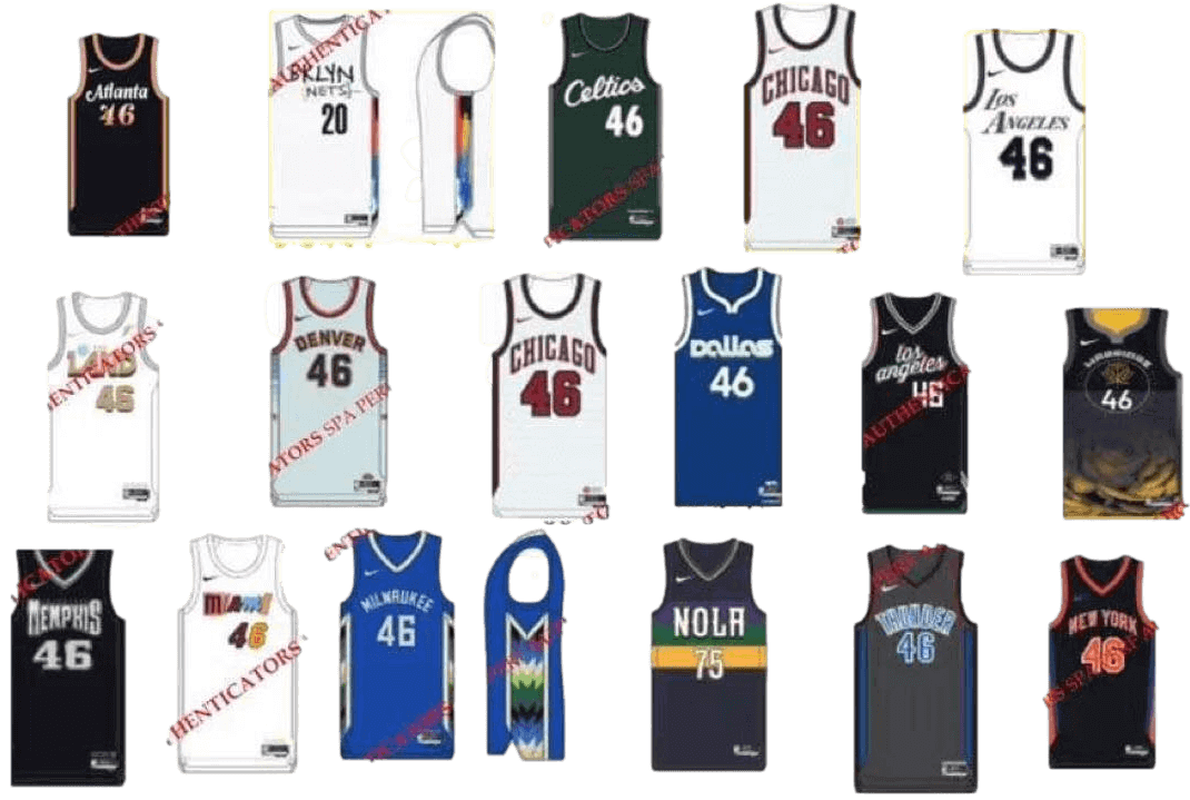
Sometimes it’s hard to keep up with breaking news when covering a daily beat, and that was the case for me yesterday. I had a bunch of obligations that kept me out of the house for a good chunk of the day and most of the night. While all that was happening, a shitload of NBA uni designs for next season leaked. I saw rumblings of what was happening when I checked Twitter on my phone while running from one appointment to another, but I didn’t fully comprehend the scope of the leak until I got home at 9:45pm, by which time I had other things to catch up on and was too wiped out to do a full assessment.
But I do want to provide some sort of coverage, so here are the basics:
• The leaks came from Twitter-ers Casey Vitelli (a longtime source of good NBA uni info) and @skunwong32 (with whom I’m unfamiliar).
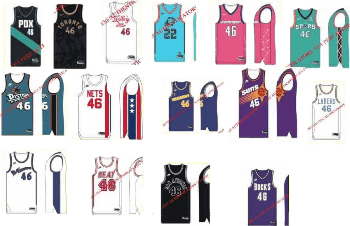
• All told, those two sources provided 37 leaked designs — 22 City, six Statement, and nine throwback, all for next season. Some of them are shown above, and here’s a bunch more:
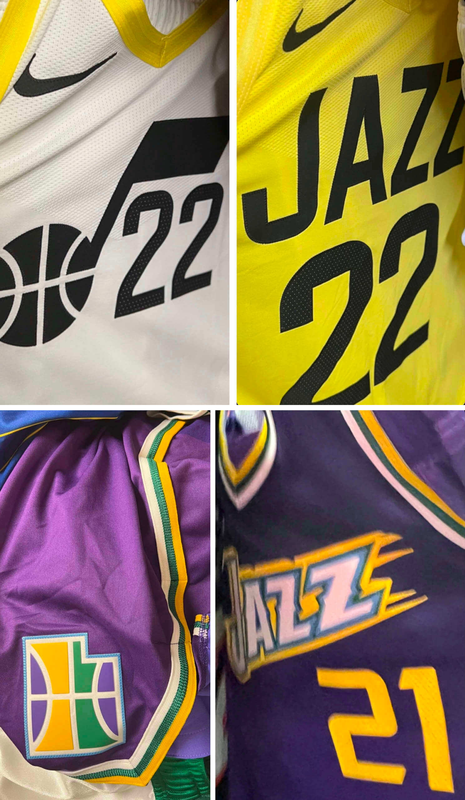
• In addition, the @JazzNationNews Twitter account shared photos — not just catalog mock-ups — for some additional leaked designs that appear to confirm the long-suspected change to the team’s color palette:
Obviously, this all qualifies as big news in the uni-verse, so you’d think I’d be excited about it. But I have to admit, the endless churn of NBA uni designs has become numbing. Just the thought of 30 new City designs next fall, plus all the other alternates, makes my eyes start to glaze over. Even the good designs seem more like happy accidents — the proverbial blind squirrel finding a nut — than the result of a healthy creative process. And what’s the point in getting excited about a good design anyway if it’s just going to be mothballed after one season?
I know there are some people out there who love the constant rush of new product, but I find that a lot of it leaves me cold. Even if all the designs were great, I don’t want to eat a new amazing flavor of ice cream every day — sometimes I just want chocolate, you know?
But that’s just me. What do you folks think?
Click to enlarge
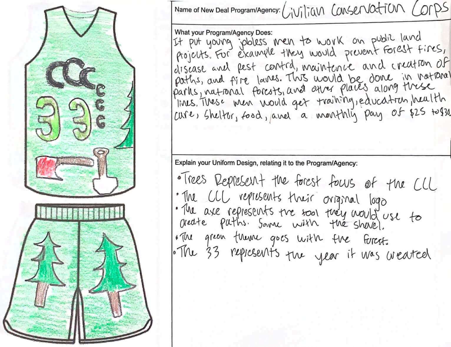
Uni-related school assignment: If you know your basic American history, then you know that the Civilian Conservation Corps was an important government program that was part of the New Deal. To my knowledge, the CCC didn’t have a basketball team — but if it did, maybe it would have worn a uniform like the one shown above.
What’s this all about? I’ll let Uni Watch reader Tom Roddy, who teaches 11th grade history, explain:
I recently had students design a basketball uniform for a New Deal-era federal agency, as if the New Deal programs had a basketball rec league. I was super-pleased with my results! The students were really excited to be able to color in class — I’ve never seen 17-year-olds so excited to use colored pencils! It was a nice distraction from the hellscape this school year has been at times.
You can see 16 of the best submissions from Tom’s students here. Of particular note is this one, for the Tennessee Valley Authority, which Tom says is the one that included a Nike maker’s mark:
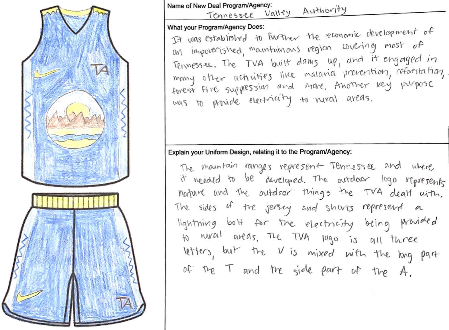
It’s always a treat to learn that a teacher is incorporating uniforms into their lesson plans (other reader-teachers who’ve done this are Marty Hick and Trevor Williams). Thanks for sharing the results, Tom, and, more importantly, thanks for the important work you do as a teacher!
Collector’s Corner
By Brinke Guthrie
Follow @brinkeguthrie
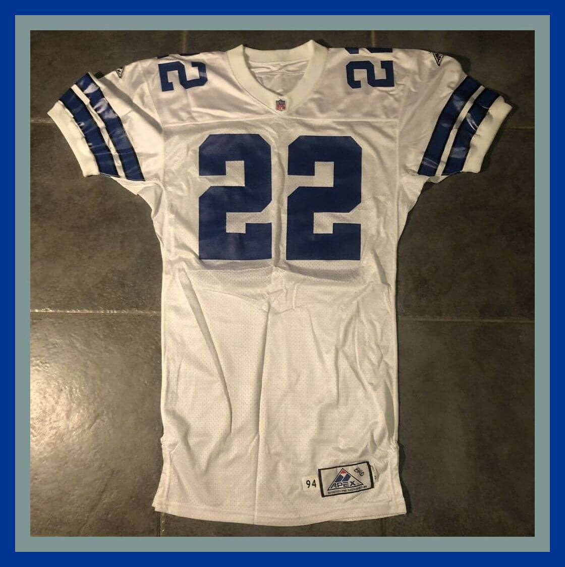
Following up on yesterday’s 22-centric blog post, here’s a game-issued Apex No. 22 worn by one of the game’s greatest players, Emmitt Smith of the Dallas Cowboys. The jock tag down by the hem says “94” indicating the 1994 season, and someone wrote “Bad” on the label — no idea what that means. Maybe like the Michael Jackson song?
Now for the rest of this week’s picks:
• C’est magnifique!! Check out the rouge, blanc, et bleu artwork on this 1970s Ken Dryden/Montreal Canadiens lunchbox.
• The Boston Patriots are represented on this 1960s Technigraph helmet plaque. (This is the small size. You can see the larger size here for the 49ers. )
• These 1960s Packers slipper/socks (looks like a sure Sears item to me but no tag) might not be quite right for a visit to Lambeau, but they’re just right for Cheeseheads who want to watch their team at home.
• A few more Pack items here. First, this 1968 Bart Starr paperback from Scholastic. I remember loving this cover illustration back then, especially the look of the football coming at you in an underhand spiral. (The photo the artist based it on is here.) Next, this Packers poster, also from 1968. And finally, a golf-style cap from the 1970s that says “America’s Pack, Green Bay USA.”
• Player’s Choice: Great Tales of the Gridiron is the title of this 1969 book featuring Gale Sayers and others.
• Here’s a 1960s Kansas City Chiefs “Touchdown for Boy Power” patch from the Boy Scouts.
• This 1970 item is called an NHL Hockey Computer. It seems you slide the inner card inside the sleeve to line up stats in the little windows.
• Something similar here from 1989 with a bit more technology: a “Sports Talk” player. With this one, you’d stick a card in the slot, and it would talk to you. “Hear the real voices of your favorite sports superstars!”
• “The Coolest Game on Earth” is the slogan on this 1996 NHL school folder. You can fill in your class schedule on the inside, with the days of the week shown in French and English.
• The cover of this 1958 New York Yankees yearbook shows the team’s uniform in royal blue rather than dark navy. “Artistic license” at the expense of accuracy? Never!
That’s it for this week, except for this shameless plug: I’m a big 007 fan, so check out my new Instagram collection page here…….Mr. Bond.

Click to enlarge
Public service announcement: Here in NYC — and, I’m assuming, in most other places — the pandemic has taken a major toll on blood supplies. So if you’re not deathly afraid of needles, this is a particularly good time to donate blood (as I did yesterday — that was one of the things that kept me out of the house).
I’ve told this story before, but it’s been a while, so once more won’t hurt: I began donating blood in the aftermath of the Sept. 11 attacks in 2001, when there was a big outcry for donors. I’d never done it before, but I answered the call, and I found that it felt like a really worthwhile thing to do — a very simple way to be a good person and give something back. So I did it again two months later, and again two months after that. I’ve kept it up roughly every two months ever since (in case you weren’t aware, I’m a pretty ritualistic person), which I figure is one small positive thing that emerged from Sept. 11.
You don’t have donate as regularly as I do in order to make a difference. Even if you do it just once, that could save someone’s life. You can schedule your donation here.
Thanks for listening. Now back to uni-related content.
By Lloyd Alaban

Baseball News: The Yankees will retire RF Paul O’Neill’s No. 21 in August. Here’s a breakdown of all of the team’s retired numbers (from multiple readers). … MLB is considering holding a game similar to last season’s Field of Dreams game at the Negro Leagues’ historic Hinchcliffe Stadium in New Jersey (from Kary Klismet). … Here’s how the Cardinals’ affiliate Peoria Chiefs came up with their alternate identities for this season (from Wes Huett).

Football News: The Commies have changed their secondary logo to reflect the seasons they won the Super Bowl instead of the calendar year they won them (from multiple readers). … Here’s one from Paul: “I heard former Giants RB Tiki Barber saying on the radio yesterday that he never wore a cup during his NFL career, and that most other NFL players didn’t either.” … If you scroll down in the USFL’s Twitter feed, you’ll see Photoshopped images of draft picks in their new teams’ uniforms (from Marcus Hall).

Hockey News: The Capitals’ Black History Month warm-up sweaters, which will be worn next Monday, have a shoulder patch for the Fort Dupont Ice Hockey Club. The team wore Fort Dupont gear at a practice earlier this month (from multiple readers). … Autism awareness-themed mask for Western Michigan G Brandon Bussi (from Kary Klismet). … Here’s the logo for the OHL’s outdoor game next month (from Wade Heidt).

Basketball News: Here’s a video about the development of the Raptors’ initial “Barney” identity (from Johnny Garfield). … Cincinnati men’s “The Cats” throwbacks have a great story behind them too (from our own Phil Hecken). … Kansas is the Sunflower State, so the Jayhawks’ men’s team wore sunflower-themed uniforms last night (thanks to all who shared). … A Kobe Bryant card has sold for over $2 million, despite not being a rookie issue, not being autographed, and not having a memorabilia relic.

Soccer News: New crest for Argentine side River Plate. Here’s the old crest for comparison (from Ed Zelaski). … Charlotte FC used a locker room-themed graphic to reveal each player’s number (from James Gilbert). … Manchester City is working on building a virtual version of its home stadium in the metaverse (from Kary Klismet).

Grab Bag: Italian women’s volleyball team Busto Arsizio posted a “match the shoes to the player” challenge (from Jeremy Brahm). … Here’s why Syracuse chose orange and blue for its school colors (from our own Phil Hecken). … New logo for the National Space Society (from Lukas Hoffland). … New logo for The Container Store (from John Cerone). … Here’s a fun thread about stadiums and arenas that have retired-number banners for the same number in more than one sport.

TEAL PISTONS JERSEYS FINALLY RETURN.
Can you tell I’m happy and grew up in the 90s?
Feel the same way about the Bucks bringing back purple!
The Black Spurs’ uniforms with the ghosted city name and numbers is my favorite.
I was just talking about that with my cousin the other day – he’s been a Pistons fan pretty much his whole life, as he grew up with the Bad Boys and came of age in the New Breed era. I was curious about the Lids state-by-state report of best-selling jerseys for January citing Grant Hill for Michigan, and he pointed out that yeah, there’s definitely a resurgent interest in that era, particularly among those who grew up in that time.
That Packer cap isn’t from the 1970s. “America’s Pack” was the team’s official fan club, run by the Packers organization itself. Now defunct, it existed in the late 80’s thru mid 1990s.
In the NFC Central days, they used to sponsor a huge tailgate party at Tampa Stadium for the annual Packers-Bucs game there.
They didn’t even describe the physical properties of the hat correctly, since it’s a) not a snapback, and b) not a trucker hat.
Typos:
Tom says is the one one that included a Nike maker’s mark
It’s always a treat to learn that a teach is incorporating uniforms into their lesson plans
Also, the link to the student’s work is not formatted correctly.
I could only get here through the link on Twitter, when I go to the home page it shows 2/22/22 at the top. I’m on an iPhone, not sure if anyone else is having the same issue.
The site is working as usual for me now.
I think it’s fixed now.
The Lakers adding more black to the ‘statement’ uniform is a crime.
Nigel Tufnel approves!
That’s probably their City Edition uniform. Lakers are probably going back to the “Lore Series” uniforms inspired by players.
If I had to wager a guess, this time it’s Jerry West. The Lakers probably would have trotted these threads out this season, but the “retro remix” stuff the entire league had to do probably pushed that back sometime to this season. After all, West is rather famous for his silhouette being the basis for the current NBA logo.
They had a white City Edition uniform before, in the 2020-21 season. That one had light blue and silver trim, honoring Elgin Baylor.
This one seems to mimic old black-and-white photographs, hence the lack of actual team colors. To be fair, they have had the more successful City Edition uniforms overall (though I’m biased, being a Lakers fan)… Except for the Tragic Bronson threads. Those ones were atrocious.
As far as gimmicks go, the Lakers can sorta get away with their Lore Series, in my opinion. They’ve never used a color outside of a heritage color in those uniforms, save for black (which actually is now classified as a team color thanks to those utterly horrendous bfbs panels on the purple uniforms.)
Frankly I’m sick of the lakers (and Celtics) even participating in these promotions. I assume I’ll feel the same of the Yankees city connect costume. I applaud a team that embraces creativity and change but I also applaud a team that embraces tradition. But stop coming up with these barely different jerseys or just using throwbacks particularly when the jersey hasn’t changed significantly in many decades, if at all. Having a purple jersey that looks just like another purple jersey but this one has a drop shadow instead of an outline is not worth the effort. I’d rather see them just stick to a clean established uni set rather than water down the brand image with a promotional jersey that looks *slightly different*
Looked at the “Coolest Game on Earth” folder link in Collector’s Corner, and aside from that item being sold already, it pales in comparison to the very first suggested item below it – a 1994-95 Detroit Vipers Daniel Shank pro-weight jersey, with the early number font in the stile of the Vipers wordmark. (By 1996-97 they’d switched to regular block numbers.)
link
And then I looked right below that and there was a Gordie Howe gamer from when he laced up for the Vipers for the opening shift of the 1997-98 home opener (which did kind of overshadow the team raising their 1997 Turner Cup banner – I was at that game, as well as their Cup-winning game over the Long Beach Ice Dogs).
link
My Uni-Watch membership card is based on that sweater. In purple, of course.
If you give an infinite number of monkeys an infinite number of crayons, they will never be able to keep up with randomly drawing all the new NBA uniforms year-in, year-out.
Applause for being so consistent on blood donations. It is an easy <60 min of your time to do some serious good.
When it comes to the NBA alts, I have to agree, with so many out there, and how they come and go, seems almost pointless to take the time to evaluate them. At this point I just look at them and say "does this look like the team that is wearing it" if the answer is no, 99% of the time I consider it a bad look, regardless of any design elements. For example black and teal PDX? How is that the Trailblazers? Or, black and purple is for the Kings, not the Lakers. Yikes!
Home button works now. In the past, I could also click on the Uni Watch header and get to the latest post, but that has not worked in a while. Can we get that back?
The NBA is just doing too much. I love new uniforms, but you have to let some stuff breathe. Good versions of these unis in the past few seasons have no shelf life because they came and go.
And thanks for that reminder on blood donations. I’m regular, but long overdue because some work commitments at the end of the year really got me sideways. Also, if you have a rare blood type (like me, B-), consider doing double red blood cell donations. There is a return machine that puts your fluids, plasma and platelets back in your body. A few positives to this:
1. You can just leave when you’re done. No 15 minute period to make sure you aren’t lightheaded or anything. But still take your snack!!!
2. In two donations, you give enough red blood cells to help people that would take four whole blood donations to get.
3. It’s 112 days between eligible donation dates.
So can actually help more by going to the donation drives less!
Seconding the double red option…the center workers can advise you on if your blood type is best suited for double red, whole blood donation, or plasma…they are all good, but you can maximize your impact by volunteering for the one best suited for your type.
Paul O’Neill is a marginal candidate for the Hall of Very Good, and the Yankees are retiring his number? They’re already closer to a number shortage and now this? In the pantheon of legendary outfielders, O’Neill doesn’t belong, not when you’ve got Ruth, DiMaggio, Mantle as your Top 3. By WAR, he ranks behind luminaries like a Roger Peckinpaugh, Snuffy Stirnweiss and Bob Meusel. Sorry, don’t see it. It’s almost pandering and the Yankees should be above that.
Would suggest it is not the Hall of Excellent Players, but the Hall of Fame. Which is to say, there is some consideration in there outside the numbers. I am not arguing for O’Neill’s placement in the MLB HOF, but given his leadership role during the 1990s Yankees dynasty he has non-number qualifications to consider.
Also and perhaps more to your point on retired numbers, just because he is a a player of note and recognition (already has a place in monument park) does his place in Yankees’ history reach such heights to also retire his number? My position would be no. Really of recent Yankees it is probably only Jeter and Rivera that deserve that honor.
The one justification I can mount for retiring O’Neill’s number is that he was a standout on a run of terrible Yankees teams early in his career. Making him sort of the NYY equivalent of Kent Hrbek for the Twins. Hrbek, alongside Kirby Puckett, was a standout both in terms of talent and fan-belovedness during a couple of runs of truly terrible teams. Same with O’Neill in his early career with the Yanks. But by the mid-1990s, the Yankees had surrounded O’Neill with a team of all-time great talent, all of whom were even more beloved by fans. When a team goes to the World Series a bunch of times and a player routinely bats seventh, that player’s number should not be retired. Even if he previously batted third or cleanup when the team was in the cellar.
The Twins don’t have the same history as the Yankees. Kent Hrbek was also a local from the Twin Cities and brought the Twins their first title. Paul O’Neill isn’t anywhere near the top 10 in Yankees history in anything of note. It cheapens the prestige of retiring numbers if they let this happen. I agree with Greg – Jeter and Rivera absolutely deserve it. Posada and Bernie are more marginal calls but they are both far more appropriate than O’Neill.
C’mon! He hit two homers for that kid in the hospital. Although that second one was just a triple with a throwing error ;-)
I never did hear if he caught followed that up with catching a fly ball in his hat!
One note on the Kansas uniforms. The state is indeed the Sunflower State but also games against Kansas State are referred to as Sunflower Showdown. Probably a bit if both at work on those sunflower themed unis.
I second the emotion of getting numbed by the sheer number of NBA uniforms, most of them created without any creativity or simply flipping the base color of a more or less original design from this season. It is an overload and it is not adding anything to the appeal of the game. Only the City Editions of Phoenix (with turquoise as a nod to Arizona’s original inhabitants) and the Warriors (with something that looks like a rose, a tiger skin, a storm or a tree trunk) seem to look original.
The Jazz changing to Steelers colors seems puzzling to me. Why?
It is odd that there are no black and yellow (or gold) teams in the NBA given it is a good color set. Perhaps simply the city of Pittsburgh holds those colors in the other sports so nobody has jumped on it in the NBA?
I figured the Nets would have done well to go to black and gold (or yellow) vs the colorless black and white they settled on.
That all said, it doesn’t make much sense for the Jazz to take up those colors. Historically some combo of the mardi gras theme from their New Orleans days is how you’d recognize them. And if they are actually going away from that, their red rocks set is a more appropriate choice for their location.
Utah is the Beehive State, so the change is to reflect an Apian color scheme. In fact, the “Utah Buzz” makes more sense than the “Utah Jazz”. I would expect the Pelicans to revert to Mardi Gras colors.
Oh, excellent point, though given the existence of the Hornets it is unlikely they’d switch to an apian name or logo.
Perhaps they should have made that trade back when the original Hornets moved to New Orleans; New Orleans Jazz and Utah Hornets.
Oklahoma City also feels an ideal place for a black and yellow team given their completely generic and nondescript uniforms, colors, and logos since relocating. Black and yellow evoke storm clouds and lightning.
The Salt Lake Buzz was the name of the minor league team here through the 90s (now they’re the Salt Lake Bees). link
As a Jazz fan, I don’t mind the change. The Jazz’s color set has been all over the place since the purple mountain rebrand in the 90s, so I don’t feel any affinity for a set of colors necessarily. What I am fine getting away from is the navy/yellow set that so many teams have, and we know black/yellow looks good. The main visual identity I think matters is the Jazz Note logo, which rules. Also, we all know Jazz isn’t in Utah, but Jazz is such a good name for a basketball team, it really shouldn’t matter where it’s located anymore.
ESPN Magazine had an article about team names that needed to be traded and one of the suggestions that the Raptors name needs to go to Utah and the Jazz name needs to go back to New Orleans.
link
I was all for Utah and New Orleans swapping nicknames back in 2002, but then “Hornets” wouldn’t have been available when the Bobcats rebranded. The name belongs in Charlotte.
“And, did you know, the Syracuse University mascot wasn’t always an orange (Otto)? In earlier years, the mascot was a warrior, gladiator, and even a dog wearing a helmet, among others.”
I guess you could consider the racist caricatures to be “among others”.
The warrior WAS the racist caricature.
The article, and the web page it’s paraphrasing, both describe why Syracuse chose orange, but nothing about blue.
Just to touch on what Tiki Barber said, I played football from about age 8 through college and never once wore a cup. I also don’t know of any other players that ever wore a cup.
It’s interesting to see/hear the reaction of people that always assumed players wore cups. I suppose it makes logical sense to think that, however, it’s something that isn’t done. Baseball, on the other hand, is a sport that you must wear a cup while playing lol.
I only wore a cup when playing catcher. Because obviously. Also if you wanted to play against the best pitchers, hitters and phenoms in SoCali in the 70,s 80’s. regularly without an invite. Just Show up with a cup and tell them you want (actually)to play catcher and call games. You want to find out if you are good, this was a great way to find out.
When I played youth football in the early-to-mid ‘90s, cups were required. By the time I got to high school I always wore one, probably because it was what I was used to. Looking back it probably did more harm than good. The only times I remember it coming into play was taking a hit and landing on it, which definitely slowed you down for a play or two. As a QB I certainly never minded centers wearing one. It made the exchange a bit more comfortable if you catch my drift.
When I played football in high school, the only guy I knew of who wore a cup was one of our deep snappers. Guess he felt extra vulnerable. I only got hit there in a game one time. It’s pretty rare.
Jazz back in purple with green and yellow trim! That is what I like to see.
The most interesting part of this article is the Google rabbit hole it sent me down on mother lode vs motherload. I’ve always used the latter, but now I know it’s technically wrong!
I actually thought about that as I wrote the headline. “Are people going to think I misspelled it, even though I didn’t?”
I also looked it up & now I learned something. I always understood it to be motherload as in “the mother of all loads” (i.e. large or impressive).
It seems I was wrong all this time. Although I think I have really only spoken the term, so by not writing it out & not misspelling it. I guess technically I wasn’t wrong?
Love the plug for blood donation. I have a friend with an immune deficiency. They get an infusion of white blood cells every four weeks. I figured I should replenish the supply. That was years ago and now I’m on my 4th gallon!
So the Yankees now have 21 retired numbers. So over 1/5 of the numbers are retired. I’d rather see teams honoring players with their names displayed, like some teams do with a “ring of honor”. At least with my school, USC, they limit it to only Heisman winners.
Interesting coincidence with the blood donation blurb today, I actually have an appointment to donate at 1pm. Glad to see there are others that giving regularly; keep up the good work!
Some facts from the Red Cross:
– Only 3% of people in the US give blood
– If you have Type O negative blood, your blood can go to anyone with A, B, AB, or O blood. Known as a “Universal Donor”
– Approximately 45 percent of Caucasians are type O (positive or negative), but 51 percent of African-Americans and 57 percent of Hispanics are type O.
– Types O negative and O positive are in high demand. Only 7% of the population are O negative. However, the need for O negative blood is the highest because it is used most often during emergencies. The need for O+ is high because it is the most frequently occurring blood type (37% of the population).
Facts Here: link
Sign up to donate here: link
Paul O’Neil #21 being retired? That Yankees list of retired numbers is looking like a Hall of the Pretty Good.
Thanks for the nudge about donating blood…it’s been a while since I donated.
I was a regular at a local blood drive, then the Bloodmobile quit making scheduled stops there.
A trip to a donation center, while a bit inconvenient, is in order.
Hi,
I started going to give blood after 9/11 too. I didn’t like needles, but I felt it was important to do. I still do it today on an 8 week basis. The people at the donation are nice and good at what they do (I did have one sort of rough experience. All in all, it’s been pretty easy). In fact, I am going today to donate blood. Thank you for sharing that story.
I’ve been a regular when my church hosts blood drives, which it didn’t do for a minute there what with the pandemic. They started up again, and I gave blood last week for the first time in a while, and it was a great experience. I’ve been told I have slippery veins, and it often takes the Red Cross folks several tries to get the needle into a vein. (“Certainly it hurts. The trick, William Potter, is not minding that it hurts.”)
Anyway, the nurse last week got it in one quick jab. Which anecdotal experience I’ll take to be 100% representative data and report that the Red Cross has used the pandemic to hugely improve the phlebotomy skills of its blood-drive workers. Give blood if you’re able! And thanks, Paul, for the PSA/reminder.
Yep, law of diminishing returns with the glut of NBA uniforms. I can’t even say what the main uniform is for the Suns. I know “The Valley” is their favorite. Alternates should be occasional, and not the norm.
The Emmitt Smith eBay jersey is definitely from 1994 because that was the only year the Cowboys had the Apex logo on the sleeves and the thinner TV numbers. They were outfitted by Apex in 1993 but the TV numbers were much blockier. Interesting that the 75th Anniversary patch is nowhere to be found, but that would make sense if the jersey was never deemed game-worthy.
There’s no date on this, link, so I don’t know when the Tennessee State Parks had throwback Civilian Conservation Corps baseball games with era appropriate ‘uniforms’.
I just wanted to second Paul’s post about blood donations. I started donating blood after the pandemic hit. It doesn’t hurt, and it is not that big of a time commitment.
I would recommend donating blood as well.
Jayhawks basketball unis by Anne Geddes. Brilliant!
slipper socks!
The only sport I wore a cup for was hockey.
Especially not football – granted that was in the mid-70’s when “cups” were basically a shield which didn’t really cup anything. Maybe some of the linemen did. Never asked.
Never wore one in baseball either, played shortstop through high school and never took one in the giblets. Maybe I was just lucky. In fact, I never remember ever getting racked in sports.
It took DIY projects at home for that
It looks like Adidas used the same template for Kansas’ sunflower unis as they did for those underwhelming black history month designs.
The Warriors wearing their best uniforms instead of the current abomination. Yummy.
That’s Hinchliffe Stadium.
I love the CCC uniform! My family and I camped up in the PA Grand Canyon during the summer of 2020, and one of the things we were able to do was to take a tour of the canyon on horse drawn wagon. Our guide was the grandson of a CCC member and the stories he told that his grandpappy told him were absolutely amazing!
On blood donation, I’ve known since I was young that I have O+ blood, so I’ve been a regular donator since then. One thing I would like to note, if you have a local hospital running drives, consider donating directly with them as opposed to an organization like Central PA Blood Bank. Despite being a not-for-profit organization, the price they charge our local hospitals for blood products is leaps and bounds higher than what the cost is for the hospital to store blood in it’s own blood bank. Especially consider this option if one of your hospitals is a Trauma Center.
The laziness of some of the NBA designs has me thinking this leak dump is BS, although if you and Chris claim it’s real, then I won’t argue. Just tells me that Nike and the NBA don’t care if they put out unis that make people think “someone could have mocked these up in Corel Draw in an afternoon.” I shouldn’t be surprised. The warriors have been using a typeface straight out of Microsoft Word for years now and people talking about they have the best uniforms in the league. What’s the motivation to really give it a go every single time? Hopefully some of these look better on the court, and hopefully I gain more appreciation for some of them when I see them individually (Atlanta’s seem like another lazy font swap when lumped in with many lazy font swaps, but will probably look decent on its own)
Thank you for the blood donation reminder. Just signed up.