By Phil Hecken
Follow @PhilHecken
Good Saturday Morning, Uni Watch readers. I hope everyone has had a good week and you’re all staying safe and well.
A few weeks ago, I featured an entire conference of “Thursday Night Throwback” concepts from Fabio Leonhardt, a reader from Germany, which — if you missed it — you can see here. Very briefly, what Fabio has proposed is a set of “new” throwback uniforms and alternates which could be worn by the TNF teams as they play each other throughout the 2022 season. If you missed that post (or need to catch up on the premise), feel free to refer back to that link above.
Fabio is back today to complete his concepts, this time with the NFC. So on that note, I’ll turn it over to him now as he brings you his…
Throwback Thursday Night Football Concept Part II
by Fabio Leonhardt
Twitter: @Bio_1209
Instagram: @cards_need_new_uniforms
NFC North:
Lions:
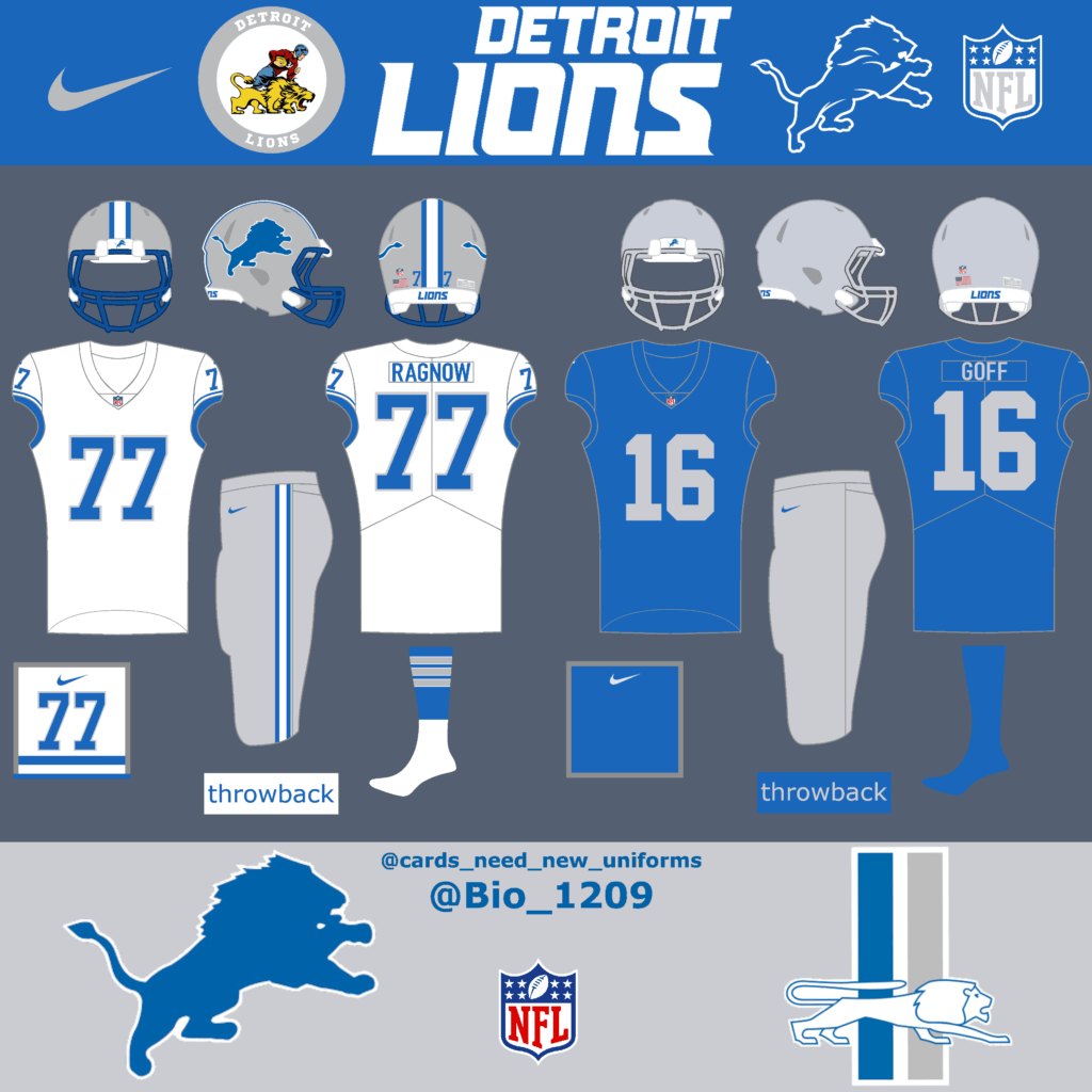
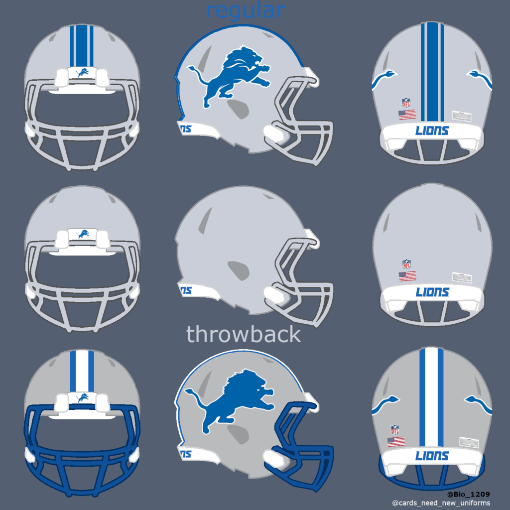
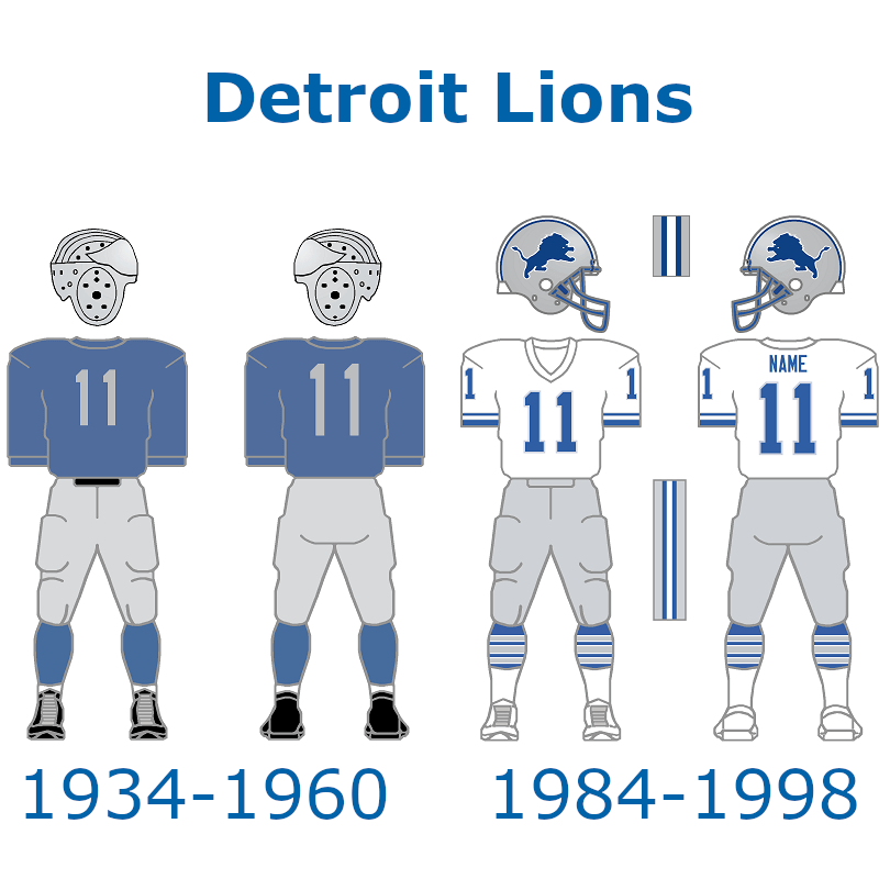
The Detroit Lions already have one of the best throwback uniforms in the league. They’re wearing them for a very long time now and I don’t believe this will change in the future. But they could potentially add another throwback uniform.
Vikings:
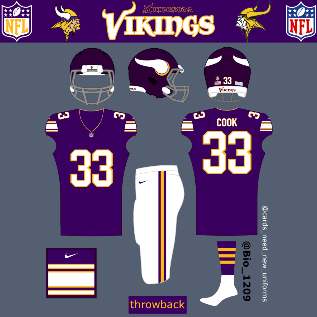
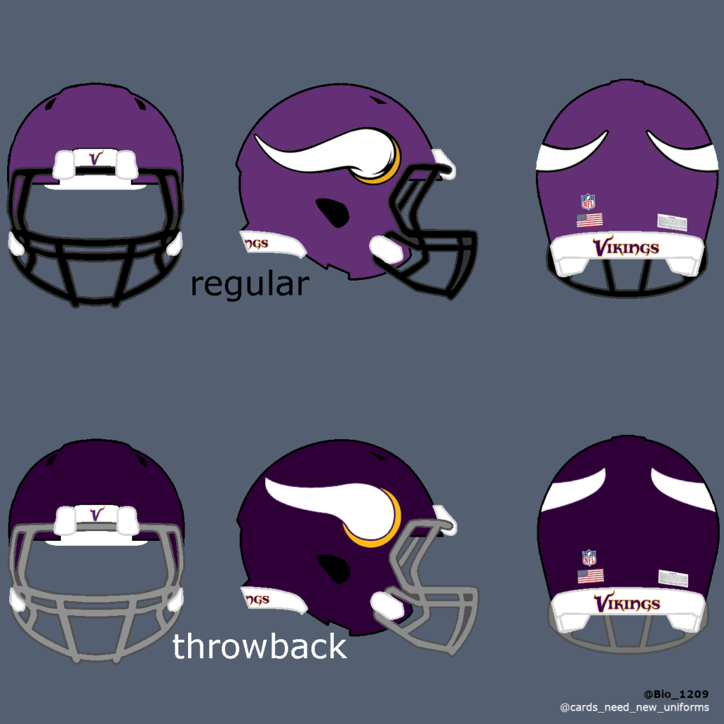
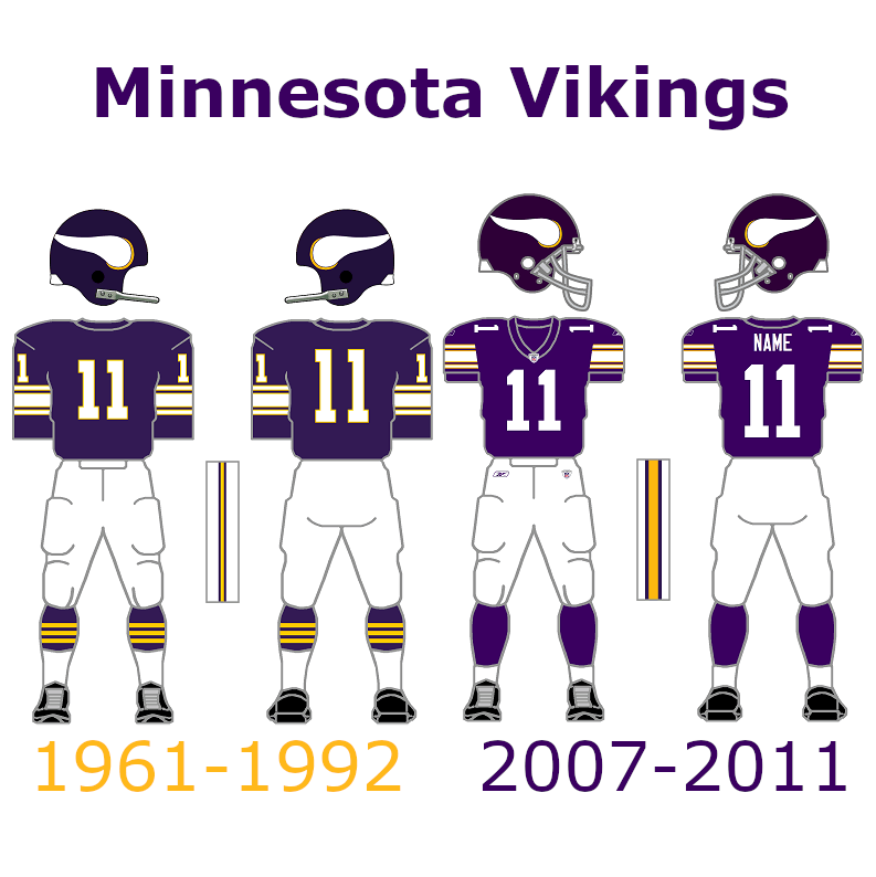
The Vikings uniforms are one of the best in the league. But they could bring back the throwback uniforms they already used from 2007 to 2011.
Bears:
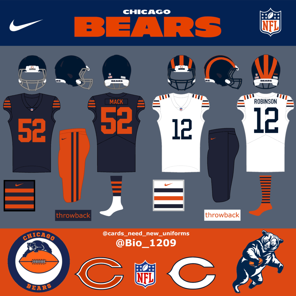
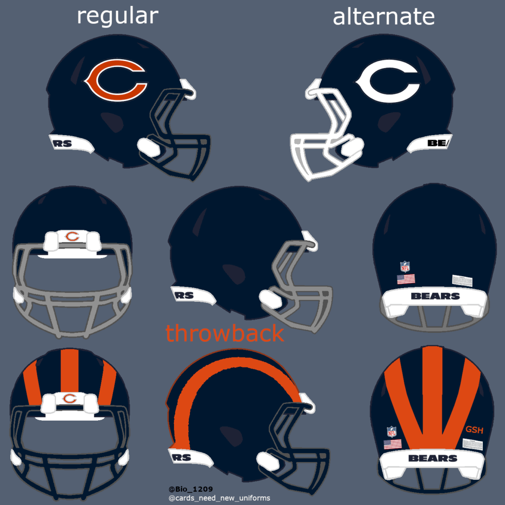
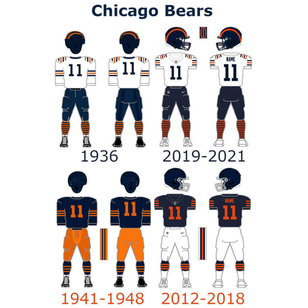
The Chicago Bears are a front runner if it comes to bring in good looking throwback uniforms. They already played in very fresh throwback uniforms the last couple of seasons. They could add orange pants to the mix but no big changes are necessary in my opinion.
Packers:
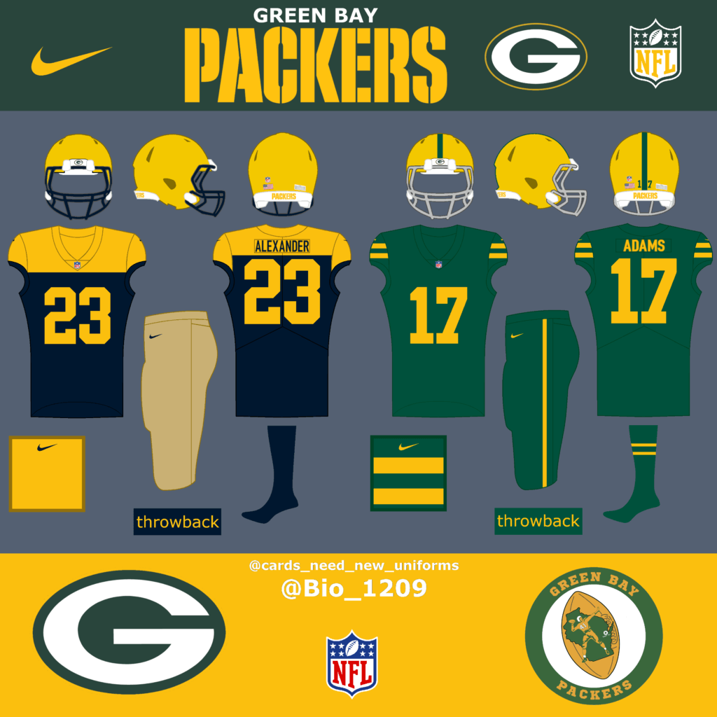
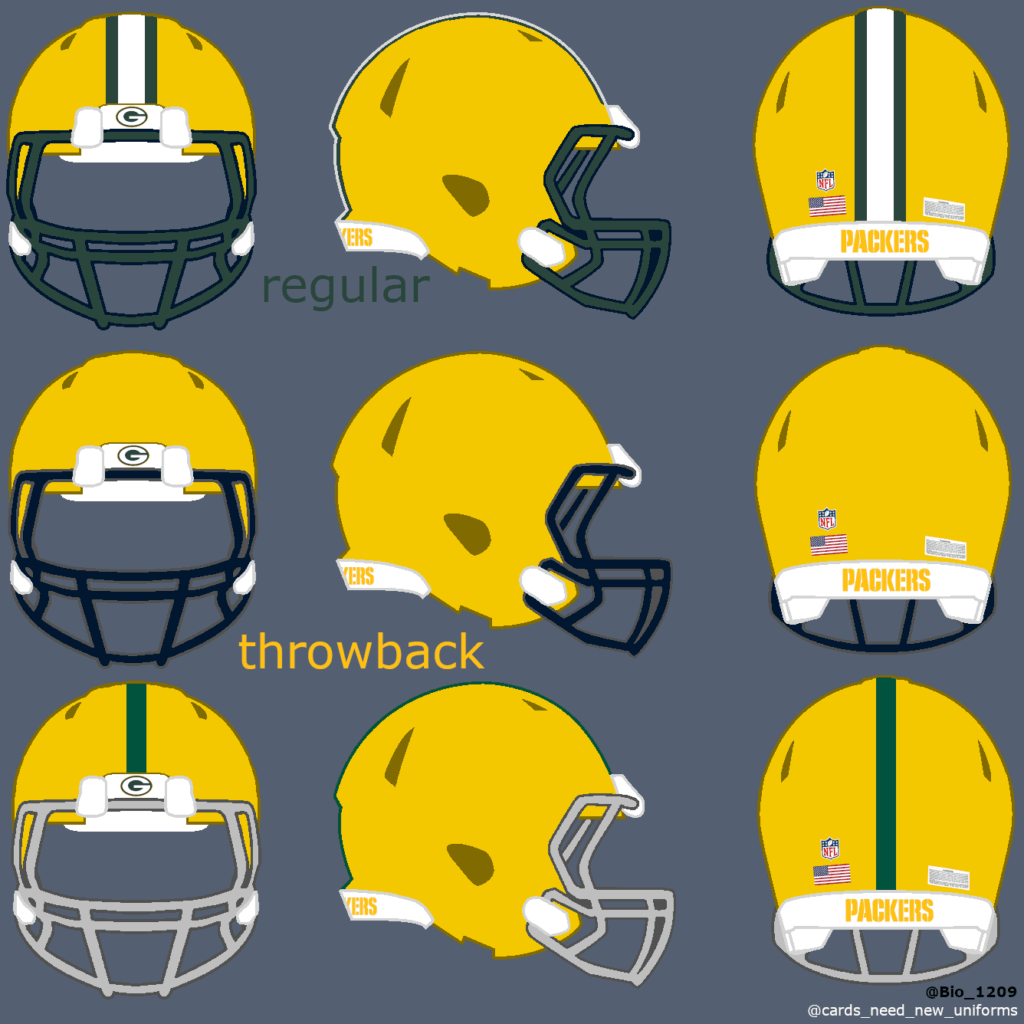
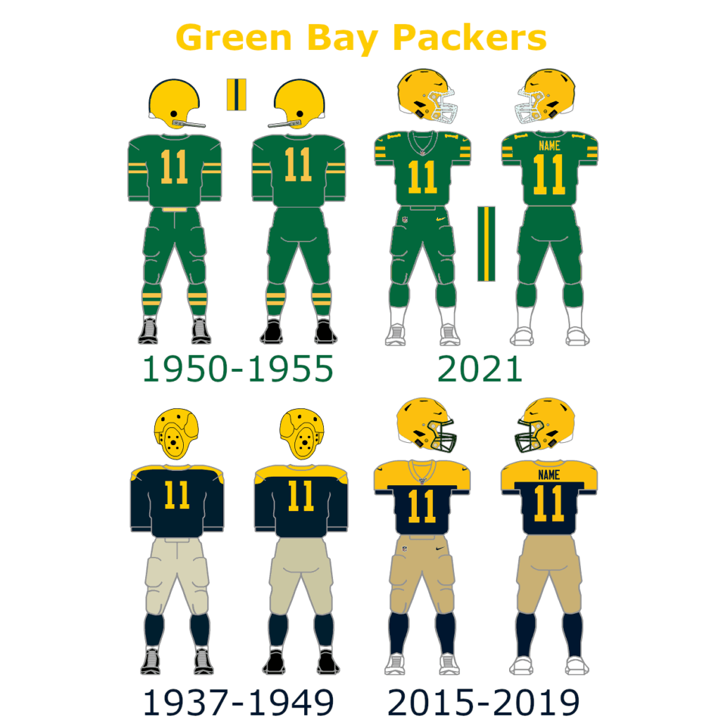
The Green Bay Packers already brought us some great throwback uniforms. Their dark blue uniforms are one of my favorite uniforms all-time.
Last season they played in new throwback uniforms that looked great on the field too.
NFC East:
Giants:
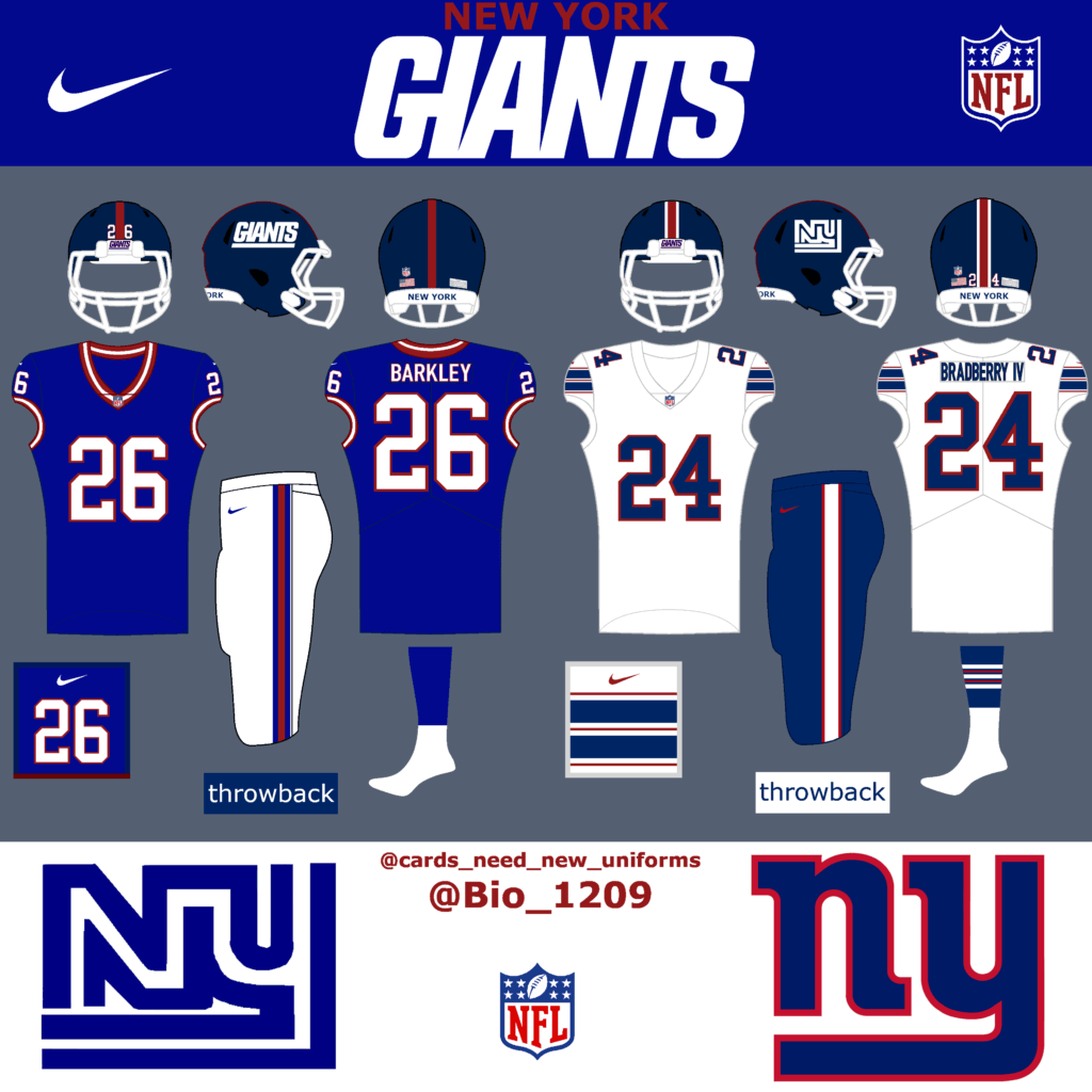
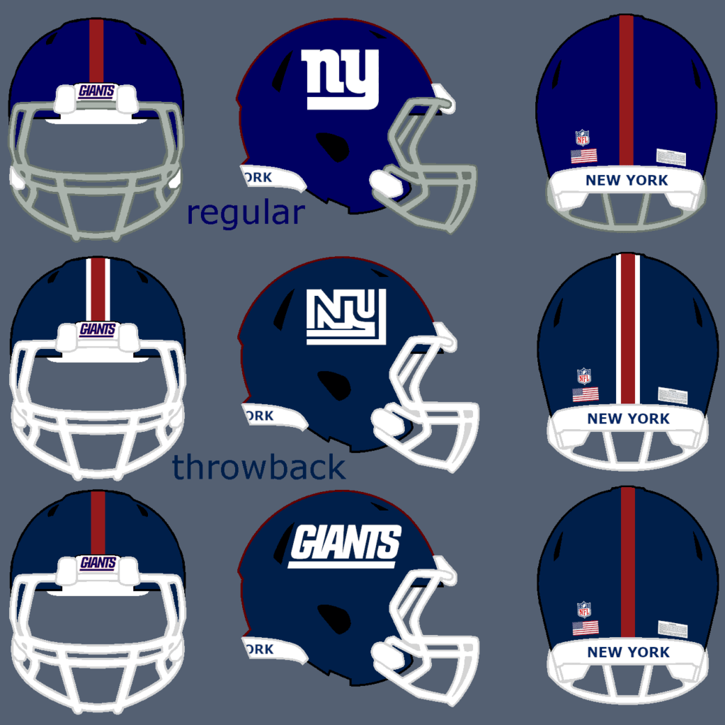
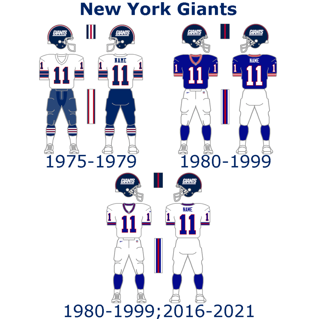
The Giants have clean and simple uniforms. Their color rush uniform is kind of a throwback uniform too. Here I have two throwback concepts for you.
Eagles:
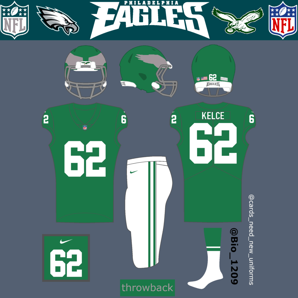
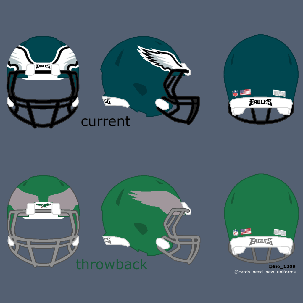
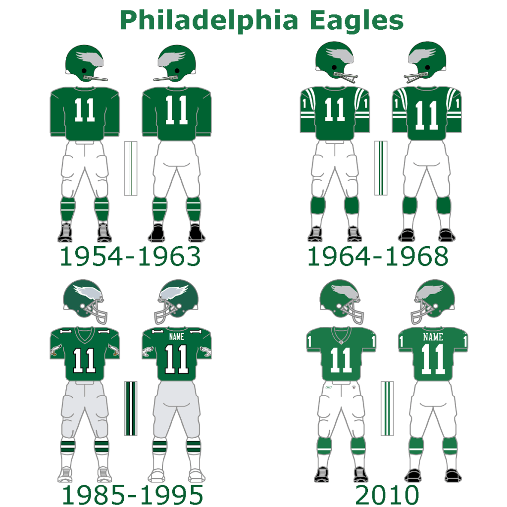
I didn’t have to think long about which uniforms would be suitable for the Eagles. The kelly greens are great and need a comeback for sure.
Cowboys:
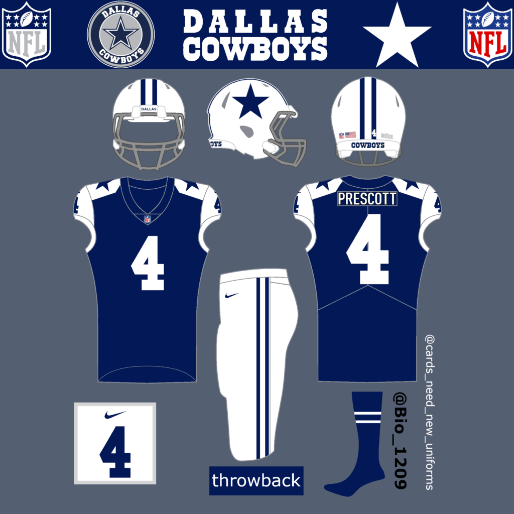
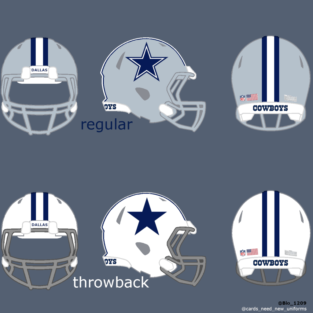
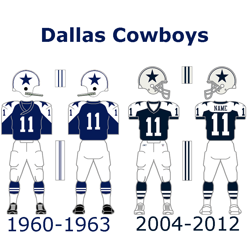
The Cowboys could/should bring back their very first uniform from 1960. The white helmet completes the classic uniform and looks better than the gray helmets in my opinion. They already wore this uniform in 2004.
Washington:
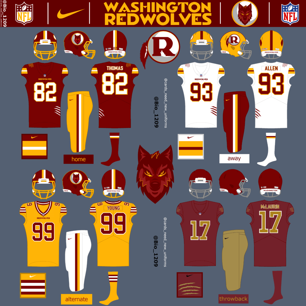
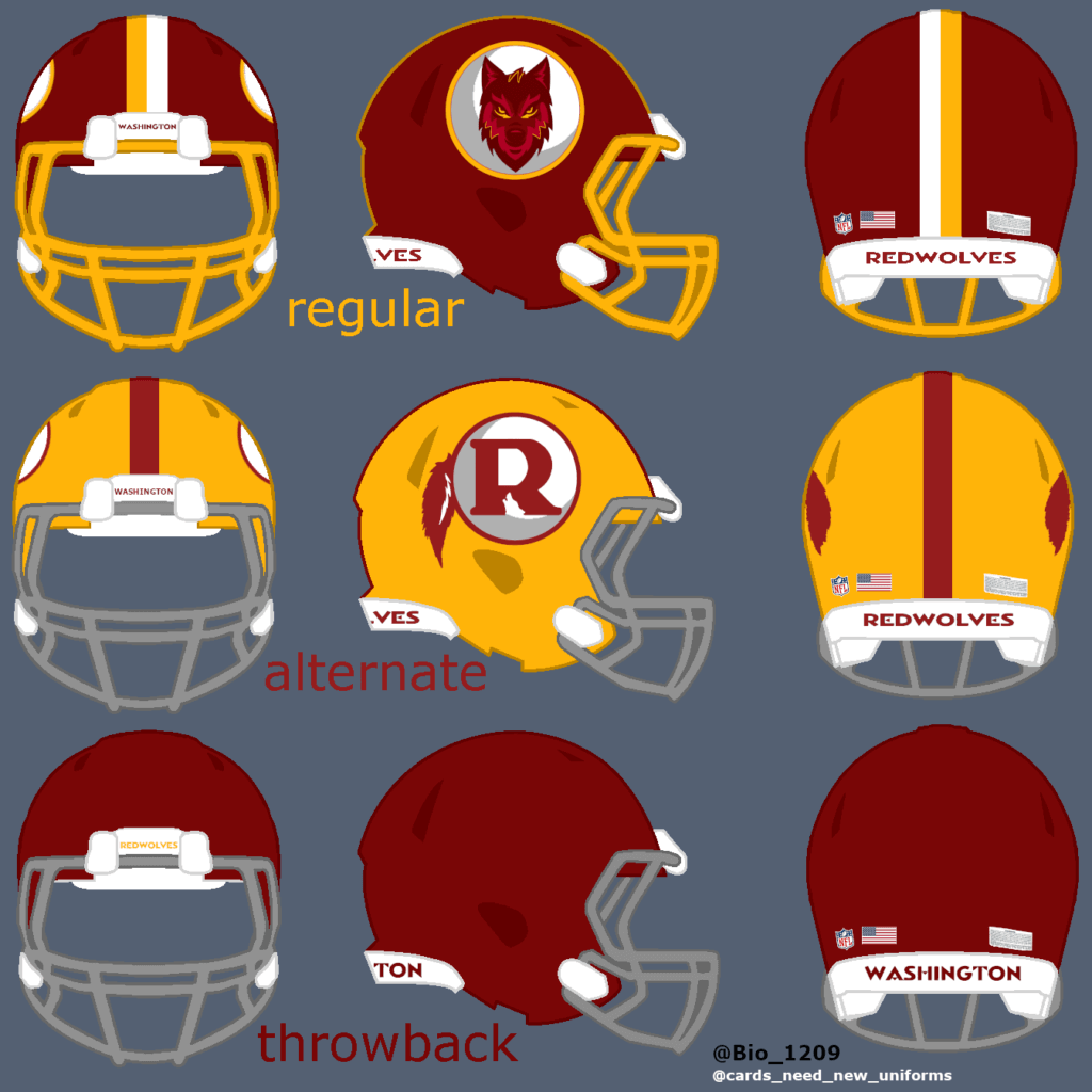
If you followed this name change process you might heard about the fan favorite name ‘Red Wolves’. The franchise told their fans, that they will have an input in the name decision, but as we know now, they did care less about the fan voting. Commanders is not the worst name, but Red Wolves would have been the perfect name for them in my opinion. Washington could have used this name to build a new reputation for the future but don’t let people forget about their past. The name could have been used with their HTTR too. That’s why I haven’t changed a lot on their jerseys (just a few details here and there) and the burgundy and gold to honor their past. Only my yellow alternate design is a little different than usual, but the design is also based on a former jersey. My logo design is similar to the former Logo with the white circle, but I have added a moon and a wolf. 🌙🐺
NFC South:
Saints:
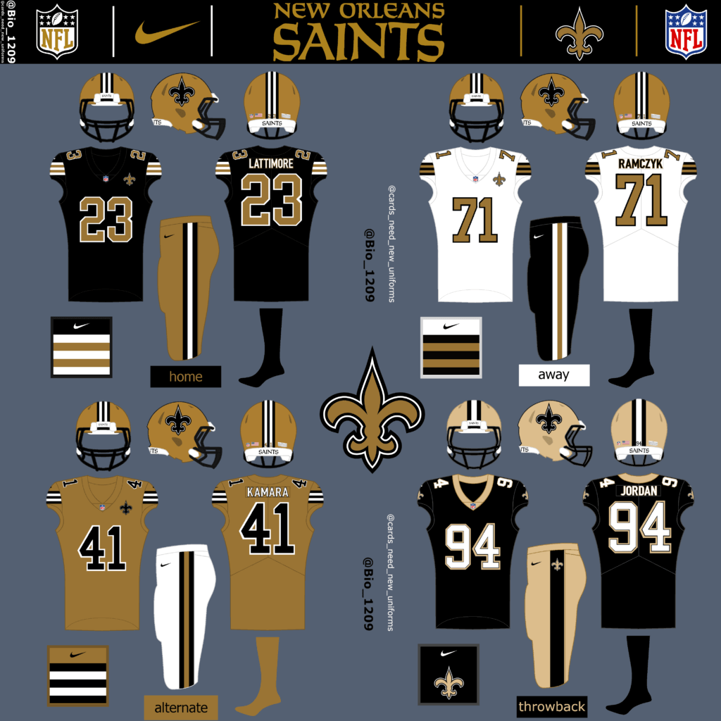
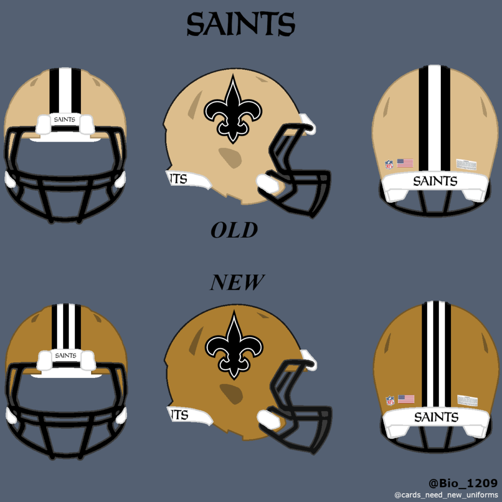
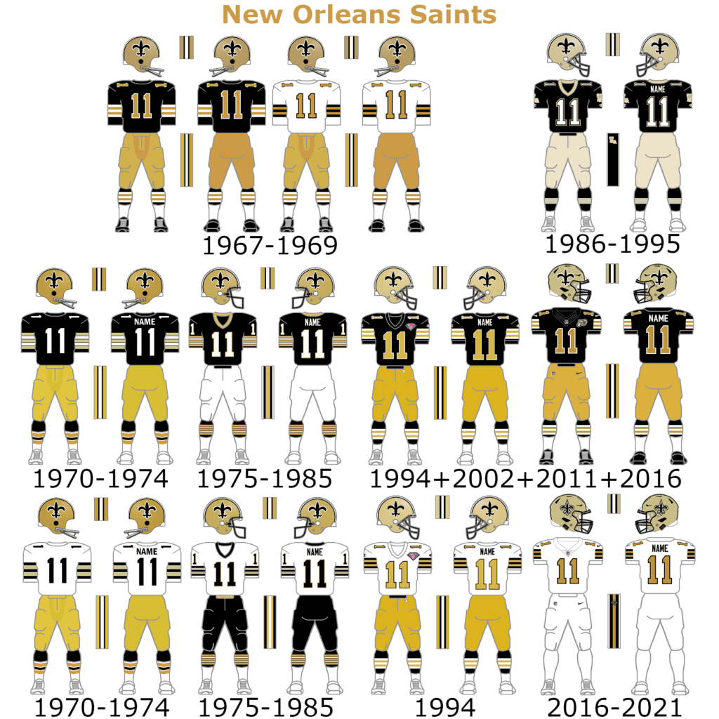
The Saints could go back to the original design. The white color rush uniforms are very popular among the fanbase and could be worn more often as their regular away uniform. I decided to create a new helmet for them to match the new shape of gold. The old-school black home design could work as the new home unis. My alternate jersey is gold. The current home uniform with old-school helmet and old-school white numbers are the throwback uniforms in my concept.
Falcons:
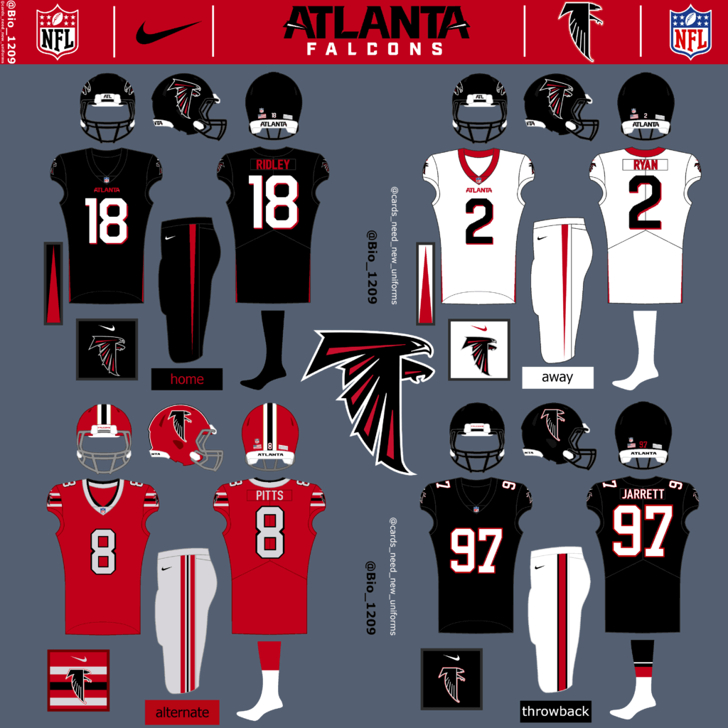
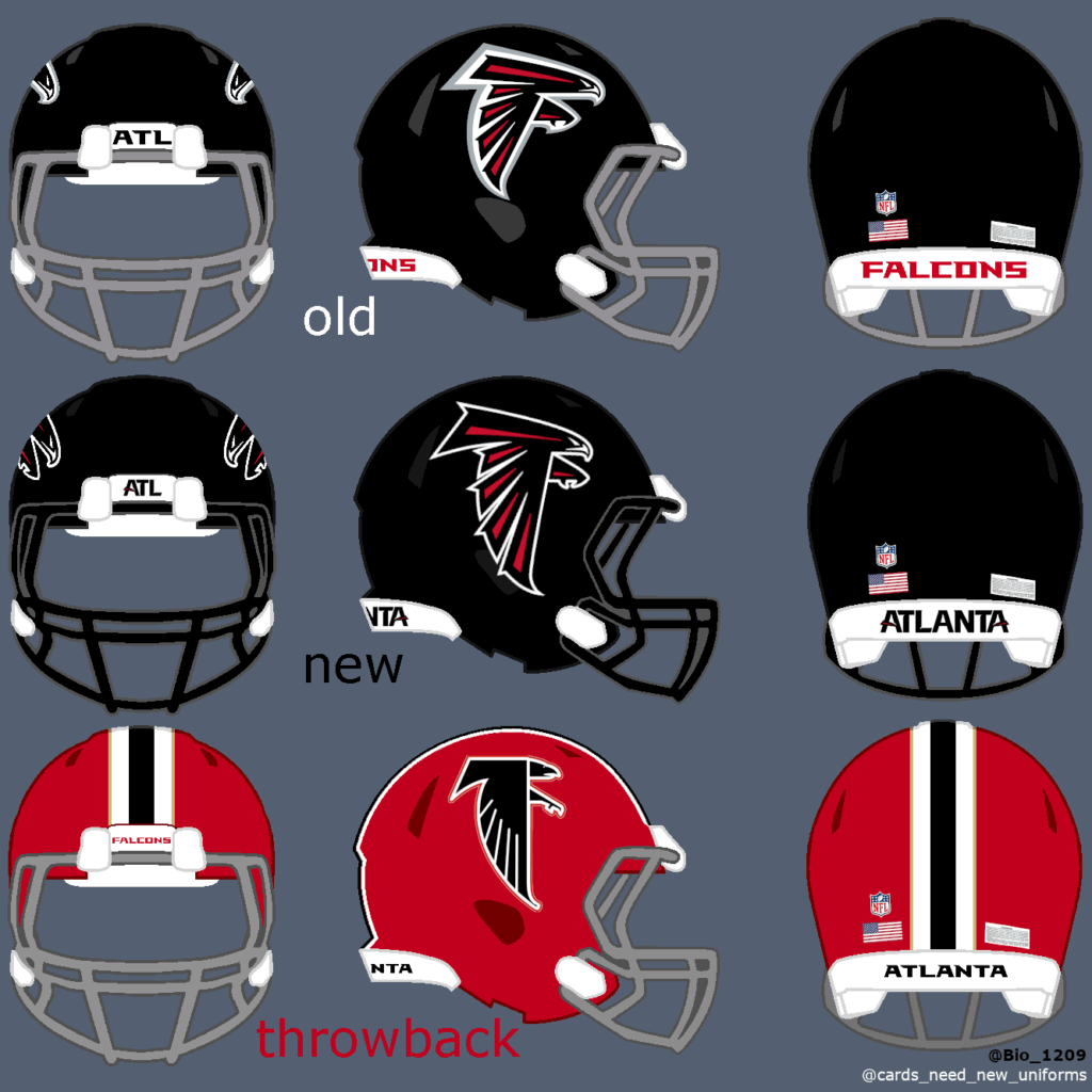
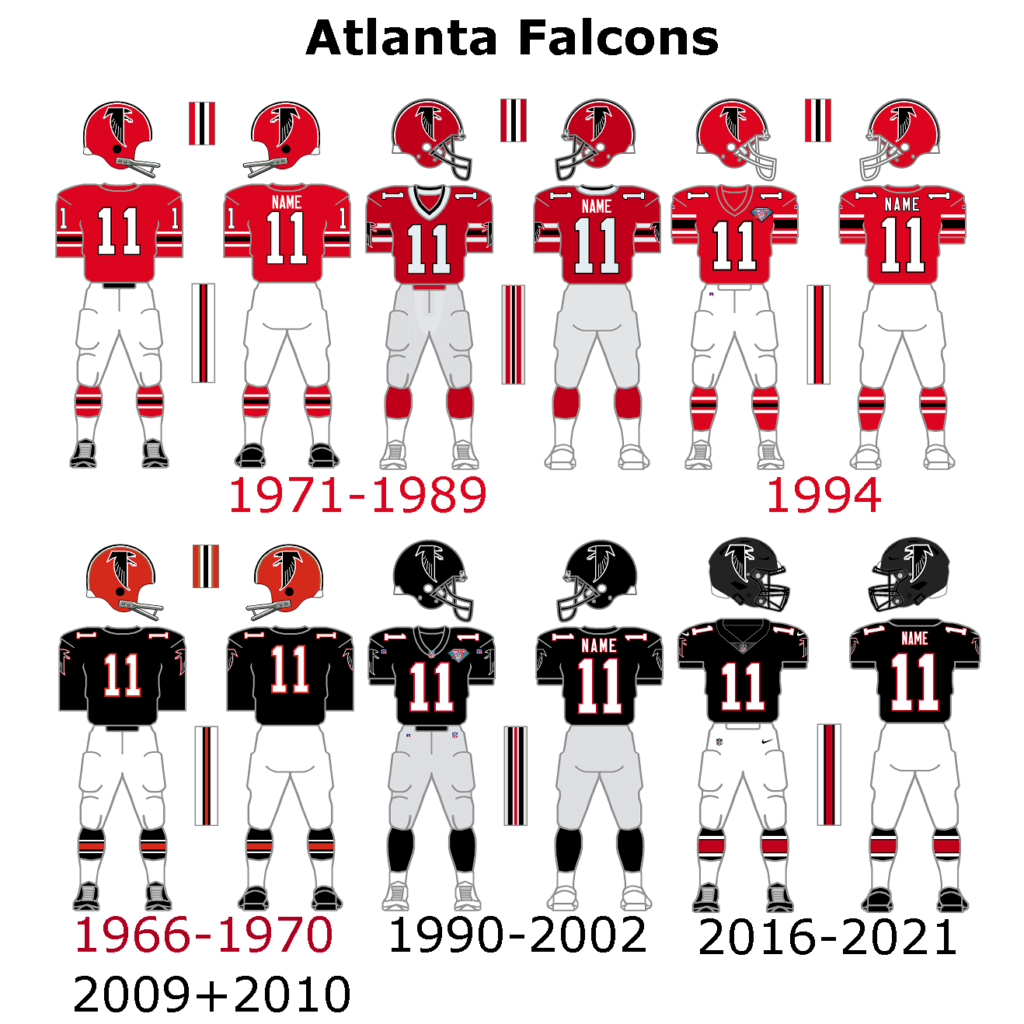
The Falcons just changed their uniforms a few seasons ago, but to be honest, I don’t really like them. The basic design itself is great but some things just don’t look good and make the whole unis mediocre.
• The gray facemask does not look good.
• The ‚ATL‘ is too big on the chest.
• The number font looks kind of weird.
• The red uniform is not it.
That’s why I used a new slim number font and changed some little things for this concept and now I like it a lot. The logo is not bad but it could look better with little changes. The current throwback uniforms of the falcons are great and should not be changed at all. But they have to bring the red helmet back which could also be worn with a new red throwback/alternate uniform.
Buccaneers:
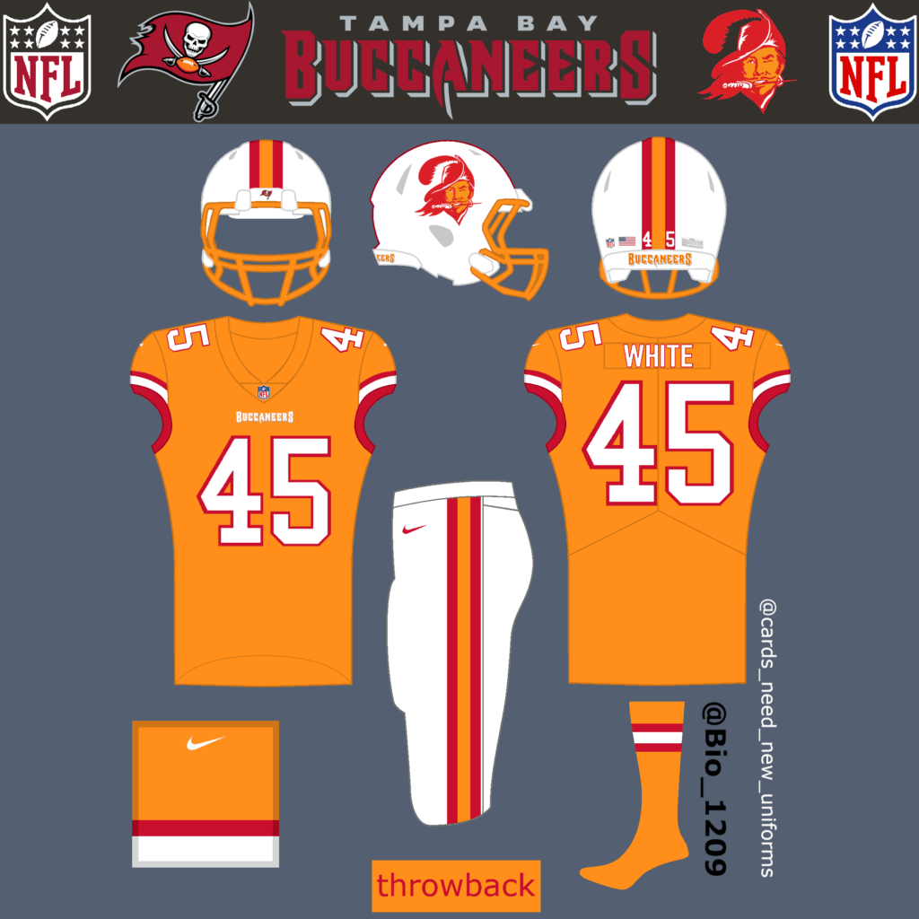
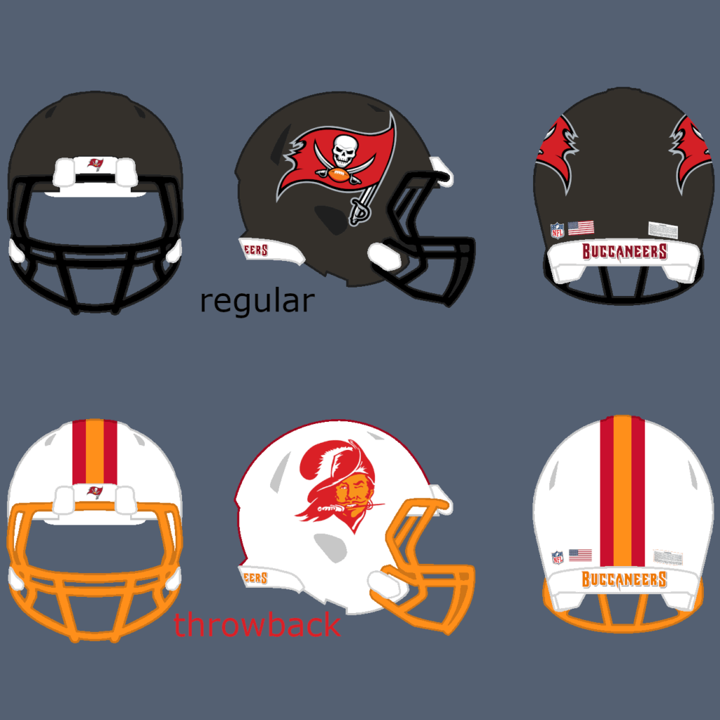
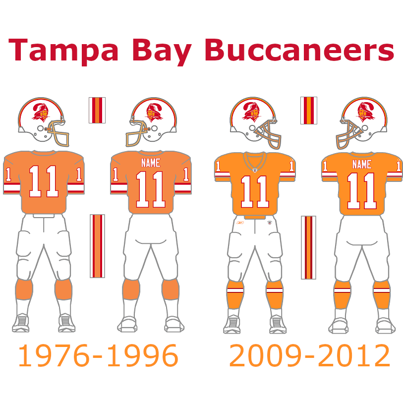
This was perhaps the easiest choice. The Bucs have to bring back the orange and white throwback uniforms. They just changed their uniforms and there is nothing to dislike in my opinion.
Panthers:
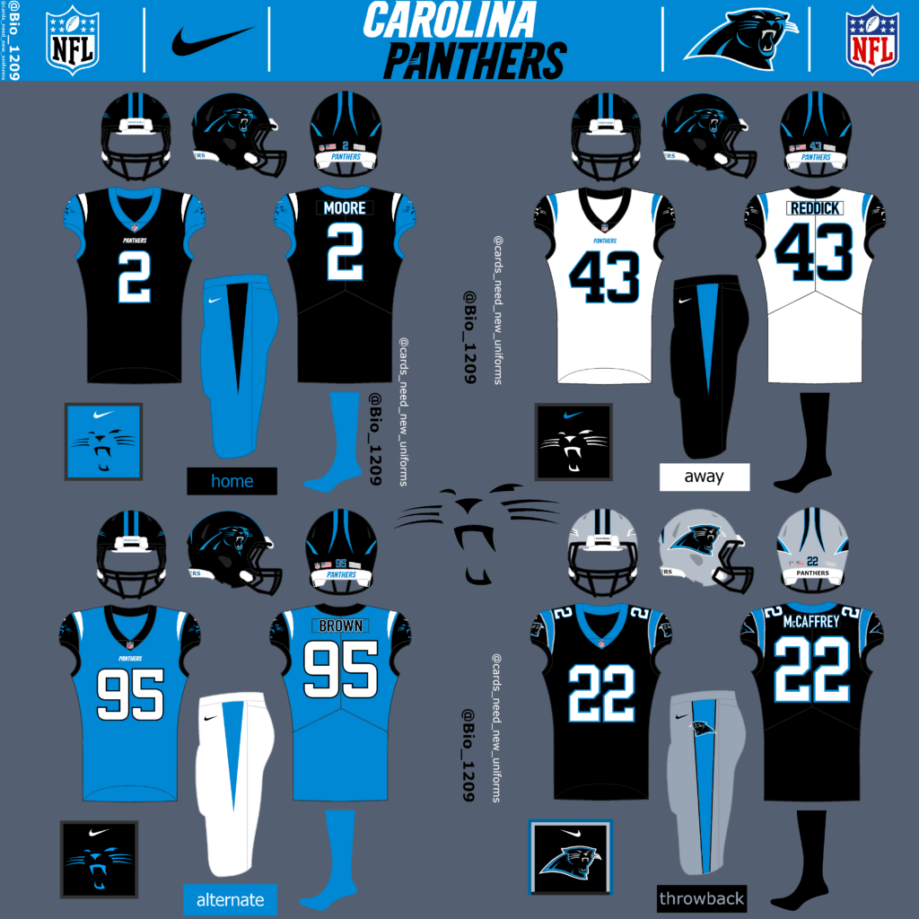
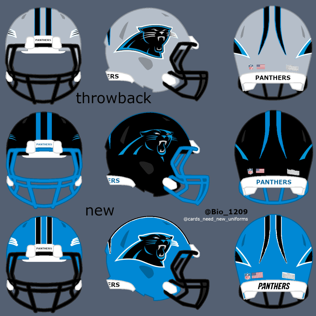
I personally don’t like the current Panthers uniforms, which they have never changed since they entered the league in 1995. It’s very hard to create a completely new look for a team and I had a hard time with them. They should remove the silver completely („in my opinion“) and use more black and blue instead, with the exception of the throwback uniform. I couldn’t decide which new helmet color to choose so I asked my followers. It was close but most people wanted the black helmet over the blue helmet.
NFC West:
Seahawks:
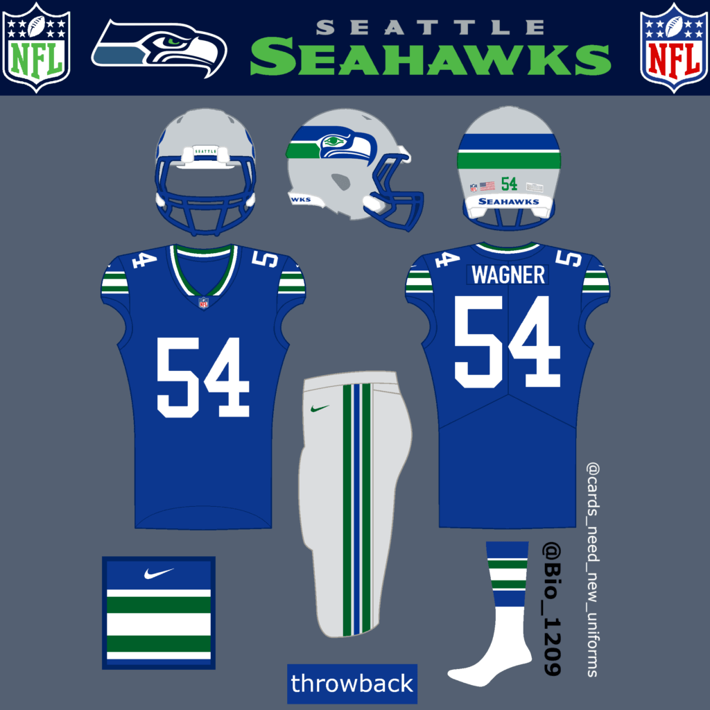
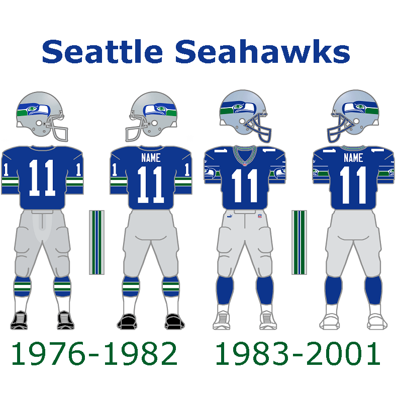
The current Seahawks uniforms are solid and don’t need any changes in my opinion.
They could use this uniform as a throwback.
49ers:
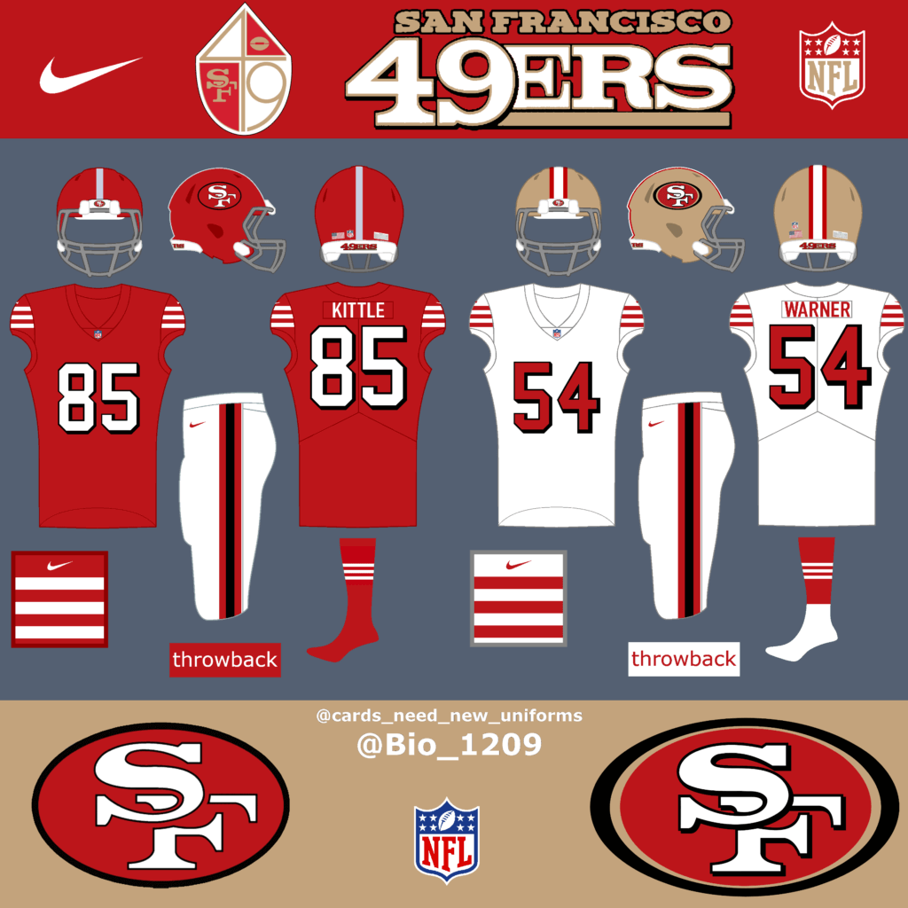
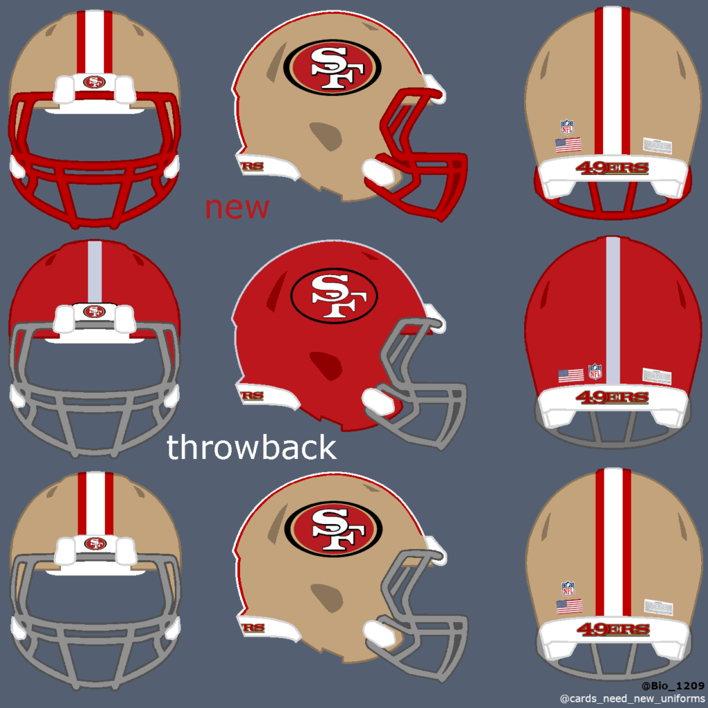
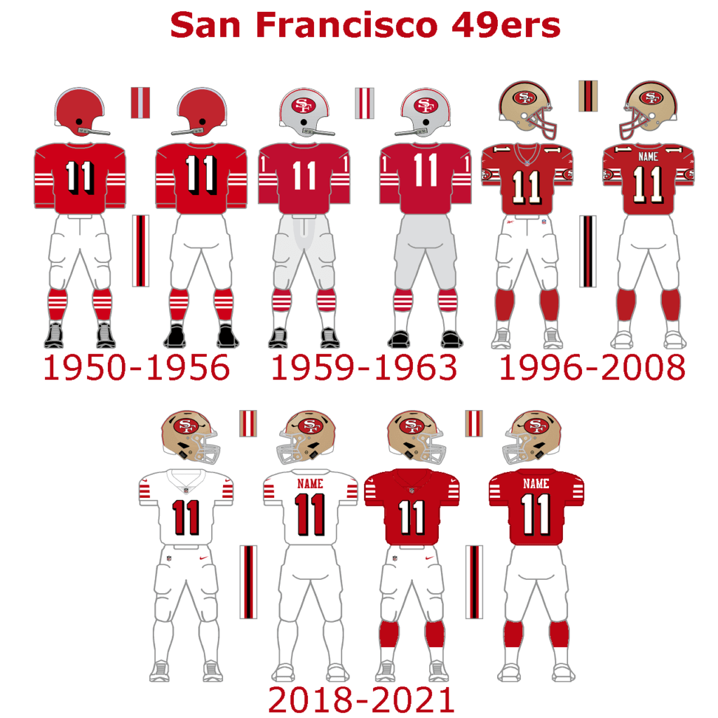
The 49ers have very clean uniforms. There isn’t much to complain about. But they could bring back the red facemask for the golden helmets to replace the gray grid. The current throwback uniforms are solid, but a new red throwback helmet could round this look off.
Rams:
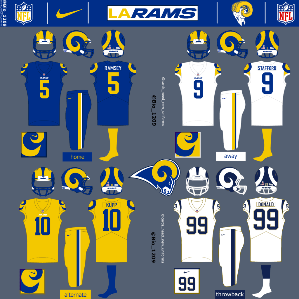
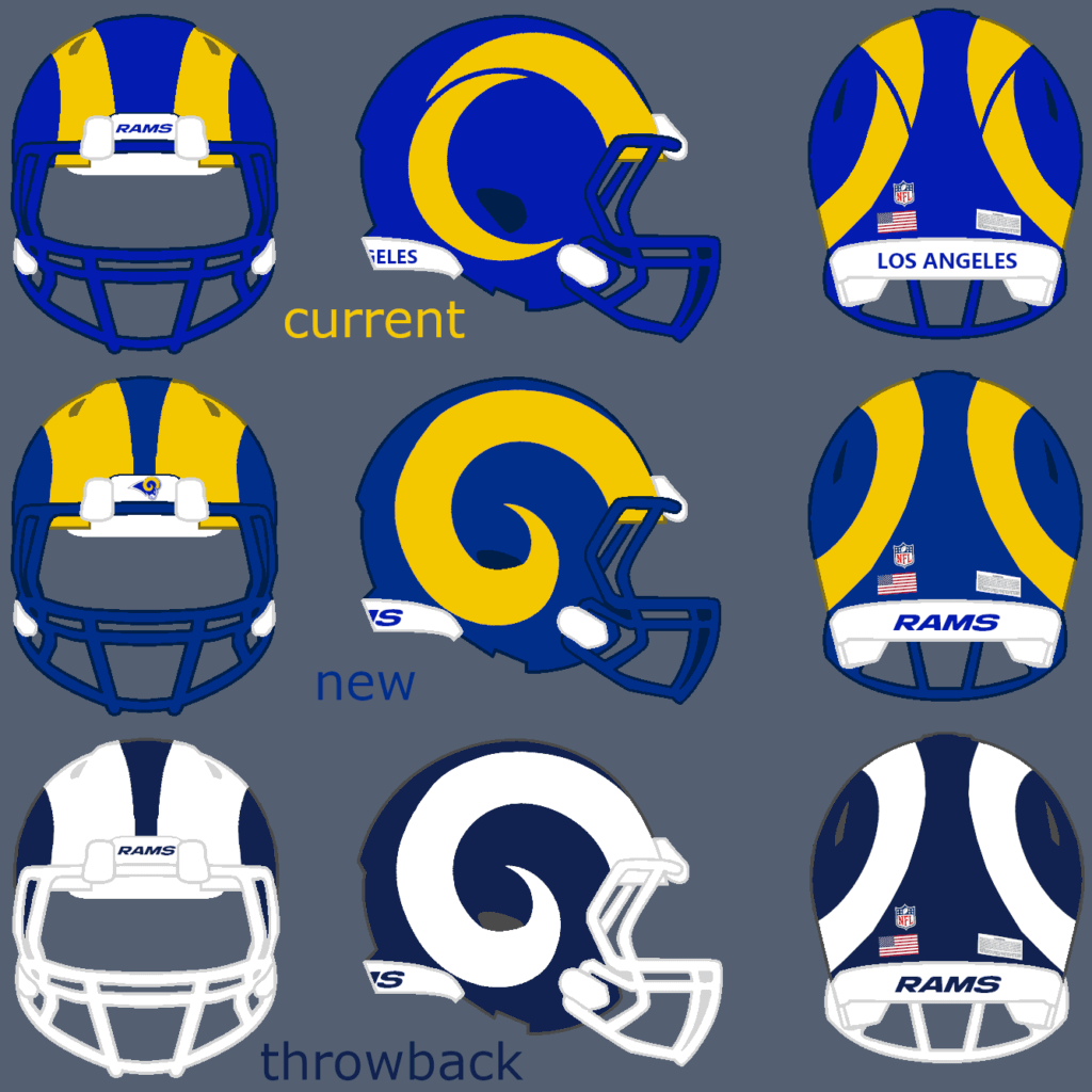
What the Rams should have done.
The Rams new outfit is a disaster and quite a failure in my eyes. The colors are too bright and the new horn style is nowhere near as beautiful as the old design. When I saw the new logo for the first time, it reminded me of the other team from LA (Chargers) and I still don’t understand what was wrong with the old logo. The worst thing about the current jerseys is the gradient color on the ugly number font.
Make the colors darker and bring back the old horn and the uniforms are much much better. Leave out the gray/bone jerseys completely and add a yellow uniform to the mix. The throwback uniforms are a no-brainer for me.
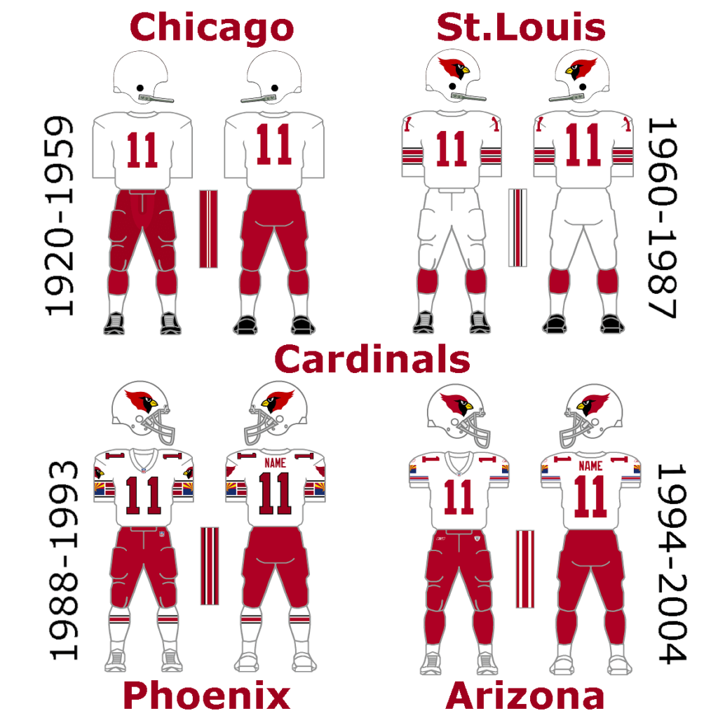
Cardinals:
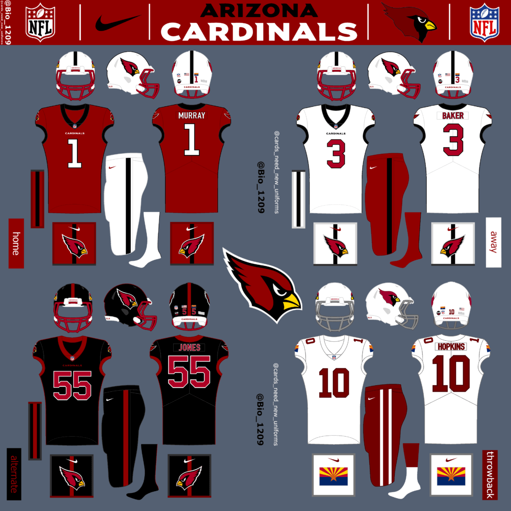
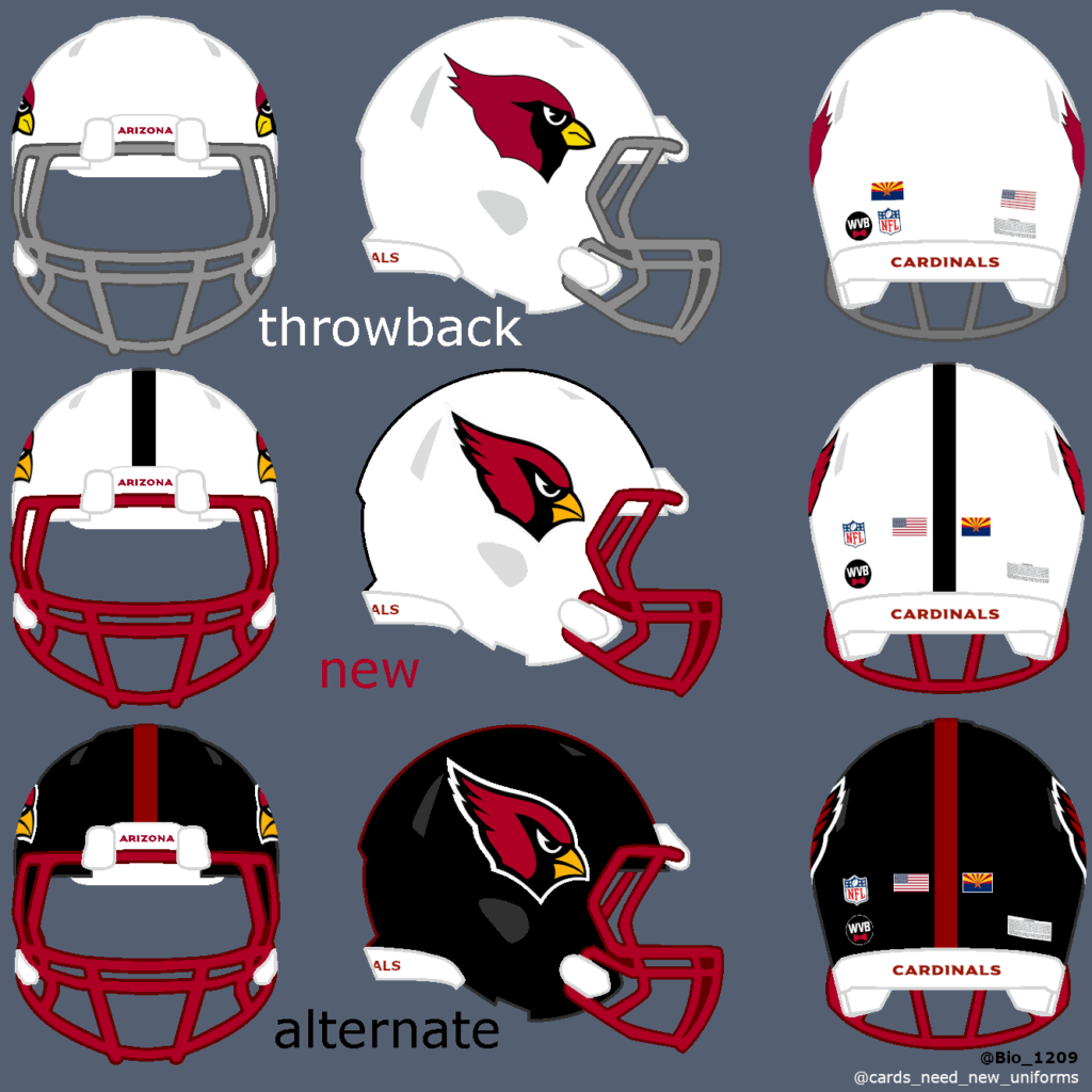
For me as a Cardinals fan, this is the most needed new uniform in the league. The fans want a change for years but the front office somehow still sticking to the 2000 Reebok design. The current design is not bad, but very outdated. Almost every uniform voting puts the Cards on last place. The best thing about the Cardinals is their Logo. It’s perfect and should not be touched. For my design I went with a new white helmet design with a single black stripe on top and a red facemask. The uniform design is simple with the Cardinals logo on the shoulders. The black stripe goes along the outside of the jersey and continues on the shorts. For the Throwback uniform I went with a simple white jersey, a little darker shape of red and the state flag back on the shoulders.
You can sign this petition if you want the Cardinals to finally change their uniforms!
Thanks, Fabio! Another interesting set of throwback concepts there, and some good food for thought. What say you readers?

Fifth Time’s a Charm…
A little over a week ago, I was a guest (my fifth appearance!) on the Shawn Anderson — and his trusty sidekick Lou Olsen — podcast, “Hall of the Very Good.” I’d previously done two solo appearances, and the past two were with the great Todd Radom.
The boys usually have a specific topic they’d like me to discuss, but this time around they went with the “AMA” (Ask Me Anything) format where folks from the Twittersphere would ask me questions — on ANY topic — to be answered on the show. As expected, most of the topics involved uniforms in some way, but there were a couple where uniforms were certainly NOT the topic of discussion. I had a really fun time and I thought the show went well.
Topics addressed included, but were not limited to, what I thought the best logo(s) in sports are, will the Arizona Cardinals get new unis this season, why Rob Manfred hates baseball and is the worst commissioner ever, and of course, why a hot dog is NOT a sandwich. I also give my opinion on the new uniforms for the Washington Commanders (first time I’ve ever expressed those views publicly) and much more.
So please, if you have a bit of spare time, give it a listen! I’d love to hear your thoughts on some of the things we discussed.
Link to listen is below:

Guess The Game…
from the scoreboard
Today’s scoreboard comes from Mike Styczen.
The premise of the game (GTGFTS) is simple: I’ll post a scoreboard and you guys simply identify the game depicted. In the past, I don’t know if I’ve ever completely stumped you (some are easier than others).
Here’s the Scoreboard. In the comments below, try to identify the game (date & location, as well as final score). If anything noteworthy occurred during the game, please add that in (and if you were AT the game, well bonus points for you!):
Please continue sending these in! You’re welcome to send me any scoreboard photos (with answers please), and I’ll keep running them.

Uni Concepts & Tweaks
Time for more Uni Tweaks from the UW readership.
I hope you guys like this feature and will want to continue to submit your concepts and tweaks to me. If you do, Shoot me an E-mail (Phil (dot) Hecken (at) gmail (dot) com).
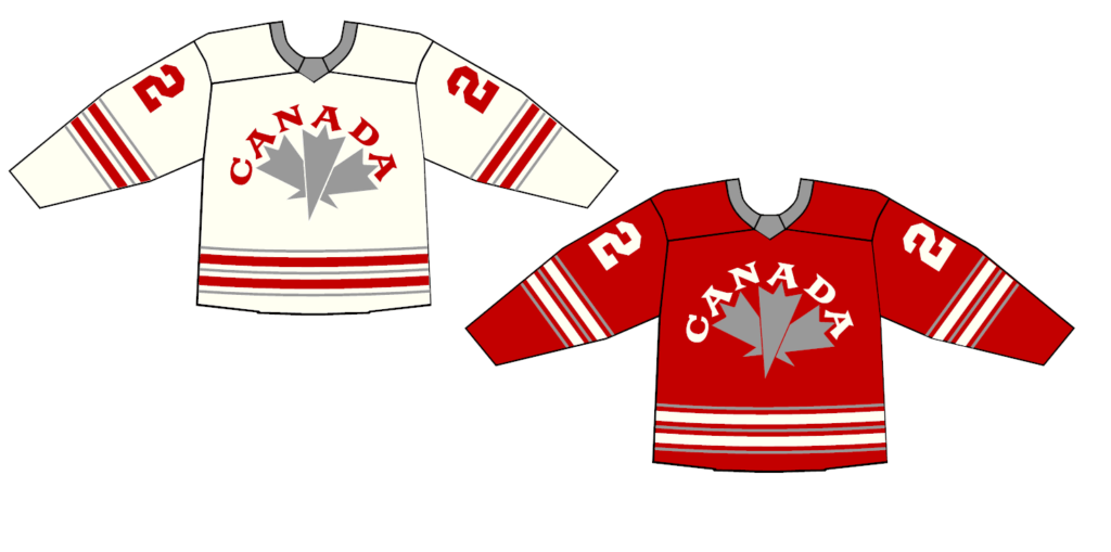
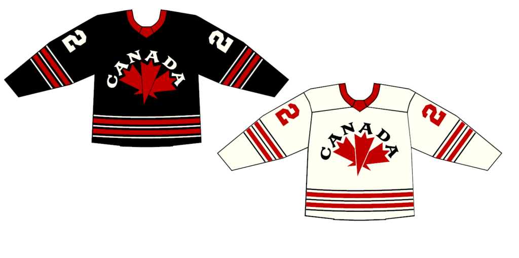
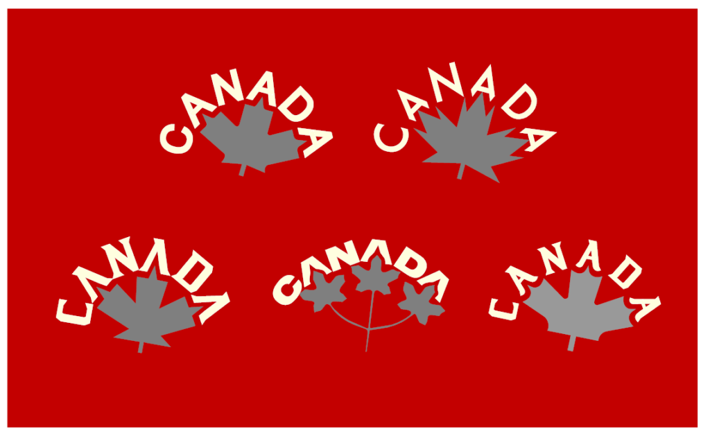
Today’s concepts come from John J. Woods:
Hi Phil!
The Canadian Maple Leaf symbol features three pointed leaf sections.
The word “CANADA” has three A’s.
So I did a design with the pointed sections starting from the A’s.
I put the letters in an arc. CANADA is centered. The Maple Leaf is slightly rotated.
Although the flag is red and white, I used a secondary color. Some people don’t like that color being black. I tried a metallic gold but settled on a silver/gray.
For merchandising, I did create a black version. With it, a white version with black/red.
Also attached, some other wordmark/leaf attempts including an old three-leaf design.
Thanks,
Johnny Woods
OK readers (and concepters). If you have some tweaks or concepts, shoot ’em my way with a brief description of your creation and I’ll run ’em here.
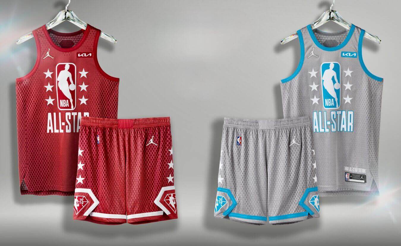
NBA All-Star rankings reminder: Paul here. With the NBA All-Star Game taking place on Sunday night (they’ll be wearing the designs shown above), my Bulletin article this week is a ranking of the 10 best and 10 worst uniforms in NBA All-Star history.
My premium subscribers can read the article here. If you haven’t yet subscribed, you can do that here (you’ll need a Facebook account in order to pay). If you want more info on what you’ll get for your money, you can find that here. And if the Facebook requirement is a dealbreaker, email me and I’ll let you know about non-Facebook payment options and possible workarounds.
That’s it for me. Now back to Phil!
Everyone’s Famous for 15 Minutes Four Seconds…
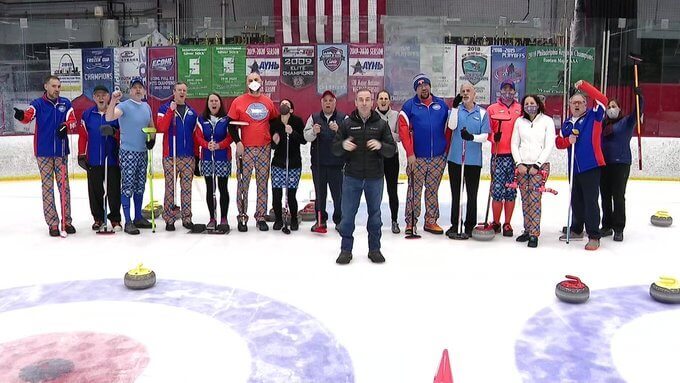
With the Winter Olympics in full swing earlier this week, it seems that everyone becomes a bit of a curling “fan” for about two weeks … and then basically forgets it exists as a sport for four more years. It’s a cycle those of us who curl regularly are used to. Yes, we wish more people were aware of our (IMO) fantastic sport and would try it. And every time curling gets its own 15 minutes of fame (every four years), we get a lot of people interested in, and who do come out to the sheets to learn how to play.
So, since we’re in the “curling is the hot thing” cycle right now, our local news station, News12, came out to our curling rink to do a feature on my club, the Long Island Curling Club (I also used to curl out of the Brooklyn-Lakeside CC, and still teach there). The news crew spent about two and a half hours on the ice with us, shooting a ton of footage — which we all knew would mostly end up on the cutting room floor while they filled their two minute segment on the club.
In the photo above, I’m located third from the left (in the light blue shirt, LICC pants — properly cuffed — and blue socks). For the piece News12 shot, they used me for the “sweeping” part. All in all I thought it was nicely produced (although the reporter, Kevin Maher, could have inserted himself a bit less into the segment). I think I was on screen for about four seconds (which is fine — I’m not looking for screen time).
Unfortunately, I can’t embed the video, but you can click here to view it. They do a pretty good job of explaining curling…or as best as one can do in less than two minutes. I’m VERY briefly on the screen at about 1:14 and then again around 1:58, doing the sweeping thing.
The purpose of their visit was to give viewers a sense of their local curling club, but also to let folks knew we do teach it to anyone who wants to come out (I’ve been teaching for about four or five years now). If you live nearby and want to try curling you can register here (limited spots still available!). If you do sign up, let me know what date, and I’ll try to arrange to be your instructor! I always meet Uni Watch readers whenever I bonspiel, so it’d be great to meet a few of you on the sheets.
The Ticker
By Anthony Emerson

Baseball News: The Oakland City Council has OK’d an environmental impact report on the Athletics’ new ballpark plans (thanks, Brinke). … The Hickory Crawdads, High A affiliates of the Rangers, have unveiled their 30th anniversary logo. … New unis for West Carroll High out of Atwood, Tenn. (from Andy Windsor).

Hockey News: Wild C Connor Dewar wore No. 25 on his back last night…except he normally wears No. 52, and that number was still on his sleeves, and the No. 25 has already been assigned to D Jonas Brodin. Odd! (from multiple readers). … The Canucks have unveiled a Black History Month warmup sweater (from Wade Heidt). … Zendaya and Tom Holland wore matching Rangers jerseys to a game on Thursday night, though Zendaya’s was personalized with “Holland” and Holland’s, likewise, with “Zendaya” (from multiple readers). … The AHL’s Milwaukee Admirals will rebrand as the “Fish Fry” on March 11 and 12. The unis are just as insane as you imagine … The OHL’s Sault Ste. Marie Greyhounds unveiled their 50th anniversary alternate unis (from Wade Heidt).

Soccer News: More MLS reveals, with FC Cincinnati, FC Dallas, Orlando City, CF Montreal, DC United, Minnesota United, Sporting Kansas City, and finally, LAFC (thanks to all who shared). … USWNT CB Becky Sauerbrunn won her 200th cap Thursday night, and was given a No. 200 jersey to celebrate (from our own Jamie Rathjen). … Gorgeous new kits for Swedish side AIK. … Excellent Twitter thread and article from the graphic designer and co-founder of new USL League 2 side Vermont Green FC (from Josh Billman).

Grab Bag: Mercedes has revealed their 2021 Formula 1 livery (from multiple readers). … Fanatics continues to conquer the world, now buying Mitchell and Ness with Jay-Z. … New logo for the European Rally Championship.
Uni Tweet of the Day
The original USFL had both the greatest and worst helmet logos simultaneously…
So many @USFL uniforms and helmets on my timeline. It made me get these bad boys down and clean them! pic.twitter.com/p8iKtNBVqz
— Jerry Quickel (@JerryQuickel) February 17, 2022
And finally… that’ll do it for today. Big thanks again to Fabio Leondardt for sharing his Thursday Night Throwback concepts. There are definitely some good ones in there!
Everyone have a good Saturday — mourn the loss of football Sundays for a while, pray for an end to the MLB lockout, enjoy the end of the Olympics, and of course it’s NBA All Star Weekend if that’s your thing. I’ll catch you guys here tomorrow. Till then…
Peace,
PH
GTGFTS November 16, 1996 Bruins at Sabres ppd.
I was supposed to go to this game. Erie Youth Hockey had a bus trip scheduled for this and then we saw the video. The players had just gotten off the ice from practice.
I think they made it up to us with a Sabres Lightning game later in the year.
As a Cardinals fan, I liked these except for the black stripes on the helmet and pants.
I appreciate it.
I just used the little black stripe on the current uniforms and gave them a new and modern touch. I actually saw this design on a nike soccer jersey and liked it a lot.
That’s just my opinion on it and nobody knows if they will ever change the uniforms at all…
I like the throwbacks on balance. I want to give credit for trying something new but things like the 49ers in red helmets didn’t work for me.
The Bucs, Eagles and Seahawks should revert immediately (although I would silver britches for the Eagles).
Red wolves was creative and sidesteps the controversy over the team’s past.
I would love the Northwestern stripes back for the Lions and the UCLA stripes for the Vikings, maybe on a white throwback.
Why did some teams get 4 designs and the Vikings only got 1?
Tom Holland and Zendaya make good money, not sure why they got stuck with fake jerseys. Vertical arching matters!
Put the Eagles in the White helmets with the green wings…
As a lifetime niners fan I would never accept a red helmet, and would really struggle to accept anything other than the gold they have now. that said, their infamous “one day logo” is NOT as bad as some people say. Many, including many here in the watch community act like it’s one of the worst design atrocities committed in uni history, but actually aside from it being a total break from niners design tradition, it’s fine. It was very late 80s early 90s – as it should have been given when it debuted. So while I don’t want the niners to have anything other than good helmets (which means they could have done this ages ago) I would love to see an alternate uni set based on that logo. I don’t think it needs to be anything crazy other than maybe that logo on the helmet and that don’t for the numbers on the jersey. But I’m an era when teams have so many unis and alternates/throwbacks/color rush/ etc change as often as possible, why not bust something like that out for temporary enjoyment?
The Vikings already got great uniforms. That’s why they only got one throwback proposal from me.
That’s the scoreboard after the 2019 NBA all star “game” when the final score was 178-164.
I put the letters in an arc. CANADA is centered. The Maple Leaf is slightly rotated.
This is the problem. The maple leaf is the strongest element of the design, or should be. It visually dominates over the text. For it to be tilted makes the design look wrong.
But centering the leaf (and this tilting the text) wouldn’t work either.
Overall I think the throwbacks were really nice.
I would have loved to see the Seahawks in the plain silver helmet though.
I appreciate it.
A throwback thursday night game with every team playing in a throwback uniform would give this game a much better look.
Especially when you consider that these games don’t have a good reputation.
Really like the Canada jersey design
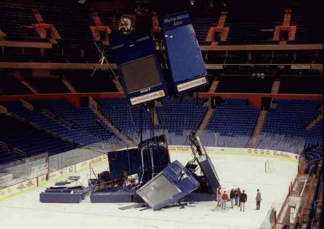
That’s from Madison Square Garden. That’s the night that Jim Dolan thought Charles Oakley was living in the scoreboard. It had supervision and security take the scoreboard apart to look to see if Oakley was actually in there.
USFL helmets and uniforms are better than 75% of what the NFL wears now. Special love for the Invaders, Gold, Showboats, Breakers, Outlaws, Panthers, and Bulls. Also wish some teams would use the Starter font on their numerals.
It was the Champion font first.
Nov 16 1996, Marine Midland Arena, Buffalo, NY
Final Score:
Gravity-1
Human Engineering-0
Assembly Hall at Indiana University after a Bobby Knight team lost in the final seconds.
In the throwback concept for the Eagles, I’d much prefer the 74-84 “Stripes Ad Nauseam” jerseys, which seemed to be both a bold statement and absurdest parody at the same time. Of course, re-creating the design on a sleeveless jersey would be challenging.
That’s what I thought, as well. The Jaworski-era tops need to be resurrected.
But, the sleeve thing….
Fabio has lots of interesting ideas for his Thursday Night Throwback concepts. I love the Seahawks ones in particular. I miss their old uniforms. I don’t have a strong preference for the Red Wolves name for Washington’s football team over the Commanders, but I sure like Fabio’s uniform concepts for them much better than what they came out with!
Thank you.
It’s all about the principle. The front office said they care about fan opinion and the name that was by far the most popular was not Commanders.
They got the chance to make this name change about the fans and let them decide, but instead the owner was to cheap to buy some copyrights and now it’s not sure if he has to sell the team or not. He is by far the worst owner in the NFL if all the things and rumors are true.
To be honest my little cousin would have designed better jerseys than them and he is not even 6 years old. I really have no idea what they were thinking.
They turned one of the best kits in the league into one of the worst.
Loved your appearance on the Hall of Very Good podcast, Phil! You’re always a great listen – entertaining and informative! You should start your own podcast. Just sayin’… B^)
Hey…sounds good to us!
Thanks Kary!
But after seeing what Paul and Chris went thru with Unified, I’m not sure that’s in the cards. I’m happy to be on Shawn and Lou’s cast though. It’s always a great time!
The Team Canada design is spectacular. About 1,000 percent better than the dreck they wore in Beijing.
Those RedWolves concepts are legit! So, so much better than the focus-grouped tripe that the Red Commies ended up with. Putting a howling wolf in the negative space of the R was a great idea, and not something that I immediately noticed, but I can’t un-see it, now.
Cheers!
Fabio, I really liked how you used different names and numbers for every team. It provided a broader display and helped me appreciate your concepts more. Good job!
I appreciate it.
I wanted to show how the uniforms would look on the field with the best players of each team.
Thank you Phil for having me.
It was an honor to show the community my thoughts on the NFL Uniforms and how the NFL could make Thursday night games more interesting again. Watching two teams play each other in classic throwback threads at a Thursday night prime time game could be very satisfying and make a lot of older football fans happy.
Greetings from Germany to all of you.
FL