By Phil Hecken
Follow @PhilHecken
Good Saturday morning, Uni Watch nation — hope everyone is doing well and the weather isn’t getting you too down. Unfortunately, my namesake in Punxsutawney saw his shadow the other day, so if you believe such things, we’re in for about another six weeks of winter. Let’s hope he’s wrong.
Back in December, I received a few graphics and descriptions from today’s featured graphic designer, Fabio Leonhardt, a reader from Germany, who had some ideas for how to spruce up the aesthetics of Thursday Night Football. More specifically, with the “one shell rule” now a relic of an age when the NFL was in CYA mode over concussion protocol, Fabio wanted to propose some “new” throwback uniforms and alternates which could be worn by the TNF teams as they play each other throughout the 2022 season. After a bit of back and forth, Fabio has now completed his proposals for the AFC, which we’ll see below. It’s pretty in depth, and Fabio sets it up in his intro, so I’m going to turn it over to him now as he brings you his concepts for…
Throwback Thursday Night Football
by Fabio Leonhardt
Twitter: @Bio_1209
Instagram: @cards_need_new_uniforms
With the new two-helmet rule coming in next season the NFL could bring us something quite like the color rush Thursday night games back in 2016. Each team got new color rush uniforms back then and it was kind of epic.
This time every team could get a new throwback uniform (some teams already got great throwback uniforms by the way) for the 2022 season and beyond and wear them at least once on their Thursday night prime time game, to honor the history of the NFL franchises.
Some franchises are not old enough for a throwback uniform or don’t got any changes in their uniform design until now, some should consider a new alternate helmet design and some should update their whole uniform package (in my opinion). So, I designed a completely new look for some teams and others will get a suggestion for a new alternate helmet or uniform redesign.
Here is my opinion on what the franchises should do and especially a throwback look for all 32 teams in the National Football League for the Throwback Thursday Night Games.
AFC North
Bengals:
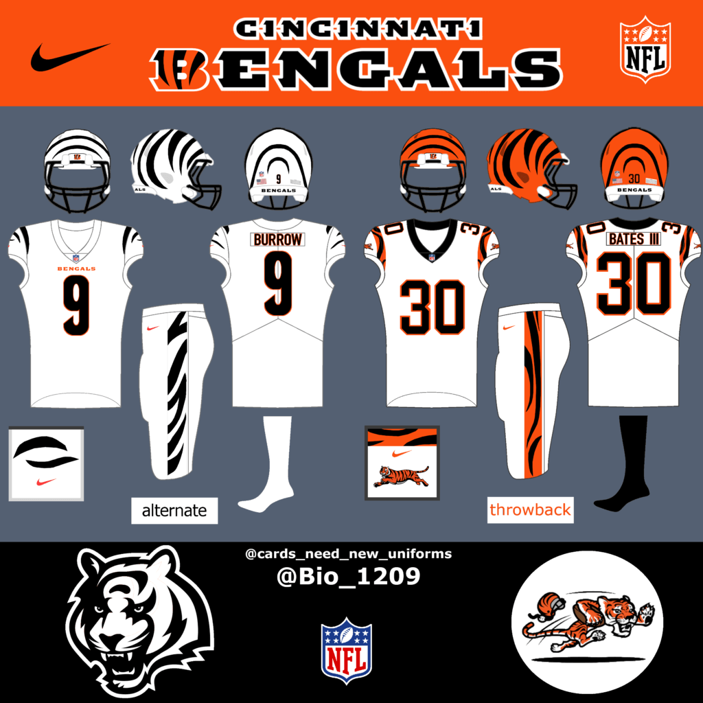
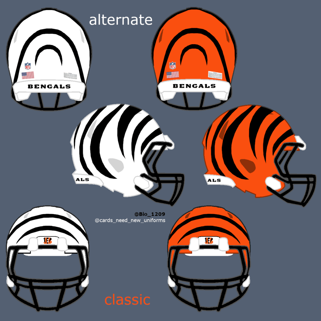
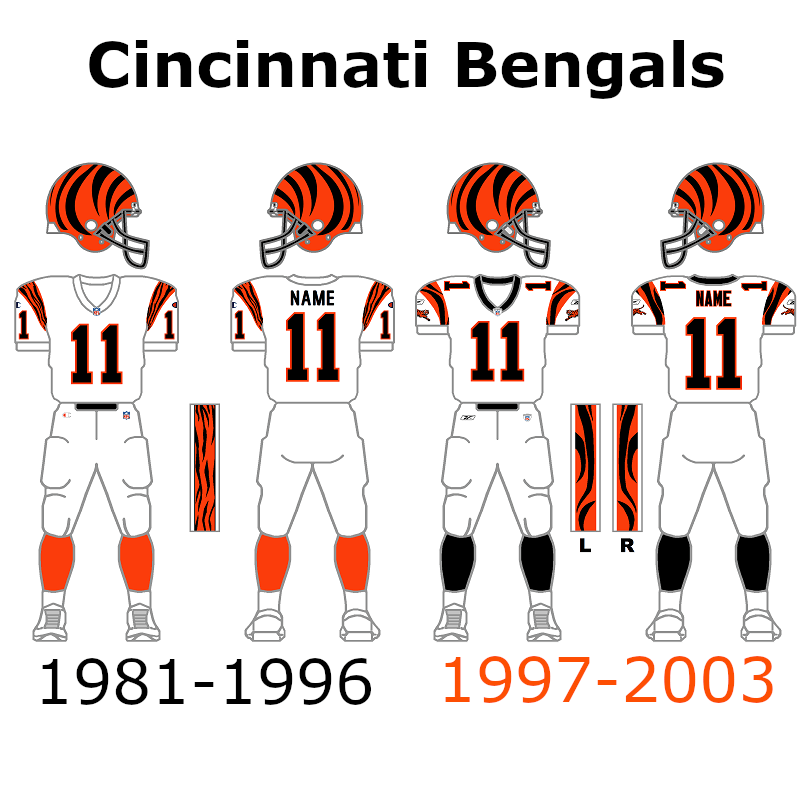
I‘m going to start my throwback series with the AFC North and the Cincinnati Bengals. The Bengals are the only team that got completely new uniforms in 2021/22 and they look nice and clean. But the two-helmet rule could make a big wish of the fanbase come true and make the uniform even better.
The alternate white Tiger edition helmet. Just do it Bengals‼️ The throwback uniform that I have chosen was worn from 1997 to 2003.
Steelers:
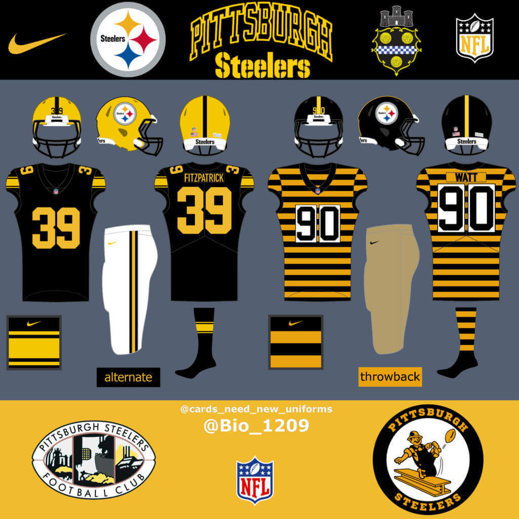
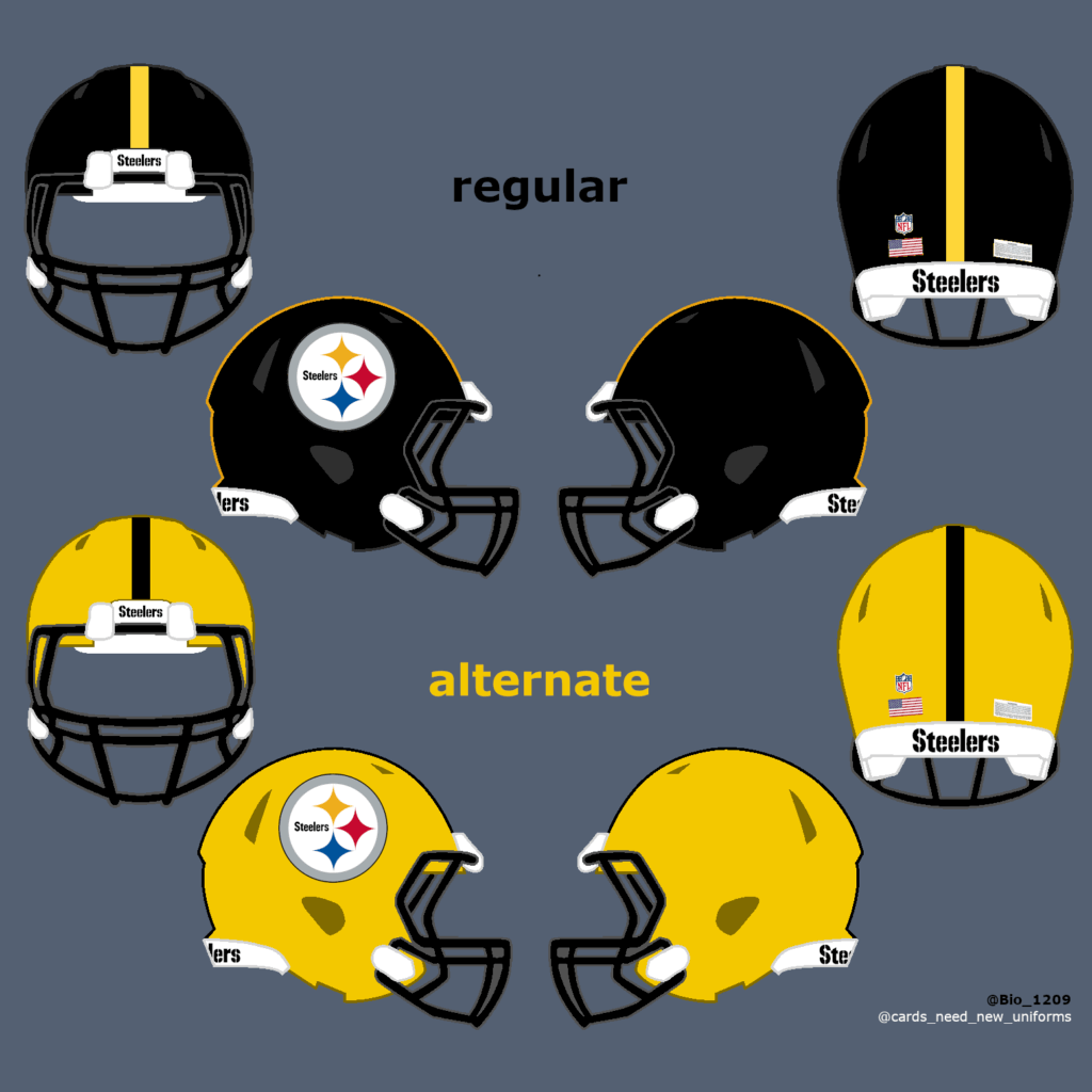
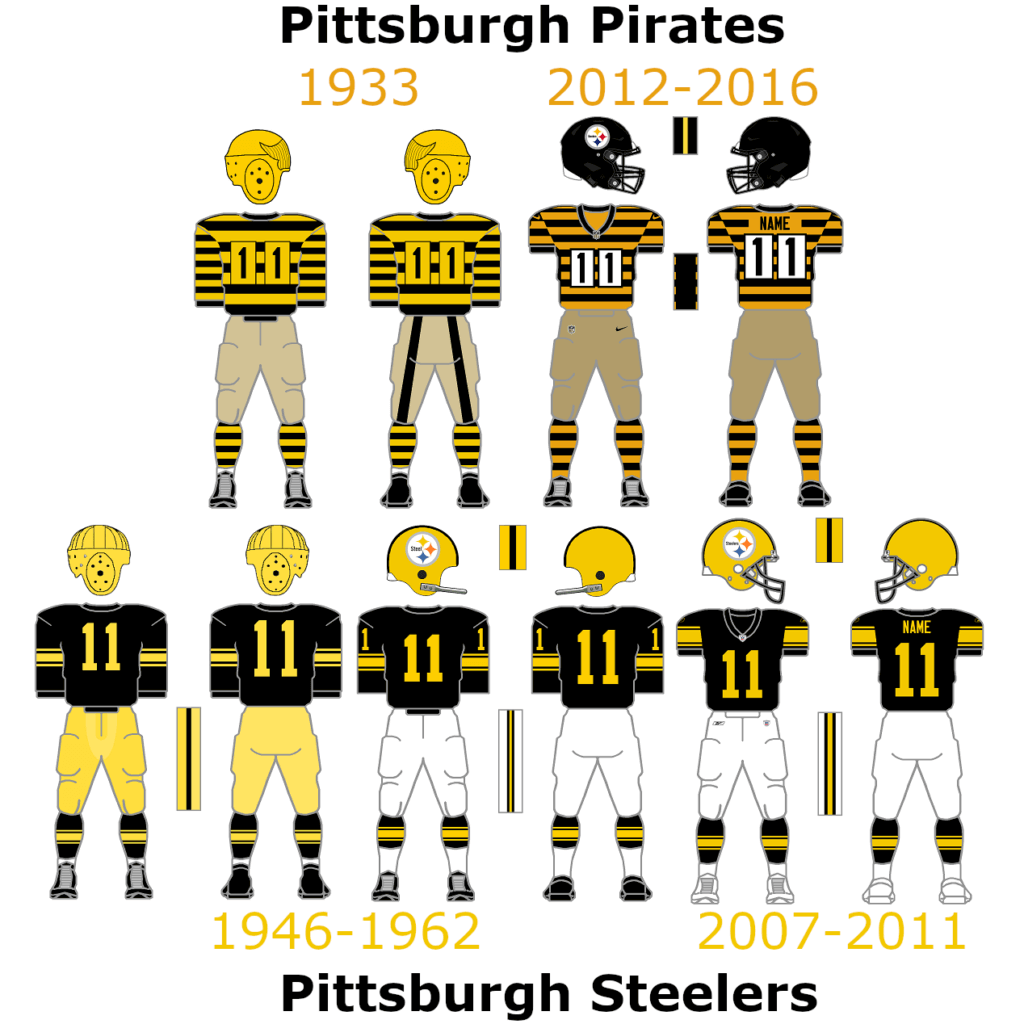
The Steelers already got some great throwback uniforms over the years. My favorite Steelers throwback is the bumblebee uniform. They originally wore them in 1933. Bring back the yellow helmet and use it for the color rush jersey, add white pants and you got another great protentional throwback uniform.
Browns:
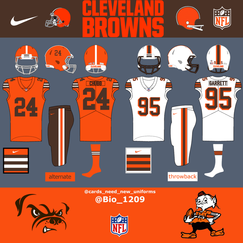
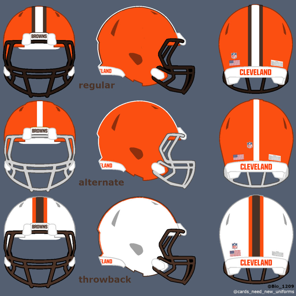
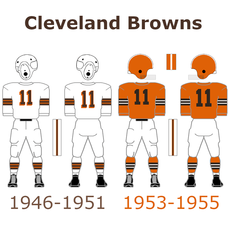
The Browns just got new throwback uniforms for the 2021/22 season. They wore white helmets with this uniform back in 1946. That could be possible again in the future with the new two helmet rule. The helmet they announced for the 2021 throwback uniform could be used for a new orange alternate uniform quite like the uniforms back in 1955. I decided to combine them with brown pants to create a unique look.
Ravens:
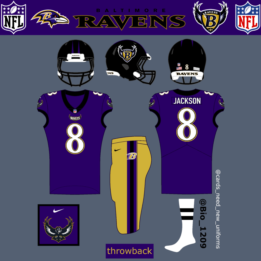
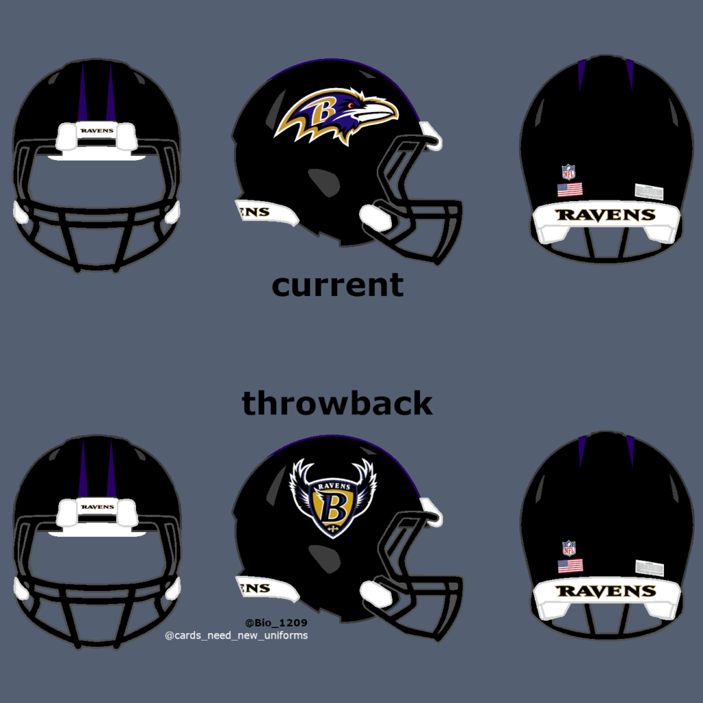
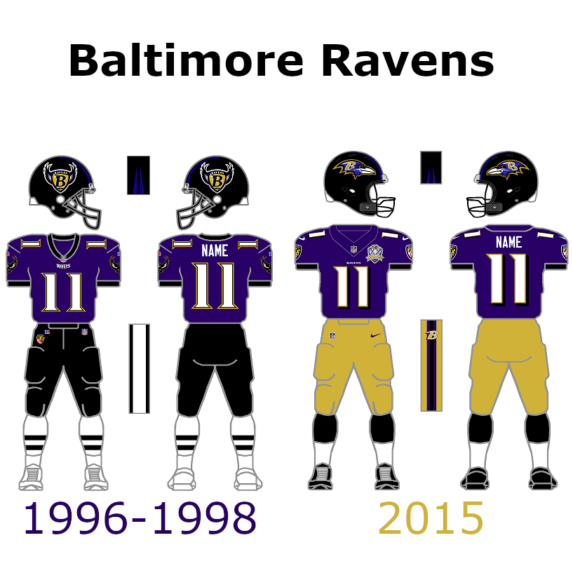
The Ravens were only founded in 1996. Since then, they barely changed their uniforms. The uniform is unique and looks very good so no reason to change anything about it. I brought back the black collar and the old & bigger number font for my throwback uniform design. Golden pants could be worn by them like they did back in 2015 to make the look unique and special. Black pants are an option too of course. However, that doesn’t mean they don’t look good. I don’t think they should change anything on the helmets except the old logo on it.
AFC East
Bills:
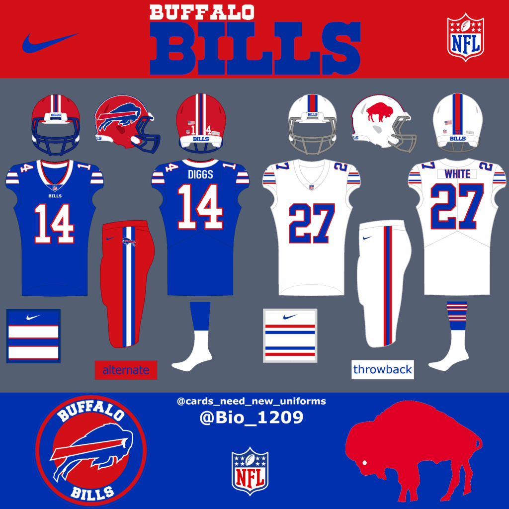
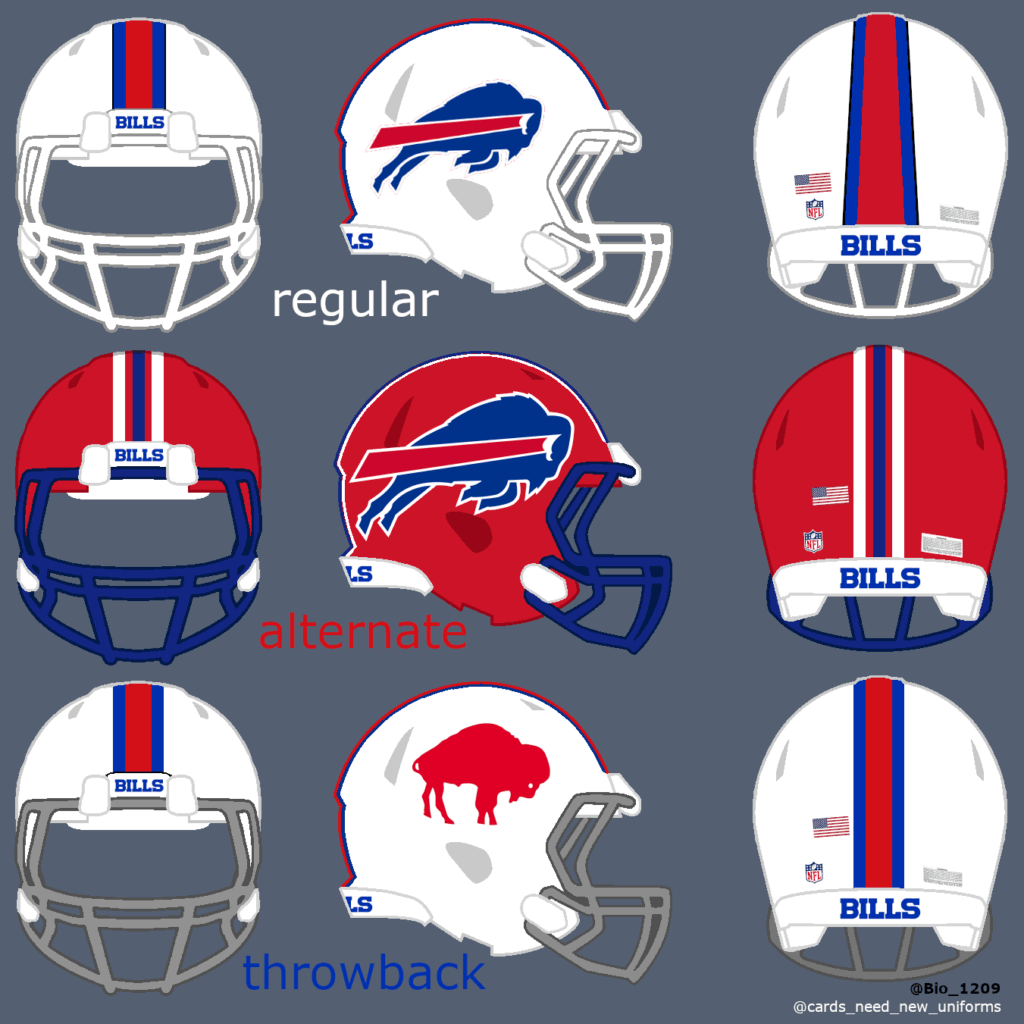
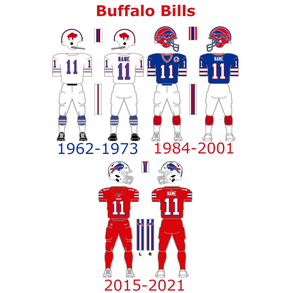
The Buffalo Bills are already wearing a great throwback uniform in some games. They could and should bring back the red helmet as an alternate option with the new two helmet rule. The Bills could combine it with their current home jersey and maybe some red pants (color rush) to create a new and unique alternate look for a few games in the season.
Jets:
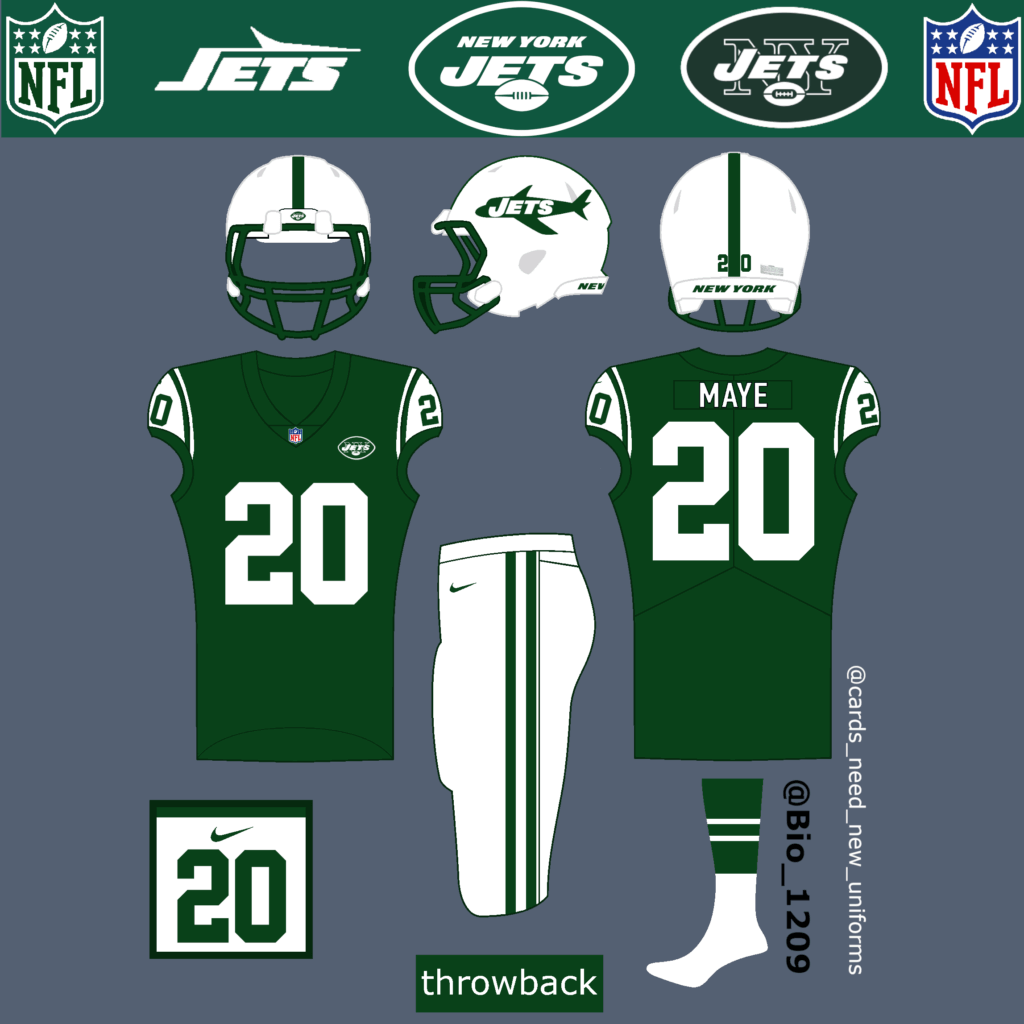
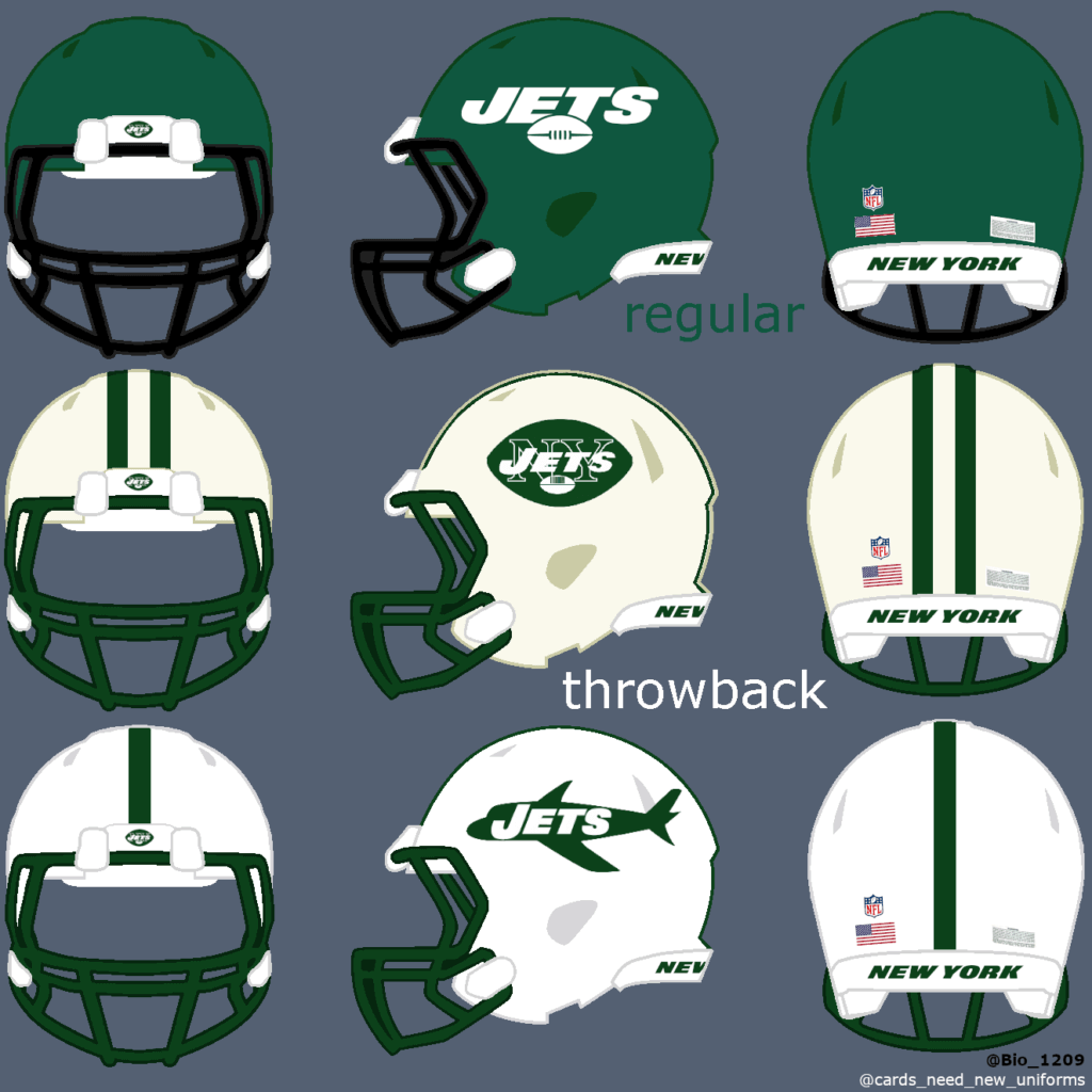
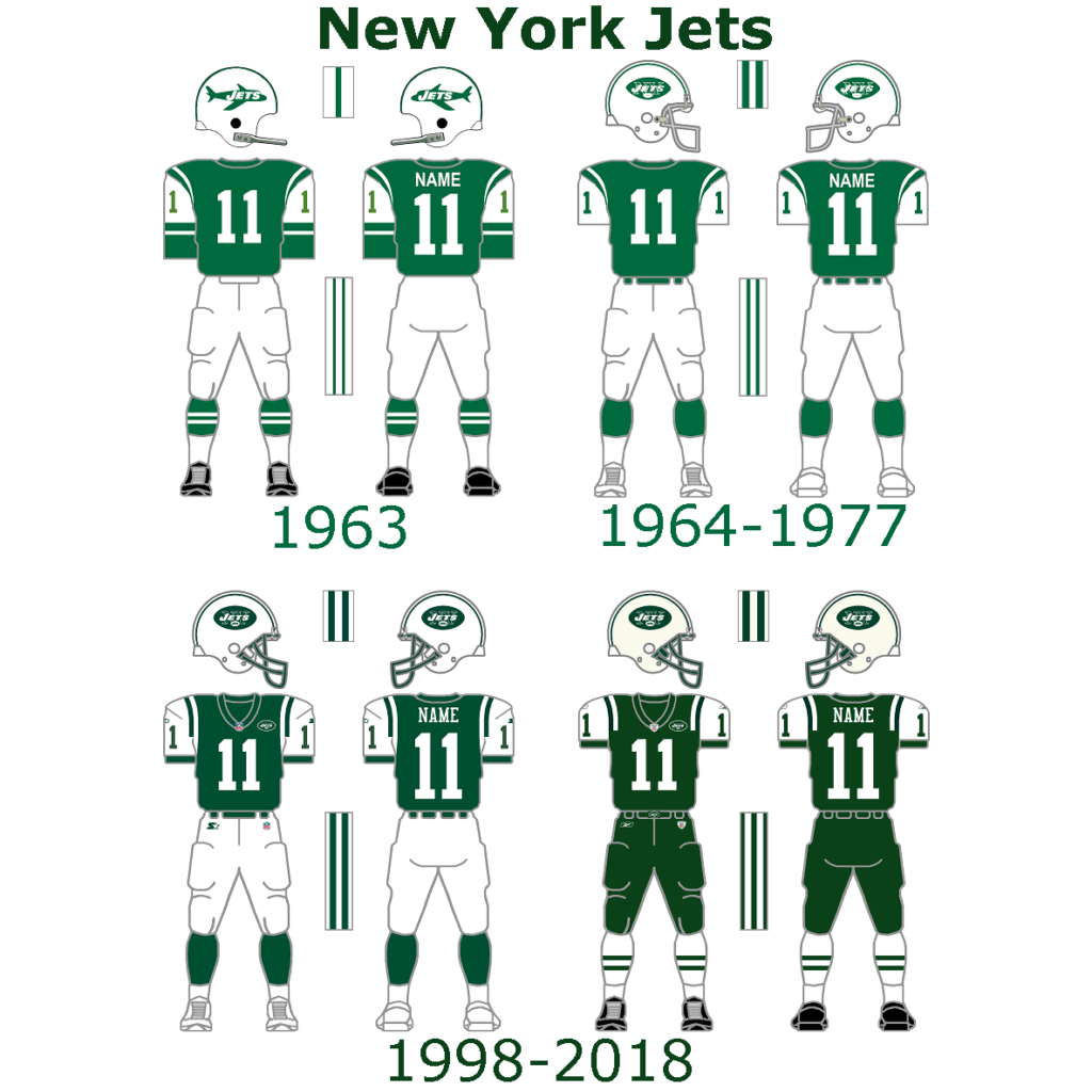
First of all, I like the newest NY Jets uniforms. They look modern and I don’t understand the hate on them. Nevertheless they should bring this classic look for some games. The helmet Logo from 1963 is great but the 1964 – 2018 logo would work here too.
Patriots:
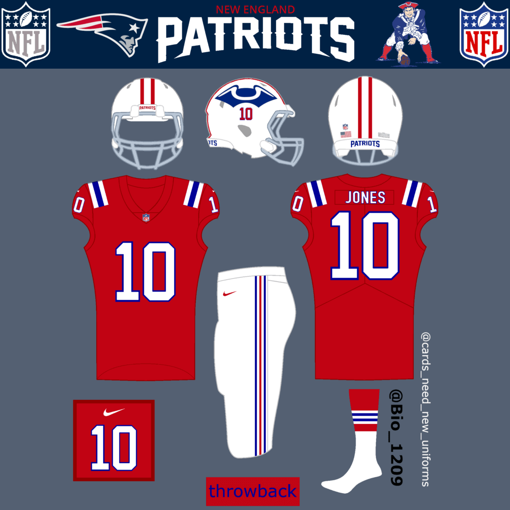
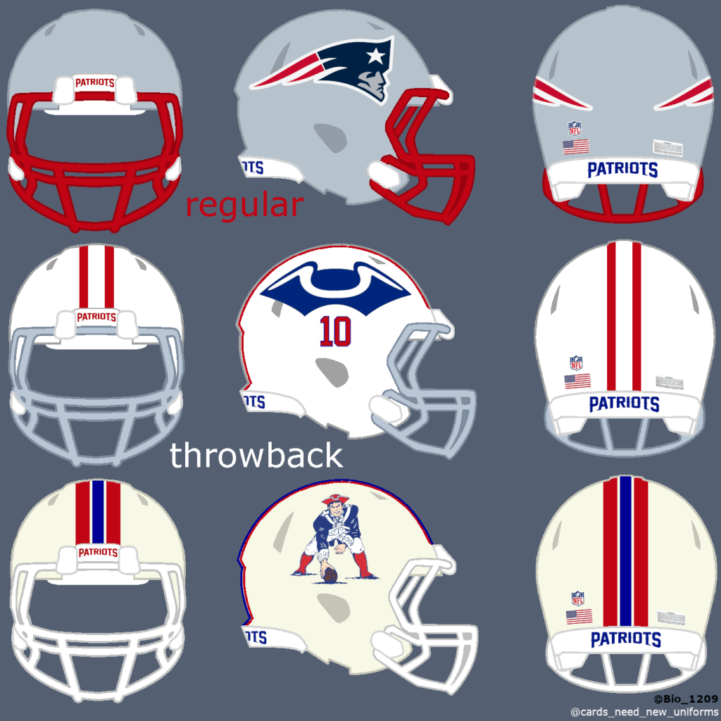
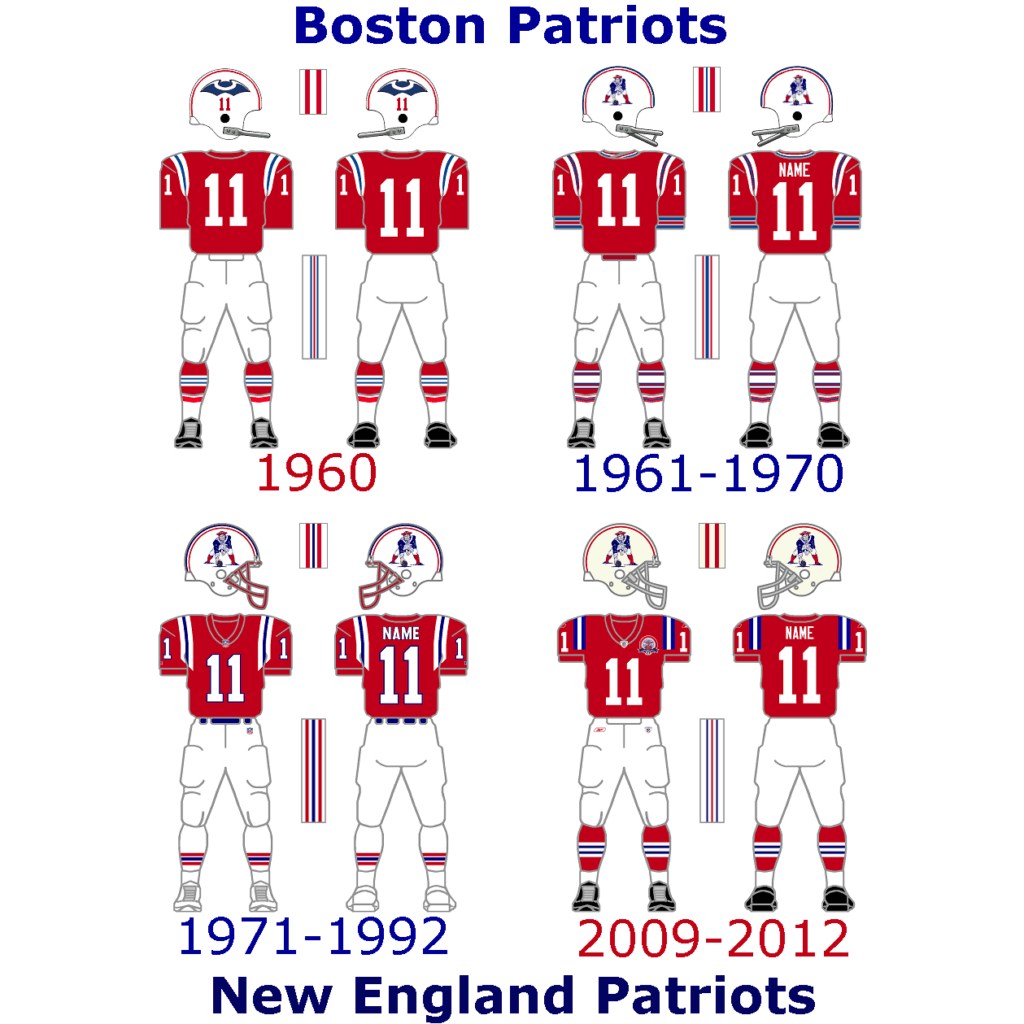
The Patriots only got new Uniforms in 2020 and they look much better on the field than the old uniforms. The red throwback uniform is a fan favorite and a no-brainer for me. I had a hard time choosing a helmet or logo, but I like the 1960 logo more than the Pat Patriot logo.
Dolphins:
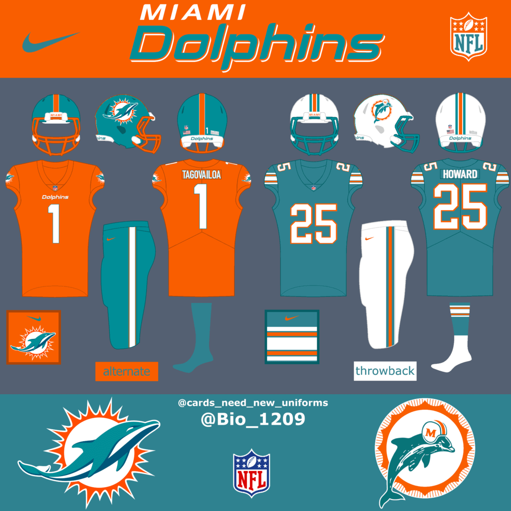
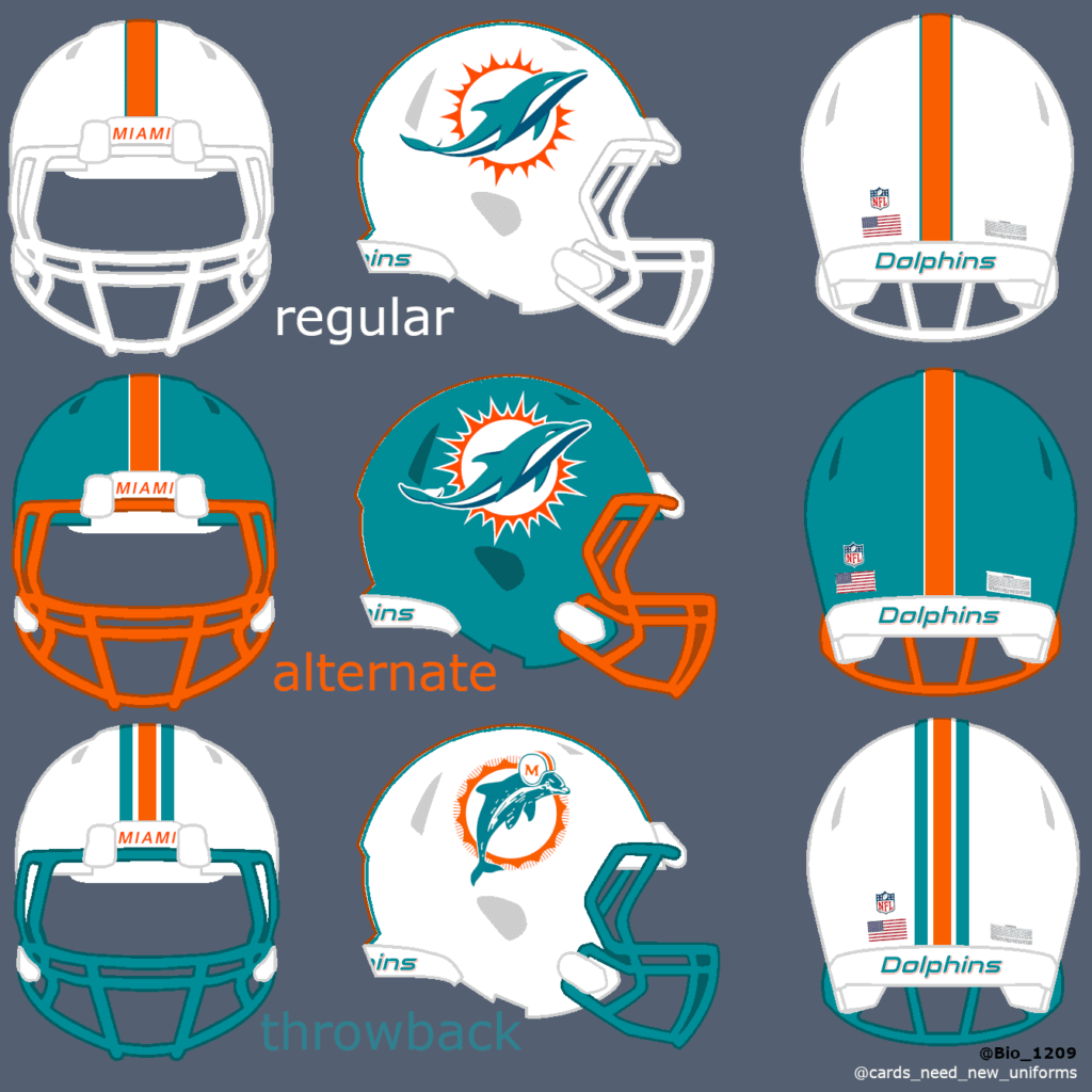
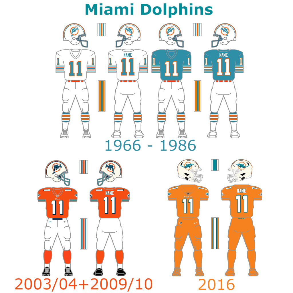
The Miami Dolphins already got two great throwback uniforms, which could both be used for the Thursday games, but they should bring back the aqua facemask for them. As an alternate helmet the dolphins could bring something new with a blue helmet in combination with the orange color rush uniform or a new alternate combination, because there are a lot of possible color combinations with their current uniform design.
AFC South
Colts:
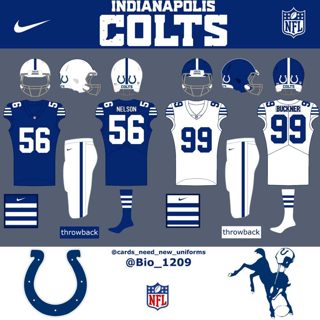
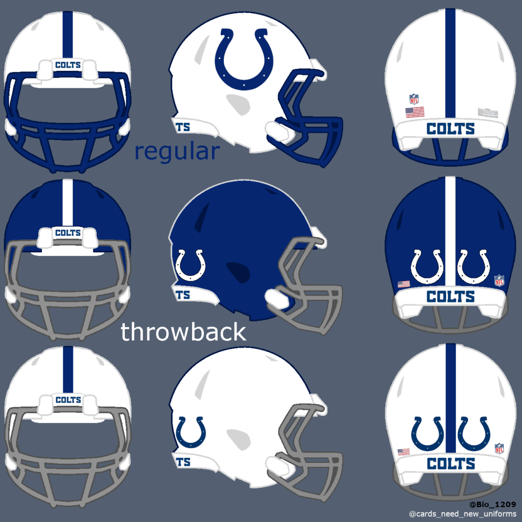
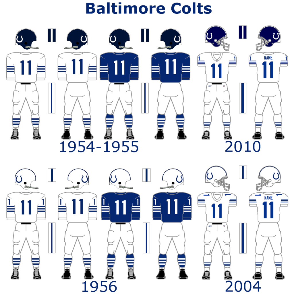
The Colts just got new throwback uniforms. With the new helmet rule coming next season, they could bring back the blue helmet for another similar but great throwback uniform. For the regular helmet they should get rid of the gray facemask and use a blue one instead.
Jaguars:
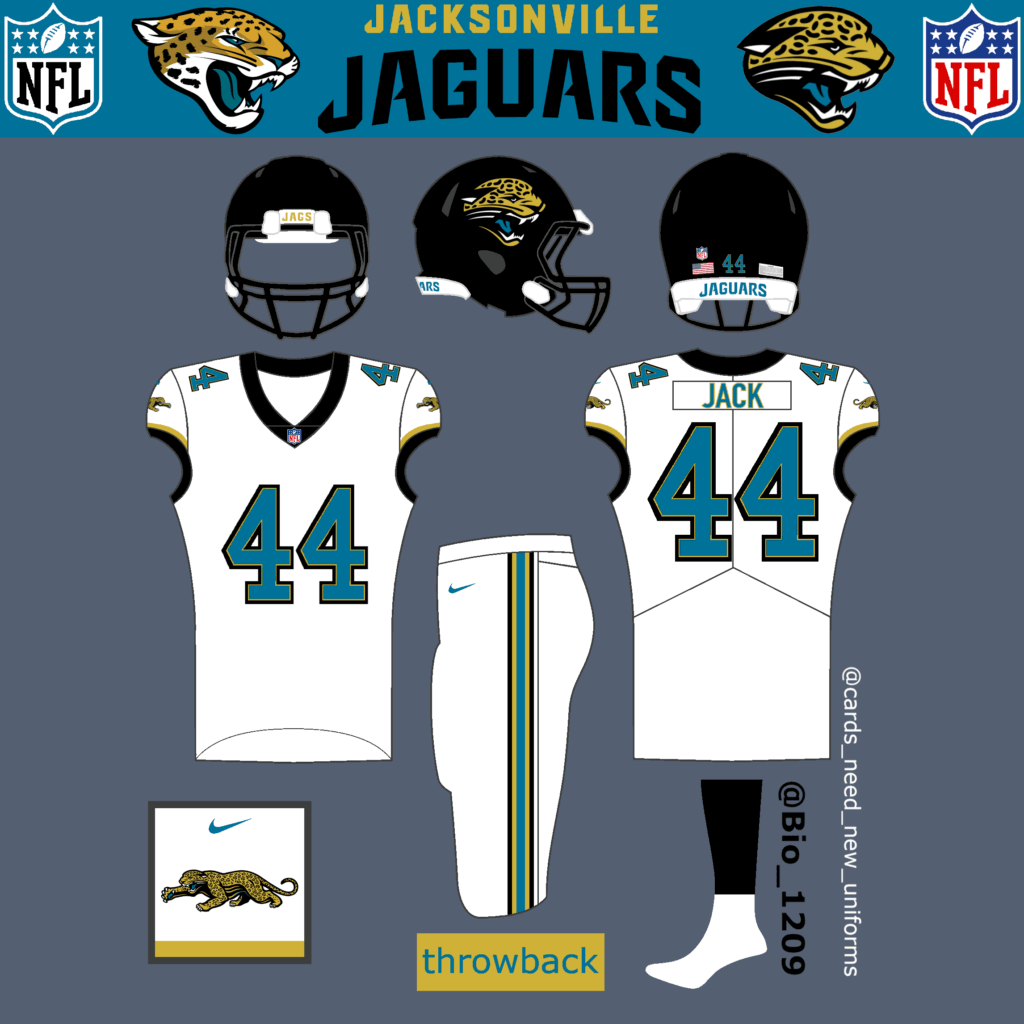
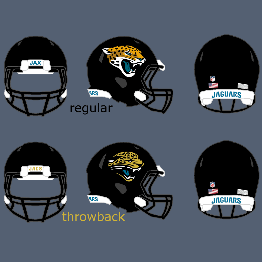
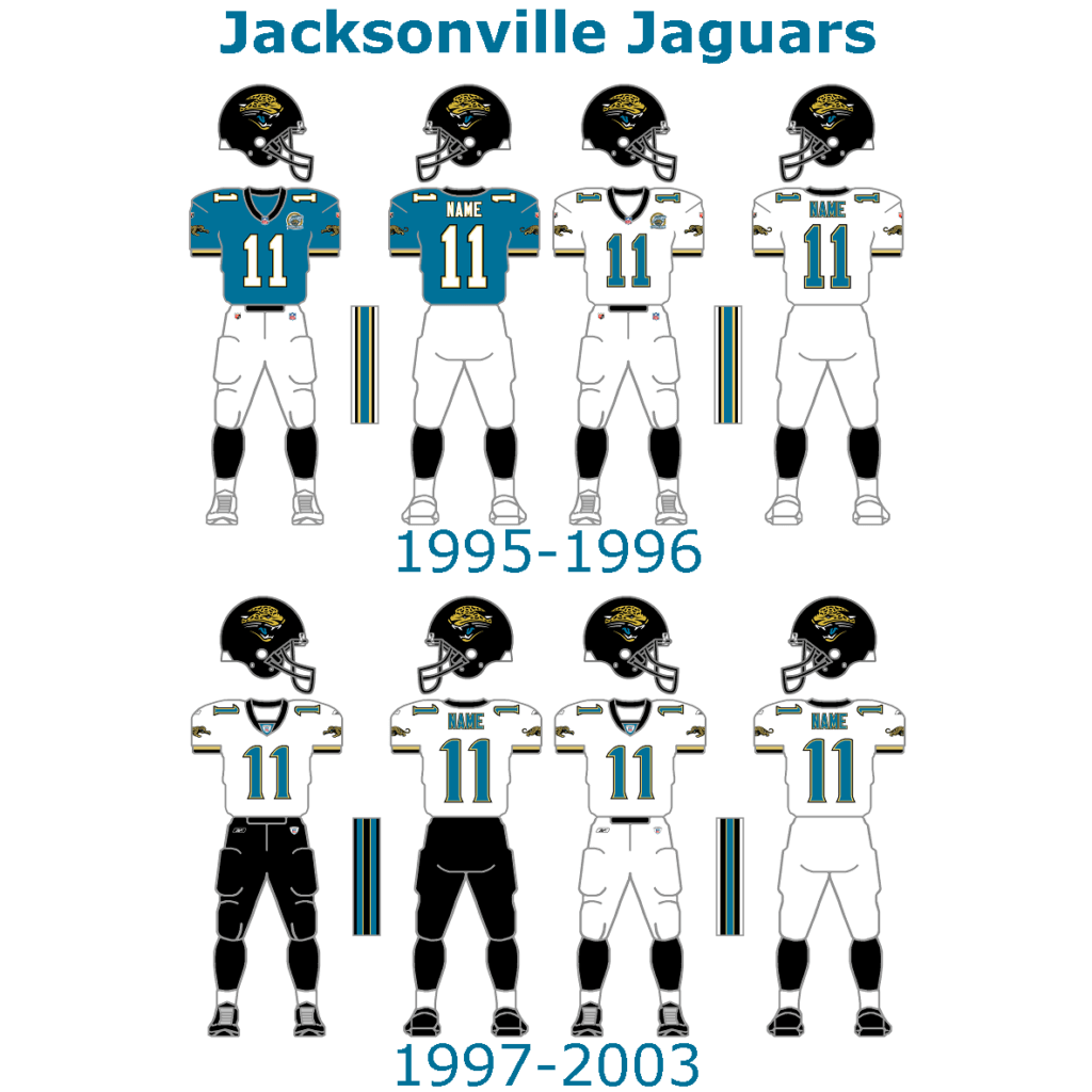
The Jaguars are a very young franchise. They were founded in 1995 and have already changed their uniforms several times. I really like the current uniforms much, because it‘s a simple and clean look with many possible color combinations. The all-black helmet is just great. I decided to go with the first white away uniform with teal numbers from 1995 as their throwback-uniform. The old Logo on the helmet would do it for them.
Titans/Oilers:
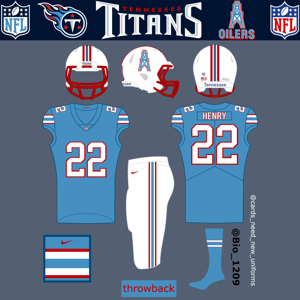
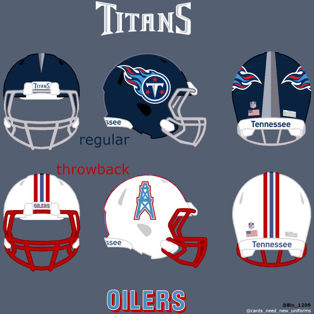
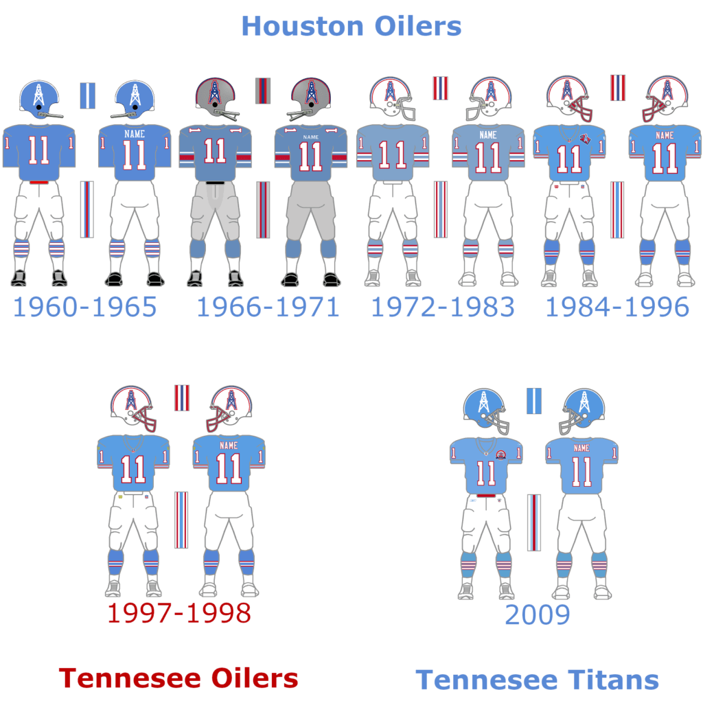
The Titans have once been the Houston Oilers until the team relocated from Houston to Nashville, Tennessee in 1997 and have been the Tennessee Oilers for two seasons. In 1999 the franchise changed its name and they have been the Tennessee Titans ever since. They already wore a throwback oilers uniform back in 2009. A lot of fans speaking out loud that they want to have the Oilers back. A throwback uniform is a must have for the Titans.
Texans:
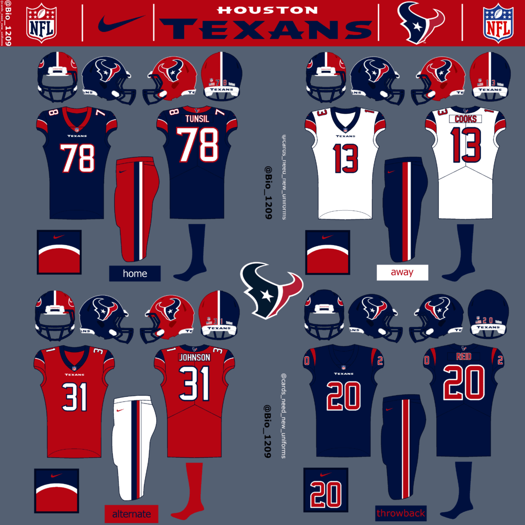
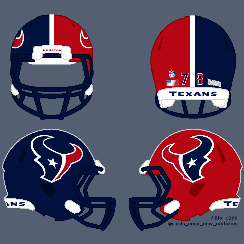
The Texans are the youngest franchise in the NFL. They were founded in 2002 as the 32nd team in the NFL. They haven’t changed anything on the uniforms since then and that’s why I designed a completely new concept for them. The new two-colored helmet is unique and reflects the logo. The logo is an abstract depiction of a Bull head, split in such a way to resemble the flag of Texas and the state of Texas. The current design is not bad. That’s why I decided to keep their current color rush uniform as their throwback uniform.
AFC West
Raiders:
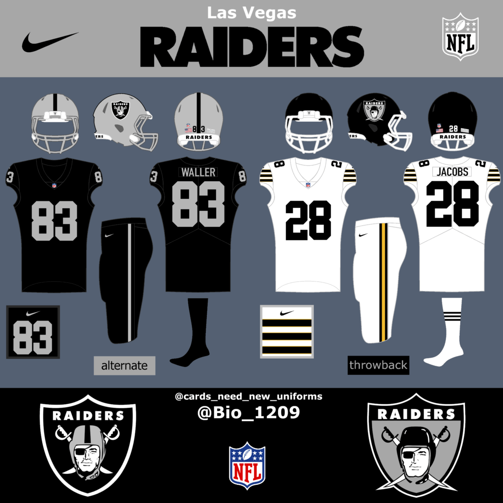
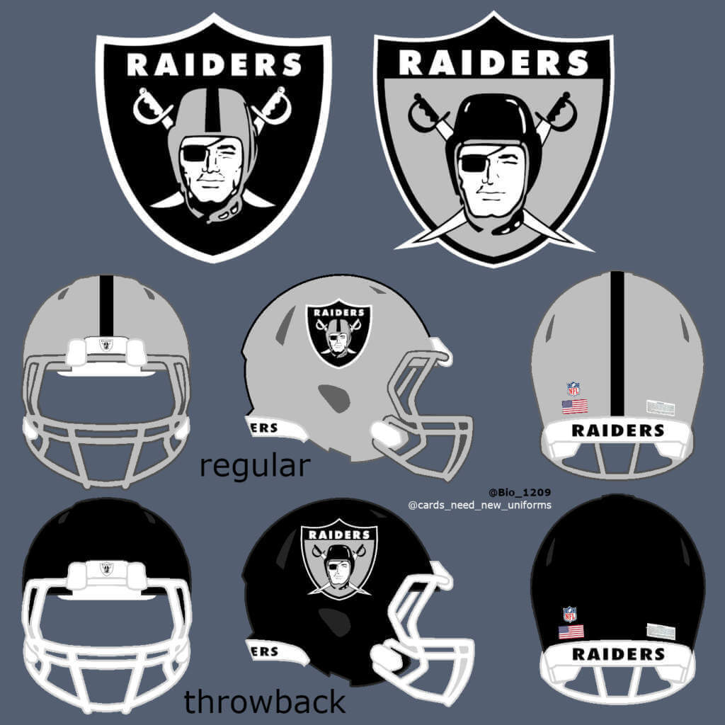
The regular Raiders uniforms are one of the cleanest uniforms in the NFL and one of my favorite uniforms. But I heard some fans asking for a blackout uniform. For the throwback uniforms I changed the sleeve stripes and went with a black helmet but changed the yellow stripe because of the similarities to the Steelers helmet.
Kansas City:
[In keeping with protocol, we will not show KC concepts featuring Native American iconography, but you can view them here, here, and here — PH]
The regular Kansas City uniforms are very classic and clean. They could add a yellow alternate uniform with the same design. Maybe add an alternate helmet with an alternate logo and yellow facemask but that’s not necessary. For the throwback uniforms I went back to the Dallas Texans days with an even simpler red jersey. The helmet logo back than was the shape of Texas with a little star. I used the regular logo as a whiteout and put the jersey number in the corner, to mimic the former logo.
Chargers:
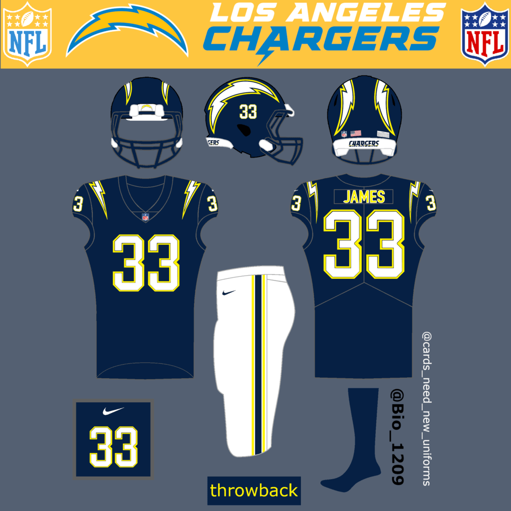
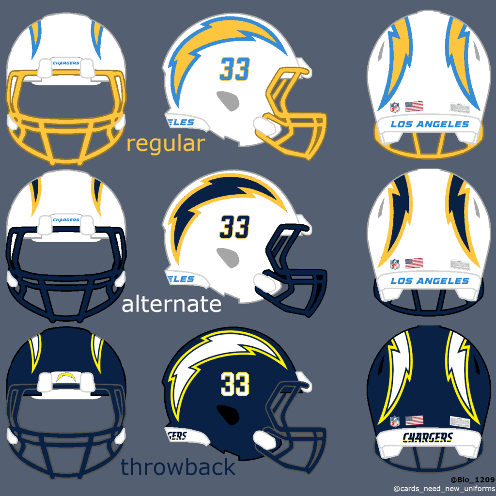
The LA Chargers did everything right with their latest uniform changes. Nothing to complain about.
Throwback uniforms would work with the dark blue helmet and neon yellow flash.
Broncos:
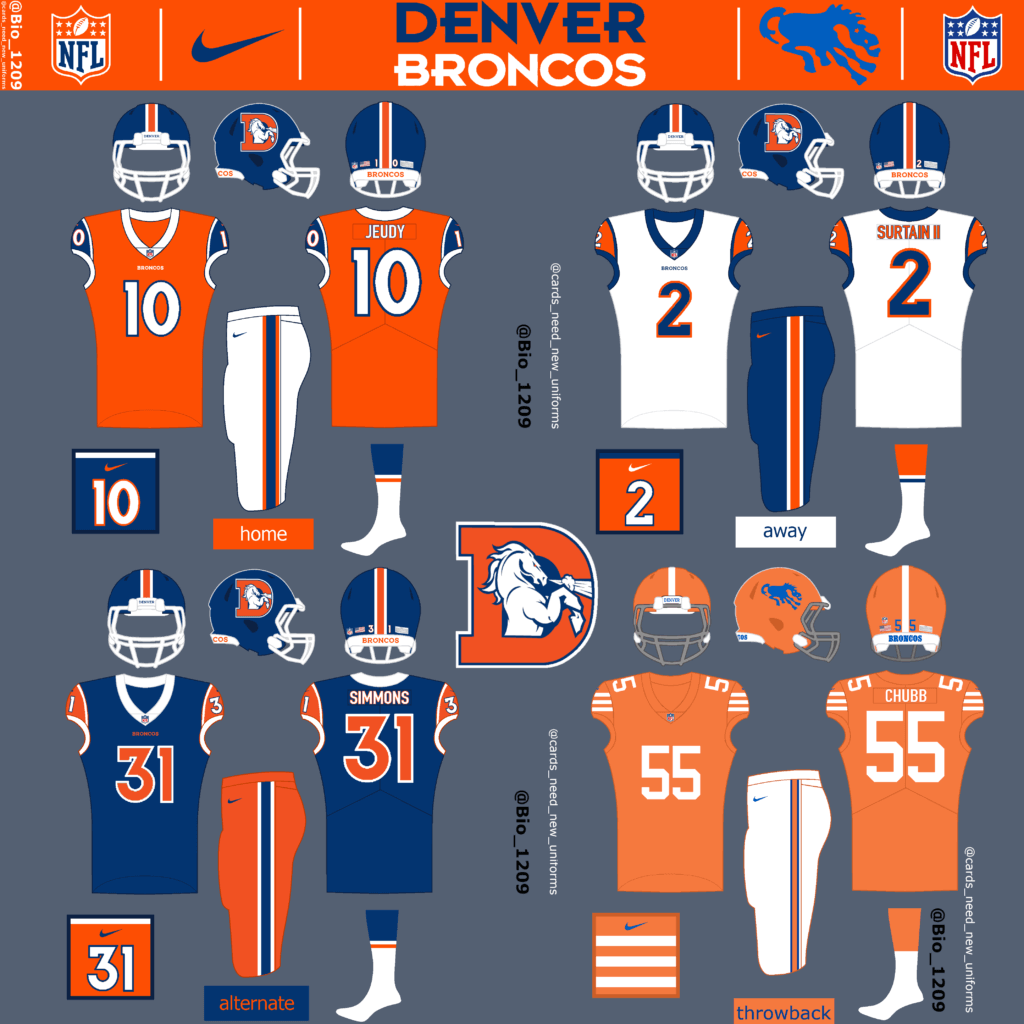
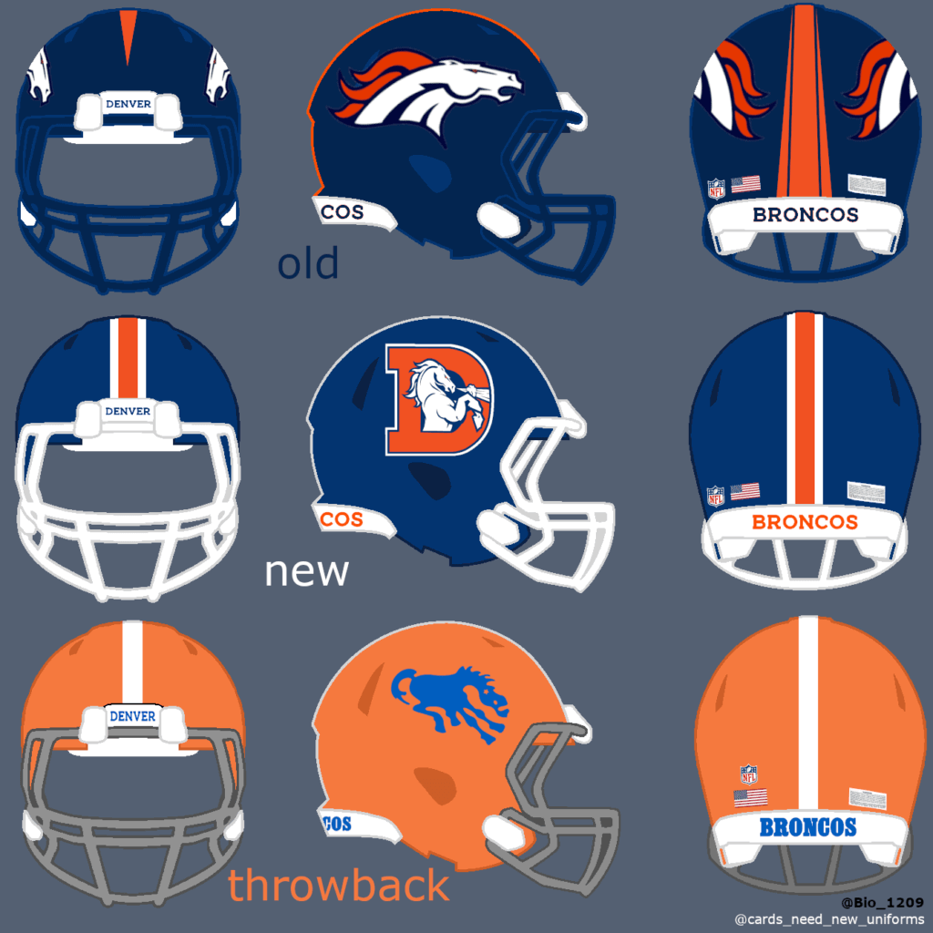
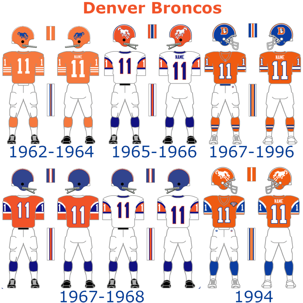
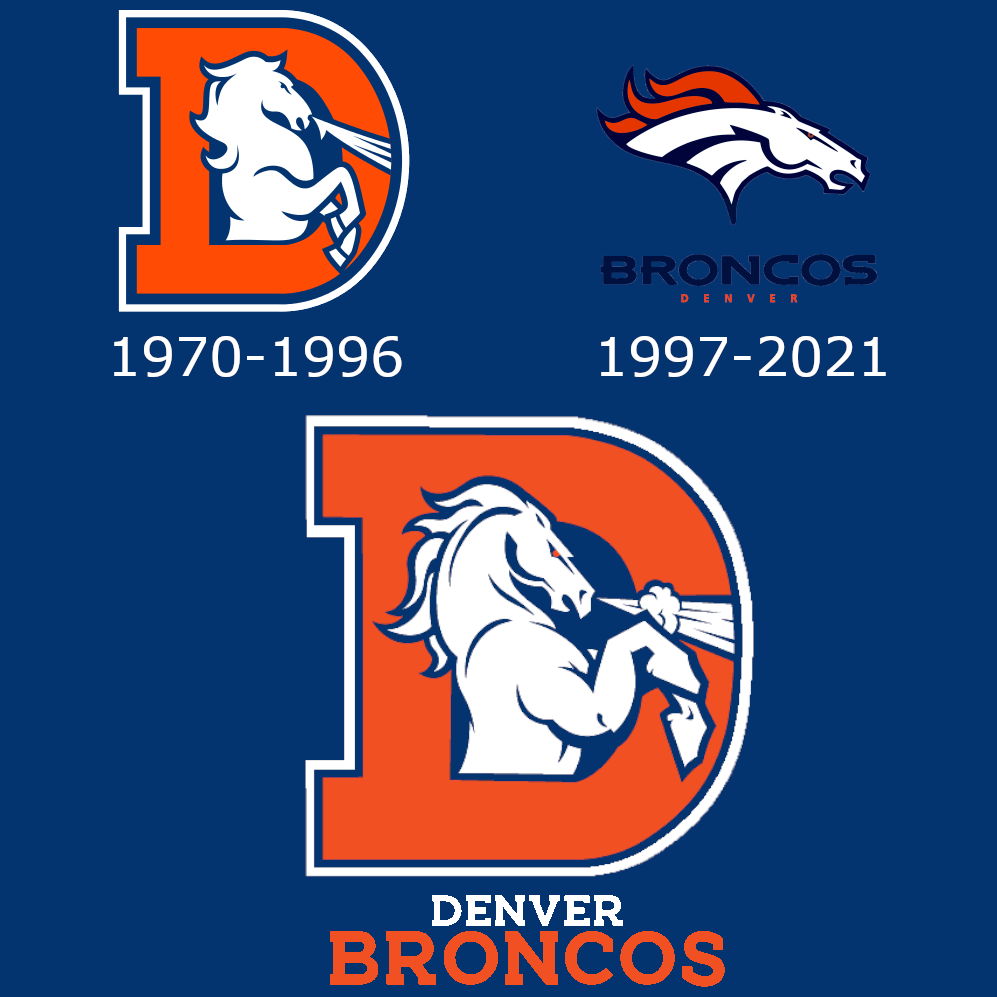
The Broncos are one of the teams that absolutely need new uniforms. Something must change for them in my opinion. They use the same design since 1997. I went with a whole new concept based on the 1965-68 design. The shade of blue is a little different and the helmet logo is an updated version of the old Bronco logo. For the throwback uniforms I went with the design from 1962 to 1964.
Thanks, Fabio! Definitely some interesting throwback concepts there, and some good food for thought. What say you readers? I’ll have Fabio’s NFC concepts in a little bit — looking forward to those.


Guess The Game…
from the scoreboard
Today’s scoreboard comes from Mike Styczen.
The premise of the game (GTGFTS) is simple: I’ll post a scoreboard and you guys simply identify the game depicted. In the past, I don’t know if I’ve ever completely stumped you (some are easier than others).
Here’s the Scoreboard. In the comments below, try to identify the game (date & location, as well as final score). If anything noteworthy occurred during the game, please add that in (and if you were AT the game, well bonus points for you!):
Please continue sending these in! You’re welcome to send me any scoreboard photos (with answers please), and I’ll keep running them.
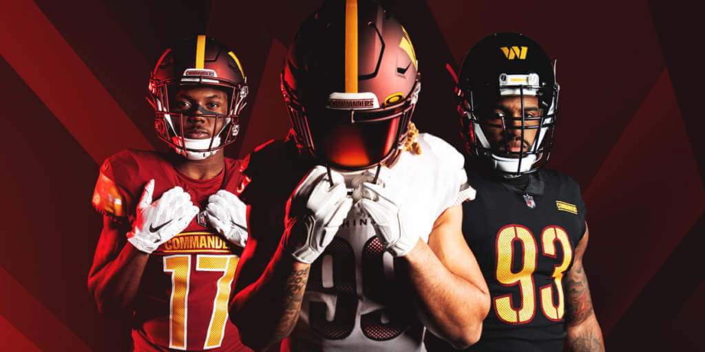
Commanders reminder: Paul here. In case you missed it, I have a very detailed assessment of the Commanders’ new team name and uni set. You can read it here on Bulletin, but you’ll need a paid subscription to access the article (and you’ll need a Facebook account to pay for the subscription). The price is $4 a month or $35 a year.
If you haven’t yet subscribed to my weekly Bulletin column, you can do that here, or just click on the article link. If you want to subscribe but the Facebook requirement is a dealbreaker, I can let you know when a non-Facebook payment option is available — just shoot me a note and I’ll keep you in the loop.
Next week’s Bulletin article will be my annual Super Bowl Preview, full of fun facts about the Rams’ and Bengals’ uniforms (past and present). The week after that, I’ll likely have a deep dive on the new Riddell Axiom helmet. All of my annual Big Four season preview columns will be on Bulletin as well.
That’s it from me. Now onto the ticker…
The Ticker
By Anthony Emerson

Baseball News: Reader Jeff Falcusan writes in: “A buddy of mine recently won an autographed Ronald Acuña jersey from a memorabilia store. It came with a certificate of authenticity, but that’s just for the signature. We can’t figure out the provenance of the jersey itself. No team logo, no patches, just his name and number on the back and his number on the chest in front. Any idea what this is? Minor league BP? Custom pajamas? Something a dude bought at Kohl’s and stuck in front of Acuña?” My guess is the latter, but maybe someone can shine a light on this for Jeff?

NFL News: Chase Young, LB for the Commanders — god, that feels weird — loves the team’s jerseys. Someone get him a Bulletin subscription! (from Tom Turner). … The Los Angeles Sheriff’s Department will have custom badges commemorating the Super Bowl for the next week (from Adam Stoneman).
College/High School Football News: Penn State and Fanatics have partnered to being selling player jerseys (from William F. Yurasko).

Hockey News: Swedish club HC Frölunda has dropped its new branding just two days after unveiling it. The new logo was being associated with Nazi iconography. Frölunda has now returned to its previous logo…a Native American caricature (from multiple readers). … Great story from Brian Bennett: On Jan. 30, 1987, Division III SUNYAC (State University of New York Athletic Conference) hockey rivals Oswego Lakers and Geneseo Knights faced off. The visiting Lakers, whose road uniform was green with gold trim, packed everything but their jerseys, so they borrowed and wore Geneseo’s blue sweaters. Brian sent along a colorized black-and-white photo of the game.

College/High School Hoops News: N.C. State is the latest school to unveil commemorative uniforms for Black History Month (from Kary Klismet). … Scratch that, Georgia Tech has now also revealed Black History Month unis (from multiple readers). … Also from Kary: The Fox College Hoops Twitter wants fans to weigh in on which Big Ten team has the best throwback logo. … Dan Pfeifer noticed a very odd basketball court paint scheme for East Central Community College — no paint in the key, but paint between the men’s and women’s three point lines. … Indiana men have unveiled another alternate uni (from Todd Usher).

Soccer News: New third kit for Mexican side Pumas (from Ed Zelaski). … During yesterday’s FA Cup match against Middlesbrough, Manchester United wore black armbands to honor the 63rd anniversary of the Munich Air Disaster, which killed eight United players and three United coaches. A bit difficult to tell in this picture, but United’s armbands featured the Munich Clock, installed at Old Trafford after the disaster.

Olympics News: Twitter loved Canada’s scarf from the Beijing Opening Ceremony (from Jason Hillyer). … Twitter also freaked out about the German ice dance team’s Joker and Harley Quinn performance (from Kary Klismet). … Also from Kary, the New York Times has a piece on the history of Olympic mascots.

Grab Bag: Virginia men’s lacrosse added a helmet decal of the punch/fist bump emoji in memory of a former player, Henry “Punch” Peterson (thanks, Jamie). … The National Lacrosse League has added ESPN+ ad patches in the US and TSN ad patches in Canada (from Wade Heidt). … Wales/Ireland in Six Nations Rugby will be color on color, red/green, despite WorldRugby decision to avoid color clashes like this to help distinguish the teams for the colorblind. The teams are on two-year kit cycles, however, and neither team has a white kit at the moment (from @TheBigJamesG). … Also from @TheBigJamesG: the teams in Super Rugby Pacific have unveiled their primary jerseys.
Uni Tweet of the Day
I think we’re gonna look back in a few years and say, “You know what? This was a pretty good looking Super Bowl.”
Great look at former Tigers in their Super Bowl uniforms pic.twitter.com/a4OE8tPPXS
— LSU Uniform Tracker (@LSUUnis) February 3, 2022
And finally… that’s it for today. Big thanks to Fabio for the Thursday Night Throwback (and CR-modified/alternate) concepts. We’ll have the NFC down the road.
If you’re into exhibitions, this is your weekend, as we have the NHL All Star Game today, and NFL No one watches Pro Bowl on Sunday, and of course, the Olympics are now in full swing, so there’s lots of “big” games and a bunch of sports you probably only watch every four years. Definitely a good pre-Supe weekend lineup.
Everyone have a good day and stay safe, and I’ll catch you back here tomorrow.
Peace,
PH
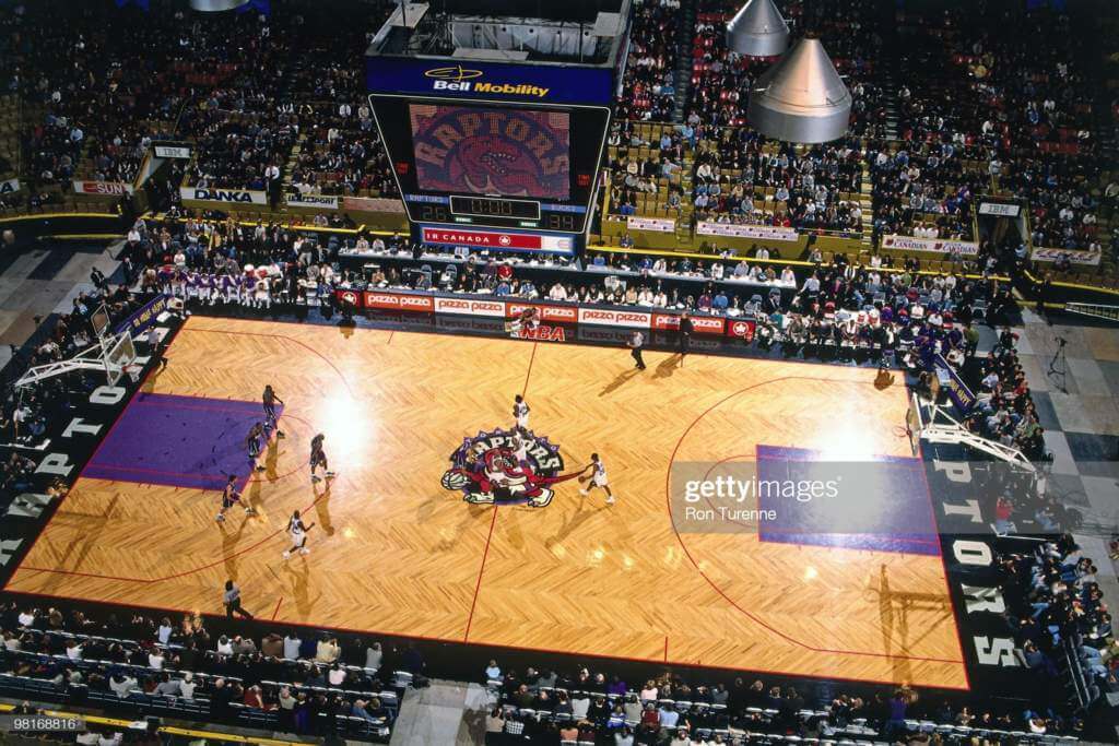
12/26/1995 (Boxing Day in Canada) Raptors beat the Bucks 93-87. The game was played at Copps Coliseum in Hamilton, Ontario.
Looking at the arena the game was at Maple Leaf Gardens.
Yep – not Copps. Copps had the goofy orange-purple-yellow seating that was meant to hide empty seats.
If anyone has pictures of the Raptors at Copps I’d love to see them. Finding today’s GTGFTS of the day sent me down a rabbit hole of trying to find one and I utterly failed.
(though I did find this one, which is Copps set up for the finish of the Around the Bay Road Race)
link
The Titans/Oilers have some things going on.
The Tennessee Oilers state flag patch is shown during the wrong timespan.
I believe that the asymmetrical helmet stripe the Titans use is actually silver and white. I could be wrong. The image above shows the two shades of gray that are found on the sword yokes and the “stripes” on the pants. The two shades of gray would certainly make more sense.
I believe the helmet stripe is much thinner as well. Thank goodness. If you’re going to go asymmetrical in a spot in which it does not work, keep it skinny.
On that Broncos throwback helmet, the horse should be brown.
Toronto Raptors hosting the Milwaukee Bucks on February 9, 1999 at the Maple Leaf Gardens in Toronto. Final score Bucks 91 Raptors 77. Final basketball game ever played at the Maple Leaf Gardens.
I came here to say that. Well done.
I don’t know why my Titans comment is awaiting moderation.
It was about the Tennessee state flag patch in the wrong era and what I think is a mistake on the Titans helmet stripe.
The Bengals’ White Tiger look needs more orange than a very thin outline around the numbers. Black/orange looks great; black/white looks sterile. I get the concept but a little orange would make it pop. On balance I like most of these.
Kudos to Fabio as He did some good work. Thanks for sharing.
What resonated with me was a few of the helmets.
Like the Brown’s white helmet striping.
Barring any legalities, Steelers- love to see the original Steel for a throwback.
Nothing really new but some teams show take his Lead vs the Current Designers.
Being a Cardinal fan, when they change, hope it will not be overdone vs going back to the 80’s style
Am I the only one who prefers the old Jaguars logo to the newer one? I know it’s more abstract, but that’s what I like about it. It felt original and kinda artsy. The new one is too sleek and looks like the same cat face profile we see on lots of helmets, from high school to the pros.
Everytime I see the old Jags logo I have the same thought. I don’t know if I think it’s aesthetically better or if it’s nostalgia for those Mark Brunell teams making me miss it.
Those are amazing concepts! Totally unique!
Who doesn’t love Pat Patriot?
Reference the Ravens concept, the team faced a lawsuit over the original logo’s origin. Not sure they would use it in a throwback concept. Love the bigger numbers and wide white leg stripe.
“The Patriots only got new Uniforms in 2020 and they look much better on the field than the old uniforms.”
Lol, no.
The Acuna jersey is likely a “custom” they create to get signed. The thought is instead of spending $150 an a legit MLB issued top you can get one made in Asia for $20 and charge $150 total since only the back would be displayed in a frame. Pretty common recently especially with the online auctions I see linked on social media.
Ahhhh…makes sense. Thanks!
Oilers moved to Memphis first before Nashville. Played 2 seasons at the Liberty Bowl, if I’m not mistaken.
Baltimore can’t use the flying B logo for legal purposes. Also, those yellow pants they wore should never again see the light of day.
I was hoping to see a Bengals wordmark helmet for the throwback.
2 seasons as the Tennessee Oilers. Only one in Memphis though. They moved to Nashville the 2nd year in Tennessee and played at the 40,000 seat Vanderbilt stadium since attendance was terrible in Memphis.
Hi Uni-Watch. Not sure where to send this to….so I’ll leave it here. German football club Fc st.Pauli creates custom posters for each of their home games. link
Yeah, this should get put in the Ticker tomorrow, St. Pauli FC always doing interesting things
Congratulations, Fabio–fine work! For some reason, I especially like the Texans’ two-tone concept: easy to call it “gimmicky,” but I think it would work in a way the Jags’ front-to-back gradient didn’t.
My only concern about the Ravens is, weren’t they obliged to drop that original helmet logo because of some copyright issue?
Kudos to Fabio! Amazing work and presentation! My $.02:
Bengals: Fixing the pants stripes to something closer to the originals and adding a white helmet option were great choices.
Steelers: I fully support a throwback yellow ‘bucket’.
Browns: The orange jersey would benefit from white outlined numbers, and while I usually am against doing so…giving those white helmets gray facemasks ups the throwback ante.
Ravens: If the gold pants must return, why not pair them with the ’16-’17 purple CR jerseys?
Bills: Red helmet with blue facemask…yes! Red pants…no!
Jets: I too like the current Jets set (lose the New York on the jerseys and ditch all uses of black would end the hate?). But show me a Sack Exchange option!
Patriots: It’s gotta be Pat.
Dolphins: I’m maybe one of the few who prefer the modernization over returning the ‘Perfect Season’ to full-time wear, but keeping them as a throwback means keeping the gray facemasks(sigh). No to the aqua helmet.
Colts, Jags, Titans: Nailed them!
Texans: The ‘original’ white helmet would work with their lack of neck-down throwback options. White pants only, please.
Raiders and Chiefs: Best to leave both of them alone (though the Texans decal is a favorite of mine).
Chargers: Navy? Nah, go full Air Coryell.
Broncos: That’s a lot of pants. Love your updated D, and seeing your jersey work makes me wish they didn’t have to have a white one.
I understand the criticism of Native American names and images in team mascots and logos, but I honestly don’t understand why the Chiefs’ arrowhead is often treated as “offensive” imagery in the same vein as, say, Chief Wahoo, or the Redskins’ old logo. If a team does insist on using a Native American name, using an arrowhead seems less ethno-centric and more historically accurate than some of the more obvious offenses of the past.
The only thing I can think of is by using a stone arrowhead, you are pointing out that indigenous peoples were effectively living in a “stone” age for centuries after metals had been developed for weaponry in all of the old world (not just by white Europeans, but in Asia and Africa, too).
As a longtime fan of the site, been debating offering my opinion, but it has bothered me for some time:
Why must you, a non indigenous person feel so obliged to offer your voice on what we deem “offensive”? While I understand many of my brethren feel opposite of me, I also find a large majority of my brethren to not be offended by names and iconography. The only true offensive items I have found have been the use of “Redskins” As a name and the well known “Chief Wahoo” logo of the currently known Cleveland Guardians. I’d enjoy to hear a reasoning why you yourself feel offended by these items, as a fairly obviously white male.
Much appreciation
The Texans helmet would only work if they were playing a team with white or silver/grey helmets. The visual cues of looking at receivers would be thrown off by the 2 tone look.