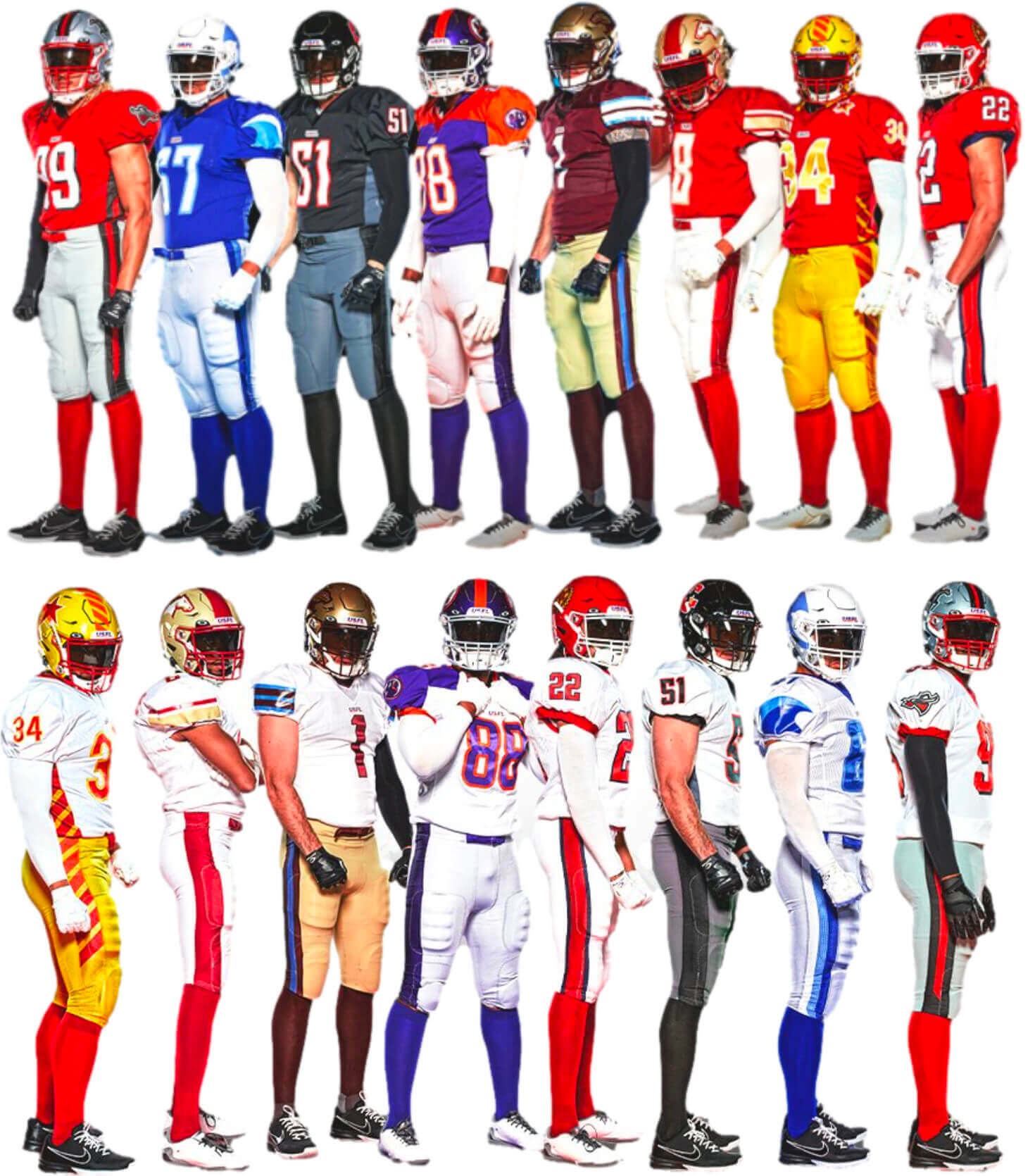
The new USFL unveiled new uniforms yesterday for all eight of its teams. It was an interesting unveiling, as they did one team per hour from 8am to 3pm — sort of a rolling disclosure. I mentioned in yesterday’s Ticker that the plan was for me to provide light coverage today and then Phil would have a deep dive on Saturday. But due to some unexpected developments, the deep dive won’t be happening (at least not this weekend), so I’m going to provide a medium dive today.
Before we get started, here’s a quick refresher course on this league:
• The original USFL launched in 1983 with 12 teams (it eventually had as many as 18) and played for three seasons before folding. You can see the original uniforms here.
• The new version of the league will begin play this April (which I assume means they’re rooting really hard for the MLB lockout to continue for a while). It has eight teams, all of whose city/name identities are carried over from the original USFL, even though there’s no corporate connection between the original league and the new one.
• The new league and its teams are owned by Fox Sports, which will televise the games.
• Although the teams are nominally tied to cities like Pittsburgh, Houston, and so on, all the games will be played in Birmingham (except for the championship game, which will be played in Canton, Ohio), which I believe is because the entire enterprise is just a vehicle for online betting so the “home markets” don’t really matter.
• By my count, this is the seventh non-arena pro football league to launch in the United States since the NFL/AFL merger in 1970. All six of the previous upstart leagues — the WFL, USFL 1.0, XFL 1.0, UFL, AAF, and XFL 2.0 — folded after three seasons or fewer. (An additional upstart league, the A11FL, folded before playing its first game.)
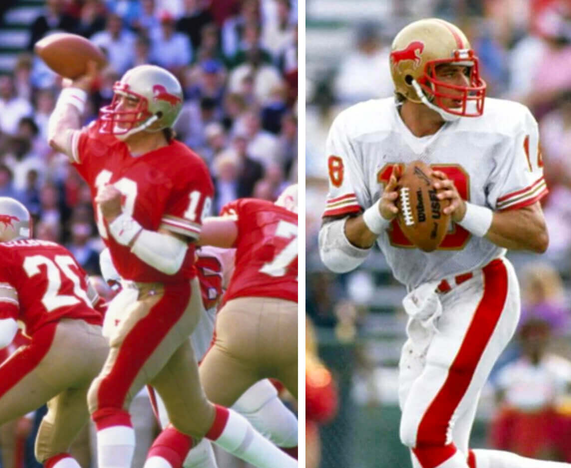
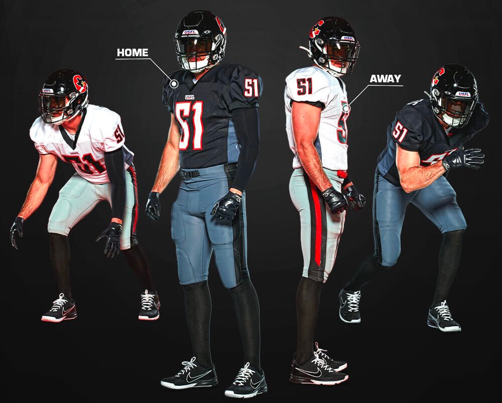
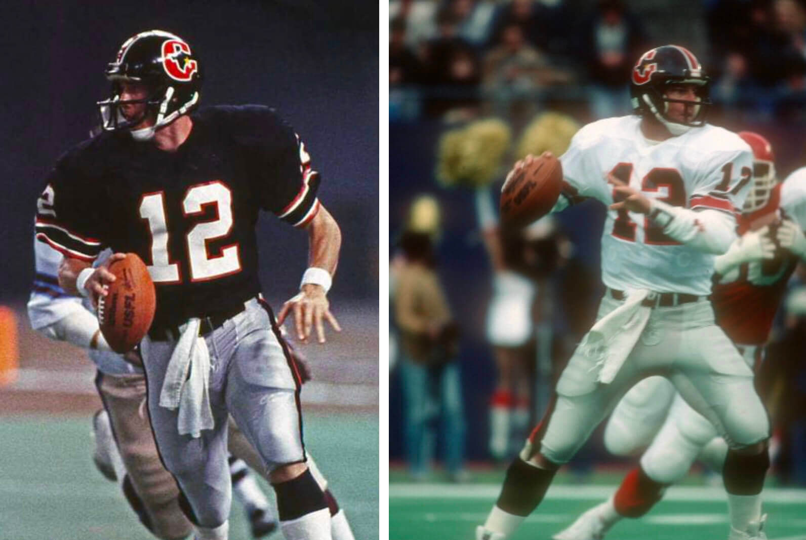
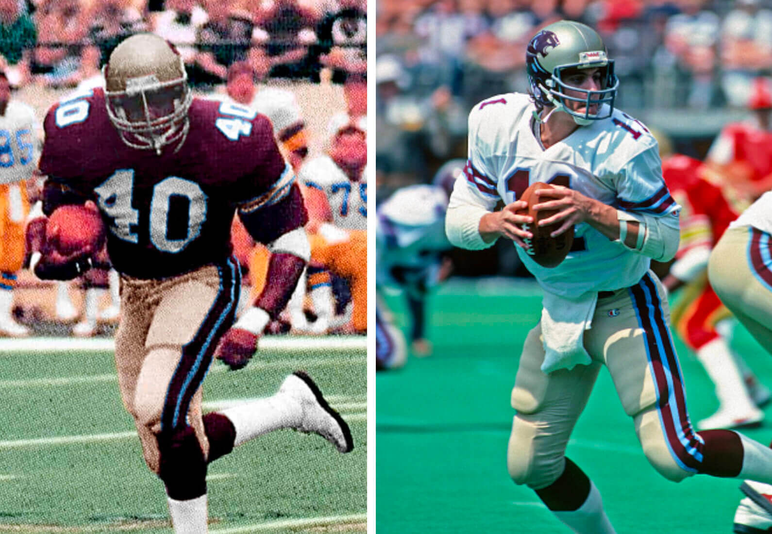
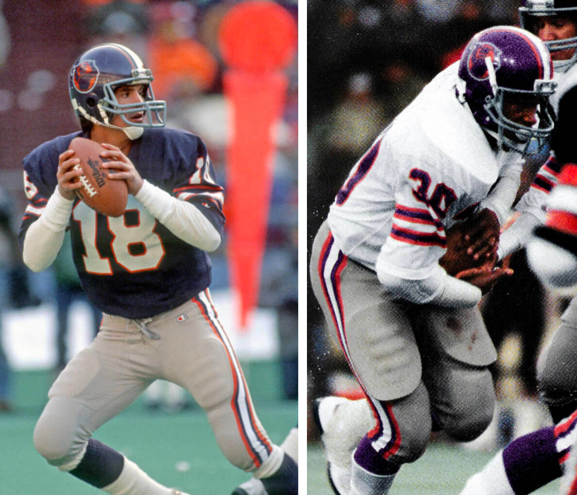
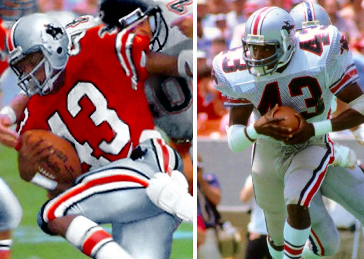
Okay, with all that in mind, here are the eight uniform sets that were unveiled yesterday, along with the uniforms worn by the original version of the team back in USFL 1.0 (for all photos, you can click to enlarge):
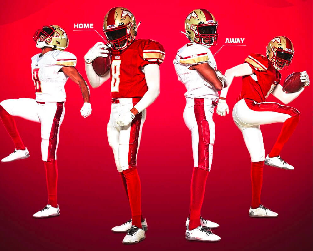
Birmingham Stallions
———
Houston Gamblers
———
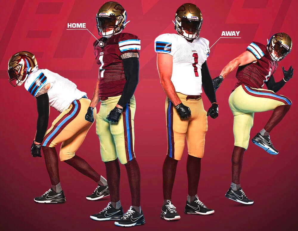
Michigan Panthers
———
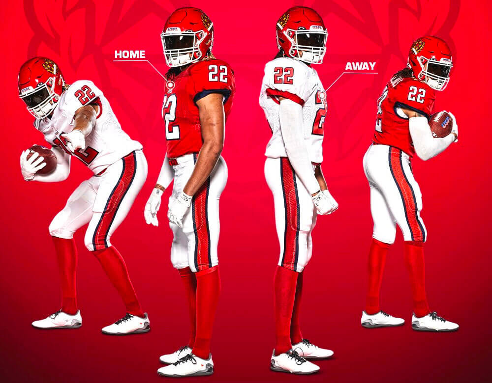
New Jersey Generals
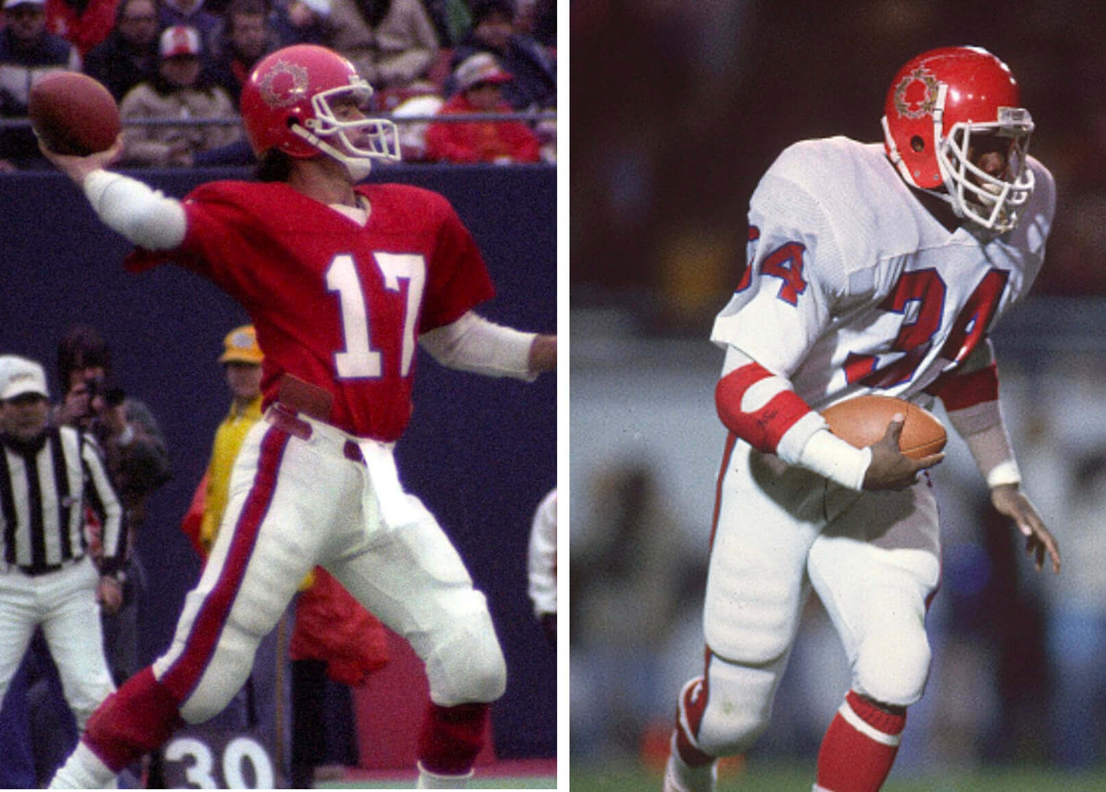
———
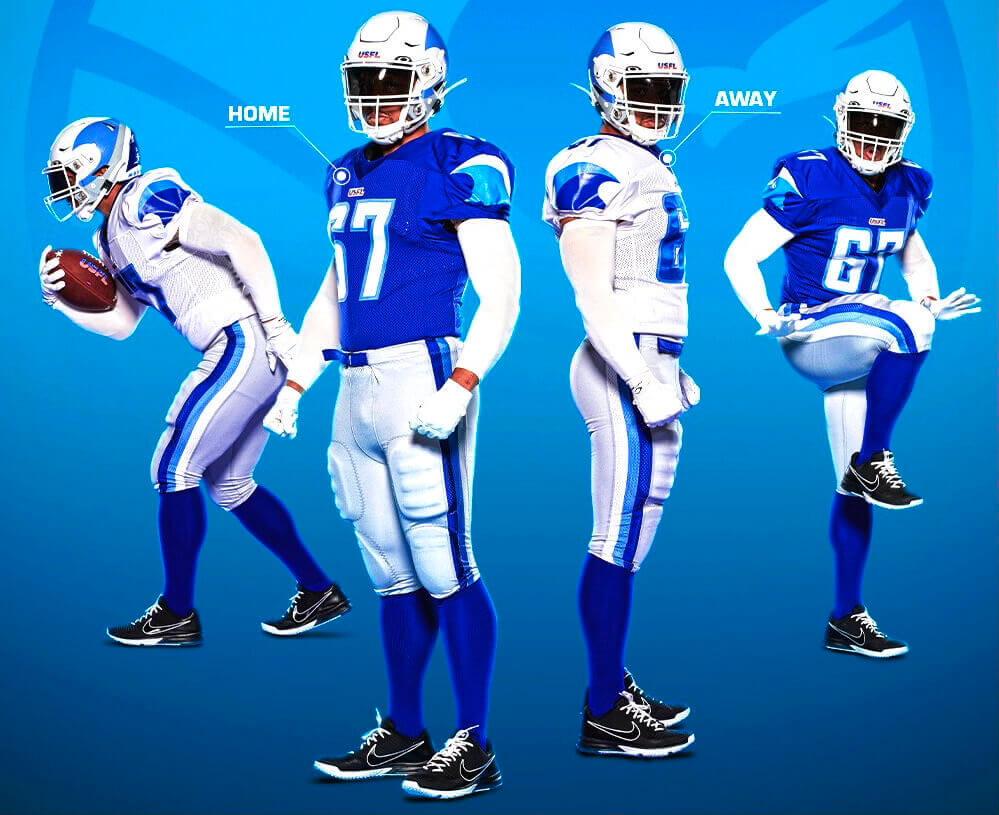
New Orleans Breakers
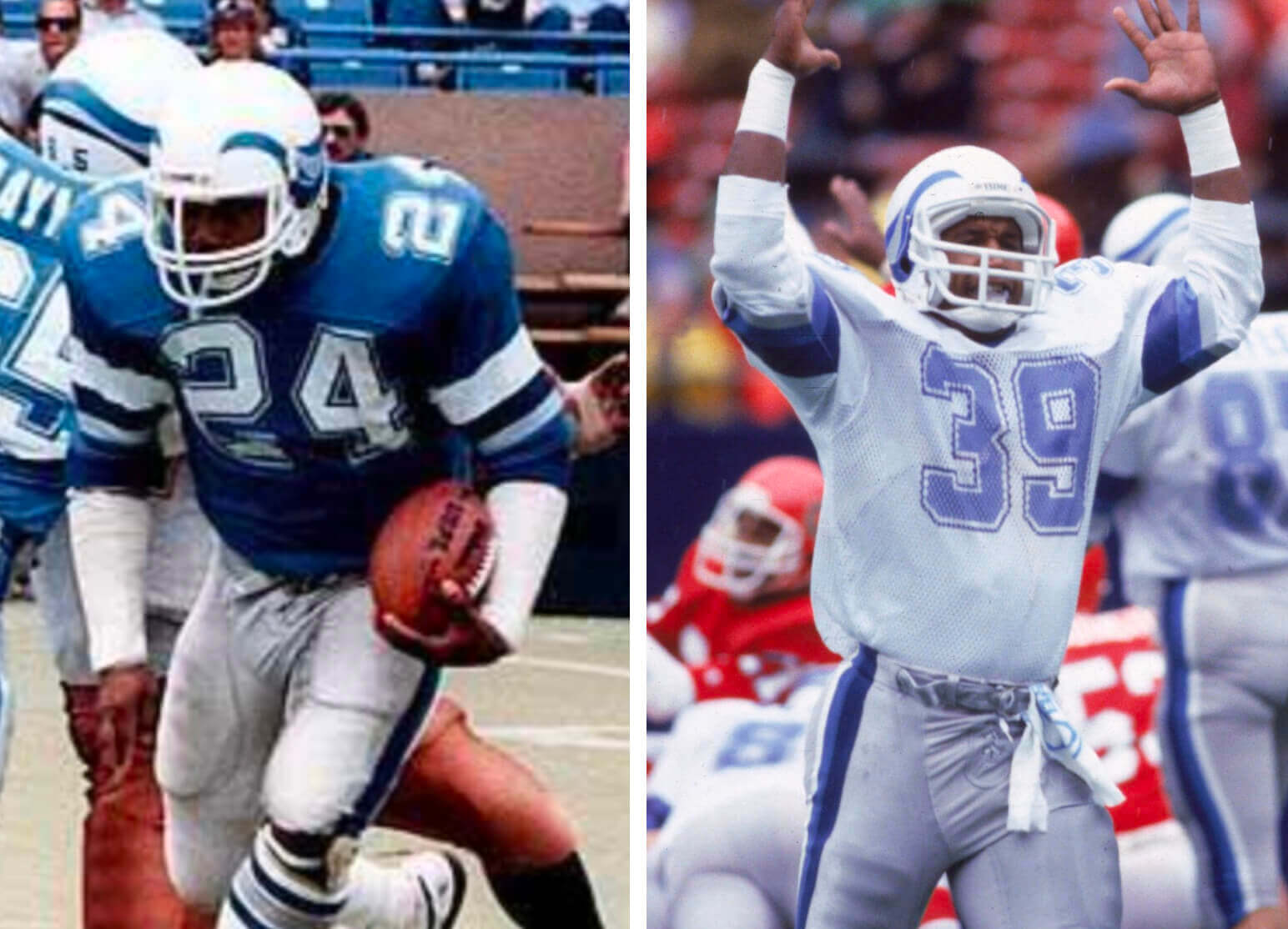
Two additional notes on the Breakers: First, it’s worth noting that the new Breakers’ helmet looks a bit unusual from the back:
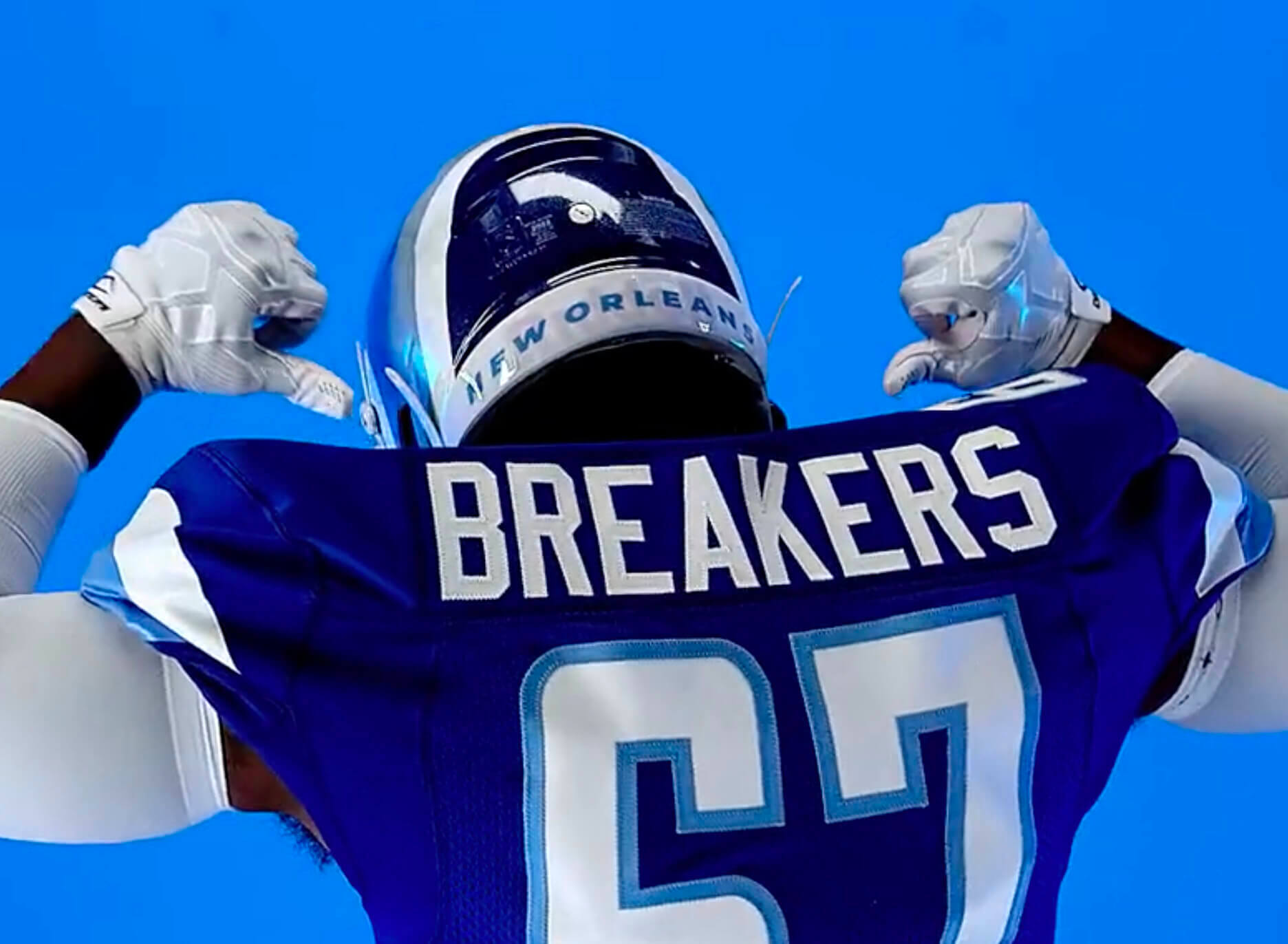
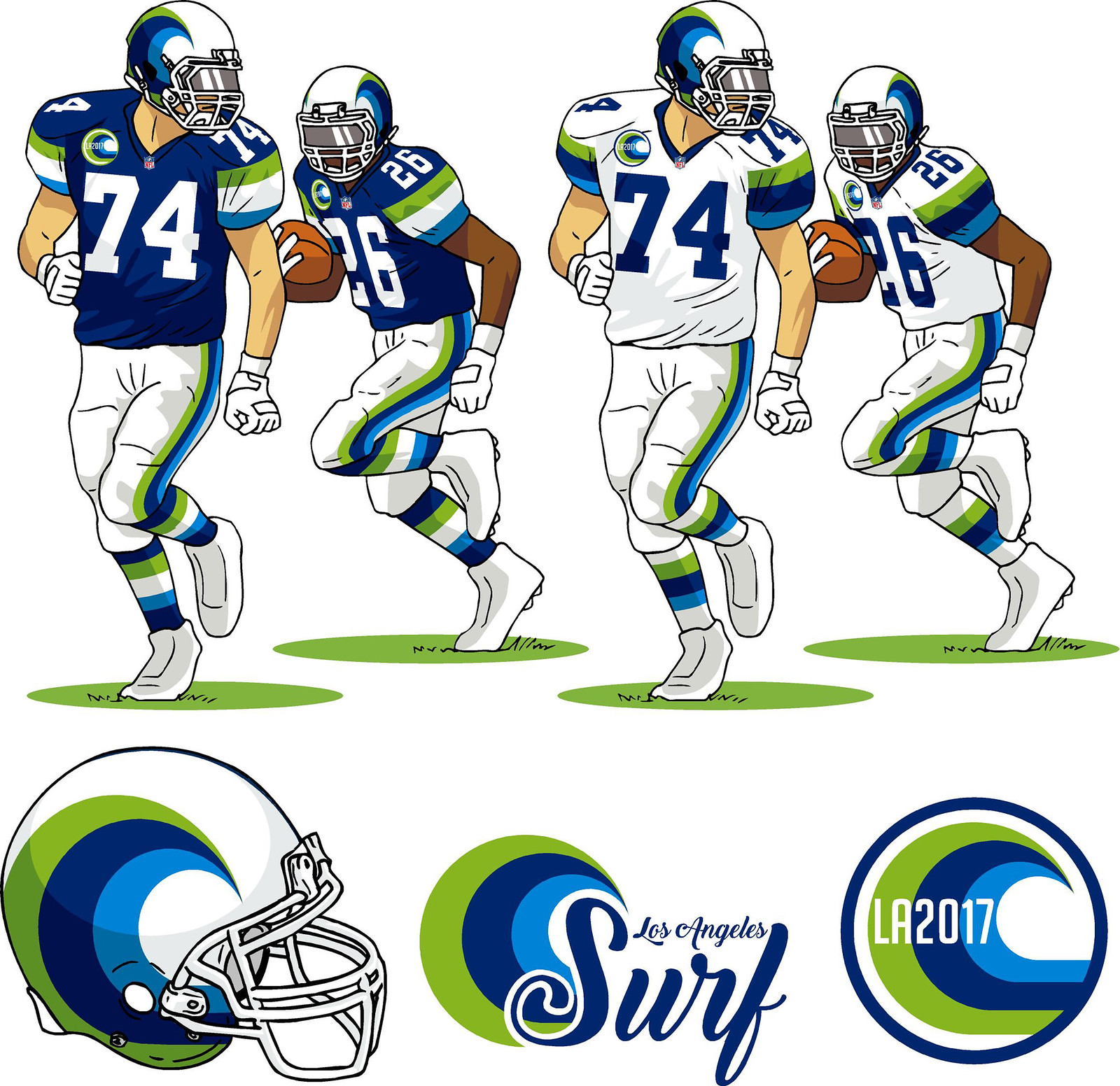
And second, back in 2017 I did a Chargers-redesign contest. Reader Gene Sanny reimagined the Chargers as the Los Angeles Surf and gave them a helmet very similar to the new Breakers helmet:
———
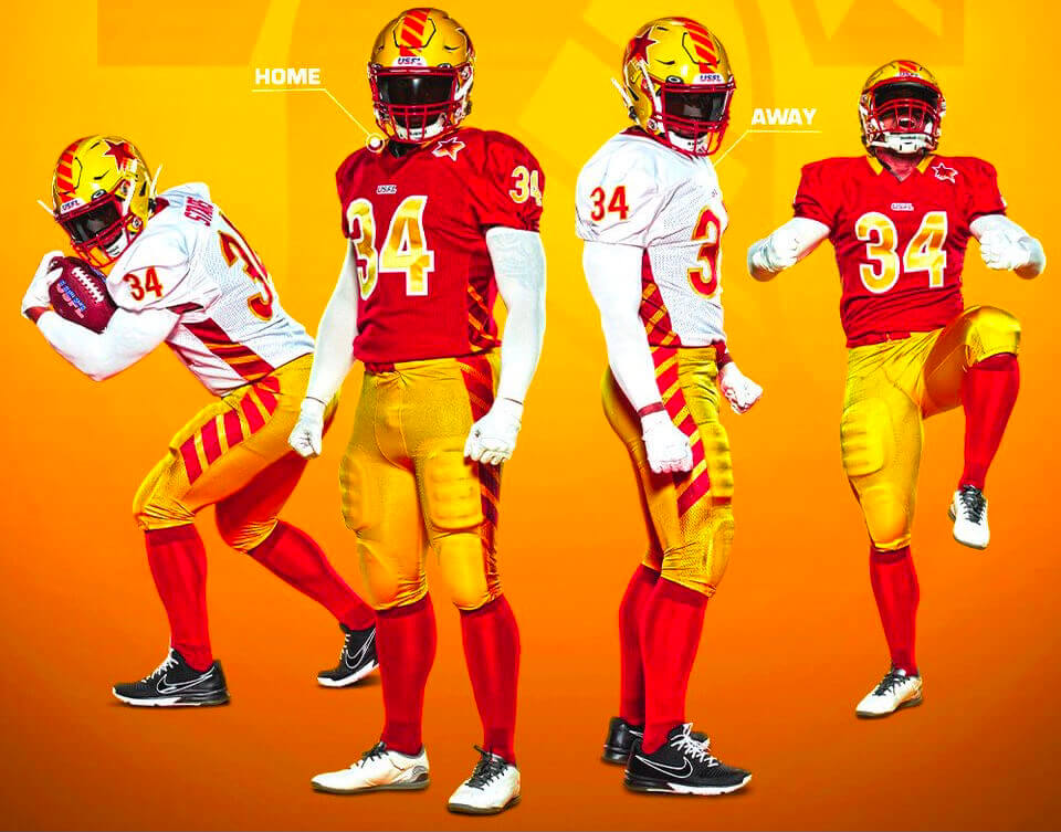
Philadelphia Stars
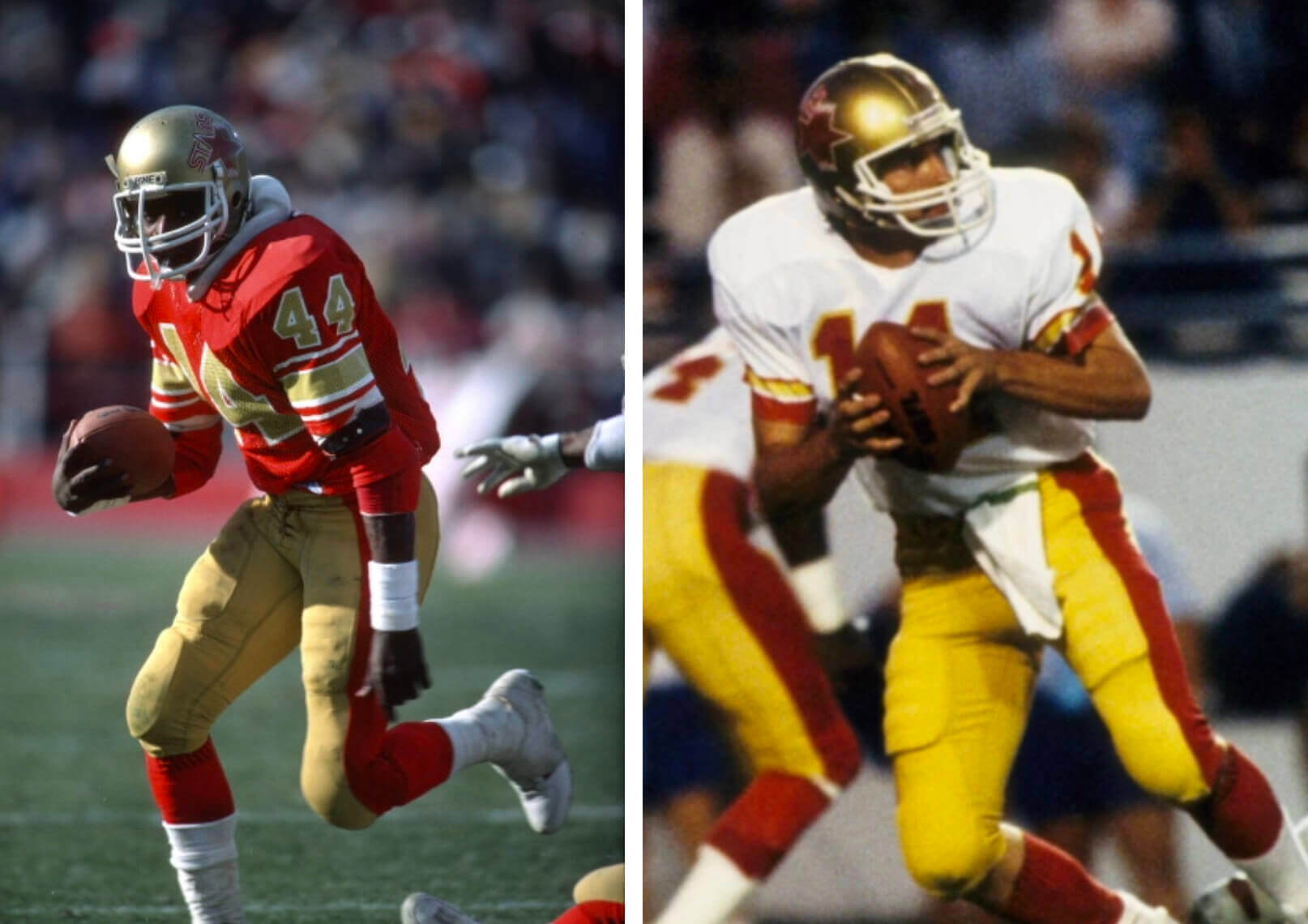
———
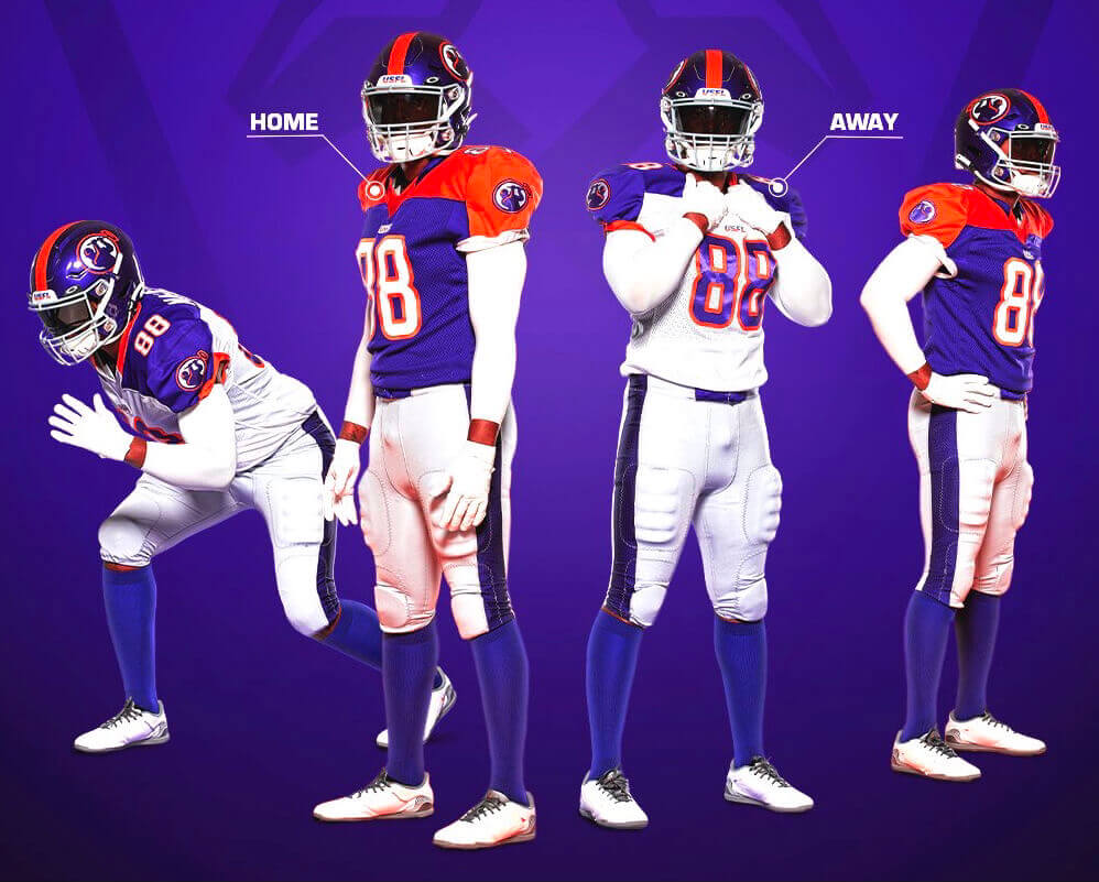
Pittsburgh Maulers
———
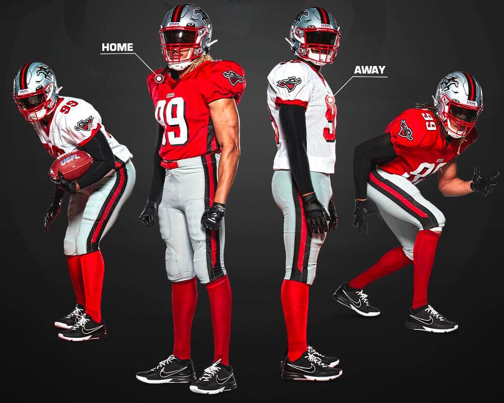
Tampa Bay Bandits
———
Looking at these, several things jump out at me:
• Half of the teams — four out of eight — have a red jersey (and that’s not counting the additional team wearing maroon), which seems like a bit much.
• Only two uniforms per team — home and road (although those designations are pretty pointless because, again, all the games are taking place in Birmingham). No alternates.
• No maker’s marks (!), at least for now. I suspect this is still being worked out and that the manufacturer’s logo will be added before the season starts. (I think something similar happened with the AAF and/or the XFL 2.0, but I’ve already forgotten all the details about those leagues, thankfully.)
• Every jersey has TV numbers, which certainly bucks the current trend in the NFL.
• The jersey fronts don’t feature team wordmarks or logos — just the league logo and the front number. Or at least that’s the case in the unveiling photos — but team wordmarks do appear on the chests of the replica jerseys. Hmmmm — will those retail wordmarks migrate to the game jerseys?
• Not a single mono combo is shown in the unveiling photos (well, except mono-white). In fact, none of the teams will be able to go mono even if they want to, because not a single team has colored pants that match their colored jersey.
• Similarly, there are no same-colored pants and socks, meaning that there’s no leotard effect.
• Number fonts are fairly conventional.
• For teams with center helmet stripes, the striping tape is consistently unbroken across the SpeedFlex helmet’s flex panel, at least in the unveiling photos. (I suppose that could change once the individual equipment managers are on the job.)
The big news, at least from my perspective, is that everything looks fairly traditional, which is not what I’d expect from an upstart league. Of course, some of it also harkens back to the original USFL, which makes sense, but I’m surprised they didn’t update or modernize it more. I don’t mean that as a criticism (on the contrary, I prefer it this way) — it’s just not what I expected.
Overall: Not bad. Not awesome, but not bad. But I think the traditional approach is more notable than the overall good/bad quality of the individual designs. Definitely didn’t see that coming — aren’t they worried about appealing to the youngs? I guess not!
Noticeably absent from yesterday’s unveilings: the officials’ uniforms. That’s significant because the original USFL zebras sometimes wore shorts! Dig:
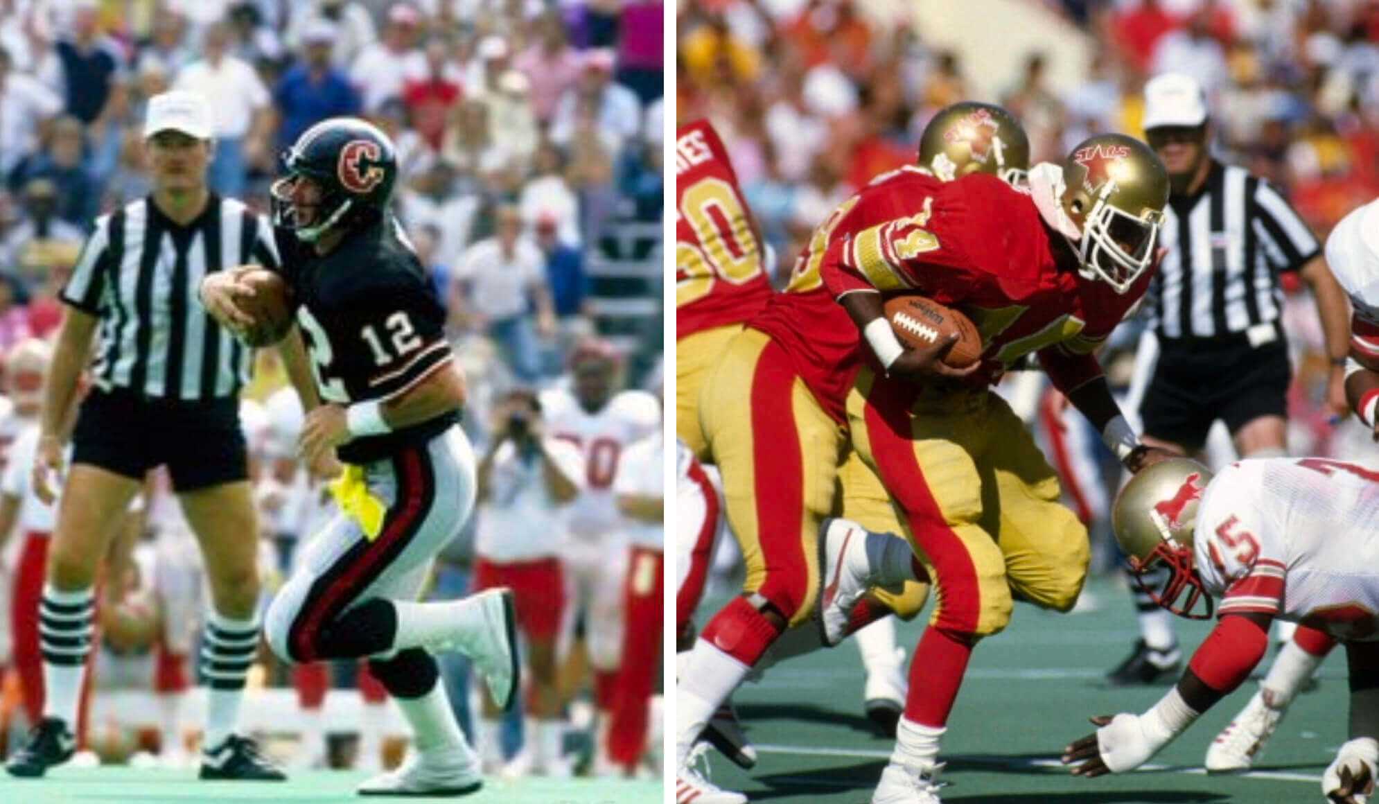
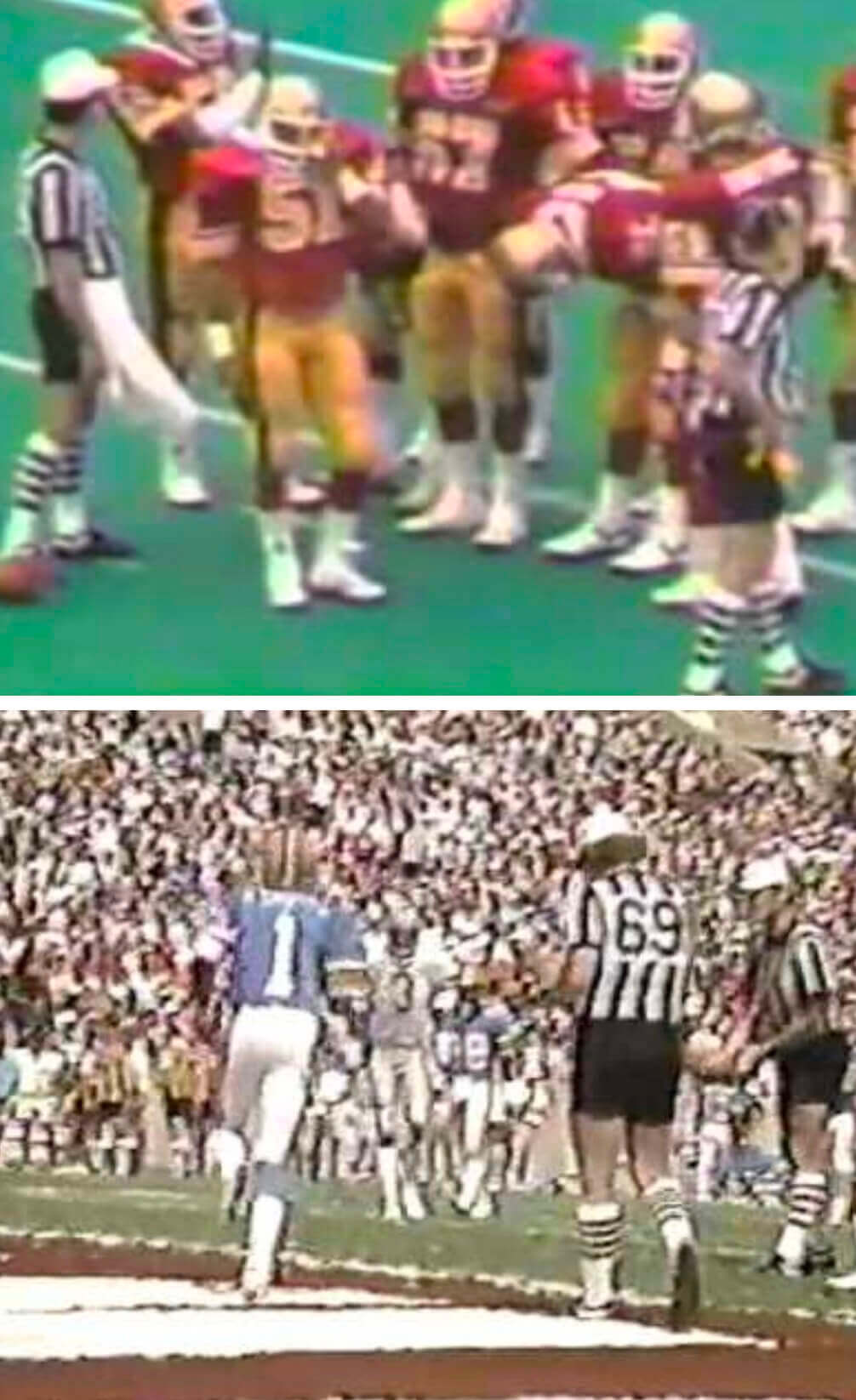
I don’t really expect them to bring that back, but a guy can dream.
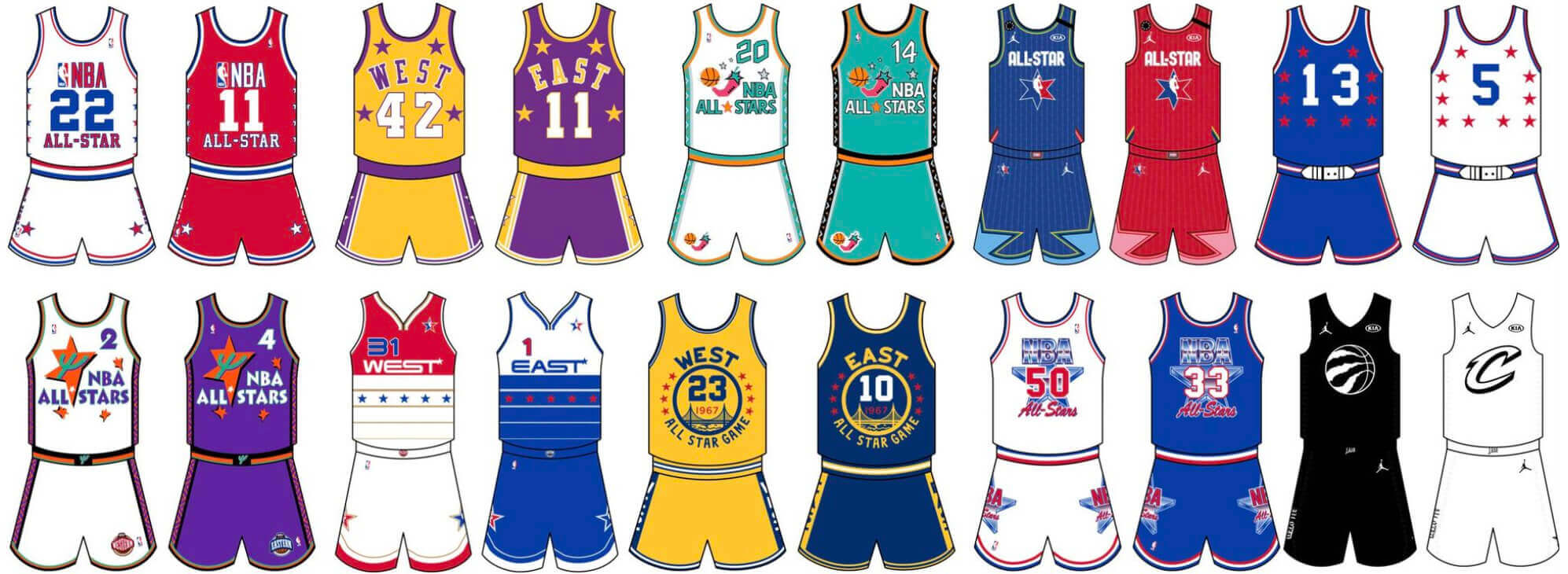
NBA All-Star rankings reminder: In case you missed it on Thursday: The NBA All-Star Game is this Sunday, so my Bulletin article this week is a ranking of the 10 best and 10 worst uniforms in NBA All-Star history.
My premium subscribers can read the article here. If you haven’t yet subscribed, you can do that here (you’ll need a Facebook account in order to pay). If you want more info on what you’ll get for your money, you can find that here. And if the Facebook requirement is a dealbreaker, email me and I’ll keep you posted regarding non-Facebook payment options and possible workarounds. Thanks!
Click to enlarge
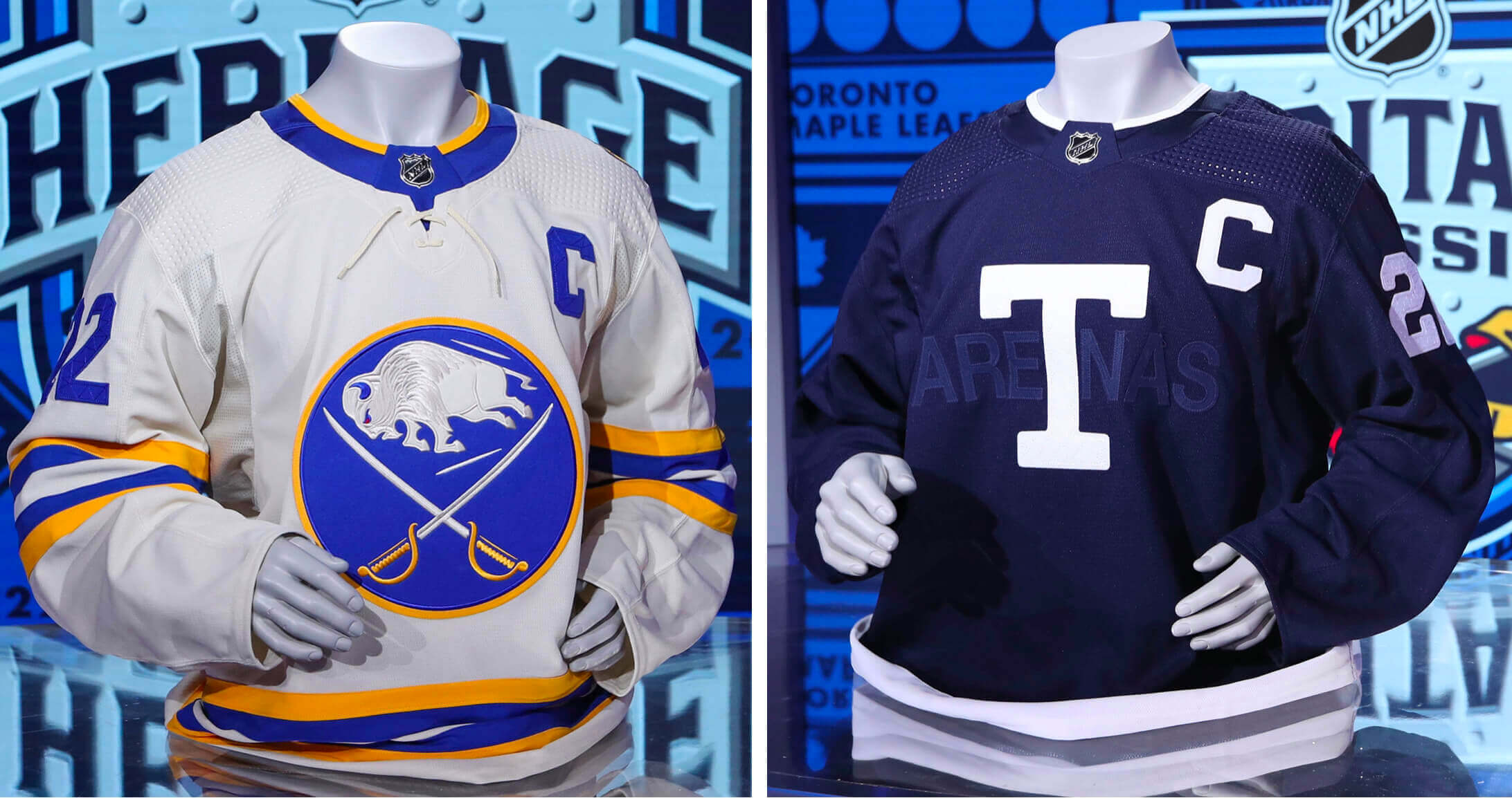
Heritage Classic uniforms now set: The Sabres and Maple Leafs both released the designs they’ll be wearing when they face each other in the Heritage Classic on March 13.
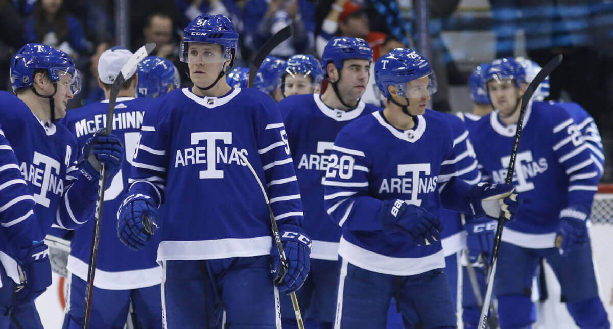
Buffalo’s design, which had leaked a day earlier, is a beauty, although it’s really nothing new (additional photos and info here). As for Toronto’s — no, that’s not a Gilbert Arenas watermark on the photo. The design is a shout-out to the franchise’s early incarnation as the Toronto Arenas, but I don’t understand why the “Arenas” lettering is blue-on-blue (additional pics here). Maybe it’s a nod to former owner Harold Ballard’s infamous ghosted NOBs? In any event, it definitely feels like a step down from the Arenas throwbacks that the Leafs wore in 2017:
And now my regularly scheduled gripe: The Leafs provided photos of the jersey but not the rest of the uniform. The Sabres provided photos of the various uni elements but somehow managed to avoid showing us a single full-body shot. Lame-o.
The Ticker
By Anthony Emerson

Baseball News: Remember Paul’s post last year about the thin batter’s boxes at Dodger Stadium? The newest version of the MLB: The Show video game has updated to reflect that detail. Here’s how the boxes looked in the 2021 version of the game (from Matthew Edwards). … The Springfield Sliders, a team in the collegiate United States Prospects League, are rebranding as the Springfield Lucky Horseshoes. The Lucky Horseshoe is “a local ‘delicacy,’ open-faced sandwich with your choice of meat on Texas toast covered in cheese sauce and topped with fries,” explains David Dahl (also thanks to other readers who sent this our way). … New home unis for Penn State (from Chris Grosse). … Kansas will be rocking the powder blues this year (from Mauricio Gómez Montoya and David Hanson). … Vanderbilt will wear cleats honoring a fallen soldier every Sunday (from Lee Wilds). … Sugar Land, Texas, is auctioning off seats from its minor league baseball stadium that are being removed as it undergoes renovations (from Kary Klismet).

Pro Football News: The Commanders are already looking to update one of their logos, after getting the seasons of their Super Bowl victories wrong on their crest (from multiple readers). … Speaking of the Commies, the Virginia state legislature passed bills this week that could allow the team to build a new stadium. … Staying in Washington, reader Matthew Houk is reading the book I Was With Patton and sends along this photo of General George S. Patton in a self-designed uniform featuring the Washington football team’s gold helmet of the era. … The Titans are “exploring” a new stadium in Nashville (thanks, Brinke).

Hockey News: New mask for Canucks G Thatcher Demko (from Wade Heidt). … Here’s a ranking of all 32 current NHL arenas (from Kary Klismet).

Basketball News: Rapper J. Cole has a line of jerseys for sale that closely mimic NBA jerseys but with the word “Dreamer” in place of the team names (from Kary Klismet). … Strange scenes in Virginia high school girls’ basketball last night, as both Virginia High and Richlands High brought home whites to a neutral-site semifinal. Richlands, the designated away team, was forced to wear Marion High’s jerseys to avoid the clash (from @Sanchize405). … Traverse City (Mich.) Christian High School boys wore throwback uniforms on Tuesday night (from Kary Klismet). … New logo update for the National Basketball Retired Players Association.

Soccer News: New Europa League kit for Barcelona, which FW Ferran Torres promptly debuted sans club crest and Nike maker’s mark during last night’s match against Napoli. Stranger still, Torres changed his shirt at halftime from one that had both logos to the one that didn’t. Torres, naturally, scored Barça’s lone goal of the match (thanks to all who shared). … Philadelphia Union, Real Salt Lake and Chicago Fire are the latest MLS teams to unveil their home kits, while the Vancouver Whitecaps have launched their away kits (thanks to all who shared). … The next two are from Kary Klismet: New third kits for Mexico’s Club América. … Borussia Dortmund is wearing a small badge under its team crest to commemorate the team’s 1,000th game at its home stadium. … Japanese side Sanfrecce Hiroshima has put all of the team’s kits on display as part of its 30th-anniversary celebrations (from Jeremy Brahm). … Also from Jeremy, new kits for the Kuwait national team. … Here’s a soccer rarity: an outfielder wearing No. 1! Winger Jakub Kosecki of Motor Lublin of the Polish men’s third tier has picked that number after signing with the team earlier this month (from Ed Zelaski).
Olympics News: The IOC has offered the U.S. figure skating team Olympic torches in lieu of medals while the doping situation involving Russian skater Kamila Valieva plays out (from Kary Klismet).

Grab Bag: Ferrari has revealed its new F1 livery (from Russ Flynn). … Our own Jamie Rathjen sends along some of the Australian Football League Women’s Indigenous designs for the upcoming Indigenous round. Here are Gold Coast, North Melbourne, and West Coast. … Here’s a study of sleeve patches spotted at the Singapore Air Show (from Michael Mills). … A man recently discovered a Maine Department of Transportation helmet washed up on the shore in Norway (from John Muir).
That’ll do it for me for this week. Enjoy Phil’s weekend content and your long holiday weekend. I’ll be back here on Monday. Peace. — Paul
As a note to the AAF (because I LOVED the Atlanta Legends jersey and bought one right before they folded), they used Starter brand which was a possible big deal if the AAF wasn’t run on a house of cards financially.
Someone already made the Space Force comparison to Patton’s uniform: link
I don’t think those are the new Spring Training caps. I believe they are simply a Spring Training-themed cap that some teams are selling. I believe the actual on-field caps are a 59fifty with a trucker mesh back, but a one-color logo, as seen here:
link
Came here to say this–I don’t think MLB would steer away from the batter man logo on the back of the cap for anything on field, including Spring Training/BP hats.
Ah, you’re probably right – my bad. Will remove.
Crazy that the titans are “exploring” getting a new stadium! Opened in 1999! Ridiculous ! And cmon! A roof ?!!! Please stop with these domes! Football made to be played in the elements ! Changes the way uniforms look! Love some sunshine and grass !
Since the USFL teams don’t play in the cities they represent (for now), I still call them the Portland Breakers :).
If by “Portland” you mean “Boston” I am 100% with you!
LOL. Sorry to see they changed the helmet logo. I love the old one. The new one isn’t bad though, looks more like an actual “breaker”.
I’m a bit surprised and a bit disappointed that they aren’t the Boston Breakers. The name works so much better than NOLA or Portland. I guess the problem is when they start playing in their home markets, there (still) isn’t a suitable stadium in Boston to play in – the same as was the case in 1983!
Nah – they’re the New Orleans Breakers of Birmingham.
I was a kid during USFL 1.0 and I loved the local team (Philadelphia Stars), nice to see some version of spring football come back.
In general, I am impressed with this unveiling. They should a lot of restraint in the designs, which is sadly in short supply these days. More than that, each of these looks are reasonable updates and you can see a lot of continuity, like if the league had stuck around, these are all logical evolutions of what these teams would be wearing decades later.
I do miss the Oakland Invaders though. That was a unique color scheme and great logo.
MJ —
The USFL was the genesis for my love, and attention to detail, for all things sports uniforms. I was 14 in ’83. Perfect age to get into it.
My U-W membership card is proof.
I also still have the ticket stub from the aerial show, “The Greatest Show No One Saw” between Young and Kelly at the LA Coliseum. Well, I saw it! LOL.
Finally, I still have all the championship games on Beta, too!
Loved Philly’s team. Bryant and Fusina and Eatman and Lane and Mills … Go Stars!
-C.
In lieu of the Maulers, I would have revived the Federals.
Add a little green/white in this league with (mostly) red/dark color schemes, and having a bird-themed logo in the mix wouldn’t hurt, would it?
Plus there’s probably a good number of football fans in the DC market these days who are ready to explore other rooting interest options.
There is gossip at the Youtube spring football news sites that the USFL and XFL have quietly coordinated where their markets will be. So the XFL abandons Houston and Tampa Bay, but retains Washington, etc.
The Vancouver Whitecaps home and road looks are now as close to looking like the old 1979 NASL team that won the Soccer Bowl as they have been since the MLS team started. A modern take of course.
The disappointing part is that this should permanently stay as the home and roads, but MLS rotates in a new kit every year in a rotation. So they will be forced to change what should stay their regular look long-term.
Mentioned this really late yesterday: The Stallions’ video clearly shows a tan set of pants (this would track with their former set), but the still photo only shows white. Strange. Also, the Gamblers have what is obviously two sets of pants in varying greys, but am I seeing things, or do the Panthers also have pants that are subtly different home vs away? It appears clearly to be the case in the current set’s photo, but the photos of the prior uniforms also seem to show that (squint to see it).
The Gamblers appeared to be wearing the Bandits pants with their white jerseys in their photos. In the group pics at the top of today’s entry they are wearing the darker grey pants with both jerseys. Perhaps their darker grey pants weren’t ready yet when they photographed those pics?
The Panthers pants do look different with each jersey, but I am assuming that is just because of lighting differences between the two photo shoots? Seems as if they are attempting to match the gold from their helmet, but as Paul often notes, “metallic” football pants rendered onto modern materials tend to show up very differently in different situations.
I didn’t see the Stallions video, but I can only assume that they will ultimately only have the white pants as shown in the photos.
I think even the original Panthers had trouble clarifying what their shade of “champagne” actually was.
I suspect you’re right about Birmingham’s pants. The need to distinguish it from Philadelphia is too great.
I think the inclusion of TV numbers and lack of makers mark are related. On new NFL uniforms nike seems to be actively using sleeve space to have their logo be prominent in that space, limiting options for including both the swoosh, as well as numbers and stripes/team logo. Additionally, I wouldn’t be surprised if the NFL is slowly phasing out TV numbers to make space available for ads.
While we do all rag on the spring football leagues, it did seem XFL 2.0 might have been able to find a niche. They did some innovative stuff with the rules and having watched a few games it was a decent enough product. They had the misfortune of starting up during the start of the pandemic. Not saying they would have succeed if not for the pandemic, but from what I saw it was a better product than other spring leagues.
I think the inclusion of TV numbers and lack of makers mark are related.
Only if you assume the maker’s marks would be on the sleeves. Aside from the NFL, they’re almost always on the chest.
3.6 roentgen, not great, not terrible
Wow, that Commies story… roman numerals in reference to Super Bowls is considered IP by the NFL and won’t let teams use them in logos. How many decades until they’re just called NFL numerals or “Super Bowl numbers”?
Re: USFL uniforms. I agree that the new unis are decent but nothing great. Seems like an awful lot of work for a league that most likely won’t see Season #2.
I’d say the best IMO are the Stars. The worst is the Breakers.
“Long Holiday Weekend”? Are there really that many people taking today offf to observe National Battery Day?
link
Titans “exploring” the idea of a new stadium !! Opened in 1999! Crazy! And the talk of a roof! Anyone else getting annoyed with the constant talk of domes just at a chance to host one super bowl?! Football made to be played in the elements ! Changes the way uniforms look! Need that sunshine and grass!
I guess it goes to the expected lifespan of the stadium, its 23 years old now, and if you assume it will take at least 7 years to approve, fund, design, and build it it would replace a 30 year old stadium. While Nissan Stadium isn’t bad, Owners want more premium seating to earn more money off of each game, more integrated tech and just to keep up with the (literal and figurative) Joneses.
For example Three Rivers Stadium lasted 31 years before Heinz Field was built.
As far as the dome part goes, while I agree football is better outside a dome increased the ability to have concerts and other events year round, and not just for ~8 months out of the year.
What is really odd is they are citing structural concerns. I can understand that a stadium becomes dated for use during 20 to 30 years as the market and demand for how people want to view games live changes. However it seems crazy to me that the physical stadium itself seems to be nearing the end of its useful life.
You have MLB ballparks that are 100+ years old. The Superdome and Joe Robbie (Miami) Stadium are 22 and 13 years older than the Titans stadium and managed to get by with renovations rather replacements. Something isn’t right if the stadium is physically nearing its end of life.
I absolutely love the squiggly number reinforcement on the Leafs jersey. A nice historical detail from the old wool felt numbers that was just waiting to be used.
Also, since it’s just faux quilting (i.e., just decorative), it’s also an excuse to use the great word “skeuomorph”!
IMO Dreamers set has pretty much the best version of each of those teams’ jerseys! (Except Golden State; prefer the one with the trolley but this one is still cool.)
It certainly appears that the road pants for the Gamblers are the exact same pants that the Bandits have for both home and road. Same stripe, colors, everything. I know there’s a lot of red teams but that seems especially lazy on behalf of the design team.
On second look, I *think* the home pants for the Bandits are white, as compared to the very light grey. The road pants are still the same, though.
No, the Bandits’ pants are all gray.
The photo above shows the darker gray Gamblers pants with the road jersey. So it appears for some reason the model for the Twitter photo had to wear the Tampa Bay pants with the Houston road jersey.
It’s worth noting that the CFL also expanded into the US, only to see that attempt fail as well. I think it deserves half credit.
In the list of non-arena pro football leagues, you missed the FXFL, which played in 2014 and 2015, and the Spring League, which played from 2017 through 2021. Both of these leagues were founded by Brian Woods, who then acquired the USFL trademarks, and is now that league’s president. So the Spring League would be the only one to go beyond three seasons.
While the Spring League had all teams in hub locations and did not assign any city names to the teams, the FXFL had teams playing in their home locations. The New York team was the Brooklyn Bolts, who played at the Brooklyn Cyclones’ park.
link
Actually, the Spring League was not pro — players were not paid. That’s why I didn’t include it.
My bad for forgetting FXFL.
The USFL trademarks originally ended up with the A11FL, a league that Paul mentioned above (but did not actually play even a single game). Woods got them (and the A11FL’s new trademarks) in turn, but only used a few in the Spring Football League – including the Austin Generals!
He definitely worked out a formula for low-budget, no-attendance football, and then got Fox to take over and move it up a level.
Kinda wish the USFL teams were playing in proper home markets. I’m sure there’d be a nostalgia factor bringing some interest to the Panthers, who won one more league championship in their 2 seasons than the local NFL team has won in the past 64!
(I should be nice to the Lions, there were some signs of optimism this year… but it’s tough not to be jaded by decades of “S.O.L.”.)
On the Heritage Classic unis: Leafs look alright; as far as the Sabres go, I’m disappointed by a decent design being affected by being Yet Another Off-White Hockey Jersey.
When Fox negotiated stadium and housing rights with the City of Birmingham, it informed it that in 2023 there might be up to 4 teams still in Birmingham. But it is known that the teams are being prepared to be sold off to individual groups in the home cities. Presumably 4 of those are already spoken for but unannounced. So it’s like MLS which started as single-entity but tried to sell its franchises off over time.
Someone on twitter called the Birmingham Unis “Faux-ty Niners.”
After seeing the logos, I had quite high hopes for the USFL2 unis and they haven’t disappointed! Sure I’d like to tweak them a bit, but they at least have stayed pretty true to the original team looks and colours. And of all the comments on Twitter I only read a few that were complaining about the lack of mono-colour or saying they weren’t “modern” enough. I hope the NFL takes note – but they probably won’t!
The problem is, the original USFL was way overloaded with 1980s-favorite red, black, gold and silver. Honoring the original colors sticks the new USFL with the same problem in a less appropriate era.
This is why I’m willing to get used to the blue-gray Gamblers pants. The original Gamblers uniforms were a bit dull except for the shiny silver pants, but it seems current uniform fabrics don’t do metallics very well. Better to go to a unique blue-grey instead, rather than any approach that would make them look even more like the Texans. On the other hand, a team called the Gamblers has to wear lots of black and red, doesn’t it? Ditch that boring G logo for a roulette wheel or four aces.
The side panels are across the board the worst “modern” touch.
My brief assessment of U.S.F.L.I.N.O:
Stallions: Wonderful balance of colors, though horse head logos are a dime a dozen. Guess the Stars didn’t need ‘their’ stripes back.
Gamblers: A few mis-steps with the modernization. Removal of the helmet and sleeve stripes? Ok, so then why not got with plain pants too? Side panels were not necessary (are they ever?).
Panthers: Really good update but for the truncated sleeve stripes on the away jerseys, the stripe pattern on the homes (swap out that lone burgundy stripe for blue), and the white panther eye on the helmet. A few tweaks away from terrific.
Generals: While I’ll miss the royal blue, these are the most ‘big league’ looking of the bunch.
Breakers: Beautiful balance of both blues. I’d like these more had they returned to the original helmet design.
Stars: The one team that they should not have messed with…and what a mess they are! Yellow helmets? Red facemasks? Silly striping? Side panels? A front jersey logo? Nice number font though…whoopee.
Maulers: Frankfurt Galaxy, anyone? The gray facemasks (a nod to the past) would fit better if they had matching pants.
Bandits: A downgrade from THE Ohio State Bandits. An update that seems dated.
Looking at the old Bandits’ uniforms, and I have to ask, “Who went to Ohio State?” Looks like they stole the Buckeyes’ uniforms and slapped a decal on the side of the helmet.
The Panthers’ uniforms were and are about the best in the league, and maybe all of football. I think the new ones are a slight downgrade, because of the changes to the helmet (I mean, a panther is SUPPOSED to be dark, right?) and the pants don’t really match anything else (helmets and pants were a champagne tint originally).
That USFL photo is awful. Would it have been that hard to have the players line up in the same order for the home and away versions?
Also, four out of the eight teams have red home jerseys is pretty lame.
My dad, brother, and I all think that the Bandits sleeve logo looks way too much like the logo for the A ball Quad Cities River Bandits. I don’t know if it’s to cease and desist level, but it is noticeable.
Quite a few teams have had logos in that same vein:
link
Wonder how Philadelphia fans will take to having a red Cowboys star on the helmet. The old logo with “STARS” on it was just fine.
Just speculating here, but it may be that the Dallas Stars have ownership of that ‘wordmark above a star with a point serving as the A’ design?
And, they could NCAA regionals or Final Fours.
And, maybe it boosts attendance for music city bowl
And, could hold concerts year round.
Not saying it’s worth it but it would be for more than just one game
With the exception of the Maulers and Stars, each of these USFL uniforms looks more like an NFL uniform than anything Nike has come up with in the last decade.
The Gamblers’ set looks hilariously amateur, the Panthers’ colours are all over the place – particularly with their Cowboy-esque mismatching gold tones (not a comparison to be proud of), the Generals look like a CFL team, the Breakers are just bad, and the Bandits look like an NCAA team.
The Stars and Maulers are indeed terrible, so that leaves the knock off 49ers. Safe to say I don’t see what you’re seeing.
Panthers featuring the return of champagne silver to a colour scheme, which looks a bit more like champagne gold this go around.
About the General looking like a CFL team, sub in black trim instead of the blue trim, give these to the Calgary Stampeders to use and put their logos on. I would be ecstatic.
The USFL database made a crucial mistake on the Los Angeles Express’ helmet logos. The motion lines always pointed toward the back, so they used two sets of stickers.
I know you have to take “NHL Arenas Ranked” articles with a grain of salt, but this one is way off. To rank MSG ahead of T-Mobile/Las Vegas which I was just at least week is crazy.
Think more along the lines of every arena opening at the same time, then rank them. MSG would probably rank near the bottom. But as well, original 6 rank in 4 of the top 5 spots so I know where the writer is coming from.
It was an incredibly lame ranking exercise. It was like someone starting a major essay 9:30 pm the night before it was due
Re: “the reimagining of the Chargers as the Los Angeles Surf and gave them a helmet very similar to the new Breakers helmet”, that design was still a very close copy (even down to the color line-up) of the logo of the California Surf of the NASL…
Bruce! Always good to hear from you, buddy. Eat ’em up!!
Milwaukee Admirals will be the Milwaukee Fish Fry for a weekend in March.
link
In terms of old USFL, I think the biggest thing it had going for itself was the quality of the uniforms, so it’s not surprising FOX is trying to capitalize on that nostalgia. The Michigan Panthers uniform always stood out for me due to the unique colors. In these fringe leagues there can be a look that transcends the fringeness of the league. In arena football it’s the Iowa Barnstormers, in the WNBA – the New York Liberty in my opinion, i.e. the use of the light green color, I can’t think of any others?
The ABA Nets stars & stripes.
The Minnesota Fighting Saints of the WHA.
The Pittsburgh Maulers uniform has strong Frankfurt Galaxy vibes:
link
The thing I always liked about USFL uni’s is they seemed to be the last hurrah for sleeve stripes. A lot of northwestern variances along with some unique patterns like the Breakers. Memphis basically had red Dallas Cowboy jerseys while LA added thin red lines to their Cowboy knock-offs! At least they kept the classic Michigan Panthers stripes, but I wish more sleeve stripes from the origional USFL were revived.
The Generals and Breakers uniforms are the ones I like the most.
Also, XFL 2.0 is supposed to come back next year 2023.