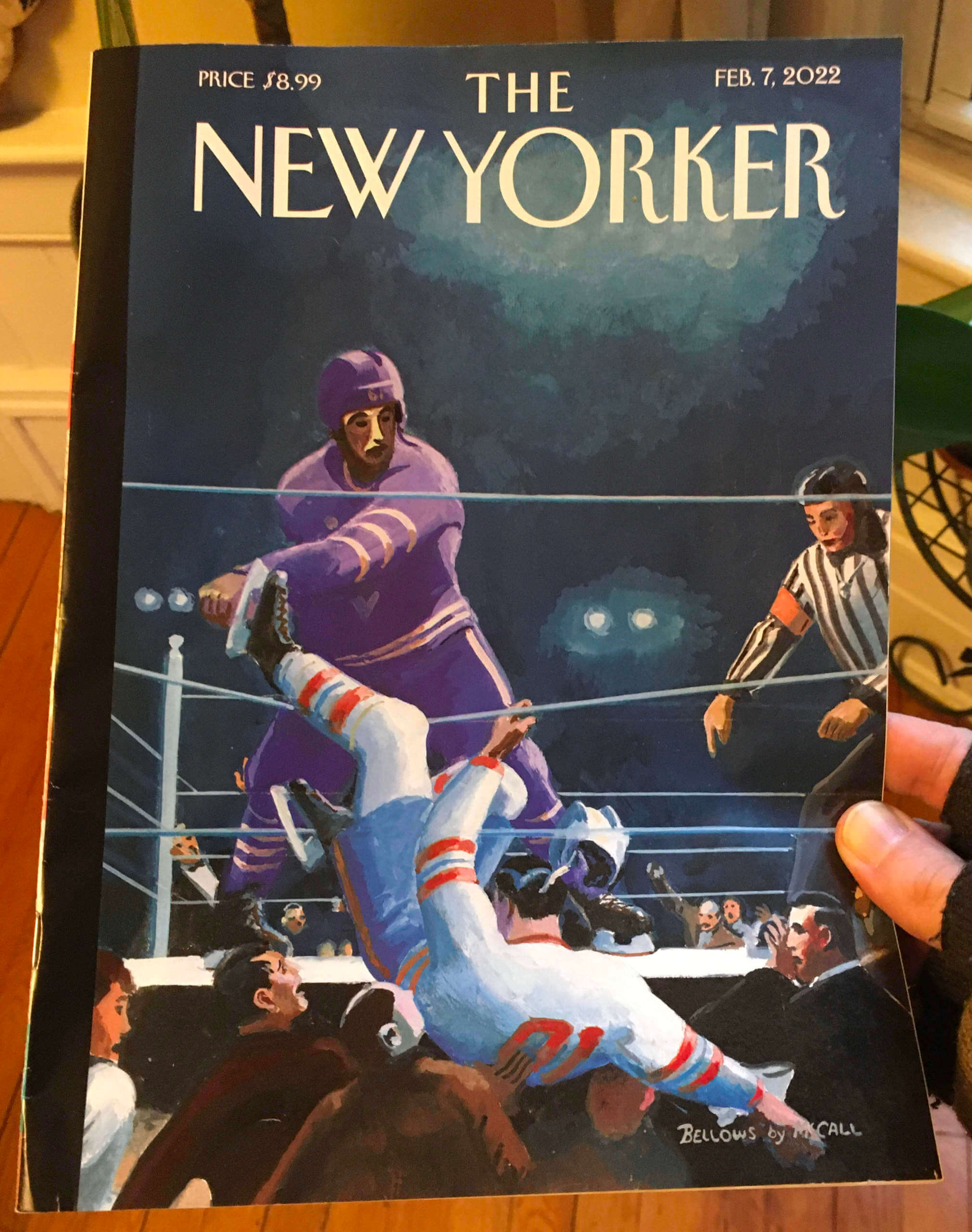
Click to enlarge
At first glance, the cover of last week’s issue of The New Yorker, by longtime magazine illustrator Bruce McCall, seems like a fun but weird image of hockey players fighting in a boxing ring. Okay, hockey is violent, there’s that old joke about going to a boxing match and a hockey game broke out, and so on — we get it.
But there’s more to it than that. The cover illustration isn’t just a random composition — it’s a take-off on a famous 1920s boxing painting called Dempsey and Firpo, by the artist George Bellows (click to enlarge):
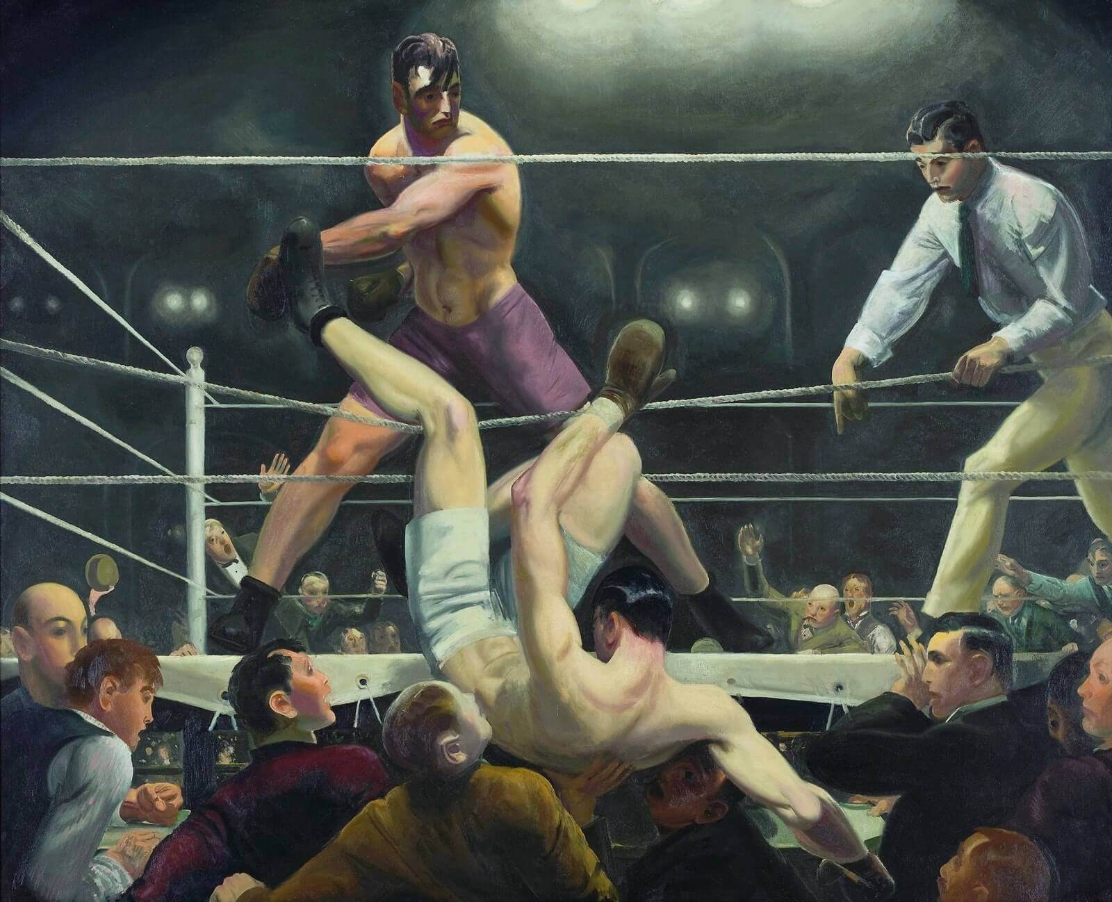
The Bellows painting was based on the 1923 world heavyweight title bout between Luis Firpo vs. Jack Dempsey. Firpo knocked Dempsey out of the ring during the first round (although Dempsey would ultimately win the fight), a moment you can see at the 2:35 mark of this video:
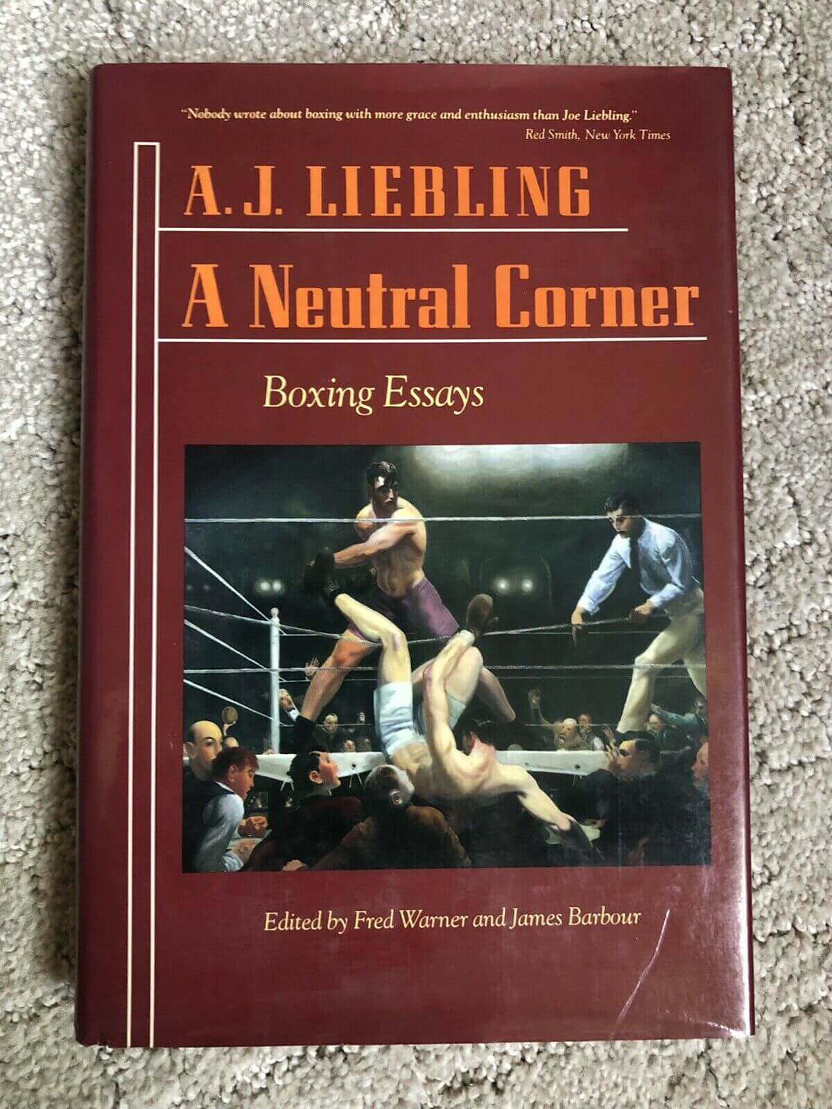
I first saw the Dempsey and Firpo painting in the late 1980s, when a friend gave me a copy of the A.J. Liebling boxing anthology A Neutral Corner as a birthday present. The book had the painting on its front cover:
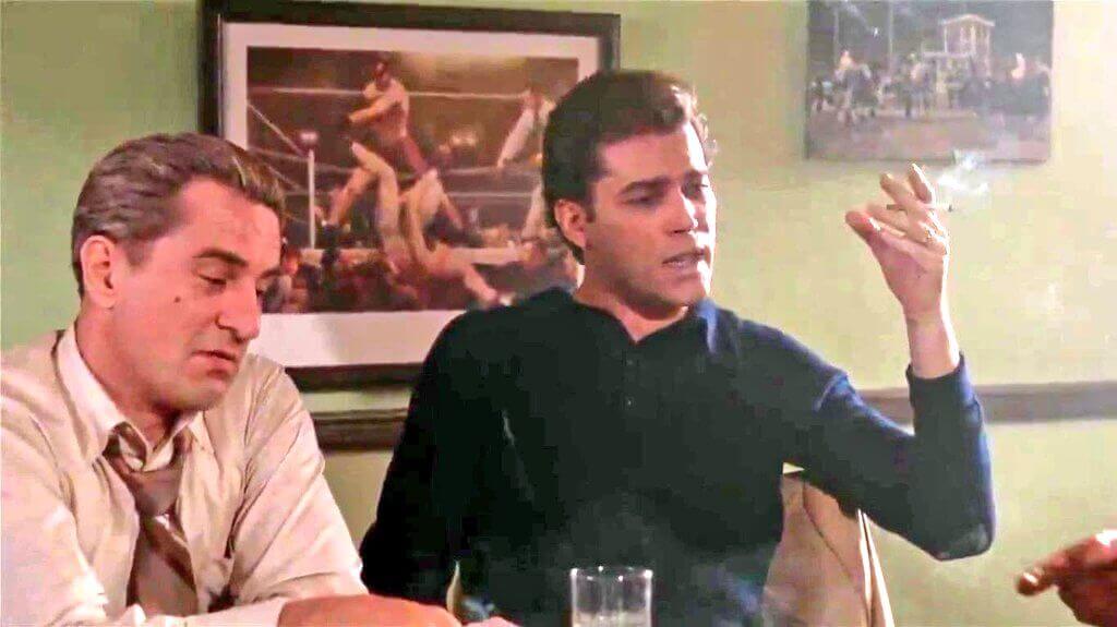
At the time, I didn’t realize that the painting was famous or iconic, but it has since showed up several times in pop culture. For example, it’s in the background of a scene in Goodfellas:
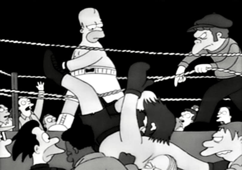
There’s also a boxing-centric Simpsons episode, “The Homer They Fall,” that includes a scene inspired by the painting (with Moe playing the ref!):
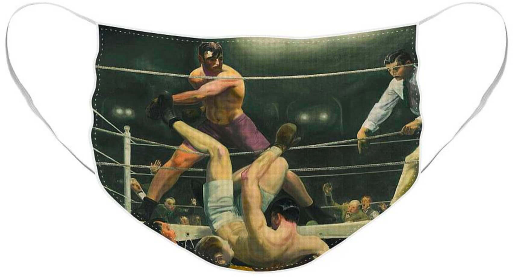
While researching this blog entry, I discovered that you can even get the painting on a Covid mask!
———
Okay, with all of that background in mind, let’s look again at the New Yorker cover:
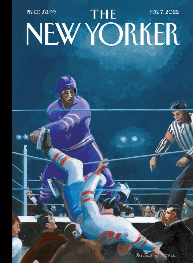
It’s clever on several levels. I love the idea of transforming the ring into a rink, and I also love that McCall (the illustrator, who’s Canadian and a big hockey fan) has given the ref an old-school jersey instead of the current design. Also: Boxers wear gloves when they fight, but hockey players drop their gloves to fight. I kinda wish the illustration showed their discarded gloves on the ring/rink surface.
There aren’t many pieces of art that involve Jack Dempsey, Homer Simpson, Martin Scorsese, and The New Yorker! It’s hard to think of another sports painting — much less another boxing painting — that’s turned out to be this influential. Can anyone else think of any?
Click to enlarge
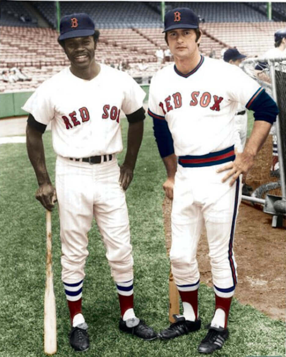
Another MLB prototype: Reader Steve Simons sent along this 1972 photo of Yaz wearing a Red Sox prototype pullover/sansabelt uniform. The Sox did go pullover/sansabelt during the 1970s, of course, but with different collar trim, sleeve trim, belt colors, and pants piping. Here’s a side-by-side comparison — the real thing on the left, the prototype on the right:
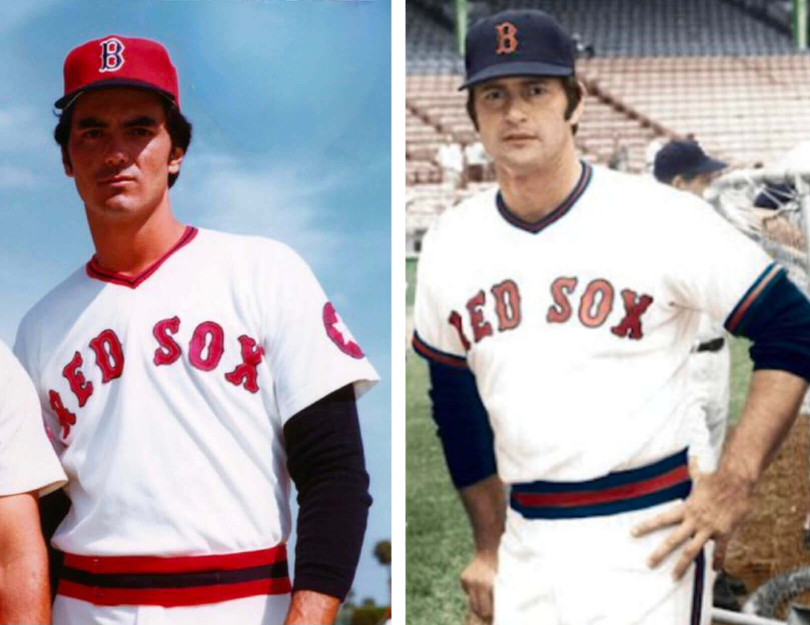
The prototype, interestingly, is closer to what the Angels wore during that period. Intriguing!
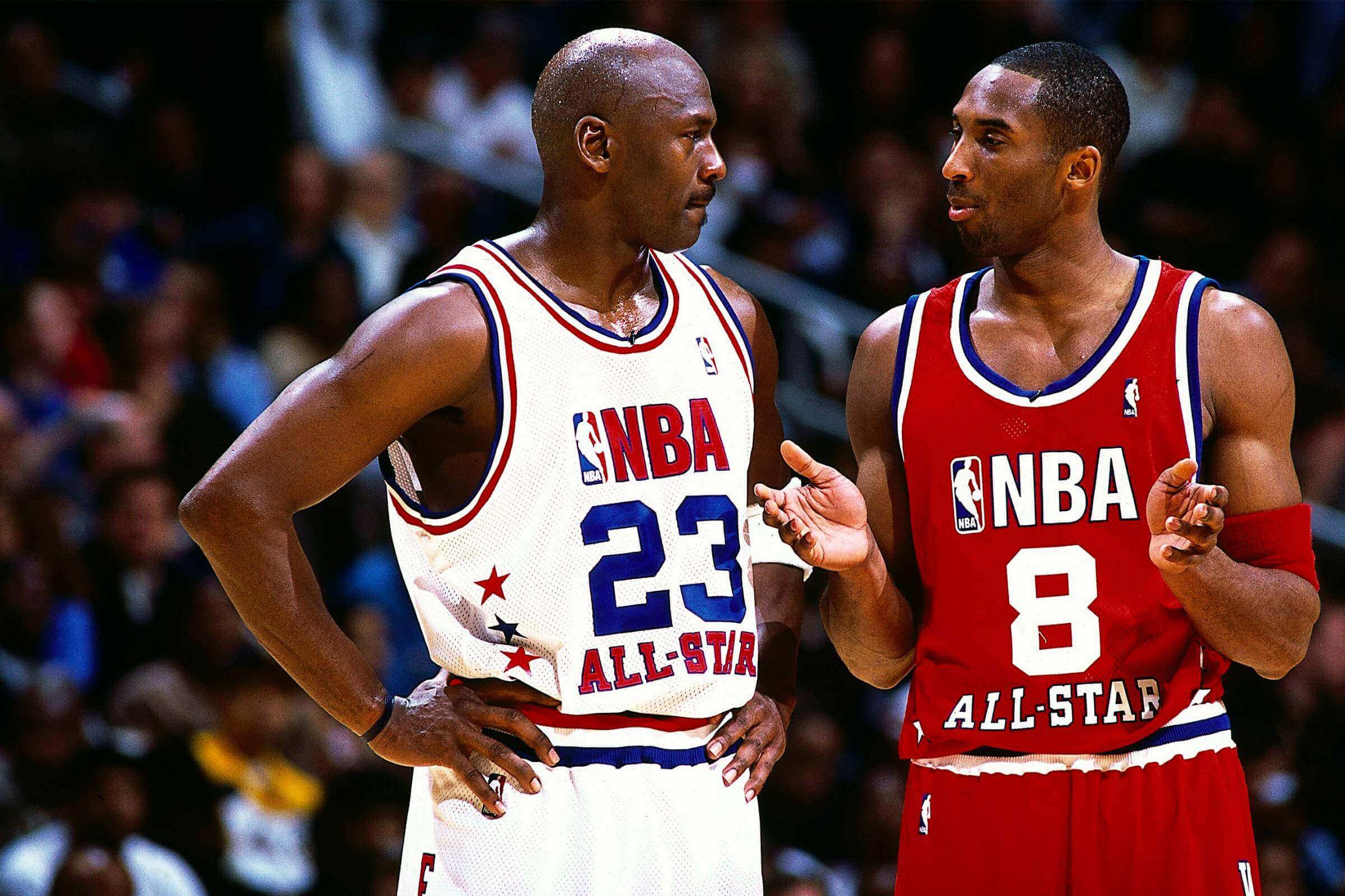
NBA All-Star-O-Rama: With the NBA All-Star Game coming up this Sunday, my Bulletin column this week will be a ranking of the 10 best and 10 worst NBA All-Star uniform sets.
This column will be available to my Premium Subscribers tomorrow morning. If you haven’t yet subscribed, you can do that here as long as you have a Facebook account. If you’re interested in subscribing but the Facebook account requirement is a dealbreaker, email me and I’ll let you know when other payment options or workarounds are available. Thanks!


ITEM! Membership/magnets raffle: With the NASCAR Cup season starting, reader Chris Hickey is generously sponsoring a raffle. The lucky winner will get a membership card (preferably based on an auto racing paint scheme) and a pair of Uni Watch magnets. “My winged stirrup magnet has been on my ride about two years now,” says Chris. “The colors haven’t bleached out and it hasn’t peeled off at the car wash either. Now that’s quality!”
This will be a one-day raffle. No entry restrictions. To enter, send an email to the raffle in-box by 8pm tonight. I’ll announce the winner tomorrow. Big thanks to Chris for sponsoring this one!
The Ticker
By Lloyd Alaban

Baseball News: Free agent P Matt Harvey, testifying under oath yesterday, admitted that he used cocaine during his time with the Mets, which may explain this 2013 Uni Watch post about him getting a nosebleed on the mound. … The Astros’ spring training cap has leaked (from Ignacio Salazar). … So has the Mariners’ cap. … The Amsterdam Mohawks of the Perfect Game Collegiate Baseball League will be wearing flag desecration unis several times this season (from Dick Holbrook). … New unis for Stony Brook (from John Carpenter). … New 100th-season logo for Arkansas (from Matt Snyder). … Franklin is the new official batting glove supplier for Boston College.

Football News: Some social media moves by the Cardinals have convinced some fans that the team is getting new uniforms, though nothing is confirmed (from our own Phil Hecken). … WWE is giving the Rams a custom WWE Championship belt to celebrate their Super Bowl victory (from Kary Klismet). … This USFL commercial provides a sneak peek of the Houston Gamblers uniform (from Ignacio Salazar).

Hockey News: The PHF’s Metropolitan Riveters will celebrate Black History Month by wearing alternates with a Black version of Rosie the Riveter (from our own Jamie Rathjen).

Basketball News: Cincinnati and Memphis men’s went throwback vs. throwback last night (from our own Alex Hider). … Missouri released a bobblehead of former SF Michael Porter Jr. wearing a jersey he never actually wore in his three appearances for Mizzou (from Briar Napier). … A youth hoops team in Iowa City, Iowa, has a jersey based on Golden State’s “The City” design, complete with a depiction of a bridge. The thing is, Iowa City does have a notable bridge, but it looks nothing like the one on the jersey (from Ted Taylor). … Something to keep an eye on when the Suns play the Warriors on March 30: Based on their current rosters, each team could put five guys on the court wearing Nos. 00, 0, 1, 2, and 3.

Soccer News: Big day for MLS unveilings yesterday, as the Seattle Sounders, New England Revolution, Austin FC, Portland Timbers, and Colorado Rapids all released new kits. … A recent Paris Saint-Germain kit-reveal photo has F Lionel Messi’s shoes obstructed by a sign. Messi has a footwear deal with Adidas while PSG is outfitted by Nike/Jordan, which likely explains why his Adidas boots are covered in the photo (from @Coach_KT).

Grab Bag: New livery for F1’s Williams Racing (from @RussFlynn_). … New costume for Supergirl, along with a uni history (from John Cerone). … The rest of these items are from Kary Klismet: Cross-listed from the football section: WWE is giving the NFL’s Los Angeles Rams a custom WWE Championship belt to celebrate their Super Bowl victory. … AlphaTauri Formula 1 team drivers Pierre Gasly and Yuki Tsunoda unveiled new helmets for the 2022 season. … New look for Fullerton College’s mascot in California. … Dothan High School in Alabama has unveiled a statue of its wolf mascot. … Sikh soldiers in India can now wear a helmet designed to fit over their religious headwear.
That boxing story is also brought up in the movie Rocky. When Mick goes to Rocky’s apartment to ask to be a manager he tells the story about how he knocked an opponent (he uses a slur so I won’t quote it) out of the ring the “same night Firpo knocks Dempsey out of the ring” but Dempsey got the publicity because he had a manager.
Such a terrific exchange with many memorable lines…while Stallone’s explosiveness toward the end steals the scene, but Meredith’s performance was truly masterful.
Balboa’s matter-of-fact answer as to the ‘real’ reason why Dempsey got the publicity was probably the right one.
The way Mickey barely audibly sighs the f-bomb at the end of that scene might be the best use of the word in cinema history.
I really liked a number of the spring training/batting practice caps from the last few years, which I recognize is an unpopular opinion. I thought the designs for the Blue Jays, Tigers, Twins, and Phillies were especially good. There ere also many designs that were pretty bad. But most of all I liked the material the crown was made out of. It’s really comfortable!
That said, if MLB/New Era is going all trucker-mesh caps with this year’s versions, I want no part of that.
On-field mesh trucker caps? No thanks. But if there’s no spring training, then there won’t be spring training caps, so, um yay? The owners have shut down the sport for the indefinite future, so you’d think the first thing they would do is cancel the order for equipment they have no intent of using.
Hi R. Scott,
I think there will definitely be a spring training, but it would be shortened and delayed. But the players will definitely need three or four weeks to get ready for games. Hopefully sanity prevails at some point!
Mesh caps remind me of the Reds spring training look during the Marge Schott era – a connotation that just screams “cheap” to me.
Looking forward to seeing MLB and New Era charging $40 for trucker hats.
If poker is a sport, then the “Dogs Playing Poker” painting might qualify as the most influential sports painting.
I was at the game in 1972 when the Red Sox rolled out the knit uniforms. It was a complete surprise as they didn’t announce it and in the pre-social media days there was no leak. My first impression: This doesn’t look right.
Also it’s interesting that noted curmudgeon Yaz agreed to be the model for the protptype.
The Red Sox prototype looks much better than what they ended up wearing. The darker color should always be on the outside on that piping scheme.
Leroy Nieman was famous for his sports paintings although I don’t know if any are iconic. Also, why do teams allow 0 and 00 to be worn? 00 is not a real number, it’s imaginary.
Well, strictly speaking, the square root of negative one is imaginary. Maybe 00 is fictional? But, yes the notion of padding with zeros to the left for only one of the ten single digits is bad protocol.
The purpose of uniform numbers is identifying the player wearing it, not performing mathematical calculations. Sure, mathematically, 00 is the same as 0. I suppose you could use 01 and 02 as sports numbers, as well as letters and other characters like !@#$%^&*().
Let us not forget Benito Santiago: link
And a short video on why he took 09
link
Looks like the Portland Timbers took the NWSL Thorns black/red rose kit and swapped it for pink/red.
Can’t blame the men’s league for copying the women’s league as the NWSL kits are so much better than the MLS kits.
I think the NWSL also started the trend of calling new releases “The ________ Kit,” the blank being something marketing fills in. That’s where I first remember seeing it. Four of the five MLS teams here did that, and the Sounders gave it a name but seem to have left off “kit.”
FYI, Paul. Any link to the Denver Post cannot be viewed as the site is now fully paywalled.
I contacted the Post when I was blocked by a screen indicating I had reached my article limit after not having visited the site in weeks (I used to live in Denver and my daughters still live in Colorado).
The Post responded, indicating the article limit is zero (which isn’t a limit; it’s a restriction) and then pitched me on a subscription.
New link now swapped in:
link
Found a site that looks to be a bit of a “go to” for Soccer kit around the world.
link
Has all the 2022 MLS Kit posted. No paywall.
Geez, that bit about the Cardinals possibly getting new uniforms just about gave me a heart attack, until I saw it was in the football section.
I saw the New Yorker cover yesterday on a newsstand. Not recalling the Firpo-Dempsey painting, my first-glance impression was that it was a Rockwellian parody of the iconic Ali-Liston knockout photo. But that’s because to me there are far more iconic sports photographs than iconic sports paintings.
The easy go-to sports painter is obviously Neiman, but the New Yorker went deeper, which is good.
An illustration based on the Ali/Liston KO photo has also been the basis of a Uni Watch post! Here:
link
Harvey’s cocaine nose, allegedly, is a bit of a wow.
Another Bellows boxing painting, “Stag at Sharkey’s,” is one of my favorites at the Cleveland Museum of Art. Wasn’t familiar with “Dempsey and Firpo,” though I’ve certainly encountered some of the pop culture references before.
I’ve always been intrigued by the way the New Yorker chooses covers. They’re obviously often related to current events, but then there’s one like this featuring an homage to a 100 year old painting using hockey players? Good stuff.
Here’s Buffalo Gap High School in Virginia, using a repurposed Buffalo Sabres logo as their mascot:
link
-Jet
A great piece of athletic art is the Greek bronze usually referred to as Pugilist at Rest. The author Thom Jones uses it for a short story title and the title of short story collection. The actual bronze is of a boxer late in his career. He has cauliflower ears and essentially looks like a pug who has had his day. It was on loan at the Met several years ago. It is a powerful piece that still speaks to the notion of the used up athlete. link
Lots of new MLS kits.
C’mon Vancouver Whitecaps! Now is the time to bring back the brown!
link
I love that New Yorker cover. I was familiar with the Dempsey-Firpo painting but I had never given it much thought and I have certainly never heard of Bellows. Scrolling through the paintings on his Wiki page, however, was a real eye opener. WOW! Absolutely gorgeous!
I’m apparently the only one to interpret the New Yorker cover as a commentary on the absurdity of continuing sanctioned fighting in professional hockey, even now when we know the toll of repeated blows to the head. Hockey is not boxing, and it should not be. Pummeling a guy with bare fists in a bar will land you in jail. Doing it in a rink does not make it OK and it’s shameful and embarrassing that the NHL still allows it to happen.
(I’ve heard all the standard explanations for why fighting is allowed in the NHL. They are all BS. It is dangerous and wrong and it should be disallowed immediately and permanently.)
I agree that fighting in hockey is stupid and should be banned.
But I’m not convinced that the illo is a commentary on that. I’ve read interviews with the illustrator and I don’t think that was his intent.
Has there been a team using more colors for their kit than the Colorado Rapids?
link
Since 1996, I see Red/Maroon, Powder Blue, green, white, yellow, blue, black, gold…
Let’s hope to God those Gamblers uni’s are just generics for that commercial. PLEASE STOP THE SIDE PANELS!!!!!
“New livery for F1’s Williams Racing”
Stencil-ized W’s seem to be trending these days.
The Color picture of the Red Sox above is colorized. The colorized version had me looking for a Red Sox hat that didn’t have a white outline around the B. The White outline shows up well in the B&W original.
link
Paul – are you planning on doing anything for the USFL uniform unveiling? Perhaps a paragraph or two?