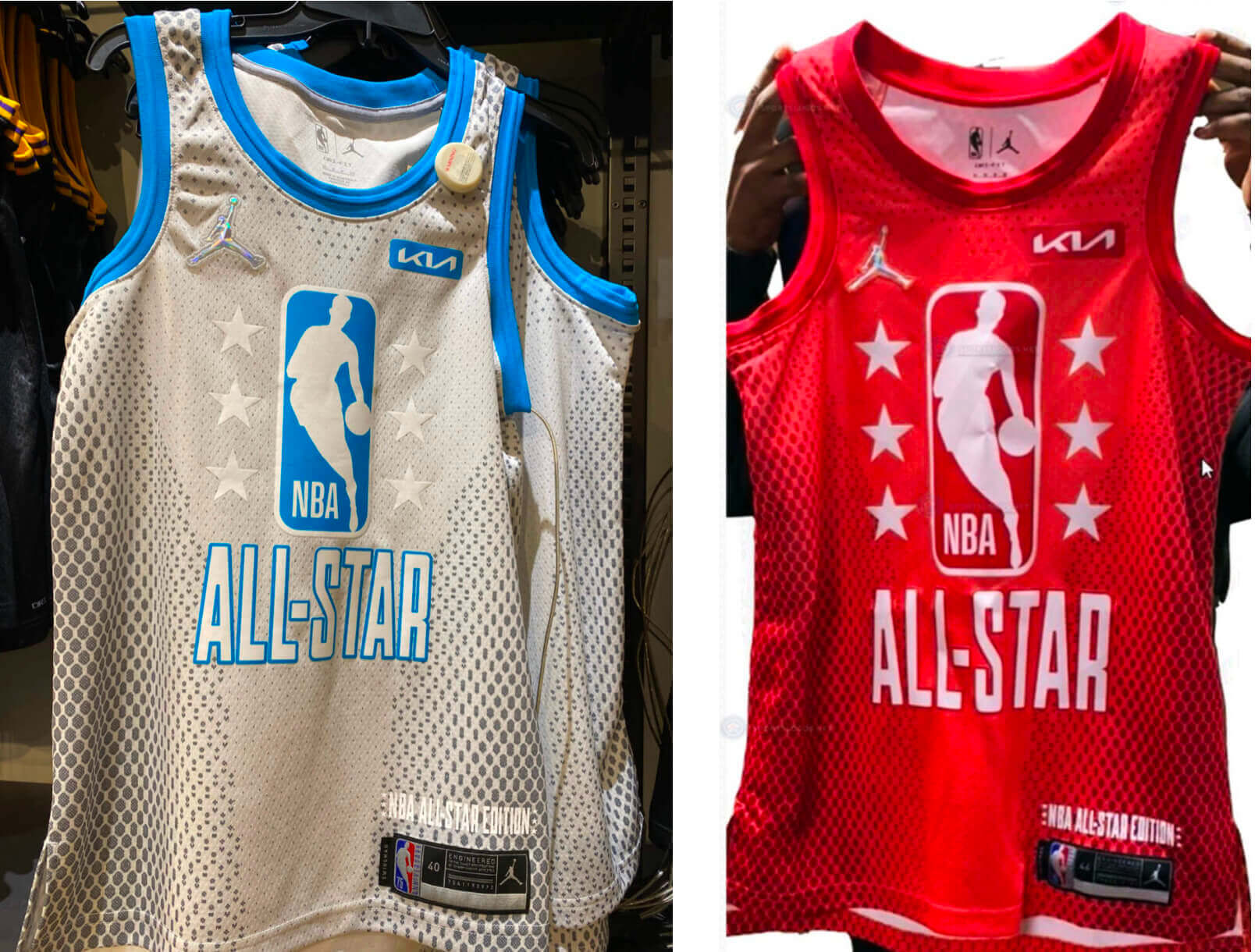
Click to enlarge
Last Friday we had a leak of an uninspired grey/blue design purported to be one of this year’s NBA All-Star jerseys (above left). Now the other one has leaked, and SportsLogos.net has confirmed that the leaks are legitimate, so these are indeed what the NBA All-Stars will be wearing on Feb. 20.
These aren’t just bad — they’re inexplicably bad, confoundingly bad. Consider:
1. As you may recall from last Friday, I initially speculated that the first leak might be a practice jersey, because that’s really what they look like. The diamond gradation pattern (similar to the Diamondbacks’ late, unlamented snakeskin pattern) even makes the grey jersey look a bit like mesh fabric, enhancing the “Don’t take this seriously” effect.
2. This year’s game is in Cleveland, but the jerseys are completely devoid of Cavs-related elements. I can understand that they might have preferred to avoid local design references after what happened last year (as you may recall, the game was originally scheduled for February in Indiana, then was postponed due to the pandemic, and eventually took place on March 7 in Atlanta, but with players still wearing the Pacers-themed unis that had already been designed), but why go with such a characterless design when other options were available? Which leads us to…
3. As we all know, the NBA is currently celebrating its 75th-anniversary season. This would have been the perfect opportunity for a retro/throwback-style All-Star design. Fans would eat it up, Nike could go nuts with retro-themed design details, and you wouldn’t have to worry about the game being moved to another city. Or…
4. They could even have taken a page from this season’s mash-up City designs and created an All-Star uni set that drew upon previous NBA All-Star unis. Granted, that would probably be a train wreck, but at least the idea behind it would make sense, unlike the designs they’re apparently going with.
5. In case you’ve forgotten from last Friday, the grey jersey has white typography on the back (we don’t yet know what the back of the red jersey looks like):
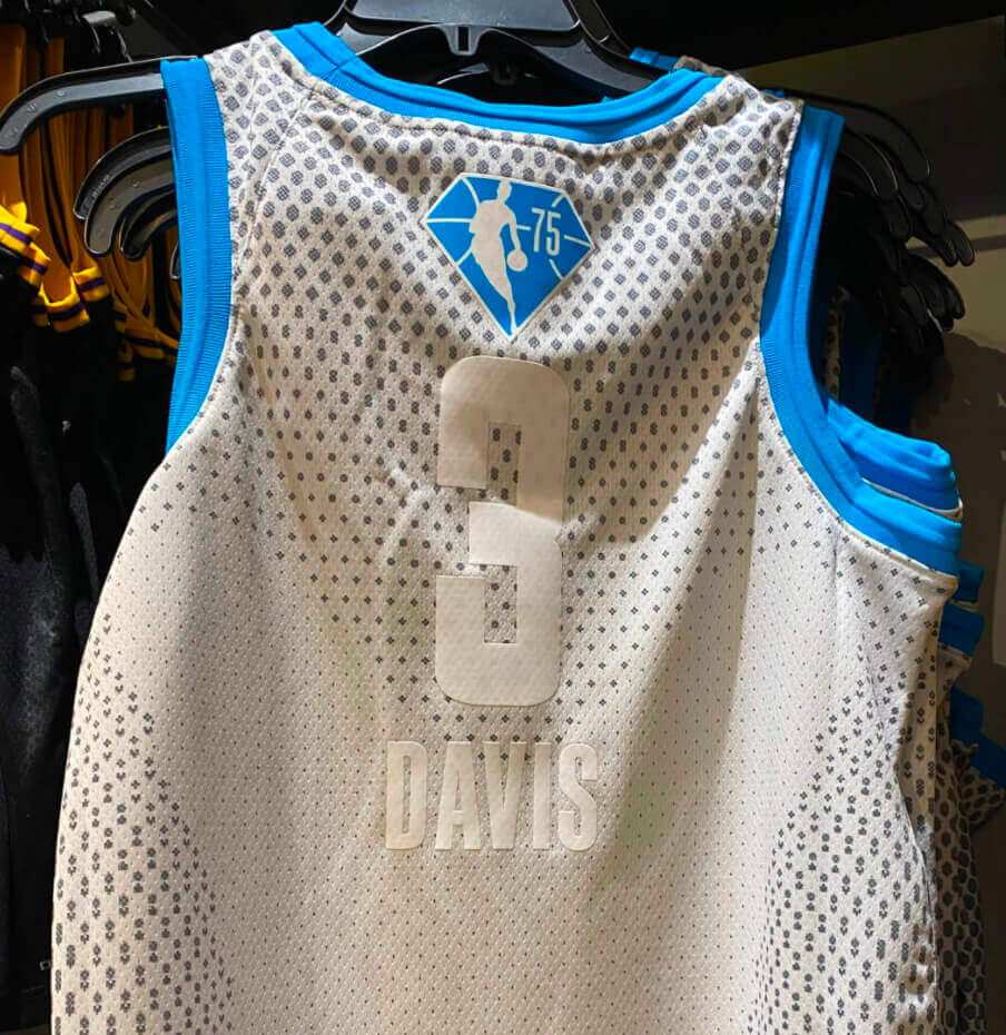
Like I said, this all seems so inexplicable. There are lots of bad uniforms where I can at least understand the underlying approach, even if I don’t agree with it. Usually I think they’re trying too hard. But in this case, it’s like they didn’t bother to try at all. Very strange.
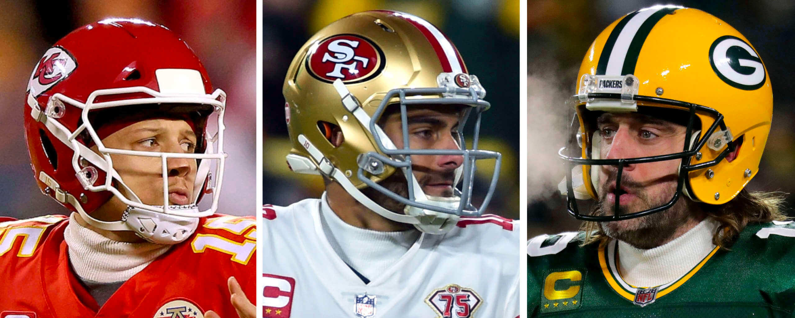
Click to enlarge
Neck-alikes: Reader Evan Miller noticed something interesting on Sunday: Three of the quarterbacks in that day’s NFL playoff games — KC’s Patrick Mahomes, San Francisco’s Jimmy Garoppolo, and Green Bay’s Aaron Rodgers — were all wearing the same mock-turtleneck collar.
Is this a full base-layer undershirt, or just a dickey? Either way, the off-white ribbed collar has an endearingly old-school look. As Evan put it in his email to me:
It’s such a traditional-looking piece of apparel. When everything else in sports is “VaporMax SuperDry Wick Wick Wick,” this looks like something an Austrian skier would’ve worn at the 1948 Winter Games. If it’s produced by Nike or another big company, it just looks much more old-school than what those companies typically put on the market. And if it isn’t made by a big brand, then it’s interesting that all of these NFL QBs would insist on wearing some lesser-known company’s gear because they’re just that good.
Well put. Since there’s no visible maker’s mark (refreshing!), I asked on Twitter to see if anyone knew who makes this accessory. Several people informed me that it’s from a Minnesota-based company called WSI, which specializes in cold-weather gear. And sure enough, they were bragging about their TV exposure on Sunday:
@WSISports special #coldgear will be on both the #packers #49ers tonight! #proudlymadeinusa #madeinamerica pic.twitter.com/Kmu0clQtLp
— Joel Wiens (@theunderweardoc) January 23, 2022
Like #GHOSTBUSTERS WHO YA GONNA CALL! When #packers #49ers need special #coldgwear made up overnight and delivered game day we love it! Thank you @ewise01 for braving the elements to deliver the gear! #proudlymadeinusa pic.twitter.com/Awmbuqm3Ee
— WSI Sports (@WSISports) January 23, 2022
I looked on the WSI website but couldn’t find the exact item that the quarterbacks were wearing, so I’ve contacted the company to see if they can tell me more. Stay tuned.
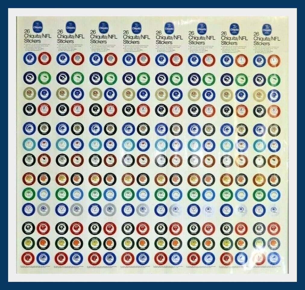
Click to enlarge
Collector’s Corner
By Brinke Guthrie
Follow @brinkeguthrie
Great googly-moogly! As you might expect, this one caught my eye. A great visual, no? Not one, but eight — count ’em, eight — complete sets of the 1970 Chiquita Banana NFL stickers. Continues to be my eBay Holy Grail!
Now for the rest of this week’s picks:
• Love the artwork on this Coca-Cola promo set of 1960s NFL gumball helmets. It helpfully points out you get only one sticker for the Steelers.
• This Kansas City Royals pin features the Grateful Dead “Stealie” logo.
• Here we have a late-1960s Detroit Red Wings pin that says “© 1968 NHL Service.”
• How about some glorious tequila sunrise action on this 1982 Houston Astros season ticket ordering booklet! It includes a flexi-disc recording from Nolan Ryan’s fifth no-no.
• I’d say late 1960s or early 1970s for this “Luv Ya Braves” promo seat cushion from Eastern (“The Wings of Man”) Airlines, which folded in 1991.
• In the 1990s, Russell Athletic was one of the suppliers of NFL team uniforms. Here’s one of their print ads, featuring the Atlanta Falcons. Always liked Russell’s “NFL Pro Line” stuff, which was top-quality.
• Patriots head coach Bill Bellichick didn’t always sport his current disheveled look. Here he is, “pre-hoodie,” for an NFL Pro Set card from 1992, when he was with the Browns.
• Terrific artwork on this 1974 San Diego Chargers poster.
• Here’s a 1970s Louisville Slugger baseball bat pen set featuring the Cincinnati Reds’ “running man” logo, minus some of the finer detailing.
• This sticker is for a 1970s publication called Basketball Pro-Style Magazine.
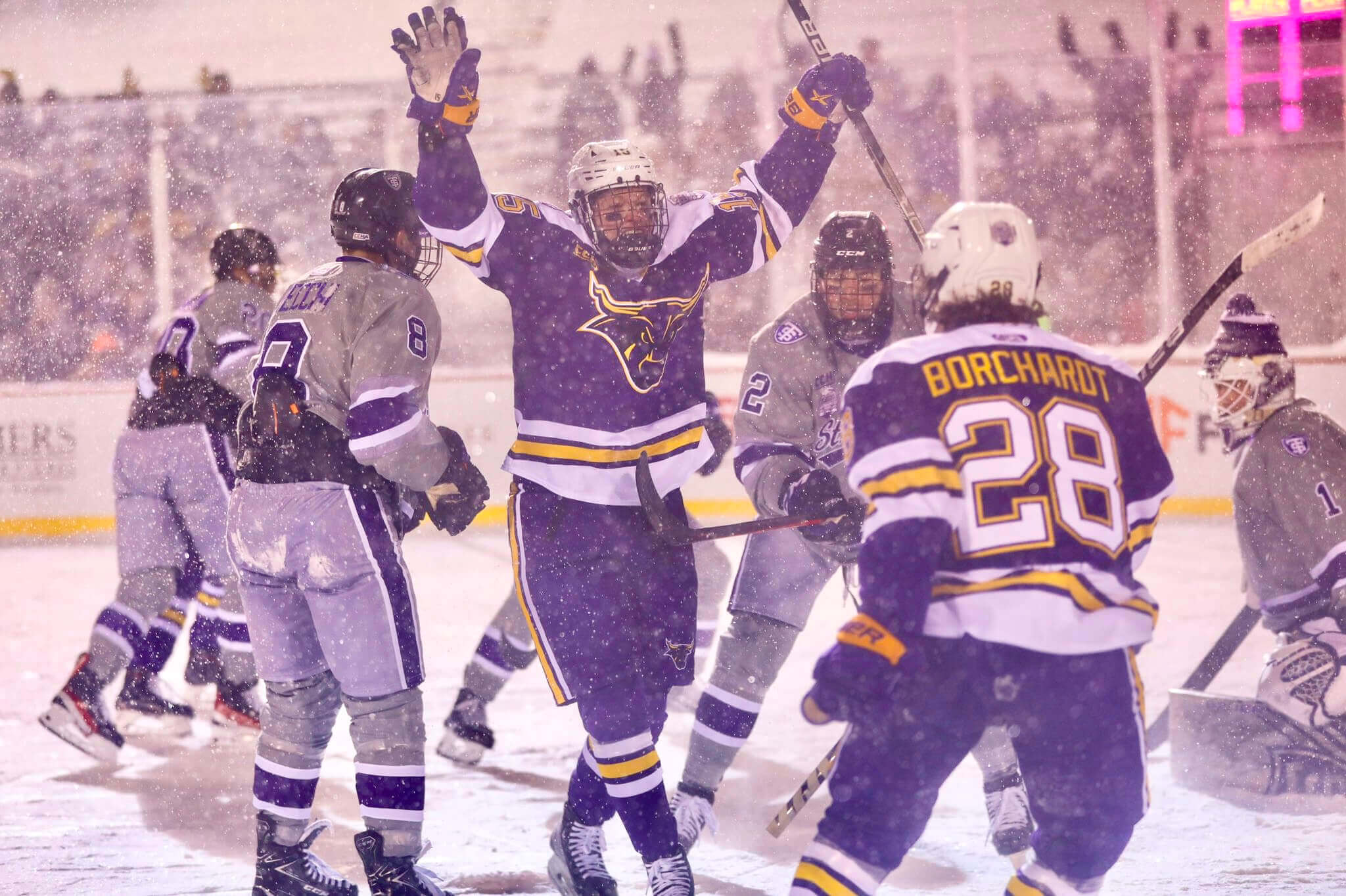
Photo by Evan Procaccini; click to enlarge
Too good for the Ticker: How awesome is this shot from last weekend’s Hockey Day Minnesota outdoor game between St. Thomas and Minnesota State? So awesome that I don’t even mind that it was a purple-vs.-purple matchup!
You can see more photos here and in this very nice Twitter thread.
(Big thanks to Scott Fasano for this one.)
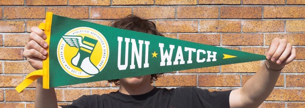

Raffle reminder: Today’s the final day to enter the raffle for the last five Uni Watch pennants. Once they’re gone, they’re gone for good!
To enter, send an email with your mailing address to the raffle in-box by 8pm Eastern tonight. USA mailing addresses only. One entry per person. I’ll announce the five winners tomorrow. Big, big props to the great Oxford Pennant for collaborating with Uni Watch on this product and for shipping out the five pennant prizes!
LAST CALL for the baseball bobble pin: We are now down to the last remaining July 2020 pin — that’s the baseball bobblehead design, with a head that really bobbles! Once this last one sells, they’re gone for good. Update: The bobble pin is now sold out.
This pin, like the rest of our remaining pin inventory, is available here, with big discounts for multi-pin bundles. We’re running low on a few of the other designs (June 2020, November 2020, December 2020, November 2021, a few others), so get ’em while you can.
Also: In case you missed it on Monday, I’m trying to gauge how much interest there is in a new round of Uni Watch caps. Full details here.
The Ticker
By Alex Hider

Baseball News: No surprises from the Guardians’ official cap reveal yesterday (thanks to all who shared).

Football News: Has anyone else noticed that the red palm trees in the Super Bowl LVI logo look like dripping blood spatter? … Speaking of Super Bowl logos: Michael Rittenhouse spotted this commemorative Super Bowl champions poster at his local Hobby Lobby and noticed that while it features modern Dolphins and Giants helmets, it uses older designs for Washington and the Jets. … The University of Minnesota has a cool wall display devoted to the team’s recent helmet designs (from @KevinZintheTC).

Hockey News: The Rangers wore Pride pregame sweaters last night (from @uniformnerd). … The Hurricanes will wear their Whalers throwbacks for the only time this season on Saturday. Here’s a video showing the team practicing in their throwback helmets and breezers but with their usual black/red practice sweaters (from Wade Heidt). … Kraken G Philipp Grubauer was using several different equipment brands Sunday: CCM pads, a True blocker and glove, and a Bauer stick and helmet (from Ted Taylor). … A Ducks trainer was wearing team-colored Vans sneakers on the ice during last night’s game (from Adam Femino). … The Coachella Valley Firebirds, who will begin playing in the AHL next season, unveiled their inaugural uniform set yesterday (from Rich Franklin). … Gotta love this vintage Penguins pennant, probably from the late 1960s. The skating penguin looks different at that angle, right? (From Trevor Williams.) … Henrik Lundqvist played for Team Sweden as well as for the Rangers. In this Sweden photo, he appears to be wearing his Rangers pants with a blue Sweden shell over them (from @SDubs35).

Basketball News: The South Carolina women debuted new pinstriped uniforms last night (from @Starkman55).
a.

Soccer News: Comoros was forced to play LB Chaker Alhadhur in goal yesterday during an Africa Cup of Nations match after all their other keepers contracted Covid. Because he was playing in goal, Alhadhur opted to wear No. 3 and made a makeshift shirt number out of tape, which he pasted over his typical No. 16 (from Germán Cabrejo and Jeremy Brahm). … Yesterday marked an anniversary that most readers probably don’t celebrate — the 46th anniversary of English club Kettering Town FC becoming the first British club to wear an shirt ad.

Grab Bag: The top Twenty20 cricket league in India, the Indian Premier League, has two new teams, one of which will be the Lucknow Super Giants (from our own Jamie Rathjen). … Timmy Donahue sends along the story of the 1st Samoan BN, a unit that fought in World War II with a unique uniform of a khaki cover, a white shirt, and no shoes.
FBS Equipment Guy here – WSI’s cold gear is the real deal. Widely used among FBS and the NFL. Definitely wouldn’t trust the major manufacturers when it comes to cold weather apparel.
Do you recognize the specific item the NFL QBs are wearing?
I’m not a football guy but a winter runner and cyclist.
Under Armour ColdGear is the real deal. I’m sure there are sponsorship reasons they can’t wear it but its first rate equipment for a base layer.
A correction on the defender who had to play GK yesterday in Africa Cup of Nations: Chaker Alhadhur plays for Comoros. They took on Cameroon yesterday, and all of their registered goalkeepers tested positive for Covid.
Also, Alhadhur normally wears #3, but they did not have any 3s in the gold namesets that their goalkeepers wear (the outfield players wore white jerseys with green namesets), so they gave him #16, which was the normal goalkeeper’s number. However, you can’t switch numbers during the tournament, thus the need for the duct tape to give Alhadhur the #3 he was registered to use during the tournament.
It should be noted that Cameroon won 2-1 in a valiant effort by Comoros to get back into it and have several chances to send it to extra time.
Team name now changed.
Ticker clarification: The Samoan Marines wore khaki “coverings” – the Corps name for their hats – and a white shirt along with khaki lava-lavas, or traditional Samoan skirts.
Isn’t “cover” also acceptable for a military hat?
I believe so, but the point is that the Ticker describes the Samoan Marines as wearing a hat, a shirt, and no shoes. Leaves out the lava-lava skirt, which is both the most notable element and, absent it, implies that they’re bare below the shirt.
Yes, cover is the Marine Corps term for hat
Samoans.
Do the humpty-hump.
A-do the humpty-hump.
I thought for a second with the lead photo on the South Carolina jerseys that they were vertical thick black/garnet stripes, offset by white pinstripes. Which would be phenomenal.
I saw that too. Like very clearly. To the point I was surprised when the later shots showed an all red design. Huh.
Seems like this is the WSI turtleneck they were wearing?
link
Possibly!
Maybe these used to come in white? (Or custom ordered?)
link
I think you’re right, it’s most likely from the team gear collection.
OK these uniform designers are just trolling now, aren’t they?
Two thoughts:
–Totally agree that those All-Star jerseys are as bad as I’ve ever seen. I wonder if the “fantasy draft” wrinkle for the All Star Game has stifled jersey sales, leading to half-hearted design.
–The new Guardians cap design is quite savvy, I think–the C is different enough that it’s a change, but not so different that the old block C would be so out of place.
I had the AFL version of the Coke helmets. 8 helmets, one for each team at the time. I collected bottle caps until I had one for each team, and had to bring the caps to the Coke bottling plant in Cambridge, MA to exchange for the helmet kit.
Hank would often wear his Rangers pants under a team Sweden shell. That game, Lundqvist was actually wearing his full set of NYR pads. That picture was from the ’17 World Championship, which took place during the NHL playoffs after the Rangers were knocked out. He presumably wasn’t planning on playing for Sweden, and so he didn’t have a new set ready to go and just wore what he had been wearing.
That picture is great, because about 0.25 seconds later Nylander completely bowled him over, haha!
link
More shots of Lundqvist wearing the Rangers breezers
2006 Olympics
link
2014 Olympics
link
Is it possible that Mahomes, Garoppolo, and Rodgers weren’t wearing all the same item? Both Garoppolo and Rodgers had white sleeves for the game, making me think it was a full base-layer shirt, but then there’s Mahomes with a white collar and red sleeves, making me think his was just a neck thing. Looking further into it though, Garoppolo’s sleeves have some sort of pattern on them that’s not quite the ribbing of the collar, but could reasonably be considered to be similar enough to be the same garment: link wheras Rodgers’ sleeves had no pattern on them at all, making it seem as though his sleeves and were two separate items: link
On a similar topic, I would just like to take a moment to appreciate Rodgers’ commitment to base-layer aesthetic consistency. Whenever he needs long sleeves for a cold weather game, he always – ALWAYS – wears white sleeves with his green jersey, and a green sleeves with his white jersey. So many players would and have mixed and matched those two possibilities with each other, and I’ve always loved how Rodgers has not only not swayed from his consistency, but picked what I consider to be the much better looking options in either case, having the sleeves compliment the jersey rather than mirror it.
The best part of the Guardians hats is the white outline on the C. I wish the Indians would have done that when they launched the Block C hats, using the same design from the Hargrove 80s era Tribe.
I still think the team got it right with the un-outlined C. But I think the more complex shape of the Guardians C does require the outline. The cap looks better than expected.
Also, the team needs to ditch the all-blue cap and make the red brim their only chapeau. Red letter on navy with a red brim should be one of those distinct-in-baseball things where the briefest glance tells you what team you’re seeing.
Super Bowl LVI logo would work better as Super Bowl: CSI
The NBA uniforms are terrible. Especially the gray version. I still would not love, but I could deal with the red one if it was opposing a white or blue uni. Even a color vs color navy red match up is far better than the gray/baby blue mess.
I completely agree on your idea of throwbacks. Huge missed opportunity. 75th anniversary is the perfect time to go back to the glory days of the 80s design.
Is it possible the league is shying away from going full red, white & blue/stars & stripes? We understand the throwbacks were traditionally based on the league’s logo color scheme while the stars are about being an “all star” not the nations flag. However do you think they are concerned about the international audience (& some fans in the US) interpreting and disliking that style as USA national uniforms or patriotic imagery. While the NBA is trying to highlight how they are very much an international game/league?
I think the mock turtleneck was the ARCTIC MICROTECH™ FORM FITTED LONG SLEEVE SHIRT from the team collection. Only mock they have listed in white supplied for teams.
link
Is there anyone else who has the visual problem I do with the new KIA logo? To me it looks like a K and a backwards N. Not KIA…
I agree, it seems like terrible design from a branding perspective. If you don’t know about the rebrand you might not even be able to tell it’s a Kia.
I still have the NFL Chiquita stickers that I pulled off of bananas here in Canada back in 1970. Going to the grocery store was never so much fun! I was never able to find the Denver and Houston stickers so I got those on eBay several years ago.
I did that too. Ahem.
That Penguins pennant would have been from the first year or so. Their first GM, Jack Riley, hated – HATED – the Pens’ name so much, the first year’s uniforms made no reference to Penguins at all. This pennant didn’t help soothe the feelings that the name was too ‘cutesy’ for a hockey team. It’s similar to, but not exactly the same as the official logo, and yes, the penguin was almost standing straight up, out for a leisurely skate. I’m sure Riley was real enthusiastic about that.
Rotating the logo so that the top line of the triangle was horizontal made the skating penguin look more aggressive.
I don’t particularly like this year’s All-Star jerseys, but (at least to me) they actually do give off a retro vibe? The use of the logo, stars, blocky lettering, and faux mesh pattern immediately made me think of this:
link
Hopefully they will add a blue outline to the name and number on the back.