Click to enlarge
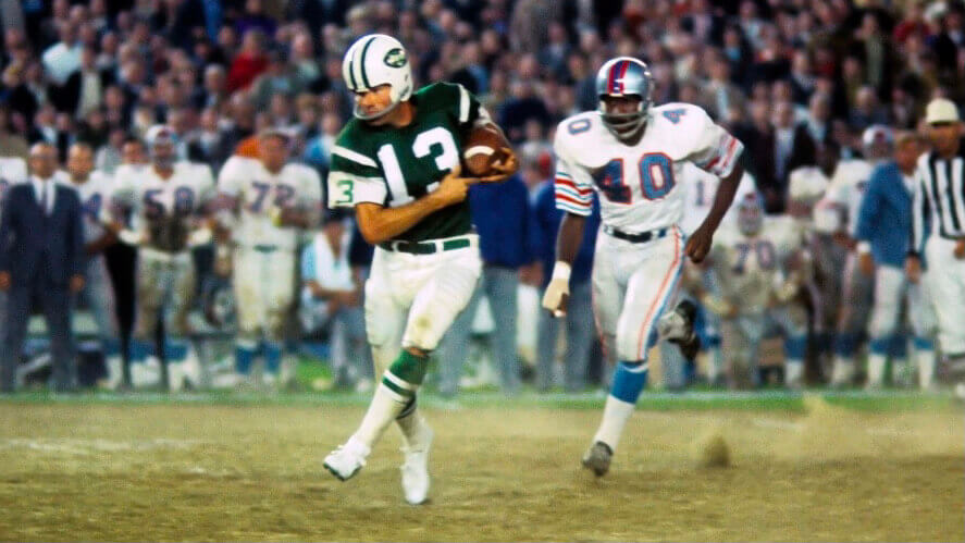
Pro Football Hall of Famer Don Maynard died yesterday. I saw him play during the tail end of his career in the early 1970s, when I was just starting to watch football as a kid, and even then I spotted the uni-notable thing about him: He never wore a chinstrap.
It turns out that the chinstrap was just the most obvious example of Maynard’s unusual approach to his gear. Quoting from this 1973 Sports Illustrated article:
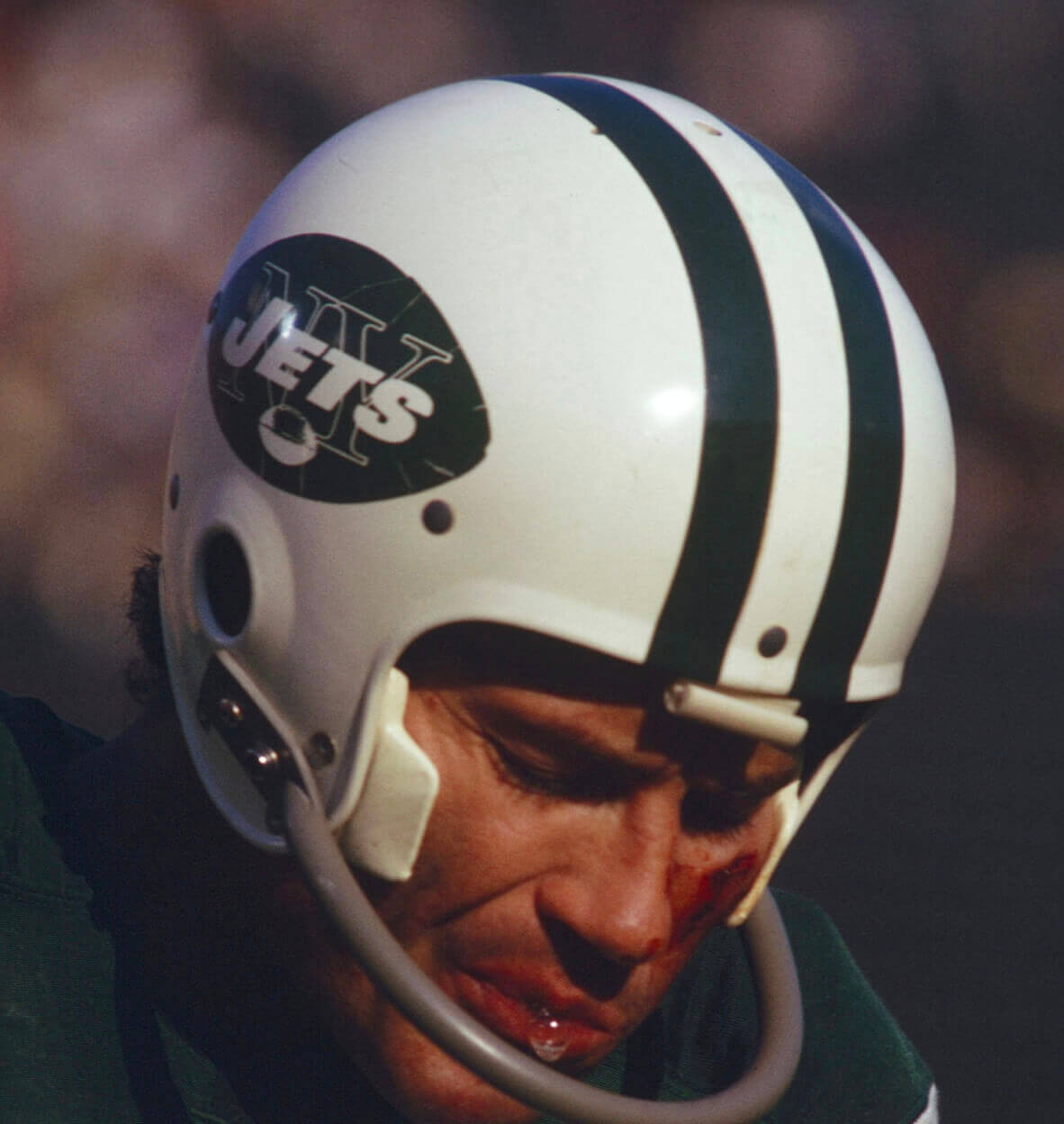
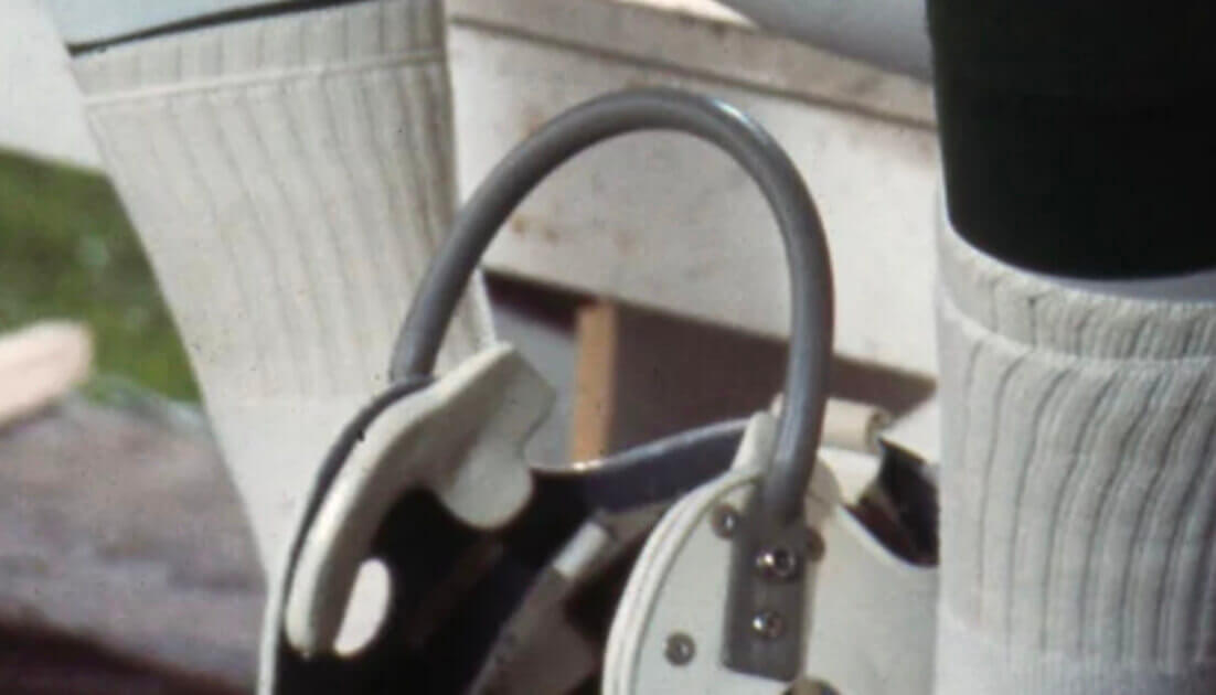
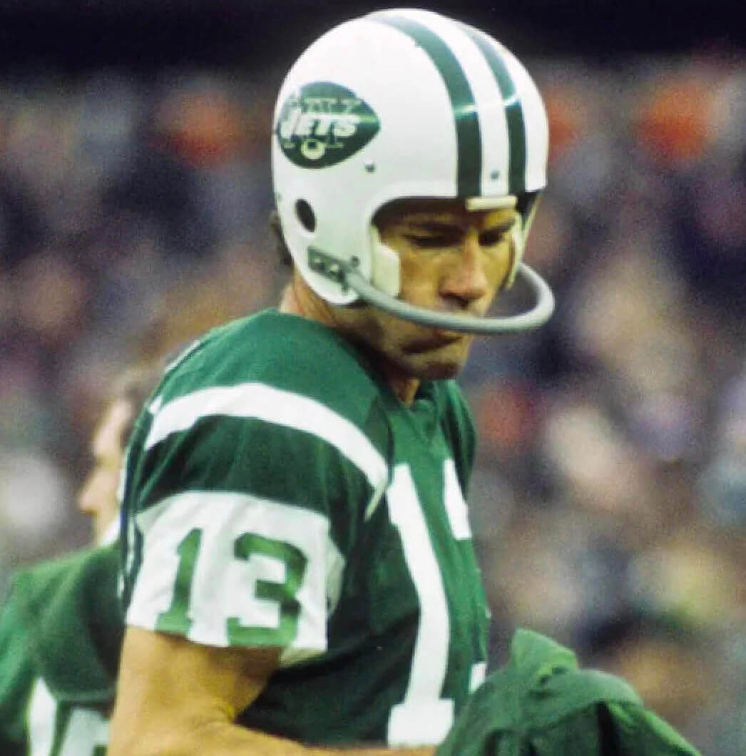
The ear flaps of [Maynard’s] helmet are specially molded to fit snugly over his wide cheekbones, and so he needs no chin strap. His shoulder pads have been carved down to an almost transparent shell of plastic and foam rubber. The front of the pads extends far enough over his rib cage to allow him to dispense with rib pads. Maynard would as soon wear chains as the heavy, long-sleeved jerseys worn by most of his Jet teammates. His are made of a lightweight mesh and usually have short sleeves. Most players use leather belts, but Maynard’s is made of a stretchy elastic. He wears cutdown, kangaroo-skin soccer shoes with about 20 cleats (the conventional football shoe has seven) because he has decided they are easier on his legs and provide greater traction. When sleekly decked out for action, Maynard somewhat optimistically estimates that he carries five pounds less uniform than any other wide receiver in the NFL.
Yikes — probably not the best way to take care of your body. Still, it’s fascinating that Maynard was doing all of this decades before the modern wideouts who were similarly obsessive about stripping their gear down to the bare minimum (Ed McCaffrey comes to mind). He was an early pioneer in this regard.
Here’s a closer look at those custom cheekbone pads that kept Maynard’s helmet anchored to his noggin:
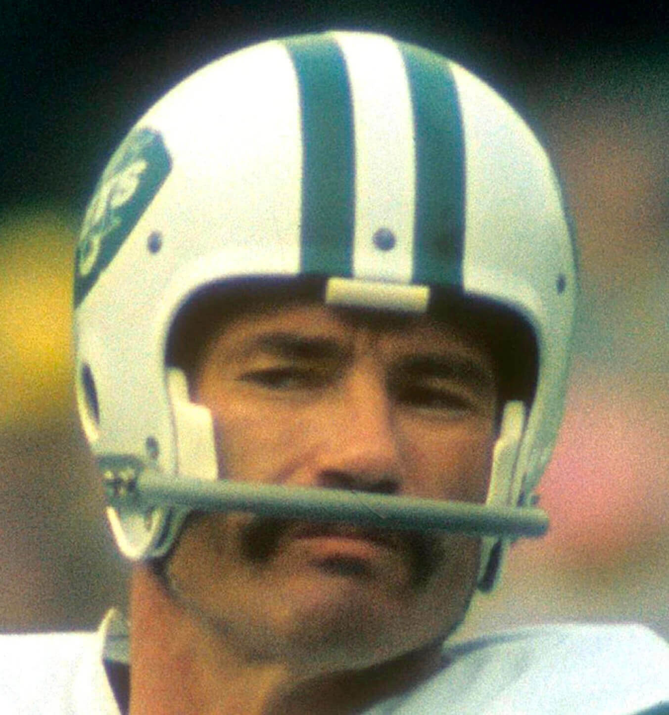
He even went strap-free when wearing an earlier, more primitive helmet model in 1963 (when the Jets were still the Titans):
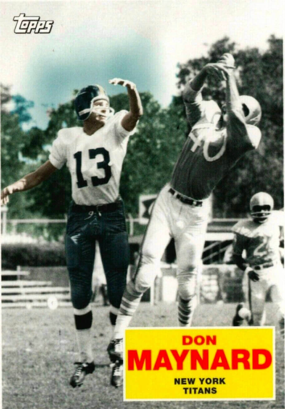
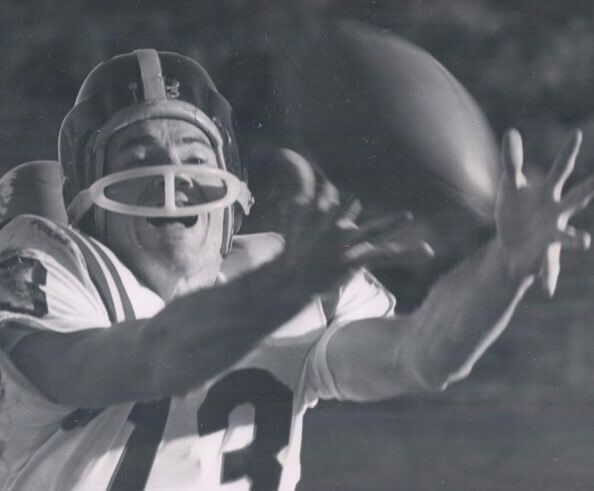
And here are some looks at Maynard’s era-unusual short sleeves — again, decades before that became a common thing:
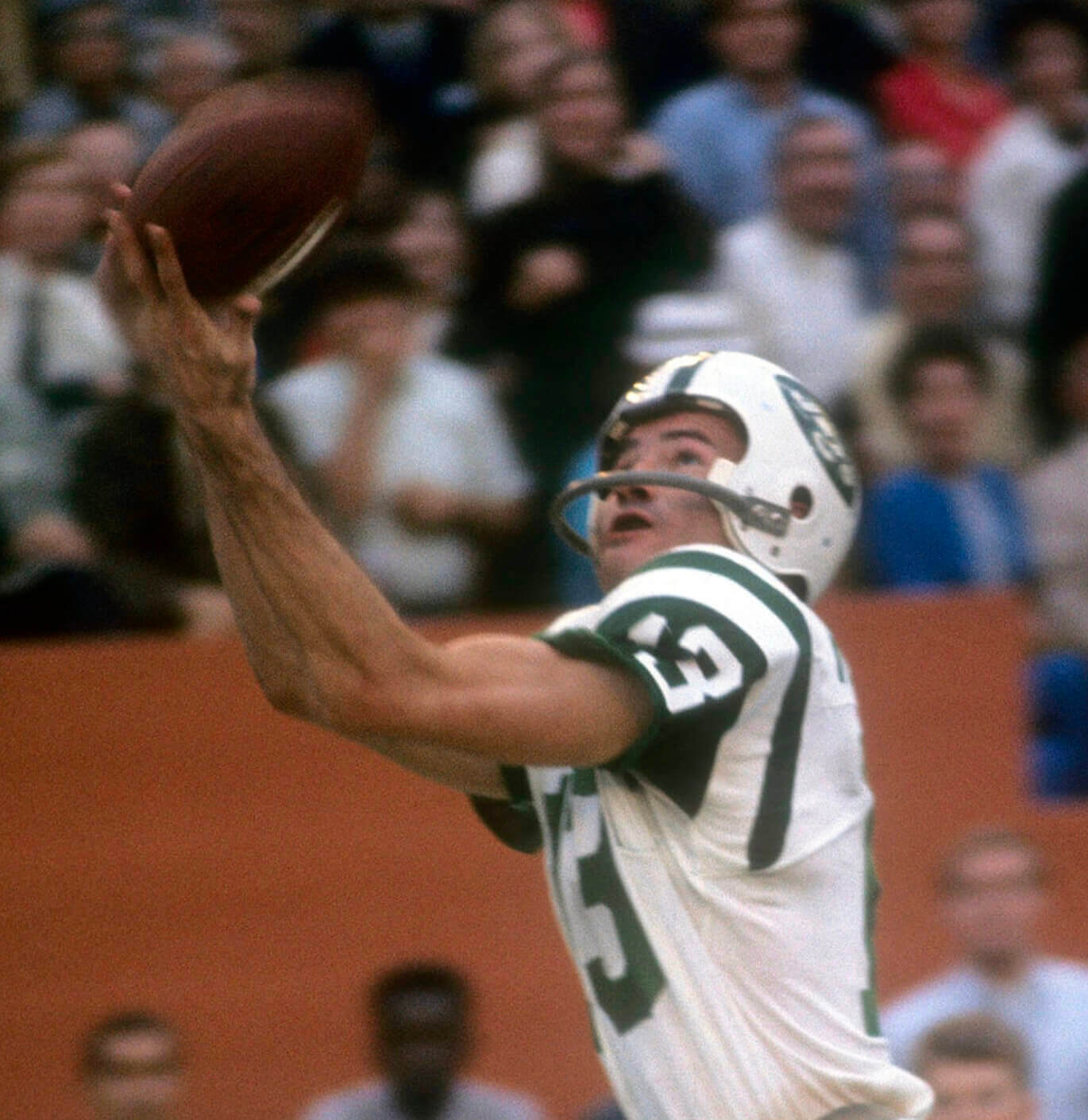
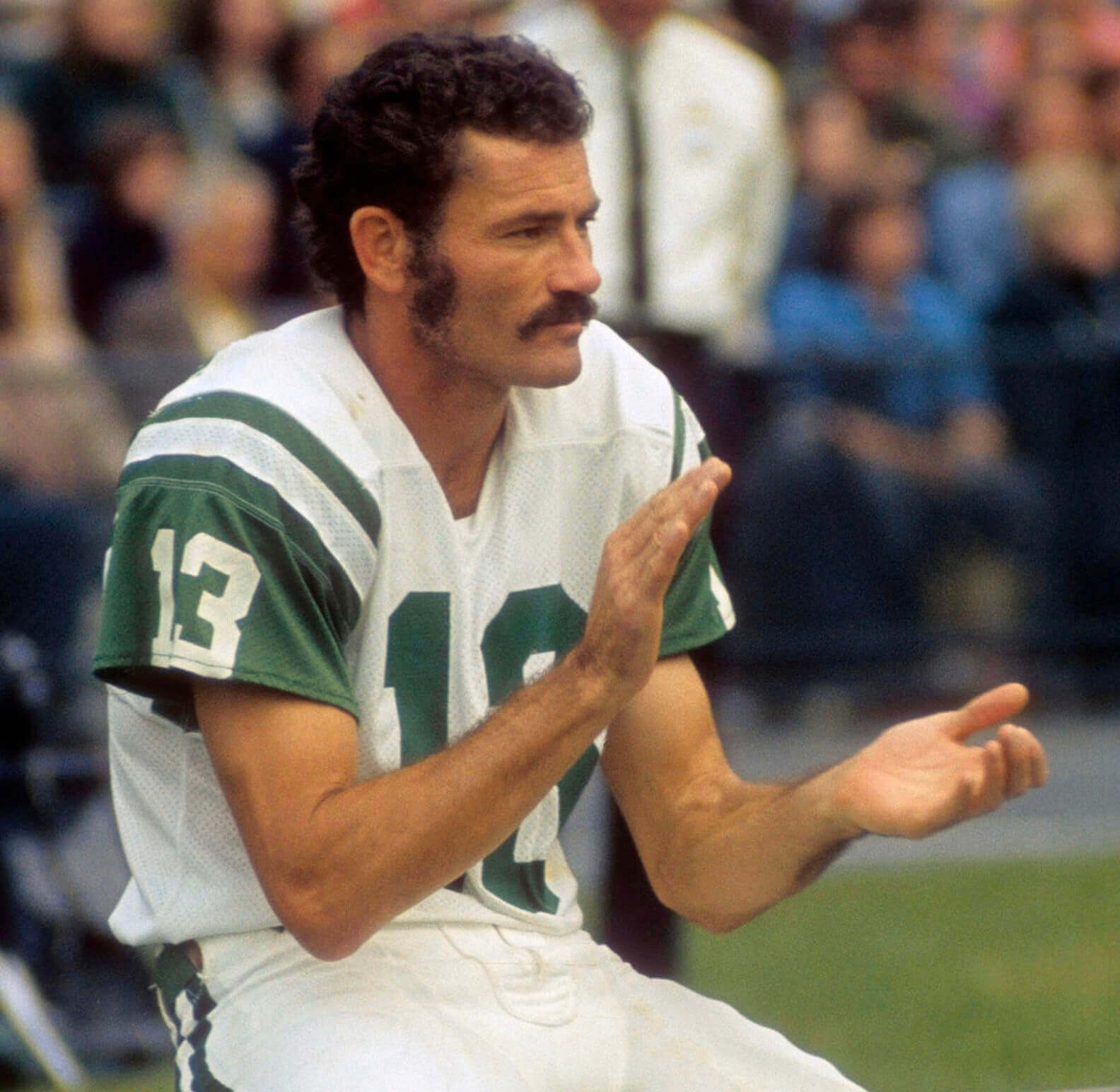
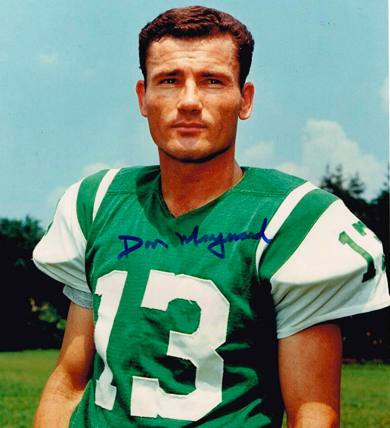
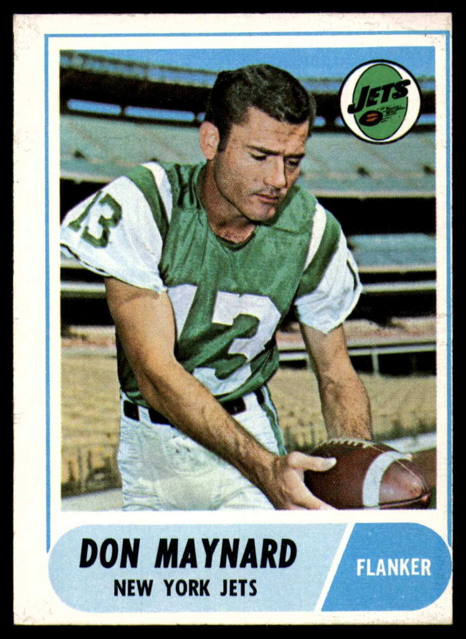
A few other uni-related notes about Maynard:
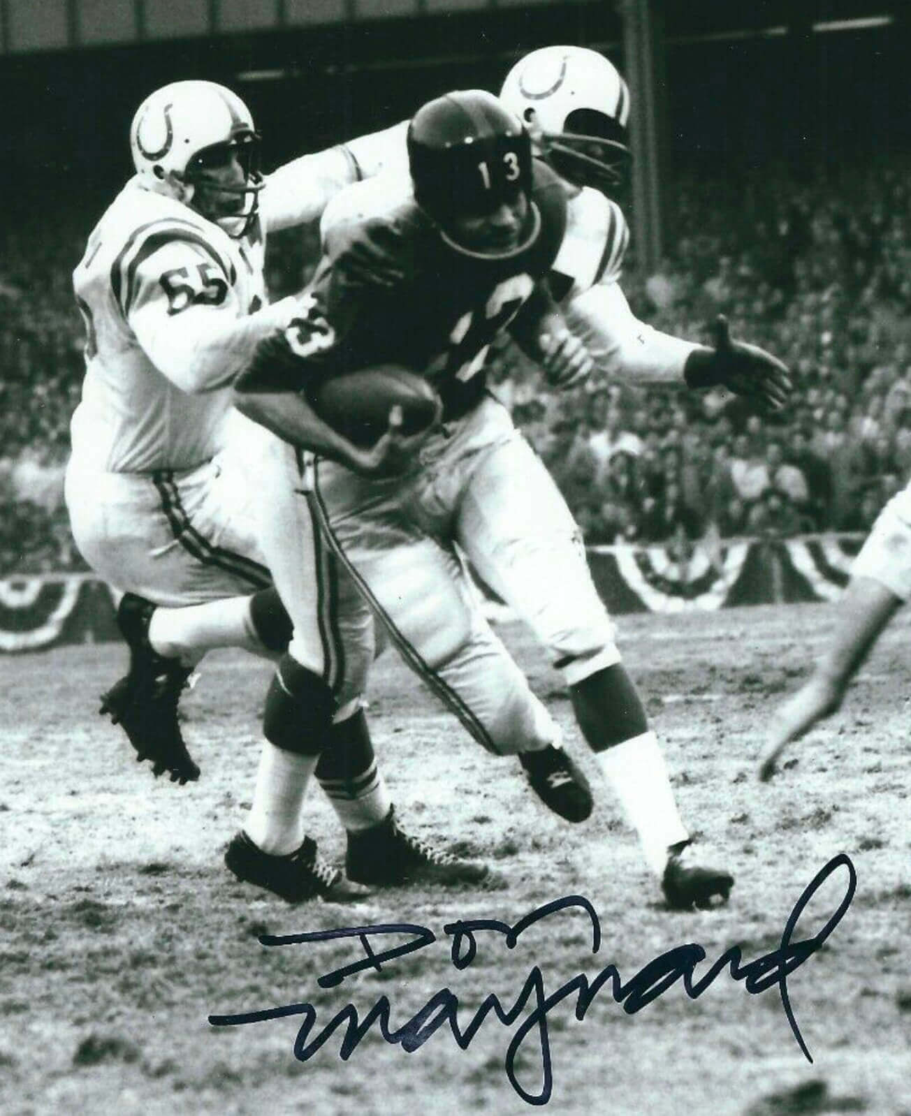
• Although Maynard is best known for his lengthy tenure with the Jets, he spent his rookie season of 1958 with New York’s other team, the Giants. Here’s a shot of him in a Jints uni:
• Maynard spent his final NFL season, 1973, with the Cardinals. I was unable to find an action photo of him from that year (he played in only two games and had just one reception), but here’s a shot of him in a Cards uni:
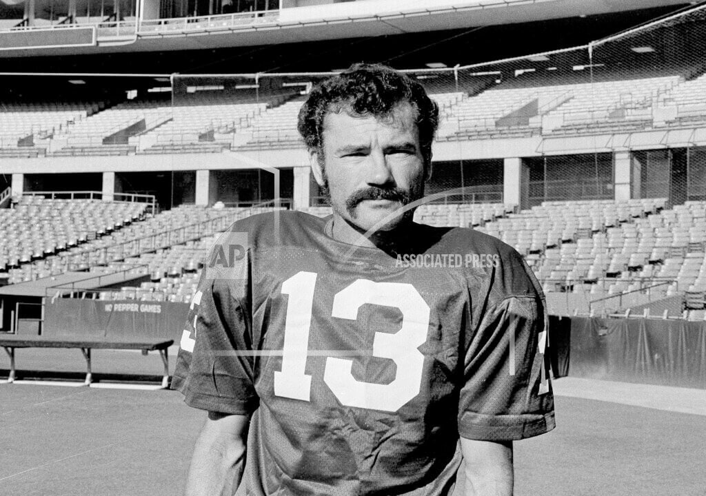
• After his NFL finale, Maynard hooked on with the WFL’s Houston Texans (who quickly morphed into the Shreveport Steamer). This is apparently the only photographic record of him in a Houston/Shreveport uni:
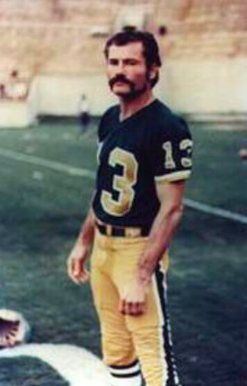
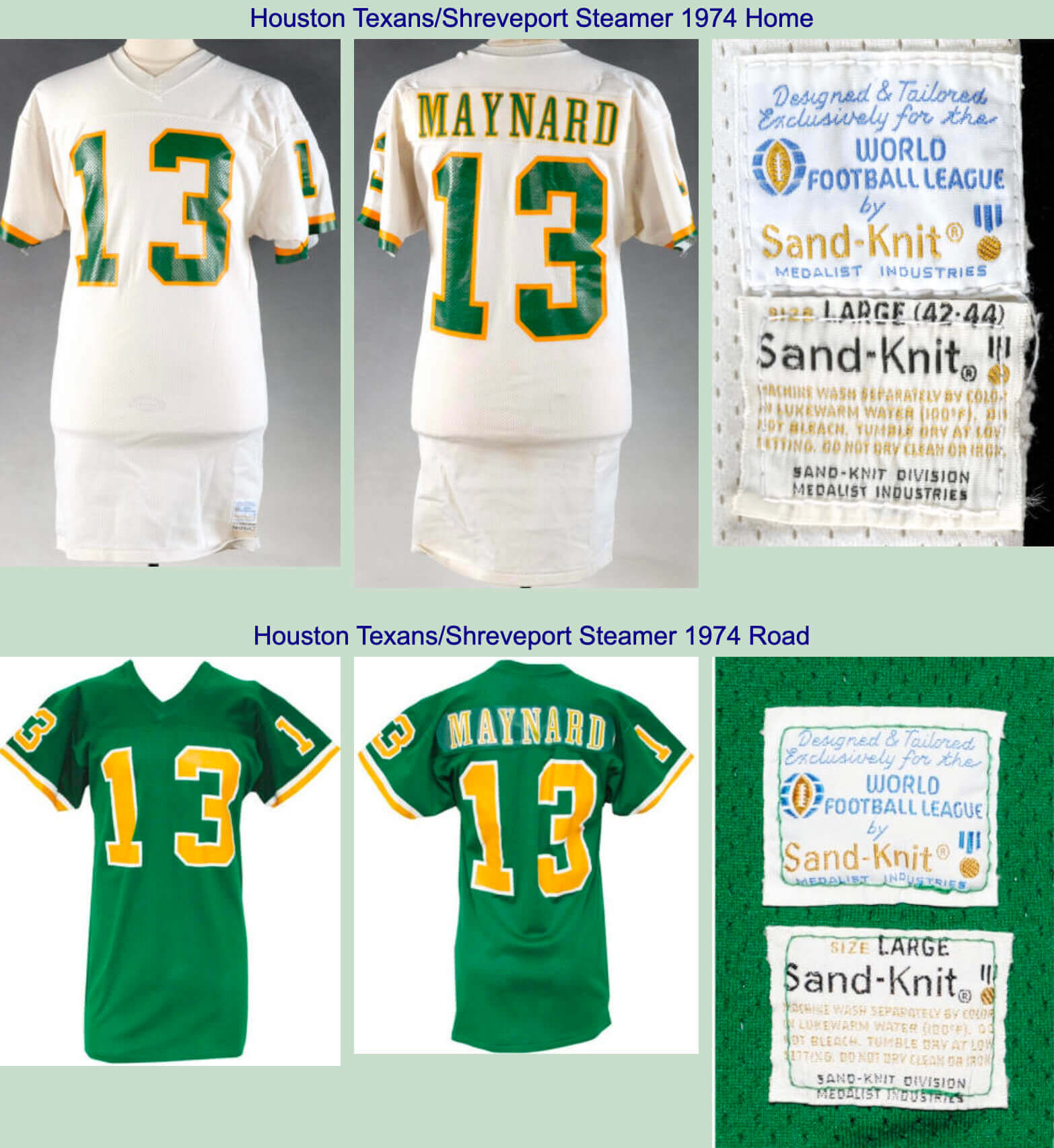
Although the jersey in that last photo looks black, it was actually green. Here are two reputedly game-used Maynard jerseys from that 1974 season:
• Maynard spent 1959 playing for the CFL’s Hamilton Tiger-Cats. Unfortunately, I was unable to find a photo of him in a Ti-Cats uni. (And before you get too excited, this one is a Photoshop job.)
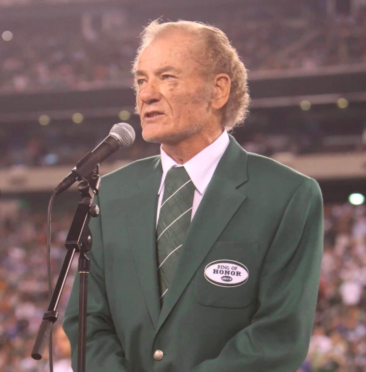
• When Maynard was inducted into the Jets’ Ring of Honor in 2010, he wore his green necktie in what’s known as the Onassis knot (also known, at least at Uni Watch HQ, as the Herb Tarlek knot):
———
Finally, as an aside, there’s this: While looking for Maynard pics, I came across a 1965 shot of Joe Namath with a conventional two-bar facemask. Almost startling to see him without his usual cowcatcher mask design:
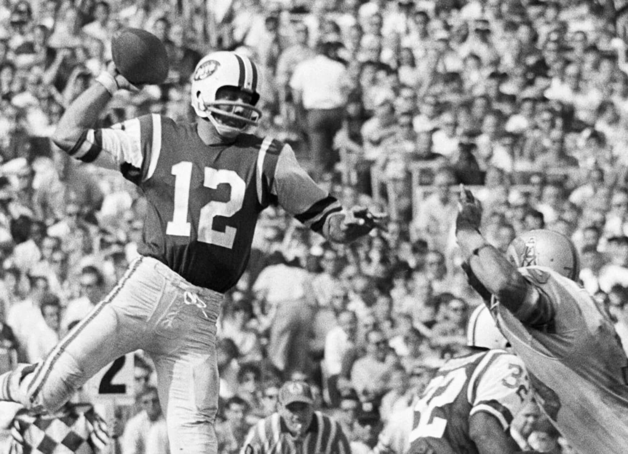
Naturally, Maynard was the targeted receiver for that pass, as he was for so many others. R.I.P.
(My thanks to longtime reader Doug Brei for his assistance in preparing this article.)
Click to enlarge
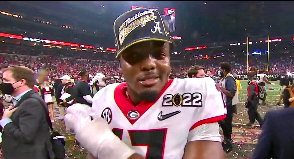
Oopsie: In the aftermath of last night’s national championship game, Georgia linebacker Nakobe Dean somehow ended up wearing an Alabama cap.
It’s not clear how that happened, but phantom caps are fun collector’s items, so Dean now has himself a little bonus story to go along with the national championship.

ITEM! Facebook Live event this Thursday: With winter and the pandemic combining to keep many of us holed up inside, I’ve decided to try doing a half-hour Facebook Live session this Thursday, Jan. 13, at 7pm Eastern.
I’ll respond to questions that people post in the comments and will also show-and-tell a few items from my vintage jersey collection. I’ve never done one of these before, so we’ll see how it goes, but I’m hoping it will be a nice little comm-uni-ty event.
The event will livestream on my Facebook page. Anyone can view it, even if you don’t have a Facebook account, but you do need an account if you want to post a comment or question.
Looking forward to it — see you then!
Click to enlarge
Collector’s Corner
By Brinke Guthrie
Follow @brinkeguthrie
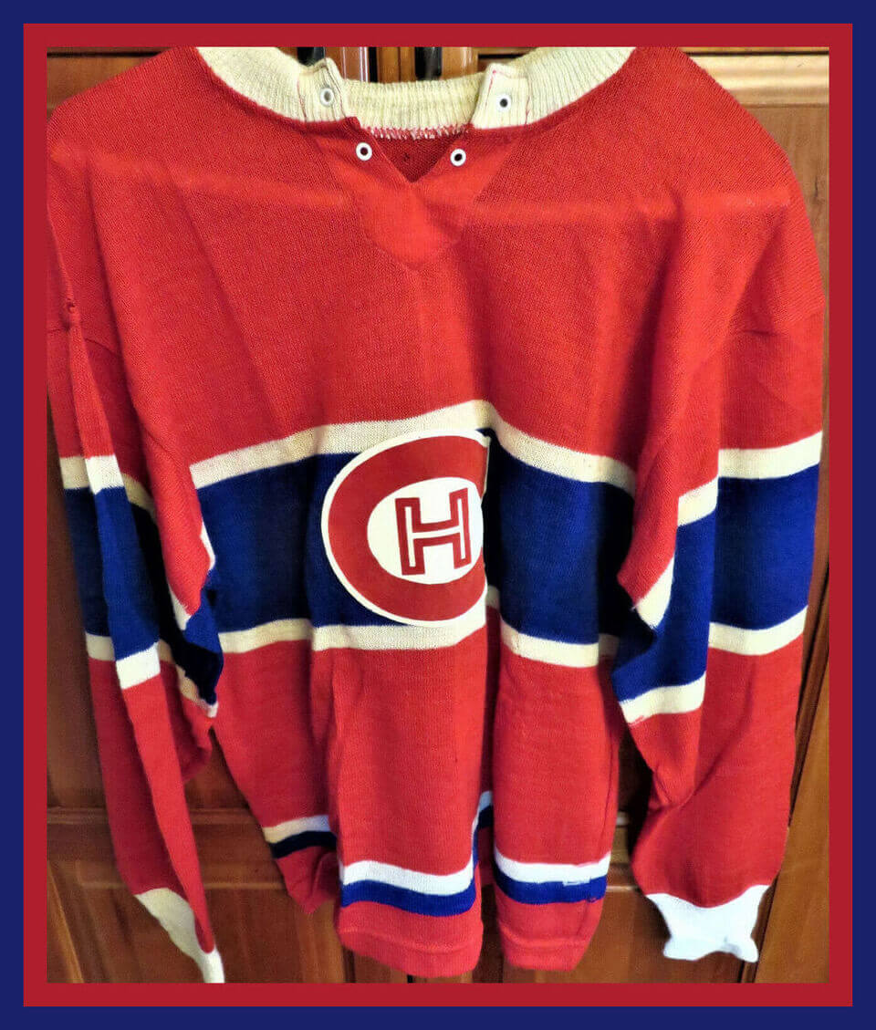
Kicking off this week with this excellent Montreal Canadiens knit jersey sweater. The seller says “This is small, which makes it great for a display to add that vintage look to your hockey room.” Or good for your kid, or just for yourself if you’re on the smaller side!
Now for the rest of this week’s picks:
• Here’s another vintage hockey sweater from the same period, this one for the Toronto Maple Leafs.
• Check out this Chiquita Banana “50th Anniversary Special” NFL radio from 1969. I have one of these in pristine condition, and this one looks great too. Note: The seller says it does power up but you get static. Well, so does mine, but I fiddle with the stations and they eventually come in.
• Here’s a 1972 Atlanta Flames hockey puck pencil sharpener.
• Hutch labeled this 1950s-60s kids’ football gear set as a “Football Uniform Outfit for Future All-Americans.”
• This is a 1950s advertising sign for Cincinnati brewery Hudepohl’s sponsorship of NFL games with “Red” Grange on WLWD in Dayton.
• Look at this terrific 1975 NFL helmet “divisional” poster! It’s got the Disco NY Giants, and I had forgotten the Falcons were once in the NFC West!
• Got some more posters here, including a 1966 Dave Boss print; a 1970s Puma Fran Tarkenton promo poster; a 1970s “Charger Power on 1160 KSDO” poster; and an “Evolution of the Uniform” poster from General Tire.
• Got a nice-looking “foil”- like 1970s Minnesota Vikings decal here.
• It looks like Mickey Mantle had his own line of denim jeans at one point. Here’s a set of seven baseball-themed buttons from ’em.
• Choose your favorite team from this set of 1970s-80s NFL helmet ink-stampers!
Click to enlarge
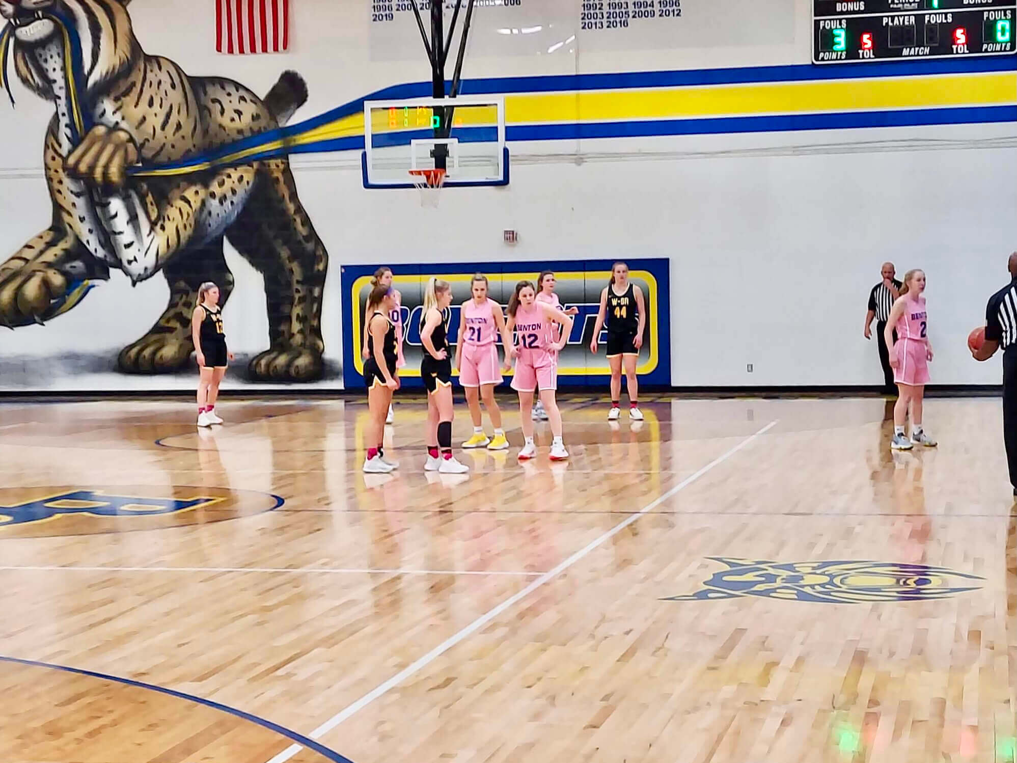
Too good for the Ticker: I don’t usually get too excited over gym murals, but the one at Benton Community High School in Iowa is so awesome! Their teams are called the Bobcats — hence the giant feline having its way with the big stripe on the wall. Love it!
Actually, I misspoke: Benton’s boys’ teams are called the Bobcats. The girls’ teams are the Lady Cats, which is sexist and pathetic. Come on, Benton — your girls deserve better.
(Big thanks to Owen Siebring for this one.)
part 2 pic.twitter.com/3Ghm9e7EN8
— kelli anderson (@kellianderson) January 7, 2022
Oh. My. God. This has nothing to do with uniforms or sports, but these two videos of finished projects from a paper engineering class are completely amazing pieces of design. Totally worth your combined four and a half minutes — trust me.
The woman who teaches the class, Kelli Anderson, appears to be a genius. If you want to learn more about her, here’s a good primer video, along with her Vimeo channel and blog. It’s all really inspiring!
(Mega-thanks to the Tugboat Captain for bringing those tweets to my attention.)
The Ticker
By Alex Hider

Baseball News: We’ve had this before, but once more won’t hurt: Juan Francisco has been wearing No. 111 (no, that’s not a typo) while playing for the Gigantes del Cibao of the Cuban Winter League (from Bryan Beban). … The Asheboro Copperheads of the collegiate summer Coastal Plain League have are now the Asheboro ZooKeepers (from Kary Klismet and Rex Henry). … New 20th season logo for the Tri-City ValleyCats of the Frontier League (from @ThatShaneBua). … Baseball cartoonist Carl Skanberg definitely Gets It™ (from @esbrechtel).

NFL News: At least one DC-area newscaster thinks the WFT’s new name will be “Commanders” (from Andrew Cosentino). … Fox displayed a graphic featuring former Vikings WR Randy Moss during Sunday’s Vikes/Bears game. The graphic improperly listed Moss as wearing No. 81, even though the accompanying photo showed him wearing No. 84 (from Matt Sanderson). … I’ve never heard this before: On Feb. 17, 1975 — a year and a half before the Buccaneers’ on-field debut — The Tampa Times reported that their colors would be orange, green and white. The story also notes that the team considered “Bay Bucs” as a team name (from Edward Hickey). … Reprinted from yesterday’s comments: Yesterday’s MMUW report failed to mention that the Rams added a “KW 1946” helmet decal. “I pieced together that it must be to celebrate Kenny Washington, because they just announced a memorial scholarship fund in his honor last week,” says Ken Hanson. 1946 was the year that Washington and Woody Strode broke the NFL’s modern color barrier. … A game-worn Tom Brady jersey from last season has been auctioned off for $480,000, a record for a game-worn NFL jersey (from Brinke). … Carrboro High School (North Carolina) is poaching the Jags logo. They covered their tracks a bit by changing the tongue color from teal to purple (from Akul Nishawala). … The NHL’s Nashville Predators tweeted their support of the Titans’ upcoming postseason run but used an outdated white Titans helmet in their photo. The Titans changed to navy helmets in 2018 (from @KCNep95).
College Football News: Reader Jordan Daniels is talking about the topics that matter: Georgia’s record based on coach Kirby Smart’s visor color. For the record, Smart wore a white visor last night. … The next two notes are from Kary Klismet: An Atlanta news station published a history behind Uga, Georgia’s live bulldog mascot, ahead of last night’s National Championship game. … A Cincinnati Bearcats fan is creating a series of graphics for the school’s football and men’s basketball games based on their opponents’ logos. … Joe Owen found an eBay listing for a T-shirt commemorating the 1997 Rose Bowl matchup between Ohio State and Arizona. Just one problem: The Buckeyes played Arizona State in the Rose Bowl that year. … As talented as modern equipment managers are, I don’t think I could see any of them going to these lengths on the sidelines these days (from Andreas Papadopoulos).

Hockey News: The Huntsville Havoc of the Southern Professional Hockey League will wear jerseys designed by a seven-year-old fan on Jan. 15 (from Kary Klismet). … Here’s a series of concept sweater designs, based on old casino neon signs, for this year”s NHL All-Star Game in Las Vegas (from @theerandomfan). … Coaches often lace up the skates during practices, but Herb Brooks, then the coach of the Minnesota Gophers, went a step further by wearing shinguards during a practice in the 1970s. Also: That photo shows two players wearing the captain’s “C”! (From Ben Hagen) … Cross-listed from the NFL section: The Preds tweeted their support of the Tennessee Titans’ upcoming postseason run but used an outdated white Titans helmet in their photo. The Titans changed to navy helmets in 2018 (from @KCNep95). … Lakeland Union High School (Wisconsin) will wear camo uniforms tonight for military appreciation night (from @paulmjung). … More bad news for the Coyotes, who reportedly do not have sufficient city council support for a new arena in Tempe.

Basketball News: New Jazz G Denzel Valentine will wear No. 15 (from Etienne Catalan). … During at least one game in the 1980s, Lakers G Byron Scott was wearing a NNOB No. 00 jersey. Further research shows that the Showtime Lakers carried No. 00 as their spare jersey in case of emergencies (from @GotEm_Coach and @NBACobwebs).

College Hoops: Syracuse G Buddy Boeheim has his own cereal (from Max Weintraub). … Cross-listed from the college football section: A Cincinnati Bearcats fan is creating a series of graphics for the school’s men’s basketball and football games based on their opponents’ logos (from Kary Klismet).

Soccer News: Borussia Dortmund is asking fans to help design the club’s home uniform for the 2023-24 season (from Kary Klismet). … Spanish side Athletic Bilbao will add chest and sleeve patches for the upcoming Supercopa de España this week (from Ryan Maquiñana). … New jerseys for Peruvian club Universitario (from Ed Żelaski). … New jerseys for Japanese club Kawasaki Frontale (from Jeremy Brahm).

Grab Bag: The U.S. Mint has released a Maya Angelou quarter design, which is the first edition in its American Women Quarters Program (from Marcus Hall). … Check out actor Steve Buscemi wearing a singlet for his high school wrestling team. That photo comes from the National Wrestling Hall of Fame, where he’s enshrined not for his achievements on the mat but as an “Outstanding American” award winner (from Max Weintraub). … The Professional Bull Riders have unveiled the team logos for the new PBR Team Series (from Kary Klismet). … NASCAR driver Kyle Larson will have two racing suit options in 2022. He’ll wear white during “home” races and blue during “away” races. The team will determine “home” and “away” races based on the proximity of the car dealerships owned by Hendrick Cars, his team advertiser (from @spadilly). … Speaking of NASCAR, here’s the paint scheme Denny Hamlin will sport next season (from @indywestie). … The Norwegian military says it’s struggling with dwindling supplies and has ordered conscripts to return their underwear, bras, and socks at the end of their service so that the next group of recruits can use them (from Timmy Donahue). … Speaking of Timmy, not only did he get his daughter some mini football helmets for Christmas and her birthday, but he also got her a display case to show them off. Pretty cool! … The Fresh Prince of Bel-Air is getting a reboot, and the show’s new trailer features several Southern California and Philadelphia uniform references (from @PhillyPartTwo). … Here are the new 2022 jerseys for the Australian National Rugby League (from @TheBigJamesG). … New city flag for Springfield, Mo. (from Rob Turning). … Pro sports teams are expected to spend over $10 billion this decade on new and renovated stadiums and arenas, most of which will likely be smaller than their predecessors and will also aim to be carbon-neutral.
Syracuse G Boddy Boeheim has his own cereal
Should be “Buddy.”
Fixed.
“…Maynard is best known for his lengths tenure with the Jets.” You mean LENGTHY.
Fixed.
Oh my- I just bought a similar late 50’s model Habs sweater for a big project I’m working on. I was going to ask Paul if he wanted me to document it and put it in the can for a slow news day.
Please do!
Maynard looks very Trebekian in those ’70s photos, doesn’t he?
“Bay Bucs” was a term that was used by some newspapers in the area for about the first 10 years of the team’s existence. “Tampa Bay” as a moniker was new at the time. The Bucs and NASL’s Rowdies came into existence at about the same time and both were the first to use it* (I believe the Bucs announced their name first, the Rowdies were first to play a game with the name). The issue was that despite trying to appeal to the entire area, some in Pinellas Co. thought “Tampa Bay” still sounded too Tampa and ignored them. So the St. Pete/Clearwater fans and newspapers tried to get “Bay Bucs” to stick even after the team was named. It finally died out in the early 1980s.
*There was a high school in the area that used Tampa Bay before any pro teams
I guess no sketch of a Tampa Bay jersey with green in it ever made the light of day — all we’ve seen is the 1975 sketch where the red looked more purple.
link
The Rowdies announced their name on Nov. 21, 1974.
And while the name “Tampa Bay Buccaneers” was bandied about within days of the announcement of the franchise, and a panel of local media types chose and recommended that a month later, the name was officially approved by the NFL and announced on Feb. 15, 1975, one day after the Rowdies played their first (indoor) game ever.
And are you referring to Tampa Bay Tech as the high school in question? Yes, it was founded in 1969.
And despite having grown up in Tampa,and having been there for the first 12 seasons of the club, I don’t recall the “Bay Bucs” moniker lasting very long in the local media, certainly not 10 years.
The confusion seemed to come over whether they were the Bay Buccaneers of Tampa or the Buccaneers of Tampa Bay (a still relatively new concept, TBTHS notwithstanding). I don’t recall “Bay Bucs” sticking very long. They were always just Bucs in common parlance.
The Jets posted a good photo gallery of Maynard today:
link
Wow, not one but two Eaton’s kids’ hockey sweaters in the Corner today! It’s notable that they didn’t really put much effort in the logos, trying to simplify them instead of replicating the authentic logos (it’s really notable with the weird Red Wings shield and the Rangers just having a block R).
Weird that they put 81 for Moss on the screen for a Vikings game, considering he only ever wore that number with the Patriots. If I had to guess, the person responsible for the graphic might’ve remembered he wore 81 at some point, and thought it would make for good symmetry with 18 on the other side, except they clearly didn’t fact-check, and just threw up a picture of Moss as a Viking without paying much attention to the fact he was wearing 84.
Thanks for the info! I was wondering why that Habs logo looked so strange.
There’s a ton of old Eatons catalogues on the internet. Their versions of NHL uniforms are the definition of “half assed job”
link
link
I find the sexist name issue to be an intriguing discussion. Some sound awful. For example Bobkittens or Bobkitties is waaayyy worse than Lady Cats to my ears. And kittens isn’t even the feminine form. It’s a baby cat. Lady Cats? It’s unnecessary, but sexist? What about Lionesses instead of just Lions? Again, unnecessary (and Lionesses doesn’t exactly roll of the tongue), but it’s just a female Lion. Is that inherently sexist? Lumberjacks vs Lumberjills? I’m not sure I’ve even heard of a lumberjill outside of high school sports, but sexist? That depends on how you view a lumberjill, doesn’t it? Could you argue, at least in some cases, that the issue isn’t the name but rather the characterizations we attach to the name?
I’m not siding either way, it’s just a complex debate in my opinion.
“Lady Cats” is sexist because it assumes the male version as the default. The boys’ team isn’t called the “Boy Cats” — they’re just the Bobcats. No reason they couldn’t have used Bobcats for the girls’ team as well.
Spot on
This. And it’s why I never used “Lady _____” during my tenure as a sportswriter. If I needed to distinguish between the two in a headline, I’d use “_______ girls” and “______ boys.”
As soon as I left the paper, the person who replaced me started using “Lady ________” and it irks me greatly.
Lumberjack/Lumberjill and Gamecocks/Gamehens are inherently different, as those mascots are specifically male or female in their name. You cannot have a female gamecock. So the need to add on Lady in front of a general neutral mascot is pointless.
A while back Paul brought up one team named the Tomcats, and I think the women’s team were called the kittens, or something along those lines. In this case tomcats is gender specific, but then the female version of the mascot is given a lesser name as a immature version of the mascot rather than just the female/feminine version. Of course a tomcat is a male out on the prowl looking for a mate, so the female would be something akin to sex kitten, but this just shows the problematic nature of nickname to begin with.
It is fairly simple, if you mascot is gender neutral you don’t need a female qualifier for the women’s team. If the mascot is masculine specific, the female version should be on equal footing, not one with the connotation that they are lesser.
Well, to be fair, the womens/girls teams are lesser. Females are not as good at sports as males, that’s why they have to have their own separate divisions.
Next you’ll be telling us that we shouldn’t call the baseball minor leagues the “minor leagues” because that implies that those players are not as good as the ones in the majors.
Did football teams of the era issue number 13 regularly? My main reference is hockey and I don’t think teams even had jerseys made up with that number. Maynard wore the number so regularly I wonder if it was already made, or if he requested it everywhere he went?
Football teams are sometimes boxed in by the numerical restrictions of the various positions, so leaving a number out of circulation for superstitious reasons isn’t always an option.
Anyway: Here’s a list of all the NFL players to have worn 13:
link
I don’t have time at the moment to see if 13 was issued more/less often in Maynard’s era than now, but that would be an interesting project!
Regarding your note about the then-new Bucs’ potential color scheme in the ticker…
The paper being referenced was the ‘Tampa Times’, not the ‘Tampa Bay Times’. The current ‘Tampa Bay Times’ was formerly the ‘St. Petersburg Times’ and rebranded in 2012. The old ‘Tampa Times’ ceased publication in 1982.
Fixed.
Maybe this is obvious, but what team is #40 playing for in that top photo? That silver looking helmet is throwing me off. Houston? Miami?
Houston. They wore silver helmets from 1966-71:
link
RE: The Maya Angelou quarters, and of Baseball Interest, the US Mint released pre-orders of its Negro League Baseball set of coins.
link
I pre-ordered mine already. Well, not the gold coin. That’s out of my price range! But it will go well with my curved baseball coin they did a few years back.
Long suffering (had to add that) Jets fan here. Re Mr. Maynard, I always loved that numerically you had Namath #12 throwing to Maynard #13. Something so cool about that I always thought. I immediately thought of Easy Ed McCaffrey when reading today’s post. Didn’t know DM was an early entry into such uni alterations.
Side story: I’ve been to the Pro Football HOF many times, and during one visit they were either renovating the place, or it was just a really long time ago. Anyway, at the time, the team displays were not behind glass or otherwise separated well from the public. In the case of the Jets area, the separator between the exhibit and the public was simply two posts and some ribbon/tape between the walkway and the totally open exhibit. The reason I remember this is because they had a Don Maynard jersey, cut sleeves and all, on a mannequin torso less than a foot from where you walked. I actually reached over and sort of tugged on the sleeve for a second or two, and thought, “what’s keeping someone from just taking this and making off with it?” Given the fabric and the look of it, it was most definitely one of his game-worn jerseys. For a kid, it was such a cool experience A) seeing it up close and B) seeing and feeling what it was actually made of. One of my early uni-centric experiences, and I’ll die on the hill that that era’s Jets jersey (and uni for that matter) is their best, and was most unique. Too bad they will likely never be able to have that sleeve design again with the death of sleeves as we know it!
RIP Mr. Maynard. Pull down a few long bombs from Johnny U while you’re up there!
I think I’m going to need a Uni mockup of the Bucs with orange, green and white colors. Like, now please.
Paul ran a piece about the early Bucs history a few years ago (where I first learned about their proposed use of green and orange) which included an unoffical concept uniform drawn by a St. Petersburg Times artist:
link
I wonder if UW’s ‘Redesign The Bucs’ contest had any submissions using the originally proposed color scheme.
I can’t see the Miami Dolphins being happy about that original Tampa Bay color scheme.
“…before the Buccaneers’ on-field debet…”
FYI.
Got it.
Now I like ‘white-at-home’ for stick/ball sports, but the rationale for what the #5 Cup team is doing (surely at the behest of the team owner who just happens to be the car’s primary advertiser) with Larson’s firesuits is pretty much one of the silliest things I’ve heard of since the sanctioning body decided to hold a race at the LA Coliseum.
It seems most Uni Watchers are not NASCAR fans but I wonder what fans/non-fans think of the look of the Cup cars now that the side numbers have been displaced for more prominent advertising. Does anyone like/prefer their new home? I sure don’t!
link
“The Next Gen car features a smaller quarter panel, therefore impacting space available for sponsors. Moving the number forward will allow more space for logos.”
I know it’s NASCAR, so the ad boat sailed decades ago, but still, moving the numbers so they’re not directly below windows specifically to make more room for ad space… gross.
Having the numbers up closer to the front wheel wells just looks wrong.
Appreciate the Herb Tarlek reference… I tried to bring the Onassis knot back at my job in the early 2010’s… no one even noticed.
I’m strictly a Windsor man myself but I might bring back the Tarlek. Somehow I never noticed that knot when I watched WKRP as a kid.
Speaking of all things Cincinnati – I love those Cincy mockups! I would love to see him to more of these.
My memory is that Joe Namath wore the “regular” two-bar facemask until Ike Lassiter of the Raiders broke Joe’s jaw in the game in Oakland in December, 1967. Joe didn’t miss a play in that game, and he played the next week in San Diego with the cowcatcher mask for the first time. I think I’m right, but 54+ years can fog the memory! In that last game of the season at San Diego, Joe became the first quarterback in history to throw for 4,000 yards in a season. And it was a 14-game season.
Those Kelli Anderson tweets are beyond amazing.
I hope all the students earned an A.
Baseball ticker – #111 is in the Dominican League
Also, I swear I had commented on this yesterday but I guess it didn’t stick.