By Phil Hecken
Follow @PhilHecken
Good Sunday Morning, Uni Watchers. I hope everyone had a good Saturday.
Waaaaaaay back in August, when I was doing the weekday posts during Paul’s sabbatical, I had featured Zachary Wooldridge and his for reimagining the ABA (American Basketball Association). Originally, Zachary had hoped to do concepts and backstories for six teams, but was only able to complete three. He’s now finished the final three teams, which he sent to me over the holidays. We’re going to look at those today. If you didn’t read Part I, it’s not really necessary as a prerequisite for Part II, but it was a very nicely done piece, and I’d recommend you take a look at it if you have some extra time.
Here’s Zachary with…
Re-Imagining the ABA — Part 2
by Zachary Wooldridge
The ABA ended folded in 1976, way before my time. But it fascinates me nonetheless, and I attribute that to two major factors.
The first would be growing up in basketball-obsessed Kentucky and hearing tell of the Kentucky Colonels, their success, and how the state was “robbed” of having a professional sports team. Sure, Cincinnati is just over the river but who wants to cheer for Ohio sports? Not to mention their lack of basketball. The second would be the 30 For 30 documentary Free Spirits, about the Spirits of St. Louis. Seeing the Spirits explored through that documentary increased my fascination with the colorful and short-lived league.
Some months ago I set out to imagine what some of the former ABA teams could look like today. Back in August, I published the first part, which featured re-imaginings of the Baltimore Claws, Pittsburgh Condors, and Virginia Squires. Now, in Part 2, I’m presenting you with three more, including the two teams that have fueled my interest in the ABA.
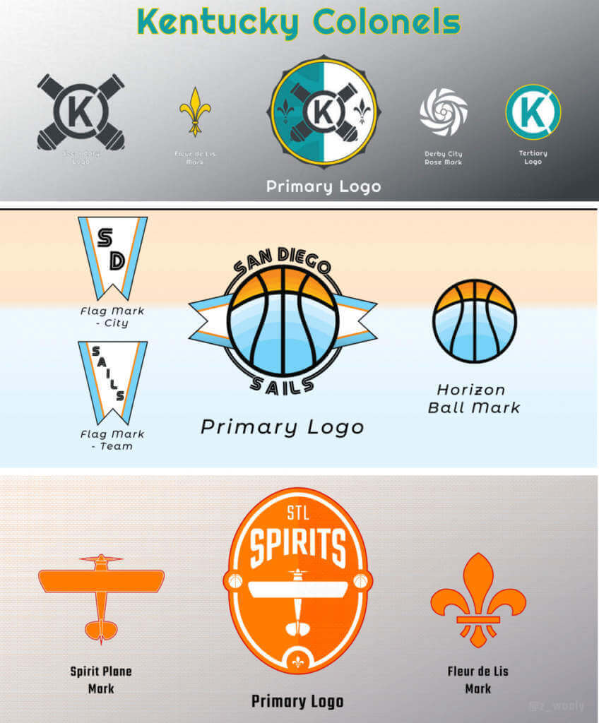
Kentucky Colonels
Some say Kentucky was robbed of a professional sports team because in 1976 the Bulls wanted star Colonels player Artis Gilmore and they opposed adding Kentucky to the NBA. That’s the story I was always told, and it’s hard not to think there wasn’t some politickin’ going on behind the scenes. After all, the Colonels were one of the most successful teams in the ABA. The most wins of any ABA team, a championship and several runs at one, as well as one of the best-attended teams. An impressive resume, but the NBA didn’t want them.
Another thing of note is the Colonels were one of only two franchises that didn’t relocate or rename during the ABA’s existence. The other team so happened to be their archrival Indiana Pacers. However, they did change their team colors and uniforms several times, which left a lot of looks to build an identity off of.
Being a native Kentuckian, I know that were the Colonels to return it would need to be a team that represents the entire commonwealth. This meant I didn’t feel like I could make the Colonels a red team or a blue team, the colors of the Universities of Louisville and Kentucky respectively. Additionally, I didn’t want to go with the classic red-white-blue color scheme the Colonels wore near the end of the ABA. It’s an overused color scheme in North American sports. I also considered purple, the mixture of red and blue, but due to a hate-filled high school rivalry I couldn’t stand the thought of my team wearing purple.
Then in my research, I learned that in the early days the Colonels wore green. And our nickname is the Bluegrass State after all. So after some playing around, I settled on Bluegrass as the primary color, Goldenrod (the state flower) as the secondary, and Charcoal as an accent as needed.
As for the logo, I wanted to leave as little room as possible for any connections to the Confederacy with the Colonels name. No Johnny Reb-esque mascots or iconography, especially since Kentucky wasn’t ever a member of the Confederacy. Instead, I leaned into a general military theme with cannons serving as the prominent symbol for the team, partly chosen because “Cannons” would serve as a fine name should Colonels ever need to be abandoned. I included fleur de lis to represent Louisville, where the Colonels would play.
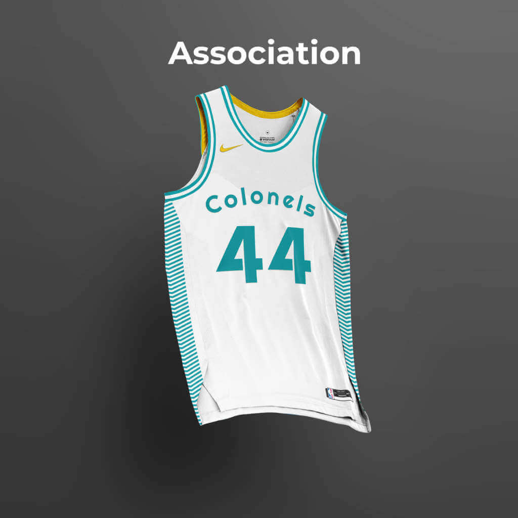
Association
Icon
For the Association and Icon jerseys, I wanted something clean and simple. The side panels feature repeated inverted chevrons inspired by army rank insignia to play with the Colonels name. I also continued the Colonels aesthetic tradition of having only the first letter capitalized, as opposed to all-caps like many other teams.
For the City Edition, I wanted to make something for Louisville the city. Purple is now associated with the city, especially with the rise and success of soccer teams Racing Louisville and Louisville City FC. Fleur de Lis, found all over the city, adorn the sides with striping descending down from them. A blackletter typeface seemed appropriate and in character for the city as well.
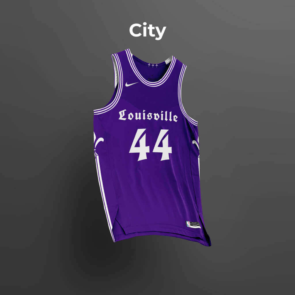
City Edition
The best teams have traditions, so I thought one the Colonels could adopt would be modeling their Statement jerseys after the silks of the winning horse from that year’s Kentucky Derby. After all, what is a bigger statement than winning one of the biggest events in sports? So I not only designed one for this year but for the previous two years as well to show how this tradition might look year to year. While the designs might differ each year, a common thread between each edition would be the inclusion of roses to further tie each jersey to the Run For The Roses. I based this season’s edition on the silks of Medina Spirit.
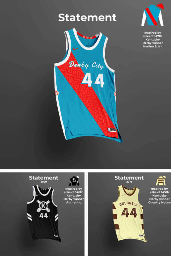
Statement Edition
All in all, I’m pleased with what I put together for the Colonels and I would happily rep the team’s colors. And I’m sure Paul will be pleased to see a green and yellow inclusion as well, though he’ll have to forgive me for the one purple set.
San Diego Sails
The San Diego Sails spent more time existing as the San Diego Conquistadors than they did the Sails, but I felt the Conquistadors name might not be the best in this day and age. So I elected to go with the Sails name, which they used in their last, partial-season of existence. While the Conquistadors wore red and yellow and the Sails wore blue, green, and white, I admittedly reached from a different chapter of San Diego basketball history and drew inspiration from the colors of the Clippers during their time in San Diego.
I wanted to lean into the California coast/pacific theme, so I incorporated a stylized representation of where the ocean and sky meet and nautical flags into the logo. The horizon-motif features on both the Association and Icon jerseys as well. For the City jersey, I stylized the name on the jersey after the Old Town sign, as well as a subtle sublimated pattern based on the shape of the Mission Basilica San Diego de Alcala. For the statement edition, I took inspiration from San Diego’s Hispanic heritage by incorporating a sarape-inspired pattern throughout the jersey.
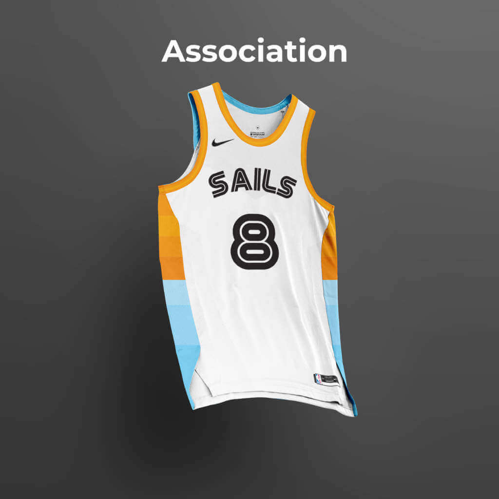
Association Edition
Icon Edition
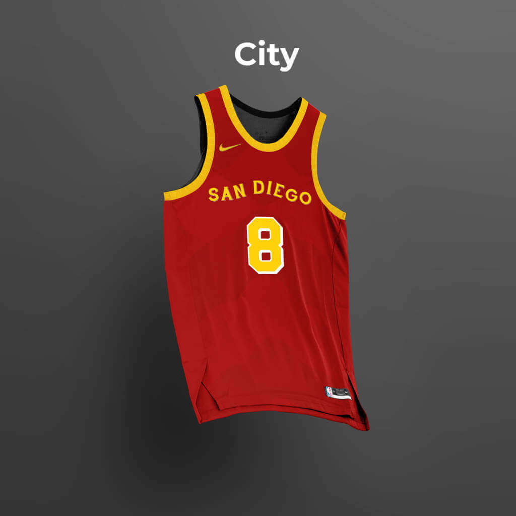
City Edition

Statement Edition
Spirits of St. Louis
The Spirits of St Louis and the Kentucky Colonels were the only two ABA teams left standing at the time of the ABA-NBA merger that did not make it into the NBA. Named for the Atlantic-crossing plane of Charles Lindbergh, they were a high-flying and colorful team with some big personalities.
When re-imagining this team I wanted to give them a brighter orange than the burnt orange the Spirits originally used, and I paired it with red to give a warm and energetic feeling to the team identity. For the logo, I based the shape on the arc of, well, the Arch. It’s St. Louis, you have to incorporate the arch. A top-down representation of Lindbergh’s plane and a fleur de lis serve as alternate marks.
The Association jersey is simple and clean, features subtle, diagonal striping to invoke the upward movement of a plane taking off. The Icon jersey goes for a modern-classic look with two-tone pinstriping. The city edition takes inspiration from St. Louis’s flag, transposing the colors and elements of the flag to the jersey. The Statement jersey features script paying homage to the original Spirits uniforms and a sublimated brick pattern to reference the buildings of the midwestern city.
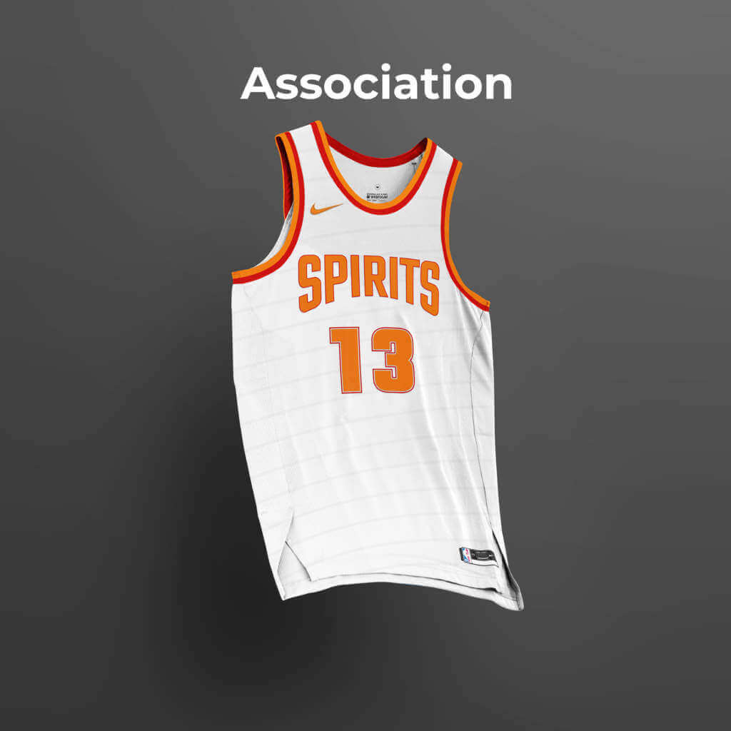
Association Edition
Icon Edition
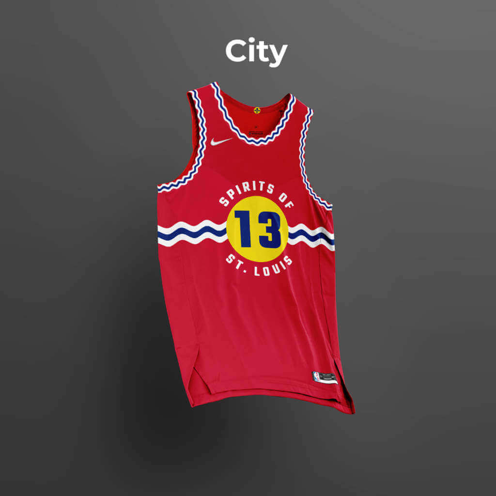
City Edition
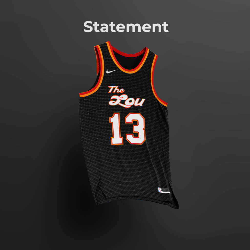
Statement Edition
Final Thoughts
There seems to be more and more talk about expansion for the NBA, and I would like to see it happen. There are a lot of cities hungry for professional basketball and it’d be nice if the NBA gave a look at some of these communities that supported teams in the past. My vote is obviously to bring the Colonels back, but I’m excited to see how any future teams might look back at the past for inspiration.
Good stuff, Zachary! Thanks again for sharing — sure, it took longer than either of us originally envisioned, but it was worth the wait. Readers? What say you?


Guess The Game…
from the scoreboard
Today’s scoreboard comes from Jan Scott.
The premise of the game (GTGFTS) is simple: I’ll post a scoreboard and you guys simply identify the game depicted. In the past, I don’t know if I’ve ever completely stumped you (some are easier than others).
Here’s the Scoreboard. In the comments below, try to identify the game (date & location, as well as final score). If anything noteworthy occurred during the game, please add that in (and if you were AT the game, well bonus points for you!):
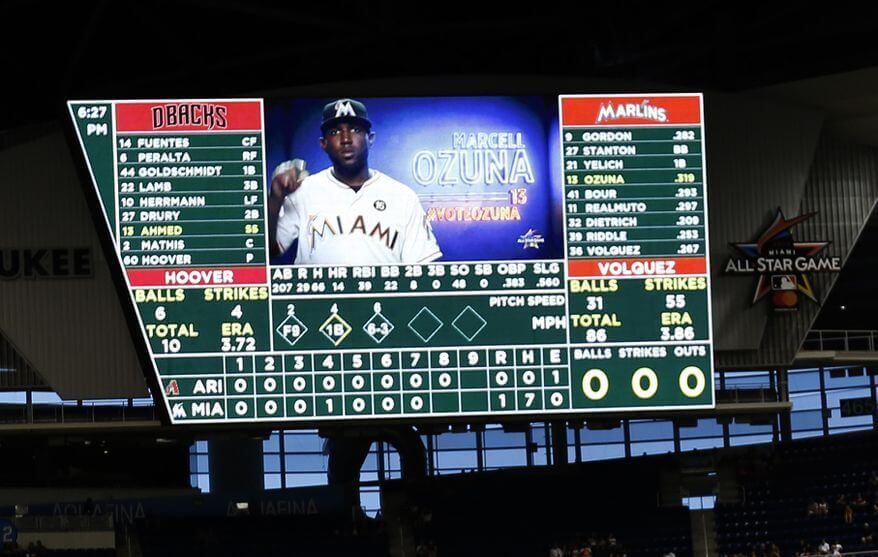
Please continue sending these in! You’re welcome to send me any scoreboard photos (with answers please), and I’ll keep running them.
The “BEST OF” Kreindler’s Korner
Hey guys & gals. You’ve enjoyed Kreindler’s Korner for several years now, mostly on the weekends, on Uni Watch, and we’re still doing the “Best of” until Graig can re-devote his efforts to new writeups for paintings you haven’t seen. Hopefully that will be soon!
Here’s today’s offering:
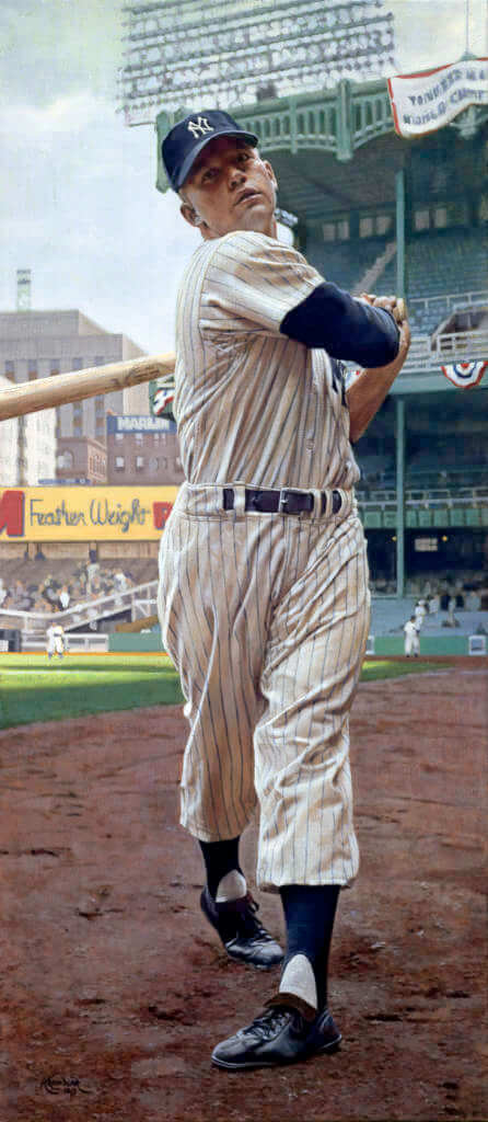
Title: “A Bewildered Bystander”
Subject: Mickey Mantle, 1951
Medium: Oil on linen
Size: 20″ x 46″Here we see a young Mickey Mantle posing before his first regular season debut with the Yankees on April 17. Being a cool, mid-April afternoon, I wanted to make some conscious decisions with my color choices. The sky was kept a little bit dusty and overcast, as it seems like there was mostly cloud-cover during the contest. We can tell that the sun is peaking out a bit here due to the shadow cast by the tripe deck stadium across the right field-side (near his belt). It’s not super bright though, as we can still make everything out in the shadows of the stadium and Mantle himself. Had it been overdone, all of that stuff would appear a value or two darker than it is, as well as the light grass being much brighter, and for whatever reason, just wouldn’t have felt like April. Sure, the focus of the painting is obviously the young rookie, but I was just as concerned with putting him in the proper context of his debut – that sort of attention to detail is the kind of stuff I really strive for.
Thanks, Graig! You can (and should!) follow Graig on Twitter.
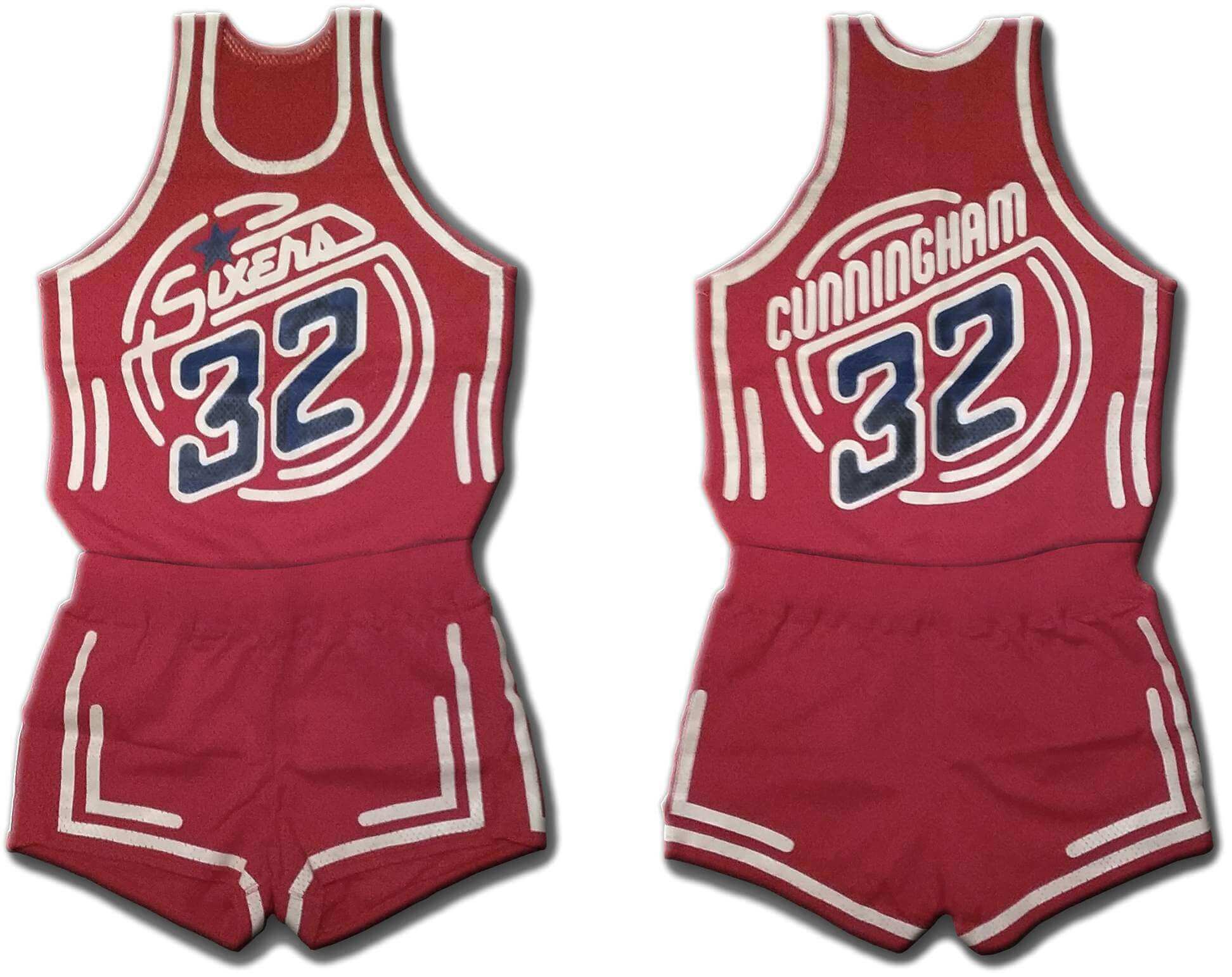
And new a few words from Paul Hi there. In case you missed it on Friday, my latest piece on Bulletin is an exclusive interview with the designer who created a prototype uniform for the 76ers in the early 1980s. As you can see above, the design had a neon sign motif, but it was more involved than that — it was meant to shimmer under black light — yowza!
It’s a fascinating story, loaded with photos and original mock-up drawings. I hope you’ll check it out here.
Uni Watch News Ticker
By Phil

Baseball News: The following are all from ticker stalwart Kary Klismet: This video provides a computer-rendered tour of North Carolina State’s planned upgrades to its baseball stadium. … 65 years ago this past week, the Brookly Dodgers became the first team in Major League history to buy their own airplane for team travel, and the livery on it was spectacular. … The University of Notre Dame library has a special exhibit called “Words on Play” that details early baseball literature before the 20th century. The physical exhibit was mentioned in The Ticker way back in 2010, but since then it’s also been turned into a spectacular online exhibit. (The “Printed Ephemera” section, in particular, is not to be missed.)

Football News: Reader Luke McCarnan writes, “It drives me nuts, but ESPN often uses photos for their headline games that aren’t from the actual game presently being played. However, usually they don’t include players from both teams so it’s not so easy to tell. But (yester)day, it’s obvious. And maybe insulting. For the FBS Championship game (1/8) Montana State played North Dakota State, but ESPN featured a picture of Montana State playing a different team — I’m pretty sure it’s South Dakota State, the Jack Rabbits. Ufdah!” … Not quite uni-related, but uni-adjacent (since the Giants do have an “NY” on their helmets): Is it time for the Jets and Giants to return to New York? A $6 billion lawsuit says yes (from Jenkins Smith). … Pretty impressive hype video for the Ravens. “What if they told you this was the last time you was gonna wear this uniform? How would you seize this moment?” … The Bills will go royal/white today vs. the Jets, who’ll be in mono white. … The Lions teased it earlier this week and now it’s confirmed: They will wear their throwbacks today for the season finale. … A Tampa Bay Buccaneers player signed a contract extension wearing an MLB Arizona DBacks jersey (from Lee Wilds). … It appears that Jackson Mahomes’ jacket that spells out Mahomes is missing the letter “E” (from Moe Khan) Or was it? (from Texas Trevor). … Looks like Melvin Gordon III’s NOB actually uses #1s instead of “I”s (from Clay Mitchell), but no — that’s just the Broncos “stupid custom font” (per Paul). … WHOA — Check out the uniforms for the Virginia High School Football Team Champions — Little Ten Conference, Virginia, Minnesota (from Nick Hannula). … Interesting display of Georgia and Alabama uniforms, ready for Monday’s College Football Final (from Greyson Roberts). … The uniforms for the High School “All American Bowl” were um…colorful (from Marcus Hall). … The Pro Bowl, which no one apparently watches or cares about, will still have uniforms for both the NFC and AFC (from Sportie McKenzie). … This website details Michigan’s uniform history dating all the way back to 1879 (from Kary Klismet). … Also from Kary: here’s one writer’s list of the 10 worst uniforms in college football since 2000.

Hockey News: Here’s another article that ranks NHL jerseys (from worst to first). The worst? Chicago Blackhawks. You can probably guess why. … I’ve always said there are good color vs. color and bad color vs. color matchups. This one is one of the good ones (from Mark Wellner). … Check out the Oregon Ducks Hockey team (via Paul). … The Kalamazoo Wings played on rainbow ice on Friday night (from Paul). … 18-year-old Grant Gilbertson was a player with the Peninsula Panthers, who tragically passed away on Monday. The team will honor him with his number on their helmets for the rest of the season (from Wade Heidt). … Here’s some great video of the original Quebec Nordiques uniforms (from sheduardo). … In addition to unveiling its all-star game logo (as mentioned in Saturday’s Ticker), the Premier Hockey Federation (formerly the National Women’s Hockey League) has also revealed the game jerseys (from Kary Klismet).

Basketball News: The Philly Voice ran a nice piece on the 76ers prototype that Paul had written about on Friday. Lots of props to UW! … An old field house in Davenport, Iowa, contains a reused Coastal Carolina basketball court (from Nick Pfeiffer). … This is cool: Texas MBB players on the floor are numerically 5 in a row (from GeoPokes). … Here’s an ESPN graphic showing both Avery Bradley and Malik Monk wearing 11. Bradley is now wearing 20 (from Bill Russo).

Grab Bag: Not uni-related, but VERY cool nonetheless. Check out this article: From Greek to Latin: Visualizing the Evolution of the Alphabet (from Jon Vieira). … The NLL (Lacrosse) teams wore the orange “Every Child Matters” shirts in warm-ups for Jan. 6-8 games. These acknowledge the children left behind and the survivors who are still healing from the trauma at indigenous residential schools. … Ads are a bane to uniforms, but they’re a boon to many Minnesota pro teams (from Brian Kerhin). … This sign literally put my OCD into hyperdrive (from Walt Young). … New logos for Chippewa Hills High School in Remus, Mich. (from Kary Klismet). … Also from Kary: The Fort Worth Polytechnic High School Parrots have new logos. … Here’s a gallery of uniforms for several professional road cycling teams for the 2022 season (also from Kary).
Uni Tweet of the Day
Probably one of the better “one and done” uni ideas…
On this day in 1989, NC State basketball debuted their infamous @Nike unitard uniforms!
The Wolfpack wore them for one game, a 71-59 win over Temple, before retiring the concept.@PackMensBball | @UniWatch pic.twitter.com/TQefACbrWC
— Origin Sports (@OriginSportsTV) January 7, 2022
And finally… that’s it for today. Thanks to Zachary for sharing his ideas for the remaining three defunct ABA teams! Fun stuff.
Everyone have a great week — enjoy the NFL today (is the regular season finally over???), and of course the Natty between UGA and ‘bama tomorrow night. Stay safe! Until then,
Peace,
PH
Interesting how time changes things. When we see a hockey team wearing yellow uniforms against another team wearing their darks it is mentioned as colour vs. colour. Though in the 1970-1980s this was nothing special. Just another home game for teams like the Golden Seals, Kings, and Canucks.
About the memorial helmet decal for Grant Gilbertson of the Peninsula Panthers. It is a different team in the league (Oceanside Generals) wearing the memorial patch in the Ticket item. Does make for a unique situation with the Generals wearing the logo of an opposing team in their league on their helmets.
Really thoughtful work from Zachary – thanks for sharing! Couple of suggestions: With the Colonels, I’d rather see something other than a fleur de lis to symbolize Louisville, since the team will hypothetically be near neighbors to the Spirits, with their much more prominent fleur de lis. Something like a horseshoe would more overtly connect with the Derby, with the Derby City nickname, and it would also tie into the distinguished cavalry service of several notable Kentucky-born officers in the Union Army.
For the Sails, my one suggestion would be to turn both of the flag logos sideways, as they appear in the primary logo. One, this establishes a clearer visual connection among the marks. Two, burgees are meant to be displayed horizontally. And in any wind, when a sail would be effective, a burger in the rigging will tend to flap about horizontally. This way, the flag marks can imply the presence of sails, which are otherwise absent from the team’s visual identity. The vertical orientation kind of makes the flags look like sails hanging in a windless calm, which is not ideal.
Great job on the ABA concepts, Zachary! Really well researched and designed. And I appreciate you reaching deeper into your crayon box on your color palettes than most modern teams do. There are so many color combinations that team’s never explore because they’re too concerned about whether they’ll sell at retail. Not that it should ever be the primary consideration of a sports uniform, but I, for one, would buy several of these uniforms, especially the Sails, precisely because they’re NOT cookie cutter color choices.
(I meant this to be a standalone comment, but it seems to work fine as a conversation thread started by Scott, too.)
Thanks Kary! I agree wholeheartedly about colors.
Thanks for all the thoughts and feedback Scott! I’ll look at adopting your suggested changes for the Sails, I think you’re probably spot on there.
Going on the Michigan football uniform website, I have a college teams tracker list. If anyone has leads on missing teams, let me know.
acc-tracker.com/trackers/
GTGFTS: June 3, 2017 – Edinson Volquez’ no-hitter for Miami vs. Arizona.
“The University of Notre Dame library has a special exhibit called “Words on Play” that details early baseball literature before the 20th century.”
Here’s a link to the full online exhibit from the Notre Dame library:
link
There are some great visuals to be seen in the other sections of the exhibit in addition to the “Printed Ephemera” section.
Also, it looks like I forgot the “n” at the end of “Brooklyn” in the Ticker item about the Dodgers’ plane. D’oh!
Like the ABA concepts – but need to see it with the shorts. Not a complete set without the shorts
I can’t let a discussion about the ABA go by without recommending Terry Pluto’s
Loose Balls: The Short, Wild Life of the American Basketball Association. It’s an informative read, mostly fun but sad in parts.
Different topic: shout out to Luke McCarnan for using a Scandinavian expletive.
Nice job with the ABA takes. I’d stick with Conquistadors, since Sails is too close to Clippers. I don’t see the problem with that name, since a Conquistador isn’t much different from a Viking, but Spanish instead of Scandinavian. Minnesota has a lot of people with Scandinavian descent, whereas many people in San Diego have Spanish, Hispanic, background.
Really, “The Lou”? Is that really a nickname for St. Louis? Wouldn’t play well in the UK. And you might want to downplay the Lindbergh connection.
The Dolphins look FANTASTIC today. Wish they would keep that look. Why f@@k with perfection???????
The extra effort they take with the retro end zones is a nice touch!
Their throwbacks are a nice option for every-so-often wear…while I consider myself a ‘classicist’, I much prefer the modernized set even though that’s a minority viewpoint on UW.
Yeah forgot to mention that the St Louis name association with a supporter of Nazis and eugenics is a bad look.
There’s no good reason for this site to run concepts that contain ad patches. We would get the idea of these ABA concepts without them. Why give companies like Nike a favor that they would never offer in return?
Late night proofreading:
The ABA ended folded in 1976…
the Brookly Dodgers became the first team in Major League history…
Really great job on the ABA redesign.
Also, there’s nothing sexist about “Lady Cats”. This site would be so much better without the woke ridiculousness.
It would be helpful if you put the Lady Cats comment on Tuesday’s post, since that’s when that issue came up. Thanks.