[Editor’s Note: Paul is on his annual August break from the site. Deputy editor Phil Hecken is in charge from now through the end of the month, although Paul may be popping up here occasionally.]
By Phil Hecken
Follow @PhilHecken
Good Morning Viet Nam Uni Watch Nation! It’s Friday — we made it.
When I put out the call for reader submitted articles back in July, today’s guest author, Zachary Wooldridge, contacted me and offered up a pair of posts — he creates full uni, logo, and brand mockups for every team in his fantasy football league (which is an intriguing post itself) as well as “a series in which I create what a modern uniform and identity could look like for some of the old ABA (American Basketball Association) teams.” After our initial conversation, I didn’t hear from Zachary for a couple weeks, but with my time doing weekdays coming to a rapid close (yea!), he came through with what you’re about to see today. The original plan was for him to do six teams, but life interceded (as it often does), and Zachary was able to complete three of the six teams. But even though it’s only three, he’s done a nice job creating new logos, identities and jerseys. I’m going to just turn it over to Zachary right now. Enjoy!
Re-Imagining the ABA – Part I
by Zachary Wooldridge
I am not old enough to have seen a game of the American Basketball Association, but it has always fascinated me for some reason or another. The unique team names and identities? The “fun” perception it created for itself? Or am I still salty John Y. Brown opted to sell the Colonels and deprived me of ever cheering for an NBA team in my home state?
Who’s to say?
Regardless, some months ago I set out to imagine what some of the former ABA teams could look like today. I elected to work on six total teams and today I present to you the first three.
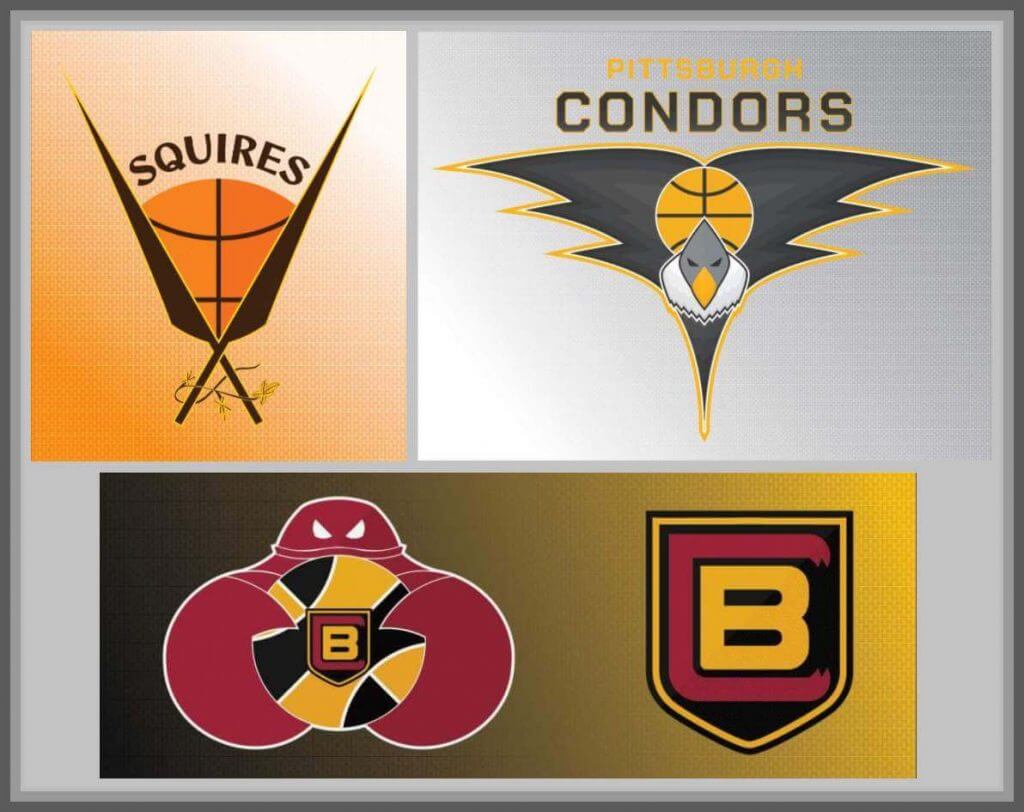
Baltimore Claws
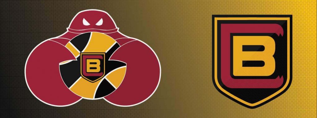
The Baltimore Claws technically existed. The team had existed under varying names in varying cities from 1964-1975. The team known as the Baltimore Claws intended to play in the 1975-76 ABA season, but collapsed before the season started. They managed to play three exhibition games, which were all losses. Still, the Claws name stood out to me as one that could be fun to play with.
The original Claws, from what I can gather, wore red uniforms. So I started there and eventually ended up where so many Maryland sports teams do: At the flag. I evoked the checkerboard-esque pattern of the Baltimore city flag in the basketball in the crab logo. Additionally, that same pattern appears sublimated into the Association and Icon edition jerseys. The shield on the Statement edition is reminiscent of the shield present in the Baltimore city flag. For the city edition jersey I created a faux-back to one of the original Claws uniforms, with Baltimore’s “Charm City” nickname appearing in script across the chest.
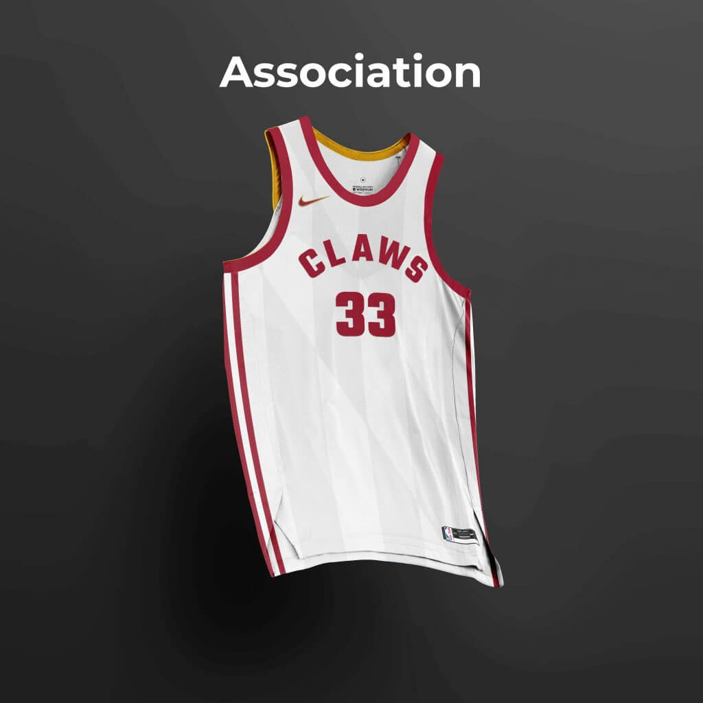
Association:
Icon:
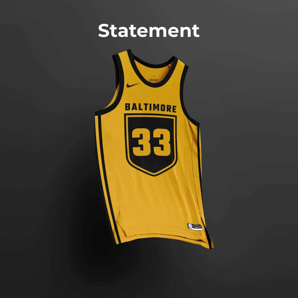
Statement:
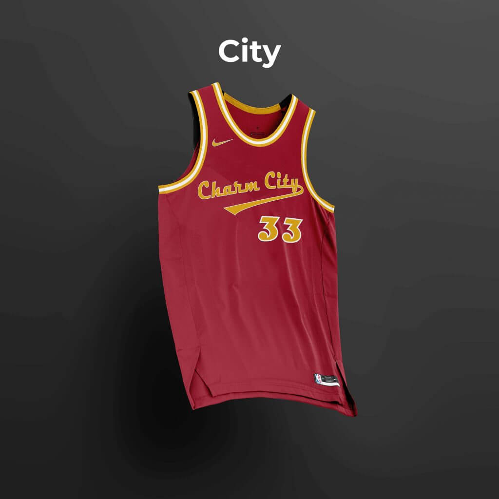
City:
Pittsburgh Condors
The Pittsburgh Condors began play in 1967 as the Pipers, a name which they bore through stints in both Pittsburgh and Minneapolis. In 1969 they returned to Pittsburgh and in 1970 changed their name to Condors.
Being a professional sports team in Pittsburgh, what choice of colors to use didn’t take much thought. Both the Association and Icon editions feature a sublimated, stylized feather pattern like the pattern on the wings of the logo. And seeing as how the league has done away with “home” and “away” designations for uniforms under Nike, I opted for the Association edition to be yellow (as opposed to white). The Statement edition jersey is a faux-back inspired by the original look of the Condors. The City edition jersey calls back to elements present on the flag of Pittsburgh.
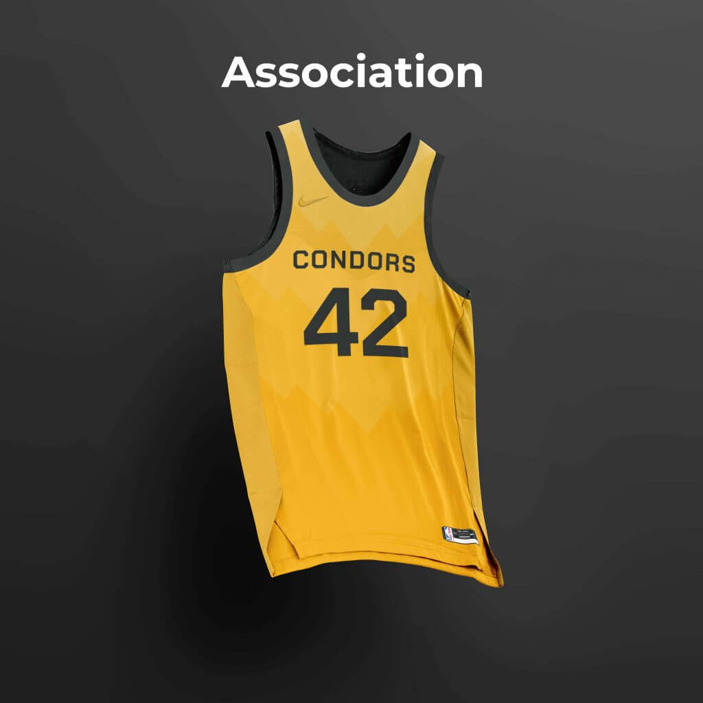
Association:
Icon:
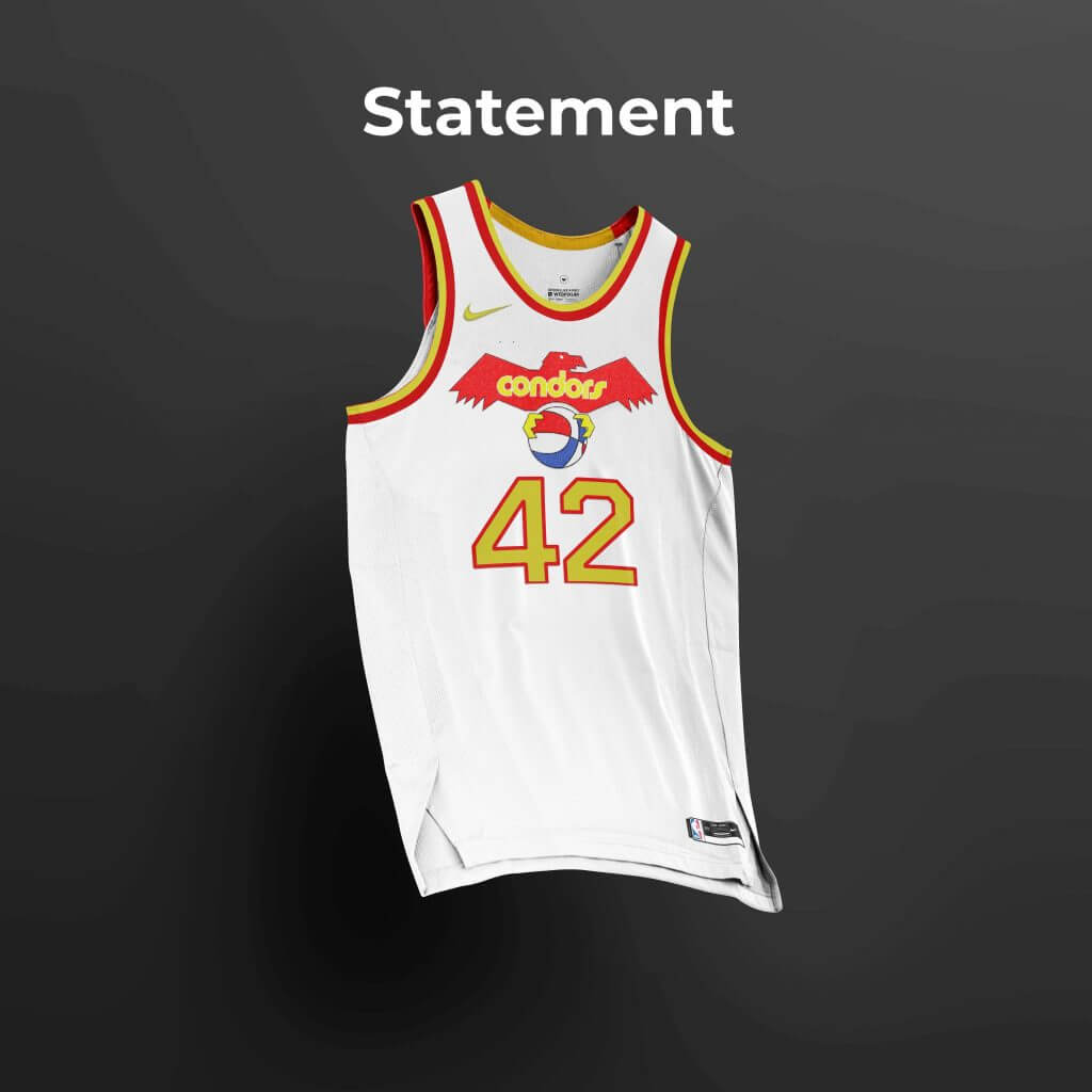
Statement:
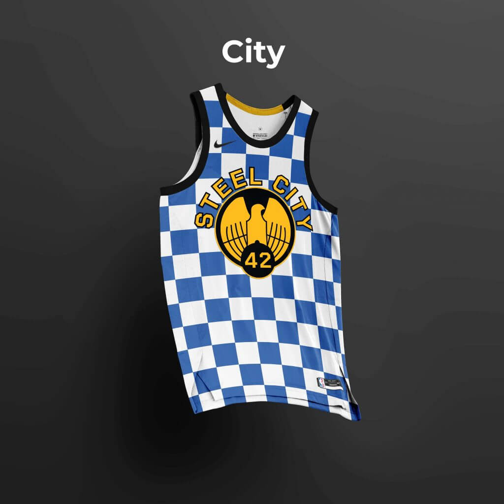
City:
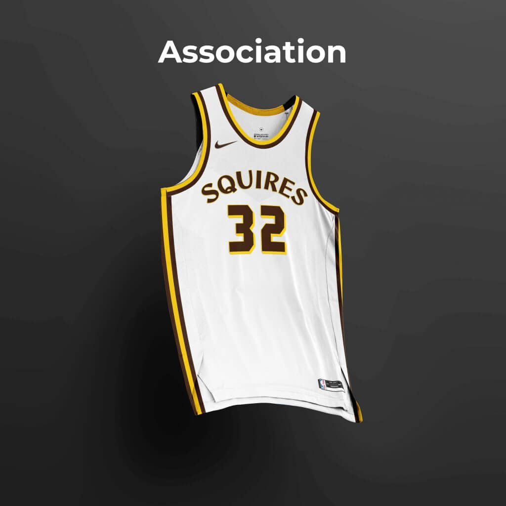
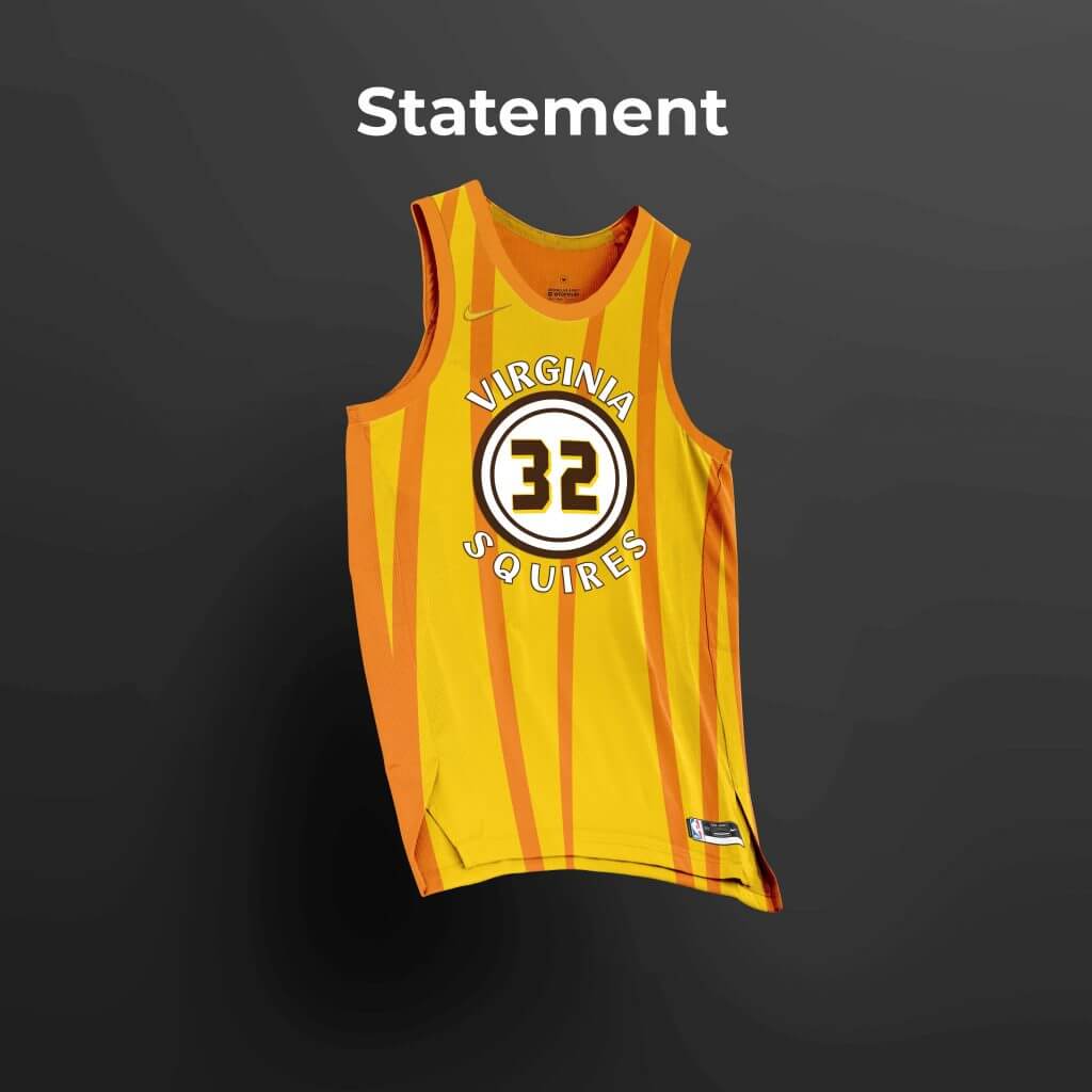
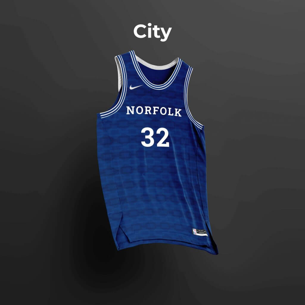
Virginia Squires
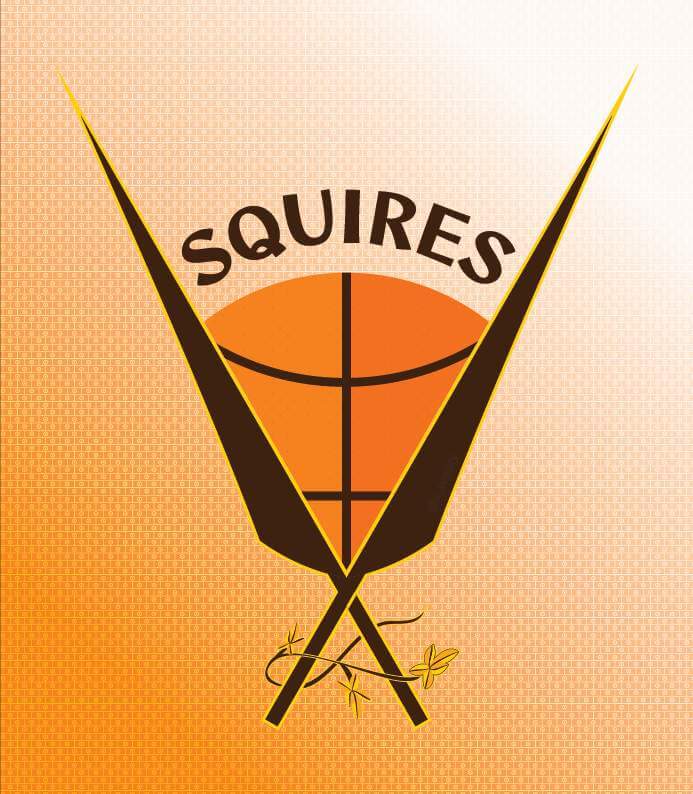
The Squires originated in 1967 in Oakland as the Oaks, but by 1970 they were playing in Norfolk as the Squires. The Squires operated in a unique way, playing home games between Norfolk, Richmond, Roanoke, and Hampton. In my imagined reality, the Squires would have set up a permanent home somewhere in the Hampton Roads metropolitan area.
The Squires wore varying color schemes throughout their history. They wore red, white, and blue from 1970-74, but there are already too many teams in today’s league using a similar palette. Instead, I opted to work with the more unique brown and orange they wore from 1974-75, and added yellow to expand the palette.
The Association and Icon editions feature striping inspired by earlier Squires uniforms. The Statement edition features a bold orange and yellow pattern evoking the shape of lances. The roundel featured on the Statement edition represents a shield, as a reference to the shield-bearing duties of squires of old. The City edition pays homage to the United States Navy and Naval Station Norfolk. It features stripes on the cuffs reminiscent of those found on naval uniforms, as well as a sublimated pattern of an anchor’s chain.
Association:
Icon:
Statement:
City:
Thanks, Zachary! Definitely a fun little project which I think turned out really well. We’ll have the second half of Zachary’s designs one of these coming weekends, so stay tuned.
Readers? What do you think of Zachary’s concepts?
Bulletin reminder: Paul here. In case you missed it yesterday, latest Bulletin article is a think piece that addresses a question that’s been on my mind: Is the rapid rise of legalized sports betting good or bad for uniforms? You can check it out on my Bulletin page.
Okay, now back to Phil!
The “BEST OF” Kreindler’s Korner
Hey guys & gals. You’ve enjoyed Kreindler’s Korner for several years now, mostly on the weekends, on Uni Watch, and we’re still doing the “Best of” until Graig can re-devote his efforts to new writeups for paintings you haven’t seen. Hopefully that will be soon!
Here’s today’s offering:
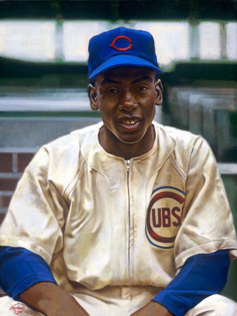
Title: “The $20,000 Roomate”
Subject: Ernie Banks, September, 1953
Medium: Oil on linen
Size: 18″ x 24″This classic image of Ernie has always appealed to me for a number of reasons. One of the main reasons being that great zipper-front Cubs jersey. Though the pinstriped version of the late ’50s became de rigueur, there’s something about the previous designs that have always seemed extra cool to me. Maybe it has something to do with the fact that Banks started his career in them? Either way, mixed with that classic Cubby blue, you can’t go wrong. Also worthy of note, Banks’ gold tooth! I don’t think he had it for too long after coming up to Chicago.
Thanks, Graig! You can (and should!) follow Graig on Twitter.

Guess The Game…
from the scoreboard
Today’s scoreboard comes from ojai67.
The premise of the game (GTGFTS) is simple: I’ll post a scoreboard and you guys simply identify the game depicted. In the past, I don’t know if I’ve ever completely stumped you (some are easier than others).
Here’s the Scoreboard. In the comments below, try to identify the game (date & location, as well as final score). If anything noteworthy occurred during the game, please add that in (and if you were AT the game, well bonus points for you!):
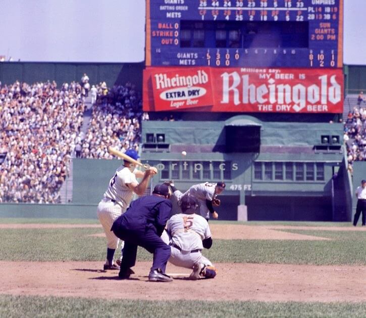
Please continue sending these in! You’re welcome to send me any scoreboard photos (with answers please), and I’ll keep running them.
The Ticker
By Anthony Emerson

Baseball News: SABR posted a really great pic of the Alou brothers yesterday. Curiously, Matty and Jesus are in home unis while Felipe in the Braves’ road greys. … Giants IF Wilmer Flores has Friends cleats. I think I’ll get some Seinfeld cleats for my intramural softball league (from Benjamin Alexander Hochberg). If don’t know the significance of Friends to Wilmer, read more here. … The Erie SeaWolves, Double-A affiliates of the Tigers, are having a 25th anniversary promotion for the movie That Thing You Do! which is about a one-hit wonder band from Erie (from James Meeker). … Dig the pillbox Bucs cap on injured Pitt Panther QB Rick Trocano in 1979 (from Jimmer Vilk) Also posted in College Football.

NFL News: Dolphins wideout DeVante Parker wore a generic red no-contact jersey during practice yesterday. The jersey also didn’t feature the team’s ad patch (from @Frankie_Doodle). … @_RF30 found some 2020 NFL Draft Caps in the bargain bin at TJ Maxx. The 2020 draft was, of course, the one conducted from Roger Goodell’s basement. … Today I learned that the Panthers played their inaugural preseason in Apex unis but switched to Reebok for the regular season.
College/High School Football News: Ohio State will wear this helmet decal on Sept. 11. … The NCAA’s official website has a quick rundown of some of the uni changes in Division I this offseason (thanks, Phil). … Our own Jamie Rathjen writes in: “It looks like Virginia’s going to wear orange jerseys for the first game of the season next week because fans are being asked to wear orange. But there’s little threat of mono-orange because orange helmets and pants haven’t appeared with the current uniforms (both last appeared in 2015, according to the ACC Tracker). … It’s not just bowl games that have been inundated with title ads — now opening week games are getting in on the action (from Ignacio Salazar). … Here’s Illinois’ official explainer on the Illini’s new helmet (from multiple readers). … FAU will add a memorial patch and decal for Howard Schnellenberger, FAU’s first coach. … Dig the pillbox Bucs cap on injured Pitt Panther QB Rick Trocano in 1979 (from Jimmer Vilk) Also posted in Baseball.

NBA News: While the Phoenix Suns may or may not wear that “Aztec” uniform Phil covered yesterday, they revealed plans for another alternate uniform in the works for 2022-23 that would honor Native American communities indigenous to Arizona: “We’re excited to introduce a uniform honoring the Tribal Nations of Arizona for the 2022-23 season.” (from Phil).

Soccer News: Aston Villa have released their third kit (thanks, Jamie). … Bundesliga side 1. FC Köln will wear a special jersey this weekend listing the names of the 6,400 season ticket holders who chose not to ask for refunds during last season, which of course was played without fans (from Jeremy Brahm).

Grab Bag: SMU slightly altered their athletics logo, changing from a generic college block font to Copperplate, also known as “the old Warriors’ font” (from Raheel Anwar). … The US took on Canada in wheelchair rugby at the Paralympics on Thursday morning. The Americans came out in navy blue jerseys against Canada in black, making the teams basically indistinguishable. For the second half, the US came out in less-clashing white jerseys (from Brian Fowler and Marcus Hall). … The Commonwealth Clash, which is an annual competition between Virginia and Virginia Tech in every sport where they both have teams, now has an ad in its name (thanks, Jamie).
(Non) Uni Tweet of the Day
This just blows me away. I cried because I had no gloves, until I met a man who had no arms…
This is incredible. 48 year old Egyptian Paralympian Ibrahim Hamadtou who lost his arms in a train accident aged 10 in Tokyo today. Could have played football but took up table tennis “as a challenge.” How inspiring is this? (via @Ch4Paralympics) pic.twitter.com/ONB59KwgVD
— Omid Djalili (@omid9) August 25, 2021
And finally… that will do it for me for the week. Big thanks to Zachary for those ABA concepts! Well done, sir.
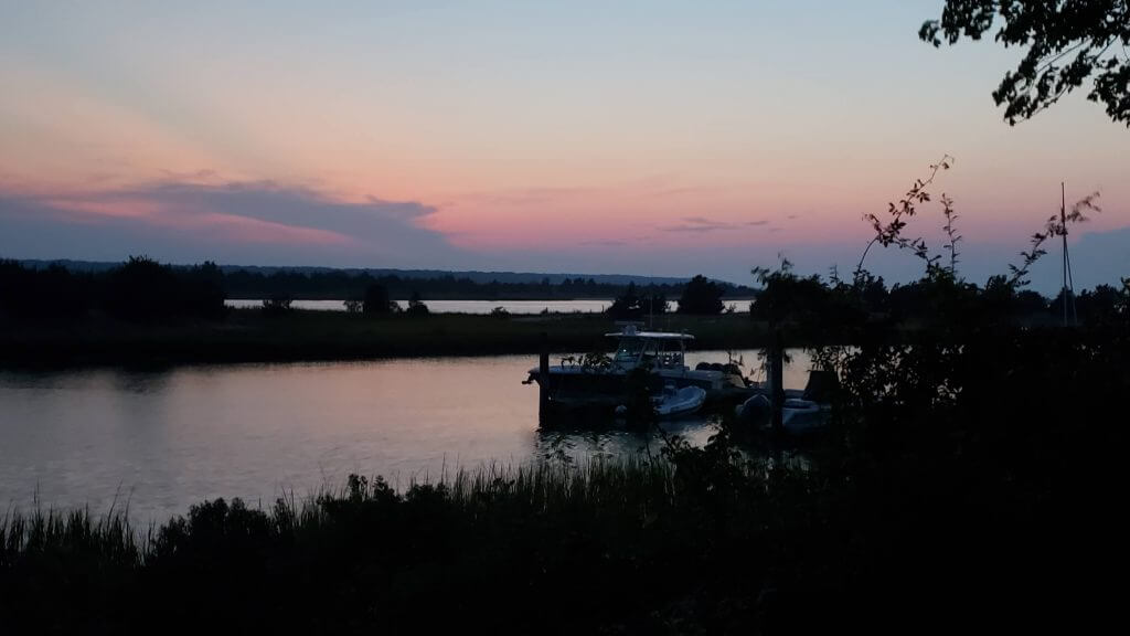
Back out at the summer place, and after an absolutely STIFLING day (90 degrees and about 95% humidity) and crystal clear blue skies, we ended up with another low cloud deck at dusk, so there was no visible sunset. But still a pretty sky afterwards…
Everyone have a great weekend. Webmaster Johnny Ek will take you through it, and I’ll catch everyone back here on Monday.
Peace,
PH
Giants first game at Polo Grounds as the road team? 1962?
Actually their second. Game 1 of the June 2, 1962 doubleheader, which the Giants ended up winning, 10-1. (The only unearned run was the Mets’ because of a Willie Mays error.)
That’s Jack Sanford pitching to Frank Thomas in the photo.
Frank Thomas is wearing a flocked helmet(?).
He did so in ’62:
link
Got me to thinking – how many times have teams come back and played in their old home against the team that replaced them?
It requires a relocation, a new team to move into the old city, and the old building to still be used for the new team. The third one is the hard one because so many of the new teams never played in the old building (e.g. Atlanta Thrashers never played in the Omni, Texans never played in the Astrodome, Browns never played in Municipal Stadium, new Jets never played in Winnipeg Arena).
The only examples I can come up with:
– the Twins visiting the Senators in the one year the new Senators played in Griffith Stadium
– the New Jersey Devils at the Colorado Avalanche in the few years that the Avalanche played at McNichol.
– the Oakland A’s visiting Kansas City Royals in the few years the Royals played at Municipal Stadium
– the New Orleans Hornets visited Charlotte once in 2004 while the Bobcats were at the old arena
– every time the Chargers played at the Coliseum against either the Rams or the Raiders
The St. Louis Rams played at Busch for a season but the Cardinals didn’t visit. The Ravens played in Memorial Stadium for a couple of years but the Colts didn’t visit. It doesn’t look like the Raiders ever visited the Coliseum after the Rams moved in.
The Braves played the Brewers at Milwaukee County Stadium from 1998-2000.
Atlanta Hawks played the Bucks at the MECCA multiple times upto 1988.
Wouldn’t the Braves playing the Brewers in 1970 be what we’re looking for?
Braves and Brewers never faced off until the Brewers switched league in time for the 1998 season. Prior to that interleague play was divisional alignment only.
The only time I know a Braves player would have suited up in Milwaukee post 1970, would have been the 1973 all star game.
While not the same thing (and only an exhibition), the Philadelphia Flyers were the visiting team when they returned home to the Spectrum to play the AHL Philadelphia Phantoms in 2008.
I thought there was a chance for the Texas Rangers to have played the Washington Nationals at RFK Stadium, but in 2005 the two teams played in Arlington. By the time the Rangers came to Washington to play in 2008, the Nationals had moved to Nationals Park.
The Rockets would return to the San Diego Sports Arena a couple times a year when the Clippers were there from 1978-84.
After they moved to Anaheim, the Rams played three games against the Raiders at the Coliseum (1982, 1988, 1991).
Love to see the ABA getting attention. Now if we could just get the NBA to use the red, white and blue basketball.
Yep,at least on occasion, like throwback games.
Typo alert — in the ticker item about the Alou brothers, Matty’s name is typoed as “Marty.”
Thanks, Tom. Now fixed.
The reimagining brought back some painful memories. I was a big ABA fan and looking back I wish that merger could have come about earlier when the ABA had more viable teams. I would have loved to have seen each league compete separately and then face off in the finals. I think the ABA would have been far more competitive with the NBA as compared to some of the other mergers in football and hockey. But, oh well. It was nice to see mention of some of the teams though! Nice job!!
AFL was very competitive, After the first 2 Super Bowls that the Packers won, AFL teams then won 5 of the next 9 Super Bowls. Of course can’t count all the AFC wins, because the Colts and Steelers were originally from the NFL.
On Wilmer Flores’ cleats: When he was with the Mets, his walk-up song at Citi Field was the Friends theme song. Which makes his wearing of those shoes for his first time back at Citi Field as a visiting player pretty funny to me.
It’s his walkup song on the Giants too
Flores did learn to speak English by watching Friends, so the tribute makes sense.
Great concepts Zach! Can’t wait to see the rest of the teams.
Thanks Memal!
Thanks for sharing the Table Tennis player. Amazing!
Welcome. I heard my *local* sports radio guys (Carton & Roberts) talking about it yesterday, so I went and found that tweet. Pretty amazing and inspirational.
Panthers also had 2 versions of their Inaugural Season patch. One for the preseason that included ‘Clemson University’ on it and a second regular season patch that just said ‘Inaugural Season.’
Very classy work, Zachary! I had never seen the Maryland flag done in a way that I thought was good until today. Subtle, but still very much there. Great job from one concept artist to another.
Thanks Ian! I appreciate the kind remarks!
I really like the Crabs logos. Unis seem a little dull though, particularly given how out of the box some of the ABA unis were (i.e., Nets). Cool concepts though.
That paralympics table tennis footage. Ho.Lee.Crap.
The new SMU font is not Copperplate. Not even close, really.
Oh wow, Zachary, very well done on these handsome designs! Each of the Association ones are scorching hot.
The new SMU wordmark is a serifed font but it is not Copperplate, a specific font.
Whatever it is that new SMU font is horrible.
Makes more sense to me on top of the slim mustang logo. Never thought there was anything wrong with what they had, but I prefer the new one.
Wow. Rick Trocano; there’s a name from the past. I believe he also played safety for Pitt.
Always wondered what might have been if there wasn’t some guy named Marino at the school …
Trocano’s injury opened the door for a freshman named Dan Marino. Never heard of him.
Home or Away…those are some tasty unis in that Alou Bros pic.
Love the ABA stuff – Good work Zach
Steel City Condors jersey is Sa-wheeeeet
GTGFTS – June 2, 1962, at the Polo Grounds. The Giants returned to their old home for the first time since moving to SF and proceeded to sweep the hapless Metropolitan Baseball Club of New York, winning this particular game by a score of 10-1.This was game one of a doubleheader. My Little League did a trip later in the season to see the Dodgers handily beat the Mets 8-2 on Saturday August 25th. I bought a Mets Yearbook with the baby Met on the cover. Wish I still had that one.
I’m not much of a basketball fan but those ABA concepts were pretty nice. I was worried that the Baltimore uni would go over the top with the Maryland flag but it was tastefully restrained. The Charm City uni was also on the mark, hon.
I found the article about the Illinois football helmets fascinating. I remember those plain Illini wordmark helmets as being NY Giants-ish. And I could have sworn my life that they used to have a helmet with Chief Illiniwek on the side but that was probably a concept from years ago.
Someone should definitely doublecheck me, but I believe that since July 15th (the dark day the Mets announced that they were officially bringing back the black jerseys), the team has gone 14-28 and have lost all three games while wearing the black jerseys. Ditch the black!
Thing that strikes me about the Guess the Game photo is how dumpy Frank Thomas looks in his uni…..the Players Association would probably fine a player who looked that way today !