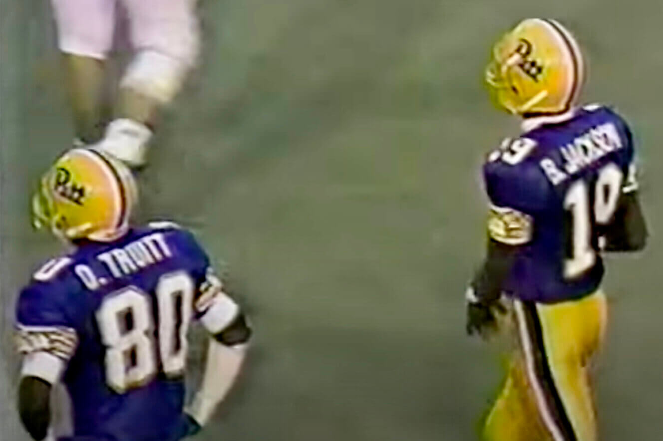
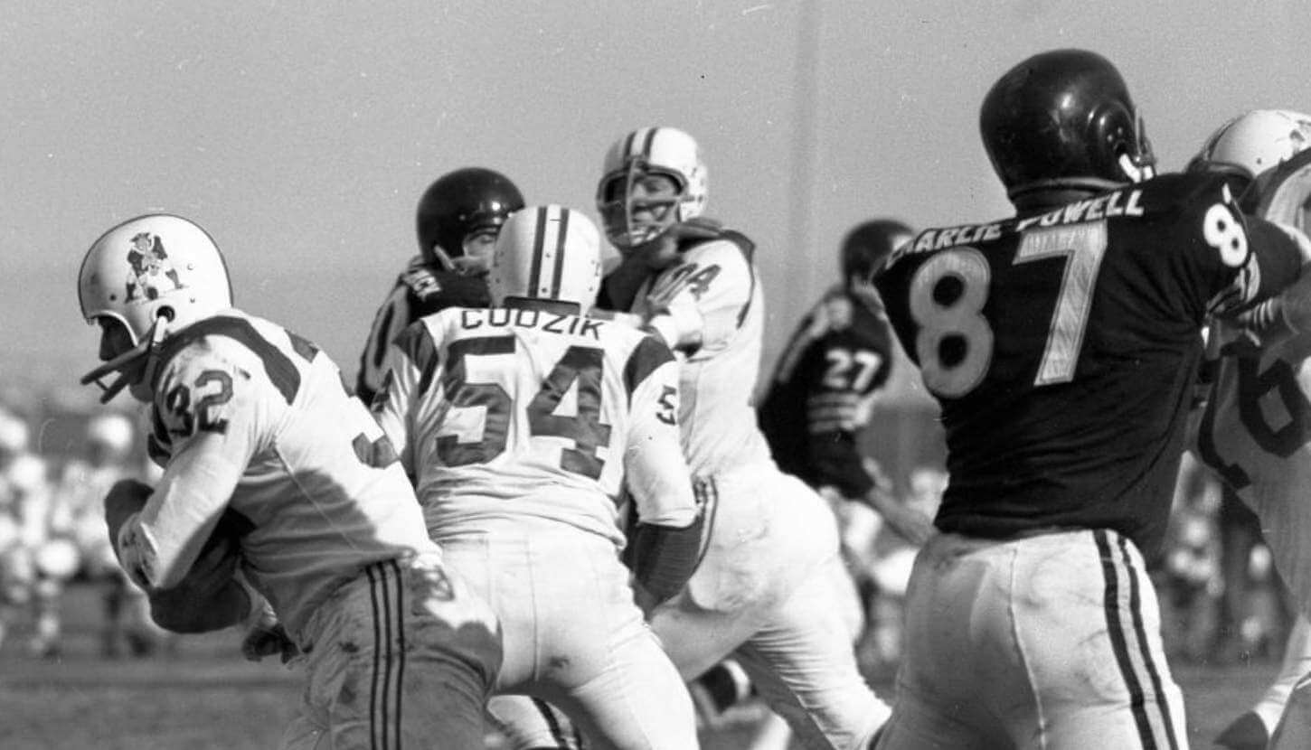
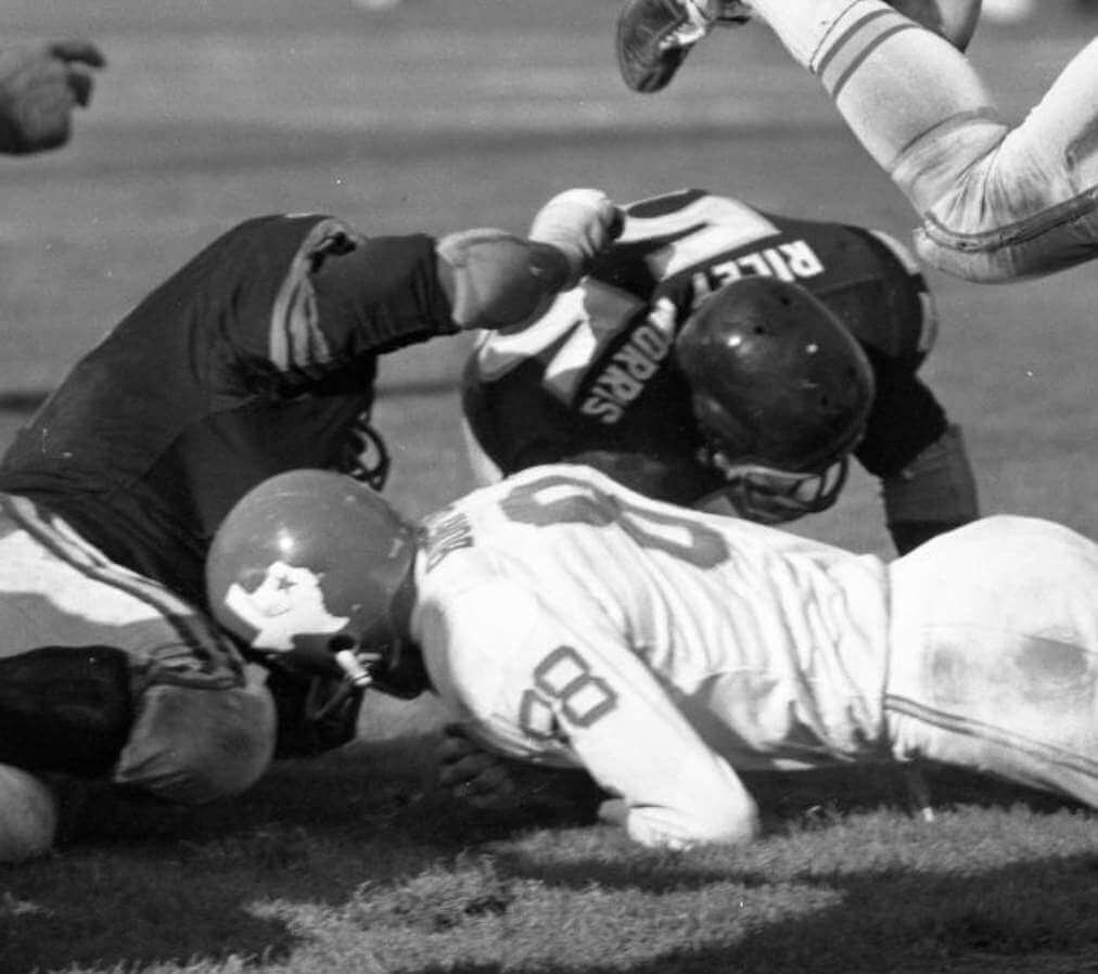
The screen shot above is from the 1989 game between Pitt and Penn State. It shows Pitt wide receivers Olanda Truitt and Baron Jackson. It’s funny that their NOBs both included first initials, right? And it was a nice additional coincidence that the camera happened to capture the two wideouts and their two FIOBs, side by side.
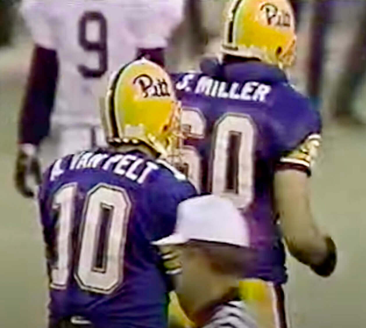
But wait — quarterback Alex Van Pelt and offensive lineman Scott Miller also wore first initials that season, and the camera managed to capture them together as well:
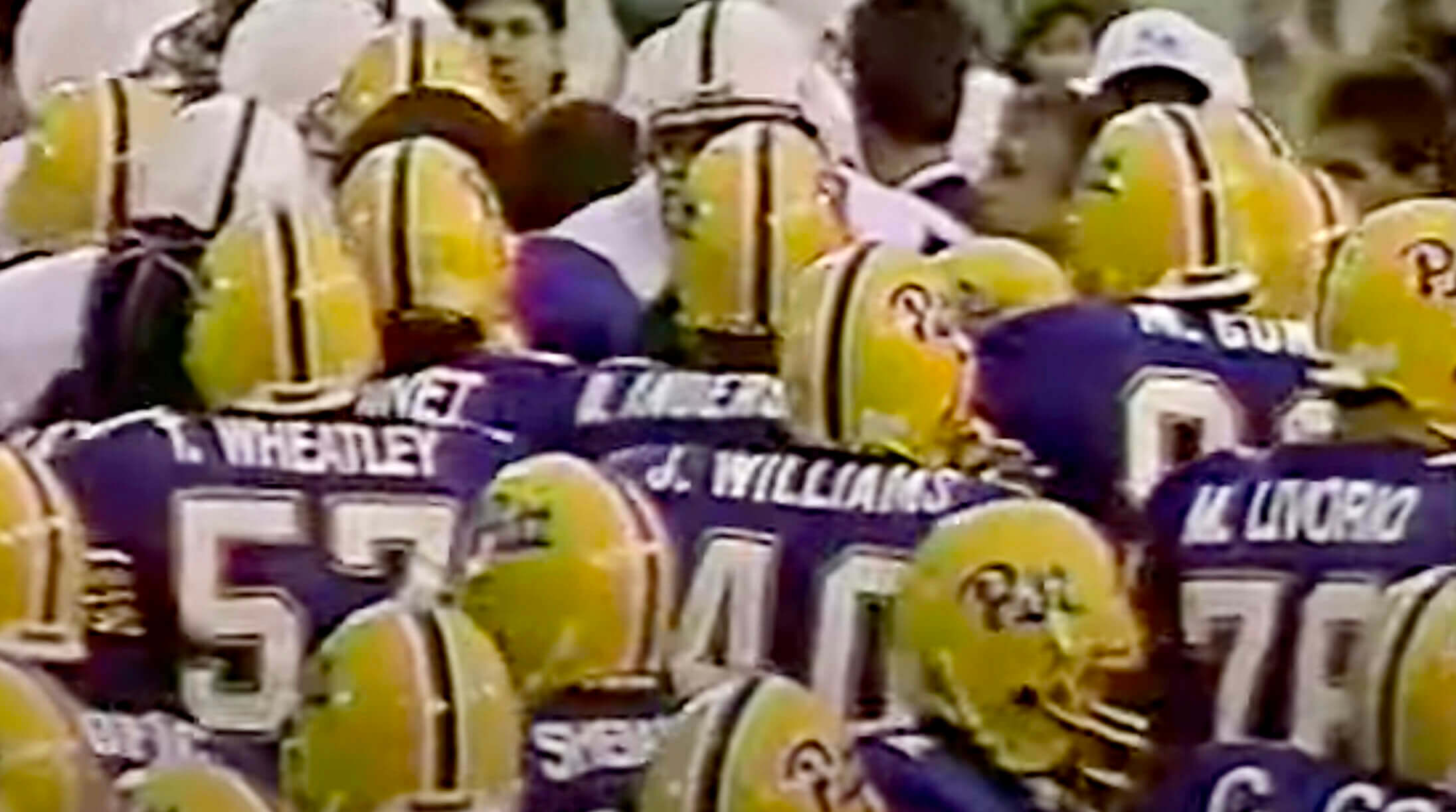
If this seems like something too unlikely to be mere happenstance, that’s because the entire Pitt team wore first initials in that game (and, I’m assuming, for the whole 1989 season). You can see more examples here:
All of those screen shots come from this video clip, which shows the last few minutes of the game:
I had no idea that Pitt went all-FIOB that season. Is this common knowledge? Maybe something I once knew but then forgot about..?
Off the top of my head, I can think of only one other team that went full-FIOB. That would be the 1977-78 Cincinnati Stingers of the old WHA, as seen here:
Have there been other all-FIOB teams that I’m overlooking?
As a footnote: It’s also worth noting that there’s been at least one all-FNOB team — the 1960 and ’61 Oakland Raiders (more details here):
But for some reason all-FIOB seems even more eccentric than all-FNOB. Crazy stuff!
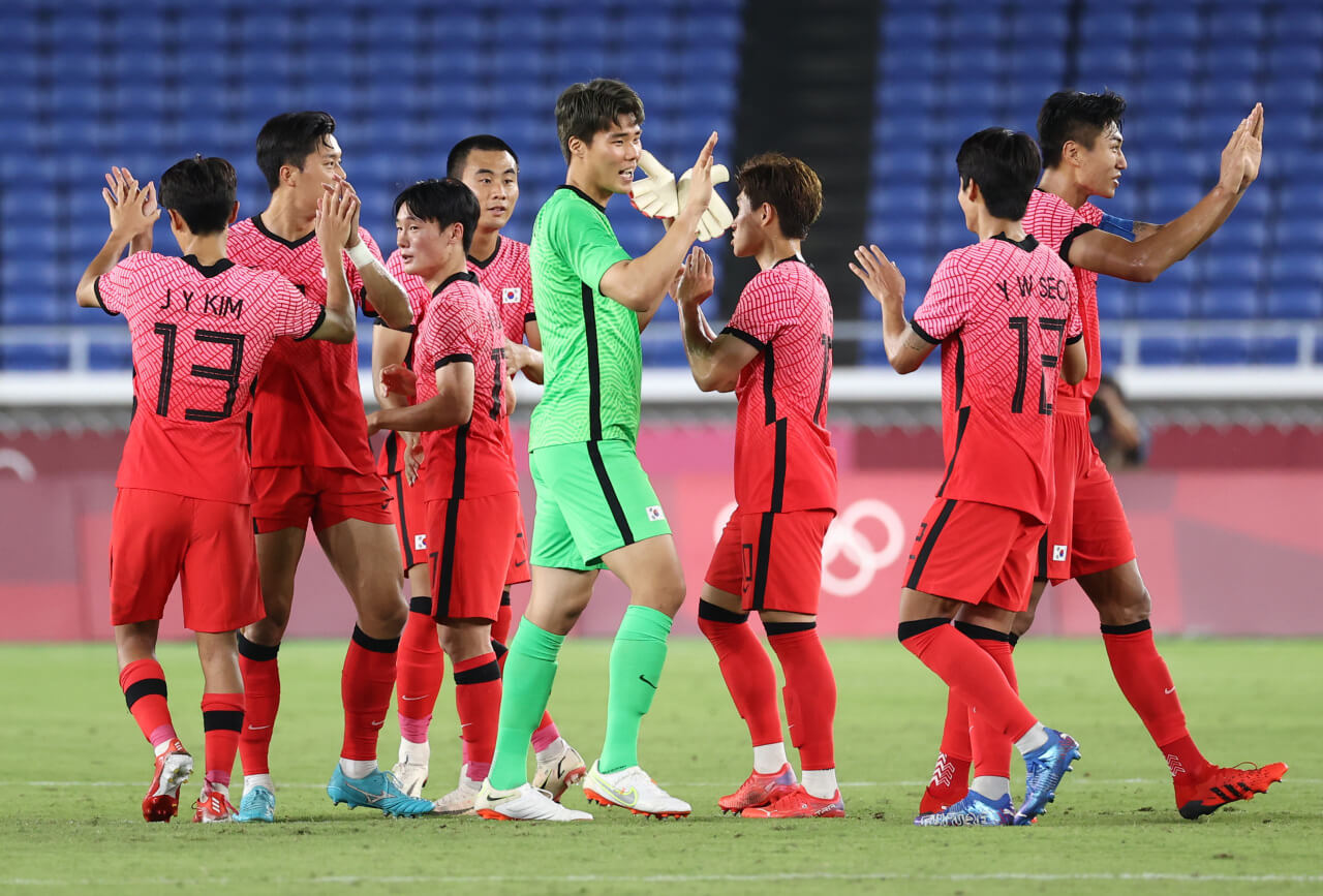
Update: Our own Jamie Rathjen reminds me that all-FIOB teams are common in South Korean soccer:
(Big thanks to Matthew Troy for bringing the Pitt situation to my attention.)
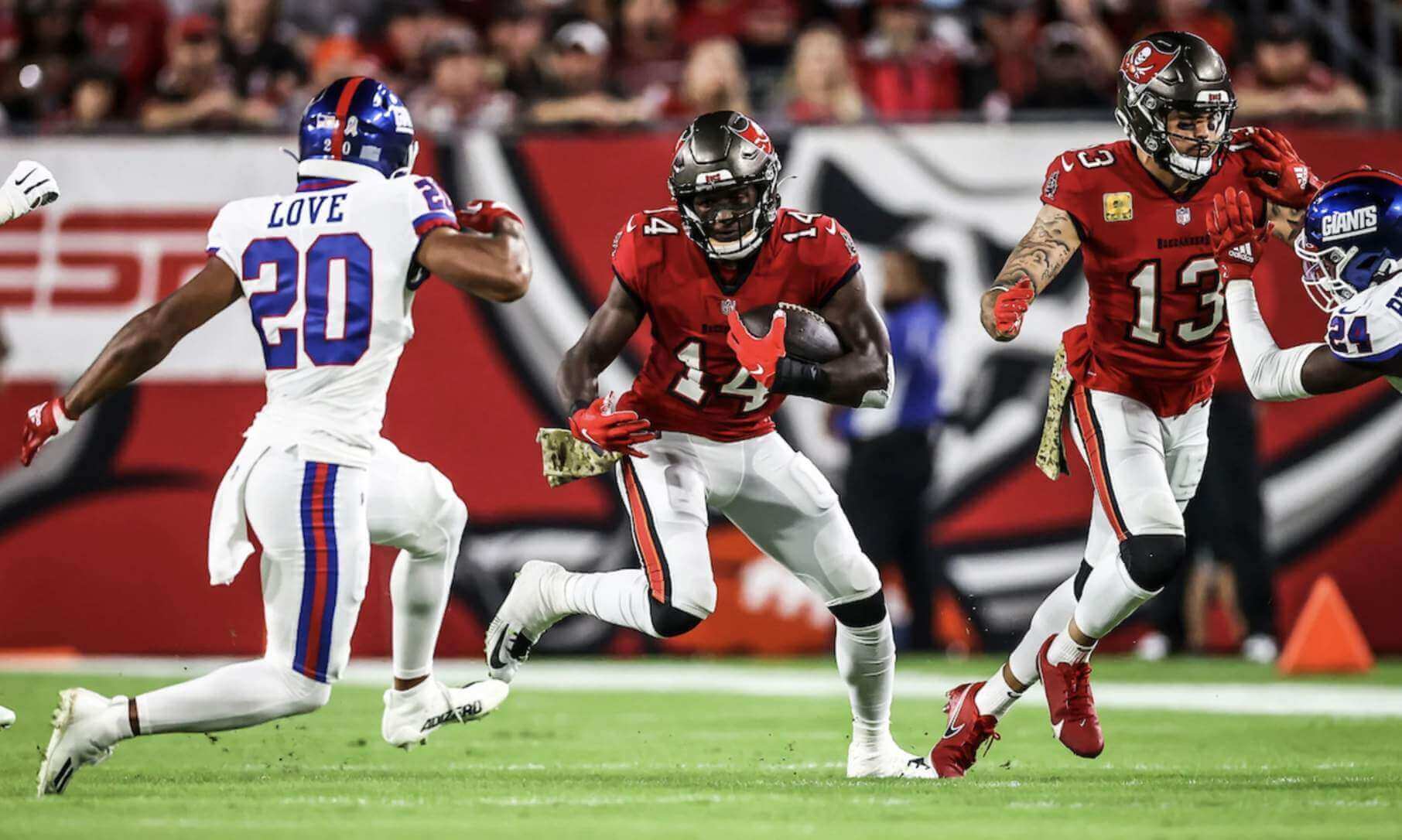
Buckaroo switcheroo: When the Bucs posted their 2021 uni schedule back in September, they called for last night’s game against the Giants to be mono-pewter. But as you can see above, they changed their minds somewhere along the way (thankfully) and decided to wear red over white instead. (The home team is allowed to change their original uni choice as long as they don’t change from color to white or vice-versa.)
According to the Gridiron Uniform Database, the last time Tampa wore red jerseys and white pants prior to last night (preseason notwithstanding) was all the way back in 2011, for a Week 10 game against the Texans. Personally, I like that look and hope they wear it more often.
(My thanks to Dom Ingram for pointing out the discrepancy from the Bucs’ original uni schedule.)
Click to enlarge
Collector’s Corner
By Brinke Guthrie
Follow @brinkeguthrie
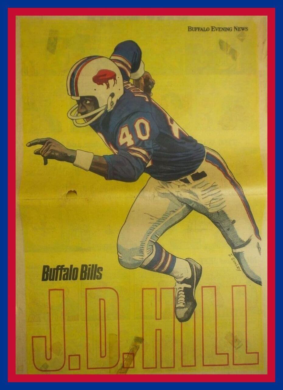
Leading off this week with this 1972 Buffalo Evening News fold-out poster of
Bills wide receiver J.D. Hill. If you check the seller’s other auctions, there are posters for the Braves and Sabres too.
Now for the rest of this week’s picks:
• Let’s go way back for this one; the Spalding Official Athletic Library Baseball Guide from 1914. Such a deal — just 10 cents!
• This Knothole League of America membership card (#7595) was at one time issued to one Edmund Heyne Jr. It was duly signed by Knothole President Lou Gehrig, entitling Eddie to “all privileges.”
• Here’s one of those late-1960s/early-1970s Westclox Team Mate pocket watches. This one is for the Montreal Expos.
• Since the 1989 MLB All-Star Game was held in Anaheim, the logo designer decided to put a halo on the “A” as you see on this decal.
• Union 76 sponsored this booklet featuring Dodgers outfielder Willie Davis, The 1961 Dodger Family. (He’s a “new Dodger with speed to burn!”)
• Look at that great old-timey cover on this 48-page booklet from 1949, Playing the [New York baseball] Giants Game.
• This Yahtzee Travel Edition game comes with a New York Yankees baseball that contains the game pieces.
• Yikes — it’s my bet that the designer of this scary vintage Joe Namath statue indulged in a bit of artistic license when making this one. Say it ain’t so, Joe.
• It seems that back in 1986, the Massachusetts Interscholastic Athletic Association had no problem using the trademarked name “Super Bowl” — or Bob Griese’s — likeness, on this game program.
• Speaking of quarterbacks wearing No. 12, that’s clearly 49ers QB John Brodie on the cover of this 1977 NFL Properties publication, How to Play Quarterback.
• And let’s go out with this beauty: a 1950s Green Bay Packers jacket in great condition.
That’s it for this week. Happy almost-Thanksgiving!

ITEM! Cap raffle: Longtime reader Chris Hickey’s birthday is this Sunday, and he’s celebrating by giving a gift! Chris has generously supplied funds for a Uni Watch Alternate Cap to be raffled off, so that’s what we’re going to do today.
This will be a one-day raffle. No entry restrictions, but there are two caveats to note:
• Non-USA addresses will require the raffle winner to pay for overseas shipping. Figure an extra $20 or so, depending on which country it’s going to.
• The only sizes we have remaining are 7-1/8, 7-5/8, 7-3/4, and 7-7/8.
To enter, send an email with your shipping address and preferred size, to the raffle in-box by 9pm Eastern tonight. One entry per person. I’ll announce the winner tomorrow. Big thanks to Chris for sponsoring this one (and happy almost-birthday!).
The Ticker
By Alex Hider

Baseball News: Whoops — somehow, a Brewers/Pittsburgh Steelers mashup knit cap made its way to retail. Perfect for that Wisconsin-based Steelers fan on your holiday shopping list! (From @sdextrasmedia).

Pro Football News: In last night’s Giants/Bucs game, a Giants player was having issues with his throwback helmet decal (from Joel Hooper). … Reminder from Phil: The Colts will be wearing their new throwback uniforms on Sunday. … Fox is re-launching the USFL in 2022, and yesterday it was revealed that the league would be reviving eight classic team identities from the league’s heyday in the ’80s (from Kenn Tomasch). … The Vikings use their number font to mark parking stalls at their stadium, but they only use the font for the 10s digits, not the 1s digits (From Kyle Hammer). … Back in 1983, a Buccaneers fan apparently took out a newspaper ad to encourage coach John McKay to run more trick plays (from Trevor Williams). … The Jets have a podcast featuring former QB Mark Sanchez and C Nick Mangold. The video version of the podcast features graphics showing the two players in modern Jets unis that neither player ever wore on the field (from Chris Wilde). … The Hamilton Tiger-Cats are asking fans to wear black to their playoff game on Sunday. Could they be going mono-black? (From Wade Heidt.) … Cross-listed from the Baseball section: Somehow, a Milwaukee Brewers/Steelers mashup knit cap made its way to retail (from @sdextrasmedia).
College/Youth Football News: Columbia and Cornell played a mono-blue and mono-red color-on-color matchup on Saturday (from Jace McKeighan). … USF will wear all-white uniforms with “slime green” accents on Friday against UCF. Meanwhile, UCF will be going mono-black, including helmets with a Knight decal (from Phil and Teddy Gorman). … San Diego State has sold the naming rights to its new stadium, which is being built on the site of old Jack Murphy Stadium (from Timmy Donahue). … BYU will wear royal helmets and pants along with white jerseys on Saturday at USC. The Cougars will finish the 2021 season without repeating a uniform combo (from Josh Hjelmstad). … The film The Big Short features a youth football flashback scene that takes place in the ’80s. However, the scene was clearly filmed on a FieldTurf surface, which didn’t yet exist in the ’80s (from @_BenBecker).

Hockey News: The Kitchener Rangers of the OHL wore jerseys designed by a young fan on Sunday as part of the CHL’s Leave Your Mark program (from Wade Heidt).

Basketball News: Enjoy all the classic NBA logos shown in this 1989 Converse ad (from @kidhell). … The Yes Network mistakenly used a Magic logo instead of a Cavs logo in a recent social media graphic (from Jorge Cruz). … The Celtics used throwback scoreboard graphics yesterday for ’80s night (from Ignacio Salazar). … One Coppin State player went NNOB last night (from Andrew Green).

Soccer News: EA Sports may be headed to a divorce with FIFA, as the video game maker says it may not want to pay the governing body for naming rights for its soccer video game moving forward. … Toronto has a new logo for its campaign to host a game during the 2026 World Cup, which will take place throughout North America (from Gabriel Hurl).

Grab Bag: Papa Johns founder “Papa” John Schnatter isn’t happy that the company decided to drop the apostrophe from the company name (from Timmy Donahue). … Colombia’s president has issued an apology after cadets at a police academy wore Nazi uniforms during a “cultural exchange” event in honoring Germany.
When South Korea’s soccer teams have worn NOBs in the past few years (which they don’t always do, even in competitive games), they always wear their initials. You can see it on the men’s team at the Tokyo Olympics.
If that sounds familiar, I mentioned that in the context of the initials not having periods, which was an entry not that long ago about Cincinnati football.
Also, Coppin State men’s basketball played Virginia last week and I noticed there were multiple players that didn’t have NOBs, but there wasn’t an obvious pattern for who didn’t.
Thanks for the reminder about South Korea, Jamie. I’ve added that to the entry.
Sometimes college teams give NOBs to scholarship players but not to walk-ons, so that might explain the Coppin State situation.
I think the Ottawa Rough Riders did the FIOB deal in the 80’s but am struggling to find visual evidence.
I remember the same about the Rough Riders. There could be some clips of games from around that time on YouTube that would show it.
“Colombia’s president has issued an apology after cadets at a police academy wore Nazi uniforms during a “cultural exchange” event in honoring Germany.”
I’m just asking, but why?
The article doesn’t directly state a reason why anyone involved thought the Nazi uniforms were a good idea, but it’s worth noting the final paragraph of the article: “Under fire internationally for its brutal suppression of anti-government protests earlier this year, the Colombian police has embarked on a “transformation” campaign to improve its image, which will include a uniform change.”
Anthony asks why an apology was issued? THAT’S the question he has coming from that article? Really?
I’m going to assume he was trolling this board and was wondering if Paul would clip that comment that I won’t put a pejorative adjective on out of respect for this board. Nazism must be confronted wherever it raises its head.
I think he was asking why they were wearing the uniforms in the first place. Or at least that’s how I interpreted it.
Sorry, Tom. I should have been more clear in my initial question.
Paul has it right that I’m surprised that *anyone* thinks it’s acceptable to wear a Nazi uniform in the 21st century.
Please don’t jump immediately to conclusions without at least clarifying my comments first.
Anthony, maybe accept this as an opportunity to be reminded how important it is to write clearly what you mean the first time, not expecting someone to request a clarification about what you may have intended to say. It’s all the more important when you weigh in on a volatile topic.
Have a good rest of the day.
Tom, I interpreted it the same way that Paul did, and the way that Anthony intended. Perhaps the difficulty in interpreting what seemed like a pretty obvious question on Anthony’s part was not in Anthony’s phrasing? Maybe accept this as an opportunity to not assume the worst of someone’s intentions when someone weights in on a volatile topic.
Yeah, I’m thinking this needs some context… they seem completely ambivalent to the disturbingly accurate and thought-out Nazi regalia.
(And, no, I hope this comment is not seen as thinking there is a VALID reason for such.)
Christopher, please see my above comment responding to Tom.
I am with you, Anthony. I cannot for the life of me imagine how anyone would take your question any way other than how you meant it. Bizarre.
I’m sure I’m in the minority, but I actually like the Bucs pewter jerseys, and I would like to see them paired with the white pants.
Came here to say this. Pewter over white has to happen eventually, right? I’m almost amazed that it wasn’t what they ended up switching to, if they were set on wanting the white pants last night. Would’ve been a much more natural decision, IMO.
The pewter jersey exists, I think, simply so they can go head to toe pewter, as that is the current trend.
If there was not a one helmet rule in place they probably wouldn’t have the pewter jersey, but instead a different helmet color to allow for mono-red, mono-white, or even mono-orange.
Of course contrasting pants would look better.
Pewter/Red/Pewter and Pewter/white/white should be the only two combos used in TB. All others seem a bit “off”
Of course, I would be okay with white/orange/white in the future!
The pewter jersey needs to be mothballed. I’m with Paul, red over white is a good look. It’s less clunky than red over pewter, which isn’t terrible.
FWIW, part of the reason for Korea’s use of initials is that there are relatively few Korean surnames. According to the 2000 Korean census (as linked on Wikipedia, caveats), there were 286 surnames in Korea: link
In contrast, according to the 2010 US Census, there were about 162,000 surnames which had at least 100 entries in them: link
Faaaascinating. Thanks for that, Ed!
I should also say that 44.6% of the Korean population has one of 3 surnames: Kim, Lee, Park.
Hence, Jeongeun Lee, one of the best female golfers in the world, goes by Jeongeun Lee6. One of my all-time favorite sports names.
Was going to say the same – this appears purely functional and not stylistic, and when most of your team needs initials it’s more consistent to just make that the standard.
From what I can tell, the current squad has 4 Kims, 2 Songs, 2 Jung’s, etc.
Kind of surprised that the USFL redux went with the Pittsburgh Maulers, a franchise that existed for only one of the league’s three seasons, as one of the 8 teams, especially since they won’t actually be playing in Pittsburgh. In fact, off the top of my head I think the Maulers were the only franchise that didn’t survive in one form or another for a second year, e.g., the Oklahoma Outlaws became the Arizona Outlaws after merging with the Wranglers, the Orlando Renegades were the relocated Washington Federals, &c. And the Maulers were terrible, going 3-15 in their only season, tied for the worst record in the league.
I have nothing against the Maulers per se but if they were only picking 8 names and presumably weren’t restricted by IP issues, I might have chosen the Chicago Blitz, L.A. Express, Memphis Showboats, Arizona Wranglers, Denver Gold or Jacksonville Bulls instead.
Most of these logos are decent modernizations.
Birmingham’s new mark looks much like those St. Louis Stallions concepts that were floating around, though that’s still an upgrade from the original. And I always liked the Gamblers logo…glad to see that one got picked for the reboot.
I’d rather see the Federals return(decked out in something close to their ’83 uniforms), if only to add more color variety to this red-heavy new USFL.
The original USFL was red-heavy, especially in 1984 with the Generals, Stallions, Stars, Showboats, Blitz, Bandits, and Wranglers all using red as their primary jersey color (although the Wranglers wore their white jerseys in every game).
I might have liked to see the Federals for the same reason, but like the Maulers the Federals were terrible and not particularly memorable; their “star” player, IIRC, was Craig James. At least the Showboats had Reggie White, the Express had Steve Young, the Gold had the run-and-shoot, the Wranglers played in a championship game, and the Bulls had incredible attendance.
I might have also liked to see the Oakland Invaders, whose name and logo were both fantastic, but I think that could be construed as trolling Oakland fans who have now lost the Raiders for the second time.
Agree about the Invaders branding…disagree about the trolling.
‘Returning’ (all USFL games are to be played at a to-be-determined neutral site, correct?) a rooting interest, even one that’s less-familiar and/or hasn’t been cheered for in decades, is a good thing even if it’s a short-lived one given the history of these leagues.
Speaking of the stadium site situation, why not (aside from the cost involved) conduct the league as a barnstorming venture, playing in places areas currently under-served by pro football like Detr…err, San Diego, St. Louis, Oakland, etc.? Then again, gate revenue and fan experience/involvement may be less important; I’ll probably be watching just for the uniforms.
The original USFL was eminently watchable, with good players and great uniforms. I loved the concept of spring football. This version sounds like a silly rip-off.
Well, the original Oakland Invaders were so located and named for the express purpose of trolling Al Davis, who had just moved his team to L.A. two years earlier, with a similar-sounding team name (i.e., “Invaders” was intended to rhyme with “Raiders”).
But now, in practically the exact same scenario, with the Raiders in their second year in a new city after abandoning Oakland… I don’t know; part of me thinks it would be cool for the same reason it was the first time, and part of me thinks it would be a cruel joke to have history repeat itself.
My understanding based on their press releases so far is that while they’re playing in a bubble location for their first season, the intent is to move to their stated home cities for future years. They may have made enough progress on a future site in Pittsburgh to make it the more logical choice.
Right; they wanted a “Northern” and “Southern” division. No teams west of the Mississippi.
I still think the Blitz would have been better form the Northern Division (or, put the Breakers in Boston and have the Showboats in the Southern division), but you’re probably right that Pittsburgh has a better venue situation to offer.
I wonder if the Generals will play at Red Bull Arena.
Oops; Houston is west of the Mississippi. Duh.
There is a very slim chance there will be future seasons of this reboot. (And I loved the original.)
With Brian Woods involved, it will be a train wreck.
No one under 40 can possibly have any meaningful memories of the original, and anyone old enough to have memories will see right through this.
This is not the USFL. This is just another popup league for the guys who won’t get on with their lives and will sign up for any league that comes along.
There is an obvious trend concerning alternatives to the NFL. 1. AFL: Formidable competitor to NFL, plays ten seasons, entire league is absorbed as a new conference. 2. WFL: Interesting concept with some new ideas, plays two seasons, peters out because of fan indifference. 3. USFL: Entertaining play, spring/summer schedule is a novelty, plays three seasons, league folds when it sacrifices its unique asset. 4. CFL America: August Canadian league attempts to fill holes in America’s football map, plays three seasons, yields one enduring franchise (Baltimore/Montreal) 5. XFL: Half-baked concept with a few entertaining ideas, One season and done, folds due to fan indifference. 6. UFL: Small league, small budget, subpar talent, folds after 2 1/2 seasons. 7. AAF: Limps through part of one season.
The only lesson I’ve realized from all of this is it might be a good idea to put an NFL team in Birmingham.
Another team that was full-FIOB. Ottawa Rough Riders did it 1989-1993. With 2 different uniform designs as they changed unis in 1992. Every player first initial on back 1989-93.
Here is a Rough Riders at Roughriders game showing Ottawa with full-FIOB in 1990.
link
Thanks, Wade! I’m very CFL-ignorant, so I appreciate you filling in that gap.
For anyone that cares, here are the BYU combos that were used/not used:
royal royal royal x
royal royal white x
royal white royal x
royal white white x
white royal royal
white royal white x
white white royal x
white white white x
navy navy navy x
navy navy white x
navy white navy x
navy white white
white navy white x
white navy navy
white white navy
white white white x
FYI: this goes helmet-jersey-pants if that wasn’t clear, and the possible combos assume they were never going to mix and match navy with royal at any point.
One note on the “Classic” NBA logos.
The San Antonio Spurs is the only logo that has no (r) or ™designation for a trademark.
Oversight, typo, or true I do not know just an observation.
The spurs TM is kind of hard to see, but it is in white right next to the last S in Spurs
As a lifelong Pitt fan I can tell you, I was aware of this and always chalked it up to “they just did this that year for some reason”. I’m all ears in the comments today to see if there is an actual explanation of this.
Paul, if you’re really interested (and bored, lol) maybe reach out to EJ Borghetti. He’s the associate AD, foremost Pitt historian and pretty active on social media. He may be able to shed some light.
I was 13 at the time, and growing up in Western PA, I saw lots of Pitt coverage. Even then I was a Uni Watcher before I realized there was such a thing, and I also noticed the FIOB, but my thoughts on the matter were similar to Kek’s.
I’ve long been a Penn State fan (no offense, Kek), and always noticed that compared to the Nittany Lions, Pitt has been much more progressive with their uniforms. I figured that this was just one more element of that approach.
Ottawa Rough Riders of the CFL went FIOB in 1989 link
Comment about the current football turf used in “The Big Short”. I remember catching an Olympic field hockey game a few years ago, and at the NCAA level and up, they still use the 70s/80s style artificial turf. It may even be required at the international level (although by rule it’s also watered down during games).
While there may be a number of colleges with a dedicated field hockey turf field, it might be a difficult project to acquire one with permission to repaint for filming purposes.
Wouldn’t another solution to be to find a grass field to film the scene on? I do remember there being grass in the 80’s.
Or the visual thing I miss the most about football: Football on a baseball diamond.
On the vintage NBA logos link, I was always struck that the Pacers ball in the team logo looked like a tennis ball, but clearly the Heat, Sixers, and other logos where a basketball is featured look much more like an actual basketball.
Y-E-S! Always looked like a tennis ball to me!
Agreed 100% on the Pacers tennis ball.
Looking back at those logos I am blown away by the # of logos that are built around (or contain) a basketball… I counted 21 on that page. Additionally the Nets changed & added one the next year (royal blue/tie-died era). Also 2 Canadian franchises added the next year or 2 after this had a ball in their initial logos. Atlanta Hawks changed to the winged hawk carrying a ball soon after as well. Going by this list I think the Bulls & Spurs would be the only franchises that never had a basketball featured in it’s primary logo????
Using a football, baseball or hockey puck/stick happens, but not as frequently in the other major professional sports leagues as the NBA
That NBA sorta-kinda has a policy on that. They don’t officially require teams to include a basketball in their logos, but they encourage it.
Always loved Pitt’s yellow face masks on the yellow helmet.
The initial thing makes me think of something in the other direction: Here in Wisconsin, our teams seem to have taken to not wearing first initials.
Neither the Bucks, with their multiple Antetokounmpos, nor the Packers, who have seemingly had numerous Smiths in recent years, seem to be using first initials. The Bucks thing kinda makes sense from a practical perspective, as it’s not like there’s much real estate left with that name, but both are a bit of a disappointment to me. I like FIOB. It’s the easiest way to know a team has multiple guys with the same name.
Makes you wonder if Aaron Rodgers had some kind of veto power with Amari Rodgers as a teammate, and Richard Rodgers before him?
I think it’s more that teams don’t like to add the initial when a second named player joins the roster, because then fans who already bought the first player’s jersey have an “inaccurate” jersey. (Which I think is absurd, but whatever.)
In fact, that’s how the NFL waived the first-initial rule: Kyle Brady joined the Pats, and the Pats didn’t want to piss off all the fans who already had Tom Brady jerseys. So the rule got changed and neither player added an initial.
The rare instance in which the merch tail wagging the on-field dog produced a good and virtuous result. Here’s how a fan can distinguish between two players with the same surname on the same team: Look at the even bigger and more legible number below their names. The Rodgers with the big old 12 beneath his name is Aaron. The one with an 8 is Amari. If the number isn’t sufficient for this purpose, then that would call into question the utility of having numbers at all.
San Antonio Gunslingers. Terrific blue/green/silver color scheme and a very unique helmet.
This was the best photo I could find, but Appleton West High School wore FIOB team-wide during its 1992 Wisconsin state championship season: link
I know it’s only a host logo but I really dig the Toronto 2026 logo
I know not everyone is likely Catholic (or Christian, religious, etc.), but this is fun: link
Has anyone ever put all the saints in a tournament bracket?
Not that I’m aware of.
The real Pitt news here is that, looking at those 80s uniforms, it’s clear that white numbers on the blue jersey look much better than the gold numbers on the rebooted unis. Otherwise, I love their look, but the gold numbers have always seemed wrong.
The Raiders should bring back their first uniforms as a throwback.
Agreed. Al Davis acted like there were no Raiders before him, maybe Mark will be a bit more encompassing of their history.
Great point Joe (no offense taken either!)
Hidden in this FIOB talk, is this beautiful era of Pitt jerseys with the striped sleeves with the script logo on top! I was just talking about these very uniforms the other day with some fellow Pitt friends and uni-watchers and I refer to them as “The Alex Van Pelts”!
Bill Virdon: the only Yankee manager to never manage a game in Yankee Stadium.
” the Colombian police has embarked on a “transformation” campaign to improve its image, which will include a uniform change.”
Er, guys, this probably isn’t the best direction. . .