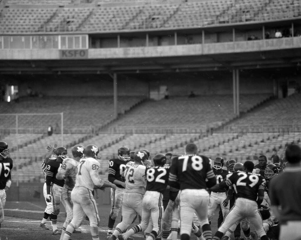
Yesterday’s Ticker included a link to slideshow showing the Raiders playing in various home stadiums other than the Oakland Coliseum. We’re going to follow up on that today, because eagle-eyed reader Tim Dunn spotted something interesting lurking within one of those photos. As it turns out, the photo he singled out may contain something potentially historic — but it’s not the part of the photo that got his attention.
The photo in question can be seen above. Let’s take a closer look at the section of the image that Tim found so interesting (click to enlarge):
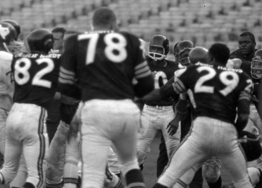
As you can see, two Raiders players — wide receiver Charlie Hardy (No. 82) and defensive back John Harris (No. 29) — had FNOBs. Good spot by Tim!
Having two FNOBs in the same photo seems pretty unusual, right? But not so fast: It’s actually the other Raider with his back to the camera — defensive lineman Bob Voight (No. 78) — who’s of historic interesting in this shot.
Here’s the deal: As shown on the mighty Gridiron Uniform Database (and confirmed in some discussions I had yesterday with the GUD honchos), when the Raiders came into existence in 1960, they initially went NNOB for the first five weeks of the season and then went FNOB — first and last names — for Week 6. They stuck with the FNOB format for the rest of 1960 and throughout 1961 (except for the ’61 preseason, when many players went NNOB and didn’t get their nameplates until they made the final roster cut). They didn’t go with what we now think of as a standard surname-only NOB until 1962.
So while the sight of two FNOBs in the same photo might seem unusual, it’s actually Bob Voight — the guy with the conventional NOB — who’s actually the outlier in that photo. “It’s the first instance I have seen of a Raiders player with only his last name on his back for either 1960 or 1961,” says GUD researcher Tim Brulia.
So was this a one-time, one-player anomaly, or were there several Raiders with conventional NOBs in 1961? “When encountering anomalies such as this, we have used the ‘Rule of Three,'” says GUD researcher Bill Schaefer. “Basically, if three or more occurrences of something are found in a single game, then there is something to it.” Otherwise, it’s just a fluke. For now, Bob Voight’s NOB is in the latter category — but hey, there are always more old photos out there to learn from.
Friday Flashback: My Friday Flashback on ESPN today is about the Hartford Whalers’ awesome logo and uniforms. Aside from the basic “That’s such a cool logo!” gushing, the piece also features an exclusive interview with the logo’s designer, Peter Good — a Hartford native who’d never done a sports-related design before tackling the Whalers assignment and has never done one since — that you won’t want to miss. Check it out here.
Orphaned jersey now has a good home: On Tuesday I gave some space to reader Dave Truman, a heartbroken Rams fan who wanted to give away his Jackie Slater jersey. Here’s an update from Dave:
We have a winner! I received about 30 requests for the jersey and probably could have chosen randomly from most of those and been confident that the jersey would go to someone who would appreciate it, but three writers elevated themselves above the rest: Bruce Mao, Tim Baker, and — the winner — Richard Betancourt of Selma, California, who made an impassioned and moving plea for the jersey on behalf of his father, Jay. Here’s an excerpt from his letter:
“I’ve literally been looking for that exact jersey for years. Jackie Slater is far and away my dad’s favorite Ram of all time. This jersey would be for him. He and I are very close, and as soon as I was old enough to understand what football was, I asked him which team was his favorite and so I became a Rams fan. He never spent on things like jerseys for himself, but once the team left and changed uniforms, he regretted not ever getting one. I just know he’d absolutely love to be able to wear this jersey to see our Rams play back ‘home’ in L.A. I’ve found old Rams items on eBay that I’ve gotten him, but the Jackie Slater authentic jersey is my white whale.”
Great stuff. Congrats to Richard and his father, and kudos to Dave for doing this very good deed. Nice story all around, and a good way to make lemonade out of a tough situation.
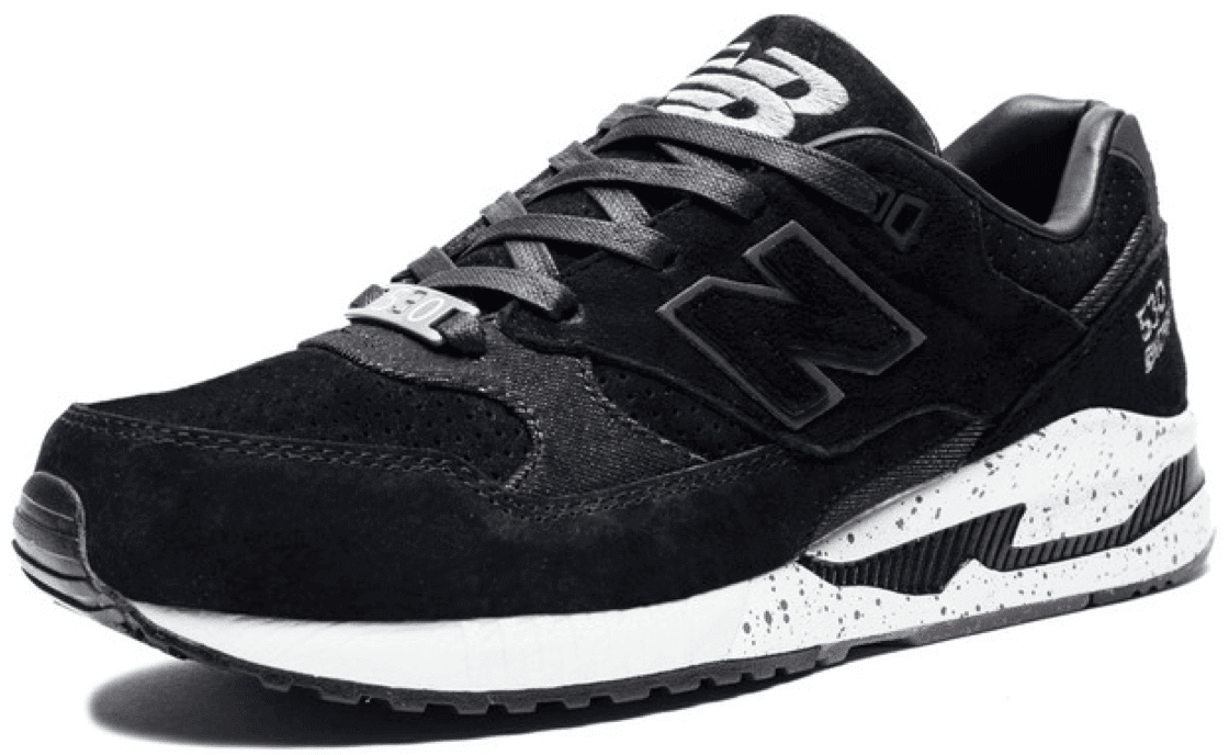
Sneakers for sale: I have a brand-new pair of New Balance Evan Longoria 530 sneakers, size 9. Lots of additional photos here, and there’s a video review (which is mostly ridiculous but provides good views of the footwear) here. They retail for well over $100, but I’ll let a Uni Watch reader have them for $50 plus shipping. If you’re interested, give me a shout. Thanks. The sneakers have now been claimed. Thanks.
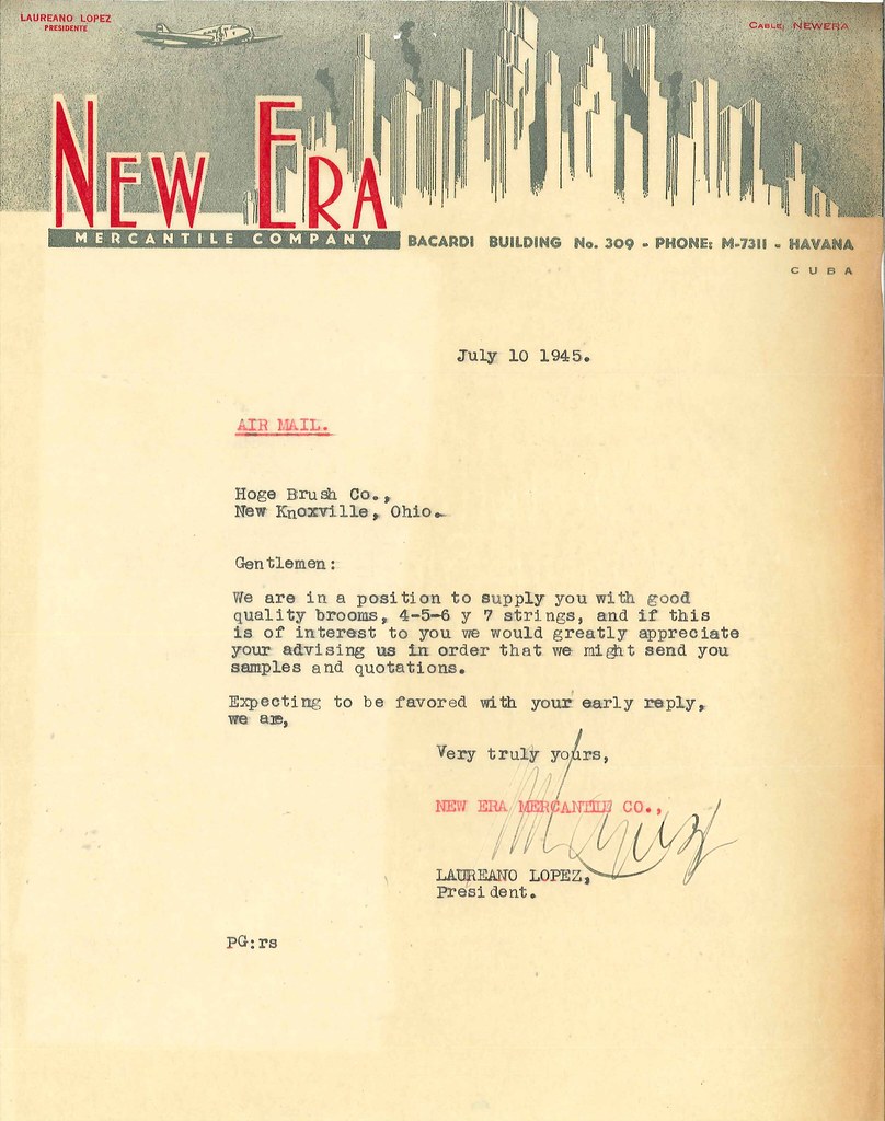
PermaRec update: Our latest intriguing letter from the Hoge Brush Company files comes from a company based in Cuba! Get the full story over on Permanent Record.
Reminder No. 1: I’m currently accepting entries for an ESPN contest to redesign the Rams. Full details here.
Reminder No. 2: In case you missed it last week, all of the Uni Watch T-Shirt Club’s 2015 designs are available from now through the middle of next week at our Second Chance Shop. Further details here.

Gromm•It update: Behold the grommetini! Additional photos available over on Gromm•It.
The Ticker
By Paul

Baseball News: New 70th-anniversary logo for the Visalia Rawhide, a Single-A affiliate of the Diamondbacks. … Neosho County Community College sure has a whole lot of uniform combinations (from Tanner Liby). … Lots of uni combos also in the works for Louisville (from Joseph Matlock). … Tequila sunrise jerseys for USF.

NFL News: “This Gillette ad drives me crazy,” says Andrew Cosentino. “Why is John Urschel’s jersey untucked? Also, the pants are missing the Ravens logo on the sides.” … The Council of Fashion Designers of America is celebrating Supe50 by creating 50 “bespoke footballs” (from Tommy Turner). … Rare sight: The Saints in their gold alternate jerseys, worn for one game in 2002. Additional pics here.
College and High School Football News: Here’s something you don’t often see: white vs. white. That’s a pair of junior high teams from Michigan (from Rod Dunn).

Hockey News: Very meta: Don Cherry wearing the Toledo Walleye’s Don Cherry tribute jersey. … Phil’s alma mater, Hamilton College, is going pink in the rink. … Here are the throwback pads that Canucks G Ryan Miller will be wearing on Feb. 13 (from Daniel Donnell). … Here’s another look at what is probably that new Maple Leafs logo, this time as worn on Leafs coach Mike Babcock’s hat (from Mike Guterman). … Then again, maybe that isn’t the logo after all (from Ian R.). … So now that John Scott’s going to be allowed to play in the All-Star Game, which uni will he wear? (From Jeff Bryniarski.)

NBA News: Here are the socks for the NBA All-Star Game. A press release says the multi-colored stripes at the top “pays homage to the same stripe on the uniform.” This initially seemed confusing, because that stripe pattern doesn’t appear on the uni photos that were issued earlier, but Conrad Burry spotted the stripes on the inner collar. … Here’s another article suggesting that the era of baggy shorts may be over (from David Goodfriend and Tommy Turner). … The Suns are hosting a ’90s Night so they have a throwback website (thanks, Mike). … Hundreds of game-worn NBA and NHL jerseys have been stolen from the offices of MeiGray, one of the major memorabilia houses. I met MeiGray prexy Barry Meisel and visited his offices in 2009, when he had the concession for all the pieces of Shea Stadium, and we’ve occasionally communicated since then. Nice guy — sorry to hear he got burgled.

College and High School Hoops News: Over the past two days everyone’s been getting worked into a lather over this neon Michigan State jersey, but I haven’t yet seen any indication that it’s going to be worn on the court. Just an ugly retail item, at least for now. … Neon green is now the color of honoring cancer survivors, at least at Purdue (from Josh Claywell). … Nevada and UNLV will be going color vs. color for two upcoming games (from Lmoneyfresh). … Eastern York High in Pennsylvania has Indiana-style striped warm-up pants, but in a different color scheme. … “While looking through a San Diego Salvation Army store I came across these vintage USS Midway basketball trunks,” says Mark Swisshelm. “They were in such good condition that it made me think that perhaps the complete uniform had been donated but had been separated by store employees. I searched the rest of the racks to no avail. Anyway, I like the Midway patch on the leg.”

Soccer News: What if soccer jerseys included skylines? (From @EsWookieGrande.) … Here’s an “informed guess” on what FC Barcelona’s new jerseys might look like. … New away kit for Boca Juniors.

Grab Bag: U.S. Olympic sprinter Nick Symmonds has filed a lawsuit against USA Track and Field and the U.S. Olympic Committee, contending that his company’s logo should be able to appear on his uniform. … New logo for Max Life Insurance. … The UC Irvine men’s volleyball team has added a memorial band for Tim Vorenkamp, a high school player who had committed to play for Irvine but died from cancer before he got the chance. The team’s jerseys don’t have sleeves, so the players are wering the black band on their biceps. Further info here (from Jeremy Brahm). … This is pretty awesome: a thousand years’ worth of English soldiers’ uniforms, from the Battle of Hastings in 1066 to deployments in Helmland Province in 2014. Same story with fewer photos but more detailed text here (big thanks to R. Scott Rogers). … Adidas is becoming increasingly popular in China. Why? Because people like to wear it to weddings (from Tommy Turner).
In the lede, Voight is wearing 78 rather than 82.
Now how did I make such a stupid mistake?
Fixed.
According to the GUD the Saints wore their gold alternates and their throwbacks in 2002.
Proofreading: “says GUD research Bill Schaefer.”
Nice interview with Peter Good.
Fixed. And thanks!
Is it any mystery that the Raiders History Mystery photo is … a brawl.
The numbers the Raiders are wearing in that photo also look just like the numbers worn by the Houston Oilers around that time.
Ok, the Vancouver Canucks are celebrating the 90’s, while the victory V is pretty much late 70’s/80’s, but I don’t care, because the colors match, it’s fun, and it looks awesome!
I’m just kind of surprised that Ryan Miller gave Vaughn the blocker business. Ever since his last year in Buffalo, he’s used a CCM blocker alongside Vaughn pads and a trapper. A sign of things to come, or just a one-time deal for the sake of matching?
NHL should make a half and half Franken-jersey for John Scott. Geez, can pro sports please do away with ASGs?
Neosho Community College: A different uni set for every hitter in the line-up, plus the pitcher.
R. Scott – Thanks for the great link to the English (and after the 1707 Acts of Union)British uniforms.
Awesome interview with Peter Good. I like uniform design but logo design is my favorite and is a regular hobby of mine. His developmental drawings are great to see. It would be great to see the trident design as a finished product. He was on to something there, too. Guy has some serious design talent!
Great interview with Peter Good and I’ve always been a fan of the logo. But regarding this thought:
“Well, you know, a harpoon is used to kill whales, but the whale was the team’s mascot. So there was something not quite right about that, some cognitive dissonance — you don’t want to kill your own mascot! And they agreed with that when I explained it to them.”
The team name was the Whalers, not the Whales. So a whale really isn’t the team mascot and a harpoon logo would be acceptable. The same logic holds true with the Mariners who use a trident as a logo. Regardless, all’s well that ends we’ll since the tail is a better choice than the harpoon, but I just thought it was interesting that some flawed logic contributed to the ultimate logo design.
I agree with you. The issue is that the team was called the Whalers but the mascot was a whale. THAT’S really the cognitive dissonance there — the team name and mascot don’t match.
I think it’s too simplistic to say the mascot doesn’t match the name and that’s the end of it. If the mascot wan’t related in any way to the name, then I think there would be an issue, but let’s dive a little deeper.
To a whaler, a whale isn’t necessarily the enemy. It’s his or her means; the commodity that is traded to make a living. Thus, I think it would make perfect hypothetical sense for whalers to celebrate whales. If the harpoon is a whaler’s paintbrush, then the whale (s)he sells is the finished artwork. The product (s)he is proud to deliver.
Furthermore, clarity and efficiency of communication also must be considered. What conveys your intended message better? What is the better communicator as a visual device to both children and adults? A person with a harpoon or a harpoon itself both contain inherent ambiguity as there is no explicit connection to whales. Is it a guy with a spear? Is it a trident? Without knowing the team name, ten different people might give you ten different guess based on what they’re looking at, depending on their age, gender, culture, location, etc. The whale tail creates the necessary visual connection to whales and in a way that’s more universally understood.
If you had a team called the Vintners, would the logo be a guy holding a barrel or would it be a bunch of grapes? Would a team called the Lobstermen use a wooden trap as its logo, or would it use a lobster?
If you had a team called the Vintners, would the logo be a guy holding a barrel or would it be a bunch of grapes?
Not a very good example. A vintner GROWS grapes; a whaler HUNTS AND KILLS whales.
Not a very good example. A vintner GROWS grapes; a whaler HUNTS AND KILLS whales.
First, a vintner does not grow grapes; a vintner makes wine. Viticulturalists grow grapes. Vintner:Baker::Viticulturalist:Farmer.
But it seems to me a perfectly apt example. True fact: Plants are living things. Now, wine is closer to cheese, in that if all goes well one can make the product without killing the original living source of the raw materials, whereas there’s no way to extract the blubber from a whale to render it into industrial oil without killing the whale. But that’s a happy accident for the grape vine. As we can see with almost literally every other agricultural product that has ever existed, if the only way to make wines required killing the vines, we’d kill the vines, just as we kill the plants that give us most of our grains and vegetables.
Bottom line is that a mascot need not be a literal depiction of a team’s name. Nobody looks at Beer Barrel Man and says, “But a barrel is a tool the beer-maker uses, whereas the team is named after the beer-maker himself. Fail!” A whale represents a whaler in much the same way, just as a bunch of grapes would sensibly serve as a mascot for the Sonoma Vintners.
And, heck, it’s not like whalers are mythical creatures. These were actual men who lived and recorded their own experiences. Take a look at scrimshaw artifacts: The whalers of the American Northeast often used depictions of whales to symbolize their vocation. Just as today, sportsmen’s groups often use a picture of the prey they hunt to depict their organizations. The mascot for the nation’s largest group of fly fishermen is not a guy standing in a river casting a line, it’s a trout. The mascot for the nation’s largest group of foul hunters is not a man standing from a blind with a shotgun raised to his cheek, it’s a duck. Or sailors, who most often symbolize their vocation with an anchor, despite the fact that if an anchor is in use, one is not only not sailing, one is not even at sea.
A few things I also like about the Whalers’ logo –
It’s one of the minority of logos that gets a change when it’s put on home vs. away sweaters. Not only is it a flip to a complimentary colour that pops better on the different background, it’s a whiteout on the greens – almost like the home fans get a better treat via the more colourful version of the logo. Away fans get a token version.
The other aspect I file under “clever” was when the Whalers had a minor league team in Binghamton. take the W, rotate 90 degrees, and voila, you have a stylish B for the farm team sweaters. Cool.
SB
The other aspect I file under “clever” was when the Whalers had a minor league team in Binghamton. take the W, rotate 90 degrees, and voila, you have a stylish B for the farm team sweaters. Cool.
Read my bio line at the end of the Flashback piece.
I think they should’ve closed the resulting sideways H. Would’ve made it look even more like a B and less like a 3.
The 2 and 7 in your Bingo example link like mismatched fonts.
SB
Another great thing about the Hartford Whalers logo is that even if you put it in black and white, you don’t lose anything.
Hey Paul, the MSU Neon link says it doesn’t work
Works fine for me.
Strange, works now for me too
Matt Hendricks of the Edmonton Oilers took a puck to the groin last night, and tweeted a picture of the damage to his protective equipment (and fortunately NOT to the cash and prizes).
link^tfw
Why is John Urschel’s jersey untucked?
Because he is wearing a lame store bought replica. They are deigned to be worn like t-shirts. It probably looked worse tucked in. And the neck/sleeves look pretty awful too. I hate the Nike replicas.
My guess is that he is wearing off the shelf pants too. If he couldn’t bring his real jersey to the shoot, I’m sure he couldn’t bring his pants either.
Forget the jersey…the worst part of that ad is the dancing.
So will John Scott have two NHL patches on the shoulders of his All Star jersey? He likely won’t have a Coyotes patch and he won’t have a Habs patch. So will it be tow NHL patches or just no team patch?
Also of historic significance in the photo is that the Raiders are playing the Dallas Texans who would eventually become the Kansas City Chiefs.
John Madden once wrote about a player* asking him, “Coach, can I have my first and last name on my jersey too?”
“Too? Who has his first name on his jersey?”
“<a href="link Eeghan!”
(*I want to say John Matuszak.)
Ugh.
link.
Paul briefly mentioned the Whalers’ secondary logo (link) in the Friday Flashback. Am I the only one who hates this logo? I like the fact that the whale is more cartoony than aggressive, but I can’t get over the misspelling: “whale” + “-ers” = “whaleers”, which is neither an actual word nor the name of the team. Am I the only one bothered by this?
Actually, I find it delightful if not anachronistic to see a critter NOT looking like a crazed jerk on a uniform.
SB
Yeah, I like that part. It’s the fact that is spells out “Whaleers” that bugs me.
I totally understand this complaint, and honestly I would have dropped the E if I were designing it. But the visual language of sports often has ERS spelled out for teams with number names. 76ers, 49ers, and so forth. So keeping the E makes it more of a whimsical play on that formula, rather than a self-serious, literal spelling of the team name. If the whale itself were not so cartoony, I don’t think it would work at all. But the whole thing is so lighthearted that I think it actually works better with the E.
When I was in college in the early 1990s, the “Whale-ers” jersey was the one any cool Whalers fan would wear. :)
I loved it as a kid. It reminded me of Fudgie the Whale from Carvel.
The first thing that struck me about the Raiders photo was the empty seats. ???
Am I missing something here?
The Raiders drew awfully their first couple seasons. Empty seats were the majority.
Lee
The AFL was a pretty ragtag operation in its early days.
The Rayduhs were definitely a rag tag outfit in the early days… though there were some well heeled teams with lots of cash to operate with, (i.e. Dallas-KC Chiefs owned by Lamar Hunt, and the Oilers run by Bud Adams. Baron Hilton with the LA-SD – mebbe back to LA Chargers. Serious coin even by todays standards.
Totally true that Oakland, and NY (Titans) were seriously cash strapped and nearly folded until two events occured. Sonny Werblin (Showbiz power broker) for the renamed JETS and some coach turned, GM turned ownuh named Al Davis changed everything in Oakland.
It was in no small part that Hunts vision of establishing the AFL as a force to be reckoned with (TV Money) came to fruition. How sweet it must have been for him to receive the Lombardi trophy and achieving a merger with the NFL for all his hard work.
I took an art/design class when I was in college and the textbook we had contained the exact same Whalers design study and development sketches.
“Neon green is now the color of honoring cancer survivors, at least at Purdue”
In the future, when we finally confirm that neon does in fact cause cancer, we’ll look back at this moment with the same perspective we now look at vintage ads proclaiming the health benefits of smoking cigarettes.
“Here’s another look at what is probably that new Maple Leafs logo, this time as worn on Leafs coach Mike Babcock’s hat”
I hope not.
Great choice by Dave Truman. I think he made a great choice and has found a fitting home for his Jackie Slater jersey.
Indeed, there will be countless other St. Louis Rams fans who will disposing of their gear in the near future. Technically speaking, the St. Louis Rams no longer exist,no more memories at the home stadium. And in the years ahead, even more old St. Louis Rams merchandise will be moved, this is precisely why relocation is so painful. Kurt Warner brought up the great point about the uncertainty of how his era of St. Louis Rams football will be received in Los Angeles. While those players will be applauded by the LA fans, it definitely won’t resonate the same way as before.
In the post about the single-A Visalia Rawhides I was taken aback at first because I thought they were called the Oaks. So I looked up their history and it turns out they changed names from Oaks to Rawhides way back in 2009!
Thanks for getting me straigthened out.
WYO releases their new uniforms. Weird deal on the letters and numbers that basketball wears made it on them.
link
link
Okay, yes the Spartans jersey is pretty neon green… but they are just copying the NBDL Greenville Groove and before them the Pistol Pete Atlanta Hawks…
link
link
Great video feature on ex-Expos and Mets star Ellis Valentine. Yes, they more than just uniforms now aren’t they?
link
MSU has confirmed that they are actually going to wear the neon tomorrow:
link
The Denver airport added a little “1” to Runway 8 prior to the Patriots arriving. I’m surprised the FAA allows that…
link
Likely had to get special permission. Found a Gizmodo article “Beginners Guide to the secret language of airport runways”.
link
All characters have to be 60 feet high, except 6 and 9–which can be 3 feet higher because of the tails….The FAA keeps strict rules about how paint or marks are removed–they’re absolutely never to be painted over, since the decay of the new mark might wear away to reveal conflicting information. Instead, airports have to sandblast or power wash the old paint away and re-do it.
Very cool!
The NBA socks quote is the equivalent of saying navy dress socks pay homage to a navy suit.
Did anybody else initially think, “Raiders? What is Paul talking about? That’s the Texans vs. the Chicago Bears!”