
For all photos, click to enlarge
When I announced a few weeks ago that I’d be visiting Durham, N.C., reader John Austin got in touch to recommend that I check out the Carolina Basketball Museum, which is on the UNC campus, while I was in town. I have no particular connection to UNC, and I don’t even follow college hoops that much these days, but I figured it might be worth a quick look, so I stopped by last Saturday morning.
I was seriously impressed. From the curation to the presentation (they clearly hired a high-end exhibition design firm), everything was top-notch. Sometimes places like this just throw a bunch of crap on the wall without any discernible rhyme or reason, but everything at this museum made sense and was done with obvious thought and care. No dusty, cobwebbed displays, no typos on the informational placards, no bullshit — just a really good museum experience. Uni Watch’s highest rating!
Also: I had expected that there’d be an outsized amount of material pertaining to Michael Jordan. That would have been the obvious and easy route to take, right? But that’s not what they did. Sure, there was some Jordan content, but not much more than for any other former UNC player. I really respected that approach of not letting any one player be bigger than the program.
Photography was a bit challenging because of the lighting and reflections from the glass cases, but I managed to get a few dozen decent pics. Here they are, broken down by category:
Jerseys
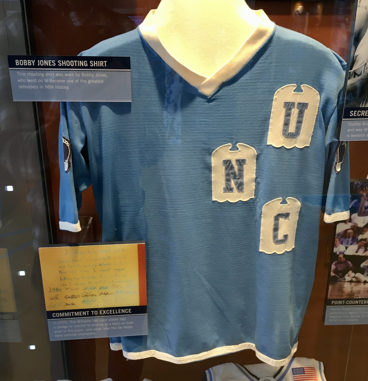
As you’d expect, there were lots and lots of jerseys on display. I loved seeing the late-1950s ones with the red-beaded trim and the super-snug chest lettering (plus they also had a pair of shorts from that same uni):


It was also interesting to see how the collar styles and typography have morphed over the years:


I had forgotten that there was a phase when the entire jersey — including the collar! — was mesh. It’s an awful, cheapo look that seems like it would be more appropriate for a practice jersey, but it was interesting to see it up close:


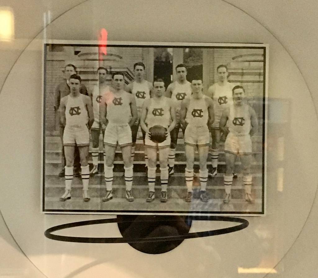
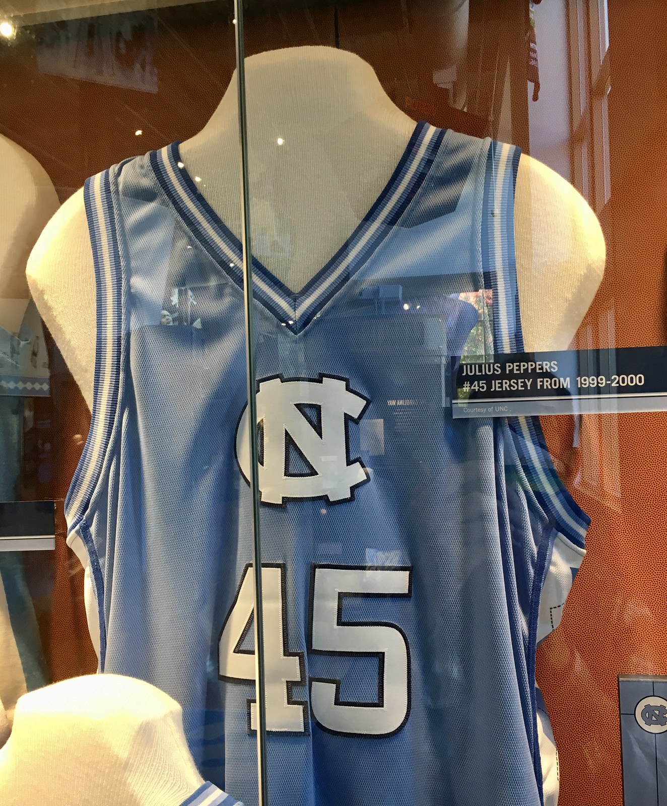
I liked the connection between this 1924 team portrait and the 1999 alternate jersey:
They even had a few sweatback designs:


There were also a few jerseys worn by UNC alums in the Olympics and other non-NCAA settings:


Warm-Ups
One of the most interesting things was seeing the wide variety of warm-up tops and jackets on display, starting with these quarter-zip Durene beauties:

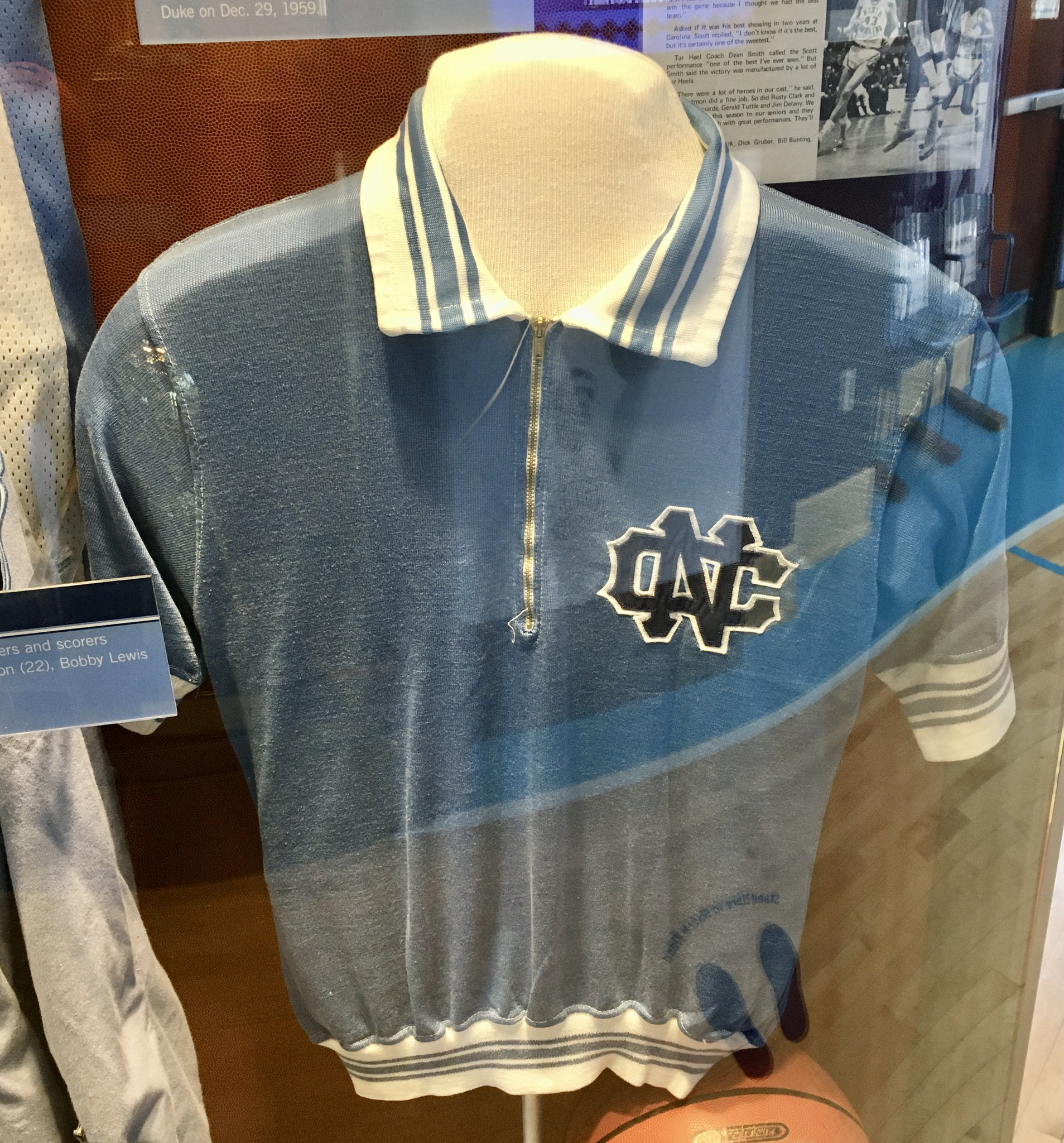

I would totally wear those!
Can’t say I’m quite as fond of these denim jacket warm-ups:


I was surprised to see some warm-up cardigans from the 1950s that appeared to be maroon-ish:


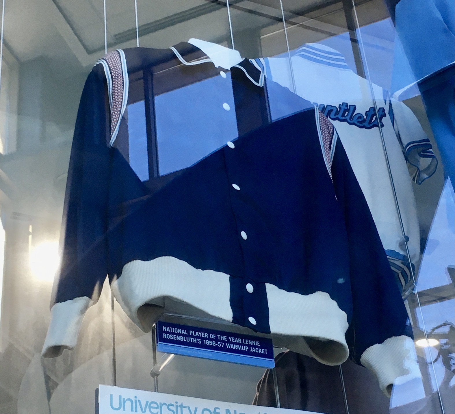
Here are some other warm-up styles that were on display. Note that the first one in this group has red shoulder sleeves, matching the red trim on the late-1950s uniforms we saw earlier:

Socks
Back in the day, UNC routinely had uni-numbered socks, so I was hoping they’d have some of those on display. Sure enough, they did:


As you can see, the socks were actually stirrups. This isn’t so unusual — lots of basketball teams used to wear stirrups with white crew socks over them. But here’s the part that’s never been clear to me: Did they wear sannies/undersocks, then the stirrups, and then the crew socks (for a total of three hosiery layers), or did they put the stirrups over their bare feet and then add the crew socks (two total layers)? Anyone know?
Basketballs
I enjoyed seeing some of the old balls stamped with old lingo, like “Last Bilt.” Here are a few that they had on display:


Bling and Hardware
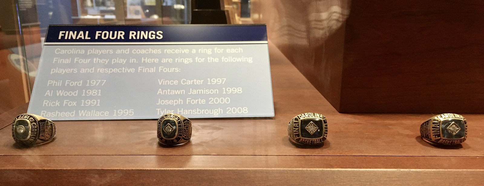
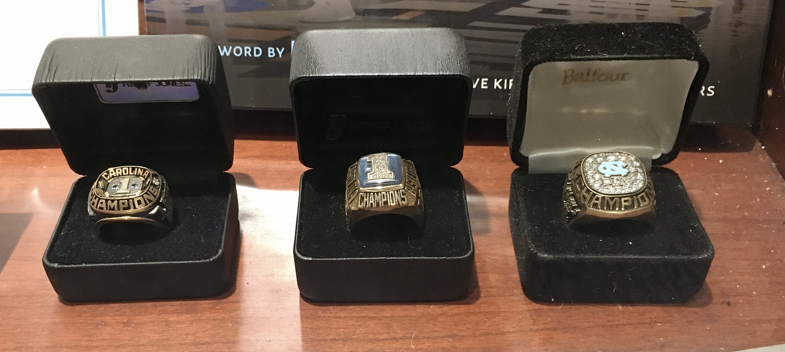
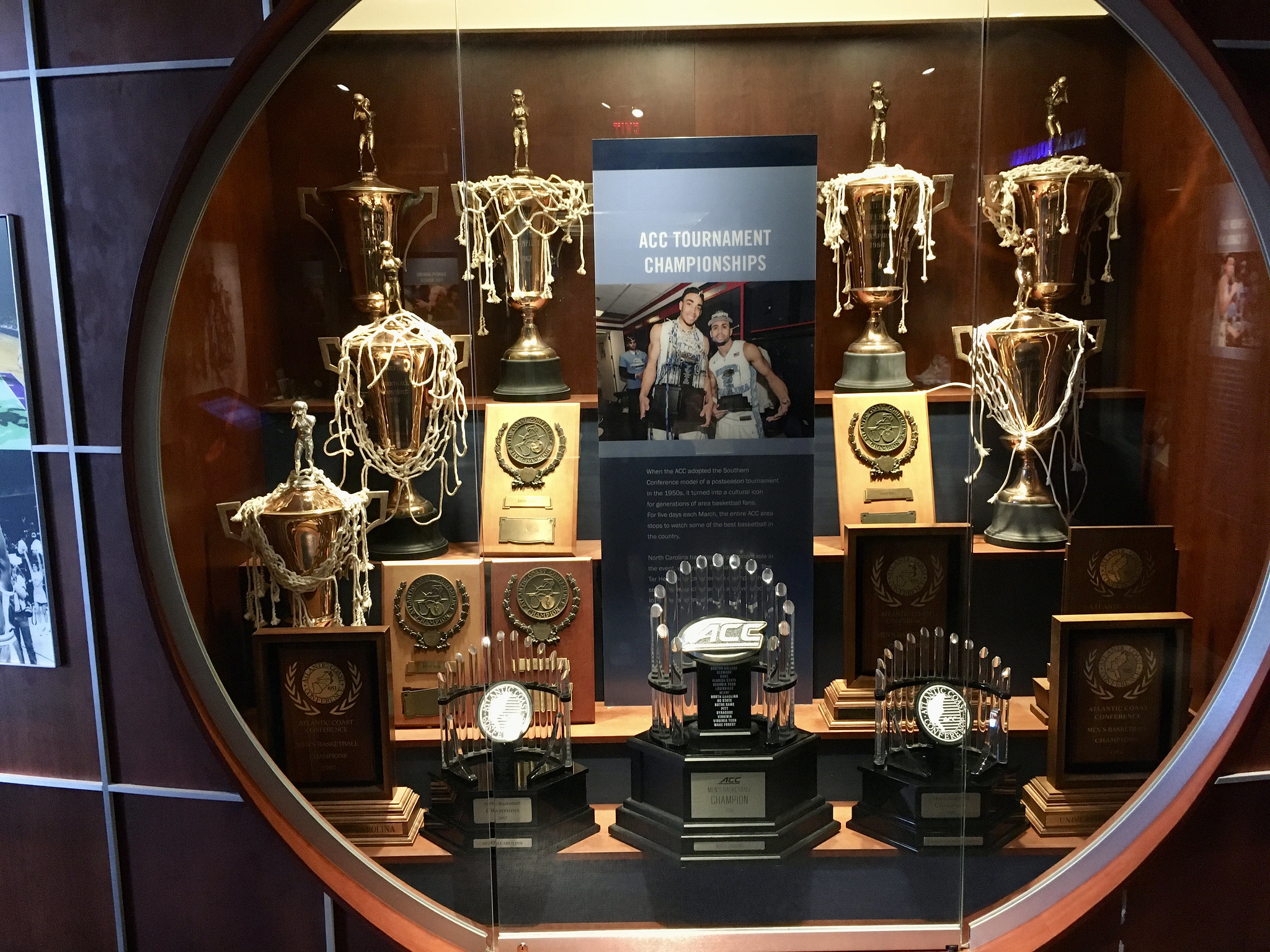
As you might expect, there were lots of championship rings on display, along with other trophies and some wristwatches:





Press Passes
I love that the curators thought to include some press passes — a nice touch to round things out:


Publications
There weren’t many programs, yearbooks, or things like that (which I found somewhat surprising), but here are a few items they did have:


Miscellany
There were also things that didn’t fit into any particular category but were nonetheless interesting, like this bizarre weighted vest that players sometimes had to wear as punishment for breaking a rule:

I also liked this travel bag that once belonged to Michael Jordan:

And I loved former player Bill Chamberlain’s Carolina blue blazer with “UNC” embroidered on the chest pocket:


———
There was more — a lot more — but that should be enough to give you an idea of how great this place is. Even better: Admission is free! Definitely worth a visit if you’re in the area.
(Huge thanks to John Austin for recommending the museum to me, and to my Durham-based buddy Tim Adams for chauffeuring me to the museum and patiently waiting while I geeked out over all the exhibits.)
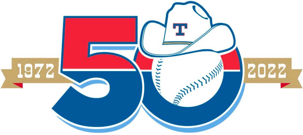
The big five-oh: The Texas Rangers yesterday announced their 2022 promotional schedule — and, with it, a new 50th-anniversary logo. No official word yet about this logo being used as a patch, but that will surely happen (hopefully just on the sleeve, not on the cap).
The logo includes the cowboy hat from the team’s 1970s logo, the “T” cap logo from the 1970s and ’80s, a powder blue drop-shadow, and the baseball from the team’s current logo. Also, like the current logo, the anniversary logo is half-red and half-blue — a perfect representation of the team’s decades-long inability to choose between being a blue team or a red team.
The Rangers wore a series of throwbacks for their 40th-anniversary season in 2012. Will they do the same next year? No official word yet on that, but the promo schedule has lots of throwback shirsey giveaways, so it would certainly make sense for them to wear throwback unis on those dates. Stay tuned.
New threads.
11.19.21. pic.twitter.com/L7ANADU9yx
— Kansas City Nice Trys (@Royals) November 17, 2021
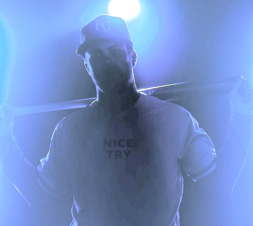
Well played: The Royals yesterday teased a new alternate uniform (probably a solid-powder design) that will be unveiled tomorrow. As is usually the case these days, fans immediately began tinkering with the teaser photo’s exposure, contrast, and so on, hoping to glean some additional info about the new uni. When they did that, here’s what they found (click to enlarge):
The Royals aren’t the first team to do something like this (I can’t recall which other teams have done it, but I know it’s been done), but they took things a step further by changing their Twitter account name and profile text:
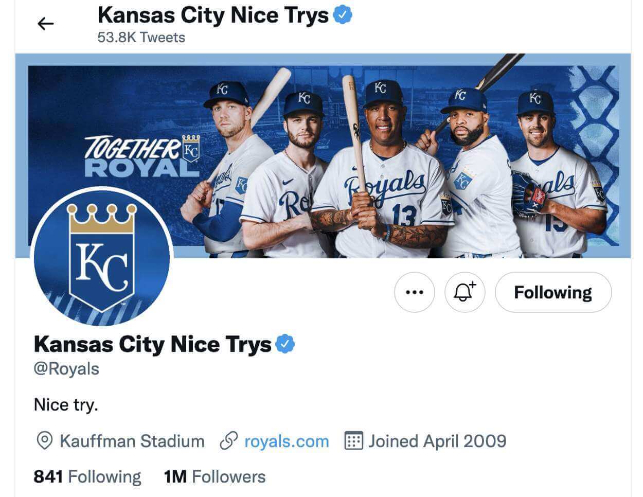
That’s pretty funny. I wish my favorite team had half that sense of humor.
Warmups underway in Cleveland. Both teams come out wearing white jerseys … something’s gotta give. pic.twitter.com/0DdRgHwtYN
— Lukas Favale (@LukasFavale) November 17, 2021
Oopsie: Bit of a cock-up last night in Cleveland, as the AHL’s Cleveland Monsters and Syracuse Crunch both came out of their dressing rooms wearing white uniforms. How does this happen?!
The Monsters eventually changed to dark unis (no surprise, since the home team obviously has more wardrobe options on hand than the road team) and the game proceeded.
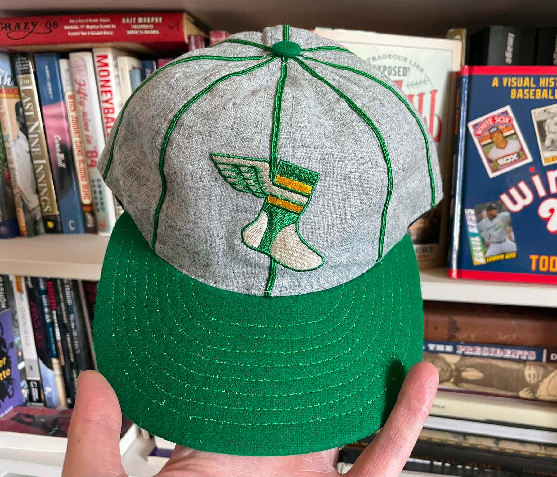
Photo by R. Scott Rogers; click to enlarge
Cap inventory update: Supplies of the Uni Watch Alternate cap continue to dwindle. Here’s what we have left:
7-1/8: 1
7-3/8: 1
7-5/8: 4
7-3/4: 2
7-7/8: 3
All other sizes are sold out. The hat is available here while supplies last.
Sorry, no Ticker today, as I was busy yesterday dealing with various family dramas. You can keep up with most of yesterday’s Ticker-worthy news by scrolling through my Twitter feed.
Speaking of family dramas: Thanks so much to everyone who sent kind thoughts yesterday, publicly and privately, about our little Covid outbreak here at Uni Watch HQ. I’m happy to report that I once again tested negative yesterday (although I won’t feel like I’m truly in the clear until I come up negative for today and tomorrow). So the good news is that I’m still okay, and the bad news is that Mary therefore has to remain at the Chez Covid hotel/sanitarium. She has mild symptoms, but nothing too horrible. She’s allowed to receive deliveries (but not packages, oddly), so yesterday I sent her some flowers to brighten up her otherwise drab room, and of course we’re constantly texting, Zooming, and so on. It’s not ideal, but it’s not the end of the world either. We’ll get through this.
Thanks again for all your support. It makes a difference! — Paul
Continued good health Paul and good vibes your way so that you and Mary are reunited soon.
Hang in there Paul, and feel better Mary!
Did you get to spend any more time in Chapel Hill besides the museum? It’s a great college town and it would seem to have a vibe you’d enjoy.
Paul, I hope you and Mary continue to be hale (link) and are reunited in presence soon.
Man, if the Rangers would swap their current cap logo into the centerpiece of their anniversary logo, not only would they have the best logo in team history, they’d have an actually good, above-average logo for the, what, second time in team history? I get why the “Toledo” T is in the anniversary logo, and honestly as much as I do like the team’s current cap-logo T the older T will look better on the Stetson, but an actual full-time team primary logo just sort of has to have the current cap logo on it.
And I object to the continuing jibes that Texas fails to choose between being a red team or a blue team. For at least a generation now, Texas has plainly chosen to be a blue-and-red team. That’s not a failure or inability to choose, it’s a choice. And it’s a perfectly valid choice. In a league where too many teams are either red or blue, adopting and using both in balance is a distinctive color scheme. Now, whether the Rangers succeed in balancing red and blue together with any skill or success, that’s another question. (I’d argue mostly no.) But it seems clear that the team quite intentionally tries to present itself as both blue and red, and that’s a perfectly valid choice to make.
You guys WILL get through this. My parents are both just getting over it, & they’re in their 80s. Without that vaccination? Who knows.
Hang in & God bless you both!
Hi Paul, didn’t have a chance to leave a comment yesterday, but sending best wishes to you and Mary. Hang in there, this too shall pass.
Hoping for the best for you and Mary!
My late mother took me to that museum when I first started to get into basketball when I was maybe 10. She wasn’t aware that it was a UNC basketball museum, but thought that it was a museum for the state of North Carolina. Either way, great memories. Looks the same now as it did then from the pictures.
It is a shame the Texas baseball team didn’t use this opportunity to change their offensive name, but here’s hoping for progressive change by their 60th season!
As far as the logo, I guess it makes sense to create a hodgepodge design for a team which has never had a really good look or identity. It definitely works for them.
I hope you don’t find “New York Rangers” offensive.
Only the New York part ;-)
Stay safe, Paul.
I was scrolling through the Gridiron Uniform Database this morning to see the combos for this week. And for some strange reason, I went and looked at all the uniform combos of the Patriots last set. With the trend to mix/match different pants/jerseys, I found it odd that the Patriots never wore their grey pants with their white jerseys.
You guys are fortunate to have a COVID hotel available. Stay healthy, Paul. And, since you mentioned it, some light reading on a local landmark: link
Seriously, we are *so* lucky to have that municipal amenity! A great example of government providing an essential public health service for the betterment of all.
Very interesting history of the facility & Dr. Kellogg. It was covered in detail on the Food that Built America: “The Breakfast Barons” episode.
That story focuses of the rise and split of the Kellogg brothers and their relationship/rivalry with CW Post. Amazing facility and Kellogg was definitely ahead of his time from a health & wellness point of view. Also a pretty incredible business success story for his brother
I’m trying to find some confirmation of who the first player was to wear an umlaut on his jersey in the NBA. Some people on Twitter say Hanno Möttölä but I can’t find anything more reliable than that. Any help?
I don’t remember any of the details, but I’m fairly certain the Tennessee Titans were the first to pull the “nice try” move on a uni teaser. In fact, I think Paul interviewed the guy responsible for it.
link
I’ll be honest: I had completely forgotten about that interview! Only three-and-a-half years ago — my memory is going!
I wish they had tried harder on that uniform design ;)
Interesting that the “LAST BILT” trademark is on both the Wilson and Spalding balls. A google search also brought up examples of Rawlings and MacGregor balls with the mark. It looks like the trademark was held by Spalding, but has since expired circa 2001. Anyone know more about it?
Glad to hear you’re still testing negative and that Mary’s symptoms have been manageable. Hang in there and hoping for the best.
Still sending positive thoughts to you and Mary!
That museum looks amazing. Some really great uniform construction details like that beaded trim I hadn’t seen before. The all mesh one is interesting as mesh doesn’t curve like rib knit trim, so it can definitely look like a less elegant piece when used for trim. Got a kick out of the denim warm up top, that would be a fun DIY. Great stuff.
The Cleveland Monsters/Syracuse Crunch white uni mess is more annoying for Cleveland as it seems. Not only did they have to swap jerseys and helmets, but they had to change out of their white socks as well, which is a real pain in the butt! It means they basically had to fully undress after warm ups.
Great stuff from the Carolina Museum! I remember those Wilson basketballs that you thought you said “Last Bilt”. I always read it as “Cast Bilt”. That seems to make more sense I think?
Ah, interesting – hadn’t considered that!
Google searches turned up results for both Last and Cast…but these images where the box is included indicate that it’s Last Bilt:
link
link
Sorry to hear about Covid. I hope Mary mends up well.
Awesome NC Story. Thank you for sharing.
If the Rangers did use that logo on their cap, they would join the Orioles in having a hat on a hat.
Re: the Carolina socks. It was not uncommon to wear multiple pairs of socks back then, supposedly for ankle support, so it is likely they wore crew or tube socks under the stirrups. Ed Searcy wore seven pairs of socks when he played for Prof St. Johns.
Hope all is well Paul and Mary.
Wishing you continued negative news and Mary a speedy recovery! The pandemic just keeps on going.