For all photos, click to enlarge
[Editor’s Note: Today we have another guest entry from baseball jersey restorer extraordinaire Bill Henderson and his business, the Dream Shop. Enjoy. — PL]
By Bill Henderson
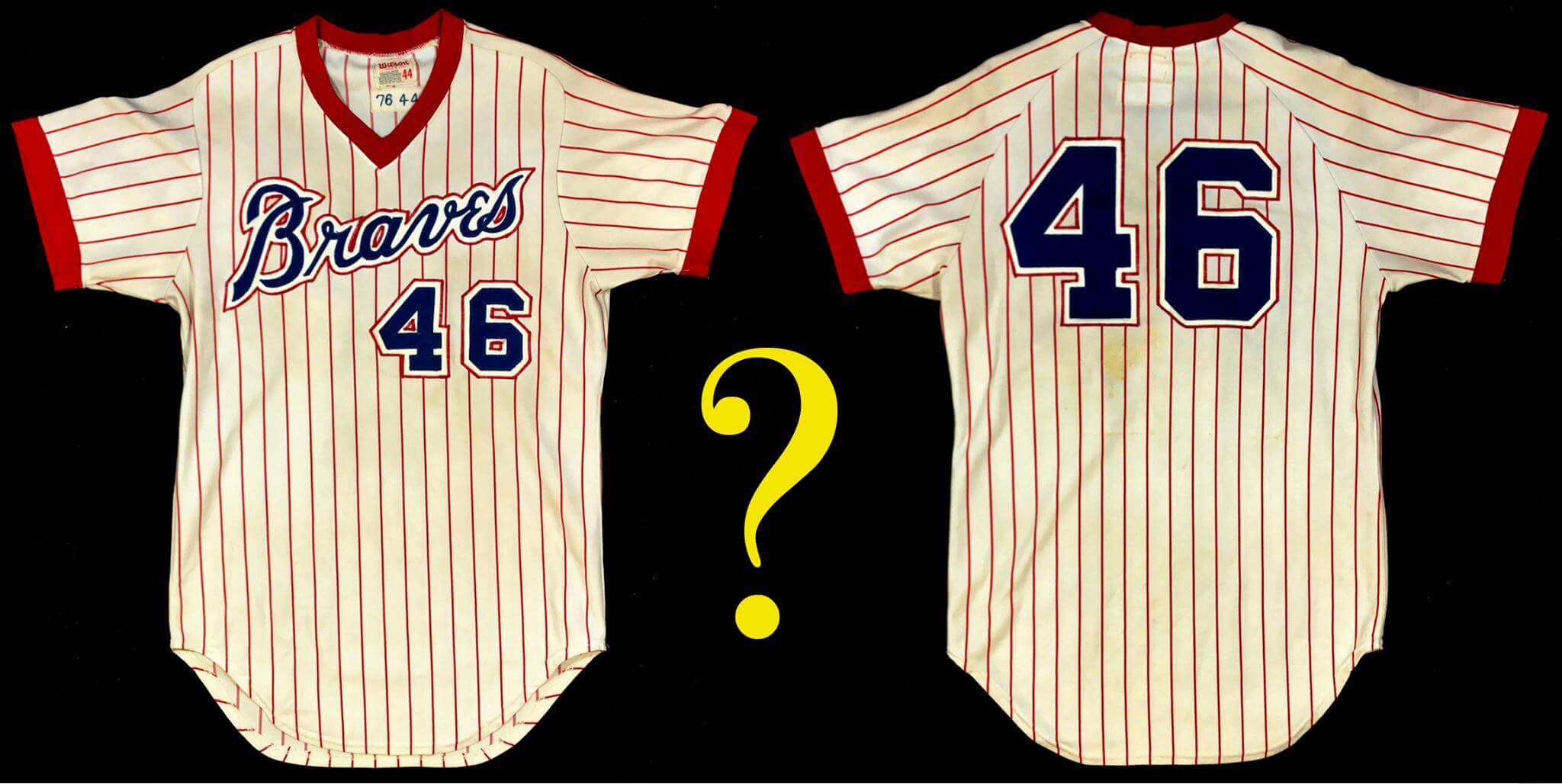
“Is this worth restoring? And what is it?”
These were the questions that collector Guy H. recently asked me. He sent me photos of a rather dingy-looking Braves jersey in the uncommon style worn only from 1976 through 1979. I was intrigued, but I also knew that the organization had multiple minor league clubs also called the Braves in the 1970s and ’80s. These teams often wore their own Braves jerseys, which are frequently misrepresented as MLB-issued when they had actually started their lives far from Atlanta as minor league uniforms.
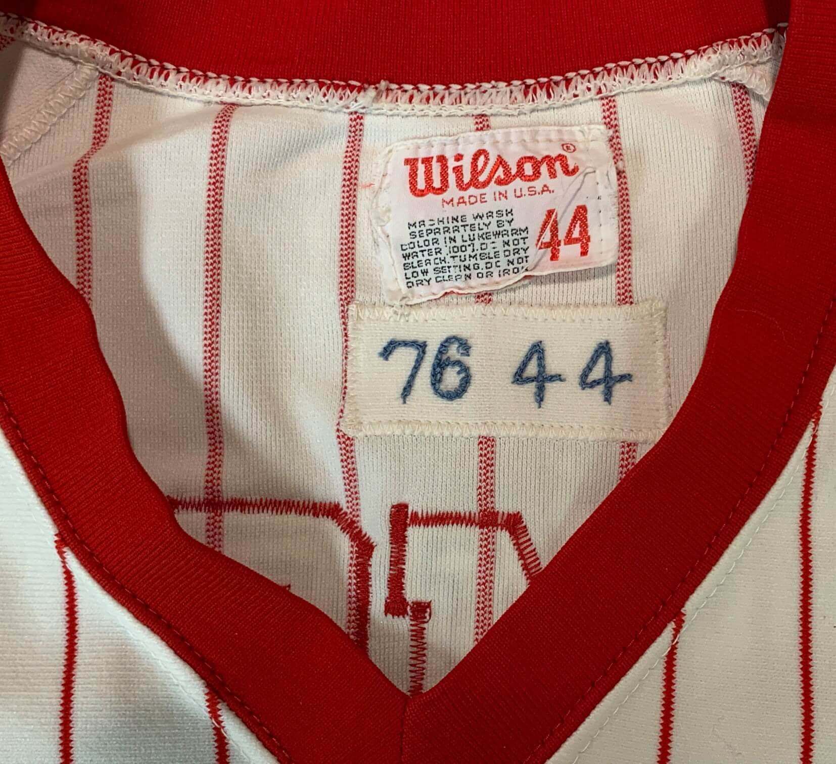
“Send it along,” I suggested. “Let me take a look at it on the light table and see what I can learn.” I was hopeful — even though the jersey clearly had a number change. The “76 44” team tagging on the inner collar was promising:
When the jersey arrived, it was clear that it had done several tours of duty. While the front numbers could have been original, the back numbers were not. On the light table, it was clear that another pair of numerals had previously been on the back, sewn uncharacteristically low. But odder still, there was some slight fabric scarring right between the two back numerals up near the top of the back of the shirt. It wasn’t much, just a couple of stray lines.
While the scarring extended under the current back numerals, it didn’t look long enough to be anyone’s name. More to the point, the Braves didn’t even have NOBs in the late 1970s, so what I was seeing presumably wasn’t from a player’s name.
But wait — low-positioned numbers, name on back — it suddenly occurred to me that this could be one of Atlanta’s famous nickname jerseys, which were worn for about a month and a half in 1976. Very few of those original jerseys have ever surfaced, and their whereabouts were generally a mystery. Collectors have unearthed a few over the years, but for the most part these had been lost to the ages. Was I now dealing with one of them? I strongly suspected so.
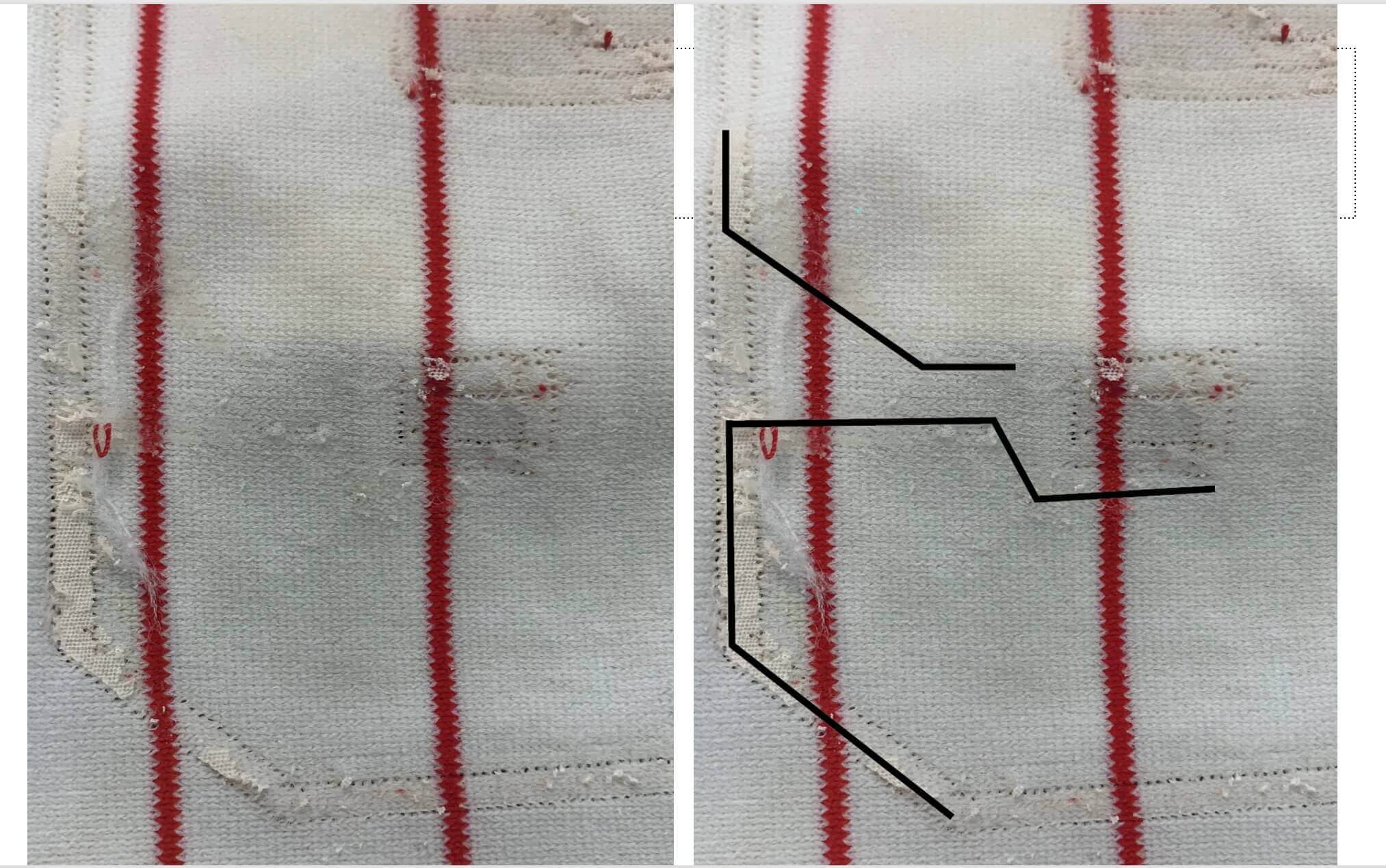
Guy gave me permission to strip off the back numbers to see what we could learn. The jersey was extremely dirty, and finding the outlines on the light table was not easy. Look at the photos here and note the evidence that shows up on the light table — evidence that’s nearly invisible to the naked eye:
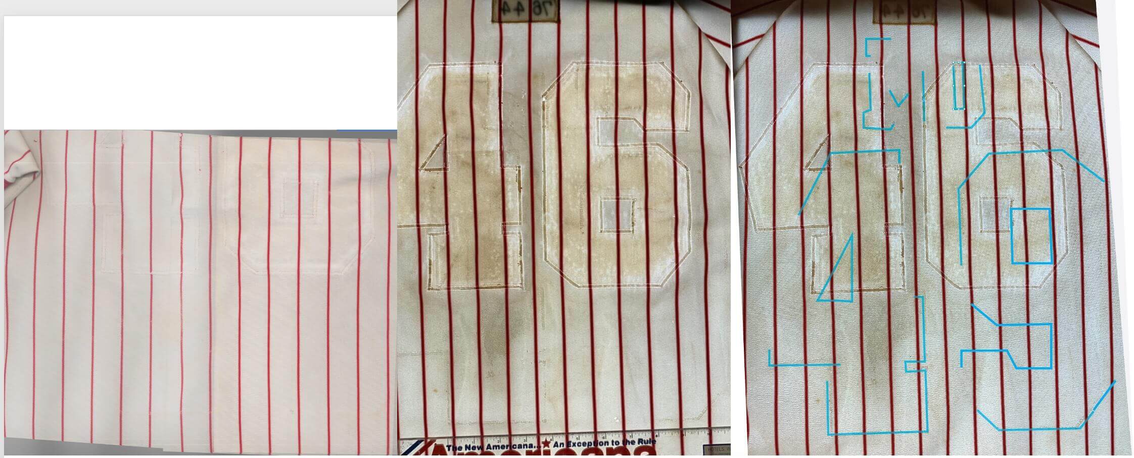
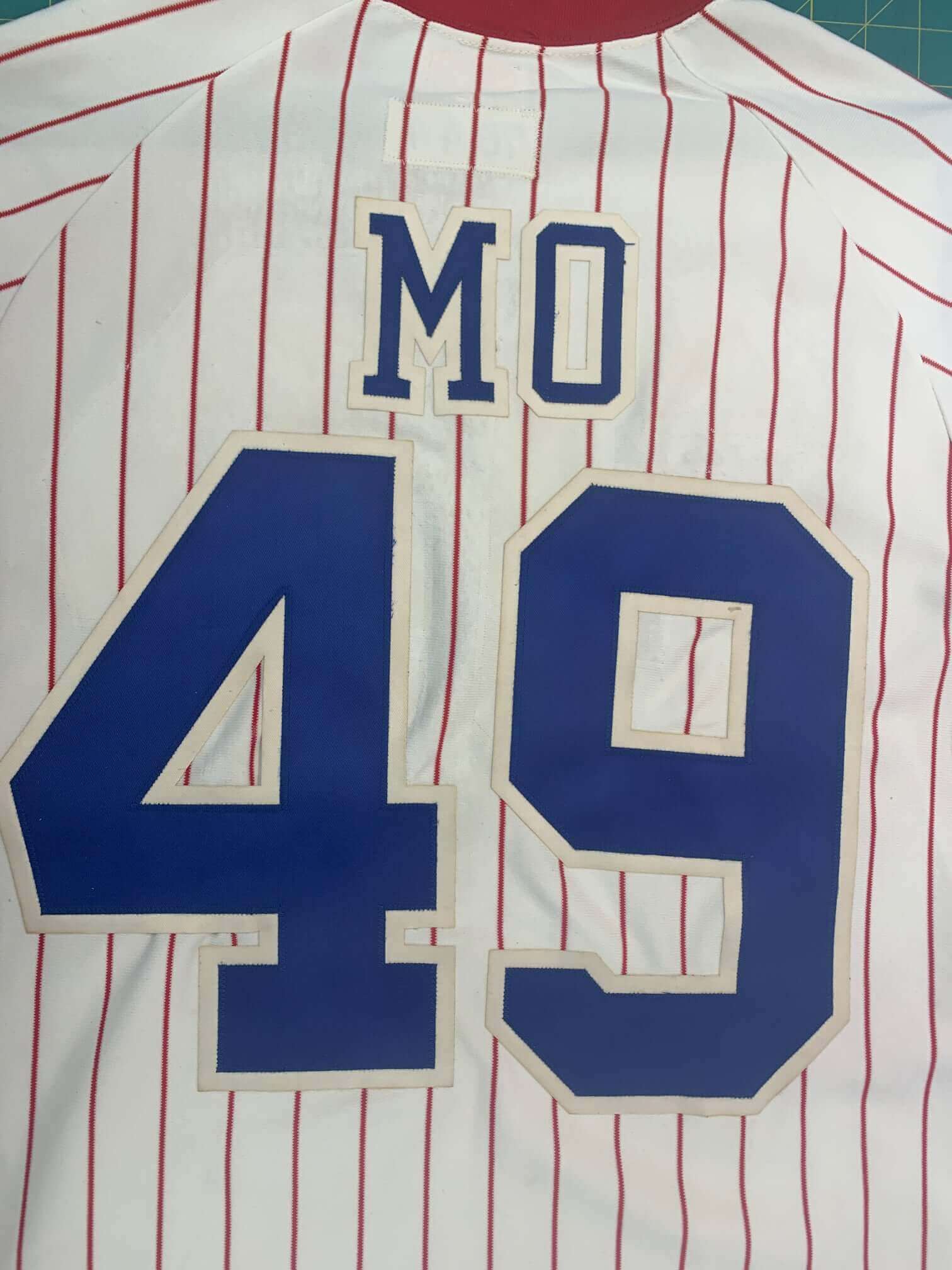
With the numerals removed, I could see that the previous numbers were huge, almost football jersey-sized, and were positioned seven inches below the newer numbers. I was able to coax out enough faint strokes, glue points and pulls in the fabric to see that the original number had been 49. Who was No. 49 on the 1976 Braves? Answer: pitcher Carl Morton, whose jersey nickname had simply been “Mo”:
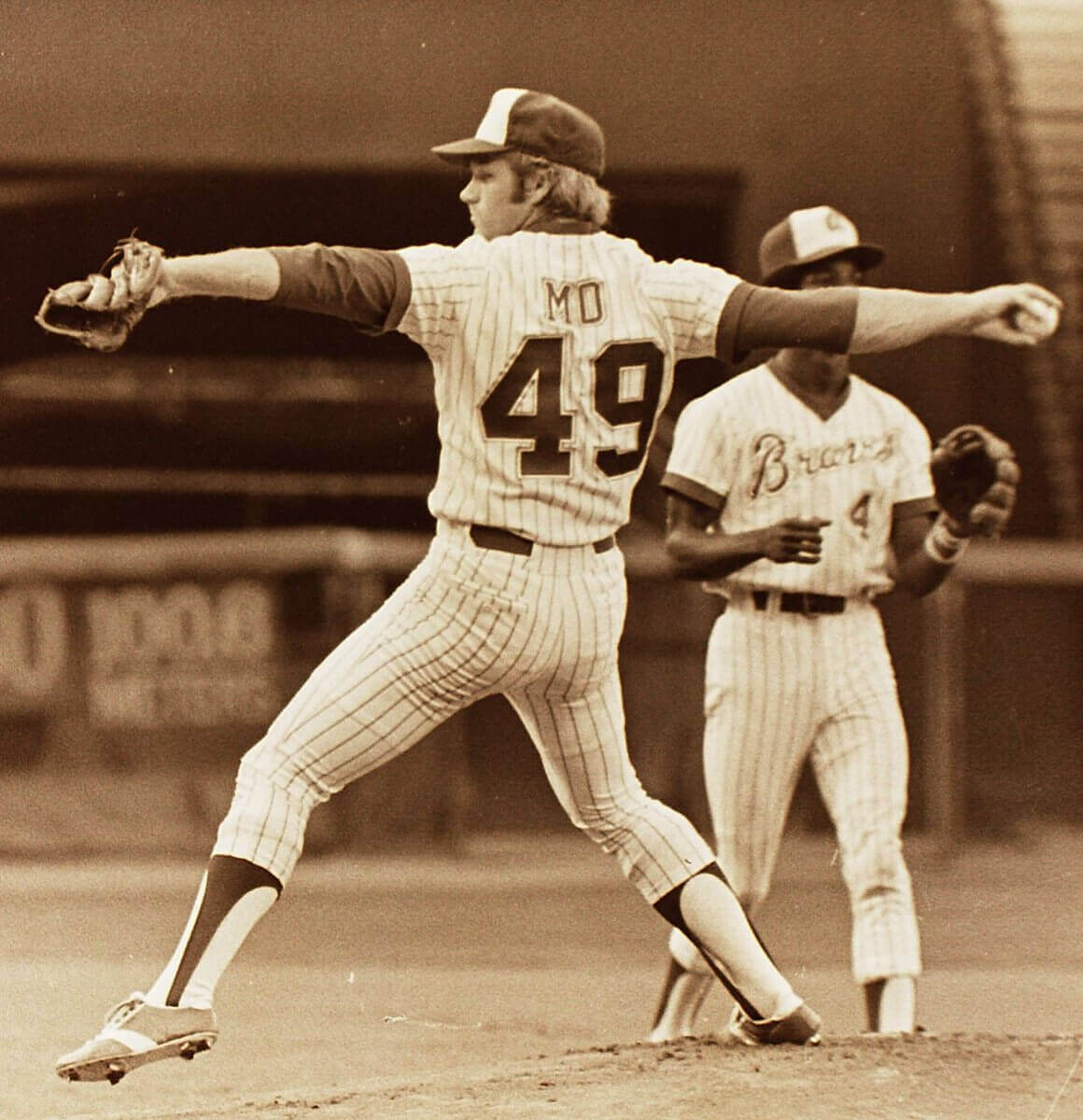
That two-letter NOB explained why I could barely see any signs of a typical name!
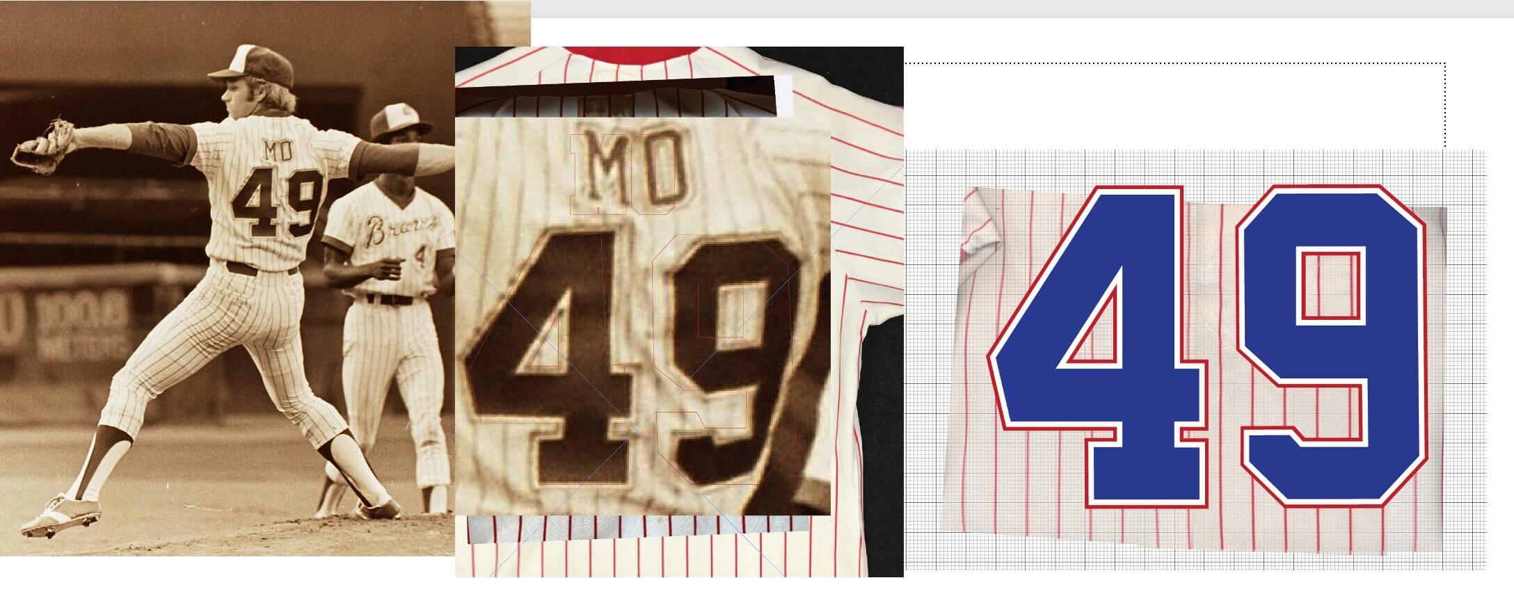
Now that I knew what I was looking for, I started zooming in to look for the intersection of any possible shadow lines so I could re-establish the placement and positioning of the original 1976 lettering. Since that photo of Morton shows the entire back of his jersey, I blew it up, distorted it slightly with Adobe Illustrator to “flatten” its angle, and then overlaid it onto the light table-scan image of Guy’s jersey. Lo and behold, when compared to the photograph, there were multiple pinstripe intersections of each of the shadow lines that I could decipher:
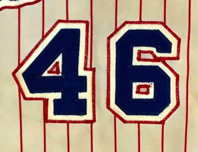
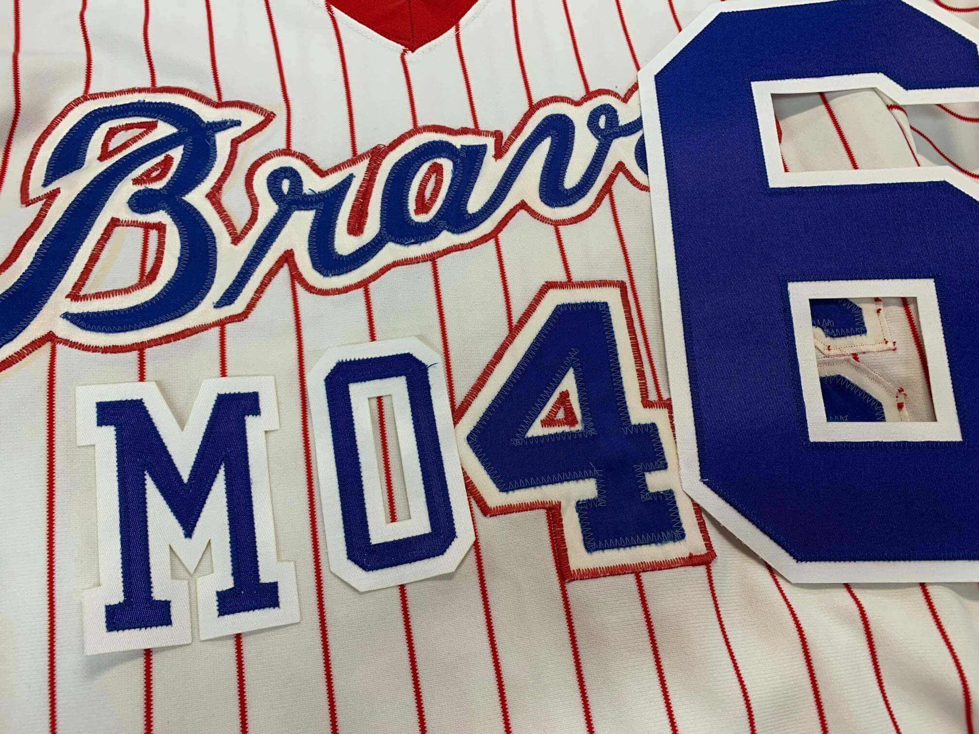
Next, I turned my attention to the front of the jersey, where a couple of things caught my eye. First of all, the front numbers looked original. Braves jerseys from this period used an unusual method for attaching the numbers. The numbering was actually two-color — blue twill over white — and then the edge of the white fabric was bound to the shirt using a very tight embroidery stitch of red thread. They may have thought this looked fancy and unique, but to my eye it generally looked somewhat sloppy, and it tended to look worse over the years as the red embroidery faded and frayed. Moreover, the tight stitching usually caused the fabric of the shirt to pucker.
Meanwhile, I noted a couple of spots where the Braves chest script looked like it had been removed and restitched:
My guess is that it had gotten so ratty and puckered that the minor-league team ripped out all the red thread, ironed the fabric flat, and then stitched it all back on. That would never happen today, but it wasn’t so uncommon back then — labor was cheap, and teams regularly went to extreme measures to preserve the viability of old uniforms.
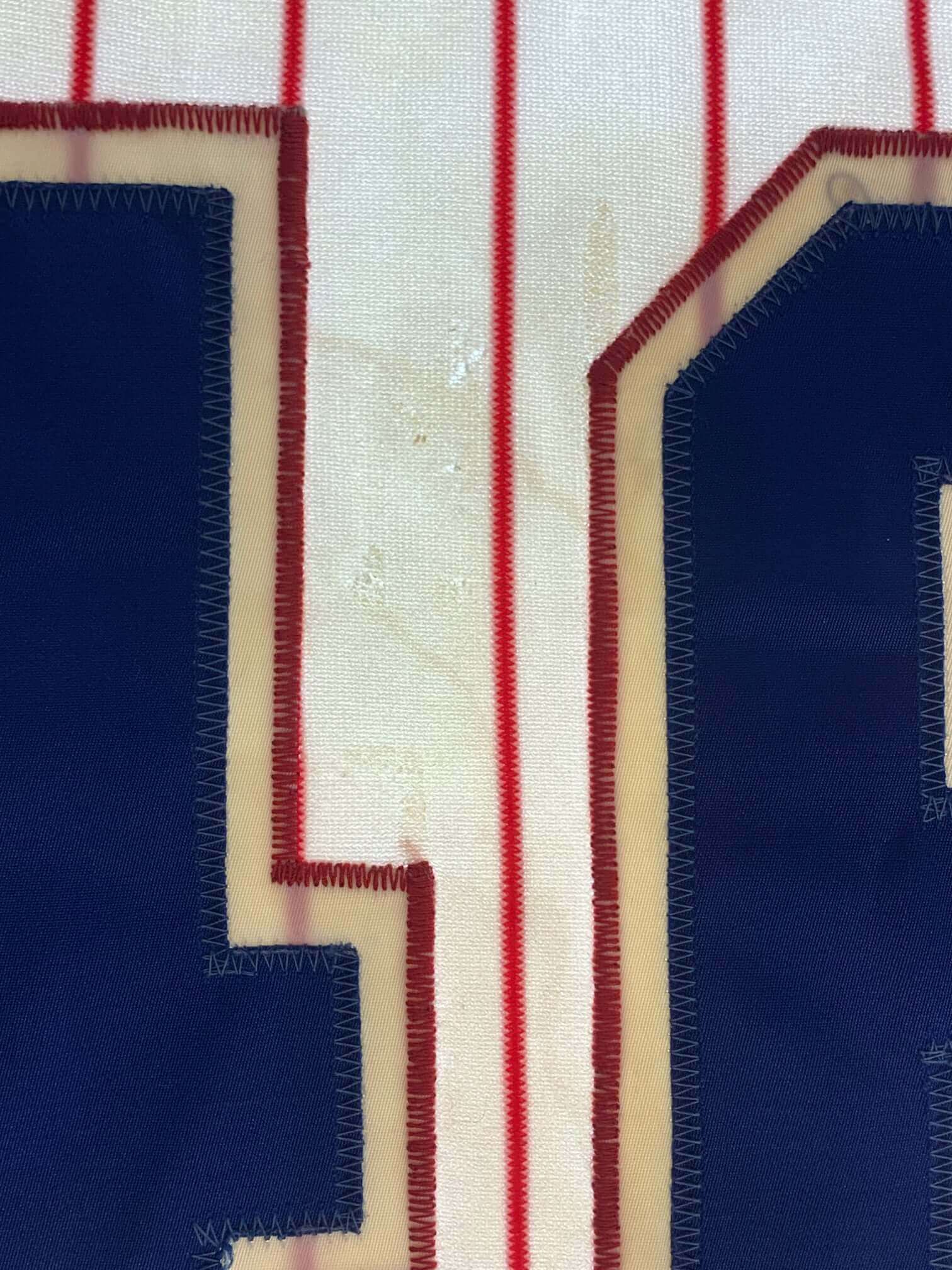
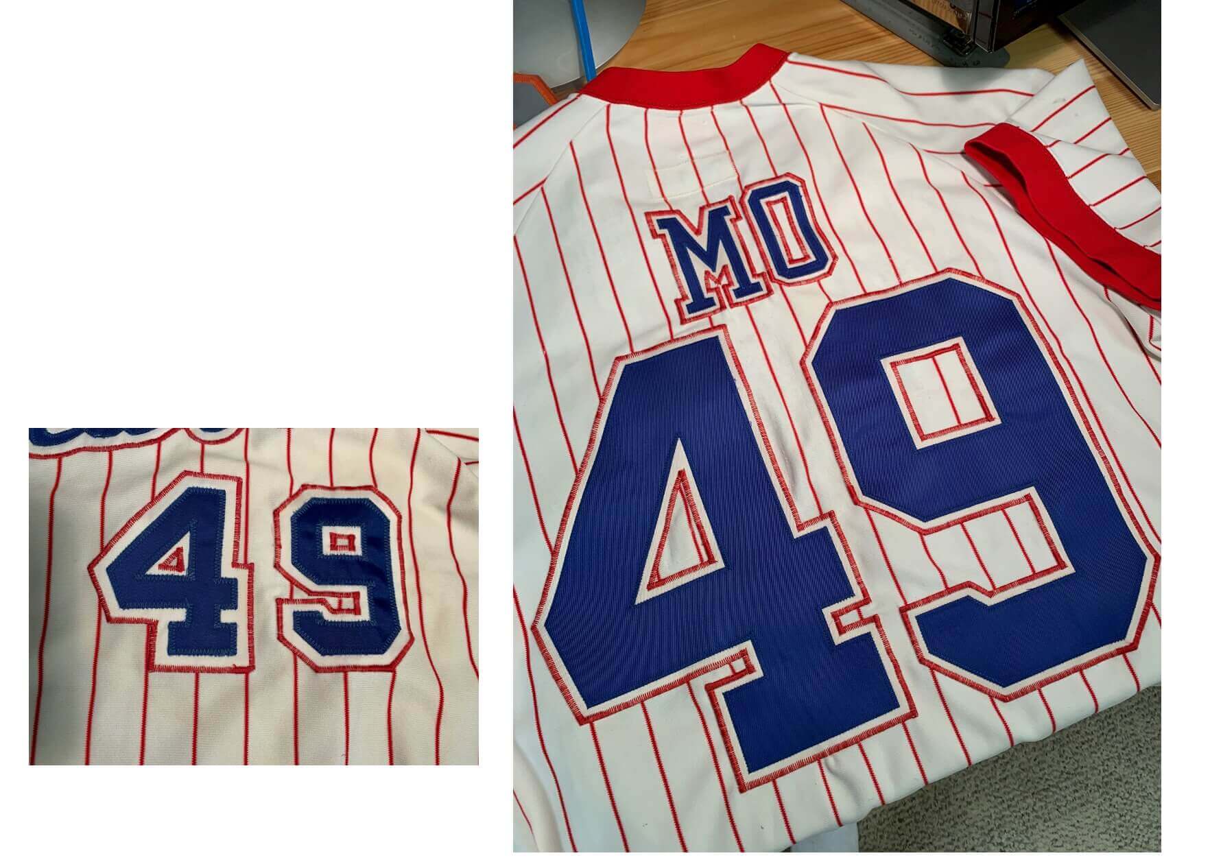
As I mentioned earlier, The 46 on the front looked original, but I decided to remove the 6 to see if it had perhaps been turned upside-down. When I did, my suspicions were confirmed by some very faint ghost lines from old stitching and some flecks of dried glue in the single spot I expected to see them:
The front numbers were very probably the originals, with the 6 turned upside-down and the 4 left in its original position. It’s probably the only original stitched element remaining on the shirt.
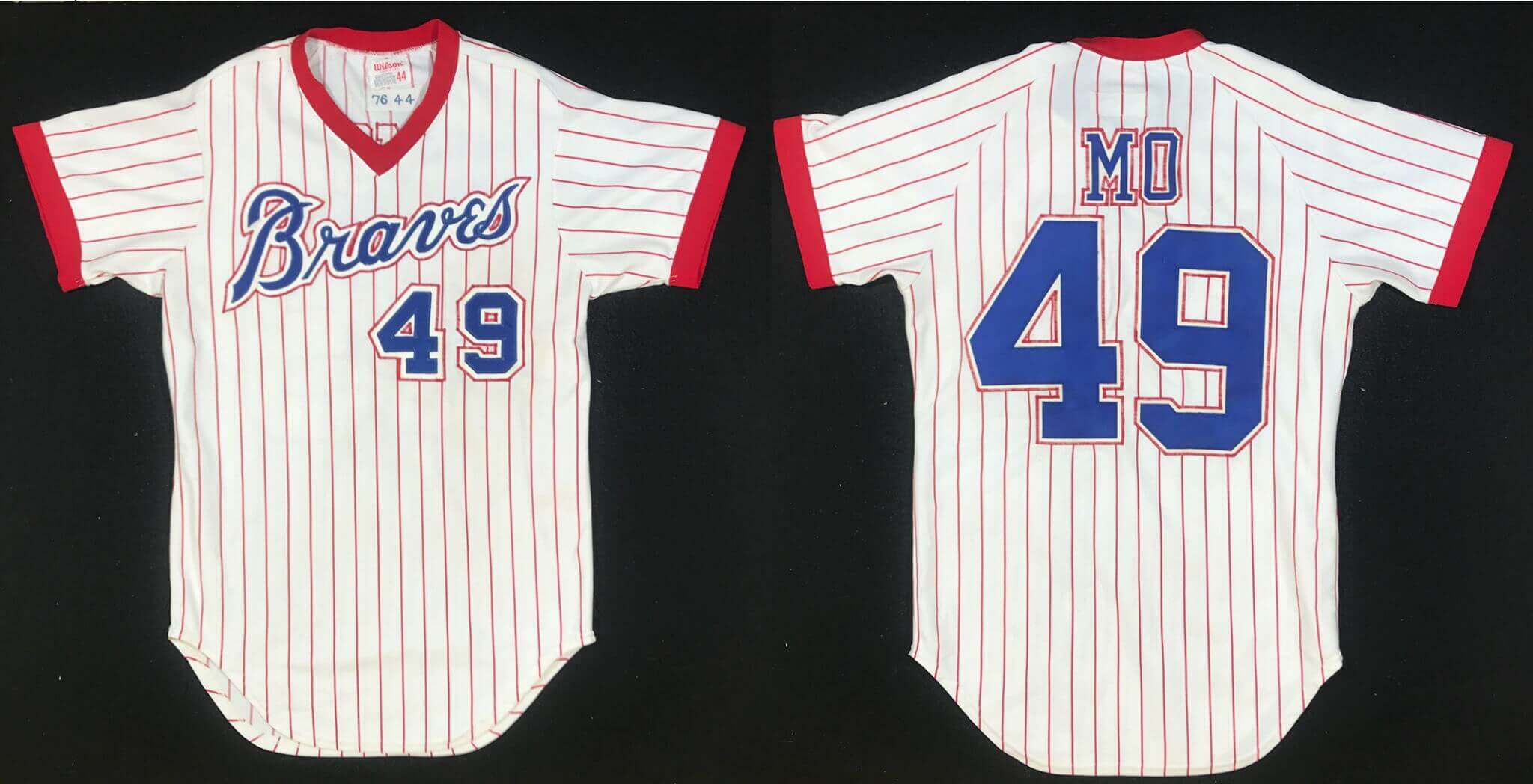
Using the ghost outlines of the numbers and letters from the back, I re-created those in the appropriate colors of two-layer tackle twill:
My forensic work now complete, I turned my attention to cleaning this filthy jersey. It was so stained with years of dirt, and caked with dried, crusty adhesive, that you could barely see through some spots when I put it on the light table.
I have learned one of the dangers of cleaning very dirty fabric is that you can over-clean it, resulting in bright white spots that the rest of the shirt can’t hope to match, so I proceeded with care. You can see in this next series of photos that I was able to remove most of the glue that had been layered on underneath both the original and current numbers.
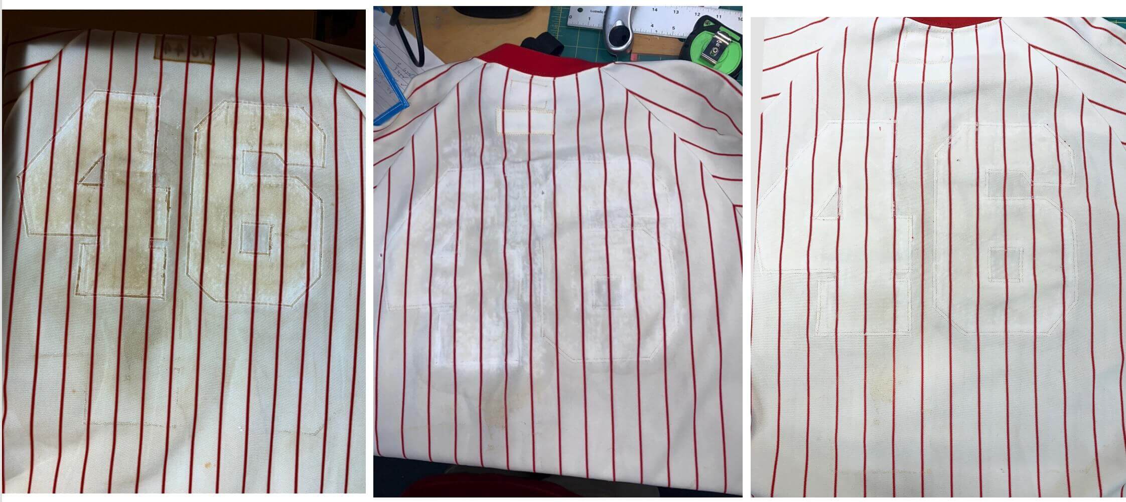
Now it was my job to make the rest of the shirt at least as white as that. I use chlorine bleach only as a last resort, and it turned out not to be necessary on this project. After wetting the jersey and literally soaking it with OxiClean pre-treat spray, I let it sit for almost a full day, then soaked it in a bucket of water with OxiClean powder, agitating the water every hour or so. I machine-washed it twice using OxiClean and non-chlorine bleach, and the result was stunning. The base color evened out to the point where it looked very presentable indeed.
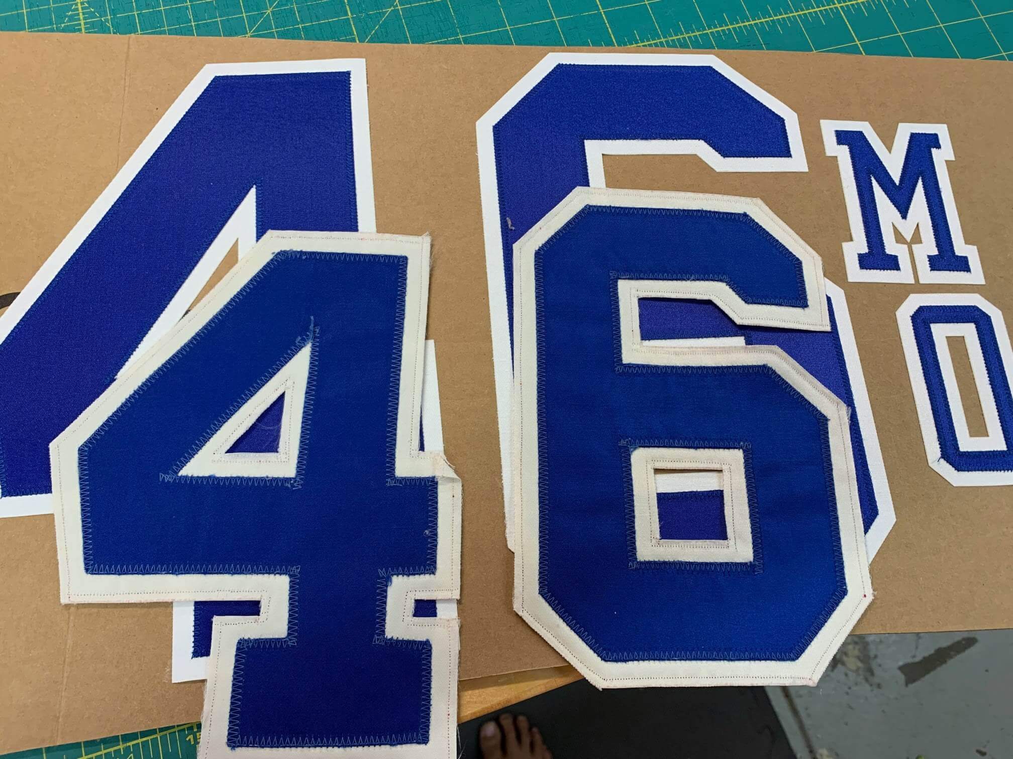
The next step was to make the new lettering and numbering match the old in terms of color and patina. After being worn and washed dozens of times, the twill lettering didn’t look very much like it did when it was new. The shine was gone, and the whites had faded to beige. I’ve done enough of these now that I have ample experience with both media blasting and organically dying new lettering to approximate the look of the well-worn originals. I proceeded to execute that process in the sandblaster and on the stove, to make the old lettering look like it belonged.
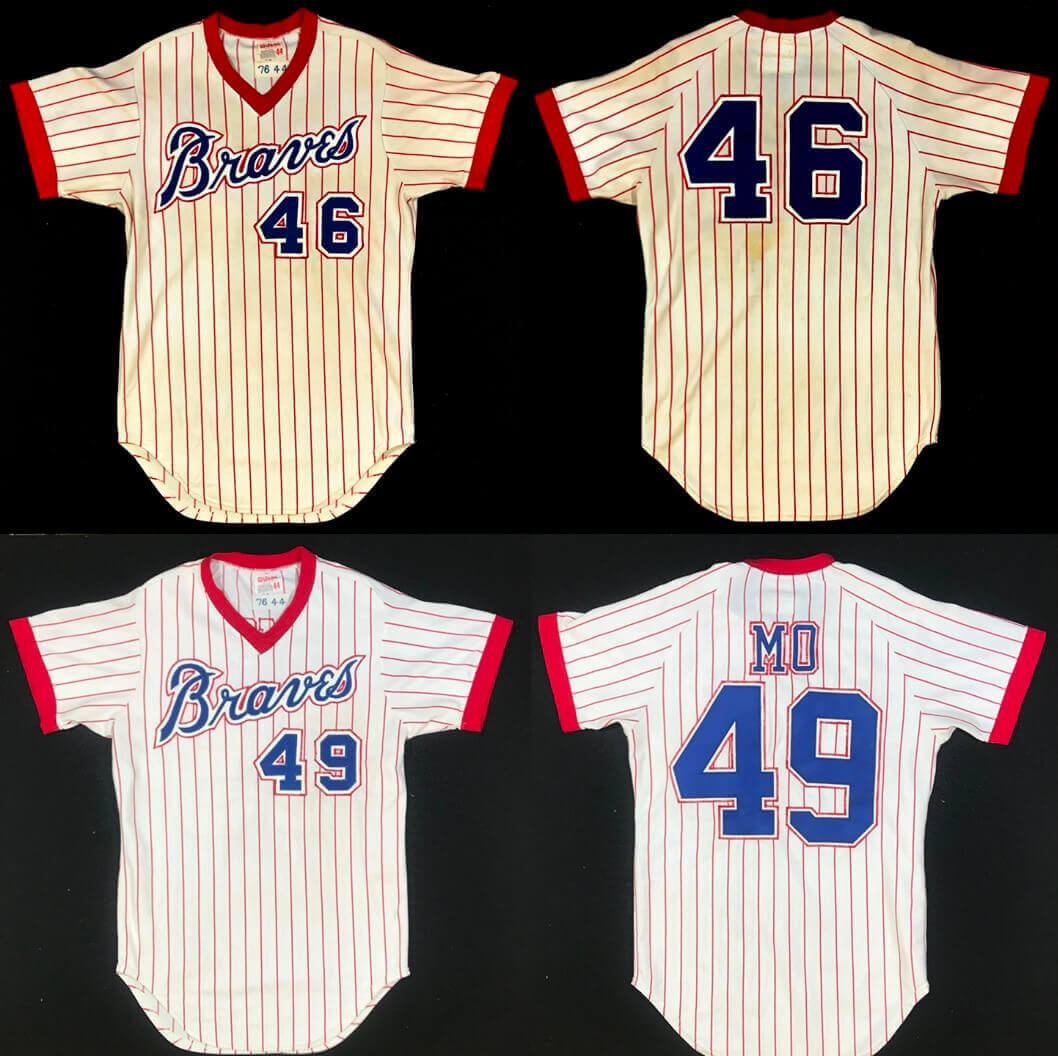
The next step was to tack the now-aged-looking lettering in place over the old outlines. This required me to slightly pucker the fabric of the shirt beneath the new numbers, because the jersey had become slightly misshapen in its decades of use. To make all of the lines of the pinstripes intersect with the numbers in the appropriate places, I had to perform some minor manipulation:
You can see that the back numbers are not completely straight and aligned with each other. Part of this is due to the stretching of the shirt through years of use, and frankly they probably weren’t exactly aligned to begin with. Our job is to restore things to the way they once looked, not to make them look new and perfect.
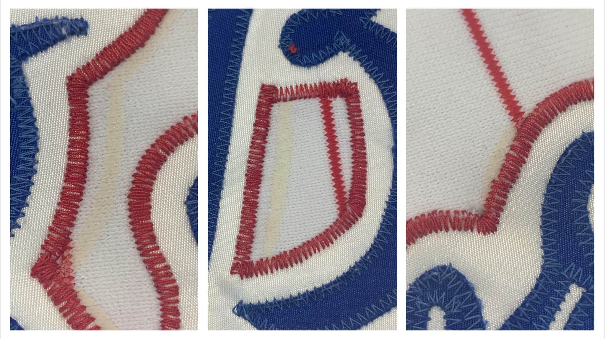
Next, I gave the jersey to Emily, my expert stitcher, and asked her to re-create the embroidery stitch around the edges. I probably have 10 different shades of red embroidery thread that I keep on hand for this type of a project, and we found one that was the closest match to the stitching that was around the original 4 on the front. That completed the restoration!
But that doesn’t mean my work was over. Simply restoring the garment isn’t enough — it requires a full authentication, as well as complete pictorial documentation of the restoration. I did both for this historic piece.
I hope you enjoyed reading about this project. It might give you hope that some diamonds in the rough are still out there, waiting to be found. So many old MLB jerseys were repurposed in the minors that almost any old minor league jersey you find for sale quite possibly has a big league heritage hiding underneath.
———
Paul here. I’ve written so much over the years about Atlanta’s nickNOBs, so it’s very cool to see one of those original jerseys get the Dream Shop treatment. Big thanks, as always, to Bill Henderson for sharing his expertise with us. You can see more of his Tales from the Dream Shop here.
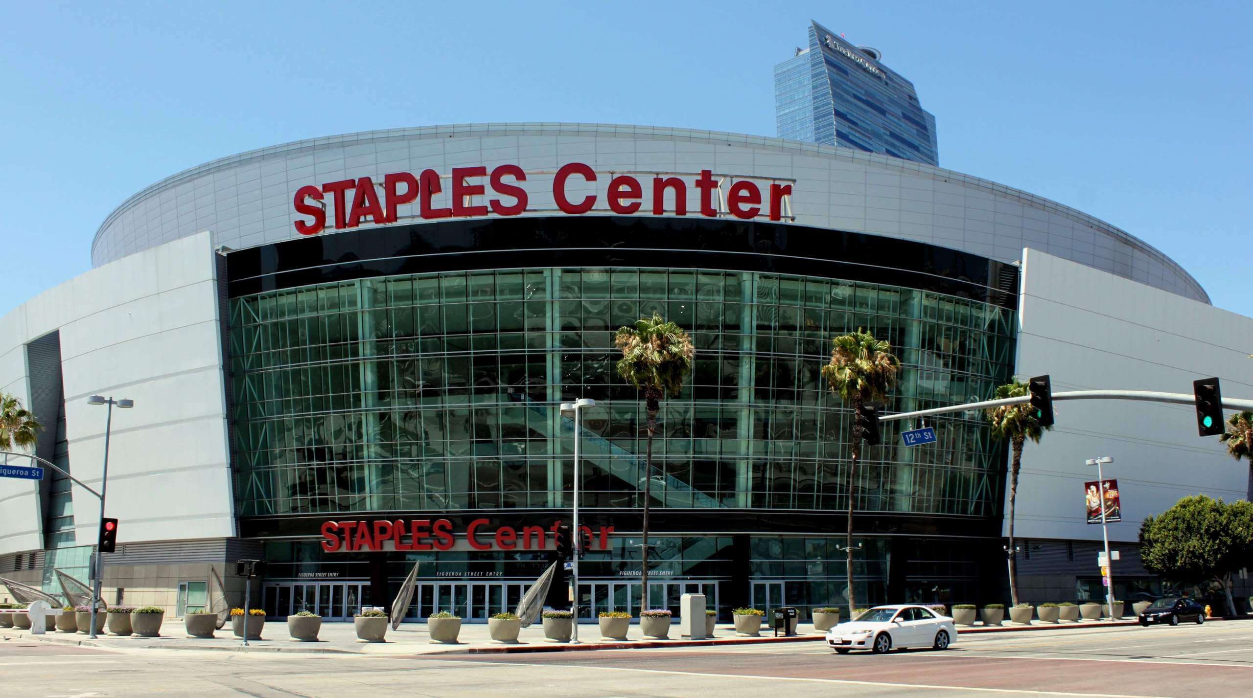
Gross: Here’s some coal in your stocking: Starting on Christmas Day, the arena where the L.A. Lakers, Clippers, Sparks, and Kings play, whose name is currently an ad for a chain of office supply stores, will change its name to an ad for a cryptocurrency exchange.
When this news was announced last night, lots of people said, “Ooooh, time for a new Naming Wrongs shirt!” But as I explained to those people, we only do shirts for non-corporate names — not for names that are ads for office supply store chains. (As you may recall, I went through this same explanation a few years back for the Brewers’ ballpark.)
I do agree that the new advertised name sounds worse than the old one (any building name that includes “.com” is pretty much dead on arrival). And of course I’m used to the old name — after hearing it for more than 20 years, it “sounds right.” And that’s part of what’s so insidious about advertised building names: They normalize the spread of corporate culture and soften us up for it to spread even further. It would have been much better — for the city, for fans, for the teams — if the name we had gotten used to for the past 20-plus years had been “City of Angels Arena,” or “the L.A. Center,” or something with genuine civic equity.
So while the new name is definitely gross, I won’t mourn the loss of the old one. It’s basically just swapping in a new ad on the billboard.
Never a dull moment: On Saturday, while I was down in North Carolina, Mary hosted a book-swap party at Uni Watch HQ. All attendees were fully vaccinated. One of those attendees — let’s call her Val — started feeling sick on Saturday night. On Sunday Val got tested — negative. On Tuesday morning (yesterday), Val was still feeling shitty, plus she’d lost her sense of smell, so she got tested again — positive. At that point, she emailed everyone who’d been at the Saturday gathering, including Mary.
There’s a testing facility right around the corner from Uni Watch HQ, so Mary and I went there right away. My rapid test came back negative — but Mary’s was positive.
Fuck.
Mary’s exposure to Val was on Saturday. But my exposure to Mary didn’t start until I got home from North Carolina on Monday afternoon, which means my Tuesday-morning negative test result doesn’t really mean anything. I could have been infected but not yet had enough of a viral load to be detected by the rapid test. I’ll keep getting tested every day this week. (My non-rapid test from yesterday also came back negative. But again, that doesn’t necessarily mean anything.)
On the plus side, Mary didn’t yet have any symptoms, she’s fully vaccinated, and I’ve received my booster, so we figured this episode would likely be no big deal. On the other hand, I’m high-risk (I have asthma and I take a drug that leaves me immunocompromised), so we figured we’d better stay separated from each other.
Which, we quickly realized, would be a bit tricky. Uni Watch HQ, like many New York apartments, is small, has only one bathroom, and does not have a dedicated guest room or a second bed. At first we thought Mary would basically live in our “work room” (a back room where we keep our workout clothes, our printer, my file cabinet, my merch inventory and shipping supplies, etc.) and sleep on an air mattress. But that would present a series of awkward workarounds, plus there’d still be the issue of the shared bathroom, which is a prime Covid risk.
So Mary reluctantly decided to relocate to a “Covid hotel” run by the city. It’s probably an overcautious step to take, but she did it to keep me safe, which is very, very humbling. A taxi took her away yesterday evening and I couldn’t even hug her good-bye. It really sucked.
If I continue to test negative, she’ll stay at the hotel until the day after Thanksgiving, which would be pretty miserable for both of us. If one of my subsequent tests this week turns out to be positive, she’ll come back home at that point, because then there will be no longer be any need for us to stay separated. I almost hope I test positive, just so she can come back home.
It’s all a major, major drag. But it’s a good reminder that the pandemic isn’t over and that we all have to stay vigilant because we’re (still) all in this together.
Click to enlarge
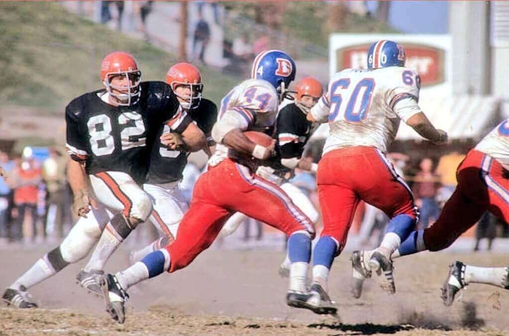
Too good for the Ticker: Oh man, look at this sensational photo from a 1969 Broncos/Bengals game. Is that sheer Perfection or what?
Here’s another shot from the same game:
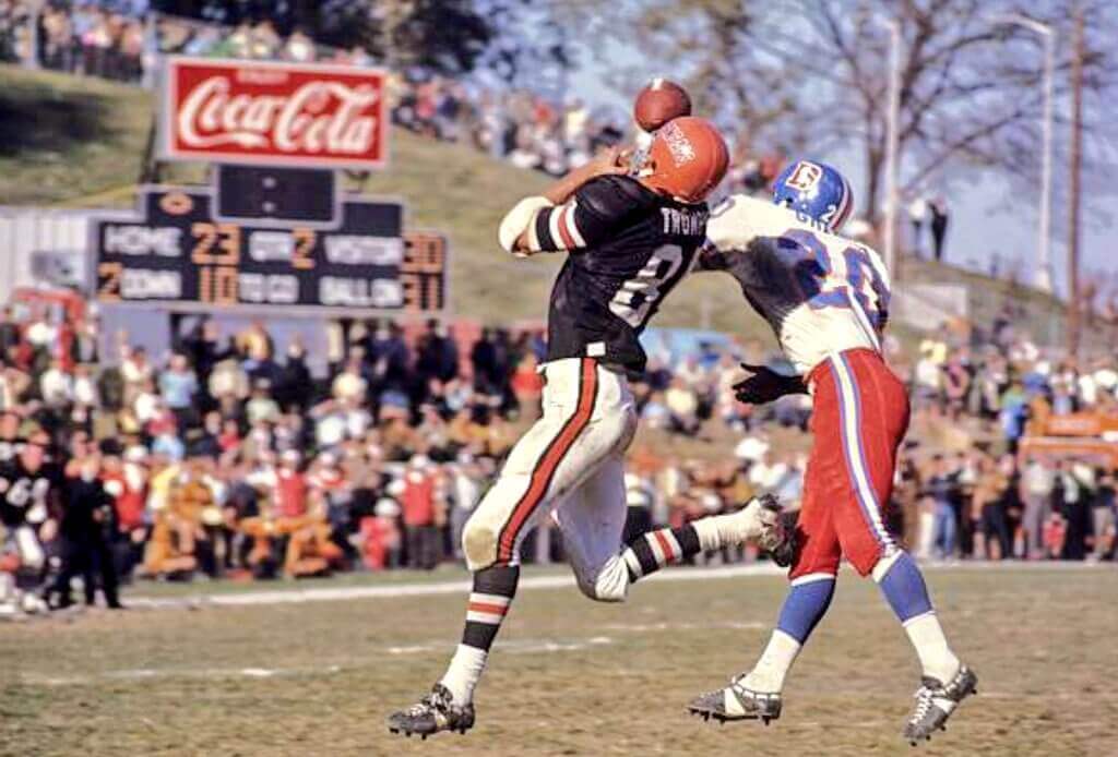
Looks like they were playing at a local park, right? That’s actually Nippert Stadium, longtime and current home of the Cincinnati Bearcats. The Bengals played their first two seasons there, while Riverfront Stadium was being built. Obviously, Nippert has had a few renovations since then.
(Big thanks to Kevin Gallagher for tweeting these pics, and to @Coach_KT for pointing me toward Gallagher’s tweet.)
The Ticker
By Lloyd Alaban

Baseball News: New cap logo for the Triple-A Iowa Cubs (thanks to all who shared). … An Atlanta World Series champions poster includes some players who weren’t even on the team when it won the World Series two weeks ago, including 3B Josh Donaldson (now with the Twins) and P Dallas Keuchel (now with the White Sox) (from Zach Mauldin). … An episode of High Heat on the MLB Network showed a misspelled NOB for Dodgers P Fernando Valenzuela (from David Medina). … Here’s another article about that Indigenous Mexican softball team whose players play barefoot and wear traditional dresses.

NFL/CFL News: White over black for the Bengals this week (from our own Phil Hecken). … Toronto Raptors player Khem Birch, who’s from Montreal, arrived at last night’s game wearing a CFL Montreal Alouettes jersey (from Wade Heidt). … The Packers created a graphic showing the Cardinals with a red facemask (from @PrimeTimePhil). … The Jets’ Twitter account posted graphics of former players Nick Mangold and Mark Sanchez in uniforms they never actually wore in real life (from Jesse Scherl). … According to the @NFL_Memes Twitter account, the Panthers’ win over the Cardinals on Sunday means that the NFL’s all-time “cat teams vs. bird teams” rivalry is now exactly even — 209-209-10 (from Trevor Williams).
College Football News: The next two items are from our own Phil Hecken: LSU is going white/purple/white this weekend. … Here’s why Ohio State started giving out Buckeye stickers. … A petition is calling for Oregon State to make their 2000 throwbacks their primary uniforms (from Joey McCullough). … Penn State LB Brandon Smith is among a handful of players wearing a new prototype helmet from Riddell (from William Yurasko).

Hockey News: The Hurricanes’ logo on this Hockey Fights Cancer sweater is upside-down (from Dawson Pridgen). … You don’t often see a team wearing an 800th-anniversary uniform, but that’s what KHL team Torpedo Nizhny Novgorod will be wearing as they celebrate the city of Nizhny Novgorod’s octocentenary with this commemorative uniform (from @daveyboy604).

NBA News: Cross-listed from the football section: Raptors C Khem Birch, who’s from Montreal, showed up at in Portland for last night’s game against the Blazers wearing a Canadian Football League Montreal Alouettes jersey (from Wade Heidt). … Also from Wade: The Canadian Elite Basketball League expansion team from Montreal, slated to begin play in 2022, will be called the Montreal Alliance. … Knicks C Mitchell Robinson said he’s gone through several pairs of shoes this season (from Mike Chamernik). … Mavs owner Mark Cuban says the team doesn’t have a separate court design to go with its City alternate uni because he wants visiting players who previously played with the Mavs to see their names on the primary court’s border, which features the names of every player in Mavs history (from our own Phil Hecken).

College/High School Hoops News: Kentucky men’s coach John Calipari wore a pullover last night with the school’s old logo on it. Here’s a comparison of the old and new logos (from Michael Kinney and Josiah Brewster). … South Carolina is one of many states where high school basketball doesn’t use a shot clock, so Dorman High School has a little game clock on top of the backboard, where the shot clock would normally be (from Dan Pfeifer).

Soccer News: D.C. United striker Ola Kamara hit 150 total goals at the club level and for Norway’s men’s team last season, so he got a No. 150 shirt that’s signed by the rest of the team (from our own Jamie Rathjen).

Grab Bag: Here’s a video showing all the mascots in the University of Wisconsin system at a “board meeting” (from Scott Rogers). … Anaheim High School in California will keep its “Colonists” team name (from Craig Harris). … How many Big Four 1970s-era logos do you know? (from K.C. Cless). … Roush Fenway Racing has rebranded to reflect its new ownership structure and will be changing the look on its flagship No. 6 Ford (from Christopher Hickey). … “Pizza” chain Papa Johns has a new logo and is dropping the apostrophe from its name. … Neat trick by Capital High School in Idaho, which has managed to poach three well-known logos at once — UCF’s, the Cleveland Cavaliers’ and the Philadelphia Eagles’ (from Preston Crompton). … Foot Locker is merging its Champs Sports and Eastbay brands.
First, wishing the best for Paul and Mary, and hoping for good health.
The quotes from Paul George and Reggie Jackson at the end of ESPN’s Staples Center story surprise me:
“It’s kind of like just stripping the history here by calling it something else,” said Paul George
Nah, it’s too many memories. It’s gonna be hard to not call it Staples,” – Reggie Jackson
I spent last Thanksgiving away from my wife as she tested positive days before. Trying to keep my 4-year-old entertained to boot, I felt awful on Thanksgiving Day and eventually tested positive as well. Nevertheless, I managed to make a tasty turkey that we had already purchased, so not all was lost.
Best of luck to you!
Best wishes and thoughts to get past this inconvenience. With vaccines available, it can be just an inconvenience. Blessings!
Thinking about you Tug.
Wishing you and Mary good health — recovery for her and hopefully you not getting sick…
Those original Bengal uniforms are probably the most uninspired uniform set in NFL history.
I’ll agree with that in terms of the helmet, but the rest of the set hit most the style marks for a standard uniform for that time (how they got away with not having TV numbers for so long is really something!)…aside from the color scheme, they looked much like most teams in the AFL and NFL.
To me they looked like the Browns, except with black in place of brown.
Which makes sense, considering Paul Brown founded both teams and had large input into how they looked.
And here’s hoping Mary’s symptoms don’t worsen and you stay healthy Paul!
Here here. Get well soon Mary. Thanks for not killin’ Paul with the ‘Rona. I vote for her to stay at the Carlyle, since she is doing a most unselfish and wonderful thing for the Uni Verse.
link
Best wishes Paul! I understand your reasoning, but I am going to hope you keep testing negative. Also, hoping Mary continues to be symptom free and she can return home soon.
Really enjoyed the article on the jersey restoration too.
Paul – all the best to you and Mary. You’re doing the right thing and doing all that you can. You’re vaccinated and you’ve taken as many precautions as are reasonable. You’ll get through.
We spent last Thanksgiving without our youngest, who got sick the day before the holiday. He bounced back. Be safe and be well.
Hope the Covid situation has minimal impact, so sorry you’re having to deal with that
Of interest, article regarding MA efforts to eliminate Native mascots, please don’t read the comments lol
link
“I almost hope I test positive, just so she can come back home.”
I TOTALLY understand this sentiment. Prayers and positive thoughts to you both!
Paul- Sending positive thoughts towards you and Mary.
Paul – Echoing what others have written, I hope everyone comes out of this with zero or minor symptoms.
Mary “gets it.” The pandemic is about society at large. It isn’t just a personal thing. Mary rules.
Bill Henderson and The Dream Shop: like watching a great artist work who moonlights as a detective!
Exactly! If it weren’t so visual, his stories would be exactly my ideal podcast content. Kudos, Bill, and thanks for sharing the details of your work on this one, which is both an amazing artifact and an amazing restoration.
Thank you both.
The Bill Henderson episodes are some of my favorites. I’m not a collector or much of a Jersey wearer, but the stories behind the items and the research is fascinating stuff.
Anaheim High could potentially keep their Colonists monicker in perpetuity if they change the mascot to a doctor and interpret “Colonists” as a colloquial term for “proctologist.”
We played the Anaheim HS Colonists every season in the 70’s. From 9th grade on. Western HS Pioneers (Tiger Woods alma mater) too. Two things I recall, the general intensity of those games, we all knew each other, grew up with each other, and cheered for each other, Uh when we were not playing each other.
The other was the ribbons that everyone wore. You remember these things.
link
My HS nick was the “Fighting Irish” and I do remember a “Shillelagh the Irish” ribbon with a politically inappropriate beating graphic.
Wish I had kept a few. They were outrageous by todays “Wokies” standards. It is a good thing that we are learning and dealing with it all. Should have happened decades ago.
We didn’t have a clue. Then over time, we evolved. Or some of us did anyways.
The other John-related fast food chain, Taco John’s, continues to use an apostrophe.
link
I hope fans start calling that renamed arena “The Crypt.”
Best wishes to you and Mary. Hang in there.
Echoing what others have said… all the best to both of you! We had to cancel our Thanksgiving plans last year for similar reasons. Hopefully you two can share a Pandemic Porch Cocktail “together” while being apart.
Best wishes!
“I almost hope I test positive, just so she can come back home”
Paul, you’re so thorough on your beat that sometimes we lose sight of just what a poignant and evocative writer you are. This hit me. Best wishes for you, man.
Sorry to hear about everything and know it’s not easy to ‘do it by the book’, but it’s the right way to go.
Wishing Mary a speedy recovery and you continued negative results (although I completely understand your rational for the a positive).
Sending best wishes to you and Mary.
Hi Paul, like everyone else, here’s wishing the best for you and Mary.
Regarding the Hurricanes’ sweater: I had to compare photos to see how the chest logo is upside down, but to me, the puck in the center looks more like a puck upside down (the incorrect way they have it). I also chuckled out loud: it’s for a great cause, but the logo being upside down is what you commented on with that putrid looking color scheme???
I came here to say the same thing. I never realized it was a puck until seeing it upside down!
Best wishes and good health to Paul and Mary!
Paul, as others have said, best wishes to you and Mary.
I wonder if these naming rights deals are as valuable as companies think. I never once connected the name Staples Center to the office supply chain, at least consciously, until this story came up yesterday. And I lived in Utah for most of the 1990s and never realized the Delta Center was named for the airline until they changed it and it was reported in the news. Possibly it’s just me.
Finally, those Bengals-Broncos pictures are great! That’s the shade of orange the Broncos SHOULD wear, not the traffic-cone orange of today. Also, that scoreboard is pretty messed up. No time display, and the quarter is wrong, it had to have been the 4th since 30-23 was the final score and the last points came on a 10-yard (!) FG by Horst Muhlmann in the 4th quarter.
Sorry to hear about Mary. My daughter, who also received the booster, was with a friend who a couple of days later had very mild symptoms and tested positive. Nobody her friend was with, including her husband, ended up testing positive. I’ll send good thoughts to you and Mary, but I’m confident both of you will be fine.
Bill – incredible column on this Atlanta Braves jersey!
Thank you Trevor. I really feel like every day is Saturday. What a job to have.
And that’s part of what’s so insidious about advertised building names: They normalize the spread of corporate culture and soften us up for it to spread even further.
*****
I don’t agree with all of Paul’s takes, but this times a million. Thanks for writing it, and for reminding us.
Agree Artie.
I think part of it is when they do a relatively good job & pick a decent corporate partner or a more clever name. Some of these stadium names aren’t so egregious, Citi Field, Gillette Stadium, Miller Park, Ford Field, Staples Center to name a few, even the Carrier Dome. They aren’t terrible names and some seem like a traditional name, so over time we more or less forget they are corporate names.
Thanks Paul for writing it today. You reminded me of one of my dad’s sayings/lessons:
“Just because it could have been worse doesn’t mean it was okay”
Paul, I’m so sorry for the situation with Mary, and especially the timing. Intra-family quarantine never doesn’t suck, but it sure sucks less in, say, mid-September than it does the week before a beloved holiday. I hope you both remain hale and hearty and are reunited in presence soon. I hope that in time this Thanksgiving becomes one of those weird but ultimately sort-of-fondly-remembered holiday stories for you, like the elephant at my parents’ wedding or the time the three-year-old got up early and opened every present under the tree.
And super-thanks for sharing Bill’s writeup today. I’d seen his photo essay on this project on social media, and it’s a wonderful project, both in terms of his careful investigation and his expert restoration. But the more detailed text writeup here adds so much to what I’d already seen.
Sending good vibrations to you and Mary..wishing u both the very very best
Best wishes to UW HQ and everyone else in similar peril. I need to smell the roses of thankfulness more often.
Right on cue, this article quotes a few fans vowing to still call it the Staples Center. This is why we can’t have nice things. link
I would read articles by Bill Henderson once a week forever and not get tired of them!
Thanks Paulio. You do follow my blog on Facebook, don’t you?
The AZ Cardinals need a new look. I’m thinking that their old look is too “old” for them, therefore, it is time to ditch the gray face mask. I used to think white was the answer, but that has become more prevalent (Bills & Dolphins). I think red may be the answer. Or go the secondary route (ala Patriots, Chargers, and Washington)? Black?
Keeping/shelving the gray facemasks all depends on which route they choose to take from the neck down.
Return to a ‘classic’ look…stick with the gray.
Double-Down on the ’05 modernization model…they shoulda went then, they gotta go now.
Paul, sending best wishes and positive thoughts to you and Mary.
So sorry to hear about Mary; I hope both of you stay safe and healthy and can be back together soon.
TBC, Get well soon!
Wishing Mary a speedy recovery and the two of you are back together soon.
Jerry
Best wishes to you and Mary–hope she gets well soon, and that both of you weather this as well as can be asked for.
And on a less consequential note: all hail Bill Henderson! I’d LIKE to say that 9yo me saw Morton rocking that jersey back in the day … but thanks to 1970s MLB blackout rules, an Atlanta home uni was the one thing a young Atlantan could be 100% guaranteed never to see on the tube. Never change, you asses.
Guessing people in Milwaukee will wonder why an arena is named for a parasite which made thousands sick.
link
Despite the full name, it’s usually just referred to as “crypto”
Can you at least do “I’m Calling It New LA Sports Arena” in Lakers colors?
I’m hoping you are both well. Courage.
Today is my first day back to work after my 10 day quarantine. Exposed 11/5 and symptoms a few days later. I was isolated and my wife was out, but she came home with it yesterday.
I figured with the downturn in Florida cases, and the herd immunity we are close to getting we’d be pretty safe, but it sounds like it’s making a comeback.
Stay well Paul and Tug Captain.
10/10 Do not recommend.
Here’s hoping for Mary’s continued symptomlessness, and that all remains well with both of you, Paul! And I really hope that stuff is sorted by Thanksgiving for you.
Wishing the best of health to both of you. We’ve been through (I think) 5 quarantines in our household so far but fortunately our house is big enough to manage it. I can’t imagine what you’re going through and you have all of our support and best wishes.
Its interesting that the LA arena naming deal is the biggest of all time when one of its three tenants is leaving in a couple of years. Didn’t the Clippers just announce last month the biggest naming rights deal of all time for their new arena?
Here is a YT clip of that Broncos/Bengals tilt with Charlie Jones and some groovy NFL films tunes.
link
Flyers had Hall of Fame night last night, inducting Rick Tocchet and Paul Holmgren. Team wore Tocchet and Holmgren jerseys during warmup
link
and the commemorative patch during the game
link
Better look at the patch here (in banner form)
link
For a variety of reasons I found those Atlanta uniforms tough to love. They were a bad team I couldn’t bring myself to like; strange, since I was an easy touch for the Padres, Indians, Blue Jays, and Mariners. Maybe I was put off by the inept detailing of the jerseys. I remember thinking the pants looked all wrong owing to the lack of a Sansabelt. Worse still, the road suits were mostly blue and didn’t match the home uniforms in any way.
Oddly, the Dodgers unis were always compared to American flags when the Braves wore actual red stripes.
I have family who have been vaccinated and got breakthrough cases. Was like a common cold. Not hospitalized.
I have a number of friends who have not been vaccinated and gotten a case. They took the drug cocktail (zinc, Vitamin D, etc.) and came out fine, and now have natural immunity. None were hospitalized.
The vaccine uses your immune system to minimize the effect of the virus. It doesn’t kill or stop the virus. We’re going to have to deal with it for a long time.
Best wishes and Godspeed.
Thanks, Tim. (But just to be clear, nobody claimed that the vaccine stopped or killed the virus.)
They should still consider getting vaccinated. Testing has shown that natural immunity only lasts approximately 6 months, and less than that in some people
Get well soon Mary.
Paul, hope you stay well.
Stay well, Paul and Mary.
And thanks for featuring the beautiful Bengals uniform I fell in love with 51 years and made me a life long fan of the team.
Mr Henderson – what is the significance of the collar tag with 76-44 ? I always thought that it was a “year-player” thing, but you never mentioned Hammerin’ Hank.
The team tagging on every uniform was specific to a team and a year. In this case it simply means the year of issue and the size. Sometimes even uniforms issued later in the year to the same team have different tagging formats than those issued at the beginning of the season! As inconsistent as it is it is a useful tool in determining authenticity.
“Pizza” chain Papa Johns…
I see what you did there. We can disagree on whether New York style or Chicago style is better, but we can agree to agree as to what Papa John’s isn’t.
Paul and Mary sorry to hear this news. Wishing you the best soon