By Phil Hecken
Follow @PhilHecken
Greetings and a good Saturday morning, Uni Watch readers. It’s the weekend — we made it.
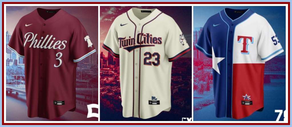
As you’re all aware, Nike MLB introduced the “City Connect” program this season (with seven of the thirty clubs participating this year). According to Nike, “The designs continue to explore a franchise’s connection to its city and its fanbase, each with distinct personalities, values, customs and traditions.” Reaction to the jerseys and caps (and pants) has been mixed at best, and as with many things these days, those who love (or like) the jerseys & caps have strong feelings in this regard, as do those who detest the entire program. But there’s no denying those who normally wouldn’t think about or discuss uniforms are doing so, and clearly swooshie has succeeded in the “there’s no such thing as bad publicity” department. Still, this hasn’t stopped designers from crafting their own “City Connect” concepts (including reader Walter Helfer, whose designs I featured on this site about a month ago).
Today, the “Jersey Club” (whose concepts in other sports I’ve hosted on UW before) have created a full slate of CC unis, including redesigning those for the seven clubs whose CC uniforms were worn this year, and I’m pleased to bring them to you. Since this is for the entire league, I asked they keep the descriptions to a sentence (or sometimes two) — although I’m sure if they wanted to produce an entire word salad for each one they could oblige. I’ll turn this over to the Jersey Club now. Their names (or pseudonyms as the case may be) are listed along with their Twitter handles, should you wish to check out more of their work.
Enjoy!
Jersey Club City Connect Concepts
In an attempt to shake up uniform design across the sport, Nike has been working with each MLB team to craft a uniform that expresses the personality and communities of each team’s home city.
The Jersey Club has taken on the task of creating uniforms for all 30 MLB franchises.
DESIGN RATIONALES
Casey Vitelli (@caseyvitelli)
White Sox
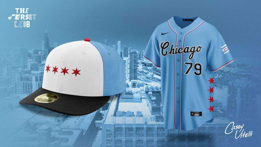
Represents the Chicago flag, in all its glory
Giants
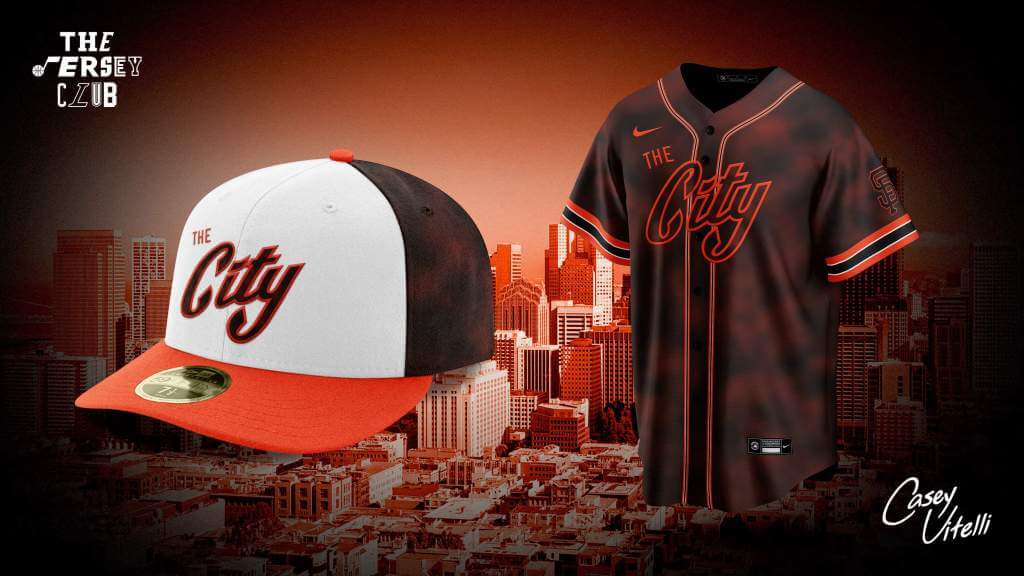
Represents ‘The City’ and SF being a city in fog.
Nationals
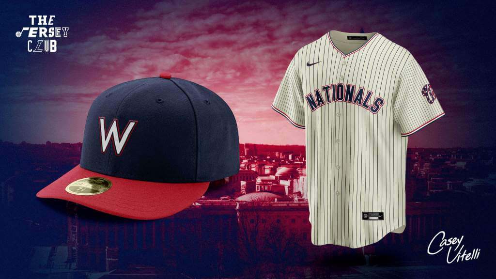
A fauxback design, paying homage to past teams in Washington baseball history.
Blue Jays
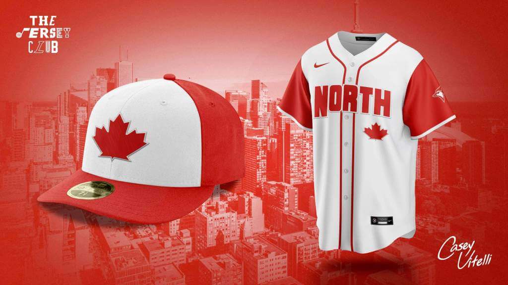
Canadian flag inspired.
Jazz (@JazzUniTracker)
Cubs
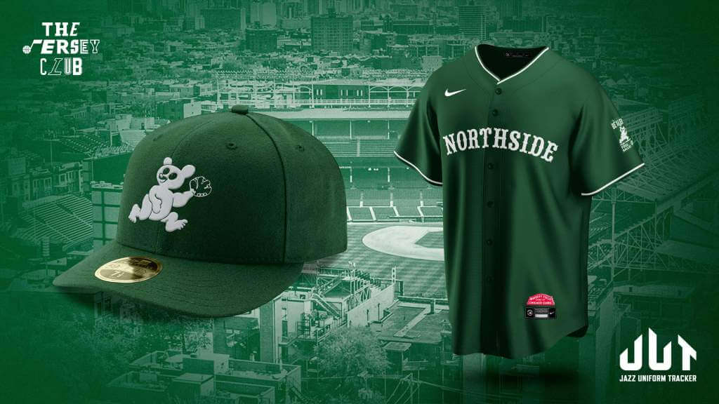
Green cap and jersey pay homage to Wrigley Field and the NorthSide while reminding fans to “Be Alert for Foul Balls”.
Yankees
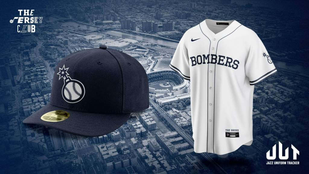
Represents the Bronx Borough, the pride of New York City
Mike Joseph (@SunsUniTracker)
Diamondbacks
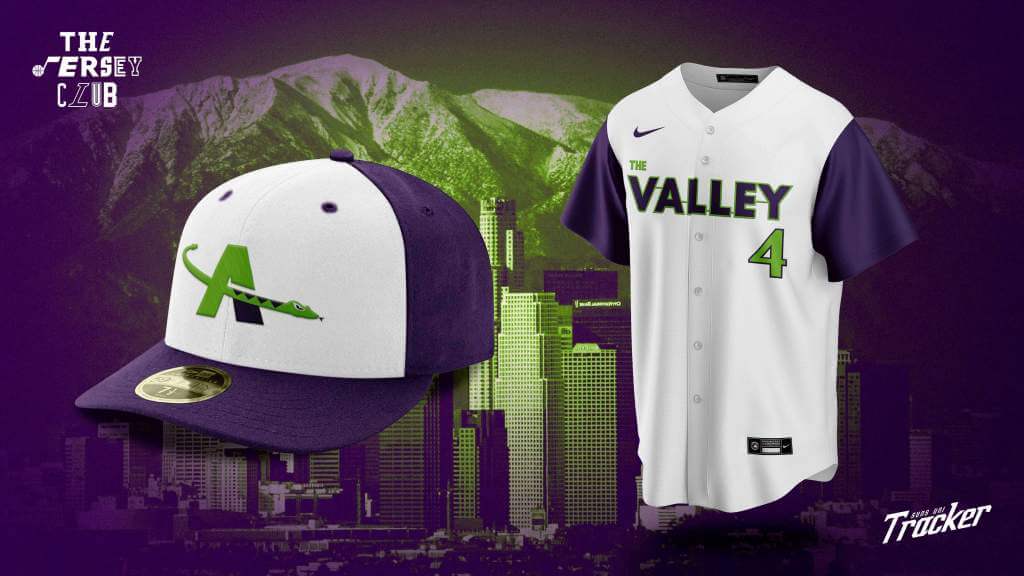
A nod to the Phoenix area’s public transportation system, Valley Metro – because it connects the valley
Athletics
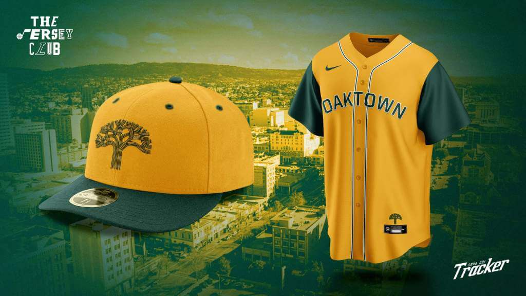
City of Oakland logo and wordmark a la the Warriors
Angels
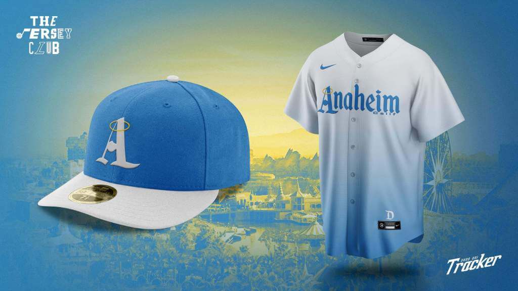
Disneyland inspired because that’s what I think of when I think Anaheim
Nick Mueller (@MLR_Studios)
Guardians
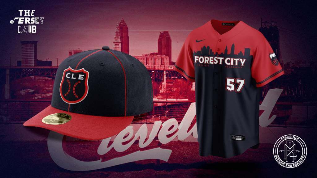
Based on the Flag of Cleveland and using the nickname Forest City.
Royals
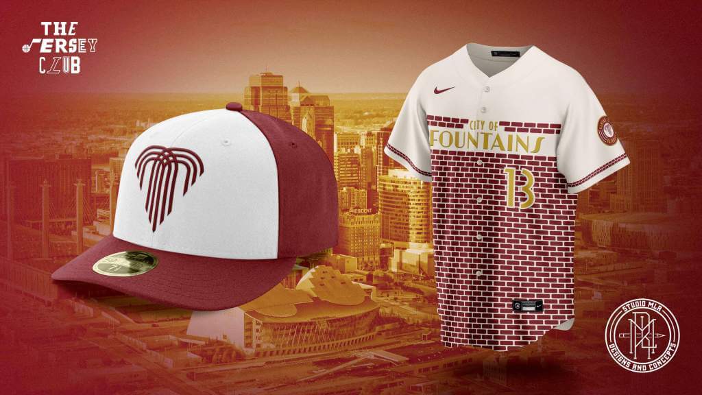
Kansas City is home to the Museum of Jazz, and the Negro League Baseball, and they even share the same building. I used the signage of the shade marquee outside.
Mariners
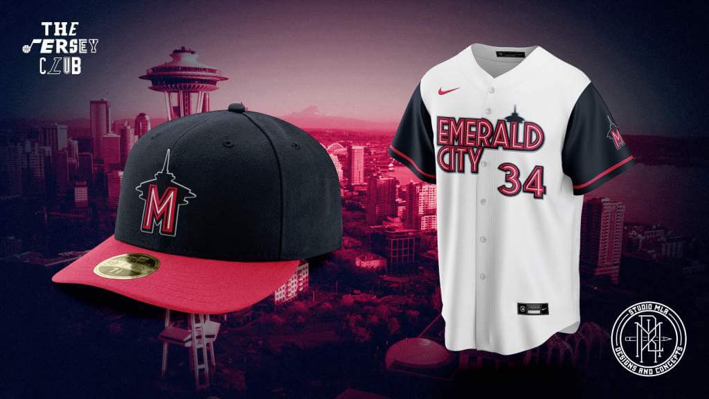
Pike Place is the main inspiration for this one, creating a wordmark based on their neon signage.
Niranjan A. (@niranjangfx)
Dodgers
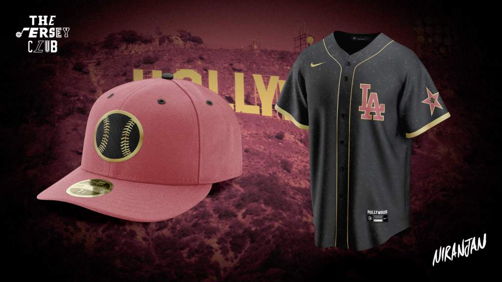
Inspired by the Hollywood Walk of Fame which recognizes LA’s illustrious entertainment industry
Mets
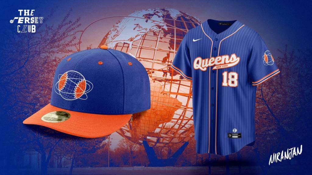
Inspired by the Unisphere, a landmark built in Flushing Meadows for the 1964 World’s Fair
Tigers
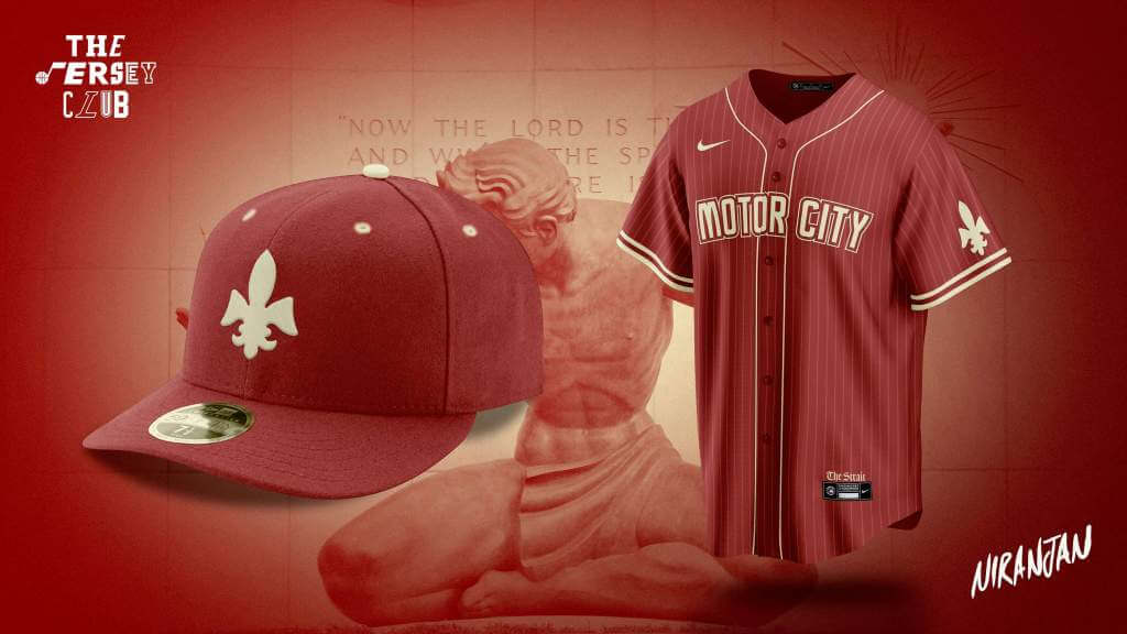
Pays homage to the city’s French heritage and automotive industry
Pete Rogers (@petemrogers)
Orioles
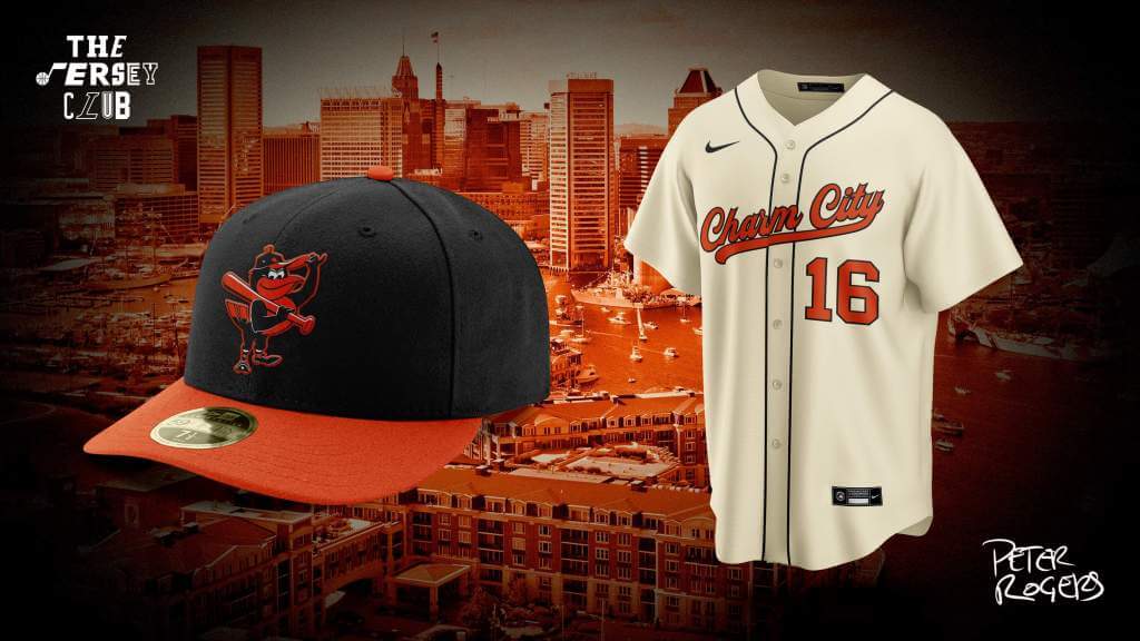
Inspired by the 1966 World Series jerseys and celebrating the nickname Charm City
Red Sox
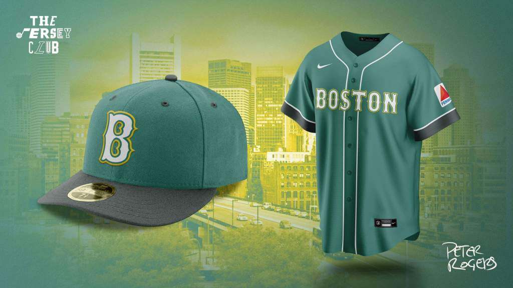
A tribute to the Green Monster, Fenway’s towering left field wall
Rockies
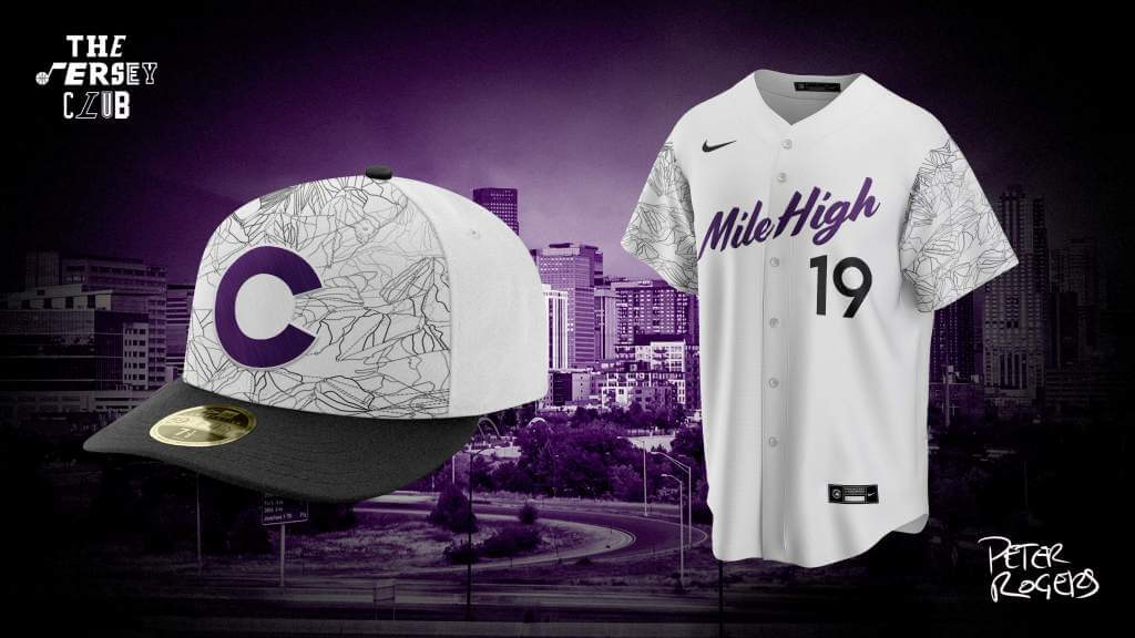
A nod to Colorado’s ski mountains and Mile High nickname
Padres
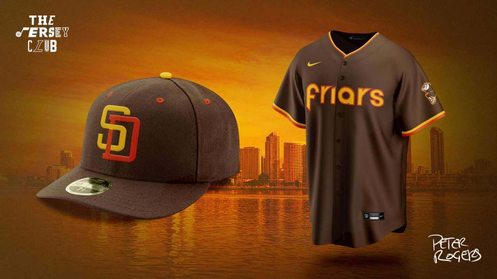
The retro look of the 70’s Padres with the Friar nickname
Ryan Meils (@ryaninsix)
Brewers
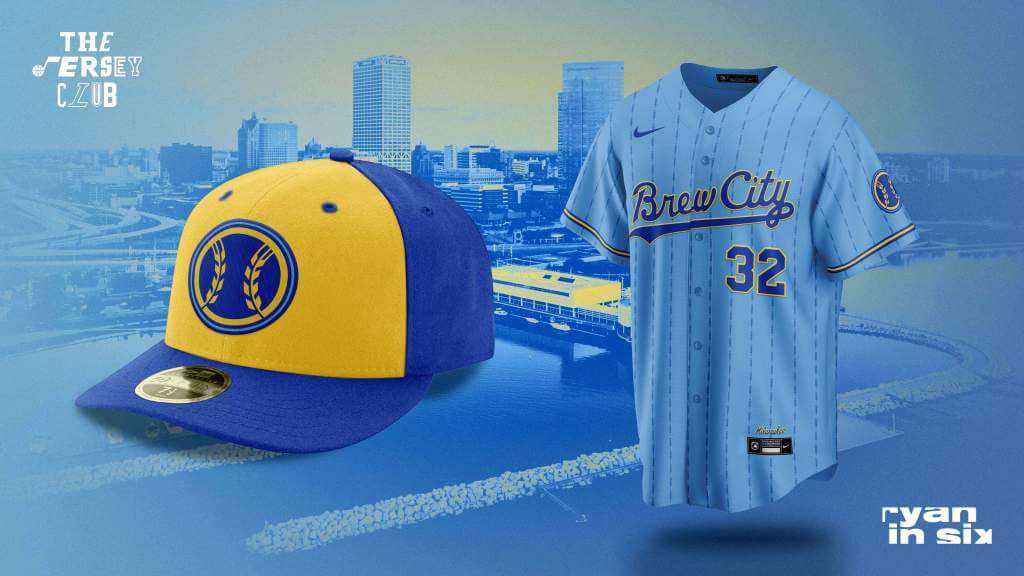
Pays homage to the city’s lesser known nickname, beer culture, and ‘80s uniforms.
Twins
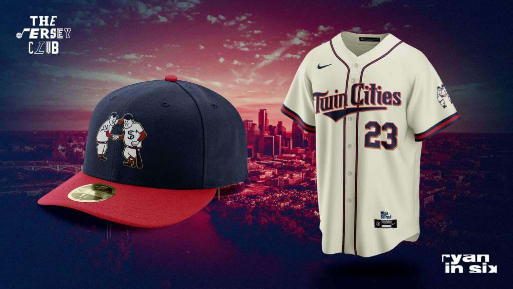
Pays homage to the city’s nickname and alternate logo.
Atlanta
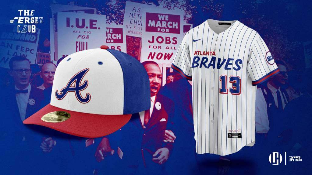
Inspired by the picket signs used in Martin Luther King Jr.’s March on Washington.
Lance Hinesman (@Lance_Hinesman)
Marlins
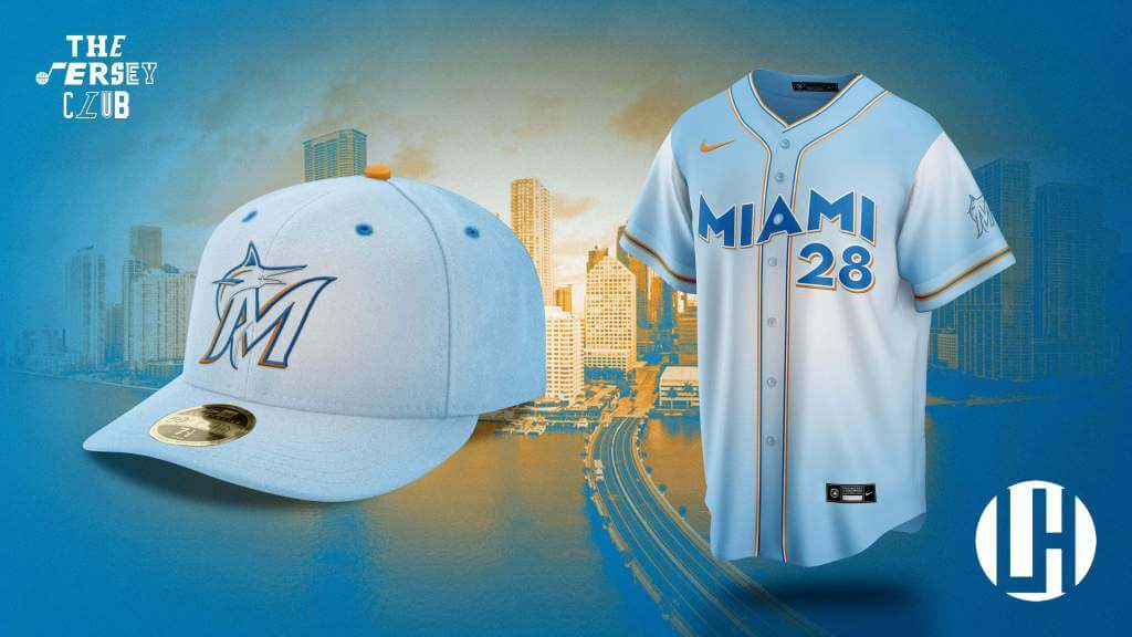
Derived from Miami’s Seaquarium.
Seth Reese (@SethR94)
Reds
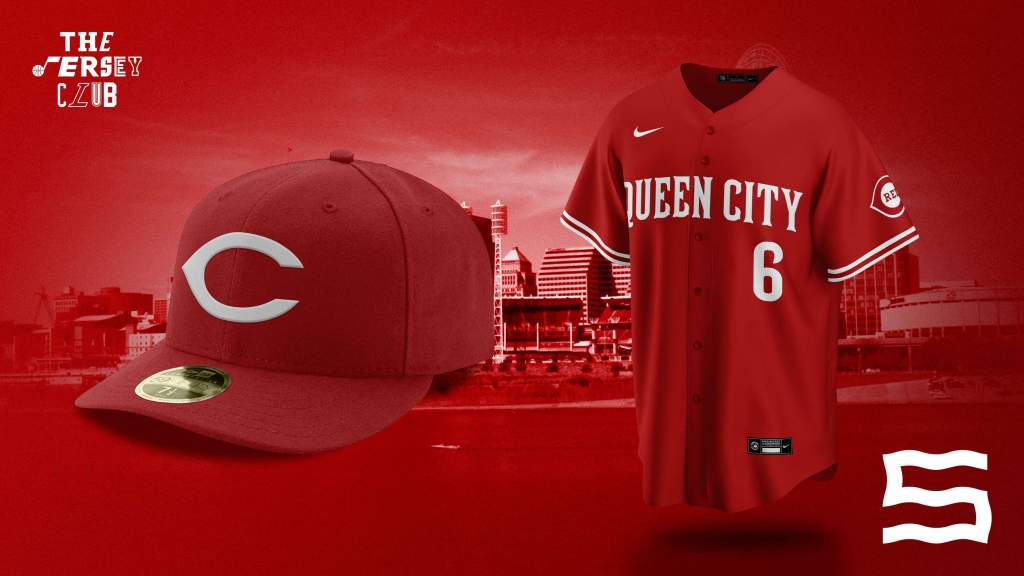
Big Red Royalty. The Reds’ City Connect jersey brings the Big Red Machine era of the 1970s back to Cincinnati, while declaring Cincinnati, Ohio as the true Queen City.
Rays
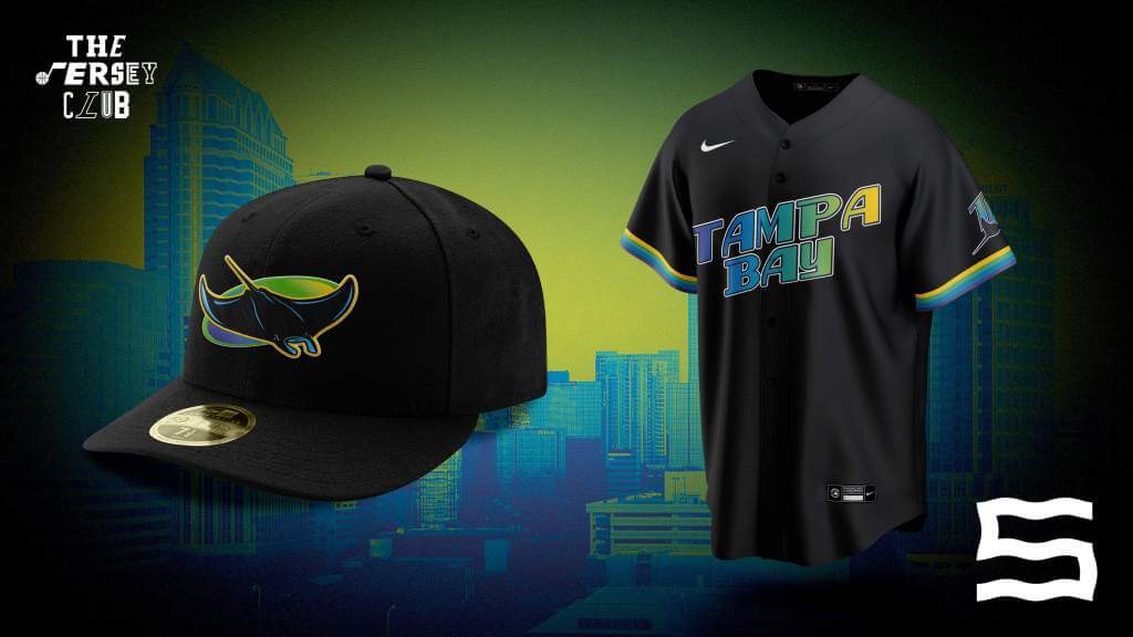
Sometimes, The Devil is not in the details. The Rays’ City Connect jersey gives Tampa Bay another fauxback jersey. The favored color scheme of the late 90s returns with a slight twist.
Phillies
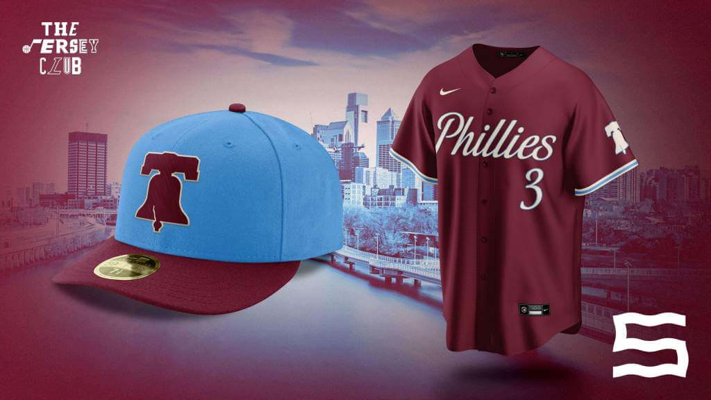
A jersey inspired by the events of July 4, 1776. The Phillies City Connect jersey honors the greatest event in the city’s history w/ the beloved maroon and baby blue color scheme.
Z89 Design (@Z89Design)
Astros
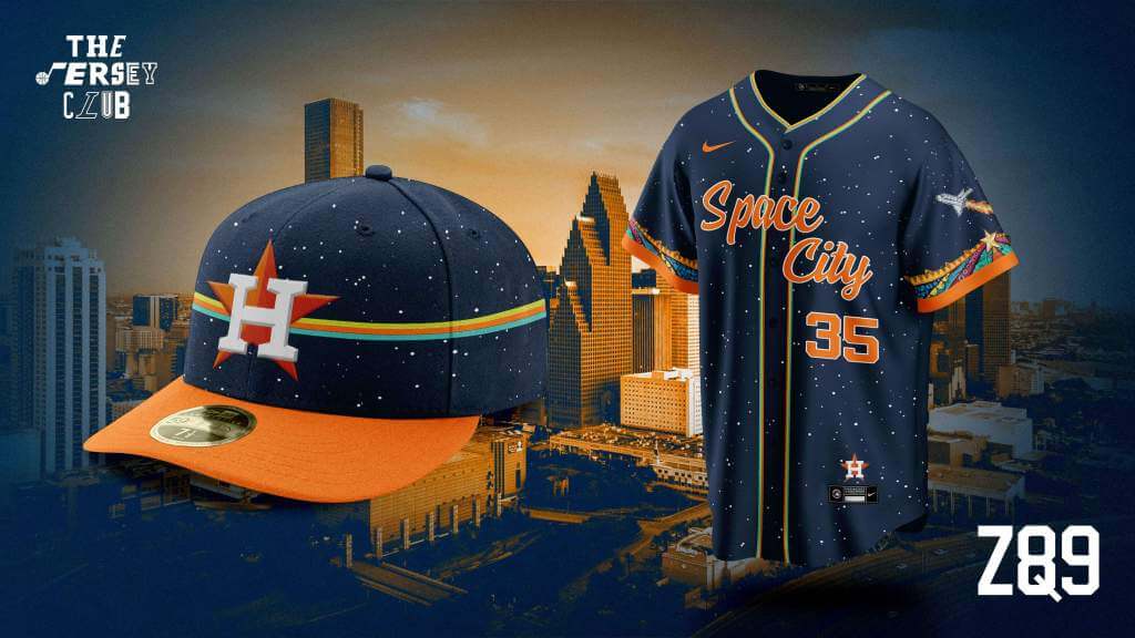
Inspired by Mexican-American graffiti art and the city’s deep ties to the space program
Cardinals
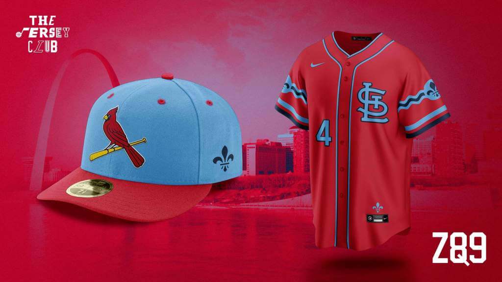
Uses elements from the city flag, coupled with classic colors
Rangers
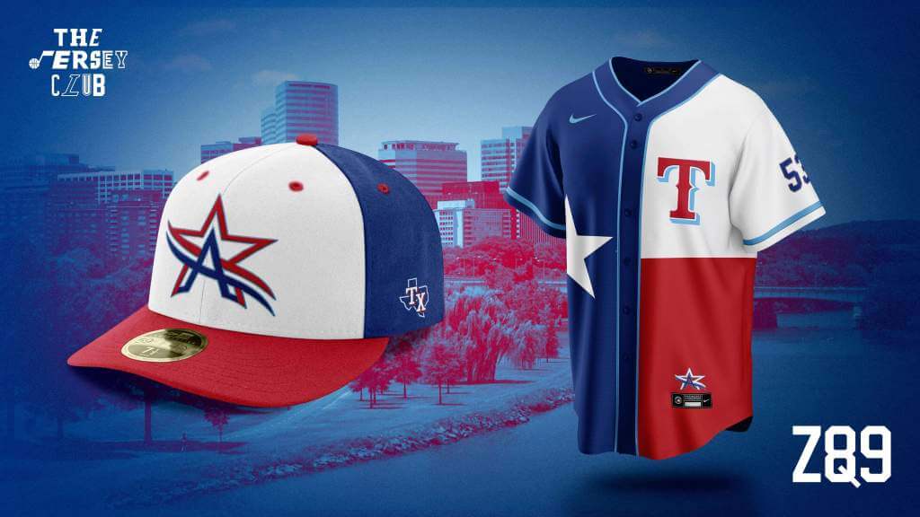
Joins the Arlington city logo with the iconic state flag
Pirates
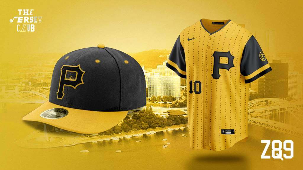
Yellow and Pinstripes representing rivets from the Clemente Bridge
Thanks guys! I have to say, there are some jersey and cap designs in this series I would absolutely love to see on the field. I would love to see what pants some of these designs would use. Readers, what say you?


Guess The Game…
from the scoreboard
Today’s scoreboard comes from ojai67.
The premise of the game (GTGFTS) is simple: I’ll post a scoreboard and you guys simply identify the game depicted. In the past, I don’t know if I’ve ever completely stumped you (some are easier than others).
Here’s the Scoreboard. In the comments below, try to identify the game (date & location, as well as final score). If anything noteworthy occurred during the game, please add that in (and if you were AT the game, well bonus points for you!):
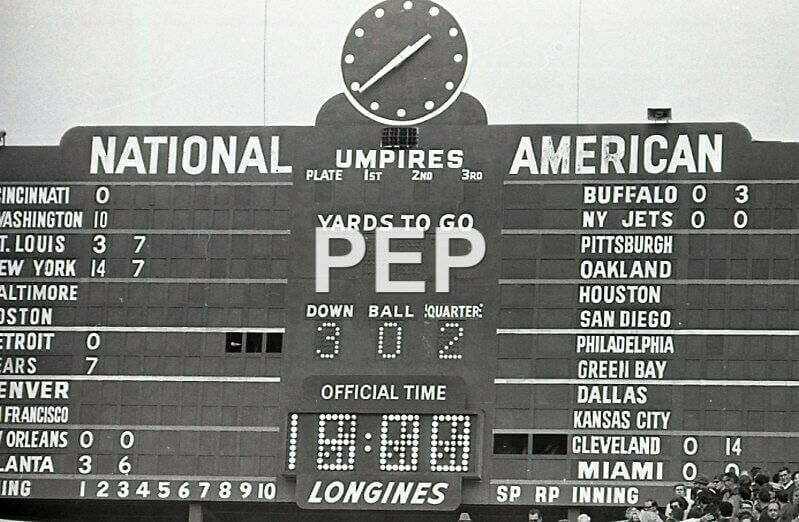
Please continue sending these in! You’re welcome to send me any scoreboard photos (with answers please), and I’ll keep running them.


MLB Playoff Uni Tracking
It’s BAAAAACK.Alex Rocklein has been tracking the jerseys of all the teams involved in the MLB Post Season for the past several seasons. We’ve almost reached the World Series, with the Astros wrapping up the American League Pennant last night, and Atlanta and the Dodgers playing Game Six of their NLCS. One small change: any team that has a front number on their jersey shows the number of the starting pitcher from that game (previously it was all #21). Alex sent me the graphic below before the game was complete, but the jerseys are correct.
Here’s the full tracker (which will get filled in as we go through the NLDS/ALDS, NLCS/ALCS and World Series):
I hope you guys enjoy this annual feature and you’ll thank Alex for all his effort with a quick “Thanks” in the comments below! Look for this feature every weekend until the World Series is complete!


Bulletin reminder: Paul here. As most of you know, it really bugs me that teams and leagues never refer to their uniform ads as “ads,” or to their uni advertisers as “advertisers” (instead using terms like “branding partner” or “helmet entitlement partner”).
One person who disagrees with me on this is Ben Thoma, a longtime Uni Watch reader who also happens to be a longtime veteran of the advertising industry. For my latest article on Bulletin, I interviewed Thoma about the language of advertising, and about whether a company’s logo on an NBA jersey is or isn’t an ad. You can check it out on my Bulletin page. Enjoy!
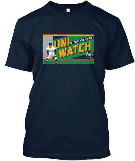
Also: In case you missed it on Friday, I’ve revived this awesome “Hit Sign, Win Stirrups” T-shirt, designed by the great Todd Radom. It was originally available as a limited edition in February of 2017. Lately I’ve had a few requests for it (apparently some of the originals have gotten a bit ratty over the past four and a half years), so I’ve decided to make it available once again.
Short- and long-sleeved versions are available here. If you want any other formats (women’s, kids’, hoodie, V-neck, etc.), drop me a line and I’ll hook you up.
Here’s a closer look at the design (click to enlarge):
Again, the shirt is available here. My thanks, as always, for your consideration of our products.


The Ticker
By Anthony Emerson

NFL News: During Thursday Night Football, the broadcast package used an incorrect Broncos logo, with the upper lip and snout of the bronco cut off (from Daniel Hermanson).
College/High School Football News: Here are this weekend’s uni combos for Northwestern, NC State, Virginia Tech, Tennessee and Syracuse (thanks to all who shared). … Here’s a new one: High school team has street address down side of pants (from Chris Berumen).

Hockey News: The Blue Jackets have a new home helmet advertiser (thanks, Phil). … Here are the Lightning’s Stanley Cup Champion rings. The rings can be “opened”, for lack of a better term, revealing an additional inscription (from Wade Heidt).

NBA News: The Celtics’ gorgeous new Classic Edition unis made their on-court debut against the Raptors at the Garden last night. … Sports Illustrated named the best uni for every NBA team. I’m sure our readers will find nothing at all objectionable about this list (thanks, Phil).

College Hoops News: The University of Northern British Columbia women’s team have unveiled a new uni featuring a logo designed by an indigenous artist, the first to be worn across Canadian college athletics (from @rProDart).

Soccer News: Dynamo Moscow of the Russian Premier League wore a gorgeous one-off kit to honor legendary keeper Lev Yashin, considered to be the greatest keeper of his era. He was known as the Black Spider due to his all-black keeper’s kits. Unfortunately, Dynamo reverted to their standard home kit after a pregame ceremony honoring Yashin.

Grab Bag: Here are a few of the helmets that some F1 drivers will be wearing during this weekend’s US Grand Prix in Austin. Clockwise, that’s Daniel Ricciardo of McLaren with the Dale Earnhardt-themed helmet (closer look here), Lando Norris of McLaren with the stars-and-stripes helmet, Valtteri Bottas of Mercedes with the Austin-themed helmet, and George Russell of Williams with the sheriff-themed helmet (from Russell G. Flynn).


Uni Tweet of the Day
Remember when hoop unis had no makers marks, no ads, and exotic names like “home” and “road”?
The pinnacle of NBA dunk contests and uniforms… pic.twitter.com/m2NyuvAh0r
— 80s Sports N Stuff (@80sSportsNStuff) October 22, 2021


And finally… that’s all for today. Big thanks to the Jersey Club for their visions of MLB City Connect jerseys and caps, and Alex for his MLB tracking. Everyone have a great Saturday and I’ll catch you back here tomorrow with the SMUW Crew. Till then,
Peace,
PH
Scoreboard…..Oct 25 1970….Bears last season at Wrigley Field….16-10 loss to the Detroit Lions
I really like the wider number font that the Wrigley Field scoreboard used back then (and up the ’90s, I think). It’s much more readable than what they have now, which, I think, is Franklin Gothic.
I despise the City Connect nonsense in MLB as much as I do the 3 hitter and runner on 2nd in extra innings rules. Absolutely hate it. BUT kudos on these designs. I consider myself a traditionalist but I think the designs that detour from what’s it’s already in use, work better. Atlanta, Cincinnati & the Mets are too close to what they have or had. I like the Cleveland set but Forest City isn’t used much anymore and if we’re going to go there, let’s change up the color scheme. Just quibbles. Very nicely done designs.
The best thing about the MLB unitracker is seeing the Dodgers look like the Dodgers in every game. My Red Sox? 3 of 11. I guess at least they didn’t wear the University of Delaware’s colors. (No offense, Blue Hens!)
I think Delaware has more of a royal blue.
The Giants stayed traditional too. So did the Astros, mostly.
I really Ike a lot of these City Connect concepts. But the three teams I care most about are a mixed bag. Twins: Yes, this, exactly. How is this exact uniform not already a regular alternate for the team? Helps that it’s a concept uni for a team with terrible uniforms. Almost can’t help looking like an upgrade. Nats & Brewers: good-looking stuff, and I’d be tempted to buy merch in either team’s style as presented here. But neither feels like city connect to me. The Nats are explicitly not connecting with anything about the city, but rather with sport history. Which the team already overtly connects to, so the whole thing feels self-referential. I’d rather see something connecting with local non-sports culture. The punk scene. The international cuisine. The parks. The bridges. The incongruous, hated, and also beloved airport on the river in the middle of the city. Anything, really. And while the Brewers concept does balance civic and team connection, Brew City is already what the team’s regular uniforms refer and connect to. And it’s increasingly an anachronistic identity anyway. Sure, there’s some good brewing still happening in MKE, but no more so than the rest of this brewing-happy state. As with the Nats, I’d like the Crew to connect with a new aspect of civic culture. The People’s Flag. The weird offset street grids. Outdoor music. Fonzie. Gertie. Bridges. Manufacturing.
I share these critical thoughts only because I think the whole project is so generally well-thought and well-executed. Well done, and thanks for sharing!
In my humble opinion, The DC “punk” scene needs to be specified as hardcore.
I would specify “hardcore scene” over “punk scene” for DC.
Oops.
I didn’t think that first one posted.
No Blue Jays concept?
Coding error on my part. Should be fixed now.
Oct 25 1970. Last season at Wrigley Field. The Bills-Jets game is the giveaway bc Wrigley wouldn’t have AFL scores on the board. Bears lose 16-10.
Also, inter-conference games (Den/SF)
Text but no images for Toronto. An Emerald City uni for Seattle but no green? So who loves their flag more: Chicago or Texas? Good call on the Phillies. I’d wear that hat! I wish they would go back to the maroon and powder blue. Such a unique set they could claim as their own. Nice call on the French heritage uni for Detroit, although I wouldn’t mind seeing some blue in there. Maybe French blue? . I’d gather that 99 out of 100 people in Atlanta or Denver would think Motor City or music though.
Pretty co how for the ‘85 dunk contest, Larry Nance, the defending champion, happened to be the only one wearing his home uniform. Even the Pacers player eschewed his home gold for the road blue. Not sure if that was done on purpose or just reflected the fact that most players in the dunk contest have chosen their road jerseys
I believe that was the custom back then. Defending champ wore white while other contenders wore their road unis.
Kudos to the Jersey Club, that was one of the best “concept” entries we’ve seen here in a long time. I’m not sure all of the uniforms work (although many are very good), but it’s great to see some creativity in these concepts instead of minor tweaks to existing uniforms or just switching the colors around, etc.
I’m pretty sure he picture with the Diamondbacks city connect is Los Angeles, right?
I’m not usually one for uni concepts, but these are absolutely wonderful looking!
One nit-pick… in Chicago, the South Side (i.e. White Sox) is a lot more Irish than the North Side. I’d flip those two.
/My heritage is South Side Chicago Irish
Oh now I see that the Cubs green is for the Wrigley Field ivy… scratch that.
Some good ones but the Blue Jays one is uninspired. Supposed to be a CITY connect. Even if you’re just going for a national Canadian theme, the maple leaf has been done many places and done much better looking. The NORTH wordmark seems out of place and pointless to me.
I was surprised how much in agreement I am with the opinion of the greatest NBA uniforms. Minor quibbles: San Antonio’s greatest uniform is the black George Gervin set with the ghosted letters and numbers. Atlanta’s best uniform is the 1976-77 version with the Tuscan font. The best 76ers’ uniform is the 1977 set from Dr. J’s first season. The best Suns’ set is the one seen on Larry Nance. 2000-20017 represents the best Lakers’ suits.
Same here. But in no Way or Form is this black Mess the greatest Uniform of my New York Knicks.
I’m okay with this list…except for New York and Miami. The Ewing-era one immediately preceding this BFBS set was wonderful, and as for the Heat, either the original (either font version) or the wishbone pnes would have been fine by me. The Vice one? Acceptable as a one-off but nowhere near the greatest one ever.
Glad to see somebody else take on a project I’ve done so we can compare notes. If the pants are not illustrated, I’m assuming they take the color of the jerseys.
TJC took into account the antipathy between Arlington and Dallas, something I didn’t recognize with my Rangers’ concept. If I could explain putting “Anaheim” on an Angels’ jersey, there’s nothing keeping “Arlington” off of los Vigilantes’.
The Yankees are the 800-pound gorilla of the discussion. Being mindful of the august reputation of sports’ most venerable franchise keeps one from playing like a kid with fingerpaints. The bar is high, and one has a narrow vernacular of what “Works”, the Players’ Weekend costumes notwithstanding.
I love the Unisphere on the Mets’ uniform! Possibly the most obvious unused object in MLB.
Tampa Bay is gradually reintroducing the best aspect of their expansion uniforms, the Mermaid Rainbow (purple, turquoise, chartreuse, yellow). If you wanted to, you could make a passable “Rainbow guts” jersey with those colors (as could the A’s).
The Space Needle motif looks great on the M’s uniform. Obviously, I’m a huge fan of World’s fair architecture.
A uniform that doesn’t work for me is The Nationals’: I can’t reconcile the two different patterns of pinstripes. And their star-spangled “W” is one of baseball’s laziest trademarks.
Splendid project!
If you’re a fan of world’s fair architecture, how about using the Museum of Science and Industry for the Chicago White Sox? link It’s about 5 miles away from where they play, on the south side. The building was originally built for the 1893 World’s Columbian Exposition and the science museum opened at the 1933 Century of Progress Exposition. Plus it’s a beautiful building.
The Chicago landmark that does it for me is the Picasso in Daley Plaza. But there might be copyright issues.
Once again, these are far and away better than anything the teams come up with. I am in love with all of these.
Penn State needs to go with this look permanently.
I like Illinois” helmet, and the rest of the uni is ok, but they look terrible together.
Awful. Just awful. Why the attempt to make mlb look like a beer league.
The Jersey Club accomplished what Nike tried and failed to do-actually “connect” with the respective cities. Wonderful creativity and design. Not all work for me, but most of them surely do, and I wish I could have some of those caps. Well done.
Please tell me that the brick patter on the Royals’ City Connect uniform extends all the way down the pants!
I didn’t find any of the Jersey Club versions of the City Connect concepts to be much better than what we’ve seen so far from Nike.
Please don’t post concepts with ads in them. We’d get the idea of these MLB concepts without the Nike ad patches on them.