By Phil Hecken
Follow @PhilHecken
Good Saturday morning, Uni Watchers, I hope everyone had a good week. Got a fun one for you today.
You guys know I enjoy running reader concepts on here, and about 99.7% of those concepts are of the digital variety, and a sizeable chunk of those are done with the aid of some graphics programs. Many of the concepts presented here are, at least in my opinion, better or at least as good as anything churned out by adidas, Nike and UA. Even when guys use very good software and have slick presentations, I’m still generally very impressed by the amount of creativity (which is why I like to share them). In fact, there are a few uni tweaks done just that way later down in this post.
But today … today we’re going old school. Like…real old school in the form of reader and frequent contributor Walter Helfer, whose approach to uniform design is decidedly primitive (and I mean that in a good way), even if his designs often border on quite modern sometimes.
Back at the end of August, Walter let me know he’d been working on some MLB “City Connect” concepts, all done with pen/pencil/colored marker and in a notebook of all places. Within a couple days he had scanned them (some of these contain five or six different jerseys — sometimes just showing the tops of pants — and caps, and others show more of the full uniform). We decided the best way to display these was to have Walter scan the full page and then describe the uniforms as they appeared on the page. I have to say, he’s done a wonderful job with the concepts, which we’re about to see.
As I’ve threatened mentioned before, I have a lot of thoughts on MLB’s CC program, and I will share them with you at some point, but today’s not that day. Let me now turn this over to Walter with what I’ll call “refrigerator” art — and it is indeed art — and his ideas for…
MLB City Connect Concepts
by Walter Helfer
I think everyone at Uni Watch has mixed opinions about Nike and MLB’s City Connect Project. The consensus varies from “Every one should be nuked from outer space” to “Some of the designs are good but they don’t have specific relevance to the team”. For my part, that relevance is the single most vital aspect of the project, and I used that as my launch pad. From there, I played with the locators, graphic elements they used and tossed aside, or new graphic elements inspired by the current look.
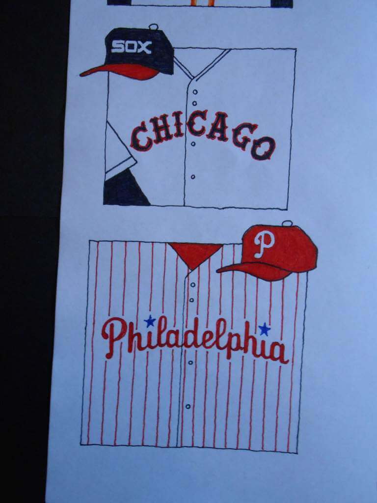
CHICAGO WHITE SOX: A plain white uniform with navy soutache trim. I chose the Tuscan lettering/numerals from their late ’70s “leisure suits” and gave it red trim. The hat has the “hug and kiss” SOX wordmark, marrying the red bill from the ’80s with the white button from the ’70s. The socks should be white tube socks with navy and red stripes.
PHILADELPHIA PHILLIES: Not unlike what they wear now, but I accepted the challenge of squashing “Philadelphia” onto the chest (it’s the same length as ‘San Francisco’). I also like their ring-spun numbers from the ’60s, but admit that might be a formidable project for a “special-event” uniform. They should be copied with tackle-twill. I rue the day they made their white squatchee blue.
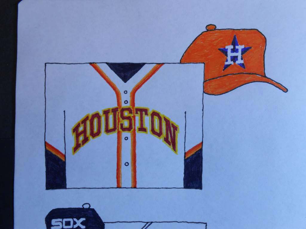
HOUSTON ASTROS: Tequila Sunrise colors in a traditional design. Soutache trim is three shades of orange; lettering and numerals are red trimmed with yellow. Hat is classic orange from the Astrodome days. Base layer is navy blue.
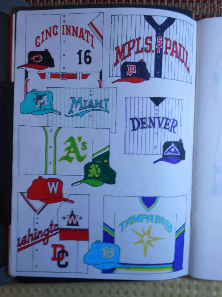
CINCINNATI REDS: Plain white with red and grey trim for sleeves and trousers. The Tuscan font is shorn of its drop shading to increase legibility. Player name in black, rear numeral in red. Hat is the black job many on Uni Watch found inscrutable but is my favorite, and has a big following around the country.
MINNESOTA TWINS: Had to get creative to name the Twin Cities in such limited space, but I think it looks old-timey, especially with that contrasting navy blue placket. The hat is the one they wore when they won their World Series’, with a red bill to spice things up.
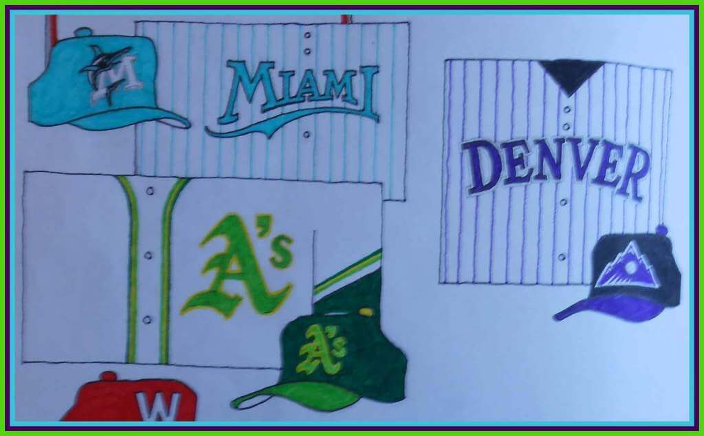
MIAMI MARLINS: The tea leaves (and not a few Uni Watchers) made this an easy choice. I will concede, though, the fish on the current uniform strikes the best balance between detail and sleekness.
COLORADO ROCKIES: The shout-out to Denver was a no-brainer. The insignia on the hat was the expansion year ball-and-mountain, which I thought had better balance than the tweaked version.
OAKLAND A’S: I love their uniforms and only wish they’d bump up their soutache game, and avail themselves to several shades of green on one uniform. And I’d pay cash money for that hat!
WASHINGTON NATIONALS: Make their locator a rebus on the front of the jersey. Their alternate hat logo makes a better sleeve patch. I went big with the cap “W”.
TAMPA BAY RAYS: Given their willingness to “Faux Back”, I toyed with an Astros-inspired Mermaid Rainbow for their sleeve trim and Sansabelt. The V-neck and pants’ trim is Columbia Blue and yellow. The “yellow sunburst” treatment is cribbed from the old Blue Jays’ jersey. This colorful uniform has everything going for it! Hat is in UCLA colors. Base layer is dark blue. Player name is dark blue, rear numeral is Columbia Blue with yellow trim.
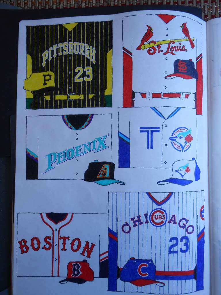
PITTSBURGH PIRATES: Loud and proud, this is evocative of their last World Series. Base layer is yellow. The hat is what their 1979 batting helmets would have looked like rendered in wool.
ST. LOUIS CARDINALS: Improving on perfection is a common hazard when taking on an entire league. I was always curious to see how the Redbirds might look with flashy soutache trim. Going against the grain, I like the Cards in navy blue hats.
ARIZONA DIAMONDBACKS: We’ll do it with the World Series colors, with the Metropolitan Area big and bold on the chest. I liked their ‘Lightning Bolt’ braid trim from the expansion years; it runs down the sides of the pants, this time.
TORONTO BLUE JAYS: The young-uns tell me one of the nicknames for the Canadian metropolis is the “T-O”, so let’s run with that. I rendered the new bird in the old colors. The expansion-year number font is one of my all-time favorites, we’ll use it. Base layer is royal blue, braids are royal, Columbia, and dark blue.
BOSTON RED SOX: Base layer is navy, AS GOD INTENDED. Soutache trim is extra-fancy, in a format used most recently by the Padres, in 2015. Hat should be familiar to fans of Luis Tiant.
CHICAGO CUBS: Chest script is based upon a description of what the 1990 road uniforms were to look like, before the switch to button-ups was made. Sleeve patch is the “angry bear”. I went with contrasting eyelets and a pretty red bill. Pullover, sleeve trim and Sansabelt are inspired by the 1984 road uniform.
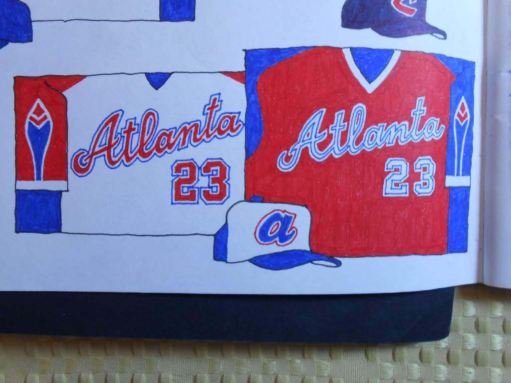
ATLANTA BRAVES: The saddle-sleeved uniforms were a big hit, and I was surprised. But now I’m curious to see how it handles the pop-art treatment. Flip-flopping the blue and red yields some interesting results, and I might be inclined to try blue pants.
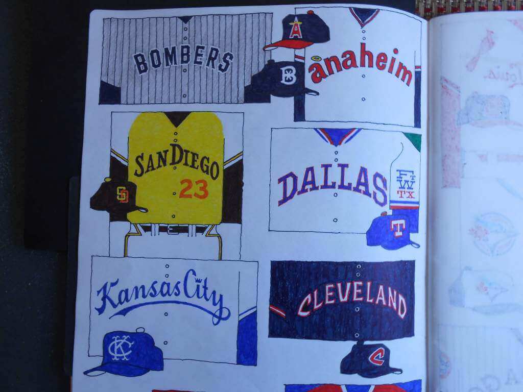
NEW YORK YANKEES: Ultimately, everyone is holding their breath to witness how the Bombers handle their City Connect project: I tried to tread gently. The only area where I needed to break ground was designing an interlocking “BX”. Pinstripes were a foregone conclusion, but I made them grey to justify a uniform that was different enough to follow through on. If the detractors beat their breasts, maybe nothing would have made them happy.
LOS ANGELES ANGELS: Anaheim earns some love, but I had to relocate the halo. The hat was a slam dunk.
SAN DIEGO PADRES: Yellow and white are good colors for a home uniform. I kinda went nuts on the pants’ striping, but trimming the belt tunnels always gets noticed. The chest lettering from the ’70s uniform is my sentimental favorite. The player name is orange, the University Gothic back numeral is brown. The hat adopts a little more color.
TEXAS RANGERS: I tried a Mpls./St. Paul approach, but have wanted to see “Dallas” across the front of a baseball jersey; Ft. Worth earns the left sleeve. I’ve always loved the gallows-shaped “T” from the original cap.
KANSAS CITY ROYALS: The 1969 road uniform hosted a wordmark that was script AND vertically-arched, a rarity. The hat uses a monogram from the Athletics that I’ve always liked.
CLEVELAND GUARDIANS: My heart belongs to the “caveman” lettering and the navy jersey over white pants. The font reminds me of a wooden National Parks’ sign. Pants adopt the navy and white stripe of the 1996 team.
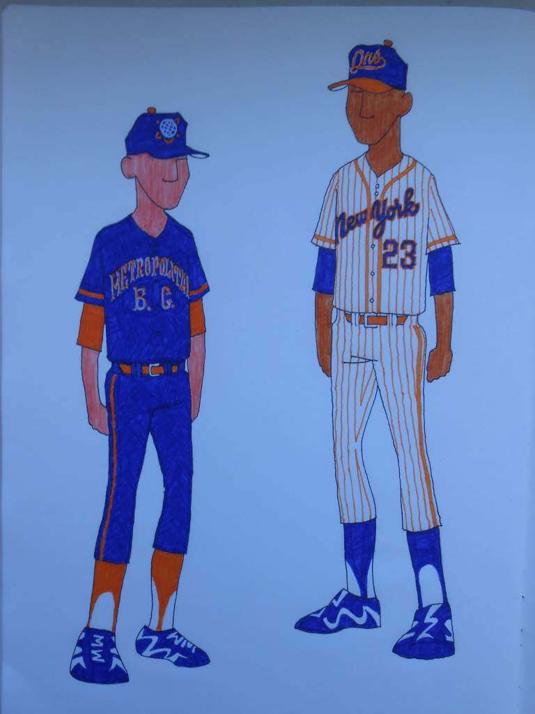
NEW YORK METS: The Mets have a library of iconography that most teams would envy. I admit I like dark monochrome uniforms, but I won’t play fast-n-loose with the New York colors. The hat features the Unisphere, a talisman of a very happy time of my childhood. The jersey bears the script, ‘Metropolitan B. C.’ (Baseball Club) in orange and white Tuscan. A little crowded, but I like sophisticated lettering on my uniform. Orange soutache matches the orange base layer. These suits will look great under the lights!
The white uniform is a bit more outside the box; I used two shades of orange for a little more color in the soutache, and experimented with orange pinstripes. The 1987 ‘New York’ script makes a return engagement, and I used ‘Qns’ for the hat logo. Thoughts?
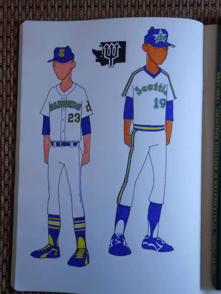
SEATTLE MARINERS: I underestimated the strong connection Seattle fans have with their 1980s’ pullovers; someone always comments on how sharp they look. I couldn’t resist swapping the city name onto the white jersey, and substituting the University Gothic numerals for the Wilson octagonal.
For the belt-and-buttons crowd, I chose Ken Griffey Jrs’ rookie-year threads. The owners detailed those uniforms on the cheap, so I added more color to the numerals. There’s also a trident patch on the left sleeve, because I said so.
Finally, for those who can’t abide a downward-pointing trident, I gave you a ‘W’ for Washington.
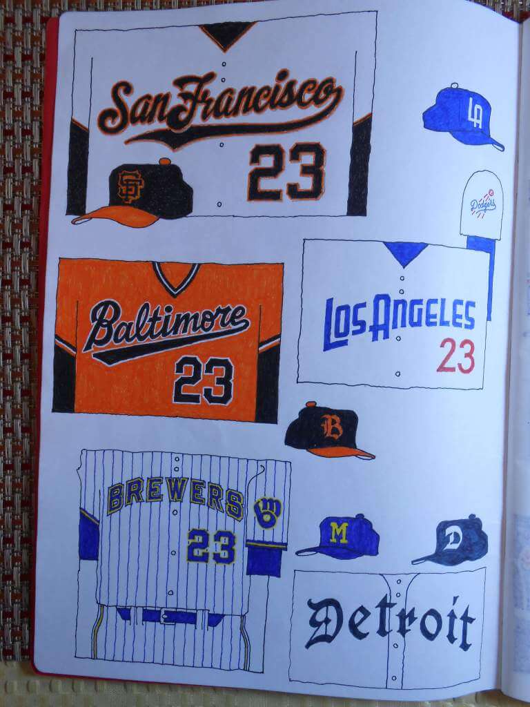
SAN FRANCISCO GIANTS: The Giants’ style guide lists this amazing script with the huge flourish. Now it’s on a uniform where it belongs.
BALTIMORE ORIOLES: The gorgeous ’70s orange pullover is united with the contemporary ‘Baltimore’ script. If you’re feeling courageous, team it with a pair of orange pants. The cap bears the Old English ‘B’ of the 1950s batting helmet.
LOS ANGELES DODGERS: I like Art Deco lettering and though the Dodgers the most deserving. The Futura Thin numerals are from an idea another Uni Watcher proposed. The whole Dodgers’ insignia is on the left sleeve, and an Art Deco ‘LA’ graces the cap.
MILWAUKEE BREWERS: From 1970 to 1977, the Brewers’ hat functioned as their locator, so why not use that approach. The ‘ball in glove’ moves to the sleeve, which allows it to spread out a little. I overlaid their blue and yellow braid on the pinstriped uniforms, and double-outlined ‘Brewers’ and the rear number, for a festive appearance.
DETROIT TIGERS: There’s more than one kind of Old English font. The ‘less is more’ approach suits the Tigers, and I’ve always wanted to see ‘Detroit’ spelled out in Fraktur lettering.
Thanks, Walter! I absolutely love the old-school style of uniform design presentation, and — at least based on what we’ve seen this year — I think many of the teams yet to unveil their CC threads would be well served by using your designs as a basis.
Readers? What say you?


Guess The Game…
from the scoreboard
Today’s scoreboard comes from Kelly Hannon.
The premise of the game (GTGFTS) is simple: I’ll post a scoreboard and you guys simply identify the game depicted. In the past, I don’t know if I’ve ever completely stumped you (some are easier than others).
Here’s the Scoreboard. In the comments below, try to identify the game (date & location, as well as final score). If anything noteworthy occurred during the game, please add that in (and if you were AT the game, well bonus points for you!):
Please continue sending these in! You’re welcome to send me any scoreboard photos (with answers please), and I’ll keep running them.

Uni Concepts & Tweaks
Time for more Uni Tweaks from the UW readership.
I hope you guys like this feature and will want to continue to submit your concepts and tweaks to me. If you do, Shoot me an E-mail (Phil (dot) Hecken (at) gmail (dot) com).
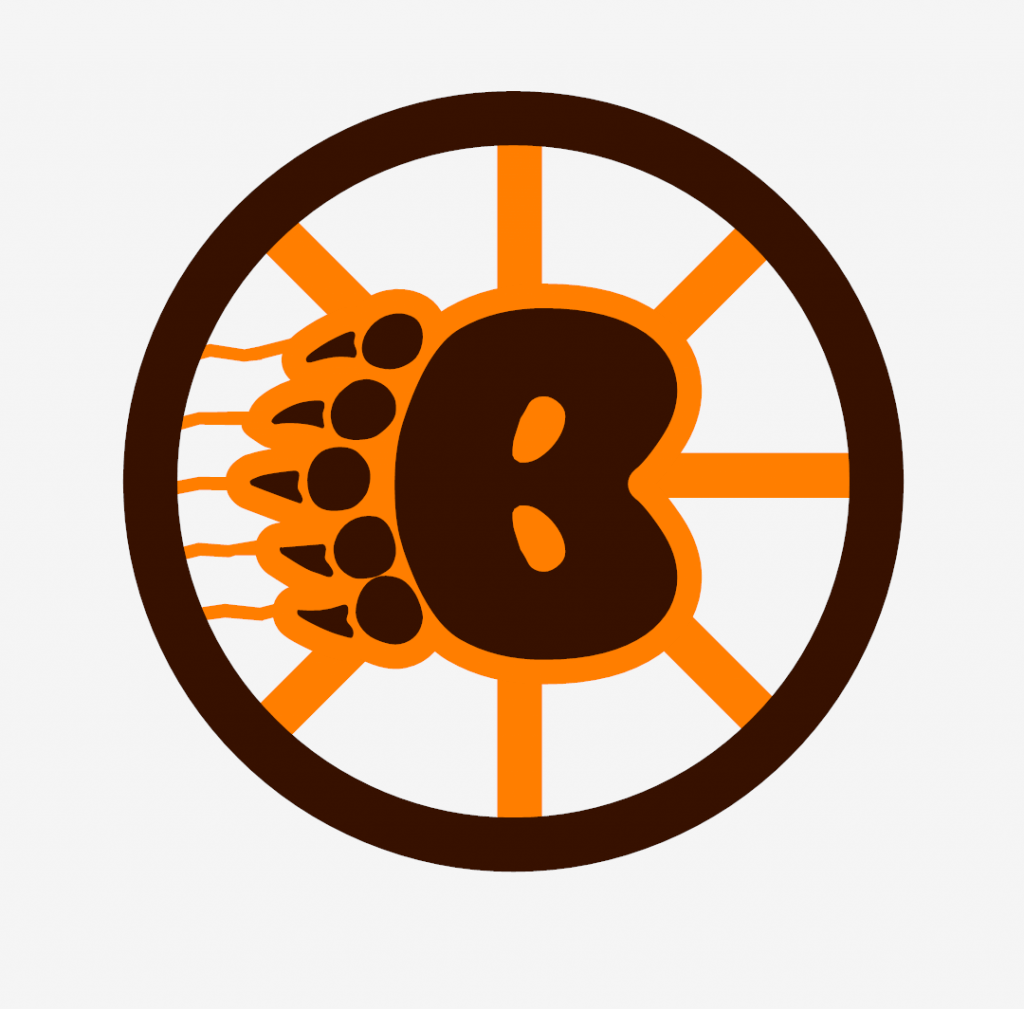
Today’s concepts come from John J. Woods:
I’ve had this concept for decades — a bear paw made up of a B. There must be high school/college teams that have used this.
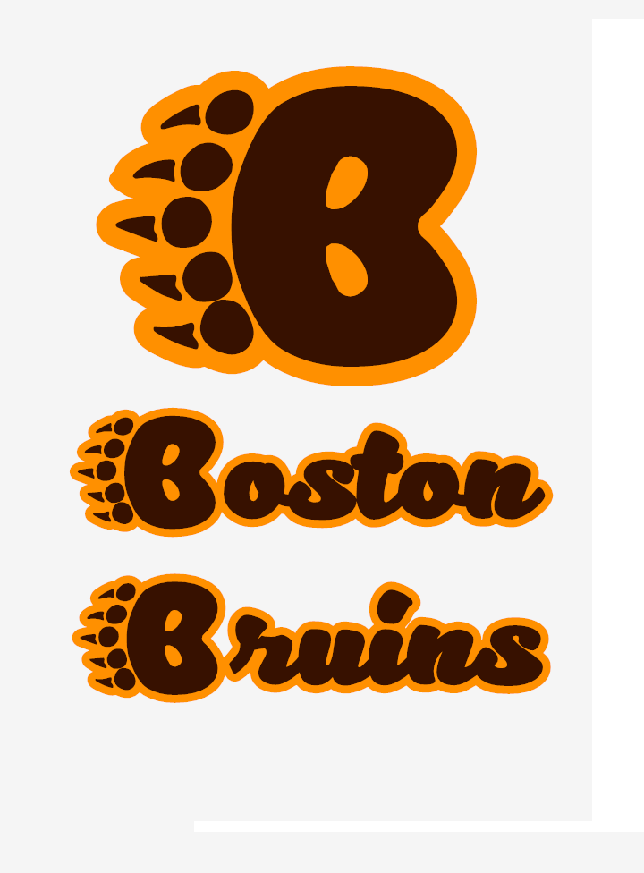
I went with the older brown and gold to make them unique. The gold home jersey is a darker yellow to contrast better against white-jersey teams.
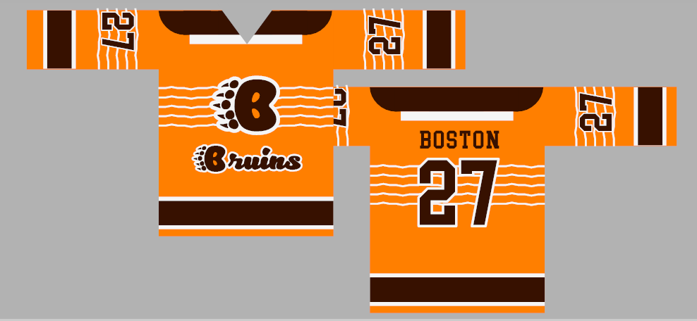
Home jerseys say BRUINS. Road jerseys represent BOSTON (like baseball jerseys). Third jersey is brown and a special black one also created.
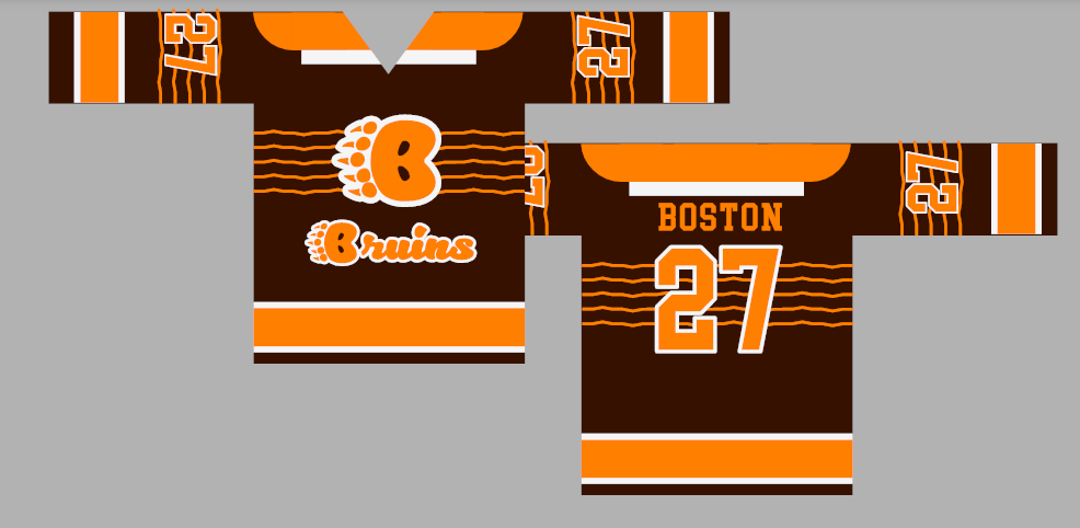
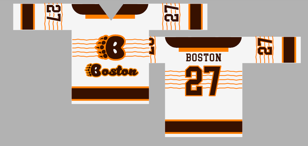
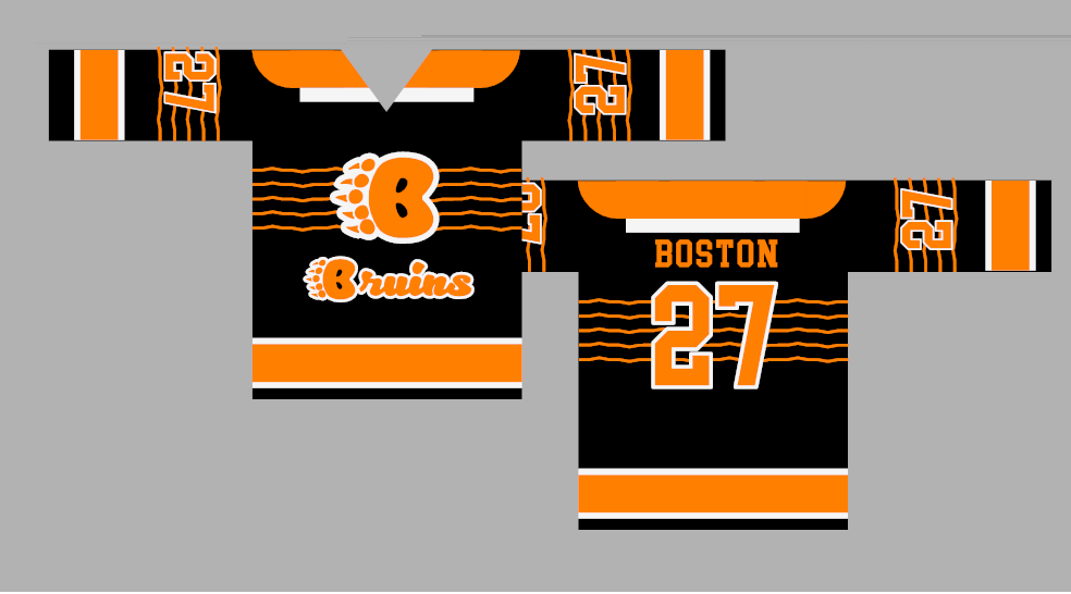
I did have straight lines across the chest to represent the claw marks. I chose to make them a little jagged.
The gold/white stripes on the white/gold jerseys help make the numbers legible. Not so much luck on the dark jerseys. I was looking at using black with a lighter brown (chestnut) in the color palette so there would be two light colors and two dark colors.
Usually, the finished products are done on jersey templates. When I draw/doodle, I start with a rectangle for the body and another long, thin one for the sleeves. I decided to leave it as is. Rustic.
I was getting a Philadelphia Blazers feel with the brown and gold instead of orange and gold (a real darker orange?)
For those who like the traditional Hub City logo, I did create one.
– Johnny Woods
OK readers (and concepters). If you have some tweaks or concepts, shoot ’em my way with a brief description of your creation and I’ll run ’em here.
And now a few words from Paul: Hi there. In case you missed it on Friday, my latest Bulletin article is a fun thought experiment. Here’s the deal: Whenever I critique a newfangled uniform or a new uniform “innovation,” a certain subset of readers will say, “You just hate anything new!” or “You just hate change!” But is that really true? In an attempt to find out, I decided to try to imagine how I would have responded to some major developments uniform history if Uni Watch had existed back in the day. For example, if I had been writing Uni Watch in the late 1920s, how would I have felt about the advent of MLB uni numbers? I tried to be as honest as possible with a bunch of hypotheticals like that. You can see the results on my Bulletin page.
Also: In case you missed it earlier this week, I’m once again partnering with Grey Flannel Auctions to offer free, no-obligation appraisals of your vintage sports memorabilia items. Think of it as an online version of Antiques Roadshow. Full details here.
The Ticker
By Anthony Emerson

Baseball News: The Red Sox are wearing their City Connect unis during this weekend’s series against the Orioles, apparently after the players asked for it (from Daniel Donell). … The New Shea scoreboard showed a picture of Javy Báez in the BFBS jersey but without the Nike logo (from @NYCKING). … Here’s a ranking of the five best and worst uniforms in Diamondbacks history (from Kary Klismet).
College/High School Football News: While watching a rebroadcast of 1971’s “Game of the Century” between Nebraska and Oklahoma, reader David Gard noticed several uniform quirks from Nebraska: a player wearing an “NU” helmet decal, and several players had torn jerseys. … Speaking of the Game of the Century, to celebrate the 50th anniversary of the game, the Huskers are wearing commemorative decals on their helmets while the Sooners have added red accents to the yard markers (from @artofscorebug and @PaytonGlen). … BYU coaches are throwing it back to the 1996 Cotton Bowl during today’s game (from Ben Whitehead). … Here are today’s unis for Appalachian State, Southern Miss, Virginia Tech, UNLV, Kentucky, Houston, and South Alabama (thanks to all who shared). … Georgia Tech DL Sylvain Yondjouen is a native of Belgium and is wearing a Belgian flag decal on his helmet (from Shawn Hairston). … Here are what someone thinks are the ten best unis of the college football season so far (thanks, Phil). … The Father Judge (Phila., Pa.) football team will be wearing helmet decals this season memorializing Bill Fox, the school’s former basketball coach who recently passed away (from Christopher Hickey). … Armstrong High School in Richmond, Va., wore throwback uniforms last weekend (from Kary Klismet).

Hockey News: New helmet advertisers for the Penguins and Kings. … New mask for Canes G Frederik Andersen (from Wade Heidt).

NBA News: Celtics PG Dennis Schröder will wear No. 71 (from Etienne Catalan). … Also from Etienne, Timberwolves SF Taurean Prince will wear No. 12.

College/High School Hoops News: New court for Arkansas State (from Kary Klismet). … New unis for BC women (thanks, Phil). … New unis for Kent State men (from Duane B. Johnson).

Soccer News: Our own Jamie Rathjen is following the Women’s World Cup qualifiers in Europe and noticed that Scotland have a rainbow captain’s armband and England are wearing black armbands in honor of ST Rachel Daly’s father.

Grab Bag: Westford Academy in Massachusetts is retiring the current hooded version of its Grey Ghost mascot over concerns that it could be interpreted as racist and is engaging the student body to help in designing a new mascot (from Kary Klismet). … Ahead of Monday’s federal election, a cat café in Montreal has put up a number of campaign posters featuring their cats as the candidates, and using official party branding for Quebec’s four major parties.
Uni Tweet of the Day
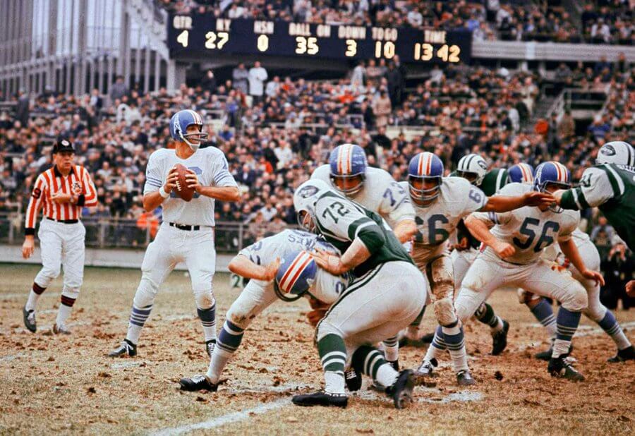
Can the Giants just make these their road unis and be done with it?
“Old Days”Homer Jones looks for a pass during a 1967
Eagles-Giants game at Yankee Stadium on a day the Giants wore their Away uniforms at Home.#NFL #NYGiants #Eagles #Philadelphia #1960s pic.twitter.com/wlfzAiQ4Oi— Tom's Old Days (@sigg20) September 17, 2021
And finally… that’ll do it for today. Big thanks to Walter for sharing those City Connect concepts! I love love love that old school pen & paper design theme!
One last weekend out at the summer place — and unfortunately there was once again a low cloud deck, obscuring an actual sunset — but I did snap this pic about five minutes prior to sunset…

Everyone have a good Saturday and I’ll catch you back here with the entire SMUW crew here tomorrow. If you see any matchups that would make for a good 5 & 1 (good games or bad game), please let @JVfromOhio (Jimmer Vilk) know — and even better include a pic of the two teams in question if possible — as he’ll be on the road today. OK? OK!
Peace,
PH
I like the Bruins concepts. This logo was used by the now defunct New Westminister Bruins. They used to play in the WHL.
Yep. The logo for WHL’s New Westminster Bruins version 2.0 who started play in 1983 after relocating from Nanaimo. This franchise the current Tri-City Americans. Has the B paw logo in the glorious days of Cooperalls and Cooper XL 7 helmets.
link
link
link
Scoreboard is 11/21/65 at Shea Stadium.
The Bruins idea is pretty cool. I actually like the Hub logo the best and might just use that with their existing jersey as a drop-in update.
The jersey concepts themselves are interesting. I would drop the word mark beneath the logo. I just cannot imagine any team ever doing that. You have a good logo that is enough. The claw marks are OK. I might simplify them rather than going all the way across the jersey.
Nice idea!
Maybe it’s just me, but one rarely sees the word “Boston” rendered in script in a sports context. It’s been done, but not recently. Perhaps folks in the Hub are apprehensive about seeming fancy, and prefer to see their city in chunky, prosaic print.
Walter, great concepts! I especially like your Phillies one. Based on Bill Henderson’s Game Worn Guide, there was a 1992 road jersey prototype with the city name.
I saw that; I don’t remember if it has the arch. In a way, I like their pre-1970 uniforms better than what they wear now, but the blue stars have grown on me!
Love the concepts. Only complaint is that ya didn’t do every team.
I believe Phil plans to make this a two-day presentation. He didn’t want to overload his readers’ eyes!
See below (and above). Mariners now added — totally my bad, as I simply spaced on this one.
New York Jets 41 Houston Oilers 14. Sunday Nov 21, 1965 @ Shea. Namath had 4 TD passes. 2 to Maynard. Blanda started at QB & Kicker for Houston. Jets busted out to a 34-0 Lead and had 522 yards of total offense. (Thanks to gridiron uniform database & Pro Football Reference for the research)
Walter, your art and concepts brought a big smile to my face! I love your renderings and your vertically arched lettering is fantastic! Thank you so much for sharing!
Vertically-arched lettering will save the world someday, but I worry it has fallen into disuse because of the proliferation of alternate jerseys. That is asking too much of baseball’s tailors and seamstresses.
One league that DOES NOT hold up its end is the NBA; there is no good reason for them to standardize and dumb down the lettering on the backs of their uniforms.
Awesome work, Walter!
These have more of a History Connect feel than a City one…I like that.
“I rue the day they (the Phillies) made their white squatchee blue.” I agree with this 100%, but then the blue stars then seem slightly out of place, no? I wonder if you would keep the sleeve number intact.
I’d say the Blue Jays jersey treatment needs to pick a lane…I prefer the T since the logo is on the hat.
The Braves red top is in ‘so bad it’s good’ territory. Well played.
If the Angels will not revive their California branding (sigh), then they must switch to your lower-case creation!
Not a big fan of sleeve numbers. Truth be told I like my sleeves blank, since player memorials have (sadly) become such a routine. But the blue stars have grown on me. Among other things, they stand for the Phils’ two championships!
If Toronto didn’t have a tradition of putting big splashy blue jay heads in odd positions on their jersey, I would agree with you.
Wouldn’t that blue+red Atlanta shirt look *great* with blue pants?!?
I figured this was the last, best opportunity to put “Anaheim” on the Halos’ uniform. Remember, RickAZ and I have a lively dialogue regarding the Angels’ most appropriate locator, and Anaheim comes in last every time. It seems like a referendum on the wortiness of Anaheim each time we discuss it, and that’s unfair to its citizens. For all I know, it’s a delightful place.
Great job, Walter, on the city connect concepts! It’s amazing how well alternate uniform designs can turn out when the goal is how they look as uniforms rather than how well the replicas will sell as “lifestyle apparel” for consumers who aren’t even fans.
I used to collect baseball jerseys when they were relatively cheap. I never spent more than $70 on one.
UPDATE!!!
I completely spaced and forgot to add in Walter’s Seattle Mariners concepts — they are now added to the bottom of the main article.
If you don’t want to scroll back up, link.
Apologies to Walter!
ANOTHER UPDATE!!!!
I also somehow missed Walter’s concepts for the Giants, Tigers, Orioles, Dodgers AND Brewers. It’s not my day. I’m going to also run these tomorrow since many readers will likely have missed them.
My sincere apologies!!!
No apologies necessary, Phil! Everything looks great!!!
Love the Uni Tweet of the Day. Those road unis would be amazing for the Giants. I just don’t understand how a team nicknamed “Big Blue” has such unexplainable road unis.
From one “primitive” uniform artist to another, that shit is dope.
Do you lose control when you stumble on a giant collection of Magic Markers in a jumbo box in an artists’ supply store? My 60-count Staedler marker kit is one of my biggest inspirations! The quality is so much better than the ones I used to get 30 years ago.
BOSTON RED SOX: Base layer is navy, AS GOD INTENDED.
Truer words never spoken. This is my biggest uniform pet peeve in baseball currently.
Nice work!
I know, right? Red sleeves AND socks is a Cardinals’ thing.
I thank Walter for the enjoyable concepts. Can we just make that the regular Miami Marlins uniform?
Thanks, Wade. One detail that always bugged me was how the “O” in “Florida” didn’t have its center cut out. Grrr!!
Fantastic concepts & amazing artistry, Walter! Simply magnificent. Thanks so much for sharing these with the rest of us here!
Thanks very much. I was concerned these designs weren’t fleshed-out enough for Uni Watch but Phil and Paul were very enthusiastic!
Nice work Walter!
Especially digging the concepts for the Rangers, Marlins, Kansas City & Anaheim
Thanks, Greg. Texas’ uniforms required the most brainpower; the Marlins, Royals, and Angels kind of designed themselves, to be honest.
Walter clearly spent his time on design instead of on software and hype videos. And IT IS AWESOME. There’s not a single one that is an instant No. The least-appealing ones are “would like to see that on a mannequin” level. And some of the best, Boston, Houston, Twins, Brewers. Took traditional imagery and plussed it just enough.
Thanks, Mike. The Astros’ uniform is one of my favorites, as well, and I think I might work out the extra details, such as the appearance of the back, hosiery and shoes, &c. Maybe a red player numeral outlined in yellow, with orange player name? Standard octagonal, though.
Hard no on the Rangers with Dallas across the front.You don’t understand our local geography.The Rangers play in Arlington. This is a very sensitive subject.When broadcasters come and do games here, even the best constantly mess up and incorrectly say things like Welcome to Dallas, even though the Rangers have never even played a game in Dallas county,let alone the neighbor city to our east.Texas works just fine thank you. The only thing you might get away with is maybe a cap design with DFW on it.
Guilty as charged, Brent; I am a Texas dilettante, with an outsider’s perspective. Although the Cowboys also play in Arlington, I understand this is a recent development and the two teams have divergent histories.
I’ll cop to simply wanting to see a baseball jersey with “Dallas” on the front, and I’ll also add I want to make one with “Fort Worth” (or “Ft. Worth”, if that’s how the locals spell it) across the front. And then I flipped a coin. Your “DFW” idea is a good one, but I think the hangman’s “T” totally spanks, so that was a requirement. Let’s try a “D.F.W.” jersey with big, blocky capitals.
Speaking as a Dallas area native, I agree with Brent Dallas had their chance to get the team and, right or wrong, didn’t do it. I like the idea of a city name on the jersey for a City Connect special, but that city should be Arlington. The special Dallas jerseys work for SMU. They don’t for the Rangers.
Having said that, the others are awesome, in presentation and design. I like how you chose to use white and focus on a good design rather than just throwing a garish color at it. I particularly liked San Fran, LA, and the Mets in orange pinstripes. Thanks for sharing Walter.
Now that you mention it, “Arlington” *would* look good across the front of a jersey.
Yes-San Fran must use that script ASAP!
No-the Mariners must not wear yellow sannies…that’s a Brewers thing.
Maybe-the Orioles in a orange cap with black visor?
Again-terrific concept artistry, Walter!
Thanks, Chris. Believe it or not, it was a “game-time decision” to go with the swoopy script over the 1977 orange-jersey lettering (a sentimental favorite). I’m happy with the choice I made. You’re right about the Mariners and Brewers unintentionally treading on one another’s designs; I have trouble divorcing the two. (“Oh well, this doesn’t look so good on Seattle’s jersey; let’s put it on Milwaukee’s, instead”) It’s always nice to see another orange cap, Baltimore’s as good a choice as any to try it out. I might put white outlines on the “B”, though.
I just love the Unisphere on the Mets hat. Of course us older folk remember coming to the Word’s Fair and gawking at this great centerpiece (it’s still there). It adorned the Mets unis as that most classic sleeve patch during 1964 and 1965…it would be spectacular to bring it back on a hat. GREAT IDEA, I WOULD PAY CASH MONEY FOR THAT! Maybe 7 line has already done that!?
Yessiree, Steve!! That Unisphere hat was one of the most necessary details in my entire project!! It brings back a flood of hazy, primal, and yes, tearful memories of an ephemeral greatness that is at the soul of any World’s Fair. (One of the reasons the Expos are so fondly remembered). IT WOULD BE THE MOST AWESOME THING THE METS EVER DID. Well, that *and* 1969, anyway.
Come to think of it, I should have done an Expos’ uniform, too.
New York Jets 41
Houston Oilers 14
11/21/65
Walter’s concepts are excellent and I just love the hand-drawn quality!
Like most:
– Pirates with the light pinstripes on a dark uniform, something baseball needs more of. And the number font (how long must we endure that hideous ‘7’?) has been fixed!
– Mets with the all-blue uniform that recalls the Negro League throwbacks they wore a few years ago, but with shadows on the lettering like their *regular* uniforms used to have. Hopefully these are NNOB as shadows look pretty terrible with NOBs.
– Twins; what perfect balance the MPLS. and PAUL have with the ST. inside the dark placket. (I want my Cubs to bring that placket, which they had in the ’30s, back.)
And I really like the lettering for Kansas City, Detroit, and Los Angeles. Never imagined the Dodgers with that space-age font, but it works!
Thanks, Mark. Pittsburgh’s numeral font is THE SUCK; they could have done so much better. I like the Descente font with its crooked “2’s”. There’s going to be L-E-E L-A-C-Y stretched lettering for the players with short names.
The Dodgers’ lettering is Todd Radom’s Nationals’ lettering, simplified for impact. I love Art Deco, and wish they could work their handsome City Hall into their iconography.
The torn jerseys seen in the Nebraska v. Oklahoma 1971 Game of the Century were tearaways, intended to tear when pulled. Love those things.
Concept is ripping off the University of Cincinnati C-Paw.