
Click to enlarge
NBA numerologist Etienne Catalan, who I recently interviewed, has really outdone himself by creating a chart that shows which uni numbers are currently roster-assigned for each NBA team (those are the vertical columns) and also which teams currently use each number from 00 to 99 (those are the horizontal rows). If you go to the spreadsheet version and click on each box, you can actually see who’s wearing each number for each team!
A few quick notes:
• The most-worn number in the league at the moment is 3, which is currently active on 23 teams’ rosters.
• The second-most popular numbers, with 22 teams apiece? 8 and 0 (I wouldn’t have guessed that one!).
• There are 13 numbers currently worn by only one team apiece: 36, 37, 38, 39, 46, 51, 54, 67, 71, 81, 91, 97, 98. (As noted in yesterday’s Ticker, the 97 is Celtics guard Brodric Thomas, who’s the first player to wear that number in NBA history.)
• The grey “R” boxes are for retired numbers. You probably knew already that the Celtics have more of those than any other team (22 of them). But which number has been retired by the most teams? That would be 32, which has been decommissioned by 11 clubs, followed by 10 (eight teams) and 24 and 33 (eight teams each).
You might be thinking, “Well, this is nice but it’ll be obsolete as soon as a player is traded, or injured, or released.” But Catalan tells me he plans to keep the spreadsheet updated with each NBA roster move. In fact, he’s been keeping this chart for two years but never shared it publicly until now.
Again, you can keep up with the updated spreadsheet here. Now we just need someone to create something similar for all the other pro leagues!
ITEM! New Bulletin article: As most of you know, it really bugs me that teams and leagues never refer to their uniform ads as “ads,” or to their uni advertisers as “advertisers” (instead using terms like “branding partner” or “helmet entitlement partner”).
One person who disagrees with me on this is Ben Thoma, a longtime Uni Watch reader who also happens to be a longtime veteran of the advertising industry. For my latest article on Bulletin, I interviewed Thoma about the language of advertising, and about whether a company’s logo on an NBA jersey is or isn’t an ad.
Those of you who’ve subscribed to receive my Bulletin content via email should already be seeing this piece in your in-boxes. Everyone else can read it on my Bulletin page. Enjoy!
Click to enlarge
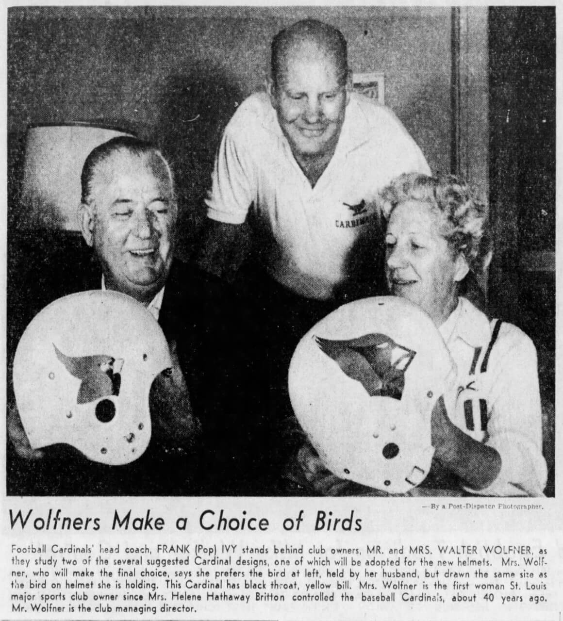
Too good for the Ticker: I love this 1960 photo showing the St. Louis football Cardinals’ owners, “Mr. and Mrs. Walter Wolfner” (for the record, Mrs. Wolfner’s first name was Violet), examining a pair of helmet prototypes. The caption says Violet Wolfner preferred the design on the left, but that’s not the one they ended up using — hmmmm.
Also, note the logo on coach Frank Ivy’s shirt in the background — almost looks more like a St. Louis baseball Cardinals logo. Never seen that one before, and it doesn’t appear on SportsLogos.net either. Interesting!
(Big thanks to Mark Haarmann for this one.)
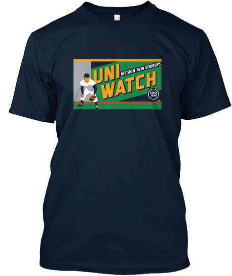
By popular demand: This awesome “Hit Sign, Win Stirrups” T-shirt, designed by the great Todd Radom, was originally available as a limited edition in February of 2017. Lately I’ve had a few requests for it (apparently some of the originals have gotten a bit ratty over the past four and a half years), so I’ve decided to revive the design.
Short- and long-sleeved versions are available here. If you want any other formats (women’s, kids’, hoodie, V-neck, etc.), drop me a line and I’ll hook you up.
My thanks, as always, for your consideration of our products.
The Ticker
By Anthony Emerson

Baseball News: Here’s a 1979 video clip showing late-night TV host Tom Snyder asking Pirates stars Dave Parker and Willie Stargell about their uniforms (from Michael Ortman).

NFL News: The Nike logo on the pants of Browns QB Case Keenum and RB D’Ernest Johnson were backwards during last night’s game (from multiple readers). … The Big 10 Network had Big 10 coaches try to guess which NFL team had which throwback NFL logo. Real easy for us, kinda difficult for them (from Igancio Salazar).
College Football News: DL Amare Barno will wear Frank Beamer’s No. 25 for Virginia Tech versus Syracuse (from Andrew Cosentino). … Here is a pretty good high-level overview of Penn State football uniform history (from William F. Yurasko). … Here are this week’s uni combos for GT, TCU, Texas State, Illinois, Purdue, Virginia, Tulane, SMU, Ole Miss, Middle Tennessee, Oregon, West Virginia, and Oklahoma (thanks to all who shared).

Hockey News: New mask for Habs goalie Jake Allen (from James Beattie). … The WHL’s Vancouver Giants have a new third sweater (from Wade Heidt). … Also from Wade, the OHL’s Windsor Spitfires wore commemorative jerseys for their 75th-anniversary game. … The Blues have unveiled their uni schedule for this season (thanks, Brinke).

NBA News: The Warriors debuted their new throwbacks last night. … The Pistons’ new City alternate — or at least its base design — has leaked. … The Pacers teased their new City uni, which they plan to unveil on Nov. 1 (thanks, Phil). … With the regular season now under way, the Wizards and Grizzlies still don’t have uniform advertisers. They are currently the only two ad-free teams.

Soccer News: New third shirt for top-tier Argentine side Lanús (from Ed Zelaski). … USWNT midfielder Lindsey Horan reached 100 caps last night and players reaching milestones are usually made captain for the game so she wore this armband (thanks, Jamie). … This weekend, Everton will wear new warm-up kits, designed to pay tribute to the club’s American fans (from Mark Cartman).

Grab Bag: The U.K. Netball Superleague’s Wasps Netball have a new second kit (thanks, Jamie). … Ohio has a new license plate design, depicting the Wright Flyer carrying a banner declaring the state as the birthplace of aviation. Except the license plate depicts the Wright Flyer backwards. Oops (from multiple readers). … Dublin GAA has a new alternate jersey (from Phil Santos). … McLaren F1 driver Lando Norris is an Englishman, but you wouldn’t know that based on his helmet design for the forthcoming US Grand Prix (from Russell G Flynn).
The most worn number per the graph is #13, being worn by 23 players.
#23 is worn by 13 players.
Actually, it’s 3. Now fixed.
link
Browns Running Back D’Ernest Johnson’s Nike logo was backwards on his pants last night.
Someone commented before reading the Ticker!
On the picture of the Cardinals helmets from 1960, did you notice they were two different makes of helmet?
Haven’t read the Bulletin article yet, but I got a chuckle that Thoma disagrees that they are ads. Thoma the ad industry executive, siding with the nonsense league corporate jargon that pretends these aren’t ads. Of course! :)
Read the article before jumping to conclusions!
It was a great article, and actually interesting to hear his perspective. Though I’ll still contend that branding, activation, sponsor, ad, etc are essentially interchangeable when it comes to uniforms. As you said, you are buying space on a highly visible location to get people to see your company. Be it a highway billboard, on tv, or on a jersey, it is an ad.
Ben definitely has a point about different TYPES of advertising, and their purposes, but nonetheless, a corporate logo on a uniform is an ad for said company’s product(s), there is no “messaging”.
While it was interesting to hear an insider discuss ads, especially in this context, reading this probably made me hate uni-ads even more than I already did. Personally one of my pet peeves with society is how much materialism, both the need for more “stuff” as well as status symbol of various brands/things, really takes the heart and soul out of life. So hearing an ad exec get into the weeds for how they sell us “stuff” makes me cringe.
I found this line the most interesting:
“… you are interrupting every time you’re showing up. You’re generally never called upon to come into people’s lives — you’re always interrupting.”
An unwelcome interruption. A great synopsis of ads.
Tom Snyder keeps calling them “outfits,” both hilarious and annoying….
I thought the same thing. He’s fairly knowledgeable on the game but why he called them outfits is baffling. He asked about the Stargell Stars near the end of the interview, too. With Willie’s hat and boots, Snyder smoking a cigarette, really great interview.
The Bulletin article is a terrific interview. Well worth reading. But I find the ad/not-ad portion of it the least interesting or compelling thing. There’s no actual case presented against uniform ads being called advertisements. The case presented is that it’s valuable for the lay audience to use industry jargon to distinguish between types of advertisements on the basis of their purposes and contexts. Which hits at a fundamental mindset that I strongly disagree with. No, industry-insider jargon generally ought not be expected of popular or common discourse. Like, by professional training, I can distinguish between a lede and a nut at the start of an article. But I would never say an untrained-in-journalism-composition reader is wrong to describe the opening paragraphs of a news story as the “intro” or even the “lead.” It’s also like the debate over calling sports yellow “gold” versus “yellow.” Sure, in the specific industrial context of describing colors used in some forms of clothing/equipment manufacture, the color is known by the specific jargon term as “gold.” But it’s also true that to the untrained eye, that color is a hue of yellow. It’s yellow. It’s obviously and inarguably yellow, even as industry insiders refer to it as gold. Yellow is not wrong, even if calling it yellow on an order form or invoice would be an error.
Likewise here. To an advertising professional, there may be value in distinguishing between rich-context “ads” like a TV/video spot or a radio hit or whatever and a low-context “placement” or “activation” or whatever like a uniform logo placement. But to the non-industry-insider, there is little to no value in making and sustaining that distinction. Such jargon will tend to obscure more than it enlightens. To the lay person, it’s an ad. No good purpose is served by claiming it’s not. As with gold/yellow, there might be value in the general audience gaining understanding that this type or that type of advertisement is called by a different name within the industry because it serves a particular purpose, but for those of us who speak dictionary English rather than specialist industry jargon, they’re all still ads.
Which is no a specific criticism of Ben Thoma! It’s in the nature of things for people with specialized knowledge to insist that their specialized jargon, which in the best case does offer precision and clarity within their field, be known and used generally. But the thing is, English is already the language with the largest vocabulary of any spoken on earth; we don’t actually need more words to remember. “Gravity is technically not a force,” while true, and while it an lead to terrific learning opportunities for understanding the weird implications of general relativity, is not actually a valuable response when a physicist hears a random person refer to the “force of gravity.”
Whereas I find the insider’s insights on matters of quality – what makes a particular type of ad good, or effective, or not – very interesting and enlightening. Great stuff!
Read the Bulletin article, and I think the best part was that even Ben was stymied by the phrase “Helmet Entitlement Partner”. And I can see his point on how they’re not full-blown advertisements in the sense that they just show the brand, and not the corresponding message… but I’m still calling them ads.
Really interesting interview with Ben. The soccer thing is interesting, because soccer uniforms almost never had the team name or logo in a prominent place on the jersey. It was usually a small patch on the chest. The front was completely blank. So when ads were introduced, they didn’t displace anything.
One exception was the NASL Vancouver Whitecaps jersey, which had the team name or city (depending on whether it was the home or away jersey) inside a hoop on the front. When the current team decided to bring back a jersey influenced by this classic design, I was completely opposed to it because the ad would replace the team and city name. I tweeted my displeasure about this, and to no surprise was drowned out by fans supporting the move, because they wanted the classic design back, and probably because most mainstream sports fans at best don’t care about ads on uniforms in the first place, and at worst totally support is as part of the “monetize everything” state of things.
The replacement of the team and city name on these uniforms remains the worst example of a uniform ad I can think of.
Wafflebored, when you say “So when ads were introduced, they didn’t displace anything,” that’s something I like to say myself.
I thought it was interesting when Ben says “To me, the identifier is Yeti, like this is Team Yeti.” Quite a few English clubs didn’t wear any visual marker of identity besides their colors until maybe the ’70s (although this was pre-everything being on TV, so it’s not like you’d show up and not know who was playing), and then when they did add crests they’ve never grown in size.
So, having grown up around soccer, the colors that the team is wearing (at least at home) are more of an identifier to me. I’d associate Austin FC with green and black stripes, for example, no matter what their shirt happens to exactly look like in a given season.
I’m starting to think retired numbers are getting out of hand. Soon the Celtics will have a quarter of the numbers retired. Maybe just having a “ring of honor” or banners with just names to honor these players would work better. Or I could see in the future when numbers are running out, players are able to wear these numbers, but only the truly great players getting their names added to these numbers. So a number in the rafters might have 2 or 3 names on this banner. Of course of all the major sports, basketball has the least number of players on a roster. I could see this being a bigger issue with football.
Makes me miss the old Toronto Maple Leafs system of “Honoured numbers”, which they discarded in 2016 by just retiring them all.
Honored numbers makes a lot of sense. You can still hang the number with the name up in the stadium/arena. But it can still be used. In general that works well, along with sort of keeping the number out of general circulation, but not officially prohibiting players from wearing it. For instance, Jim Kelly’s #12 is retired in Buffalo, but say Brady went to Buffalo instead of Tampa, in that instance is it some dishonor to Kelly if Brady wears 12 also?
All that said, retiring numbers is fine if done INCREDIBLY sparingly. When a team has some sure fire hall of famer, with actual historical significance to the team/sport, who people will still know a few generations after they played? Sure, go ahead and officially retire that number. In that case you aren’t going to have many retired numbers.
The Bears have a whopping 14 numbers retired. When they retired Mike Ditka’s 89 a few years back, that was going to be the last one retired.
I’m no fan of retiring numbers, especially for players that aren’t Hall of Famers. I like that the St Louis Blues have #7 as an honored number (Berenson, Unger, Mullen, Tkachuk), but allow players to wear it (hey Pat Maroon!). Who knows, maybe those players can get their name alongside the other famed #7’s in the arena.
My alma mater USC only retires Heisman winners. The Lakers for a long time only retired all time greats, but then retired Gail Goodrich and James Worthy, and this year they are retiring Pau Gasol. All 3 are hall of famers, or will be, but not in the same echelon as their previous retired numbers.
James Worthy is an all-time great! Just named to the NBA’s 75 Anniversary Team.
Dallas Cowboys have it right. No retired numbers but a ring of honor. 54, 22, 88, and 43 are up for multiple players. That being said, no one has worn 12 (Staubach) or 74 (Lilly) since. But I bet if Brady had signed with them, he would have worn 12.
Retired numbers should be RARE. I get Ruth, Gehrig, DiMaggio and Mantle but the air is so rare in that space, the Yankees should not retire any others. Red Sox 9 only, Dodgers 42, Cardinals 6, Braves 44, Giants 24, and so on.
I’ve always liked the idea of a team only having one retired number at a time. Particularly when a player dies unexpectedly, you could put his name and number on a flag in the stadium, and then when the time comes to honor someone else, that number goes back into circulation.
You would still have a record of who the honoree was each year, which would itself be prestigious without depriving all future generations of players from wearing a number.
classic doublespeak! its all ads
Loved that Bulletin article/interview. Really interesting stuff. The discussion reminded me of the old George Carlin routine about euphemisms and euphemistic language basically attempting make unimportant things “sound” important or less inconsequential. “Helmet Entitlement Partner” vs. Helmet Advertiser fits that idea for sure. I would also say all of this wordsmithing BS is exactly an acknowledgement of customers’ perceptions, rather than a failure to recognize them. They know “ad” and/or “advertiser” carry negative connotations in folks’ minds. So, “partner” or “sponsor” is softer and less negative, and maybe avoids it by simply sounding different. In the corporate world it happens all the time. My fave (that is, I hate it) is the old “due diligence”. It’s “research” or “consideration”… every time I hear it I internally go “UGH” and immediately perceive the person saying it as someone who is BSing me and simply trying to make something we do every day sound more important than it is. As much as I respect your interviewee’s point of view, they are all ads folks, just varying kinds.
It seems the shorts of the Golden State Warriors throwbacks are shinier than the tank top, but maybe it’s the picture.
Ultimately, when ads find their way onto the uniforms of our favorite teams, it will displease the oldsters like us. The kids, however, will grow accustomed to seeing their heroes wearing advertising. It will be like soccer, where kits look unusual without ads. By the same token, the young ‘uns will reflexively say, “Ewww”, when they hear of a team using a misappropriated Indian name, whereas for most of our lives it was the most normal thing imaginable.
Maybe. But today’s Bulletin piece isn’t about whether uniform ads are good vs. bad, or normal vs. aberrant — it’s about the *language* of advertising.
(Also: Not everyone who reads Uni Watch is an “oldster.”)
Well, I *will* admit that Ben Thoma REALLY did his homework.
I’m guessing the first thought of every Michigan fan (like myself), upon seeing that license plate, was “hmm, must’ve been designed by a ‘THE’ Ohio State graduate”.
It is truly depressing that there are people in college (football players, no less) who don’t recognize Bucco Bruce. He was only retired in 1996!
I just read the interview on Bulletin – Paul, it was absolutely fascinating. I continue to admire how well you know the topic you are talking about, the breadth of your questions, and how civil and professional the tone was – which in this case was probably easy; Ben seems like a good guy!
I really enjoyed and appreciated this – thank you for sharing!
Thanks, David!
And yeah, Ben is a *really* good guy — thoughtful, self-reflective, funny, smart.
In the Ohio license plate, it’s interesting that everyone is so distracted by the flyer that they missed the kid’s swing is literally hanging by a single leaf in that tree, if it is even connected to the tree. Where the swing is depicted in the tree, that end of the limb would have snapped before the kid even got on the swing.
I am very impressed that the Atlanta Hawks have all their players wearing numbers from 0 to 22.
That’s something you almost never see these days.