Photo by Ian Johnson/Icon Sportswire via Getty Images; click to enlarge
Nearly four years ago, I wrote a piece about how some NFL teams use a period after the “Jr” or “Sr” in NOBs that include those generational suffixes, while other teams don’t include the period. Now reader Sam Olmstead has come up with another period-related NOB detail to scrutinize: He’s noticed that the Cincinnati football team doesn’t use periods after first initials.
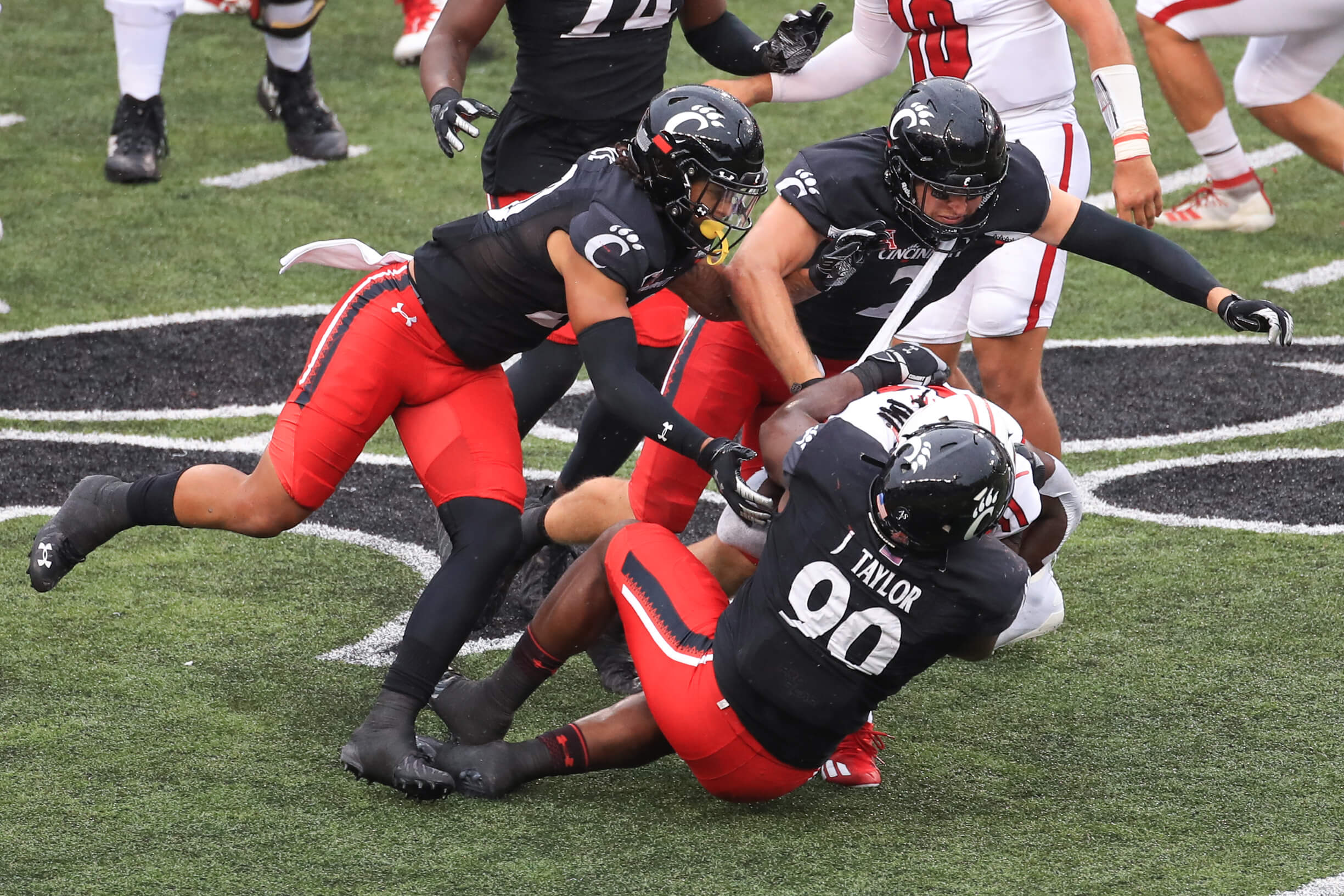
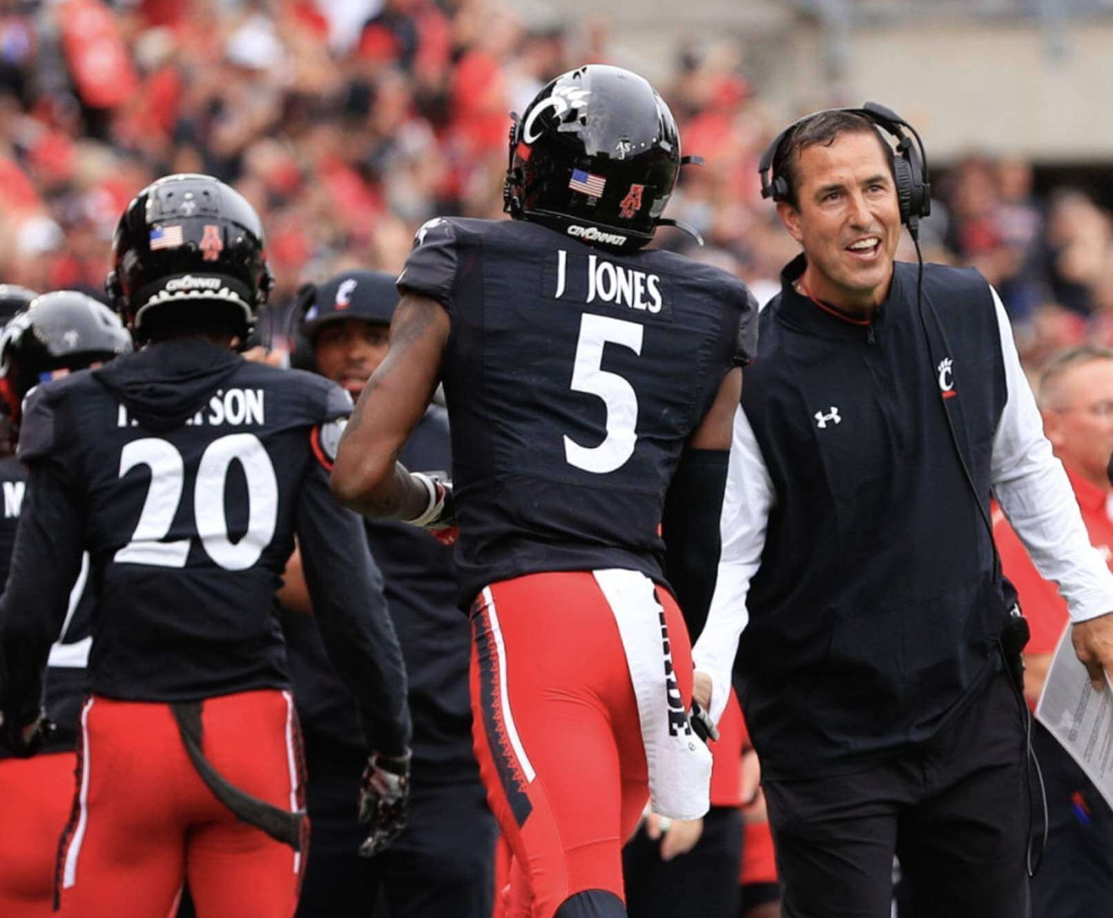
You can see one example of this in the photo of defensive lineman Jabari Taylor shown above. Looks weird without the period, right? (Although Cincy’s odd NOB font definitely contributes to the visual weirdness.) And no, that isn’t just a random glitch on Taylor’s NOB — here’s another example, this time modeled by wide receiver Jordan Jones (for this and most of the subsequent pics, you can click to enlarge):
Again, that looks really weird, at least to me.
Now, I know what you are thinking (or at least what you should be thinking): You are thinking, “Okay, so they don’t use a period after first initials. But do they use them after ‘Jr’ and ‘Sr’?”
The answer is no, as you can see in these photos of wide receiver Leonard Taylor Jr., who has FIOB and JrOB (!):
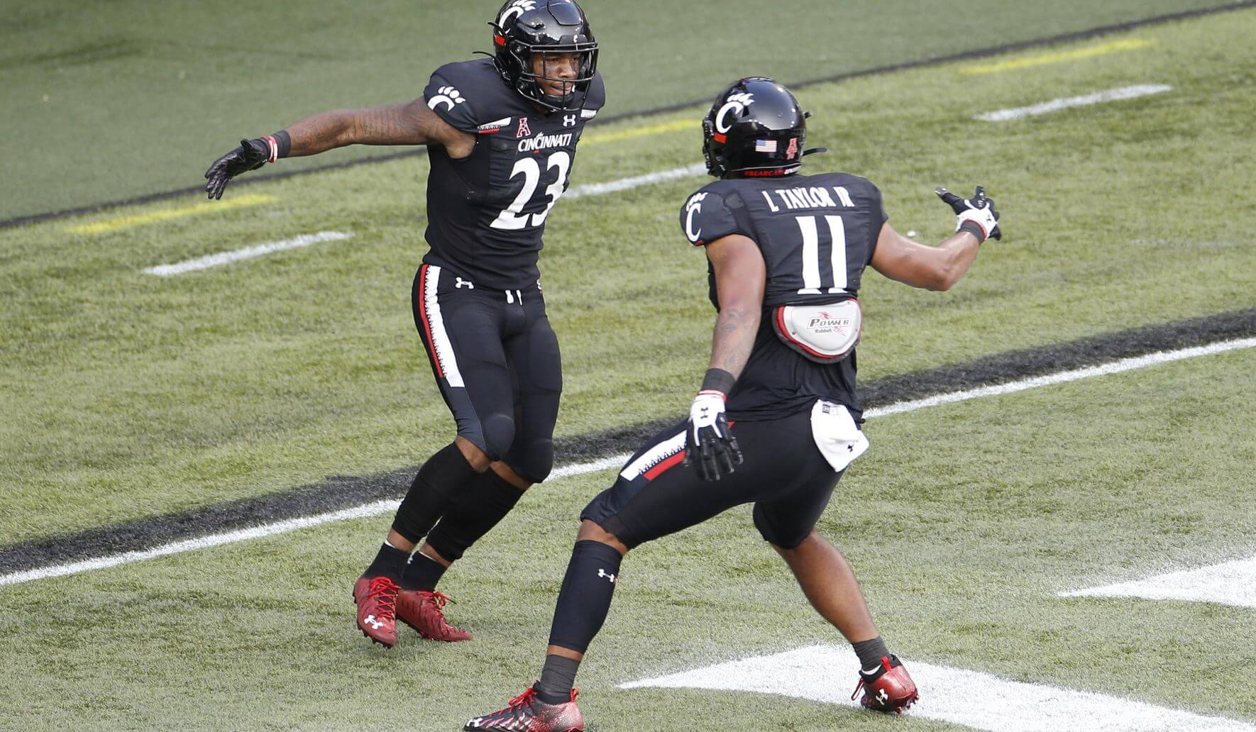
Well, at least they’re consistent. The missing period after the generational suffix doesn’t look too awful (although I’d still prefer to see the period in there), but the period-bereft first initial doesn’t feel right.
At the other end of the spectrum, here are some late-2010s shots of Memphis running back Patrick Taylor Jr., who had periods after the initial and the suffix:
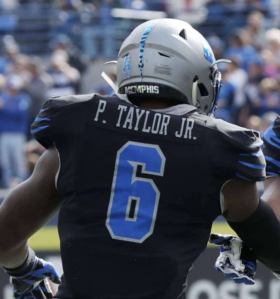
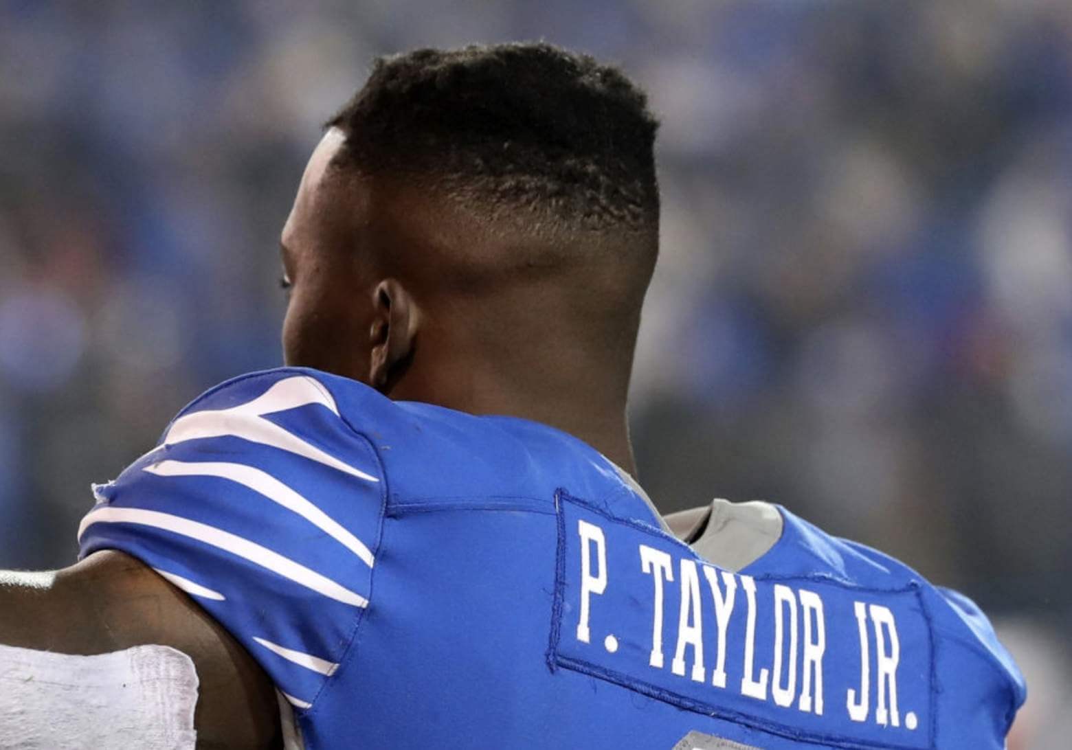
That looks better, at least to me. (Oddly, I also found a photo of Patrick Taylor with no first initial and no period after the suffix, so Memphis was apparently inconsistent in their period-age.)
Are there any other current teams that routinely omit the period after the first initial? If so I’m not aware of them. As for uni history, I can think of only one past example — the mid-1970s Chargers, but they put the first initial after the surname (sometimes with a comma separating them), so that’s sort of a different animal to begin with:
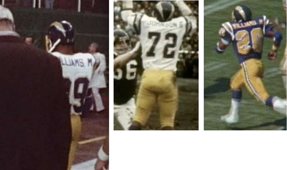
(There have also been several football teams that put the initial after the surname with the period, including the Cleveland Browns [who also added a comma after the surname], the USFL’s Denver Gold, and SMU. But I digress.)
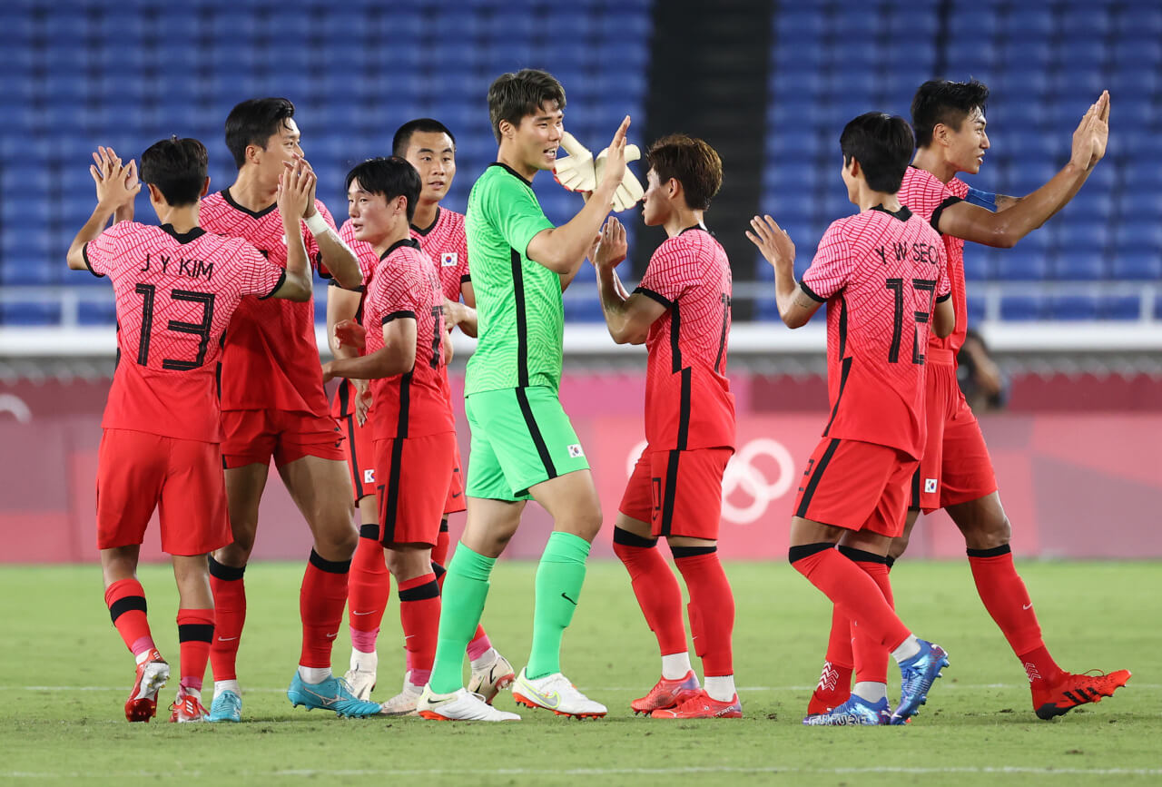
Our own Jamie Rathjen reports that period-free initials are common in Korean soccer, where players all wear their given names as initials:
Aside from that, though, I’m not aware of any team — especially in North American sports — that handles first initials like Cincinnati does. Anyone..?
(Big thanks to Sam Olmstead for sending me down this rabbit hole.)
But wait, there's more! pic.twitter.com/QhhkU6NUPv
— Brad Wolf (@bradwolfdesign) October 6, 2021
Hosiery hero: I knew that Padres starter Chris Paddack routinely wears stirrups. But I didn’t know that he wore at least eight different stirrup designs this past season, as shown in the tweets above.
On the one hand, this is a sorry measure of MLB’s lack of hosiery uniformity. But it’s also a testament to Paddack’s devotion to stirrups and his ongoing attempts to match his lower-leg stylings to his uniform. A tip of the Uni Watch cap to him!
(Kudos to Brad Wolf for compiling all of Paddack’s stirrup looks.)

Click to enlarge
Most pathetic giveaway ever?: Pseudonymous reader Valjean 9430 attended Tuesday night’s Yanks/Sox Wild Card game at Fenway and was given this “rally towel.” How lame-o is it? Let us count the ways:
1. It’s not much of a “towel” — more like a handkerchief.
2. No mention of either team.
3. No Red Sox team colors.
4. Four (!) separate ad impressions.
5. The crowning touch of lame-o can be found on the back, which has this sticker:

Way to make a fan feel special, right? Unfuckingbelievable.
Click to enlarge
Wallpaper auction reminder: In case you missed it on Wednesday, reader Kenton Bontrager is auctioning off a partial roll of vintage MLB wallpaper. Full details here.
The Ticker
By Paul
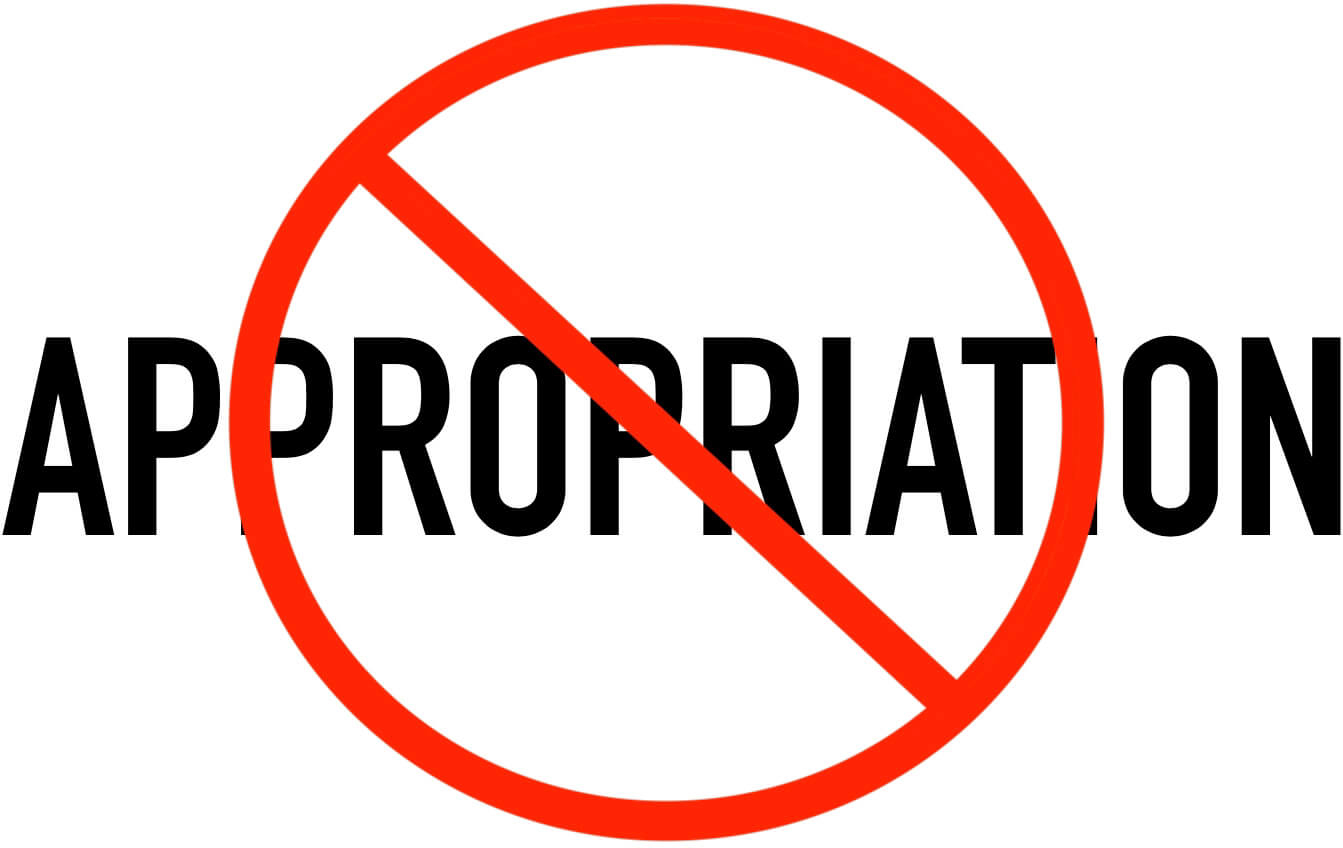
Indigenous Appropriation News: Toronto’s NHL and NBA teams, the Maple Leafs and Raptors, are both adding a land acknowledgment to their pregame proceedings, to recognize that their arena is situated on Indigenous lands. This is in keeping with the city of Toronto’s official stance, which includes a municipal land acknowledgment.

Baseball News: Someone wearing a giant, emoji-like head was sitting behind home plate during last night’s Dodgers/Cards NL Wild Card game (thanks to all who shared). … Speaking of last night’s game: Nationals OF Juan Soto and hitting coach Kevin Long saluted their former Nats teammates Trea Turner and Max Scherzer, both of whom are now with the Dodgers, by wearing Turner and Scherzer Nats jerseys to last night’s game (thanks, Brinke). … Dodgers OF Chris Taylor, who hit the game-winning home in last night’s game, wore a green “Advocates for Minor Leaguers” wristband, showing his support for better conditions for MiLB players (from Jamie Jenson). … Atlanta OF Joc Pederson has recently started wearing a pearl necklace on the field. … Speaking of Pederson, here’s some video of his cleat sole separating from the rest of his shoe as he took a swing during Saturday night’s game against the Mets. Never seen anything like that before (both of those items are from Geoff Poole). … The new softball field at Sun Prairie West High School in Wisconsin is, uh, really something (from Jeff Ash and Ryan Wozniak).

NFL/CFL News: Looks like the Falcons, who’ll be playing in London this Sunday, will be wearing their gradient alternate uniforms (thanks, Phil). … Meanwhile, here are this week’s uni combos for the Titans, Bills, Colts, Rams, Pats, and Texans (thanks to all who shared). … The CFL’s Toronto Argonauts wore early-’90s throwback helmet logos last night (from Wade Hedit). … Here’s Jason Von Stein’s uni-centric NFL illustration for this week’s games.
College and High School Football News: Here are this week’s uni combos for Tennessee (here’s why they’re not wearing black helmets with their BFBS uni), North Texas, and Cincinnati (thanks to all who shared). … Georgia has a new set of black pants, although it’s not clear when/if they’ll be worn (thanks, Phil). … Here’s an interactive site that lets you mix and match all of Oregon’s uni combos from their current set (from Jonah Henderson). … Now that Florida State has finally won a game, their helmets will have merit decals this week (thanks, Phil). … Northern Colorado’s offensive coordinator has been reprimanded after throwing a clipboard that hit a fan. … New blue end zones for Ole Miss (thanks, Phil).

Hockey News: No visuals yet, but the Blue Jackets will memorialize G Matiss Kivlenieks, who died in a fireworks accident on July 4, with a season-long “80” helmet decal, plus “80” will appear behind the nets for the Jackets’ first two regular season games and an “80” banner will be hung from the rafters this season (thanks, Phil). … Also from Phil: The Stars have announced the dates when they’ll be wearing their neon-trimmed alternate uniforms. … New home jerseys for the AHL’s Providence Bruins (from Wade Heidt). … Capitals broadcaster Craig Laughlin, whose nickname is Locker, has a new beer called Locktoberfest (from William Yurasko).

NBA News: Yesterday afternoon’s Suns/Lakers preseason game took place on the WNBA’s Phoenix Mercury’s floor, because the Mercury had a playoff game last night (thanks to all who shared). … A new Mavs shirsey seems to confirm leaks that we’ve seen for their new alternate (thanks, Phil).

College and High School Hoops News: New home uniforms for Mississippi State men’s and Arkansas State men’s (both from Phil, who’s really on fire lately).

Soccer News: The Euro 2024 logo has been unveiled. … Last night’s NWSL games stopped for a minute in the sixth minute and both teams stood and locked arms around the center circle. “The choice of the sixth minute is to symbolize the six years it took for the recently reported player abuse to become publicly known,” explains our own Jamie Rathjen. Additional info here.

Grab Bag: Pretty cool new wraparound logo for Coca-Cola (from Eric Fox). … Authorities are seeking an Ohio prison inmate who escaped after stealing a corrections officer’s uniform. … Here’s a look at 10 defunct PGA Tour event logos. … In a move to accommodate colorblind fans, red/green uni matchups will be banned from the 2027 rugby union World Cup (from Josh Gardner). … Syracuse Athletics has a new logo celebrating 50 years of women’s sports (from Michael Hochman). … Shameful: Some school districts are using Covid relief funds, intended to be used to safely reopen, to build new sports facilities (from Timmy Donahue). … New Honda-tribute F1 livery for Red Bull Racing (from Ephraim Vorzman and Rob Altman). … New men’s and women’s volleyball jerseys for Italian club team Vero Volley Monza (from Jeremy Brahm).
re UT: Once every however many years for a Halloween game I’m OK with it. I’m generally opposed to BFBS unis. At least they didn’t go pumpkin orange helmets.
“The answer is now, as you can se” now should be “no.
Ugh. Fixed!
Ugh. I have always really hated Cincinnati’s font and now I have another reason to be angry when I see their uniforms!
I really wonder if there is a reason for no periods or it’s just pure laziness.
From the Coke article:
“…increase the Coca-Cola consumer base through an ecosystem of experiences anchored in consumption occasions, such as meals and breaks, and merged with consumer passion points like music and gaming.”
Translation:
“We’re going to market this shit to people who like to drink shit while they’re doing shit” ;)
Marketspeak is terrifyingly dystopian. Why can’t a logo just be a good logo? Does that level of language help ANYONE actually market the product or consume it?
Regarding the Red Sox rally towel: Late Pittsburgh Steeler radio broadcaster Myron Cope is credited with creating the Terrible Towel, and in his autobiography “Double Yoi” (one of his trademark sayings), there is a chapter dedicated to the Terrible Towel. At one point he goes off on a rant about some of the copycats out there, and some of these points remind me of that passage. I’m greatly paraphrasing here, but he went off on how thin and chintzy most of the knock offs were (whereas, he pointed out that the Terrible Towel was sturdy enough to serve functional purposes like drying your seat, being wrapped up as a handwarmer, draped over your neck as a windbreaker, etc), and that these knockoff were usually emblazoned with the name of a bank or some other local business. Like I said, the book was published around 2002 (the very early days of Uni Watch, and before it was really in the form we know it now), but even then, Myron was someone who “Got It.”
In the Toronto Argonauts pic, isn’t the other logo listed for Ottawa actually an old Ottawa Rough Riders helmet…not a Redblacks?
The Argos celebrated their 1991 Grey Cup Championship team last night. This being the reason they wore the 1991-1994 helmet decals mixed with their current uniforms.
The Argos have been using early 1990s graphics on social media promoting the game. So yes, We have the 1991 Ottawa Rough Riders helmet there. Rough Riders really just had a single R as a logo then but that uniform they wore in 1991 was awesome.
link
Speaking of initials on the nameplate. Notable and quirky with the 1989-93 Ottawa Rough Riders uniforms. Every player had their first initial on their back in the nameplates.
Always loved that Ottawa uniform for having a picture of a helmet on the sleeve; very meta.
I knew that Padres starter Chris Paddack routinely wears stirrups. But I didn’t know that he wore at least eight different stirrup designs this past season, as shown in the tweets above.
Unfortunately, not a single instance of brown stirrups and gold socks
Between the Cinncy photos and the Memphis photos it is a clear reminder that there is no need for first initials or generational suffix. The big jersey number is enough distinction between players with the same last name.
I’m sure MLB had produced those rally “towels” before any of the Wild Card matchups were solidified, so I can’t really blame them for the lack of team names or color. They might have been used at Yankee Stadium depending on how the weekend games turned out.
Still no excuse for the terrible quality and four ads for the same company.
I’m sure MLB had produced those rally “towels” before any of the Wild Card matchups were solidified…
Yeah, like TWO YEARS before, based on the sticker on the back!
The sticker is especially odd, because the towel has “2021” listed on it twice.
Only thing I can think of is that they were leftover blank towels from the 2019 postseason and they just printed the 2021 wild card info onto them. It would be more understandable if they had a 2020 sticker as they wouldn’t have given them out without fans in the stands.
Hi mmwatkon and Paul, the same “towels” from the Fenway game were also giveaways at Dodger Stafium last night, with the 2019 sticker.
I love the Bearcats aesthetic.
Their font is really crisp and the way it lines up with the primary logo is terrific.
Their unique pattern matches the logo color wise as well (solid white or black with an underlining of red/black).
It’s a great way to utilize a coherent, modern theme in a uniform while still maintaining a classic silhouette.
Also their black helmets with white facemask look is terrific.
Just love seeing them get attention.
But what do you think about the missing period???
It’s not so much the period itself but the spacing.
The letters are still spaced as if there was a period there.
If the initial was closer to the name, the absent period would be less noticeable. So I think it’s mostly fine but would move the spacing a little closer.
Also there’s something funky going on with the vertical placement of the “J.”
Compare with the “L” initial.
The “J” is a little taller than the other letters (not that uncommon), but for some of the NOBs you see the bottom of the “J” lining up with the other letters making it look almost like a capital (see J. Jones) but for others the top of the “J” aligns with the rest of the text (see L. Taylor Jr.).
Personally, I like the top alignment better and it was probably designed that way. You can see on the Jones nameplate that the top of the “J” actually extends above the stitched nameplate, whereas in the Taylor NOB, there’s plenty of fabric space for the bottom of the “J” so it doesn’t overlap the stitches.
Just my opinion, but if your father or son with your first name is not on your team, there is no other reason to have Jr or Sr or III on your Jersey. It’s just a “look at me” move made by insecure guys.
I agree with you to a certain extent. I can live with “Jr” since I’m guessing a lot of “juniors” have been known as such their entire lives and may consider it an important part of their identity. But I don’t feel the same way about “seniors”, as all it does is tell us that they choose to give their son their same name.
I’m a Junior, but I’ve always called myself Pedro Junior, not a Junior (my last name). That’s what bothers me about it, Jordan Jones Jr. is Jordan Junior he’s not a Junior Jones. At least that’s the way I look at it, in my mind it would only make sense if the jersey had first name on back.
I’ve long been opposed to generational suffixes on NOBs. But that battle has been lost.
I feel like we should avoid telling young black men how they should identify.
Well, actually we are discussing how the team identifies them, on your own time call yourself whatever you like. (Also, not all athletes are black. Or men. Or young.)
But the addition of suffixes has clearly become a practice among black athletes (I used “young” because this started with a discussion of college athletes, but I realize that the person I was replying to was speaking to sports generally).
I think we should probably seek to understand why this has become a common practice before deciding that we don’t like it.
1) This is across the board for all athletes, regardless of race or skin color.
2) This has nothing to do with how they choose to identify, and everything to do with uniform convention, and the need for, or lack there of, various identifiers outside of the last name on the back of a jersey.
Middle name, suffix, etc. there are plenty of things that might be important to ones identity in your name. But what is being discussed here is the purpose, if there is one, in adding anything other than a player’s surname to a jersey.
Matt Smith Sr, Matt Smith Jr, Marvin Smith, Mike Smith, and Eric Smith can all simply feature Smith on the back of their jersey, and distinguished by uniform number.
I feel like the bigger question/issue is do we really need first initials or suffixes (Jr., Sr., III, IV etc.) on jerseys at all? I’m not going to be a luddite and say we don’t need/there shouldn’t be names on the back of jerseys (though one of my favorite stories is the Toronto Maple Leafs using lettering of the same color as the jersey because they were concerned about program sales), but all of the additions to the last name have gotten out of hand. It now seems like players just get to put whatever they want on there without any kind of rule or convention.
I think a first initial can be warranted if you have two players with the same last name (though I’d argue the number already provides enough distinction) or a Jr./Sr. designation when you have the unique situation of a father-son duo who share the same name on the team is cool (e.g., the Griffeys). However, if there is no other player with the same last name, there should be no one using a first initial and if there is no parent-child pair, there should be no Jr./Sr./III/IV/etc.
When the NFL took a hard stance on not letting the Chiefs’ lineman (can’t remember his name) put MD on his jersey after becoming a doctor, it really makes you question why the league lets players put generational suffixes on the jersey that provide no further clarity on who is wearing it.
Jr./III/IV is a legal designation. It is usually listed on someone’s birth certificate in their legal name.
Sr./M.D. is not a legal designation. I believe those should be left off uniforms.
If I were uniform king for a day, I would only allow:
Doe
Doe Jr.
J. Doe
J. Doe Jr.
I strongly believe Juan Soto is wearing a Trea Turner *game used* jersey. It was fun photo matching it! Sent the pic to Paul because I’m on a phone
Land acknowledgements have been a thing in the public sector for a while now. Attending anything put on by any level of government (like a city council meeting) there will be an acknowledgment of the traditional territories on which the event is taking place.
Its just now spreading to private events, conferences, sports, that sort of thing.
The language is often agreed on with the relevant First Nations. Many areas are the traditional territories of multiple nations and the language matters a great deal.
Is the guy sitting behind home plate with the giant head “Jack” from Jack in the Box restaurants? Is it lame-o product placement?
Even worse – it’s from TV ads for the biz seen on the new umpire patch.
That might be a tie-in to FTX, the official crypto something of MLB. There was a commercial during the ALDS with the moon guy. I thought it was a Jack-in-the-Box ad as well, but it was for FTX (and sounded a little like Christian Slater).
@UniWatch that emoji head at the dodgers game is an ad for FTX crypto which is what is on the umps uniforms as an advertisement or sponsor link
Re that rally hanky…it’s not as bad as the similar one we got in Oakland for the ’19 game, which was navy blue. Great for the handful of Rays fans in the park tho.
I was about to say that I am against all forms of punctuation use for NOB, but I think that tildes and accent marks should be used when it is part of the name. I wonder how that is handled by the Bearcats.
What about if someone’s surname is St. John (or something similar)?
It’s a fair question. I guess my answer is that I can live without the period. “St John” on the nameplate does not bother me. I imagine to some it is nails on the chalkboard.
If I’m not mistaken, tildes are usually used in all-caps Spanish words … but acute accents aren’t.
The Twins have had the opposite problem in the last few postseasons that they reached, that their “Homer HANKY” was made of terry cloth and much more of a Towel than a Hanky. Still feel that they’ve moved to make them incredibly cheap, and the classic 1987 and 1991 World Series hankies were already budget oriented.
The Twins have had the opposite problem in the last few postseasons that they reached, that their “Homer HANKY” was made of terry cloth and much more of a Towel than a Hanky. Still feel that they’ve moved to make them incredibly cheap, and the classic 1987 and 1991 World Series hankies were already budget oriented.
My son & daughter both played High School hockey. They were on the same team for one year, daughter was a senior & son a freshman. We discussed the name plate issue and they agreed no initial. We filled out the team paperwork saying that. Imagine our surprise when my son’s nameplate come in with the initial & period. (also the name was misspelled). When we asked the team manager, she said that she forgot what we had asks for and the other siblings on the team had initial. Anyway, they fixed it & we kept the “mistake”.
Found a ninth pair of stirrups used by Paddack. Yellow with a different stripe pattern.
link
School districts “using COVID relief funds” to build athletics facilities are actually using the relief funds to pay for upgrades they already had in the school budget and are repurposing those original monies to these athletics projects. Normally, that would be an illegal practice called “supplanting” with federal funds. But to appease one party so the bill wouldn’t be filibustered, the supplanting restriction was removed from the latest ARP funding grants. So, while the uses being made of the augmented federal funds by some districts will always be immoral, for this specific grant, it is not illegal.
I hate, hate seeing generational suffixes on jerseys. To me, the name above a number is for someone’s last name only. Ex: Smith Jr. might be a legal name, but the last name is simply Smith, which is all that needs to be on the jersey. The Griffeys, who didn’t use suffixes when they played together, are the only example I can think of when they would have been appropriate.
As an aside, are there any players out there more synonymous with “Jr.” than Ken Griffey Jr.? I’d say Cal Ripken Jr. might be second on that list. (As an Ohio State fan, Tedd Ginn Jr. is pretty much the only way I, and many of us, have ever referred to him.)
Those cleats that Joc Pederson was wearing were the Nike Huarache 2K5. While they may look cool, it’s probably not a good idea to wear 16 year old shoes at the highest level of competition in the world.
I usually enjoy those uni mixer uppers, but that Oregon one ain’t so great. Too many times f the combinations do not work well together. Maybe they should ditch the black. Has that been said before?
They gave out similar “towels” at the 2019 AL Wild Card Game.
Thank you for sharing Paul.
I wish everyone a wonderful NFL weekend.
@UniWatch that emoji head at the dodgers game is an ad for FTX crypto which is what is on the umps uniforms as an advertisement or sponsor link
Geez after reading the title of today’s blog I thought for sure this mystery was solved.
But no, still one of life’s mysteries.
The Browns are wearing the turd pants again this week. How I wish they would burn those things.
Other than that and the usual Falcons and Ratbirds abominations, it doesn’t look like any uni disasters coming up, according to the GUD.