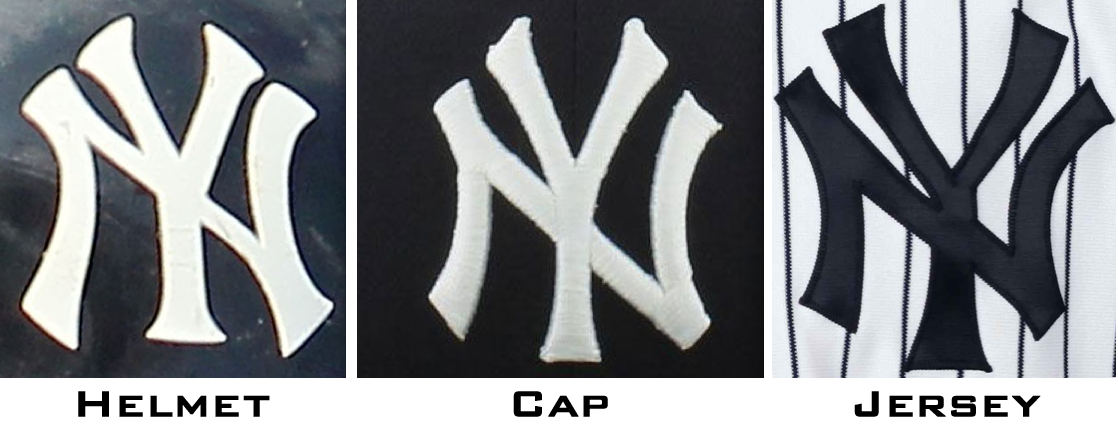
Let’s start today with something that most of you probably know already: The Yankees have some serious inconsistencies in their famed interlocking “NY” logo. As you can see above, there are three distinct versions of it — one each for the home jersey, the cap, and the batting helmet. The easiest way to see the differences is to look at the upper prongs of the Y, and also at the negative space outside of those prongs. (I wrote about this, and about several other MLB teams’ logo inconsistencies — some of which have since been standardized — in this 2014 ESPN column.)
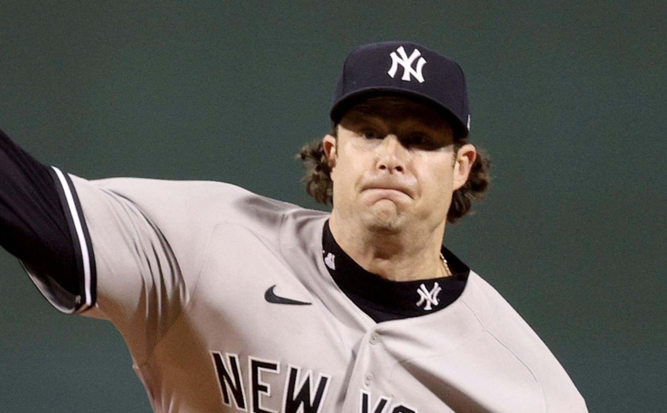
During last night’s American League Wild Card Game between the Yankees and Red Sox, Yanks starter Gerrit Cole was wearing one of those undershirts with the team logo on the mock-turtleneck collar. I’ve probably seen Yankees players wearing those a few jillion times during cold-weather games over the years, but last night for some reason it really jumped out at me that the “NY” on the collar was the jersey logo, and therefore it didn’t match Cole’s cap logo (for this and all subsequent photos in this section, you can click to enlarge):
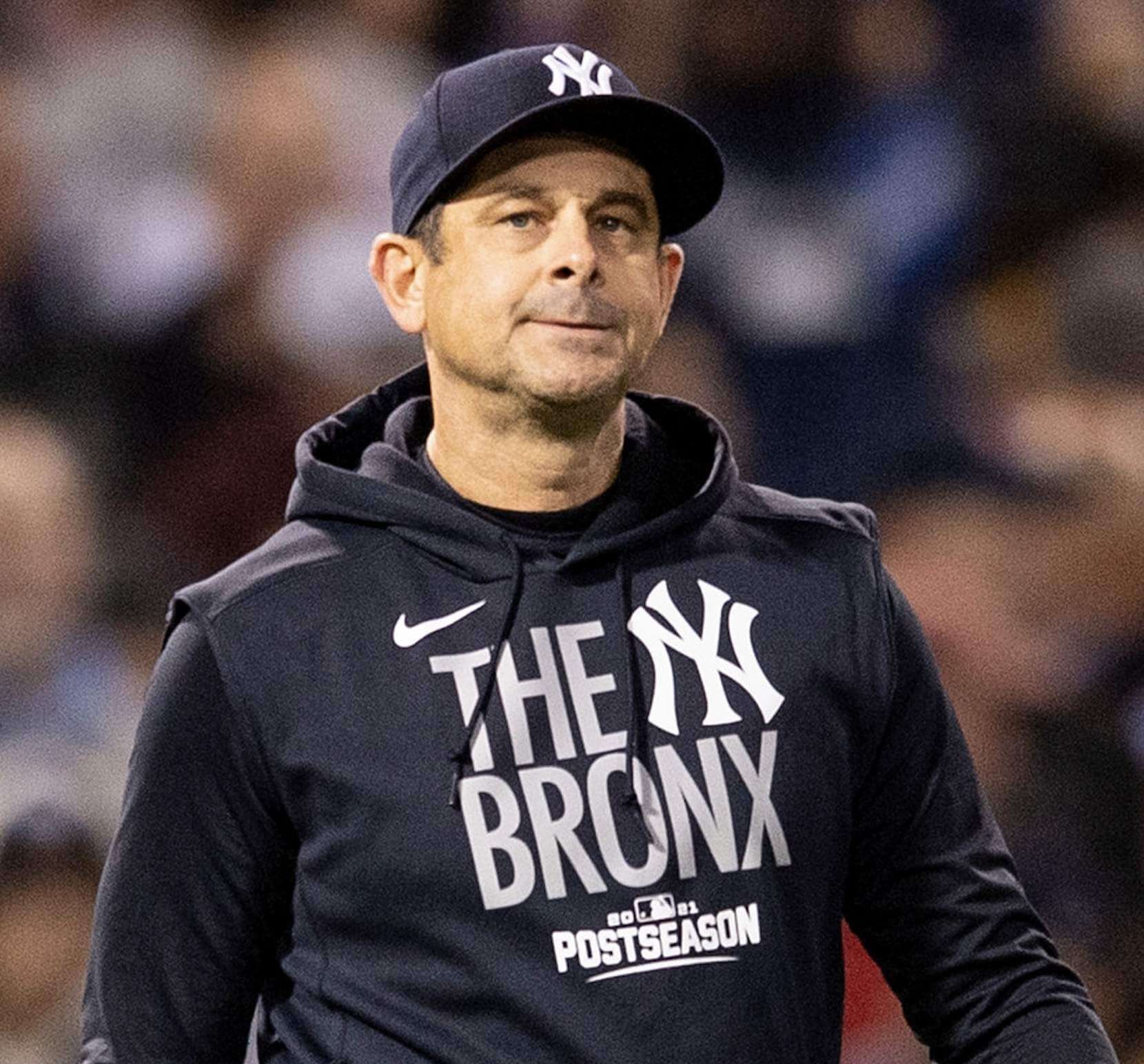
Shortly after that, I noticed that Yanks manager Aaron Boone was wearing the team’s postseason hoodie, and it had the helmet version of the “NY”:
That got me thinking: Boone, like many MLB managers, tends to wear a lot of hoodies, windbreakers, and other non-jersey tops. Which logo is used on those items?
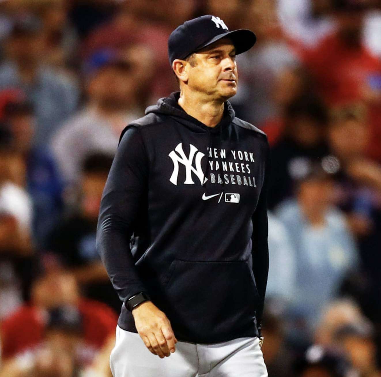
Some quick photo research reveals that Boone had two primary tops this season. The first was a “New York Yankees Baseball” hoodie with the helmet logo:
The other was a short-sleeved pullover with the jersey logo:
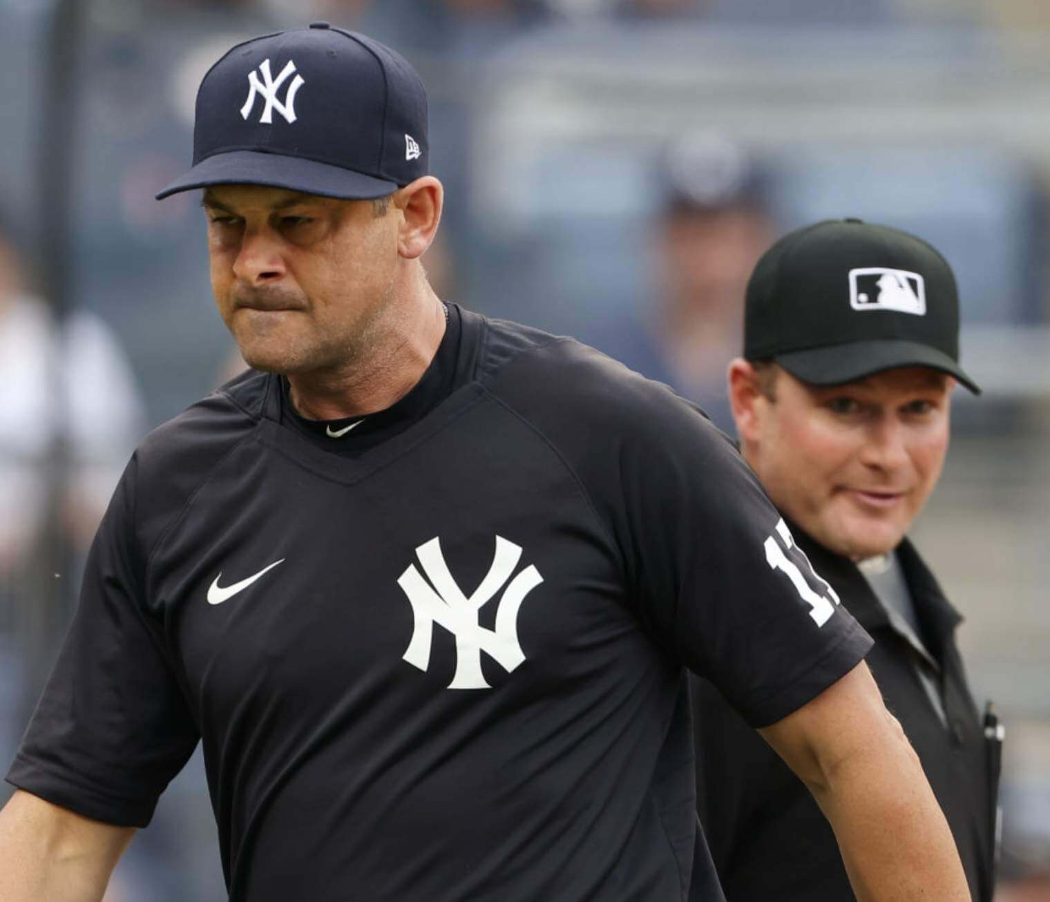
Boone appears to have worn those two items for the majority of this season’s games. But I also found a shot of him wearing a jacket with the jersey logo:
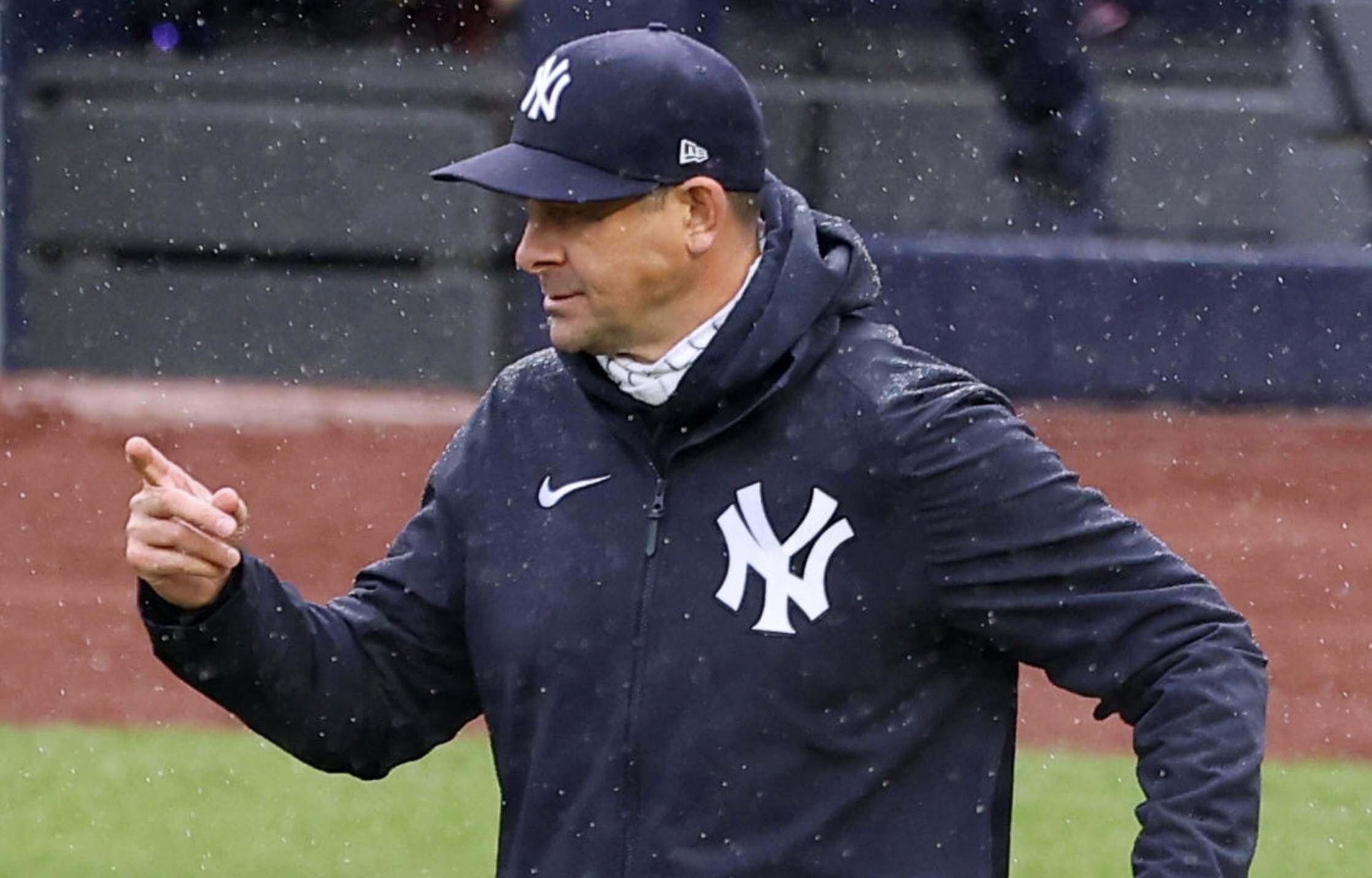
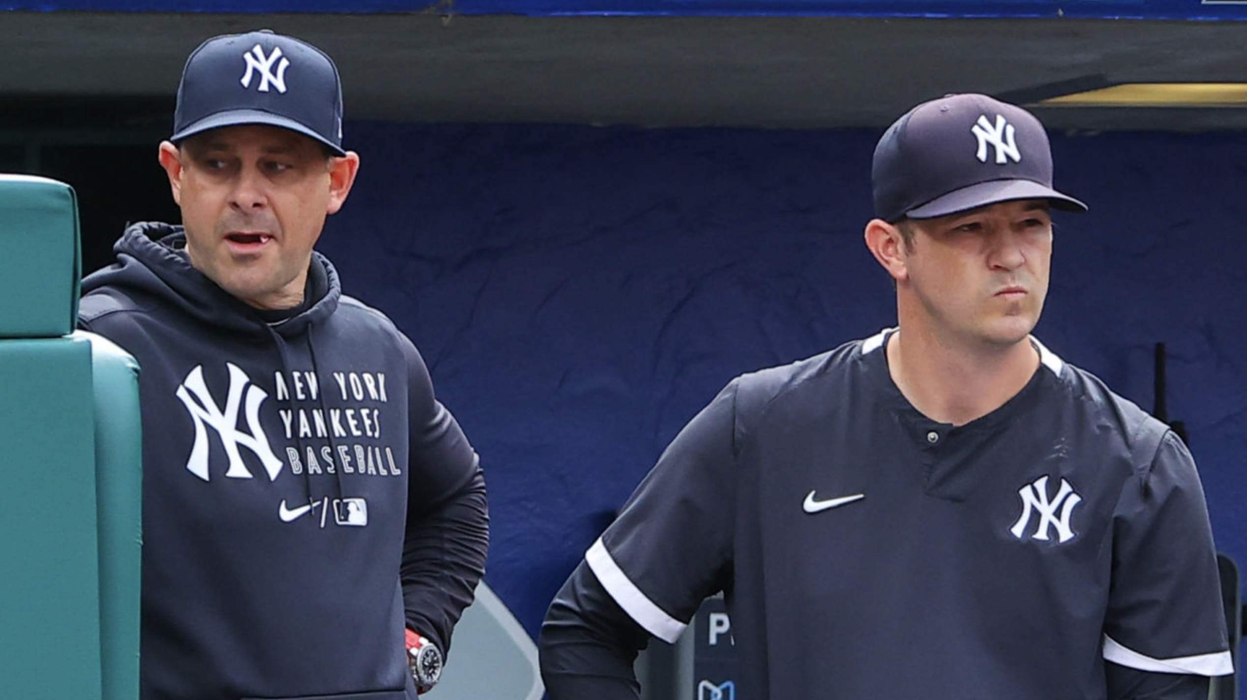
Now, you might be thinking (as I initially was), “The pullover and the jacket use the jersey logo because they both have the logo on the left chest area — just like on the team’s home jersey.” But no! Here’s a shot of Boone with pitching coach Matt Blake, who’s wearing a a different pullover with the helmet logo on the left chest area:
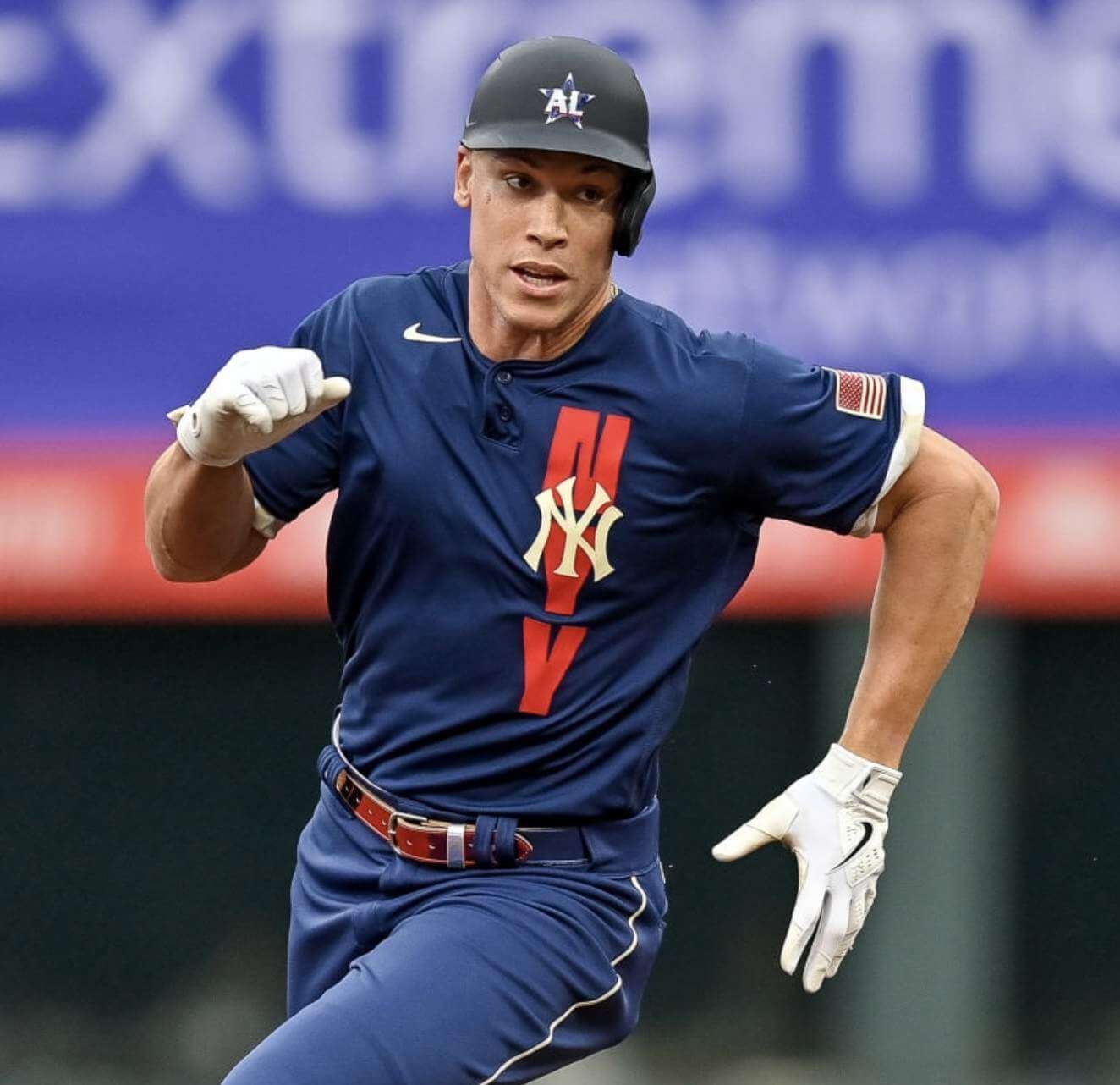
The best/worst anomaly is that they didn’t use the jersey logo on this year’s All-Star Game jersey! They used the helmet logo:
If you look at Yankees merchandise, it’s a mishmash. Most items appear to have the helmet logo, although some have the jersey logo.
Personally, I find all of this really fun and interesting — a few random glitches in the matrix. But it might bug the fuck out of me if I were a Yankees fan. For those of you who are Yankees fans, what do you think of all this?
Finally, just to make things more confusing, Yanks right fielder Aaron Judge wore the team’s “Field of Dreams” cap, which has yet another version of the “NY” logo, during pregame activities last night (along with a pullover featuring the helmet logo):
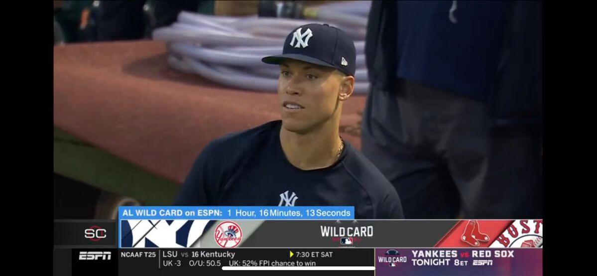
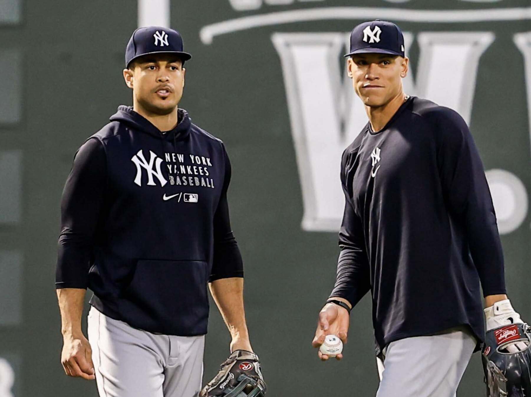
So the Yankees wore at least four different versions of their logo last night: cap, helmet, jersey (on Cole’s undershirt collar), and Field of Dreams. Crazy!
(Thanks to everyone who spotted Judge’s pregame cap.)
Click to enlarge
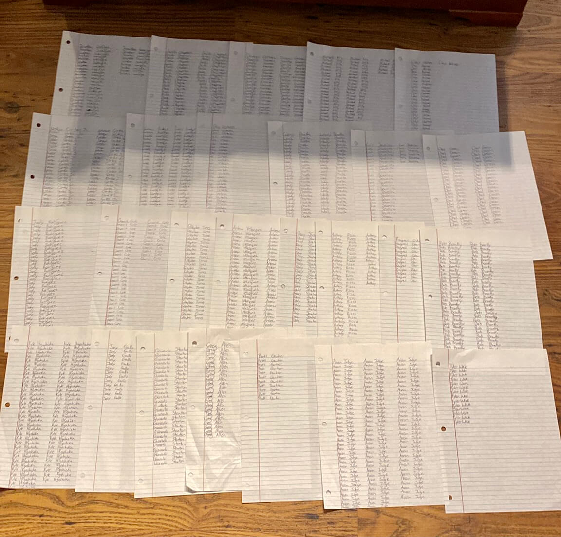
Oh. My. God. Twitter-er @Mister_Trey_, who’s a Yankees fan, tweeted the photo shown above last night, along with the following note: “Just finished my annual playoff superstition I’ve been doing since 2017: writing each player’s name on the roster as many times as their jersey number is.”
Now that’s a superstition — especially given that Aaron Judge wears No. 99! This is so great that I almost feel bad about the Yankees losing last night. (But not quite.)
(My thanks to Uni Watch webmaster John Ekdahl for this one.)
Click to enlarge
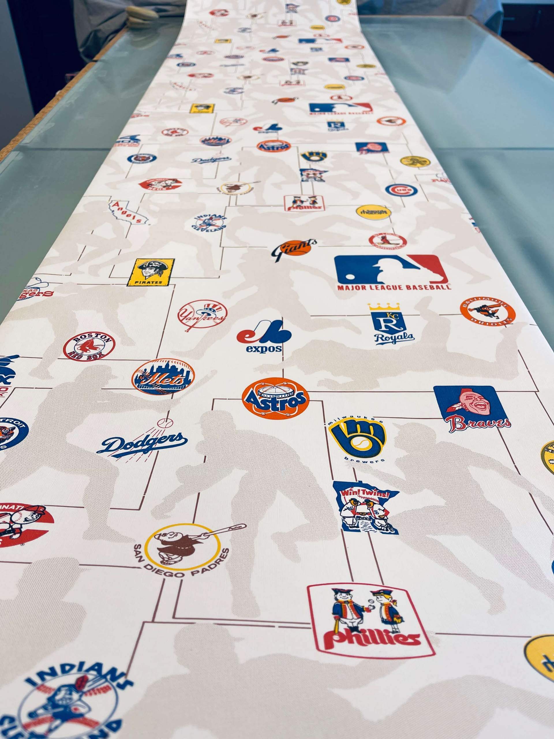
Home improvement: Reader Kenton Bontrager’s father was packing up some old housewares recently and came across this partial roll of vintage late-1970s MLB wallpaper. “It must be from between 1977 and ’79, because the Mariners’ logo is included and we moved into the house in July 1979,” says Kenton. “Twenty-five team logos are shown, but for some reason the Blue Jays aren’t included. It can’t be a Canadian licensing issue, because the Expos’ logo is there. I’ve never been able to figure out the absence of the Jays’ logo.”
The wallpaper is 20.5″ wide and 14′ long — not enough to paper a room, but still a cool conversation piece. “Amazingly it’s in very good condition after more than four decades in storage,” says Keton. Here’s a closer look:
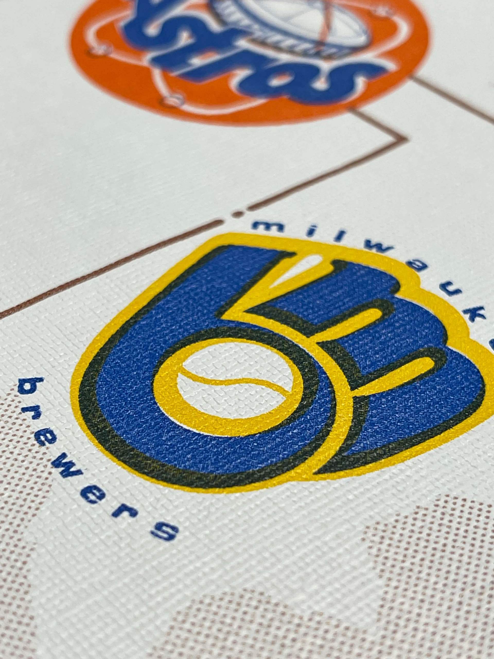
Kenton, who grew up with this wallpaper in his bedroom (“Believe me, I spent hours lying in bed staring at the logos!”), initially thought about selling the wallpaper on eBay, but then he thought that he’d prefer to see it go to someone in the Uni Watch comm-uni-ty. So he’s asked me to facilitate a blind auction: If you’re interested in the wallpaper, send an email with your bid to Kenton by next Tuesday, Oct. 12. Highest bid wins! (You can also use that email link to ask Kenton any questions you might have about the wallpaper.)
Just to clarify: I have no financial stake in any of this. Kenton isn’t paying me to run this promo, I’m not getting a percentage of the final sale price, nothing like that. I’m just doing this because (a) the wallpaper looks really awesome and (b) I love that Kenton wants it to end up with a Uni Watch reader. Can’t wait to see what the eventual winner does with it!
<
Click to enlarge
And then there were six: As of this morning, we were down to the last six pins for our October design. Get yours here while they last. Now sold out. Thanks!
The Ticker
By Lloyd Alaban

NFL/CFL News: Black jerseys for the Panthers this week. … Black over white this week for the Bengals (from our own Phil Hecken). … Also from Phil: Neon Color Rash for the Seahawks this Thursday. … Here’s the Titans’ record in every uniform they’ve ever worn (from Adam Fuqua). … The Edmonton Elks are the latest CFL team to wear orange shirts to raise awareness of atrocities committed in the Canadian Indian residential school system (from Phil again).
College Football News: Utah’s new alternate uniforms will debut this Saturday (from our own Phil Hecken). … Also from Phil: Lafayette will wear rear-helmet “95” decals to honor late DL Chris LaPietra. … Notre Dame and Oklahoma are battling over who owns the slogan “Play like a champion today.” … The Ohio State Uniform Database has a feature on the Buckeyes’ record in alternate uniforms over the years (from Kary Klismet).

Basketball News: A photo showing Warriors PF Draymond Green wearing a T-shirt with a brash pro-vaccine message was actually a digitally altered fake (from our own Phil Hecken). … Also from Phil: With Pau Gasol announcing his retirement, the Lakers plan to retire his No. 16 at some point this season, although they haven’t yet announced a date. … New advertiser for the Lakers’ practice jerseys. … The Knicks wore shirts with the team’s throwback logo last night (from @babyyodawaffles). … The Bulls released some photos of players’ lockers, and Nikola Vucevic’s jersey did not have a gold championship tab on the back (from Etienne Catalan).

Soccer News: New crest for the Italian national soccer team (from Trent Lowe). … Arsenal wore their yellow alternates this week. The kit was practically see-through, especially for D Kieran Tierney, whose black underwear showed through his shorts (from our own Phil Hecken). … Also from Phil: New pro-organ donation shirt for USL Championship side Lights FC.

Grab Bag: New unis for the LSU men’s volleyball club team (from our own Phil Hecken). … New seal for the U.S. Joint Chiefs of Staff (from multiple readers). … A Sikh Marine is now permitted to wear a turban in uniform (from Timmy Donahue). … Women soldiers will now be given a year after pregnancy to fit into their dress uniforms (from multiple readers). … Here’s how NASA paints the fairing on the Atlas V (from James Gilbert). … New 90th-anniversary logo for Berkeley College (from John Cerone). … Here’s a ranking of the top 10 flight attendant uniforms for 2021 (from Kary Klismet).
It’s incredible to me that so many ‘apparel’ items available use either the jersey or helmet version of the logo, because when I think of the Yankees logo, like what I consider the ‘definitive’ version of the logo, I always-always-always think of the cap logo.
I noticed several Yanks players in the bullpen and dugout wearing gray hoodies with what I thought was the cap logo – might have been the helmet. All told, the needless inconsistency in the NY logo is a main reason I regard the Yankees uniforms as not merely popularly overrated but actually pretty bad. There’s absolutely no defensible justification for 3 logos, and even the arguments for 2 are no better than mediocre. And the fact that the team uses all three logos in overlapping circumstances demonstrates the risible senselessness of maintaining a whole quiver of differing NY logos. Pick one – or more sensibly, design a new NY that maintains the best features of the cap and jersey versions – and just use it everywhere. That done, all the Yankees need to do is completely overhaul their road uniform and they’ll be an actually good-looking team, instead of a Twins-level crappily uniformed team that we all ignore because we’re so used to looking at them.
That said, even with their road uni being among the worst in MLB, the Yankees were the better-uniformed team last night. You can tell that the Sox have legibility problems with navy text on red when Nike makes its Mark of the Beast white on the very same jersey.
Check me on this, but with on field apparel like BP jerseys, jackets and warm-up shirts, I believe the Yankees wear the helmet logo on the road and the jersey logo at home.
The current cap logo debuted in the early-mid 1970s…before that the cap logo used was more like the current helmet logog.
If anyone thinks consistency would be better…be careful what you wish for. In Billy Crystal’s movie 61*, they used the jersey logo on the hats. Ruined the movie for me.
link
Check me on this, but with on field apparel like BP jerseys, jackets and warm-up shirts, I believe the Yankees wear the helmet logo on the road and the jersey logo at home.
Really? I’ve never heard that before (or if I have heard it, I forgot). And I’m not sure it’s true, based on my (admittedly quick) Aaron Boone photo research last night.
Home with white numbering:
link
Road with grey numbering:
link
Interesting!
But here’s Boone wearing the helmet logo at home:
link
That looks more like merch that made it on to the field. I doubt they make that in home and road versions. At least the BP jerseys do follow the protocol I mentioned and maybe other team issued stuff if someone wants to research.
30 year old lifelong Yankees fan here. I’ve noticed the difference since I was probably 8 or so and remember not being able to get a straight answer from any adults around me about it. I developed an appreciation for the differences when I got older and interested in graphic design, and different designs for different applications/scale. The helmet logo is my favorite. If they put that logo on the chest it would be jarring now, but I bet would’ve looked just fine if done long ago and that was burned into our minds instead. The Yankees overall are pretty plain, so it’s nice to at least have these difference to appreciate. The color palette for the Yankees’ primary logo is a whole other interesting topic.
I love the NY logo inconsistencies, and as a Tigers fan, wish they still had their two different D’s (for caps and jerseys). As I understand it, MLB dictated the change in 2018. If the Yankees are allowed to have different versions, the Tigers should be allowed, too.
Agreed. I am Tigers-neutral but the mismatched jersey and cap logos were a neat quirk. The jersey doesn’t look quite right.
MLB didn’t mandate it; but they preferred it, as did the Tigers. (I read this in the Freep at the time.) Basically, a single primary logo avoids the mess in the production of merch that today’s NYY story amply demonstrates. That being said, I too prefer the rounded D on the jersey and the pointy D on the hat.
Wondering if there is a correlation that could be established if you looked at the same merchandise / on field gear for other teams?
For instance, on the gear that uses the hat logo, does that same gear for other teams also use the hat logo? For the gear that uses the home jersey logo, do other teams use a non-cap logo on that gear?
If that is the case it would put my mind at ease, if it is just interlocking-NY confusion it would be frustrating.
Let the Yankees have their different logos, it’s perfectly fine. If you made it all the same it would look odd. Look at what the Tigers did – at one time they had THREE different Old English Ds (cap, jersey, and batting helmet), now they have one and it looks awful on the jersey.
Don’t all MLB teams have a style or brand guide? If the use of the differing logos is explained in such guide, it seems to me that the apparel producers aren’t reading it and the MLB logo police aren’t doing what they’re supposed to be doing.
Seattle in “Action” Green… “ReAction”? Hurl.
The wallpaper from Kenton Bontrager was the very wallpaper that I had in my bedroom in the metro Detroit area in the early 1980s. What a great memory!
On the Berkeley College logo – in Safari, the linked-to .png shows up as white-on-white.(Irrespective of Dark Mode)…but in Chrome it shows as white on gray.
Not sure how to address that other than to maybe link to the college homepage where it is placed on a blue background…
Also on the Yanks, and forgive me if this is something that has happened over time, but it stuck out to me last night. The space between NEW and YORK seems much tighter than from growing up and seeing these uniforms on baseball cards in the 80s.
Yes. Was tightened up around 2015-16-ish.
I wish the Bengals were wearing the “other” white pants with their black jerseys. The white pants that they pair with the white jersey have black stripes, instead of the white pants that have orange stripes with a black outline.
What would bug me more if I were a Yankees fan is the NOB sewn onto the replica jerseys. I never understood why they would add extra embroidery. That costs money and makes it look totally incorrect.
Real Yankee fans make fun of the people that wear those.
Surprised that you did not mention how the Knicks and (Football) Giants have used versions of the interlocking NY logo over the years.
I thought of the Knicks, but don’t the football Giants use the small case “ny” side by side? Not counting done old picture of some player or manager who happened to be wearing a Yankees hat or jacket.
THAT WALLPAPER! I had that on one of the walls in my bedroom growing up (it was expensive so my parents put something else on the other walls) and I haven’t seen it since they moved out of that house 20 years ago. I’ve searched online for it in the past to no avail, and my heart skipped a beat when I saw it here on UniWatch today. I also spent many hours studying those logos (I’m sure it’s where my knack for Getting It was born, and I also wondered what the deal was with the Blue Jays being omitted.
Wow, just wow. Thanks for this surprising trip down memory lane!
On the Arsenal “see through” kit, I suspect the fact that the entire game was played in drenching rain had something to do with it. Those kits were completely saturated. Of course, that’s not an unusual situation in English football.
I also love the Yankees’ inconsistencies with the logo. One of those charming historical uniform quirks that endures in an age of computer generated specifics and exactness. I hope they never go the Tigers route.
The Red Sox also had a different variation of their “B” logo on their batting helmets for quite awhile. I recall it looking quite different from the one on their caps. I think they standardized everything in 2010.
The Yankees and the Cowboys both have massive inconsistencies within their uniforms. Part of that may be a function of the fact that they are very rarely changed, another could be that these are marquee heritage teams and they are resistant to change. Do the other major legacy teams in other sports have these types of inconsistencies. I’m thinking like the Celtics, Lakers, Canadiens, Red Wings, Notre Dame, Alabama, etc.?
or is this just a Yankees/Cowboys thing?
I’m not sure if this counts, but doesn’t Alabama use a different number font on the helmets than the jerseys?
Number of things,….
1. The “Field of dreams”. NY is trying to be a Ruth era logo
2. Looks like Boone has removed the sleeves of his hoodie
3. No one wears the so-called “batting practice” jersey.From here on out we should just call them “spring training” jerseys.
4.I really really miss the traditional Tigers jersey
Huge downgrade on the Italy badge
The badge is only for the federation itself and will not appear on any kits. I still agree, not the nicest looking of logos.
That’s good, suppose I should have read a bit more
While that Yankee’s fan superstition is amazing… considering they haven’t even gone past the ALCS since they started their habit, perhaps one should suggest that it’s not quite having the desired effect?
What I want to know about the Yankee’s fan superstition is if last year he had a blank sheet of paper for Ottavino.
G-E-N-I-U-S!
That question was asked. Blank sheet indeed.
In the twitter link for the Seachickens Action Green (yuk) announcement, there’s the following link asking the question who has the best logo in the NFL
link
Best answer I saw was “Washington Football Team”. LOL!
The Brewers introduced the ball-in-glove in 1978, so Kenton’s wallpaper must be from 1978 or 1979.
RE: Yankees
Are all three versions trademarked?
I’m thinking Mister_Trey may have an OCD issue that needs to be diagnosed. However, he’s no match for David Wimp.
link
Any reasons given by the Yankees for why this is, or why they haven’t standardized on one “NY”?
Right there in the ESPN article I linked to, Rick.
It looks like the Yanks’ AAA Scranton Wilkes-Barre Railriders wear the helmet version on their sleeve.
link
Regarding the Sikh Marine – in this case the “M” in Marine is capitalized
Fixed.
For some reason I can’t stand the helmet logo, however the jersey logo is perfect. I feel like the helmet logo is too skinny. I realized recently that the cap logo is supposed to be the same as helmet logo, but it just looks cleaner without the serifs I guess.
I’m with you when it comes to the helmet logo, Mikhail! I’m disappointed that’s the one they seem to have made primary for print & screen use, too. It’s easily the most inelegant of the three, from a formal design perspective. It feels somewhat overwrought, too, with extra bulges and weight thrown at the ends of the strokes, like they’re *trying* to puff themselves up. In that sense it’s very garishly Steinbrenner, which I suppose makes sense. One could anthropomorphize it into a guy squeezed into a three-piece suit, waist pulled high, chest swollen with forced pride, like some old political cartoon. Some would say that suits the Yanks, but I think the team’s erstwhile “winning tradition” deserves better.
I strongly prefer the other two logos. The cap is nice and restrained, and the jersey emblem has a nice circularity to it. I do recognize that the cap logo on the helmet might look funny, with its blunted terminals, which seem like an artifact of the embroidery process. But I bet it could be adapted for print with much more class than the current helmet logo.
For some reason I can’t stand the helmet logo, however the jersey logo is perfect. I feel like the helmet logo is too skinny. I realized recently that the cap logo is supposed to be the same as helmet logo, but it just looks cleaner without the serifs I guess.
That logo for the FIGC (Italia) is the institution itself (the bureaucracy behind the team). The crest on the kits is remaining as/is.
link
Today’s Yank’s jersey logo is similar to the 1920’s and early ’30’s cap logo though, like it’s an homage to that era.
link
link
I think the current jersey logo came about in 1946 and my sense is it was an attempt to modernize the logo used up until then. IMO, it is a bit cartoonish if you take all the tradition and history out of consideration. If I look at the 3 current logos on pure design aesthetics, the cap logo looks best to me. That said, I would just as soon keep it the way it is.
The worst thing about the Yankee home uniform to me is the raglan sleeves. I don’t like them with pinstripes. They should look like this:
link
The wallpaper reminds me of my bed sheets as a kid…early 70s
link