Click to enlarge
Okay, so we all know that I really dislike ads on uniforms. But even if you have no problem with uni ads, the events that unfolded yesterday were pretty weird.
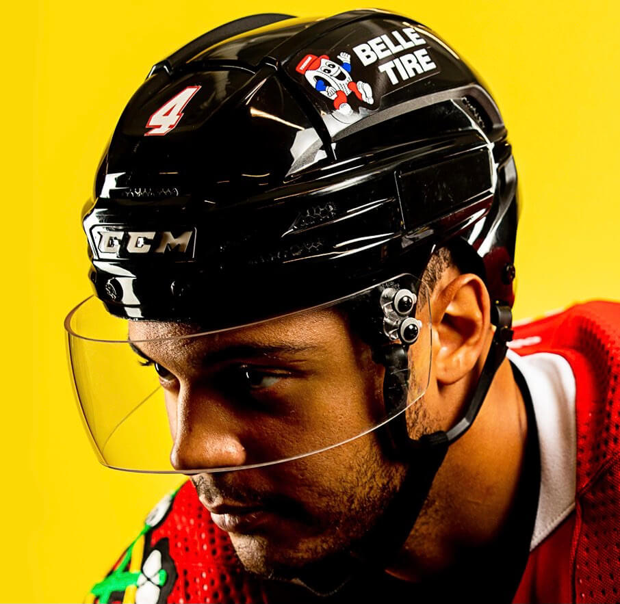
First, the Chicago NHL team announced a new helmet advertiser (describing the company initially as a “sponsor” and then as a “partner” — the usual Orwellian linguistic gymnastics). As many fans quickly noted, it’s one thing to wear a company’s logo on your uniform, but it’s another to wear the company’s cartoon mascot character. This will be the second season of NHL helmet ads, plus we’ve had NBA uni ads since 2017 and occasional MLB uni ads, but I don’t think any of those ads have included a cartoon mascot character, so this appears to be a Big Four first. (Are there any previous instances I’m overlooking..?)
Now, I happen to be a big fan of cartoon mascot characters — for teams, for corporations, for for your local power utility, whatever — especially when they involve anthropomorphized inanimate objects. And I particularly like the character used by Chicago’s new helmet advertiser — he looks happy, friendly, helpful. The uni-verse could use more characters like him! Just not as part of a uni ad.
But wait, it gets weirder. Shortly after the new helmet ad was announced, beat writer Scott Powers, who covers the team for The Athletic, reported that the team had erected a series of “massive helmet replicas” at its practice facility, which is also used by local high schools, beer leagues, and public skaters. He shared a photo of one such helmet (click to enlarge):
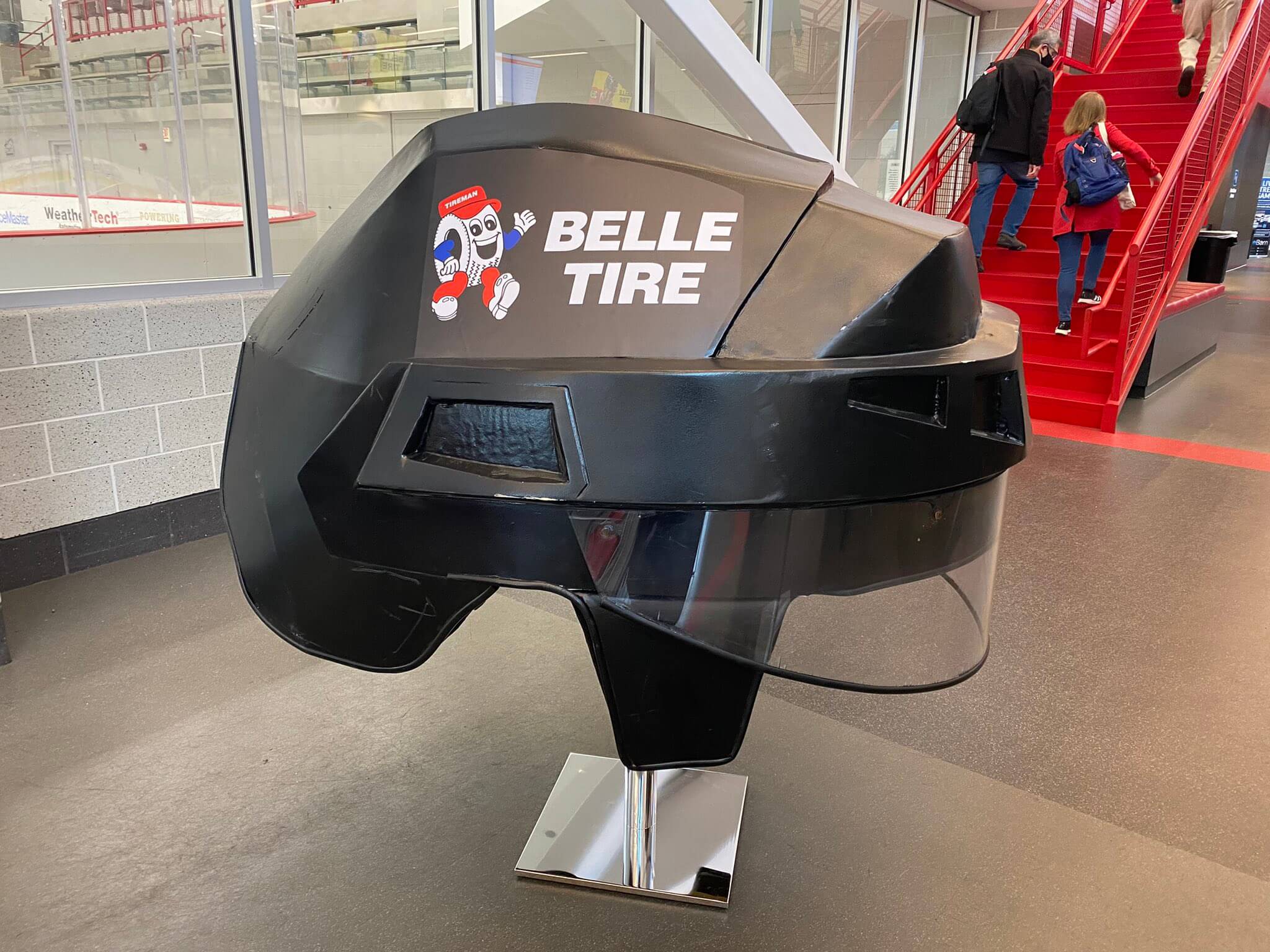
How weird is this? Let us count the ways:
1. I’m all in favor of oversized representations of uniform elements, but only if they’re good representations. This looks like something between a bad parade float and a bad junior high craft project put together with electrical tape. Like, at least make the helmet glossy.
2. The ad looks slapped-on (literally) and has been applied pretty sloppily, with several puckers.
3. The helmet appears to have some scratches and maybe even a crack:
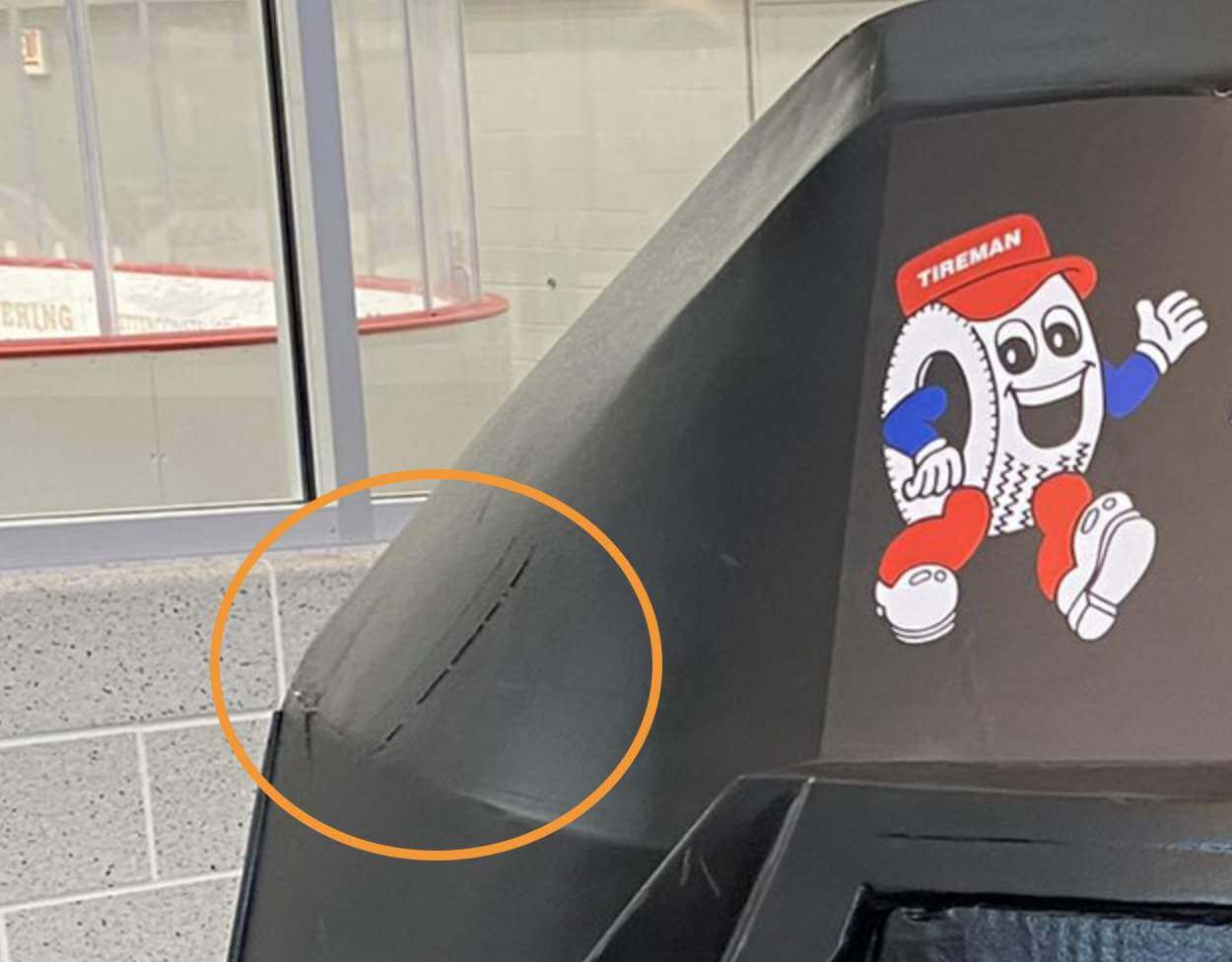
4. Now that I can get a closer look at the cartoon character, I see that he has five fingers. That is completely unacceptable, because we all know that cartoon characters, especially those wearing white kid gloves, must have four fingers because that is just how these things work and don’t try to tell me otherwise, the end. Don’t believe me? Check this out — there’s also a live/costumed version of this character, and he has four fingers, as the cartoon gods intended:
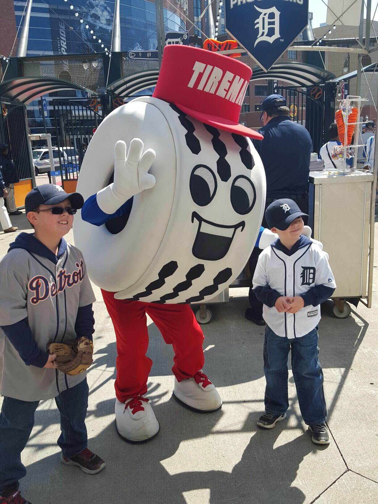
So the real-life representation of the cartoon character is more cartoon-like than the actual cartoon!
5. Isn’t it weird that a character based on a car tire would be white, instead of black? And it’s not just because the character is appearing on a black helmet — he’s always white! Strange.
Anyway: Uni ads are gross, giant ads at public skating rinks are gross, blah-blah-blah, but everything surrounding this one is just bizarre. Welcome to our brave new ad-driven uni world!
Speaking of which: As you probably know, NHL teams can have jersey ads — not just helmet ads — starting next season. This morning the Capitals became the first team to announce who their advertiser will be — and it’s a sportsbook. Sigh.
ITEM! New “Question Time” “Ask Me Anything” Bulletin article: It’s been about a year and a half since the last installment of “Question Time” (the series where I answer reader-submitted questions). Going forward, that segment will appear on Bulletin and will be called “Ask Me Anything.” The new segment is up today.
Those of you who’ve subscribed to receive my Bulletin content via email should already be seeing this piece in your in-boxes. Everyone else can read it on my Bulletin page. Enjoy!
Also: If you use an RSS reader, like Feedly or Inoreader, you can now subscribe to my Bulletin content via RSS. Just plug “https://paullukas.bulletin.com/rss” into your reader and you should be good to go.
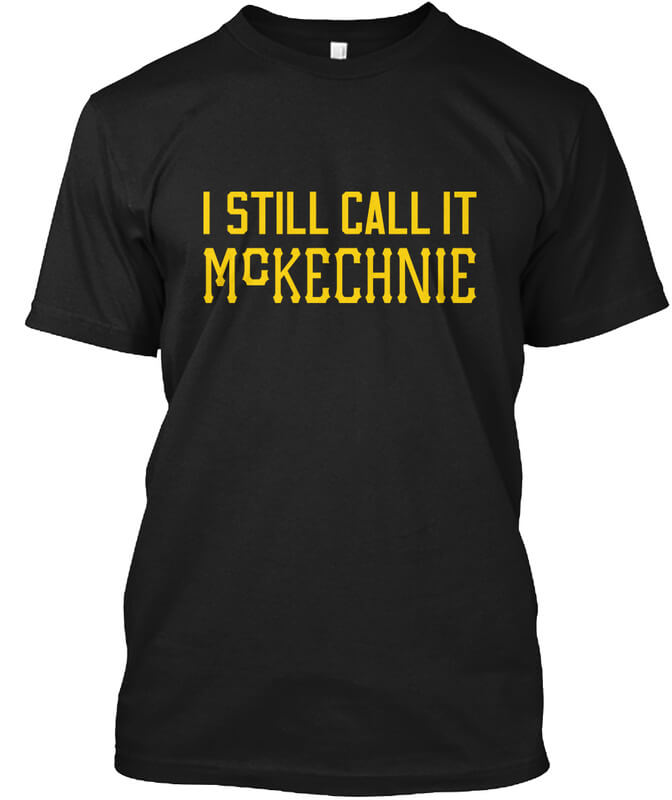
ITEM! Naming Wrongs update: It’s been ages since we had a new Naming Wrong shirt. We don’t normally do them for MLB spring training facilities, but reader James Kushner recently asked us to do one for McKechnie Field in Florida, the Pirates’ spring home, which has had an annoying corporate-advertised name since 2018, so we went ahead and made one for him. (He bought four of them for his family!)
This shirt is available here, and you can see the rest of the Naming Wrongs collection here. And as always, if you have requests for new Naming Wrongs designs, my door (or at least my in-box) is always open. Thanks.
The Ticker
By Anthony Emerson

Baseball News: MLB will allow the Red Sox to wear their City Connect uniforms into the postseason, if they qualify. The Boston Globe also has an article on the effect the superstitious Sox players think they get from the unis (from @mattyp763 and Bryan Person respectively). … During last night’s Brewers/Cardinals game, umpires made Brewers P Jake Cousins change the light-tan/grey glove he’s been using all season and replace it with a black one (from @shwrth). … Twins OF Byron Buxton’s helmet decal was askew during last night’s game (from multiple readers). … ABC’s reboot of The Wonder Years has lots of very good-looking period-appropriate Little League uniforms.
College Football News: The Air Force Academy sells game-worn jerseys for $99. While browsing the collection, reader Shawn Dzwonkowski noticed this jersey from the mid-’90s, which seems to have had a patch removed from the right side. Note the central location of the Reebok maker’s mark, too. … LB Dean Ferguson will wear Frank Beamer’s No. 25 for Virginia Tech this weekend (from Andrew Cosentino). … Here are this weekend’s uniforms for Wisconsin, Virginia Tech, Purdue in Drew Brees-era throwbacks, Wake Forest, Florida, Louisville, Mizzou, Utah State, Tennessee, and Oregon (thanks to all who shared).

Hockey News: The Rangers have a number of events planned to honor the late Rod Gilbert, including wearing memorial patches all season and the whole team wearing No. 7 jerseys during pregame activities for the Oct. 14 home opener (from @uniformnerd). … Some hot new pads for Flames G Adam Werner (from Wade Heidt).

Basketball News: The Undefeated has a retrospective on signature sneakers in the WNBA (from K.C. Kless). … Gorgeous new unis for Marshall women (from M. Brinston Berry).

Soccer News: If you go to the 1:12 mark of this video, you can see Partick Thistle player London Pollard going NNOB while the rest of her teammates all have NOBs. What’s stranger is that this wasn’t a spare jersey — according to Partick Thistle’s website, Pollard wears No. 23 (from Graham Clayton). … The Columbus Eagles, a team joining the WPSL in 2022, have unveiled their kits (from Ed Żelaski).

Grab Bag: The Canadian Imperial Bank of Commerce (CIBC) is getting a new logo (from Wade Heidt). … Lululemon will be the new opening and closing ceremony outfitter for the Canadian Olympic Team, starting in February in Beijing (from multiple readers). … Here’s a fascinating story about how a perfectly preserved World War II Royal Air Force uniform was found wrapped in an old newspaper during a house cleaning in Staffordshire, England (from Kary Klismet).
That’s a wrap for this week. I have big weekend plans — a New Jersey pig roast on Saturday and upstate studio art and public art on Sunday. Whatever you have planned for your weekend, I hope it’s a good one. See you back here for MMUW on Monday. — Paul
It’s also odd that there are no Belle Tire stores in Chicago. The nearest location is in NW Indiana. Maybe they are looking to enter the local market, but there are currently no locations around?
The team’s announcement (second link in second paragraph of today’s post) says they’re planning a major Chi-area expansion.
I thought the same thing. I used to live in Detroit and other parts of Michigan and Belle Tire is decidedly a Michigan company. It started in Detroit and advertised heavily on Tigers and Red Wings broadcasts. Odd that they’d sponsor a team that is arguably Detroit’s greatest hockey rival (at least until they moved to the Eastern Conference).
Even more weird, the Tireman wasn’t part of Belle Tire to begin with; when Belle Tire purchased the Tireman chain of auto shops, they integrated the cartoon into their branding.
Oh, wow — that’s an interesting historical wrinkle!
Bonus fun fact: There is a Tireman Avenue in Detroit and Dearborn, Michigan.
Just chiming in before reading comments, since watching the Sunday night Chiefs/Ravens game anyone know why the ‘MO’ is hi-lighted in BaltiMOre’s end zone?
link
A couple questions about Jake Cousins’ tan glove:
1. Why is the number on it 44 when his jersey number’s 54?
2. I wonder why he designed it using a mirrored four?
3. Anyone else thinks it looks like a suspension bridge (right-side up)?
The “44” with the mirrored numeral is the maker’s mark:
link
44 Pro is a brand.
Oh FFS. I feel dumb, but in my defense, that’s a confusing logo!!
What’s stranger is that this wasn’t a spare jersey — according to Partick Thistle’s website, Pollard wears No. 23
This is a bizarre coincidence, but I watched link and they were all NNOB. So it’s the NOBs that are new and weird.
It must have been difficult deciding on the lede for this story. To me, it’s the finger count discrepancy. That’s what Uni Watching is all about. On the other hand, that legitimizes uni ads as a watchable element of the uni. Regardless, very good post.
Great little league uni’s but the player wearing #3 in blue appears to have a feauxhawk or some other type of haircut not associated with that era. Swing and a miss by the shows casting department?
In the Simpson’s lore, only God has 5 fingers.
I am pretty sure there was also one time where Marge and Homer thought they might actually be related, and the joke was their kids would be some kind of strange mutants, which they imagined as caucasian skin colored, five fingered, and far more human looking than Simpsons are drawn.
So apparently God and inbred mutants have five fingers in the Simpsons’ world.
Are you suggesting the tire guy is God?
If I recall didn’t the Penguins end up changing the PPG logo on their black helmets during the course of last season? It was originally blue (which looked silly on the black and yellow uniforms) but then the blue was removed.
Hope the Blackhawks and Belle Tire might consider doing the same when they realize how ridiculous a cartoon smiling tire looks on professional hockey helmet. Just Belle Tire wordmark would be better and sufficient.
I agree that the blue ad looked horrible, but I also found a sort of neat irony in it, since I believe the Penguins are the only Big 4 sports team to ever wear blue, black, and yellow as part of their uniform.
Regarding the large helmet display, the scratches or cracks are likely due to this helmet display being a 3D printed part. I am guessing the display is from a makerbot or similar rapid prototyping system. Whoever did the finishing work (filling in the gaps, sanding it smooth and painting it) on the helmet did a pretty poor job. The overall appearance of the display look a little blobby, and it doesn’t surprise me that cracks are already showing up.
Bibendum (aka The Michelin Man) is also white.
But he’s not literally a tire!
Isn’t he a stack of tires?
I guess. But there’s no tread or anything like that. He seems more blob-y than tire-y, at least to me. But the Belle character is truly a tire!
He is a stack of tires that is anthropomorphized. According to the history of him, he is white because way back when tires were gray/white as that is the natural color of rubber, and only when they added carbon black as a stabilization agent to tires did they turn black.
I think someone from Michelin once mentioned they’d made a black version of Bibendum but it didn’t appear as well on the page with the techniques of the 1920s and 1930s so they just stuck with the white version. Just wikipedia’d it and they confirm. link
(halfway through the 4th paragraph, which begins “From 1912 on”)
link
Tires weren’t colored black until 1912, thus, Bibendum is white.
Prior to 1912, tires were either grey-white or had a light translucent beige hue. Carbon was subsequently added to the rubber formula as a preservative and a strengthener.
The biggest problem I have with the Belle Tire ad is the blatant racism of the tire being white.
Michelin has had the same problem for years with the Michelin Man being white even though tires are black.
It’s unbelievable and infuriating this racism is allowed to continue unchecked. The Chicago NHL team has enough problems in this area it is surprising they would do this.
Is it really racist? I mean, White people don’t have literally white skin, like these white logos, and Black people don’t have literally Black skin. Wouldn’t a black-colored anthropomorphized character look like a blackface racist caricature? I’d think that would lead to the opposite problem.
Stan was either joking, trolling, or assuming. No need to go down any of those roads. Let’s please nip this one in the bud and move on. Thanks.
“Okay, so we all know that I really dislike ads on uniforms.”
Really?? I’ve have NEVER guessed that. ; )
Am I a terrible Pirate fan for not even realizing McKechnie Field had a sponsor now for a few years now?!
No, I’ve seen your Jeopardy tweets, Kubby.
Ha!
Tires were white (the natural color of rubber) before the introduction of carbon black as a strengthening agent. Don’t know when Belle tire guy was introduced, but maybe tires were still often white or the artist was nostalgic.
Is this an origin of the later use of “whitewall” decoration to make tires look classier or more high-end? I can’t recall the last time I’ve seen a recent-model car with whitewall tires, but midcentury up until the 1970s, people would pay extra to have white-sided tires. You still see them pretty regularly on classic/vintage cars.
I had whitewall pirellis as an option on my VW in the 1990s. I also had the option to turn the white stripes inwards so that they were hidden. I took that option.
Minor interesting detail about the Rangers wearing Gilbert’s #7 for warm-ups. They will be wearing the white jersey at home, as was standard during Gilbert’s time on the Rangers. It’ll look interesting with two teams warming up in white.
And maybe I’m in the minority here, but I actually like the little anthropomorphic tire guy. I hate to see adds on hockey uniforms, but he’s kinda cool looking.
“It’ll look interesting with two teams warming up in white.”
It is different. Rangers may wear their blue socks with white warm-ups. Recently in 2019-2020 we saw the Canucks on two occasions wear white warm-up jerseys with their opponents in white.
link
link
I lived in the ATL for a decade and grew up going to games there. Atlanta is semi-obsessed with “rising from the ashes” motifs. The city motto is “Resurgens” (Latin for rising again, like the Phoenix) and there is Phoenix imagery to accompany it. That said, I did not know the Flames were named in reference to all that but it makes sense.
The Belle Tire logo made me revisit something that I found incredibly weird/a bit sad when I moved to the midwest for college.
I grew up in Boston where if you played hockey, it was probably for your town/neighborhood team (every neighborhood in Boston has a public rink), and if you were really good you maybe played for one of the more elite teams which were often sponsored by a local college team (Jr. Eagles, Jr. Terriers, Jr. Holy Cross, etc)
But when I started playing intramurals at Michigan, many of my teammates and friends reeled off the names of the teams they played for growing up, and instead of a neighborhood or college, it was a company. Belle Tire, Compuware, Victory Honda, Little Caesars, Honeybaked Hams.
I don’t have a huge thesis on this, and in truth it felt like the names of these teams were so ingrained into Michigan youth hockey that people barely even thought of the sponsors’ products, but it still felt a bit sad that kids grew up skating as billboards for companies from the time they were mites (talk about hyper normalization).
Now the blackhawks will be suiting up with the tire on their helmet, just like the profe…kids.
It’s not only that, it’s the stratification in youth hockey. You’ll have your house leagues, and each local association will have a travel (or select) team, similar to what you’re saying. Here in Michigan, you also have the elite teams (usually identified by the sponsoring business – Jimmy John’s is another one) that are recruited (or not, depending on how much money the parents are willing to fork over).
In most states, that ends when a player reaches high school, and everyone joins their high school team (and plenty of private schools recruit the top players) for four years. Not the case in Michigan; the other leagues continue through junior ranks, and it can decimate the HS programs. Minnesota has a week of sellouts at the NHL rink for the high school championships, while Michigan can barely scare up a few hundred fans on one Saturday.
Back when I was playing as a kid (mid 1970’s to early 80’s), the teams I played for were Pipe Trades (and then the 3 numbers of the union), IGP (Industrial Grain Products) as ‘Atom’ and ‘Pee Wee’ age.
League was Westfort (a part of the city). Elks and another leagues or two predated this one. Played some games on outdoor rinks earlier on due to older leagues getting first crack at the indoor ice times.
When I played bantam it was for the Maroons, which I think had teams for bantam and midget ages. Think the names were more long lasting for the fewer teams that existed at that age group.
Asa a cartoonist, I can tell you it’s hard to draw all those fingers in small size, so most of us leave one out. On the other hand, it’s hard for a cartoon character to give us the finger (as a helmet ad essentially does) unless you include them all.
In my college comic strip, I drew a week’s worth of comics in which two of the characters woke up after a weekend bender to find themselves married. I agonized over which of the 3 fingers/1 thumb to put the wedding rings on.
On the other hand…
I see what you did there.
When I did a weekly comic strip in college, I tried mightily to avoid having to specifically illustrate the number of fingers. I recall a couple of strips where the characters looked like they were doing jazz hands, since I needed them to gesture but I kept drawing splayed hands. (I was not a good cartoonist.)
Anyway, I hope Ron will tell us which finger he settled on for the ring! I’m hoping for middle of three.
5 fingers. I’m dying. Great observation. Well played.
Regarding the discussion of critics who you enjoy in the AMA… I highly recommend the book “Shit, Actually” by Lindy West, a look back at popular movies from 20-30 years ago, all ranked by how many DVDs of “The Fugitive” it’s worth. Hilarious and insightful.
Two examples of why Paul’s writing style and observations are great (not necessarily in that order):
“Now that I can get a closer look at the cartoon character, I see that he has five fingers. That is completely unacceptable, because we all know that cartoon characters, especially those wearing white kid gloves, must have four fingers because that is just how these things work and don’t try to tell me otherwise, the end.”
And:
“So the real-life representation of the cartoon character is more cartoon-like than the actual cartoon!”
LO freaking L!
I read where teams that have gambling ads will not have an ad on the away jersey because gambling isn’t legal everywhere. So at least there’s that.
Would you ever consider a naming wrongs shirt for a team name?
I don’t know what demand there is for something like this and this could potentially open the door for some horrible ideas but I ask as a fan of the current team name for the Washington Football Team.
Naming Wrongs’ mission is to protest the sale of stadium and arena names to corporate interests. I think we’ll stick to that.
I used to attend spring training games at McKechnie on the cheap. Now the name is corporate and dang the tix are expensive. It’s supposed to be spring training!! Get off my lawn
With the discussion of the Belle Tire character’s finger discrepancies and white coloring having been fairly well covered at this point, I’m going to turn to the elephant/giant tire mascot in the room and mention how utterly awful this specific ad looks on the Blackhawks’ helmet. I haven’t seen how it looks against the full uniform yet, but I am confident in saying that this cartoon tire character is going to be a major distraction away from the rest of the visual elements of the team’s uniforms. Talk about willfully diluting your own brand! Sheesh! Of course, considering the subject matter of the team’s visuals, some might say that’s not a bad thing…
In any event, I realize this is an entirely expected development with the creep of uniform ads into major North American professional sports leagues. Nonetheless, this ad is a particularly jarring example of just how insidious the phenomenon is. Yuck! #nouniads
Agreed. I guess I could have been more explicit about that, but that’s what I meant when I said it was weird and unprecedented for the uni ad to include a mascot character. Really conflicts with the team brand, even more so than a typical uni ad does.
“I guess I could have been more explicit about that, but that’s what I meant when I said it was weird and unprecedented for the uni ad to include a mascot character.
I took that point implicitly from what you wrote. I just felt compelled to make it more explicit in my rant. :^)
That helmet is almost certainly the same helmet the Art Institute of Chicago lions wore during the Stanley Cup Final a few years ago.
link
I wonder where they’ve been storing them
Ah, interesting. Good call!
“That helmet is almost certainly the same helmet the Art Institute of Chicago lions wore during the Stanley Cup Final a few years ago.”
So the Blackhawks took a piece of artwork made for them by a local artist as a gesture of goodwill and community support during a sporting event that helped bring the city together and polluted it by plastering ads with a goofy-looking cartoon mascot all over it? That makes it even grosser than I already thought it was! The team ownership really has sold its soul for a few pieces of silver.
I hope the Blackhawks at least got the approval of the artist, Edward L. Kerneys, before defacing his work. Why do I have a feeling they didn’t?
Edward Kemys is the artist who created the lions, not the helmets.
For what its worth, I think its funny that the article misspelled Kemys as Kernys because of bad kerning. Or keming I guess.
You’re right! My bad for not reading that story more closely.
Re: Ideas for possible NY Mets City Connect uniform, as asked about in the Bulletin Q and A. I think it should be 1964 World’s Fair/Unisphere-related. An update to this jersey:
link
It may not be baseball-related (but it looks like a baseball!), and the Unisphere is almost-right next to Still-Calling-It-Shea and is something that can’t be claimed by the Yankees/Giants/Dodgers.
Great idea, Rob. If you have a FB account, feel free to post that as a comment on the Bulletin piece.
Glad you like the idea! I don’t have Fb, sorry. But thanks for asking!
“Being woven into the Washington Capitals jersey is an exciting chapter in our collective story,” said Chris Holdren Co-President of Caesars Digital. “Like Monumental Sports & Entertainment, we love blazing trails and we are always looking for innovative opportunities that drive engagement and storytelling for fans. We are proud to extend our historic partnership with such a storied franchise after launching the sportsbook at Capital One Arena.”
I will now start projectile vomiting in 3 … 2 … 1.
Would it have been better if the logo was wearing a hockey helmet and carrying a stick? This is the best I could find: link