By Phil Hecken & the SMUW Crew
Follow @PhilHecken
Good Sunday morning, Uni Watchers. Hope everyone had a good Saturday and a good weekend thus far.
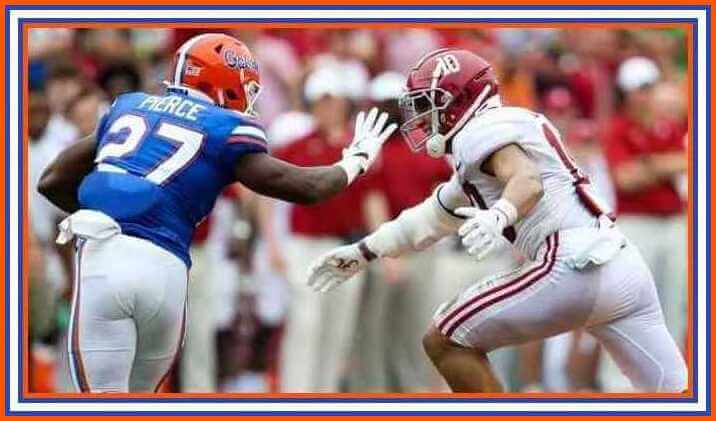
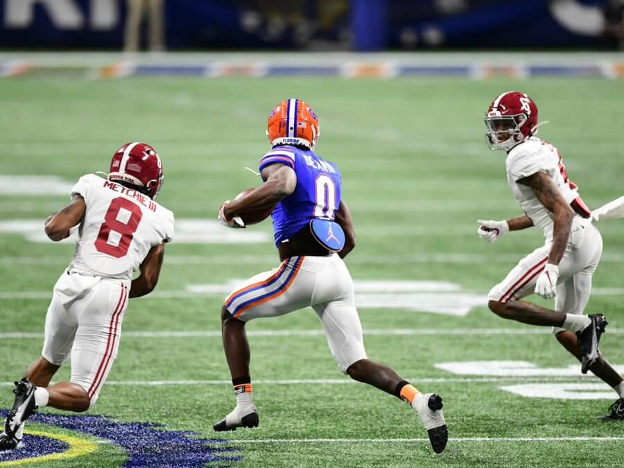
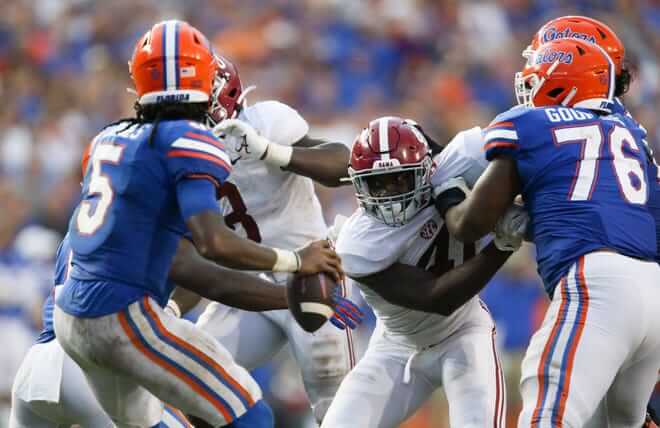
Normally, for SMUW, I “take” one game and highlight some new uniform, or throwback, or uni quirk, or what have you, to serve as the intro to TJ’s rundown. But I was just enamored with the classic uni matchup down in the Swamp yesterday, between Alabama and Florida.
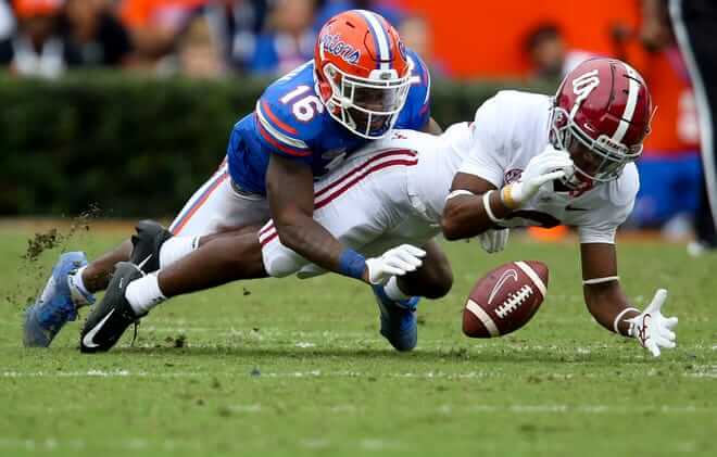
Now, as far as uni matchups go, this game probably won’t even make Jim Vilk’s 5 & 1 (I write this before Jim sends me his list, so I’ve no idea if he will select it); it’s not a great matchup (for one thing, orange and crimson helmets clash), but still, this is how both teams should look (and in Alabama’s case, it’s how they always look). Just a good old fashioned SEC meet and greet with no gimmicks. Just solid uniforms.
I haven’t ranked college unis in probably more than a decade, but when I did, Alabama was my #1 and despite the plainness, it’s just a fantastic look. Like, you see that crimson hat with the white number and you KNOW that’s ‘bama. And Florida just looks superb when they wear their “regular” orange/blue/white combo.
Another thing I love about Florida’s unis (well, at least the blue and white jerseys/pants). They always match the helmet striping pattern, no matter whether they’re on blue or on white. The helmet is orange, so the striping pattern technically goes orange/blue/white/blue/orange — notice how this pattern is repeated on both pant and jersey. It’s stealthy like that. You don’t get the pattern in your face, but it’s there. Such an underrated look and feature.
Anyway, if you weren’t aware of that, I thought I’d share. Give me these classic uni matchups (much like Auburn/PSU) every day and twice on Saturday. I don’t mind the occasional alternate look now and then, but these days it’s often hard to tell who’s playing at a quick glance. With Floribama, you had no doubt.
OK, now on to TJ and the rest of your…
Sunday Morning Uni Watch
by Terry Duroncelet, Jr.
So earlier this week in one of the Discord servers that I’m in, I came across this meme, and I’ve never felt more personally attacked in my life. Even when they don’t mean it, Coastal Carolina is a fun team. And speaking of fun, how about this weekend? So many games that were straight-razor-to-the-beard-at-the-barber-shop-which-I-think-is-technically-illegal-now levels of close! But I’m sure you know that already. Let’s get into the uni-findings of Week 3.
From Saturday:
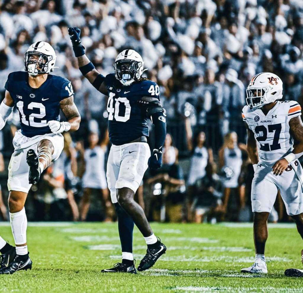
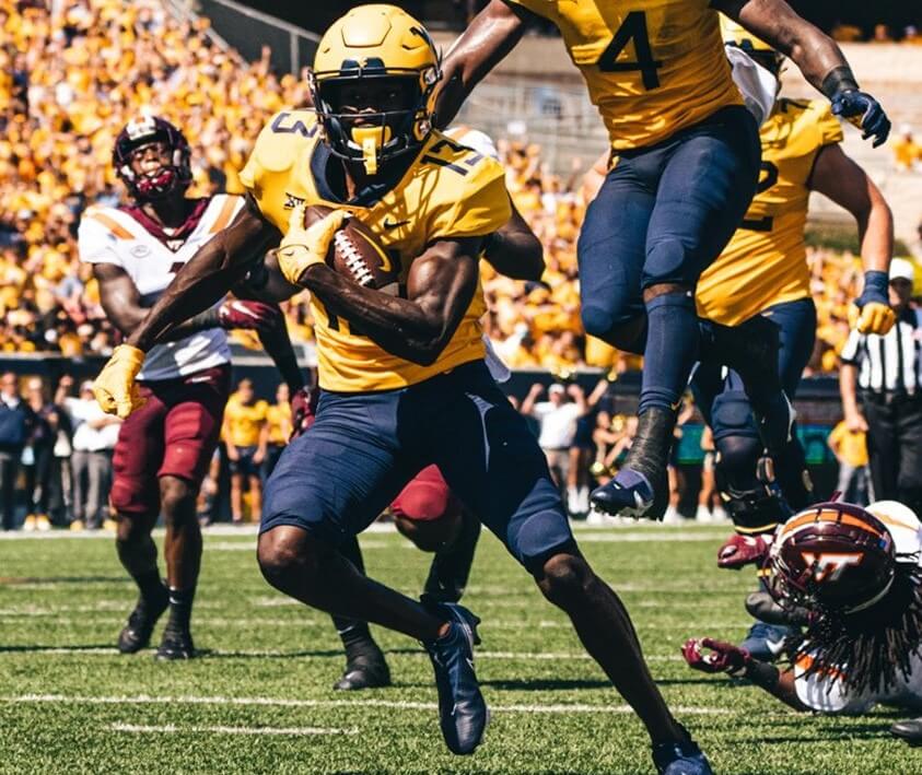
• Rare bit of deviation from Auburn, who wore white facemasks against Penn State, a literal first for the Tigers.
• Speaking of which, Southern Miss has been doing the thing and winning the sports since, what, 1912? And this is apparently the first time that they’ve ever worn white helmets in a game.
• Continuing with the weekly game of Lid Roulette, Nebraska wore grey facemasks against Oklahoma to commemorate the 50th anniversary of the Game of the Century, and both the Huskers and the Sooners wore decals for the occasion as well.
• Tulane wore decals on the back of their helmets in recognition of their three SEC championships against Ole Miss. Also, GREENIE’S BACK.
• New Mexico wore their turquoise-accented uniforms against Texas A&M.
• The fans in Bloomington purged a bleacher seat in the Hoosiers’ loss against Cincinnati. That image genuinely has the same energy as this image. Also, Indiana had some vintage flair going on with their unis.
• White-at-home for Buffalo.
• LSU wore their seldom-seen purple tops against Central Michigan. Additionally, they wore ‘KF’ decals in memory of Kevione Faulk, the daughter of LSU RB coach Kevin Faulk. Kevione died this past Monday.
• Mizzou’s look against SEMO… MINT.
• North Carolina wore their throwbacks against Virginia.
• Houston with the retros against Grambling.
Thanks, TJ! Now onto the 5 & 1 and the trackers.

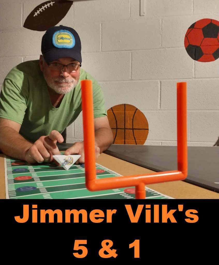
Jimmer Vilk’s 5 & 1
After more than a decade in hiatus, the original “5 & 1” decider, Jim Vilk, has returned! Jim began doing the 5 & 1 many years ago, followed Catherine Ryan, Joe Ringham, Michael “Memal” Malinowski, and several guest pickers. Once again, Jim will pick HIS 5 best looking/1 awful matchup, and occasionally have some honorable mentions (both good and bad). You may agree and you may disagree — these are, after all, just opinions and everyone has one. Feel free to let him know what you think in the comments section.
If you have a game you feel is “worthy” of consideration for the 5 & 1, please either post it in the comments below or tweet Mr. Vilk @JVfromOhio.
Here’s today’s 5 & 1:
Just like Auburn, I’m not afraid to occasionally try something new. So I’d like to make a proposal: for one weekend, let’s have every team (regardless of helmet color) wear white facemasks. Some will look better than others but I think there will be more good than bad.
Of course this means one Honorable Mention goes to
Auburn/Penn State
One my favorite frosty uniforms looks even better.
Minnesota/Colorado
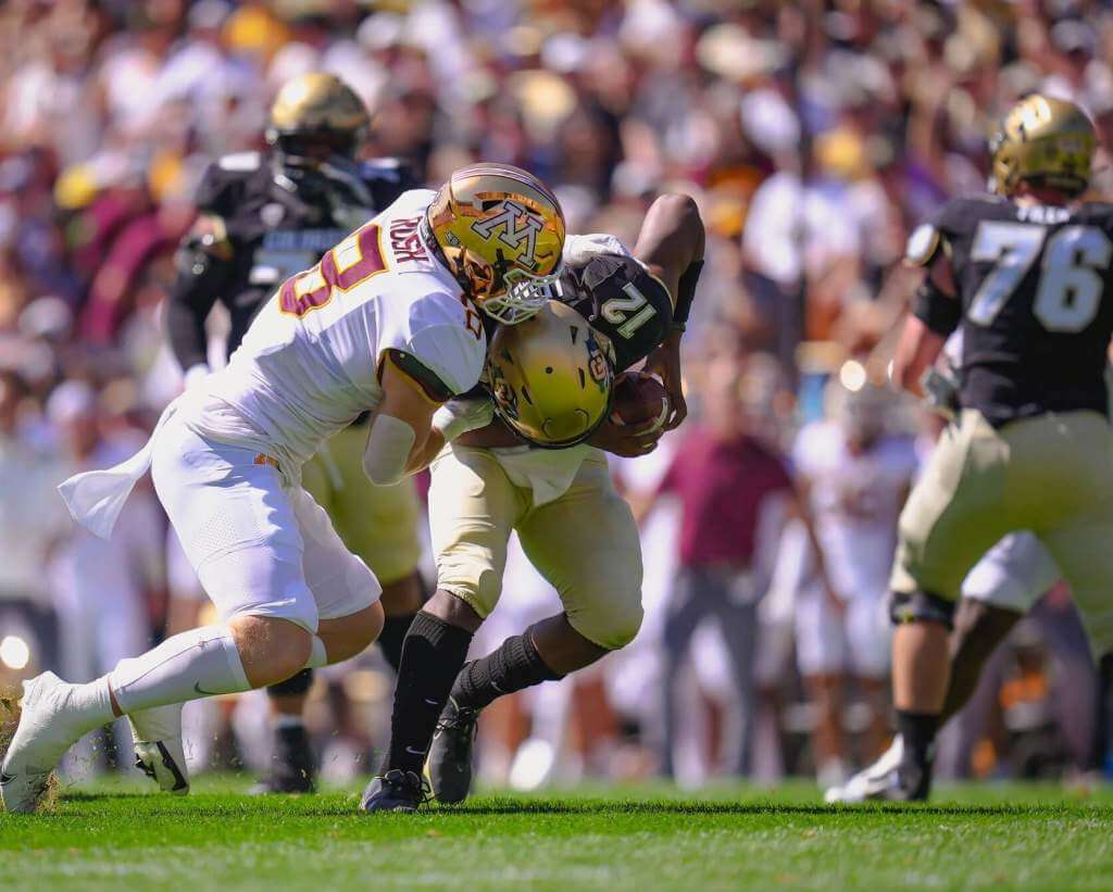
Always good to see the Golden Gophers in a golden helmet… and a snowy grill!
5. Delaware/Rutgers
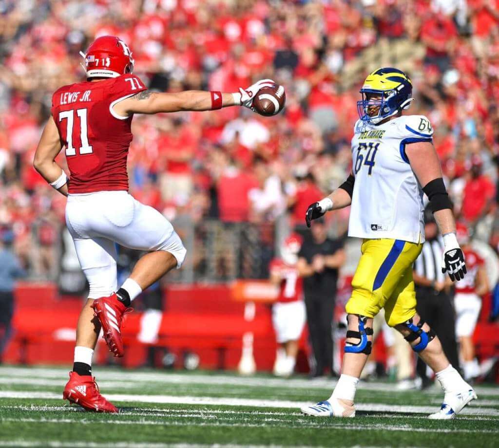
Not the winged helmet you thought you’d see this week, huh?
4. Virginia Tech/West Virginia
Not classic but it is classy.
3. New Mexico/Texas A&M
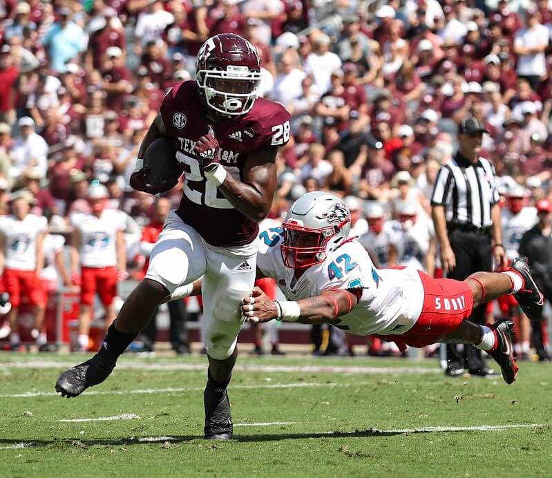
One of the few not-school-colors looks that I’m OK with, Lobos.
2. Nebraska/Oklahoma
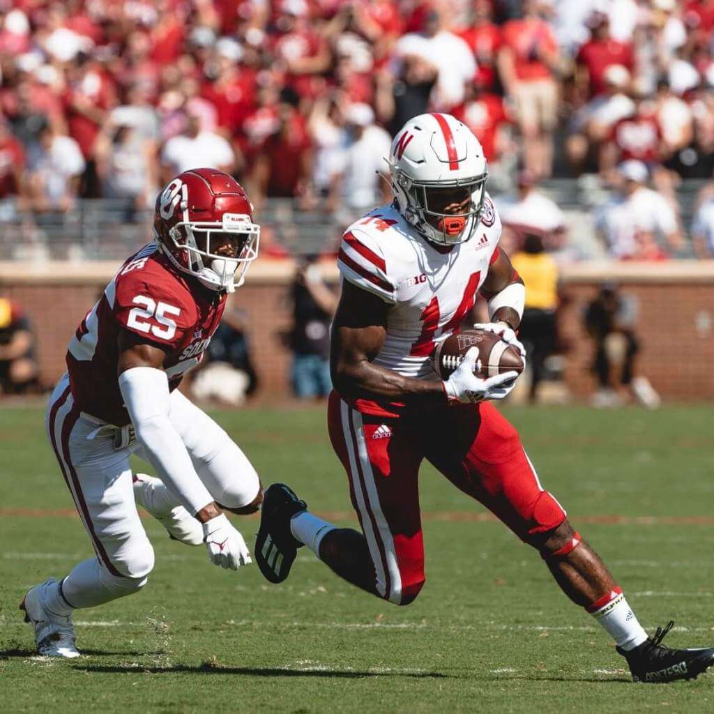
I’ve missed this…
1. Tulane/Ole Miss
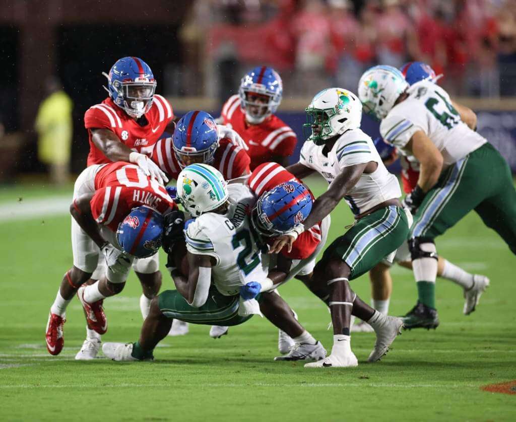
Both teams’ blues keep this from looking “too Christmas-y.”
&1. Oklahoma State/Boise State
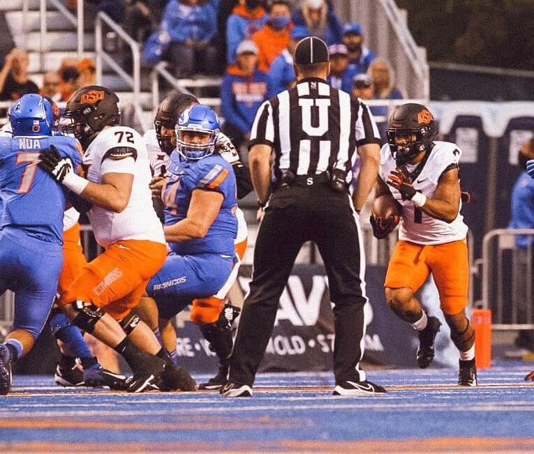
This time it’s not the Cowboys’ fault… although their look wasn’t enough to overcome Boise’s stealth blue.
I’ll still be away next week but I’ll still be here, too. See you then!
Thanks, Jim! OK readers? What say you? Agree or disagree with Jimmer’s selections? Let him know in the comments below.
NCAA Uni Tracking
Uni Watch will again track the uniform combinations worn by the “Power 5” conferences. All of the 2020 trackers are back!
We’ve got Rex Henry (tracking the ACC), Dennis Bolt (tracking the PAC-12), Kyle Acker (tracking the B1G), and Ethan Dimitroff (tracking the Big XII AND the SEC). Rex, Dennis, and Kyle and are all returning from 2015, and Ethan is back after joining the NCAA Uni Tracking a couple seasons ago. Ethan will continue to track the SEC, and has swapped the B1G for Big XII (with Kyle).
Here are the Uni Trackers for the Power 5 Conferences (along with each tracker’s info):
Rex is up first today (ACC):
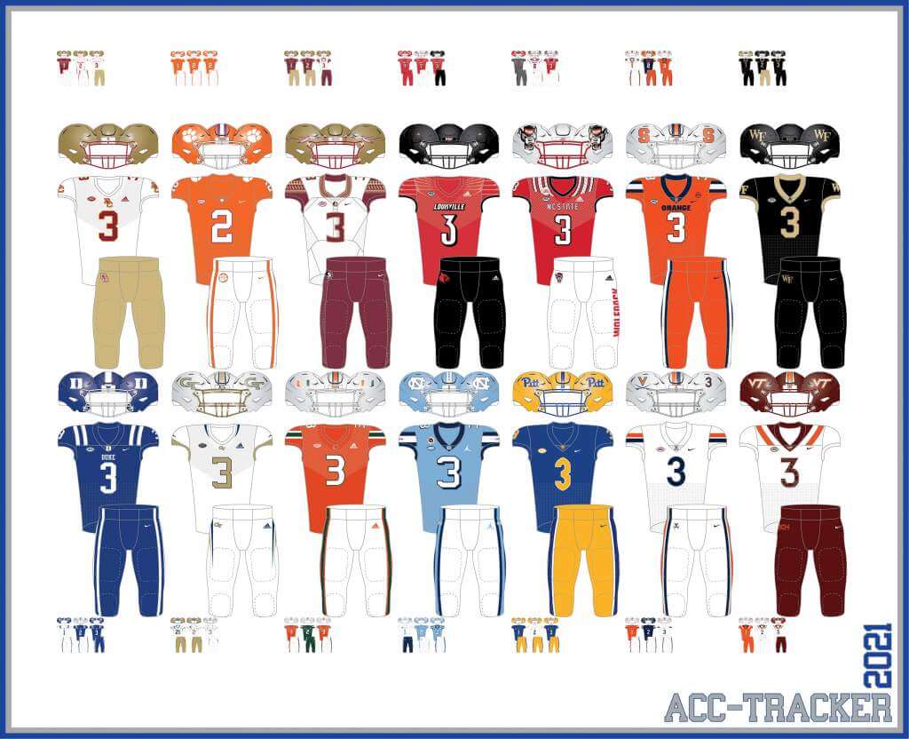
ACC
More Here.
Follow Rex on Twitter here.
And now, here’s Dennis with the PAC-12:
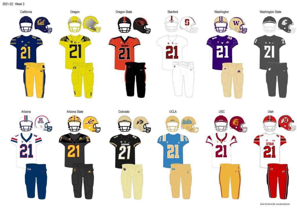
PAC-12
More here.
Follow Dennis on Twitter here.
And here is Ethan, with the SEC:
SEC
And be sure to check out Ethan’s WVU Mountaineer Tracker.
Follow Ethan on Twitter here.
And here is Kyle with the B1G:
B1G
Follow Kyle on Twitter here.
And here’s Ethan with the Big XII:
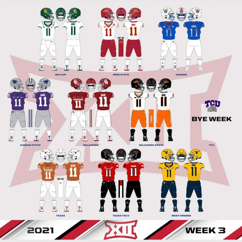
Big XII
Welcome to the 2021 Oregon Ducks Uni Tracker. This little project was originally begun way back in 2008-09 by Michael Princip, who retired after several seasons, whereupon the project was continued by Tim E. O’Brien. He, too, retired from the tracking, but the project has been ably kept up by the man who also tracks the Pac12, Dennis Bolt.
Here’s this week’s Uniform Combo for the Ducks (you can click to enlarge):
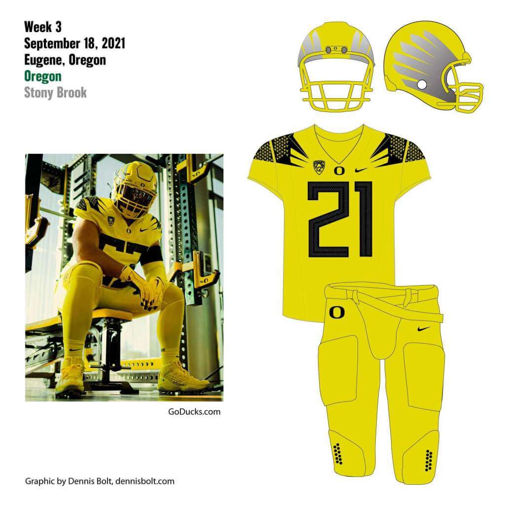
You can read about this uniform, and MUCH MORE, by checking out the Duck Tracker here and the color combo spreadsheet here!
Thanks Dennis!
ICYMI (also known as “Oops”)
Yesterday morning, in case you didn’t see, or read early, I had the pleasure of showing off many MLB “City Connect” concepts from Walter Helfer.
Due to a screw up on my part, I didn’t run all of Walter’s concepts at the beginning of the day, and added them in later. So, I’m running those (again) today, in case you checked in before noon or so, which is about the time I added the additional concepts to yesterday’s post (so you don’t need to go back and scroll through the whole thing if you missed these). Dig:
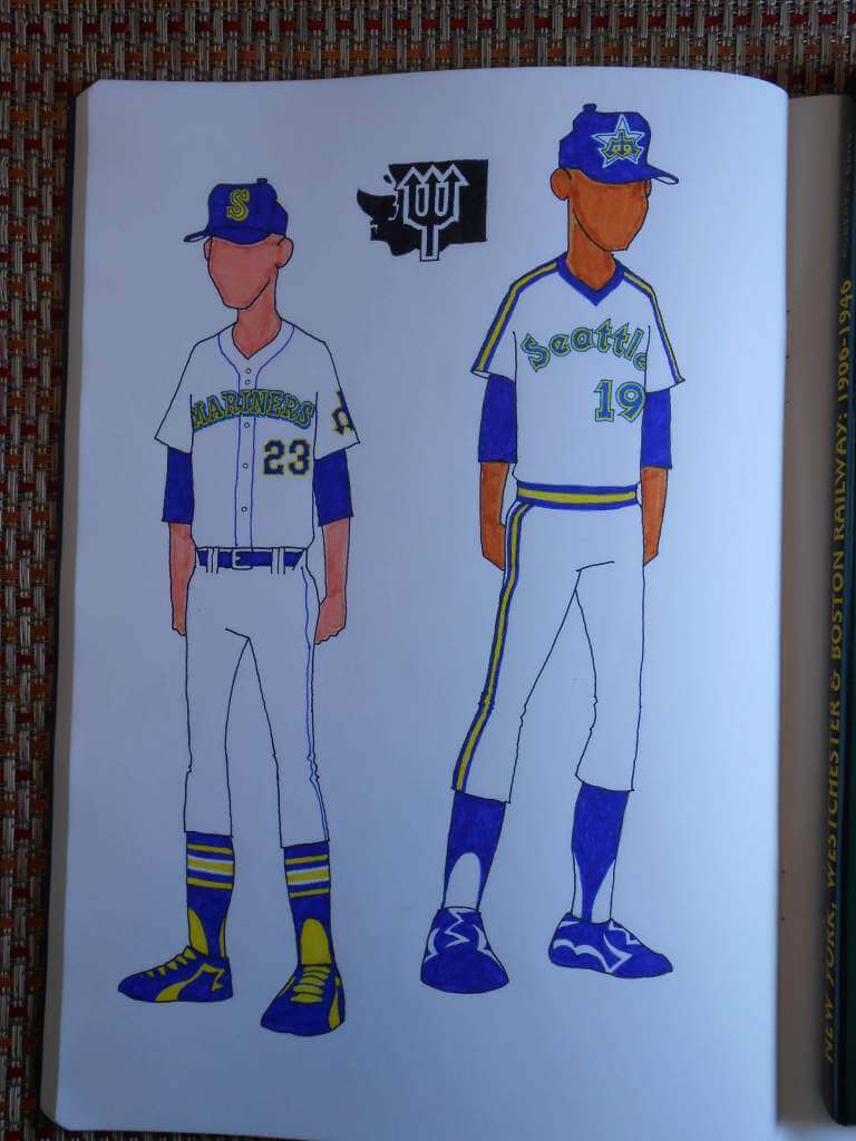
SEATTLE MARINERS: I underestimated the strong connection Seattle fans have with their 1980s’ pullovers; someone always comments on how sharp they look. I couldn’t resist swapping the city name onto the white jersey, and substituting the University Gothic numerals for the Wilson octagonal.
For the belt-and-buttons crowd, I chose Ken Griffey Jrs’ rookie-year threads. The owners detailed those uniforms on the cheap, so I added more color to the numerals. There’s also a trident patch on the left sleeve, because I said so.
Finally, for those who can’t abide a downward-pointing trident, I gave you a ‘W’ for Washington.
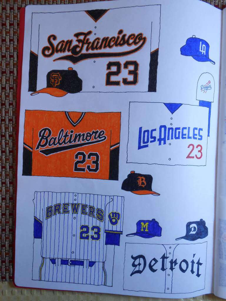
SAN FRANCISCO GIANTS: The Giants’ style guide lists this amazing script with the huge flourish. Now it’s on a uniform where it belongs.
BALTIMORE ORIOLES: The gorgeous ’70s orange pullover is united with the contemporary ‘Baltimore’ script. If you’re feeling courageous, team it with a pair of orange pants. The cap bears the Old English ‘B’ of the 1950s batting helmet.
LOS ANGELES DODGERS: I like Art Deco lettering and though the Dodgers the most deserving. The Futura Thin numerals are from an idea another Uni Watcher proposed. The whole Dodgers’ insignia is on the left sleeve, and an Art Deco ‘LA’ graces the cap.
MILWAUKEE BREWERS: From 1970 to 1977, the Brewers’ hat functioned as their locator, so why not use that approach. The ‘ball in glove’ moves to the sleeve, which allows it to spread out a little. I overlaid their blue and yellow braid on the pinstriped uniforms, and double-outlined ‘Brewers’ and the rear number, for a festive appearance.
DETROIT TIGERS: There’s more than one kind of Old English font. The ‘less is more’ approach suits the Tigers, and I’ve always wanted to see ‘Detroit’ spelled out in Fraktur lettering.
And now a few words from Paul: Hi there. In case you missed it on Friday, my latest Bulletin article is a fun thought experiment. Here’s the deal: Whenever I critique a newfangled uniform or a new uniform “innovation,” a certain subset of readers will say, “You just hate anything new!” or “You just hate change!” But is that really true? In an attempt to find out, I decided to try to imagine how I would have responded to some major developments uniform history if Uni Watch had existed back in the day. For example, if I had been writing Uni Watch in the late 1920s, how would I have felt about the advent of MLB uni numbers? I tried to be as honest as possible with a bunch of hypotheticals like that. You can see the results on my Bulletin page.
Also: In case you missed it earlier this week, I’m once again partnering with Grey Flannel Auctions to offer free, no-obligation appraisals of your vintage sports memorabilia items. Think of it as an online version of Antiques Roadshow. Full details here.
Uni Watch News Ticker
By Phil

Baseball News: If you thought (and still think) MLB’s City Connect unis are shite, remember that there are equally goofy uniforms in Taiwanese baseball. … The Los Astros, er, Los Astros broke out their Hispanic Heritage jerseys for Hispanic Heritage Weekend (from Ignacio Salazar). … The Giants did as well. … “This is what a proper Labor Day commemoration would look like in baseball, to respond to a weeks-old Uni Watch thread,” writes R. Scott Rogers. … Check out this great footage of the Mets final game in the Polo Grounds (from Bruce Menard). … OH BABY, yet another wonderful colorization from Chris Whitehouse).

NFL News: The Jets will be wearing white over white for their home opener against New England today. … Let’s hope this is a trend: the Saints will be wearing black jerseys and gold pants (the second straight week for gold pants) today vs. the Panthers. … The Browns will be wearing their “classic” brown jersey/white pants combo for their home opener. … Artist Dan Duffy has created a painting which features the names of all 1,608 Steelers players from 1933 through the end of last season. But in a very, VERY cool way (from Robert Brashear).
College Football News: Whenever a team offers a product online there are bound to be a few miscues here and there. However, I say that adidas reversing the sleeve stripes on their replica jerseys is more than a minor miscue (from Eric Partell).

Hockey News: “The Swift Current Broncos have a distinct set of jerseys for their Blue vs White intrasquad game in training camp,” says Wade Heidt. “They are jerseys with stripes with shoulder yokes. … The team has never worn this jersey design in games.” … Also from Wade: Minor updates to the logo for the Arizona Coyotes black jersey. Note skate blades are now same color and white trim all around the coyote.

NBA News: Have the new Miami Heat “retro mashup” (or whatever the 75th anniversary uniforms are being called) been leaked? No confirmation, but these seem to fit the pattern.

Soccer News: Here are some “clear cut” photos of Barca’s new home, away and third jerseys. … Paris Saint-Germain have new “uniforms,” only they’re not quite the type you’d be expecting

Grab Bag: UW stalwart R. Scott Rogers observes, “Madison Curling Club (@CurlMCC) Centennial logo unveiled. Not sure if the tartan has any particular significance or if it’s just a background illo behind the logo.” … Here’s a look at Japanese 3rd Division Men’s Volleyball team Nara Dreamers with their 2021-2022 uniforms (from Jeremy Brahm). … Also from Jeremy: NEC with the new logo for both its rugby (Green Rockets) and volleyball (Red Rockets) teams is retiring their astronauts and have created a going away video for them.
And finally… that’s it for today. Big thanks, as always, to the entire SMUW crew for all their efforts!
Yesterday was my final Saturday night at the family summer place for 2021 (will be closing up at the end of this week), and I was *really* hoping for a final sunset. Alas, even though the day turned out beautifully sunny with azure skies, there was, yet again, another low cloud deck at sunset. Disappointing. But not all was lost, as the post-sunset sky didn’t let e down.
Everyone have a good Sunday, and I’ll catch you back here next weekend!
Peace,
PH
What time is it? Time for some College Football Uni Tracking – Canadian Rules Style!
Ontario conference regular season kicked off this weekend. Here are a few games.
-The Wilfrid Laurier Golden Hawks went with an uncommon purple/yellow/purple combo at home in Waterloo. Visiting York Lions went white over white:
link
-The Toronto Varsity Blues lived up to their team name at home wearing mono-navy. The Ottawa Gee-Gees went with a white over white combo:
link
-In Ottawa, the Carleton Ravens went with their usual mono-black at home. The visiting Queen’s Gaels wore their classic mono-yellow. It is really the only uniform at home and on the road for Queen’s. What else would the Tricolour wear?
link
Let’s look at a couple of games in the Quebec conference too.
-In Quebec City, the Laval Rouge et Or were more like the Noir et Or. Going mono-black helmet to pants. Visiting Montreal Carabins in a blue/white/blue combo:
link
-In Montreal, This is the first season the McGill men’s teams are known as the Redbirds. The uniforms are not really different. They went mono-red at home. Visiting Concordia Stingers wore a white over yellow combo:
link
Concordia utilized the Oklahoma Sooners helmet logo makes as a play call(?) sign.
What does the RSEQ decal signify on the rear of McGill’s helmets?
Yep, notice that sign for play calling.
RSEQ is the name of the Quebec conference in U Sports. For all sports not just football. That is the conference logo and on most teams’ helmets. Stands for Reseau du sport etudiant du Quebec. Which literally translated to English says Quebec Student Sports Network.
link
There’s no link to the meme Terry mentions in his first paragraph.
Should be there now.
“The Los Astros, er, Los Astros”
Not sure I see a difference.
“The” + “Los” is redundant. Maybe click off Fox News and expand your cultural awareness a little bit.
Maybe I’m a purist: I want to see the team names translated into Spanish, even if the anecdotal reporting doesn’t bear this out. If there isn’t a “THE” in English, there shouldn’t be a “LOS” in Spanish. What could be a teachable moment just becomes lazy design.
Just a typo “meet and great” should be “greet”, I think.
Second time in three weeks the ACC tracker has the wrong Duke helmet logo. They wore the white Duke script instead of the “Iron Duke” D logo. Same as game one.
Oooh, that looks bad. I’ve been busy this year and only paying attention to the shell in the previews. Thanks for bringing this to my attention.
Sorry about that. I’ve been busy the last few weeks and have only paid attention to the shell color in the uniform previews. Thanks for the heads up.
Dodgers in an Art Deco Hollywood font needs to happen immediately.
Yeah, that was almost an automatic choice. My first thought was the “Commerce Bank of Beverly Hills” establishing shot from “The Beverly Hillbillies”. Then all the details fell into place.
>Mizzou’s look against SEMO… MINT.
I say we should agree to disagree on this matter. The return of the block M on the helmet instead of the oval tiger is definitely welcome. But a yellow (not even gold) helmet? No thanks.
Black cleats and striped pants were also out of the ordinary for Nebraska as an homage to the ’70s look.
Really liked the look a lot of the college football games this weekend. Especially games where you have the classic looks against each other and no costumes. Nebraska/Oklahoma, Auburn/ Penn State, Florida/Alabama.
Bit more on the Swift Current Broncos and their jerseys for the Blue vs. White game. Of course this jersey design looks nothing like their usual uniforms. I find their stripe design choice strange for these jerseys. For the white jersey, if you simply removed the few green stripes and replaced them with red, it would look like the signature former look of a rival down the highway. Why would they choose the striping to look just like an old Regina Pats jersey?
link
The Miami Heat design has been leaked (released?) before, and while it will look like this, these are apparently fakes.
B1G tracker: Wisconsin didn’t play this past week.