For all photos but this one, click to enlarge
[Editor’s Note: Today we have a guest entry from Michael Kimball, who’s going to share a really sensational story about a very unusual uniform. Enjoy. — PL]
By Michael Kimball
Potter County Memorial Stadium, a now-vacated minor league and college ballpark in Amarillo, Texas, was never anyone’s idea of a Cold War showdown site. Fans could gaze beyond the advertisement-studded outfield wall and see a grain elevator in the background. From the top of the stands you could see the nearby stockyards, their omnipresent feedlot aroma mixing with the odors of fresh popcorn and just-mowed grass.
As a six-year-old in 1990, I spent many a summer evening there watching the Amarillo Texans in the now-defunct collegiate Jayhawk League. But July 17 of that year was different. For starters, fans were allowed on the field for handshakes and autographs after the game, which was the most exciting part for me. More notable to my dad and most of the other fans were the Texans’ opponents that night: the USSR National Baseball Team.

After the game, baseball and ballpoint pen in hand, I slipped past the first base dugout toward the players, in search of an autograph. Dad suggested I use a particular word to get the attention of the broad-shouldered, visiting player near the baseline.
“Comrade!”
Spinning around to face me, his attention duly caught just as Dad suggested, was a player on the Soviet Union’s National Baseball Team. In Amarillo, of all places. It was all part of a goodwill tour that the team was on at the time.
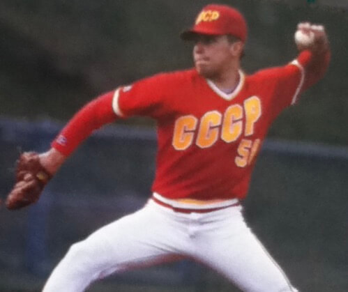
The player smiled as I wordlessly handed him the ball, and Dad said a couple of welcoming words he knew in Russian. Splashed across the player’s white pullover jersey were four red letters with gold trim: “CCCP.” Those same letters appeared on his red cap.
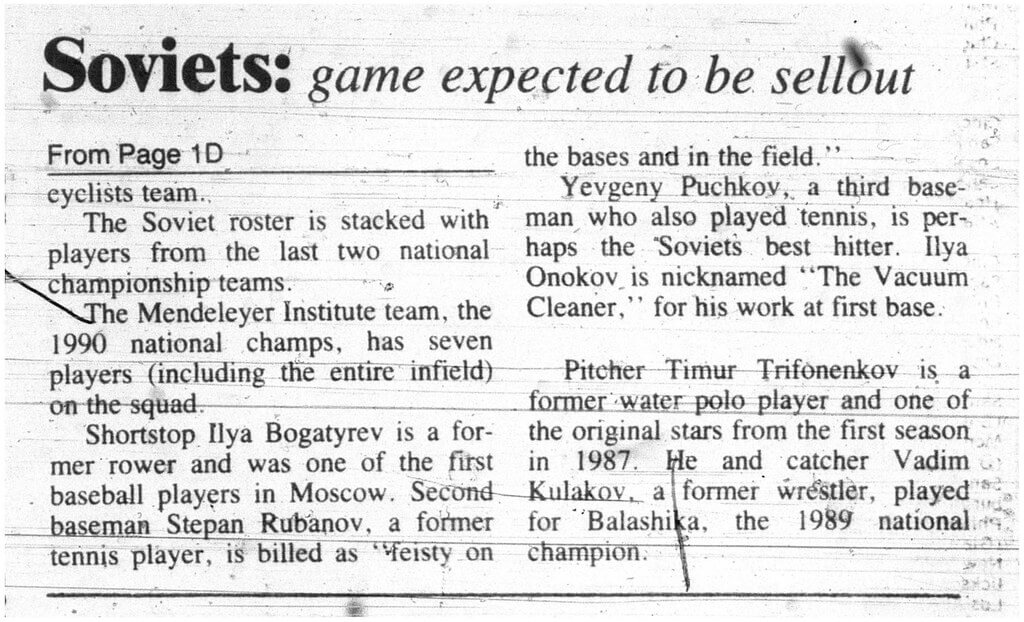
I collected four autographs that day. Most of of them were largely indecipherable, but one of them remains legible to this day. It came from a guy named Bunny Mick, an American baseball lifer who was in between stints as a hitting coach with the Cardinals and Astros and had been recruited to coach the Soviet players during this tour. The roster consisted of professional athletes in the Soviet system who were fringe players in other sports. “Good athletes, not yet very good baseball players,” as Dad put it.
The program was essentially started by an American businessman living in Moscow named Rick Spooner. The Soviets sought to build a program to compete in what was then a new Olympic medal sport. Mick and coaches like him brought expertise and equipment to help spread the American national game on the other side of the weakening Iron Curtain. The team that played in Amarillo was part of a U.S. tour before the Goodwill Games in Seattle.
“[Amarillo] was an awesome place for baseball and southern hospitality. It drew their best crowds,” said Bob Protexter, another one of the Soviet team’s coaches, in a recent Facebook Messenger interview. “The Soviets loved Amarillo.” It’s not hard to imagine why. As exotic as real, live Soviets seemed to me at the time, the western wear, Texas accents, cowboy hats, and 72-ounce steaks no doubt seemed just as exotic to a Russian athlete. (You can read more about Protexter’s experience with the Soviets here.)
The baseball product was not quite as sharp as the uniforms, which were made by Russell Athletic and likely picked up when the team arrived in the United States (information is scarce, from what I could find). The Texans scored nine runs in the first inning and cruised to a 13-3 victory, although the Amarillo crowd got behind the visitors and roared with support to reward good play.


More of the same awaited the Soviets at the Goodwill Games, as detailed in this entertaining L.A. Times story. But the Soviets, by all accounts, had a great time, learned the game, and went on to spread it widely. A couple of the players went on to minor league careers in the Angels’ system, and many kept investing time and energy in the Russian baseball program.
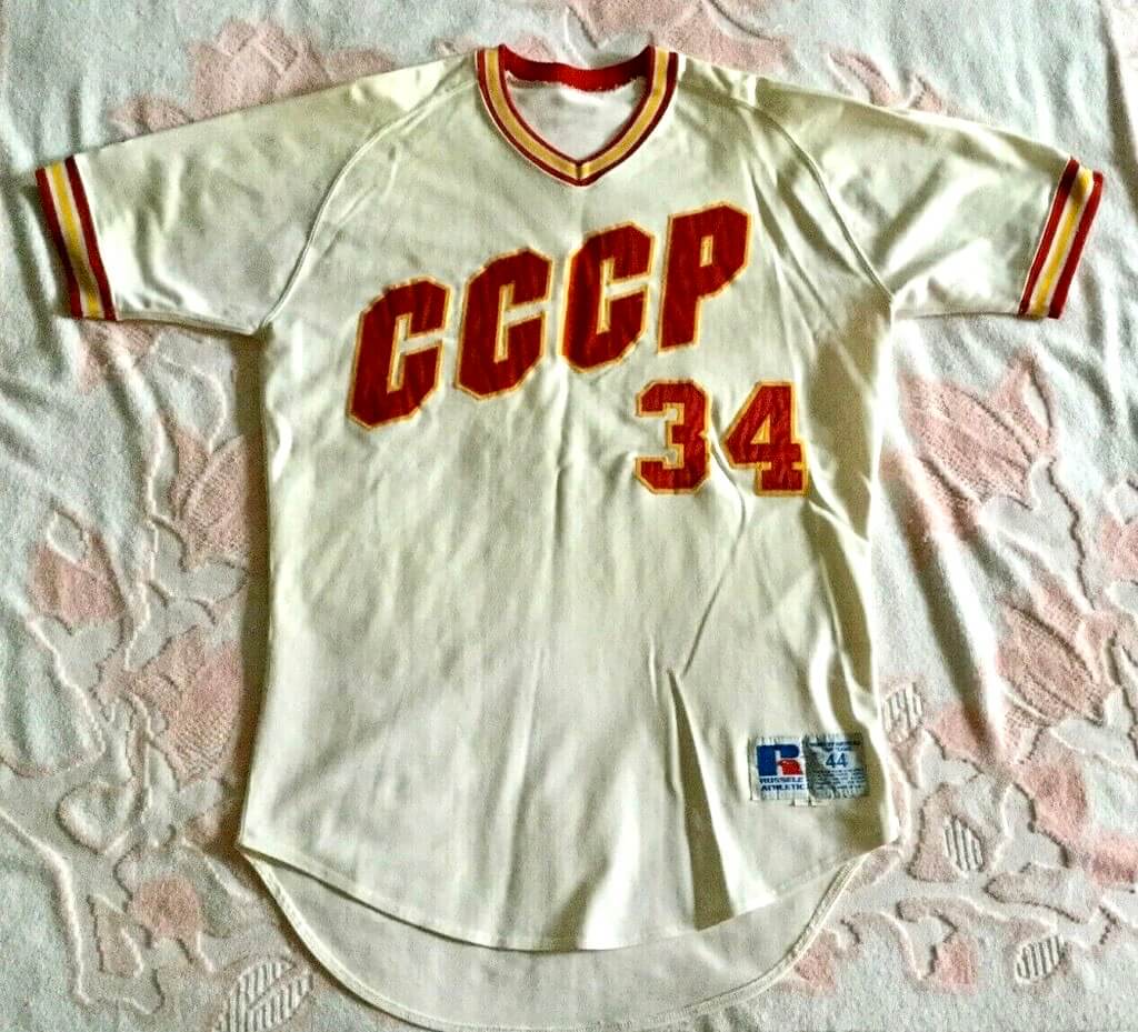
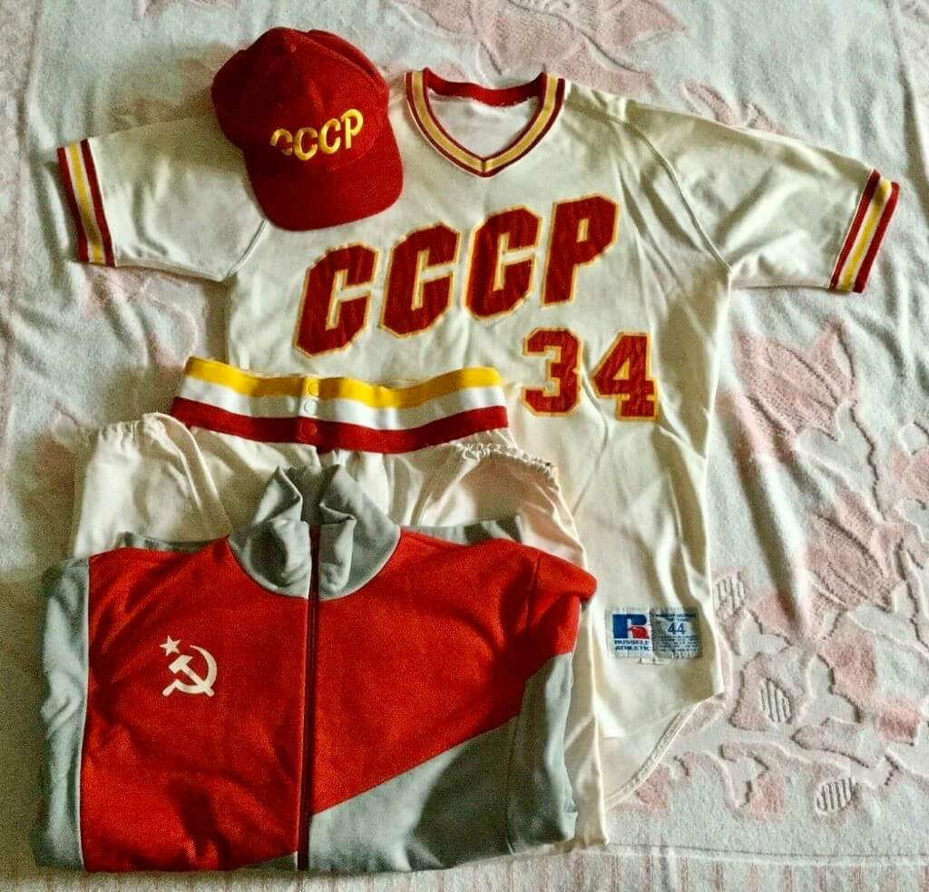
This all happened more than 30 years ago, but the memories were brought back to the surface for me when I recently found my autographed baseball in a trunk of keepsakes. That sent me down a rabbit hole to learn more about the Soviet team’s tour, which in turn led me to an eBay listing for an authentic, game-worn “CCCP” coach’s uniform from 1990. (Some of the photos in this entry are from that eBay listing.) This seemed like a great find — not just a legitimately unique and interesting item, but one from a now-defunct country, and that I saw as a kid with my own eyes.
The listed price was a bit high, but the seller immediately accepted my “Best Offer” bid. I was delighted – not only is the uniform itself cool and valuable to me, but the hat and warm-up jacket looked plenty wearable.

I was so excited about this that I told Paul about it. He invited me to write something about the vintage Soviet uniform once I received it from the eBay seller, and I readily agreed. And then … it got lost in the mail.
Yes, really. The seller did everything right – sent it insured with signature confirmation – but it just disappeared. It was last in the USPS tracking system on June 8. Since then, despite a missing mail search on my end and a package intercept on the seller’s end, the parcel remains missing.
Everyone is financially whole because of eBay’s refund policy and the insurance, but a unique and irreplaceable item is apparently gone forever. Very frustrating and disappointing.
Meanwhile, the Russian baseball program continues, although it didn’t attempt to qualify for the 2020 Olympics. And I still have the ball. Thanks, comrades.
Special thanks to Sam Jones, reference librarian at Amarillo Public Library, for locating and providing scans from the July 16-19, 1990, editions of the Amarillo Daily News.
Uni Watch Screening Room: There’s a new documentary, called The New Bauhaus, about the great Hungarian artist, designer, and educator László Moholy-Nagy, who taught at the Bauhaus in Germany and then founded what’s now known as the IIT Institute of Design in Chicago.
I’ve been a huge fan of Moholy-Nagy’s work since I first encountered it while editing graphic design books about 30 years ago. Much like another one of my favorites, the Russian painter Wassily Kandinsky, Moholy-Nagy leaned heavily on geometry, so that even his abstract art felt more like design. Check this stuff out (for all of these, you can click to enlarge):
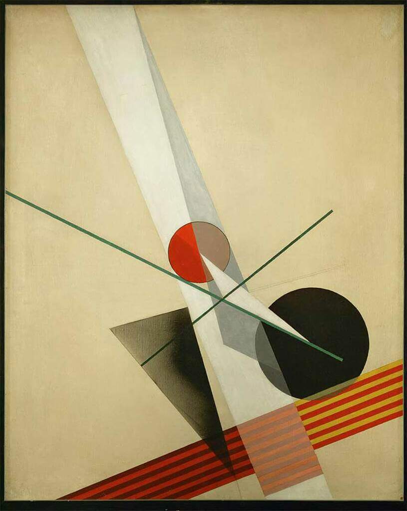
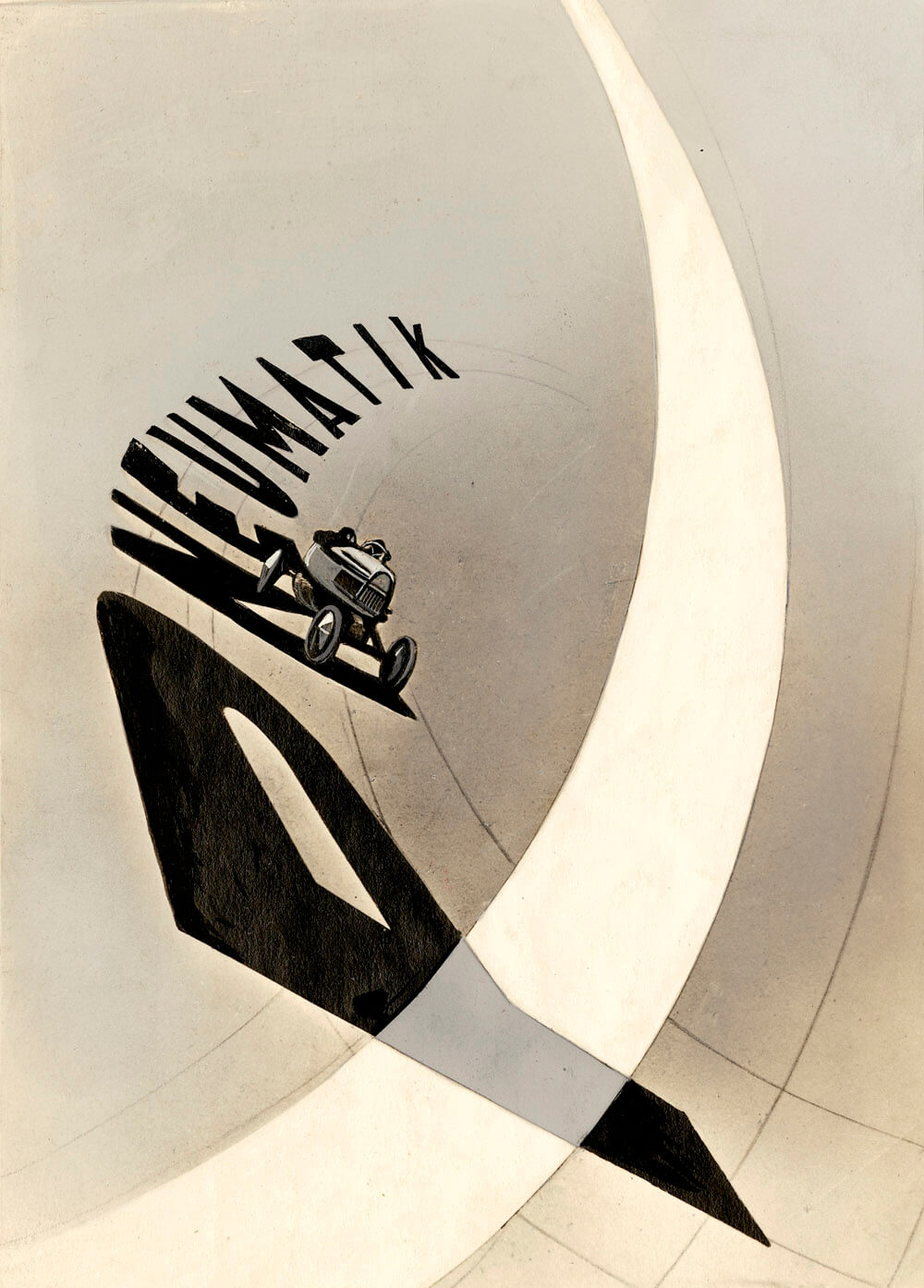


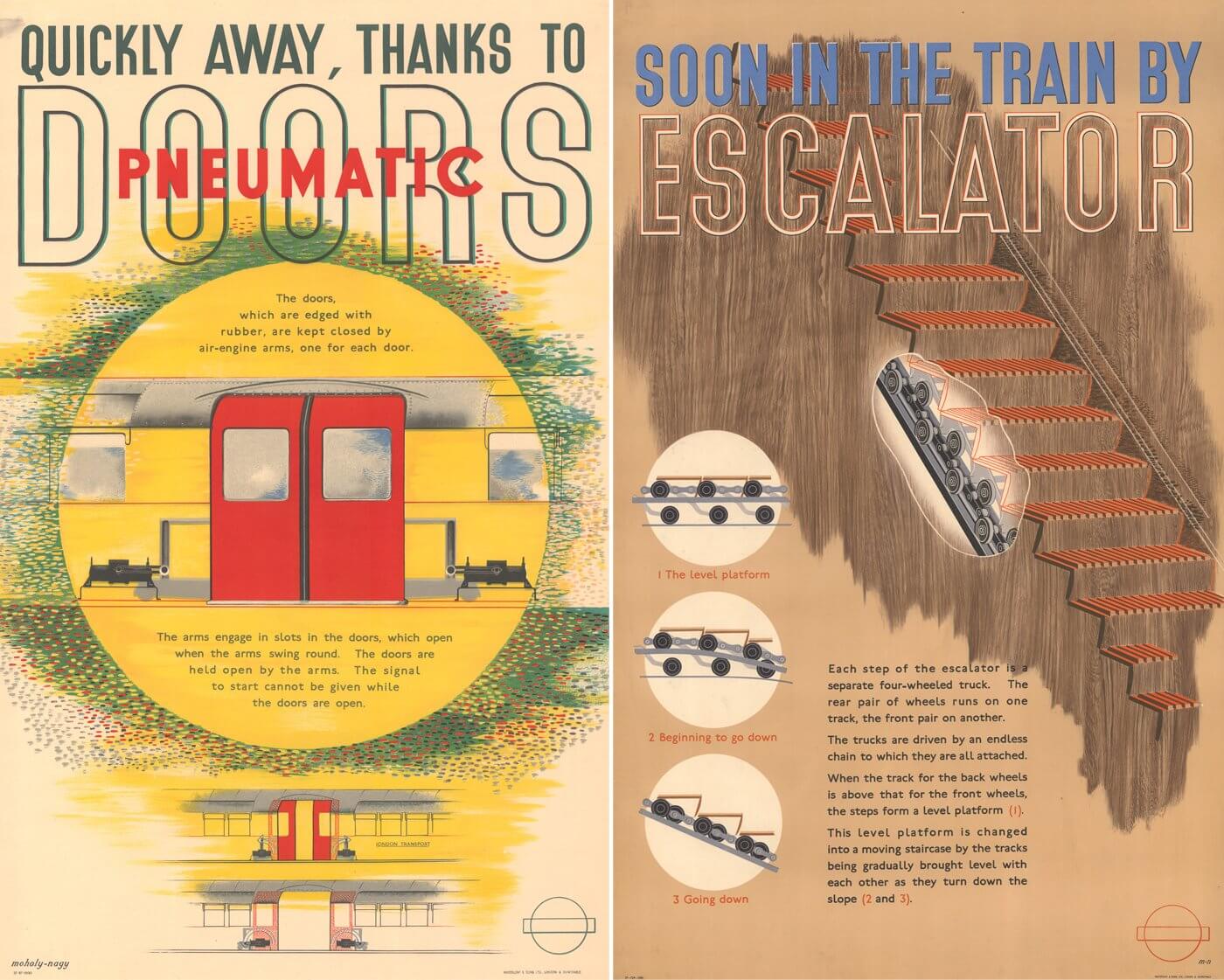
Is that awesome stuff or what?
In addition to being a great artist/designer, Moholy-Nagy was a highly influential teacher. He felt that when an artist or other creative person is creating something, what they’re really working on is themself. In other words, personal growth is the true finished product. I like that way of thinking.
Moholy-Nagy is one of those people who make you realize how little you’ve accomplished. He died of leukemia at 51, which means, as the joke goes, that when he was my age, he’d been dead for six years. But the movie includes interviews with one of his daughters, two of his grandsons, and several of his former students, creating a reasonably fleshed-out portrait of a complex character.
You can stream the movie on Google Play for $4.99, which is a bargain. (It’s actually $3.99 for SD, but spend the extra buck for the HD version — it’s worth it.) If you’re already a Moholy-Nagy fan, it’s essential viewing; if you’re not yet a fan, you’ll likely become one after watching this. Don’t miss.
The Ticker
By Lloyd Alaban

Baseball News: The way the “Minnesota” script broke across Twins 3B Josh Donaldson’s jersey yesterday made it look like “Minmesota” (from @MileHighFan29). … The Florence RedWolves of the collegiate wood-bat Coastal Plain League will announce their new name and logo on Saturday (from our own Phil Hecken). … P Wade Davis wore old cleats from his past days with the Royals last night. Davis currently wears No. 71. He previously wore No. 17 with the team (from @shelbyrays). … Here are the championship rings for the Sarasota Circus of the Florida Gulf Coast Softball League (from Griffin Smith).

Football News: New unis for SMU (from multiple readers). … New naming advertiser for the Arizona Bowl (from Trevor Williams).

Hockey News: Hockey-themed band and longtime friends of Uni Watch the Zambonis have a new song: “The Gretzky Twist.” … Winners of the WHL’s sweater design contest comment on their work (from Wade Heidt).

Basketball News: New advertised name for the Thunder’s home arena (from multiple readers). … The WNBA released a picture of its new Commissioner’s Cup trophy (from our own Jamie Rathjen). … Reader Scott Rogers’s neighbor made some awesome retro Bucks-themed yard art.

Soccer News: New second kit for Scottish club St. Johnstone (from our own Jamie Rathjen). … New kit for Premier League team Everton (from our own Anthony Emerson).

Olympics News: The Dutch women’s gymnastics team wore leotards with “The Netherlands” in Japanese on them (from @bryanwdc). … Tokyo’s mascots aren’t getting as much exposure as past Olympic mascots. … Here’s why gold medal-winning table tennis player Jun Mizutani of Japan wears sunglasses indoors (from Jeremy Brahm). … This CNN article takes a look at some Olympians’ tattoos (from Timmy Donahue). … Beach volleyball players love that they have options on what to wear during matches (from multiple readers). … The next two items are from Kary Klismet: The head of the Olympic Broadcasting Services is trying to curb the sexualization of female athletes in televised coverage of the Games. … Here’s an article about how women Olympians are taking control of their uniforms.

Grab Bag: New logo and branding for the D3 Northwest Conference. … Campbell’s Soup cans are getting their first redesign in 50 years, although the changes are fairly minor (from Tom Turner). … The Hamilton County, Ohio, Sheriff’s Office is wearing new badges to honor victims of 9/11 and to commemorate the 20th anniversary of the attacks (from Timmy Donahue). … Pocatello High School in Idaho has a new mascot costume (from Kary Klismet).
It wasn’t mentioned explicitly, but I have to recommend the enjoyable HBO Movie “The Comrades of Summer,” which starred Joe Mantegna as a washed up ex-MLB manager who launches the Soviet baseball program.
Definitely a fictionalized account of the real story, but an entertaining one nonetheless that draws heavily from the story about the real thing. Fun watch.
HBO made a great movie called “Comrades of Summer” with Joe Mantegna.
You state the Maholy video is $4.99 on Google Plus, but your link takes me to Google Play and the video only costs $3.99 to rent, even more of a bargain!
$3.99 for SD, but $4.99 for HD, which I recommend — it’s worth the extra buck.
Spasibo, tovarish Michael! Terrific story, and I hope the package materializes for you.
WNBA Commissioner’s Trophy looks like the old Cincinnati Royals logo.
I noticed from the ticker yesterday and confirmed right now watching the team USA 3×3 hoops that they wear the same uniform as the 5×5 teams but in grey…is this the first time ever a team USA hoops team has worn grey? Why would they even do that
So much cool content today! Soviet baseball and the New Bauhaus! Kudos!
“Mimesota” looks an awful lot like “Minmesota” to me in the photo
Good point. Fixed.
Was gonna say the same. It also reminds me, apropos of Michael’s excellent lead story, of the way Russian Cyrillic cursive can wind up looking like a series of m’s and n’s that can be very hard for an English-speaker to differentiate as discrete letters.
Great piece, Michael! Very well-written and enjoyable to read. What an absolute bummer about the uniform being lost in the mail! Here’s hoping it resurfaces at some point.
For the old nerdy wrestling fans in the audience:
I was a big fan of when Russian heels woukd wear CCCP on their gear, not just a generic red or black singlet or the Hammer and Sickle logo. It helped further the gimmick they were “Soviet athletes” even if they really were from Canada or Minnesota.
You did not want to mess with Ivan Koloff or Nikita Koloff back in the day!
Some people on the internet are calling for fashion brand Ralph Lauren to be replaced as the designer of Team USA’s opening and closing ceremony outfits.
This was in Sunday’s ticker. The article hasn’t gotten any better.
Some of those Maholy-Nagy works remind me of Kazimir Malevich or El Lissitzky; I don’t know that I’m very good in differentiating between Suprematism and Constructivism though.
Here’s a link to one of our local high schools who is keeping their mascot name of “Braves”, but will be updating the logos and icons used.
link
link
Watch this hysterical movie about that team starring Joe Montagna
Someone tell me again why no MLB team exists with red and yellow team colors?
Because half of the MLB teams feel the only suitable color sets are some combination of shades of blue and red.
The Angels should go red and yellow, red A with yellow halo, it is an obvious move for them.
I hadn’t thought of the Angels, but that’s a great idea.
I liked a lot about the initial 2005 Nationals visual identity, but high on my list of virtues was the strong visual presence of red and gold (effectively a shade of yellow) alongside the navy. If they’d stayed leaned-in to the monumental-architecture vibe of their initial uniforms, then red and yellow/gold could have been a viable color scheme. And it would be a bit of a regionalist tie-in, what with the biggest team in town wearing dark red and yellow.
The Angels caps actually had a yellow halo in 2011, the season they celebrated their 50th anniversary. I have one from that season, and I think it looks great. The yellow halo stands out much more than the silver they went back to in 2012. I’d love for them to go back to that.
From 1929 to 1930, the Boston Braves’ color scheme was red and yellow:
link
Atlanta could faux back to those uniforms, with certain obvious modifications,…I doubt they ever will.
The Dodgers former AAA affiliate, the Albuquerque Dukes had some pretty sweet red & yellow uniforms
link
Also can’t forget the Calgary Cannons and Hawaii Islanders. Triple-A had lots of red and yellow.
link
link
And if we move down to the AA level, there were the El Paso Diablos
link
The Alaska Goldpanners have had a number of great red and yellow unis in the past:
link
No shortage of teams with the Bumblebee pinstripes used by the Pittsburgh Pirates. Didn’t Pittsburgh have to use Descente as the manufacturer because no American company would make that pattern?
Michael – great guest column! In regards to your package, if you haven’t done this already, I recommend paying USPS to keep the tracking number saved for several years. Within five or so months, they delete the tracking number from their system. I have had a few packages go missing but ones with tracking numbers were eventually found.
Michael – great guest column! As for your missing package, if you haven’t already, I would go to USPS.com, type in the tracking number and pay $3.59 to have the tracking number saved for 3 years with their USPS Tracking Plus program. After six months, USPS removes the tracking number from their system if you don’t pay the fee. In the last several years, I have had several tracked packages lost for months at a time. However they would eventually end up somewhere due to me paying to keep the tracking number active. And yes, this is completely unfair to the customer.
So essentially it gets lost, but when it turns up later a package is junk because the tracking number is no longer valid and thus undeliverable?
So I can understand that once tracking numbers are invalid the system can no longer identify where the package should go, BUT the address is presumably on the package as well!!!
Aside from being unfair the to consumer, it is odd the tracking number would become invalid at all, but should rather stay active until its delivery is closed out, even if it does get lost somewhere for a few months before it turns up again.
This is great advice. Thank you!
Loved reading about the CCCP uniform despite the sad ending.
If anyone was wondering, the Japanese name for the Netherlands is pronounced “Oranda,” derived from the Portuguese “Holanda.”
The Alaska Goldpanners have had a number of great red and yellow unis in the past:
link
A hammer and sickle cap logo would have been great
Okaya question completely unrelated to the topic at hand here. Over the past few seasons, on the right chest of the Eagles practice jerseys, there has been a round circle, which looks like something sewn under the fabric of the jersey itself. I have been completely unable to find anything (through admittedly limited research) on what it is. I’m thinking it’s a performance tracker or something of the sort, but not really sure. Sure with photo attached below.
link
Yes, it’s a tracker.
Thank You!!
Too bad MLB doesn’t have more variety in their colors. Yes the CCCP use red, but it looks great with the yellow trim.