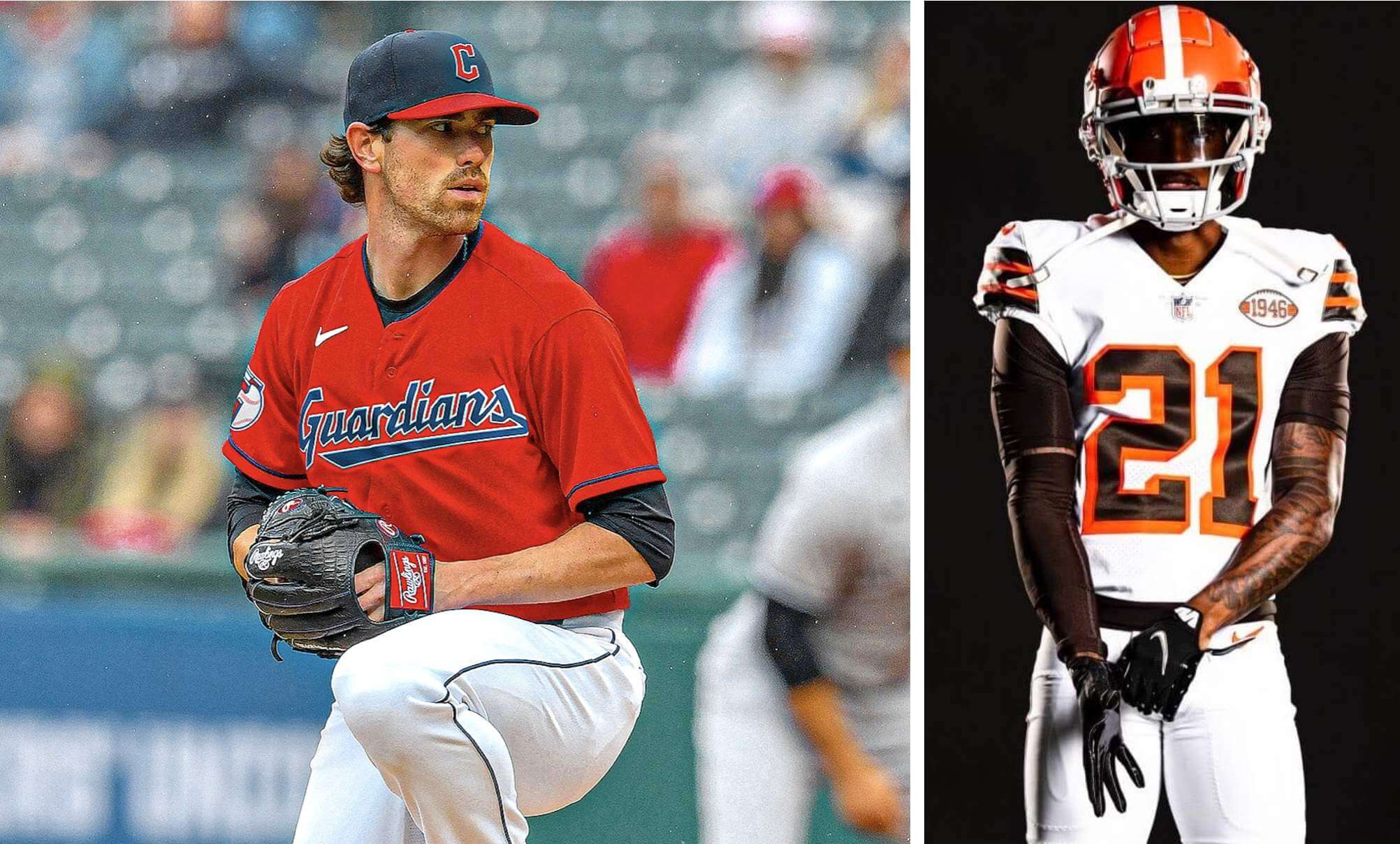
For all images, click to enlarge
As you probably know by now, there was a lot of Cleveland-related uni news over the past few days, as the Cleveland MLB team announced its new “Guardians” identity and the Browns finally unveiled their 1946 throwbacks (part of their 75th-anniversary celebration). Before I get to my own thoughts on those developments, let’s have a standing O for Phil, who provided great coverage over the weekend. If you haven’t already read his stories on the Guardians and Browns, I strongly urge you to do so.
As for me: Let’s start with the Browns, since that’s a fairly straightforward situation. Just to refresh your memory, here’s a look at the design:
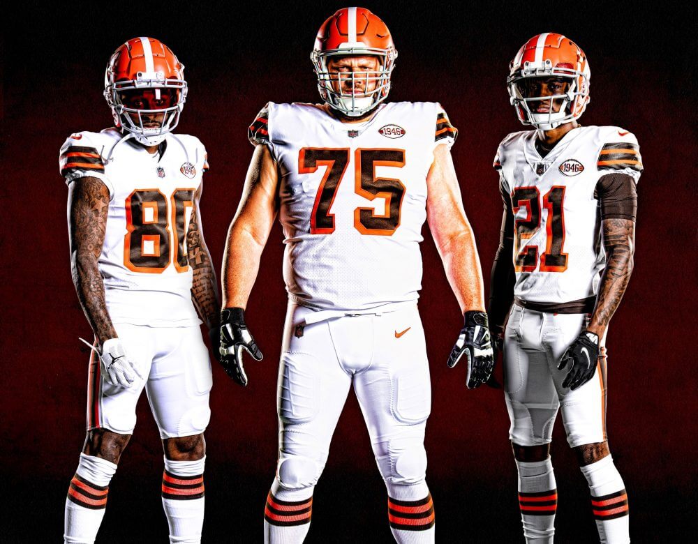
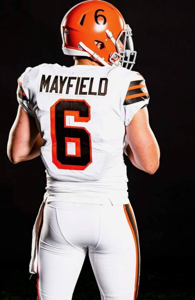
As Phil did a good job of explaining, this isn’t a true 1946 throwback, because the one-shell rule makes it impossible for them to use the era-appropriate white helmet. So instead they’ve added TV numbers and a white stripe to their standard orange shell, mimicking the look they had in the late 1950s.
While the resulting uni may be more fauxback than throwback, it still looks great. I love the helmet, the block-shadowed jersey numbers, and the sleeve/sock stripes. My only gripe: The “1946” jersey patch seems really cheesy to me. I mean, imagine if every throwback uni had a patch indicating its year of origin — lame-o. And the matching “1946” decal on the back of the helmet isn’t even accurate, since that helmet design didn’t yet exist in ’46.
Those are minor quibbles, though. Overall, this gets a big thumbs-up from me.
Okay, now let’s talk about the Guardians, going one element at a time:
The Name
Ever since the team announced that it would be changing its identity, people have been asking me what I think the new name should be. My answer has been the same all along: “I have no dog in this fight. As long as they move away from the Native American theme, it’s an upgrade.” And that’s still what I think — “Guardians” is way, way better than “Indians.” (And yes, they both end in “dians,” which was no doubt a factor in the final choice.)
As you’ve probably heard by now, the new name is based on the city’s “Guardians of Traffic” statues (you can learn a lot more about them here). That’s a very local reference — I’ve been to Cleveland at least half a dozen times but was not even aware of the statues’ existence until the name change was announced on Friday, and I get the feeling that I’m not alone in that regard — which makes this feel very much like a City or City Connect approach. Similarly, the party line throughout the team’s messaging about the new identity has been “It’s the first name that counts; Cleveland, that’s what counts.” Again, that feels very City Connect to me. That’s not necessarily a good thing or a bad thing — it’s just the vibe I get from the name, its inspiration, and how they’re framing it.
I do worry a bit that “Guardians” lends itself to all sorts of comic book/superhero nonsense, but let’s see how they leverage the name in the months and years to come. Any way you slice it, it’s better than the old name, and the local Indigenous community seems pleased with it. I’m happy for them.
(As an aside: “Cleveland Guardians” is also the trademarked name of a men’s roller derby team. The MLB team definitely knows about them and has been in touch. More details in this Twitter thread.)
The Colors
Given how many other teams out there use red and blue, I was wondering if they might use the new identity as an opportunity to stake out some new chromatic territory. But that would probably be too jarring a change for the fan base, so I understand why the team has chosen to stick with the existing color scheme. Sensible, if a bit conservative.
The Script
I hate the script. H-a-t-e the script. It’s all sharp corners and clunky angles. In this regard, it reminds me so much of the Milwaukee Bucks’ “Cream City” script from a few years ago (which itself was clearly based on the Milwaukee Tools logo), except the Guardians script feels more ham-handed, sort of like a Flintstones version of the Bucks script:
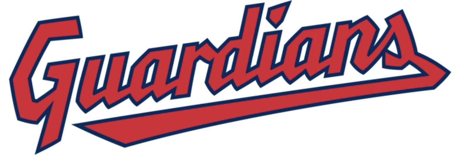
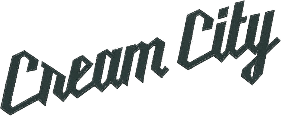
The use of corners instead of curvatures is apparently supposed to evoke a chiseled-in-stone effect, because the Guardians of Traffic are made of stone. In any case, the resulting script feels both brutal and Brutalist — no elegance, no flow.
The “Winged Baseball” Logo
This logo, which will be used as a sleeve patch and maybe as an alternate cap logo, feels very, very minor league to me — although with a few tweaks it could look Major League:

Sort of bizarre that the stitches on the new logo are oriented almost exactly the same as the stitches on the Major League logo, no?
More importantly: It seems odd that this “G” doesn’t match the one in the script.
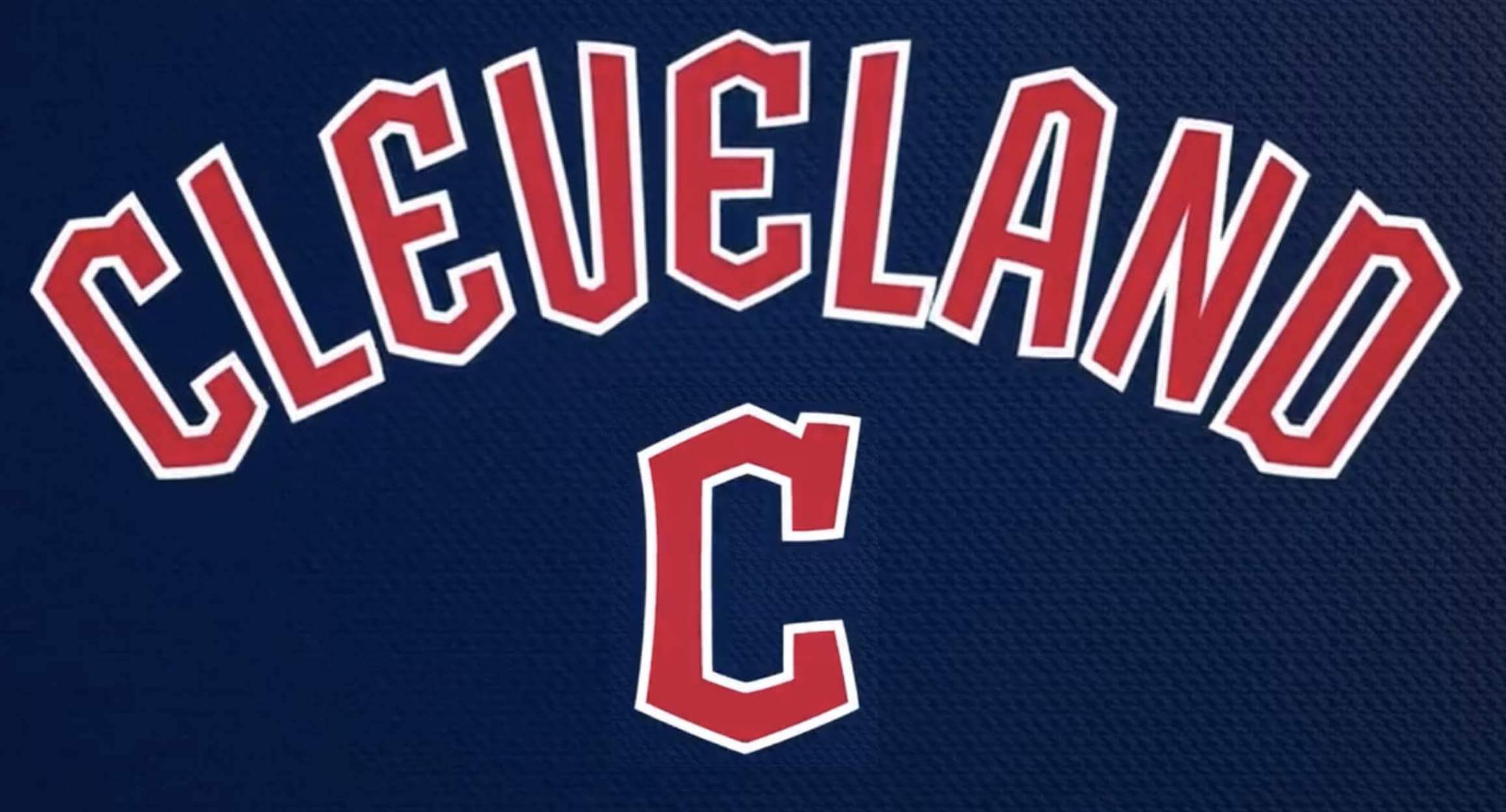
The Wordmark and “C” Logo
Again, this feels very Flintstones to me: clunky, uneven, unpleasant to process with the eye. The standalone “C,” which will be used as a cap logo, is a particular disappointment — after the boring block-C, I figured they’d go for something with a lot more character. Also, the standalone “C” doesn’t match the one in the wordmark (are you sensing a pattern here?).
The font is called “Bridge Print” — again, an apparent reference to chiseled letters in the bridge where the Guardians of Traffic stand sentinel. This is the same mistake the Tennessee Titans made with their chiseled-font uni numbers — type that looks like it’s chiseled into stone might make for good “storytelling,” but doesn’t read well on a uniform.
Speaking of the uniforms, the team has released these mock-ups:
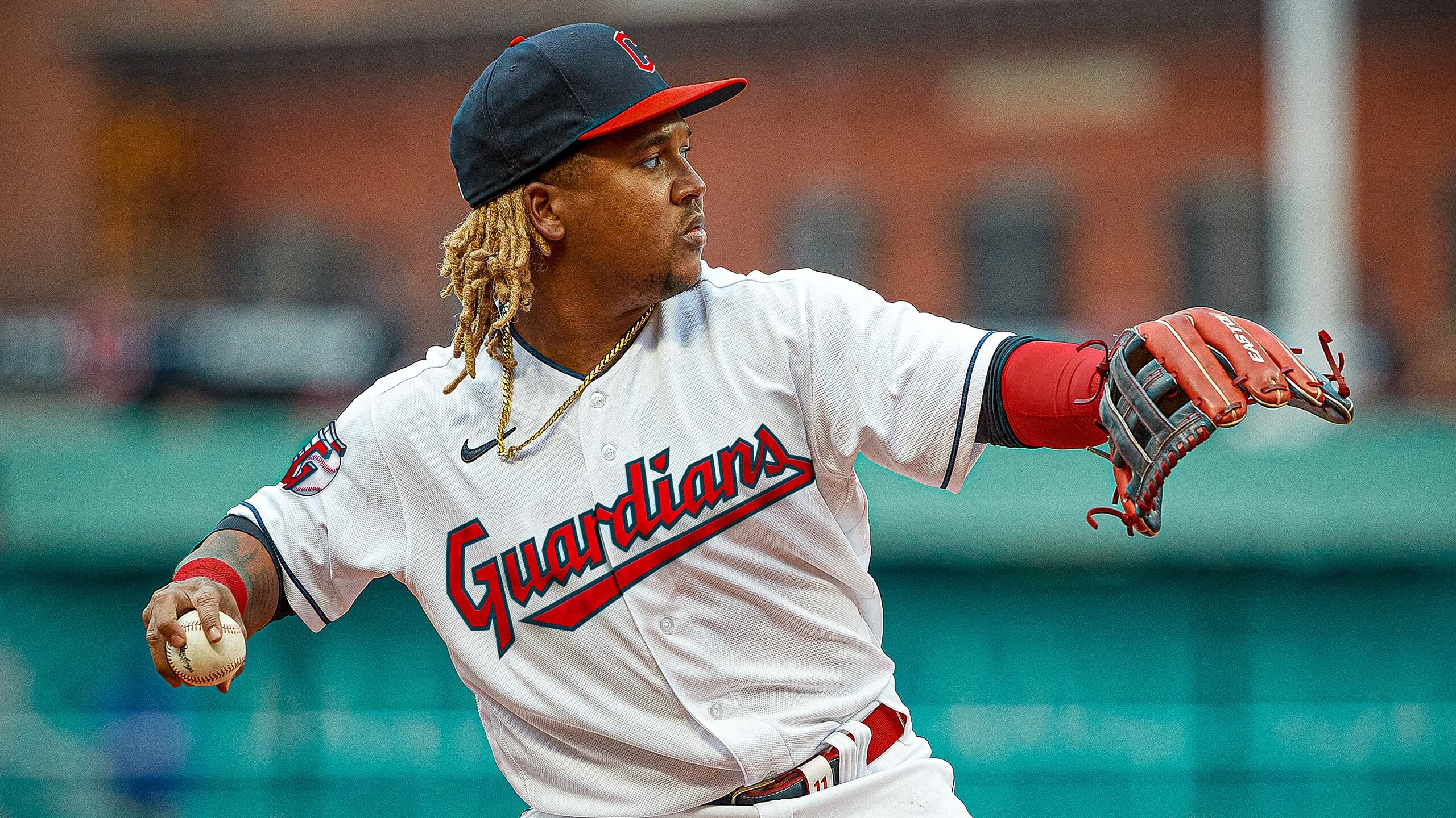
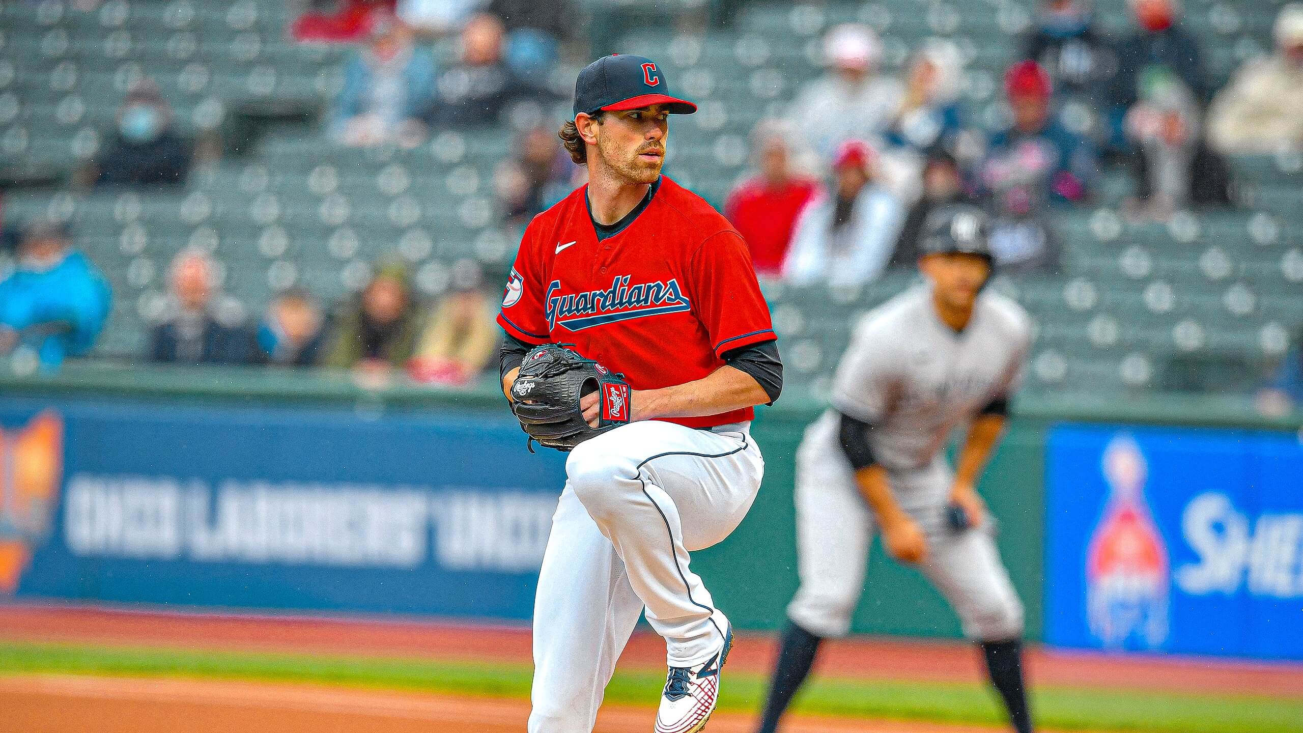
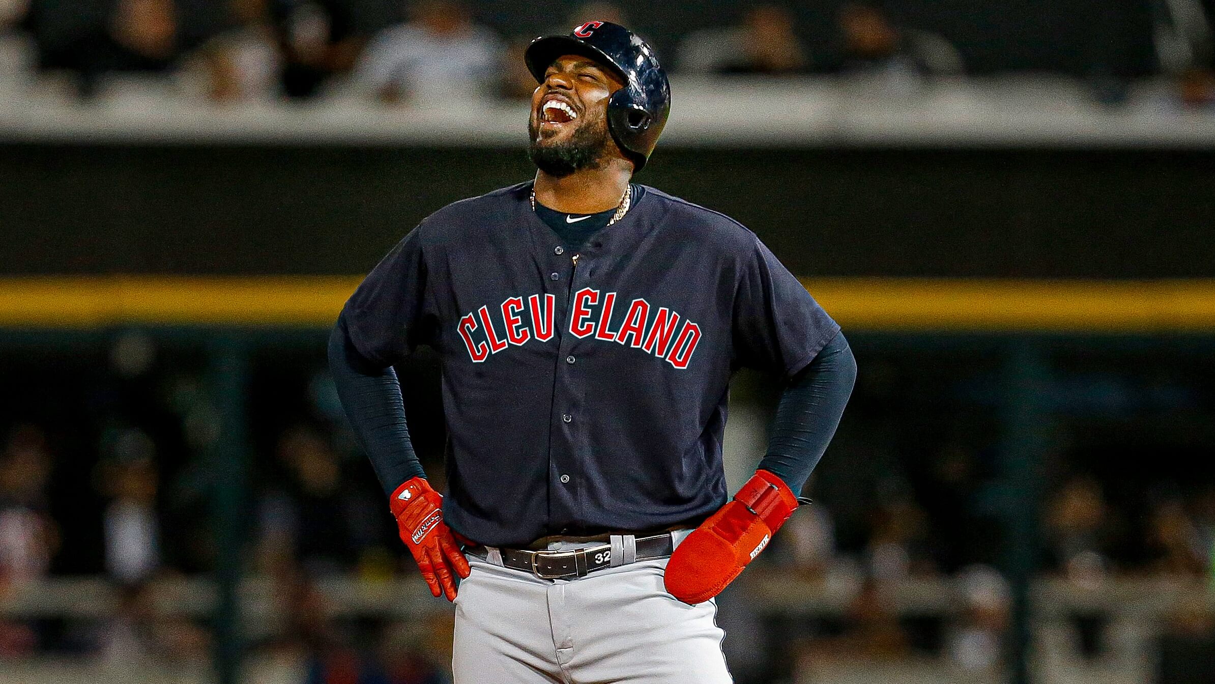
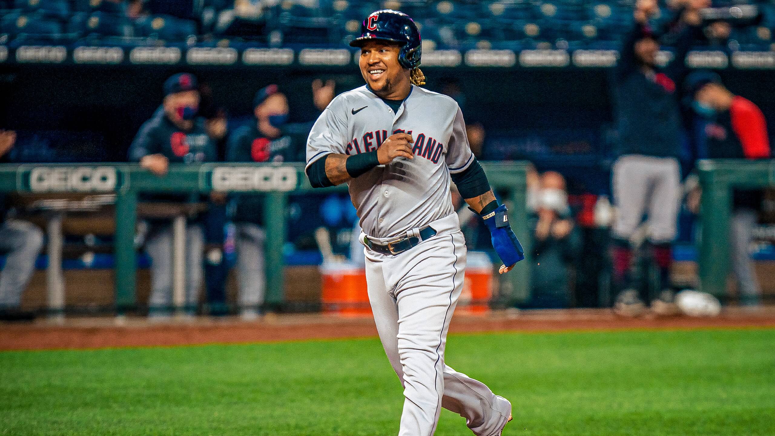
I’ll say this much: Most of the graphics look better on those mock-ups than they do on their own, although the overall effect is still pretty underwhelming. I’ll reserve further judgment until we see the full uniform set in real life.
To longtime Indians fans: I realize that this is hard for you. I totally get the emotional connection that forms between fans and their favorite team’s visual identity — hell, that connection is a big part of why Uni Watch exists — so I understand that you may be mourning a bit about the name change, even if you were in favor of it happening. Please accept my condolences — I feel for you.
(My thanks to Twitter-er Brian Chesnick for the ‘Major League’ joke and mock-up, and to Rick Moreno for pointing me toward the roller derby thread.)

Click to enlarge
“When you come to a fork in the road, take it!”: On Friday we drove up to western Massachusetts, where we saw some music and spent the night with Mary’s brother and his family. The next day we drove southwest to the Hudson Valley, where we met up with friends and spent the night near Kingston, N.Y. Along the way, we passed the town of Rock City, N.Y., where there’s a fork in the road — two of them, in fact.
The forks are at the intersection of Routes 199 and 308. The two roads split around a grassy triangle of land, where a local artist named Stephen Schreiber erected a 31-foot-high fork in 2000. The sculpture is locally famous and has been featured in various road guides, but we had no idea it was there until we drove by it. Seemed worth a stop, so we pulled over and took a few pics:

As we were getting set to move on, we noticed another piece of playful art (by the same artist, I’m pretty sure:

After being stuck at home for so long during the pandemic, it’s great to see roadside attractions like these. Looking forward to more of the same next month, when we have a nine-day road trip planned.
Click to enlarge
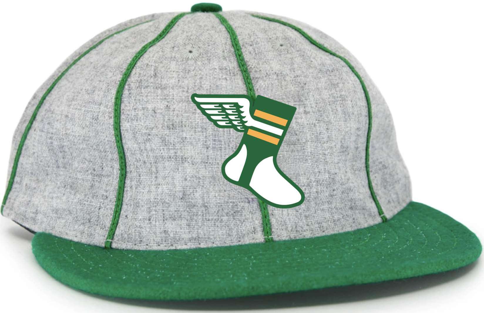
LAST CALL for the new cap: I’ll be putting this cap concept into production with Ebbets Field Flannels in the next day or two. I’ll be ordering enough for readers who’ve expressed interest, plus a few extras — but not many extras. So if you want in on this cap, you must tell me now.
If you emailed me to say you’d be willing to purchase this cap, I will soon be getting in touch to ask you to pre-order and confirm your size.
If you missed my previous posts about this cap concept, here are the details:
• This will be an eight-panel cap (not the more common six-panel) with green piping as shown in the mock-up.
• Just like the Classic Cap, this one will be 100% wool and made in the USA by Ebbets.
• That green brim is a Kelly green. As I recently explained, Ebbets no longer has the shade of green we were using for the Classic Cap. I don’t want to do a solid-Kelly cap, but I think the combination of Kelly, grey, and piping works really well.
• Speaking of the brim: The photo that I used for the mock-up showed a cap with a short, soft visor. But the real-world cap will have a conventional-length stiff visor.
• No visible maker’s mark, of course.
• It should be available to ship around the end of September.
• Based on the quote Ebbets has given me, the price will be $43 plus $6 shipping.
If you’re interested in pre-ordering this cap based on the info I’ve just provided, please send me a note indicating that you’d be on board. If you want to list your preferred fitted size, that would also be helpful. I’ll be back in touch soon to arrange your pre-order payment. Thanks!
The Ticker
By Jamie Rathjen

Baseball News: The Orioles usually wear black jerseys only on Fridays but have now worn them for three games in a row (from multiple readers). … Reader Darick Sears sent us a picture for the Ticker item yesterday of Bally Sports Wisconsin using the new Guardians logo in its graphics, which didn’t have a picture. … Double-A Harrisburg Senators manager Tripp Keister was ejected for removing his cap and jersey during an argument (from Max Weintraub). … The Single-A Lansing Lugnuts are doing a promotion for Tool Time, the show-within-a-show on the sitcom Home Improvement.

Football News: The Buccaneers are planning to use colored wristbands during practices to distinguish between players who are and aren’t vaccinated (thanks, Brinke). … South Carolina’s Williams-Brice Stadium has a new banner that clearly uses the wrong shade of garnet, and the school admitted as such (from David Sharples).

Hockey News: The KHL’s Metallurg Magnitogorsk have new jerseys (from Conan Smeeth).

Basketball News: Ohio 1804, a team in The Tournament, comprised of former Ohio University players, has interesting Ohio-themed uniforms (from @TreeWeezel).

Soccer News: On Friday, Germany’s 2. Bundesliga’s Schalke 04 wore black armbands for the victims of the recent German floods (from my brother Nate Rathjen). … New second shirt for Portugal’s Sporting CP. … Scotland’s women’s team are to start playing all their games at the men’s home of Hampden Park in Glasgow. … Kansas City NWSL goalie Katelyn Rowland was traded to the team from North Carolina last week and kept her No. 0, remaining one of the few pro players to wear it. Kansas City also has a No. 99, midfielder Victoria Pickett, and not only does KC now have both 0 and 99, Rowland was previously sometimes listed as No. 99 on scoring apps and websites like ESPN that can’t display somebody wearing No. 0. Now that Rowland’s at Kansas City, ESPN duly switched her to No. 98.
Olympics News: The U.S. women’s 3×3 basketball team wear a grey version of the other basketball teams’ white uniform, but have the same blue one. … Members of the Great Britain soccer team have been kneeling before matches and getting their opponents to join in, and yesterday the women’s field hockey team also did so and got Germany to join them. … It wasn’t just Uni Watch readers who pointed out that France’s men’s basketball team wears the Jordan logo but the U.S. teams don’t (from Chris Mycoskie). … At least some of the teams participating in the first games of the rugby sevens tournaments have numbers on the front of their shirts, which is unusual in sevens (from @Stumpy7780). … The Mongolian 3×3 basketball team appears to have a cover-up patch over its maker’s mark (from @flowfloxflow).

Grab Bag: Here is an overview of the shirts for The Hundred, a new English men’s and women’s cricket competition that started last week using an also new short-form 100-ball format. … New pandemic surges are slowing down production in Nike’s and Adidas’s Asian factories.
I’m a lifelong Cleveland baseball fan who had opportunity to participate in the name change discussion. The single most important thing I stressed was to have a name that was tied to something uniquely Cleveland. Based on the confusion of fans outside NE Ohio, I think Guardians did that and I can live with the name. No matter what name was chosen people were going to hate it.
As for the logos, graphics, etc. To me the wordmarks evoke the Caveman C era particularly with the cap. It’s not the greatest look but it’s kind of unique. The C logo looks like the caveman C mashed up with the block C of the early 80’s that followed it. The ball logo? Hot mess. I’m not worked up over it because the team had to rush to release the name on their terms. I fully expect these logos and wordmarks to be fine tuned and slightly revised before they end up on uniforms and fan merch. I believe the same thing happened with the Jacksonville Jaguars and Houston Texas initial logos.
I agree on the new C logo, I find it to be a good nod back to the caveman days but actually a bit more visually appealing. I’m not even a Cleveland fan, but that generic block C they’ve had as the primary cap logo lately has bugged the hell out of me. I’m not quite sure why, especially since it replaced something I found abhorrent.
Always thought the Block C would have benefited from having a white outline The new cap C remedies that and looks terrific.
The new name is ok, and yes, I see how the wordmark does harken back to the caveman days…I like it.
Ball logo needs to go…too ‘Angelic’.
I would like to see a “Cleveland” script in the same style as the “Guardians” script.
GUARDIANS RE-BRAND
The new “C” on the caps is clunky and really not that good looking, as is the corner-intensive “script” on the jerseys.
My biggest gripe with the entire re-branding is the Flying “G”, or “Pegusus G”. It would look 1000% better if it were a flat,
winged “G”, instead of the oblique viewed two “Gs” sandwiching a baseball.
My thoughts on Guardians mirror Paul’s. I have no stake in this but think the name should have been changed. This should be an easy name to adjust to over the years and I think it will fine.
I do not love the script but the uni mockups look OK. I think there is a lot of time between now and the official release of the uni’s to clean up some of the details and even if they don’t there is a lot of room to evolve and improve this over the upcoming years.
I do not mind the baseball logo. I kind of like that they are using the G as a pitching grip. If this logo were being used on the caps I might feel more strongly against it, but as a sleeve path it should be OK.
The block C logo for the caps makes sense for now to keep a link to the past but I would like to see them come up with some cap appropriate logo they could use someday in the future.
I would just add that they are clearly trying to lean in to the statues as the reason the name makes sense for a Cleveland team. Trying to link this to statues is the reason for the odd script and the ball logo. In 10 years when we just accept them as the Guardians and they do not have to try to hard to justify the name there ought to be easy new directions they can go to improve the look … if they want and need to.
A fork in the road, like Johnny Carson as Art Fern hosting the “Tea Time Movie” Don’t forget: when you come to the Slauson Cut-Off, cut off your Slauson. link
I get the gentle approach to moving fans to a new identity, and maybe it is the right one, but I would imagine that a lot of the fans that are resistant to the change (and I’m related to a few of them) could be easily annoyed by the similarities. If you’re prone to see the rebranding as a corporate/political sanitizing of your beloved team identity, would you really want it to actually look like one, day in and day out? But I’m not a Cleveland fan, and I’m decidedly more of a rip-off-the-bandaid type of person.
People are always resistant to change and social media and the local editorial page is full of “team falls victim to cancel culture” type comments. The team clearly wants people to associate the Guardians name with Cleveland baseball history. The color scheme and other similarities are designed to help with that. Doing the right thing can be divisive. The team knew that. But they knew that the status quo was no longer an option. It should have happened when Chief Wahoo was retired but what’s done is done. This is why the hype video stressed Cleveland so much. The nickname may cause division but the city name should unite people.
I see your point. I could feel very differently if it was my own favorite team seeing such a change. As an outsider, I’m looking for more excitement…and as a Red Sox fan, I’d love Cleveland’s home white and especially road navy’s to confuse me less for a split second when I’m watching random baseball highlights.
The Browns throwbacks are an excellent reminder that the team should have numbers on the helmet full time. It just works for them from a sort of minimalist design standard.
Feels much more appropriate than helmet numbers on Football Team’s temporary design, or with the lightning bolts on the Chargers’.
The Browns throwbacks are an excellent reminder that more teams (OTTOMH, Chicago, Houston, KC) that can should go white-over-white full time, especially the Washington Redsk…err, Football Team, given that they have ditched the yellow pants again.
The blank orange helmet should remain blank. Always.
If I ran the IndiGuardians, this could have been a chance to change the colors scheme a little. Cleveland is known as The Forest City, so why not go forest green and red? A link to the historical team colors and the city itself? No other pro team besides the Devils goes dark green and red. Maybe an off-white/cream home set like the SF Giants? Coulda shoulda woulda.
Since they didn’t go Spiders, I guess this is better than the current but they left a lot of upgrades out of the final product.
“No other pro team besides the Devils goes dark green and red.”
The Minnesota Wild do.
And except for the RR (or the rare throwback), the Devils don’t anymore (and haven’t for decades)
Wild: true; I forgot that they eliminated a lot of the yellow/gold.
Devils: should never have changed from red and green.
Re: Guardians
1) The winged logo is awful.
2) The name feels very much like was chosen because it sounds similar to Indians, rather than it actually being the best or most popular choice.
3) Totally agree with Paul’s thoughts on the colors. Now was the time make that move. Instead it is a bland name with what is a generic color set in MLB.
4) Fonts are mediocre, but probably the least disappointing part given the three previous problems.
Regardless of the name chosen, they should have gone with the 1921 style C for the cap, in some wat used the crest from the city flag as the basis for the new logo, and changed up the colors (my preference would have been burgundy and baby blue). Aside from the new logo nothing here is horrible, but in all very much a wasted opportunity.
First off, Paul, thanks for the comments about Cleveland’s name change. I’ve been a fan since the ’80s, and was definitely in favor of dropping “Indians.” That said, the move to Guardians, especially with the ill-conceived and poorly designed logos and workmarks just feels like a huge slap in the face. The feelings remind me of when the Browns announced they were leaving for Baltimore.
I would have much preferred something connected to Cleveland’s baseball history. Spider, Forest Citys, Buckeyes, Bronchos, Blues…anything to connect to the franchise’s past other than the last 5 letters of the name. It all feels forced, contrived, and very much like somthing that should have been the Nike-ified city connect alternate rather that the permanent identity. I’m struggling to get past that, and I’m not sure I ever will.
I don’t know that I like the name, but I seriously don’t understand anyone (meant generically, not you) seriously considered Spiders, Blues or Buckeyes as possibilities that had any chance of happening. The University of Richmond and St Louis Blues would have stopped the first two.
As for Buckeyes, Ohio State sued Ohio University over using the word “Ohio” … there is no chance they would have permitted another team, especially one in Ohio, to use “Buckeyes”. Cleveland would have gone from the Indians to folding in order to pay the damages. A roller derby team can be bought off; Ohio State has more money than the Dolans can dream of.
As a lifelong follower of Cleveland baseball, and as a pragmatist, I think they did fine. It’s safe, it’s somewhat generic, it’s almost boring. They were in a tough spot having to come up with a re-brand that everyone was going to hate… not an enviable position.
As to the logos and wordmarks, I echo what Doogie said above…good chance there’s an attempt at harkening back to the Caveman-era look going on here, and if that’s the case, it works. Even if it’s not, there’s nothing so egregious with the design that I can’t live with it. I’m sort-of hoping they follow the recent example of the Nationals…Washington’s initial set was godawful, all those heavy beveled edges and drop shadows, but they soon settled in to the more traditional, “baseball” looking set they have today. I don’t think Cleveland is necessarily done with this rebrand.
And the Winged-G? I think the concept is great, though it needs a little work. They’ll get there with it.
I’m from southwest Ohio, so I’ve enjoy dunking on Cleveland whenever I can, and it’s been easy the past few days because this is so… silly. Like, seriously? The primary criterion for the new name was how many letters it shared with the old name? But I kind of have to admit that Guardians is growing on me. It’s the kind of silly name that, if they’d been named that in 1927, everybody would just accept, like how we accept “A’s” because that’s just how those wacky 1920s people named things. And considering how wacky 1990s-2000s-2010s people have named things, we’re pretty lucky that they didn’t end up being named the Cleveland X-treme Edgelordz or something. Ten years from now, when the novelty has worn off and nobody remembers the “storytelling”, it’ll sound classic. The color scheme is still classic, you can work with the logos and wordmarks, so I think this is a win for Cleveland.
At least they didn’t come up with one of those compound word names like a lot of minor league teams do. There is actually a team in Jacksonville in AAA. Their name is the Jacksonville Jumbo Shrimp.
RIP Jacksonville Suns. That was a good name that should not have been changed.
I agree with Kevin. I feel the same way about Guardians that I did when the Nationals were announced. It’s a bit disappointing when something is bland when it could be unique, but there’s something to be said for blending in as well. Like the Nationals, time will make the Guardians seem natural and generally forgettable.
I don’t understand the criticism of the hat logo “C” not matching the “C” in the “Cleveland” wordmark. Isn’t this pretty par for the course in baseball? It’s true of many of the most classic, most respected sets out there. For instance, per your Bulletin page Paul, one of your favorite MLB uni sets (mine too) is that of the Athletics, and the “A” in their hat logo and the “A” in their home wordmark absolutely do not match either.
Anybody else find it a bit odd that the Guardians ownership (and many fans) wanted reminders of and connections to the team’s past…a past with a racist nickname and logo that necessitated the change in the first place?
It’s almost a bit of a dog whistle that the team didn’t really see anything wrong with the old imagine and the change was made strictly due to public pressure?
Come on. Really?
Well, maybe it’s obvious that the change was made strictly due to public pressure. But I think the mixed messages are interesting nevertheless.
Same amount of syllables probably has as much to do with it as anything else. There is a flow to a three syllable name that you won’t get in a shorter name. As well as the connection to something, anything to the city’s heritage.
Can’t you 24/7/365 Wokies even “win” anything with any semblance of class and humility. You agitate a change in a team’s century-old identity and name, and now you are carping and complaining that it isn’t enthusiastic or quick enough.
Get a Life.
Hey, there’s still one or two American urban restaurants without George Floyd murals and icons to have everyone look at while they try to eat. Go hunt them down and fix that “problem” ….
If after the 1914 season, The Cleveland Naps changed their name to the “Guardians”, Cleveland fans, like me, would be just as upset to let go of that name, as they are the “Indians” in 2021.
Also, I personally couldn’t agree less with your take on the “Guardians” wordmark, Paul. In my opinion they succeeded in doing something incredibly hard – creating something unique and distinctive with the angular edges, while still reading as classically “baseball.” It’s by far my favorite part of the redesign.
We’ll have to agree to disagree on that, Dan!
I used to pass the big Prozac capsule when driving to visit my pal in Western MA from the Hudson River Valley. There is (or was) a very large chicken sculpture / advertisement by the side of the road. Good stuff and a super nice area. (I missed the tickets for Waxahatchee in Jersey City, but they are good!)
Love MASS MoCA!
Great coverage the past three days, guys. (Well, always, but you know what I mean.)
Long-time Indians fan here. The new name isn’t knock-your-socks-off great, but what could they have chosen that would have been better? (Don’t bring Spiders, Blue Socks, or Rockers ’round here, son.) At least I don’t hate it.
And yes, it was good to keep the red and blue color scheme. I believe going to some trendy garbage like black, purple, and/or teal would have been a disaster as far as fan acceptance goes. I would have loathed that, and I suspect a huge majority of fans would have despised it as well. The red and blue script has softened the blow. Smart move.
As for the Brownies, they have done a nice job with the uniforms ever since they shitcanned those clown costumes they wore from 2015 through ’19. And the fauxbacks are pretty nice too, given the shell restrictions. (But they have got to stop wearing those putrid brown pants forever. God, those are horrible.)
“But they have got to stop wearing those putrid brown pants forever. God, those are horrible.”
Cleveland Browns should never wear the brown pants with brown jerseys.
However, I like the current brown pants with the 2 orange stripes when they are worn with the white jerseys. The striping matches good with the sleeves and socks when wearing white jersey and accompanying socks.
I’d love to see Kevin Morby live, he’s great! I grew up in the Hudson Valley in the Poughkeepsie/Beacon area, and live in Rockland County now. If you ever want day trip tips for the area let me know.
I’m surprised I haven’t seen anyone mention that the tittle on the “I” in “Guardians” is the shape of Ohio. At least that’s what it looks like to me.
That’s interesting. Without an announcement it’s hard to say whether or not it is intentional. Likely just a coincidence like the Pirates’ “keystone serif” or when people thought the Richmond Flying Squirrels logo was in the shape of Virginia.
I think it looks like home plate more than Ohio, but the resemblance is definitely there
Why are you so confident that they didn’t originally design home plate in the shape of Ohio? ;)
The Guardians have given every middle school and high school called “Indians” a template for change. The Washington Football Team punted on that opportunity.
Look for little “Guardians” to start popping up everywhere.
You can count me in the camp that wanted a change, but still gets that empty stomach feeling.
For the Browns 1946 patch, I like that they didn’t go for the standard diamond motif. While yes, if all throwbacks had the year on them, it would be lame, but I definitely prefer this approach over most other 75th anniversary patches.
As for the Guardians, I don’t really like much about the entire branding package, from the the name to the scripts and logos. But I think that’s why it will probably be successful long-term. Most great baseball names and uniforms are only great because they are classic. Yankees is a stupid name, and their uniforms would be considered yawn-fests if they were unveiled today (and the hat and jersey logos don’t match exactly!). Same with the Dodgers, Tigers, and Cubs. Iconic teams with iconic uniforms that would be panned by the majority of the public if we saw them for the first time today. So I think the Guardians skipped the step of being hip and cool, and went straight for something that seems like it’s always been there. It’s how I’ve always thought of the Mets. They seem like they’ve been around so much longer than Houston.
Re the Clevelandians: glad they kept blue and red. Might be overused in the league, but keeping the colors would be pretty important to me if I was a fan of the team. Any new name would have sounded strange at first, and I liked Spiders the most, but I can see why they avoided a prior team’s name.
I got the same vibe as someone above re the cap “C”. The first thing I thought of was the old caveman font. I think I like it. Don’t mind the script too much (although it looks strange from a distance) and agree the ball logo is super stupid looking (although I enjoyed how Paul evolved it into the Major League logo).
Regarding the name itself, I asked a friend of mine, a life-long resident of the area, if there was any local connection between “Guardians” and Cleveland. Not being from there, I really didn’t know. He said he knew of no connection (his exact response was “none whatsoever”). Not sure what others from the area would say, but I question how well known/recognized the whole guardians of the bridge/highway thing is locally, and more to the point, what meaningful connection there really is. My sarcastic takeaway was that the guardians on the bridge are so well known that a life long Clevelandian had never heard of it. All that local connection BS seems forced to me. On the other hand, my friend may just be oblivious. What would you other Clevelandians say?
People here were vaguely aware of the statues, but nobody has ever made much of a deal about them. They’re nice, and they’re there, but that was about it.
And I don’t think very many people knew that they are called Guardians of Traffic. I didn’t, and I’ve live here forever.
But the statues have certainly gained instant fame locally, and we’ll probably be seeing and hearing a lot about them, at least for a while.
BTW, the very first image that appears on the screen during the movie “Major League” is one of the Guardians. Check it out on YouTube. How
prescientcoincidental was that?My mom is from Cleveland’s suburbs. She didn’t know about the statues. She also asked people she knows from Cleveland. I believe they all also didn’t know.
I’m also a Cleveland west sider, and Guardians was one of the first names to pop in my mind when they announced they’d be changing. The fact that you can see the statues from the ballpark probably gave me that idea.
I sure hope that the rationale for the name being the last five letters was not the driving force! Not a big fan of the wordmark, less so of the “split finger-fastball G. Just glad to be moving forward!
Alumnus of Case Western Reserve. I must admit that I had no idea until I looked it up.
This might be an unpopular take on Guardians, but…
I am a lifelong (53 years) Cleveland baseball fan. I thought the name should be changed. The name I would have preferred was not chose (Spiders). Guardians is a little bland.
However.
Ignoring the team history as the Indians – and ignoring the Cleveland football franchise’s history (good and bad) for a moment.
As a name, “Guardians” is still a better team name than “Browns”.
In ten years, Guardians will seem normal.
I haven’t watched much Olympic soccer, but I know the teams knelt before the kickoff in the US-New Zealand game. I don’t know if it’s happening in every match in the tournament or just select teams choosing to.
The rebranding of of the Indians/Guardians reminds me of that of the Expos/Nationals, even though the circumstances are different. The result is a navy/red team with a name that was calculated not to offend. And like the Nats, the Guardies are going sharpen the good ideas while tossing aside the bad ones. This change is going to wear pretty well over time. Also, I don’t get the hate over the “G-baseball” logo; it mimics the style of the statues pretty well.
I’m gonna start drawing caps with silver wings on the sides, now!
I’m a fairly casual fan of the Cleveland MLB team — they’re probably about my #5-6 favorite in the majors, and I live about 100 miles away somewhat within the team’s sphere of influence, and for what it’s worth, first and foremost, I think keeping the colors was the most important aspect of this makeover for me. What matters most in my case is that this team has been a presence in the AL for 12 decades and retaining some continuity with and role within the game’s history is the primary concern I had going into this. So while I don’t actually love any aspect of the re-design, I love that it so smoothly transitions from the team’s current visuals.
Wait, ESPN.com can’t display #0? Am I the only one kind of shocked by that?
As an Indians fan since 1968, I was against the name change but when the dust settles, I think Guardians will be just fine. I am not against the sci fi aspect (with Guardians Of The Galaxy) as it puts the name in line with Astros, Rockets, IMO. The logos will be tweaked down the line I would bet. Lots of well grounded posts on todays comments here on the topic. Bravo to Doogie Stardust for his opening comments today. He nailed it! Go Gaurdies!
In regard to Cleveland’s “Winged G” logo looking very minor league, completely agree, I might even go further and say it’s a logo you would see in something like a High School Year Book, or your local pee-wee baseball team.
Guardians while could be worse, reminds me too much of Guardians of the Galaxy, which will quickly date itself? Not unlike my city’s basketball team – the Raptors
Wade, I actually sort of like the Elks white numbers (re; your comment on Friday), the numbers they’ve worn in recent years have always seemed a little too messy, I could never figure out if there was some black trim thrown in
Since 1996, the Edmonton Eskimos had the black drop shadow on their numbers. I did not like it. It did look messy because the black trim of the numbers touching the forest green did not contrast well.
I do think there are improvements in the new numbers with regards to the font now and no more black trim in the uniforms. So it is not the end of the world. However, would have preferred they go with just the one-colour yellow number instead of white. They have the yellow numbers on current practice jerseys. The yellow numbers would be just like the team used to wear. Reminiscent of the Grey Cup glory years:
link
The white numbers make the jersey look like the Packers. The Edmonton football team for as long as anyone can remember have worn yellow or gold numbers. If going with white numbers, they should have at least put some yellow trim on them.
The Edmonton FOOTBALL CLUB’s former “EE” Helmet logo was pretty sharp, Why not keep it?
The Green Elk antlers look pretty awkward, as Green thin antlers over a Yellow helmet does not read well from a distance.
Yellow antlers over a Green helmet would read immensely better. The older “EE” logo reads better.
The new plain jersey numerals are hideous.
Yellow numerals over a Green jersey would look 1000% better. No sin to use trim to make numerals stand out.
You have colors, use them.
A flat, non-oblique single “G” with the wings would look 1000% better. The oblique two-“G” baseball sandwich indeed looks almost satirical. Silly. An 8th Grade art class concept put together in a pop quiz ….
Also, why not use the “C” logo font used on the team’s caps in recent years? I guess you can’t sell those older font “C” caps to those owning them already, so that was a non-starter ….
The “Cleveland” wordmark looks like they were trying to line up individual letters to get heat pressed and the table got bumped.
I’m more or less okay with the name they chose but the lazy rollout and the conservative nature of the “change” are what irked me most. Feels like the approach was let’s make a change without changing to appease people who hate this. It seems like the only reason the script even changed was so the G could be more legible than a traditional script G would be. But in the end, the people who hated the change still hate it and the people who were on board were left feeling VERY underwhelmed. I include myself in that. I wanted them to go bold and really overhaul everything. This was their once chance. Hopefully things evolve over time, but it’s frustrating that there are fan renderings and ideas out there that are infinitely better than what they actually rolled out.
All fair points, but I’d swap “rushed” in place of “lazy”.
Either way, I was hoping for better. (Which is pretty much the theme for all of my beloved Cleveland sports teams.)
Here’s an article that really delves into the history of the first use of the Indians team name: link
Specifically on the double-G logo,
More importantly: It seems odd that this “G” doesn’t match the one in the script.
To my eye it does match almost exactly. The only difference I can see is that the tail of the G is more elongated, and thus more acutely angled at its bottom, on the jersey version. Otherwise, both have the same sequence of straight bits and angles in the same places. One is see head-on, the other angled in three dimensions. I don’t love, or much like, the double-G logo, but the one thing it has going for it is that the Gs match the G on the jersey script.
While there’s plenty to pick on with the branding, let’s not lose sight of the big story; A big league franchise – at more risk to the owners than I think most readers here know – not only said they’d change their name, but they did it more quickly than expected.
Terrific write up and terrific Uni Watch coverage all weekend. Thanks, Phil. Thanks Paul.
A flat, non-oblique single “G” with the wings would look 1000% better. The oblique two-“G” baseball sandwich indeed looks almost satirical. Silly. An 8th Grade art class concept put together in a pop quiz ….
Also, why not use the “C” logo font used on the team’s caps in recent years? I guess you can’t sell those older font “C” caps to those owning them already, so that was a non-starter ….
Pasadena has a fork as well. No SSRI though.
link
To longtime Indians fans: I realize that this is hard for you.
Much appreciated, Paul. I wish some of my longtime friends had your tact. From them, I get, “DON’T YOU KNOW THIS IS GOOD FOR YOU?!?”
I’m actually pretty good with everything about Cleveland’s new name and look, except the flying “G” logo. It looks juvenile, something I’d expect to see used by some bush league independent club.
Why not use the head of one of the traffic guardians, either in profile or partially turned?
Here is a link to an image of an Etsy product that illustrates exactly what I attempted to describe-
link
It certainly ties directly into the name and font, and presents a timeless, heroic figure.