By Phil Hecken
Follow @PhilHecken
Good Sunday morning, Uni Watchers. Hope you all had a good Saturday.
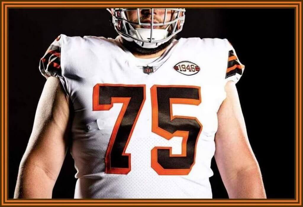
After Friday’s plethora of uni news, as you’re all likely aware, very early yesterday morning the Cleveland Browns released their 75th Anniversary uniforms. While these were mentioned in yesterday’s post, I promised the rundown on those uniforms today.
Unfortunately, due to the leak (which Paul covered way back in March), the jersey design unveiling was one of the worst kept secrets ever. We all knew what was coming — the only details we didn’t know were what pants the team would pair the jersey with, and what kind of helmet the team would use. Both of those questions have now been answered.
Before we look at the “throwback” uniforms — I put that in quotes because, unfortunately as we’ll see, it’s actually more of a fauxback/mashup than a true throwback — let’s take a look at the uniform worn by the 1946 Cleveland Browns.
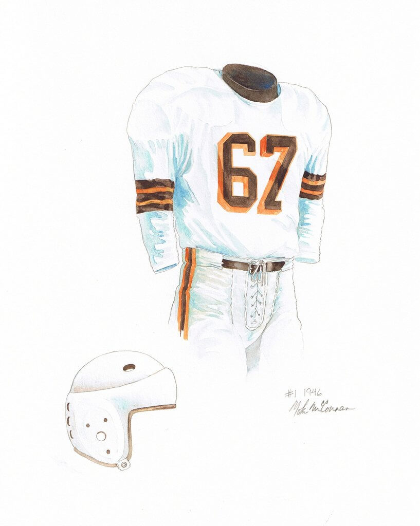
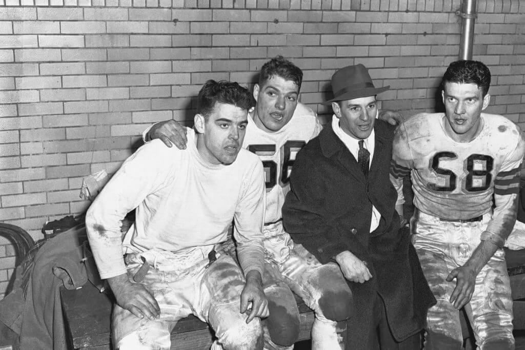
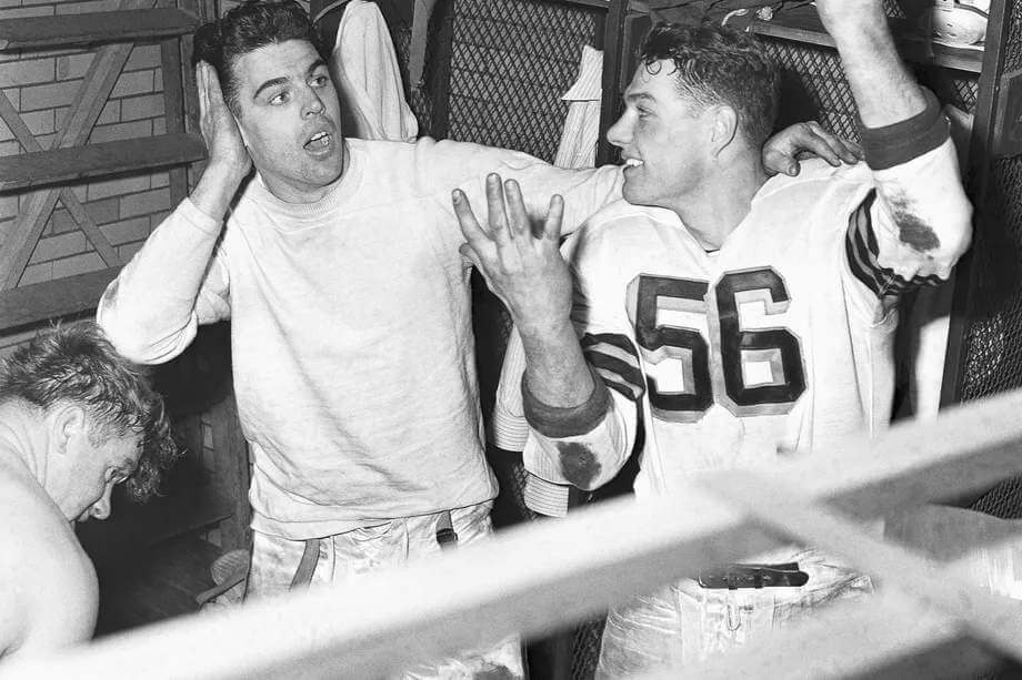
As you can see, back in their inaugural season of 1946 (in the All-America Football Conference), the team wore a jersey very similar to the one they will don in several special anniversary games this year. Obviously, the sleeves were longer, but the classic striping pattern of brown/orange/brown/orange/brown was present back then. Pants were white with an orange/brown/orange stripe, and the team wore plain white (leather) helmets. Here’s some photos from that season:
The numbers on the jersey were standard block, rendered in brown, with a pronounced orange blockshadow. Here’s a great graphic from the Gridiron Uniform Database. In case you weren’t aware, those orange blockshadow numbers were a one-year wonder, as the team went to one-color numbers beginning in 1947. We’ll be referring back to that page in a minute or so.
So…that’s what the original 1946 uniform looked like. How’d the Browns do?
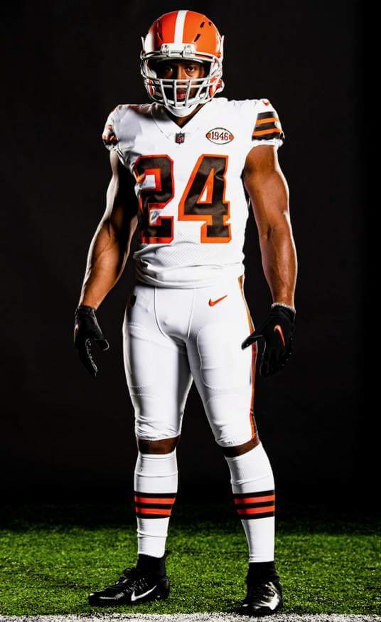
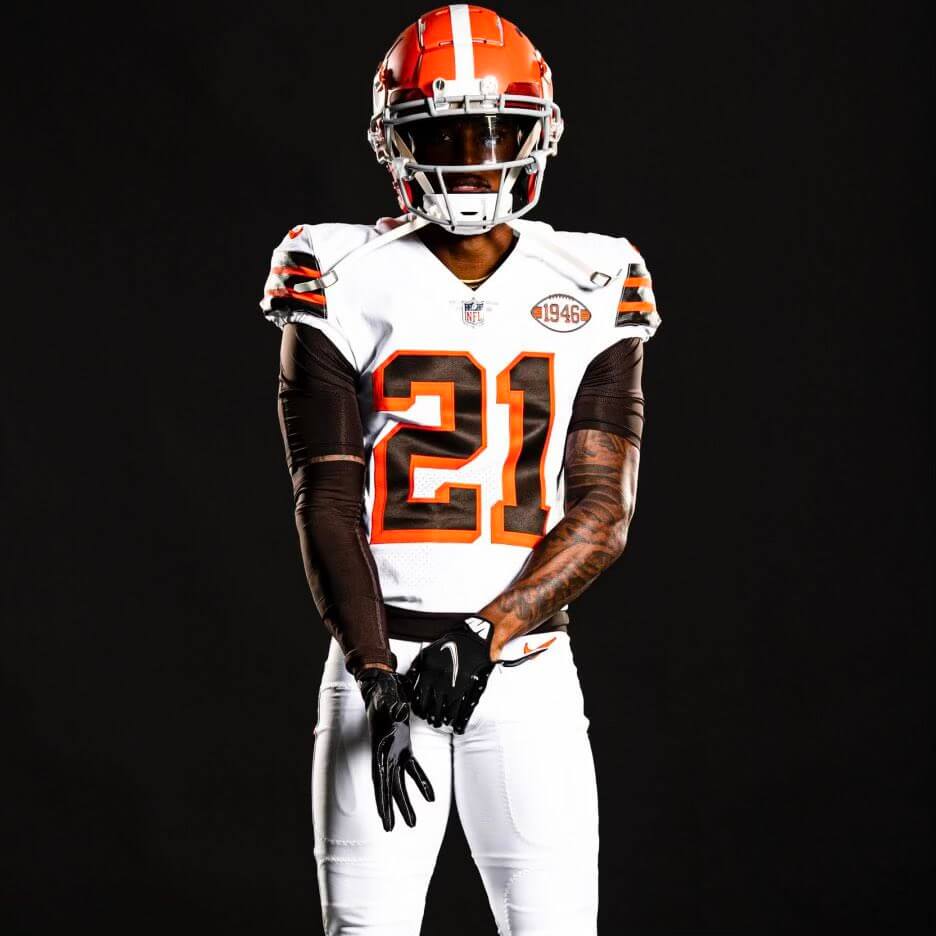
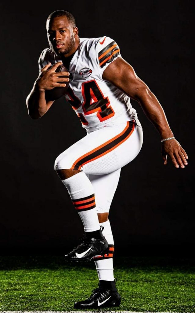
Let’s discount the helmet for a second. As you can see, despite the modern tailoring, the jersey fairly well represents that which was worn in 1946. It’s got the brown numbers with orange blockshadow, and the brown/orange/brown/orange/brown “sleeve” (cap) stripes. Obviously, there were no makers marks in 1946, but neither the 1946 nor the 2021 “throwback” jersey have TV numbers. The obvious signifier that this is a retro jersey can be found in the form of a football-shaped patch with the date “1946” emblazoned in brown on it (really, a football shaped patch?).
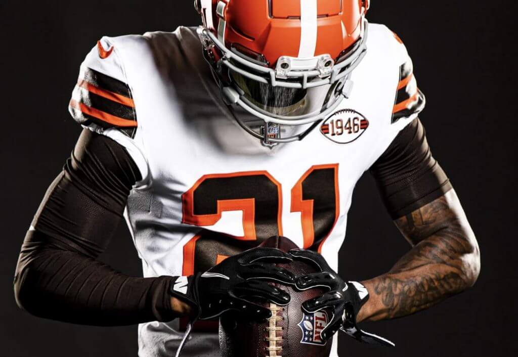
Obviously there were no NOBs in 1946, but as they are a requirement now, the new retro jersey has them. The rear numbers, like their original predecessors, also feature block brown numbers with orange blockshadow.
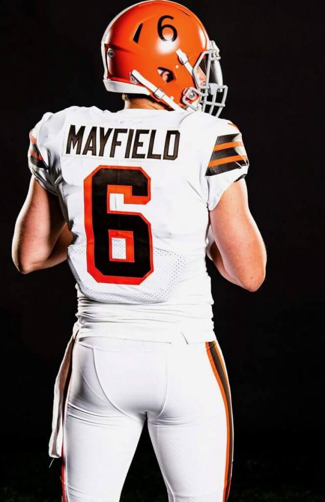
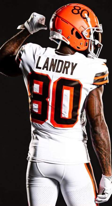
And the pants? Not much has changed between 1946 and today’s look, and the team nailed the orange/brown/orange stripe, as well as the five-striped socks, which mimic the pattern found on the sleeve caps.
OK, now let’s get to that orange helmet. As we’ve seen, in 1946 the team wore a plain white helmet (leather and without any kind of face protection), but due to the still-in-effect “one shell” rule, we know the team can’t (yet) have a helmet in any other color but the current orange. While this gives them some “leeway,” nothing they could wear would make this a true “throwback” look — at least not until 2022, should they continue to wear these (and could go with white shells). However, rather than going with a plain orange helmet (and simply removing the brown/white/brown striping from the current helmet), instead the team has done something intersting.
They took the orange shell, and added a single white stripe as well as TV numbers, and a gray facemask, producing this look:
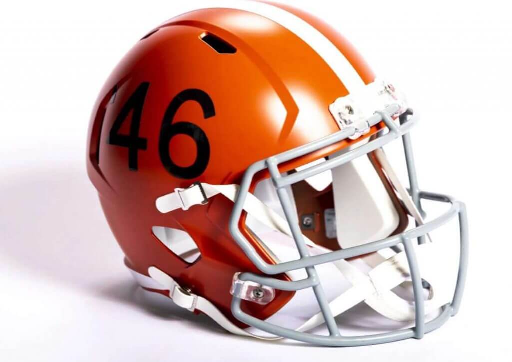
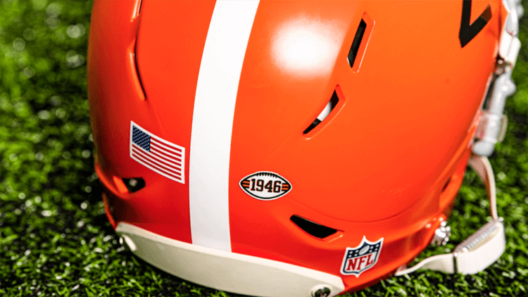
Note the nose bumper is blank — the current helmets have brown masks and the nose bumper says BROWNS (as does the neck bumper). The “throwback” helmet has a blank neck bumper, and will feature a small, football-shaped decal (the same design as the patch on the left breast of the jersey) reading “1946.”
So why the decision to use a white stripe and TV numbers? Well, the team did wear a helmet in that style from 1957-1959.
That’s an interesting choice. For those not familiar, while the team has never reached, let alone won a Supe, they were a very successful franchise from their inception through the mid-1960s. They won four AAFC championships (1946, 1947, 1948 & 1949), and after that league folded following the 1949 season, the team joined the NFL, and immediately won the NFL championship in 1950. They were also NFL champs in 1954, 1955 and 1964. If you refer back to that GUD page, you’ll see the team added a white stripe to the helmet in 1952 (but not TV numbers), and added TV numbers in 1957. So the helmet they’re wearing with this uniform is not in the same style as any of their AAFC or NFL title seasons. Obviously they can’t go with a “straight” throwback plain white helmet, but they’ve chosen to mash up the 1946 uniform with the 1957-59 helmet.
The team will wear the fauxback uniform three times this season, but haven’t announced which dates they will be worn.
Like many of you, I’m a big fan of throwbacks and (usually) fauxbacks, and I love these. Considering the one-shell constraint, I have no problem with their choice of helmet (though I’m surprised they didn’t go with just a plain orange shell). If you didn’t read the team’s release (posted yesterday), here it is again, where they explain (sometimes in cringe-worthy detail) the uniform, and the helmet choice.
I’m looking forward to seeing these on the field this fall, whenever that may be.
Your thoughts?

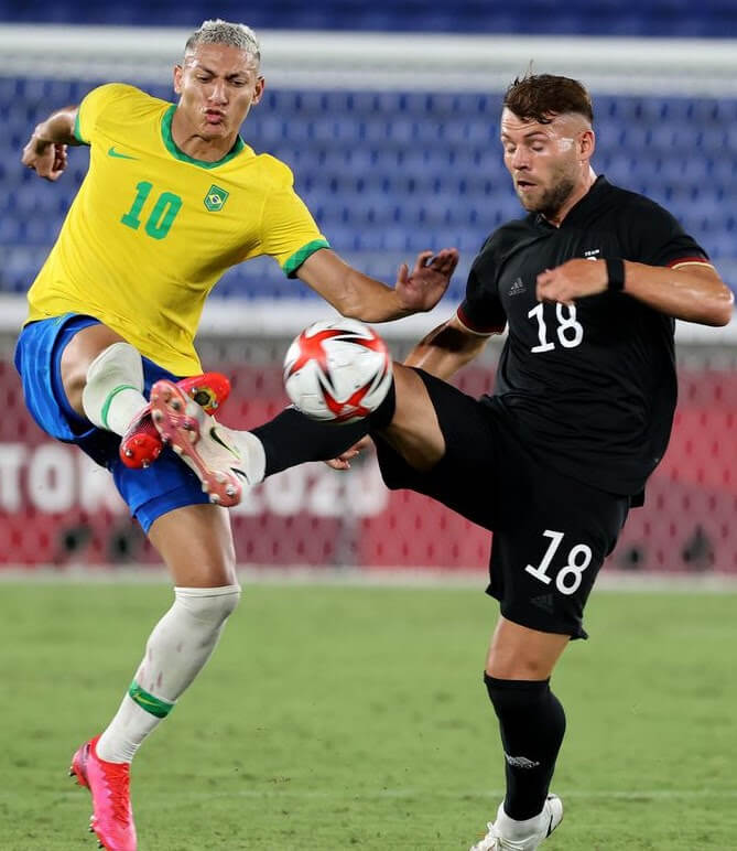
Men’s Olympic Soccer Kit Review
In case you missed it, my “soccer guys” Kyle Evans and CJ Fleck provided us with a p/review of the Women’s Olympic Soccer kits yesterday (scroll down) and today they’re both back to bring us up to speed on the kits for the men’s teams. Rather than a kit-by-kit review, the lads have looked at the first games played by all the teams and their hot takes are below.
Men’s Olympic Soccer Kit Review
by Kyle Evans and CJ Fleck
Thanks Phil! We’re back today with the men’s soccer tournament in Tokyo and we’ll take a look at what teams have worn so far. Keep in mind that this is mostly a youth tournament and that there are 16 teams in the men’s event as opposed to 12 in the women’s.
Group A
Mexico vs. France
Mexico actually unveiled new green uniforms before the tournament with a geometric pattern paired with red shorts. (At the current Gold Cup they’ve been wearing maroon/black and all-white.) France retains their options from the Euros and in this match countered with their all-white with red/blue side stripes.
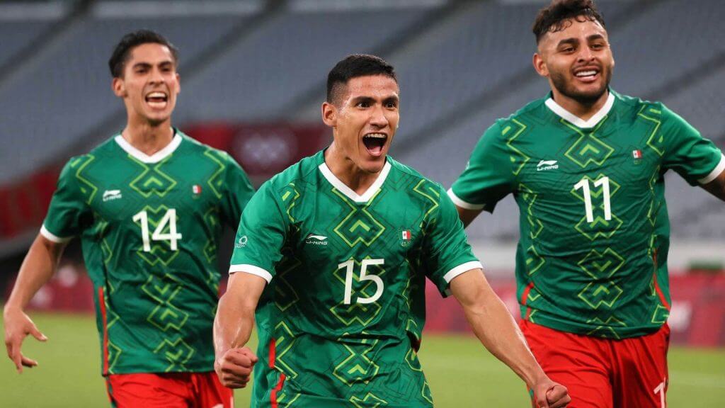
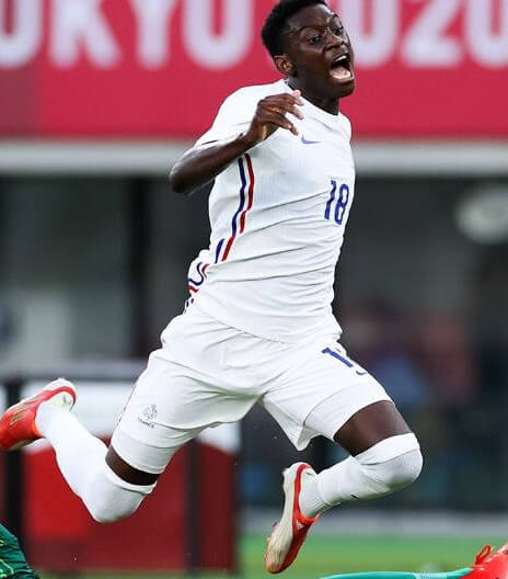
Kyle: Mexico should always have green in its rotation and this particular pattern just feels so right for them.
CJ: Not sure I’m a fan of the pattern, but it could be much worse.
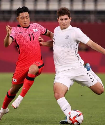
Japan vs. South Africa
Japan’s primary look is the same as the women with an artistic jersey pattern while South Africa wore a new yellow over green kit.
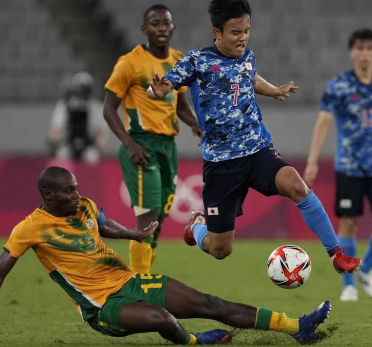
Kyle: Still not sold on Japan’s look and it looks like South Africa could clean up those side panels.
CJ: Between the socks, shorts, and side panels, I’m not impressed.
Group B
New Zealand vs. South Korea
As usual, New Zealand has all-white and all-black options with the white jersey having a side stripe made up of black triangles. South Korea wore their primary red gradient with a wavy geometric pattern and has a zebra-style secondary as well.
Kyle: South Korea is the eye-grabber here and I’m going to chalk this one up as a nice-looking gradient design!
CJ: The trend continues, and I still don’t like it, with apologies to Kyle.
Honduras vs. Romania
Honduras have their all-white or all-blue options but without their large “H” federation logo as that isn’t allowed in the Olympics. Romania have all-blue and all-white kits made specifically for this tournament that feature an outline of the Olympic flame.
Kyle: Romania haven’t qualified for this tournament since the last time it was in Tokyo (1964) so why not embrace it? I like the flame outline for the special occasion.
CJ: It’s certainly an interesting choice, but is it a good choice? I’m not sold.
Group C
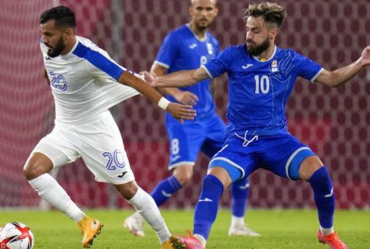
Spain vs. Egypt
Spain kept their options from the recent Euros (all-white and red over navy) while Egypt opened by wearing red over black.
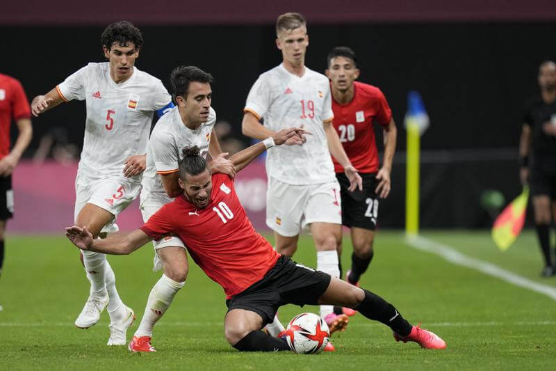
Kyle: Still not a fan of Spain’s options (good colors but unnecessary designs) but I do like Egypt’s simple look.
CJ: Simple in the Olympics is good.
Argentina vs. Australia
Argentina continue to wear the latest version of their classic sky blue and white vertical stripes jersey, this time with a camouflage-like pattern inside the sky blue stripes with the shapes of Argentina’s regions. Australia matches the women (and most of their other sports and athletes in Tokyo) with an all-green (or all-yellow) kit with contrasting top diagonal panel and side panels.
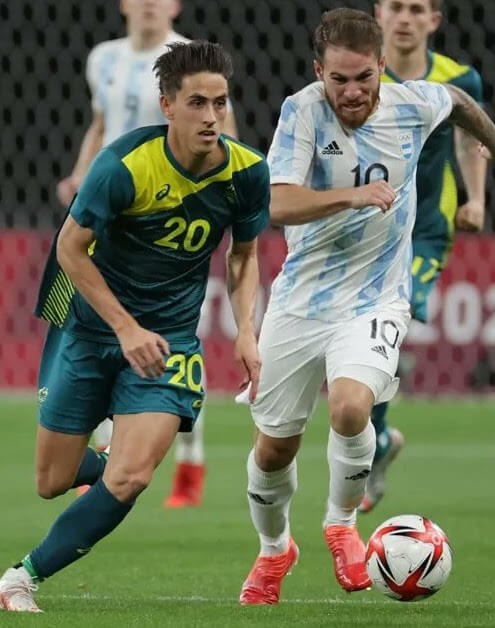
Kyle: Whether the shorts are white or black you know it’s Argentina and I kind of like that Australia has a consistent look across most Olympic sports.
CJ: Both sides here are recognizable, but just a bit too different from their usual looks. I appreciate the effort.
Group D
Brazil vs. Germany
Brazil has their classic looks as usual – yellow with green accents over blue and blue over white. Germany retains their Euro looks (minus not allowed Adidas striping) of all-black and white with thin black horizontal stripes over black.
Kyle: The Brazilians always look great and I know CJ prefers a green secondary for the Germans.
CJ: Strange how much better that kit looks without the adidas stripes!
Ivory Coast vs. Saudi Arabia
Ivory Coast wore an all-orange kit and Saudi Arabia countered with white over green with a sublimated palm tree leaves design (based on their national emblem). This design is much more visible on their secondary option.
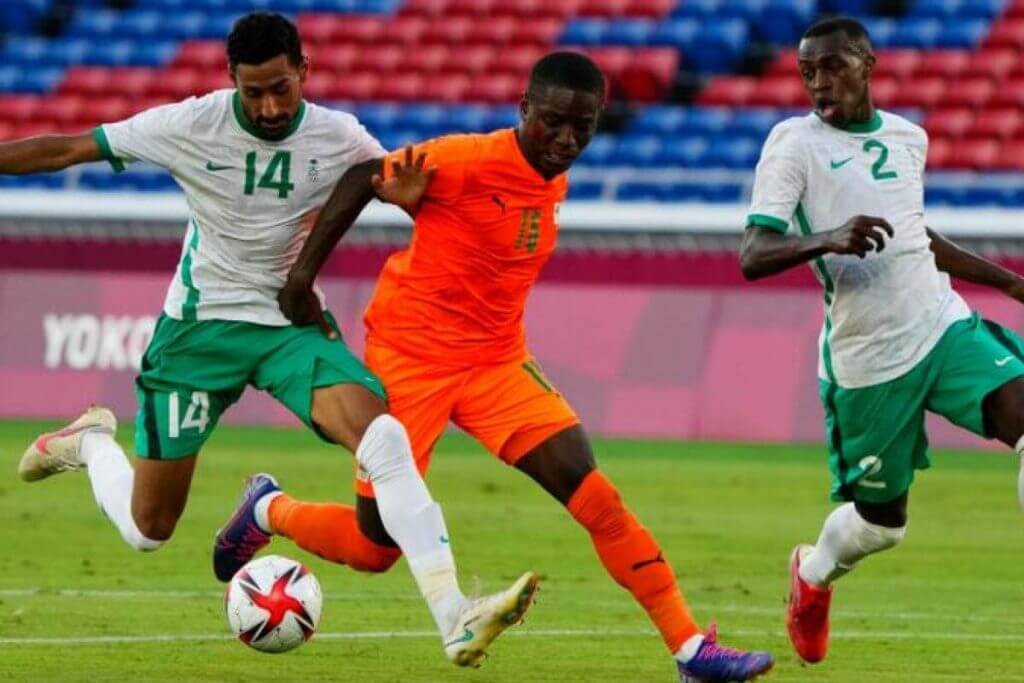
Kyle: Love the palm tree leaves design and when countries make connections to national elements.
CJ: Gotta second Kyle here, though the mix of colors on the side striping is throwing me off as well.
Thanks, fellas! Everyone please give the boys a nice virtual hand for all their soccer kit previews and reviews so far this year. Look for them to be back soon!
The Other Boys of Summer…
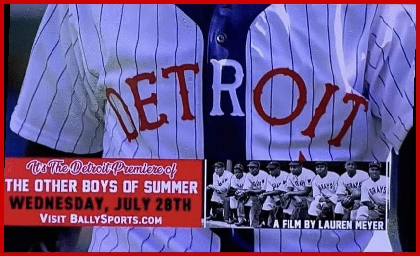
If you’re anywhere near Detroit this coming week, I want to bring your attention to an event you won’t want to miss: the free screening of the film The Other Boys of Summer, which was created by filmmaker (and my friend) Lauren Meyer, and which is a documentary, with many interviews focusing on the trials and tribulations of many Negro Leagues ballplayers (sadly, a number of the interviewees have since passed, but Lauren was able to capture their stories and memories before they departed). She spent years gathering these. It’s a wonderful film, which I saw in late January of 2020, just before the pandemic really struck the United States. It’s all part of the Detroit Tigers “Negro Leagues Weekend” (which is a fantastic experience), and the film debuts Wednesday evening, July 28th. If you’re anywhere in the vicinity and can catch this showing, I urge you to do so!
I asked Lauren to share some more information on the event:
The Tigers are kicking off their 18th Annual Negro Leagues Weekend with a free outdoor public screening of The Other Boys of Summer at Campus Martius Park on July 28th. The Detroit Stars were one of the original 8 teams in the Negro National League in 1920. The Tigers will don Negro Leagues throwbacks as they host the Orioles for the weekend.
Through the lens of America’s pastime The Other Boys of Summer draws from our past to shine the spotlight on issues that dominate today’s headlines. It explores civil rights through the lives of the Negro Leagues baseball players. The film’s narrated by the iconic Cicely Tyson and includes never-before-seen interviews with the civil rights trailblazers who played alongside of Jackie Robinson and changed baseball and America forever.
Following the film Bally Sports Reporter Trevor Thompson will host a panel discussion with Filmmaker, Lauren Meyer (Emmy Nominated Director), Pedro Sierra (Detroit Stars Pitcher) and Craig Monroe (former Detroit Tiger).
The Other Boys of Summer is proving valuable to companies, communities, schools and organizations as an original Diversity, Equity & Inclusion program. It creates a space where people come together (virtually and in person) and engage in courageous conversations around race and cultural bias. Following a program at AT&T in 2020 an attendee was so touched by Bob Scott (NY Black Yankees) that when the pandemic struck, she had groceries delivered to him and his wife, for 6 months! She sent so many groceries that Bob and Mae shared them with their entire block. This act of kindness not only fed families, but potentially saved seniors from risking their health going to the store.
For more information visit www.theotherboysofsummer.com and BallySports.com Or email: TheOtherBoysofSummer@gmail.com
Thanks (and thanks, Lauren!). Do yourself a favor if you have the chance and check this wonderful film out!

Guess The Game…
from the scoreboard
Today’s scoreboard comes from Bob Kazamakis.
The premise of the game (GTGFTS) is simple: I’ll post a scoreboard and you guys simply identify the game depicted. In the past, I don’t know if I’ve ever completely stumped you (some are easier than others).
Here’s the Scoreboard. In the comments below, try to identify the game (date & location, as well as final score). If anything noteworthy occurred during the game, please add that in (and if you were AT the game, well bonus points for you!):
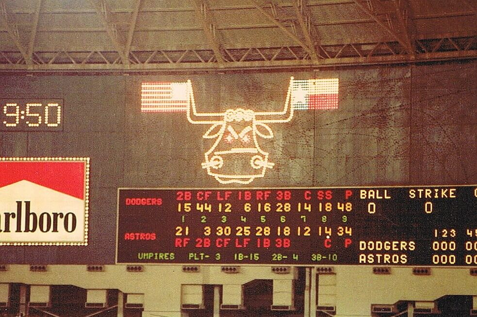
Please continue sending these in! You’re welcome to send me any scoreboard photos (with answers please), and I’ll keep running them.
Bear Trap…er Keeper
Got the following e-mail from reader Alan Filipczak that needs to be shared with the readership:
Hi Phil,
I hope this finds you well. I came across this weird connection by chance and thought it would be good to share with the Uni Verse to get some second opinions.
For kids of my generation, the Mead Trapper Keeper was an essential back-to-school item. In a recent fit of nostalgia, I was looking at some of the old designs, especially their series that depicted intense animals playing sports in a very 90s Xtreme sort of way. Examples here and here. While scrolling through some of these, one particular binder caught my eye. It was a grizzly bear hurling a baseball that was torn by claw marks. Here it is:
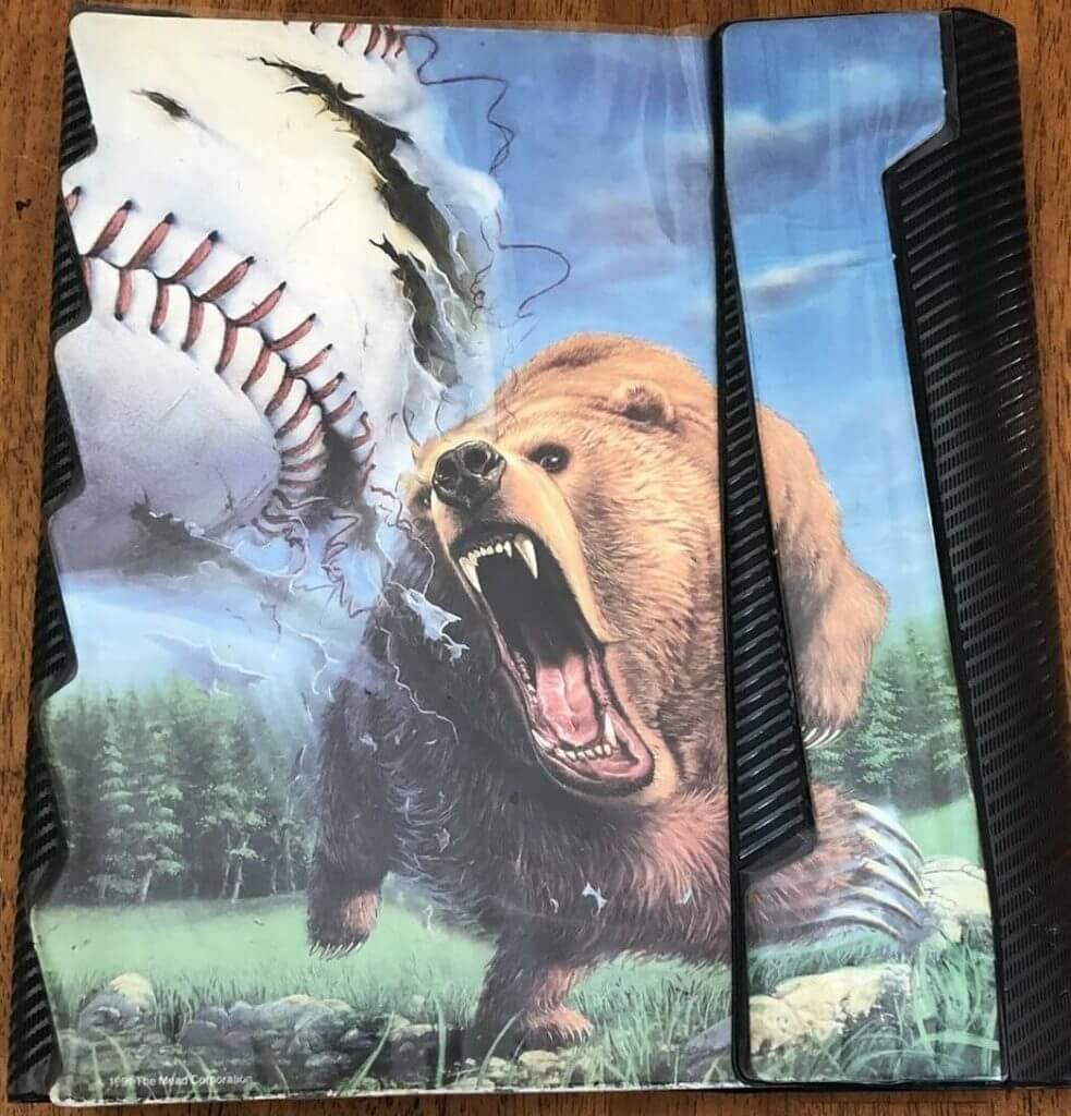
As soon as I saw this, I was like “Wow! That really looks like the old Fresno Grizzlies logo.” The logo I was thinking of was used by the minor league team from their first season in the Pacific Coast League in 1998 through the 2001 season. Here’s that logo.
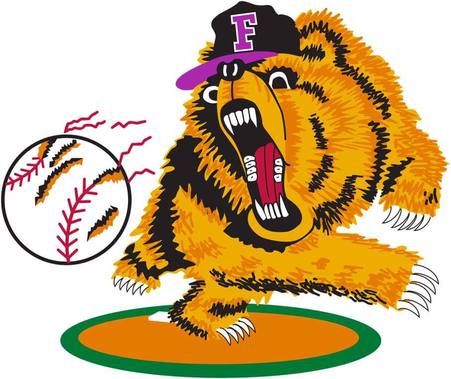
When I checked the logo, I thought it was just a coincidence. The eyes and teeth are different, the ball is very different, the logo bear wears a cap, etc. But then again…there’s something uncanny about the proportions and the pose of the bear, not to mention the similar overall concept of a grizzly bear pitching with a ripped baseball in the foreground. Looking at the big picture, that old Grizzlies logo was very unique at the time when most minor league logos were either 2D cartoons or very basic clipart designs. If nothing else, it was an inspired concept for the new ballclub. Or did the original inspiration come from elsewhere?
I did a little more digging and found a print version of the Grizzlies logo from 1999 and now I am mostly convinced that a graphic designer in Fresno copied a 1991 Trapper Keeper design, slapped a cap on the bear and tweaked a few other grizzly details. Here’s a side-by-side.
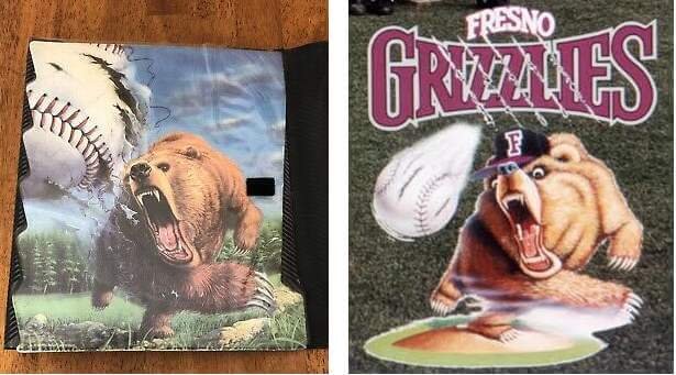
So what do you think? Am I seeing things that aren’t there or is there some deeper cons-bear-acy going on?
Many thanks as always!
Alan
What say you readers?

Looking Ahead…
As the calendar nears the month of August, you’re probably all aware that Paul will be taking his annual sabbatical from the blog, leaving me in charge of the weekdays.
And as always, I can’t get through the whole month without a little help from the readers, so I’m putting out the call once again.
I’ve actually got enough stuff for a few “Olympics” posts, but I’m still looking for General Interest articles. If you’d like to propose and submit an article of interest to the Uni Watch readership — I’m all ears! Every summer you guys come through with some amazing research, concepts and other fantastic uniform-related materials, and I’ll be happy to feature your work on here again during the month.
So, if you’re interested in contributing something Olympics or uniform-related, please Shoot me an e-mail (Phil.Hecken@gmail.com) and let’s discuss! Looking forward to seeing what you guys have in store for 2021!
Uni Watch News Ticker
By Phil

Baseball News: No photo, unfortunately, but Geoff Poole noted, “The Brewers (we)re playing the White Sox on Bally Sports Wisconsin and the AL Central standings were shown briefly in the top of the 3rd. The logo for Cleveland had already been updated to the new Guardians name, even though the change doesn’t take effect until after the season.” If anyone happened to screenshot that, could you post it below? … United States Senator Cindy Hyde-Smith of Mississippi rang a cowbell on the Senate floor last week to celebrate Mississippi State University’s College World Series championship (from Kary Klismet). … Check out this vintage circa 1915 baseball photo with a mystery attached (from Jason Brown). … Check out this gorgeous photo of Casey Stengel managing his last ever MLB game, with the 1965 Mets (from SABR Bio Project). … Marcus Hall brings up an excellent point about uni aesthetics when teams wear belted throwback pants. … Scotty Rogers is either conspiracy theorist — or onto something — about the Cleveland team purposely obscuring the “IN” of “Indians” in a cover photo shoot. … The Lehigh Valley Iron Pigs became the Lagers last night (from MiLB Promos).

Football News: In addition to their 1946-era uniforms, the Cleveland Browns will also have throwback endzones to commemorate the 75th anniversary of their inaugural season (from Kary Klismet). … Colorado State has unveiled new helmets for its annual Ag Day game (also from Kary).

Hockey News: Here is a teaser of the new jersey for the Cape Breton Eagles. The team’s 25th anniversary patch is on the shoulder and jersey striping appears to be a throwback nod to older uniforms worn by the Eagles (from Wade Heidt). … The former mascot of the American Hockey League’s Rochester Americans is trying to recover his championship ring from the Amerks’ 1996 AHL title-winning season, which was stolen and has since shown up on eBay (from Kary Klismet). … Looks like some minor logo updating on the Flames jersey as seen at the draft (from Wade Heidt).


NBA/College/Hoops News: This article looks at the uniforms being worn by Ohio State’s alumni team, Carmen’s Crew, for The Basketball Tournament (from Kary Klismet). … Boston Celtics legend Bill Russell is auctioning off hundreds of items of memorabilia from his basketball career, including his 1957 and 1969 NBA championship rings (Kary, again). … And here I thought all those phantom championship jerseys ended up in a random needy nation (good spot by Steve Sher).

Soccer News: The Athletic has a (paywalled) article examining the best uniforms in the history of the Premier League’s Wolverhampton Wanderers F.C. (from Kary Klismet). … Bayern Munich has released its new kits for the 2021-22 season (from Kary, once agin).

Olympics News: Interested in a photo retrospective on Olympic mascots through the years? The Chicago Tribune has you covered (from Kary Klismet). … Mexico had an unfortunate uniform mistake on the jersey of midfielder Erick Aguirre, whose shirt displayed the Mexican flag upside-down. … This article decides who has the most stylish national team “kits” from Tokyo 2020. … Shockingly, people aren’t too crazy about having Ralph Lauren continue to design the USA Opening Ceremonies outfits. … The First Lady doesn’t seem to mind wearing “team USA” uniform at the Olympics. … Dakota Bryan Hill asks, “Any idea why the USA Women’s Beach Volleyball Team uniforms have two different sponsors? One player is wearing Adidas while the other is wearing Mizuno.” (I think he means manufacturers, not sponsors) Throck seems to have the answer. … Jeremy Brahm says if you look closely at the scoreboard in badminton and you will see the shuttlecock to show the server. … Speaking of badminton, apparently the USA doesn’t wear red, white and blue? (from Brevity Wit). … In the Olympics opening ceremony, Mike Tirico mentioned on the broadcast that the 1964 Tokyo Olympics were the first to use pictograms because of the language barrier (the first games in Asia). Here is an article on that (from Matthew Wolfram).

Grab Bag: New uniforms for the Rockingham County (N.H.) Sheriff’s Department (from Kary Klismet). … Check out this beautiful Rhode Island logo creation from the great Kevin Cearfoss).
Uni Tweet of the Day
This probably isn’t a big deal to most folks, but I grew up less than two miles away from this spot. Trust me, it doesn’t look like that anymore…
Babe Ruth caught a baseball dropped from an airplane at Mitchel Field in Garden City, Long Island. The New York Times reports Ruth donned an army uniform to drum up publicity for the Citizens Military Training Camps, July 22, 1926. pic.twitter.com/t4XZo5hnrM
— Baseball In Pics (@baseballinpix) July 24, 2021
And finally… that’s it for me for today…and this week…and this month. Next Saturday is still July (7/31), but Paul will be handling the content that day, and I begin my weekday August run on Monday, August 2. If you’ve got a story or idea you’d like to see tackled in August, give me a shout (see the “Help Wanted” graphic above for more info). Big thanks (again) to Kyle and CJ for that look at the Men’s Olympic soccer kits.
Once again, too cloudy for a sunset yesterday (after another spectacularly gorgeous day), so we’re going photoless.
You guys have a good Sunday and rest of the week, and I’ll catch you here on Monday, August 2.
Peace,
PH
At the current Gold Cup (Mexico have) been wearing maroon/black
Not maroon. Magenta.
In the ticker: The Browns end zones are at First Energy Stadium. They’re in Cleveland, not Cincinnati
“You don’t live in Cincinnati, you live in Cleveland!”
Whoops (just copied Kary’s copy). Now removed.
D’oh! I know better than that! Sorry for the confusion (and the inconvenience, Phil!)
One reason not to pay for The Athletic (besides its shocking lack of copy editors) is someone deciding they needed to rank Wolves’ uniforms and that you are expected to pay for it.
And if you really want to rank Wolves’ uniforms for yourself, for free, have at it:
link
Hey Phil, as per Uni Watch tradition you forgot to refer to the Browns’ fauxbacks as a “merch dump”. :)
The Browns 75th anniversary uniforms look great. No issue with the football shaped. This is not the first time they’ll wear helmets with TV numbers on them. If memory serves they did it in 2008 in a prime time game against the Giants.
The Cleveland baseball team has gone out of its way to avoid using the “Indians” logo in marketing. A block Cleveland white home jersey turned up but they stuck with script Indians. The overwhelming majority of fan merch omits Indians in favor of Cleveland or the block C.
Just seems more accurate to say the Browns unveiled throwback numbers.
“Obviously there were no NOBs in 1946, but as they are a requirement now, the new retro jersey has them.”
Would be nice if the NFL would allow no NOBs on the throwbacks on the field. Make it look more authentic. Only going to be worn for a few games right?
It has been done elsewhere. Other leagues that require NOBs have allowed teams to go no NOBs with throwbacks.
1996-97 Toronto Maple Leafs:
link
Even both teams playing against each other going no NOBs.
2010 Los Angeles Kings at Vancouver Canucks:
link
All the 1960s throwbacks worn by each CFL team in 2009 (except Toronto wore a NOB). Many games teams wearing throwbacks against each other:
link
That Kings-Canucks game looks so good. Nice big readable numbers!
Finally! Some good uni news from Cleveland!
The Brown throwbacks aren’t bad, but drop shadow should be avoided always and everywhere.
[Browns], of course.
Got a kick out of that Trapper Keeper story. Same designer?
Heresy.
Small details: the gage on the striping (both) on the jersey and the pants has been tweaked to better reflect the 1946 look.
If you look at photos from that season, the brown stripes on both the jersey and pants were noticeably thicker than the orange stripes.
The current Browns have equal width orange and brown stripes on their white jerseys and pants.
It’s a tiny change but great attention to detail.
Did this get covered here? :
link
I take it this was before the game started?
Greetings from Tower of Babel Stadium.
The trapper keeper binders definitely came in other jungle animals/sport styles. I had one with a warthog and a basketball – linked here: link
There was an alligator volleyball one too!
Great stuff today, Phil! Appreciate the in-depth coverage of the Browns’ throwback uniforms. I always enjoy Kyle and CJ’s soccer kit analysis. And that find by Alan relating to the Fresno Grizzlies poaching their logo from an image off of a Trapper Keeper binder from the early ’90s is Uni Watch gold! I can’t wait to see if he digs up more information about that.
This design was used on cardboard folders too; I know because I had one. I remember thinking what a great Cubs logo it would make!
Guess the Scoreboard: Game 1 of the 1981 NL West Division Series, Dodgers at Astros, October 6, 1981. As you might recall, due to the strike that season, the “winners” of each half of each division played in a round before the two League Championship Series. The Dodgers won this series 3 to 2, as well as 3-2 in the NLCS over Montreal, before beating the dreaded Yankees in six. These two former NL West rivals did not meet up again in the postseason until the 2017 World Series, with the Trashtros prevailing in seven. Ugh!
I thought I finally got one, thought it was Nolan Ryan’s 5th no-hitter, until I got halfway through the Astros lineup
Good job! Id narrowed it down to 1981, but didn’t think to check playoff games. link
Check out this beautiful Rhode Island logo creation from the great Kevin Cearfoss).
Stunning work, no criticism from me. But those Ivy League-inspired monograms usually use the diagonal line to split a single letter; most famously, the “P” in Penn. Two letters invite the opportunity to use two colors; say, a periwinkle “R” and a dark blue “I”.
Re: the Ralph Lauren story.
Bad tabloid journalism relying on social media as a source. Lazy on the part of the British news media. They should pick on someone their own size.
Like Italy.
Paywalled as well.
I’m glad the adults in Cleveland’s front office have finally been able to stifle Jimmy Haslam’s worst instincts. The franchise appears to be run like a competent organization now, and it is doing things right. Just keep Haslam bound and gagged in a closet (they can let him out on Sundays), and we should be okay.
Browns helmets…are we certain the TV numbers will vary by player…or could they go with 46 for every player as a nod to the anniversary? I think an anniversary “46” for everyone would be unique and much more interesting.
It would be, but (at least basing this off of the reveal photos — a few of which appear in this article) it looks like each player will be wearing his own number on his hat. I don’t foresee that changing; this isn’t a JRR “everyone wears 42 for the day” thing.
To get by the “one shell” rule this year, I suspect the club’s equipment managers will re-stripe the helmets every time they wear the throwback set. That would involve taking the players’ normal shells, removing the two brown stripe stickers, and adding number stickers. They would then have to reverse the process when not wearing the throwbacks. Any way to confirm if that’s the process?
Yes, that’s exactly what they will do. It’s what *every* NFL team does when they change up helmet elements (this includes replacing nose/neck bumpers, swapping cages, etc.).
I’m not a helmet guy, but I’d suspect this is also what college teams, who are not bound by the one-shell rule, also do, rather than say, having two different red shells for different games.
I didn’t look at the individual player pics closely enough…I see now that every player has their number on the helmet.
Still like the idea of everyone with 46 on their helmet.
Here’s a screencap of the ChiSox/Brewers broadcast where they used the Guardians logo in the AL Central graphic: link
In the first 46 Browns photo, number 58 looks more like number S8!
I was just going to mention that; the 5 looks like it was put on upside-down, but the shadowing is correct, so it must have been *made* upside-down, with the two layers sewn together before it was put on the jersey.
Incidentally, the Gridiron Database seems to show the link Not sure I’ve ever seen a team do that.
The picture of Casey Stengel is not from his last game managed. That would have been at Shea and they would have the Met logo sleeve patch. It may have been the anniversary of that game, but that photo is from 1962 or 1963 in the Polo Grounds.
Correction…he would have a World’s Fair Patch.
link
D.G. Yuengling & Son, Inc., America’s Oldest Brewery® is a major sponsor of the Lehigh Valley IronPigs. Their flagship product is Yuengling Lager, so divining the origin of the name change is not too much of a stretch.
Marcus Hall brings up an excellent point about uni aesthetics when teams wear belted throwback pants.
Details trip up the Phillies’ uniforms every time. The Phils only went to the trouble of having a tunnel-spanning stripe beginning in 1981. Other obvious compromises are the lack of vertically-arched player names and zipper fronts instead of the cheaper buttons.