By Phil Hecken
Follow @PhilHecken
Greetings and Good Sunday morning, Uni Watch readers.
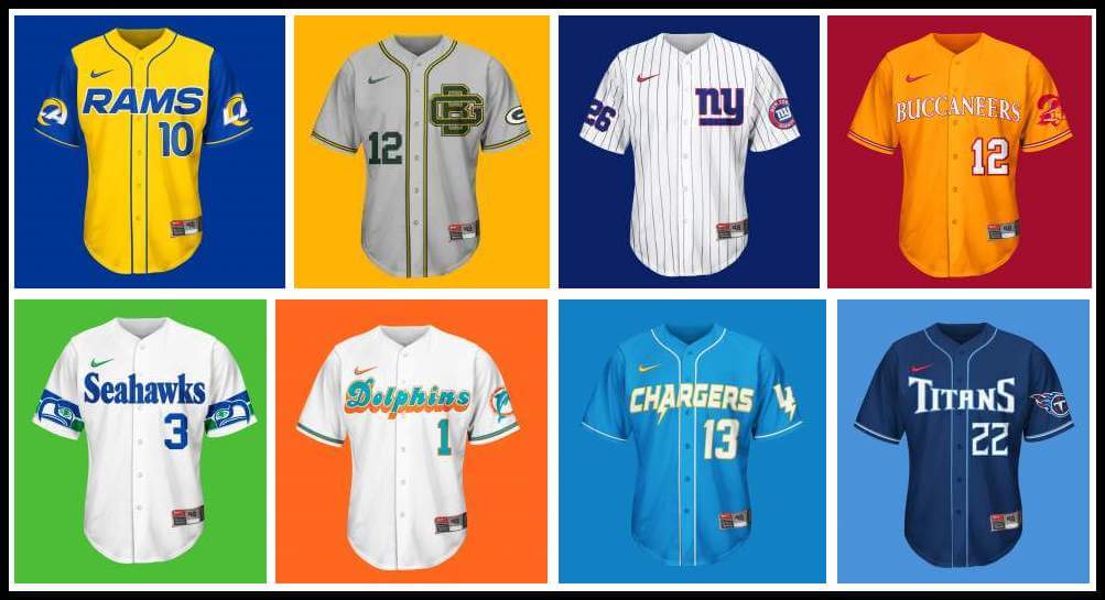
Back at the beginning of June, I ran the first set of concepts from reader Brandus “Bearly Made” Foust, which were MLB x NFL crossover designs for caps and jerseys. As I mentioned in that post, Brandus had sent me “tons” (it was something like 376 individual images) of graphics — usually about 10 per team, and I had decided to run all of them for each team. That was way too time-consuming to continue doing (especially if I were going to break it into 8-team segments), so for Part II, I will simply show you the “Showcase” graphic, which features every iteration of cap and jersey in one image. If anyone *really* wants to see the individual images for a certain team, shoot me an email and I’ll see what I can do. But for today, I’m going to finish up with the remaining 24 teams, along with Brandus’ descriptions of each. I’ll repost Brandus’ introduction below. Enjoy!
NFL x MLB Crossover Concepts
by Brandus Foust (“Bearly Made”)
As a sports fan, freelance designer (printer & painter otherwise) & longtime reader (LONGTIME reader, think “Mina H.” long), I’ve always enjoyed uniforms, as well as introspective looks into team identities. Since Uni-Watch has come along, it’s been exciting to see other people be as passionate about the science of the sports uniform, as well as seeing other designers showcase their concepts and talents, yet I never had the schedule or nerve to do this myself. However, with the ongoing pandemic slowing things down considerably, I had some time….and I’m rambling. Long story short, I did a NFL x MLB concept. NFL teams on MLB Hats & Jerseys, simple enough. As with UW’s NA-Free Policy (cheesy shorthand for it, I know), I did my best with Kansas City and Washington.
I imagine people will have some words about “the swoosh”. It bothers me too, but I wanted to remain as true to the product as possible (which also includes removing as many football elements as would allow), Mi Scusi…
All the best and Enjoy,
Brandus Foust aka Bearly Made
Dallas Cowboys
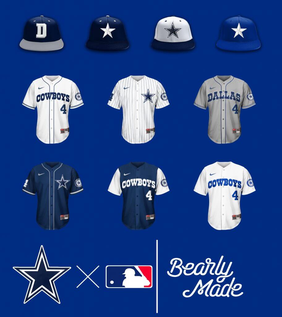
Three words: Sunday Special Set.
Denver Broncos
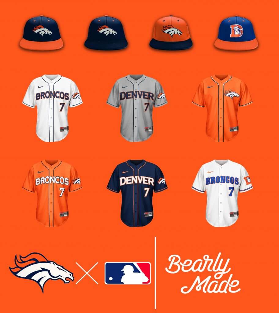
No crossover can save this dated motif. Look towards the vintage set…
Detroit Lions
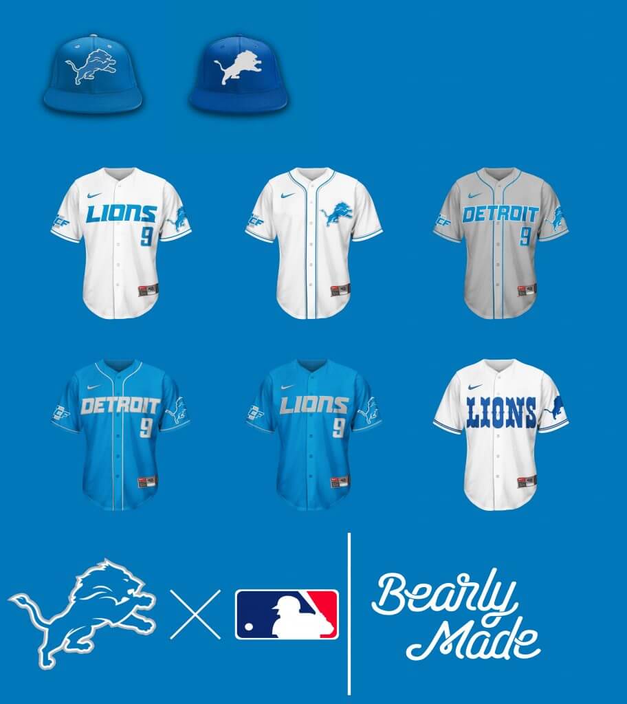
What’s to describe? It’s the Detroit Lions. Old Bubbles stitched in white, gives the vintage cap, that vintage feel.
Green Bay Packers
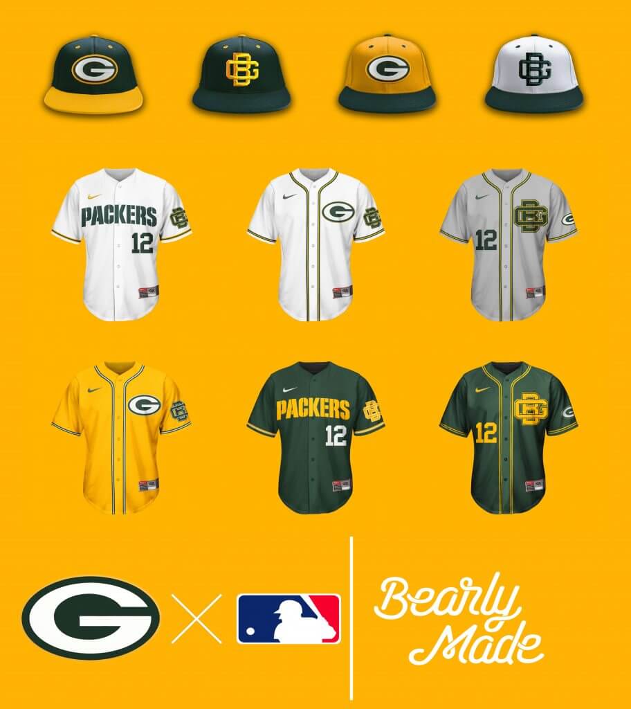
Ahh, the interlocking “GB” logo. SO underutilized….
Houston Texans
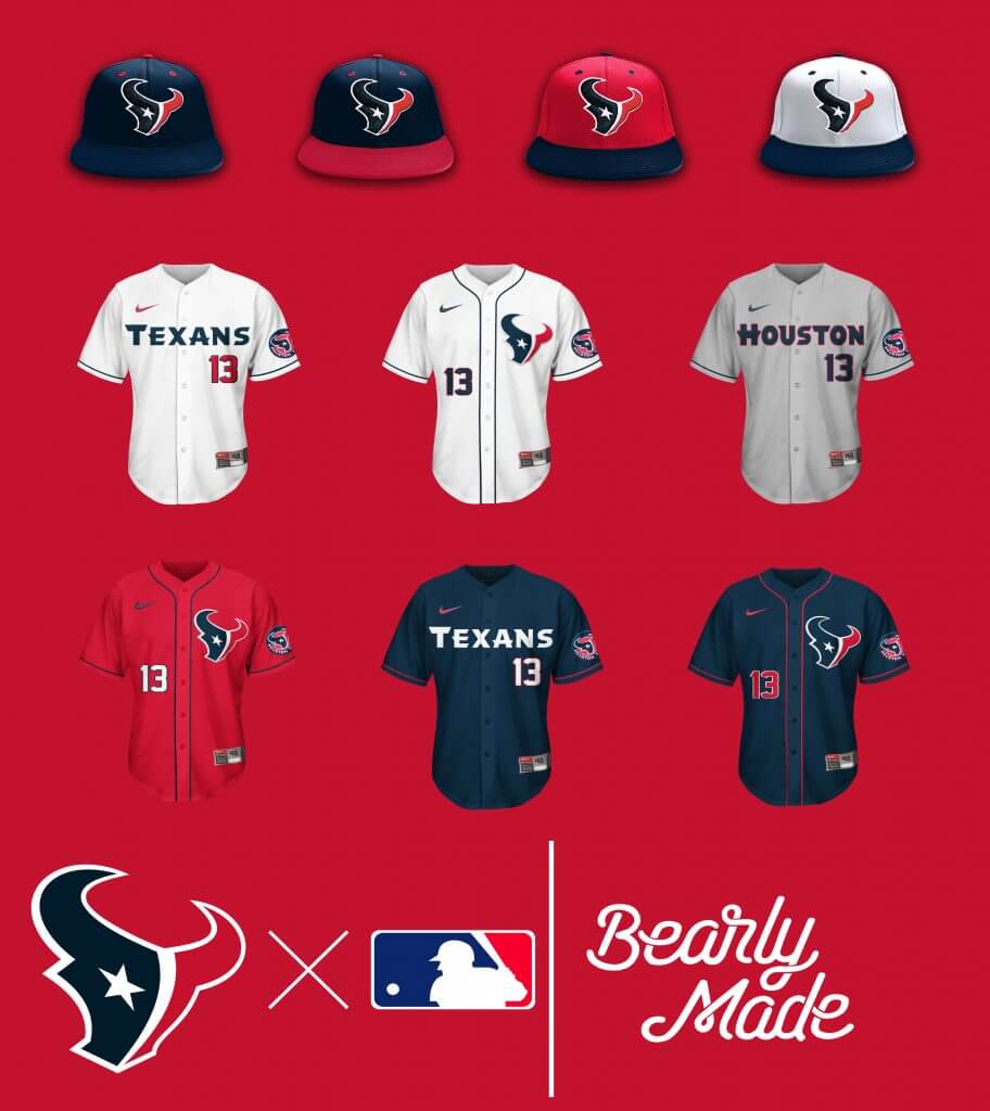
Solid crossover set, from a currently not-so-solid franchise.
Indianapolis Colts
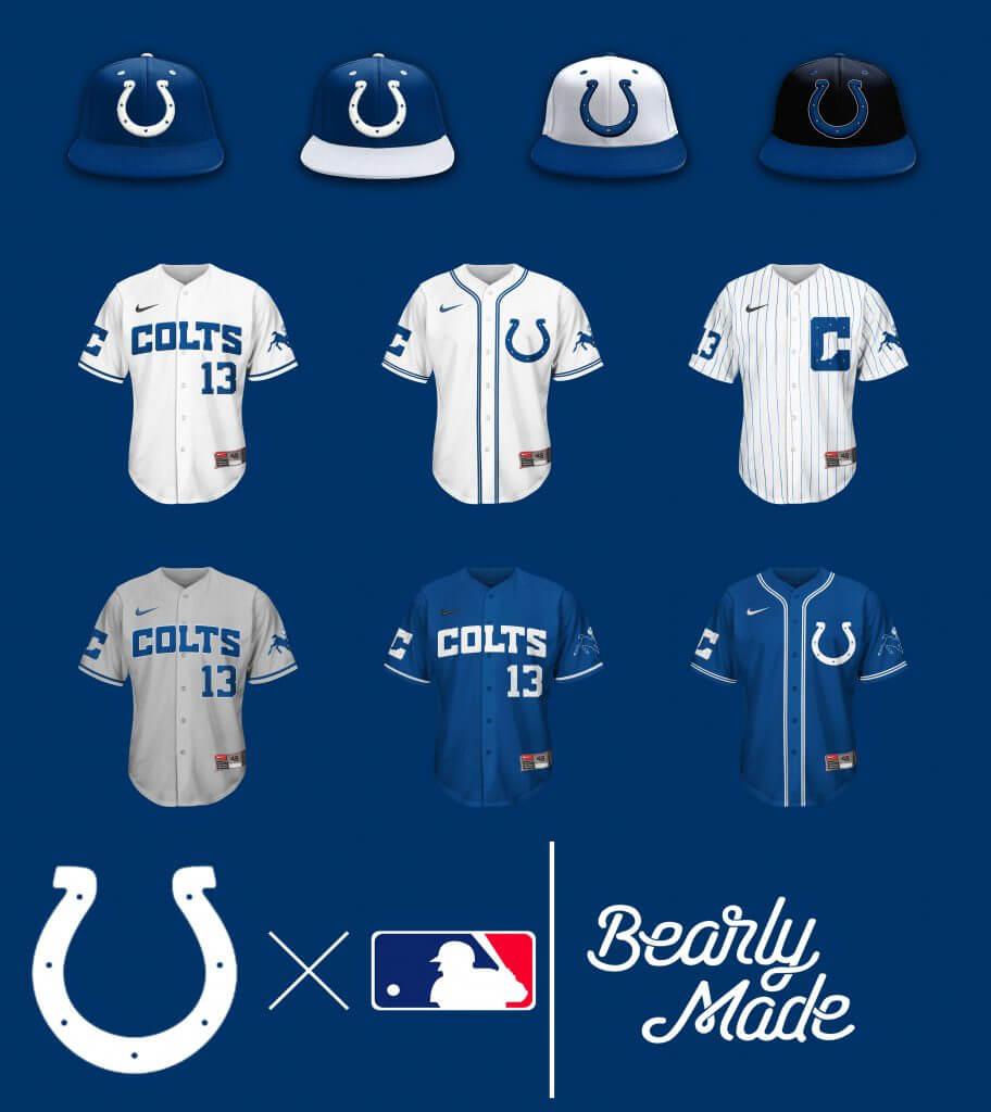
No Black softball top, not giving them the satisfaction of their superfluous “dash of black” amounting to something. I’ll give them a hat… goes with the road and pinstripe top.
Jacksonville Jaguars
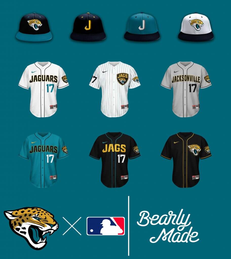
Had more fun with this than I’d like to admit. So many options, maybe too many…
Kansas City
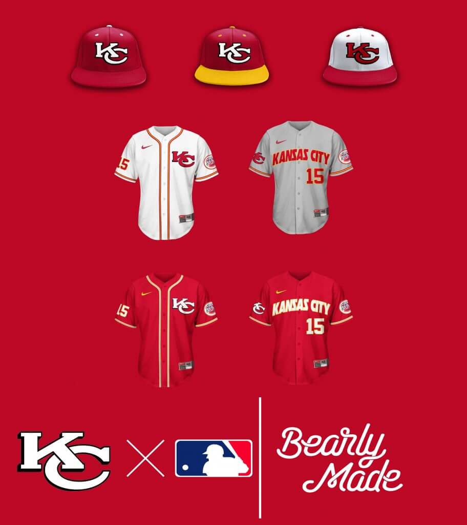
Even when the C***** is removed it’s a decent set, and the KC stands out more without the arrowhead outline.
Los Angeles Chargers
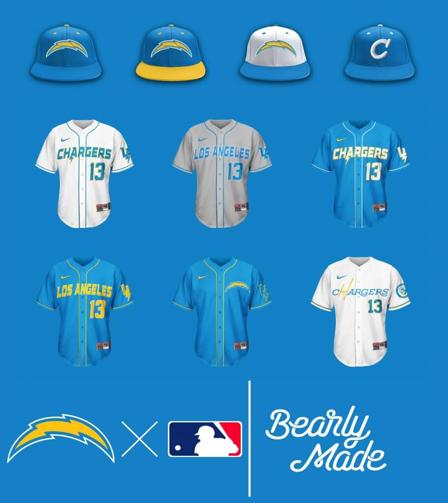
Another set with maybe one too many options, but still a fun set. The vintage hat and top is clean.
Los Angeles Rams
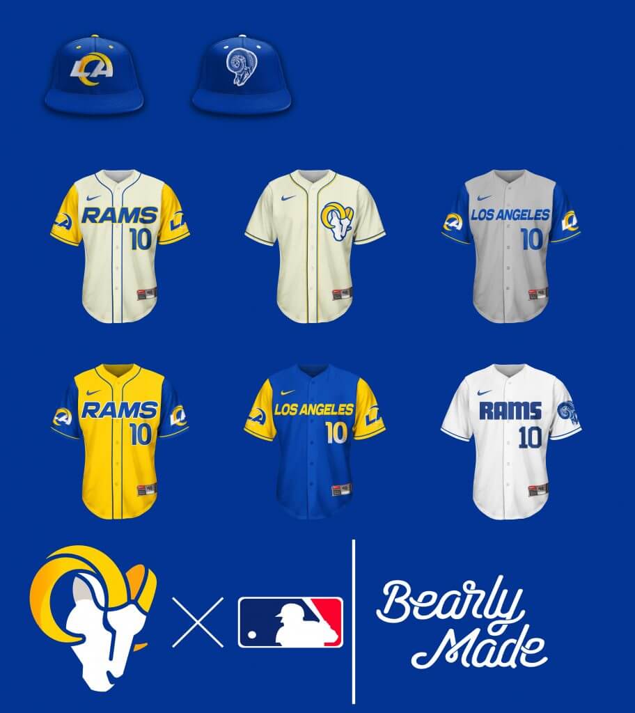
Sigh, the Rams. Again with the gradient…wouldn’t a simple solid number, or white outline around the yellow number been enough? And thanks to Paul Lukas, I only see dishwater, tried to add some yellow to make the hometops ‘bone-like’.
Las Vegas Raiders
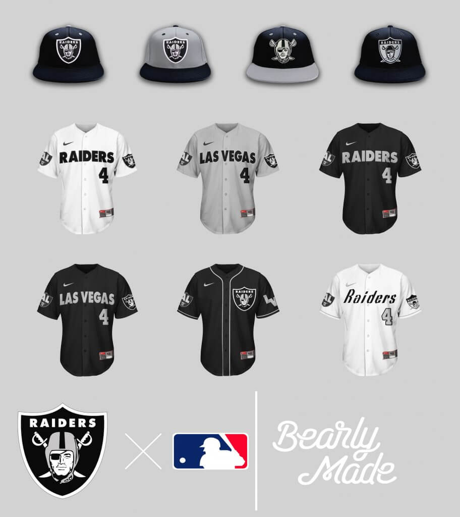
It’s the Silver & Black, Baby!!!! What more can you ask for?
Miami Dolphins
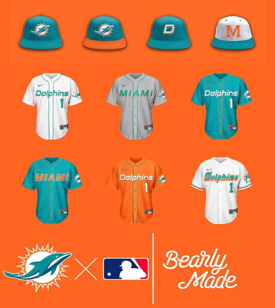
Standard Dolphins set. On the vintage hat, I recreated the helmet from the old “Flipper” logo, Longtime reader Brandus Foust has created multiple jerseys and caps for NFL Baseball teamsthought it came out nice.
Minnesota Vikings
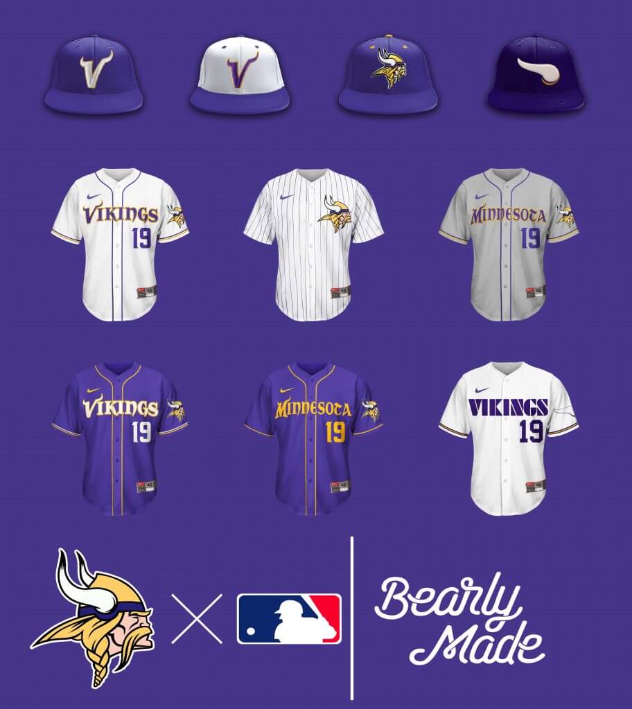
Embrace the purple, Paul. It’s pretty unavoidable with the Vikings. The old Horn logo on the vintage cap, as well as the deeper plum color the vintage set together.
New England Patriots
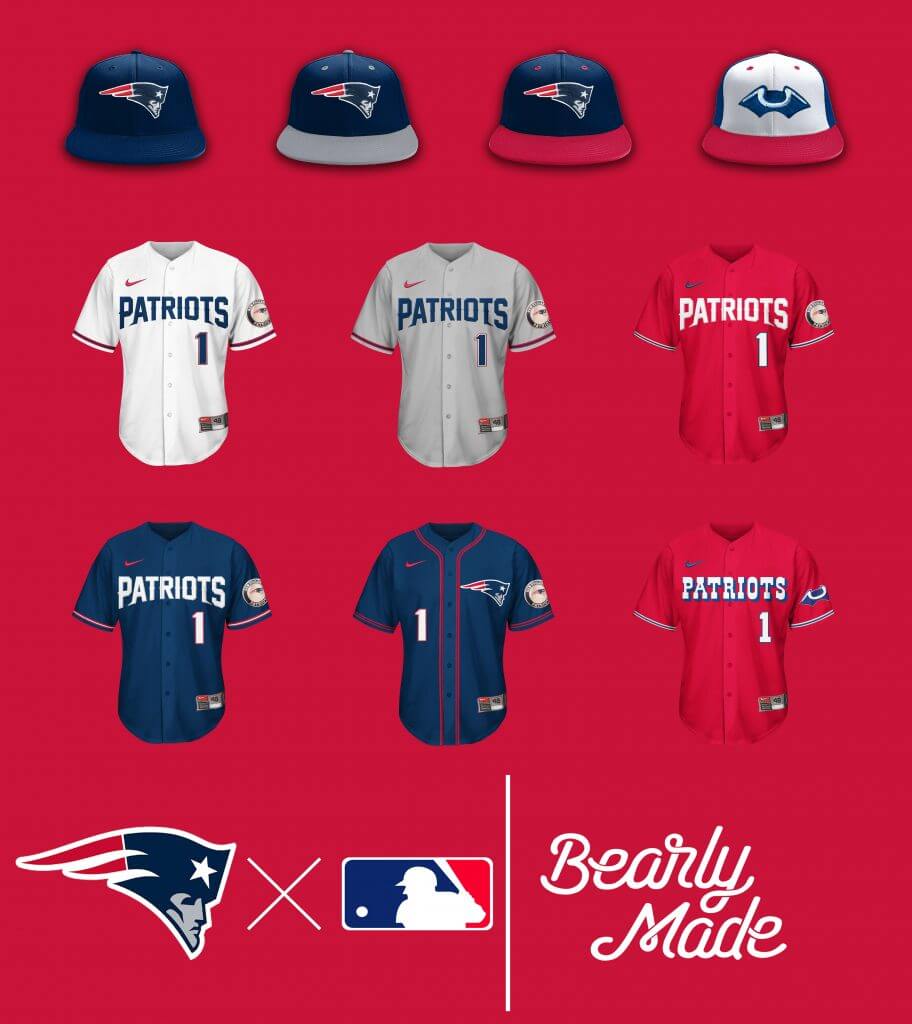
A HAT…ON A HAT!!! Love the Tricorn logo. As for the Red tops: doesn’t work that well on the current set, works very well on the vintage set.
New Orleans Saints
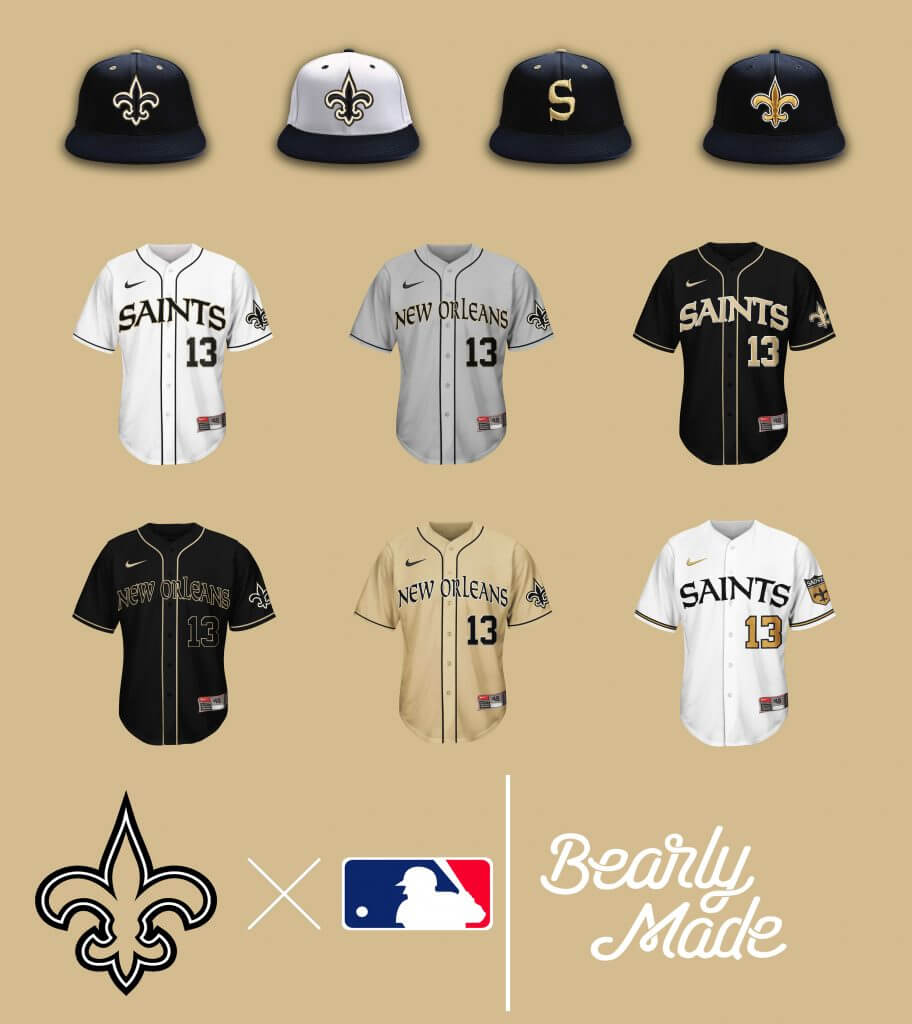
I really, really, really, dislike the Saints as a football team. I really, really, really, enjoyed doing this set, especially the vintage hat and jersey. Also note: A visual example of Vertical Arch vs. Radial Arch.
New York Giants
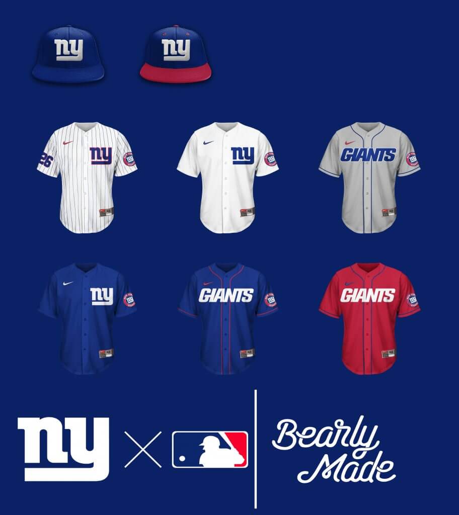
Ever come across a team identity that, despite its minimalism, is a classic and timeless look? That’s New York for you. Those Friday Reds though…
New York Jets
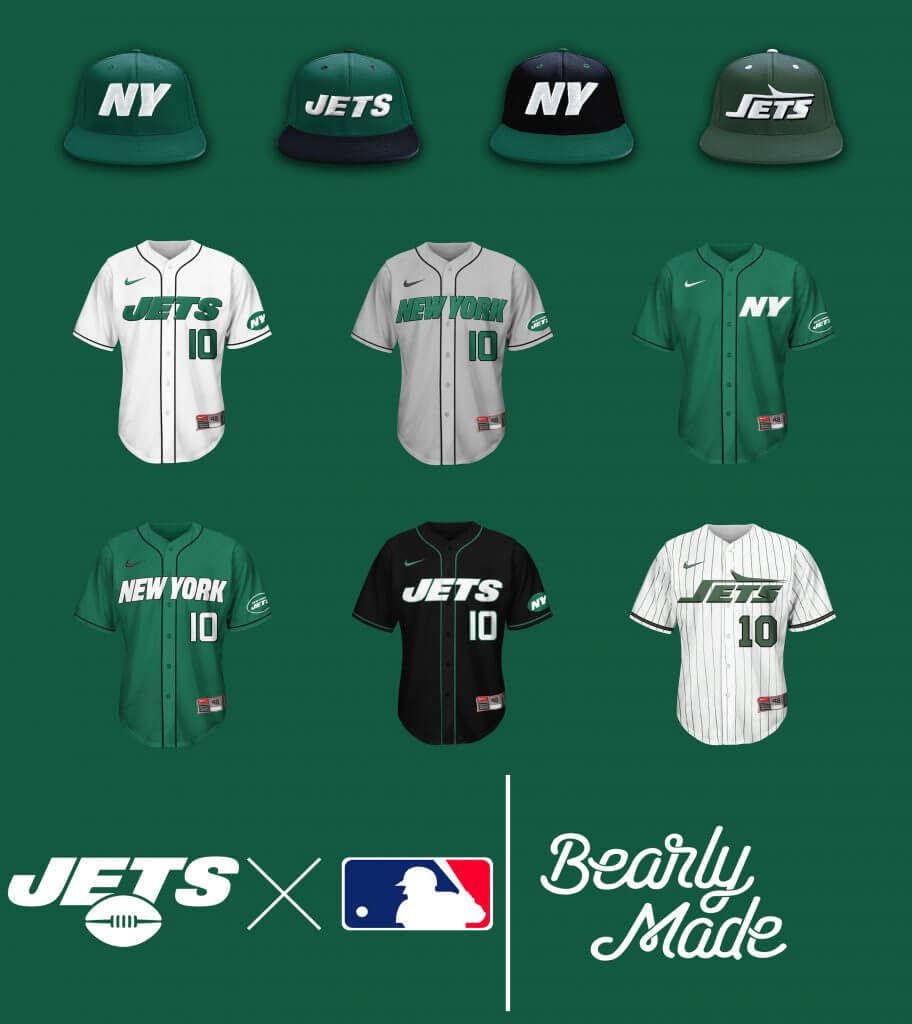
Ever come across a team identity that, despite its efforts, is a nondescript and bland look? That’s New York for you. That Vintage Set though…
Philadelphia Eagles
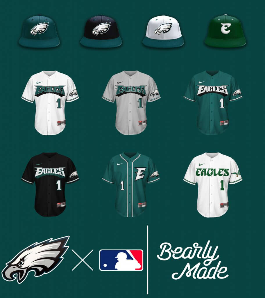
Another example of the classic Kelly Green sets overshadowing their current Midnight Green sets.
Pittsburgh Steelers
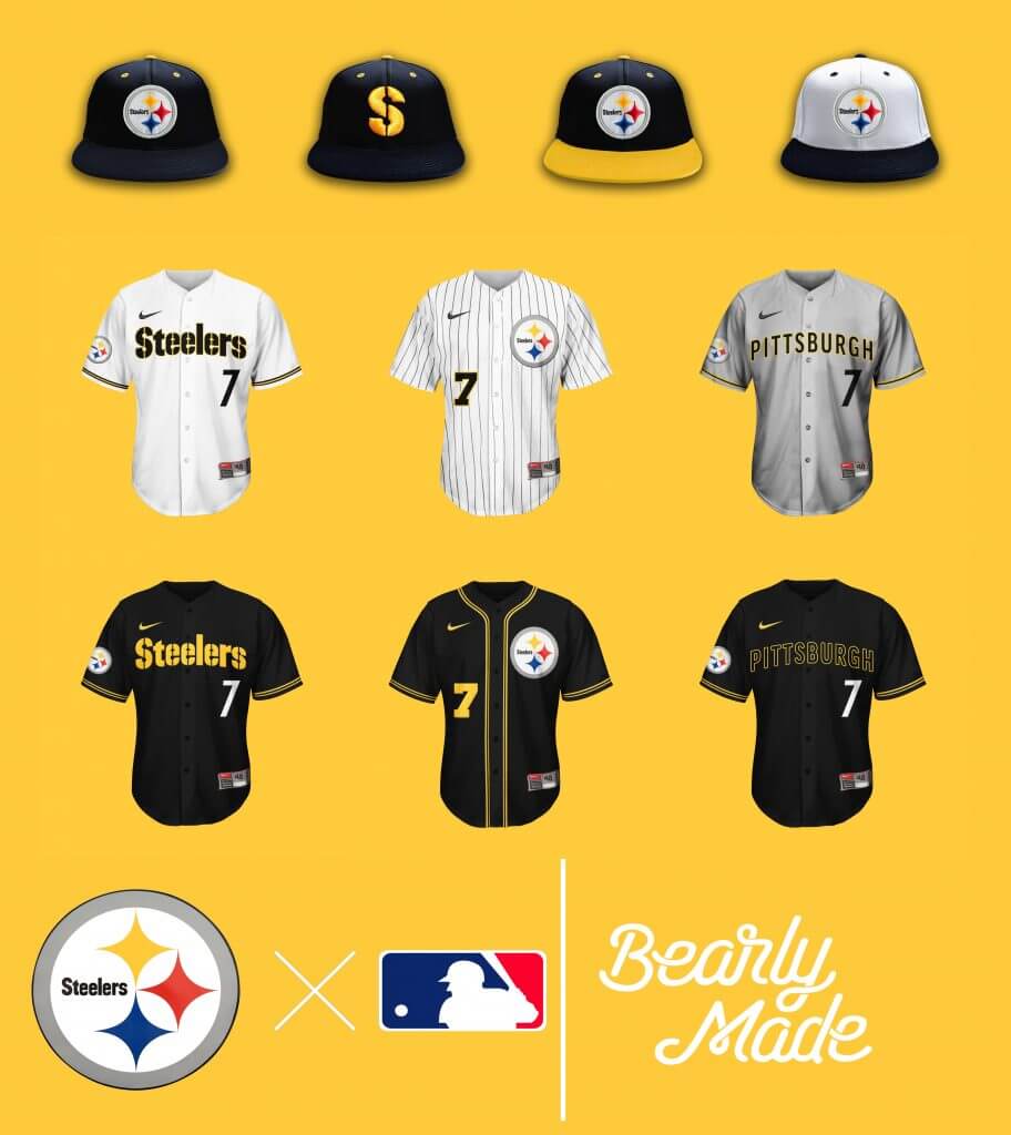
These aren’t the Pirates. I SWEAR THESE AREN’T THE PIRATES!!!
San Francisco 49ers
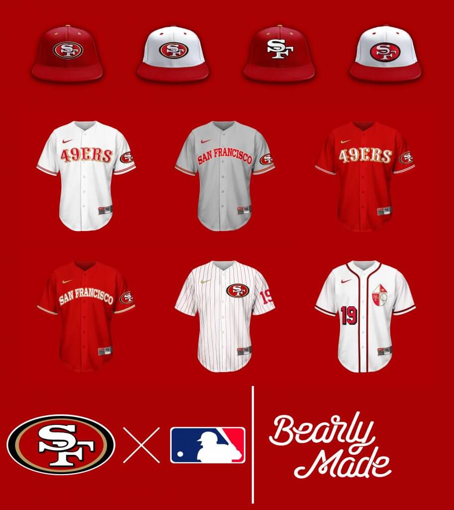
Oh, that vintage set…
Seattle Seahawks
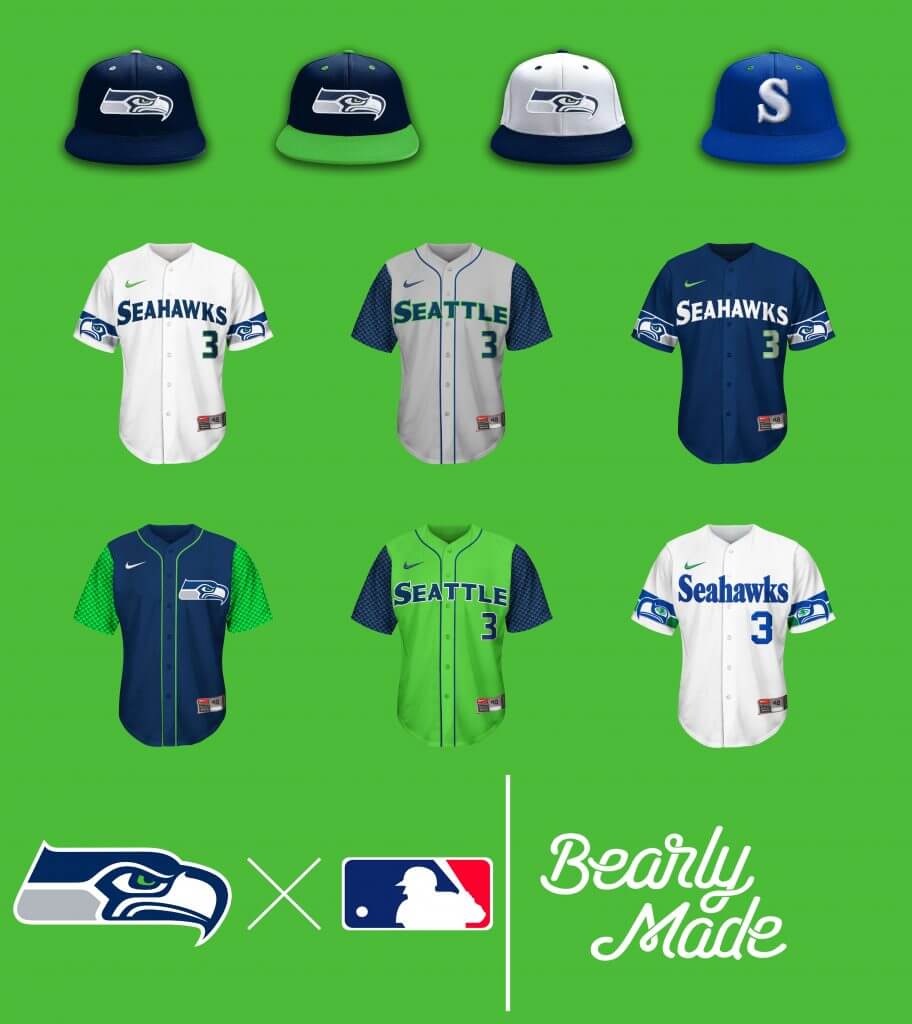
Put a Bird on It. Oh wait, that’s Portland. Sorry… But the Seahawks on the sleeves, I just had to. Had to show a little love to the feather pattern as well. (Seriously, to the friends I have in Seattle, forgive me for that terrible joke.)
Tampa Bay Buccaneers
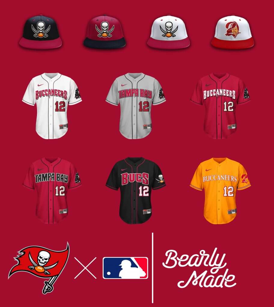
All about the Creamsicle Tops! The current set is nice too, BUT DO YOU SEE BUCCO BRUCE ON THE HAT?
Tennessee Titans
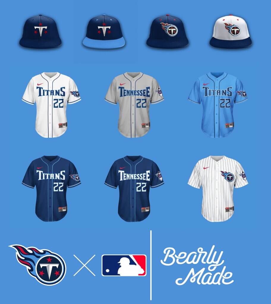
I was gonna do the sword-bevel, two-tone sleeves…but I thought better of it.
Washington Football Team
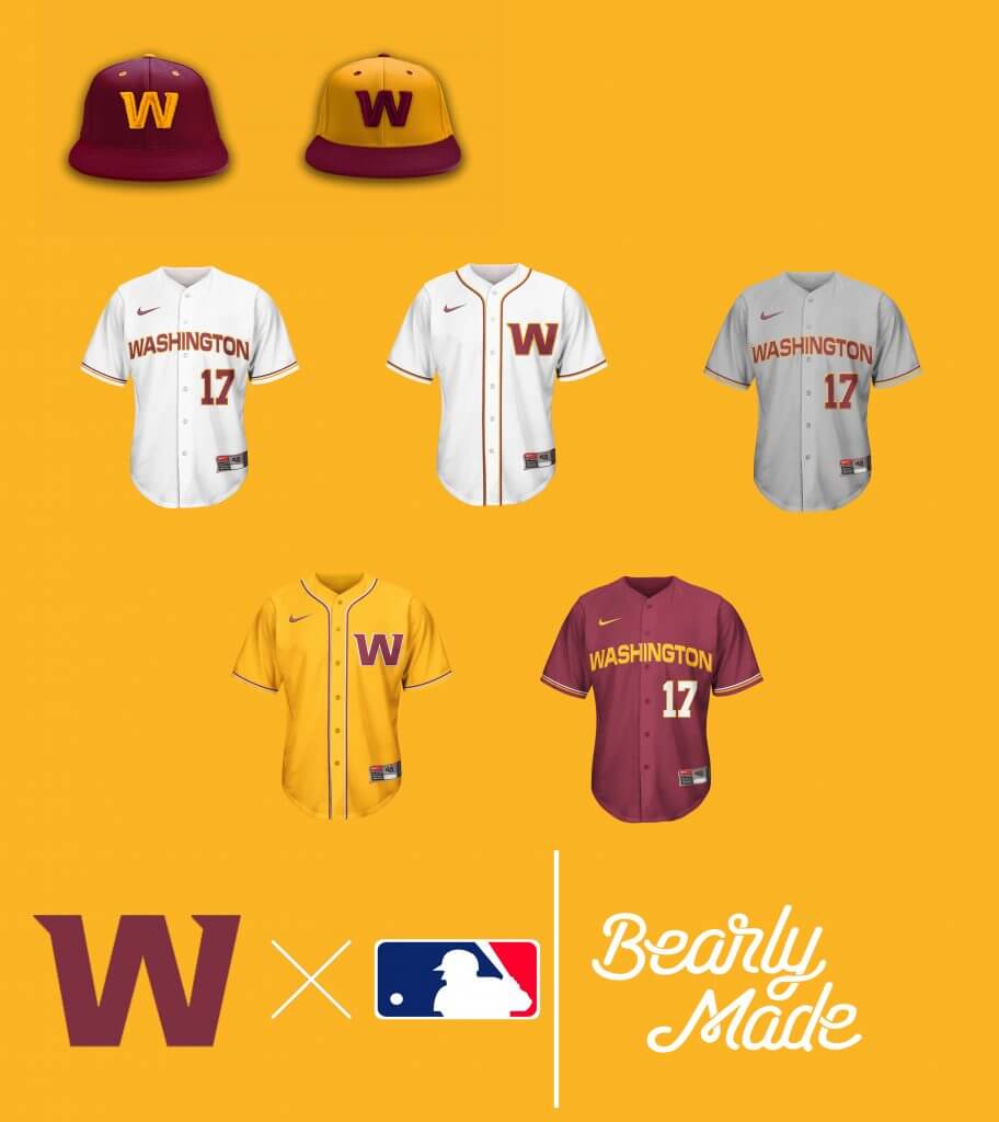
Just as the name of the Washington Football Team, this Washington Baseball Club set grew on me. The golden softball tops were an aesthetic surprise.
Thanks Brandus! Apologies (to Brandus and any readers who enjoyed seeing each graphic in detail) for shortening that part, but I think we can all agree it’s much better in this format. Please let him know what you think of his creations in the comments below!


Guess The Game…
from the scoreboard
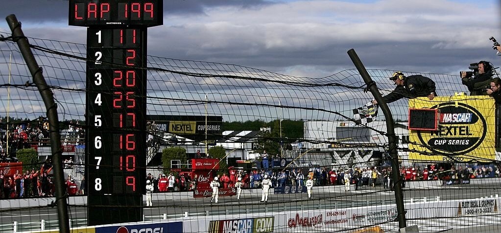
Today’s scoreboard comes from Chris Hickey.
The premise of the game (GTGFTS) is simple: I’ll post a scoreboard and you guys simply identify the game depicted. In the past, I don’t know if I’ve ever completely stumped you (some are easier than others).
Here’s the Scoreboard. In the comments below, try to identify the game (date & location, as well as final score). If anything noteworthy occurred during the game, please add that in (and if you were AT the game, well bonus points for you!):
Please continue sending these in! You’re welcome to send me any scoreboard photos (with answers please), and I’ll keep running them.
The “BEST OF” Kreindler’s Korner
Hey guys & gals. You’ve enjoyed Kreindler’s Korner for several years now, mostly on the weekends, on Uni Watch, but with the recent coronavirus outbreak, Graig’s time is just too precious and he needs to tend to other things besides coming up with a new writeup each weekend.
So, going forward, for as long as the COVID-19 situation is bad in New York, I’m going to run a few “Best of’s” until Graig returns.
Here’s today’s offering:
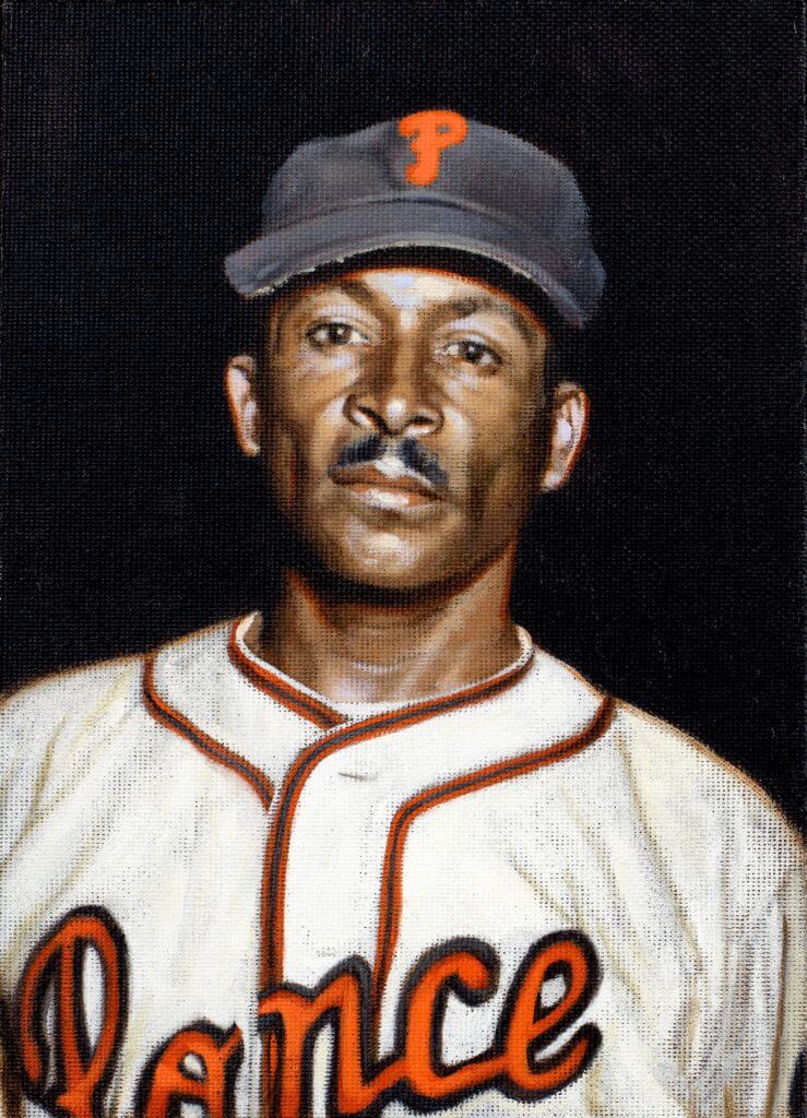
Title: “Pedro Cepeda, 1949” (color study)
Subject: Pedro Cepeda, 1949
Medium: Oil on linen mounted to board
Size: 5” x 7”When baseball fans hear the name “Cepeda”, most of them think of Orlando, the Hall of Famer who spent most of his career with the San Francisco Giants and St. Louis Cardinals in the 1960s. But in the world of Latin American baseball – especially in Puerto Rico – the name conjured images of Pedro Cepeda, Orlando’s father.
Though he started playing ball before there was any official professional league on the island, Cepeda was considered the first superstar in Puerto Rican Professional Baseball. Signing with the San Juan Athletics in 1928, he came up as a shortstop. Considered to be as fierce and aggressive on the basepaths as Ty Cobb, he was eventually called “Babe Cobb”, with the nod to the famous slugger being by his reputation as a hard-living, hard-drinking man. Though certainly, most people remember him as “Perucho.”
The 1930s saw him him playing for various clubs in Puerto Rico, Venezuela and the Dominican Republic. The most notable of those teams were Los Dragones de Trujillo from the latter of those countries. The team was created to promote the re-election campaign of the Dominican dictator Rafael Trujillo, and featured many of the best players of the Latin and Negro Leagues. Included among his teammates were Sam Bankhead, Cy Perkins, Silvio Garcia, Josh Gibson, Satchel Paige, and Cool Papa Bell. The latter three were future members of the Baseball Hall of Fame in Cooperstown. In its first year it won the Dominican professional baseball league championship. Speaking of championships, Cepeda’s Brujos de Guayama also won the ’38-’39 and ’39-’40 Puerto Rican League championships, with Pedro winning batting titles both of those seasons.
Though invited to play in the American Negro Leagues (and even supposedly signed to the New York Cubans by Alex Pompez in the mid-’40s), he declined because of the racism that permeated the country at the time. During the 1940s, Cepeda stayed in the Puerto Rico Professional Baseball League, spending time with the San Juan Senators, Mayagüez Indians, Cangrejeros de Santurce, Criollos de Caguas, and finally, the Leones de Ponce.
Here he’s pictured with the Leones during the ’49-’50 season, his last. This is one of 200+ such paintings of mine that were on display at the Negro Leagues Baseball Museum in the spring of 2020.
Thanks, Graig! You can (and should!) follow Graig on Twitter.

Looking Ahead…
As the calendar nears the month of August, you’re probably all aware that Paul will be taking his annual sabbatical from the blog, leaving me in charge of the weekdays.
And as always, I can’t get through the whole month without a little help from the readers, so I’m putting out the call once again.
This time around, I’m looking for reader submissions in two categories — the Olympics (which begin later this month and run through August 8th) and General Interest. For the Olympics correspondents, I’m looking for either historic uniforms for a given discipline, or a review of the uniforms being worn by individuals or teams in any given event (i.e. wrestling, basketball, volleyball, track and field, etc.) or both. These would run during the first week of August.
If the Olympics aren’t your bag, but you’d like to propose and submit an article of interest to the Uni Watch readership — I’m all ears! Every summer you guys come through with some amazing research, concepts and other fantastic uniform-related materials, and I’ll be happy to feature your work on here again during the month.
So, if you’re interested in contributing something Olympics or uniform-related, please Shoot me an e-mail (Phil.Hecken@gmail.com) and let’s discuss! Looking forward to seeing what you guys have in store for 2021!
InsideHook/TATC reminder: Paul here. In case you missed it earlier this week, my latest piece for InsideHook is an in-depth oral history of MLB’s “Turn Ahead the Clock” promotion from 1999. The uniforms were supposed to represent the year 2021, so the future is now! You can check it out here.
Okay, now back to Phil!
Uni Watch News Ticker
By Phil

Baseball News: “Watching Cincinnati Reds at Milwaukee Brewers (Friday) night, I noticed that Reds catcher Tucker Barnhardt’s batting helmet has a yellow, maybe gold, stylized C while the rest of the players’ helmets have a white C. (Photo attached from the game.)” writes Malcolm Spicer. “Any idea why Barnhardt uses a yellow, or gold, on his batting helmet? Maybe it’s the same helmet he wears while catching and the C has changed color?” It’s gotta be that or pine tar, right? Readers? Any other thoughts. … Check out this great video of Linsday Berra, Yogi Berra’s granddaughter, explaining the purpose behind the deep hinge Yogi had in his catcher’s mitt (from Kary Klismet). … Reader Eric Trager observes, “Looks like Ducks pitcher Darin Downs is wearing his old MLB pants. Odd because he last pitched in the MLB in 2014.” (Don’t think teams had the MLB logo on the belt tunnel then — PH) … Michael Cooperman saw the Angels vs Red Sox getaway day game and noticed something interesting: The Angels had SIX players wearing stirrups! “This wasn’t a special throwback day — just a normal day” he notes. The entire outfield, pitcher, shortstop, second baseman (pictured during a shift), all displayed the beautiful hosiery. … Vladimir Gurierrez, he of the Cincinnati Reds, had a belt/jersey number discprepancy. His jersey had 53, while the belt was 76 (from Christopher Fellerhoff). … The Salt Lake Bees wore throwbacks last night to celebrate 100 years of pro baseball IN Salt Lake City (from John Ewanowski). Here’s some some more pics (from Josh Claywell). … Former New York Yankees star Joe Pepitone has sued Hall of Fame to get a valued bat teammate Mickey Mantle hit his 500th home run with (thanks Paul). … This is awesome: SABR has now updated their Baseball Reference stats for all their Negro League player bios (from SABR Bio Project).

Football News: Arizona is getting new uniforms! Before you get too excited, it’s the Arizona Wildcats and they’re finally getting new unis for football and basketball. At least in football, Arizona has had terrible uniforms for several years (and different redesigns) now. Also posted in Basketball.

Hockey News: Lotsa uni-goodness in this video featuring Minnesota North Star Goalies – Cesare Maniago & Gump Worsley A Day in the Life. Both describe what being a goalie is like, outline goaltender equipment, and more. Nice find by Jeff Ingalls.
.


NBA/NCAA/Basketball News: Looks like the North Carolina Tar Heels have a new “decoration” for their practice gym floor (from James Gilbert). … Cross-posted from the football section: the Arizona Wildcats are getting new football and basketball uniforms.

Soccer News: New away kit for Hull City AFC in the Championship in England. Submitter Ben Karnish adds, “A nice alternative with team colors compared to their home kit.” … Check out the new home and away kits for BSC (Bern) Young Boys, which were recently released (from Evan Feick).

Olympics News: I’d thought most nations have already unveiled their uniforms, kits and Opening/Closing Ceremonies gear for the Tokyo 2020 (2021) Olympics, but just yesterday, Kenya unveiled some of their uniforms, and I can’t decide whether I love or hate the 3-D honeycomb look of some gear.

Grab Bag: This is a weird one. First they were going to…then they weren’t. And finally they didn’t: the Fiji rugby team were set to wear “Vaccinate Fiji” slogans on their jerseys, but they ended up wearing messageless jerseys in the end — if you didn’t follow this story as it developed, it shows that vaccinations aren’t just politicized in the US.
Uni Tweet of the Day
You say this like it’s a bad thing. Plus, we know the alternate black jerseys are coming later this month…
Another doubleheader with no Blue @Mets home uniforms, which still haven’t be worn at all this year, despite being proudly marketed on their website as the “most popular” “on-field” caps/jerseys. Weird…. pic.twitter.com/8Sr1tq4BFq
— Niko Goutakolis (@NikoGoutakolis) July 11, 2021
And finally… sorry — no sunset photo today. Once again, it was overcast as the sun went down, so we’ll just leave this one photo-less. Also, and unrelated, I wrenched my back yesterday trying to move what had to be at least a 250 lb. statue. It didn’t budge. And, today will be a somber day for me, as it marks the 10th Anniversary of my father’s passing. Paul wrote a wonderful piece on UW 10 years ago in remembrance. Thanks buddy, I read that every year on July 11th.
Thanks to Brandus for sharing those MLB x NFL crossover concepts! There were definitely some gems amongst the many designs. Hope you guys enjoyed these.
Everyone have a good week (and let me know if you’re interested in contributing either as an Olympics Correspondent or on any other uni-related articles for August), and I’ll see ya next weekend.
Peace,
PH
Barnhart has gold stitching on his chest protector, which might be a nod to his being a multiple gold glove winner.
That helmet does have a lot of pine tar, though.
The “Guess the Game” photo shows the finish of the Pocono 500 NASCAR race on June 11, 2006, won by Denny Hamlin in #11, with Kurt Busch second in #2 and Tony Stewart third in #20. I’ve been to several Indy Car races at Pocono so recognized the track, and the Nextel sponsorship of the “Cup” series narrowed it down to 2004-07.
That was Hamlin’s first win in the Cup Series!
Cool, and I noticed he and Kurt Busch repeated their 1-2 finish at that year’s July Pocono race.
Missing link in the Hockey section of the Ticker.
Thanks. Should be there now.
Barnhart’s helmet has a bunch of pine tar. He sprays it on before leaving the on deck circle.
Very impressive, Brandus. Thank you for sharing.
Love the Miami Dolphins “M” cap. Would think New Era would have one like it; very classy and old school looking.
Also like the Steelers “S” hat. Was looking for a hat with that “S” a while back but couldn’t find any.
From baseball, I wonder if the pitcher wears the old MLB pants to remind himself how good he was/is.
Steelers jersey with the logo on the jersey (like the Cubs) works several levels because the logo is also on just one side of the helmet. Maybe all these MLBxNFL teams should have batting helmets with logos on both sides instead of the front excepy for Pittsburgh who pnly has it on one side. (And maybe WFT who has the W on one side and numbers of the other, and any other team who also does that, if any.)
Barnhardt definitely isn’t using the same helmet at the plate and in the field. A catcher’s fielding helmet doesn’t have an ear flap. I’d guess the discoloration is from pine tar or rosin.
On almost every one of those NFLxMLB concepts, the logo on the sleeves are facing backwards, which is driving me nuts. Turn them around so the animals and pirates and pointy objects are moving/looking forward, and they would look a lot better.
Came to say this. Also, the seahawks on the sleeves of the Seattle jerseys need to be to be turned around.
Nice job with the jerseys, but same as the first time too many of these MLB X NFL Crossover hats just look like the NFL hats you could get at the Lids store in the mall. Also would like to see this as a completed uniform, including the stirrup socks.
as for the crossover concepts, most are good but every single hat logo is far too large for a baseball cap. looks more like a nfl draft hat than an in game mlb cap
Barnhart’s yellow logo is definitely pine tar. You can see how uneven the color is in this photo:
link
Also visible is the stitching sewing his placket shut. (Other Reds with this stitching, if anyone is curious, are Nick Castellanos, Shogo Akiyama, and Nick Senzel.)
As for Vladimir Gutierrez’s belt, 76 was the number he was assigned for Spring Training this year, before he was called up to the big leagues.
The contrasting eyelet colors on the majority of the hats also does not seem indicative of MLB either.
Definitely pine tar on that Reds helmet. I noticed the same thing on the White Sox helmets when they debuted the Southside CC uniforms.
The Jacksonville cap should have started black and faded to yellow. The Rams jersey should have had the “name tag” plate. And no gold on those SF jerseys and caps?
Are we planning on doing a Griffins concept contest this summer? My favorite part of every summer!!
Wasn’t there some conflict-of-interest/controversy with that?
Was it discontinued?
Sorry to hear about the challenges you had today, Phil.
Nice work, Brandus!
I would have liked to have seen some helmet/pant stripes repurposed as ‘racing stripes’ ( like for Dallas, Washington, Green Bay or San Fran) but hey, that’s me.
Not seeing an Oilers throwback option for the Titans was also a bit disappointing, considering how strong the concepts were otherwise.
Especially considering the Titans set was possibly the worst of them all. (No fault of Brandus. Not much to work with.)
I don’t remember this. When was this?
Love the easter egg of all sleeve patches being put on the left sleeve (like usual) except the Steelers haha
Only one that feels like an actual “crossover” (and not just NFL logos on a baseball jersey) is the Green Bay interlocking. Because it so beautifully mimics the old Brewers design.
link
That Cowboys set is sweet.
Ironically, the Texans set suffers from the same placket + nameplate alignment issues that the Astros have.