By Phil Hecken
Follow @PhilHecken
Greetings UW readers — I hope everyone had a good week and is doing well this fine first Saturday in June.
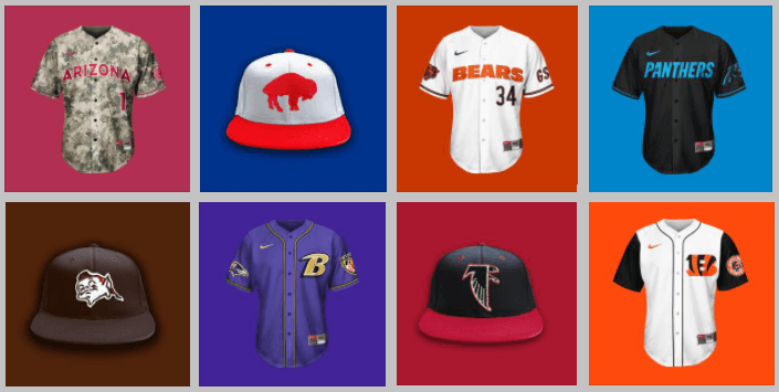
Back in April, longtime reader Brandus Foust (aka “Bearly Made”) sent me (almost literally) a TON of MLB/NFL “crossover” concepts — these being NFL teams rendered on baseball jerseys and caps. Each one of the 32 NFL teams contained a file featuring multiple caps (usually four) and jerseys (usually six). So, over the course of a few weeks or months, I’ll be showing off Brandus’ concepts — instead of simply running the one “full” file, I will show each of the different cap and jersey designs so that you can get a deep look at the details. Every graphic below can be enlarged by clicking on it.
He sent me the concepts alphabetically by city, so that’s how I’ll group them for you guys. I asked Brandus for a brief introduction and short writeup of his concepts, so this one will be graphic-heavy but you won’t get bogged down with too much text. I think you’re going to like these. Enjoy!
NFL x MLB Crossover Concepts
by Brandus Foust (“Bearly Made”)
As a sports fan, freelance designer (printer & painter otherwise) & longtime reader (LONGTIME reader, think “Mina H.” long), I’ve always enjoyed uniforms, as well as introspective looks into team identities. Since Uni-Watch has come along, it’s been exciting to see other people be as passionate about the science of the sports uniform, as well as seeing other designers showcase their concepts and talents, yet I never had the schedule or nerve to do this myself. However, with the ongoing pandemic slowing things down considerably, I had some time….and I’m rambling. Long story short, I did a NFL x MLB concept. NFL teams on MLB Hats & Jerseys, simple enough. As with UW’s NA-Free Policy (cheesy shorthand for it, I know), I did my best with Kansas City and Washington.
I imagine people will have some words about “the swoosh”. It bothers me too, but I wanted to remain as true to the product as possible (which also includes removing as many football elements as would allow), Mi Scusi…
All the best and Enjoy,
Brandus Foust aka Bearly Made
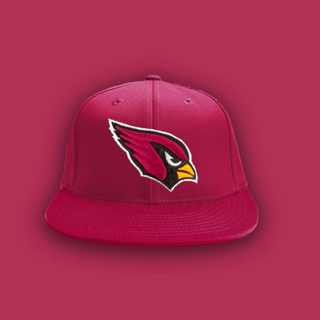
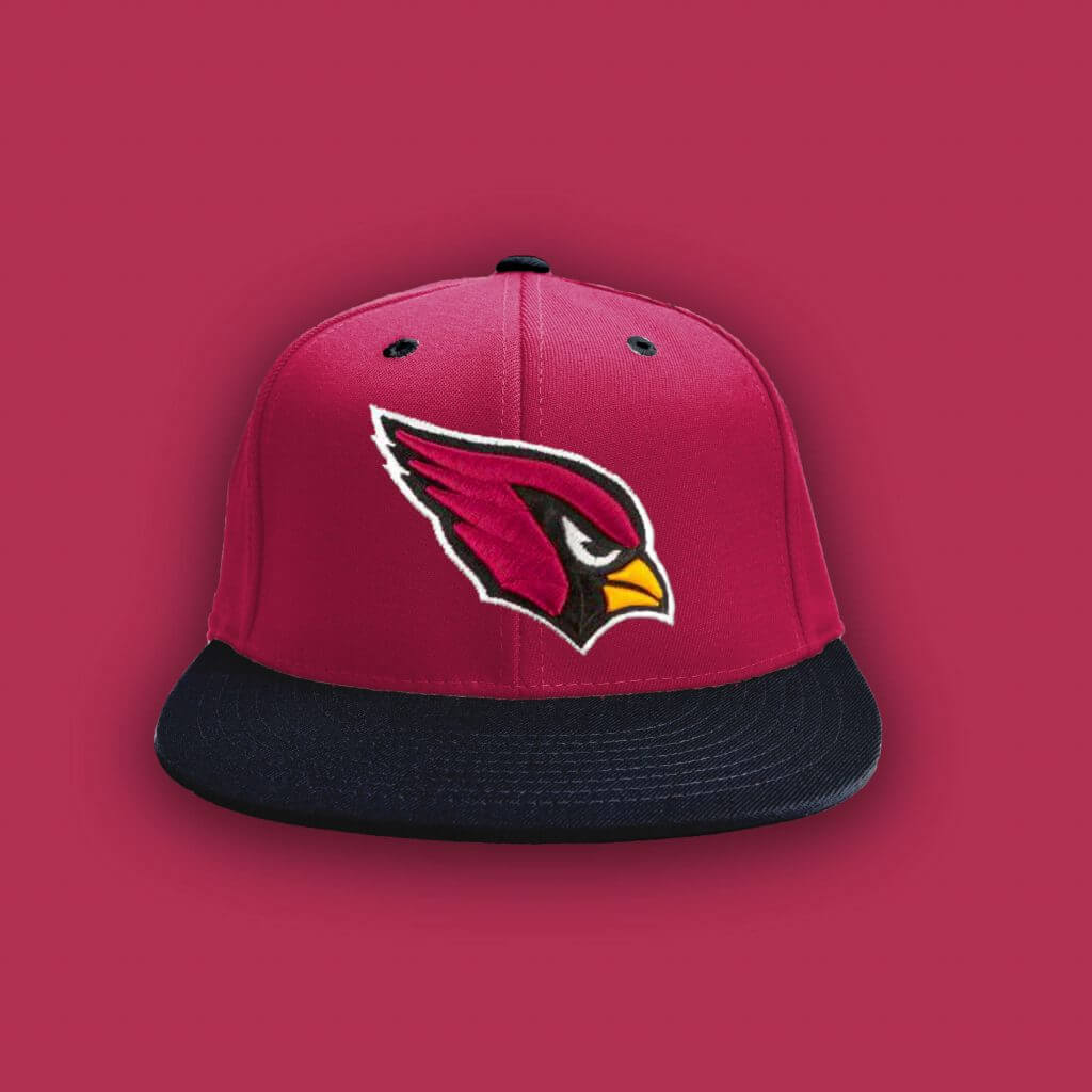
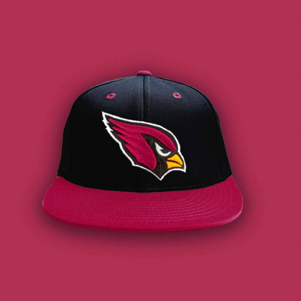
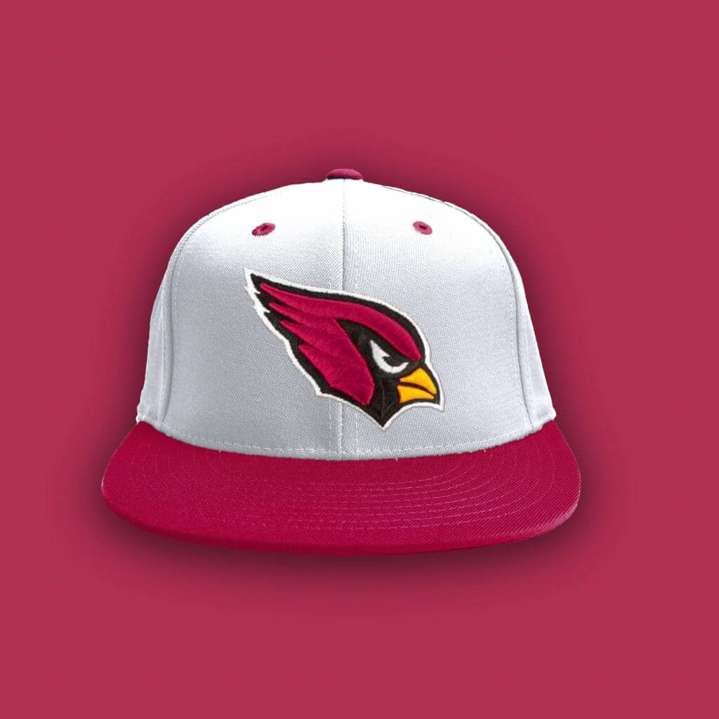
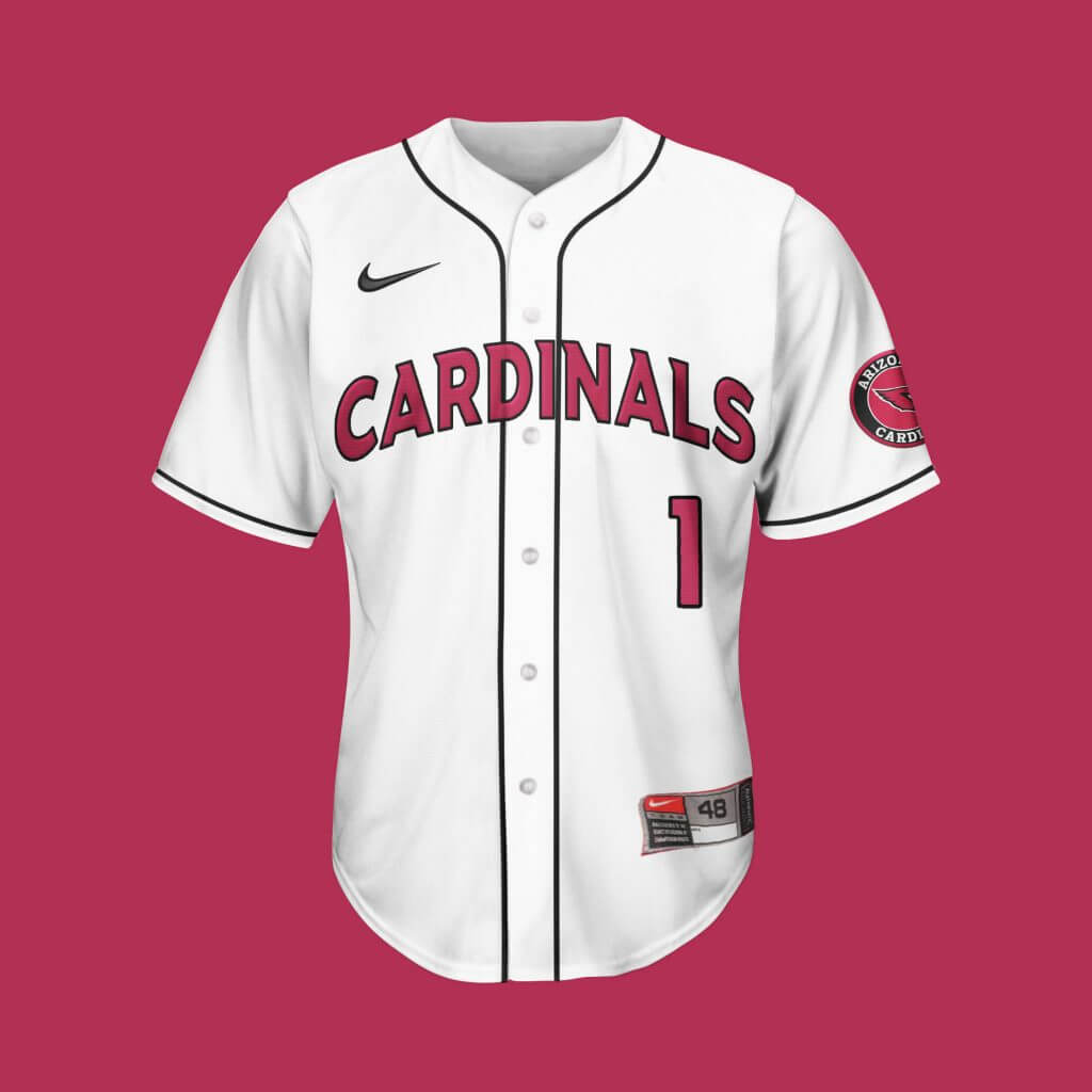
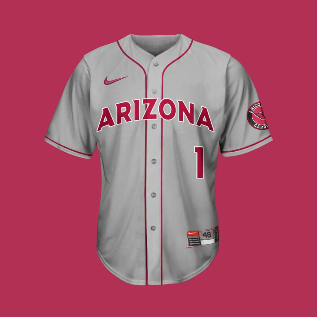
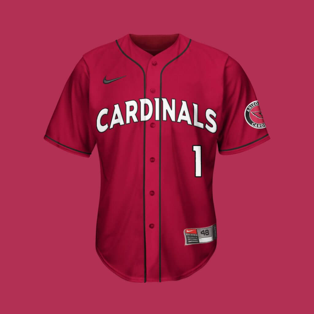
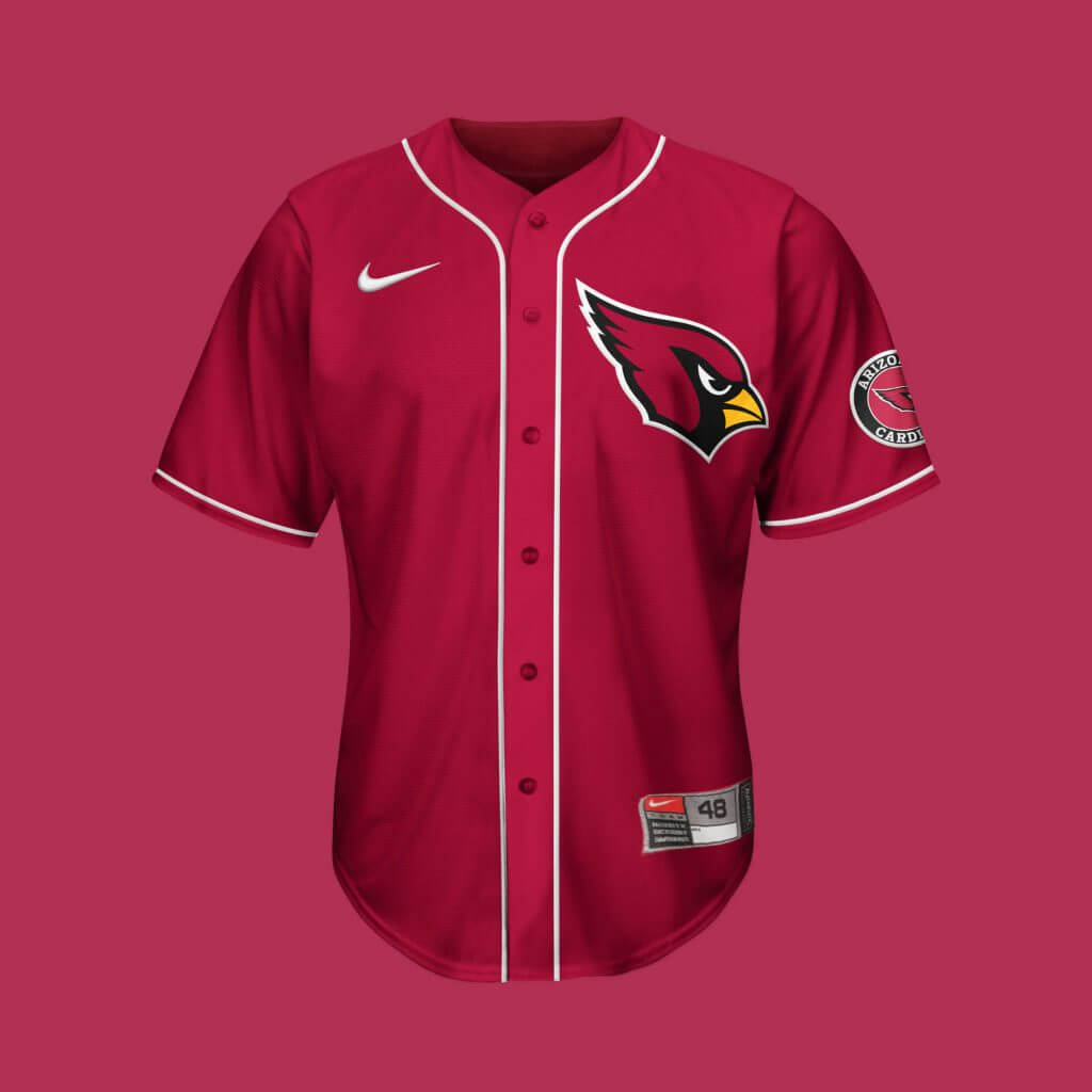
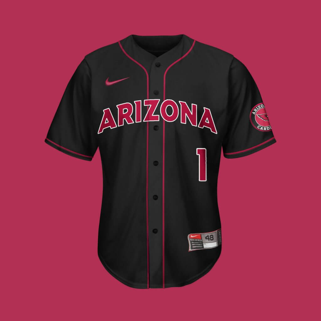
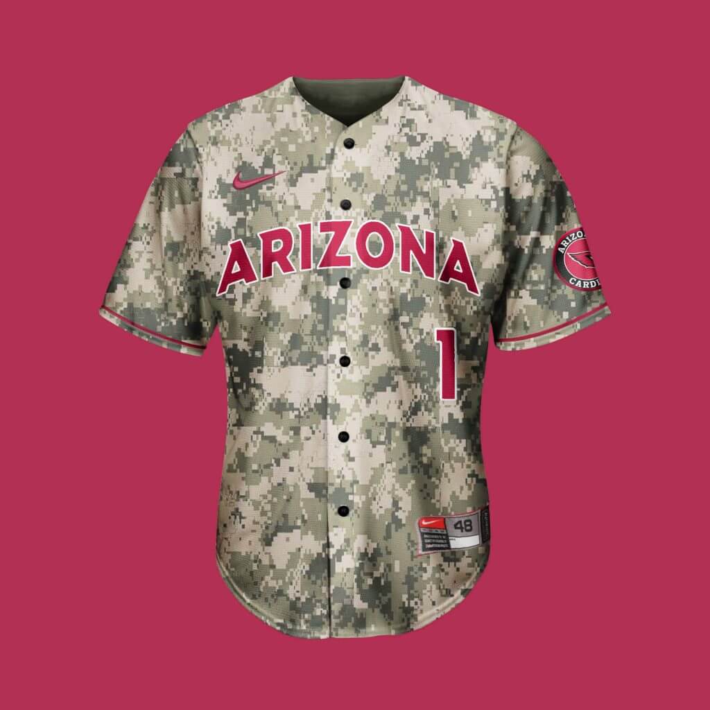
Arizona Cardinals
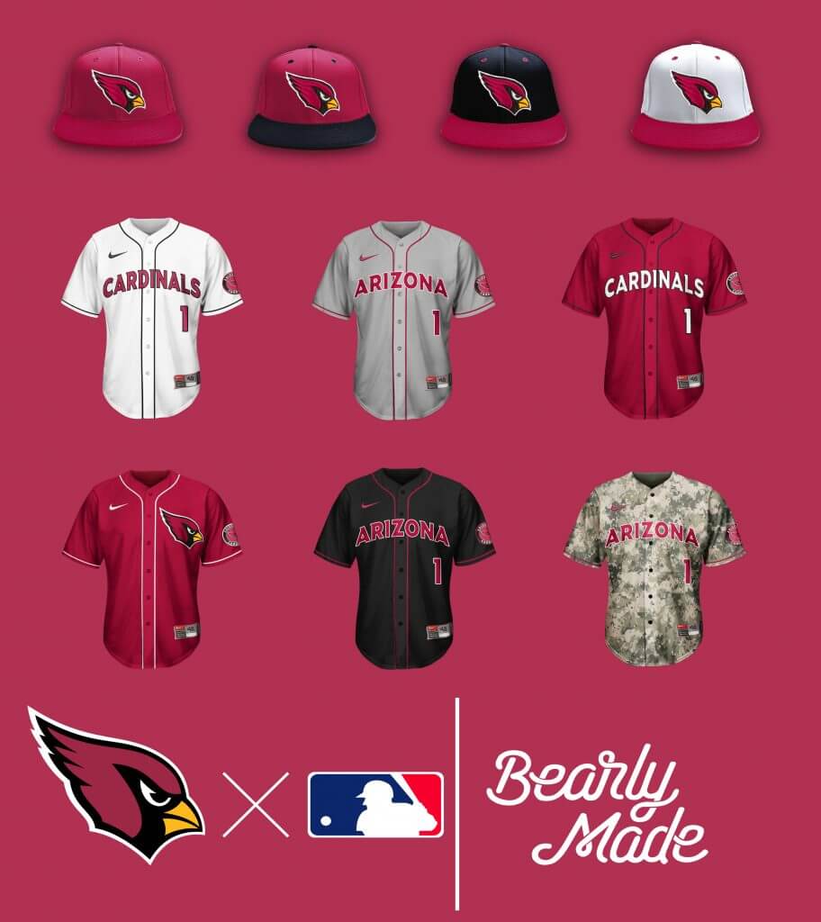
If there’s a team most likely to go camo, it would be the Cardinals for obvious reasons. Aside from that, a fairly respectable baseball set from a team that needs an update on the gridiron.
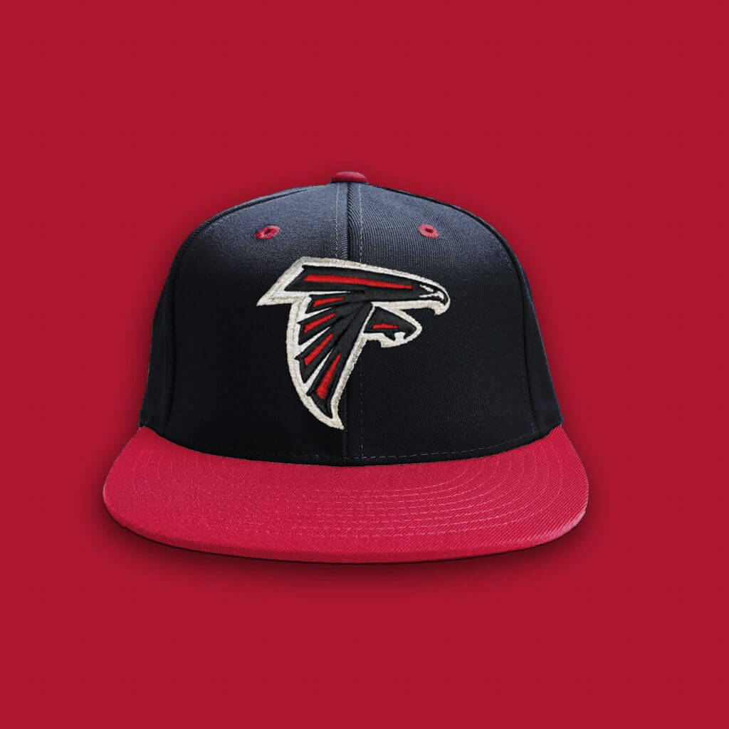
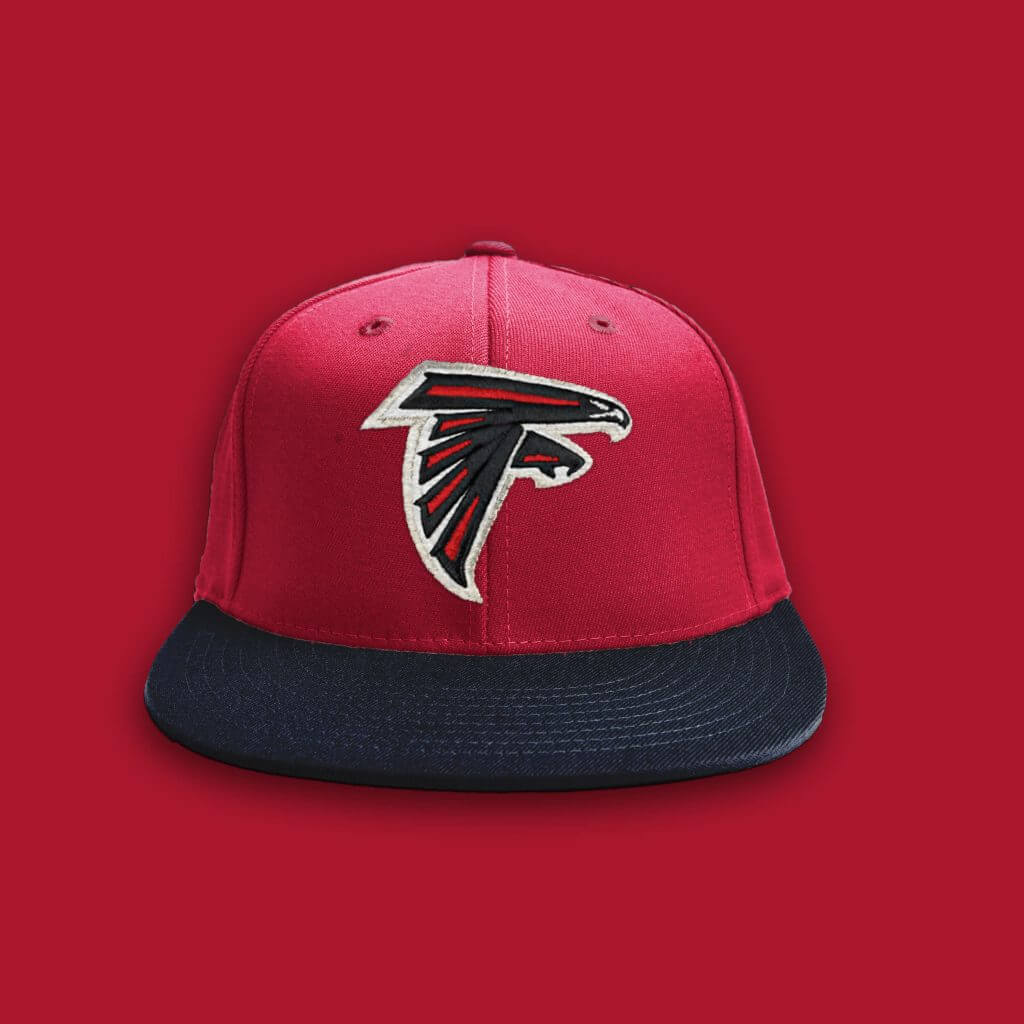
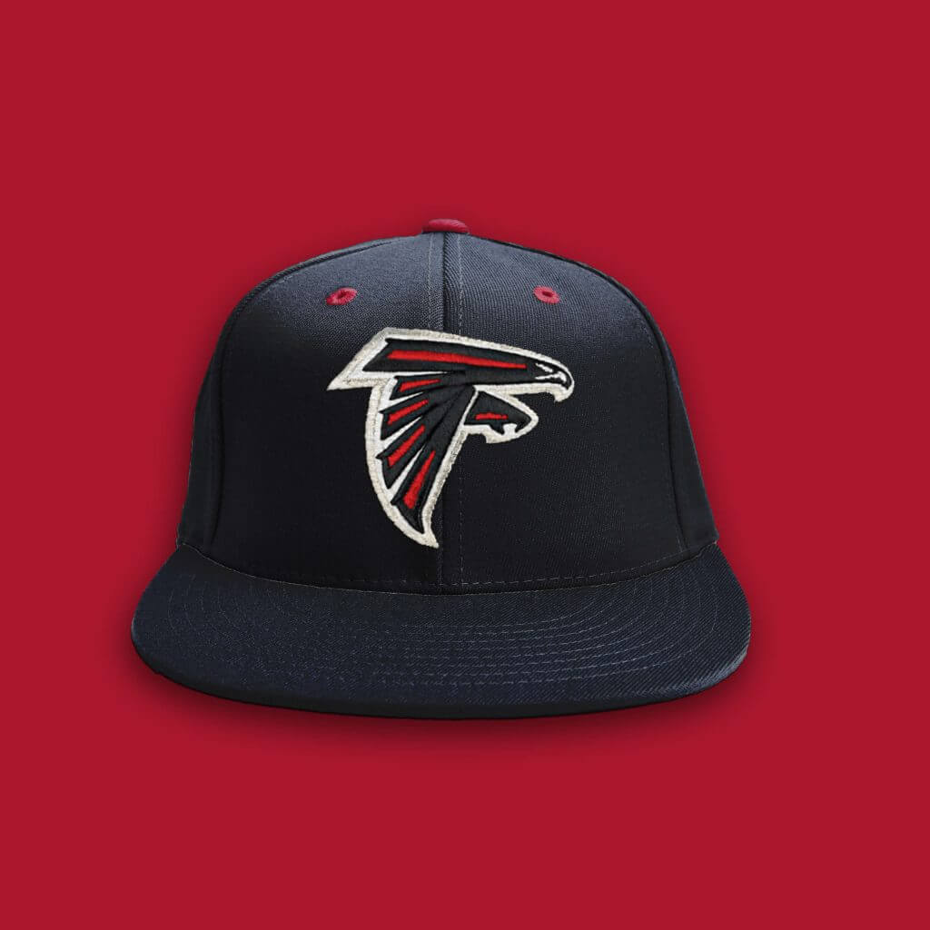
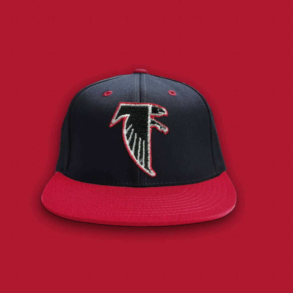
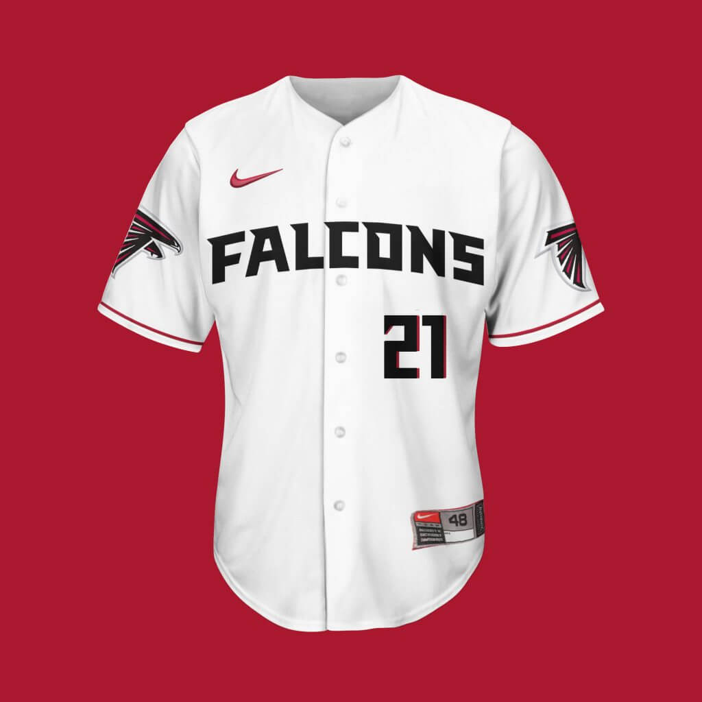
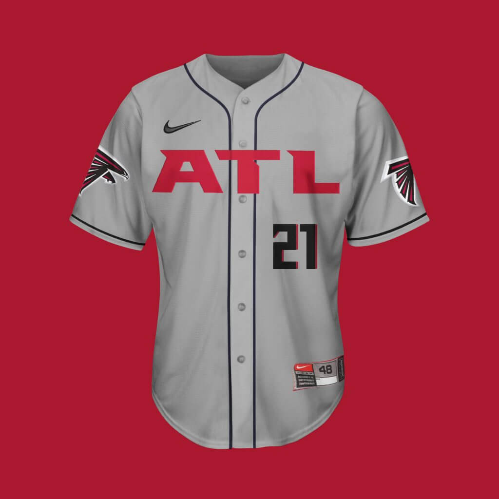
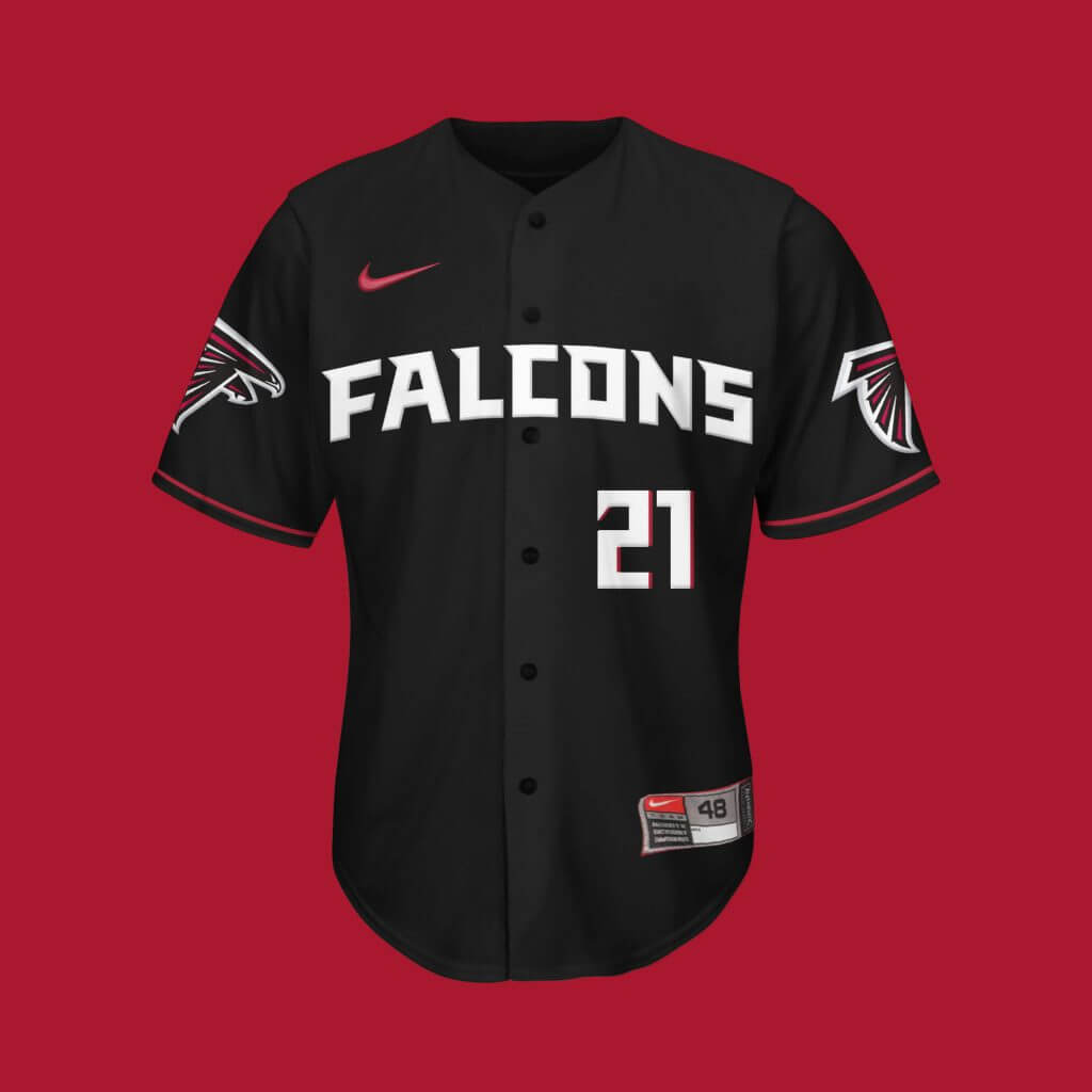
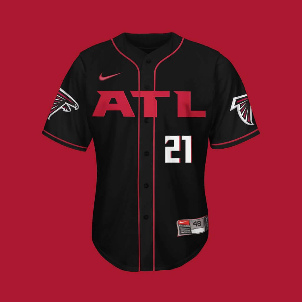
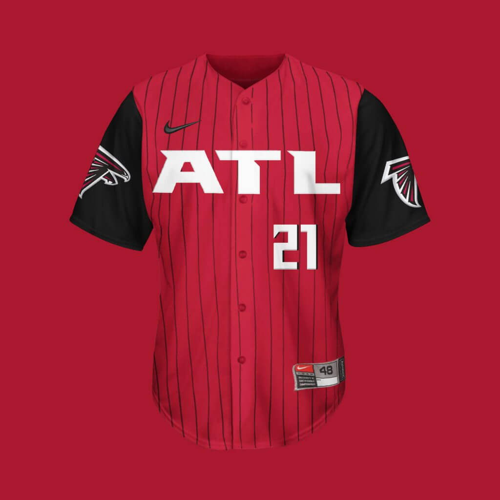
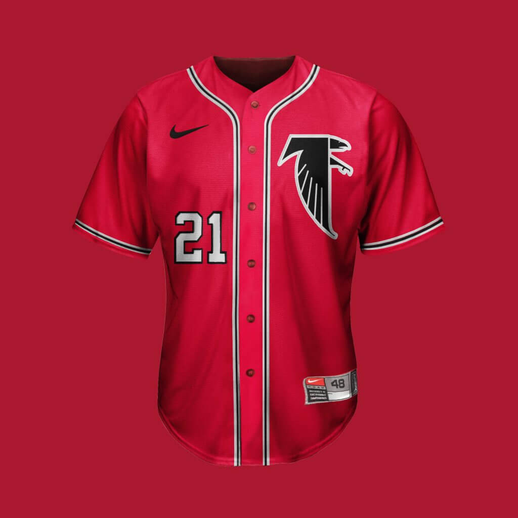
Atlanta Falcons
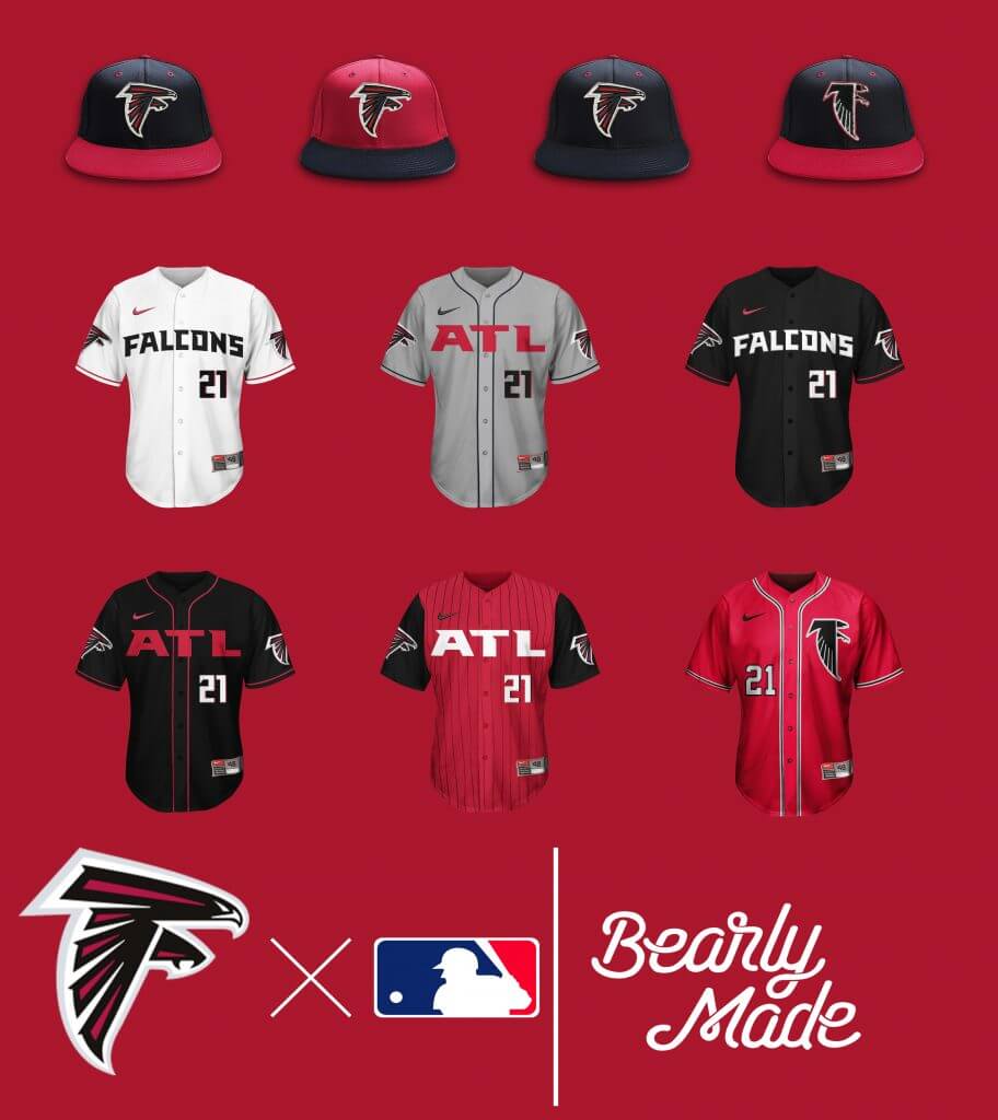
The football version grew on people as the season went on, but the gradient jerseys are just brutal. Replaced with pinstripes and cutoff sleeves, makes for a decent softball top. I think those red vintage tops are just purrdy.
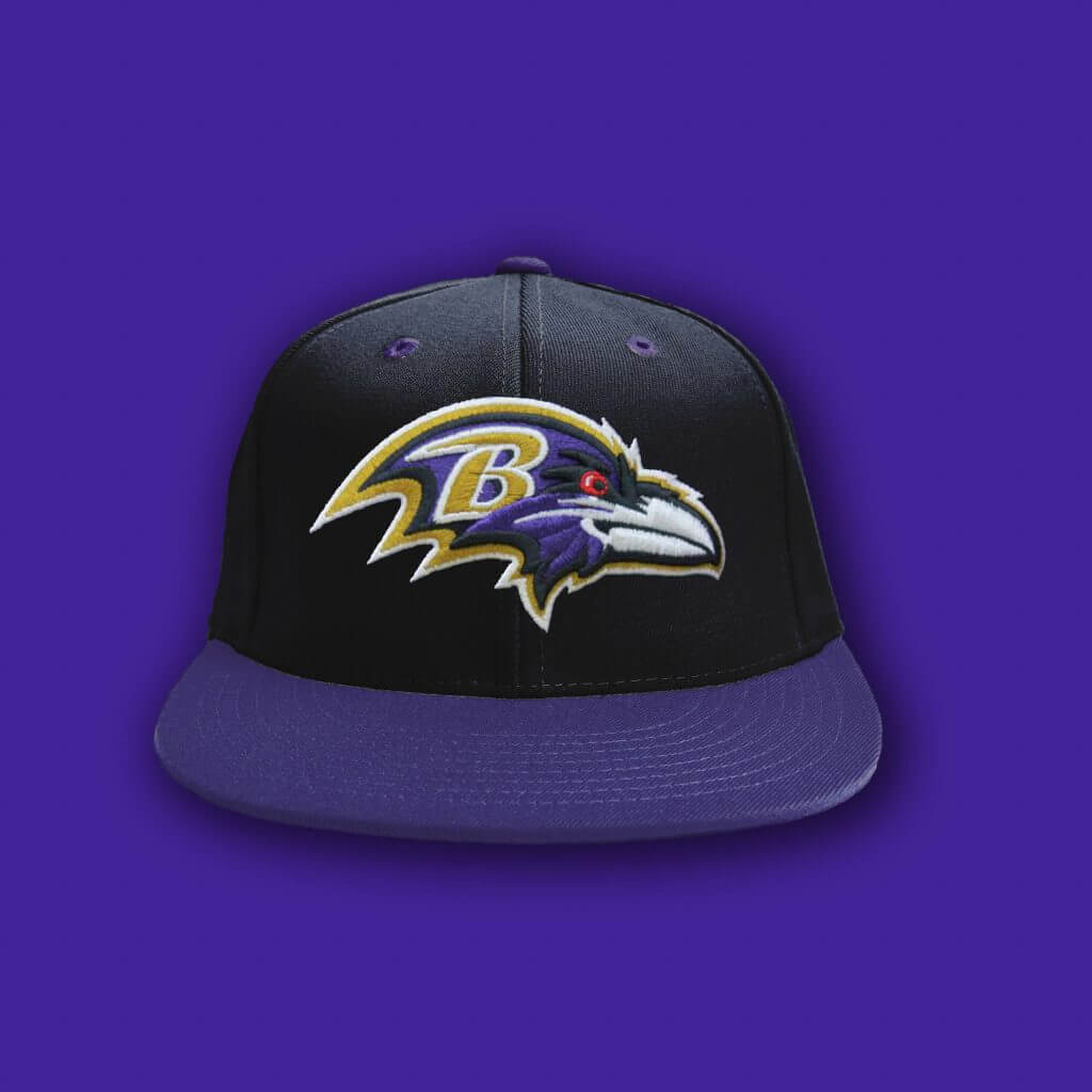
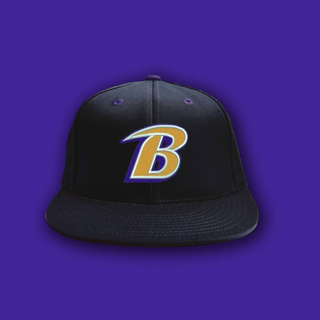
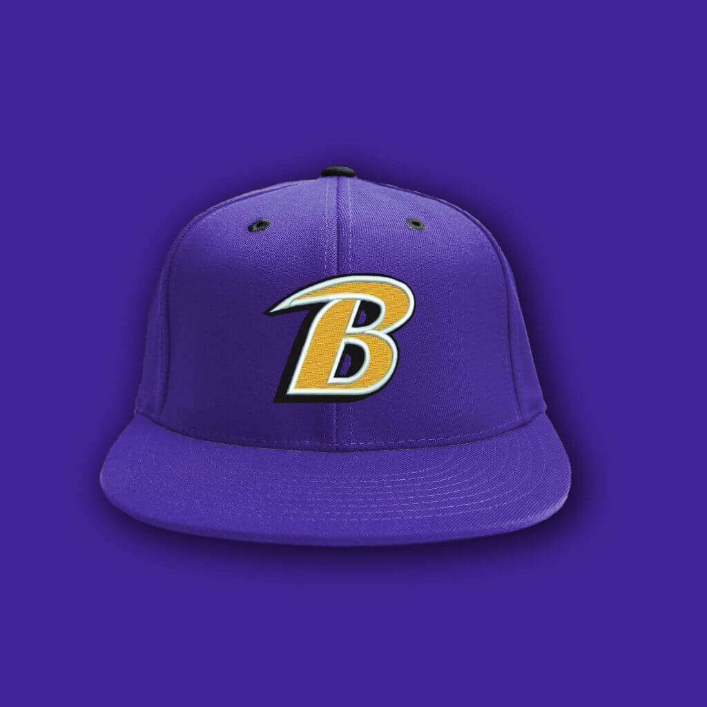
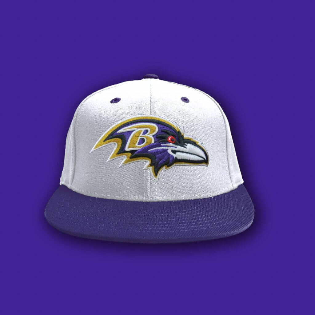
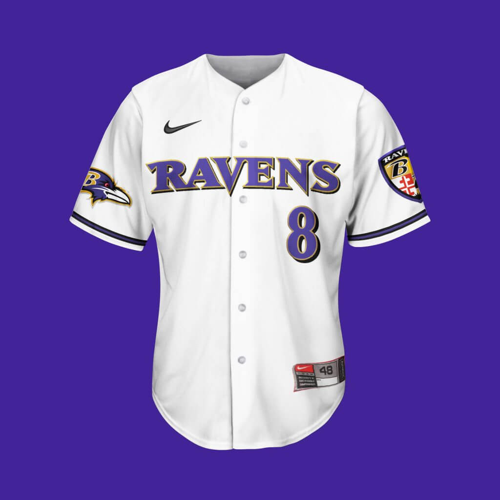
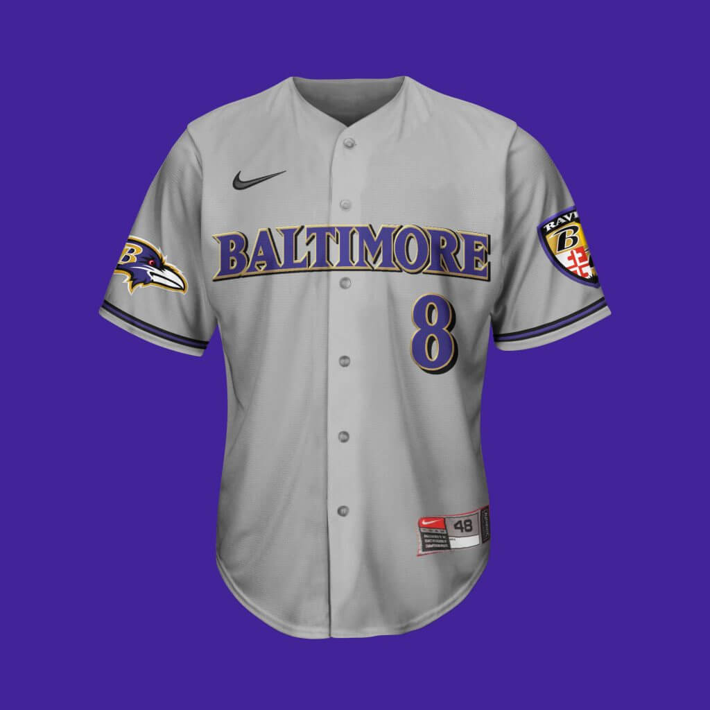
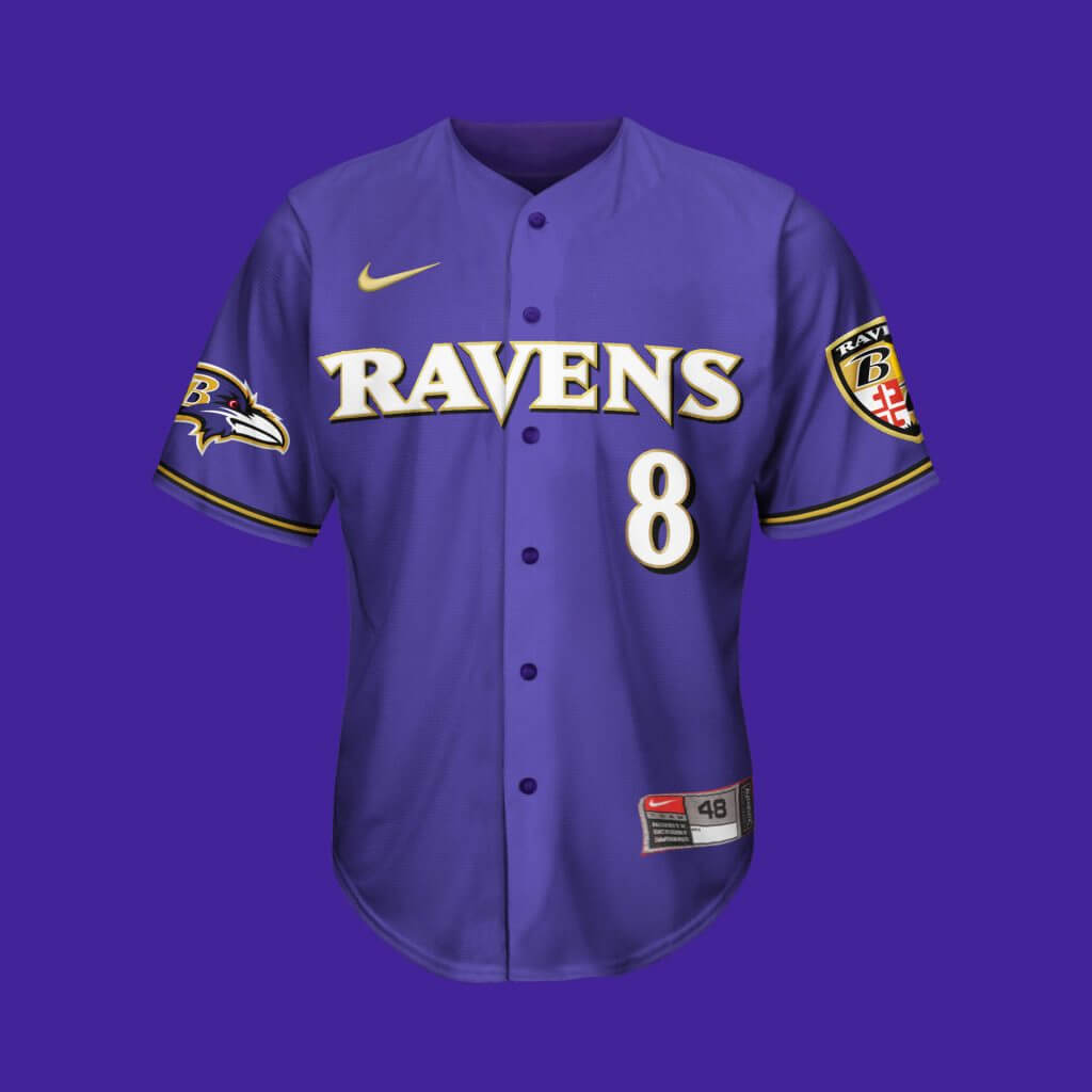
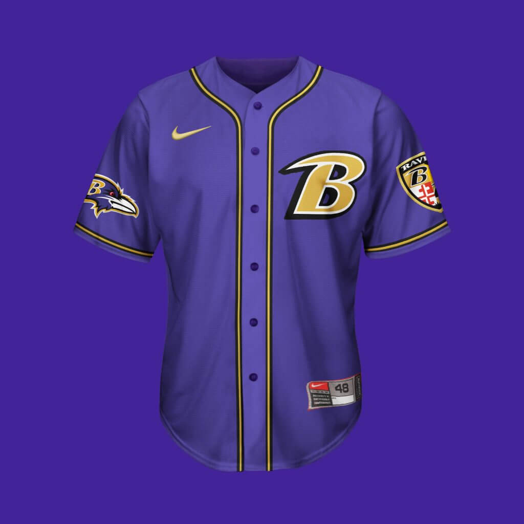
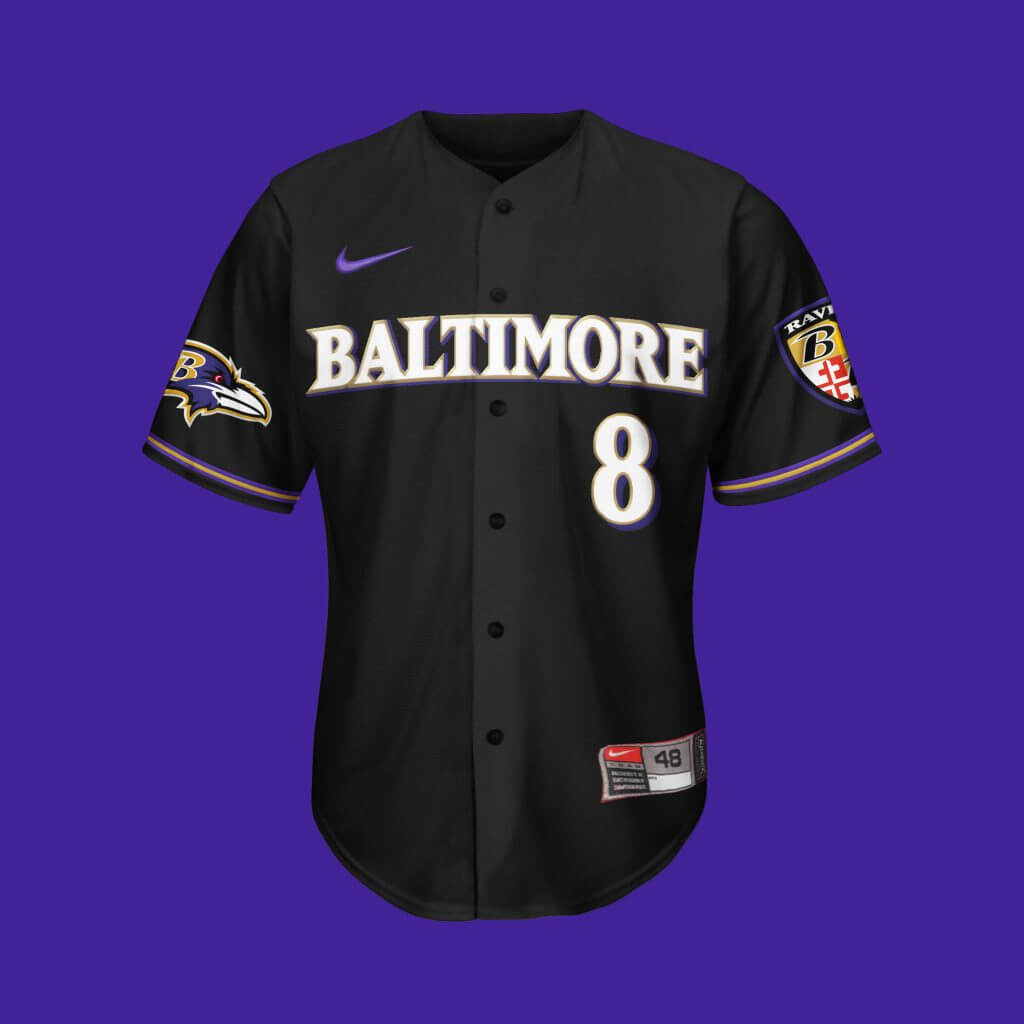
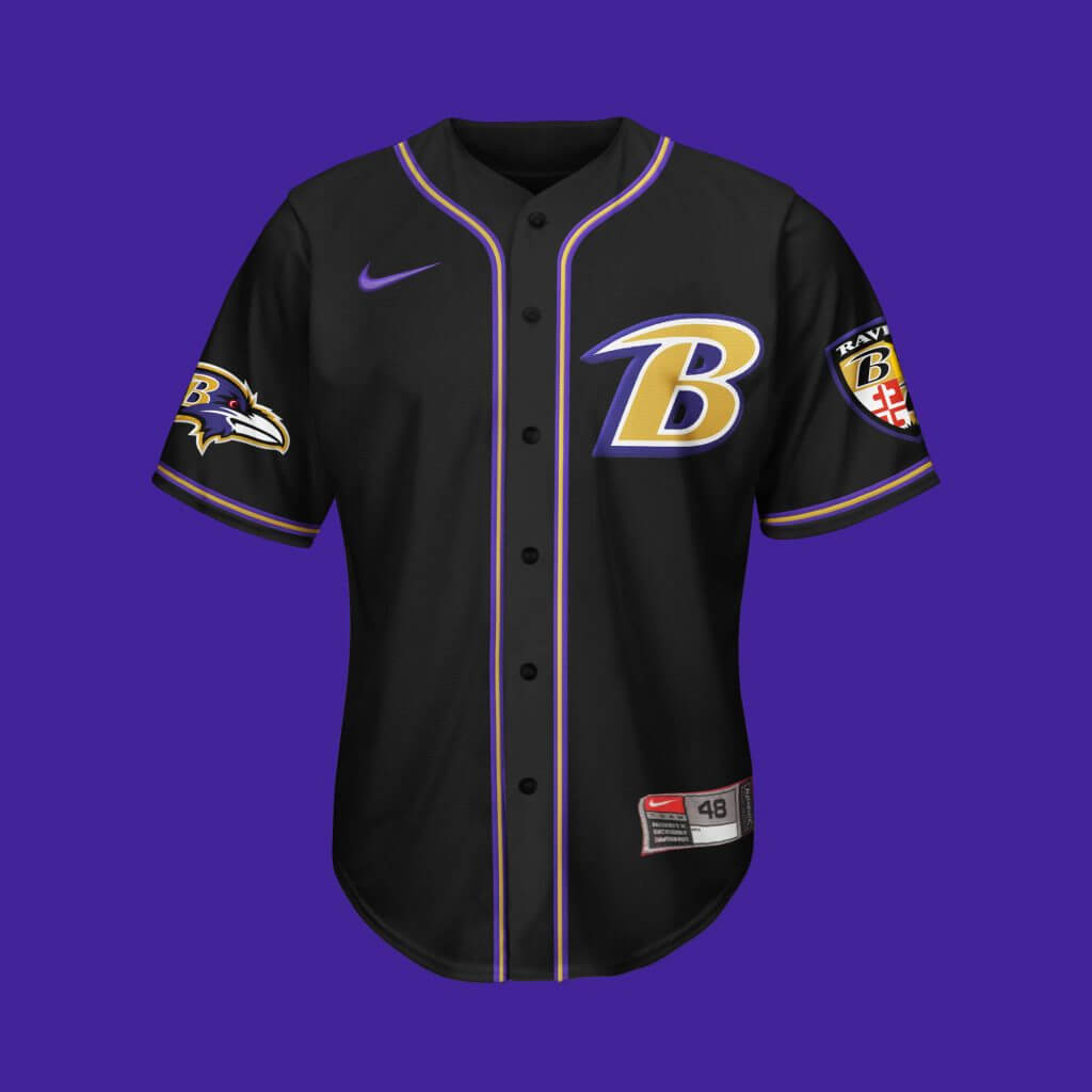
Baltimore Ravens
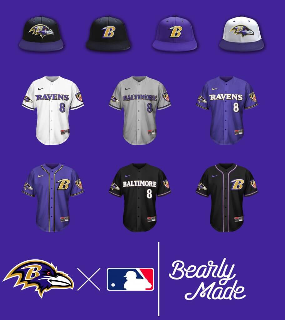
Pretty Straightforward. Although I wanted to showcase the “B” logo a little more, and THERE ARENT ENOUGH WHITE HATS IN BASEBALL!!! (I think they bring a classic look during games, sue me.)
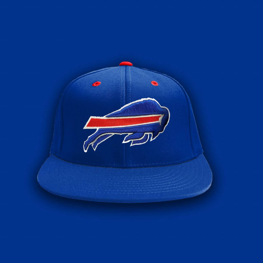
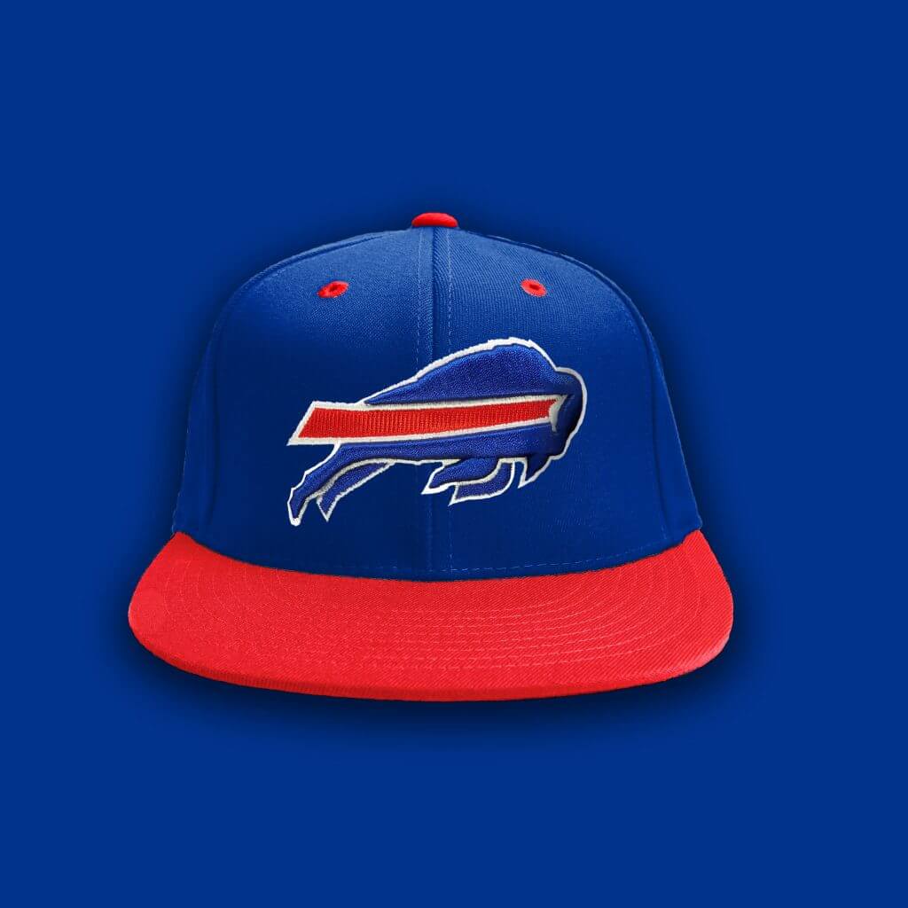
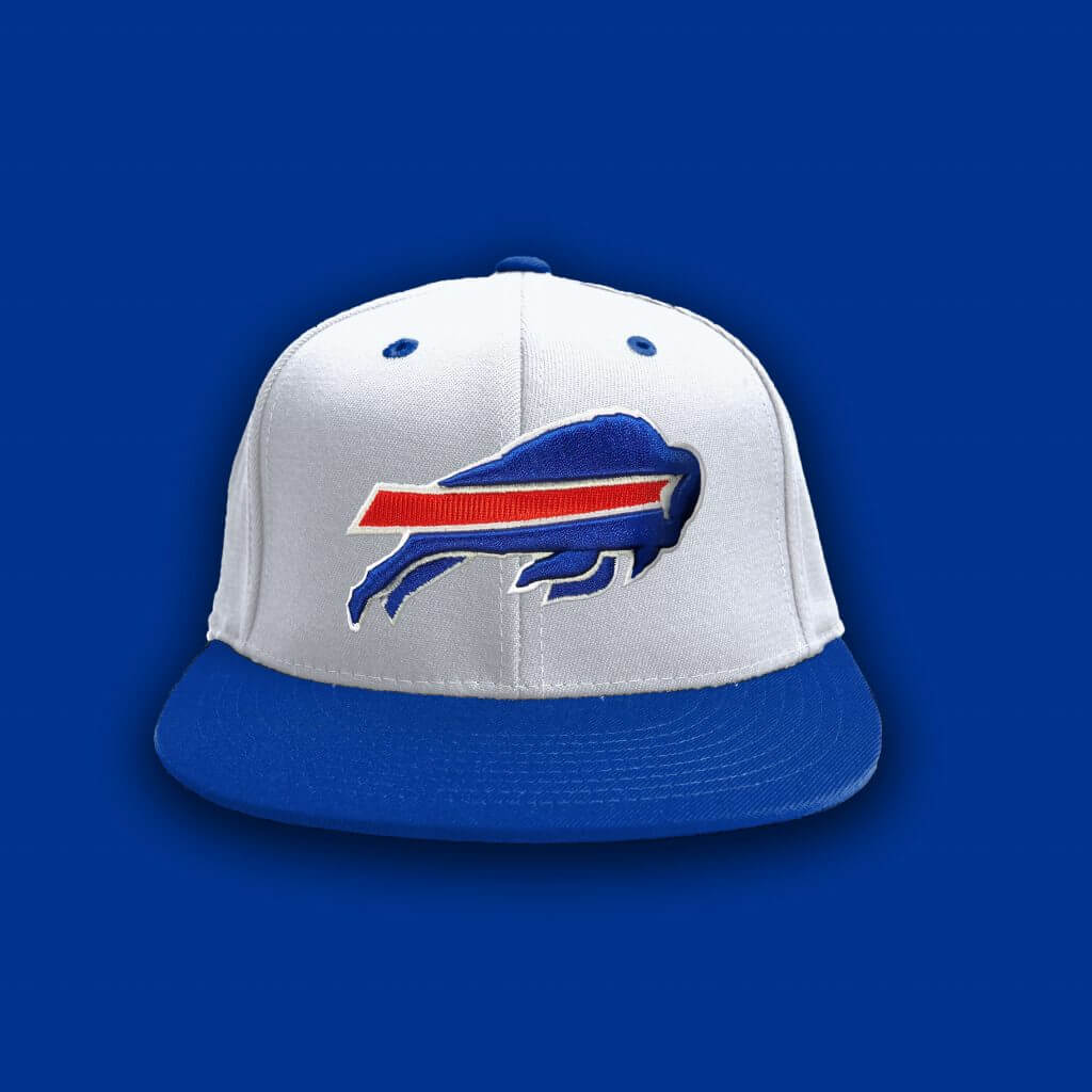
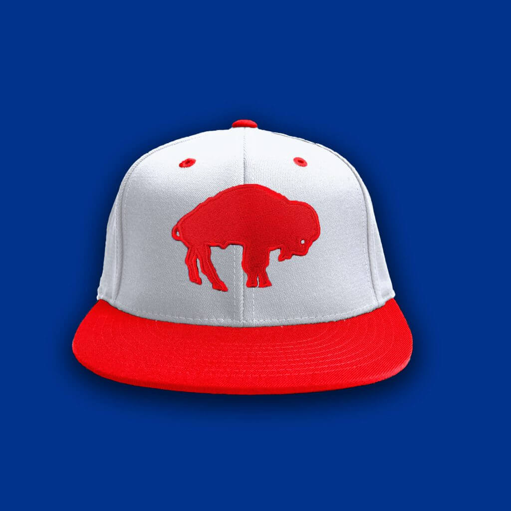
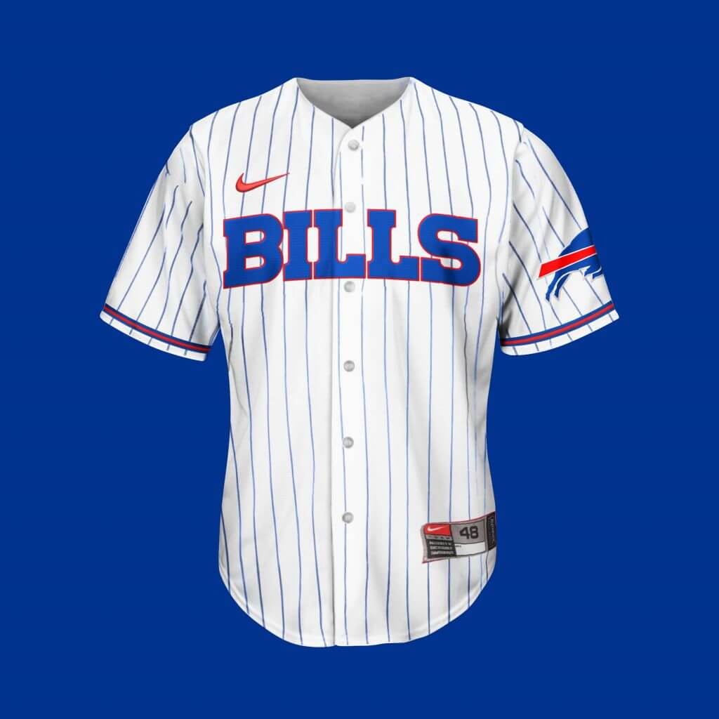
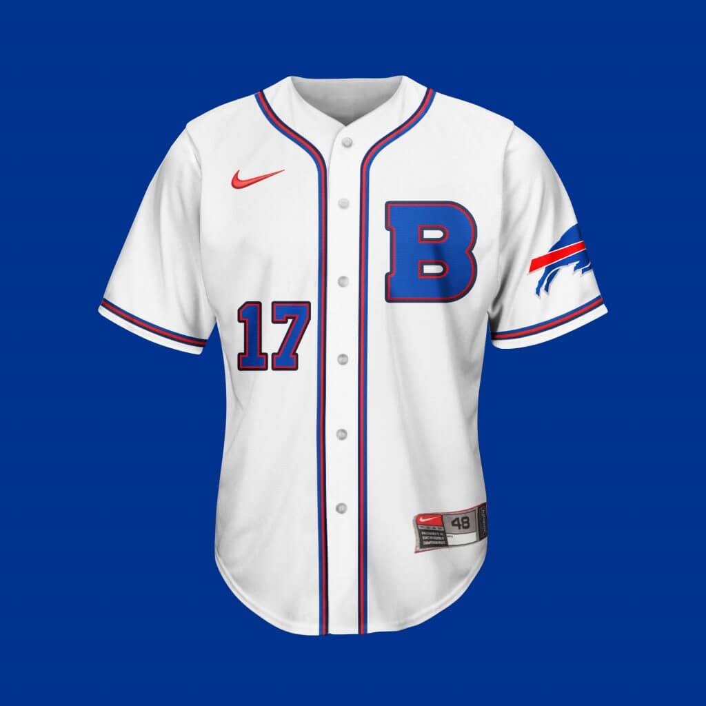
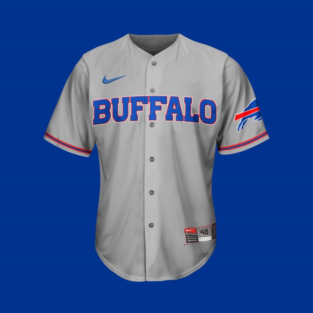
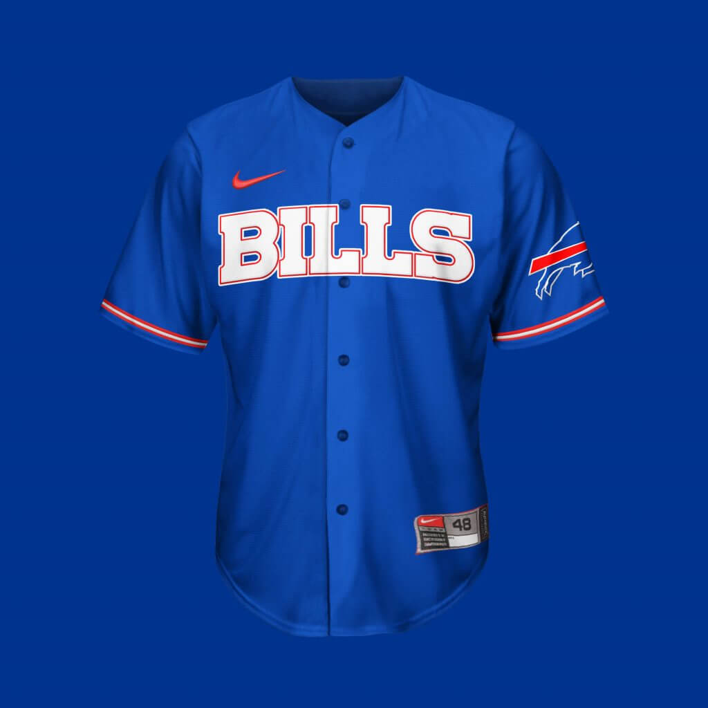
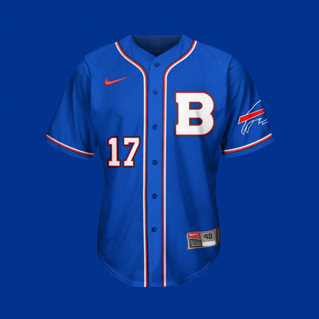
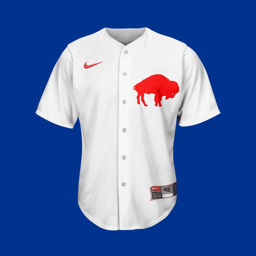
Buffalo Bills
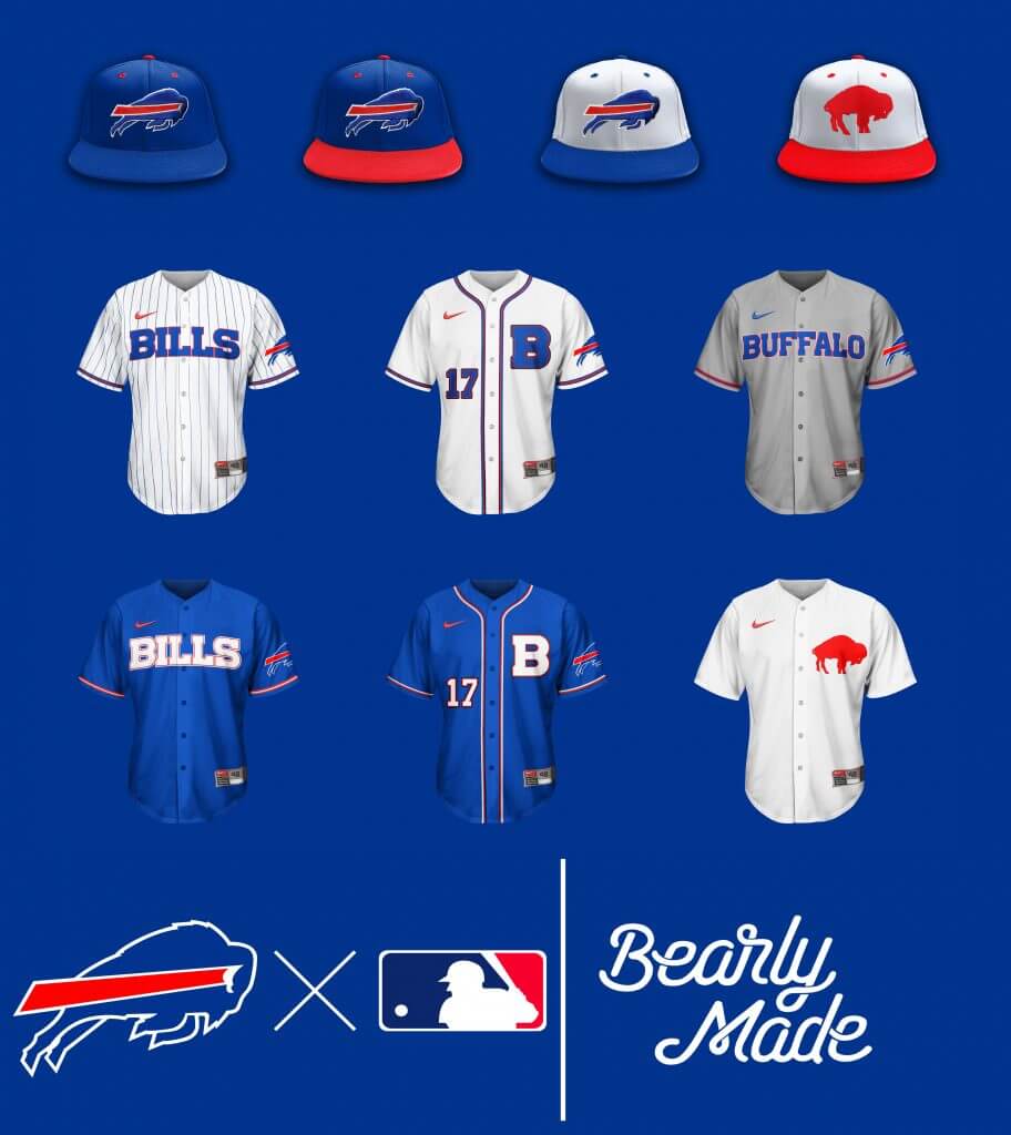
I think the vintage hat and jersey speak for themselves…
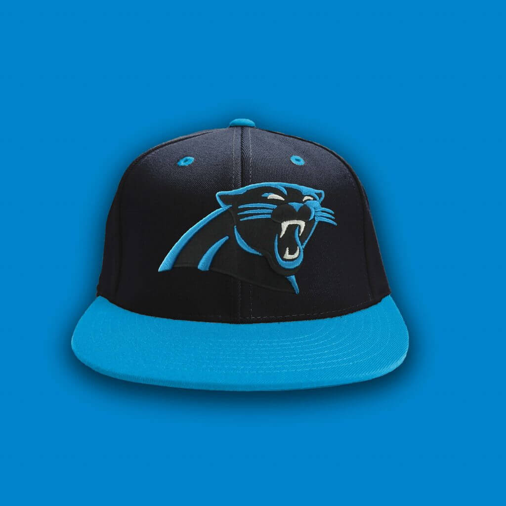
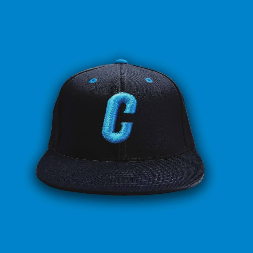
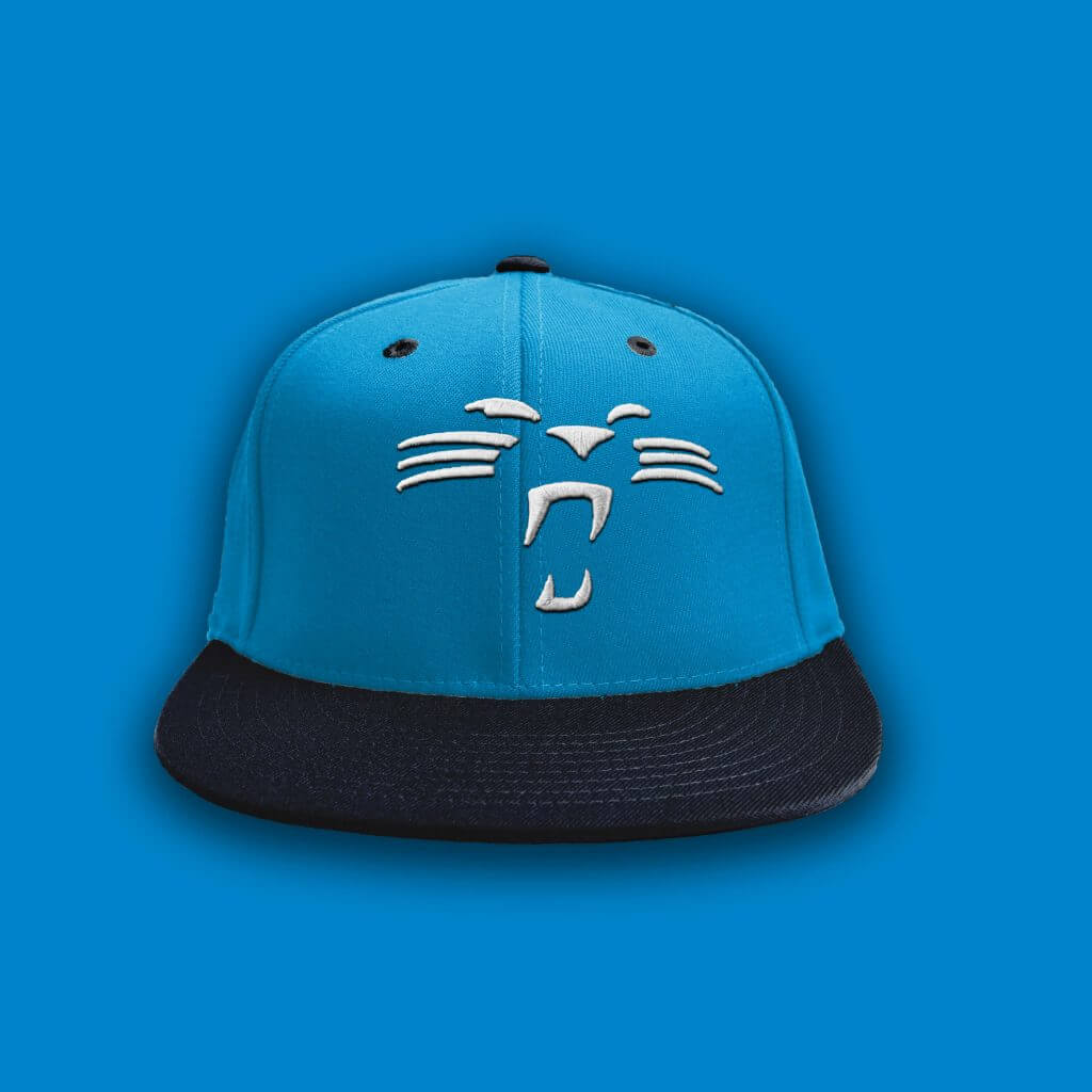
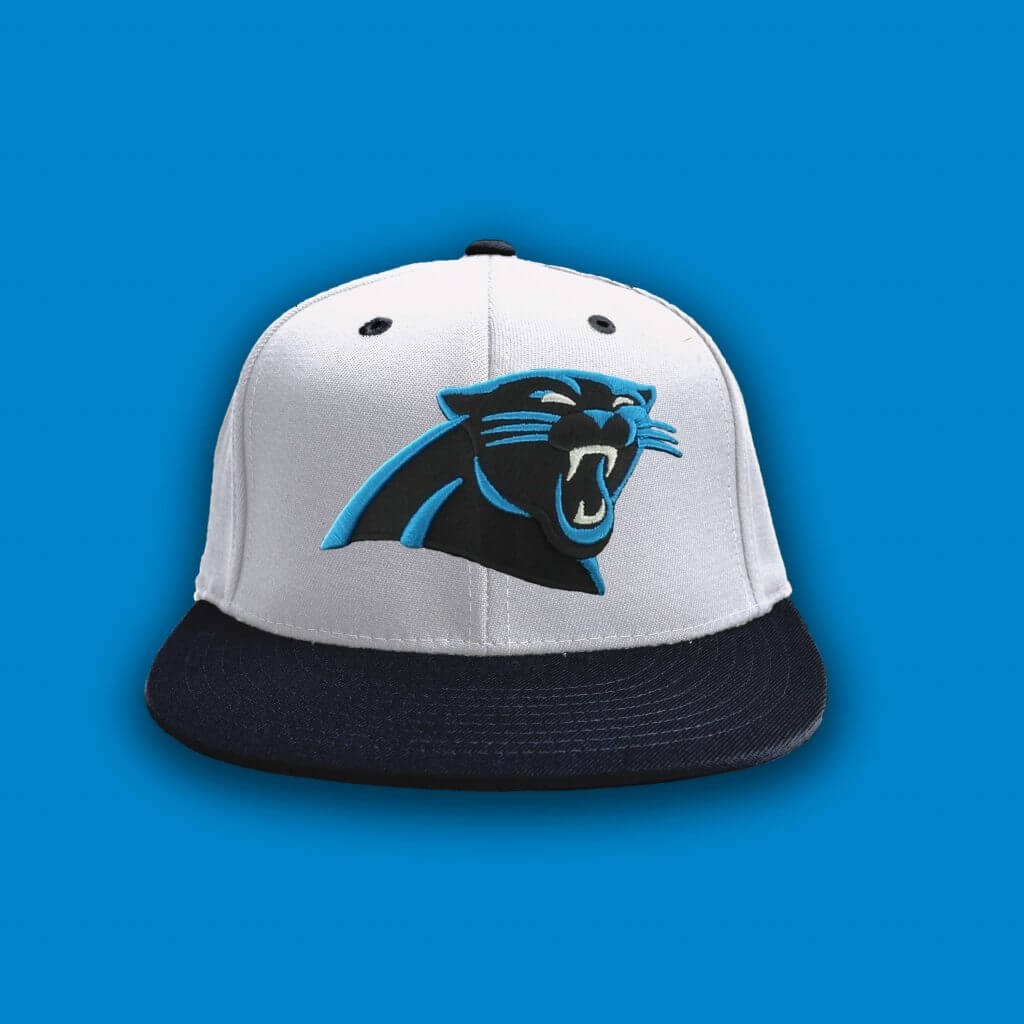
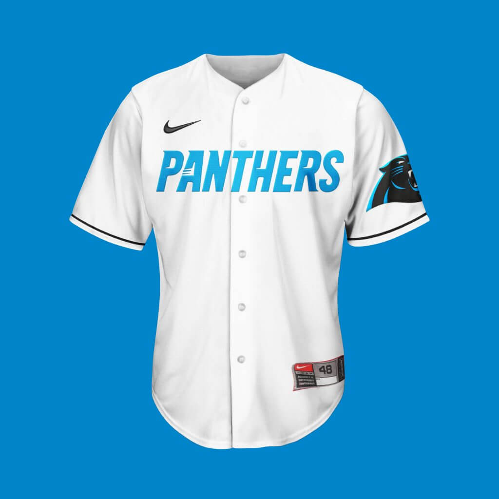
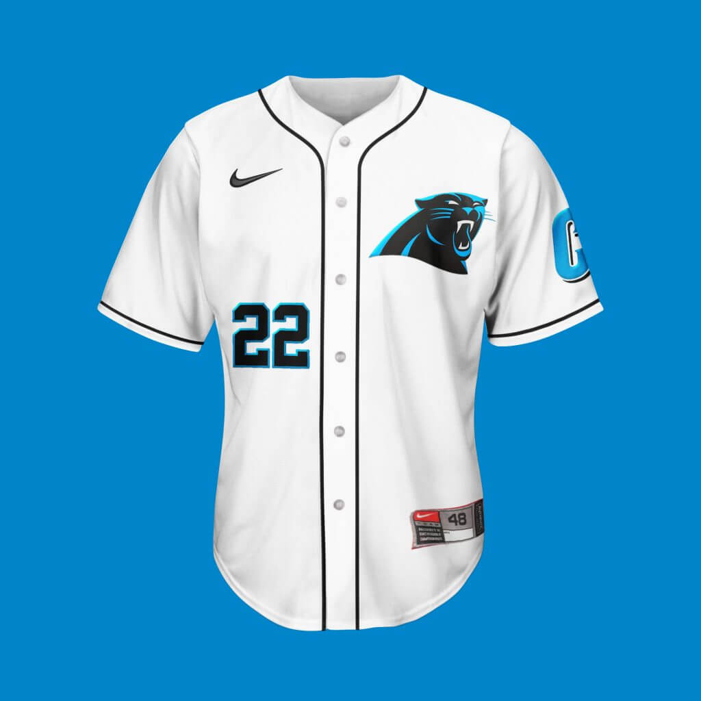
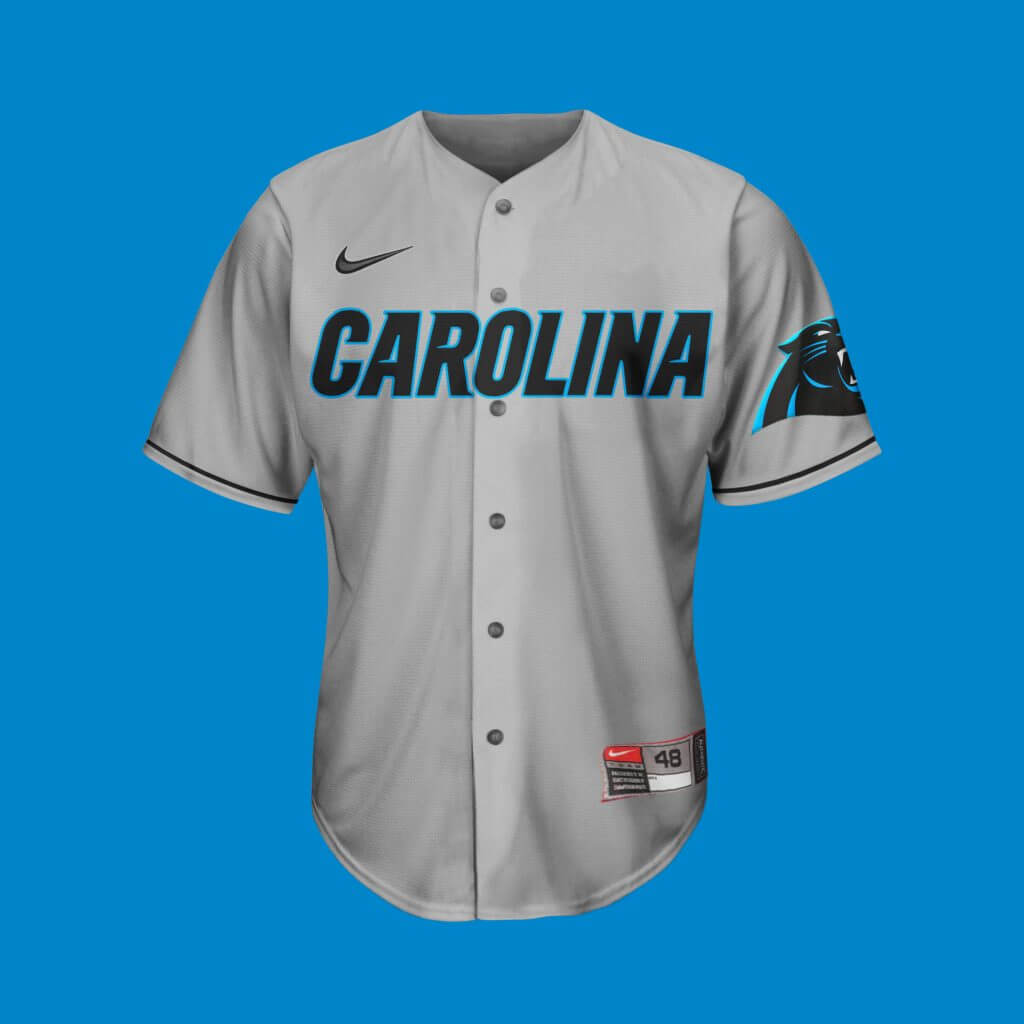
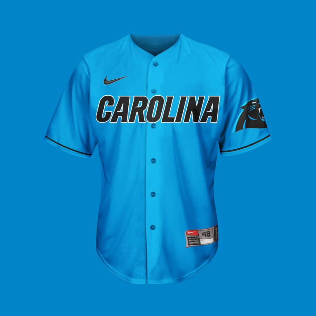
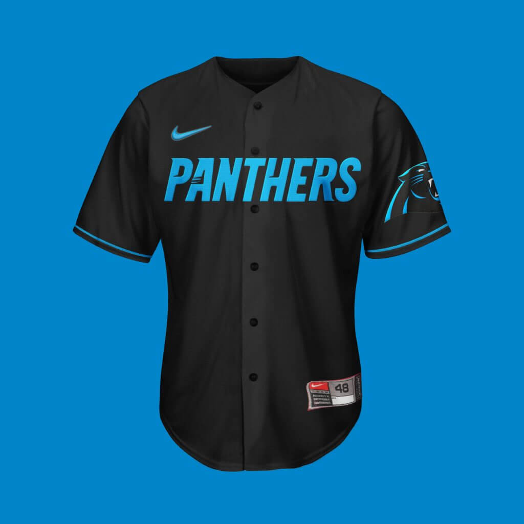
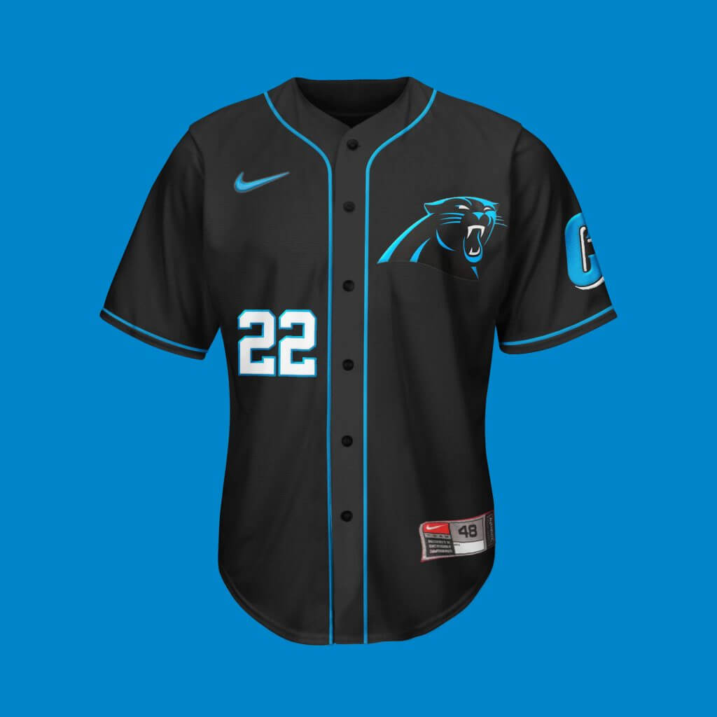
Carolina Panthers
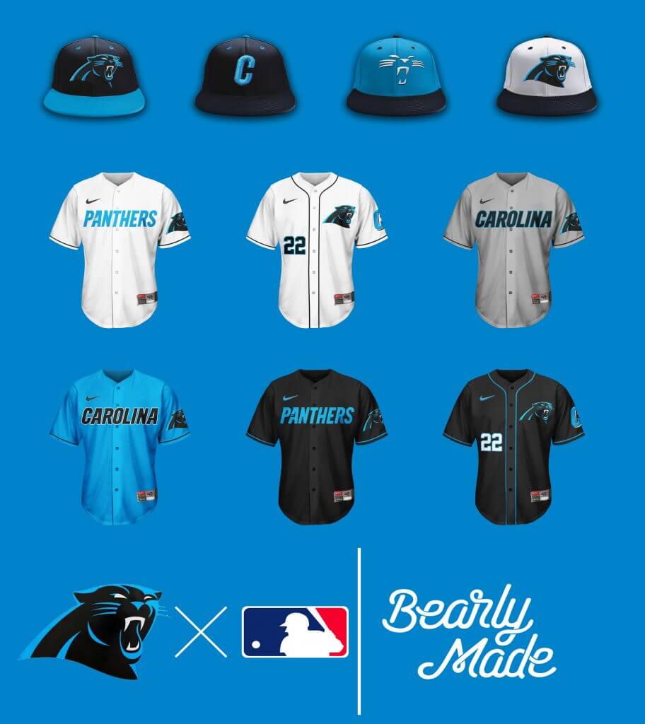
Full disclosure, Panthers fan. Aside from a few nitpicks (thinning the shoulders stripes, as to bring the TV numbers back to standard size — if not getting rid of them altogether, “silver britches”), it’s been a solid set since the team’s inception. That said, I had to be a little playful with the blue cap.
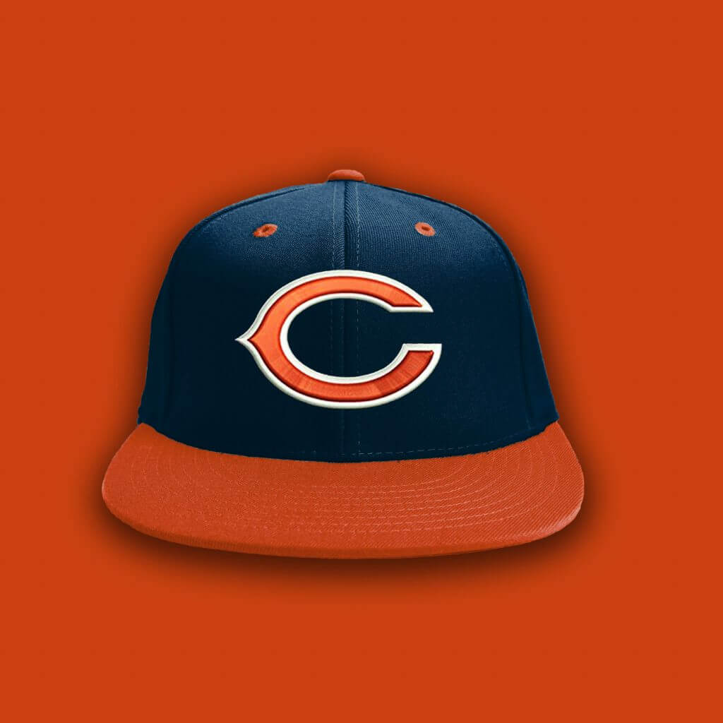
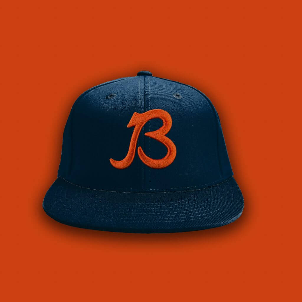
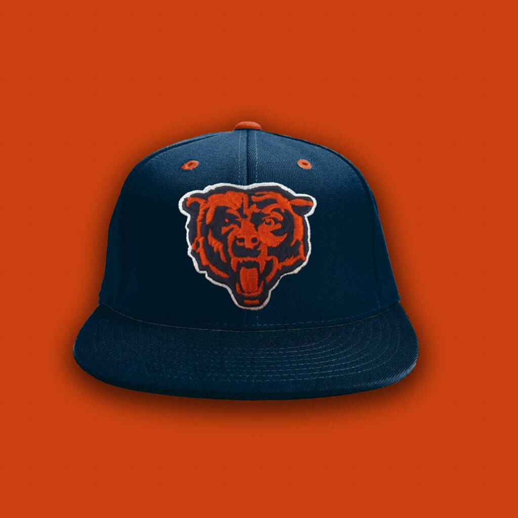
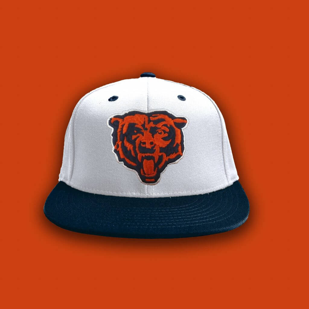
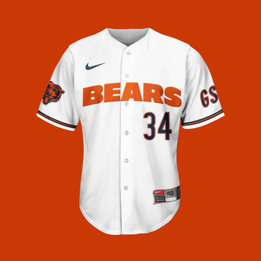
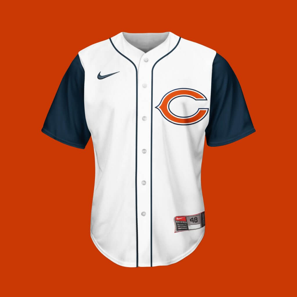
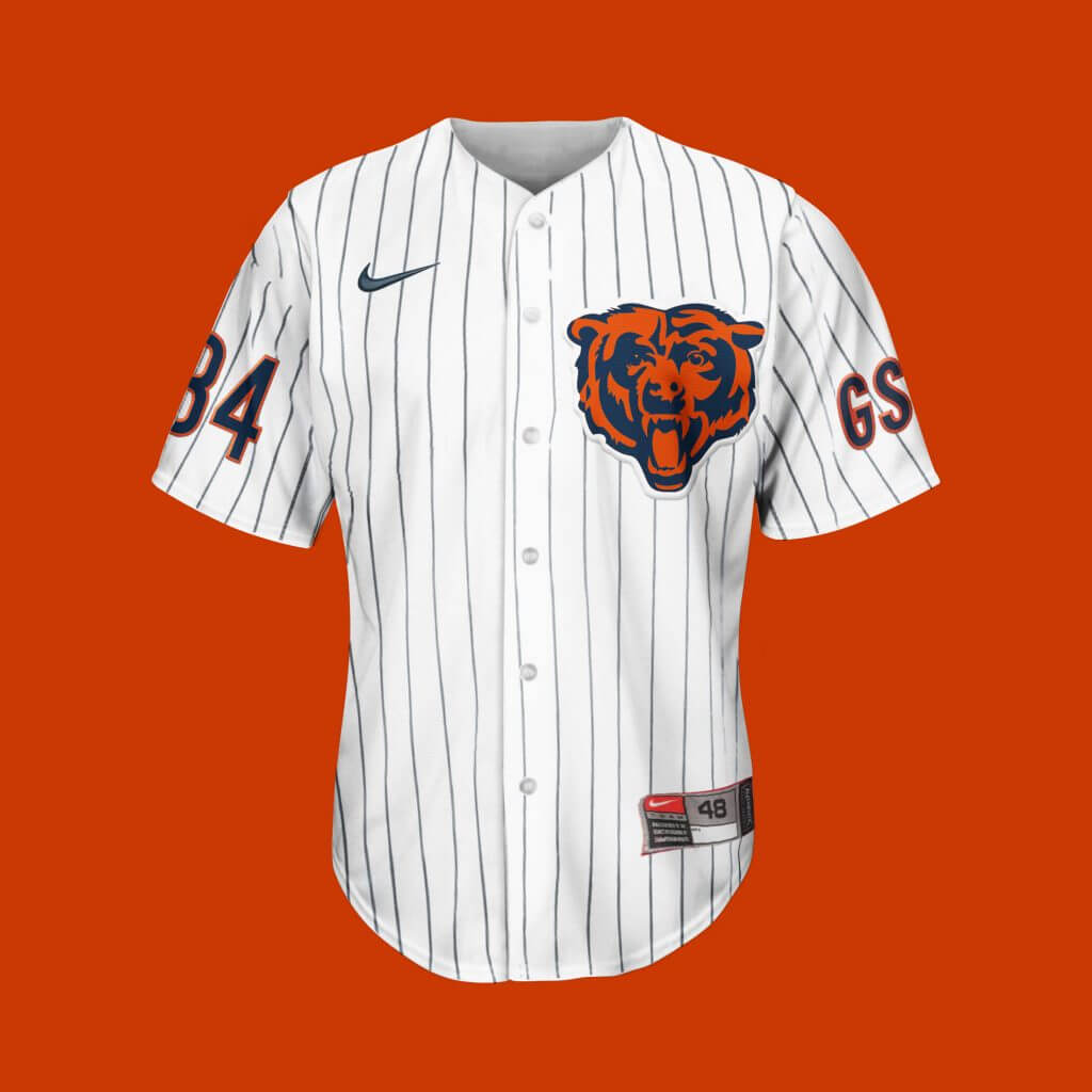
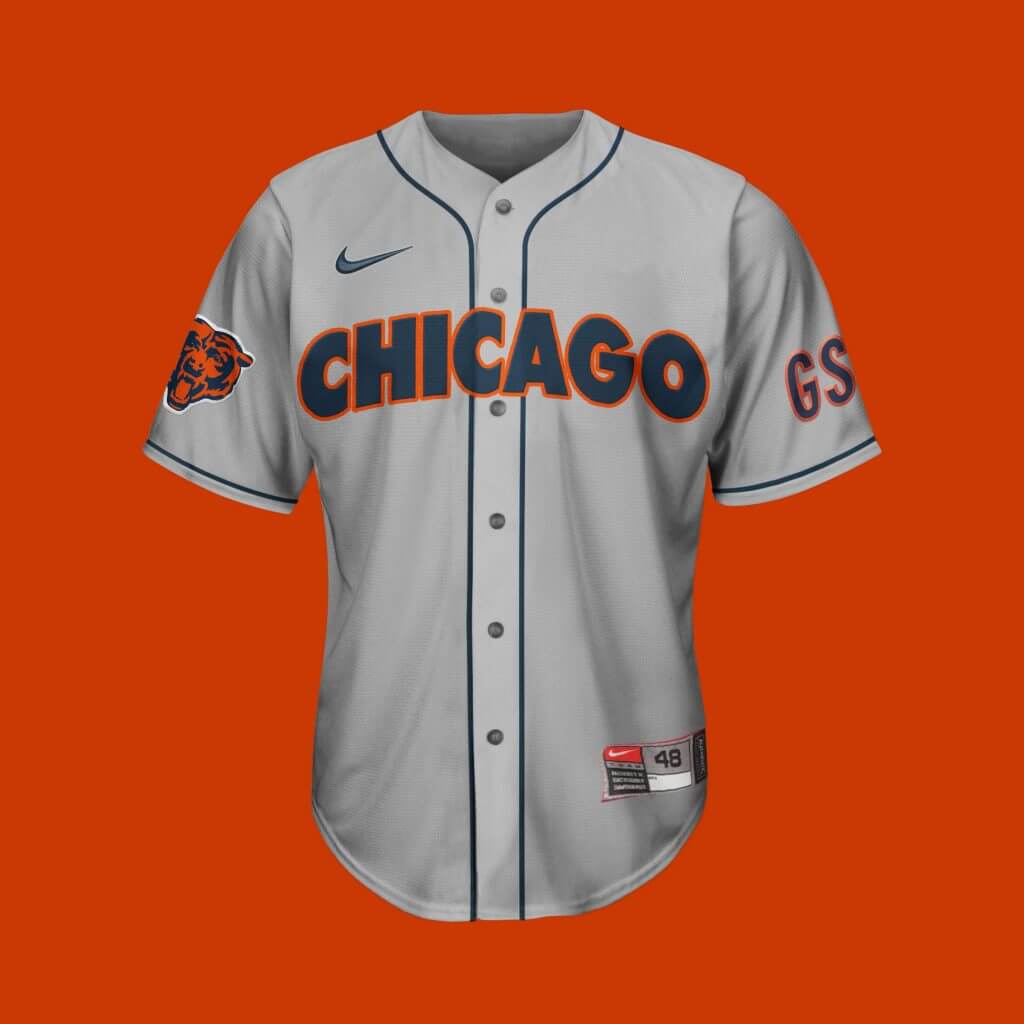
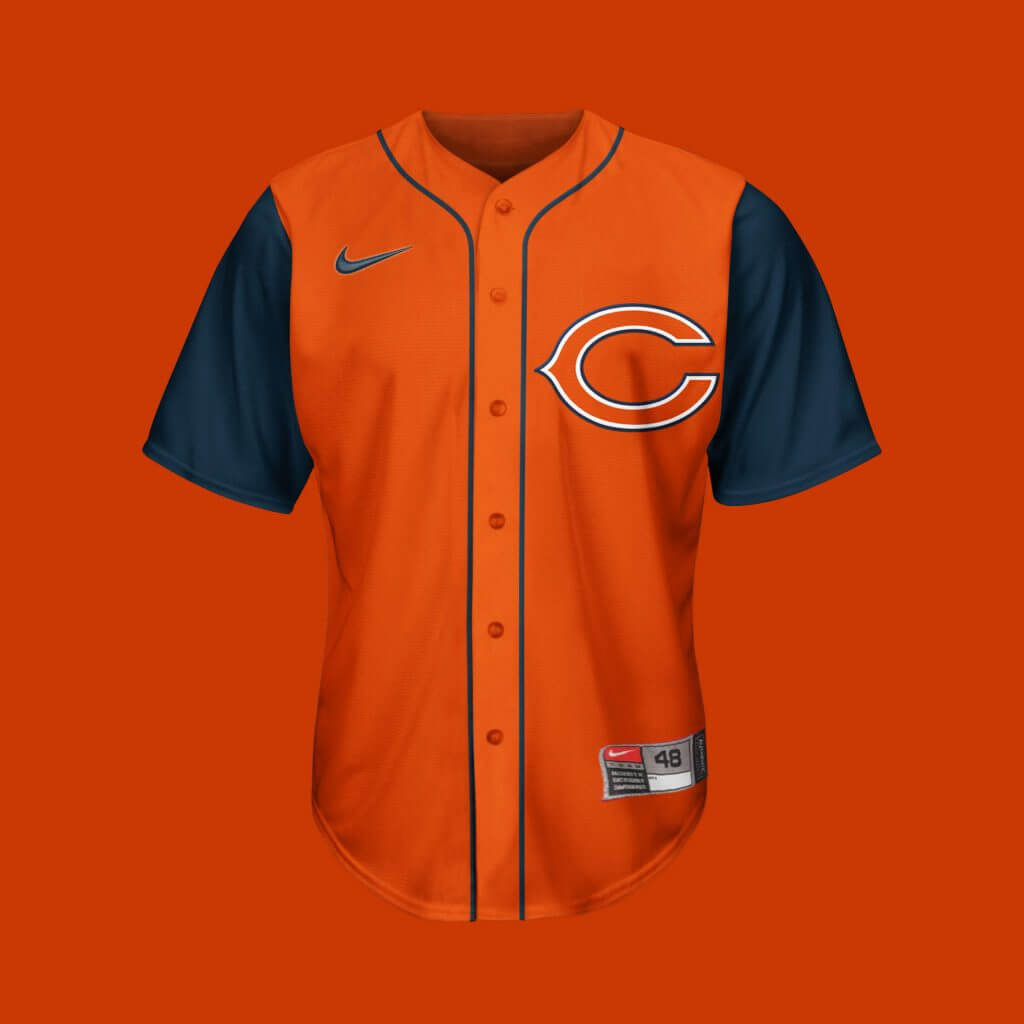
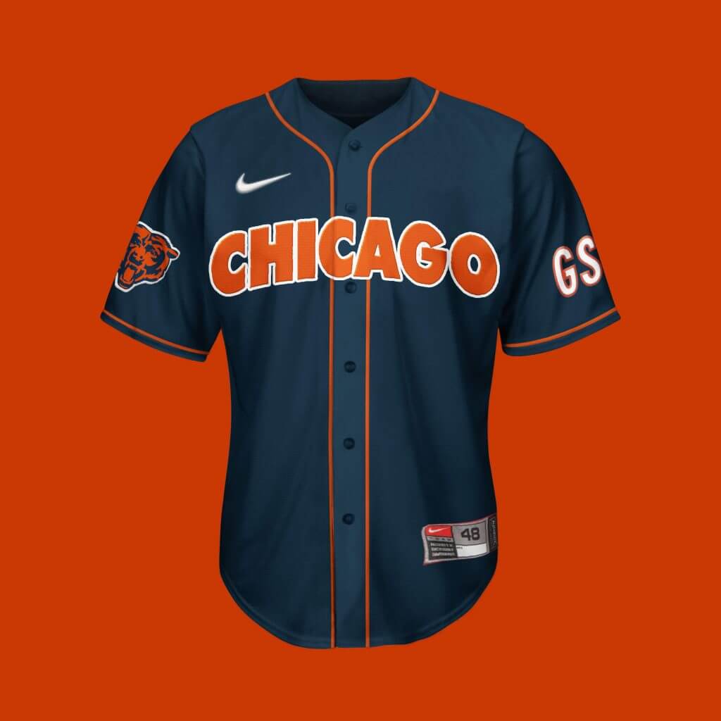
Chicago Bears
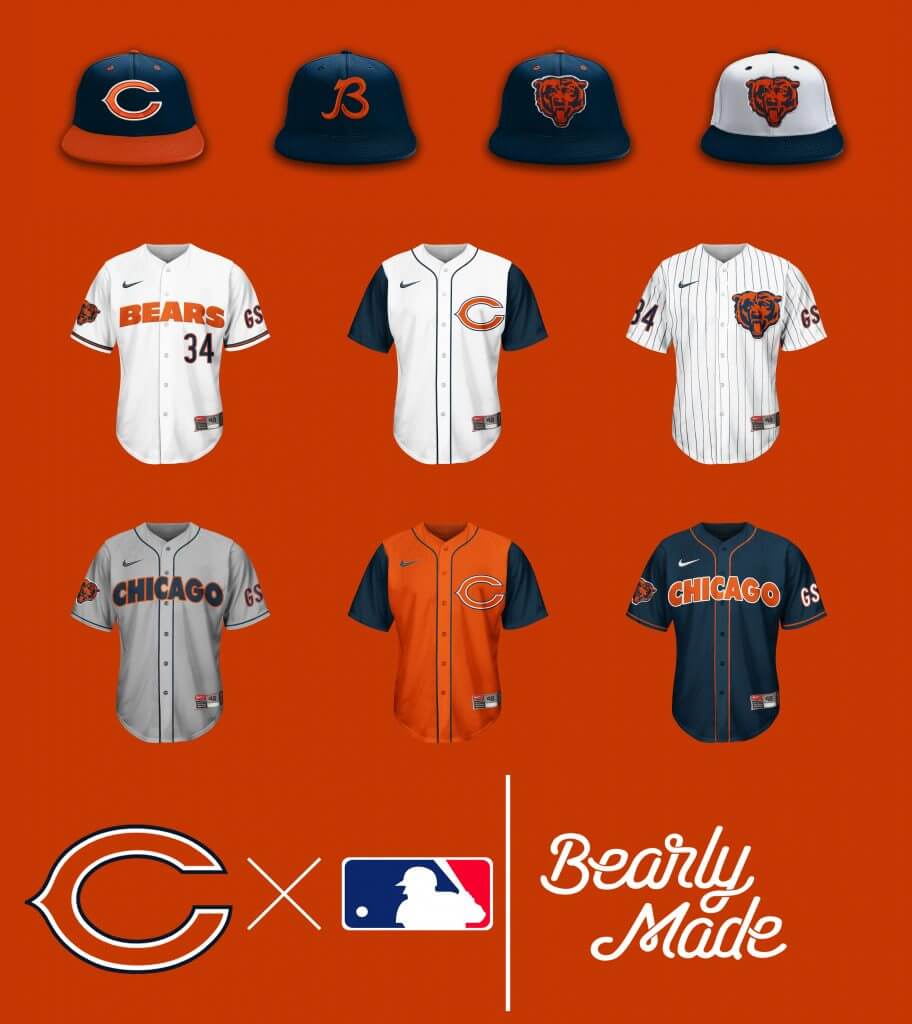
Had to add the sleeveless tops, as to not rip off the Cubs entirely. The cursive “B” hat is just special.
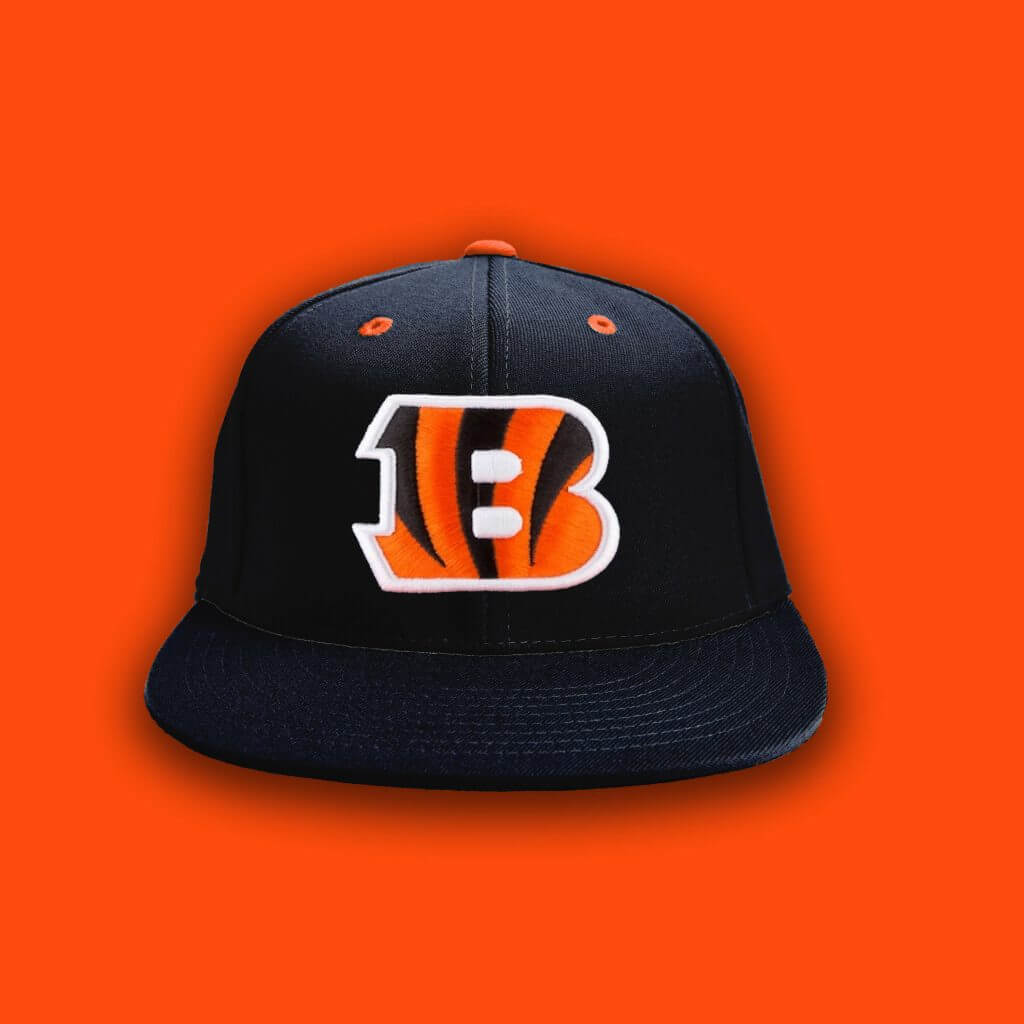
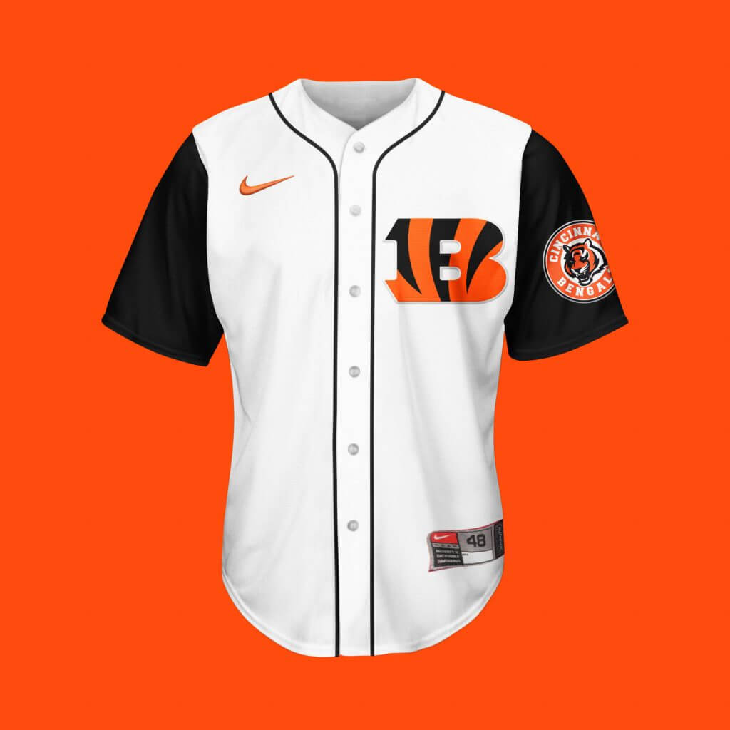
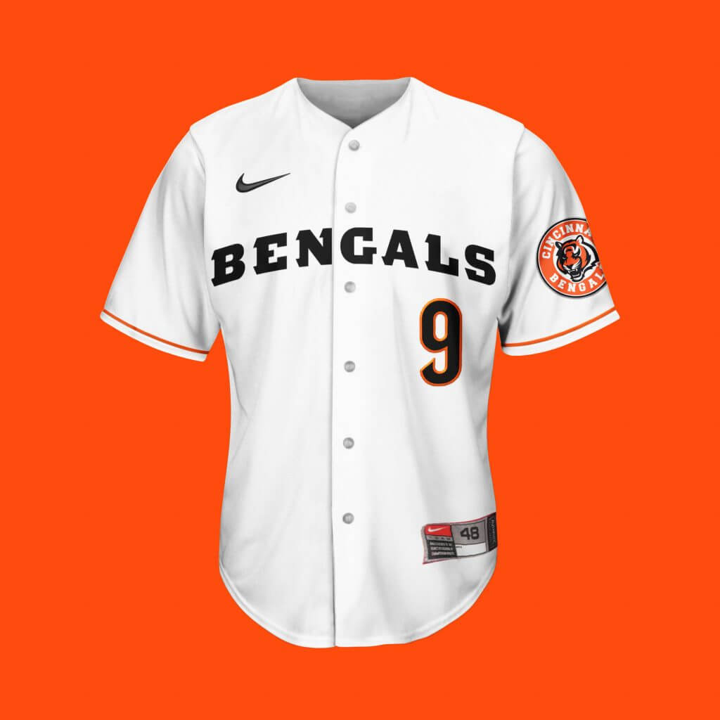
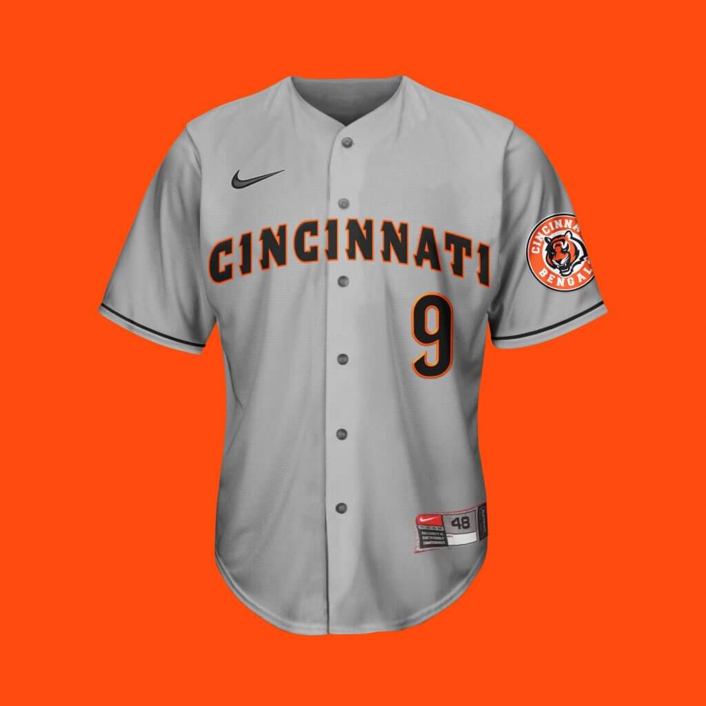
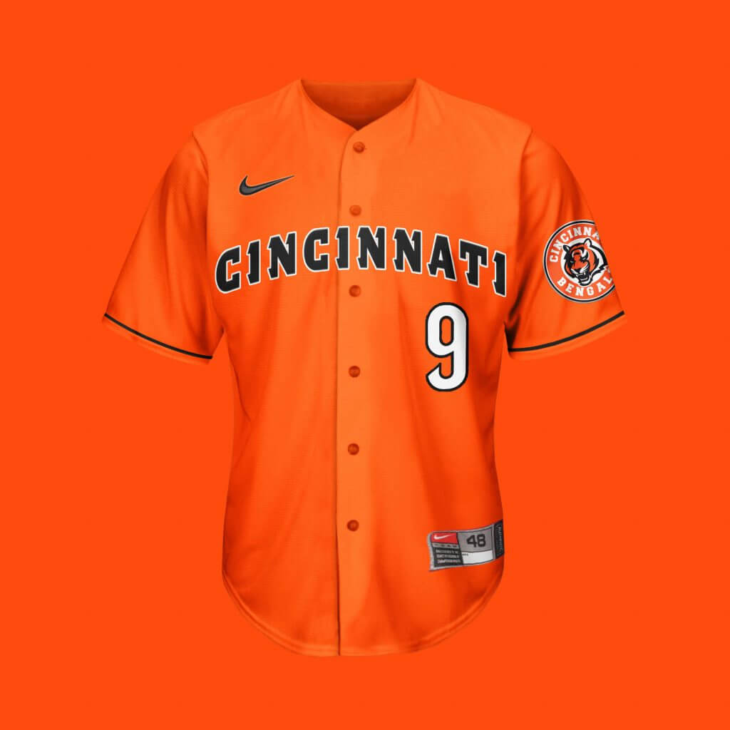
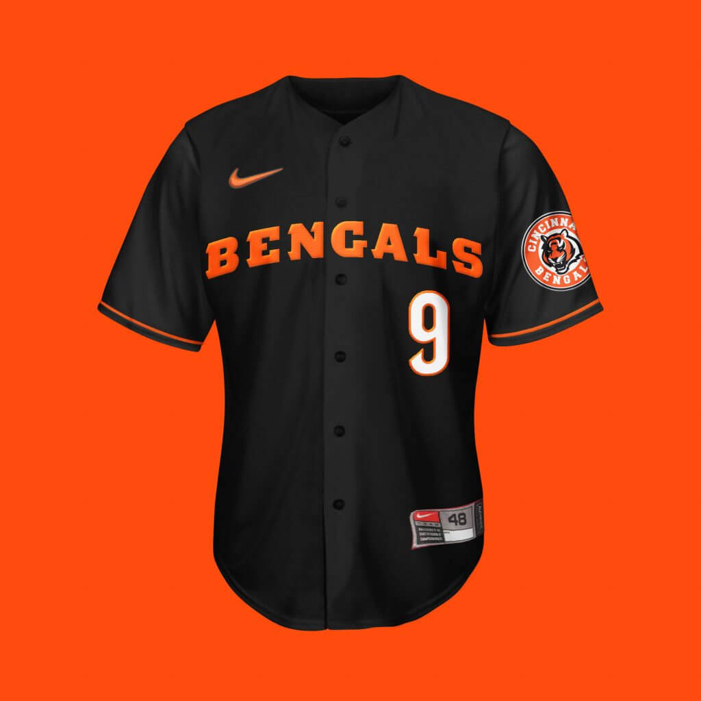
Cincinnati Bengals
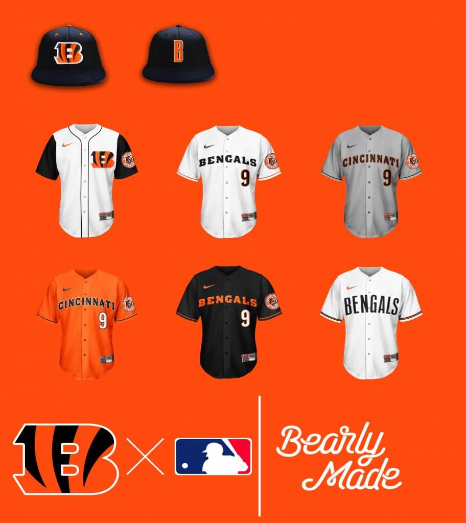
Just in time for their new redesign, yet still one of the few teams I only did one hat for. As for the vintage set, two words: Paul Brown.


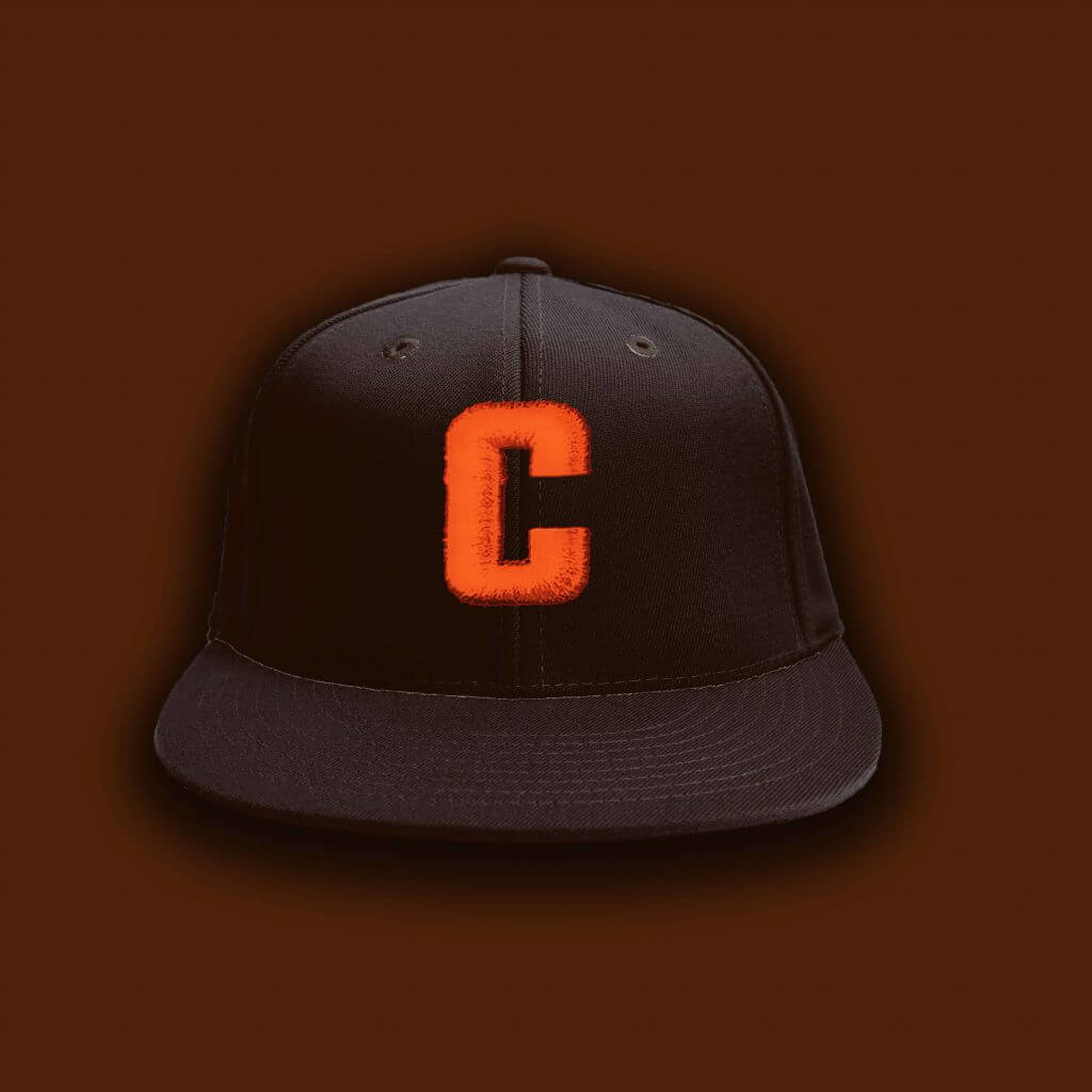
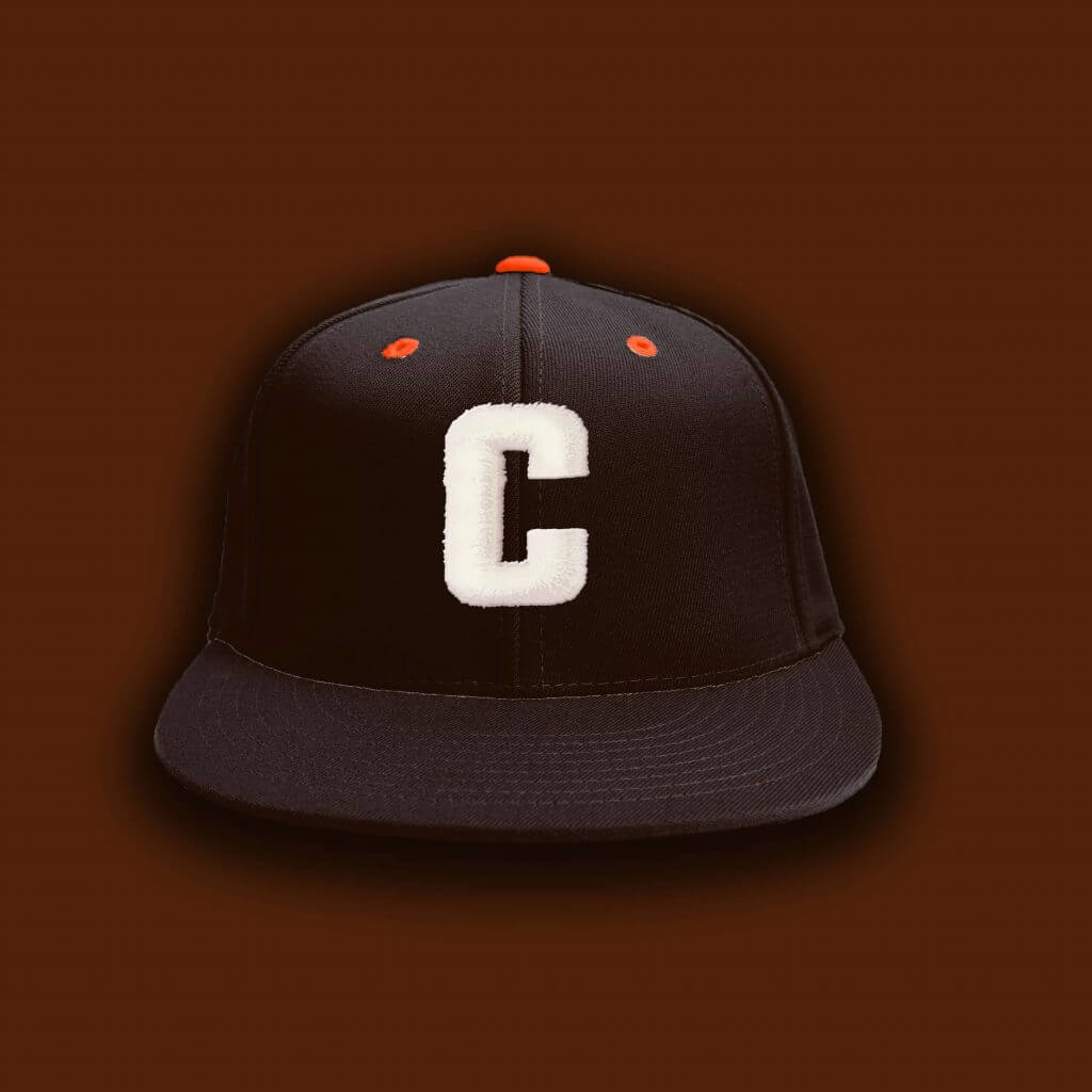
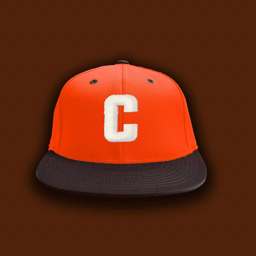
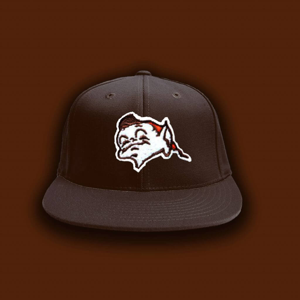
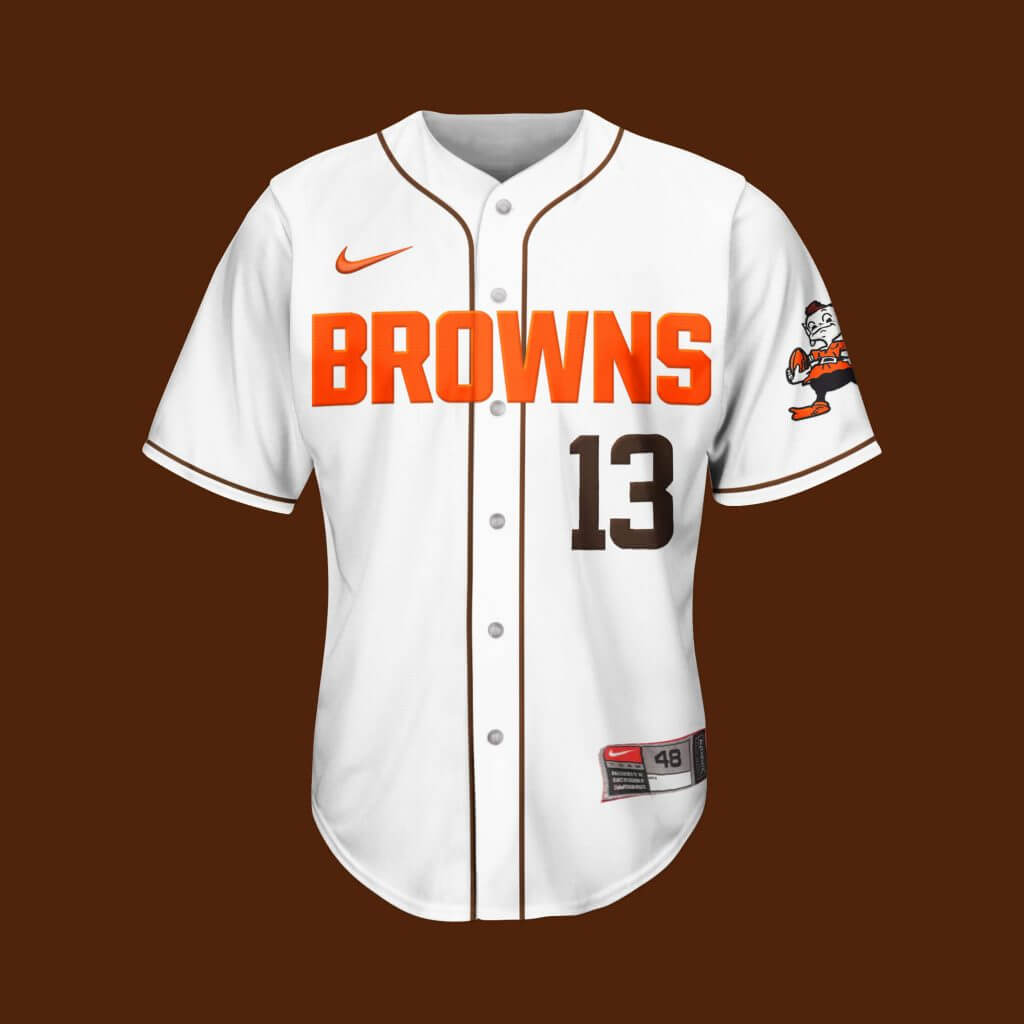
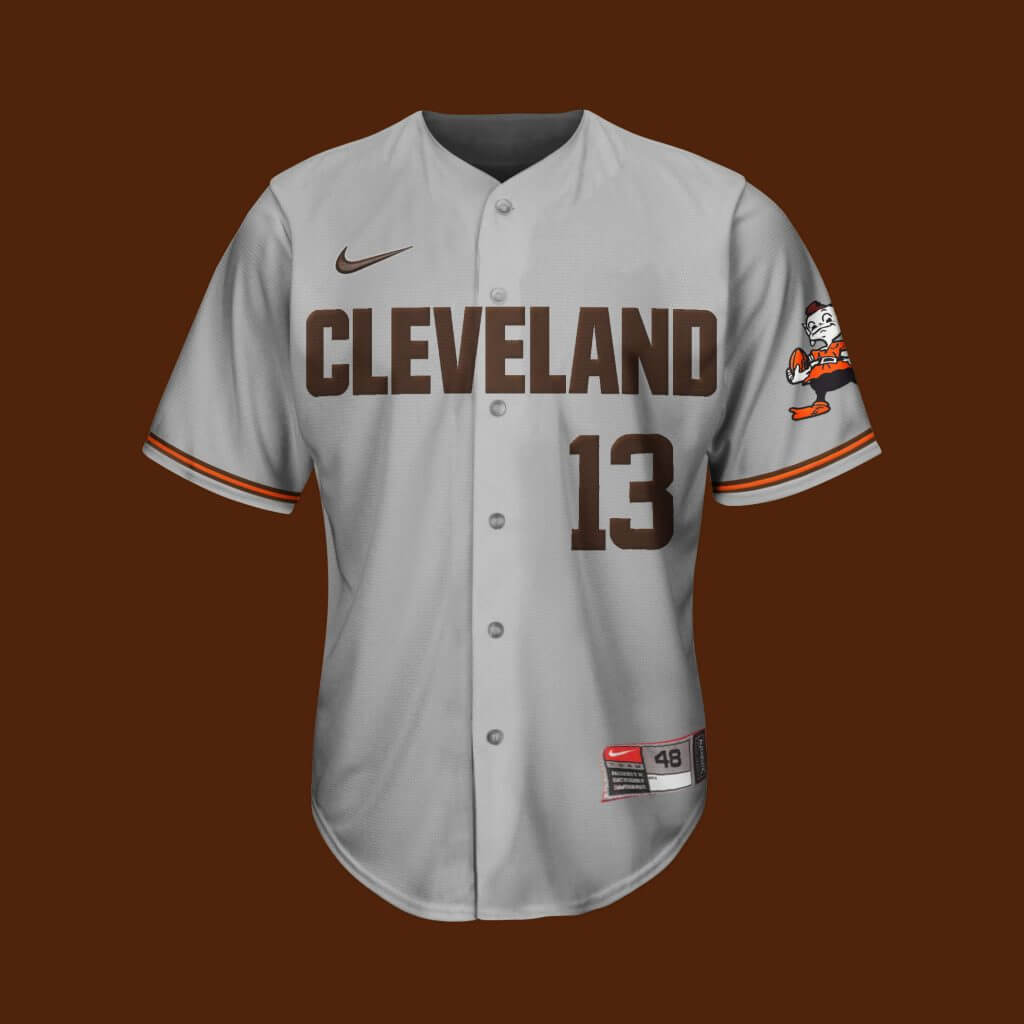
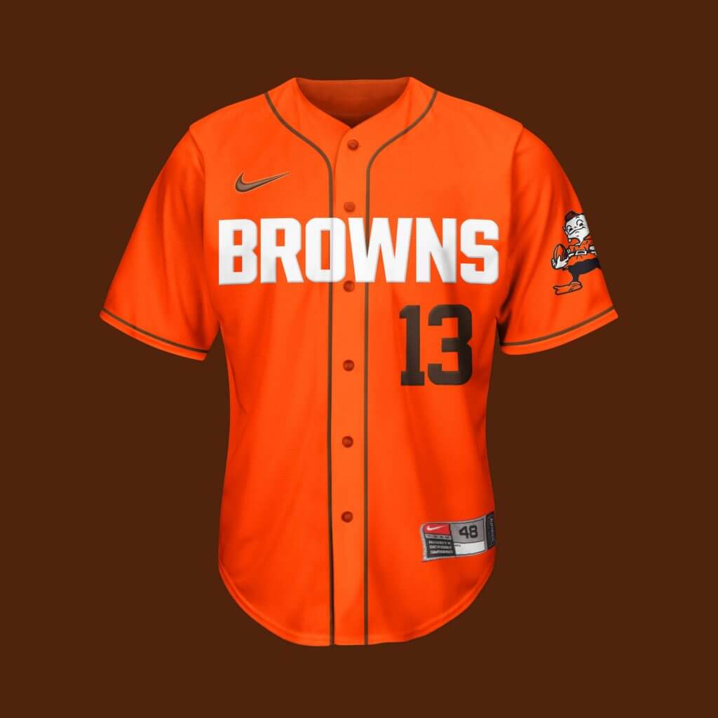
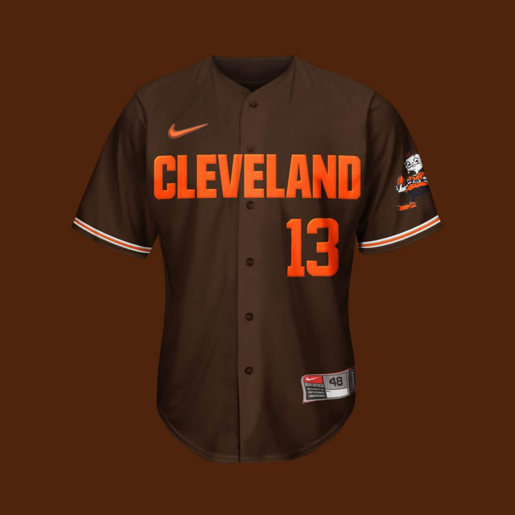
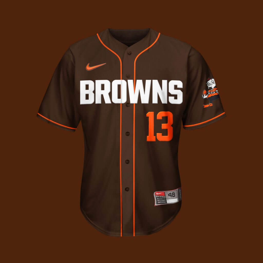
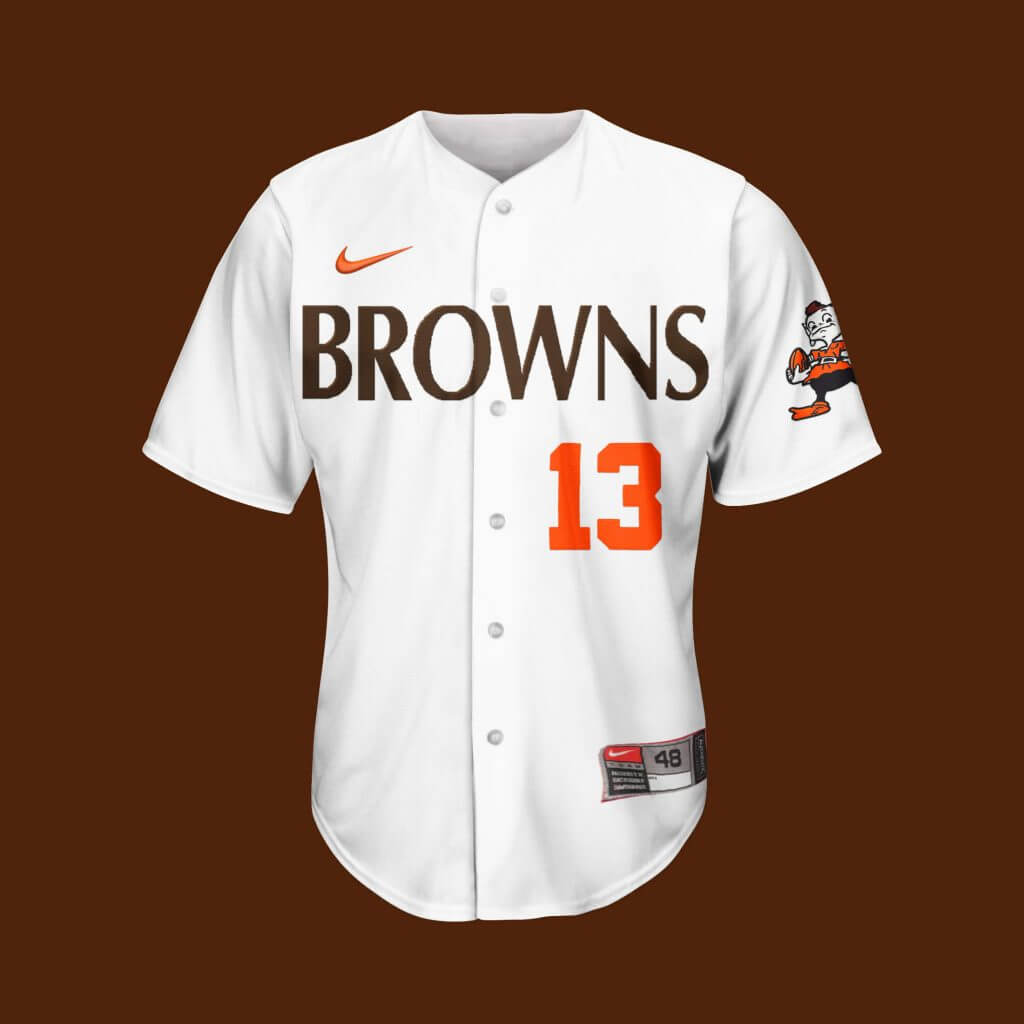
Cleveland Browns
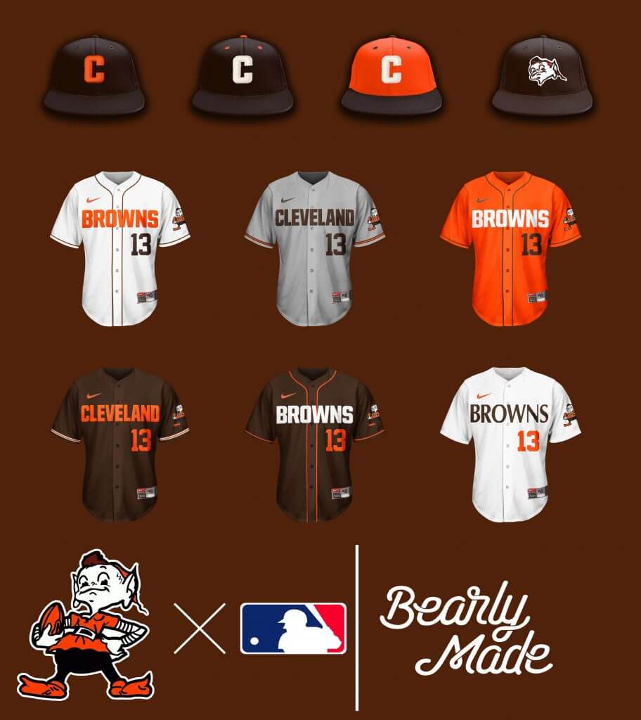
When your current official logo is a helmet, it doesn’t leave much for hat options, so the “C” will suffice. I personally want a Brownie cap made.
Thanks Brandus! We’ll be back with more of these concepts from Brandus periodically.

Did the Cubs “City Connect” Jersey Leak Online?
Leaked images of the Cubs new city connect jerseys. Thoughts? pic.twitter.com/qz86RwzQMk
— Barstool Chicago (@barstoolchicago) June 4, 2021
Late yesterday afternoon, the following tweet started making the rounds on Twitter. It appears to be a leak of the (soon-to-be-released-anyway) Chicago Cubs “City Connect” jersey. While I can’t confirm its legitimacy, it certainly looks legit and fits the pattern of the first three “City Connect” uniforms that have already been released. Both Boston and Miami have already worn theirs, and the crosstown Chicago White Sox are scheduled to wear their City Connect uniforms beginning today.
Fans (and non-fans) on the Twitter and the Interwebs are not happy with the leaked jersey.
If this is indeed what the team will be wearing starting next Saturday (when the Cubs are scheduled to begin wearing their CC unis), I think this may be the weakest one so far, but I’ll reserve judgment until the official uni is unveiled.
As you can see, “WRIGLEYVILLE” is the wordmark, rendered in either cream or white, with a powder blue outline, on a navy jersey, with powder blue sleeve piping. Wrigleyville is, of course, a reference to the neighborhood where Wrigley Field is located, and the arching on the wordmark would mimic the mimic the arching on the famous Wrigley Field sign.
Looks like there is a patch on the left shoulder which appears to mimic a CTA transit token (I’m guessing they no longer use those). NOB is rendered in a custom light blue font (which I’m sure mimics something else about Chicago), and appears to be very slightly vertically arched. The number on back is also a custom font, and again, I’m sure it takes its inspiration from something related to Chicago (or northern Chicago). If there are any Chicagoans out there who know more about these visual clues, please do let us know below in the comments.
I’ll wait until this jersey is “confirmed” before giving an additional assessment, and obviously it remains to be seen whether the cap will be rendered in powder blue, navy blue…or something else, and we’ll also have to wait and see if Nike creates specific pants for this one (one would assume the pants, whether they be navy, powder or white, will not be the standard blue pinstripes the team wears at home). There is potential here for a very interesting uniform if Nike doesn’t go the white-pants-route. But again, until anything official is released, we’ll just have to speculate.
I’d love to hear what you guys think of this leak — and what you think of their possible CC jersey.

Guess The Game…
from the scoreboard
Today’s scoreboard comes from David Raglin (although he did not submit it as such).
The premise of the game (GTGFTS) is simple: I’ll post a scoreboard and you guys simply identify the game depicted. In the past, I don’t know if I’ve ever completely stumped you (some are easier than others).
Here’s the Scoreboard. In the comments below, try to identify the game (date & location, as well as final score). If anything noteworthy occurred during the game, please add that in (and if you were AT the game, well bonus points for you!):
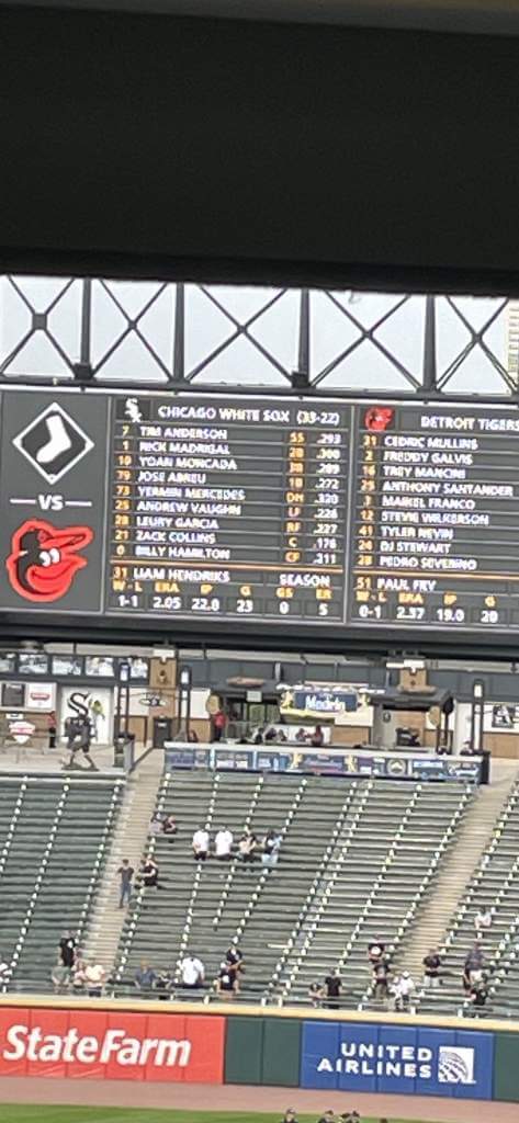
Please continue sending these in! You’re welcome to send me any scoreboard photos (with answers please), and I’ll keep running them.
Click to enlarge
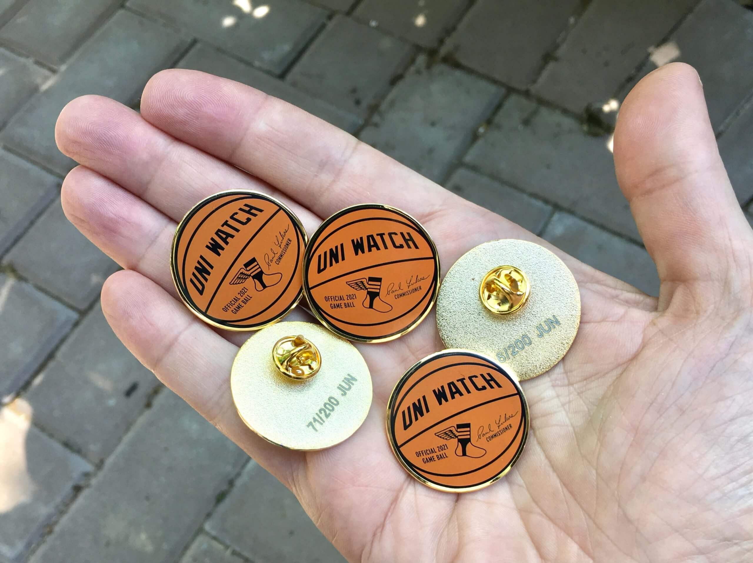
June pin reminder: Paul here. In case you missed it on Tuesday, our June pin is now available. With the NBA playoffs in full swing, we’ve decided to go with a basketball theme this month. Our “Official Uni Watch Basketball” pin — similar to the baseball pin that we did in April of last year — comes with my signature and is also the first pin we’ve ever done that doesn’t include green!
This pin is available in a numbered edition of 200. You can order yours here while supplies last.
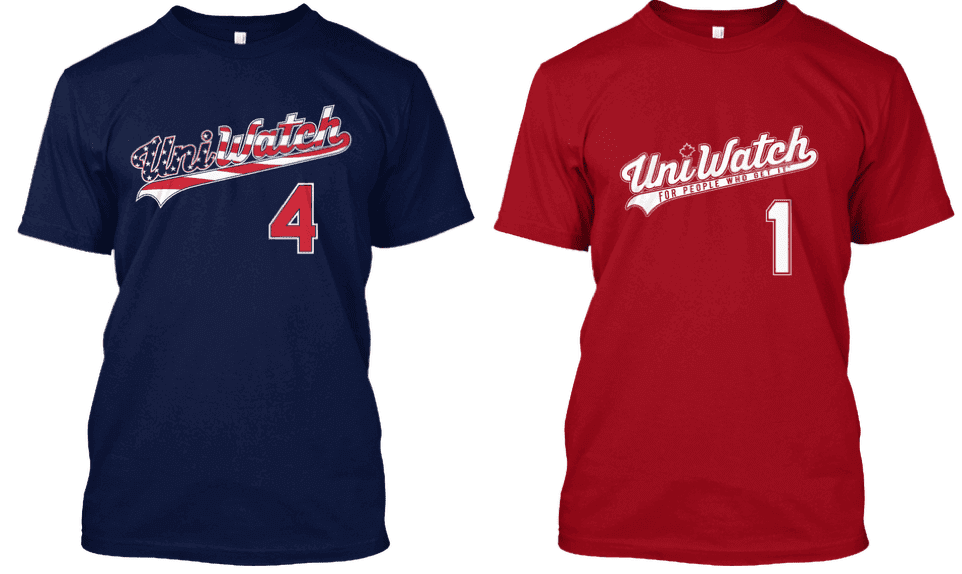
While we’re at it, it’s worth noting that those two early-July holidays — Canada Day on July 1 and Independence Day on July 4 — are right around the corner. For those who care to celebrate athletics aesthetics while celebrating the holidays, you can get Uni Watch shirts for either holiday (or both holidays!) by ordering now — the Independence Day shirt is here and the Canada Day shirt is here. Thanks.
The Ticker
By Anthony Emerson

Baseball News: During last night’s game against the Yankees, Red Sox P Nathan Eovaldi switched jerseys mid-game to his Memorial Day jersey, complete with the patch (from Ryan Walters). … heck out this Red Sox letterhead from 1950. I wonder how long they kept the “Boston American League Base Ball Company” name? (from James Gilbert). … Phillies ushers and other stadium staff looked pretty fly back in the day (from @YourCarGuyStan). … The Akron RubberDucks, Double-A affiliates of the Indians, wore their Conetown unis for the second half of a doubleheader (from Matt Rashford). … It’s Udder Tuggers weekend for the Wisconsin Timber Rattlers, High-A affiliates of the Brewers (from multiple readers). … Indiana State wore their home whites despite being the designated road team against Georgia Tech. Tech wore blue softball tops with white pants (from Michael Rich).

NFL News: Also posted in the hockey section: Bill Belichick rocked a Bruins cap during his presser yesterday. … The NFL is now selling officially licensed paper footballs (from Jerry Wolper).
.
College/High School Football News: A blogger has ranked the worst helmets of all time among independent and Mid-American Conference football programs (from Kary Klismet). … Cincinnati’s Nippert Stadium will have black end zones for the entirety of the forthcoming season (from Bill Fenbers).

Hockey News: Cross-posted from the NFL section: Bill Belichick rocked a Bruins cap during his presser yesterday.
.
.

College/High School Hoops News: Ohio has a new court design (from Kary Klismet).
.

Soccer News: The blog Museum of Jerseys has a new piece on Portugal’s numbering system during the 1984 Euros. Players chose numbers by drawing lots, leading to some players in “wrong” numbers (thanks, Jamie). … New shirt advertiser for Bundesliga side Hertha Berlin (from Ed Żelaski). … Also from Ed, new jersey for EFL Championship club Nottingham Forest. … Another one from Ed: Trinidad and Tobago have unveiled their new kits ahead of World Cup Qualifying (also from Germán Cabrejo). … On a similar note, here’s a cool piece on how Caribbean nations are refreshing their identities by working with smaller companies rather than apparel giants (from @texastrev). … Canada has unveiled their World Cup Qualifying kits as well (thanks, Phil).

Olympics News: India’s Sports Minister has unveiled the nation’s Olympic uniforms (thanks, Phil).
.

Grab Bag: This week’s episode of the AEW Unrestricted podcast is an interview with Sandra Gray, the seamstress for All Elite Wrestling (from Dane Druis). … In the 2017 comedy The Death of Stalin, costume designers put fewer medals on Georgy Zhukov’s (Jason Isaacs) uniform than what Zhukov wore in real life, because Zhukov wore so many that it was ridiculous.
Uni Tweet of the Day
Looking forward to these today…
The San Francisco Giants will support Pride Month on the field and on their uniforms and caps. https://t.co/4HeVwLvV1P pic.twitter.com/ZkIMIV52gA
— ABC7 News (@abc7newsbayarea) June 3, 2021
San Francisco Giants to be first MLB team to play in Pride uniforms https://t.co/vh1P8ZMjBf pic.twitter.com/472I7z1t1d
— CBS Sunday Morning 🌞 (@CBSSunday) June 4, 2021
And finally… big thanks to Brandus for those MLB x NFL crossovers. Hope you enjoy them.
Happy Birthday to Uni Watch team member Jamie Rathjen, who produces the Tickers that run on Mondays and is also our resident expert on soccer, rugby, women’s sports, and all things UVa-related. Enjoy your special day, Jamie!
Everyone have a good Saturday — remember, besides NBA & NHL playoffs, there’s also the French Open and the Belmont Stakes today, so lots of sports to watch if you’re so inclined, including the ChiSox debuting their “Southside” unis plus the Giants in their Pride-themed uniforms (an MLB first!).
Peace,
PH
The “Y”/CTA Token is a play on the Chicago Municipal Device, which – long story short – represents the three branches of the Chicago River. More information: link
Dunno about the font or numbers, but near the tag is the phrase “Respect our Neighborhood,” which is a reference to signs outside bars in Wrigleyville (and other neighborhoods) that request that you please avoid vomiting on people’s front doors when you leave the bar or stadium.
As a Cubs fan from out of state (my grandma grew up in Gary, Indiana and her father loved the Cubs and took the South Shore Train in *all the time* to see them just like my parents and I do now. I’m from Michigan.) who didn’t know all these connections (the Municipal Logo on the sleeve in particular which was already far and away my favorite part :) ) it does make me appreciate it more. I still don’t *like* it from an aesthetic standpoint (if you’re going with a Wrigleyville theme and making the wordmark mimic the sign, go whole hog and *make the jersey red FFS!*), but I do appreciate that they seem to have at least put some effort into it, even if it seems like the absolute minimum amount.
I think if they had done a red outline on the word mark, and added a flourish of ivy as an underline maybe or around the patch roundel it would really make it an on-the-nose Wrigley homage. But I am fine with simplicity.
The token doesn’t bother me — my native NYC had them for years, with the Y cut out, and the Knicks once had a logo based on it — but everything else about this jersey is garbage.
Why does it have a NOB? And what is that silly custom font? That “4” looks hideous. Why not bring back the classic Shepard font from the 1930s and ’40s which is so much more stylish?
If they wear dark blue pants with it, I’ll be happy about that part. The link were like that, but they could just throw back to those, as they did in link. Make those the regular road alternate!
Just for the record, the CTA’s tokens actually didn’t resemble the Municipal Device (or the design on this jersey). They looked like this: link
(Smaller silver tokens represented regular fare, and larger gold tokens represented reduced fare, e.g., senior citizens.)
The NFL is now selling officially licensed paper footballs (from Jerry Wolper).
The link takes you to yesterday’s UW, Phil.
Wonder if the league got the idea from this blog…
I thought of you when I saw this.
link
I have to admit…those are pretty sharp.
Funny…the logo is positioned perfectly for me. I kick paper footballs narrow-side down. For those of you who hold the ball the
wrongother way, does this bother you? Is it a deal breaker?Happy Birthday Jamie!
It was not just Belichick wearing a Bruins cap. Other Patriots did as well:
link
Thanks!
Like the Red Sox City Connect uniform, Cubs City Connect uniform looks like it should be a Tampa Bay Rays uniform.
Not getting the hate for the wrigleyville unis. The color combo is very nice in its subtlety for a team that has kept the same basic color scheme through its history (could have made them baby blue and electric yellow, after all) the word mark is a clear reference to the neighborhood instead of just the city name, and it’s instantly recognizable as a reference to the stadium sign. I suppose because this design doesn’t scream “New! Hip! Different!” like Miami’s or Boston’s some might view it as a case of non-design, like a Ford Taurus just begging to be part of an airport rental car fleet and never get anyone too excited about driving. But I don’t see it that way. I think it’s a great design (the pants color could really make it something special, too. I’m hoping for navy there as well and powder blue socks).
The worst of the CC jerseys for me so far are the Chi Sox. I absolutely love the head to toe black with pinstripes, but I just don’t like the Sox gothic font. Using more of it didn’t help. And the S is so oversized, it looks (much like the Clippers alts) like a discount rip-off of a video game or 90’s rap album cover, not a flattering homage. I also don’t like that they just mirrored the diagonal Sox logo with the Chi lettering. I wish they had done something different with the hat logo.
Today’s scoreboard comes from David Raglin (although he did not submit it as such).
Yes, submitted as part of yesterday’s ticker.
Right. But he didn’t submit it as a GTGFTS…
That scoreoard is from last Sunday’s Sox-Orioles game a 3-1 win by the wrong team ;-) The lineups and listed pitchers match the end of that game. The ‘Detroit Tigers’ above the Orioles lineup is either an error by the scoreboard operator or the pic was snapped as he was getting the board set up for the next Sox home game which was against the Tigers on Thursday. Either way, it’s weird.
I suppose the other possibility is that the pic was taken prior to Thursday nights’ Sox-Tigers game and the previous home game info is still being posted as sort of a recap. THAT would really be weird.
The scoreboard is from this past Thursday’s Tigers/White Sox game.
Great looking MLB/NFL Crossovers. I would have liked to see more hats with initials and not mascots, so as to look more like MLB hats and not just NFL hats you can currently get at the local mall Lids shop.
Agree. Also would like to see logos flipped when it looks like the animal is headed into the player’s armpit. The “Paul Brown” Bengals’ jersey is an obvious whiff; why didn’t you respect the placket?
Yeah, I hate to be too critical of other people’s work, but while these crossovers look competently done from a graphics standpoint, they really show very little creativity. Really he just put current team logos on hats and established wordmarks/logos on baseball jerseys. And in addition to hat designs that are already commonly available, a quick Google image search shows that “baseball” NFL jerseys are commercially available as well.
I have always wanted to see the B logo of the Ravens on the helmet. I think that would add a classic look if they ever redesigned the unis.
Two things I want to say
1) The black cap of the Cardinals shows a Falcon
2) What does UVa means?
I would suspect most of those NFL crossover caps are already a thing. And it looks like the designer just photoshopped the city/team name onto a blank jersey. You can tell because the placket was not respected.
I don’t think that rainbow logo looks good on the Giants cap. The interlocking SF is too thin. Would look better on a bigger cap logo like Toronto or something.
Trying to figure out why he felt the need to add the Nike logo…
And it looks like the designer just photoshopped the city/team name onto a blank jersey. You can tell because the placket was not respected.
Just like the Nike/Majestic designers…
#RespectThePlacket
I don’t think that rainbow logo looks good on the Giants cap. The interlocking SF is too thin. Would look better on a bigger cap logo like Toronto or something.
The Yankees made a rainbow cap with the regular “fat” lettering as a souvenir hat. San Francisco would have done well to copy it.
cubs fan here
ill pass on that CC jersey……just bland
White Sox Fan. I’m very broken up about the Cubs’ jerseys. It’s really sad that it looks like a knockoff made in a sweatshop that is sold in one of the crappy souvenir shops that surround their ballpark.
My definitive ranking of city connect jerseys:
Miami > White Sox > Boston > Cubs.
Good Lord, those crossovers are kino. Excellent job.
Did an ATL hat get transposed into the Arizona section?
Whoops. That’s my bad. Should be fixed now.
Wahoowa, Jaime. Thanks for your reporting and especially all things from Hooville.
Thanks!
Fun stuff from Brandus! I’ve always thought many of the NFL logos and wordmarks would translate well onto baseball uniforms, and many of Brandus’ designs demonstrate just that. Nice job!
White Sox fan… their CC unis look like a celebration of gang culture.
Cubs are even worse. Lazy design.
Foust missed a great opportunity to do a double breasted BB for the Bills. The throwback should be done in cream. That might be the very best of today’s bunch.
Disappointed there were no pants or socks/stirrups.
Seems like they were stock designed, like something out a uni catalog.
I can hear the dog whistle from your first sentence.
Not sure if you saw or not, but a retailer in North Carolina offloaded a ton of Stadium Series jerseys for the Carolina Hurricanes yesterday. The Hurricanes were supposed to play in a Stadium Series game last year before the season was suspended and apparently they had already been supplied with replica jerseys which had been sitting in storage till now
Unless Nike is paying the Uni-Watch site and the Bearly Made designer, I don’t see why Nike’s ad patches appear in the football/baseball crossover designs. The concepts would look no less “official” without them. If the Nike ad patches are going to be in the concepts, may as well tilt the angle on the concept caps to give New Era some free advertising as well