By Phil Hecken
Follow @PhilHecken
Greetings and good morning, Uni Watchers. I hope everyone has had a good couple weeks, and your Independence Day weekend was good.
Last evening, the San Francisco Giants became the sixth (of seven, this year) team to debut their “City Connect” uniforms. In case you missed it, here’s the MLB spin and also Paul’s take (scroll down), if you aren’t aware of how these unis came about, or why they were created in the first place.
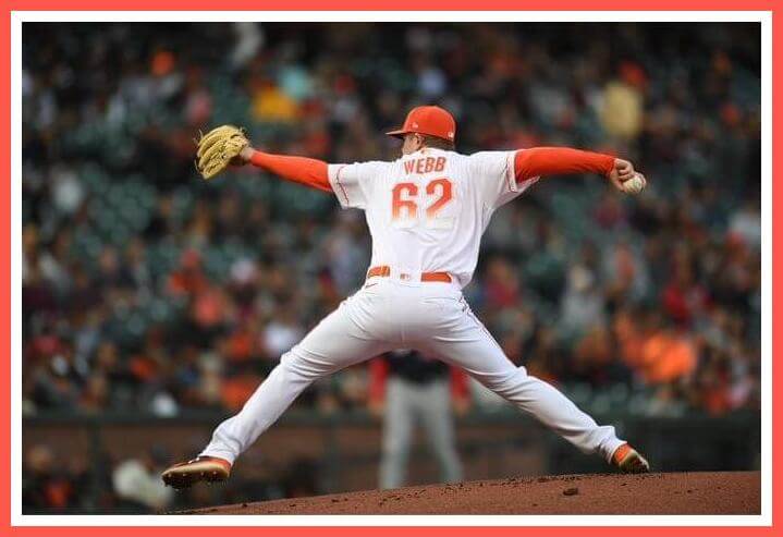
I admit I had somewhat high hopes for this uniform, as I pretty much liked every detail and nuance, but for “the fog” element/sublimation. Yes, I get what they’re going for, but I was worried the unis would not look good on the field — particularly (as you can see in the splash photo), the “fog” effect upon the readability of the numbers. Generally, when something is difficult to discern up close, chances are it’s going to be magnified (as you’ll pardon the paradoxical phrase) at a distance. Unfortunately, that maxim held up on the field of play.
But first the “good,” which is a relative term when discussing “City Connect” uniforms. In general, I thought the uniforms looked really good; I liked the brighter white uniform (I know the creamish home SF uniform is almost iconic at this point, and a lot of people love it, but I’m a fan of the brighter uni), I thought the shade of orange, even if it technically didn’t match that of the Golden Gate Bridge, was sharp, and I even liked the orange caps.
I even liked the “bridge” motif sublimated into the sleeves. If there was a spot to really add a foggy effect, this was it.
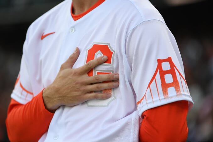
About the only effect I didn’t like (other than the excessive fog sublimation on the numbers, which we’ll get to in a second) was the bridge design repeated on the cap. Not only was this overkill, but because it was rendered on the cap, it didn’t have the same “fog” effect as that design on the uniform itself.
Here’s another look at the cap and jersey:
City Connect threads are ready for their on-field debut: pic.twitter.com/bjMMsL12UD
— SFGiants (@SFGiants) July 9, 2021
As mentioned above, in a still, up-close shot, the numbers are readable, but even then, aren’t particularly easy to read (much like Paul, I do like the custom font):
However, at any distance (even in a still shot), that “clever” fog/sublimation design begins to get lost in the white of the uniform:
Other than the NOB (which is honestly not necessary), the one other identifier in a sports uniform is a players number. Haven’t we learned yet that contrast is important, and purposely creating a shading that will blend in with the uniform is not the ideal way to display a player’s number? Sure, sublimate the “G” on the front, sublimate the bridge on the sleeves — hell, even sublimate that player’s NOB, but the one thing that should always be clear and readable is the number. And in their quest to be clever, Nike was too clever by half. You can notice how difficult it is to read the number at distance and in action:
Man, he REALLY hit that 💪 pic.twitter.com/YPbhMDUjtm
— SFGiants (@SFGiants) July 10, 2021
Woof. What was that number?
OK — don’t get me wrong, you can read the numbers, but not without some effort. In the tight shots, it’s fairly easy, but not at any great distance, and certainly not to most of the fans.
Teamwork makes the dream work✨
(via @SFGiants) pic.twitter.com/MvjQ20Vl88
— FOX Sports: MLB (@MLBONFOX) July 10, 2021
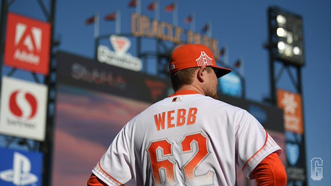
Even with my complaint about the number readability, I generally liked this uniform (not that any team needs a CC alternate). In terms of CC unis, I’d say of the six so far released, this one is my third or maybe fourth favorite. It’s interesting the team (or Nike) chose to go with a bright white uniform, as this was the first (and perhaps will be the only) CC uni to be manufactured in this color. As we have now seen with the Cubs and Diamondbacks, custom helmets were not created (or ready) in time for the debut of this uniform (the Cubs finally got matching CC helmets for their CC uniforms yesterday) — so the Giants wore their normal black batting helmets. While there is no black to be found anywhere on the uniform, the helmets looked fine. I’ll be interested to see when (if) they add an orange helmet.
Maybe I’m being a bit overcritical (or overdramatic?) in disliking how the numbers looked, but if there was one thing to change on the uniform, it would be making the numbers solid orange. Everything else seemed to work nicely.
You can see more photos here. Your thoughts?

NFL Films Lost Treasures “The WFL”
Got a spare 45 minutes this morning (or any time this weekend)? Then you won’t want to miss what follows.
I received an e-mail from my (and UW) pal Jimmy Corcoran (who, if you don’t remember, had his father — “King” Corcoran — starred for the Philadelphia Bell in the World Football League) which I’d like to share with you. Jimmy is quite the WFL expert and has assisted me on several WFL articles that have appeared on Uni Watch over the years. Here’s Jimmy:
Hey Phil,
I know you have read quite a few WFL related articles I have written for Uni Watch over the years but I’m not sure if you have ever seen the movie? On Thursdays the NFL Network has throwback day and have started airing some of these movies again. People ask me if I know when the WFL movie will air again? Considering I don’t know one person at the NFL Network, their guess is as good as mine?
Someone posted it a couple of months ago on YouTube.
I always loved the beginning with the movie projector turning as they play Steve Sabol’s favorite song, A Hero Remembered. There is something sad and nostalgic about the tune, almost telling you, here comes a part of football’s past that is no longer here but I still like hearing it. I remember when I saw Lance Alworth in one as the music was playing and the projector clicking Lance says “Oh my God was that me?” Almost surprised how young and swift he was all those years ago.
When NFL Films came to my house to interview me for this film, I just said, what do I have to do to get myself in the opening credits when the music is playing? Phil Tuckett looked at me and says that’s not easy Jimmy my best advice is to say something good? I filmed this in March 2001 and the movie was released in October 2001 and no one told me if I made it into the opening or not? When I would ask them they would say, we’re working on it, but you’re still in the running. A few days before the movie premièred on ESPN I got a FedEx box from NFL Films. When I put the VHS tape in I saw that I made it into the opening credits of a Lost Treasures film and it wasn’t even part of my formal interview? That was Phil Tuckett and I talking after the interview and they had the cameras still rolling.
Jimmy Corcoran
Thanks Jimmy. It can’t be embedded, but if you want to watch a great little movie, here you go! Delta Burke never looked so good (you need to watch this to figure out why…).
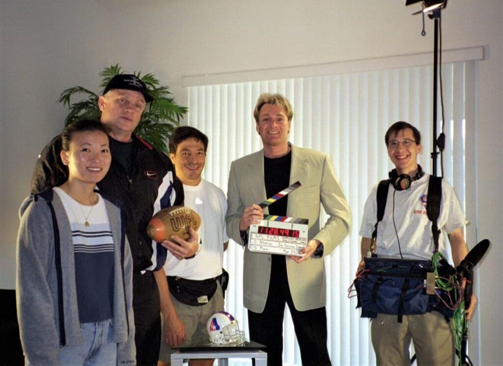
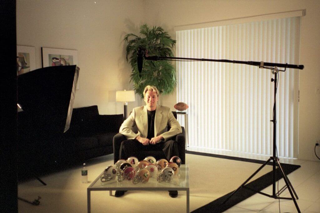
Post Script: Jimmy followed up with the following (one of the photos of which Jimmy speaks was used for this section’s splash, and the second follows)…
Here are two photos from that movie, they turned my living room into an NFL Films studio. I was in charge of getting the mini helmets, I was worried that some of the logos were not accurate enough for NFL Films? but they never noticed the Chicago Fire flame was wrong. Then I remembered they never saw a WFL game and would not know what the uniforms looked like.
Uni-sleuthing Help Sought…
About a year ago, I received an e-mail from reader Tanith Harley, who had sought reader assistance in identifying an obscure pair of jerseys she had purchased, and thanks to some excellent research/sleuthing, you guys were able to provide her with an answer. Now, she seeks your help again, if possible.
Her latest e-mail reads as follows:
Hello Phil.
I hope this finds you safe and well and enjoying the summer months over there.
I am hoping you may be able to assist me in me uniform information again…?
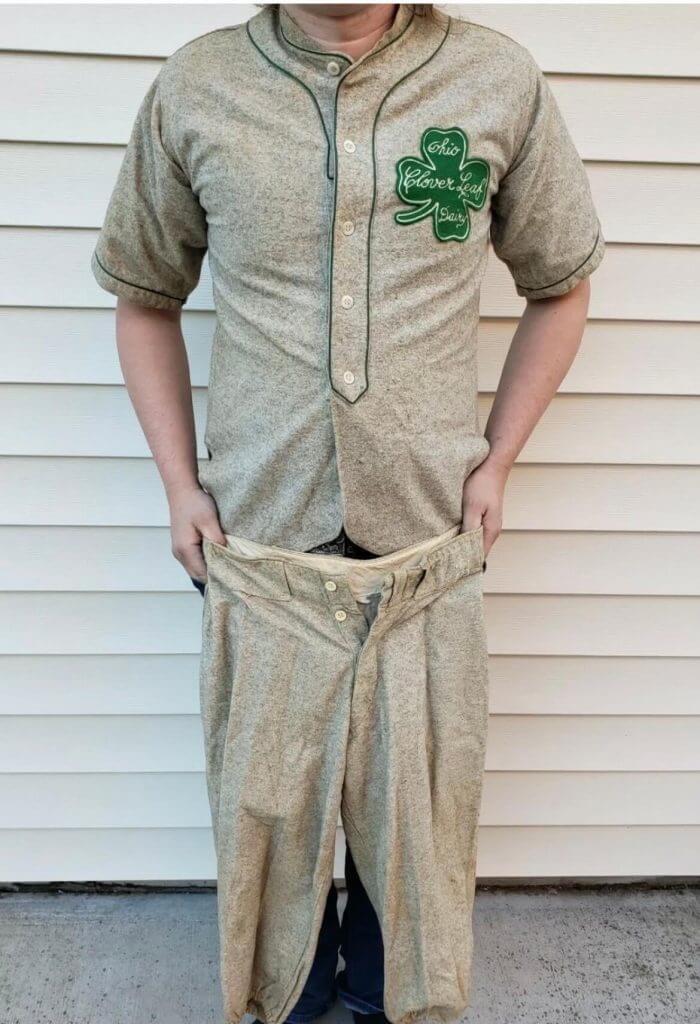
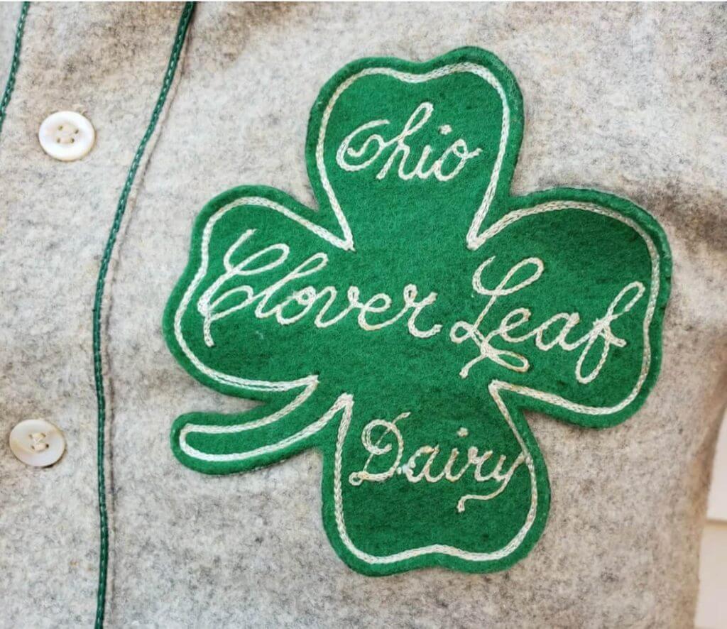
I have recently purchased this dairy farm uniform. I was guess it’s from the 1940’s but happy to be proven wrong. Unfortunately I can find very little information, in fact none, on a clover leaf dairy baseball or softball team. Perhaps your wonderful readers might?
I hope you don’t mind me reaching out again and I understand if you’re unable to help as I’m sure you get thousands of emails.
Warmest regards.
Tanith.
She attached the following two photos:
After I offered to show the photos to you guys, she followed up with the following:
Thanks so much. Hopefully someone can help me solve the dairy mystery. I had thought it might be from the Clover Leaf Dairy Farm in Pella Ohio but can’t find any further info.
Anyone out there have any additional information about this (full) uniform? Please either post your thoughts in the comments or e-mail me, and I’ll forward along your replies to Tanith.
Thanks!

Guess The Game…
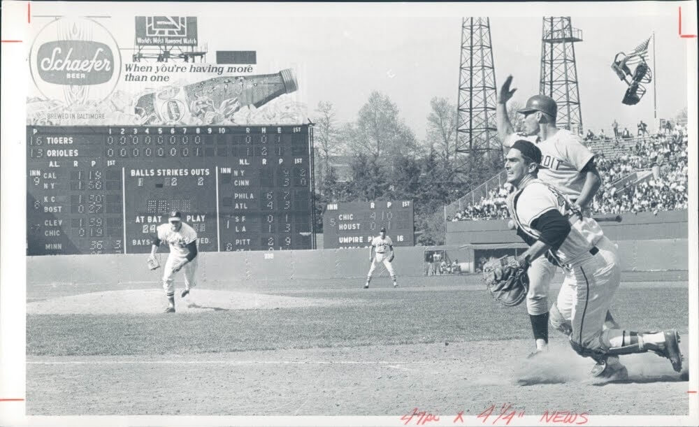
from the scoreboard
Today’s scoreboard comes from ojai67.
The premise of the game (GTGFTS) is simple: I’ll post a scoreboard and you guys simply identify the game depicted. In the past, I don’t know if I’ve ever completely stumped you (some are easier than others).
Here’s the Scoreboard. In the comments below, try to identify the game (date & location, as well as final score). If anything noteworthy occurred during the game, please add that in (and if you were AT the game, well bonus points for you!):
Please continue sending these in! You’re welcome to send me any scoreboard photos (with answers please), and I’ll keep running them.
InsideHook/TATC reminder: Paul here. In case you missed it earlier this week, my latest piece for InsideHook is an in-depth oral history of MLB’s “Turn Ahead the Clock” promotion from 1999. The uniforms were supposed to represent the year 2021, so the future is now! You can check it out here.
Okay, now back to Phil!
The Ticker
By Anthony Emerson

Baseball News: The Cubs finally got matching City Connect helmets for their City Connect unis (from James Huenig). … Giants C Curt Casali has bright orange catcher’s gear, matching the team’s City Connect unis (from Josh Crome). … The Rocket City Trash Pandas, Double-A affiliates of the Angels, have unveiled their uniforms for Space Night (from @CaliGlowin). … At the 39:00 minute mark of this podcast, actor Robert Wuhl goes off on the All-Star uniforms (from Douglas Ford).

NFL News: A blog has chosen the best player for each uniform number (thanks, Phil). … Also from Phil: The Street has an article about how Nike and the NFL profit from uni number changes.
.

Pro Hoops News: Images of LeBron James’s new No. 6 jersey have leaked online (thanks to all who shared). … The Big3 has named a major multinational corporation its “title sponsor” (thanks, Phil).

Soccer News: New kits for Scottish sides Hamilton Academical and East Fife. The Scottish League Cup also has a new logo (both from our own Jamie Rathjen).
Uni Tweet of the Day
I had no idea Mike Piazza had a guest appearance on Bay Watch. I can never unsee this…
I too like to go to the beach in uniform and practice my swings. https://t.co/rJTuhpzvqY
— Matt Zawaski AKA Father Zo (@SouthsideZo) July 9, 2021
And finally… apologies on the length/appearance of the ticker, as Anthony had major connectivity issues yesterday and ended up having to create the ticker on his phone. Thanks to Jimmy for sharing the WFL video and his recollections, and Tanith for the uniform: hopefully one or more of you will be able to give him a full identification.
Unfortunately, we had major cloud cover at sunset yesterday (after having had Tropical Storm Elsa pass through overnight into the early afternoon). In fact, the weather in the NYC area has been kinda gross of late (either 90 and humid, or frequent rain/thunderstorms…and sometimes both). But we did have a gorgeous sunset last weekend on the Fourth of July, so that’s what I’ll show you guys today:

Everyone have a good Saturday and I’ll catch you back here tomorrow.
Peace,
PH
Scoreboard: Sunday, April 30, 1967. Steve Barber throws a no-hitter but loses 2-1 as Tigers score 2 in top of the 9th.
Scoreboard: Sunday, April 30, 1967. Steve Barber throws a no-hitter but loses 2-1 as Tigers score 2 in top of the 9th. Let me add that he walked 10.
Caveat…Orioles, not Barber, throw a combined no hitter.
Right. Stu Miller gave up the error that brought the second run in before getting the last out.
Looks like the photo was taken when Barber threw the wild pitch that allowed Dick Tracewski to score Detroit’s first run. (The photographer did a great job of capturing the catcher’s mask in midair.)
The catcher appears to be Larry Haney.
I’m noticing that the AL side of the scoreboard has the pitchers’ actual jersey numbers, whereas the NL uses the sequential numbering from the scorecards sold in the stadium (which is almost completely gone from baseball today; the Cubs still have it).
That would have been a little unusual even then, wouldn’t it? I thought most teams did it one way or the other.
Overcritical is not a word I’d use to describe your opinion as I think most people find the Giants’ City Connect uniforms ghastly. Especially for a storied team like the Giants.
Considering that the Giants have one of the best looks in all of MLB, you cannot be critical enough of these CC uniforms. And the Golden Rule of sports uniform design is clarity. Ideally, you should turn on your TV and know what teams are playing, and what players are playing by the uniform number. The first half of that is already beyond threatened since every team has turned their uniform into a fashion show where even “team colors” are negotiable, but ghosted numbers and fogged over numbers render the purpose of numbers irrelevant.
You’re not entirely wrong, but baseball’s Jackie Robinson day where everybody in the league wears the same uniform number pretty much proves that you don’t need numbers at all to stage a baseball game.
Although yeah, I agree with you that numbers on a jersey should be legible at the very least.
Also, I do sympathize with your take that you should be able to turn on the TV and quickly recognize which teams are playing. But I guess this doesn’t apply so much anymore now that all TV games have the “score bug” on the screen at all time.
That’s a one-off and a tribute.
GTGFTS – April 30, 1967. Detroit Tigers at Baltimore Orioles. Memorial Stadium (game 1) Baltimore throws a combined no-hitter but loses on a walk, wild pitch and error in the top of the ninth.
I was at the famous Philadelphia Bell game where the fans broke down a door to get in, fans stormed the field during the halftime show, and was involved in the “Papergate” scandal. Big fun. Colorful uniforms. Didn’t stand a chance.
funny how you talked about the good and bad parts of the sf uniform and the only thing i DO like about the uni is the bridge on the cap. the thin lines of the bridge don’t make it an overwhelming image, so i think it works in this case (and probably this case only).
Shouldn’t the fog effect be on the top of the numbers, G, and bridge?
I’m pretty sure they are going for the link motif with these.
I was thinking the same thing, and they could at least have had a darker-colored border around the numbers so that you could still read them even with the fog turning the inside parts to white.
I grew up in NE Ohio, and one of our neighboring school districts was Cloverleaf in Lodi. There are several dairy farms in the area. Their colors are even green & white. Maybe Tanith’s uniform has something to do with them?
It seems like what you’d get if you gave a class of 3rd graders a box of crayons and told them to draw new uniforms for the Giants. You wouldn’t get the contrived back story but I guarantee you’d get the bright orange.
If they wanted to do fog on the numbers, maybe give it a little grey for contrast. Numbers are there to be read, yet Nike has yet to learn that form follows function.
The unreadability reminded me of this disaster from a few years ago, courtesy of the Pennsylvania Department Of transportation.
link
There already is gray trim on the numbers, which contributes zero to their legibility.
I’m glad teams are using names sourced from eatliver.com, like the Trash Pandas. It would have been great to see a game between them and the Albany Fart Squirrels.
*I like em more when on the field as opposed to just the photos
*They are REALLY orange
*Black batting helmets are out of place
The Giants uniforms would be great without the fog effect on the numbers and chest logo and without the bridge on the cap. I’d also have the SF on the cap be white instead of outlined.
One word for the Giants uniforms.
Laughable.
What good is a uniform if you can’t read the team identity or the numbers (Miami Marlins anyone?).
Nice write-up, Phil! I still dislike the City Connect uniform program, even if I have begun to begrudgingly accept some (some) of the concepts that Nike and the teams have rolled out. The Giants’ uniforms are not among them.
Despite some individual uniform elements that I like, the uniform as a whole falls flat. The Golden Gate bridge motif has promise. Why relegate it to the side of the uniforms – the sleeves and the side panel of the caps (yuck!) – instead of featuring it more prominently on the front?
My biggest pet peeve is the “G” insignia on the jersey paired with the “SF” on the cap. I usually like it when teams wear a logo on the left breast of their jerseys instead of a longer wordmark across the whole chest. It feels like baseball’s version of a monogramed shirt or a crest on a soccer jersey. But it only works, in my opinion, when the logo on the jersey and the cap match. They don’t have to match exactly, but they have to have a unifying theme and an easily identifiable visual commonality, kind of like the Cubs, Reds, and Yankees.
Wearing a different letters/initials on the hat and jersey looks jarring and disjointed to me. I think I’d like the “G” logo better if the Giants used in on their hats for these uniforms, too.
Why doesn’t the “fog” effect transition to grey at the bottom? The numbers are outlined in grey and white, so it’ll seem logical. It might add just enough contrast to solve the readability problem. I guess the problem would be that all the other gradients transition to white. Nike could say the grey on the back numbers represents SMOG!
Hi, Tanith! Could the uniform be associated with the Ohio Clover Leaf Dairy from Toledo, Ohio? Here’s an old photo I found online:
link
…and an eBay listing for an old milk bottle from the dairy:
link
It looks like the dairy would have existed around the same time as your estimated timeframe for the uniform. I haven’t been able to find too much more about the dairy. It looks like it probably doesn’t exist anymore.
It’s likely this was a uniform used for an amateur or semi-pro “company team,” which were common throughout the United States, but particularly in the Midwest, from the late 1800’s through the middle of the 20th Century. Such teams played in “industrial leagues” or “town leagues” against teams from other companies. It wasn’t unusual for teams to bring in “ringers” to stack the rosters with a few players with pro-level talent.
Here are a couple of articles about company baseball teams from the era:
link
link
I wish I could find something more specific about the Ohio Clover Leaf Dairy team in particular, but hopefully the information above helps to put the uniform into some context.
The Ohio Clover Leaf Dairy would have been a different dairy than the Clover Leaf Dairy of Pella, Iowa. Pella is about 550 miles or 890 kilometers west of Toledo. “Clover Leaf” was a fairly common name for regional dairies in the United States during that era. It’s still not unusual to see the name applied to creameries or dairy farms even today. It ostensibly comes from the idea that cows allowed to graze on sweet clove in pasturelands produce the best-tasting milk.
Here’s another interesting tidbit that might help provide context, if not more specifics about the Ohio Clover Leaf Dairy team:
link
This is a photo celebrating the 1918 Toledo Commercial Base Ball League championship won by the Page Dairy team. I wouldn’t be surprised if the Ohio Clover Leaf Dairy played in that league.
It looks like the digital collections section of the Ohio Memory website might be a pretty good resource for trying to find more information.
link
And I’d encourage you to reach out and contact a research librarian at the Toledo Public Library:
link
Every research librarian I’ve ever known or interacted with has assured me that they live for opportunities to help people with requests like these. The worst case I can imagine is that they’ll provide some ideas about how to contact your local library to assist in making inter=library requests.
Speaking as a lifelong Giants fan, and generally a curmudgeon about alternate uniforms, I’m surprised to find myself saying after watching last night’s game that I don’t hate these as much as I thought I would.
Of course, “Well, it could have been worse” is the very faintest of praise. I’d still be delighted if the Giants magically announced tomorrow that they’ll never wear anything but their classic primary uniform again.
More specifically, here’s what I think actually works about this uniform:
– The color combo is pleasing enough to the eye, in action. The splashes of orange from the hat, logo, etc. work with the bright white background.
– The GG Bridge for a splash of orange at the end of the sleeves is a distinctive touch. I thought it looked silly at first in the marketing photos, but on the field it’s fine.
What doesn’t work:
– The “fog” gradient on any element except for the bridge on the sleeves. Just makes characters that are supposed to be read, annoying to read.
– The bridge on the side of the hat. Looks cluttered, just shouldn’t be there.
– The color-on-color, outlined hat logo. Hat logo should’ve just been white.
– The “G” chest patch. Should’ve been the classic “SF”. As a local columnist joked: “Apparently, the city they’re trying to connect with is Gilroy?”
– Last but very much not least: the Giants already have great, classic uniforms, and I’d rather they only ever wore those.
Take the bridge off the cap
Make the numbers solid
Replace the G with SF
And you have a decent set imo. I actually do like the bridge on the sleeve, it’s the perfect place for it.
“And in their quest to be clever, Nike was too clever by half.” This is a chronic affliction of Nike’s designers which always seems to make it through the approval process. Further proof that the higher one gets in management, the more one’s judgement becomes impaired.
The CC uniforms are horrible, period. Absolute garbage. Just another opportunity for MLB & Nike to sell unnecessary poorly designed merch.
Absolutely agreed. These are big league teams wearing uniforms that even minor leaguers would be embarrassed to wear.
People were genuinely interested in a Lebron jersey leak?
he just changed his number to a 6! What’s the mystery?