Good morning! Hope everyone had a good holiday weekend, as I did.
My friends, I come to you today to discuss a matter most urgent. It is no secret that our nation is increasingly riven by conflict, division, and disagreement, to the point where it is nearly cleft in twain. At times it seems like people are living in separate realities, each with its own set of “facts” and “truths,” each with its own version of our national story. Even the Great Plague of the past year, which in earlier times would likely have brought us together in a united stand, has led only to more discord and hostility between our warring factions, laying bare the seemingly irreparable rips and tears in our civic tapestry. Some observers have begun to think that the old truism “What unites us is stronger that what divides us” is no longer accurate, and that only the most elemental choice between Right and Wrong — a perfect storm of moral clarity, if you will — is capable of bringing us to rally together as one.
Fate has now provided us with such an opportunity.
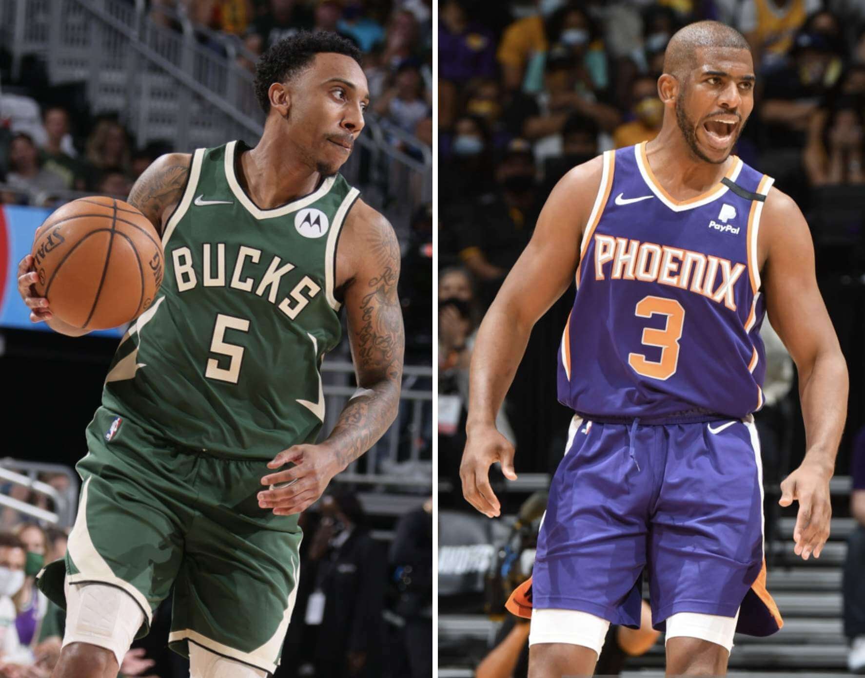
Tonight one of our marquee sports will begin its annual championship series. The aesthetic divide between the two clubs could not be more stark: One has chosen to clothe itself in the resplendent color of Green, thus aligning itself with all that is righteous, life-affirming, and Good; the other wears the accursed hue of Purple, thus representing all that is ignoble, malodorous, and Evil. As they prepare to face each other, the choice of which team to support is so self-evident, so existential, as to become a moral imperative. Must you choose to breathe oxygen? Must you choose to crave things like love, safety, and sustenance? Of course not, for these desires are ingrained in our inner beings, and so too is the choice of which team to support in this series.

The stakes are magnified by the fact that the Green-clad team at one time went over to the Dark Side. Fortunately, this dalliance was short-lived, and the team eventually exorcised Purple from its color scheme, as if to say, “Begone, foul demon, I cast thee out!” And just as they made the fateful decision to embrace Good and reject Evil, so too must we.
It is true that these two teams don’t always wear the uniforms shown at the top of this page. (Indeed, the Green team occasionally and inexplicably wears blue.) But Green and Purple are nonetheless baked into their identities, their bloodstreams, their very DNA. American soldiers may not wear red, white, and blue on the field of battle, yet those are nonetheless the colors for which they valiantly risk life and limb, are they not? So it is with these two teams and their respective connections to Green and Purple, irrespective of what they may be wearing on a given night.
This isn’t the first time these two colors have faced each other during this sport’s championship round. But those previous matchups took place during periods of relative national calm and clarity, when the need for a uni-fying moment of shared resolve was not as great as it is now.
I realize that some of you reading this reside in the great Southwestern city represented by the Purple team, and that my words are may therefore be hurtful to you. To these fine readers I say this: I wish you no harm, I bear you no ill will, and I understand your affection for your local team. But there are times when circumstances demand that we make a difficult choice for the sake of the greater good. This, my friends, is one of those times.
In conclusion, my fellow uni-zens, a historic moment is at hand, a moment in which each of us has the opportunity — nay, the duty — to come together and take a united stand for Good and against Evil. I trust you will all answer that call with the appropriate degree of honor and dispatch.
Go Bucks!
For all photos, click to enlarge
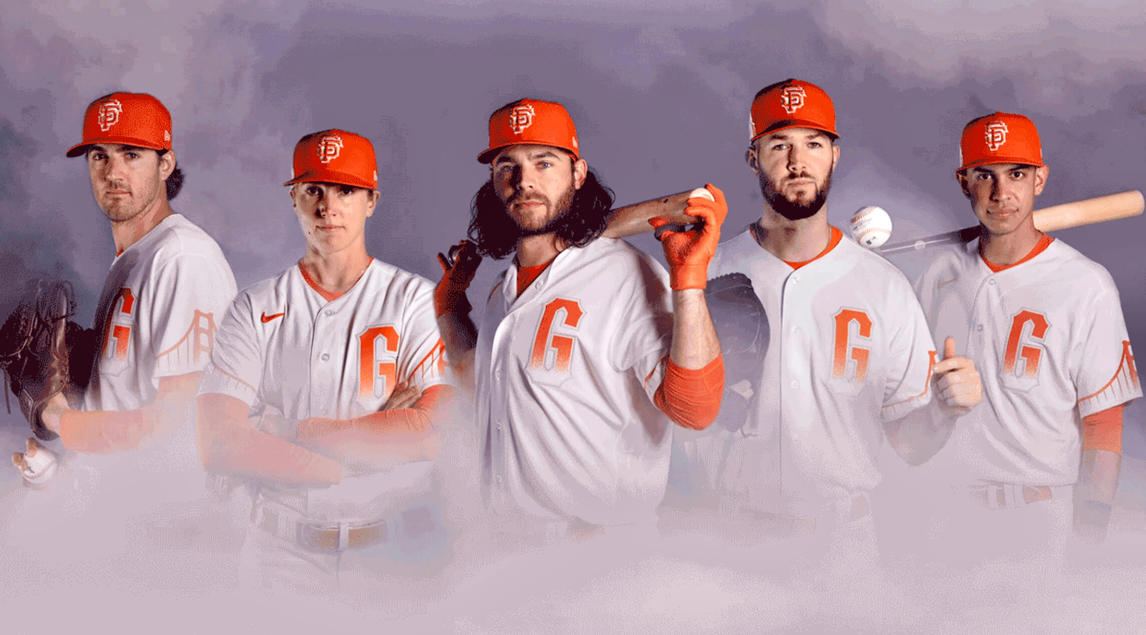
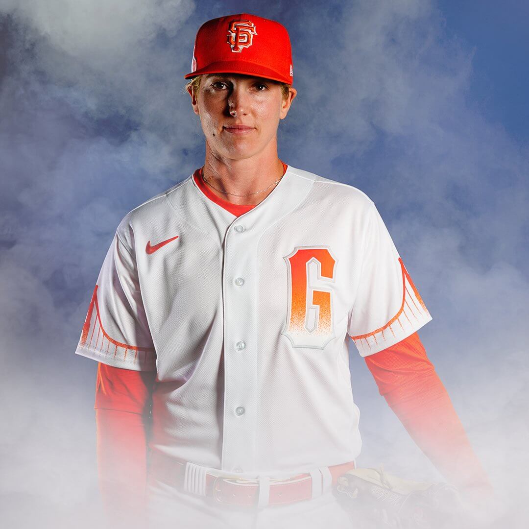
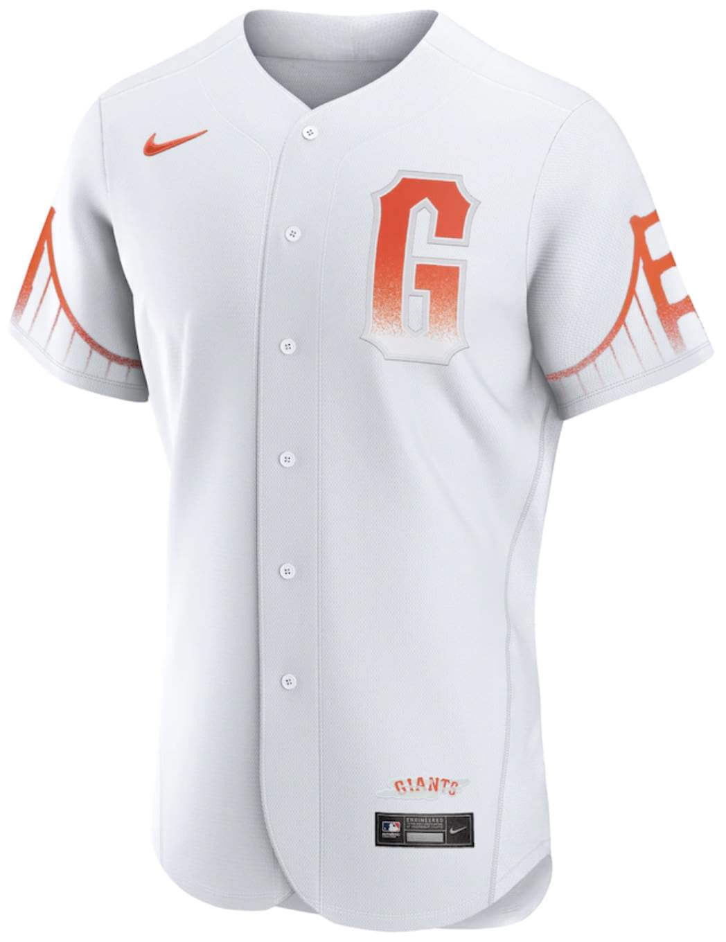
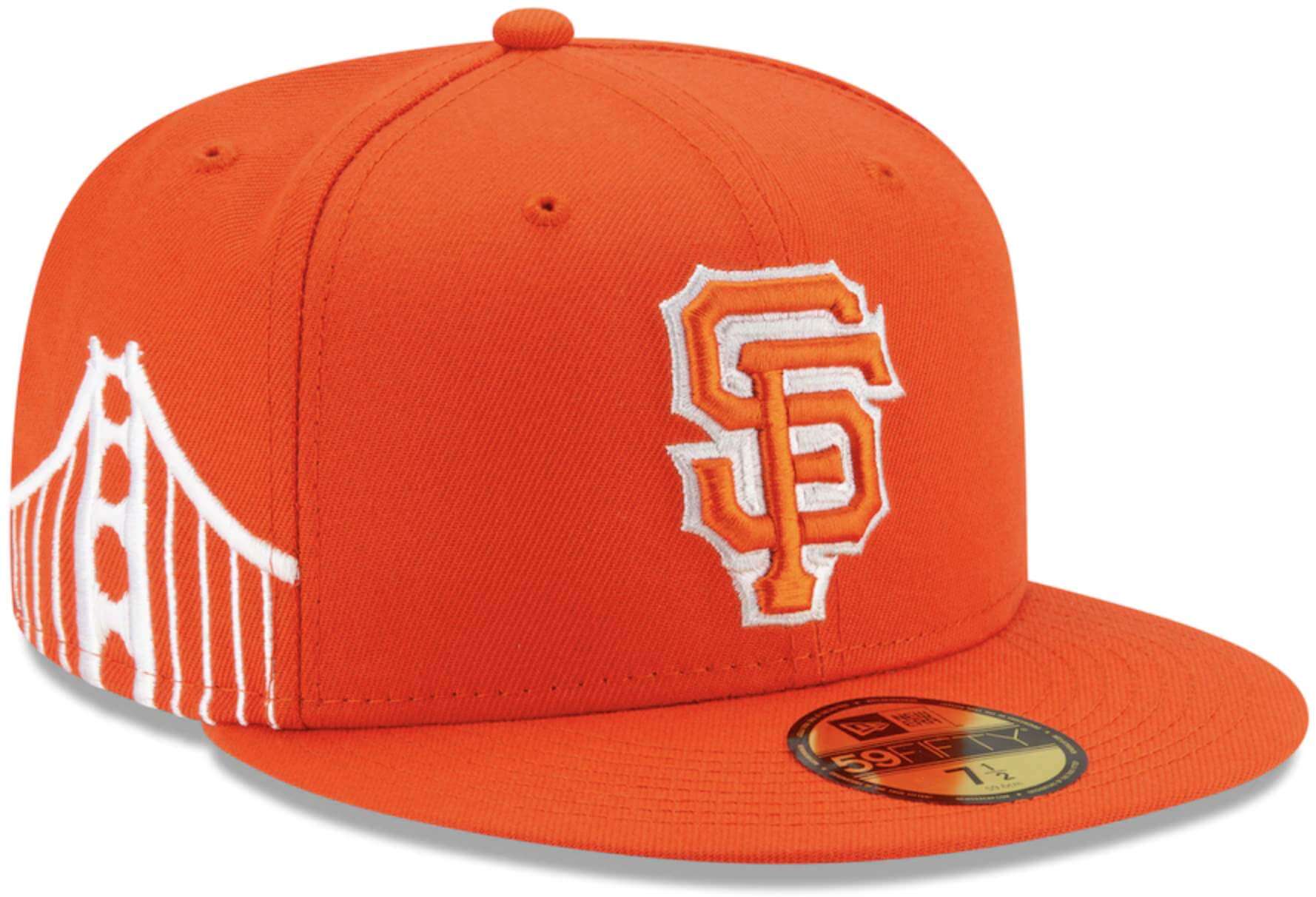
Foggy notion: The Giants notched a milestone of sorts yesterday, as they unveiled their new City alternate, which I believe to be the uni-verse’s first-ever fog-themed uniform.
Here’s the front view:
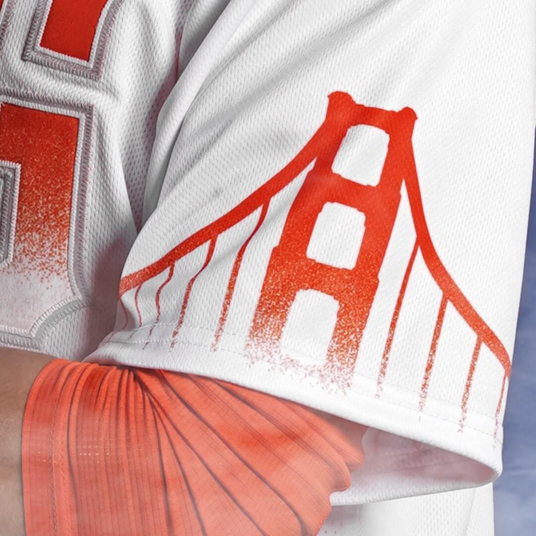
The bridge design on the sleeves appears to be sublimated. Here’s a close-up:
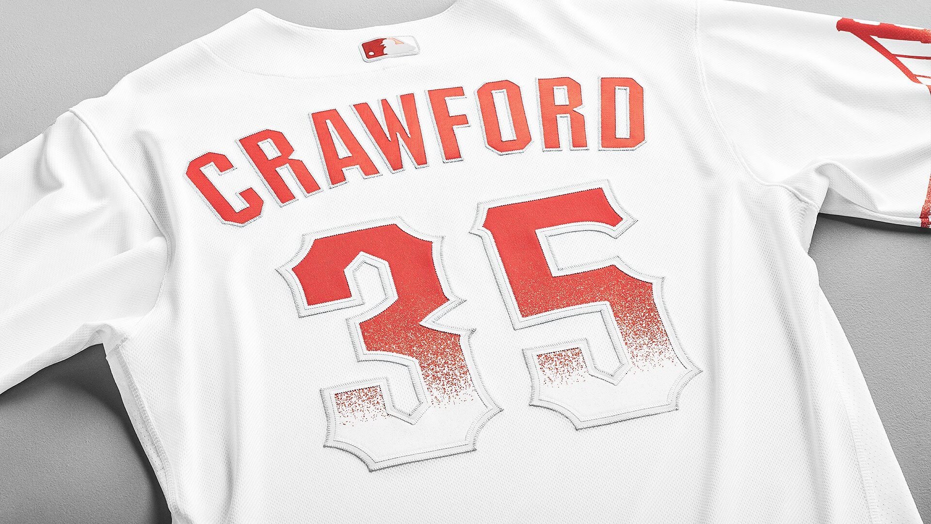
The fog motif is repeated on the rear jersey numbers, but not on the NOB lettering:
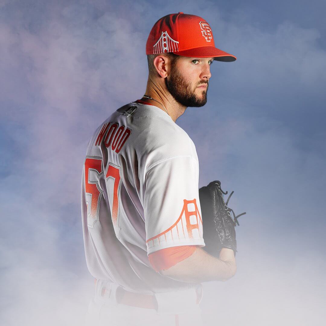
The bridge motif is repeated on the side of the cap:
I really like the number font (just the font itself, not the fog motif), which is based on the lettering that’s long been used on the front of the team’s home jersey. The Giants should consider using that font on the back of all of their jerseys. Aside from that, this is a laughable mess. Bonus points to whoever wrote the hilariously bad “storytelling” text, most of which could be copied/pasted for any other city. It’s like someone was playing a game of Marketingspeak Mad Libs.
But that’s just me. Our own Brinke Guthrie is a longtime Bay Area resident and Giants fan, so what does he think of this? Take it away, Brinke:
The “G” on the jersey looks odd, I guess because you never see it as a standalone entity. “SF,” sure, but not a solo “G.” I read on ESPN that they lengthened the “G” to match the bridge profile. The Golden Gate on the sleeves? Well, that’s a truly recognizable landmark, so if you’re gonna slap something local on there, it has to be the bridge. I’m not a fan of the gradient look anywhere, but I understand the fog angle.
I don’t care for the bridge on the side of the cap. Or at least make it a bit smaller. It seems to overwhelm the cap profile.
This uniform will make its on-field debut for this weekend’s three-game series against the Nationals. After that, it will be worn for Tuesday home games. You can see the full slate of dates here.
That leaves us with one more team to reveal its City alternate this season: the Dodgers, whose design will be made public sometime in August.
Click to enlarge
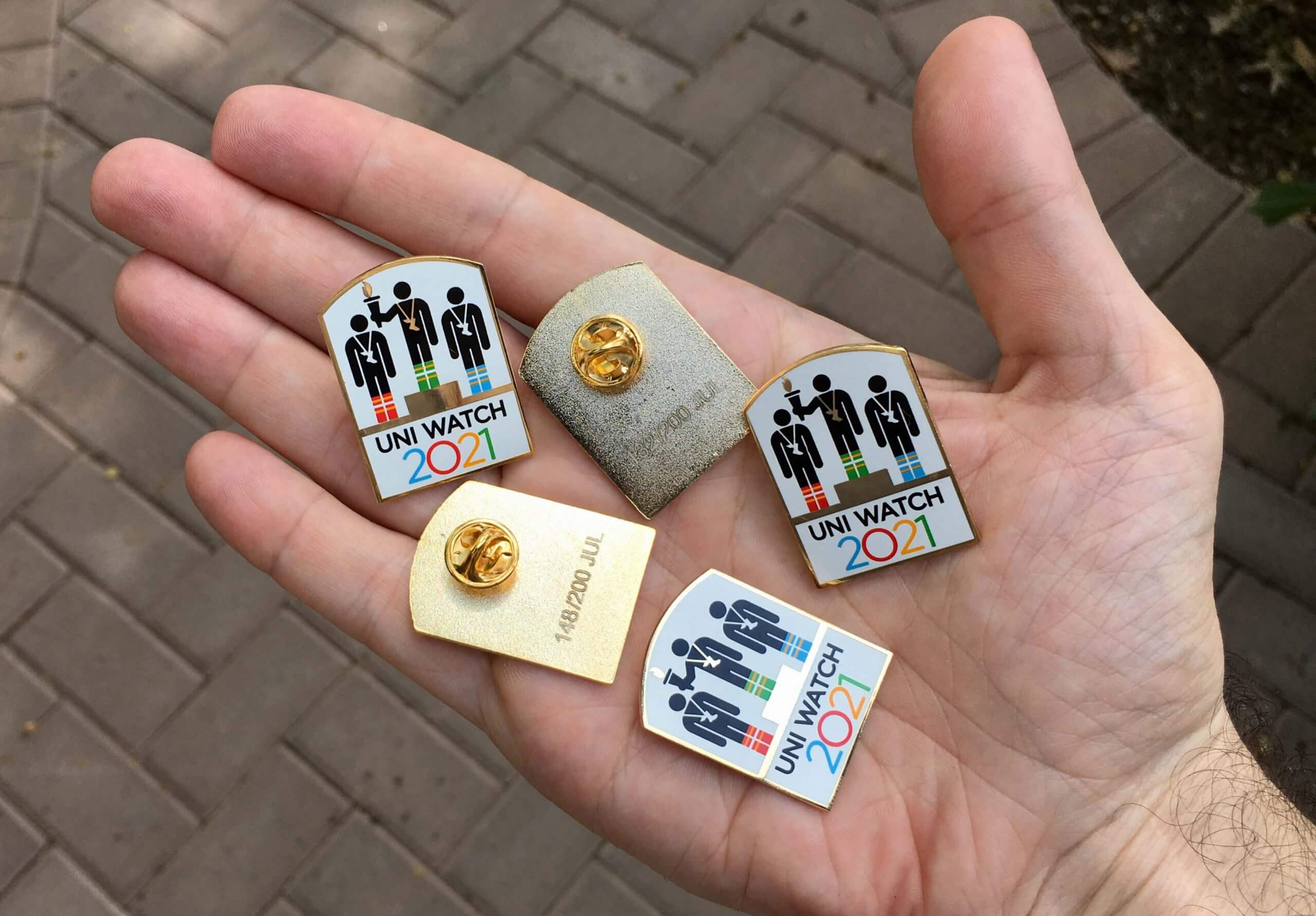
July pin reminder: In case you missed it yesterday, our latest pin is based on classic Olympic pictograms (something that pin designer Todd Radom and I are both very fond of). Looks great, no? Check out those winged stirrup medals, and note that the gold medal winner’s striped socks are in Uni Watch colors!
This is a numbered edition of 200 pins. As of this morning, there are about 80 of them remaining. You can order yours here.
Who wants the very last cap? We are now down to a single Uni Watch cap — size 7-7/8. Somebody snap it up!
Click to enlarge
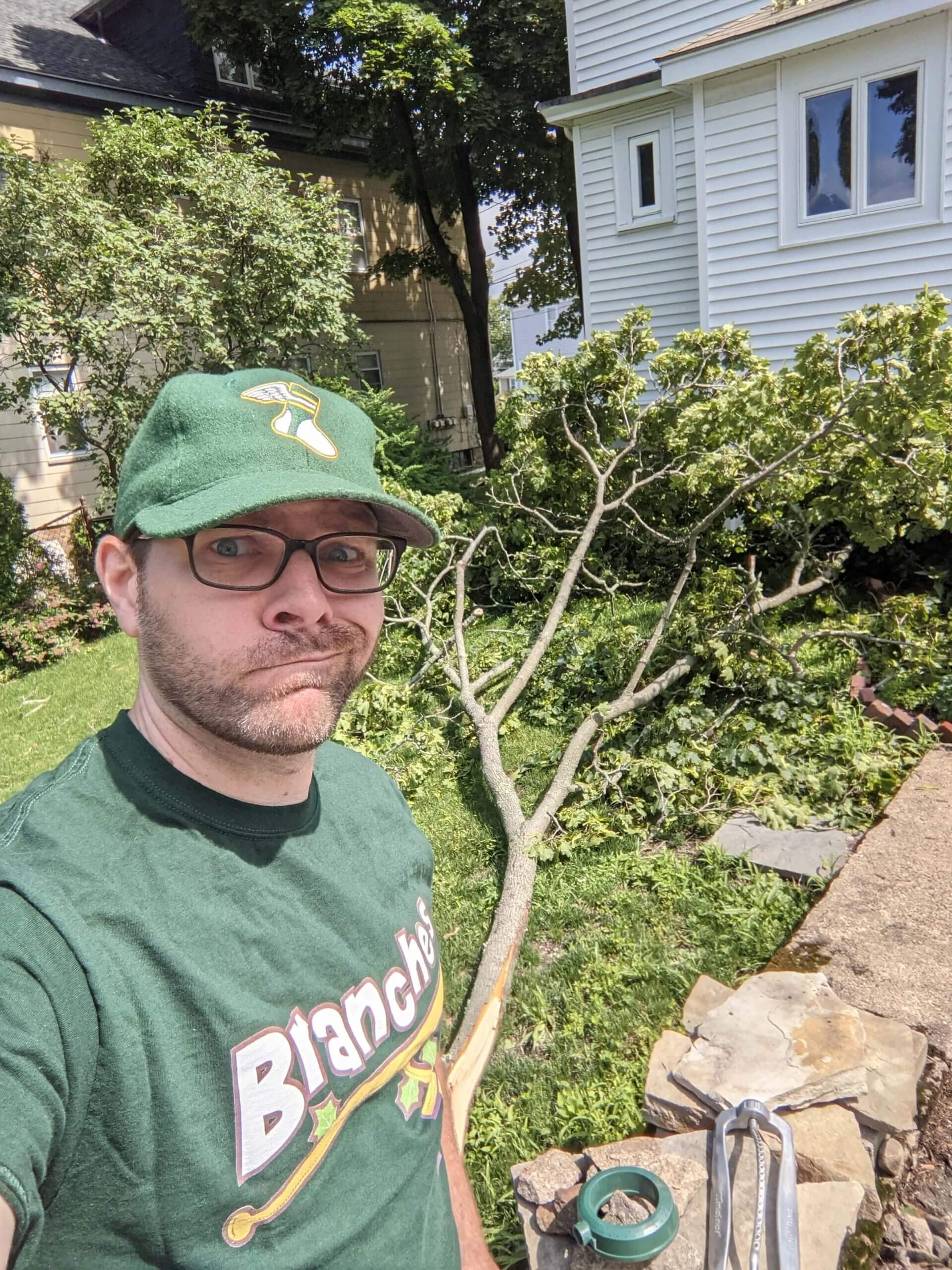
Dressing for the occasion: Uni Watch reader Jason Tierney recently returned from a week-long vacation to find that a large branch had come down from one of his trees while he was away. Fortunately, he had just the right shirt to wear for this selfie!
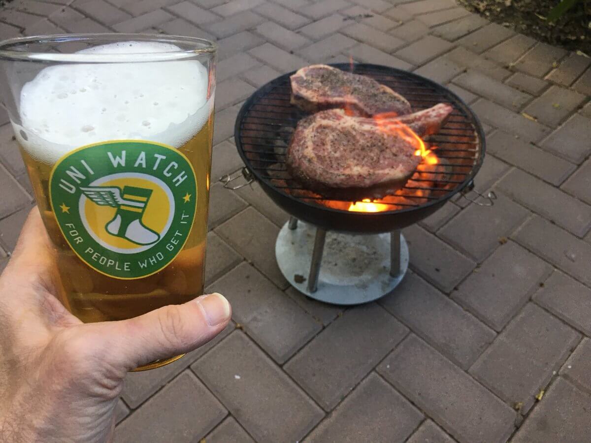
PPPC reminder/update: Remember, this Thursday, July 8, is Post-Pandemic Porch Cocktails Day, with all members of our comm-uni-ty encouraged to celebrate our return to normalcy by sharing a photo of yourself enjoying a beverage on your porch (or stoop, deck, driveway, or whatever). Uni Watch pint glasses and/or koozies are welcome but not required.
I’ve been trying to decide the best way to handle all the photos. At first I thought maybe I’d just create a Facebook page where people could upload their PPPC pics, but some people don’t like Facebook. Similarly, we could have a really long Twitter thread (or just a Twitter hashtag), but some people don’t like Twitter.
So now I’m thinking the best option would be for everyone to email their PPPC pics to one person (that person would be the PPPCPC — the Post-Pandemic Porch Cocktails Pics Coordinator) and then have that person put all the photos in a Flickr set. If you’d like to volunteer to be that person — and/or if you have an idea for a better way to handle this — give me a shout today. Thanks!
Click to enlarge
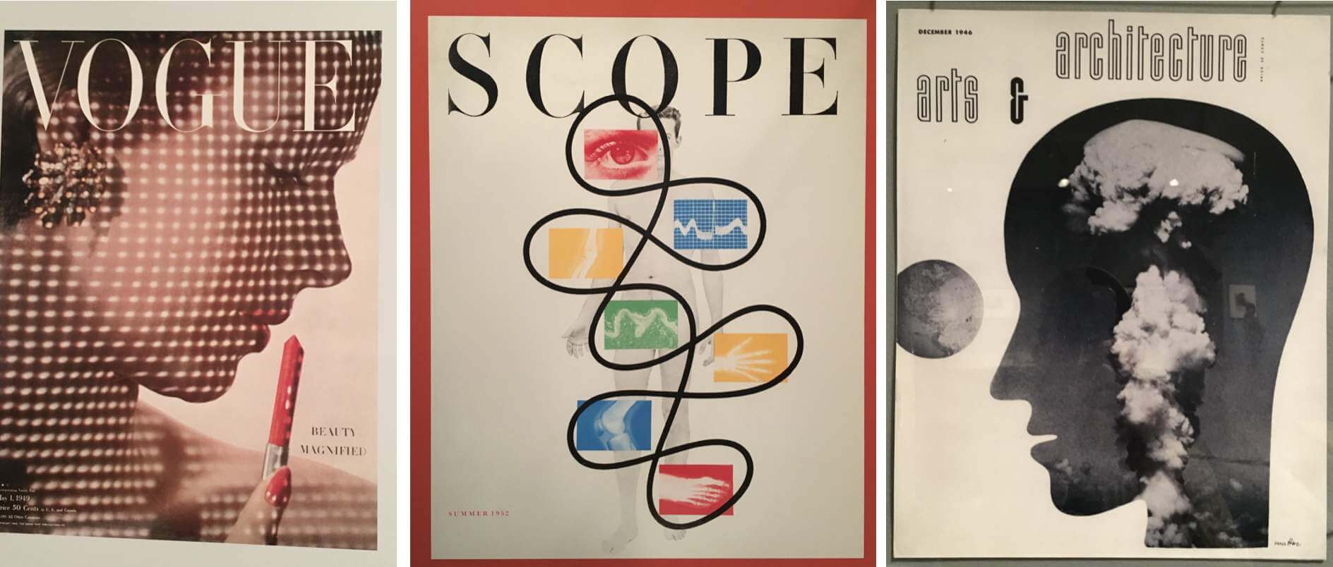
Godhead design show: On Saturday Mary and I went to the Jewish Museum to check out an exhibit called “Modern Look: Photography and the American Magazine.” Although ostensibly about photography, it’s really more of a design exhibit, with tons of great examples of spectacular publication design (and, yes, some great photos too). You can see a few dozen examples from the show here.
The exhibit’s final day is this Sunday, July 11. Highly recommended!
Sorry, no Ticker today, because the whole Uni Watch team had yesterday off. The Ticker will return tomorrow. — Paul
I think my biggest critique of the Giants uniform is that it looks like the printer ran out of ink.
I agree. The concept is great. the execution? Meh. The only one of these Nike outfits that really stuck me as well executed and was the D-Backs’ kit. Baseball does not lend well to this kind of marketing, the fans are too traditional.
My biggest issue with the giants CC jersey is not featured in this entry. The hem tag (which I will try to paste here but may not be successful) has the giants word mark overplayed with a slightly opaque whitish gel appliqué in the shape of long cartoonish clouds. It looks like… well… it looks like Nike got a little too excited about their design and umm… made a happy little mess in the jersey.
Not good.
You can see the hem logo in this article, third picture in the giants section of the feature:
link
Yeah, my policy is not to show or discuss the customized jock tags, or messages on the inner collar, or anything else that we can’t see on the field, because that has nothing to do with the uniform — it’s just a retailing gimmick.
That said, your analysis is hilarious.
Nike’s background stories are basically Elaine Benes writing about the Urban Sombrero. My review of the Giants set is just two words borrowed from This is Spinal Tap “Sh*t Sandwich.”
Did the spray paint can nozzle got clogged up and they just kept spraying?
As other teams have demonstrated that the City Connect uniforms aren’t necessarily bound to the teams’ actual colors, it makes you wonder why the Giants didn’t go with International Orange, the actual color of the Golden Gate Bridge.
Beat me to it. Agree 100%
What, no shot of the 1976 Finals between the Celtics and the Suns?
Good point! Now added.
If you’re going to feature the Golden Gate Bridge, why not use the bridge color, International Orange, which seems to have more red in it? Swing and a miss.
Fun lede today, Paul. Very entertaining. As I sit here in a a purple shirt, I just have to say:
GO SUNS!
The Giants merch dump uniform is obviously the worst of the bunch so far, the others had varying degrees of good and bad to them, this one is simply bad all around. There are no redeeming qualities for this one.
Worse that Boston’s City alt by a nose.
Back in 2012 when the Marlins re-branded(for the record, I kinda miss that set after seeing what they were replaced with) I supported the “Free The Orange Cap” movement. Today, I can’t say I ever want to see the Giants version ever again…I want to like what the Giants put out there, but the GGB graphic on the side makes that impossible.
And the font used for the numbers, while consistent with the Giants’ lettering, is just too Pirate-y…and made more ridiculous by adding the foggy bottom.
IMO—the White Sox is truly horrendous. Black pinstriped pajamas with gothic writing. Yeah, that’s baseball.
Sure it is. It’s certainly not the first all-dark baseball uniform, nor is it the first all-dark uniform with pinstripes. As for the Gothic/Old English script, it is a Sox hallmark. Also one of hip-hop/rap design. Which is the point: when the Sox adopted their current design in the early 90s, it seemed like every rapper on both coasts started wearing it. Or something similar. This is a “rap version” of the White Sox uniform.
It sort of reminds me of how bands like the Beatles and The Rolling Stones took the American music they loved, made it their own, and sent it back our way.
Any idea what uniforms the Suns and Bucks will be wearing, I know before the Suns Clippers series I read what uniforms the teams would wear for each game, but I haven’t located this for the finals. The Suns wore their black “The Valley” for all home games, and their orange uniforms for all road games against the Clippers. The Suns can decide what home uniforms they will wear, but the road are impacted by what the Bucks choose to wear at home. They could go color v color if the Bucks wear green, with the Suns wearing orange.
It will presumably be posted on the NBA’s LockerVision site, but they haven’t done so yet.
Just posted first 2 games in Phoenix. Suns black “City” “The Valley”. Bucks white “Association”.
Full series is up. Suns, as expected, will wear “The Valley” in all home games, only potential Green vs Orange would be game six.
Green vs White in game 3 and White vs Orange in Game 4
All other games Black vs White.
Looking at the Lockervison website, 5 out of the 7 games will have the road team in white. Maybe I’m just a traditionalist but this bothers me a great deal. White uniforms should be worn at home in basketball.
(And Go Suns!)
For better or worse (worse because of all the Wombat and Elbow editions), you won’t get to see the Suns in purple.
One more City Connect uniform that would look good if there was such thing as ArenaBaseball.
Instead I’ll just add it to the growing list of ways Rob Manfred has killed Baseball.
One more City Connect uniform that would look good if there was such thing as ArenaBaseball.
Brilliant metaphor, Doug. I may have to steal that one!
As one who was married in a purple suit, the heretofore King & Queen of All Colors, I respectfully disagree.
I may be biased, but the green Branches shirt pairs up nicely with the green UW hat.
Any guesses on what the Dodgers (or rather Nike) pull inspiration from for their uniforms?
Dodgers will just copy the Giants uniforms, change the red to blue, and call it smog. Kidding! I hope…
My best guess would be the Dodgers put Hollywood on their chest in the shape of the Hollywood sign. And then add in a bunch of stars everywhere. That seems like the easiest and laziest choice which means Nike will probably go that route.
A fun idea that won’t happen would be a La Brea Tar Pits theme.
Go with the smog, a can’t miss. It’s on the UW Facebook page, BTW.
As a Giants fan, I cannot put into words how much I loathe these uniforms. And further, the G logo isn’t even an original idea for Nike! I have a Nike fashion cap that my sister bought me sometime in the early 2000s with that G logo and the Golden Gate Bridge. Nike couldn’t even be bothered to come up with a new logo for this hot trash! I could actually dig the cap if the bridge was removed.
All in all, hard pass. These are hideous.
The anti-purple bit is a little played out
But not as much as the “merch dump” thing. Especially on a site that regularly offers merchandise for sale. And from readers who without a doubt own or have owned at least one pro or college branded piece of merchandise.
For the umpteenth time, Jasper, I have nothing against team merchandise. Indeed, I feature all sorts of cool merch each year in my holiday gift guide.
What I object to are merch dumps masquerading as uniform unveilings. That’s all.
If you can’t grasp that distinction, I don’t know what else to tell you.
Quite apart from the gradient elements on the uniform, the cute decision to have the *photos* fade out at the bottom is quite annoying when you’re looking for fine details.
Too clever by half, once again.
My first reaction to the new SF unis was…
When did God start sponsoring a baseball team? I mean, you’ve got the logo and the numbers up in the clouds, you’ve got the pearly gates on the hat and sleeves…only thing missing was the cherubim and seraphim in the promo photos.
I guess they could have used a halo around the G to really bring it home, but you don’t want a holy war with Anaheim on copyright infringement…
:-)
One interesting fact about the NBA Finals – both the Bucks and the Suns were added to the league in the 1968 expansion.
I don’t have a horse in the race, but I’m rooting for the Bucks purely because their 1981-85 “Irish Rainbow” unis are my favourite sports uniforms of all time.
Here’s what I’ll say about alternate uniforms in general. Kids LOVE them. They are not for us middle aged fans who grew up in a time when sports uniforms were, well, uniform. I dropped off my 11 year old son and his two buddies this morning at baseball camp in New Jersey. For the 12 minute car ride, three 11 year old boys from New Jersey talked about nothing else but the uniforms of an MLB team in San Francisco, CA and how they compared to baseball uniforms from teams in Boston, Phoenix, two from Chicago and Miami. Again, New Jersey kids who are all Yankee or Met fans talking about baseball uniforms of teams they do not root for from far away places. These uniforms are tangible connections to the game for these kids. It makes them bigger fans. Sure they often go too far. But, for the most part they work. If things like this get little kids into playing and watching baseball more and spending less time on you tube, then I’m in.
As an OG, I’m not against alternate uniforms, just bad alternate uniforms.
That’s good intel, Mike — thanks for sharing that!
When will the long national nightmare be over. The Giants in RED?
That’s some rather purple prose in the lede…
On July 4th in Trenton, the Buffalo-Trenton Bisons-Thunder wore Trenton Thunder jerseys and Buffalo Bisons 4th of July hats.
link
I don’t understand why more people aren’t calling them the Thunder Bisons. It just seems like a natural mash up.
Not a Giants fan, but I’m a Bay Area native. Every Bay Area native I know calls the fog rolling in under the Golden Gate, Carl the Fog. A Missed the opportunity for Giants.
Actually “Karl”, with a K.
Lee
You are correct, sir!
Karl has moved on–it’s Karla now. Seriously.
I was about to post that Jarred Kelenic is still wearing his MLB pants following his demotion from the Mariners, here:
link
Then I realized that at least some other Rainiers (AAA) players are also wearing MLB branded Mariners pants, even those who have never played a game for the Ms:
link
Seems weird to me — I wonder how common that is at the AAA level
It appears to be universal. Here are three quick examples from different teams in different games:
link
link
link
I love those 1976 Suns’ uniforms. But Phoenix doesn’t wear them now.
My horse in this race is my neighbors in New Hampshire, Lenny and Sue Connaughton, are the parents of Bucks’ G Pat Connaughton, and I can’t think of a better reason to root for them.
Paul, I can only imagine your giddiness as you were writing todays post. It’s obvious (to most of us, at least) that your hatred of purple is all in fun. You know – we all know – that there are obviously way more important things in life than a purple uniform or any color of uniform or anything to do with any uniform. But that’s not why we’re here. I hope you enjoyed writing it as much as I did reading it. All in fun!
Thanks, Munch! I wrote most of it in my head during a bike ride. Then came home and typed it out. All in good fun indeed!
The Giants jersey has a player’s weekend-ish feel to it. I know we are not about the merch here, but the collateral merchandise is really nice. The jersey is a very passable “fashion jersey” like they sell at mlbshop.com. None of it belongs on the field, however.
All of that and not even a mention of the Suns totally awesome “Valley” Jerseys? The best in the NBA?? From an AZ resident and lifetime Suns fan, GO SUNS!!
I’m on record as liking that uniform. But still: Green > Purple.
MLB steps in pile of shit…insists its Valrhona ganache…keeps dancing in it.
Joining the tsunami of merch with more and more alt-unis is such a woeful misstep…variation after variation just becomes meaningless noise. Does anyone really care what NBA teams are wearing any given night?
Its having the effect of tamping down my heretofore fervent interest in uniform design.
“More is More”, some will say. I say: More and More is a stultifying bore.
That SF uni is a volcano of “meh”
I choose violence. Go Suns!
Wow, that first base coach must be pretty special to be included in a uniform unveiling.
I had no idea the NBA finals were happening.
I’m a bit of a U-W and sports-in-general scanner until the NFL starts again. It’s about the only thing I pay attention to these days in my old age. Why? Lord only knows.
I kind of like the simplicity of essentially an orange and white Giants uniform. Yes I agree, the golden gate on the hat is overkill and the fog story doesn’t really work, but colors are good
In regard, I was initially excited about the match up from an uniform perspective. No red, blue, black or yellow. Then I remembered, off course we’ll see those colors, the Buck could wear that blue uniform, Phoenix will wear black, and then I lost interest from a uniform perspective and cursed the NBA.
Go Green!
Suns need to dump purple and replace it with yellow-orange and yellow are the real colors of the Sun. Live in PHX and getting grief for rooting for the Bucks.
If you live in PHX, you know full well what a Phoenix sunset looks like. C’mon now.
They may wear purple and green but it seems like every nba game in the playoffs has been black vs white jerseys.
All this market-speak and not once did the Giants mention Karl :(
There is at least one previous Fog-themed uniform….
link
Sorry I’m late to the party, but the Suns are downplaying purple big time. Rumor is the owner doesn’t like the color, so in effect the Suns are now Black, Orange and a little Purple trim (for now)
A DISASTER. WOULD ANYONE EXPECT NOTHING LESS FROM NIKE? BUT WE’RE LIKELY MISSING THE POINT; IT’S FOR THE YOUNGER FANS, WHO KNOW NEXT TO NOTHING ABOUT TRADITION, HISTORY OF THE GAME, ETC. NIKE AND THEIR LOGO PLACED ON THE MLB UNIFORM IS AN AFFRONT TO ANYONE WHO VALUES TRADITION, HUMAN RIGHTS, DECENCY, JUSTICE…
HOW MANY PARENTS WILL PONY UP $400 PLUS FOR THE “AUTHENTIC” VERSION (EXACTLY THE SAME JERSEY WORN ON THE FIELD!)?
CAN ROB MANFRED BE IMPEACHED?
The Giants are the second team in San Francisco to wear a fog theme jersey. In the 1980s there was an indoor soccer team called the San Francisco Fog with the Golden Gate and fog as the logo.