Click to enlarge
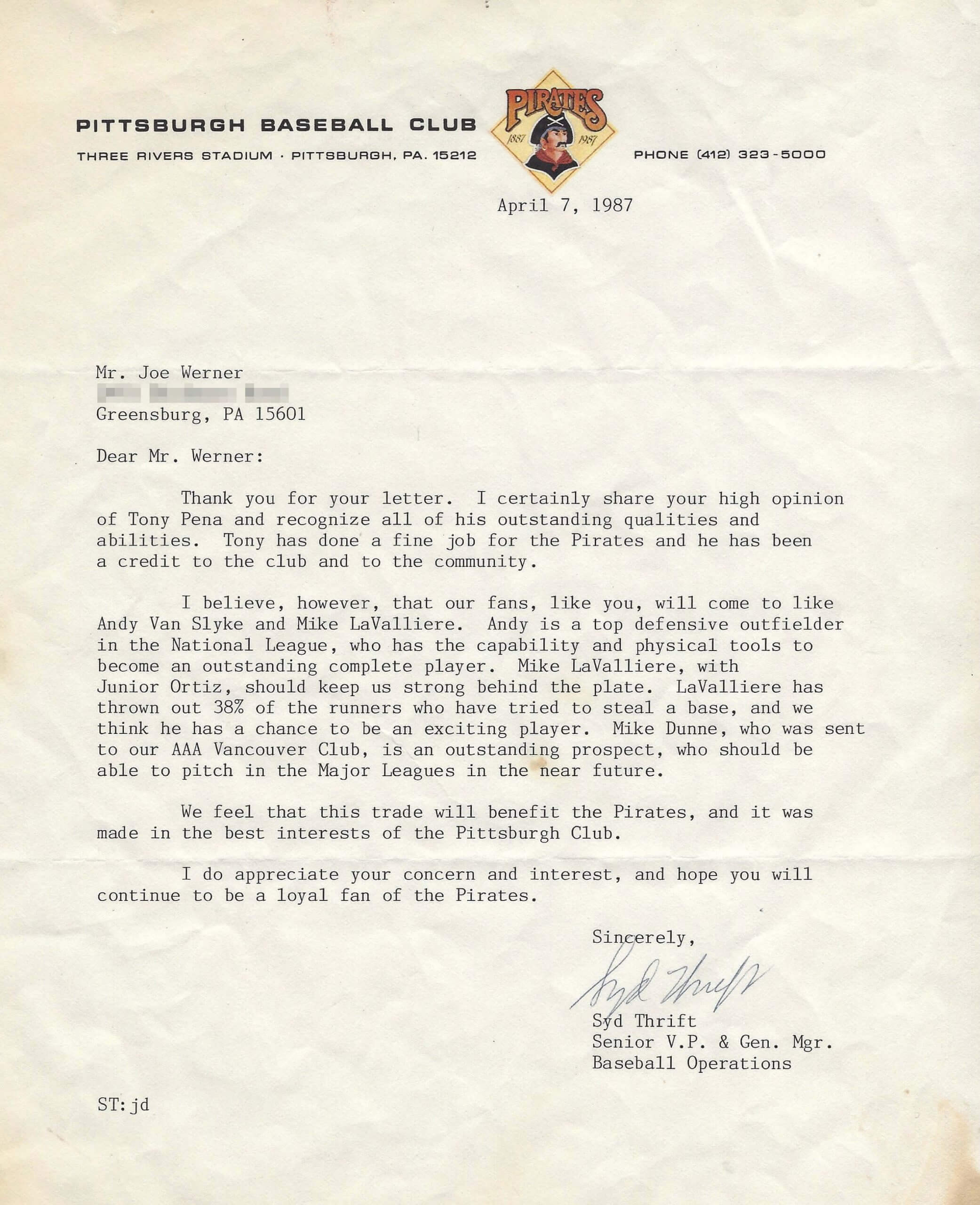
The letter shown above was sent in 1987 by Pirates GM Syd Thrift to a very young Joe Werner, who would grow up to become a longtime Uni Watch reader. Here’s the story behind it:
In 1987, when I was about 10 years old, I wrote Mr. Thrift a letter voicing my displeasure with the trade of Tony Peña, who was arguably the Pirates’ best player at the time. I was rather surprised when I received a reply, and a very thoughtful one at that. My mom probably typed up the letter I wrote, since my handwriting at the time was atrocious, but I imagine that the style of my writing tipped off the fact that it was from a kid.
In the end, he was right, as Andy Van Slyke and Mike LaValliere became pillars of some strong Pirates teams in the early 1990s.
How great is that? I wonder if there are any MLB GMs who would do something similar today.
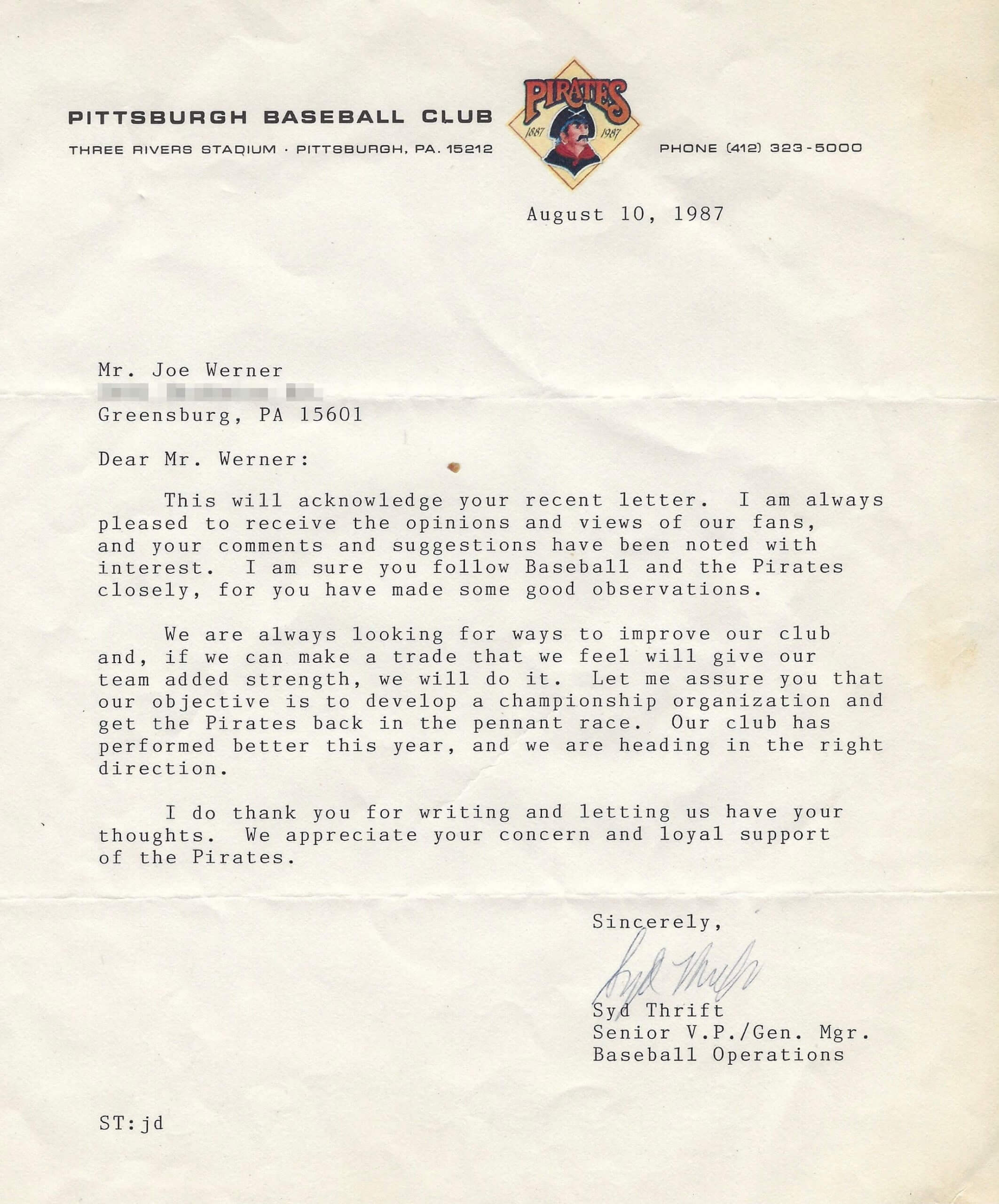
Later that summer, Joe wrote to Thrift again, protesting yet another trade. “This time, the response was more of a form letter,” Joe says. “But the fact that Mr. Thrift wrote back at all was very cool.” Here’s that second letter (click to enlarge):
———
The thing that interests me about these letters, aside from Thrift’s commendable willingness to engage with the team’s fan base, is the letterhead. Let’s take a closer look at that logo:

I have to say, I’ve never cared for that logo. It originally appeared on the team’s 1940 and ’41 uniforms, as our own Alex Hider detailed two years ago in this Uni Watch post (which I strongly recommend). It later resurfaced as one of the three pirate heads that have served as the team’s primary logo (click to enlarge):
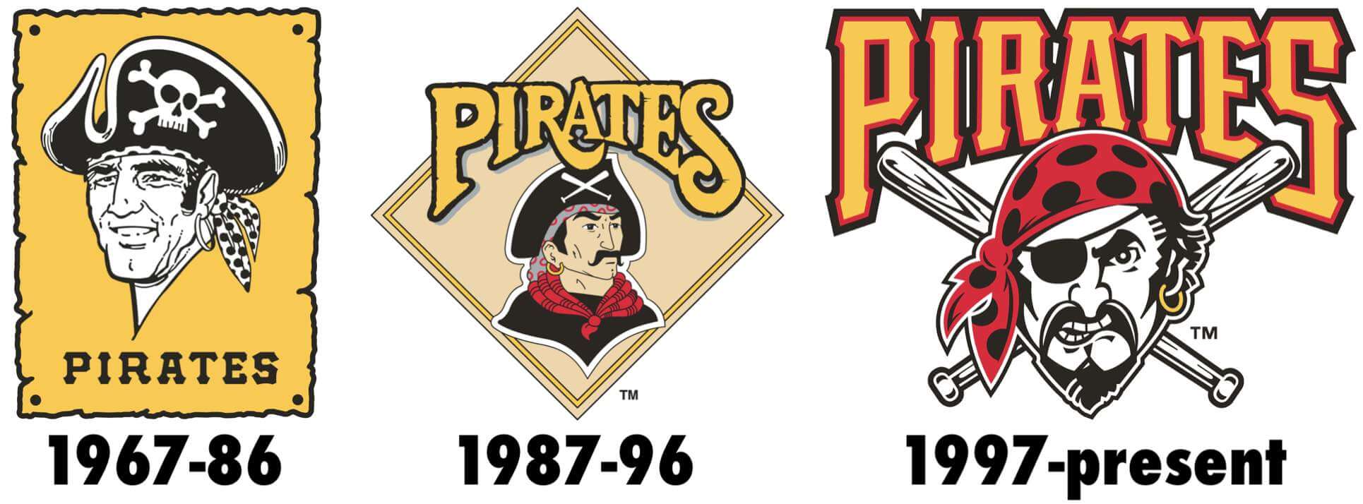
That’s a pretty funny progression: first a rough-but-warm smile, then stern-but-dignified gaze, and then crazed aggression. Pretty well sums up the evolution of sports logo design during that period.
Interestingly, there’s been at least one period when two of the logos were used simultaneously, at least on a BP jersey (click to enlarge):
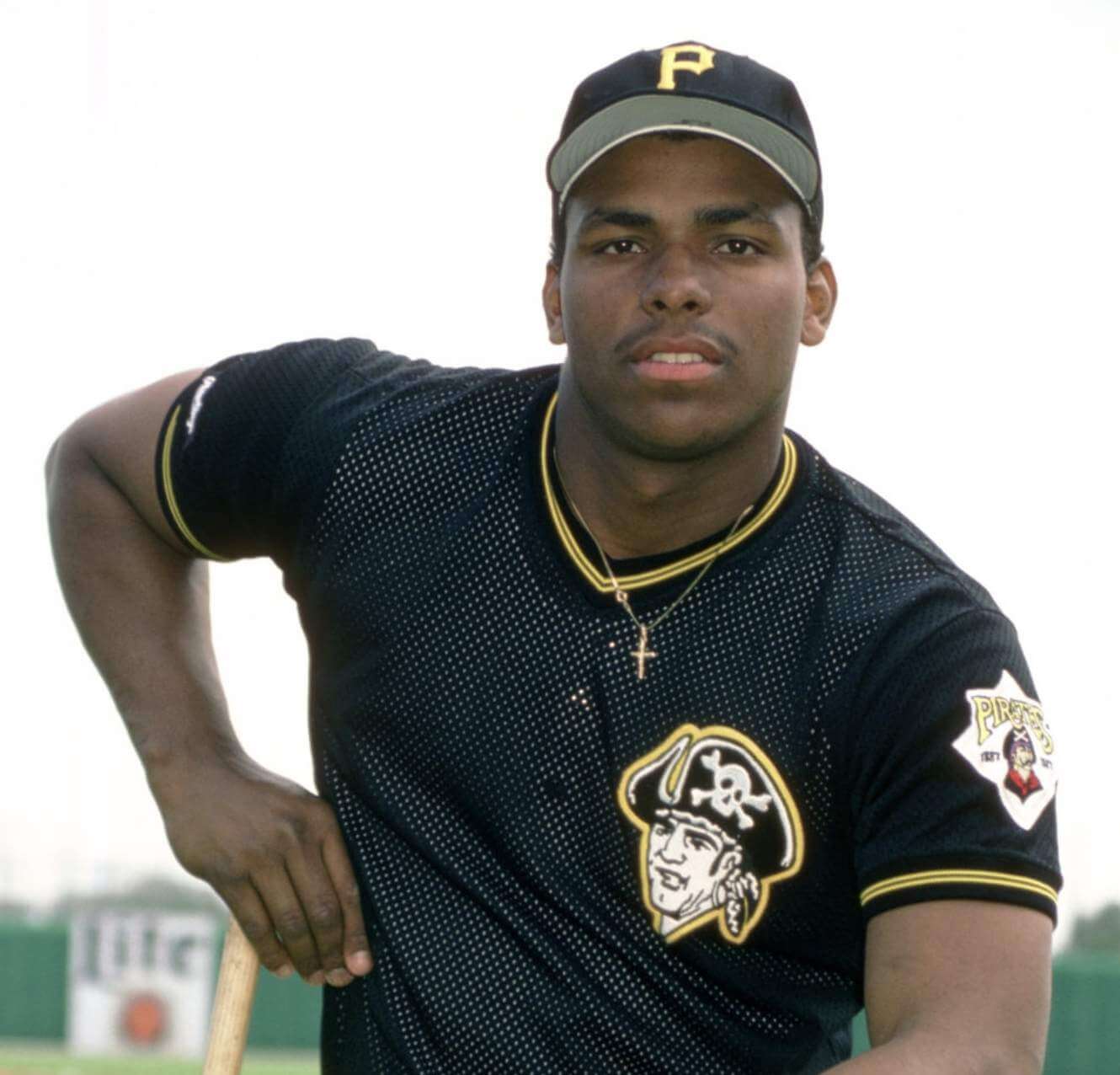
Yes, kids, that’s a young Bobby Bonilla, long before he became a holiday.
Anyway: Big thanks to Joe Werner for sharing his letters from Syd Thrift, and kudos to Thrift for writing back to Joe. I’ll give Joe the last word:
I thought it was incredibly cool that the GM of my favorite major league baseball team would take the time to reply to a letter I wrote. Now, almost 35 years later, in this world of emails, texts, and tweets, I find a typewritten letter on professional-looking stationery to be something special for different reasons.
InsideHook/TATC reminder: In case you missed it yesterday, my latest piece for InsideHook is an in-depth oral history of MLB’s “Turn Ahead the Clock” promotion from 1999. The uniforms were supposed to represent the year 2021 — the future is now! You can check it out here.
ITEM! Today is PPPC Day: As I’ve been saying for a few weeks now, today is Post-Pandemic Porch Cocktails Day, with all members of our comm-uni-ty encouraged to celebrate our return to normalcy by sharing a photo of yourself enjoying a beverage on your porch (or stoop, deck, driveway, or whatever). Uni Watch pint glasses and/or koozies are welcome but not required.
Reader Michael Malinowski has gracious offered to serve as our PPPCPC (that’s Post-Pandemic Porch Cocktail Photo Coordinator). After taking your beverage selfie, email it to Michael. He’ll arrange all of the photos into an online album, which I hope to be able to share with you tomorrow.
Let’s all raise our glasses to salute our comm-uni-ty — cheers!
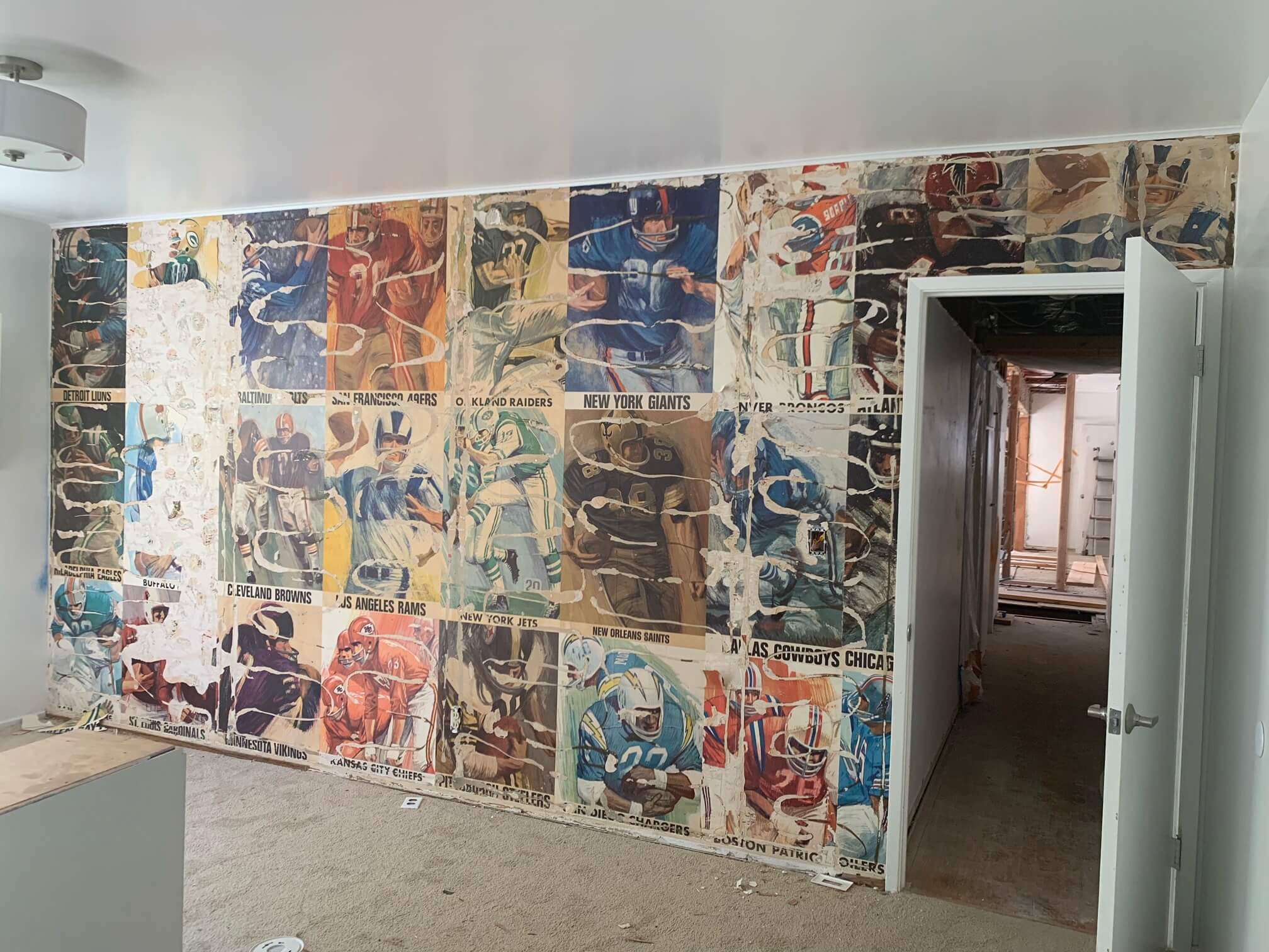
Click to enlarge
Too good for the Ticker: Got a note yesterday from reader Ryan Thompson. He has a friend who’s been renovating his home and removed some paneling to reveal some amazing vintage NFL/AFL wallpaper!
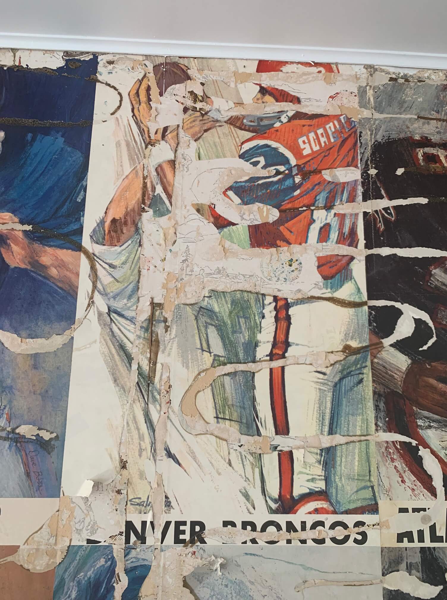
Judging by the uniform shown for the Broncos, which was worn only in 1965, the wallpaper dates back to the mid-1960s:
It’s a shame that the wallpaper was ruined in the renovation process, but it’s still a pretty amazing find!
One cap still remaining: We are now down to the very last Uni Watch cap — size 7-7/8. Somebody snap it up! Update: The final cap has now been purchased! Thanks for helping us sell through the inventory. I’ll have more news soon about possible new cap designs.
The Ticker
By Alex Hider

Baseball News: For obvious reasons, the Dodgers have canceled a Trevor Bauer bobblehead giveaway that was scheduled for August (from Brinke). … The Mets put an outdated Brewers’ logo on the bullpen mound during Milwaukee’s visit to New York last night (from @barrelman_mke). … With the unveiling of the Giants’ City Connect uniforms, here’s a concept by graphic designer Derick Lazaro that takes inspiration from the BART system map (from @texastrevor). … The Double-A Corpus Christi Hooks are giving away fauxback jerseys to fans this weekend. Unfortunately, they include a giant ad on the sleeve (from Ignacio Salazar). … Phillies P Zack Wheeler appeared to be wearing teammate Bryce Harper’s arm armor last night (from Stephen Babb).

Pro Football News: Images were released yesterday from the set of American Underdog, an upcoming movie about Kurt Warner-era Rams. Jeff Brand notes that despite the movie being set in the late ’90s, players are wearing “current-model helmets.” He also thinks the numbers on the Rams’ classic unis look off, probably because the numbers are much too small. Moe Khan also notes that the wings are “slightly off” on the AFL Iowa Barnstormer uniforms featured in the film. … New uniforms for the Colchester Gladiators, who play in the British American Football Association (from Perry Wayman).
College/High School Football News: High school offensive tackle Jake Taylor committed to Oklahoma yesterday, and instead of donning a Sooners cap, he put on the “Golden Hat” — the Red River Showdown rivalry trophy (from Kevin C. Burns). … If this video is any indication, ’70s throwback uniforms may be on tap this season for South Carolina (from Joel Mathwig). … New uniforms for Bartlesville High School in Oklahoma (from Anthony W. Tucker).

Hockey News: When the Lightning won the Stanley Cup while wearing their blue home uniforms last night, it broke a five-year streak of the Cup being won by a team wearing white. … The Caps and their arena-mates, the NBA’s Washington Wizards, have both commissioned local artists to create NFT collections (from Tom Turner).

Basketball News: Although it leaked a few days ago, the NBA has now officially unveiled the diamond-shaped 75th-anniversary logo that it will use throughout next season (thanks to all who shared). … This photo of former NBA C Elmore Smith signing with the Buffalo Braves shows him holding a strange, numberless jersey that the team never wore on the court (from @NFL_Journal). … Cross-listed from the hockey section: The Wizards and their arena-mates, the NHL’s Washington Capitals, have both commissioned local artists to create NFT collections (from Tom Turner). … Back in the day, the Bucks took a wide variety of approaches to Marques Johnson’s NOB (from @NFL_Journal). … The G League’s D League’s Grand Rapids Drive will now be called the Grand Rapids Gold (from John Chapman).

Soccer News: Ontario has a new soccer club. Simcoe County Rovers FC will begin play in the tier 2 League1 Ontario in 2022 (from Will Leslie). … New home jerseys for Premier League club Leeds United. … The next three submissions are from Ed Żelaski: New uniforms for Bundesliga club SpVgg Greuther Fürth. … New away shirt for third-tier German club TSV 1860 Munich. … New home kit for top-tier Belgian club K.R.C. Genk. … Scottish club Heart of Midlothian revealed their new primary jersey last weekend. The advertisement on the jersey was given to Scotland’s ALS charity, a nod to center-back Marius Žaliūkas, who died of ALS last year. The club’s current center-back Craig Halkett has offered to give up No. 26 to further honor Žaliūkas (from our own Jamie Rathjen). … New shirts for Italian club Bologna (Ed Zelaski again).

Olympics News: Jayson Tatum will wear No. 10 for the USA basketball team, a number he chose to honor Kobe Bryant, who wore the number during his Olympic appearances. … Here’s what Ireland’s rugby team will wear in Tokyo later this month (from Phil). … Here are the Japanese rowing and gymnastics uniforms (from Jeremy Brahm).

Grab Bag: Russian tennis player Karen Khachanov was ordered to change out his cap during Wimbledon yesterday because the black underbrim was not compliant with the club’s all-white dress code (from Mark A. Brieve). … The Los Angeles Tourism & Convention Board has a new logo for the city — and it has a totally rad ’80s vibe (from John Cerone and our own Lloyd Alaban). … This blog recaps 50 “secrets” behind brand logos (from Brinke). … Teams in Major League Rugby are auctioning off game-worn cancer-awareness jerseys with the proceeds going toward the American Cancer Society (from Andrew M.). … New uniforms for police officers in Petal, Miss. … The U.S. Navy now has a maternity flight suit for expecting crew members (from Timmy Donahue). … Also from Timmy: Fans of Jackson State’s football, men’s basketball, and women’s basketball teams can now buy the naming rights to a player’s locker. … A Covid outbreak necessitated some last-minute lineup changes yesterday for rugby union team British & Irish Lions, which resulted in some players wearing their teammates’ jerseys (from @Stumpy7780).
Click to enlarge
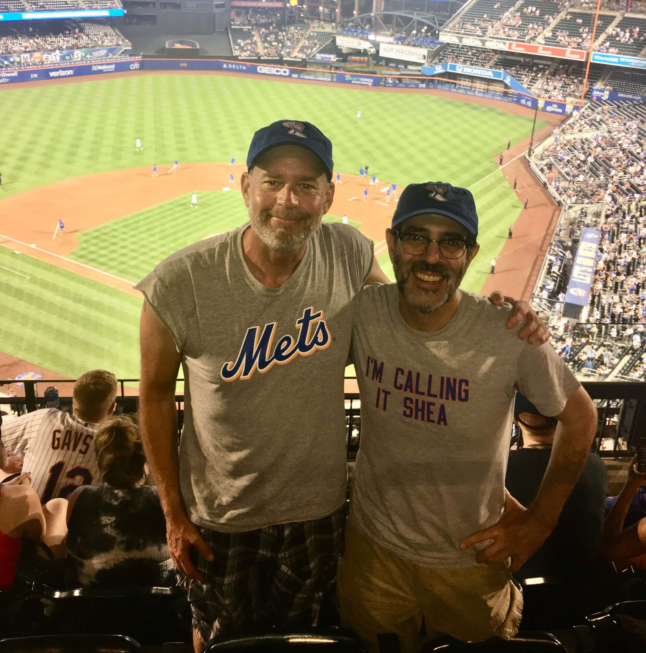
What Paul did last night : Who was that at last night’s Brewers/Mets game? None other than Uni Watch deputy editor Phil Hecken and myself. Although it’s hard to tell in that backlit photo, we were both wearing Uni Watch Color Remix caps in the Mets’ blue/orange color scheme, as you can see more clearly in this next shot:
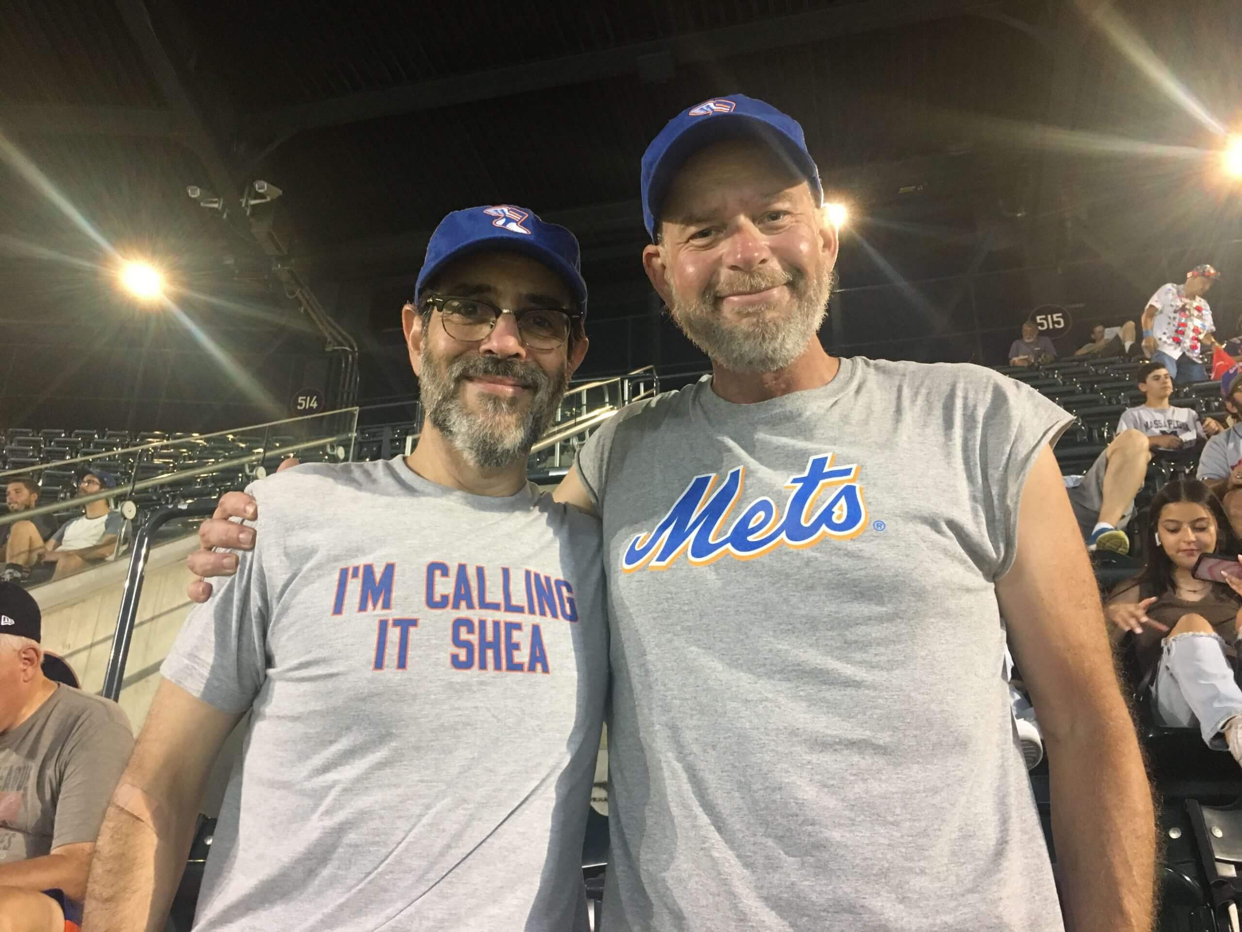
Alas, the Mets barely showed up (there was one excruciating inning when the first three guys walked and the next three guys struck out), but that barely mattered. What mattered was two good friends catching up, sharing stories, and enjoying a nice night at the ballpark.
You can also tell that the previous owner of that house got married in the late 60s.
I totally get what you’re saying, but that also could have been a kid’s bedroom at one time, that was later fixed up for someone else. I say this from personal experience. When I was very young, my parents “commissioned” my very talented cousin to paint some Peanuts scenes on one wall of my bedroom, and they turned out great. A few years later when we shuffled bedrooms, it became my sister’s room, and my dad wallpapered over the scenes with some girly wallpaper :-(. Fast forward about 30 years, my parents recently took the wallpaper down, so the scenes once again were visible, albeit somewhat obscured by a thin layer of white paint my dad rolled over them before putting the wallpaper up. Eventually they got painted over for good.
It was a …joke.
Dude, I totally get it! I have a wife and 2 daughters who hate sports, and all my posters, swag, and other memorabilia are boxed up in the basement, out of sight, out of mind!!!!
If this was in fact a kid’s bedroom…
Coolest. Parents. Ever.
The half-wall makes me wonder. Looks awfully big and airy for a kid’s bedroom. Just sayin’.
When Mickey Mantle died Bob Costas gave a beautiful speech saying something like it was for all the ones who idolized him growing up. Like me. I wrote him a letter thanking him. A year later he answered apologizing for the delay.
Similarly for me. I wrote Costas to commend him on his 2000 book “Fair Ball: A Fan’s Case for Baseball.” He sent me a handwritten postcard in return. The kicker, at least for me, is that the front of the postcard is a noir-ish print of an announcer of some sort. The back has a pre-printed return address from him at 30 Rock. For my money, Costas is definitely one of the good guys.
Anyone else find it odd that the football wallpaper gave equal design treatment to AFL and NFL teams? This was before the Super Bowl era, so it would seem the NFL was still considered the much more dominant entity.
That’s a good point. Also, depending on exactly when that wallpaper was made, the two leagues could have still been separate entities, and thus subject to two separate licensing agreements.
A quick look at the GUD to reference the uniforms would indicate it is not specific to any one year.
Broncos wore those uniforms in 1965 and 1966.
But the Saints weren’t around until 1967.
In 1965 the Chargers had those helmets, but not in 1966, and had them again in 1967.
The Oilers didn’t switch to the silver helmet until 1966.
Steelers had those yellow sleeves in 1965, but in 1966 and 1967 they switched to the Batman jerseys. Also appears they are wearing yellow pants, but had white pants in 1965.
Man oh man do I wish I could get to a Major League Baseball game….Hopefully the borders can open soon…or the Blue Jays can come home.
Blue Jays back home hopefully July 30:
link
Joe, I too was crushed when the Pena trade happened, but like you I quickly came to realize that Syd was right!!!
Those ’40 and ’41 unis were gorgeous. I would love a faux-back, either re-imagined with the black/gold scheme or the original blue/reds.
Syd was right with Van Slyke. LaValliere however could’ve been swapped out with any one of a half-dozen other non-descript catchers of the era, none of which could have held Tony Pena’s jock. The fact that LaVallier later revealed himself to be a rather large, full douchebag also didn’t help.
I actually ran into Pena as he was walking into Three Rivers for the first time as a Cardinal, on Opening Day 1987. He climbed out of a cab, and at first didn’t know where he needed to go – he’d always come in through the Pirates parking lot/entrance, and didn’t know where visiting players entrance was. The rest of the team arrived around a half hour later, by bus.
I was crushed but as a very young Cards fan. I hated to see Van Slyke traded
The letters are from 1987, which was the 100th anniversary of the Pirates joining the National League. So the Pirates celebrated that centennial by using an old logo with 1887 and 1987 on it. They took the years off and kept that for another ten years before new ownership went with its own logo in ’97.
Great jersey concept for the Giants by Derick!
That wallpaper is good stuff. Love the vintage, weathered looked to the artwork, and were it not for the heavily damaged Packers/Bills/Cardinals column, the damage from the glue almost still fit in the weathered look.
Hi Paul, thanks for sharing my old letters. When I sent them to you, I thought that they might become a Ticker item, or MAYBE a “Too Good for the Ticker.” When I saw them as the lede this morning, it really made my day! Thanks again! Regarding that picture of Bonilla, I’m guessing it’s from spring training (based on the background, and use of BP jerseys), and probably from 1987, since the patch on Bonilla’s arm has the two centennial years on it. As BurghFan noted, that logo was rolled out for the Pirates’ centennial that year, so the team probably wanted to get it out in front of fans as early as possible (ie, spring training). At the same time, it was probably still common practice back then to use old uniforms during spring training, even if they were being replaced by a new design (I think the Pirates did this in 1985 with the “We Are Family” era uniforms that were retired after the 1984 season). It was probably easier to add the patch to the sleeve and keep the old one than to remove the one from the chest.
Thank YOU for sharing the letters with me, Joe. Sorry it took so long for me to showcase them on the site!
In the ’80s, old uniforms would be used in spring training, then make their way through the minors.
By the way, I remember being excited to get a reply from Joe L. Brown when I was a kid.
Joe: I grew up in Allegheny County in the 80s and 90s, and it’s fair to say that the Pena trade was a defining childhood moment – just about the only baseball memorabilia I’ve held onto into my early 40s are my prized collection of 300+ different Andy Van Slyke cards! I’m curious about the second trade you wrote in about. The Pirates sent Jim Morrison to the Tigers on August 7th of 1987 (according to the Internet), so the August 10th reply would be remarkable turnaround!
Zach,
I honestly can’t remember which trade I wrote about in my second letter. The Jim Morrison trade seems likely, since he was another guy that I kind of latched onto when I started following baseball and the Pirates in 1987. But as you pointed out, August 10 is a very quick turnaround when the trade happened on August 7. The only other transaction around that timeframe that might have caught my attention was Don Robinson on July 31. But I doubt I would have been as compelled to write about that trade as I would have about Jim Morrison. It’s also possible that they back-dated their letter a day or two, especially if they were using a canned, form-letter response at that point.
Joe: I also liked Morrison! My first trip to a major league game was the ’87 home opener, when he hit two home runs and scored a walk-off run. One of the other few bits of baseball memorabilia that I’ve held onto into my early 40s is the scorecard that Lanny Frattare used to call the game. I bought it from his website (link). $10, a steal for the sentimental value.
Hey Joe, I’m just curious: What trade motivated you to write the second letter? My guess is either Johnny Ray to the Angels, or Reuschel to Giants. Don Robinson deal maybe?
“I’m calling it Shea” still remains the greatest of the various “naming wrongs.” Perfectly captures the whole idea and sentiment. Excellent!
I love the whole “naming wrongs” t-shirt concept, but this one doesn’t quite fit as Shea Stadium is a totally different venue from the Mets’ current place.
It does make me curious as to whether Paul literally refers to Citi Field as “Shea” in everyday conversation…
It does make me curious as to whether Paul literally refers to Citi Field as “Shea” in everyday conversation…
I do.
I love the whole “naming wrongs” t-shirt concept, but this one doesn’t quite fit as Shea Stadium is a totally different venue from the Mets’ current place.
Jasper, here’s the history behind the shirt (and, in turn behind the whole Naming Wrongs project): When the new ballpark was getting set to open in 2009, the country was emerging from the wreckage of the 2008 financial crisis. Citibank was one of the banks that had to be bailed out by the federal government. When the Mets announced that they’d sold their new stadium’s naming rights to Citi, lots of people were saying things like, “They should call it Taxpayer Park!” or “They should call it Debits Field!” and lots of other sarcastic names. So there were all these names floating around, and the Rev. Vince Anderson basically said, “Fuck it — I’m calling it Shea.” It made sense, since the new stadium was built in Shea’s parking lot. Same site, same name. That’s how the first shirt in this series, “I’m Calling It Shea,” came about. It was a big hit, and the rest of the project developed from there.
Thanks. Didn’t realize that was the first shirt in the series, so it makes more sense now. If I lived in NYC I’d probably just refer to it as “the Mets’ stadium” or something like that.
Paul,
Clearly Phil needs a raise. Poor bastard can’t even afford a shirt with real sleeves. Pay the man.
I would keep that wallpaper up, damage and all.
I agree. It’s definitely got a Pompeii-ish out-from-the-ashes fresco vibe. -C.
Paul, re. Elmore Smith and the Buffalo Braves jersey – that’s the uniform the Braves wore for their inaugural season in 1970. The home jersey had red & gold trim, with Braves in gold trimmed in red (there was also a variation used with no “tail” extending from the S), and the road jersey had “Buffalo” in gold trimmed in red. They switched to the much more well-known orange & black unis with the diagonal striping the following season.
I’d been researching NBA uniforms for around 15 years before I ever found a pic of this set – it was probably another decade before I found any colour pictures!
Interestingly, the 1970 Braves road uniform had no white on it; the home set had no blue. Buffalo took the baseball approach of using one color scheme for its graphics, but using them against two different backgrounds (in baseball, the backgrounds are usually white and grey).
Neither did their expansion mate the Cavs. Just wine and gold.
My guess is that it’s not wallpaper, but rather twenty-five Dave Boss posters plastered onto the wall. Also, the Rams was the only team used twice.
The decorator left out the ‘skins, which is fine by me since the Boss-designed depiction for them in his poster series was not all that attractive…good call leaving them off the wall.
Yes, those are Dave Boss NFL posters from the period!
I had them all on my bedroom wall back in the day. I think I ordered them from the back of a magazine–Sports Illustrated, perhaps.
Loving the Jackie Robinson sleeves on Phil’s shirt. Perfect for this heat.
I saw another still shot from the Kurt Warner movie where the actors are all in Rams gameday uniforms but holding a football devoid of any commissioner’s signature, NFL shield, Wilson logo, etc.
As a 59-year old, lifelong Pirate fan, I must say I do not like the current pirate head logo, and would welcome a return to either of the prior logos.
Agreed! Can’t stand their current logo.
Growing up a Cardinal fan, I always thought the 70’s era logo looked like Mike Shannon. I couldn’t figure out why Mike Shannon was on the Pirates logo!
Ha! I can see that, actually! Good one.
Not sure if this was ever shared, but with the NFL easing on its one shell helmet rule for next season, the 49ers are considering going with a plain red helmet with silver stripe and gray face mask, recreating the 1955 look. Link of article below:
link
Speaking of TATC night in 1999, I was working my only summer as a Twins usher at the Metrodome, I remember being a young 18 year old excited for the game, only to find out how really lame and boring the uniforms really were, like everyone said, it was just the logos blown up.. I was really disappointed.
For that particular game, I was working a gate, so I didn’t see for sure whether or not they implemented any in-game or between innings athletics or aspects of the “Future” in the stadium, but as far as the uniforms themselves, very lame.
Also I remember it was pitcher Mark Redman’s MLB debut, he got the start last night, I wonder if there were any other players who made their debut in those funky uniforms?
link
I have a story from, I believe, the 1970s. Maybe 60s.
My father, a life-long and bitter White Sox fan was sick of what the team was doing at the time (1960s – 1970s, this makes sense). He called the team to complain. Lady answered, and gave the phone directly to Bill Veeck himself, who listened to by dad complain.
Well, getting the owner himself on the phone definitely trumps my letters from the GM! For reasons that escape me now, I found myself on Bill Veeck’s Wikipedia page the other day. He served in the Marines in WWII, and had one of his legs badly crushed by a recoiling piece of artillery. He eventually had to have the leg amputated, and replaced with a series of wooden legs. According to the article, Veeck, being a heavy smoker, had holes drilled in his wooden legs so he could use them as ashtrays!!! How crazy is that???!?!
Speaking of TATC night in 1999, I was working my only summer as a Twins usher at the Metrodome, I remember being a young 18 year old excited for the game, only to find out how really lame and boring the uniforms really were, like everyone said, it was just the logos blown up.. I was really disappointed.
For that particular game, I was working a gate, so I didn’t see for sure whether or not they implemented any in-game or between innings athletics or aspects of the “Future” in the stadium, but as far as the uniforms themselves, very lame.
Also I remember it was pitcher Mark Redman’s MLB debut, he got the start last night, I wonder if there were any other players who made their debut in those funky uniforms?
link
Paul—which of the Pirates logos do you prefer the most? I kinda like the “Mel Gibson” version from the 1960s, but all are equally unique and silly in their own way. I think a parrot secondary logo could work, too.
Never thought of him as Mel Gibson, but yeah, that’s the one I prefer.
I like the “wanted poster” backdrop to the smiling pirate.
Wowza. SF uni design by Derick Lazaro positively great! Vastly superior to the official version.
I one-hundred percent agree. It’s the kind of thing you’d get if the City Connect program’s mission statement was sincere.
Does anyone know how the jersey numbers are determined for the USA Basketball Team? I believe you can only wear numbers 4-15 in international play. However, I always wonder how the players end up choosing their numbers for USA Basketball. I would love some insight about this.
Two Buffalo items…
Elmore Smith was holding the first Braves jersey.
link
The Dave Boss poster for the Buffalo Bills doesn’t features a strong rusher or a speedy receiver. It features a quarterback getting sacked. Sums up the late 60s Bills.
link
Nice photos of you and Phil. Glad you could take in a game.
The Buccos dude-logo has gotten progressively worse…I prefer the original to the middle version, and the middle version to the current version. However, the current version has an alternate take that can be found in some places, where the guy is instead just a skull:
link
This is probably my favorite of all the options, and they should start using it more often immediately, including on the jersey sleeves. Make the bats yellow and you’re all set.
That Kurt Warner movie looks embarrassing.
New 75th Anniversary Logo for the NBA.
link
Hey, Paul. I was at the Mets game last night too. First one this year and first since Aug 2019. Went with a guy I worked with for many years. Totally echo what mattered was two good friends catching up, sharing stories, and enjoying a nice night at the ballpark. Let’s Go Mets!
RE: Jake Taylor. It has come to this….the 26th ranked offensive tackle in the country gets to make his overblown announcement on live national TV.
Assume that is former Broncos receiver Bob Scarpitto on the wallpaper…kinda scary that I know that.