By Phil Hecken, with James Lansdowne and William Weible
Follow @PhilHecken
Good morning Uni Watch nation. Hope everyone is doing well and that you had a good week.
You fine readers may recall a few months back, we took an in-depth look at a proposed new identity for Cleveland’s baseball team, to be called the Cleveland Municipals (click here), which was followed shortly with a second post (click here) which addressed the development of the name “Municipals,” and discussed some of the other options which have been bandied about (Spiders, Guardians, Rockers, etc.).
That is just part of a project created by Will Weible and Jamie Lansdowne, who have continued to work on their project in the hopes the Cleveland baseball team will adopt their preferred moniker, “Municipals,” when the team finally announces a new identity sometime in the future. Will and Jamie are back again today, for Part III of this series, where they discuss possible mascot options for the Municipals.
The Cleveland Municipals — On Mascots
By Will Weible and Jamie Lansdowne
Cleveland’s MLB team recently released a statement on their progress as they search for a new name, saying it is necessary the new name accomplishes three main goals: it connects to the city, it preserves our baseball history, and it unites the community. “Municipals” ticks all of these boxes and more, building off of the team’s 120-year foundation and expanding it for a modern fanbase. Renaming one of baseball’s oldest teams is a delicate undertaking, so we thought it helpful to take a look at how team names and mascots function in sports — and Major League Baseball in particular — and then lay out why “Municipals” has the necessary staying power to serve Cleveland well for decades to come.
One of the most frequent questions Munis HQ gets asked is what our mascot would be. We always found this strange because if you take a look at the other teams in MLB, mascots just aren’t given that much prominence. Sure, you have a few birds, a fish, and a baby bear, but by and large you don’t see many literal embodiments of a club’s team name in their hat logos and jersey wordmarks.
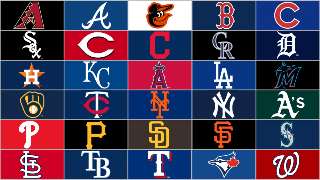
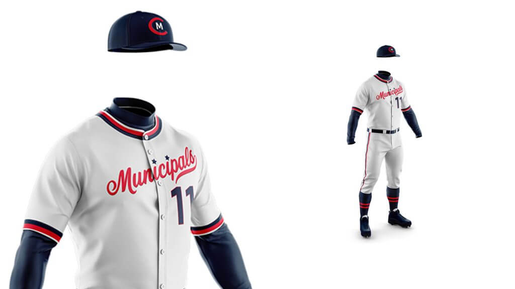
The hat is where logos shine, while jerseys are typically reserved for wordmarks. Twenty of the 30 teams’ hat logos are simply their initials, and of the remaining 10 only the Marlins, Blue Jays, and Orioles explicitly include a mascot. The rest, like the Angels, Astros, and Mariners, hint at the hometown characteristic that inspires their name. We think the combination of a letter-based hat and clean jersey wordmark is a good look rooted in baseball tradition, which is why we’ve retained it for the Municipals.
Another common critique that puzzles us is that “Municipals” doesn’t sound tough or intimidating. How many MLB mascots could be classified as intimidating? Do people think professional athletes and fans are intimidated by team names and mascots? If we’re playing the Detroit Tigers do people think, “Gosh I’m not so sure about tonight’s game, tigers are one of nature’s most fearsome predators”? It sounds silly, but we hear it frequently. So when people ask us, “What’s a Municipal supposed to look like?” we can’t help but think, “Well what’s a Yankee or Athletic or Phillie or Dodger or Met or Astro or Brewer or Red or Royal or National or Rockie supposed to look like?” The Yankees have the most World Series titles out of anyone—is their mascot intimidating? Even the Cleveland Torso Killers would be a laughing stock if they went 20-134.
The point is, sports team naming conventions are such that, when taken out of context many would appear absurd, but when viewed within context they lock into place. At best, a team name authentically represents its hometown, but many names are successful simply because they fit the naming conventions of their sport. Take, for instance, the White Sox and Red Sox. Within baseball those are two classic and esteemed names, and some have even suggested Cleveland should rebrand as the Blue Sox. Take a step back and you’ll realize that these franchises are named after laundry, yet these names have stood the test of time and have represented two proud fanbases for over a century.
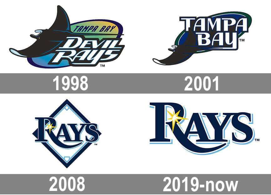
Even franchises with what some would call “marketable” names seem to shy away from them. The aforementioned Tigers primarily use the stylized “D” and the Tampa Bay Rays have gone so far as to rebrand away from their original manta ray namesake towards a more abstract burst of sunshine. Were Cleveland to adopt what some call “marketable” names like the Spiders or Guardians, we think the oversaturation of similar superhero characters and franchises would cheapen our team’s legacy and reduce our stature in the league. Many times in sports, especially baseball, less is more. Our team has too much history for it to ride the coattails of other pop-culture trends.
So how should we approach a new name if not going for intimidation or pop-culture-style “marketability”? We believe Cleveland should do everything possible to preserve its rich baseball history with a classic baseball-style name that authentically connects to the city they play for and unites the community they represent.
As we’ve said elsewhere, Municipal Stadium was a jumping off point, but the Municipals name, by definition, encompasses the entire city. Our primary logo is partially inspired by the old stadium, but anything in our geography, architecture, culture, and history is fair game. Those who say the Municipals lack marketability just aren’t thinking big enough.
Take for example the Cleveland Browns. With the exception of a brief blip that proved the rule, the Browns are a perfect embodiment of the power of legacy and why less is more in sports. The Browns do not have a logo, they wear a standard, classic-football uniform, and have some of the strongest brand recognition in sports, even during two decades of mostly miserable play. The Browns’ greatest strength is staying true to themselves and to the city, not playing to fads that pass quickly or outside opinions that don’t matter to Cleveland. For fans who still crave a mascot, the Browns have employed Brownie the Elf and the Dawg Pound as secondary or tertiary symbols for decades without compromising the integrity of their classic look. In short, the Browns maintain roots few teams can claim.
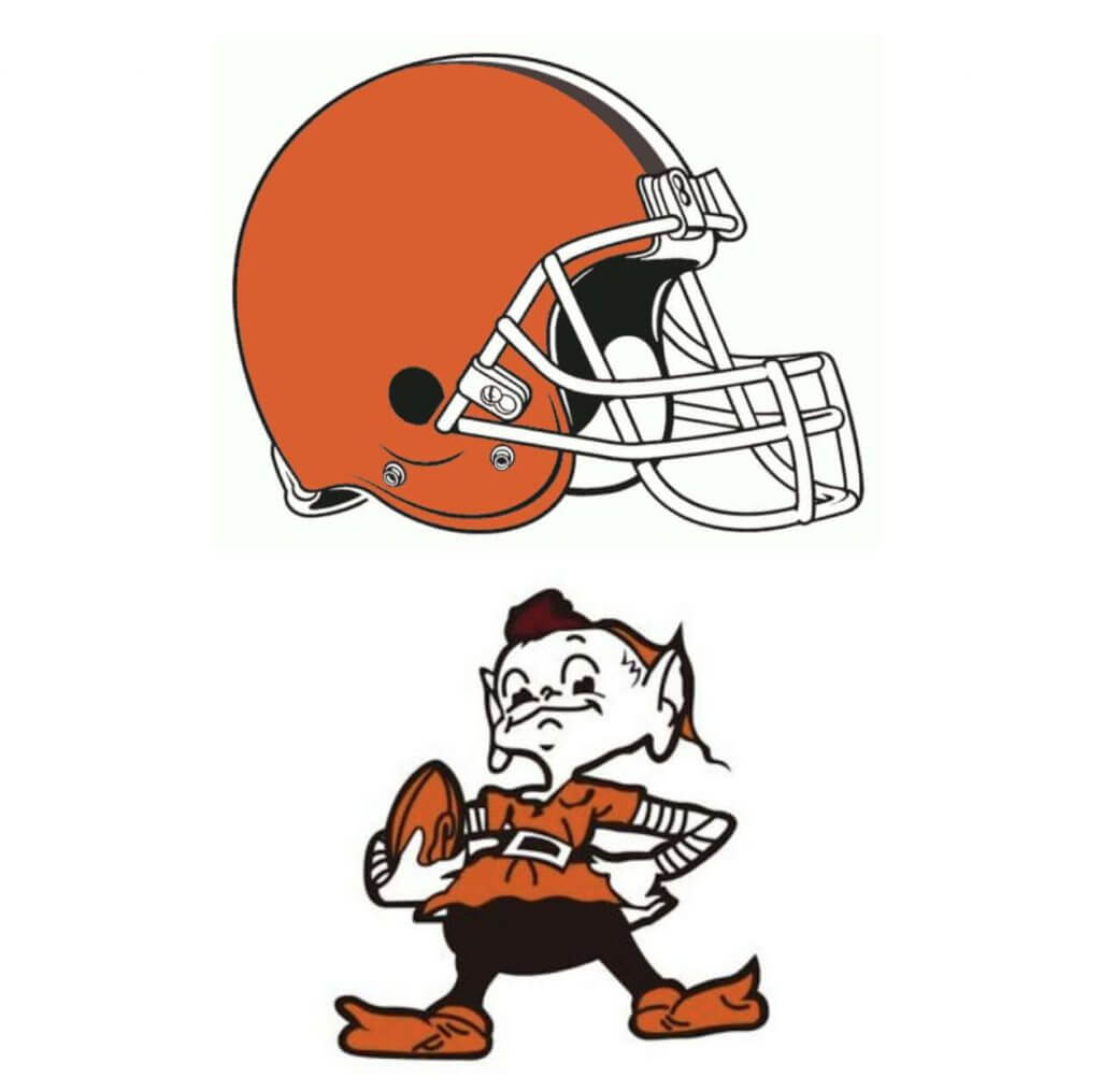
So we encourage folks to look beyond the surface and see the potential for depth as this new era of Cleveland Baseball begins. Just like the Browns name means more to Cleveland because we understand the team’s heritage, the link to our founder, and our role in developing football, the Munis name would celebrate the history of Cleveland sports in our longest-serving home stadium and emphasize the “municipal” sense of ownership and dedication Clevelanders feel for their city and their teams.
The main consideration is that we are not naming a new team, but instead choosing a new name for a team that has deep connections to its city and fanbase. If there was no history of baseball in Cleveland you could get away with any random name. Expansion teams do it all of the time because they need to forge identities. Cleveland baseball already has an identity, and because we’re one of the oldest franchises in baseball it would be a shame to throw that away by choosing a name that sounds like an expansion team. Few clubs can claim to be a founding member of the American League, so we must capitalize on that by choosing a timeless name that sounds like it’s been around that long. “Municipals” accomplishes that, while also recentering the focus onto a united community moving on from a divisive name and into the future together.
Clevelanders have many passionate ideas on what the next name should be. Rightfully so. Some portion of the fanbase will inevitably be unhappy no matter what the name is, but we believe one of the strengths of Municipals/Munis is that it functions as an all-encompassing title that can represent the many ways Clevelanders identify with their city and team. We’ll be elaborating on how the Munis uniforms will allow fans to see their Cleveland represented by the team in a future post, but for now let’s take a look at how fans of some other common name suggestions can find elements of their preference reflected in the Municipals concept.
“Guardians” is based off of one specific bridge in Cleveland, but we understand that some supporters are trying to get at a larger civic history and pride. The Municipals name is grounded in that same sense of civic history and pride, while expanding the concept beyond one location as we lean into the word “municipal,” which means “related to a city or town.” We gather that Guardians is also meant to indicate a united front defending the city — the municipal spirit in the Munis name is borne from Clevelanders’ famous loyalty and tireless defense of their city and teams. Whereas Municipals exhibits a grounded Midwest strength, Guardians feels as if it’s trying to appear tough with superficial bravado that just doesn’t land in the big leagues.
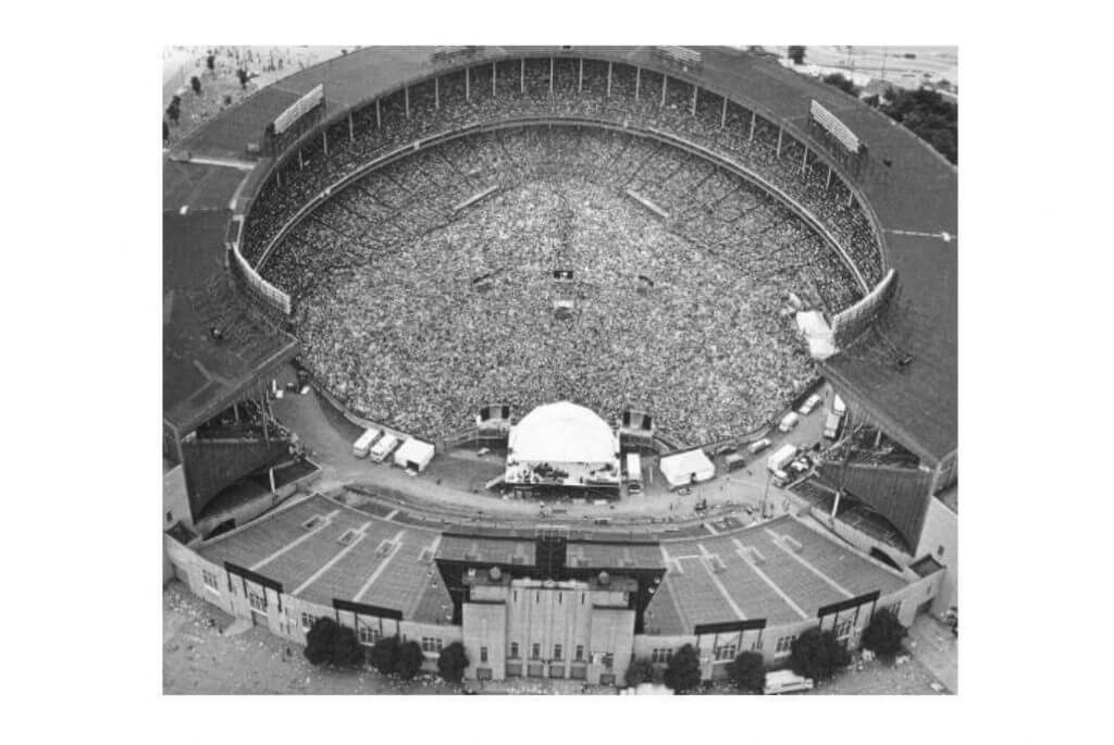
For those still craving a famous piece of Cleveland architecture to capitalize on, the C in our logo directly corresponds to the aerial view of Municipal Stadium, which plays a far larger role in Cleveland’s cultural heritage than the Lorain-Carnegie bridge (and has a stronger connection to the team we are renaming).
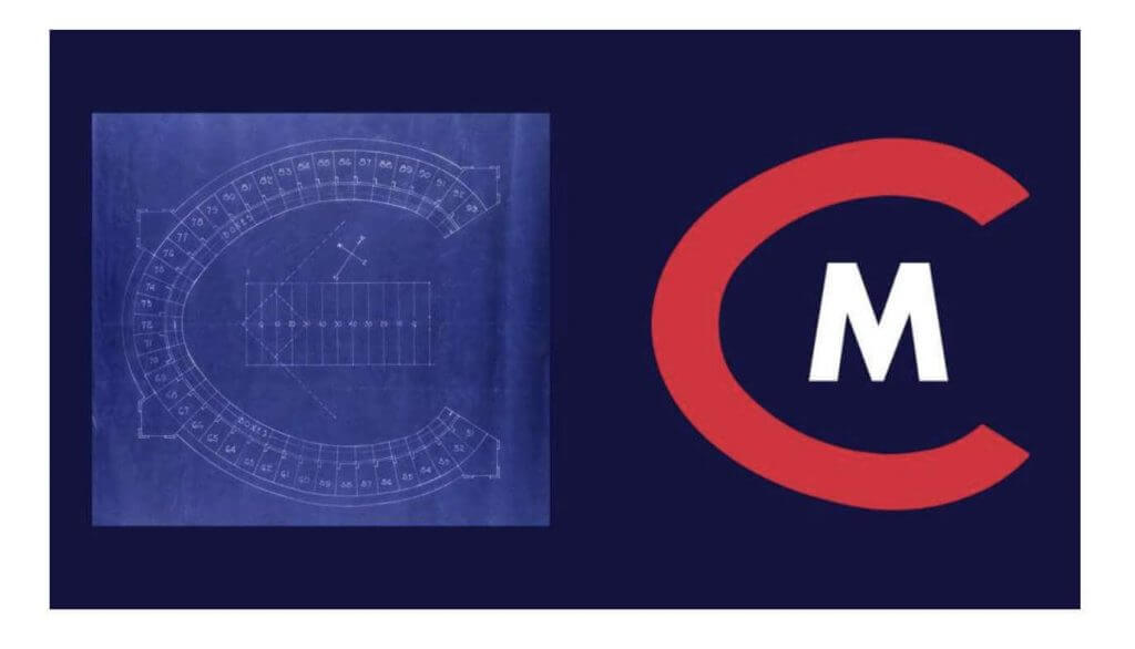
While the stadium is represented in the logo, any element of Cleveland can find its way into the concept in a variety of forms, much like Brownie the Elf and the Dawg Pound. We do agree the real-life bridge statues are beautiful, so perhaps that iconography could be used in a different way. We see the sleeve patches on Municipals jerseys functioning as a sort of carousel of Cleveland symbols, furthering the connection between the team, the city, and the fans.
“Buckeyes” has long been considered an ideal successor to the Indians name. In addition to being the state symbol, this name would honor the city’s most successful Negro League team, paying homage to an all-too-often overlooked part of our city’s and country’s history. Unfortunately, it is highly unlikely this name can be used due to the presence of Ohio State. Even still, we feel the legacy of the Cleveland Buckeyes is long overdue to be incorporated into our MLB team. The Municipals logo is a nod to the Buckeyes, incorporating elements of color and design from a logo they wore in celebration of their 1945 Negro League World Series championship, part of which was played at Municipal Stadium.
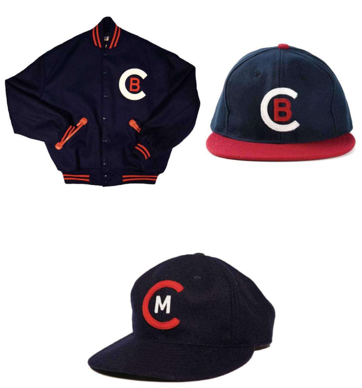
On jackets of the era, the Buckeyes had a white C enclosing a red B. Our logo uses a red C to continue the Cleveland tradition of a red C on a blue cap, while enclosing within it a white M. In this way, the Municipals are embraced by the city of Cleveland, much like the stadium itself held within it important events throughout its existence. We believe referencing the Cleveland Buckeyes in our primary logo is an important step in elevating Cleveland’s Negro League history to the major-league level it has long deserved.
Rockers has also been batted around as a potential name. Choosing a name directly related to rock and roll would continue a trend we believe has been overdone by nearly every major event we’ve hosted in the last quarter century. However, we can still honor this important contribution Cleveland has made to the world. By using Municipal Stadium as a jumping off point, the Municipals can achieve a larger narrative of Clevelanders’ relationship with their hometown. Municipal Stadium played a large role in reinforcing Cleveland’s status as the birthplace of rock and roll. The stadium played host to incredible solo acts in the early years of the genre, including a Beatles concert during their final American tour, and many other big acts throughout the years from Springsteen and U2 to the Rolling Stones and Pink Floyd. From 1974 to 1980, it was home to the legendary World Series of Rock, and in 1995 it was the venue for the inaugural concert for the Rock and Roll Hall of Fame, which had perhaps the greatest lineup in rock and roll history.
The Spiders have been a lingering suggestion for some time, based on the brief existence of an early National League team named the Spiders in the 1800s. We agree that honoring Cleveland’s exceptionally long baseball history should be a priority, but we don’t think the Spiders name sufficiently brings that extensive history into the future where today’s fans can interact with it. “Municipals” maintains a direct connection to the current franchise, while the overarching “municipal” homage to the city allows us to be inclusive of all of Cleveland’s baseball history. “Spiders” would pigeon-hole the franchise by honoring only one specific team no current fans have a living memory of, but “Municipals” gives us a chance to tell the story of Cleveland Baseball and our relationship with it over the last century.
The Municipals emphasize the community’s relationship with our history because the community is the critical ingredient to this team. Without fans, professional sports would not exist as they do, with the grandeur that they enjoy. What makes Cleveland sports different is not the performance of the team or the intimidation factor of our mascots — it’s the unrivaled dedication of the fans. It’s the same reason the name change is such a passionate topic — our city’s oldest team is an extension of us, a repository of our memories with family and friends, an anchor to our childhoods and a common ground that is real and profound. In addition to suiting the team and the sport of baseball, the name should honor the fans, the people that imbue the team with all of its importance and remember its history and care for its existence.
So what are the Municipals? The Municipals are a tribute to the city of Cleveland and its people, the culture and legacy we share and the community we’ve created around those things. The Municipals are rooted in a place where we watched America’s Pastime in one of those golden-age cathedrals that simply do not exist anymore, save for Fenway and Wrigley. The Municipals are a celebration of our deep baseball history and how that history unites the community in a higher level of fellowship we aspire to beyond the world of sports. By honoring our team’s legacy and leaning into the word “municipal,” the Munis signify that this team, and by extension this city, belongs to and represents all Clevelanders.
Certainly we can all get behind that.
Thanks Jamie & Will! Thank you for sharing this project with us. You can follow their efforts on Twitter: @clemunicipals and Instagram: @clemunicipals.
Readers? What say you?


NBA PRIDE In The Name of Love
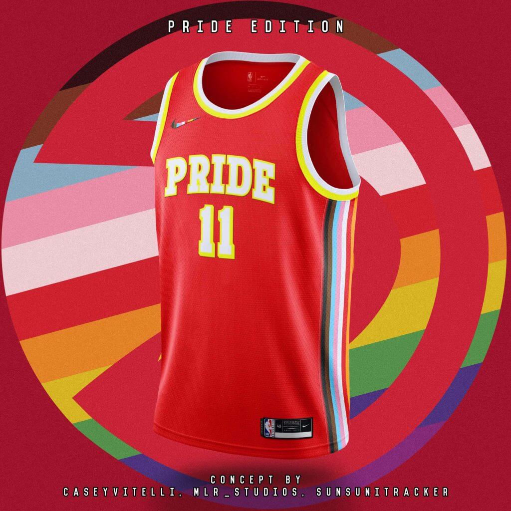
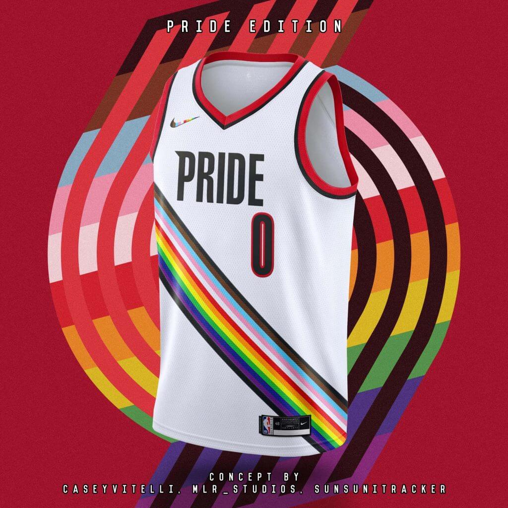
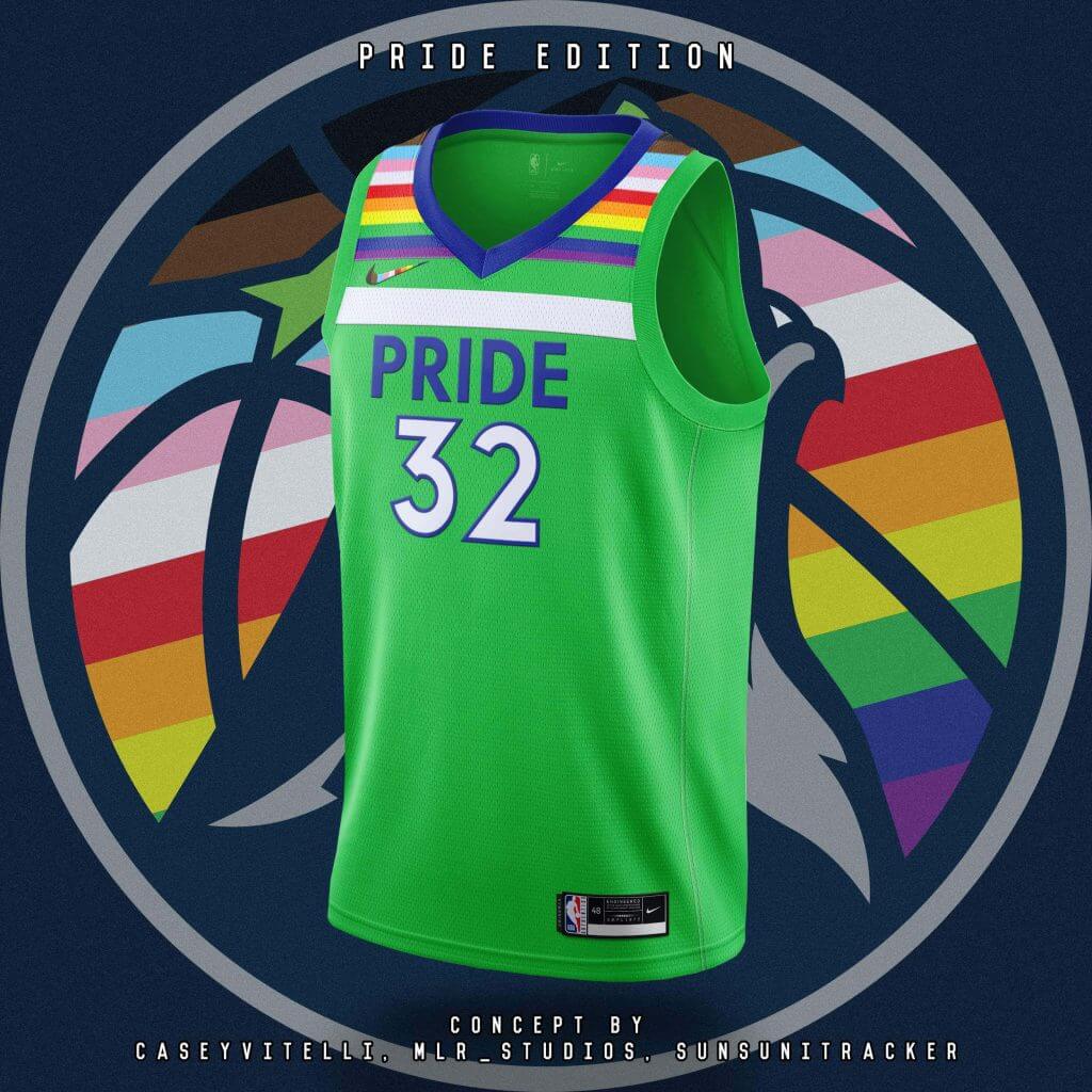
You guys may remember I have done a few articles featuring the graphic design of Mike Joseph, and more recently, Casey Vitelli and Nick Mueller (as well as a more recent one introducing the “Jersey Club”. Since then, they’ve done a few various NBA uniform redesigns, and most recently, they completed a “Pride Edition.”
I’m not going to feature it as a lede here, as there are simply too many jerseys to show (and many of them share a similar motif), but the Jersey Club have done a really nice job giving each NBA team a “Pride” themed logo as well as uniform jersey tweaks. What I like about these is that while the jerseys are accented in pride colors, it’s not overdone, so it’s a simple tweak (honestly I’d prefer the name of the team on the jersey instead of the word “Pride,” but that’s a small complaint).
Anyway, first check out all the logos they have created:
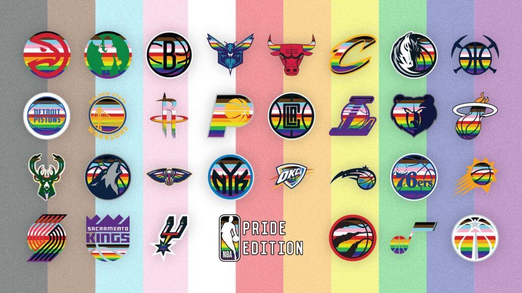
Some of those are really good, no?
A few of the jerseys also stood out to me:
Atlanta Hawks
Portland Trail Blazers
Minnesota Timberwolves
You can see the entire project, along with every NBA jersey design here. Definitely worth checking out!


Guess The Game…
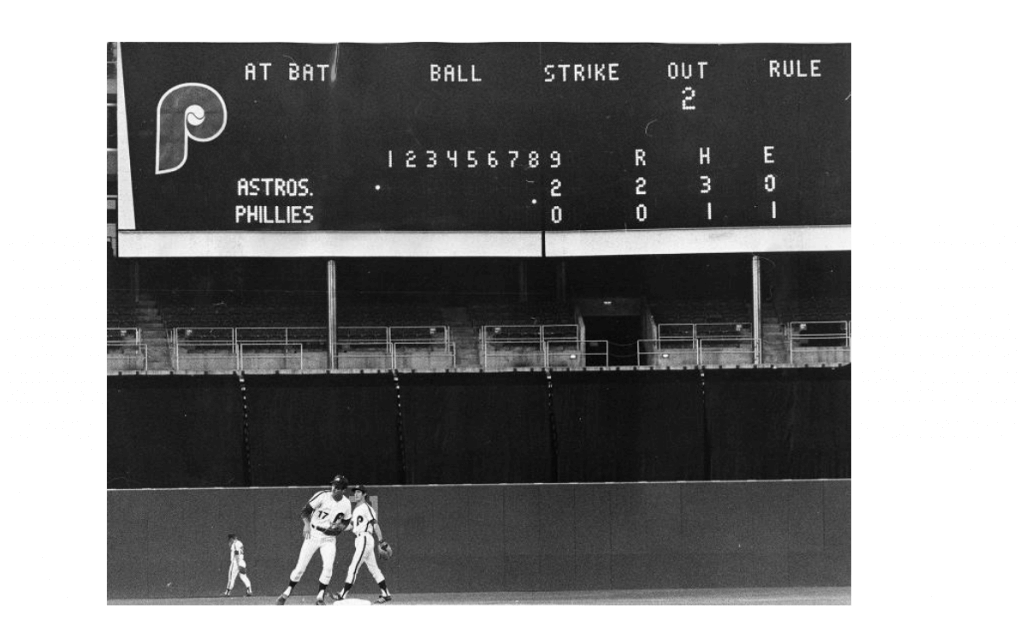
from the scoreboard
Today’s scoreboard comes from Chris Hickey. It’s not a typical GTGFTS, so here’s Chris to slightly elaborate:
Hey Phil:
Attached are 2 shots from an odd one. Maybe you could combine them into 1 photo?
Peace,
ChrisH
The premise of the game (GTGFTS) is simple: I’ll post a scoreboard and you guys simply identify the game depicted. In the past, I don’t know if I’ve ever completely stumped you (some are easier than others).
Here’s the Scoreboard. In the comments below, try to identify the game (date & location, as well as final score). If anything noteworthy occurred during the game, please add that in (and if you were AT the game, well bonus points for you!):
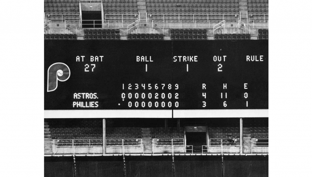
Please continue sending these in! You’re welcome to send me any scoreboard photos (with answers please), and I’ll keep running them.


The Ticker
By Anthony Emerson

Baseball News: The Cubs have worn their blue alternate unis for each of their last five no-hitters, all on the road. … Could the weird floral pattern on the All Star Game unis be a holdover from the original plans to have the game in Atlanta? The flower is similar to Rosa laevigata, Georgia’s state flower. … Also posted in the College Football section: with Jack Murphy Stadium set to be demolished, the Holiday Bowl will move to the Padres’ Petco Park. Here’s how the field will be laid out (from Kary Klismet). … The Mets have been teasing the return of the BFBS jerseys, including at the Stadium last night, and it appears as though they will definitely be worn in July.

NFL News: A Chiefs blog wonders if the team could start wearing throwback helmets with the nixing of the one-shell rule in 2022. Except, of course, KC could always wear throwback helmets because every helmet in their history is red! (from Kary Klismet).
College Football News: Cross-posted from the baseball section: with Jack Murphy Stadium set to be demolished, the Holiday Bowl will move to the Padres’ Petco Park. Here’s how the field will be laid out (from Kary Klismet).

Hockey News: The Hockey News has published a list of the top 10 logos outside of the NHL (from Kary Klismet).
.

Soccer News: UEFA has unveiled new logos for the Europa League and the inaugural logos of the Europa Conference League (from Kary Klismet). … Belgian side RSC Anderlecht have unveiled their new home shirts (from Ed Żelaski). … Also from Ed: Raith Rovers of the Scottish Championship have a new home kit. … Jamaica has unveiled new home and away kits (from @texastrevor). … Scottish Champions Rangers new home kit has leaked. The shirt will be formally launched today. … Pretty interesting sleeve design on the new Preston North End home kit. … French champions Lille OSC have had their new home and away kits leaked. … Norwich City’s new shirt advertiser will be Lotus Cars. Lotus is headquartered in Hethel, England, about 20 minutes away from Norwich’s stadium.

Grab Bag: The logo for next year’s Kentucky Derby has been revealed (from Patrick O’Neill). … What are the 20 most unique college mascots? Newsweek has thoughts (from Kary Klismet). … How do sunbleached stadium seats get restored? Well, you need to fight fire with fire (from @jayappletree).


Uni Tweet of the Day
I never thought in my lifetime I’d ever appreciate a suggestion like this. Those TATC jerseys were brutal. But the ASG jerseys are worse.
Instead of these monstrosities, MLB should have brought back the Turn Ahead the Clock unis from 1999 for the #AllStarGame since 2021 is the year those uniforms were supposed to throw ahead to. https://t.co/9120xl9WYj
— Fusilli Jerry (@schraderbrau88) June 26, 2021


And finally… big thanks to Will and Jamie for sharing another chapter of “MUni Watch.” Even if “Municipals” is not chosen as the team’s new name, it won’t be for lack of persuasion and effort on their part.
Didn’t really have a sunset yesterday (clouds came in very late in the day and settled down by the horizon at dusk), so I’ll share the one we had Thursday:
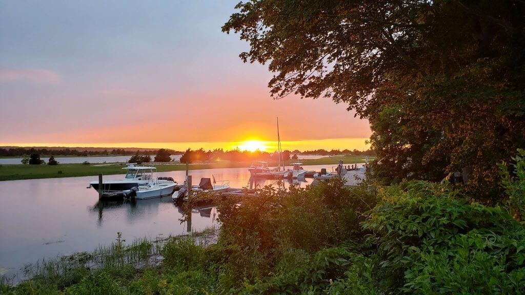
It’s tough to make out in that photo, but Thursday’s sunset was the exact opposite — after a mostly cloudy day and evening, the sun barely broke through the clouds as it was going down, for a rather pleasing effect (love the pink glow of the cloud just above the horizon).
That’ll do it for today. Everyone have a good Saturday and I’ll catch you back here tomorrow!
Peace,
PH
As many said to each of the last two posts, this is a well-considered post backed by nice graphics work that comes to such a wrong conclusion. No matter how many times they say otherwise, Municipals has the double-distinction of being uninteresting and almost exactly like an existing team’s name (the Mets). How many more of these posts are left in the can?
I do like the hat emblem.
Also, Phil, I think you meant “bandied about,” not “bantered”
Also, Phil, I think you meant “bandied about,” not “bantered”
I did! Not sure how I missed that…good catch. Now fixed.
How many more of these posts are left in the can?
X+1, with X being the number of posts they’ve written plus the one they will write when another name is actually chosen by the team.
Cleveland Municipals sounds bad so they won’t pick it. Tying into a hundred years of history just isn’t as important as how it sounds. There’s a reason the Mets, Philies and Reds don’t go by the Metropolitans, Philadelphians and Red Stockings (respectively) which either have more history or all unite the whole city better. They go for the snazzier version.
And no-one thinks Cleveland Munies is a good name.
I appreciate the thought & effort put in by Will & Jamie but as a lifelong Cleveland fan and one who thinks it’s the finest city in the world, I loathe the idea of naming the team after that old dump of a stadium. Backed up toilets, obstructed views, awful baseball and tens of thousands of empty seats is what I think of when the old stadium comes up. The place was such an atrocity that the team was in danger of moving for decades until the tax to build the Gateway project was passed. Municipal stadium was a Browns stadium. The baseball team was a tenant & an afterthought for the stadium’s last three decades.
I suspect the new name will be something we’re not talking about. The only guarantee is the name won’t be offensive or one that forces a big payoff to a trademark squatter. I do not envy the task in front of ownership as no matter the new name, a good segment of their customer base is going to hate it. Kudos to Will & Jamie on their idea and I hope they are correct and the team chooses a name that celebrates its community, its local history and its future.
Agreed. If you want to name them after the stadium, call them…
Cleveland Mistakes
Cleveland Turds
Technically the Chiefs “throwback” helmets are a darker shade of red than they currently wear. So sure they could have done a throwback during the one-shell era because nobody but hard-core fans and really eagle-eyed Uni-watchers would have noticed.
I don’t know… the shades of red look the same to me:
link
I’m not saying that the Chiefs/Texans haven’t had some slight variations in the shades of red they’ve used for their helmets over the years based on what’s been available from manufacturers at various times. But the differences have never been, nor were they intended to be, significant.
Every time I’m aware of that the Chiefs have worn throwbacks – 1994 and 2009 in particular – they’ve worn their standard red helmets, with changes only to the decals and/or facemasks. Based on how the Chiefs themselves treat their official shade of red for throwback purposes, they could could have worn throwback helmets under the “one shell” rule without missing a beat.
I’ll leave the discussion over whether “Indians” is an offensive name to actual Native Americans, but this whole “Municipals” proposal seems like a real wasted opportunity. Why not work with Iroquois leaders/people (or at least the Native population of Cuyahoga County) to come up with a name that would honor their culture/history in a way that’s satisfactory to them? If we’re trying to correct an offense against a particular culture, simply walking away from even acknowledging that culture at all just seems lazy.
Makes sense and might even lead to a name everyone likes.
I get the impression the Cleveland Baseball Team isn’t choosing to change their name to better engage with the local native communities (that they’ve ignored or dismissed for the decades they’ve been campaigning against the current name).
They’re changing the name because it’s untenable in the current climate. It’s not unreasonable to assume they want to get as far away from political discussions as possible and get back to their core business, selling a captive audience $12 domestic draft beer… I mean baseball.
There have been organized protests regarding Cleveland’s name by native american groups on opening day since 1973. The team is changing their name due to league and sponsor pressure not a desire to honor native tribes properly, so I wouldn’t expect those groups to take an offer like that seriously.
Plus I’m sure ownership want to get as far away from controversy as quickly as possible and focus on their core business, selling $12 draft beer to a captive audience… I mean baseball.
In my opinion the municipality’s just doesn’t sound like a sports team. I would honestly like them to do what Washington did and just be called The Cleveland baseball team.
For my part, I’ll once again comment that I love the name Municipals and agree very much that the team deserves a name that embraces its history, through good times and bad, and has the feel and gravitas of a team that’s been around since the very beginning of the American League.
I’m sorry but rounded ‘C’ on blue cap = Cubs. The fine, clever point of it being shaped like the old stadium will be lost on everyone.
Agreed. And I wonder if it would even survive a trademark challenge?
I couldn’t support Jamie’s and Will’s efforts and the Municipals movement more than I do. Go Munis!
Two words:
CLEVELAND SUPERBAS.
Three words:
CLEVELAND TIP TOPS.
Two words:
CLEVELAND TRIBE.
A lot of us already refer to them that way. As in, “Hey, how did the Tribe do today?” I think that moniker would be a guaranteed winner for those of us in NE Ohio. Management could have changed to “Tribe” 10-20 years ago and I don’t think fans would balked much. God help us if we get stuck with a name like Spiders.
New Uni Watch t-shirt once the name change is official: I Call Them The Tribe.
If Cleveland isn’t going to use the Spiders name, they should at least acknowledge the history of that moniker with then a giant spider as the mascot. It checks all the boxes.
Furry and cute? Just hold a tarantula sometime.
You like googly eyes? How ‘bout eight of them?
Huggable? Even standing on two of its legs, it has 6 more furry appendages to embrace.
What could possibly go wrong?
Cannot stress how terrible “Municipals” is. A complete lack of color and excitement. It’s a knock off Nationals name and design. Go with Spiders. It’s an easy win.
…And you get to nickname Cleveland “Team Tarantula”. A winner!
Scoreboard: June 6, 1972
Backwards day at the Vet to turn the Phillies fortunes around.
It did not work.
link
Nicely done.
Watched the Mariners and the White Sox last night. The “Southside” uniform wearing Sox looked like they were wearing a set of pajamas, especially since most wore no stirrups. Those uniforms are hideous.
As nice as the uniforms and graphics are, the name “Municipals” cannot escape the fact that it could describe a team from ANY city. “Municipal” just means relating to a city; people associate that word with trash pickup and county court lol. Additionally, “Muni’s” is such an ugly thing to call a team, especially since it is being proposed on a blog with “uni” in the name. The authors clearly have a heartfelt connection to the proposed name, but I just can’t countenance such a drab identity. Spiders baby!
That’s a really long article with a lot of reasoning but the simple fact remains that Municipals is a really bad name. At least it ends in S though.
The Jokerit insignia is perhaps the most indelible and extroverted logo in sports outside North America. I’d be proud to wear that on my uniform!
I applaud the commitment of the authors to the efforts to try and convince us why the Cleveland baseball team should be called the Municipals.
Sorry guys, I cannot get on board. It just is not a good name.
When I hear Municipals I think of city workers. Maybe a garbage man might be a good mascot.
How many teams named after inanimate objects are thought to be well-named?
I love “Cleveland Municipals”. I love the uniform design. I love the talent and passion that bolsters the argument. But it’s a nickname and identity with a ton of unintended consequences.
I was last in downtown Cleveland in 2019. There are a couple of really good restaurants (Michael Symon’s Polish/Barbecue fusion place, whose name I can’t remember, is terrific). Mostly, there are reminders of past glory, with once-thriving businesses and corporate headquarters reduced to nightclubs and a Dave and Busters-looking place. It’s less vibrant downtown than carefully curated museum. Or mausoleum. It’s not exactly booming.
And aside from affiliation to the local sports teams, I don’t know that most Clevelanders identify themselves with Cleveland. The city, like most northeastern cities, has balkanized and spread: Cleveland-Akron-Canton is a municipal area of over 2 million people. Only 380,000 of those live in Cleveland proper. We all know there tends to be an adversarial relationship between the urban center and the outlying suburbs (in metro Houston, residents of Fort Bend County, which is only about 20 minutes from dowtntown, are quick to note that they live in Sugar Land or Richmond, not Houston).
Part of the reason I like “Municipals” is that I grew up watching Duane Kuiper highlights on “This Week In Baseball”. I liked that decrepit old “Mistake By the Lake,” the way I liked Memorial Aud in Buffalo and the weird Exhibition Stadium in Toronto and the ramshackle Ivor Wynne Stadium in Hamilton. I’m 58. The name has a nostalgic, comforting vibe for an old man like me. Baseball doesn’t need to market to fogeys. They need to draw in the younger generations. “Municipals” doesn’t do that.
I really like the notion of using some sort of Native homage. What about the Cleveland Cuyahogas? It’s an Iroquoian name, meaning “crooked river.” The river’s reclamation is one of America’s great ecological success stories. The color schemes and potential mascots are myriad. (So are the headlines. On a winning streak? “Cuyahogas On Fire!” Get shut out? “Ohtani Cleans Up The Cuyahoga”.)
Also, six out of ten logos in that Hockey News story are TERRIBLE.
Cort, I always pause and make sure to read whatever you put in the comment section. The quality of your writing makes it time well spent.
I can’t say I disagree with what you’ve said about the name “Municipals.” I like it for the same reasons you do, and I understand why I may not be a good sell for the long term. But of course, the younger generation isn’t immune to the allure of classicism, either.
When you hit upon something as steady and timeless as the Yankees or the Cardinals, everyone of all generations can get behind it. I don’t know if “Municipals” fits that bill or not, but I’d like to thank a good design, aesthetically speaking, and a good name that’s meant to reach across in three timelines would work better, for the long term, than something that “appeals to the kids.”
I love your suggestion of the “Cleveland Cuyahogas.” But with a team that has a history of thumbing its nose at a segment of the Native American population who was begging the team to consider their feelings when it came to a name change, that name, with its allusions to Native culture, would be hard to pull off.
You’d have to get unquestioned and complete buy-in from a number of well-placed Native American leaders and community representatives to make the name work. With even a hint of disagreement, the team, for PR reasons, would be better off at going in a different direction entirely. And frankly, that’s probably the safest bet.
Well, that didn’t turn out too bad for having dictated the whole thing using talk-to-text on my phone. Corrections below:
…and I understand why *it may not be a a good sell…
…I don’t know if Municipals fits that bill or not, but I’d like to *think a good design, aesthetically speaking, and a good name that’s mean to reach across *many generations and timelines…
If Will & Jamie were to envision how someone from outside of Cleveland would look at this they could come up with a winner.
re: best logo’s outside the NHL.
Really like the Jokerit jester – it, somehow, feels like a good fit for a hockey team.
For me, the real star is Edmonton’s. The crown and Oil Kings script are outstanding.
Both logo’s would look great on white uni’s with matching stripes.
The Oil Kings especially could use the crown’s gemstone colors to come up with some dazzler stripes, tastefully done, of course.
Maybe they already have – I haven’t seen their current treatments.
I’m a life long Cleveland baseball fan, and I can appreciate the work and passion that went in to each post Will & Jamie have put together. That being said…
I can’t shake the feeling that the new name will end up being the Nashville Stars.
I think Will and Jamie are misunderstanding the mascot question. People are asking what would be the costumed character that would roam the stands? And we have a very long post here that doesn’t address that question.
I would have no problem with the name “Municipals”. There are far worse ways to go.
The Municipals? Nope. Even Cleveland Manciples would be better. Honoring the Negro League Buckeyes is a safe bet while Spiders could be a marketing boon.
Yikes, that this is the best name some residents of Cleveland can come up.
Cleveland Manfreds? Cleveland Steamers? Cleveland Spirit?
This post spends time explaining how you need to try to include everyone and touch on everything. A city is too diverse to hit on everything so when you try to cover it all, it loses its meaning. Just call them the “Cleveland Clevelands” since that’s the only REAL way to honor everyone.
As a lifetime Cleveland fan, and as someone who loves that old stadium – “Municipals” is a terrible name for Cleveland baseball. The stadium had its days. Many decades ago. But that lovable dump does not define Cleveland. It certainly doesn’t define its future. We must do better.
“The [insert better name] are a tribute to the city of Cleveland and its people, the culture and legacy we share and the community we’ve created around those things. This is a lovely sentiment.
So, if you love this team, and if you love Cleveland, please stop advocating for a name that literally means it could be from anywhere.
I respect the passion and effort. But please. Stop.
I haven’t seen another response to the scoreboard challenge but I believe this was from 6/6/72 – Phillies Turnaround Night (or something close to that) in which they did everything backwards, in a symbolic effort to turn around their poor season. The scoreboard went from the 9th inning to the 1st, and the stadium announcer called the lineups backwards.
Oh – it was at the Ver