By Phil Hecken, with James Lansdowne and William Weible
Follow @PhilHecken
Good morning Uni Watchers — hope everyone is staying safe and well, and that those of you who are eligible to get your COVID vaccination have done so.
I’ve got a really special lede for you guys today: A little less than a week ago, Mike Joseph (whose work has appeared on Uni Watch and who actually created the uniform template used below) introduced me to two gentlemen who have created a new visual identity and name for the Cleveland Indians: Cleveland Municipals co-founders Will Weible and Jamie Lansdowne will weigh the options and explain how the Cleveland Indians can “get it right.” It’s part one of two, and today will focus on Jamie and Will’s uniform vision for a redesign of the Cleveland baseball club, who have announced they will be jettisoning the name “Indians” (now expected in time for the 2023 season), and have yet to settle upon a new moniker. It’s quite an in-depth project, so let’s get to it straight away. Enjoy!
The Cleveland Municipals
By Will Weible and Jamie Lansdowne
Cleveland’s baseball team has finally decided to drop the “Indians” name. Now it is the club’s task to choose a new, replacement name suitable for one of baseball’s oldest and most storied franchises. While many replacement options have been suggested, only one will preserve and carry forward the team’s legacy: The Cleveland Municipals. Naming the team the Municipals gives us, the people of Cleveland, the opportunity to tell a real story about ourselves and our shared history — a story that holds within it our proud sports traditions, a profile of our city over the last 125 years, and a recognition of what all Clevelanders share.
We’re two born-and-raised Clevelanders with a lifetime of passion for our town and our teams. We’re supportive of the organization’s decision to change the name, and because we’re huge fans we want to make sure the new name properly honors one of the oldest franchises in baseball and a charter member of the American League. Our biggest fear is that our team might get stuck with a grab-bag name that sounds like an expansion team with no history.
The Municipals concept as a whole is a way for us to honor as much Cleveland sports and cultural history as possible, while paying tribute to the people of Cleveland and their reputation as the most loyal fans in sports. Leaning into the meaning of the word municipal also embodies the renewed commitment to the community the organization has promised, while making clear that the team belongs to and represents all Clevelanders.
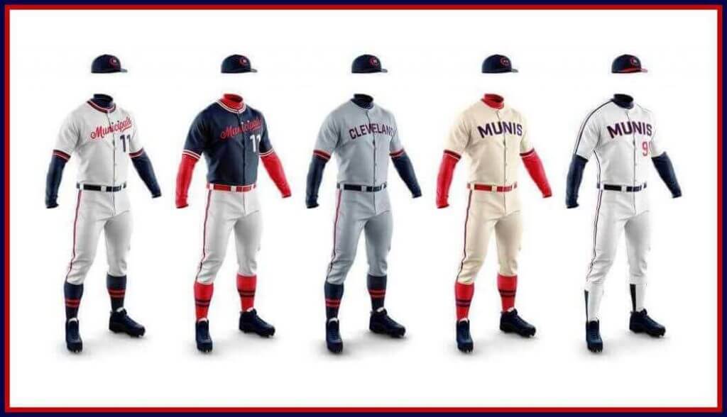
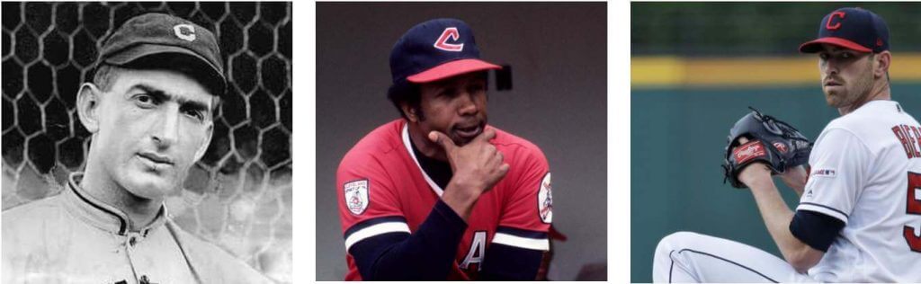
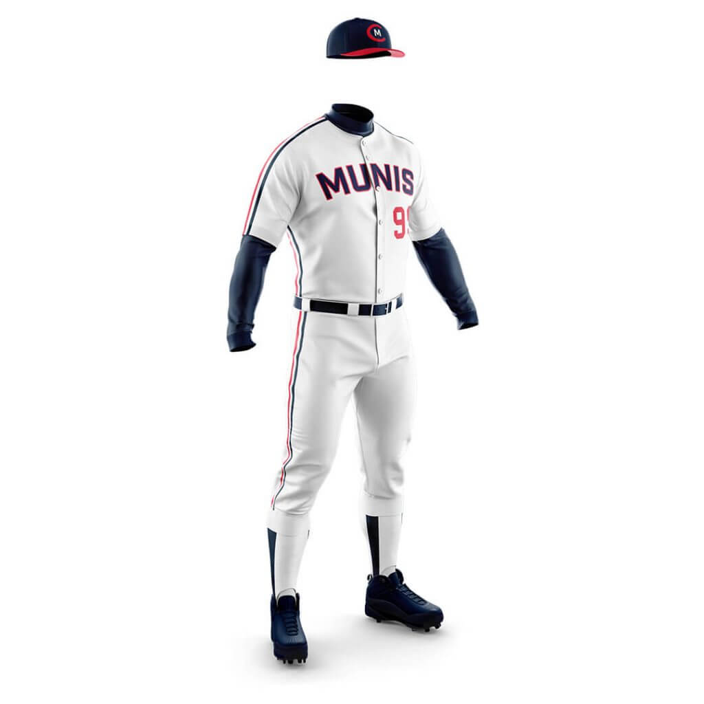
When it came to designing the Munis uniforms, we wanted to be clear that although the name was changing this was not meant to be a new team, but rather a new era for a storied franchise. So we combed through our entire uniform history from 1901 to the present, picking out things we like and things we think most Cleveland fans regard as canon. The idea was to not only have a timeless uniform lineup that looks good, but also one that serves as a sort of summary of the franchise to maintain a solid foundation as the name changes. These uniforms are pretty similar to what the team is wearing now, with a few elements from different eras woven into the look. During the process we fooled around with different color schemes, but ultimately could not imagine a Cleveland baseball team in anything other than red and blue. It just wouldn’t feel right. We believe the resulting look is a classic style appropriate for a team with our history and one that long-time fans will find familiar.
We’re always examining ways to improve and expand the concept for eventual use across the franchise, and we’ve been fortunate to gain the enthusiastic support of esteemed designers and Northeast Ohio natives Michael Bierut and Jesse Reed, who have recently come onboard as informal advisers. From the beginning we’ve viewed this as a community project, so we leap at any opportunity to work with fellow Clevelanders like Michael and Jesse who understand the city. At the end of the day, this name is a tribute to Cleveland and its people.
MU-NIC-I-PAL
relating to a city or town
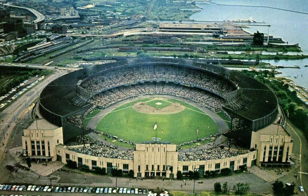
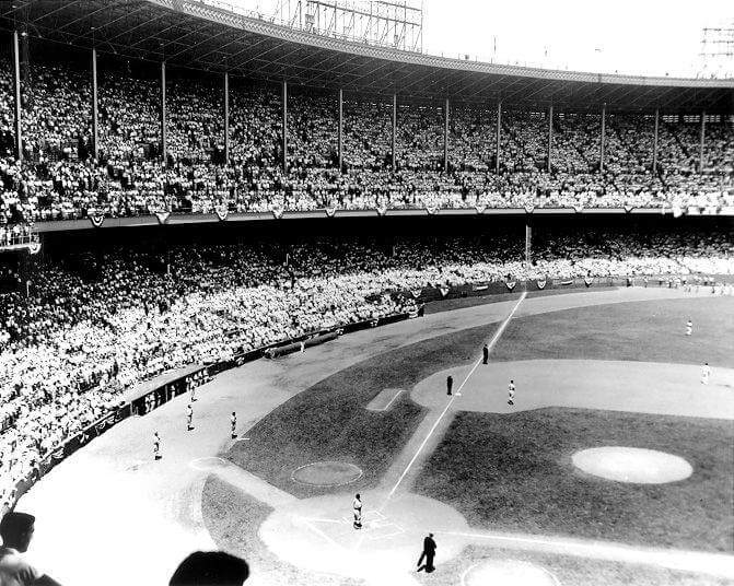
Municipal Stadium holds the top three All-Star Game attendance records, set by the 1981, 1935, and 1954 Midsummer Classics respectively. The five World Series games played at Municipal in 1948 and 1954 each drew over 71,000 fans.
THE LOOK
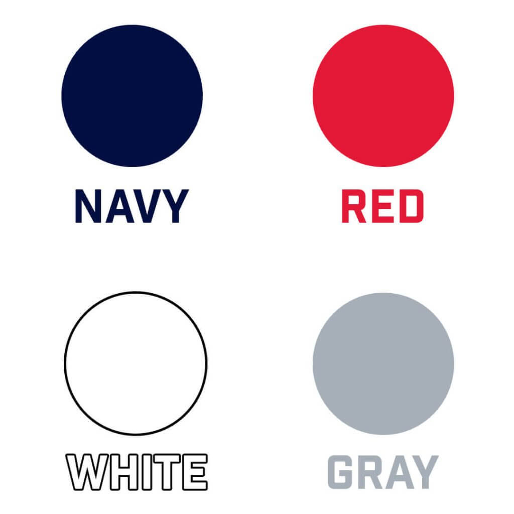
We will continue the blue, red, white, and grey color scheme Cleveland has worn for over a century, maintaining a solid foundation for the fans and the franchise.
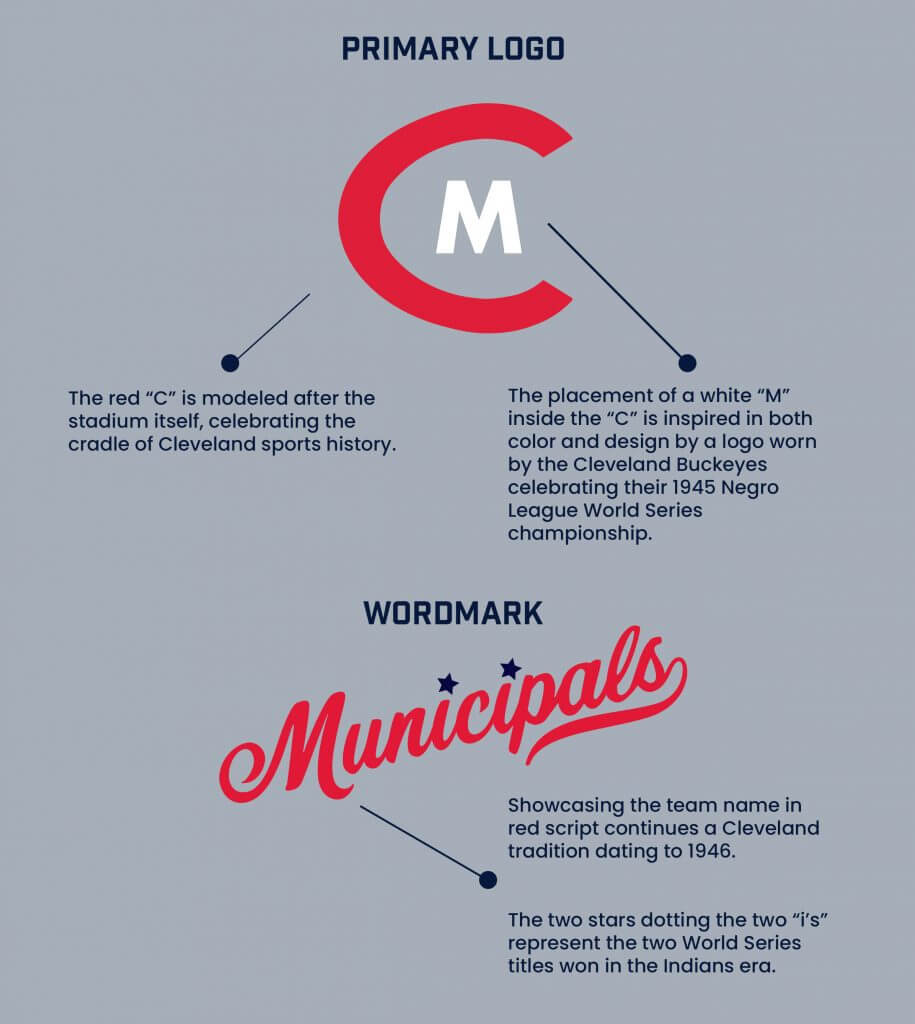
Showcasing the team name in red script continues a Cleveland tradition dating to 1946.
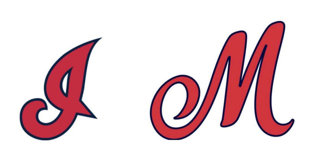
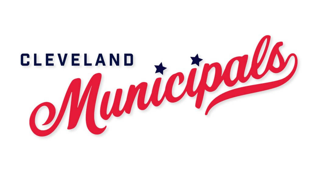
The two stars dotting the two “i’s” represent the two World Series titles won in the Indians era.
THE LOGO
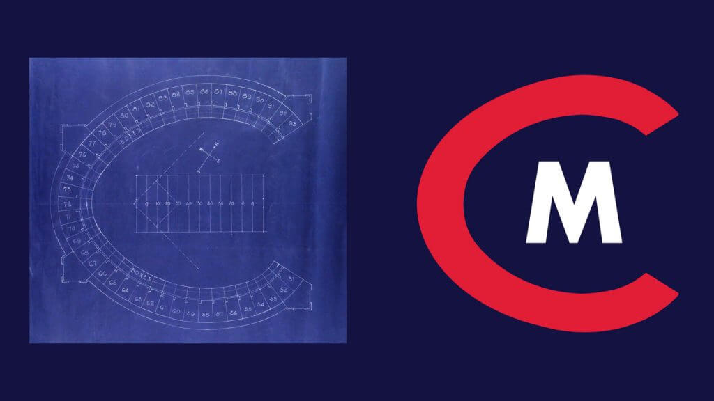
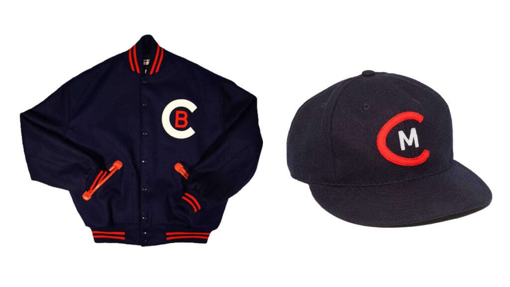
Completed in 1931, Municipal Stadium hosted four All-Star Games, two World Series, seven NFL Championships, and countless other cultural events. The “C” in our logo is modeled after the stadium itself, celebrating the cradle of Cleveland sports history. A white Municipal “M” inside the “C” is a nod to Cleveland’s most successful Negro League team, the Cleveland Buckeyes.
THE HAT
Cleveland has worn a blue hat throughout our history, most often with a red “C.” The placement of a white “M” inside the “C” is inspired in both color and design by the Cleveland Buckeyes. The Buckeyes wore the above logo on jackets celebrating their sweep of the Homestead Grays in the 1945 Negro League World Series, the first game of which was played at Municipal Stadium. This logo pays homage to Cleveland’s Negro League teams and recognizes their contributions to Cleveland sports history.
THE UNIFORMS
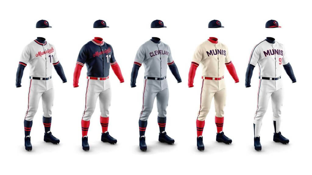
Home:
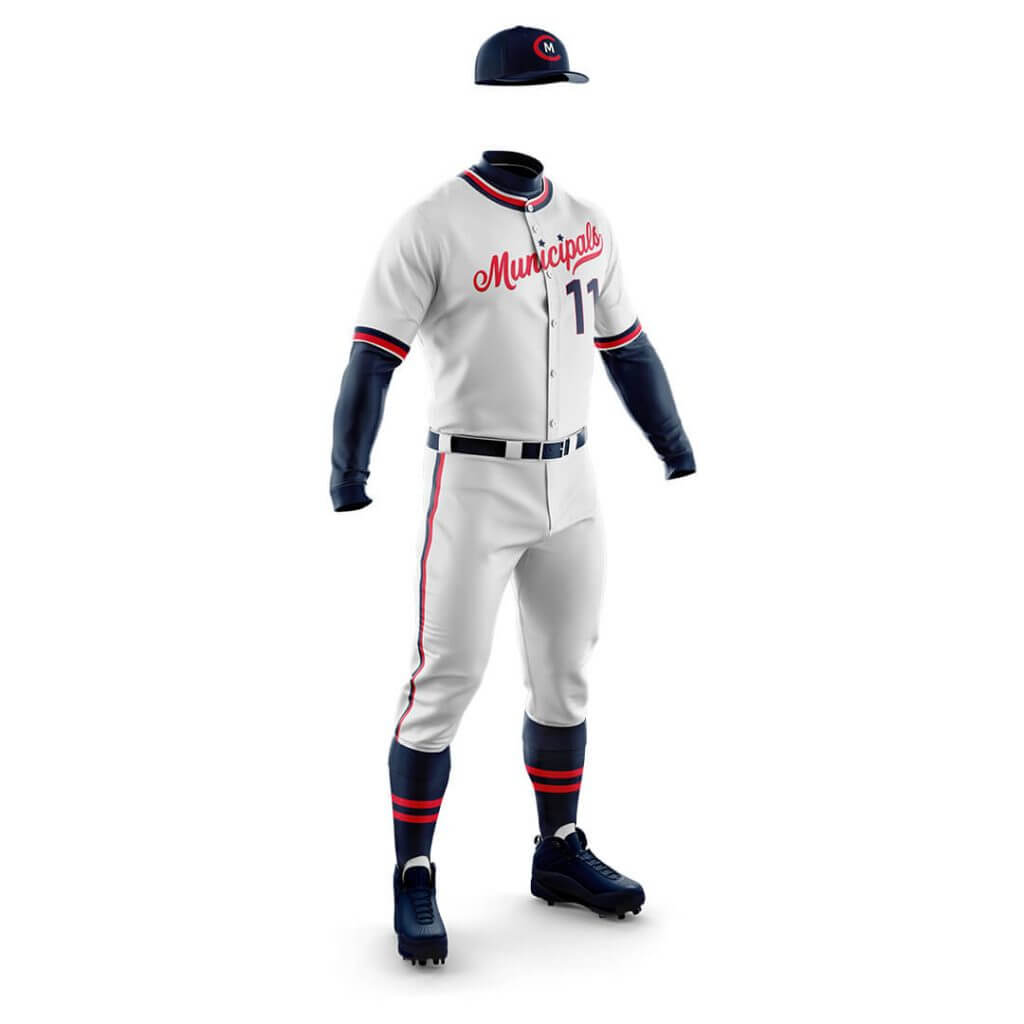
A white home uniform with red and blue has been a staple of our look since the 1930s. The tradition continues with collar and sleeve striping inspired by the 1970s and front numbers inspired by the 1960s, ’80s, and early ’90s. Blue socks have been worn since our inception, with red stripes common from the 1930s to present. Matching blue undershirts follow our most consistent style since 1901.
Road:
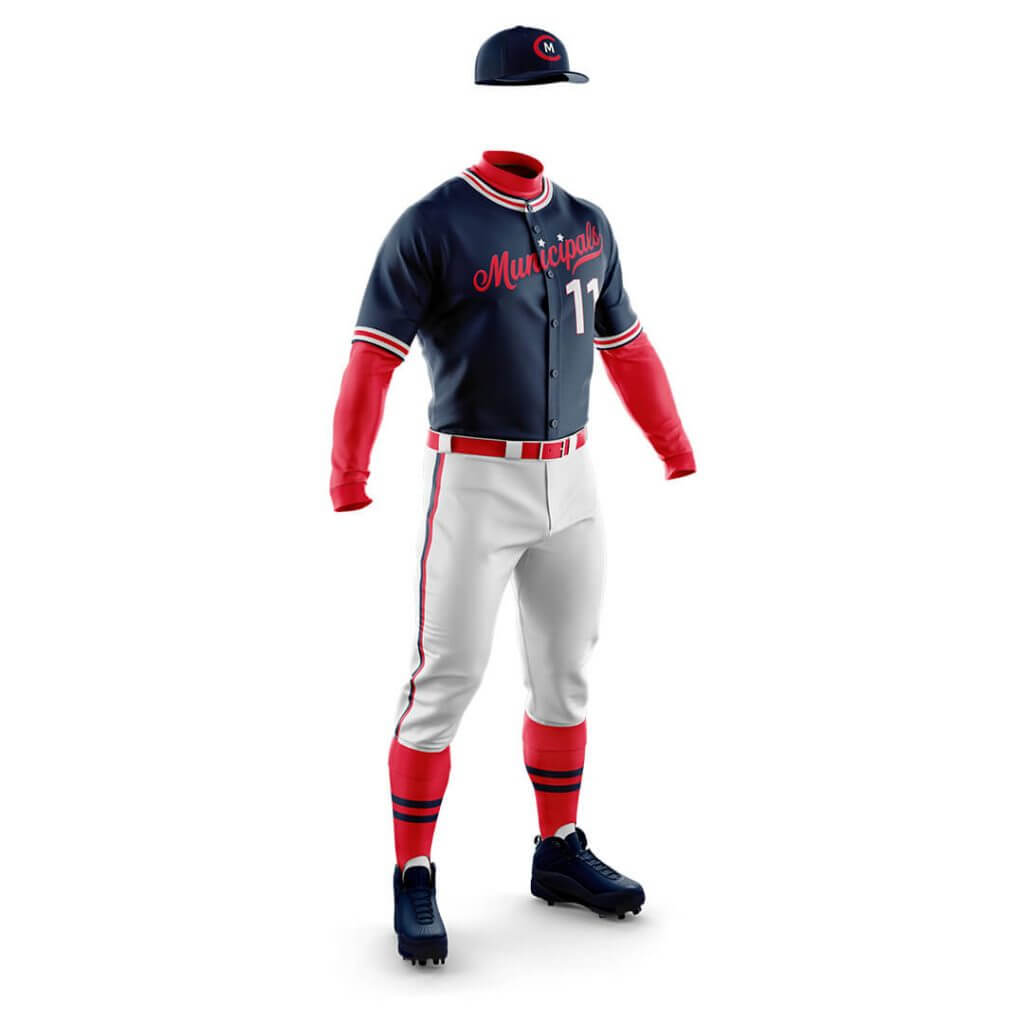
A blue road uniform was used from 1902-04, but wouldn’t appear again until 1975. This look matches the striping and numbers of the white, but incorporates the red undershirt, belt, and socks combination made iconic by the boom years of the 1990s. It has remained part of our lineup ever since. White pants with matching striping carry over from the home uniform.
Alternate:
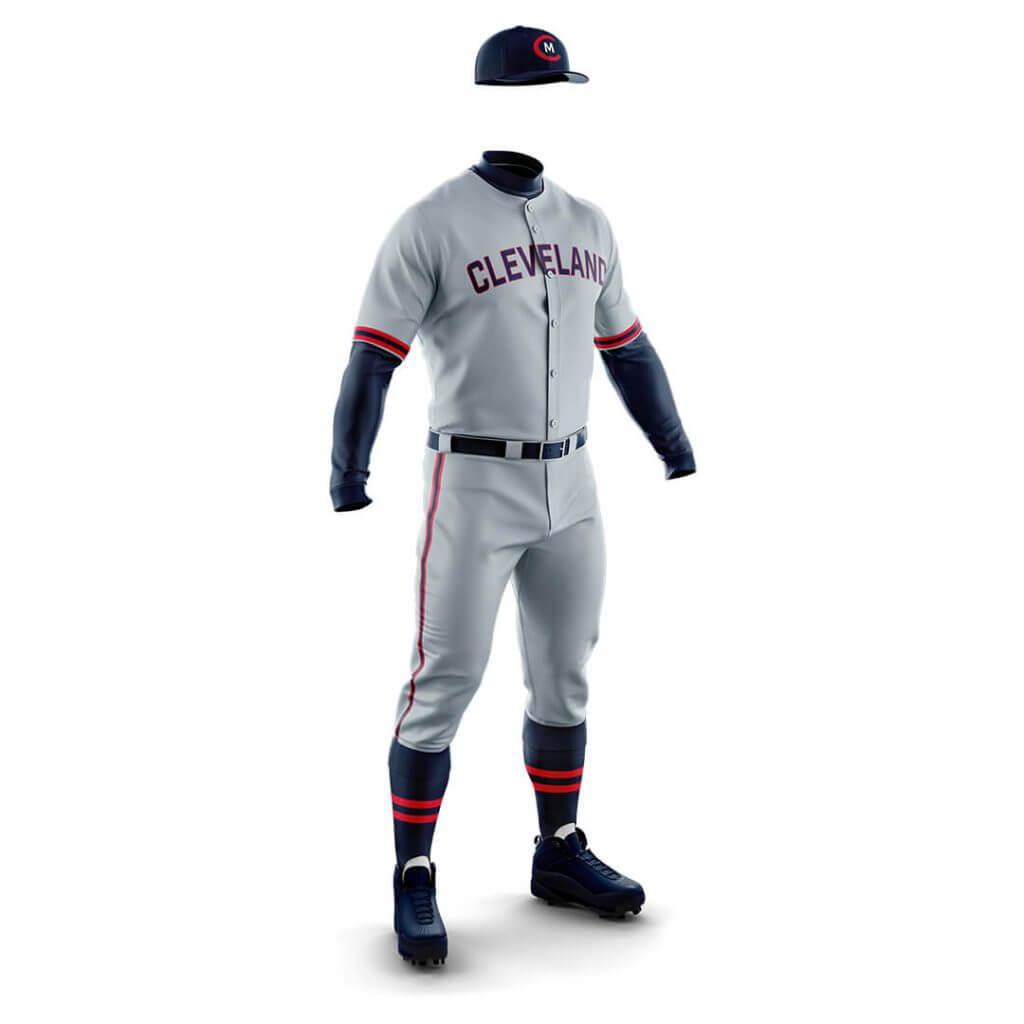
Cleveland has worn grey uniforms for all but nine seasons since 1901. This version is similar to the grey alternate fans have come to love in recent years, acting as a bridge into the new era of Cleveland baseball. A simple grey uniform encapsulates Cleveland’s entire baseball history. A blue undershirt and matching blue socks complete the look.
Sunday Alternate:
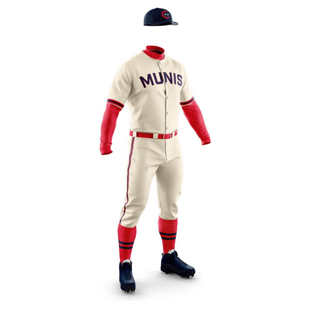
While League Park was still in use, Cleveland played Sunday games at Municipal Stadium. This Sunday alternate pays homage to that tradition with an old-school cream tone and the team nickname on the chest. The red undershirt, belt, and socks contrast the blue versions of the white home uniform, as does inverted sleeve striping. The alternate hat and helmet feature the two stars from the main logo, ensuring the titles from our previous era are always represented.
Major League Throwbacks:
When you think about Cleveland throwback uniforms two eras come to mind immediately: the 1970s sansabelt/pullovers and the late ’80s/early ’90s uniforms as seen in Major League. Worn in varying forms from 1986 to 1993, these unis are a fan favorite—and not just because of Lou Brown’s legendary squad. Front numbers returned to our jerseys in 1986 for the first time since the 1963-69 era as pullover shirts reverted to button downs. In 1989 the “racing stripes” on the pants were extended to the sides of the torso and sleeves, making for a look that is hard to deny as classic ’80s. These were the uniforms worn during the last season at Municipal Stadium, and the first Cleveland uniforms worn by many of the iconic players that fueled our 1990s run. We add a red brim to our standard Munis hat to complete the look. Our friend Mike from UniMockups made these as a fun tribute to the team in celebration of Opening Day.
Wow! Thanks Jamie & Will! Thank you for sharing this project with us. You can follow their efforts on Twitter: @clemunicipals and Instagram: @clemunicipals.
But we’re not quite done with Jamie and Will yet — there’s still more to be told. Next time, we’ll learn how the guys came to embrace “Municipals” as their preferred choice for the new name and identity of the Cleveland professional baseball team.
Readers? What say you?


Guess The Game…
from the scoreboard
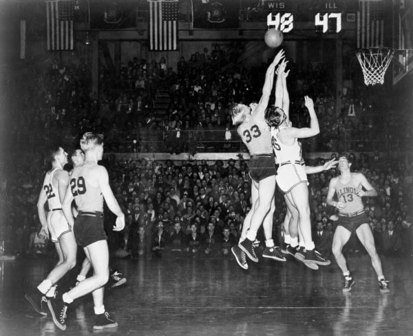
Today’s scoreboard comes from Nicholas Bartell.
The premise of the game (GTGFTS) is simple: I’ll post a scoreboard and you guys simply identify the game depicted. In the past, I don’t know if I’ve ever completely stumped you (some are easier than others).
Here’s the Scoreboard. In the comments below, try to identify the game (date & location, as well as final score). If anything noteworthy occurred during the game, please add that in (and if you were AT the game, well bonus points for you!):
Please continue sending these in! You’re welcome to send me any scoreboard photos (with answers please), and I’ll keep running them.
The “BEST OF” Kreindler’s Korner
Hey guys & gals. You’ve enjoyed Kreindler’s Korner for several years now, mostly on the weekends, on Uni Watch, but with the recent coronavirus outbreak, Graig’s time is just too precious and he needs to tend to other things besides coming up with a new writeup each weekend.
So, going forward, for as long as the COVID-19 situation is bad in New York, I’m going to run a few “Best of’s” until Graig returns.
Here’s today’s offering:
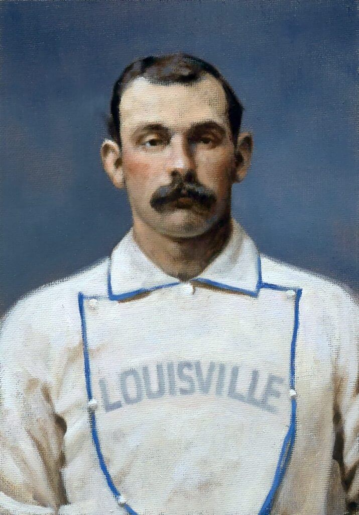
Title: “Jim Devlin, 1876” (color study)
Subject: Jim Devlin, 1876
Medium: Oil on linen mounted to board
Size: 5” x 7”For me, one of the most gripping stories from Ken Burns’ Baseball documentary involved that of Jim Devlin, a pitcher for the old Louisville Grays who was eventually banned for his involvement in throwing games in 1877. He and his three teammates cost their ballclub the pennant that year, and their subsequent ostracizing from the sport was considered the first scandal in National League history.
Jim’s story seems all the more tragic because of the annual letters he submitted to National League President William Hulbert, all of which were in the hopes of being reinstated. He wrote to other dignitaries of the league, including the likes of Charles Chase (club president of the Louisville Grays) and Harry Wright (then the manager of the Boston Red Caps). A letter to the latter still survives to this day.
In said correspondence, he pleaded for help from Wright, explaining that he was in need of any kind of work to support himself and his family, claiming that he hadn’t a dollar to his name. No response ever came, either from Wright or any of the other magnates he reached out to.
Devlin died in October of 1883 from tuberculosis. To read more about the scandal of the Louisville Four, MLB Historian John Thorn’s account is a must-read.
My painting depicts the man a year before those events, with the Louisville Grays in 1876.
Thanks, Graig! You can (and should!) follow Graig on Twitter.
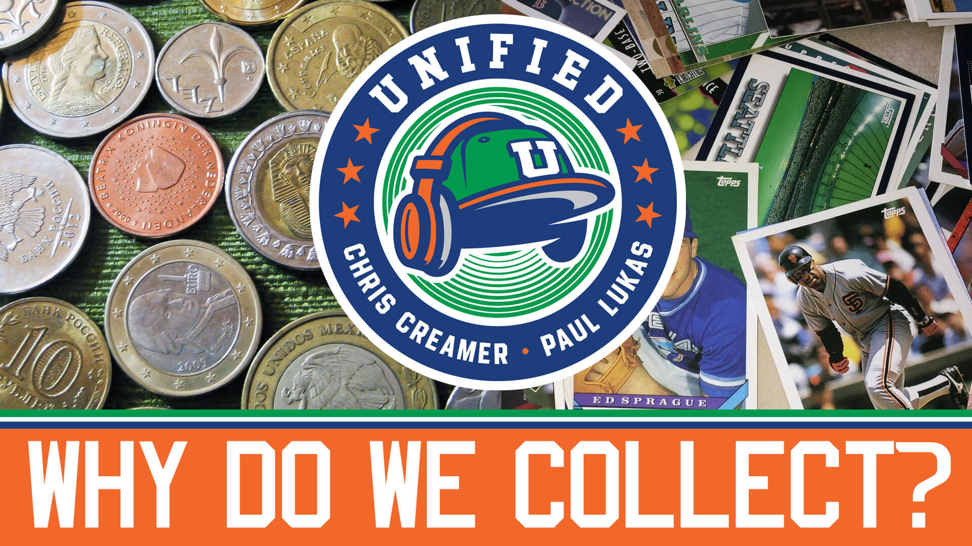
And now a few words from Paul: Hi there. In case you missed it earlier this week, the latest episode of Unified is about collecting. Why are so many people who are into uniforms and logos also into collecting stuff? What’s the difference between collecting and hoarding? What did Chris Creamer and I collect when we were kids? What do we collect now? And what does all of this have to do with the 1987 movie Throw Momma From the Train? Chris and I discuss all of that in this episode, and a lot more.
As always, you can listen to us on Apple, Google, Stitcher, TuneIn, and Spotify, or just use the audio or video player below:
Please consider supporting this episode’s advertisers, Oxford Pennant (get 20% off any order with checkout code UNIFIED), Ebbets Field Flannels (10% off, except on NFL items, with checkout code UNIFIED), and Homefield Apparel (15% off with checkout code UNIFIED).
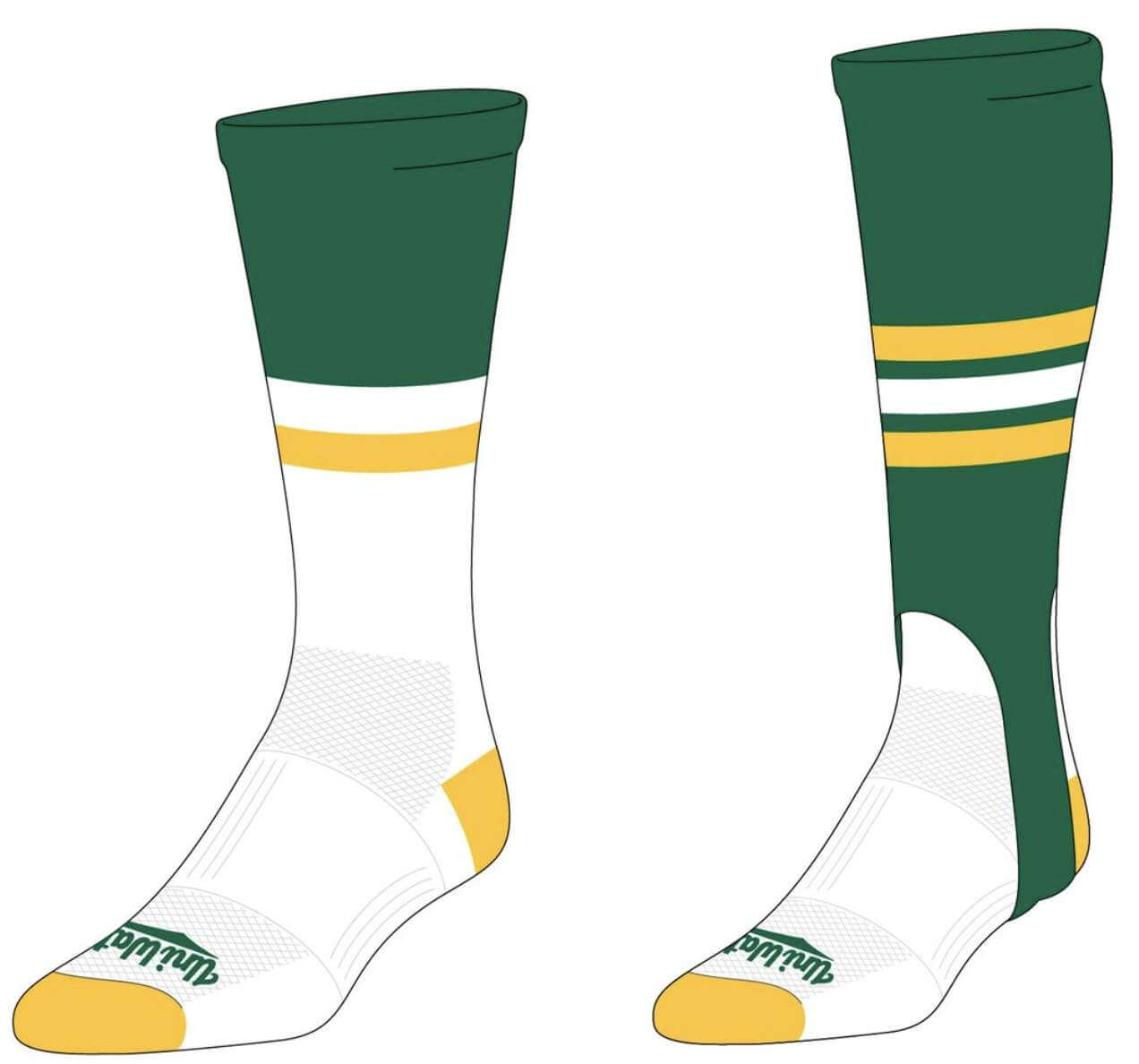
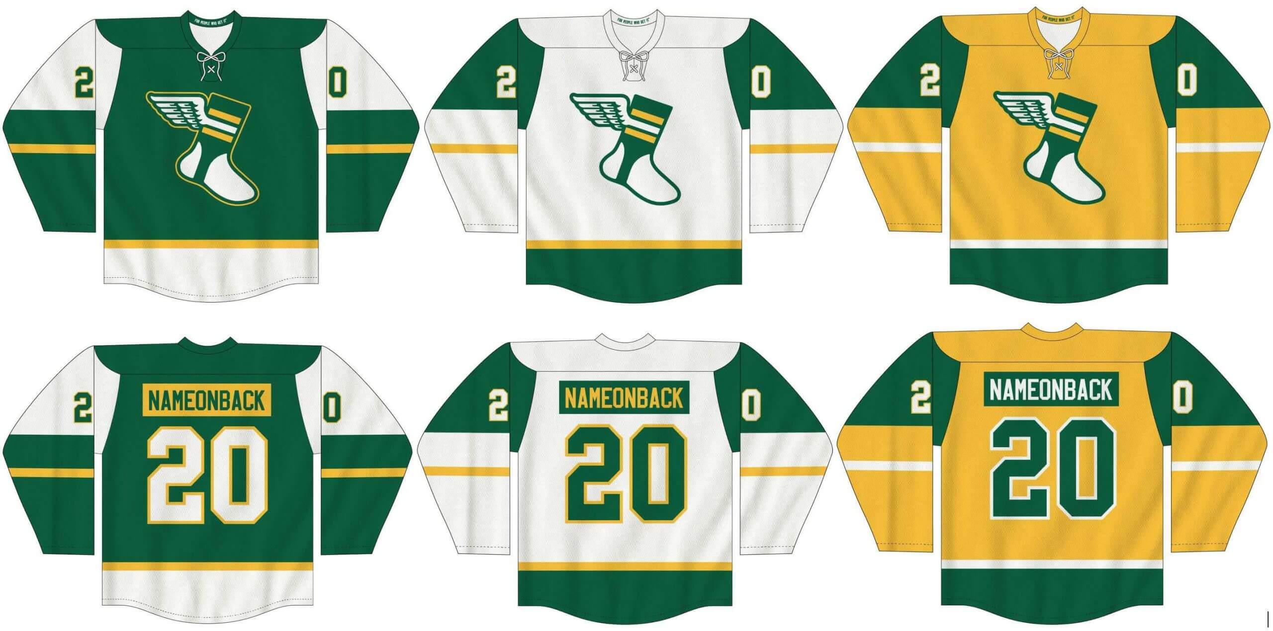
Meanwhile, I’ve teamed up once again with Adelph Wear — the brand run by longtime Uni Watch reader Nathan Haas — to create a new line of Uni Watch hockey jerseys (shown below), which are customizable with your choice of number and NOB, as well as new Uni Watch socks and stirrups (shown at right).
In order to get in on these items, you must place your pre-order by March 31. You can do that here. We expect the finished product to ship out by the end of April.
My thanks, as always, for your consideration.
The Ticker
By Anthony Emerson

Baseball News: David Cone wore a knockoff Mets uni with his own name in script on the front in a 1989 New York Daily News commercial. … This is so cool: the Burlington Sock Puppets, a new team in the now-independent Appalachian League, have a stirrup mascot and logo (from multiple readers). … Here’s some great color home video footage of the 1967 Cubs/White Sox exhibition game (from Bob Gassel). … The Smithsonian Magazine has a pretty nice article about how the baseball cap became a fashion item (from Gary Chanko). … Kansas State wore green jerseys last night for St. Patrick’s Day (from Blake Cripps).

NFL News: Longtime OT Donald Penn signed a one-day contract with the Raiders in order to retire with the team. He wore a T-shirt with his face as the Raiders logo during the ceremony.
.

Hockey News: The Athletic has a truly excellent article about NHL players who choose to add accent marks to their NOBs, like Alexis Lafrenière and Tim Stützle (from multiple readers). … Rangers G Alexandar Georgiev has added a No. 77 to his mask, honoring Russian junior league player Timur Faizutdinov who died this week after being hit in the head by a puck (from Deb Seymour). … The Capitals wore St. Patrick’s Day-inspired warm-up sweaters last night, with odd green-to-white gradient numbers (from our own Jamie Rathjen). … The Lightning have turned tweets from their fans into rolls of hockey tape (from Wade Heidt).

NBA News: New Bucks players P.J. Tucker and Rodions Kurucs will wear Nos. 17 and 00 respectively (from Etienne Catalan and Maverick Johnson). … Also from Etienne: new Heat F Trevor Ariza will wear No. 0.

College/High School Hoops News: The New York Times has a great article on the number of teams wearing orange in the midwest bracket (from Peter Lattman). … In addition to having less-furnished weight rooms, the swag bags for the Women’s NCAA Tournament are way less substantial than the men’s tournament (thanks, Jamie). … Oral Roberts’ NOBs are super inconsistent. Come on, ORU, Thompson isn’t even that long of a surname! (from Beau Parsons). … Liberty and Oklahoma State represented the two extreme ends of the uni number width scale (from Dave Pod). … Two NOB notes from North Texas — G James Reeves V is going RNOB, while G Mardez McBride appears to have the remnants of an old NOB underneath his (from Gavin Paul). … Morehead St. had a very satisfying starting lineup, uniform number-wise (from Matt Estreich). … Also from Matt, a Powerade spot airing endlessly during NCAA games features this confused hockey player wearing an NFL captain’s “C” patch.

Soccer News: Here’s something I didn’t know: La Liga side SD Huesca uses a different captain’s armband for every road match, in honor of the team they’re playing. The one Huesca captain Jorge Pulido wore a few days ago at Camp Nou in Barcelona an absolutely beautiful one honoring FC Barcelona, and the city of Barcelona itself. I’ve never heard of a team doing this before, but I love it (from Brent Wilson). … Hallelujah: Manchester United will have a new primary shirt ad at the start of next season, finally moving on from the ugly Chevrolet logo they’ve worn since 2014 (from multiple readers). … German side Sandhausen will have Macron as their new kit provider (from Ed Żelaski). … New primary shirt ad for LAFC (from Andrew Doran). … FC Cincinnati’s West End Stadium had its external façade lit for the first time (from Kary Klismet and Wade Heidt).

Grab Bag: The Major League Rugby team Houston SaberCats have sold their butts to a company appropriately called Tushy. … New logo for the San Diego Zoo (from Kary Klismet). … Also from Kary: New Indigenous-inspired uniforms for Surfing Australia. … The town of Herzogenaurach, hometown of Rudolf and Adi Dassler, founders of Puma and Adidas respectively, used to put Adidas and Puma logos on directional signs pointing to their factories (from our own Brinke Guthrie).
And finally… big thanks to Jamie and Will for sharing their Cleveland Municipals project! Really stellar work guys.
That’ll do it for me for today — everyone enjoy the Tourney and/or whatever sports are on the dial today, and I’ll catch you back here tomorrow.
Peace,
PH
Excellent Munis uniforms — my only gripe is that I hate “softball tops” so would much prefer the grays as the primary road uni. But kudos for a concept that so faithfully keeps alive the team’s traditions and lore while making a clean break from the negative aspects of that legacy. And as mentioned a couple days ago, I love the “Municipals” team name.
I’ve said this all along, if your going to change the names of teams you can’t just change the name and leave the colors the same,I love the designs that were shown I just feel that the team needs to go all in and change everything from name logo and colors if because to me if you leave the same red white and blue, they would still be the Indians and not the new name
I was about to write something similar. I thought the Munis concepts were very well done, but I agree that this would be a great opportunity for the Cleveland franchise to start totally with a clean slate and come up with something unique and new.
Most importantly, this gives the team a chance to cease being one of the many blue-and-red teams out there and employ a more distinctive color scheme.
Sure you can.
You don’t have to, of course, and I think most historical examples of teams changing their name but staying put (of which there aren’t that many, at least since WWII) involve a change of colors (NY Titans -> Jets leaps to mind, along with Washington Bullets -> Wizards and New Orleans Hornets -> Pelicans), but I think if a team has been in one place with the same colors for a really long time — e.g., Washington Football Team — then it can keep its traditional colors.
And not to belabor the matter too much:
Cincinnati Royals -> Kansas City Kings
Seattle Pilots -> Milwaukee Brewers
Montreal Expos -> Washington Nationals
…and basically… St. Louis Browns -> Baltimore Orioles
Other examples probably exist.
New York Mets -> Brooklyn Dodgers, New York Giants
Those teams all moved; I was referring to teams that changed names but didn’t move.
I’m fine with keeping the colors. But I wouldn’t mind seeing the Munis in brown and orange. Those are the only two options for me.
And while we’re at it, since the Cavs can’t stick to just wine and gold, why not make them brown and orange as well?
I think professional sports already has the perfect number of brown teams.
perfect number of brown teams in professional sports?
not quite for me, none in the NHL, but the Boston Bruins are very unlikely to go back to brown ever.
Houston Astros kept the Colt 45s colors.
Fantastic stuff! Go Munis! It should be mentioned that Jamie and Will are two quality human beings as well.
Reminds me of the Montreal Canadiens. Le club de baseball Municipal!
The name did not jump out at me at first but the post did a decent job selling it. I like that the C logo echoes the shape of Municipal Stadium.
I would prefer the Grey uniforms be the default. I do not like the softball uniforms in general.
I also think the people suggesting a total break and bringing in new colors have a valid point.
I think I’d like to see the C with the four gates left on it. At least for comparison…not saying I’d prefer it until I see it.
Cleveland fan/NE Ohio resident here. My only concern is the hat and 3/5 of those Municipals uniform designs give me more Minnesota Twins vibes than Cleveland baseball. Not sure if I’m sold on the Municipals name either, but anything is going to take some getting used to. I would welcome a change to the team colors too to try to start uniting the Cleveland pro sports teams, but can’t think of any combinations that would be truly unique – even the Padres are embracing the brown these days.
WOO HOOO!!!! Somebody finally found the “Cone” commercial!! That’s been one of my ‘white whales’ for a long, long time. Kudos to whoever dug up that VHS tape…
As for the Cleveland redo, that’s some mighty fine work right there. I especially like the “C” shaped like the old Mistake by the Lake; the team should definitely use that no matter what name they come up with.
HOWEVER … and with all due respect and appreciation and apologies to the artists … I just can’t get behind “Municipals” as a team name. I mean, I get that it invokes “Cleveland Municipal Stadium” and I like the connection between the team and civic institutions/public service in the city as a general concept, but when I hear the word “municipal” the first thing that comes to mind is a parking garage. The second thing is the dingy link on Joralemon Street in Brooklyn that I walked past every day during law school. And the short form, “Munis” (“Myoo-nees”), just isn’t very pleasant to say (and rhymes with “puny”; imagine the back page, “Puny Munies Drop Fifth Straight”).
Maybe I’m over-thinking it. (What am I talking about; of course I’m over-thinking it, it’s what I do.)
Municipals is much too generic for my taste. So, for that matter, are Metropolitans and Athletics, although those are both well-established.
I have no issue with “Athletics,” although I agree it’s rather “generic” but in a different sense. I think “Municipals” is more analogous to Washington’s “Nationals” and “Federals” (USFL 1983-84) which are a lot easier and more pleasant to say; they’re not so much “generic” as awkward attempts to use an adjective as a noun. Same goes for “Metropolitans” (1880-87; “Mets” is not short for “Metropolitans” although the name derives from the original corporate entity Metropolitan Baseball Club, Inc.).
Or, imagine naming a team in L.A. the “Memorials” after the Coliseum.
I like the logos and the uniforms. I think it would be cool to see the racing stripe uniforms in red and royal with a small patch in between on one sleeve, mimicking the city flag.
Serious question, when you see “Munis” how many of you think “m’you knees” and how many think “moonies”? Obviously the first one first with the main monicker, but the second one rolls off the tongue much easier.
Call ’em the Pals.
Die hard Cleveland fan. I loved going to that old stadium as a kid. But this is an absolutely terrible name for my hometown baseball team.
The designs are nice. I’m sure the people proposing this mean well. I have great fondness for that old dump of a stadium.
But the name matters. Designs change. The name has to last.
The term ‘municipal’ means “local government”. It’s a generic term that can apply to any municipality anywhere in the country. The stadium carried that name because it was publicly funded. There’s nothing special about the word that ties it to the city.
Tying the new name to the heritage of the city and pro baseball in Cleveland is what I am desperately hoping for with this whole naming effort.
But we can do soooooo much better than this. We have a once-in-a-lifetime chance to get it right. “Municipals” is not getting it right.
Good points. Also, according to Webster, “municipals” when used as a noun refers to municipal bonds that a city offers to investors as a way to raise funds. It does not mean “somebody who lives in a municipality”. So the team would literally be named after a financial security.
Have to agree re: “Municipals,” for these reasons and those stated above.
Also, I think “Municipals” would be the only four-syllable team name in MLB, one of very few in all of sports; the only current one I can think of off the top of my head is “Knickerbockers” which is practically never uttered or printed. “SuperSonics” was another one, nearly always shortened to “Sonics.” “Canadiens” is another but it’s only three syllables en français.
On the other hand, since “Cleveland” is only two syllables the name “Cleveland Municipals” would have six, just like “Tampa Bay Buccaneers” and “Golden State Warriors,” one less than “Arizona Diamondbacks” and “Minnesota Timberwolves.” So, OK.
Truth!
Thank god the five syllabled New York Metropolitans was shortened right out of the gate. Horrible name either way. To go from Dodgers & Giants to Mets? Lame-o!
“Metropolitans” wasn’t “shortened”; meaning, the team was never called and was never going to be called the “New York Metropolitans” with “Mets” for short (analogous to the “New York Knickerbockers” with “Knicks” for short). The original corporate nomen was “Metropolitan Baseball Club, Inc.” from which “Mets” is derived.
There’s nothing wrong with the name “Mets” as it’s unique, short enough to fit on the front of a jersey and be read from a distance, easy to say/yell/chant (“Let’s Go Mets!” has always had a nice rhyming ring to it), and it’s hard to imagine any city other than New York having a team by that name. The club was intended to represent the entire New York [small-m] metropolitan area; “Dodgers” was very Brooklyn-specific. And it made little sense to recycle “Giants” given that (a.) the San Francisco club didn’t change its name, and (b.) we still had the football Giants.
I love the Mets name. As for Cleveland? Spiders all the way.
“There’s nothing special about the word that ties it to the city.”
Other than the fact that the word ‘Cleveland’ will be right in front of it. I think it’s great. I’m very proud of the city. Most Clevelanders are. It sounds like you are too. Intelligent and well-meaning people can certainly disagree, but I think this name ties the team to the city and its people very nicely.
The Munis is a great concept overall. One challenge I see is script name with the stars over the ‘i’s is a design element already executed by the Phillies.
Clevelander here, LOVE the Municipals concept. Really excellent work! I am partial to Guardians but this pitch really sold me on Munis.
I really love the shape of the C, it feels classic like the bears/cubs/reds but has a uniqueness especially to Cleveland and team history. I like the white M in the middle as well. The current Red block C is good but I miss the white outline of the previous cap logo and the white M in this one brings it back for that visual pop. I would like to have the red brim on all of the home caps though, its something I always loved as a kid and it was one of the first things that helped me tell instantly if we were playing at home or away.
The sleeve and collar striping is way too heavy for me but hey, everybody’s a critic. The Major League throwbacks are amazing, instant nostalgia for anyone that knows the movie, not just Cleveland fans.
I am also in the camp of keeping the colors. I understand people wanting to have a clean break but, to me, that goes the route of feeling like an expansion team, not the same team with all new identity. Of course it might be fun to have an expansion team (Browns) with the same colors and logo and a non-expansion team with all new stuff. I feel like that would be right up Uni-Watch’s alley of quirky sports trivia.
Overall really really impressed with this. I only hope the Dolans and the team are looking at things like this. Also, please, I’m begging anyone that will listen; NOT SPIDERS!!!!
Just curious; why not?
Spiders have always creeped me out and I dont like them. They are awesome at eating bugs and things and do really cool stuff. Im not saying they shouldn’t exist or anything crazy like that, they just creep me out and I, selfishly, dont want spiders all over my home team sports apparel. I love the historical connection and appreciate it greatly but not enough to get over my fear of spider stuff. Purely a personal dislike not an aesthetic or historical one.
Birds are the way to go: Athletic with a light touch. I like “Robins”, “Nightingales”, “Starlings”, “Magpies”, “Blackbirds”, and “Skylarks”.
“Buntings.”
“Flycatchers.”
Perfect birds for baseball!
Jamie and Will,
Outstanding work. Municipals is a very good fit for this club. It celebrates the people of Cleveland and its storied history and shortens to “Munis” quite well. I love the logo and how it ties to the old stadium and Negro league franchise. Of all the uniform sets the throwback whites are my favourite.
It shortens even better to “Pals”.
“We like each other” could be their first marketing slogan.
Probably already stated but I like the concept of Americans as a nickname and then honoring the Native American imagery in an appropriate way, maybe ill sketch some up!
It certainly works insofar as we have a team in the NL called the “Nationals”. Now, would the Cleveland squad be nicknamed the “Amerks” or the “I-Cans”?
Looking forward to the article explaining why they have embraced “Municipals”, because to me it makes no sense to name a team after an old stadium. Also having 2 Stars seems like they’re celebrating something that actually isn’t something to be proud of, having only won 2 World Series in all that time. Too bad the Negro League team was named the Buckeyes, since it would have been a great thing to honor the Negro League by naming them after the Cleveland Negro League team. Buckeyes is just too well known for Ohio State University. Lastly, not a fan of teams wearing white pants on the road.
The game is Wisconsin vs. Illinois at the UW Field House in Madison on Saturday night, Jan. 3, 1948. This is near the end of the game, which Wisconsin won 52-47. The tell is the 30-star U.S. flag from 1848. Wisconsin was celebrating its centennial in 1948.
[Ding ding ding] CORRECT!!
(Go Badgers!)
The Burlington Sock Puppets are a summer collegiate team, NOT an independent professional team. MLB took away the professional status from dozens of teams, sadly.
Lifelong Cleveland fan here. I’m not liking Municipals. As BurghFan pointed out, it’s very generic, and as Kyle noted, the look is pretty Twinsy.
Of all the names that have been suggested, Guardians is the least objectionable. Spiders is terrible.
To be snarky, we could be totally inclusive and name them the Inoffensive Multiracial Polycultural Pansexual Omnireligious Diverse Beings (IMPPODBs). We could call them the Imps for short.
Or, if the Society of Perpetually Offended and Outraged People (SocPOOP) think that’s too something or other, we could go with the Featureless Inanimate Nondescript Entities (FINEs).
Home run with the Cleveland redesign. Absolute home run. Hats are beautiful. Great work!
CLEVELAND BEAVERS!! I really like these uniforms and the shape of the “C” on the hat. I’m not really feeling connected to the name. I would prefer something more playful and less institutional. It is a kid’s game after all. When I was a kid, I really like Chief Wahoo because he was a playful looking cartoon character. As I got older and became more aware, I recognized it to be racist and inappropriate. I think a team name like the Beavers, with a playful logo like U of Minnesota, would be fun. My favorite logo in baseball today is the Orioles cartoon character. I’m glad they went back to that instead of the anatomical version. I would also be OK with the Spiders with a cartoon mascot as well. I think we should leave it to the Beaver Cleavers for the win!
I think the design is great and name is fun, but what about instead of the “Munis” it’s “Pals”. Overall great job and I look forward to more of these concepts.
Great job with the Municipals designs. I have no dog in this fight (or, seeing as we’re talking about Cleveland, should it be “dawg”?), but I have one quibble that I haven’t seen raised yet. In my opinion, the red wordmark on the blue tops needs a white outline or shadow to break up the color-on-color. We’ve seen a wide variety of numbering and lettering fails with BFBS or GFGS that make it impossible to read during a broadcast, much less from the cheap seats when we can return to them. The white would help.
Very nice job with the redesign. One minor tweak, on the grey road alternate how about blue lettering trimmed in red.?
As for the one suggestion about orange and brown, would be interested in seeing a mockup of that using the Municipals template.
I don’t like the name, but excellent work!
Can someone explain why the Buckeyes nickname for the Cleveland baseball club isn’t drawing more support? I realize not everyone there went to Ohio State or supports them but I think its so much better than the other options.
I was born in Cleveland and I love the Munis concepts. The detail and purpose in the design is going to leave me disappointed with whatever Cleveland decides to do. Mixing eras without it looking jumbled and distracting is brilliant. The purposeful reflection of the contrasting undershirts, belts and socks create a definitive look. The Buckeye elements are a perfect tribute. The MUNIS alternate is beautiful. Even the mascot of “Municipals” has such a classic era bent; reminiscent of Trolley Dodgers, Knickerbockers, Metropolitans etc. It’s classic without being forced. I need one of these hats. What can we do about that?
Cleveland redesign is outstanding. Especially the hat logo design (irrespective of the team nickname). If I were in ownership, I would contact that design team and just flat out use it.
I mean, if the stadium was so great, why did they implode it?
I think the generic answer to this question is locker room facilities. When the St. Louis Blues asked for a new venue, that was their pitch for imploding the old St. Louis Arena. My wry contemporaneous observation was “You do realize that Guy Lafleur used these locker rooms do you not? What makes you better than Guy Lafleur. Please be specific.”
As a die hard Cleveland fan, the last thing I want to see is a team name that evokes imagery of a stadium built on a landfill that spent its last 40 years as a monument to horrible baseball. Credit to the designers for coming up with a nice cap and a creative design. They certainly gave it some thought. However, I don’t think the Major League era uniforms are that beloved by Cleveland fans in comparison to the Jacobs Field and Caveman C eras.
I’m in the camp that says it’s time to make a break with the past. Wahoo is gone. The name soon will be. There a million teams in those colors. It’s a chance to do something new and inclusive. No more half measures. Time to rebrand and start again.
You want to name your baseball team after a stadium that was the laughing stock of the world for most of its existence? That’s just pure Cleveland.
If you want a truly new brand identity, change colours change the name change at all. Maybe change your uniform colours to Brown white and Orange, Get the cavs to do the same and then you can be just like Pittsburgh
The Municipal’s hat design is inspired, but a bit clunky. The “C” looks awkward, as if drawn by a child instead of looking like a stadium. The uniforms are well done, but points off for using the word “iconic” not once but twice in the description.
Redesign the cap and get a thesaurus.
I like the concept but municipals no I don’t like. Growing up in Mentor I used to go to a lot of Tribe games, Friday nights and Sunday games had biggest crowds. In fact when I a kid my father would only take us to yankees games I thought there were only two teams. I like their ideas especially the idea about the negro league Buckeyes. I know Ohio State owns the rights but if they stay with their uniform concept stay away from the red tops I believe they would ok.(however I always liked the red uniforms from the 70’s. and also I can’t stand when you refer them as caveman. They stood for the crooked river the Cuyahoga River. The river that caught on fire in the 60’s so guess why it was called fire engine red) but municipals doesn’t work. I think more of the Browns in the Stadium. Remember the Tribe moved out of the Stadium in 1993. Do they call our mustard municipal mustard no they it stadium mustard I like the Buckeyes or a take off of the WMMS Buzzard in fact they one of looking like Chief Wahoo batting big beak in all. The Municipals sounds like what we used to call the Stadium the Gray Lady
Municipals? ….nah
Thanks to Will and Jamie for submitting this concept-it’s clear you 2 put a lot of time, thought and love into the Indians rebrand.
So, about those uniforms:
I really like the Stadium-shaped cap C but think it works better as a stand-alone…the M in there is distracting.
5 uniforms is quite a lot. (for any team). The “Major League” harken-back is one too many, especially if you’re not going to go full-on throwback.
The script is well done (though I consider the Indians to be a Block team – my age is showing through I’m afraid) and stands out from the other squads that use it. The stars dotting the i’s are a Phillies thing(as Mike Wissman stated)…though the Phils did sorta help themselves to the number-on-sleeve look that originated in Cleveland.
Lastly, while it’s regrettable that the Indians name is going away, Municipals is not a replacement that old fans would get excited about or new fans would be drawn to.
Will and Jamie, you guys put a lot of time and effort into this and it is amazing! but like ChrisH said, though it is regrettable that the Indians name is going away, I think that it is a great idea! Its not some washed-up or pull-out-of-a-hat name, although it is a mouthful to get used too
I guess if the idea is to create a nickname that will offend nobody, Municipals is pretty close to perfect since it just means a person who lives within a jurisdiction, which is all of us.
Other suggestions:
The Cleveland Blanks
The Cleveland Flaccids
The Cleveland Woke
The Cleveland Vanilla
The Munis uniforms remind me A LOT of the Nashville Sounds. Just missing the third tri star.
Overall like the idea, but baseball has enough red and blue teams. This is a good time to completely rip off the bandaid and switch the colors too. As long as they don’t try to take on the football teams colors.