
A team logo by itself doesn’t usually do much for me. I mean, I like a good logo as much as the next guy, but I usually want to see how the logo looks on a uniform, how it fits into a fully integrated identity system, and so on. That’s why I usually don’t like it when teams release new logos without releasing new uniforms to go with them.
Sometimes, though, a logo is such a good piece of design that you (or at least I) have to tip your hat and say, “Wow, that’s really good,” even if we don’t yet have all the surrounding visual context. That’s the case with the logo for the ECHL’s latest team, the Quebec-based Trois-Rivières Lions, which was released yesterday and feels like an instant classic.
The logo’s excellence is all the more remarkable considering that it uses two well-worn tropes that have been around forever. A few jillion teams in various sports have used a fleur-de-lis, and there are lots of teams with lion-based logos (including some that aren’t even called the Lions), yet this new logo manages to combine those familiar signifiers and come up with something entirely new.
Even the logo’s “storytelling” bullshit — of course there’s “storytelling” bullshit — boils down to two elements that are largely innocuous:
• The lion is supposedly “metal-plated” and the grey tones are supposedly rendered in “Metal Grey,” because Trois-Rivières has a longstanding metalworking heritage (which explains why the logo’s hype video features a burly blacksmith, thereby neatly combining “storytelling” bullshit and blue-collar bullshit). It’s insipid, but whatever — there’s nothing particularly metallic about the shade of “Metal Grey.” It’s just grey! I wouldn’t even have known about the supposed metallic aspect if I hadn’t read about it on other websites that were too lazy to think for themselves and instead chose to parrot the team’s press release.
• The Lions will be affiliated with the NHL’s Montreal Canadiens, so the lion’s forehead (or, if you prefer, the top lobe of the fleur de lis) is shaped like a torch — a reference to the Habs’ favorite pageantry prop. Yeah, whatever — again, I wouldn’t even have noticed the torch shape if other websites hadn’t copy/pasted from the press release, and the shape works fine as the lion’s forehead, with the torch aspect seeming mostly coincidental. Fine by me!
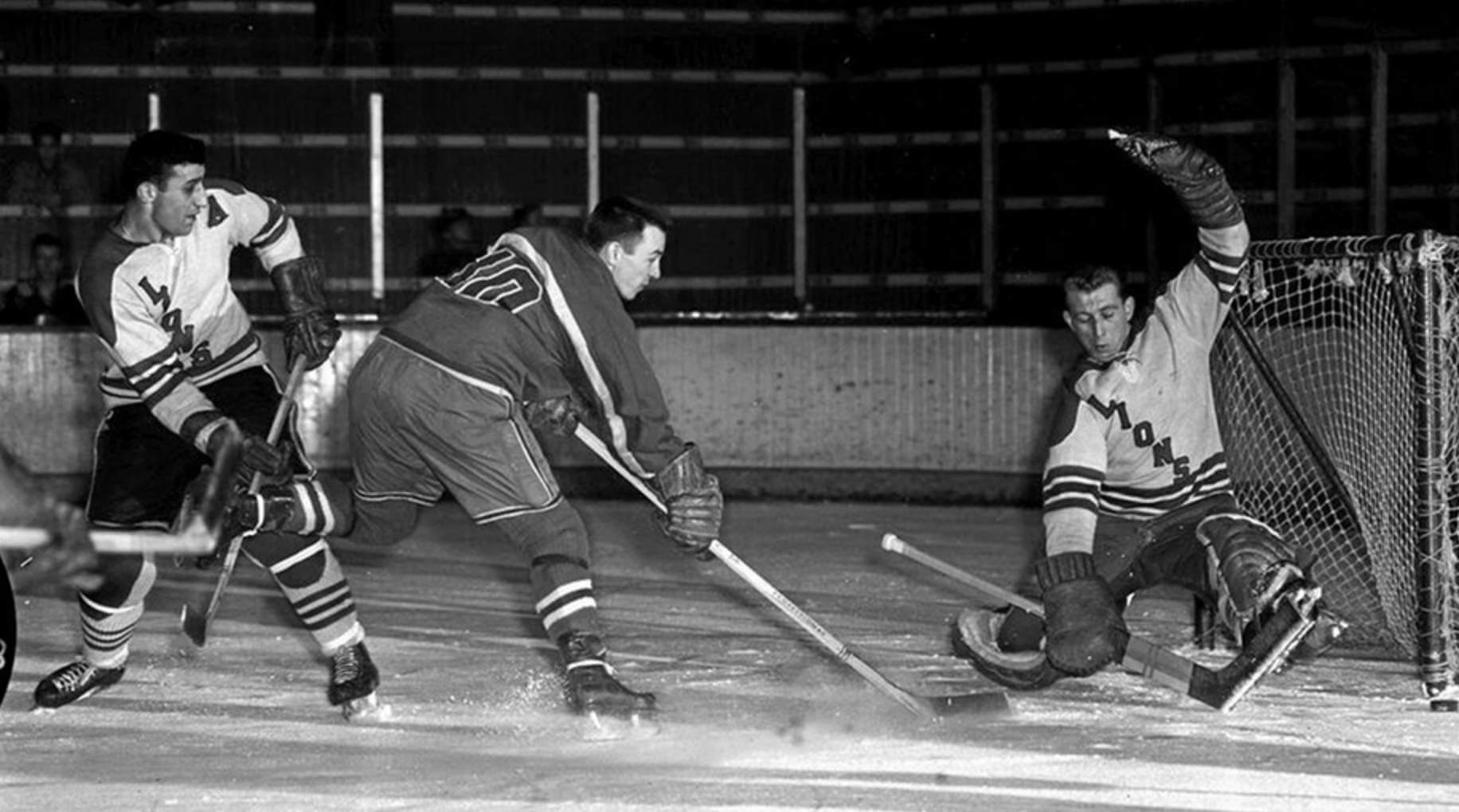
This isn’t the first time Trois-Rivières has had a hockey team called the Lions. The original Trois-Rivières Lions played in the late 1950s and were affiliated with the Rangers, so they wore Rangers-style uniforms with diagonal chest lettering (click to enlarge):
Obviously, they couldn’t go back to that design (or anything like it), since the new team is affiliated with the Canadiens, not the Rangers. But nobody could have expected the new direction to yield such spectacular results. And seriously, what were the odds that a lion-based logo in 2021 wouldn’t be roaring or baring its fangs or some other “intimidating” nonsense like that? This logo is an utter miracle!
The design was done by a Canadian firm called Win X Two, which also handled the design work for two other ECHL teams: the Newfoundland Growlers and the Iowa Heartlanders. Neither of those designs even approaches the brilliance of this logo. And just imagine how good it’ll look on the team’s jerseys — can’t wait to see that!
The team will begin play this fall. Realistically, I’ll probably never see them play. But I’m still totally stoked about the logo. Uni Watch’s highest rating.
Click to enlarge
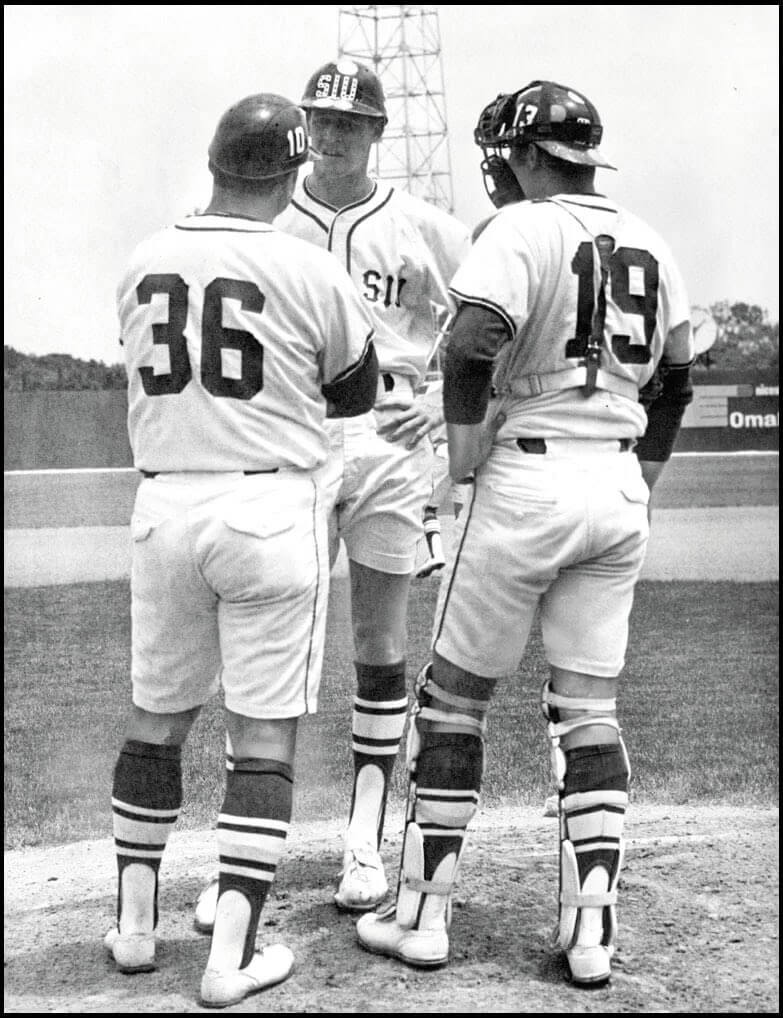
There’s a lot to unpack here: We’ve seen lots of photos over the years of minor league baseball teams wearing shorts, but I’m not sure I’ve ever seen a shorts-clad college team before. That’s Southern Illinois in the 1969 College World Series.
But that’s just the start of the weirdness on display in this photo. Consider:
• TV numbers on the helmets — and they don’t match the jersey numbers!
• What’s with the weird “riveted” style for the helmet logo?
• Is there something on the helmet brim?
• Two of the three helmeted people appear to be a coach/manager and a pitcher!
• White shoes!
That’s a lot of uni goodness wrapped up in one photo, people!
Just to make things even more confusing, a newspaper clipping indicates that SIU wore red shorts and T-shirt jerseys in the ’69 CWS (click to enlarge):
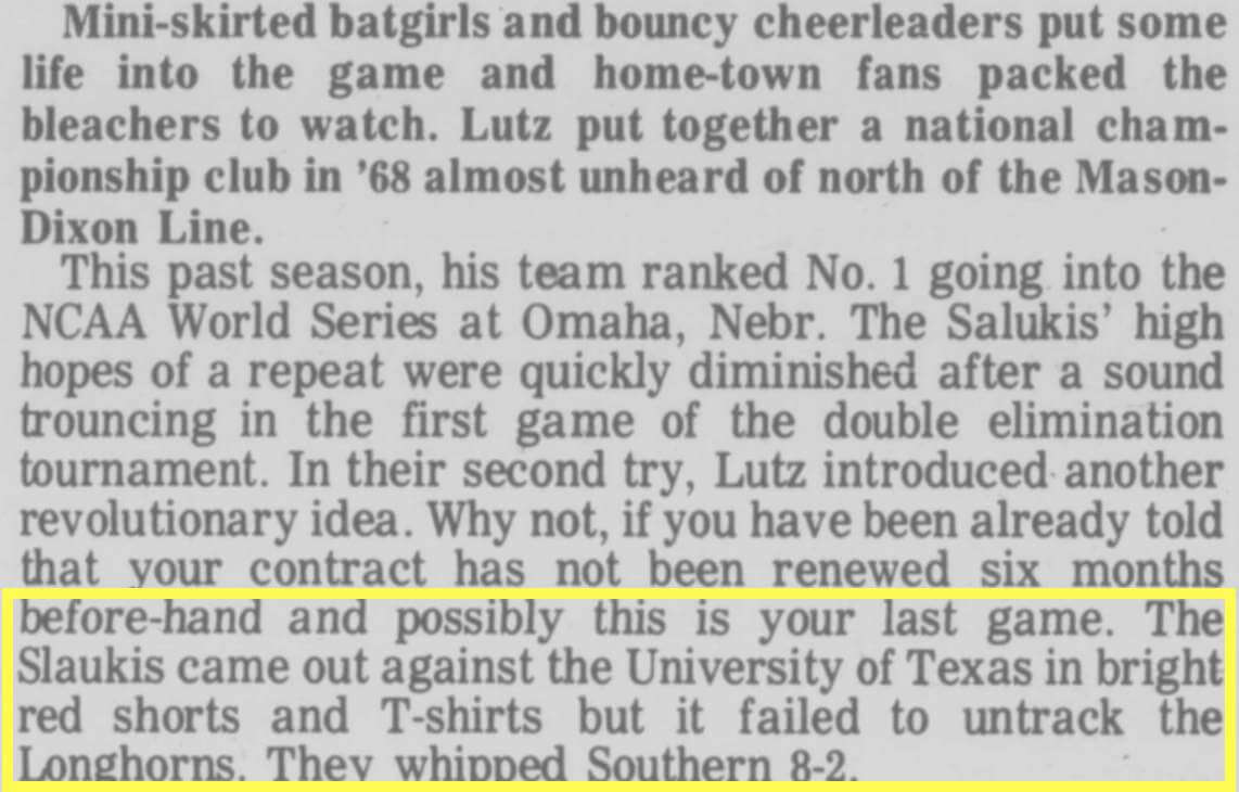
Hmmmmm. So that’s something to investigate further.
(Major thanks to Max Gittelson for this one.)
Click to enlarge
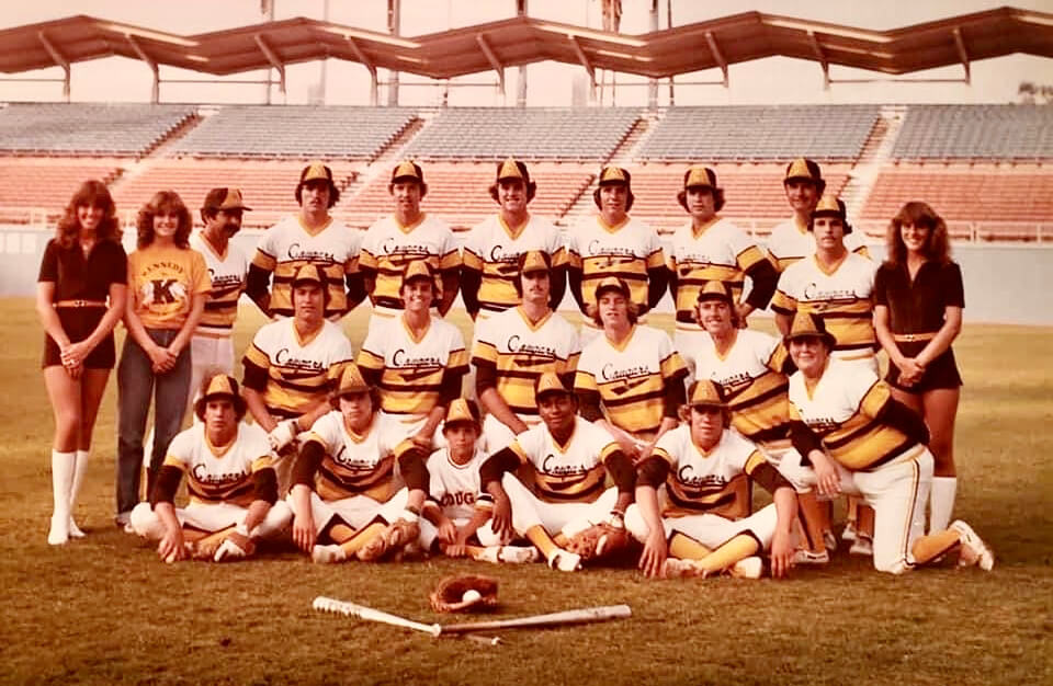
Too good for the Ticker: This photo shows the John F. Kennedy High School baseball team just before they played in the 1981 Los Angeles city championship game at Dodger Stadium. Man, those uniforms — the colors are a little washed out in the photo, but those are Padres colors on a tequila sunrise template. Brown stirrups and gold sannies, too! Proud JFK alum Bob Timmerman reports that they ended up winning the game but did not bring the uniforms back the following season.
Click to enlarge
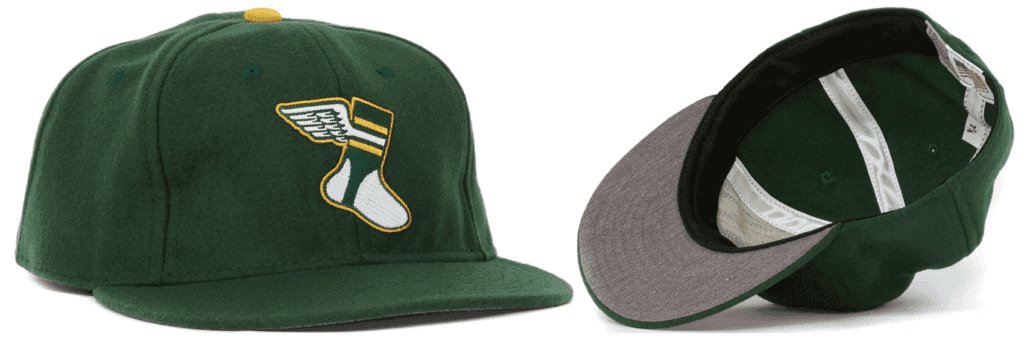
ITEM! Important Uni Watch cap news: I recently got in touch with Ebbets Field Flannels to order some new Uni Watch cap inventory. But they told me that they no longer had access to the green wool fabric we’d been using for our caps. They sent me samples of two potential replacement fabrics, but both of those were much darker than the fabric we’ve been using and didn’t feel right to me. So I won’t be getting any more caps from EFF, at least for now.
That means the caps we currently have on hand will be the final inventory of this product. At present, adjustables are sold out but we have small quantities of all fitted sizes from 7 through 8. If you want one (or more than one), get your order in now — once they’re gone, they’re gone!
I haven’t yet decided if I’ll to seek out a new cap supplier or if I’ll just get out of the cap biz. Either way, I won’t make that decision until we’ve sold out of the EFF caps, so get ’em while you can and then we’ll decide about whether there’ll be a new chapter of Uni Watch headwear. Thanks!
The Ticker
By Anthony Emerson

Baseball News: Does anyone have any idea what was going on with Twins P Scott Erickson’s sleeves in 1994’s throwback game against the Rangers? Perhaps just a production error for a one-off uni? … Astros P Lance McCullers is on a rehab stint with the Sugar Land Skeeters, and is wearing his Astros pants with the club — the Skeeters don’t have piping on their pants (from @SteveinLC). … On a similar note, Padres OF Trent Grisham is on a rehab assignment with the El Paso Chihuahuas and wore his MLB pants (from @sdsuaztec4). … The Tulsa Drillers, Double-A affiliates of the Dodgers, wore T-Town Clowns throwback jerseys, but the jerseys were grey and they wore their regular white pants. Ruined the look (from @hardchargindaddy). … The History Channel has an article about the All American Girls Professional Baseball Association, and how uniforms were designed to conform to notions of femininity at the time (from Kary Klismet). … Looks like the D-backs will unveil their CC alternates this Sunday.

Football News: Raiders QB Derek Carr has switched to the new Vicis Zero2 helmet (from Kary Klismet). … Lots of uni weirdness went down at the 1985 Bears/Packers game at Lambeau, featuring an odd Packers NOB and no GSH sleeve memorial for two Bears players. … Virginia Tech has started issuing new numbers (from Andrew Cosentino). …What are the best alternate unis in the Big Ten? This blogger has thoughts on that (thanks, Phil).

Hockey News: Whoa, check out this weird un-yoked jersey the Oilers gave Grant Fuhr at the 1981 draft (from Steven Schapansky and Rob S.).

Soccer News: Big MLS uni bombshell yesterday, as what appears to be the New England Revolution’s new logo was leaked. The Revs were the only club from MLS’s inaugural season to still be holding onto their original crest. No, I don’t like the change (from multiple readers). … During Tuesday’s Colombia/Argentina match, a Colombia player’s jersey crest began peeling off (from @BloodRust88). … UEFA has told Ukraine to change their Euro 2020 kits, saying that the combination of the map of the country including the Russia-annexed territory of Crimea (internationally recognized as Ukrainian territory) and the slogans “Glory to Ukraine” and “Glory to the Heroes” gives the kit “historic and militaristic significance” (thanks, Jamie). … Also from Jamie: Germany’s women’s team added a sleeve patch for a friendly yesterday against France. It’s for their “Fußball, die” campaign to get more women involved in soccer. The slogan’s derivation is that “die” indicates the word “Fußball” is gendered female. “Fußball” is normally male. The name is spoken “Fußball komma die.” … Still more from Jamie: For a Denmark/Australia friendly today, Australia brought Denmark’s Crown Princess Mary a shirt with “Matildas” (the women’s team’s nickname) as the NOB, as she’s Australian. … Paris Saint-Germain’s third kits have leaked (from Kary Klismet and Michael Zerbib).
Olympics News: Here’s a piece on the evolution of Olympic uniforms from 1920 through this year (thanks, Phil and Timmy Donahue).

Grab Bag: ESPN’s Sam Borden has a really great piece on gay rights activist Tom Ammiano, who was finally given a letterman jacket for track 63 years after his high school denied him one for being gay. Highly recommended — and have tissues ready (from Akul Nishawala). … Nike is celebrating their namesake, the Greek goddess Nike, with a line of shoes that misspells Nike’s name in Greek. The shoes feature the name as “ΠIKΣ”, which in Greek would be pronounced as “piks” (from Ebin Sandler). … Some truly deranged advertising deals are infecting golf’s European Tour. … A North Carolina State blog has done a retrospective on the uniforms worn by the Wolfpack’s football, men’s basketball, and baseball teams during the 2020-21 season (from Kary Klismet). … Also from Kary: Astoria (Ore.) High School valedictorian used her speech to highlight the gender inequities in the school’s team names. The boys teams are known as the “Fishermen,” while the girls’ teams are called the “Lady Fish”. … The city of Dallas has adopted its own version of the Pride flag (from Timmy Donahue).
Big congrats to Nathan Haas (who runs Adelph Wear, maker of Uni Watch hockey and cycling jerseys) and his wife, who recently welcomed their first child into the world — a baby son. All best to you and your newly expanded family, Nathan!
As for everyone else, enjoy Phil’s weekend content and I’ll see you back here on Monday. — Paul
Really interested to see what kind of trainwreck Nike comes up with for those Diamondbacks costumes.
I remember doodling the DBacks logo in 5th or 6th grade soon after the expansion team was announced, I remember where I was when they won the WS in ’01, and I have no faith that this release will truly tie into the club or city in any way.
Agreed. Think about just the number of colors that Arizona has ever used in its history: teal, purple, copper, brick, black … could be candidate for Rainbow Guts?
I hope they go in this direction! link
As someone who has been watching for a long time, I think the Revs’ new logo is excellent. Distinctive and sophisticated. If it implies that the sash is becoming a visual element for the team (on shirts, etc) even better.
In the ticker, my last name should be spelled Nishawala. Thanks.
Fixed!
Trois-Rivières Lions: Looks exactly like the dragon from never ending story. Google it if you’d like…
Didn’t notice that at first, but now every time I see this logo it will be Falcor. Definitely looks like him.
I don’t know, I’m torn on the Trois-Rivières Lions logo. It is pretty slick, but I also feel like it’s forced a bit. The ECHL is not going to be as popular as the NHL or the QMJHL of the CHL in Quebec, so they crammed a fleur-de-lis into the logo to try to get as much cred as they could.
At first quick glance when I first saw it, it reminded me of the Wizard of Oz Doorman.
About the Grant Fuhr jersey at the draft. Yep, it seemed the importance of giving your draft pick an authentic jersey back then was not a big thing.
In 1988, Trevor Linden was picked no. 2 overall by the Vancouver Canucks. Really high draft pick but they could not seem to give him an authentic jersey either. Was missing the Vs on the shoulder. They did manage to give him a hat though.
link
The College World Series is double-elimination, so it could be true that SIU wore both white and red uniforms. But I looked up the 1969 CWS on Wikipedia, and Southern Illinois did not play Texas during the series. They lost to Massachusetts and Ole Miss. So still weird.
What’s also weird is that article implied they were the ’68 champions, when in fact they were runner up. Very strange.
Worth noting that SIU mascot is the Saluki (misspelled in the clipping). Which is great.
This source claims a highly progressive (in 1949) switch from the prior nickname of “Maroon” due to racial connotations. (Which also takes the joy out of a favorite Bugs Bunny put-down.)
link
“What an ignoranimus.”
— Bugs
Why is “storytelling” is considered bullshit?
Perhaps because it comes across to many as unnecessary and contrived. And honestly, when you read these PR descriptions, is any of it really remembered? -C.
The philosopher Harry Frankfurt famously defined bullshit, in his seminal work “On Bullshit,” as communication without regard for truth. A liar knows the truth, cares about the truth, and values the truth sufficiently to try to hide it with a lie. A bullshitter just makes stuff up and doesn’t care whether it’s true or nor. “The bullshitter is faking things. But this does not mean that he necessarily gets them wrong,” Frankfurt wrote.
So this ubiquitous marketing “storytelling” is precisely bullshit as Frankfurt defines it. It’s mostly obviously post-facto pretense. It’s not true, it’s made up, but neither is it a lie, in that the make-believe is not intended to hide some adverse or unwanted truth. It’s just fake. Which is proven by the fact that some teams have lately parodied the “storytelling” bullshit by putting out link that link the making and meaning of their new logos. When you can parody a thing by telling the truth – not joking, not making up a different story, but just saying some earnest and straightforward true things – the thing being parodied is bullshit.
Fur-de-lis, perhaps?
Excited to see the New England Revolution finally updated their crest. This move is at least 10-15 years too late.
While I like the new crest, it is too reminiscent of the Scotish Rangers FC crest that was adopted in the 1950-60’s. The Revolution may have history in the MLS, but not enough in the grand scheme to pull off this “faux-nostalgic” crest as a primary logo, would work better for a third jersey.
Trying to figure out the red diagonal line. What’s the story it’s telling me? (insert eyeroll here)
What’s the significance? Without knowing what it means, it makes it look like a No Parking sign or someone is trying to cancel out the Revs.
Confusing.
The new crest is definitely an upgrade, but how could it not be? Even in the mid-1990s, the Rev logo was pretty terrible, and it hasn’t improved with age. But agreed that the new one is not great, and the marketing BS will be asked to do a lot of work. I’ve seen so many excellent fan concepts for Rev crests, most of which use either/or crossed white sashes to depict the crossed white leather belts of Continental Army soldiers and the pine tree of the Revolutionary-era New England flag. Either or both of those elements should have been part of the new club crest; either could be the basis of standout, distinctive uniforms.
It seems like MLS is doing a decent job with their new logos (Miami, Austin, Charlotte, St Louis), and an absolutely lousy job with their rebrands — Chicago (so poorly received, a new logo is being designed for next season); Houston; Montreal; Columbus (changed within 48 hours of its reveal); and now this monstrosity. It shouldn’t be that difficult to get the fans involved and come up with something that has popular support.
Wow, does Grant Fuhr ever look old for having just been drafted. Guess he just aged really well. Great picture.
Proofreading: In the lede, the sentence that includes the phrase “…and instead chose to parrot team’s press release” looks like it should have a “the” between “parrot” and “team’s.”
Fixed.
If you haven’t already, do yourself a favor and read that ESPN article about Tom Ammiano finally getting his HS letter. Great, great stuff. Prepare to be moved.
I can’t imagine any artist or designer, having been given the instruction to make the lion look “metal plated” using the white and the gray in the way the Fur de Lis does. That seems like obvious marketing BS. That’s not a metal lion, that’s a white lion with perfectly normal shading. For metal, you’d use two tones of gray, with the bit that’s currently white being the lighter tone. Unless you’re going for rhodium, but that’s the kind of specific detail you’d call out in the marketing text if you meant it.
Also working against the “metal plated” claim is that white or albino big cats are a thing and most people will have a mental image of one, so the Fur de Lis will appear to most naive viewers as depicting a white lion. If you want to communicate that it’s a metal lion, you need to do something other than start with a white lion and add a little naturalistic gray shading. Does that logo look anything like a Voltron limb? No, not the trucks, the good Voltron made of metal lions? It does not.
Hey Paul have you ever considered doing a different Ebbets hat design? A pinstriped or soutache trimmed version would be pretty cool.
Will consider it! What base color are you envisioning, now that green is no longer an option?
If you look on their site, there are some attractive hats that are grey with green brim and squatchee. Still classic and Uni Watch colours. With or without soutache would look good. If it was me I’d do the black with white pinstripes and matching winged stirrup logo but that might be too weird ha ha cheers.
Grey with a green brim isn’t a bad idea … although, again, it would probably not be “the right” green. Will think about it!
Maybe a yellow hat, pillbox style.
I own a lot (probably too many) hats, and the Uni-Watch Ebbets cap is hands down my favorite. So I just want to join in the chorus of people hoping the Ebbets cap stays around in some fashion. Shame the right color green is no more, but I sure am glad I got one when I did.
Late to seeing this, but I second the sentiments. I don’t need a second UW EF cap in all green, but a different design would be an all-but mandatory purchase for me!
I’m sure this will be a minority view here, but I think it’s unfair to dismiss the “storytelling” that is usually offered when a new logo/uniform is unveiled as BS out of hand.
No doubt, a lot of these explanations behind the designers’ choices of color or other elements will make one roll their eyes a bit, but on the other hand, logos are visual representations of ideas/identities that may not be obvious to everybody and having some further explanation of them is interesting to those who are curious.
I would just say that if you have to explain something in a logo in story telling you either didn’t do a good enough job of representing it in the logo, or whatever locale based story you are trying to tell is not significant enough that a wide audience would be able to pick up on it.
And it is certainly fine to incorporate something into the design that only locals will pick up on.
But if part of the story is only readable to locals, then the wider audience is just going to roll their eyes at the story telling because you had to explain why a certain design element was included.
I can agree with most of what you said, but I’ll argue that sometimes the beauty of the logo is in the subtlety, and it’s helpful to have it pointed out on release. The arrow in the FedEx logo, the bike rider in the Tour de France – there are lots of logos where it helps to say “we put this here on purpose.” In a sense, announcing it upon reveal proves it was intentional and not a retroactive “we totally meant that.” I’m not convinced that Wendy’s collar was supposed to say “MOM” or the Atlanta Falcons “F” is more than coincidental. With these Lions, at least we know it was supposed to be a flame on top.
A couple comments on the SIU comments:
1. Those are, rather plainly, not “TV” numbers. Back in the day–talking now about semipro play, not college, but at a time when there wasn’t so much difference between the two–we put numbers on helmets to help pick them out when it was time to go to the plate. But, except in the year when they were brand new, players always changed, and there were never enough to go around. Again, this was a time long ago and far away, and very unlike today, when every travel-team player at age 12 has his own number helmet and the like.
2. It was common to wear batting helmet in the field in that day. First basemen often did it, for example. A pitcher might be a little less common–but that doesn’t mean it was a bad idea. Ask Tyler Zombro.
I’ll echo a few other commenters here – the cynicism for storytelling in design is over the top here. I can see how storytelling in connection with NFL and other big-name brands is eyeroll-inducing, since it’s often so obviously forced into the narrative. The LA Rams bone-white color comes to mind, among many examples.
However, the awesome Lions logo is for a minor league hockey team for a smallish city in Quebec. Let them have a little fun! I believe them when they describe that they took the Canadiens flame and local metalworking into the design. I think the metal aspect will come out better on a sweater, where actual metallic elements can be built in the fabric.
In general, it seems to me like complaining about logo bullshit poisons the tone of this post, which is about an amazing logo that’s unambiguously good. I don’t mean to tone police Paul, it just felt out of place here, and takes up a lot of space in the article. Maybe I’m misinterpreting, but it seems like others have posted similar reactions.
As an aside, there are lots of similarities between the Lions and that Newfoundland Growlers logo. Head-on animal logos that are “tough” without being cartoonish. I think both are classic designs that stick around for a long time.
Just get the lighter of the 2 green fabric samples. If those were the only options from the start you wouldn’t have trash-canned the entire project. Also, for years Nike made the Jets classic uniforms without access to the right shade of Hunter Green, and nobody seemed to care.
It’s a manufacturing quirk, but I bet if you asked 500 people to submit a picture of their uni-watch cap now, you would end up with 500 different shades of green, as they all fade differently in the sun, discolor differently due to sweat, etc.
My first thought on the T-R Lions was not that a few jillion teams use the fleur de lis (only two pop into my head, though there do seem to be several jillion lion teams/logos out there), nor did it make me think of the “famous” Montreal torch, but I immediately thought that Montreal used a design trope from their former rival the Quebec Nordiques. Is “Sacre bleu!” an appropriate response, then? Placing the lion inside the fleur de lis is a brilliant new idea, I agree, but this logo seems like it should go to an Avalanche affiliate, as they have embraced the Nordique heritage.
The lettering on the vintage NYR-affiliated Lions jersey is much closer to vertical than angled!
RE: uni-watch caps:
the green in the hat in this image:
link
looks much closer to the two samples than it does to the hat in the photo with the samples!
link
All this time I assumed the uni-watch hat was a dark green!
It’s a medium green — neither kelly nor dark-forest. Obviously, lighting conditions can make the same item look a bit different in different photos, plus there’s variation in fabric dye lots, etc.
Re: Logo releases. Here’s a possible anti-storytelling-bullshit. Why don’t they just say:
Here’s our new logo. It’s a lion’s head (because we’re the Lions), shaped like a fleur-de-lis (because we’re from Quebec) with the top of the Lions mane reminding us of the Canadiens iconic torch.
There. No corporate speak, no story-telling bullshit. How’d I do? (I’m not even from the advertising industry)
As a big Canadiens fan (but admittedly not at all up to snuff on the minor league teams), I like the logo a lot so far, but I’m also VERY interested to see which jersey is the base. You’d think they’d use either the Habs template or the Laval rocket template (consistent pants and gloves, and blue helmets too, but the jerseys and socks are different)…but being a Quebec team, I think they will lean super hard on that and come out with blue jerseys, matching the provincial flag. The Habs’ Reverse Retros are considered “nice and look good, but the results are cursed.” But they’ll theoretically be good for Trois-Rivieres. I’m actually not rooting for this…especially because the logo we see has no red so I fear it would be lost with no pop…but for a prediction, pencil me in for “a blue and white look with minimal but some red on the jerseys and socks, and otherwise standard Canadiens equipment.”
A lot of ECHL team have looks more independent of the parent team than many AHL teams. The blue with silver/grey trim (no red trim) would be a way to go and an underused colour scheme in hockey. Great potential for a good looking uniform.
OHL’s Sudbury Wolves are an example of how good the colourway can look. Have worn it since late 1980s:
link
Although Paul might have preferred the look of the Sudbury Wolves better in their prior colour scheme :)
link
Comment a day late but I think the Olympic News should say evolution of United States or U.S.A. uniforms instead of “evolution of Olympic uniforms” since all of the 48 photos of uniforms are from only that particular country.