Click to enlarge
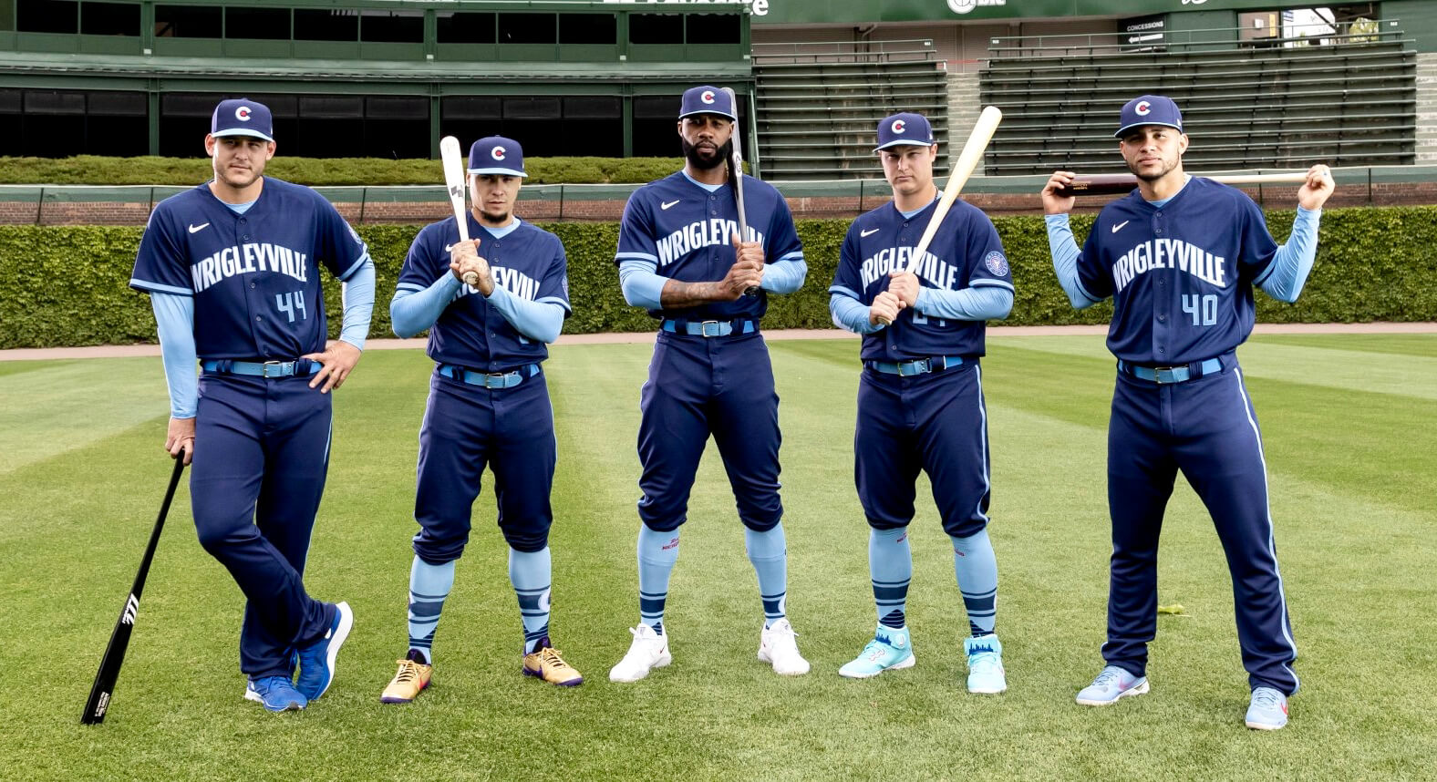
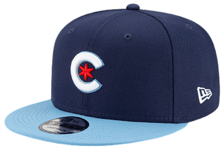
After a series of leaks, the Cubs went ahead yesterday and unveiled their City Connect (CC) alternate uniform. You can see the full uni above, and here’s a closer look at the cap:

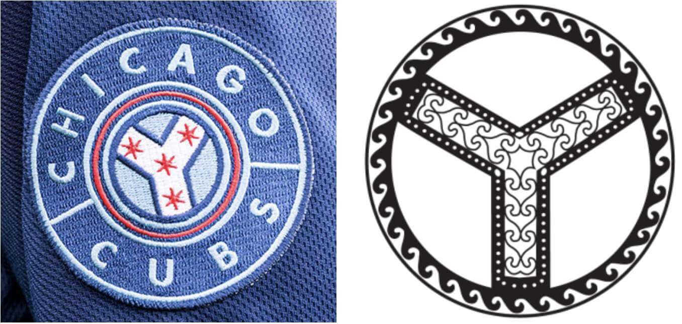
Here’s a closer look at the sleeve patch, which is based on the municipal device of Chicago, a Y-shaped symbol that appears throughout the city, representing the north, south, and main branches of the Chicago River:

Some thoughts:
1. The jersey lettering is based, of course, on the famous Wrigley Field sign. Some folks say the use of “Wrigleyville” is an affront, because real Chicagoans never use that term, blah-blah-blah — I’ll leave that to Chicagoans to argue over. Personally, I’m not nuts about something other than the team name or city name appearing on the jersey, but I do think the design of the lettering is pretty nice.
2. It seems fairly obvious that every new Chicago team uniform in any sport for the foreseeable future will feature some iteration of the six-pointed star from the city flag. As a design trope, it already feels played out. That said, the cap is pretty good. I add the “pretty” qualifier because I’m not nuts about the light-blue brim, plus the overall design looks a lot like one of the Blue Jays’ alternate caps:

3. When the jersey leaked at the end of last week, it hadn’t occurred to me that the pants might be blue to match. I’m sure some of you folks out there dislike the mono look, but I actually like it, at least with the high-cuffed pants — the contrasting belt, undershirt, and socks all coordinate nicely. Plus the Cubs have a history of going mono-blue in 1911, ’12, and ’13, so there’s historical precedent. (The look is a lot less attractive with pajama pants, though.)
4. There’s also a lot of marketing hoo-ha about how this uniform “ties together all of Chicago’s neighborhoods,” because Chicago is a “city of neighborhoods” (unlike all those other cities, I guess) and lots of associated nonsense. If you ignore all of that, as you should, and just concentrate on the design, it’s not bad. Not great, but not bad.
This uniform will make its on-field debut this Saturday, June 12, when the Cubs host the Cardinals. If the Cards wear their usual powder blue Saturday road unis, that would make for a mono-blue vs. mono-blue game — hmmmm.
The Diamondbacks are the next team slated to unveil a CC uniform. That release is coming sometime later this month.
Ump Pocket Watch, continued: Welcome to Ump Pocket Watch, where we obsess over objects that end up in umpires’ pockets. As you may recall, yesterday we discussed a college baseball game during which a wild pitch somehow ended up in the plate umpire’s chest pocket, which seemed like a once-in-a-lifetime occurrence.
But reader Chris Flinn has alerted me to the existence of two other examples of this same phenomenon! One of them, shown above, took place during a Pirates/Padres game in 2016. The other is from a Chisox/Astros game of indeterminate date (although it had to be somewhere from 1994 to 1999, based on Houston’s uniforms):
(Update: Reader/researcher Jerry Wolper has determined that his game took place on July 1, 1998. The wild pitch took place in the seventh inning, and is described thusly in the play-by-play: “Henry threw a wild pitch [Durham scored (unearned)]; the ball somehow got in the shirt pocket of HP umpire Gerry Davis; when
catcher Brad Ausmus could not find the ball, Ray Durham
scored.”)
In addition, there was a Cubs/Dodgers game in 2019 in which Cubbies catcher Willson Contreras fouled a ball into a pocket on the plate ump’s jacket (which seems a bit less improbable, since the jacket pockets are larger, but still a pretty neat trick):
That concludes this edition of Ump Pocket Watch. I’m sure we’ll have more installments in the weeks and months ahead.
(Big thanks to Chris Flinn for the first two videos shown above.)

Click to enlarge
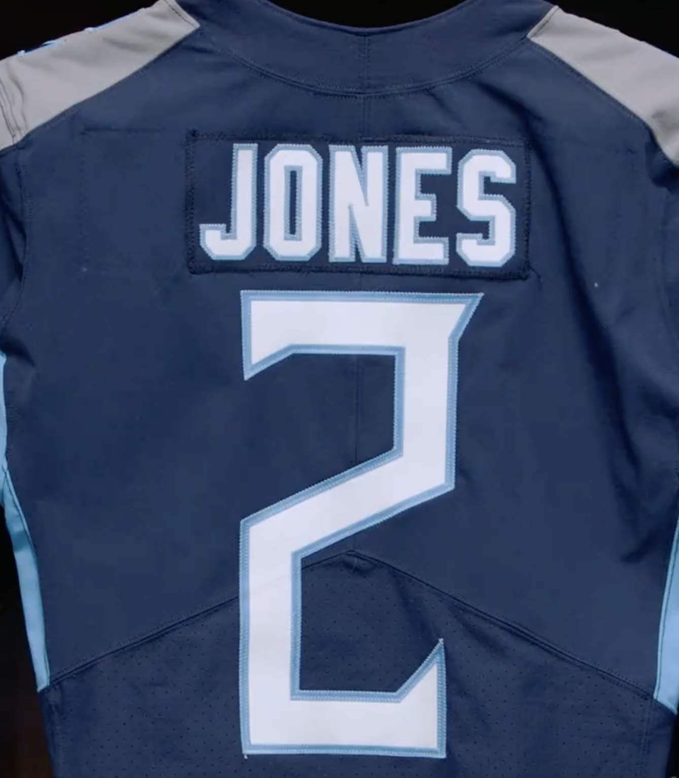
Blue (name)plate special: The big news in the NFL yesterday, as such things go, is that newly acquired Titans wideout Julio Jones will wear No. 2. The Titans promoted this development via a video on social media. But as you can see in the screen shot above, they apparently used an old jersey from which an earlier (and longer) nameplate had been removed.
Now, I’m all in favor of recycling, reuse, and all of that. But if you’re going to create a silly promo video for a largely pointless bit of “news,” it seems like you could at least use a new jersey instead of half-assing it, no?
(All credit to Twitter-er @Mr_MacDougall for spotting the outline of the old nameplate.)

Membership update: We’ve finally finished all of this year’s Purp Walk orders. That includes longtime reader R. Scott Rogers’s card, which is based on Forward Madison keeper’s shirt.
We are now fully caught up on all membership orders, purple and otherwise. The new designs have been added to the membership card gallery, which now features more than 3,200 designs!
Ordering a membership card is a good way to support Uni Watch (which, frankly, could use your support these days). And remember, a Uni Watch membership card entitles you to a 15% discount on any of the merchandise in the Uni Watch, Uni Rock, and Naming Wrongs shops, plus the discount also applies to our Uni Watch Classic Cap. (If you’re an existing member and would like to have the discount code, email me and I’ll hook you up.)
As always, you can sign up for your own custom-designed card here, you can see all the cards we’ve designed so far here (now more than 3,200 of them!), and you can see how we produce the cards here.
The Ticker
By Lloyd Alaban

Baseball News: The Sugar Land Skeeters will wear parrot-themed jerseys this weekend (from Ignacio Salazar). … The A’s wore the Lou Gehrig Day patch on June 2, when they were on the road, but they showcased an ALS-centric nonprofit group for last night’s home game, so they wore the patch again last night.

Football News: Guns N’ Roses announced their August show at Allegiant Stadium in Las Vegas with a modified Raiders logo. … A sportswriter tells the uni-verse to be more optimistic about the Packers’ upcoming throwbacks (from our own Phil Hecken). … Dolphins WR Mack Hollins wore his road jersey while scuba diving (from James Gilbert).

Hockey News: Although the Canadiens are the Maple Leafs’ rivals and actually eliminated the Leafs from this year’s Stanley Cup playoffs, the CN Tower in Toronto was lit up in Habs colors last night to support Montreal’s push toward the Cup (from Wade Heidt).

College Basketball News: Baby steps: The NCAA said it’s waiting on some sort of review of gender equality in basketball. As part of that, they might let the Division I women’s hoops tournament use the “March Madness” branding (from our own Jamie Rathjen).

Soccer News: ESPN has ranked all Euro 2020 kits (from Ridgeway Burns). … New third kit for Scottish Premiership side Hearts (from Trevor Williams). … New crest for Portuguese side Gil Vicente (from Mike D.). … The next four items are from our own Jamie Rathjen: The USMNT and USWNT are wearing rainbow numbers for Pride Month three times over the next week. … The NWSL announced a San Diego expansion team, which will begin play in 2022. … The USL W League was relaunched yesterday. The Minnesota team currently has a placeholder name and logo. It sounds like they’ll reveal more this weekend. … Not a ton of details for the USL W Washington team either. … New logo for Comox Valley United, an amateur club in British Columbia (from Kary Klismet). … New Mexico United of the USL Championship revealed Pride uniforms (from Ty Ortega).

Grab Bag: New advertiser for this weekend’s NASCAR Xfinity Series race at Texas Motor Speedway (from Timmy Donahue). … Also from Timmy: Alaska Airlines employees say the airlines’ uniforms are discriminatory. … The following three items are from Kary Klismet: New uniforms for the Midland County, Texas, Sheriff’s Department. … A study from Victoria University in Australia has found that white uniforms and skirts may be turning off many women and girls from participating in organized sports. … Team Wales has unveiled its mascot for the 2022 Commonwealth Games in Birmingham, England. … The town of Perryville, Ky., has formed a committee to redesign its logo, which currently includes a Confederate flag (from Michael Kinney).
Lot’s of great card designs! It’d be great for folks who just had their cards added to the gallery to note in the comments where some of these designs come from.
Agreed.
There’s a new addition in the gallery which could be based on a car from Rick Ware Racing’s livery…it looks spectacular, as most paint-scene designs do when re-imagined as membership cards.
+1
I’ve long since wished that the cards had some kind of identifying info.
Strongly agree. Many cards are easily identifiable but just as many were ordered by uniwatchers who are much more imaginative than myself. I would love to know what these more obscure designs are emblematic of.
Hi Paul,
Though you judge each complete uniform on a case-by-case basis, why does it bother you less when baseball goes mono-color vs other sports (i.e. NFL)
I think the mono thing is obviously sports specific to the design standards of said sport. Baseball is supposed to go mono (sans hat), either all white or all gray. The recent trend of colored tops being a break in the rule for baseball.
In football, aside from mono white, teams having matching pants and helmets is a new thing that bucks the existing trend of contrasting jersey and pants.
So whether it was the White Sox or Cubs, those city uniforms aren’t so much jarring because the tops and pants match, but rather because dark colors are rare.
I didn’t say that. I said *this Cubs mono-blue uniform* doesn’t bother me, in part because of the historical precedent.
Beyond that, there’s something about a football uniform — the helmet and shoulder pads, in particular — that make a mono uni seem much more like a superhero costume or a cyborg (which I count as a negative, although I’m sure there are other people who view it as a positive). Baseball uniforms tend not to feel superhero-ish, because we can see the players’ faces and they don’t have pads that exaggerate or distort their physiques.
I lived in Chicago for fifteen years and never knew about the Y municipal symbol….just me? Also, everybody said Wrigleyville.
Everyone says Wrigleyville. If you want to be marked as a tourist, just say “Chi-Town.” Locals don’t say that one.
As for the municipal symbol, one of the best places to spot it is in the iconic Chicago Theatre marquee. It’s right behind the second C on the front signage.
link
Agree that Wrigleyville is term used by locals.
The larger neighborhood is Lakeview–of which “Wrigleyville” is a less defined subsection.
Lived about at 5 min walk from the ballpark for several years, so I know of what I speak! ;)
Stephen Piscotty of the A’s received the Lou Gehrig Memorial Award from Phi Delta Theta Fraternity last night. Probably another reason for the ALS/Lou Gehrig patch making another appearance. link
Paul, so happy to see you recognizing the Cubs’ all-navy uniforms of the 1910s, link. They also wore all navy in the 1880s and link.
I love the all-navy look with the addition of powder blue, and “Wrigleyville” doesn’t bother me all that much (though it feels like a Players’ Weekend thing). The powder blue socks look great, as does the little red star on the cap.
But I can’t understand the number font at all, and of course I hate the NOBs. All they had to do was bring back the beautiful Shepard font from the ’40s, or the NCAA font that they wore when they brought out the 1910s navy throwbacks in 1997. Where is this bizarre font coming from?
I went to Nike’s Custom Jersey Builder site to see if I could throw together a similar jersey, and I got pretty close using their stock elements. Their “Vapor Strike Regular” number font seems almost identical.
Not sure if it is just me, but from a distance when I look at that Cubs cap I see the Colorado state flag C, as the star isn’t directly distinguishable and it just looks like a circular c with the center filled in.
Also, love how nonchalant the ump is in that Cubs/Dodgers game, pulling the ball out of his pocket like what just happened was completely normal. On the first viewing I wasn’t sure if he was actually pulling the ball in play back out, or just though the original ball was gone and was pulling a new ball out his bag.
“Not sure if it is just me, but from a distance when I look at that Cubs cap I see the Colorado state flag C, as the star isn’t directly distinguishable and it just looks like a circular c with the center filled in.”
I see it less with this cap compared to the regular one since this ‘C’ is blue rather than red.
But still there are very few ways to do a ‘C’ and not make it look like something else. For example, even the Red’s C Cap looks like the Chicago Bears. I’d argue that this is where the real tragedy lies; if Cincy did a different ‘C’, then Chicago’s city connect C could look like Da Bears, and would be a neat thing of branding.
Too bad Derrick Henry had to wait a year to reclaim No. 2….
Paul,
Did you have any opinions of the White Sox City Connect uniform? As both the unveiling and on-field debut were on Fridays, Phil weighed in on the following Saturdays, but surely you have some thoughts on them, too? They certainly didn’t use the city flag/star in their design, at any rate.
I’m OK with the jersey/pants. Could live without the sublimated grey pattern in the fabric, but that’s not very visible except in super-close-up shots.
Not a fan of the cap.
Overall: Meh-plus.
Ranking of CC releases so far:
Marlins
Cubs
Chisox
Bosox
…though I erred with the on-field debut day (which was Saturday); sorry about that.
The high cuffed pants is a good look Socks not stirrups? Boo. I noticed some red high and inside of the sock, can anyone tell me what it says or is?
It says “Respect Our Neighborhood.” It’s the slogan that Nike is using to tie the design together. Chicagoans recognize it as what’s printed on lawn signs all over Lakeview to discourage inebriated fans from urinating on homeowners’ lawns after a Cub game.
I love the design of the Cubs’ alternate uniforms, but I’m confused about how singling out one of Chicago’s 77 neighborhoods (and arguably the frattiest, douchiest one at that) is supposed to “tie together all of Chicago’s neighborhoods.” It sounds almost like Orwellian doublespeak to claim that it will.
As already noted: That’s just marketing nonsense and has nothing to do with the actual design. Let’s concentrate on the latter (and let’s also please not single out any neighborhoods for abuse or insults — thanks).
I agree!
Welcome back, Dan.
Nice to see ESPN’s Euro kit ranking follow the same tournament format at the Euro’s themselves. Made it more interesting than simply listing them off.
Rizzo and Contreras look like janitors with the pajama pants with the all navy blue look. I’m not a fan of that number font since it makes the 4 look weird. That style of 4 just doesn’t work on a sports uniform.
I like the Cubs uniforms, but part of me wonders how the jersey would have looked in red instead of blue, since they already are drawing inspiration from the red sign and red is one of the Cubs’ colors.
I was at the Mets – Marlins game where the Miami uniforms were worn for the first time, and they looked great!
I think I’d like the White Sox uniforms better if South Side was two words.
Probably would have looked unacceptably like the St. Louis Cardinals.
First thing I noticed was the ‘WRIGLEYVILLE’ on the jersey seems to be arched in such a way as to mimic the outfield scoreboard shape—no?
It’s the red sign outside the stadium that is being mimicked, not the scoreboard. Similar font, too.
“It seems fairly obvious that every new Chicago team uniform in any sport for the foreseeable future will feature some iteration of the six-pointed star from the city flag.”
Does that new Sox uni have any stars on it? I didn’t notice any. Inside the collar or some bullshit like that, maybe?
Re: monochrome uniforms. It’s okay when the jersey and trousers are made of the same material (Baseball, basketball), less successful when mismatched fabric is used (Hockey, football). Color matching across platforms creates problems, as seen when the Red Sox played at Yankee Stadium this weekend; the dark jerseys looked a lot bluer than the navy hats.
As a lifelong Cubs fan I am pretty disappointed with the cc jerseys, but I was not expecting much. I like the colors but the uniform looks boring like nobody put any effort into the design. Also I find it funny that a big deal is being made about neighborhoods when Wrigleyville isn’t actually a neighborhood. It is just a reference to the area around the ballpark
Right, but when’s the last time anyone said they were going to Lakeview to see a Cubs game?
Interesting crest for Gil Vincente, which is going more traditional with the city crest from their prior modernized crest (with gradient and all) which had the Rooster of Barcelos on it.
link
The actual municipal logo isn’t exactly a Y shape (the spokes are spaced evenly) but the sleeve patch made it more Y shaped. Seems like an odd choice. I don’t like it.
So both Chicago teams’ city connect uniforms are blah-ish, but end up looking kind of nice with stirrups, right?
I’d go out on a limb to say it COULD have to do with design- if the intention was to tie together all 77 neighborhoods, then it would be a failure at accomplishing that. It doesn’t seem like that was the original intent, however, rendering it nonsense.
The Wrigleyville uni was underwhelming, at best. I don’t mind the mono treatment but the wordmark is just…blah. Perhaps could have used a pop of red to mimic the sign. And surprisingly there was no ivy to be seen.
Thanks for the great analysis of the Wrigleyville unis. Always fun to learn about the Municipal Device!
Also, I’m waiting for you to offer umpire themed pocket watches! Maybe an umpire checking his watch for next June’s pin club?