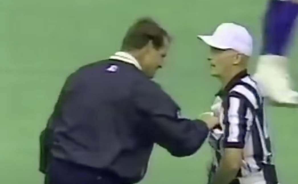
Back in 1995, there was a now-famous incident involving Steelers coach Bill Cowher. The Steelers were facing the Vikings, and Vikes kicker Fuad Reveiz missed a field goal attempt during the second quarter. But Pittsburgh was penalized for having 12 men on the field, so Reveiz got a second chance, and this time his kick was good.
A few minutes later, the Steelers’ eyes-in-the-sky staff sent down a photo showing that the penalty call was wrong — Pittsburgh had the requisite 11 men on the field, not 12, for the first field goal attempt. Cowher, understandably, was incensed — so incensed that before running off the field at halftime, he sought out the officiating crew, waved the photo in their faces, and stuffed the photo in the referee’s jersey pocket before running to the locker room.
You’ve probably seen video of that confrontation at some point, right? If you want to refresh your memory, here it is again:
Why am I rehashing this story? Because Uni Watch reader L.J. Sparvero has been reading Cowher’s just-published autobiography, Heart and Steel, and discovered that it includes an interesting uni-related tidbit about that 1995 incident. Here’s the relevant passage — the uni-related bit is at the very end:
After that incident, Pittsburgh fans were supportive of me. I heard, over and over, that what I did to that official was great. One of my daughters told me, “Daddy, I’m so glad you did that to that official because he was wrong.”
I thought about it, then told her, “No, what I did was wrong. You don’t treat people like that. You don’t show somebody up on national TV like that.” I learned something that day.
I realized I was in the entertainment business, too, and people are constantly watching me on the sidelines. To show up someone in a position of authority — even if I was right — was absolutely the wrong message. The league fined me $7,500. Both officials were fined for their mistake as well. Also, from that time on, the league took the pockets off the officials’ shirts.
Well, that’s certainly an interesting claim. You can almost hear Cowher using it as a punchline every time he tells the story. But is it true? Did Bill Cowher’s temper tantrum actually result in a change to NFL officials’ uniforms?
According to the Gridiron Uniform Database, pockets were added to the officials’ jerseys in 1979 and have remained there ever since. I checked photos from a bunch of different years (although, admittedly, not every single year since 1979), and sure enough, pockets appear to have been there all along. That includes last season, as you can see here (click to enlarge):
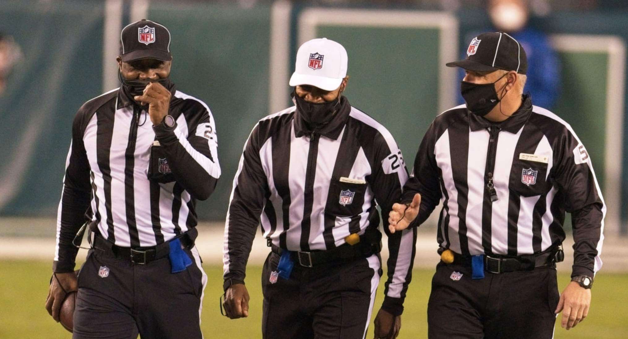
So no, Cowher’s claim is not true. It’s odd that he would make such an easily disproven assertion (and disappointing that his publisher, Simon & Schuster, didn’t fact-check such an easily checkable claim). Moreover, he still works as an NFL TV analyst, so he watches NFL games for a living and has plenty of opportunities to look at the officials. Has he really not noticed that they do indeed still have pockets? Or is he fully aware of that but is operating on the “Never let the truth get in the way of a good story” principle?
Here’s what we should do: Someone should go to Cowher’s house with a printout of that last photo I just showed you, knock on the door, wave the photo in his face, and stuff it in his pocket. I’m sure an easygoing guy like Cowher would appreciate the humor in that situation, don’t you? There’s a free Uni Watch membership card in it for the first person who does it!
More patch shenanigans: MLB teams that didn’t play on Wednesday wore the Lou Gehrig Day patch yesterday. Twins starter J.A. Happ apparently had some trouble with his patch, which spent the first four innings of the game on his chest and then moved to his sleeve for the fifth inning. Memo to MLB: Use sewn-on patches next year!
(My thanks to Twitter-er @minnysam32 for this one.)
Blast from the masked past: As you probably know, Pirates outfielder Dave Parker wore a variety of protective masks after returning to the field while nursing a broken cheekbone in 1978. The most famous of those masks is a hockey goalie’s mask that he wore for one plate appearance, during which he was intentionally walked.
I’ve shared lots of photos of that mask over the years (for full details, see this ESPN article that I wrote in 2008), but I don’t think I’d ever seen video of Parker’s famous hockey-masked at-bat until now. Click on the embed above to check it out.
(Big thanks to James Roche for this one.)

ITEM! New PPC development: As most of you know, the Pandemic Porch Cocktails project recently came to a close after 424 daily photos. I’m still trying to find a venue that will host an exhibit of the pics, but in the meantime several of you have suggested that I compile them into a self-published book — not a bad idea!
So I’ve been looking into that. I’m thinking of going with Blurb, a platform that produces photo books of surprisingly decent quality (we have a few of their books here at Uni Watch HQ). Here’s what I’m thinking:
• 7″ x 7″
• Paperback
• 440 pages
Each photo would get its own page (with the date it was taken printed beneath it), so that would take up 424 of the pages. The remaining pages would be frontmatter, an essay about the project (how it came about, how important it became for us, how it helped us feel connected to our neighborhood even when we couldn’t have normal human contact with our neighbors, etc.), maybe an essay about the branch, and so on.
It all sounds good — except that a 440-page book of color photos is expensive to produce. If I get at least 40 of them made (that’s the quantity at which the biggest pricing discount kicks in), I’d have to sell them for close to $60 plus shipping.
That’s a lot, I know. Would people be interested in purchasing such a book? If you would, please let me know.
Meanwhile, if anyone knows of a better or less expensive platform than Blurb — or if anyone working in the publishing biz wants to discuss this project as a “real” book — I’m all ears. Thanks!
Click to enlarge
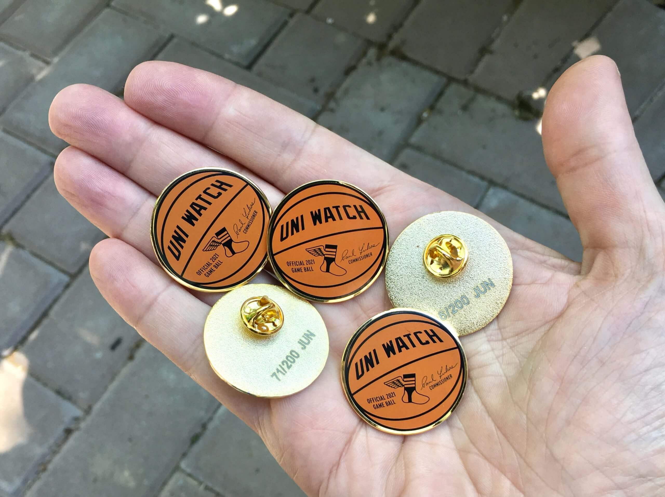
June pin reminder: In case you missed it on Tuesday, our June pin is now available. With the NBA playoffs in full swing, we’ve decided to go with a basketball theme this month. Our “Official Uni Watch Basketball” pin — similar to the baseball pin that we did in April of last year — comes with my signature and is also the first pin we’ve ever done that doesn’t include green!
This pin is available in a numbered edition of 200. As of this morning, there were fewer than 80 remaining. You can order yours here while supplies last.
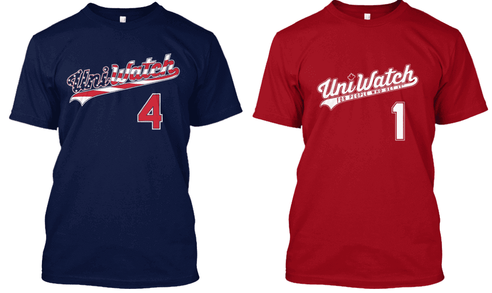
While we’re at it, it’s worth noting that those two early-July holidays — Canada Day on July 1 and Independence Day on July 4 — are right around the corner. For those who care to celebrate athletics aesthetics while celebrating the holidays, you can get Uni Watch shirts for either holiday (or both holidays!) by ordering now — the Independence Day shirt is here and the Canada Day shirt is here. Thanks.
The Ticker
By Anthony Emerson

Baseball News: The New Comiskey scoreboard operator accidentally used an Orioles logo, instead of a Tigers logo, during last night’s game against Detroit (from David Raglin). … Some MLB teams are adding logos to rectangular training fields at their Spring Training facilities, making them look like bizarro-world football fields. … The Athletic has ranked MLB road greys (from @GrumpyTigersFan). … The Nashville Sounds, Triple-A affiliates of the Brewers, wore some pretty awesome throwbacks last night (from @fletchuelse). … The Chattanooga Lookouts, Double-A affiliates of the Reds, had two different pant stripes going on during last night’s game (from Ryan Decker).

Pro Football News: A Yahoo columnist shared his picks for the 15 worst unis in NFL history (from Kary Klismet). … Also from Kary, Niners president Al Guido has hinted that the club may break out red versions of the 1994 throwback uniforms they wore last season for their upcoming 75th-anniversary season. … Rumors are building that the Cardinals have a uni change in the works (thanks, Phil). … A player for a team in The Spring League is wearing No. 100, which seems to be a fairly common occurrence in this league (from Morris Belleville).
College/High School Football News: FSU’s outgoing president has said in an interview that “it’s possible” Doak Campbell Stadium could have a corporate name eventually.

Hockey News: The Binghamton Black Bears, an expansion team in the Federal Prospects Hockey League, have unveiled their logos and uniforms. The negative space in the logo evokes the logo of the old Binghamton Whalers of the AHL, according to John D. Russell, while the colors are a nod to the Binghamton University Bearcats (also from John Cerone and Timmy Donahue).

NBA News: BC Žalgiris, a EuroLeague team from Lithuania, has Bucks-esque side striping on their jerseys (from Erik Morris). … Vanessa Bryant says the Kobe Proto 6 “Mamba Forever” shoes she worked on with Nike weren’t supposed to be released, but they nonetheless made their way into public hands (from Trevor Williams).

Soccer News: Argentina players wore a memorial patch featuring an image of the recently passed Diego Maradona and the “dates” 1968-∞ (from Moe Khan and David Altman). … FootyHeadlines has published an infographic and article about how Nike slowly took over the Euros from their 1996 debut with Italy. This year nine nations will be outfitted by Nike. Ironically, though the swoosh has taken over the Euros, the Italian FA did not allow any manufacturer’s logo on their kits until 1998, meaning that Nike’s European debut didn’t feature their iconic logo (from Kary Klismet). … Also from Kary, League One side Ipswich Town has unveiled their new kits (also from Germán Cabrejo and Ed Żelaski). … Also from Ed, the Iraqi national team has unveiled new home and away kits. … More from Ed: Scottish side Partick Thistle has unveiled their new away kit. Getting a bit of an early-’90s Germany vibe from it. … Portugal MF Bruno Fernandes’s new boots for the Euros feature the names of his children Gonçalo and Matilde.

Grab Bag: FiveThirtyEight has an article about why changing team names is so hard, mostly talking about teams stepping away from Indigenous appropriation names (from Andrew Cosentino). … The Beasley Media Group has a 60th-anniversary logo (from John Cerone). … Hendrick Motorsports broke NASCAR’s record for team cup wins last weekend, so every Hendrick car will have a commemorative decal for the remainder of the season (thanks, Jamie). … The University of Wisconsin-Oshkosh’s Fond du Lac and Fox Cities campuses both have new athletics logos (from Timmy Donahue). … Mahindra Racing of Formula E is letting fans design the race suit their drivers will wear for the London E Prix (from Omar Jalife).
That’s a wrap for this week. I’m off to see my mom today, so play nice while I’m away, enjoy Phil’s weekend content, and I’ll see you back here on Monday. — Paul
The new Iraqi soccer jerseys come with the description,
“Inspired by ancient Mesopotamian symbols that have represented this culture for many thousands of years.”
Turns out that the Umbro logo is an “ancient Mesopotamian symbol.” Why knew that when Gilgamesh wrestled Enkidu on the banks of the Euphrates, they wore cool, moisture-wicking Umbro shirts?
“Who knew”, not “why”. D’oh!
:)
Zoom in to the photo of the Jersey and you see a jacquard pattern of….a leaf? A fountain? I’m not sure, but I’d believe you if you said it was Mesopotamian. It sure as hell isn’t the Umbro logo.
There was a book about the Yankees in recent years that spoke ill of fans in Toronto and said that Rogers Centre is the only park in MLB that sells beer in cans, which is patently false. Trust me, PNC Park sells canned beer. (As do countless other ballparks if you just looked at fan shots from games around MLB!)
Seems like something a quick fact check could have prevented, as is the case with this Cowher story.
Depending on how old the book was it COULD have been true. I mean it probably isn’t true, but in my experience the switch to cans has been a more recent thing in the ballparks I have been to. Coinciding with the improvement in canning technology for maintaining flavor. In the past it was typically poured into a plastic cup by the vendor, or you got a plastic bottle when those showed up 15 or so years ago.
Riverfront had wax-lined paper cups. Beer was warm as soon as it hit the daylight. Awful! Cans would have been VERY welcomed back then.
Like this, but it had the concession company logo on it. Brinke may remember the vending company. Hell, Brinke may have an actual cup!
link
No, it was Inside the Empire, which chronicled the 2018 Yanks’ season.
Is it possible that Toronto sells unopened cans of beer? I know I’ve bought plenty of cans of beer but they always pop the tab which would greatly reduce its ability to be used as a thrown weapon due to a loss of weight and less predictable flight path
No, I was there a few summers ago at a game and they open it for you like at any other ballpark.
Paul tell me again how are you any different, selling your merch for July 4th then mlb who does the same thing, it feels a bit hypocritical to say that it’s wrong for mlb to do what they do on a holiday but then you turn around and do the same thing
You’re mischaracterizing (or at least misunderstanding) my position here. My issue is not that they’re selling stars/stripes merch. If that was my issue, the NOB would say “Merch Dump” instead of “Pandering.”
Rather, my issue is that stars/stripes uniforms are clownish-looking costumes that create a form of rah-rah pandering to lower-common-denominator “patriotism,” thereby making a mockery of the values that the flag supposedly stands for. My shirt is a critique of that practice.
I still don’t get it it feels the same to me but thanks for the explanation Paul
You’re welcome.
Maybe this will help: You seem to be saying, “You engage in capitalism, therefore you may not critique any aspect of capitalism.”
This is like saying, “You eat food, therefore you may not say that you don’t like lima beans,” or “You live in a house, therefore you may not say you don’t like certain kinds of architecture,” or “You listen to music, therefore you may not say that Journey sucks.”
The reality, of course, is that there are all kinds of food, all kinds of architecture, and all kinds of music — some good, some not so good.
The same is true of capitalistic practices. Some are good, others not so good.
All of that said, the shirt we’re discussing here is not a critique of capitalistic practices; it is a critique of a certain kind of messaging.
Think of it this way. MLB (and other sports) create patriotism inspired one off uniforms for the sole purpose of cashing in on selling said uniforms under a fake display of patriotism. They could just as easily add a flag patch to hats and jerseys over said holiday weekends. The uniforms aren’t actually about honoring or celebrating our country, but rather are just there because they know people will buy them.
Paul’s merchandise is specifically mocking that. He isn’t making money on a soulless display of patriotism that is nothing but a cash grab. What Paul is doing is making money from making fun of said cash grab. Paul’s gear isn’t faking anything, is directly saying what it is.
I think we have to watch out for what’s known in logic as a “false dichotomy” which is defined as “a fallacy based on a premise that erroneously limits what options are available”.
In this case, some here are assuming that MLB can only either be truly patriotic or just interesting in selling merchandise. But these two things are not mutually exclusive, a person or organization can be both patriotic and interested in selling merchandise that allows others to express their patriotism or honor the military, etc.
Personally, I think there is plenty to criticize about capitalism as it’s currently praticed but if there is a demand for “patriotic” merchandise and a company fulfills that demand by selling it, it’s hard to see what harm is being done.
You’re reasoning reminds me of the William F Buckley quote: “That is like saying that the man who pushes a little old lady into the path of a bus is morally equivalent to the man who pushes her out of its path, because they both push little old ladies around.”
There’s a very important distinction here that isn’t being mentioned. If you dislike a certain kind of food or a certain kind of architecture, that’s purely an opinion. But making the charge of pandering is an accusation, and that carries a whole different kind of moral weight.
If I say, “I hate eating tomatoes”, that’s an innocent opinion. But if I say, “That restaurant serves tomatoes because they’re pandering to people who like tomatoes,” that’s an accusation, and potentially a false one because I don’t really know their motives. And I think that’s where we get into a potentially morally problematic area.
Oh, please. One person’s accusation is another’s opinion. Both are subjective assessments based on one’s own standards. YMMV and all that.
How come the Independence Day shirt is “Pandering” but the Canadian one is “Canada Day?” Aren’t they both pandering?
Just curious.
Personally, I like Stars and Stripes designs.(But hate lima beans and only some Journey songs.)
Because, as far as I can tell (and I’ve consulted some Canadian folks about this, including Chris Creamer), costume-y flag-based uniforms that pander to rah-rah notions of “patriotism” aren’t as big a thing in Canada as they are in the U.S. So the Canada Day shirt is not a critique of anything — it’s just a Uni Watch salute to Canada Day, similar to our St. Paddy’s Day shirt.
You are correct, there are very few Canada themed uniforms, outside of the Blue Jays red jerseys they wear on July 1 each year. Of course there aren’t often many Canadian professional teams playing that day, outside of the Blue Jays. But in the years where the CFL has played on Canada Day there’s been little done special for the day.
And as a side note, as a Flames fan, I hated when I first saw the uniforms introduced with Canada and Alberta flags on the shoulders, and I still hate it when they wear them as a third jersey. If they insist on keeping those uniforms as a third jersey I’d much rather they go back to the 2003-04 version where they had Blasty (the flaming horse head) on the shoulders, and much more sensible stripes.
FWIW, the Twins DID play on Wednesday, just vs a different opponent. Their opponent yesterday, the Royals, did NOT play on Wed so it’s likely the Twins were just joining them in a Thursday LGD re-do. Why the Royals couldn’t have just worn the patch themselves yesterday is unclear to me.
Mariners and Angels both wore LGD patches last night. The quirk there was that the Mariners wore the patches on the home white uniform on Wednesday night at home against the A’s and wore them on the road last night on the Road Blue jersey against the Angesl in Anaheim.
Home: link
Road: link
I was going to say it looks like Argentina used a sideways 8 instead of an actual infinity symbol but seems it can be represented different ways based on typeface. Pretty interesting.
link
1968-∞ = ∞ so they could have just used ∞
Uniforms for Binghamton Black Bears are decent. Would be better with just some minor adjustments. They should get rid of the wordmark below the logo on the black and green jerseys. No need for that, just display the logo on the jersey.
Also to hockey teams out there, please quit doing jerseys with no waist stripes. A good-looking hockey jersey should have waist stripes.
^^^
THIS.
The Blue Jackets, Devils, and Sharks sweaters are for crap since they dropped the waist stripes.
The Blue Jackets have hard to see thin stripes on the jersey hem.
The Devils completely screwed up when they changed their jerseys by removing the bottom stripes and changing the shape of the shoulder yoke. It used to be such a beautifully classic jersey.
The Sharks best look was their original uni. Why they were so quick to change that design I will never understand, even though I know it was an attempted cash grab.
New PPC Development:
– 400 plus pages sounds a bit much given the content is largely similar images
– I’d consider reducing page count by using 4 images per page layout.
– I’m not sure 7×7 is a standard paperback trim size, consider 8.25x 8.25 or 8.5×8.5 as alternatives
– There maybe better choices than Blurb for POD services.
This got me thinkign about the Humans of New York book. They used layouts that included several shots per page, but in some cases gave a whole page to a single photo or story they wanted to highlight.
Are there specific days that stick out in Paul’s or the Tugboat Captain’s memories that might merit a whole page or pages, such as the Branch Rickey story?
Went into the Yahoo story about the worst NFL unis planning on not being impressed and was not disappointed. Even though the Bucs went to the SB in their new “fauxback” unis the writer still cited their old digital clock unis as their current set.
Did the same with the Bengals “current” unis. Cincy updated their unis this off-season.
It was probably an old article.
Or maybe the writer is incompetent.
It is. There’s a disclaimer at the bottom that says” This article originally appeared on USA TODAY: NFL worst uniforms: Panthers, Jaguars among ugliest in league history”
That link leads you to a 2019 article.
Paul, I think the logo on the New Comisky scoreboard is correct as that shot is from Sunday’s game vs the Orioles (end of game lineups). …the listing of ‘Detroit Tigers’ is the error. But OTOH maybe the scoreboard opperator was getting a jump on the next home game which was against Detroit last night.
Might have been a good shot to pass on to PH for his weekend scoreboard feature. Thrown folks a curve.
I came down here to say just this. I’m surprise it hasn’t been changed in the intervening two hours. Maybe it’s a very busy morning.
With the Durham Bulls pitcher being hit in the head last night, there will likely be another debate about pitchers wearing some kind of head protection. This was a thing a couple of years ago, but hadn’t heard anything about it since. Someone wore a protective piece one year, then it disappeared.
I lost interest after the first uniform on Yahoo’s list of the NFL’s worst. First question, is it ranked from worst-worst to best of the worst? Or is the # 1 uni on the list the absolute worst of the worst?
But more importantly, say what you will about Washington Football Team’s former name, the uniforms are and always have been fire. If they hold anything over from their former identity, it has to be their color scheme, which is a welcome departure from all the major sporting teams that use some variation of red/white/blue. They haven’t embraced gimmicks like side panels, tapered pants stripes, or two-toned helmets and they rejected the first round of Color Rash. And again, whatever you think of the former helmet logo, it’s no Chief Nocahoma or Chief Wahoo.
The Jags mustard and Seahawks lime green Color Rash? Those top my list of the absolute worst.
Looks like the Yahoo article is a rehost of a USAToday article from 2019.
The writer refers to the Bengals’ 2004-2020 uniforms and the Bucs’ alarm clock unis as “current”. And at the bottom of the article is a note that the article was originally published in USAToday. When following the link, a September 2019 article comes up.
Interested in the ranking of grey road uniforms, but the Athletic kept blocking me even after I signed up for a free trial. There’s 30 teams but I’ll endeavor to be brief:
1. Atlanta -The Gold Standard. I still wish the player names were vertically arched.
2. Oakland -Best color scheme in the majors.
3. San Diego -See how colorful grey can be?
4. Mets -Stunning colors, love the way the orange radiates against the grey.
5. Toronto -Beautiful bird, beautiful lettering.
6. Boston -Why are there Socks on the sleeve? Unnecessary.
7. St. Louis -Just a grey version of the white uniform, still beautiful, though.
8. Pittsburgh -Wonky numerals keep this from finishing higher.
9. Yankees -Crisp and formal.
10. Kansas City -Improved by white outlines, pretty stripes.
11. Dodgers -Only when they have the “Los Angeles” script.
12. Philadelphia -Beautiful ringspun script. Numbers are kind of weird.
13. Texas -Improved by fattening stripes and simplifying the numbers.
14. Seattle -Good colors, good use of trademarks.
15. Tampa Bay -The white outlining improves everything.
16. Colorado -Nice colors, nice lettering.
17. Cincinnati -Pick only one: the bespoke font, or the drop shadow.
18. Cleveland -“Cleveland” should be vertically arched.
19. Baltimore -Kerning problem with the “l” and “t”.
20. Houston -At least it’s better than the home uniform.
21. Minnesota -Not as cohesive as their old pinstriped greys.
22. Detroit -3-color graphics are excessive.
23. Washington -(see Detroit)
24. Miami -Team colores need to be pumped up.
25. San Francisco -Lose the headspoon.
26. White Sox -Pants stripe doesn’t match sleeve stripe.
27. Cubs -“Chicago” lettering has always looked lopsided.
28. Milwaukee -I dislike their bespoke font.
29. Angels -Too many patches, not enough “Anaheim”
30. Arizona -Shorn of all its trademarks, what’s left is drab.
You do know SD doesn’t wear gray, right? The “official” color of their roadies (and home/alt, pins-less pants) is “sand”.
Yes, but it’s the greyest uniform they have!
Angels need to go back to being the California Angels. Much better logo/trademark
Well since they aren’t the Anaheim Angels, they have just the right amount of Anaheim on their uniforms. That was only the period that Disney owned them and wanted to promote Anaheim where Disneyland is located. They were originally the Los Angeles Angels, before moving to Orange County. They then went with California, since at the time they were the only American League team located in California. They could have kept the Los Angeles name, just like many teams that aren’t located in the city they are named after, like the Dallas Cowboys. I always thought they should have done a regional name, Southern California, Carolina, Tampa Bay or New England.
Obviously Arte Moreno does not want to be backed into a corner; call ’em the “Interstate 5 Angels”, as long as the check clears. My case for keeping the “Anaheim” begins and ends with their 2002 grey jerseys, which saw the team’s only championship.
My qualms over the appellation “Southern California” include the thought of trying to squeeze it onto a uniform, and the fact that this team has used up so many locators I have an urge to say “PICK ONE!!!”
Just FYI the Twins also played at BAL on Wednesday and they celebrated Lou Gehrig Day. They wore the same navy top as the one in Thursday
Someone involved in a Detroit dine & dash incident was wearing a Ray Finkle jersey!”Group skips out on $340 bill at Detroit’s Sloppy Chops restaurant” link
I’m looking at the Gridiron Uniform Database page, and it appears to me that starting in 1982, the pocket area looks different. Whereas previously, there was a single panel (the pocket) with the position and number, starting 1982, it looks like there’s a split, two panels, one with position, one with number. And to me, it looks less like a pocket than in 1981 and earlier. This seems to last until 1990. In 1991, the position and number are on one panel which looks more like a pocket.
Here is a photo from the 1983 Super Bowl, where you can see the shirt between the referee’s position panel and number panel: link
Are either of them pockets? I can’t see from the picture. But they’d be smaller-than-usual pockets.
Here’s a better photo from the 1984 Super Bowl: link
That separation between the panels is very visible. They look like patches, rather than pockets. But what’s that shiny thing coming out of the top panel? If it’s a pen cap, then maybe it is a pocket. But I’m not sure.
1986 Super Bowl: link
It just doesn’t look like a pocket to me.
Obviously, this is all before 1995, just interesting that there’s (possibly) pocket variation over time.
I love that the HMS wins-record decal sorta throws back to their ’84 All Star Racing logo which was on the car that netted the organization’s (and driver Geoff Bodine’s) first Cup victory. Hendrick Motorsports might have ceased to be if not for that win.
How fitting that the #5 brought home wins #1 and #269!
Paul: Someone should go to Cowher’s house with a printout of that last photo I just showed you, knock on the door, wave the photo in his face, and stuff it in his pocket…. There’s a free Uni Watch membership card in it for the first person who does it!
This reminds me of…
Jerry: You walk over that table, you pick up an eggroll, you don’t say anything, you eat it, say ‘thank you very much’, wipe your mouth, walk away- I give you 50 bucks.
Elaine: OK, I don’t wanna go over there and do it, and then come back here and find out there was some little loophole, like I didn’t put mustard on it or something…
Jerry: No, no tricks.
Elaine: Should I do it, George?
George: For 50 bucks? I’d put my face in the soup and blow.
I appreciate that Cowher was humble enough to express remorse for his actions. I wish we saw more of that in professional sports. But I don’t agree with his assessment of his actions. I think he had every right to do what he did. If you mess up your job in front of a large audience, then it’s fair to be corrected in front of that same audience.
I’m curious if Bill Cowher ever apologize to those referees for how he reacted, if what he said to his daughter is true? I’m not calling Cowher a liar, but it seems odd he stating what he did, after that incident, in his book. It has the appearance of making himself look good after an embarrassing moment in his coaching career. Trying to gloss over it.
I’m probably wrong. Just an observation.