Hello! As many of you are already aware, today is the 15th anniversary of the very first post on this website (not to be confused with the first Uni Watch column, the 22nd anniversary of which is coming up next week). By longstanding tradition, that means it is also Purple Amnesty Day — the one day of the year when I grudgingly acknowledge the world’s most accursed color.
The usual ban on purple-inclusive Uni Watch membership cards has been lifted until midnight Eastern tonight (you can order yours here), plus we have some special purple content and merchandise today.
But first, some historical background: The idea for Purple Amnesty Day came from reader Tim Cox. On the blog’s fourth birthday — May 17, 2010, 11 years ago today — Tim posted the following comment:
Congrats on 4 entertaining years, Paul & company. I’m a daily reader but not a member because I can’t do a Rockies membership card without purple. The 4th anniversary seems like the perfect occasion to grant amnesty to all the Rockies, Vikings, LSU, Northwestern, etc. fans out there.
I then responded:
[Y]our idea for a one-day purple amnesty program is a good one. If anyone wants to sign up for a purple-inclusive membership card, today — and only today — I will honor all such requests!
And just like that — very informally — Purple Amnesty Day was born. It has continued to evolve since then:
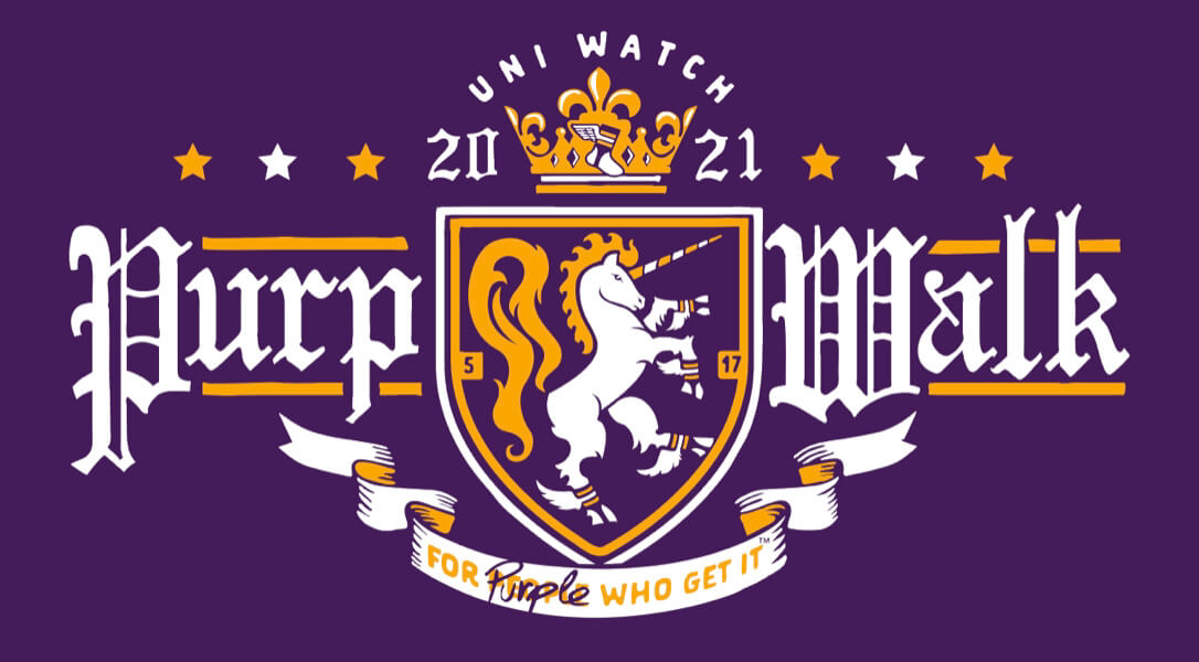
• A few years later, in 2015, membership card designer Scott M.X. Turner came up with the ingenious slang term “Purp Walk.”
• 2015 is also when designer Bryan Molloy and I began collaborating on Purple Amnesty Day merchandise (all available for only 24 hours, of course).
• I believe 2015 was also the first year that I changed all of the website’s green elements to purple for the momentous day.
I love how the culture of the annual tradition has continued to grow and take on a life of its own. It’s now one of my favorite days on the Uni Watch calendar, even though I hate looking at all that purple!
Speaking of which: People sometimes say I have “purplephobia.” But as I always explain, that’s not accurate, because “phobia” means fear. Folks, I don’t fear purple; I loathe purple. If anything, purple should fear me.
People often ask why I detest purple so much. As I always explain, I think purple in nature is quite nice — violets, plums, eggplants, etc. But purple as a human-imposed design element almost always strikes me as tasteless and tacky. It’s the diva of colors, the Celine Dion of colors — loud, grandiose, never content to do just enough when it can do way too much.
Now then: A year ago, longtime reader and Ticker-submission stalwart Kary Klismet gave us a good analysis of the Lakers’ infamous mismatched-purple uniforms. This year he has a follow-up report. Take it away, Kary!
Doubling Down on the (Dis)Pleasure: More on the Lakers’ Mismatched Purples
By Kary Klismet
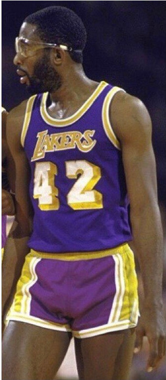
For last year’s Purp Walk, I revisited the story of the Los Angeles Lakers’ mismatched purple uniforms, one of the uni-verse’s most infamous uniform irregularities. I uncovered evidence that contradicted some of the long-held assumptions about these uniforms, including the common belief that the use of different fabrics created a “consistent inconsistency” between the jersey and shorts colors.
This year, I’ve found information that challenges more of the conventional wisdom surrounding these uniforms. Not only did the Lakers wear mismatched purple for far longer than I originally thought, but their road threads weren’t the only uniforms affected by this chromatic calamity.
The two-toned purple uniforms are closely associated with the Lakers of the early to mid-1980s. Indeed, I myself assumed this uniform quirk was specific to that era. But photos show that Lakers players wore road uniforms with different shades of purple at least as early as 1970, and that the light/dark hierarchy occasionally flip-flopped — sometimes the jersey was darker, and at other times the shorts were darker (just like the “Showtime”-era uniforms I discussed last year). The peculiarity persisted through the mid- and late ’70s, and all the way to the early ’90s.
I’ve heard suggestions that this abnormality was just an illusion caused by photographers’ bright fill-flashes intensifying the reflection of light off of certain fabrics, making variations in the shades of purple appear more pronounced in photos than in person or on television.
There might be some truth to that. If you look at old game footage, the purples look more uniform. I would note, however, that the lower-resolution TV signals and poor-quality VHS storage in the ’70s and ’80s might not be capable of capturing such subtle details. Even so, this video of a 1984-85 Lakers/Clippers game offers compelling proof that the mismatched purples could be seen on television:
Throughout the contest, James Worthy’s jersey appears noticeably darker than his shorts (it’s particularly noticeable around the 27:00 mark). I also found a photo of Worthy from the game, confirming the uniform color mismatch.
The Lakers’ road uniforms weren’t alone in sporting mismatched purples. In many ways, inconsistencies in the purple trim on their gold home uniforms were more widespread and lasted longer than the issues with their away unis.
Perhaps the most noticeable discrepancy was that the Lakers often struggled to match the purple on the waistband of their home shorts to the shade worn on the side panels. Not only did this affect the Showtime Lakers, it continued through the mid-’90s to 1999. And sometimes, dating back to 1974, the waistbands didn’t match each other.
But the trim problems didn’t stop there. As long ago as the mid-’70s, the piping on the shorts was significantly darker than the side panels. And the purple numbers and lettering on the jerseys was frequently a deeper shade than the purple on the shorts.
Interestingly enough, although the Lakers may have been the most egregious offenders, they weren’t the NBA’s only purple perpetrators (“purple-trators”?). The Sacramento Kings, Utah Jazz, and Phoenix Suns (who deserve extra demerits for not even trying to match their warm-ups to their road uniforms) have all had moments when color-coordinating their purple uniform components proved too tall a task.
So the issue of mismatched purple uniforms wasn’t just a momentary blip on the Lakers’ uniform radar. It actually has a firm foothold in the NBA’s visual history.
Click to enlarge
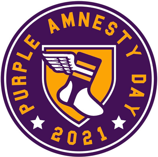
ITEM! This year’s 24-hour Purp Walk merch: Back in 2015, I was working with designer Bryan Molloy on the Uni Watch T-Shirt Club. He suggested that we pretend to do a purple design as an April Fool’s stunt, but I nixed that. So instead he proposed selling a purple shirt as a 24-hour offering on Purple Amnesty Day, which I agreed was a fun idea, so that’s what we did. Bryan and I have continued to collaborate on 24-hour purple merch offerings in 2016, 2017, 2018, 2019, and 2020, so of course we have something special for you this year as well.
First, Bryan has created a sensational new shirt. Based on the idea of purple being associated with royalty, it features a heraldic-style chest design with — wait for it — a uni-corn. You can see the chest design above, and here’s the full shirt, which also includes a sleeve emblem:
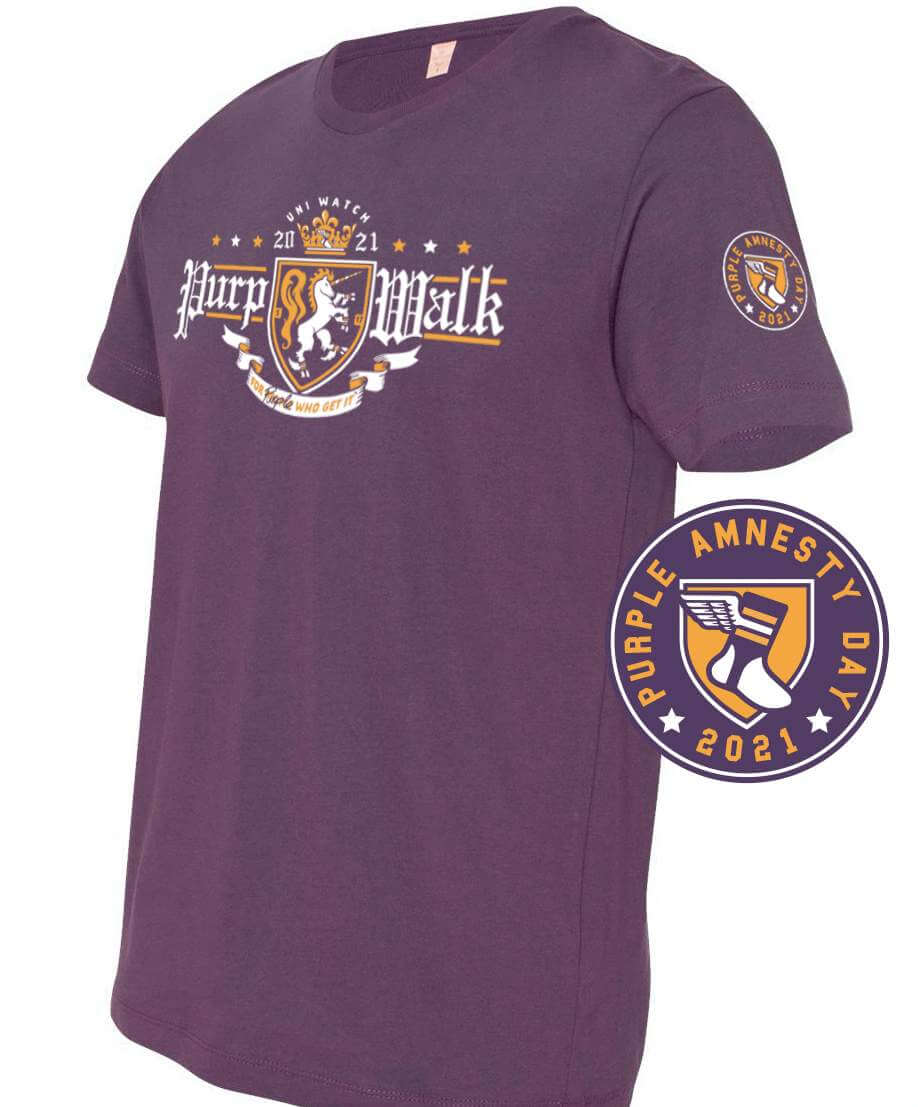
This shirt is available here until midnight Eastern tonight and will never be offered again. You snooze, you lose — no exceptions!
In addition, we’re once again offering a purple snapback version of our winged stirrup cap:
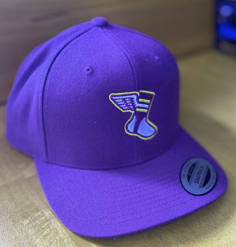
The cap is available here until midnight Eastern tonight. As I mentioned last year, the cap will be an annual 24-hour offering each year on this date.
Also: If you order the shirt and the cap, a $5 discount will automatically be applied to your order. Not bad, right?
Meanwhile: Today is the only day of the year for you to order a purple-inclusive membership card. You can do that here. I’ll even sign all of the cards ordered today with a purple pen!
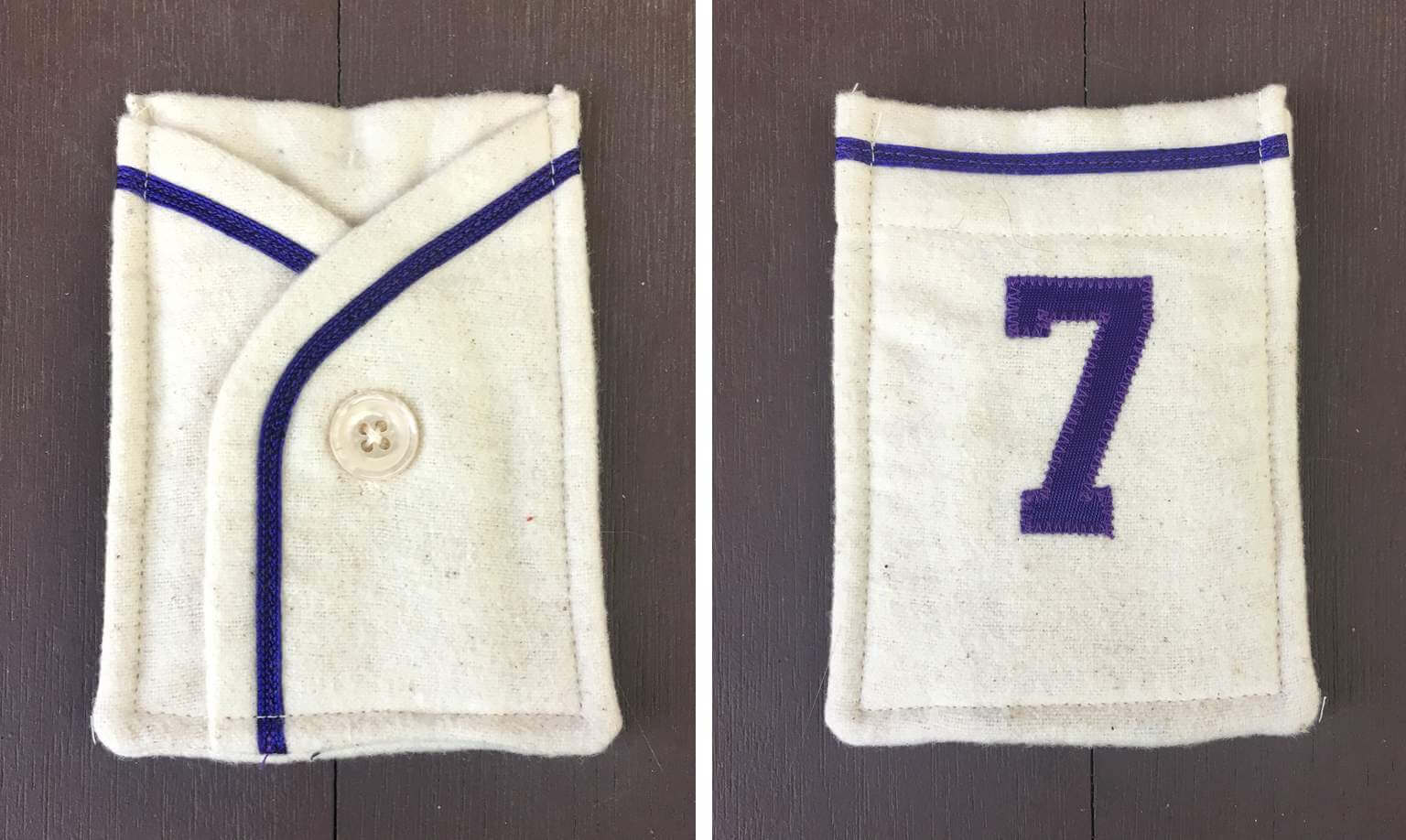
In addition, out of all the purple membership orders placed today, I will randomly select one order to receive this excellent purple card-holder pocket, made by ace DIYer Wafflebored:
Okay, that’s it for today’s purple-centric content. But before I move on to the rest of today’s post, it’s worth noting that 15 years of daily blogging is a pretty amazing thing — for all of us, not just for me. It’s a testament to this comm-uni-ty being so vibrant and interesting for so long, and that in turn is something we should all feel good about. Thank you!
(My everlasting thanks to Tim Cox for coming up with the idea for Purple Amnesty Day; to Scott Turner for coming up with the term “Purp Walk”; to Bryan Molloy for continuing to collaborate with me on Purp Walk merch; and to all the readers who make this day so much fun. Cheers!)
The Ticker
By Jamie Rathjen

Baseball News: Rockies P Jhoulys Chacín’s NOB was apparently off-center on Saturday (from Daren Landers). … Reader Kevin Clark’s room at a Pittsburgh hotel had a framed silhouette of Roberto Clemente. … The Single-A Fresno Grizzlies wore mono-red for the first time ever (from Chris Harris).

Football News: WFT rookie players got their numbers, though the team noted that Nos. 25 and 35 are duplicates and they can obviously change. … One of those rookies is WR Dyami Brown, who is keeping his No. 2 from college (thanks, Brinke). … Sam Houston State made itself an FCS championship logo (from multiple readers).

Hockey News: The Professional Women’s Hockey Players’ Association’s traveling exhibition games came to St. Louis this weekend. As part of land-recognition gestures, players wore helmet decals representing Indigenous tribes in the areas that their teams are from (from Taylor Crabtree). … Capitals players’ wives got jackets featuring the 1997-2007 Capitol dome logo, or as we now know it, the ЯR shoulder patch (from @the_casserole).

Basketball News: The WNBA’s Washington Mystics finally hung their 2019 championship banner. … Meanwhile, last season’s champions, the Seattle Storm, got their championship rings (from Kary Klismet).

Soccer News: Macron, the outfitter of UEFA officials, revealed their design for Euro 2020. … English club Leyton Orient’s new third shirt again features the charity Mind, with the ad space bought and donated by Tottenham Hotspur striker Harry Kane. … The NWSL’s Orlando Pride aren’t done with things they launched into space: they sent up five patches which are to be added to shirts to be auctioned in support of charities. … The Pride also wore warm-up shirts with several variations on the phrase “believe Black women”. … OL Reign left-back Lauren Barnes got a framed No. 150 shirt for becoming the second NWSL player to reach that appearence milestone. … After winning the Women’s Champions League yesterday, FC Barcelona players put on their first shirts for the trophy presentation over the third shirts that they wore. … ESPN started using the new Columbus Crew/SC crest in its scorebug (from @anthonytx42). … Lots of smaller South American clubs have the same name as larger clubs and/or poach their logos — this River Plate is one of at least 12 on the continent or in the Caribbean, for example. But the logo of that one, in the Argentine city of Bell Ville, looks much like the logo and shirt design of the big River Plate’s rivals, Boca Juniors (from Miguel Olaya).

Grab Bag: The U.S. women’s field hockey team has new kits made by Osaka, a brand mostly restricted to that sport that usually does minimalist designs. Their shirts now have sleeves, but they still wear both blue and red as previously. The number font also has a zero-with-slash — that’s a No. 30 visible. … Some more Australian Football League Indigenous designs are out, for St. Kilda (from Ash Norris) and the Western Bulldogs. … Virginia men’s lacrosse midfielder Chris Merle was wearing two different colored shoes yesterday (from Max Weintraub). … Meanwhile, Division II Davenport’s women’s lacrosse coach has a pithy argument involving their Panthers name for why you should always qualify both women’s and men’s sports or neither (from Ben Whitehead). … The trophy for NASCAR Cup races at Dover International Speedway is the track mascot, a big grey monster as a reference to its “Monster Mile” nickname, and yesterday a mask was added to it (from @btownmoose). … McLaren’s Formula One team is to have a one-off livery next week in the colors of Gulf Oil, which has a long history advertising in motorsports with McLaren and otherwise (from @tonsoffun57).

Click to enlarge

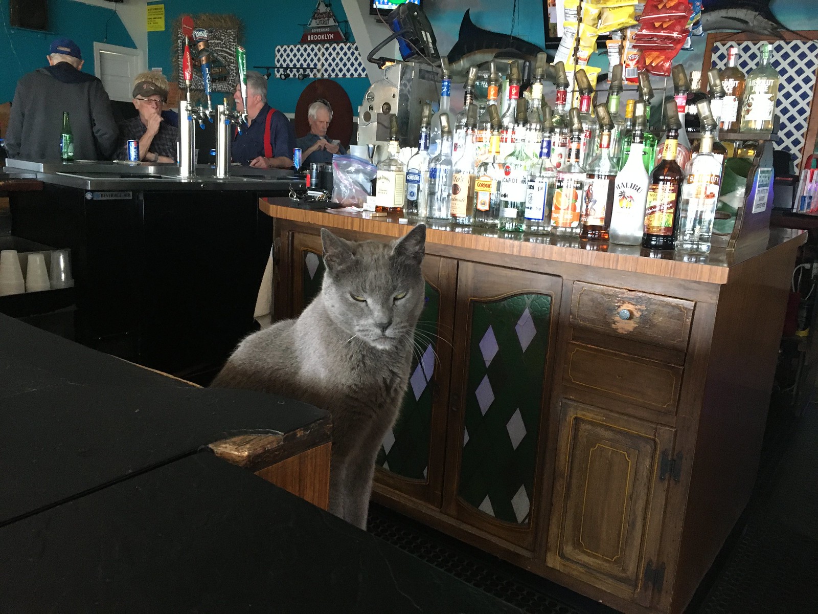
What Paul did last night on Saturday: In light of the new CDC guidelines, Mary and I did something on Saturday that we hadn’t done in well over a year: We went to one of our favorite taverns — the very excellent Tamaqua Bar & Marina — and sat at the bar for a few hours.
It was a little nervous-making to be indoors among strangers without masks, but Tamaqua is a huge, barn-like space, and on warm days (like Saturday) they open the windows and let the sea breeze waft through, so it’s almost like being outside. We figured it was pretty safe.
After a year-plus of drinking canned and bottled beer, it was nice to have suds from a tap. Plus we did all the things we usually do at a bar: kibbitzed with the bartender, reconnected with old friends, yakked with strangers (one of whom took the photo shown above), met a new dog, bought a round for someone, got a free round from someone else — simple pleasures that we had sorely missed. It felt really, really good.
One of the old friends we reconnected with was Captain Jack, the world’s best bar cat. He prowls around the marina and occasionally pops into the bar. We had wondered how he was doing and if we’d see him. Sure enough:

Meanwhile: As I’ve said all along, we planned to keep doing Pandemic Porch Cocktails™ until we could comfortably and safely sit at the bar at one of our favorite watering holes. Now that that condition has been met, the PPC™ project has come to a close. We may still convene on the porch some days, or maybe even most days — it’s something we’ve come to look forward to — but we will no longer feel compelled to do it every single day, and I will no longer photograph the proceedings. So the PPC™ photo set — 424 daily pics spanning nearly 14 months, from 3/17/20 through 5/14/21 — is now final.
I have mixed feelings about the end of PPC™. On the one hand, it was a satisfying and interesting project, and I’m sad to see it end. On the other hand, its end signals a major step in our return to normalcy, which is something to feel good about.
Like any good creative project, PPC™ has taught me a few things, including the following:
• Given the opportunity, I have a strong tendency to turn anything and everything — even a global pandemic — into an obsessive ritual.
• When confronted with the worst batch of lemons, it’s still possible to make lemonade. Or to put it another way: We’re all probably more adaptable than we think we are.
• It’s definitely worth taking some time each day to just stop and watch the world go by.
Many, many of you — way more than I would have expected — have emailed over the past year to let me know how much you’ve enjoyed PPC™. My thanks for all the positive response and encouragement. And for those of you who haven’t liked or cared about the project, thanks for putting up with the daily photos without getting cranky about it.
Finally: I think the photos would make a fun exhibit. If anyone has connections in the art/gallery world who might be interested, please let me know. Thanks. — Paul
I’m glad you were able to get a piece of your normal life back. Life is always sweeter when you are able to do something you weren’t able to do for a long time. I am going to miss the daily photos, but it’s worth knowing that their departure means the world is beginning to open up for some of us.
Normal is underappreciated right now.
There is no normal life. There’s just life.
– Doc Holliday by way of Val Kilmer
Congrats on the milestone, the blog and the end of the pandemic cocktail photos. Going to miss seeing those beautiful trees change throughout the seasons. Here’s to many more years!
Paul – Wow – 15 years of uni-blogging and 11 since you graciously accepted my suggestion about giving purple one day to roam free and frolic with the other colors . I only intended for,the amnesty period to last for that day, but here we are more than a decade later still giving purple its annual day in the sun.
I am proud to have played even a small role in bringing Purple Amnesty Day to life, and I think I speak,for,Rockies fans everywhere and for Celine Dion when I say “Merci and
Thank You,”
Tim Cox
you on behalf of Rockies fans everywhere, and of course,
Happy Purple Amnesty Day! Want some sartorial suggestions on how to do the day up in high style? Check out these tips:
link
Enjoy the day, everyone!
Happy Purp Walk day! That UCI shirt you’re wearing is fantastic
Congrats on getting off of the porch Paul and TC.
Happy Purple Amnesty Day All.
If anyone is selling the Purple Version of the Tequila Sunrise Uni Watch jersey, please let me know. I need to for a Uni Watch show I am hosting. Thank you all. Love you All.
A very, merry Purple Amnesty Day to All Who Get It! Also, congratulations Paul on 15 years with the website! A nice milestone!
Excellent design Bryan with the shirt! I love the stirrups on all the hooves.
I got a kick each day looking at the changing world in front of your home Paul with the Pandemic Porch Cocktail photos, but I’m glad to see it come to end and another step in the world returning to normal having been taken.
I was mowing the lawn yesterday and thought to myself, “Hm, I wonder when Paul is going to feel safe enough to go to a bar and end the PPC series.” I will now adjust my lawn mowing-thinking to, “Hm, I wonder when the Mets will win another World Series.” Thank me in October!
Glad to see you out and about, man.
Enjoyed your lessons learned from the PPC era, Paul. And that’s a great pic of you and Mary. Cheers to you both!
Congrats on 15 years! And what better day to end the PPC photos. A milestone and a milestone.
I was one that truly appreciated the PPC photos and thoughts behind certain pictures. My favorite lesson is #3. Too often we run around looking for something to do, somewhere to be, someone to be with and too often we fail to realize that we have that around us every day. I also am one that truly appreciates that the project is over so you – meaning everyone – can start the process of getting things back to normal.
Congrats on the anniversary!!
Now, I did have to look up and see if by some strange coincidence purple was Celine Dion’s favorite color. But in true uber-diva style, she has not one, but three favorite colors. Celine never disappoints.
Anyway, here’s to many more years of Uni-Watch and that one day of purple freedom!
What a wonderfully random bit trivia!
Congrats on completion of the PPC! It was a good ritual but it’s also good to retire it.
Congrats on completion of the PPC! It was a good ritual but it’s also good to retire it.
Congrats on getting to get back out into the world. My fingers are crossed that my family will be able to do the same maybe around Halloween.
So many milestones. Congrats on each of them. It brought a great smile to my face to see you sat at the bar. Your PPC project had us all quite invested, waiting for this day.
Be proud of what you created, Paul. Community building is no easy task. Yours is an all-too-rare success story that deserves every accolade and celebration.
Cheers!
Cheers to 15 years, Paul!
Happy Purple Amnesty Day to all!
Proudly wearing my Philadelphia Phantoms “Purple Reign” 2005 Calder Cup Finals shirt and matching (sort of) UW winged stirrup cap today.
Alex Bowman got to take home that masked Miles the Monster trophy yesterday, driving his purple-accented #48 to victory.
Monumental post today – for many reasons. Congratulations on 15 – excited to celebrate 22. What a month! (I Still Call It A Blog!)
Stacy and I were just talking yesterday about looking forward to drinking a draft beer!
Happy Purp Day to all! I am fiercely pro-purple so it is. Ice to have a day.
Great piece by Kary. Lost in the information: 1) the Clippers need those uniforms back ASAP, ideally with the naval flag trim; 2) never realized the purple was so hard to match; 3) the Suns’ shorts had zippers and waistband snaps?!
Thanks, MJ! Glad you liked it!
“the Clippers need those uniforms back ASAP, ideally with the naval flag trim”
Agreed! They haven’t worn anything better since!
“never realized the purple was so hard to match”
No doubt! Too many team manager washing unis in hot water,maybe?
“the Suns’ shorts had zippers and waistband snaps?!”
I know! Righteous, right? If you look at those photos of Wilt Chamberlain in his Lakers uniforms in the early ’70s, you’ll notice he’s wearing similarly styled shorts in one of them. But that Suns photo is from cira 1976, so apparently they were wearing them longer than other teams. Long live the NBA sansabelt!
Arsenal Women debuted the recently released change kit for next season yesterday vs Crystal Palace Women.
link
It seems fitting that the last PPC entry would fall on Purple Amnesty Day. We’re liberating the world with human contact and God’s favorite color (just my opinion, but it’s the right one). Cheers, Paul!
I’m glad you got to get out and get to one of your favorite taverns. I had a similar experience on Friday, where my team and I got together for a HH on our favorite patio near our office and saw each other for the first time (in-person) in over a year. It was mainly to celebrate that one of our teammates is leaving and moving to another city, but it was great to have it feel like a normal Friday evening again.
So let’s rank the Top 5 Purple uniforms, since this is the only day we can do it:
1. LA Lakers
2. LSU Tigers
3. Washington Huskies
4. Minnesota Vikings
5. Charlotte Hornets (alt/throwbacks)
1. Minnesota Timberwolves’ Prince tribute
2. Utah Jazz mountain jersey
3. University of the South football, 1899 (the Ironmen who set a record for winning the most college football games in one week).
4. Los Angeles Kings Reverse Retro, 2021
5. Frankfurt Galaxy (NFL Europe)
Galaxy…nice…
Let’s do this 5&1 style…
5. Milwaukee Mustangs arena football
4. LA Lakers
3. Pittsburgh Maulers
2. 20th century Minnesota Vikings
1. LSU
And the bad one…Sacramento Kings. Go back to KC (or Cincinnati or Rochester), and to Blue and red.
Happy Anniversary!
Dang, I had a mental block with both the 90s-and-earlier Phoenix Suns and the New Orleans Jazz…they can fight it out with the Mustangs for #5.
Five completely different choices
1. LA Kings originals
2. Orlando City SC
3. Kansas State basketball. Two-tone lavender
4. Arizona Diamondbacks original
5. Raptors (earned edition, current)
I’m surprised no one has mentioned it yet, but I think the best looking current uniform that utilizes purple belongs to Kansas State football.
Silver helmet with the purple wildcat logo, purple jersey with the white block numbers, silver pants with the purple/white/purple stripes. About as perfect as purple can be used.
Happy Purple Amnesty Day to all!
In my opinion, Kansas State Football is always my example of purple done right. I feel like the road uni is the exception to the “purple overdoes it” theory.
My 5:
5. Charlotte Hornets Throwback
4. Kansas State Football
3. Barkley-era Suns Purple
2. LSU Football
1. Kobe-era Lakers Purple
I think this is the best list!
Washington goes through new iterations of fonts and piping every year now like a lot of college football teams, but when they are at their most basic purple over gold with the gold W helmet, I’ve always thought it was one of the best looks in all of sports.
Re: USA Field Hockey
I was befuddled at the new USA Field Hockey kits. The logo of the company making the uniforms looks an awful lot like E-Trade, and there’s no kit sponsor this year (Citibank seems to have bailed).
I also saw a lot of Kanji characters on the sleeves and the waist — writing whose meaning is lost to a lot of people unless you learned Japanese in scchool.
I also couldn’t discern whether Kealsie Robles was wearing the 38 shirt or the 30 shirt.
The ad has been gone for a long while, as in it last appeared before the Pro League started.
I didn’t see any pictures of an 0 and 8 together, but yeah, they look similar.
Interesting that the model in the first photo is Beth Yeager. She’s an important player as the team’s primary dragflicker. She’s also a high-school senior.
She’s scored the best goal I have ever seen by a scholastic player. They’re giving her a lot of responsibility!
Earlier today when I started working, as I was dating some files I had to send off and putting “5/17/2021” on them, I kept thinking “I know today’s date is something” but I couldn’t think of why today’s date was something.
Then I visited the site as I always do, and then it hit me PURPLE AMNESTY DAY.
Congrats on the conclusion of another fantastic year with the site, Paul & all the contributors. Here’s to another great year!
Thanks Paul for making this site and for keeping it up so long! I’ve been visiting each morning since day 1 (and longer with the old espn stuff).
Like you, I’ve gotten back into the world after celebrating 2 weeks since my full pfizer dosage. We still have a 10 year old waiting for eligibility so we’re not in 100% party mode, but we’ve able to venture into low risk situations a bit more often.
I don’t know if you’ve seen the movie “Smoke” or were inspired by it, but your PPC reminds me of a scene from that movie. Harvey Keitel’s character owns a corner store and takes a picture at the same time every day:
link
You mention the term “purplephobia”, but there’s actually a term that uses the correct Greek prefix: “Porphyrophobia” (link).
There’s a liver disease called Porphyria (maybe had by King George III), of which one symptom is that your urine can be purple.
Misomovia. From the Greek: Mis-, “to hate”; Mov, “Purple or mauve”
That’s good AND it sounds like a fictional kingdom from a Disney movie.
I’d be curious to know if in metro areas where you have a team that wears purple (Twin Cities, Los Angeles, Denver), if you see just more purple, non-team gear, worn in general. Does having that team make purple a more common favorite color for people? I live in NJ an there is Vikings fan in my office, who has a handful of non-Vikings purple shirts he wears.
Anyone in the those areas have any insight on this?
As a Denver resident, I’d say, completely unscientifically and anecdotally, that yes, I see more people wearing purple as non-sports team apparel than I have elsewhere. It’s actually a pretty common sight during the summer to see businesspeople downtown wearing purple dress shirts or blouses, especially when the Rockies have a day game (and even more especially on Opening Day).
Of course, I also seem to see more orange casual wear in Denver (especially when it’s football season and the Broncos are playing) than I do other places, too. I’m not sure if I’m just more attuned to it because I’m a fan, or if these color choices are an actual phenomenon. I’d like to think it’s the latter!
Seems likely to me. Denver is a great example having two uncommon / bold colors in orange and purple in their sports landscape to test out that theory.
Same in Baltimore
Happy Anniversary, Paul, and thank you for all you have done to bring joy to our lives. This blog has been a near-daily presence in my life for 15 years now, and while I know I am not the only one or even the most important person that can say that, it means a great deal that I can log on here every day and have a fresh, thoughtful, and nuanced opinion to read.
Thank you again, and here’s to however much longer you have the juice to keep this project going!
The mismatched purple on the picture of the Lakers James Worthy is terrible. Can you imagine if there was an NFL team whose uniform colors were that mismatched nearly every Sunday? In 2021? We call them the Dallas Cowboys, where silver contrasts with silver-blue-green and navy stripes/stars contrast with royal blue. We are so used to it that we call them a “classic,” but if our kids Little League uniforms arrived like that we would demand a refund.
Oh, man! That stirrup-clad “uni-corn” is fantastic! I hope this isn’t the last time we see that crest design.
Also, the PPC photos would make a really cool time-lapse video. I’ll definitely miss seeing the photos on the blog every day.
Hi
I still think the different shades are more related to lighting than actual mismatched uniform pieces.
I remember for years the Dolphins aqua uniforms showing up as blue in pictures and on TV, but distinctly green in person, to the naked eye.
Love the Homefield Apparel shirt, I have the “Zot!” UCI baseball tee and it’s one of my favorites.
It’s a legitimately sensational shirt. Love the dribbling anteater!
Agreed on all counts! Great mascot! Great logo! Great shirt!
Congrats on concluding the PPC series, Paul! I’ve thoroughly enjoyed it, but for all of our sakes, I’m glad it’s coming to an end. It’s been subtle and though-provoking way to measure the passage of time of this event in our lifetimes that none of us will forget.
Somewhat jarring to see a weekday post end without the porch photo, but happy for you Paul for getting back to normalcy!
One small blessing of the last year was the saga of The Branch. It’s amazing how I came to be so invested in something so seemingly trivial. But the PPC was a worthy project. I am sad, yet happy, to see it end.
Congratulations Paul!
RE: “Lady Panthers” in the ticker.
I wonder what the coach would say about my high school alma mater, Milwaukee Pius XI. The boys teams are the “Popes” and the girls teams are indeed the “Lady Popes.”
No, I am not making this up.
You should have had a sponsor for today. Maybe purple dot com (they sell mattresses) or thepurplestore dot com. Anyway, looking forward to ordering and wearing the 2021 shirt.
Just like the Lakers’ colors, the purple in the hat and shirt don’t match.
We planned it that way, to be more Lakers-like. (Read: Not really.)
Just like the Lakers’ colors, the purple in the hat and shirt don’t match.
Wonderful picture! It’s great to have both of you in the frame and be able to see more of Mary than the back of her head. Looks like a good time was had by all.
I couldn’t resist that purple T-shirt today and just ordered one! Can’t wait to get it. Yes, I know i need to become a member. Can you do a Baltimore Colts themed card?
Apparently you have no Texans responding to the favorite teams lists: how can you go wrong rooting for deep purple uniforms and one of the best mascots of all time- The TCU Horned Frogs! My wife is an alumna, and we met in Ft. Worth.
Finally, enjoyed all the pictures of Pandemic Porch Cocktails- you must be good neighbors. But get some porch chairs for god’s sake! It’s easier on the back than sitting on concrete steps! Have one last one for me.
Hi, Joe! Yes, we can do a Colts-themed card.
We have porch chairs, which we use for various situations. But for PPC™, we preferred to sit on the steps. It feels a little less formal, or something like that.
Congratulations Paul and all other readers for this great feat! Purple Amnesty Day is always fun. This year, I was really excited to see what you came up with for the new shirt, and it is phenomenal. A uni-corn wearing stirrups is so delightful! Hats off, Bryan.
Cheers to all!
I’m very tempted with the purple shirt this year; VERY nice. With think on it this afternoon and decide after work.
For those in Canada that don’t want to fill in name, address and email to get the shipping cost, it will run you $38 U.S. ($26 shirt + $12 shipping)
Whenever I hear about sports teams with mismatched purple, reminds me of the helmet worn by Tiger Williams for a brief period when he was with the Kings. Needed to be clarified Forum Blue is not actually blue. Likely was it was not real easy to get a purple Cooper SK2000 quickly so a blue helmet it was.
link
I had a suggestion (that was purple) that was a possibility for my city’s 50th anniversary, but that and many others things didn’t come around because of COVID.
On the 25th anniversary, there was tartan done up for my city. Think it was a kilt and possibly other items made up for sale. I suggested we should do something similar (maybe scarves?) and my city ward councillor like the idea and was part of the committee on the 50th celebrations.
link
link
15 years! Can’t believe this site is that old. Congrats!!
Congrats for so much! Any thought toward doing an enamel Purp Walk pin, or would that just be too much to design & produce for a single-day event? I am loving the shirt design, just weighing whether I need another shirt to wear to Coors Field.
I’d love a purple pin too. Maybe next year a purple stirrup pin could be offered!