
Good morning! Greetings from Uni Watch HQ, where all three inhabitants continue to be healthy and safe. Hope the same is true for you and yours.
Yesterday was the 14th anniversary of the very first post on this website (not to be confused the the first Uni Watch column, the 21st anniversary of which is coming up next week). By longstanding tradition, that would have made it Purple Amnesty Day — the one day of the year when I grudgingly acknowledge the uni-verse’s most accursed color. But since the date fell on a Sunday this year, I decided that today — Monday the 18th — would be Purple Amnesty Day (Observed). That means the usual ban on purple-inclusive Uni Watch membership cards has been lifted until midnight Eastern tonight (you can order yours here), plus we have some special purple content and merchandise today.
But before we get to that, it’s worth noting that this is Purple Amnesty Day’s 10th anniversary. The idea came from reader Tim Cox. On the blog’s fourth birthday — May 17, 2010 — Tim posted the following comment:
Congrats on 4 entertaining years, Paul & company. I’m a daily reader but not a member because I can’t do a Rockies membership card without purple. The 4th anniversary seems like the perfect occasion to grant amnesty to all the Rockies, Vikings, LSU, Northwestern, etc. fans out there.
I then responded:
[Y]our idea for a one-day purple amnesty program is a good one. If anyone wants to sign up for a purple-inclusive membership card, today — and only today — I will honor all such requests!
And just like that — very informally — Purple Amnesty Day was born. Five years later, in 2015, membership card designer Scott M.X. Turner came up with the ingenious slang term “Purp Walk,” and then we started offering special Purple Amnesty Day merchandise, so the culture of the annual tradition continued to grow and evolve. It’s now one of my favorite days on the Uni Watch calendar, even though I hate looking at all that purple!
Speaking of which: People sometimes say I have “purplephobia.” But as I always explain, that’s not accurate, because “phobia” means fear. I don’t fear purple; I loathe purple. If anything, purple should fear me.
Why do I detest purple so much? Short answer: a near-bottomless reservoir of good taste. Longer answer: I actually think purple in nature is quite nice — violets, plums, eggplants. But purple as a human-imposed design element usually strikes me as tasteless and tacky. It’s the diva of colors, the Celine Dion of colors — loud, grandiose, never content to do just enough when it can do way too much.
Or at least that’s usually the case. But there are some purple uniforms I’ve managed to enjoy over the years. This year I decided to list my top 10 purple (or at least purple-inclusive) uniforms. When possible/applicable, I’ve also posted a corresponding membership card, ordered on one of our previous Purple Amnesty Days, for each uni on the list. Ready? Here we go (for all photos, you can click to enlarge):
1. Arizona Diamondbacks Home Vests, 1998-2006
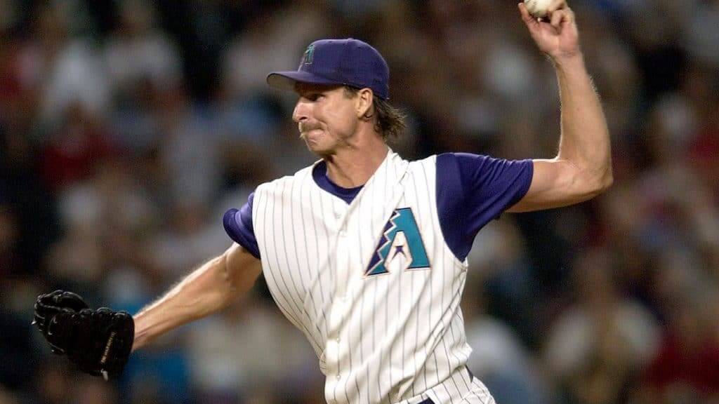
Most new franchises launched in the 1990s used purple or teal. The Diamondbacks used both. I hated this set when it was released, but I have to admit that the vest version in particular has aged extremely well (as I’ve said many times before). Too bad they didn’t stick with it — could’ve been a modern classic.

2. Louisiana State Football Home Whites
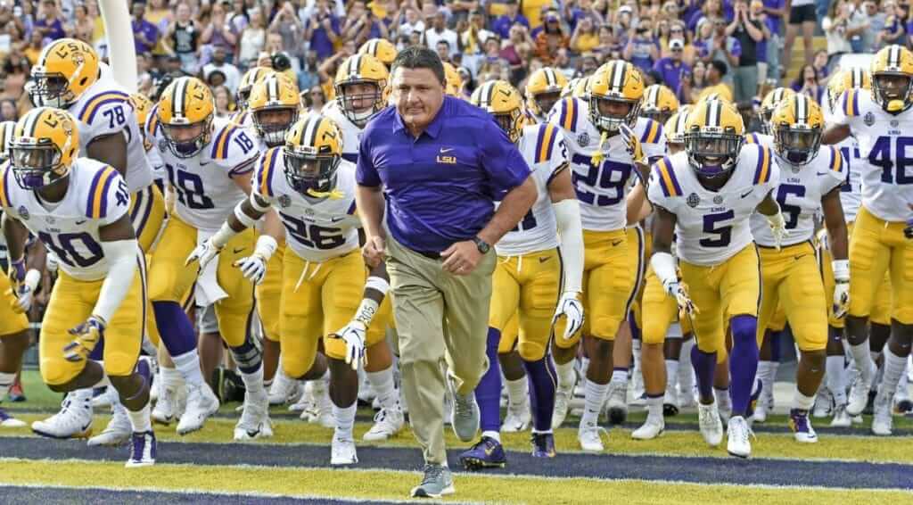
Such a gorgeous look. Dare I say it, the purple looks magnificent against LSU’s shade of yellow, and the purple works everywhere it’s deployed — the helmet, the shoulder stripes, the numbers/NOBs, the pants piping, even the socks. Since LSU wears this combo for most of its home games and also on the road, we get to see a lot of it — and that’s a good thing!

3. Minnesota Vikings, 1970s
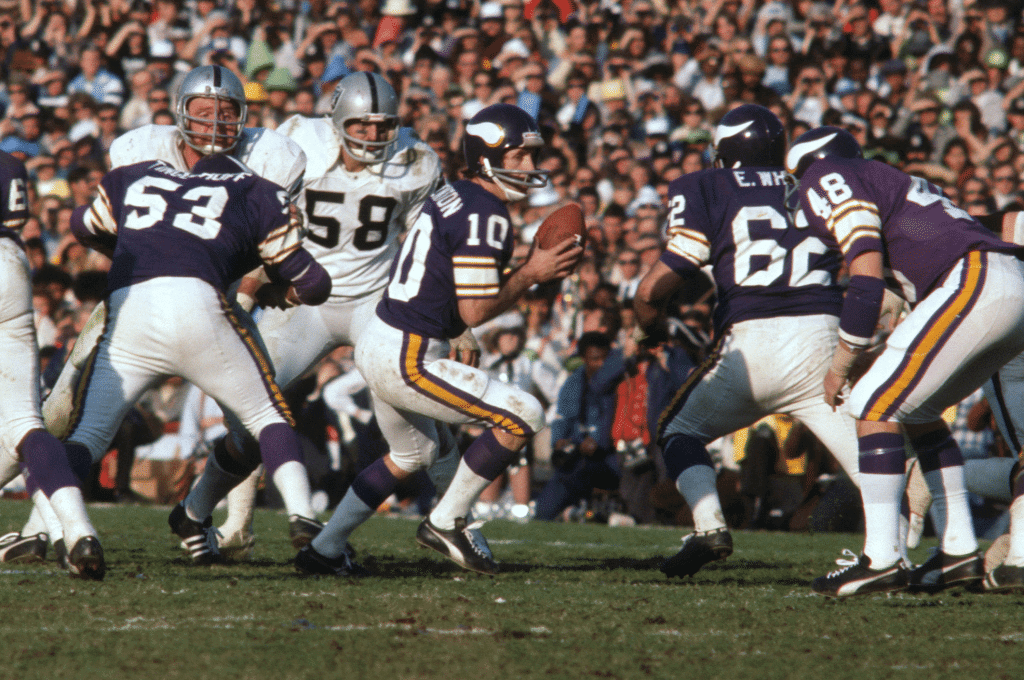
My purple antipathy hadn’t yet fully formed when I was a kid, so I enthusiastically rooted for this uniform set (unsuccessfully, alas) in several early Super Bowls. And really, how could you not like a team whose defense was nicknamed the Purple People Eaters? The Vikes wore this basic design for decades, up until the disastrous 2006 redesign, but I prefer the 1970s version, when the home sleeves were still long enough to accommodate the full Northwestern stripes and the road jerseys still had the full-length UCLA inserts.

4. New Orleans Hornets Mardi Gras Alternate and New Orleans Pelicans City Alterate
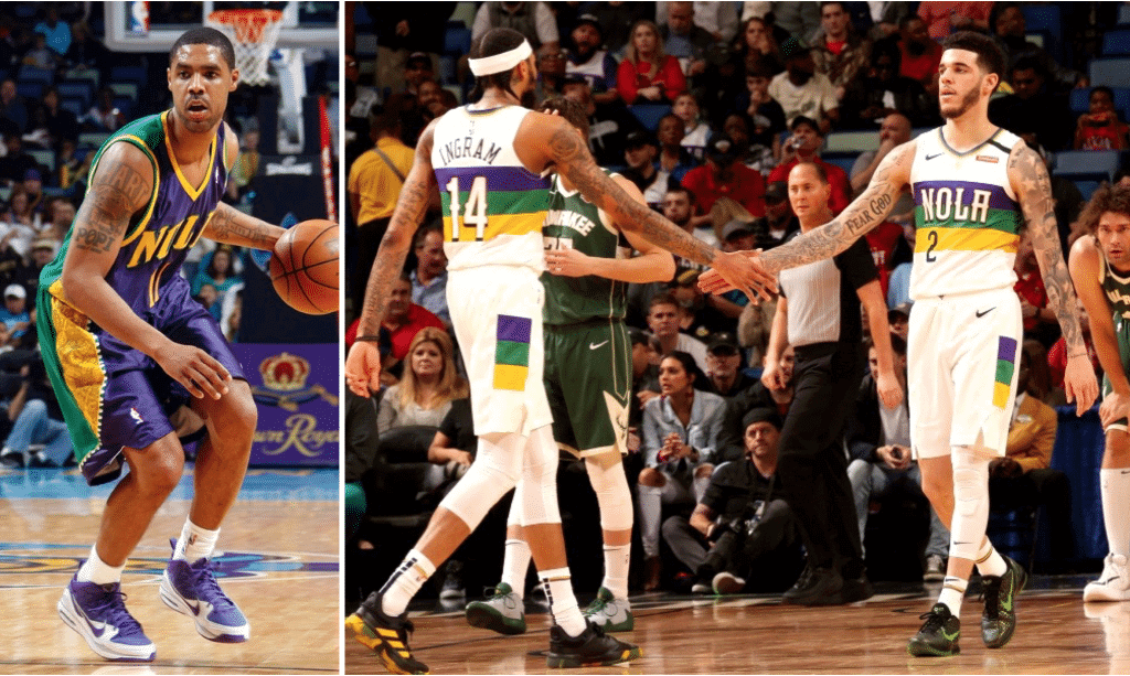
I could have counted these as two separate entries on this list, but the two teams are the same franchise and the two designs both celebrate Mardi Gras, so it felt right to group them as one entry. I love the two-tone Hornets design (and said as much when it was released in 2009), which feels appropriately gaudy for Mardi Gras. Likewise, I had high praise for the gorgeous Pelicans alternate when it was released in 2018 and wish they’d make it their primary white design.
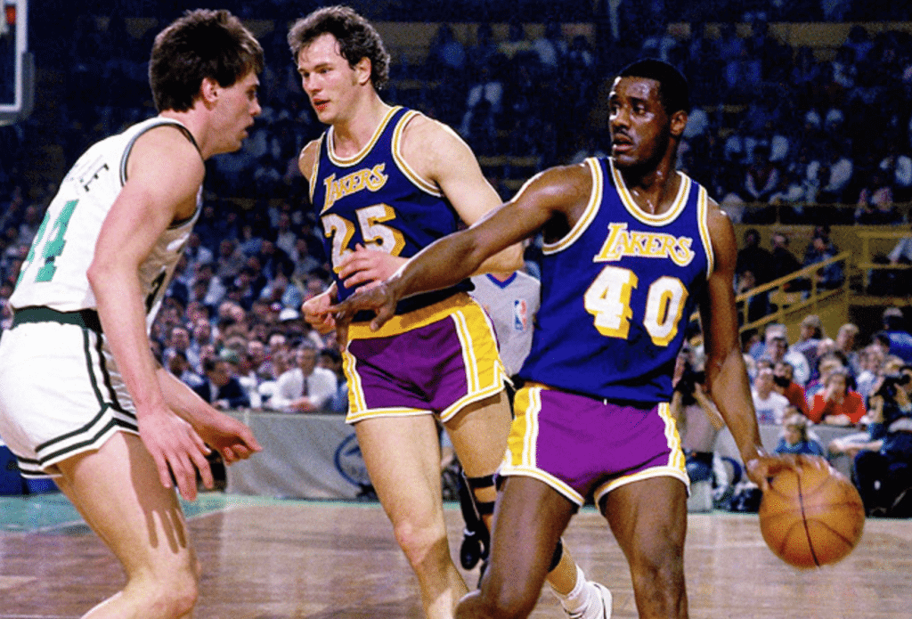
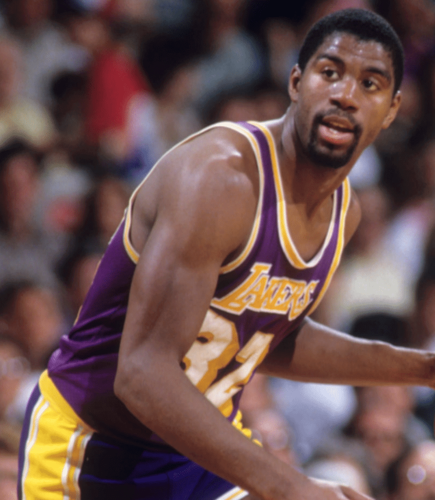
5. Los Angeles Lakers “Showtime”-Era Home Yellows
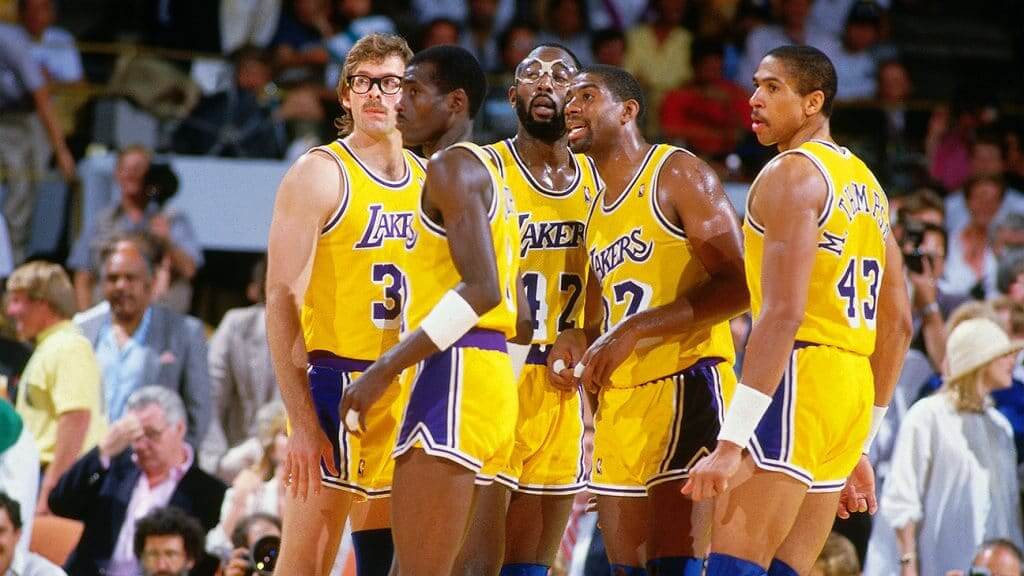
As a kid, I was always intrigued by the Lakers’ block-shadowed uni numbers and their lack of a white uniform. The purple was part of the package, and I still have a soft spot for this design today. Bonus points for Magic’s purple knee pads. (And yes, I know there’s a major purple storyline lurking in the Lakers’ road uniforms from this era — we’ll have more on that later in today’s post.)

6. Northern Iowa Basketball
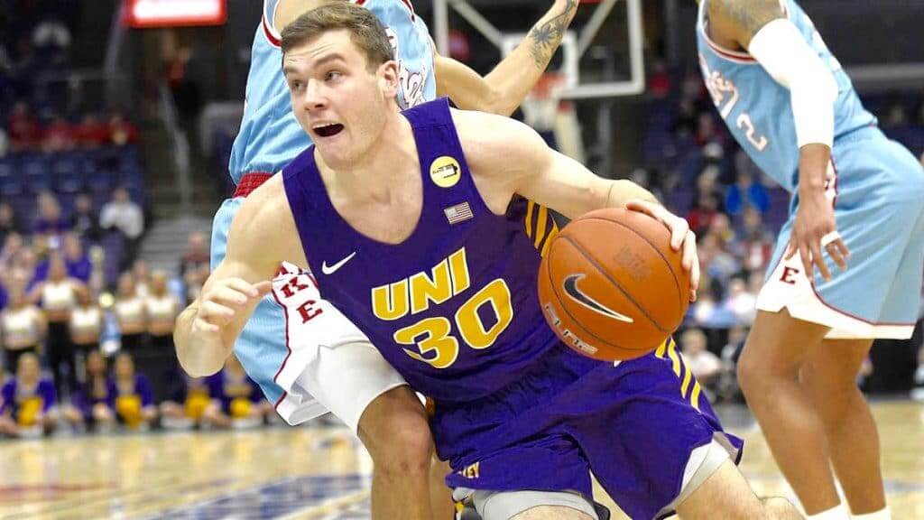
It figures that the one school to wear “UNI” on its chest would have purple as its primary team color. Oh cruel fate, why do you torment me so?! But purple or no purple, I can’t get enough of that acronym — go UNI! (As an aside: Although Northern Iowa usually uses the all-caps abbreviation, at one point in the early 1980s they had warmup tops with “Uni.” So all the fans in the crowd were Uni watchers!)

7. Los Angeles Kings, Rogie Vachon-Era
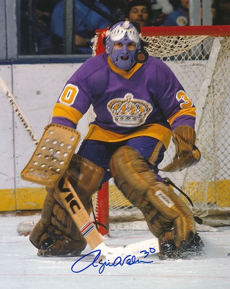
When I started following hockey, Rogie Vachon wore that mask that made it look like he was always smiling. That confused me — like, was he a King or a jester? But then he painted the mask purple to match his uniform and added the two crowns above his eyes (which didn’t really make sense, but whatever) — indeed, he was now the kingliest of Kings! No Kings uni since then has compared.

8. Denver Nuggets City Alternate, 2018-19
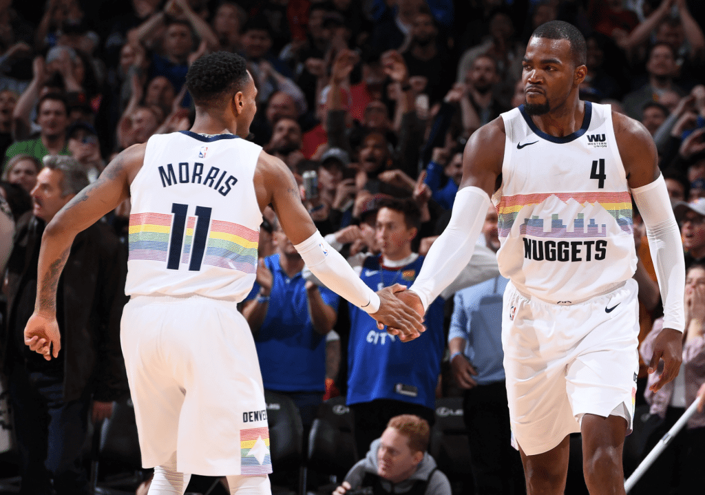
As noted in the introduction to today’s post, one of my longstanding gripes about purple is that it’s too loud, to diva-ish. But it turns out that purple can look really nice if you mute it a bit and tone down the saturation, as the Nuggets did with this rainbow-striped design. (They also came out with a BFBS version a year later, although I don’t care for that one as much.)

———
9. Phoenix Coyotes “Peyote Coyote” Alternates, 1998-2003
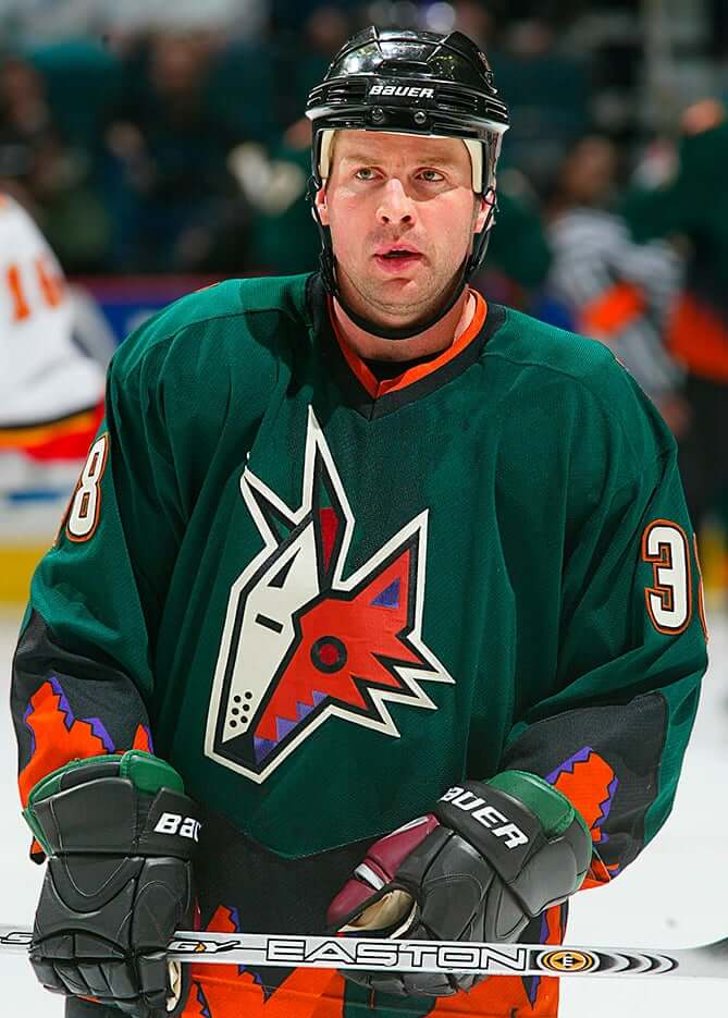
This one almost feels like cheating, since there’s relatively little purple (you can get a better sense of the full extent of it here) and a whole lot of my favorite color, green. But I have to admit that the purple accents work surprisingly well here, and the design gets bonus points for featuring one of the strangest jersey crests in NHL history.

10. 1995 NBA All-Star Game
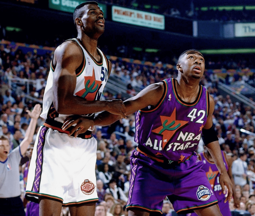
I don’t actually like these uniforms, but they’ve achieved a certain “so bad they’re good” status over the past quarter-century. Much like MLB’s futuristic uniforms from 1999 (which had some notable purple designs as well), these NBA All-Star designs were a terrible mistake, but I’m glad I live in a world where this kind of mistake can be made.
Honorable Mention: Baltimore Ravens Logo
Going with just the logo here, not the full uniform (can’t deal with that number font). So: I’ve heard many, many people over the years express disdain for this logo, and I still don’t understand why. I’ve always liked it — a nice middle ground between the endearingly cartoonish “Bugs Bunny”-style mascot logos of the 1950s and ’60s and the godawful “intimidating” animals we tend to see today. The detail that totally makes it for me is the little downturn at the base of his beak — not quite a frown, not quite a smirk. More of a quiet confidence, a “Yup, I got this. Even though I’m purple.”
———
And there you go. By tomorrow I’ll deny having said any of this, so enjoy it while you can!
Now then: In 2015 I was working with designer Bryan Molloy on the Uni Watch T-Shirt Club. He suggested that we pretend to do a purple design as an April Fool’s stunt, but I nixed that. So instead he proposed selling a purple shirt as a 24-hour offering on Purple Amnesty Day, which I agreed was a fun idea, so that’s what we did. Bryan and I have continued to collaborate on 24-hour purple merch offerings in 2016, 2017, 2018, and 2019, so of course we have something special for you this year as well.
In fact, we have several things for you. First, there’s a great ringer T-shirt (purple on purple!). Note that the design has changed slightly since I showed you a teaser view last Friday, because reader Ed Hahn suggested that we turn the feet into winged stirrups — an excellent and obvious move that Bryan and I are both embarrassed not to have thought of ourselves. Shirt’s in the mail, Ed! Click to enlarge:
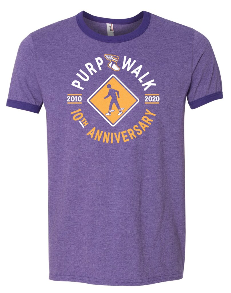

This shirt is available here until midnight Eastern tonight and will never be offered again. You snooze, you lose — no exceptions!
In addition, we’re offering a purple snapback version of our winged stirrup cap:
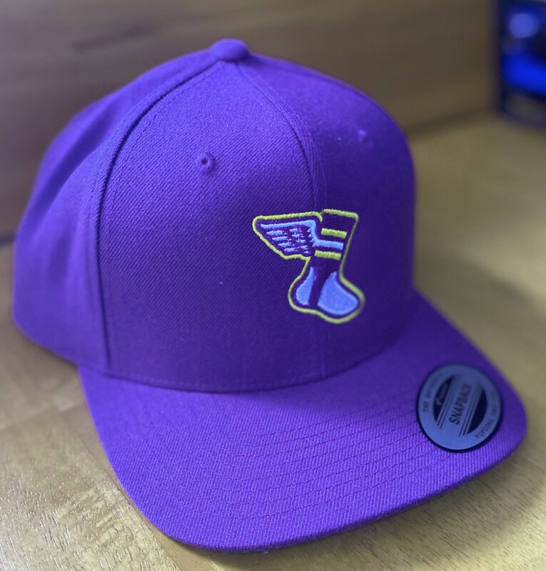
The cap is available here until midnight Eastern tonight. Unlike the shirt, however, the cap will be offered again — we’ll bring it back each year for a 24-hour cameo on Purple Amnesty Day. We’ll also have a new year-specific item each year, but the cap will be a Purp Walk evergreen (or everpurple).
And! If you order the shirt and the cap, a $5 discount will automatically be applied to your order. Not bad, right?
Oh, and speaking of these merch offerings: The winners of last Friday’s Purp Walk merch raffle are Alex Allen (who’s chosen the shirt) and Jesús Orduño (who’s chosen the cap). Congrats to them, and thanks to Tim Cox for sponsoring this one!
But wait — there’s more. Remember how I recently posted a photo of reader Bob Andrews and his DIY Uni Watch face mask? Longtime Uni Watch ally Bob Halfacre, who runs the uniform outfitter Bobcat Athletic (and is a really great guy despite being personally responsible for the Mets’ BFBS phase, grrrr), saw that and offered to make Purple Amnesty Day masks! Bob only had about 24 hours to put a prototype together, so the design is a little rough, but still not bad:

The masks are available here. Uni Watch will make no profit on this item. Our cut — about $2 per mask — will be donated to Doctors Without Borders.
Okay, that’s it. Remember, you can order a purple membership card — or a non-purple one, for that matter — here until midnight Eastern (and this year, at the excellent suggestion of reader Ray Bergman, I will use a purple pen when signing my name on the front of the card!), and ditto for the shirt and cap. Whether you’re order/purchasing or not, enjoy our annual purple holiday!
(My everlasting thanks to Tim Cox for coming up with the idea for Purple Amnesty Day; to Scott Turner for coming up with the term “Purp Walk”; to Bryan Molloy for continuing to collaborate with me on Purp Walk merch; and to all the readers who make this day so much fun. Cheers!)
[Editor’s Note: We have some bonus Purp Walk content today from reader Kary Klismet, who’s taken a closer look at the Lakers’ famous mismatched-purple uniforms. Enjoy. — Paul]

Double Your (Dis)Pleasure: The Lakers’ Mismatched Purples
By Kary Klismet
It’s fairly common knowledge that the Lakers’ road uniforms had mismatched shades of purple in the early to mid-1980s. Paul has written about the phenomenon before, and reader Mark Gutierrez even used it as the basis for a membership card in 2012.
Until recently, the photo I’d seen of this uniform quirk always showed a bluish/indigo shade for the jersey and a brighter, more violet shade for the shorts. So while the shades of purple were mismatched, the mismatch itself was consistent (or, if you prefer, uniform).
In a 2009 Uni Watch entry, the late, great Terry Proctor — a former sporting goods magnate with a deep knowledge of textiles — explained the mismatch like so:
Back when teams were responsible for actually buying their own uniforms, the Lakers’ duds were made by Galbraith and Tiernan of Inglewood, Calif., a small cut-and-sew operation that made custom uniforms.
G&T bought their fabrics and braid trim from Yarrington Mills of Hatboro, Penna. The Lakers’ jerseys were made from Yarrington’s Stretch Nylon Eyelet Mesh, and their shorts were made from Yarrington’s #157 Medium-Weight Double-knit Stretch Nylon smooth-knit fabric.
Unfortunately, the mesh was not as colorfast as the double-knit. It had a tendency to “bleed” after a few washings. I know this to be true because we used that Yarrington mesh for two sets of basketball uniforms back in the late 1970s. One set was white, the other was purple, and the school’s laundry person decided to wash both sets together. Big mistake! When she took them out of the dryer, one set was a light grape color while the formerly White uniforms had turned a lovely shade of lilac. The company did replace the uniforms- in double-knit.
So the Lakers’ garments were from two different fabrics.
So that has been the long-accepted explanation, at least in Uni Watch circles. But I recently came across photographic evidence that challenges that assumption. Sometimes the mismatch was reversed, with bright violet jerseys and darker, more muted shorts:
There were also examples of one player going mismatched and another wearing all-violet:
A closer look at these photos reopens many questions about the Lakers’ 1980s uniform program. Was it a case of mixing and matching uniforms from different manufacturers? Were the equipment managers really that oblivious to the chromatic catastrophe being put on the court each night? Or worse, were they simply indifferent?
We may never know all the answers. But what better way to celebrate Purp Walk than to reexamine one of the few mysteries in the uni-verse steeped in multiple tints of purple?

Membership update: Brilliant request the other day from reader Ricahrd Paloma, who asked for a card based on last year’s MLB Players Weekend jerseys and then accessorized it with the perfect NOB. Well done, Richard!
Richard’s card is one of many that have been added to the membership card gallery, as we clear the decks in preparation for the purple onslaught.

In fact, as you can see in the gallery, the purple onslaught has already begun! We received more than 40 purple orders yesterday, and card designer Scott M.X. Turner has already produced some of them (including Mike Engle’s card, based on the New Orleans Brass, a now-defunct ECHL team). I’m expecting a lot more purple orders today. Keep ’em coming!
Ordering a membership card — purple or otherwise — is a good way to support Uni Watch (which, frankly, could use your support these days). And remember, as a gesture of comm-uni-ty solidarity, the price of a membership has been reduced from $25 to $20 until further notice.
As always, you can sign up for your own custom-designed card here, you can see all the cards we’ve designed so far here (now more than 2,700 of them!), and you can see how we produce the cards here.
@maria.lynn.family Go Twins!! I miss baseball! ##mntwins ##minnesota ##baseball ##missyou ##gotwins ##EatEmUp ##wipeitdown ##summer ##fyp (vc @joecrenshaw84)
Too good for the Ticker: I’m not sure how this works, but it’s pretty fucking amazing!
(Big thanks to @MarkMaurice89 for this one.)

Click to enlarge
A Sunday outing: We decided to go to the beach yesterday. My first time driving in nearly two months, which was interesting (turns out it’s like riding a bike). I like how the photo above makes it look like I’m holding back the ocean with the power of my mind, like Charlton Heston parting the Red Sea or something like that. (And yes, this is definitely the only time I’ll ever compare myself to — or even want to be mentioned in the same sentence as — Charlton Heston.)
The water was so cold, it made my feet ache. I mean that in a good way. After so many weeks of feeling next to nothing, at least in a physical/outdoorsy sense, it was good to feel something visceral.
Going to the beach means, inevitably, seeing surf casters. And seeing surf casters means, inevitably, seeing them catch zero fish. Seriously, I have seen literally hundreds of surf casters over the years, and I have never seen any of them reel in anything besides seaweed, or even have any catch in their buckets. Still, there was a guy yesterday who earned his spot on the beach by going out a bit on a jetty and fishing while the water crashed around him, which looked suitably dramatic even though he (of course) didn’t catch anything (click to enlarge):

There were birds. There were dogs. It was brisk. It was beautiful. It was all really wonderful and really sad and really perfect and really awful all at once. Everything was completely fucked up and none of it mattered to the ocean — the ocean doesn’t know, doesn’t care. The ocean just is.
The Ticker
By Jamie Rathjen

Baseball and Softball News: About a week ago, we had a paywalled article on the Yankees’ facial hair policy. Here’s a an article on the same subject from a Yankees blog, including some run-ins former players had with the policy (from Alan Kreit). … Brandiose relaunched something called The Clink Room, where designers can submit caps that might be made by the company (from Kai Takahashi). … Owatonna (Minn.) HS debuted softball uniforms that would have been worn if sports weren’t canceled (from Timmy Donahue).

Football News: Reader Mark Crosby sent us his NFL redesigns. … Reader touchdown72315 sent us a picture of 49ers QB Steve Young in the 1993 NFC Championship Game apparently wearing a Schutt helmet with a Riddell nose bumper. … A Montréal sports blogger has been picking the best Alouettes players to wear each number. Here’s Nos. 50 to 59 (from Wade Heidt). … A Pittsburgh Post-Gazette columnist wrote about the logistical challenges facing NFL teams even if they allow partial attendance at stadiums (from Kary Klismet). … More from Kary: a Catholic school in Delaware topped off its new stadium. … The sign from a defunct Florida high school’s stadium was moved to a local park.

Hockey News: Cross-posted from Grab Bag: NASCAR driver Reed Sorenson’s livery featured the ECHL’s Greenville Swamp Rabbits yesterday (from Ian Lee).
.

Basketball News: Hot Springs (Ark.) HS is building a new arena (from Kary Klismet). … NFL QB Matthew Stafford is selling is Detroit-area home, which comes with a Pistons basketball court (from Mike Chamernik).

Soccer News: A German soccer writer described what it was like to attend one of the Bundesliga matches this weekend, for which the German term “Geisterspiel” or “ghost game” has gained currency in English. … German team 1. FC Köln made a display of shirts and scarves for their first Geisterspiel. More pictures here (from Josh Hinton). … Italian former midfielder and manager Luciano Spalletti apparently has a big collection of shirts, all folded or rolled up so the NOB is displayed (from Steve Kriske). … Scottish team Rangers announced their kit deal with Castore, which is the company’s second deal in team sports after one with the West Indies cricket teams. I will say I’ve never seen a uni-related press release where the team feels the need to call themselves “the world’s most successful” club. … Staying in Scotland, two new shirts for League One’s Falkirk. … Two new shirts also for Brazilian team Santos; those versions have the ads removed. … Here’s a history of the New York Cosmos’ shirts, for the 50th anniversary of their NASL debut (from @texastrevor).

Grab Bag: Some items from NASCAR’s return yesterday: Hendrick Motorsports pasted healthcare workers’ names over the driver names above their driver’s-side windows. … Reed Sorenson’s livery featured the ECHL’s Greenville Swamp Rabbits (from Ian Lee). … One of the ads stuck to the Darlington walls partially came off, and track workers could later be seen ripping it off (from @Benji_91). … Fox pit reporter Regan Smith wore a network-branded mask (from Josh Hinton). … Australian Football League teams almost always run through large banners when entering the field before games, which leads to interesting stories such as how a tribute was added to a banner for Fremantle’s Tendai Mzungu’s 100th appearance in 2016 when he was a last-minute addition for a game played across the country in Tasmania. Fremantle is the only purple team in the league, of course. … New logos for the U.S. Paralympic Alpine skiing, Nordic skiing, and snowboarding governing bodies (from Kary Klismet) … Kellogg’s redesigned Froot Loops mascot Toucan Sam. “It appears to have gone over about as well as the Rams uniform reveal,” says Timmy Donahue.

Click to enlarge

What Paul did last night: After we got back from the beach, we had a quick cocktail session on the porch. Didn’t talk much, because we had already talked a lot at the beach, plus there are fewer and fewer things to talk about that aren’t upsetting and depressing. (Example: We can’t move to New Zealand because they have restrictions on immigrants over 55, and I’m now 56. Dang.)
This was a short cocktail interlude, because we had a Zoom appointment to celebrate our friend Rebecca’s birthday. That was plenty festive, and then after that we made oureslves a clam bake — clams, mussels, chorizo, potatoes. It was reeeeaaaaallly good — definitely one of the best meals we’ve had during the pandemic:


The branch is still there.
As always, you can see the full set of Pandemic Porch Cocktails™ photos here.
Welcome, Purple Amnesty Day 2020!
Those mussels look amazing. And I have plenty of chorizo and beer in the fridge, you have given me an idea for later in the week.
Toucan Sam didn’t need to change. Do we now need to start a #notmytoucansam hashtag to go along with #notmyphanatic? (Different motivations, I know – but the end result was the desecration of 2 beloved mascots.)
My feet are cold, so I’m gonna go throw on some purple socks. Happy Purple Amnesty Day! Stay safe, everyone.
My issue with the Ravens logo is that the “B” seems so out of place and seemingly shoved into the space. It’s like the opposite effect of your comment on the beak shape – as if without the “B”, people might not realize it’s the Baltimore Ravens. The Raven head should be enough on it’s own and would look so much cleaner. Every other team in the NFL with an animal logo doesn’t seem to need to include a letter to indicate what city they are from (Cardinals, Lions, Jags, Dolphins, Panthers, Broncos, Falcons, Seahawks). I know the Eagles and Falcons have their logos in the shape of a letter for the team name but that’s at least more organically designed into the logo itself.
My problem with the “B” is that it’s not symmetrical (like the old Dolphins logos’ “M”), so on the other side of the helmet the “B” points towards the back of the helmet and it looks very strange.
There’s a bit of history to that logo – the franchise started out with a winged shield logo that contained a B. I think there was a strong desire to tie the team to the city and show that it was Baltimore’s team after having lost the Colts. There was actually a raven’s head secondary logo back then without a B. The team needed to switch from the winged shield logo due to a plagiarism law suit, so the current logo was created and the B came over for the same symbolic reason. More than twenty years and two Super Bowl wins with that helmet logo…it’s kinda a classic at this point and I don’t see it changing.
Agree with Derek’s comment, though. That stretched B on the left-facing version of the helmet logo is definitely strange-looking and a quirk. I wonder how many (if any) teams in pro or college football have different logos on the two sides of their helmets?
Related note – I just re-watched Super Bowl XXXV that has the Ravens’ left facing helmet and logo on the 25 yard line, and I noticed the B on that painted logo was different from the helmet one!
I’m pretty sure the Chiefs have different logos on each side of their helmet. On one side the C in KC is near the point of the arrowhead and on the other side the K is near the point of the arrowhead.
Good call! Looks like it’s just those two in the NFL, then. That reversed Chiefs one looks so natural compared to the Ravens one, it definitely didn’t jump out at me!
It’s called “fishing”, not “catching”.
It’s for those who get it also. ;^)
I saw the new Toucan Sam in a commercial yesterday and immediately hated it! He looks like a rejected Olympic mascot. Not good.
The purple links are a nice touch!
It is so pleasing seeing cars parked evenly between those trees.
I agree! The fact that there are two cars and a pedestrian centered between the trees really satisfies my OCD.
Is there any chance someone is selling a Purple Tequila Sunrise Jersey in Small?
Thank you,
Jason
no love for the Phoenix Suns Barkley era unis? especially the home whites. definitely top 5 in basketball for me, purple or not.
The purple ruins that one for me, sorry.
Speaking of the Vikings’ uniforms, something I spotted watching old films on YouTube:
In the early ‘70s, they had two sets of purple jerseys, one with Northwestern stripes and one without. They would switch back and forth at random. I checked GUD, and they confirmed this.
I believe the Vikes’ purple jerseys sans Northwestern stripes (or an approximation of them) were their lighter weight jerseys, for warmer weather. Like in this shot (SI cover) at Texas Stadium. link
Mark Crosby’s NFL redesigns are pretty cool, but if I see another Colts redesign that takes the horseshoe logo and turns it on its side to make a “C” I’ll SCREAM!
Can’t anyone do anything different when they redesign that team??? I see it Every. Single. Time.
Otherwise, a phenomenal job.
I have a memory (possibly totally fabricated) of a Sports Illustrated photographer saying that photos of the Lakers uniforms made them look much more two-tone than they were in person and saying that it was a function of the way the fabrics reacted with the big fill-flashes they used.
Yes, I remember this too, and until this evidence in todays blog, I thought it was a lighting issue. I can remember specifically looking at photos in the print SI issue, and questioning the shading. Glad to know my eyes weren’t failing me.
First off, thanks for the special mention of the Ravens’ logo. As a Baltimore native, I am pretty proud of that logo and what the team has accomplished in their 25-year history. Interesting observation about the down-turned beak; I always thought the red eye was an interesting feature.
As for the (minor) criticism of the “B” in the logo, I take the point. However, one has to understand the psyche of the Baltimore sports fan to understand how important that “B” is to us. The Baltimore Colts sneaking off to Indianapolis in the middle of a snowy night absolutely traumatized Baltimore sports fans, and as a result we are obsessively paranoid/protective/possessive of our teams. For years the Baltimore Orioles only had the word “ORIOLES” in script on both their home and road unis (so as not to alienate their Washington DC fan base). After much insistence by the fans, they eventually put “Baltimore” in script on their road jerseys (you know, like every other MLB team). Again, obsessive and (possibly) irrational–a small thing like that wouldn’t keep a greedy owner from moving a team to greener pastures–but there it is. When re-branding after the move from Cleveland, the Ravens were very conscious of tying he team to the community with some sense of permanence; ergo the “B” and the inclusion of elements of the State flag in their uni elements.
^^^ great context.
I remember when the Broncos changed from their “D” logo to the horse, everyone in Denver was afraid the team was going to be sold now that the “Home Town D” was gone.
“you know, like every other MLB team“
Not every. The Phillies have never worn “Philadelphia” on any shirt.
Yes, I remember this too, and until this evidence in todays blog, I thought it was a lighting issue. I can remember specifically looking at photos in the print SI issue, and questioning the shading. Glad to know my eyes weren’t failing me.
Relative to Baltimore fans, Dave Tarr is only too accurate about the attitude of Baltimore fans. I am a lifelong Baltimore Colts fan (my first sports memory is watching the 1958 sudden death game on TV) and still root for the Colts if I don’t use the word Indianapolis too much), and Orioles fan. He’s right about not using the Baltimore name on the Orioles uniform for years once Edward Bennett Williams was owner, (theoretically to attract DC fans (before the Nationals came to town). And I was living in Columbia MD when the Colts snuck out of town. I had the opportunity to see them play the Jets at Memorial stadium in early DEC 1983, and didn’t go. Both teams were twrrible and I’m sure I could have gotten a ticket. It’s still my biggest sports regret is that I never saw the Baltimore Colts play live. How could I not root for the Ravens you ask (and I like purple)? Because they were a stolen team too!! Alas, the Colts have now been in Indy longer than they were in Baltimore.
Happy Purple Amnesty Day! Can’t wait to rock the new hat.
And Richard, that’s a fantastic membership card idea and well executed!
With respectful apologies to Keith @ 9:11 am and Paul,
IMO, the Phoenix Suns’ 1968-92 uniforms were superb. A great color combination of purple and orange. Simple, but classic, right down to the font! Worked for 24 years before they(sadly) went “bold.”
Agree that those Suns uniforms were amazing. Perhaps simply because I prefer orange, I thought an orange version would be perfect, as a bright orange says SUNS more than a dark purple. Obviously since purple and yellow go so well together it also pairs incredibly well with orange. I’d love if they went back to something like this:
link
Bold graphics don’t work for me, but would be interested in seeing an orange version of the those originals (with purple lettering and trim)
For me, it’s the Paul Westphal uniforms with the Tuscan font.
I love the Tuscan font unis but I think the Connie Hawkins era unis were their best.
link
See, link
You needed to be corrected- it was not just Hendrick Motor Sports that posted the names of Healthcare workers over driver names on the cars. It was the entire field:
link
True!
Wow, what a fast turnaround! Thanks so much, so exciting!
So now, for the community, story time. (And whenever this gets posted in Flickr, I’ll copy-paste this as a comment there.)
The team was an easy choice. The New Orleans Brass was my hometown team when I was 9 through 14 years old. I probably went to 50% of all home games in each of the 5 years. My card is based on the inaugural design, and I had that replica jersey (blank on the back). The Brass got a redesign in the middle of their history. I actively didn’t want the new jersey. I thought that hanging onto the old jersey was a sign that I was a fan since Day One.
Now, for the number. I flip-flopped between getting #1 or #30.
I was an inline hockey player as a kid, in an organized pay-to-play house league. In my first year, the coach’s kid cherry-picked #7, and the other numbers (#1-14, skip 13) were assigned alphabetically. So I wore #2. Nobody knew I’d become a goalie. (My dad says I wanted to be immune from line changes. I think I just liked the special equipment, and especially masks.) The following season, I showed up on the first day wearing my chest protector so I could legitimately lay claim to the #1 goalie jersey. I took it there and then because #1 was the goalie jersey, and I needed the goalie jersey.
But I’ve never been a fan of #1. Ironically, my birthday is January 1. (Or, not ironically. It’s a terrible birthday. A 1-in-365 shot, and it stinks. ANYWAY.) I don’t know, #1 looks too skinny when goalies should be big in net. All I know is, one of my earliest personal Uni Watch manifestos was: “If I could pick any jersey number I want, I’ll get a double-digit number, and not a multiple of 11. Otherwise, it’s a waste of the font not to get two digits in a 2-digit number!” Also, I’ve always been a big fan of multiples of 3, ever since I learned that cool little divisibility trick in math class.
Fast-forward to one crazy night when I got to be a kid (10? 11? I forget how old) ice hockey player during an intermission at a Brass game. The organizers laid out a team set of jerseys (these weren’t Brass jerseys per se)–goalies 1 and 30, and 2-19 in the middle for the skaters. Little Me went straight for #30…and let me tell you, even though a purple #30 jersey must have looked CRAZY with my Martin Brodeur patterned red/white/black pads, it fit! And so it was sealed. As a goalie, if the goalie jersey is #1, I’ll take it, but if you give me a choice, I’m not necessarily gonna default to #1. I’m gonna hope there’s a multiple of 3 for me!
So this is my second Uni Watch membership card. My first one is a tribute to my young adult self, which I first grew into in Montreal. But this one is a tribute to my childhood. I thought about going with #1 because I often didn’t have a choice as a kid. But I couldn’t shake the feeling that as a kid, I wouldn’t have simply picked #1. So here we are. I didn’t. #30 works though!
Happy Purple Amnesty Day (Observed)! Next year PAD will fall on a Monday naturally, but in 2022 it will be on a Tuesday, so presumably we can look forward to a four-day Purple Amnesty Weekend.
Couldn’t agree more about the top section of the purple uni rankings. That D-Backs original set may be my favorite baseball uniform of the 1990s; it’s both very much of its time but also classic and timeless. I was not a big fan at the time, but it’s aged extremely well. Especially in light of what the team has worn since. The purple worked so well for me for a few reasons: It’s a relatively bright, red-tinted purple, so it resists appearing as a dark blue like the Rockies’ purple; the teal helps the purple pop; the copper metallic accents also provide contrast that helps both the teal and the purple pop against each other. It’s just an excellent use of color in design.
As someone who leans more traditional on the uni-preference scale, and as the resident Tottenham fan here (I think), I have a soft spot for purple:
link
link
My first uni-watch membership card is based on this one, which is actually my least favorite of Spurs’ purple unis, but works well for a membership card. (The more outlandish the uni, the better the card, in my opinion. My other membership card is a Mariners turn ahead the clock uni.) link..69i57.4874j0j7&sourceid=chrome&ie=UTF-8
“as the resident Tottenham fan here (I think)”
Me too. Spurple is a great thing.
Spurple is indeed great, and I’m also a fan of anytime they trot out gold or yellow as a change kit. (And Spurquoise will always hold a special place in my heart.)
The Yankees’ grooming policy is, without a doubt, what I hate most about the team. Forced conformity is never a good look and the “professionalism” justification is ridiculous, haughty, and demeaning to the players themselves. I would hate it for any team but I feel like what really adds insult to injury is how this is for a team representing New York – a city that is otherwise celebrated for its diversity of culture and its tradition of individualistic expression.
Never forget the story of Darnell McDonald, who had grown out his dreadlocks for years and then was ordered to cut them off when the Yankees signed him in 2012. They cut him after four games.
My favorite Yankees were slobs: Catfish Hunter, Ed Figueroa, and Dick Tidrow. They would have looked great in sombreros and crossed bandoliers.
I always thought the mid-80s Jazz unis were a nice purple set.
link
I graduated from high school in the early 1970s; our colors were purple and gold and our football uniforms looked very much like the LSU set highlighted. For some reason a few years ago I visited the school website, and was shocked to see the school colors listed as “blue and gold.” I thought it was a mistake, but it turned out they changed from purple to blue at some point because they were having trouble getting a consistent purple color in the uniforms.
I’ve mentioned this before, but all my alma maters (save middle school) wore purple uniforms. New Rochelle High School rocked the Vikings colors when I was there; the Huguenots now opt for a monochrome purple+white. SUNY Albany have been purple & gold since before 1980, my first year there. But Paul would have liked Isaac E. Young Junior High School. The Knights continue to be green+white to this day.
Another great entry. Ah, to be a fly on the walk for some of those porch topics.
I have to say as someone who grew up in Arizona, the only pro sports team we had was the Suns until I reached junior high (the Cardinals were the second). As the D-Backs and Coyotes showed up and added purple to each of their sets it’s almost seemed as if purple was going to be a running theme for every pro team in the state sans the Cards. I wish the D-Backs never switched to red. MLB is over saturated with red and blue squads. Either way, the Suns KJ era as goofy as they were have that classic charm now even though the Barkley era is most near and dear.
I’ve never had an aversion to purple per se just never one of my favorite colors. The only purple uniform set that has ever been a stellar look to me has been Kansas State’s football uniforms. That shade of purple feels right offset with the silver. I’ve always loved the scrappy, underdog attitude of their program as well.
Kansas State has a real purple-collar program.
Well played!
I didn’t even realize the my insinuation.
gar! the vikings never wore northwestern stripes. they are stroked-northwestern, or steeler/packer stripes if you prefer. but without a doubt northwestern stripes imply ONE colour in the stripes.
dig!
Happy Purple Amnesty Day! Hopefully, everyone’s wearing purple to celebrate. Maybe we should send photos to Paul to show him our violaceous sartorial stylings!
Is it just me, or does Rogie Vachon have a little bit of Lakers Mismatched Purple Syndrome going on in the phtoo above? Look for yourself:
link
The sweater looks just a little on the violet side, and the breezers just a touch more toward indigo. Could this have been an issue that affected the Los Angeles Kings of the same era, too???
Oh of course! Breezers are generally of a woven cordura nylon, which is more cut resistant but less breathable or flexible. Those are great features for breezers but not for jerseys. Jerseys are anciently wool, but then durene or other air-knit polyester. With a variety of fabrics in one uniform, colors are gonna be pretty close but maybe not super perfect. Then since purple is a secondary color, there are literally more ways to make purple than, say, red or black.
The King definitely had a mismatch issue for a moment when Tiger Wlliams played with them. Rocking the blue SK2000 helmet. Guess it looked close enough to purple until he could get a purple one?
link
A uniform with an ad on it in a top ten list of uniforms on Uni Watch is nothing short of shocking. A Perp Walk miracle?
But no love for Northwestern or Evansville?
Oh, I should have included Evansville’s sleeved hoops jerseys. My bad!!
Uh…anybody know what we’re gonna do when Kary Klismet has to go back to work?
We simply cannot allow that to happen…
Still working! Just sleeping less…
Hey, just trying to support the comm-uni-ty during these trying times! :^)
Happy Anniversary! I enjoyed seeing the first blog post, but of course many of the links are dead. Any thought, just for historical purposes, of at least re-inserting live links for that first post? Not sure how long it would take you and it would obviously not be the original links, but it would be better than a lot of dead links. I’m sure the new links would be in the same spirit of the original ones.
For Purple Amnesty Day, a patriotic defense of the somewhat polarizing color (source is uso.org):
In 1782, President George Washington created the Badge of Military Merit, considered to be the first U.S. military decoration and the Purple Heart’s predecessor. According to Washington, who designed the badge in the form of a cloth purple heart, the medal would be given to soldiers who displayed “not only instances of unusual gallantry in battle, but also extraordinary fidelity and essential service in any way.”
Can we get green masks tho?
Soon, I hope.
I’d be in for yellow! On a related not, I’d also be in for a purple UW hockey jersey if inspiration strikes some future Purple Amnesty Day.
I like that LA Kings uniform too. Here is the purple Joker uniform that you are looking for:
link
This version is ad-free but not nearly as interesting.
link
Happy Purple day to all…
I must admit, I have a new hobby/obsession. After that guy last week complained about the russian “ladies of the night” on his uni-ads, I am obsessed with checking what ads run on my cpu. I must say, mine aren’t overly interesting (today’s list): air fryers (i look for recipes constantly), linkedin, my industry-specific equipment and the same Kroger ice cream ad.
Based on today’s ads, I need to make my life way more exciting (or at least my search habits…)
I keep hoping the Lakers will do the mismatched purples for their city/legacy uniform. I think that could help redeem the merch grab that things can be.
Best purple-centric unis of all time: link.
2004-2005 Philadelphia Phantoms:
link
Purple is my favorite color. It’s funny to me that your stance on purple has softened so much now that you’re selling purple stuff – I love it! ;)
Despite Paul finding it such a putrid uni hue, he’s to be commended for having a purple heart one day a year – though i still find the whole topic purplexing.
Happy Purple Amnesty Day to all. I forgot about the City Alternate jersey that the Denver Nuggets wore in 2018-19. The muted rainbow design looks good, though minus points for not including indigo.
Never paid too much attention to the Ravens logo. Thought the B was a little unecessary but I did not design the logo or own the team. As I looked towards the slope at the back of the beak, I noticed what appears to be the letter R. Was this intentional?
I’ll never understand the disdain for the color purple while teal, orange, and the absence of color, black, get so much credit on here. I don’t get it. It’s a natural color. It’s royalty. Prince!
Anyways, I can finally get my University of Washington card today. Placing my order. Going heavy on purple.
I’m pretty sure black, especially if it’s BFBS (a term basically coined by Paul), gets much love/credit here. Sure, if it’s a regular team color, like say, da Raidahs, it gets respect. And I think many (most?) of us would agree that teal was a trendy 90s/early 00s color that was played out soon thereafter. And orange? There’s not nearly enough of that (or green) in the uni-verse. Too much red and/or blue, not enough athletic gold, orange and green!
Go Panthers! (UNI)
Just went 3 for 4 (a great day at the plate!) on the purple gear. No mask. Looking forward to my first ever membership card.
All NASCAR Cup cars had the names of “Real Heroes” (the ‘sponsor’ of yesterday’s race)pasted over each driver’s name, not just the Hendrick stable.
Probably a coincidence, but today it was announced that Cup driver Kyle Busch will pilot a (mostly)purple Toyota for tommorow’s event:
link
Hope everyone had a great Amnesty Day…PURPLE REIGN!
Wednesday’s event…tomorrow is a lower-tier race!
Late reply, but I just wanted to say that I appropriately had my first uni-watch dream last night. I was wearing my classic cap around town and ran into a fellow cap wearer in a store. Apparently social distance guidelines apply in my dreams as well, so we just sort of nodded at each other and didn’t get into any sort of conversation. I then proceeded to run into another uni-watch cap clad fellow… this time, wearing purple.
Happy amnesty day.
Paul is missing the boat on purple. It is a royal color (in the regal sense), and was used by many kings and all ancient Roman Senators in the stripes on their robes. It was expensive, because the dye to create purple, which was rare in nature, was from a marine snail, and originated with the Phoenicians (Tyrian purple from the ancient city of Tyre). They were farmed specifically for this purpose. Synthetic purple dyes didn’t exist until the 19th century, when aniline purple dye was created (by accident incidentally). Some of today’s big pharma companies originated as dye manufacturers making this color. So purple, the real royal purple, has a long and glorious history.
And besides, how can you go wrong rooting tor Horned Frogs and the purple of TCU!
I knew there was going to be an ulterior motive at the end of this! ;-)
On the flip side, doesn’t its royal origins make purple an elitist color that stands in contrast to the more humble colors available to the common folk? We’re against being ruled by kings in this country, aren’t we? To love purple is to hate America! (0r ‘Murica. Either one.)
You’d think the “world’s most successful football club” would be outfitted by Nike or Adidas, not a leisure wear brand no one has heard of. #9iarow
Re: mismatched purple.
Did the same thing happen with Kansas State University in 1981? Or was it deliberate (as was the case with the tribute throwbacks a couple of years ago, which were different purples)?