By Phil Hecken
Follow @PhilHecken
Good Sunday Morning, Uni Watch readers — I hope everyone had a good Saturday and an even better Armed Forces Day.
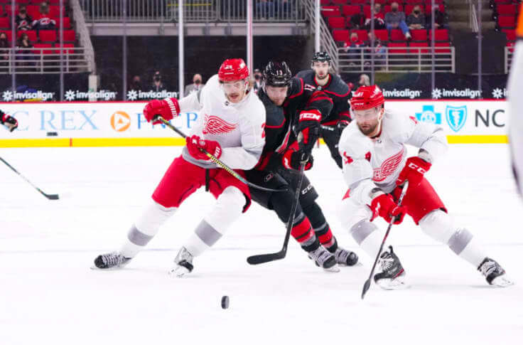
With the NHL Playoffs now underway, I thought today would be a good day to take a look at the NHL’s Reverse Retro (RR) program, which as you probably all know added a third (or fourth) jersey (and sometimes uniform) to every team’s current stable of uniforms. If you for some reason aren’t sure what exactly the Reverse Retro program entailed (or why certain designs were chosen), I recommend you read what Paul wrote about it back in November, and for an even deeper dive, Paul’s Unified podcast partner Chris Creamer really went all in with the “inspiration” for each new sweater. That should bring you up to speed, if you weren’t already.
I wanted to take a look at each design and how it looked on ice, and rather than deem a uniform “good” or “bad” or what have you (although I will indicate if I like or dislike a particular uni), I wanted to see if any of these were worth bringing back, if it were possible, for another season. When I first saw the RR jerseys, I liked about half, and thought the other half felt forced and were mere merch dumps. There definitely are some great designs (and many not so great to awful), but how many would be worth making a permanent part of a team’s uniform set? Maybe more than you’d think.
There’s a LOT to get to, so I’ll stop with the intro. Here’s what I think of the 31 RR designs, and whether they’re worth keeping or should be forever ditched. Let’s go!
East Division
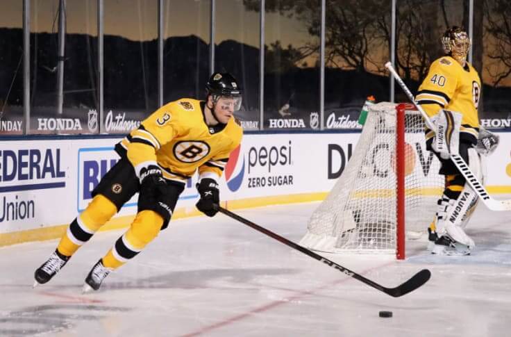
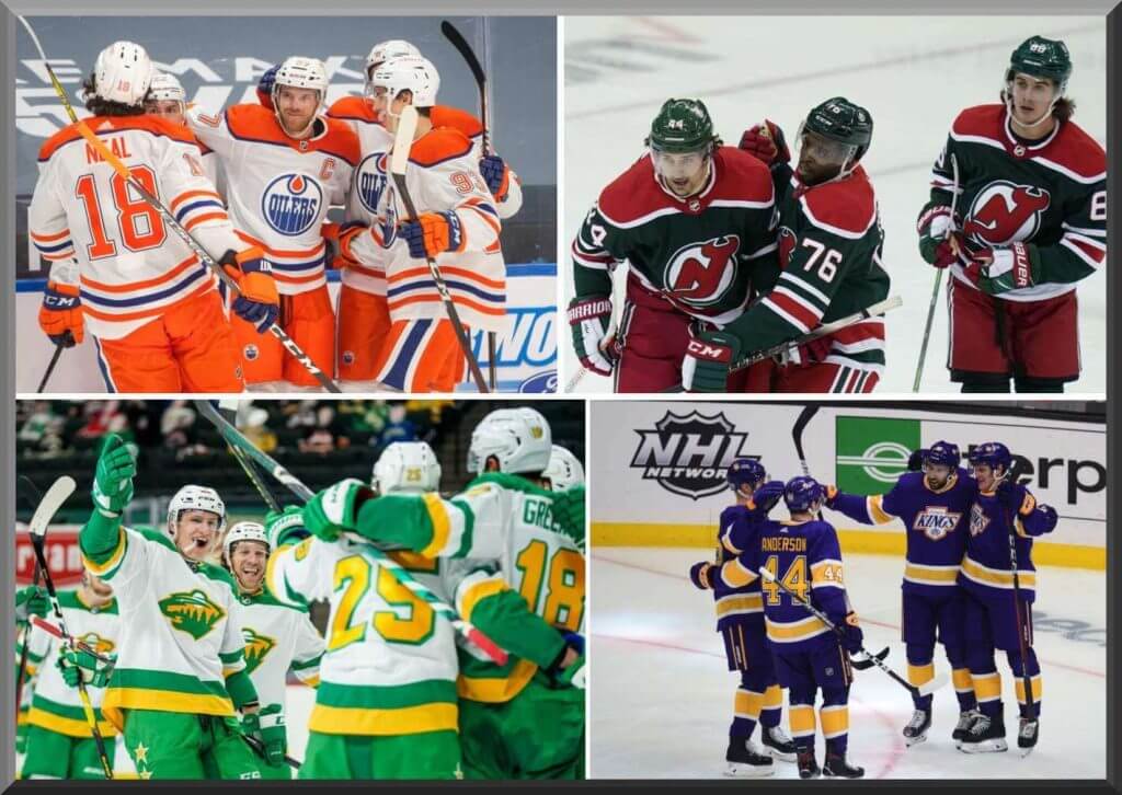
While I think five of the O6 teams have great home and roads (and don’t really need any alternates), I absolutely LOVE the Bruins RR unis. The gold sweaters and socks are fantastic! I wish the NHL didn’t mandate a white sweater, because this would be a perfect look to swap with the white jersey (to be worn as the “light” jersey).
Keep or Ditch? Keeper for sure.
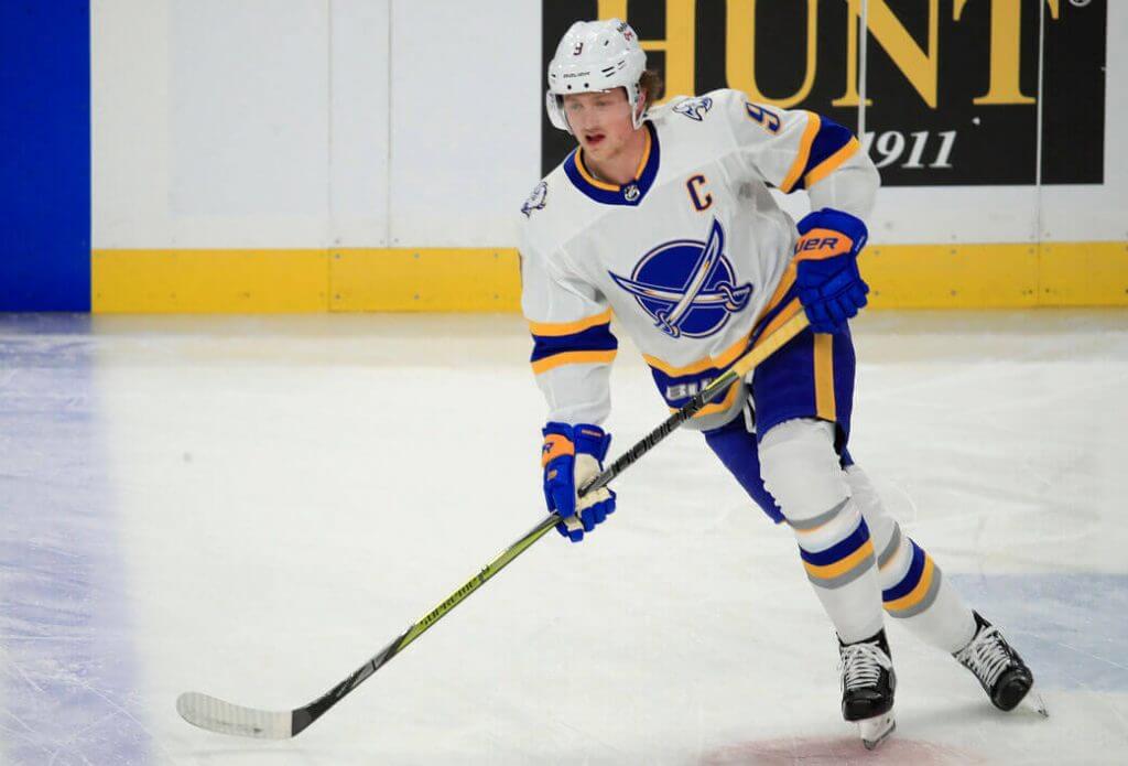
Not a huge fan of the crossed swords logo, and the “Buffalo” wordmark on the hem is brutal, but otherwise this is a pretty nice looking uni. They don’t really need a second white jersey, so if one had to choose between this or the classic whites, I stick with their regular uni.
Keep or Ditch? No need to keep this one.
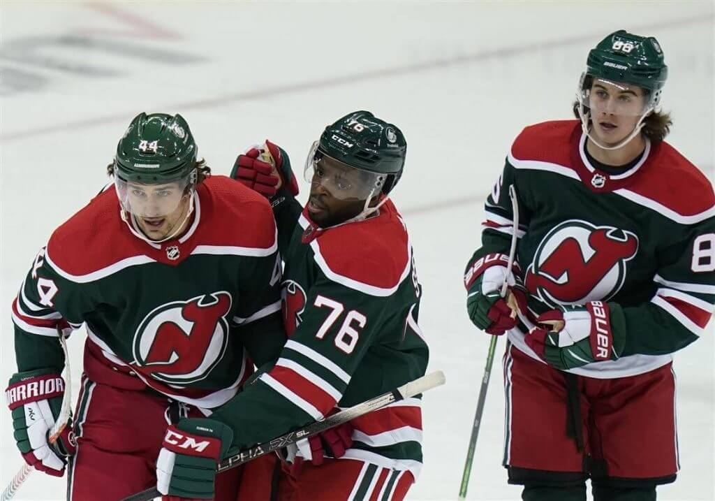
I have always loved the Devils in red and green, and was very disappointed when they swapped in black for green a few decades ago, so this is a no-brainer. One of the guys I curl with actually bought and wore this during league night this past winter, and it’s even better in person. They should make this a permanent alternate (and return to green pants full time).
Keep or Ditch? Absolutely they need to keep this.
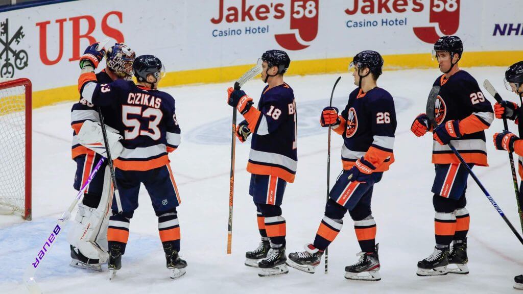
The Isles have a perfectly fine uni set — this one (especially in navy) is completely unnecessary — although it’s far better than their current third uniform. If they had to have three unis, I’d ditch the current third and replace it with this one, but I don’t think they need either.
Keep or Ditch? Dump this one yesterday.
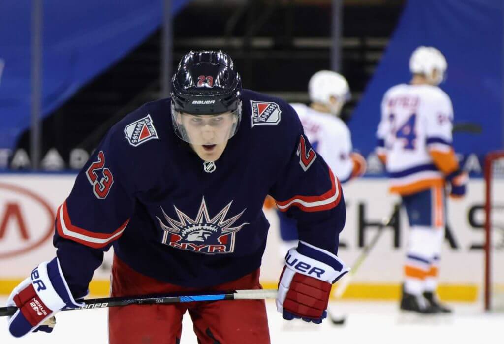
I never liked this look, nor the look upon which it was based. To me, the Rangers own the diagonal wordmark, and *that* is a signature look. The Lady Liberty logo and “NYR” just feel like something one of their minor league affiliates should wear, not the big club.
Keep or Ditch? Buh-bye.
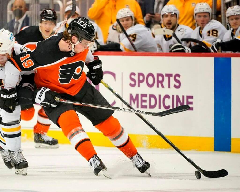
I get where they’re going with this but it’s too similar (and therefore not necessary) to their regular orange unis. At least it isn’t black.
Keep or Ditch? See ya.
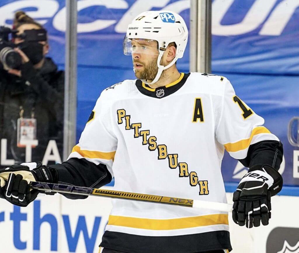
Another Pennsylvania team where I get where they’re going, but I’m not along for the ride. The team already has three fine unis, and this one needs to go. Besides, the Rangers own that diagonal wordmark (sorry Pens fans).
Keep or Ditch? One too many. Ditch it.
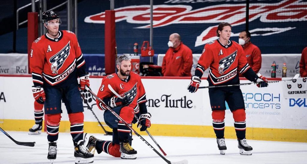
This is a jersey I should hate: bad logo, asymmetrical design, superfluous wordmark. I don’t even particularly like the predominate red color. But…I actually do like this look. And honestly, aside from the current wordmark, I’m not particularly in love with the Caps’ current kits. But they surely don’t need two red sweaters, so this one has to go.
Keep or Ditch? So long, farewell.
North Division
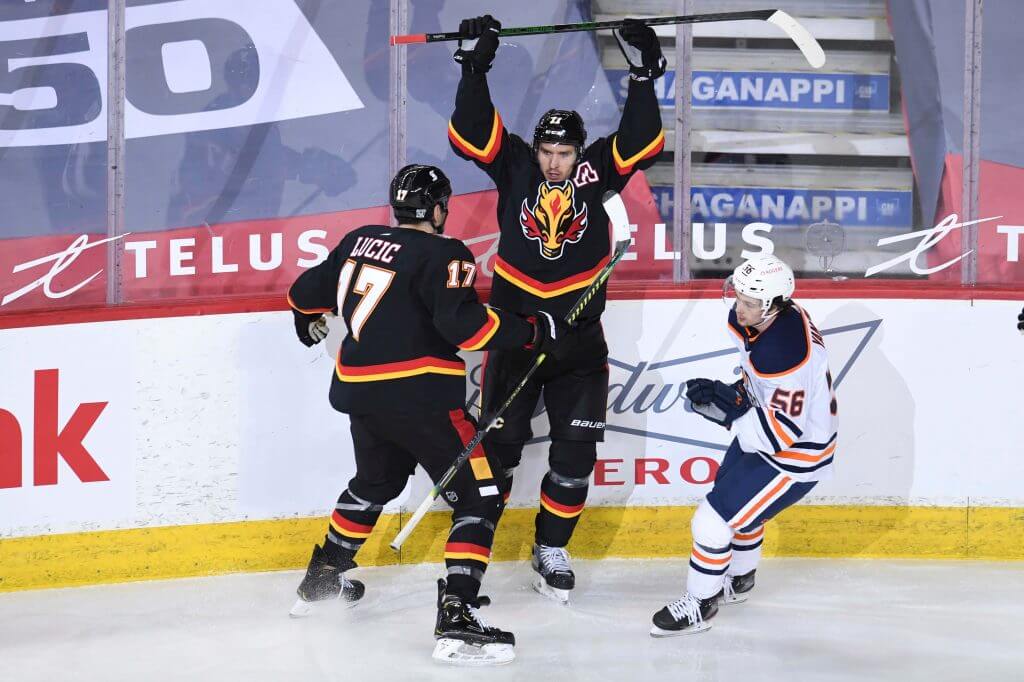
The Flames look so much better when their unis contain no black, and their current regular unis — in ketchup and mustard — are definitely some of the best unis in the league. While I kinda like the flame snorting stallion logo, that should definitely appear as no more than a shoulder patch. It’s a fine secondary logo (if a bit cartoonish), but it should never be front and center.
Keep or Ditch? This was fun for a few games, but that’s it.
This is one of my favorite NHL unis, nevermind it being an RR. When the NHL released the RRs, I knew immediately I’d want to see as much of this as possible. The orange yoke and breezers are just gorgeous. Man it would be great if this one could see a few more seasons.
Keep or Ditch? A keeper if there ever was one!
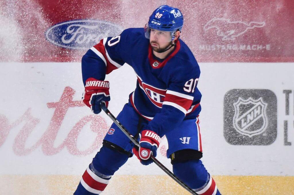
This one is another winner, although seeing les Habs in a blue sweater is absolutely jarring. But it works. My only complaint is that most (if not all) players’ breezers are a slightly different shade of blue than the jersey/socks. Not so noticeable as to ruin it, but different enough as to mess with my OCD. If players could match the blues, I’d be in seventh heaven. Currently, I’m in sixth heaven.
Keep or Ditch? This should definitely be a permanent alt, but it should be kept to 5-6 games a season. It’s that special.
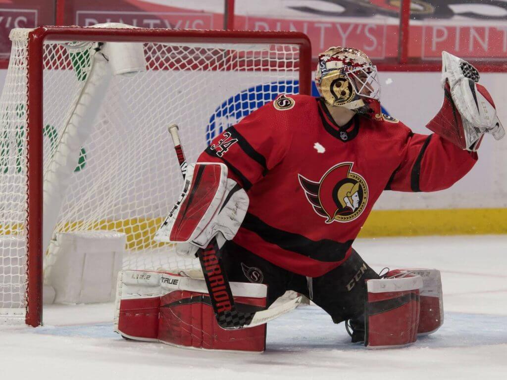
I’m not a big fan of these, but I’m not particularly enamored with any of Ottawa’s current unis. I will give them points for having three almost identical sweaters, just with flipped colors, but that alone isn’t enough for me to want to see these in the regular rotation. I’m probably in the minority in disliking these, but they just don’t do much for me.
Keep or Ditch? Yeah, dump them.
Simply because of the order, Toronto is one of several teams that add a color I don’t think should ever be on a hockey uni: gray. I know it’s tough when your color scheme involves white plus one other color, but adding gray to an alternate is NOT the answer (only adding black would be worse). The club has had some great sweaters over the years. This ain’t one of them.
Keep or Ditch? Drop these like third period French.
If there was a more widely reviled RR, I’m not sure what it could be, by fans, players, and people with eyes alike. Gradient is never a good look for a hockey jersey. A blue/green gradient, with the Orca logo, just can’t look good. We know this one is done for good. Now if they could just burn all the remaining ones.
Keep or Ditch? This never should have seen the ice to begin with.
I’ll be honest, when I first saw this jersey unveiled, I thought I would absolutely detest it. It grew on me, and I’m actually pleasantly surprised how well the dark blue and anthracite go together. But still, it’s basically GFGS, and that’s no bueno.
Keep or Ditch? It’s not the worst look ever, but it’s certainly not worth keeping around either.
Central Division
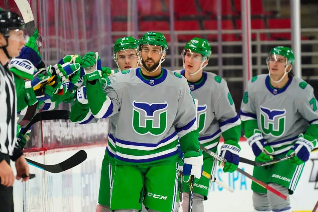
This one should have been a slam dunk. Instead, Carolina completely wasted a golden opportunity to show off the best hockey logo of all time — that being the Hartford Whalers. Instead of wearing a white sweater and socks (keeping everything else the same as it currently is), they inexplicably made the jersey and socks gray. WHY? This was literally sitting on a tee, and the team swung and missed. Maybe more than most, I want to see the Whale back, but NOT. IN. GRAY. FFS.
Keep or Ditch? Ditch these and never add gray to a Whalers throw/fauxback ever again.
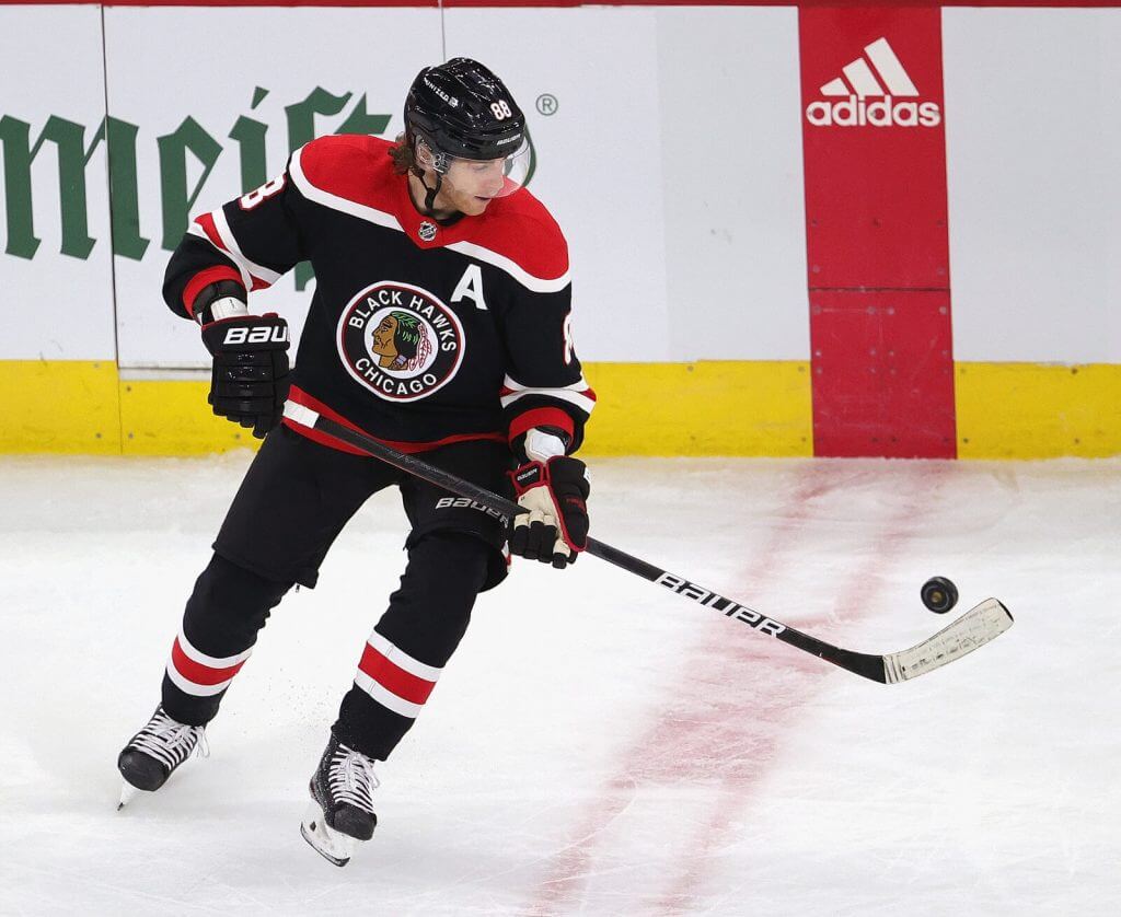
Chicago has, if you can discount the Native American imagery/appropriation and name, one of the best looking regular set of unis in the NHL. Unfortunately, we cannot discount these things (let’s face it, it’s just a matter of time before this team rebrands with a new name and logo — they’re “on the clock” as Paul likes to say). So the RR (which I don’t like nearly as much as the red or white sweater the team currently wears) won’t be worth keeping no matter how good it was.
Keep or Ditch? Sorry Chicago. It’s gotta go.
This is another jersey I hated when it was first revealed, but it has grown tremendously on me. I’m not as big on “if your team has a color in its name, then it better wear it” as some, so the predominately red jersey and socks (plus blue breezers) actually looks pretty damn good to me. Not so good I want it to become a permanent fourth uni, or even replace the current alt, however.
Keep or Ditch? It was cool for this season, but there isn’t any reason to keep it around.
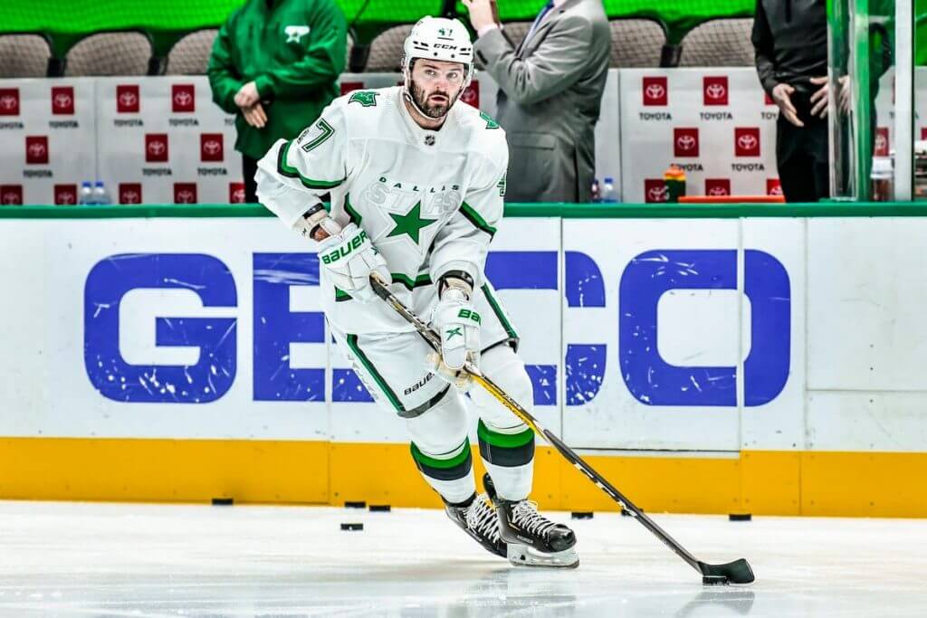
I’m gonna give Dallas props here. Between this mono-white uniform (almost unheard of in ice hockey, as white pants are almost never worn) and their new black and neon green alternate, they’re seemingly trying to be the Oregon Ducks of hawkey (which IMO isn’t such a bad thing so long as 20 other teams don’t also try to be the Oregon Ducks of hockey). I also am torn on whether an all-white uniform is bad, or so bad it’s good. It was fun to see it a few times, but maybe being the Oregon Ducks of hockey isn’t what the NHL needs now.
Keep or Ditch? While I still believe there is a place in hockey for white pants, this probably isn’t the place.
Detroit, like Toronto, is one of those one color plus white teams, so of course the NHL decided to add a third, neutral color, to their palette. Gray doesn’t belong on a Red Wings sweater and socks any more than it does on a Toronto uni. Detroit has great home/road unis. That’s all they need.
Keep or Ditch? Sayonara.
The pros: I love how the sleeve, hem and socks striping all perfectly align. The cons: You can tell that like many of the teams, the RR gimmick was pretty much forced on the team. I get how they’re trying to make a fauxback with it, but it doesn’t jibe with their home/road unis and just feels like a TJFTJS (Third Jersey For Third Jersey’s Sake).
Keep or Ditch? No need for this one.
Normally I’m a yuge fan of gold sweaters, so any time there’s a new one, I’m generally in favor of it. But the Preds already have a gold sweater as their home jersey, and this one isn’t all that different. And it’s not a particularly good looking uniform either. So, this one is done.
Keep or Ditch? Totally superfluous.
Again, I get where they’re going, but I was never fond of that look in black. It’s a little better in blue. But black and blue are, at least to me, two colors that don’t pair well, and this kit is no exception. Sadly this team has never really worn a uniform I’ve liked very much, but they always looked better when they didn’t mix black and blue elements.
Keep or Ditch? Nah. Not a keeper.
West Division
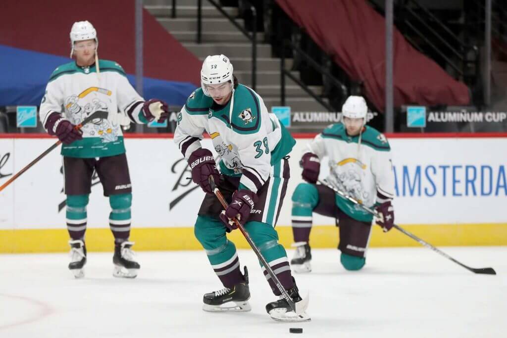
I totally prefer the Ducks in teal and eggplant, but of all the crazy third jerseys of the 90s, “Wild Wing” was easily the worst. Not even in a so bad it’s good way. It was just awful. So I won’t shed a tear if this never sees the ice again, in any form.
Keep or Ditch? The original was bad. This is worse.
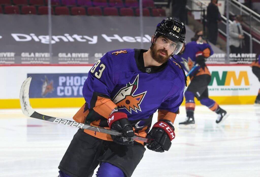
Unlike a certain uniforms scribe, purple doesn’t bother me as a color. And I have always loved the Kachina/Peyote Coyote look the team has sported for many years, so I’m on board with this one. Arizona’s current identity tries to span two eras, and I’d prefer if they returned their white sweater to the peyote motif, and kept this one around for their third.
Keep or Ditch? Yeah, let’s keep this one around for another season or two.
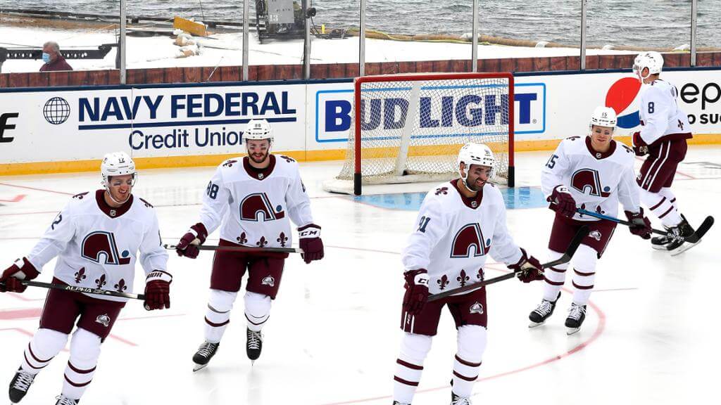
When I first saw the Avalanche’s Nordiques fauxback (in Colorado colors no less), I knew this one would be one of the better RRs, but when I saw them on the ice for the outdoor game in Lake Tahoe, I was smitten. I know Colorado hasn’t really acknowledged their Quebec roots, but this is such an outstanding look it really needs to join the Av’s rotation. Such a great logo and it’s even better when rendered in Colorado’s burgundy/teal color scheme!
Keep or Ditch? This one is for sure one of the best RRs ever!
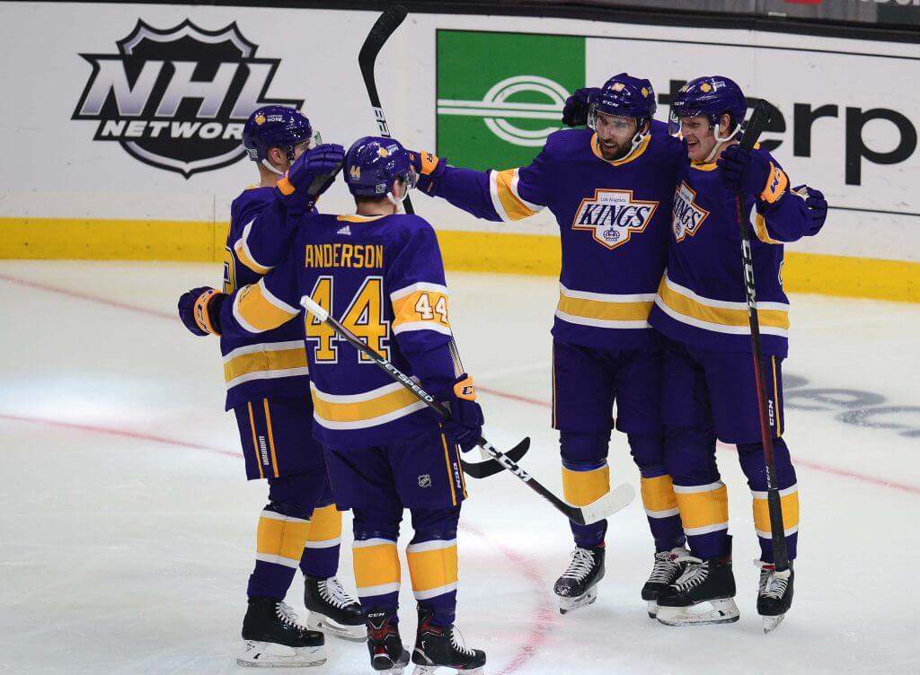
Who knew that mashing up two eras (the logo of the black/silver era, with the original forum blue/gold colors) could look so great? Also, it just shows you that the Kings had it right, color-wise, from the start. This needs to be the team’s PRIMARY jersey, and add a gold jersey as an alt, in the same style. Dear God, this is near uni perfection.
Keep or Ditch? Keep keep keep keep keep….
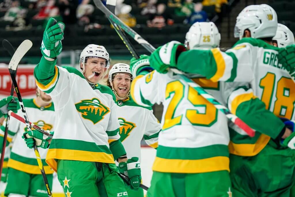
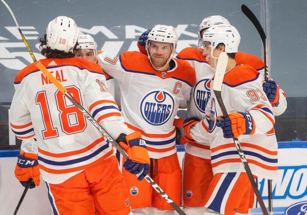
There must have been something in the water that allowed the NHL to outfit the West Division in such great looking RRs, because this is another uniform that needs to be made the permanent road (and get a green jersey for the home) — not only are the colors perfect, that Wild logo (which I have always loved) just POPS. Dallas doesn’t seem to want anything to do with North Stars iconography or colors, so it’s time for the Wild to reclaim it.
Keep or Ditch? For the love of all that is holy, please wear these uniforms all. the. time.
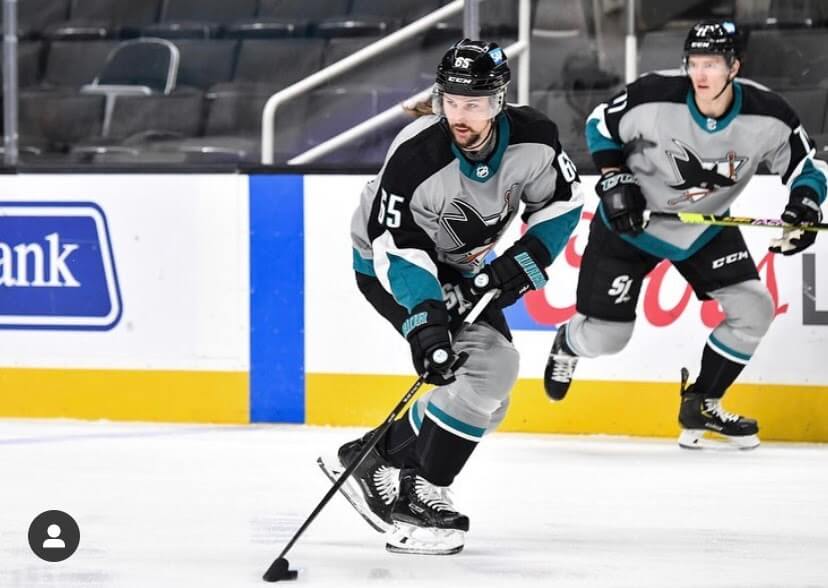
And just when I thought the West would rip off another hat trick for uni goodness, along came the Sharks and the apparent need for gray on an NHL uniform. No, NHL uniforms do not need gray. Ever. Don’t feel bad San Jose, at least you’re not the only team to have gray foisted upon you. But like the others, these need to go.
Keep or Ditch? Ditch. A very big ditch.
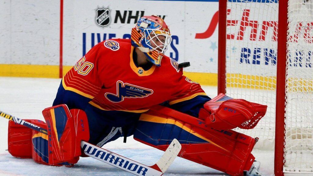
I’ve always hated this asymmetrical design, and I especially don’t like it rendered in red. I’m not wedded to a team with “blues” in their name to wear a predominately blue uni, but when it’s this design, well, it doesn’t even work in blue. I’m generally a big fan of St. Looey’s kits, but this was another 90s design that should have stayed back in the 90s.
Keep or Ditch? Nope. Not a keeper. Not by a long shot.
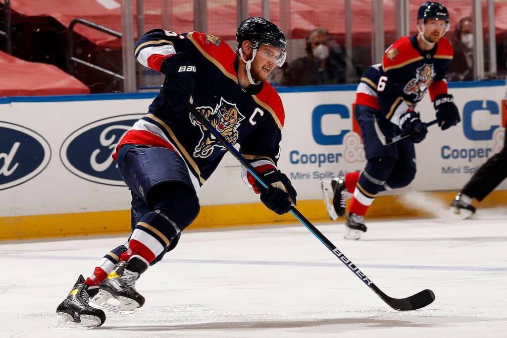
Purely as a hockey design, I like this one — and I really dig the logo. But this team just added a spectacular gold jersey (which I am pretty certain will actually become their primary home jersey next season), so this was fun to see, but it needn’t stick around, especially since all of their other uniforms have barely any red and this one doesn’t fit the template as well. I know that wasn’t the intent, but I for the most part I really appreciate symmetry throughout a uni set.
Keep or Ditch? It was fun for a few games, but we’re good now.
And there you have it. This ended up being a bit longer than I’d originally intended, and for my lack of brevity, I sincerely apologize. But if you made it this far, then you probably have some strong opinions of your own. Love to hear what you think in the comments below.


Uni Concepts & Tweaks
Time for more Uni Tweaks from the UW readership.
I hope you guys like this feature and will want to continue to submit your concepts and tweaks to me. If you do, Shoot me an E-mail (Phil (dot) Hecken (at) gmail (dot) com).
Today’s concepts come from Dan Bodurtha:
The following were originally sent to Paul, but since I’m the “concepts” guy, he forwarded them to me as well. He writes…
Hello,
Hi,
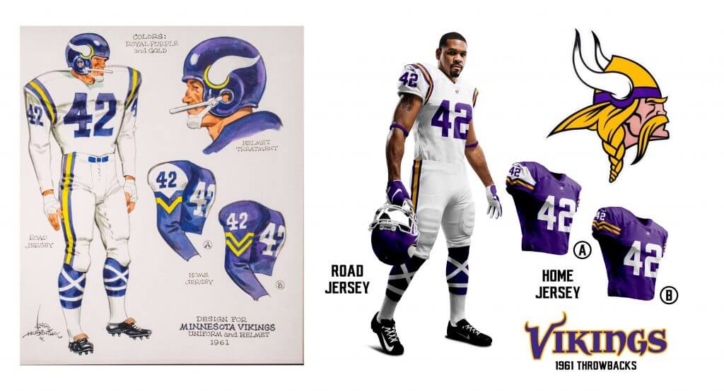
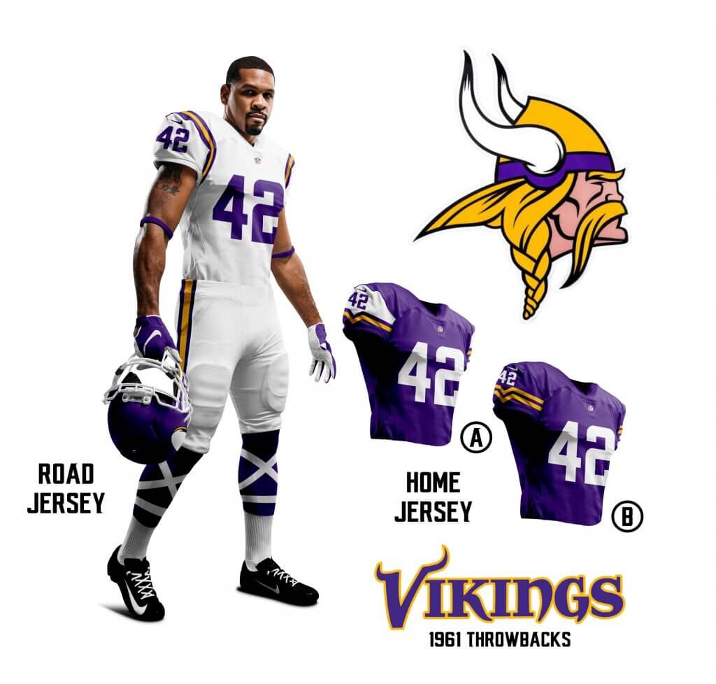
I think most Uni Watch readers know your thoughts about the color purple in the uni-verse, but thought I would share my Minnesota Vikings concepts based on the original concept sketches from 1961. Although purple may not be in your color palette, I think a nod to the past is something to appreciate and I hope you enjoy!
Thanks,
Dan Bodurtha
And here are his concepts:
OK readers (and concepters). If you have some tweaks or concepts, shoot ’em my way with a brief description of your creation and I’ll run ’em here.

Guess The Game…
from the scoreboard
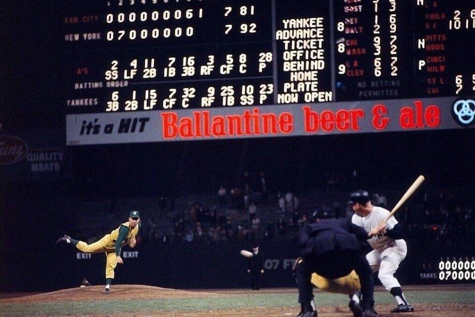
Today’s scoreboard comes from Casey Calvert.
The premise of the game (GTGFTS) is simple: I’ll post a scoreboard and you guys simply identify the game depicted. In the past, I don’t know if I’ve ever completely stumped you (some are easier than others).
Here’s the Scoreboard. In the comments below, try to identify the game (date & location, as well as final score). If anything noteworthy occurred during the game, please add that in (and if you were AT the game, well bonus points for you!):
Please continue sending these in! You’re welcome to send me any scoreboard photos (with answers please), and I’ll keep running them.

Purp Walk reminder: Paul here, reminding you that tomorrow is the (15th!) anniversary of the very first post on this blog. By longstanding tradition, that means it will also be Purple Amnesty Day. A few things about that:
• Tomorrow’s post will go live at (or about) midnight Eastern tonight. It will include some special purple-centric content.
• As soon as the post goes live, the usual ban on purple-inclusive Uni Watch membership card orders will be lifted for 24 hours, so get those Vikings, Ravens, Rockies, and LSU orders ready!
• The post will include links where you’ll be able to order this year’s Purp Walk merchandise items. Those too will be available for 24 hours.
It’ll be excruciatingly loathsome! See you then.
Now back to Phil.
Uni Watch News Ticker
By Phil

Baseball News: In the Mets game vs. Arizona on May 8, Joey Lucchesi got on base in the third and was wearing what seemed to be the previous year’s Majestic-branded jacket instead of Nike (from Vladimir Gonzales). … Here’s a fun story about when the Philadelphia Phillies were nicknamed the Blue Jays (from Kary Klismet). … With the state of MiLB these days, I guess it’s an achievement to have a 10-year affiliation with the big club. I don’t know if it’s cap patch worthy, but the RC Quakes are doing it anyway (from Minor League Promos). … On the first Thursday home game of every month, the South Maryland Blue Crabs become the Bleu Cheeses (from SoMD Blue Crabs). … Good to see not everyone is willing to play along with the Armed Forces socks nonsense (from Sal X Traction). … ICYMI: On May 11th and May 12th, the Mets started Marcus Stroman (#0) and Taijuan Walker (#99) in back to back games (I believe this has happened on consecutive days more than once). Submitter Marcus Hall adds, “What a range in uni-numbers.” … Check out how differently the RAL is for the Nationals Kyle Schwarber, depending on whether the uniform has a headspoon or not (from Capital Sports Forecast). … The Los Angeles Dodgers’ Max Muncy wore purple and gold cleats to honor Kobe Bryant last night (from M Wolfram). … Here are six players from the last 25 years who spent a year or two wearing a uniform that doesn’t quite align with how they’re remembered.

Football News: As you may know, Jim Vilk loves old school kickers. He found one from 1988, in 2nd year of Arena Football. Straight-on kicker!. He adds, “Ken Olson’s stats may have been abysmal, but he’s going into my personal Kickers Hall of Fame. He post-dates the last NFL straight-on kick (Steve Cox, Washington, 1987).” … Washington is getting new turf at Husky Stadium (from Kary Klismet). … Here’s a look at the uniform for the Frisco Fighters’ inaugural game at Spokane last night. They play in the Indoor Football League (from Chris Mycoskie). … This short gif focuses on helmet numbers, but what caught my eye were the apparent ghosted numbers on one of the players (from Old Time Football). … Whoops! New York Giants’ Kadarius Toney had to do a drill shoeless due to ‘wrong size’ cleats (from Timmy Donahue).

Hockey News: The University of Maine gave new head coach Ben Barr a team jersey with his name and the number 5 on the back during his introductory press conference. Barr is the fifth head coach in program history (from Kary Klismet). … The Washington Capitals wives will rock Reverse Retro-inspired jackets during 2021 playoffs (from William Yurasko). … Whoa. Here’s a look back at all of the uniform match ups in the 2020-21 season including all Reverse Retro games (from Taylor). … Check out the banners depicting the jersey backs of Avalanche players ahead of the playoffs. That’s Larimer Square in Denver (from Wade Heidt).

NBA/Basketball News: Our own Jamie Rathjen writes, “Looks like at least several NBA teams are wearing WNBA 25th anniversary logo warm-up shirts (this is just one example).” … Ever wonder what Kareem Abdul-Jabbar would look like as a mixed martial artist? Now you know! The photo is from this article about the basketball great’s career, which mentions how he squared off against Bruce Lee in the 1970s film The Game of Death (from Kary Klismet). … Also from Kary: The Basketball Hall of Fame has unveiled a Kobe Bryant exhibit to coincide with the late Lakers superstar’s enshrinement yesterday. He’s the first player honored with his own exhibit since Michael Jordan. … One more from Kary: Rapper Drake celebrated his rec team’s league title by designing championship rings for himself and his teammates. … Russell Westbrook just became the all time leader in “triple doubles,” so the Wizards gave him a special numbered jersey to commemorate the achievement. … Good article here on how artist Daniel Arsham is reshaping the look of the Cleveland Cavaliers (from Tom Turner).

Soccer News: Olympique Marseille’s 2021-22 home jersey pays homage to the 1989-90 Squad. … Here’s a “Great FA Cup Final kit winners graphic from classic shirts” (from Iain McHugh). … MLS has launched “Pride Training Jerseys” as part of its soccer for all campaign. Here’s a bit more on that. … Celtic will wear a special crest on their jerseys against Hibs to mark National Famine Commemoration Day. … J2 side Matsumoto Yamaga has a jet black special uniform that pays homage to Matsumoto Castle, with its black exterior (from Jeremy Brahm). … We have a new home shirt for Śląsk Wrocław (from Ed Żelaski).

Olympics News: Ben Sherman is outfitting Team Great Britain’s athletes and delegates for the Tokyo Olympic Games opening and ceremony uniforms this summer. Here’s a look at what they’ll wear.

Grab Bag: On Friday, Jim Vilk asked if I’d be covering some kind of cornhole championship that was shown on TV yesterday. I demurred. Last night he wrote, “I don’t blame you for not covering this… the shirts are an ad-filled mess. So are the Cornhole boards themselves.” … Grand River Academy, a K-12 school in Grand Junction, Colo., has added two statues of its raptor mascot to the school’s entrance (from Kary Klismet). … Costumed mascots for libraries? Why the heck not! The Sawyer Free Library in Gloucester, Mass., has added “Clawdia the Library Lobster” to its “staff” (also from Kary). … More from Kary (the next four are from him): San Antonio (Tx.) College, which dropped “Rangers” as its team name last year, has chosen “Armadillos” as its new team name and mascot. … The annual motorcycle rally in Sturgis, S.D., now has an official logo. … Rocky Mountain Middle School in Idaho Falls has unveiled a new school mascot and logos. … New logos for the El Paso Elementary School Cougars of Derby, Kansas. … Check out this Marathon medal with moving parts (from James Gilbert).
Uni Tweet of the Day
Please, Lord. Please rescind the “One Shell” rule.
The Falcons need to draw up a play to get themselves back in these uniforms. pic.twitter.com/yxdDDumXia
— Super 70s Sports (@Super70sSports) May 12, 2021
And finally… that’s a wrap for this weekend. Hope everyone had a good one and you’re all staying safe! You guys have a good upcoming week and I’ll catch you again next weekend.
Let the Purp Walk countdown begin…
Peace,
PH
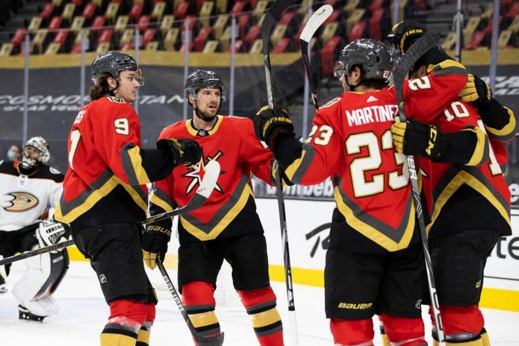
ЯR keepers: Bruins, Devils (maybe red base with green tirin, eliminate red/black and reclaim your history), Panthers (what they have now is bad), Kings (the Raiders left town years ago, go back to ripping off the Lakers, an actual successful team), Wild (find a way to make this happen, even if it means throwing a little red in the mix), Golden Knights.
Keep but with tweaks: Oilers (blue numbers and breezers), Maple Leafs (replace the gray with white and make it a fauxback), Stars (ditch the white pants), Hurricanes and Avalanche (make them authentic Nordiques and Whalers throwbacks, plain and simple).
Meh (if you need a 3rd, so be it, but it’s cool if you don’t): Sabres, Rangers, Islanders, Penguins, Habs, Senators, Blackhawks, Lightning, Sharks.
Everyone else: trash them!
*trim, not tirin
Oilers’ jersey look is a nod to their original white WHA uniforms. I would be for them to transition that uniform to a throwback similar to how they did with the orange uniform a few season ago.
RR for Stars would have looked good with green pants and gloves.
Just want to note that the picture that you used for the Flyers RR uniforms is a photoshop, and not a good one at that. Sock striping is incorrect, and the sleeve numbers are not accurate.
Thanks for catching that. Swapped in a new photo that is correct.
Should be their new primary uniforms with tweaks:
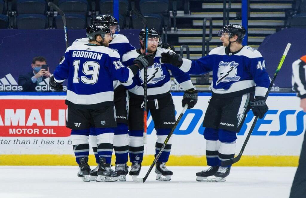
Lightning (modern logo including black and silver coloring similar to original), Panthers (modern leaping cat logo), Kings, Wild.
Keep as regular alternates with tweaks:
Bruins, Devils, Flyers (because we need anything but their current black alternate), Senators, Blackhawks.
Would not want the Rangers to keep the Lady Liberty uniforms because they should be wearing the following as a regular alternate:
link
link
Forgot to mention the Lightning should wear blue helmets with this uniform.
New York Rangers
“I never liked this look, nor the look upon which I was based.”
– Don’t be so hard on yourself, Phil. It’s not your fault you look the way you do. Blame genetics, my friend.
LOL. Nice way to point out a typo. Now fixed.
Wow! Great job on this, Phil! (Actually, the whole weekend’s content has been excellent, with today’s peace deserving special mention.) It was well worth reading all the way through.
I have many thoughts on the Reverse Retro unis, I will try to share them a bit later. For now, I’ll say that we are remarkably closely aligned in our feelings about which looks should stay and which looks should go. And I laughed out loud at the wording of several of your calls on the uniforms that deserve the heave-ho. Thanks for starting my morning off right!
As a Ranger ticket holder for 45 years who had to watch all of this season’s games on TV, I hate their RR jerseys. The numbers are unreadable on TV.
Proofreading: the link in the last sentence of the Tampa Bay Lightning entry goes to the main page of the NHL Uniform Database. I’m guessing you might have wanted something more Lightning-specific there. Just FYI in case you wanted to switch up the link.
It’s *supposed* to go (and that’s what my link shows) to the TB Lightning: link
Sorry if it’s coming up showing the NHLDB in general — wasn’t my intent. Thanks for the heads up Kary!
Thanks, Phil! Upon closer investigation, it appears to be an issue with my phone, on which I read this one is entry. It’s defaulting to the mobile link for the NHL uniform database, which apparently doesn’t support the targeted team link. Sorry for the scramble on your end for a problem that’s apparently on my end!
Nice work on today’s opinion-piece, Phil!
“I wish the NHL didn’t mandate a white sweater…”
I’m in the camp that hockey tops look better in white, except maybe the Flyers. Maybe.
It’s disappointing the Dallas Stars abandoned their historical colors, so I’ll grit my teeth and admit that yes, the Wild should absolutely go green and yellow.
It’s wonderful that the Hurricanes break out their former identity from time to time…and it’s about time the Avalanche did too, so maybe someday the Coyotes will pay homage to the Jets and the ‘new’ Jets will remember their Atlanta roots.
Dan Bodurtha’s concept is terrific…so the Vikings were going to be ‘born’ with white facemasks? Interesting.
And of course the Falcons need to bring back the red domes, but the uniforms should not be from to their ’78-’89 silver period-it’s gotta be the ’76-’77 version.
I loved the Expos as a kid. I went to Grizzlies games as a teenager too. It’s a gut punch that other cities wear those uniforms. I think there should be a ban on wearing uniforms from a previous city. Imagine the Stars wearing North Stars uniforms! Gorgeous though it may be, it’s offensive.
Thanks Chris!
I found myself agreeing way too much with Phil, except for the Pens, Caps and Sens.
Anyone want to concept the “Pittsburgh” going up the jersey instead of down? I don’t agree that the Rangers “own” that look, but given their long history I can be flexible and let them have it.
I’m not wedded to a team with “blues” in their name to wear a predominately blue uni
I am!
the usual ban on purple-inclusive Uni Watch membership card orders will be lifted for 24 hours, so get those Vikings, Ravens, Rockies, and LSU orders ready!
Let’s not forget the Pittsburgh Maulers and Phoenix Suns!
Please, Lord. Please rescind the “One Shell” rule.
No need in this instance. Atlanta never should’ve gone away from the Bartkowski-era unis.
Guess The Game from the Scoreboard:
Kansas City A’s at New York Yankees – May 22, 1963. Yanks won that one 8-7 in 11 innings with Mickey Mantle hitting a home run in the at bat after the one depicted in the photo.
That’d be the first year of green and gold in KC, when the A’s just wore the gold uniforms EVERYWHERE! White and gray uniforms debuted in 64. The A’s also had the white tv numbers on the green undershirt sleeves – except for the pitchers.
My impression here in Vancouver that is mainstream (read: non-uniform nerd) fans absolutely loved the Canucks RR uniforms. Fortunately they played so poorly in them we will likely never see them again.
The only thing they should go back to is the Flying V.
RR was only for a few games. Should allow teams to experiment (and some did) but the Canucks played it boringly safe. Fans want Johnny Canuck on the jersey and current owners will never do it. They missed the opportunity. They did not have to bring Johnny Canuck back full time but 4 games wouldn’t have hurt.
They could have executed a great RR idea. Should have been a green uniform with Johnny Canuck for the crest.
Just a thought on the Avalanche/Nordiques unis, which are nice. They also could have done a logo mashup on that, with a mountain on the left and the stick and puck on the right of the primary logo, mountains across the bottom of the sweater and fleur de lis on the shoulders. Perhaps a Uni Tweaker could mock it up. (If this is heresy, please know I’m not an NHL fan.)
Mon Dieu! Most probably would and should not have been considered. Nordiques fans and the people of Quebec would have wanted a word. Doesn’t matter if it is hockey, football, what sport. Not the best practice to disrespect the old team, their esteem logo/identity, and their fans that lost them.
You and I are in close agreement on the ЯR program; a few amendments:
I like the Flyers’ orange uniform with big blocks of black, it’s a nice changeup from the usual road/home choices, which are not different enough from one another. Islanders probably should have gone with orange numerals. Detroit and Toronto could have gone with white breezers, but Darryl Sittler-era Leafs’ uniforms would be fine. I’d like to see a Rangers’ uniform with the blue/red elements swapped.
I’m about ready to vote “ditch” on all these uniforms, just on the general principle that alternative unis have jumped the shark and it would be refreshing to go back to the days when teams in all sports had one home and one away look and that was it.
Now get off my lawn!
LOVE the Wild RR jerseys! I don’t miss the old Met Center but love to see the North Stars colors live on.
Phil — on another note don’t forget today’s the last college football game of this weird season. South Dakota State (the Jacks not the Bison) take on Sam Houston on ABC for the FCs title.
Despite the Jackrabbits wearing mono blue, this is a really nice looking matchup.
Sure beats the latest MLS mono dark vs mono white boring matchup. After seeing a minute of that game, I went exclusively to the FCS game and the Wild/Knights game. Paul’s right…the Wild look great.
On straight-on kickers: when I was at Luther College in Decorah, IA, in the late-’90s (D-III), watching their football games, on a rare occasion I’d see a straight-on kicker (it may have been Luther’s kicker, I don’t quite recall). This would have been about 1997/98, and about the last I’ve seen of one since.
Virginia Tech had a kicker (Ryan Williams) with a Dempsey-like foot (lawn mower accident) from 1991-94. I actually called a game in his freshman year, but from way up in the VT press box, we didn’t know about his foot. I believe he’s the last 1-A straight-on kicker.
Occasionally you’ll hear about a “conventional” high school kicker, but even at the small college level they are rarer than than a rotary phone.
Vilk, this guy came a little later, however, if I recall correctly, he only handled kickoff duties: link
What’s so great in that red Falcons photo is the bright sunshine.
You’re not going to see that again in Atlanta.
I hate everything about the Minnesota wild’s identity. I hate the colors (red and green look great together. Burgundy and forest has a “throw pillows in the 1990s” vibe). I hate the logo, which is busy and over clever and corporate, play the label on caffeine infused bottled water or something. I hate the word mark, which always reminds me of the typography on a Duran Duran album cover.
Change everything to green and yellow, and it’s the best looking uni set in the league. Maybe not the best, what top-five, easily. And the Kings? Blending purple and gold with the Gretzky era logo and design created the best-looking uniform that club has ever worn.
I love Duran Duran, so I count this as a positive.
Of course you do.
Yes. Keep the LA Kings. But ditch the logo and go back to the simple crown in the middle of the sweater.
link
Agreed. The Crown says it all – No need to spell the teams name.
The Gretzky era crests and colors were always abominable to me, but now they just scream 1990’s. Almost as bad as when St. Louis put “BLUES” above the note because the owner’s wife couldn’t tell which team was hers.
Cueing up The Clash for this one…
Boston: ditch it. I’d love to see them in a brown uni.
Buffalo: ditch it
New Jersey: return of the pizza delivery guy uniforms! Reminds me of a movie I once saw…
Islanders: meh. I don’t care either way
Rangers: keep it. I usually dislike wordmarks as a logo
Philadelphia: adios
Pittsburgh: ditch it. See Rangers. Also, bring back robo-penguin!
Washington: keeper. A wordmark is not a logo
Calgary: keep or ditch. I don’t care
Edmonton: keep it but make the numbers and NOB blue
Montreal: no thanks. Please do not mess with the best
Ottawa: they’ve never had a good uniform
Toronto: terrible, burn them
Vancouver: either call yourselves the Orcas or put Johnny Canuck on the front
Winnipeg: ditch them
Carolina: are you the Wilmington Hurricanes? No? Then ditch it
Chicago: ugh, boring
Columbus: terrible. They’ve never had a good uni or even team name for that matter.
Dallas: on the fence. I much preferred the black/neon getup. They just have a bad logo.
Detroit: no thanks! Very forgettable.
Florida: keep the leap and get rid of the Olan Mills panther.
Nashville: ditch it
Tampa Bay: it’s ok, just get rid of the wordmarks. Their current unis have no depth
Anaheim: ditch it and redesign their current unis while you’re at it
Arizona: duh yes
Colorado: ditch it. The fleur-de-lis should stay in Canada.
Los Angeles: yes please!
Minnesota: glorious! Keep it please
San Jose: very blah. Throw it back
St. Louis: way too much red, you’re not the Cardinals.
Vegas: the logo is ok but the red seems jarring. The hem striping is giving me old Vancouver vibes. Keep it, ditch it, I don’t care.
That Ben Barr jersey should have had a zero instead of a five. ;-)
Supposedly, the reason the Hurricanes’ RR sweaters were grey instead of green or white is because gray is the only color that the Hartford Whalers and Carolina Hurricanes have in common, though they have been only trim colors for both.
They’ll probably go back to the green sweaters for a throwback look when RR either goes away and/or some organizations integrate their RR sweaters into their regular rotation.
The real problem with the grey sweaters is failing to either make the numerals white or trim the numerals in white. Notice how much more the logo pops when it is trimmed in which. Also, the first black alternates of the Hurricanes were black with red numerals trimmed in white. That made the numerals easier to see.
Look at footage of the RR games. Good luck on seeing the numerals as players were skating down the ice.
Another problem (which I failed to identify in my review) with the gray is that it is designated as a “dark” jersey, and while there is contrast with a white sweatered team, there isn’t link. That’s another problem in general with a gray uniform — unless it’s anthracite, there’s never truly enough contrast to either a white or a “lighter dark” jersey.
The RR uniforms are a nice change. From when the author said the Flames needed to be ditched, I knew we would disagree for most of the article. Blackhawks, Knights and Ducks should be around full time as well, that’s a fact. Dark grey as a base color for the Jets is fine but the lighter grey of the Whalers is certainly too light if the other team is wearing white. Change that to dark or white, and it’s a winner as we all agree.
Re: Dallas RR whites.
Go all in with white skates/green eyelet and heel yokes. (Golden Seals)
Later on, Federov and Gretzky got it with the Wings and Rangers.
I continue to be offended when a team from one city wears the uniform of the city they ripped the team from. Quebec and Hartford jersey’s should NOT be worn by Colorado and Carolina no matter how nostalgic we all feel. Just like when the Nationals wore Expos uniforms: not ok. And when Memphis wore Vancouver Grizzlies uniforms: not ok. It’s offensive, disrespectful, and frankly stupid. Imagine the Coyotes wearing old Jets uniforms? (and yes, I know that comparison is unique because the Jets are back in Winnipeg, but I think the dumbness of that happening is no different than what that would be like)
I live in Minnesota. I’m not a hockey guy, but I am a graphic design guy. The sheer joy that the Wild’s RR unis brought to this state’s hockey fanbase is bountiful. The Wild would be smart to ditch the dark red, forest green, and gold for the nostalgic and refreshing green and yellow. Just one guy’s opinion from the burbs.
Apparently many teams sold out of their Reverse Retro sweaters (NJ Devils). What was the point of this exercise if they didn’t make enough to assure that all fans were able to purchase one? Wasn’t this about generating revenue during the pandemic?
I need to say my piece somewhere. Regarding the Habs RR. For the Habs, I really don’t like them. I can see how the design of the sweater is favorable as sweaters go without a logo, but for the Habs it very very much irks me. It is very hard to watch them play wearing all blue. Can’t stress this enough.
As a Flames fan since 1986, I say definitely keep them as an alternate. I loved them the first time, and I loved them this season. They were my second favorite of the Reverse Retros – those Wild jerseys are a thing of beauty.