[Editor’s Note: Today’s lede is by longtime Uni Watch team member Alex Hider, who has the latest on an inexplicable MLS redesign. — PL]
By Alex Hider
“Not needed. Tone deaf.”
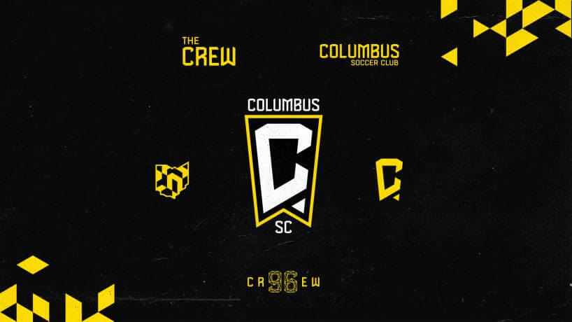
Those were the words that a good friend of mine — a lifelong Columbus Crew fan and season ticket holder — used to describe the team’s new team name and logo, which were unveiled yesterday after a weekend full of leaks.
His description is probably an understatement. A team coming off a successful push to save its club and a second MLS championship now sees some of its most ardent supporters in a mutiny over a redesign that few fans asked for.
The team is now officially known as Columbus SC and has banished the word “Crew” — a moniker the club has used since it was founded as one of the charter MLS members in 1996 — from its new primary badge.
However, the club told local media outlets that it hopes fans still refer to the team as “the Crew,” just as Liverpool fans call their club “the Reds” and Arsenal fans call their team “the Gunners.” The team even included “The Crew” and “Crew 96” wordmarks as part of their unveiling. It feels like a weak attempt to have it both ways.
For a team that likes to tout its extensive MLS history and heritage, there’s no reason to make a move this drastic. Supporters who had stuck behind the team for 25 years were unlikely to be clamoring for a name change, so making that change only alienates the club’s most hardcore fans.
Moreover, the new badge feels like a serious aesthetic downgrade. Just six years after unveiling a crest that was near-universally praised, the team opted to ditch it for a new mark featuring a “C” shaped like Ohio’s distinctive pennant-shaped state flag:
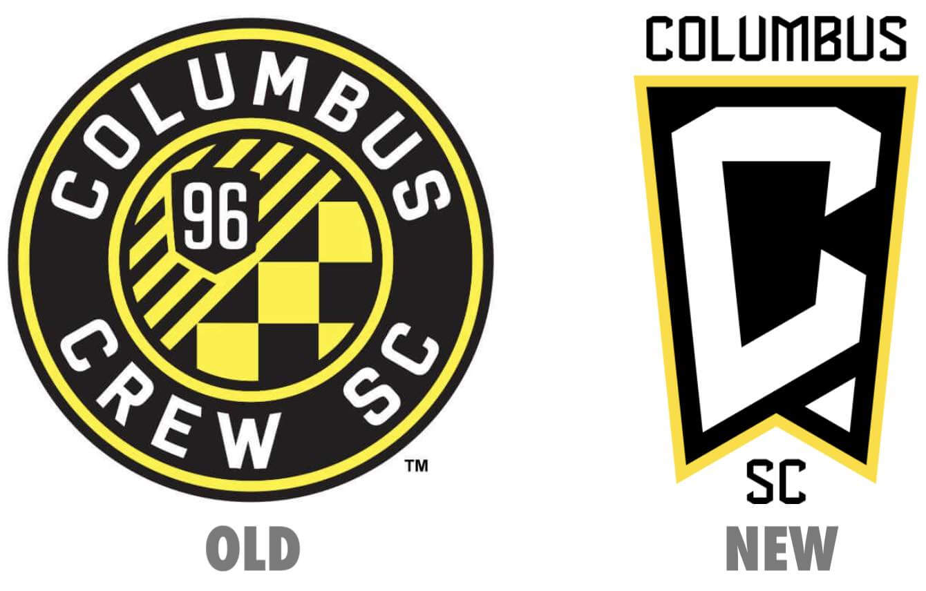
It’s a good concept in theory, but the execution misses the mark. The pennant is a difficult shape to work with, especially when trying to house letters or words. The final product feels a bit clunky, especially when compared to the simple, straightforward roundel the team has been using.
There’s also that little triangular element at the bottom-right corner of the new badge, which somehow seems simultaneously unnecessary yet essential to keep the logo from feeling incomplete. You have to figure an issue like that could have been avoided if the team chose to orient the logo horizontally instead of vertically.
For a group of fans that just fought like hell to #SaveTheCrew and keep the club in town, Monday’s formal announcement was a gut punch.
On Sunday night, the Nordecke — a coalition of the club’s largest supporters’ groups — condemned the rebrand, alleging that the club did not involve any of the fan groups in the design process and that the team recruited fans for promotional materials without informing them of changes ahead of time. A handful of fans even went to the team’s stadium on Monday evening to formally protest in person.
The #Nordecke Statement on the #Crew96 Rebrand pic.twitter.com/78K0LGY4MA
— The Nordecke ⭐⭐ (@Nordecke) May 9, 2021
In some ways, Columbus fans could have seen this coming. Among those who stepped up to buy the team and keep them in town was Tennessee businessman Jimmy Haslam — the owner of the NFL’s Cleveland Browns, who had their own ill-advised redesign in 2015.
Haslam remedied that mistake after five seasons — the quickest timeline allowed by the NFL. Could he do the same for the Crew if fans continue to voice their displeasure?
Click to enlarge
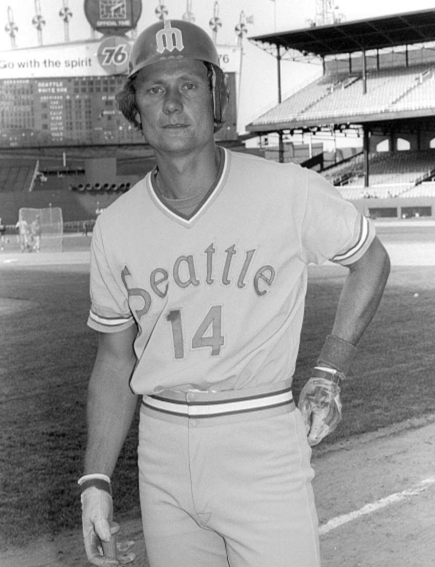
ITEM! History mystery solved: Yesterday I showed this photo of Tom Paciorek wearing a Mariners road jersey with centered numbering. The photo was clearly taken at Chicago’s Comiskey Park, probably in 1978 (the M’s wore an All-Star Game patch in ’79, had two-tone batting helmets in ’80, and switched to a different uni design in ’81, so ’78 is the year that makes sense).
I was so excited to share this photo with you yesterday that I didn’t do what I should have done first: show it to uni scholar Bill Henderson. I ran it by him yesterday and got this response:
Never seen this before! Ever. The Mariners were incredibly sloppy and cheap. And inconsistent. I wonder if he was reissued a jersey that had the 4 as the first number, and to be quick they just stuck a 1 in front of the existing 4. To prove this theory, I would look to see if he was a mid-season add to the team or if he was on the opening day roster.
That was an interesting theory, so I looked up Paciorek’s 1978 game log. And sure enough, Atlanta released him in May of that year, and then he joined the Mariners on June 22 — in Chicago. So as Bill suggested, they probably gave him a makeshift jersey, and then this photo (along with a similar shot clearly taken as part of the same photo shoot) was probably taken right after he suited up for the first time. It likely went out over the wire with a caption saying that he was the newest addition to the Seattle roster.
“It’s possible that the local shop in Chicago sewed his uniform, using whatever the team trainer had in his kit, and probably on deadline,” says Bill. “That would be similar to what happened when Mark McGwire joined the Cardinals in Philadelphia.” For details on that, look here and here.
That June 22 game in Chicago where Paciorek made his Mariners debut was the final game of a three-game series. After that, they played a three-game set in Milwaukee (the Brewers were still in the American League at the time). Paciorek didn’t play in the series opener but did appear in the second and third games. It’s not clear whether he was still wearing the centered-number jersey for those games, but the M’s went back to Seattle for a long homestand after that, so he presumably had a proper jersey when they went back on the road on July 7.
All of which is a long way of saying that Paciorek probably wore this jersey for a few games at the most, and possibly only for one game. So that photo documents a very rare phenomenon!
(My continued thanks to Twitter-er @ianb78 for bringing the Paciorek photo to my attention, and to Bill Henderson for providing the probable answer to the mystery.)
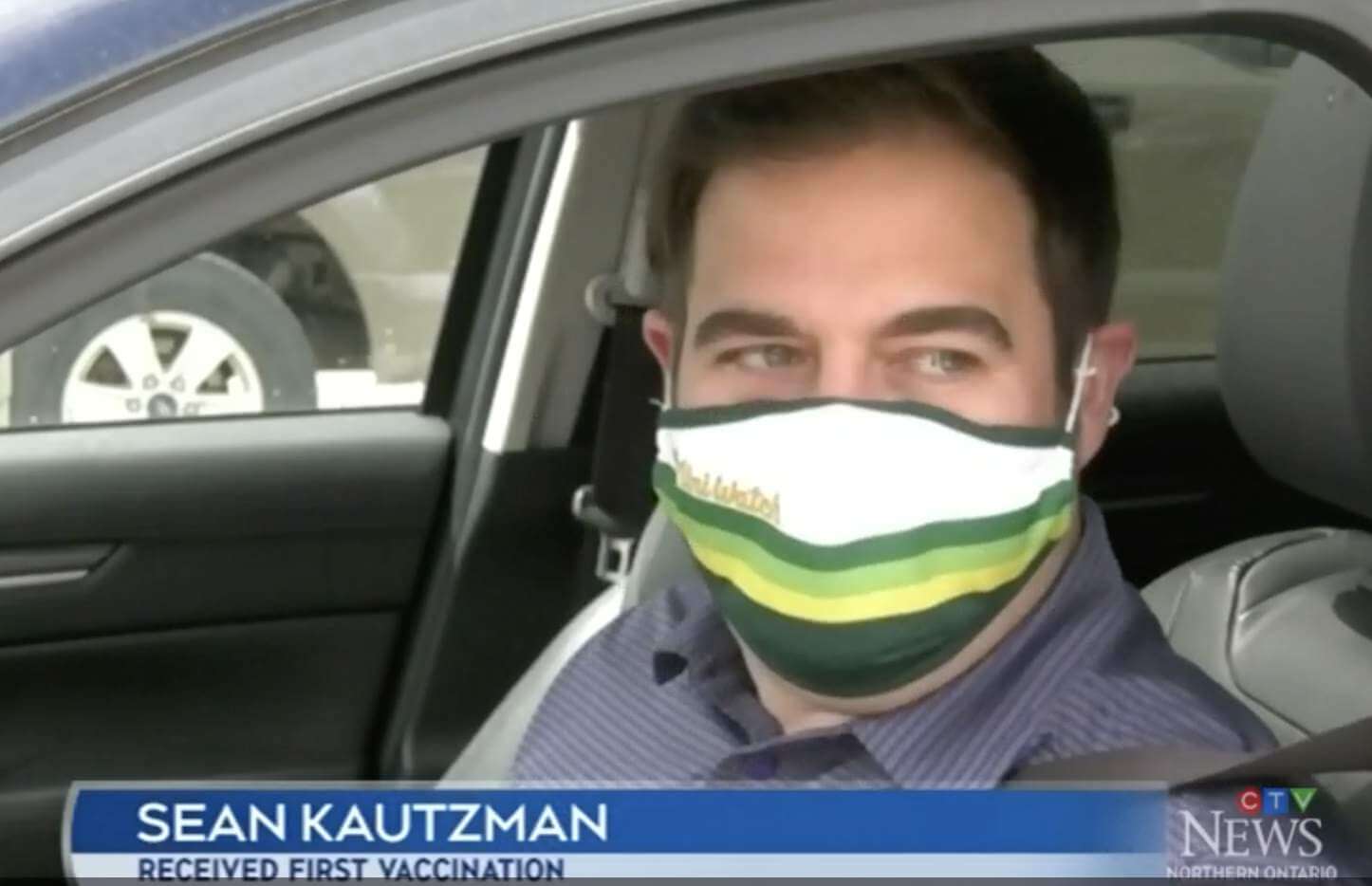
ITEM! Uni Watch mask makes televised vaccination debut: Uni Watch reader Sean Kautzman received a Covid vaccination yesterday at a drive-thru site in Sudbury, Ontario, and then was interviewed by a TV news crew — while wearing his Uni Watch mask! — as he prepared to drive back home.
You can see the full video clip here. Sean appears about a minute into the report.
I’m very proud to see Uni Watch having a presence to help promote public health. Congrats on your first vaccination shot, Sean, and also on your televisual appearance!
Click to enlarge
Collector’s Corner
By Brinke Guthrie
Follow @brinkeguthrie
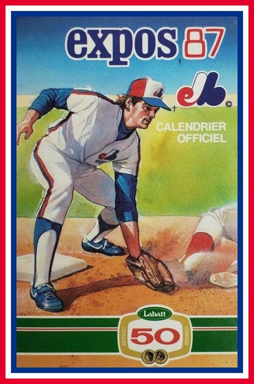
Leading off this week with some terrific calendrier officiel art on this 1987 Montreal Expos pocket schedule. Look at those stirrups! The artwork on the 1981 and 1982 schedules is almost as good. I remember getting these way back when, when postage was a dime or something. I’d write to teams and ask for a sticker and schedule, and usually got a nice reply.
Now for the rest of this week’s picks:
• This is a stadium giveaway Cincinnati Reds “Schottzie” Energizer Flashlight. Now, I don’t see any connection between Marge Schott’s dog and a flashlight, but logic didn’t always apply with Mrs. Schott. (True story: Marge once wanted to smoke in my Mazda Miata, and I told her no. Her reply was, “Awfully small car, honey.” Also: Schottzie once sat on me in Marge’s office. A huge, huge dog. And I fed Schottzie Lorna Doones and Yoo-Hoo in a limo once, but that’s another story.)
• Check out this 1950s Gotham Push Button Magnetic Baseball Game. The outfield signs even have 1950s-era advertising for Planter’s Peanuts, Burma Shave, and Gillette Razors.
• Former Baltimore Colts defensive end and Hall of Famer Gino Marchetti was also in the restaurant biz. Here’s a promotional puzzle that says, “Everybody Goes to Gino’s!”
• Last week I included an entry for Reggie Jackson Car Wax. This week? An empty box for Reggie Specs from Victory Optical. The man was an endorsement dynamo!
• How about the cover art for this 1957 Wonder Books title, Football for Beginners! That kid’s helmet makes his head look like a pumpkin.
• Here are a pair of 1960s postcard shots for Dodger Stadium. The top photo is from the first Opening Day there, on April 10, 1962.
• The Minnesota Fighting Saints were a 1970s WHA team. Here’s a team banner with player autographs.
• New York Yankees and Giants managers Bill Dickey and Mel Ott heartily endorsed Chesterfield cigarettes in this 1946 magazine ad. A) Always Milder. B) Better Tasting. C) Cooler Smoking. Checks all the boxes! (No mention of that pesky lung cancer.)
• Celebration is the title of this 1982 St. Louis Cardinals World Champions album with audio from KMOX radio.
• Yahtzee created this Montreal Canadiens Collector’s Edition. The “classic shake, score and shout dice game!”
• And we conclude with an item from reader Will Scheibler: Is this a Pro Football Hall of Fame coin bank or a juice reamer?

Calendar reminders: May is always a big month on the Uni Watch calendar, and this year will be no exception. Here’s what’s in store:
• May 17 — a mere six days away — will mark the (15th!) anniversary of the very first post on this blog in 2006. Per longstanding tradition, that means it will also be Purple Amnesty Day — the only day of the year when I’ll accept orders for purple-inclusive membership cards, so get those purple orders ready! As usual, designer Bryan Molloy and I will also have some purple merch offerings that will be available for exactly 24 hours — no more, no less!
• Nine days later — May 26 — will mark the 22nd anniversary of the very first Uni Watch column appearing in The Village Voice in 1999. It will also be the date of a very special uni-centric event that longtime Uni Watch reader and all-around swell guy Jason Von Stein has organized. I’ll let him explain:
Hello, Uni-verse!
I love Uni Watch because it brings people together, no matter what uniform they wear or root for. Uni Watch also celebrates the arts. So please join us for a free celebration Wednesday, May 26, as a bunch of wonderful musical performers celebrate Uni Watch’s 22nd anniversary and also raise money for worthy charities.
The event will be live-streaming on this Facebook page. Here’s the schedule of who’ll be performing, and the charities they’ll be supporting [click to enlarge]:
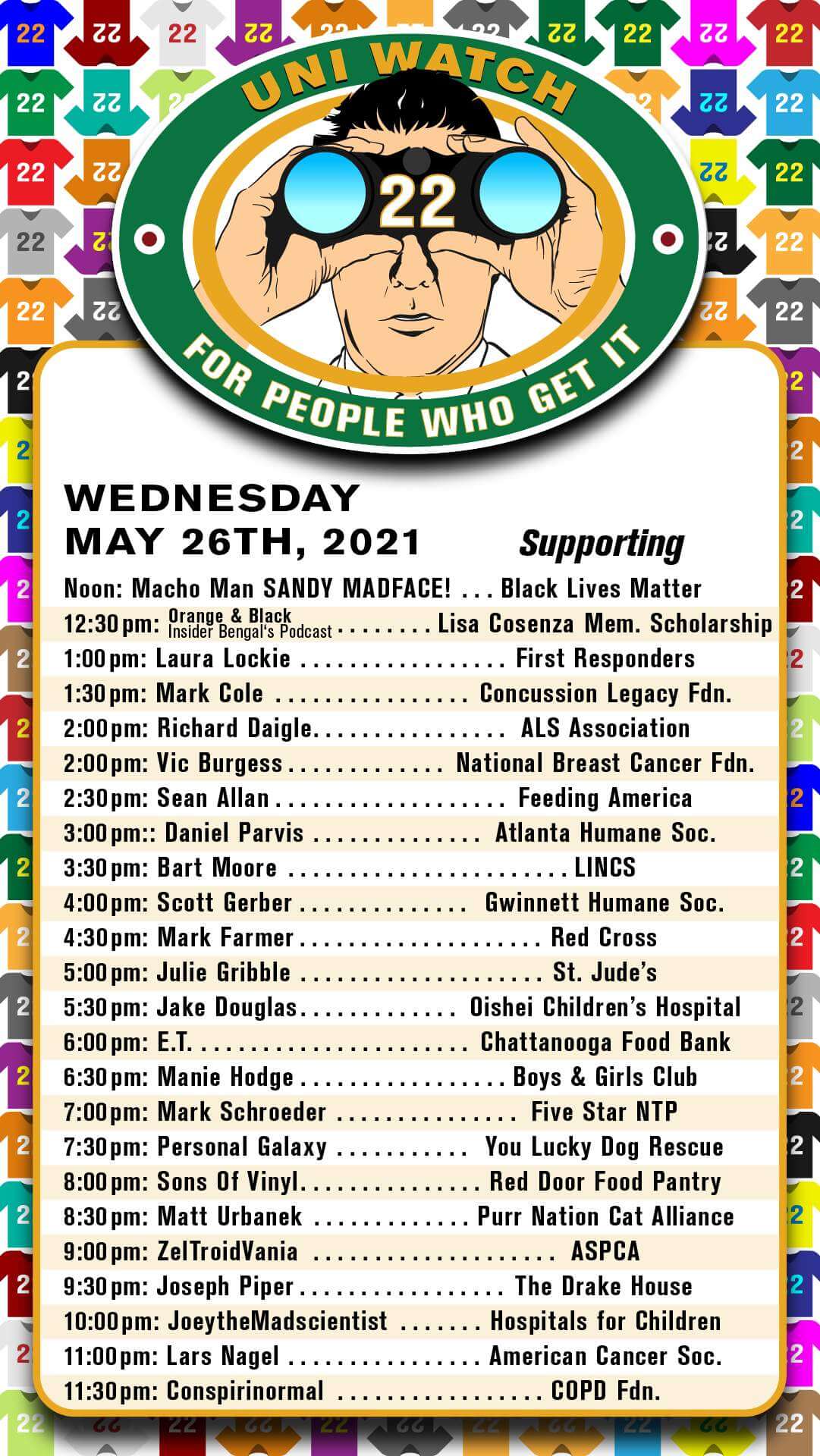
The performers will be live-streaming from their homes on the event page. You’ll know who is currently performing by the red “Live” box appearing in the upper-right corner of the screen, and you’ll be encouraged (but not required, of course) to donate to that performer’s charity.
We will also be having “Stupid Sports Trivia” between performers, with prizes courtesy of Ebbets Field Flannels, Asgard Press, and others.
Feel free to interact with us during the event and tell us what Uni Watch means to you. If you like, we encourage you to wear your favorite uniform and post photos of yourself on the event page! The person whose photo has the most “Likes” will win a Uni Watch prize package that Paul has provided, featuring a Uni Watch koozy, trading card, magnet, and membership card. (Don’t have a uniform to wear? Between now and May 26, use the checkout code UNI22 to get 10% off at Ebbets Field Flannels.)
We hope you’ll join us to celebrate 22 years of Uni Watch, to enjoy lots of great musical performances, and to support lots of worthy causes. Thanks!
Isn’t that nice? I’ve had nothing to do with the planning of this event, so Jason deserves every last bit of credit for putting it together. Thanks, Jason!
The Ticker
By Alex Hider

Baseball News: On Sunday, the Marlins decorated their mound with two team logos around a heart, spelling out “Mom” (from Brice Wallace). … Schlafly, a St. Louis-based brewery, has released a new Cardinals-themed T-shirt (from Andrew Cosentino). … The Rocket City Trash Pandas, the Angels’ Double-A affiliate, will wear gold-trimmed uniforms for their home opener tonight (thanks to all who shared). … More Ump Watch: Umpire Hunter Wendeltstedt wore Jordan 11 sneakers during the Atlanta/Phillies game Sunday night (from Tim Shriver). … Arkansas has unveiled a new, fantastic baseball-specific logo — Pitching Ribby (from Matt Snyder and Taylor Crabtree). … The Lotte Marines of Japan’s Pacific League will wear black uniforms for nine games in July and August (from Jeremy Brahm). … Oh man, check out this fantastic 1986 spring training photo of Tim Raines wearing an Expos bucket hat (from Jeff Bryniarski).

NFL News: Thanks to the league’s new numbering system, Panthers rookie CB Jaycee Horn has chosen to wear No. 8 in honor of Kobe Bryant (from Kary Klismet). … Speaking of the new numbering system, the current count is that 16 newly eligible players — not including Horn — will wear a single-digit number next season (thanks Brinke). … Man, the Seahawks’ current uni set would sure look nice in the team’s retro color scheme (also from Brinke).
College Football News: James Madison has unveiled a new logo to commemorate its 50th football season (from Ted Bloss and Andrew Rader). … San Jose State players have received their 2020 Mountain West Championship rings (from Kary Klismet).

Hockey News: The Islanders’ AHL affiliate in Bridgeport, Conn., is changing its name from the Sound Tigers to the Islanders. Here’s their new logo (thanks to all who shared). … Check out these Stars prototype designs that the team considered but ultimately rejected in 2011 and 2013.

Basketball News: When the Timberwolves unveiled their new uni set in 2017, there was a lot of talk about how the striping conveniently housed the Nike maker’s mark. But Peyton Winters notes that now that Nike uses the Jordan makers’ mark on their Statement uniforms, it leads to the logo awkwardly straddling two different fields of color. … @OrangeandPloo notes that the warm-up gear colors for Sunday’s Knicks/Clippers game seemed flipped — the black-clad Clips wore blue warm-ups on the bench, while the white, blue and orange Knicks wore dark gray warm-ups. … A new Arizona women’s uniform may have leaked in a commitment video posted by prospect Maya Nnaji (from Rocky De La Rosa).

Soccer News: An FC Cincinnati blog had some fun with the Columbus logo unveiling by adding that floating triangle from their new badge to every MLS logo (from John Flory). … Washington Capitals star Alex Ovechkin is a new investor for the NWSL’s Washington Spirit, so they gave him a custom shirt (from our own Jamie Rathjen). … Also from Jamie: AC Milan’s new first shirt will be debuted next weekend by its women’s team, which makes them the first Serie A club to do that. … Several versions of the Tampa Bay Rowdies have existed through the years dating back to the 1970s. Matthew Algeo was watching a NASL Indoor match from 1982 and noted that the team added the word “Indoor” to their jerseys. … New match ball for the Bundesliga and 2. Bundesliga (from Ed Zelaski). …

Olympics News: New men’s and women’s volleyball uniforms for Brazil (from Jeremy Brahm).

Grab Bag: Australian Football League Essendon is the first AFL club to release Indigenous uniforms this season (from our own Jamie Rathjen). … The next four items are from Kary Klismet: A Canadian newspaper has published a profile on the first member of the Royal Canadian Mounted Police to wear a turban. … New uniforms for the Royal Thai Police. … These are the eight mascot finalists for the 2023 Winter World University Games in Lake Placid, N.Y. … Japan has a new costumed mascot to promote Covid safety measures. … It appears that Amazon has updated its Android notification tray icon. It’s now the smile arrow logo. According to @PhillyPartTwo, the company used to use the shopping cart icon in that spot. … Wingate University, a D2 school in North Carolina, is considering changing the name of the school after it was found that its namesake was a slave owner. What’s more interesting was that the namesake was not involved in the school’s founding at all (from James Gilbert). … The Pensacola Police Department is removing Confederate imagery from its police badges, uniforms, and cruisers (from Timmy Donahue). … Also from Timmy: Interesting new non-mono uniform for courthouse officers in Frederick County, Md.

The last team I can remember changing anything about their visual or linguistic identity the very next season after a championship is the 92 Penguins. But at least they remained the Penguins. MLS has had such trouble finding a foothold (pun) in the overcrowded American sports market, it astounds me that they would so casually throw away any amount of goodwill they have with any team in any city, and do it THE next season after that team’s title.
A more recent example: Rams got new uniforms after beating the Titans in Super Bowl XXXIV (2000).
1995-96 Houston Rockets had a significant redesign after back-to-back championships.
And I haven’t been a fan of them ever since…
Can’t believe the Stars rejected the jersey with the D and the North Star. That would have been such a great look.
Agreed! A great looking concept!
Strictly kelly green and yellow uniforms (without any black trim) fell out of favour with hockey uniforms after the 1980s. The popularity of the Minnesota Wild Reverse Retro appears to be paving the way for a return to the use of this colour scheme.
The Wild should jump on this. Adopt the RR as their permanent road uniform and create a kelly green home uniform based on that template. The RR is better than the current primary look for the Wild, and their history disjointed home and road uniforms. Forget the forest green, cream and red which is their short tradition. Kelly green and yellow is Minnesota hockey.
I agree. The Wild RR has to be near the top of uniforms that have resonated with not only the team fan base but also the league fan base as well.
Changing to kelly green and yellow would be beautiful!
It isn’t hard to take the North Stars’ “N” and make it into a “W” for “Wild”. Only, I get the impression the italicized star and capital letters augmented with an arrow might be the Dallas Stars’ intellectual property. Do you think little details like these get hashed out behind the scenes?
Columbus area reader here and yep, the Crew issue is massive. My hope is that club decision makers will realize their error and reverse the new branding. Sort of like the 49’ers did with their one day helmet logo change years ago. This is a New Cokeish unforced blunder by the club.
If Chicago’s example is relevant, Columbus is looking at two years with this new logo before getting rid of it. At least Columbus will not be saddled with a bad uniform for the third year; Chicago will still be stuck with a navy primary kit next year (despite the acknowledged fan preference for red) even though the badge will change to something including the Florian Cross, the six-pointed municipal star, and the letter C.
Longtime very casual Crew fan here with no connection to Columbus at all. At least, none beyond Columbus being my usual overnight stop on eastbound drives from the Midwest to the East Coast. So I’m intimately familiar with the menus at every restaurant within a mile or so of one particular east-side La Quinta Inn. Anyway, I kind of fell for the Crew when MLS debuted and they wore by far my link and link. I still regard the original Crew crest as one of the greatest in soccer history. The 2015 logo always struck me as not much better than adequate. Not bad, and technically well executed, but basically soulless and generic. The new logo strikes me as a slight downgrade, but it’s a very small, marginal change in quality to my eye, and it’s not like it’s making a great logo worse. It’s making a mediocre, perfectly fine logo also mediocre and perfectly fine. Meh-plus downgraded to Meh.
As to the Crew name, I don’t see it as “having it both ways.” Rather, it looks to me like a typical MLS move of trying to import European soccer culture by corporate fiat. Which I find objectionable, but on the other hand it actually seems to work more often than not when MLS tries it. The fact that the team included Crew logos in their new identity tells me that they’re at least serious about trying to achieve their stated goal of continuing the use of the Crew name even if it’s no longer on the team’s letterhead and badge. Which, again, strikes me as a risible thing to do, but it’s in line with many of the major MLS branding initiatives of the last 20 years.
I care way more about the uniforms than the badge or the formal team name, especially given that the team is openly saying it doesn’t really want anyone to change how they refer to the team’s name. A Browns-like uniform makeover will make the brand redesign into a fiasco; a decent new uniform will make the whole fan uproar look like the silliest of molehills.
I joined Twitter last week. One of my IRL friends is a longtime Nordecke member, so between him and the @uniwatch account, a lot of my timeline has been Crew-related. I thought this was a joke at first. One of the retweets I saw was a conspiracy theory that this was foisted on them by the league, since all recent expansions and rebrands feature the FC/SC (or CF, in Montreal’s case). Seems like an MLS move.
I hope that is not true!
The MLS needs to concentrate on more important fundamental issues like the need for adding more teams than worrying about the names of current teams.
RE: Columbus SC
It seems that MLS teams don’t realize that they need to stick to an identity to build a brand. I don’t know why Columbus would think they need to change anything about their brand when they have a great fan base already. Is this just a cheap move to sell merchandise? Sure seems like it, a rather underhanded thing to do after scamming the city for a new stadium when there was nothing wrong with their previous home.
At the risk of sounding like a grouchy old man, when I turn an MLS game on and don’t immediately recognize the teams because they’ve once again adjusted their uniforms from the previous years adjustment I tend to continue flipping through the channels.
I understand MLS teams are in it to make money, so I understand why they do what they do, but, to me, it’s cheapening a product and making it harder to follow and get invested in.
The Columbus SC logo looks like the C has a little goatee/soul patch.
Browns fans know all too well that any idiot can talk Jimmy Haslam into just about anything by making it sound cutting-edge. Joe Banner and Alex Scheiner conned him into believing the Browns ’15 uniform disaster was “forward-looking.”
Owners sometimes think it’s all about them. It’s not. It’s about the fans. We make you rich, and your job is to be a good steward of our team.
And now we have another unforced error.
Columbus SC immediately evokes a completely different city and state. I just don’t understand the thought process behind this change.
I had the same thought, although the city in South Carolina is actually Columbia.
Fascinating find on the Tom Paciorek uniform.
The Seattle professional teams sure did have some crazy white whale uniform moments in the 70s. Nice to see one proven and solved.
All that’s left is the logoless 76 helmets for the Seahawks, right?
Why, Phil???
All I can see is the Qolumbus Qrew
pleh.
To the extent that the pennant logo and the little font soul-patch screws with the letter shape, I see Golumbus Grew!
I just read the ESPN story you linked to. I love the justification that their GM gave for the rebranding: a meaningless word salad of marketing-speak b.s.
I always get a laugh out of the nonsense that graphic designers regurgitate to rationalize a print redesign:
1. We’re switching to a sans serif font because it better represents our bold and dynamic vision of the future.
2. We’re swithching to a serif font because it better represents our tradition and history.
I guess it’s a soccer “culture” thing, but the fanbases of any soccer team come off as entitled to me. It’s one thing to be passionate, but why does a team need to include these supporter groups in their branding process?
The 7 Line Army guys don’t write missives when the Mets change the hot dog prices.
I don’t know. I’m not super knowledgeable about this stuff, so maybe I’m too ignorant to understand the importance of an MLS supporter group. Please anyone with better information set me straight.
It’s one thing to be passionate, but why does a team need to include these supporter groups in their branding process?
It’$ not much of a my$tery to me…the$e folk$ tend to be *very* $upportive, if you catch my drift.
I see large numbers of supporter groups – and even “regular fans” – shelling out big bucks for the latest new jersey…even if the only thing different about them is a new advertiser or a slight tweak to an iconic shirt. They’re also more likely to retain their season tickets, in spite of the inevitable increase in prices.
The Crew ownership would do well to get a hearing aid to combat their tone-deaf-ness.
Even if the supporters didn’t complain, that’s a terrible looking rebrand. The only way I can see a focus group favoring this is if the club were offering them free pizza and adult beverages while nodding and saying, “This is a big improvement over our current visual identity, don’t you agree?”
Money is certainly involved but the teams tend to reciprocate it most of the time as well (“supporter sections” are oftentimes the friendliest priced in the building).
So it’s like the Cameron Crazies at Duke, then.
Even so, these groups make for good optics at the game and on TV. That probably helps with attracting viewers, so even if it bumps the ratings up just a bit that’s good for the owners. To see that section filled with disgruntled people, or worse, not filled with people…that’s not good.
Definitely not suggesting you make them happy at all costs, but these are the folks you least want to unnecessarily anger.
Agreed. Especially when you’re a league still trying to break into national sports relevance on some level (as an aside, LOVE seeing ABC finally promoting it).
As a member of an MLS supporter group (and an EPL fan), it’s definitely a soccer culture thing. At the games, imagine a collegiate student section on steroids because soccer fans put in more planning. The other 6 days of the week and soccer fans are probably the most obsessed in sports. Not just with what’s happening on the field, but down to who the club partners with.
TBH, I don’t fully understand it either.
I would say that American sports teams are run like businesses, whereas soccer clubs are often seen as institutions of the community they’re in.
All of my soccer clubs accordingly have fans’ groups that are at least recognized by the team and might have their own section in the stadiums, for example. But they and their counterparts elsewhere also often meet with club officials to share fans’ concerns.
I’m sure the Nordecke does that as well, so to not be consulted for a very big change like this would feel extremely galling.
We saw the same thing with the European Super League. The six English clubs’ fan groups’ furious reactions at something that they are all on record as vehemently opposing, but that the clubs signed up for without consulting them, played a large part in killing it.
Also, two English clubs that have backed down from new crests since 2013 because of fan reaction are Everton (replaced after one season by one that fans voted for) and Leeds United (was withdrawn and never actually used).
It’s definitely a culture thing because, as Jamie said, for the most part these are civic “clubs” and not “franchises.” It’s a different mindset than in the States, where an owner pays a million-billion dollars for a franchise and fans root for that team because it’s the one that’s roughly near where you live. Historically, soccer teams were built foundation up by those in the community. Many were athletic clubs where soccer was one of many offerings (Charlton Athletic, Wigan Athletic) and some were groups that offered soccer during the cricket offseason. My favorite names are clubs that moved from community to community for home fields (names like Wanderers or Rovers). In Germany, clubs must be owned by 50%+1 of fans, with exceptions. There’s a reason why you’ve only ever heard of one club moving in England (MK Dons) and that club is, um, not well thought of because the owners uprooted the team from its home in Wimbledon.
It’s not that fans in the US can’t have the same attachment, but it’s a different foundational relationship. There’s a reason why you hear soccer fans say “we” and not “they.”
Here in Columbus, NOBODY likes this. Not one person. Is even include the Haslams and Dr Pete as well. This stinks of Commissioner Garber and his stupidity to Euro-ize the MLS.
The Gino’s restaurant franchise was resurrected several years ago in the Baltimore area. Unfortunately, it looks like only the Towson and Glen Burnie locations have survived. Not sure of Gino Marchetti’s connection to the modern restaurant other than the name though… link
the Marlins decorated their mound with two team logos around a heart, spelling out “Mom”
No, it spells M Heart M.
Oh man, check out this fantastic 1986 spring training photo of Tim Raines wearing an Expos bucket hat
Oh man, indeed! I’d wear that!
If cricket players can wear those on the field, why not baseball players?
Several versions of the Tampa Bay Rowdies have existed through the years dating back to the 1970s. Matthew Algeo was watching a NASL Indoor match from 1982 and noted that the team added the word “Indoor” to their jerseys
I remember when ESPN showed MISL and Indoor NASL games. Every now and then I think to myself, why doesn’t MLS have an indoor league during the offseason? Granted, there is the Major Arena Soccer League, but it doesn’t get any big time media coverage. A network might be willing to take more of a chance if MLS were involved.
No, it spells M Heart M.
Comment of the day! I’m almost as old as Robert Indiana’s LOVE sculpture in Philly, where we briefly lived when I was a tot, so I’m used to reading a heart as an O. But in the abstract, a heart looks more like a V to me than an O. So the mound might also be recognizing the Dickensian lawsuit of Marlin v. Marlin.
Yeah, I see a v easier than I do an o. Either way, I’ve never been a fan of this.
Of course, the slippery slope comes into effect, because now people use other shapes instead of a heart. Until recently, Ohio voters would get a sticker that was supposed to say “I love voting.” In place of a heart it had the shape of the state on it. So when they’d hand it to me I’d go, “I Ohio voting?” So glad they replaced it.
The B used for that new Bridgeport Islanders logo looked so familiar…I just knew I’d seen something resembling that before:
link
I like that the tape on the stick references the Islanders’ “NY”.
Great job on the lede today, Alex! And on a day when you were handling Ticker duties, too! Wow!
Much appreciated!
As others have noted, Columbus’ name change feels like a ham-handed attempt by the team’s ownership to “get with the trend” of making American soccer teams have more of the look and feel of European clubs. I’m not a fan of this in general (as I will explain momentarily), but I’m particularly opposed to it when it seems forced on a fanbase that doesn’t even want it.
American soccer has a long tradition that extends long before the advent of MLS in 1996 and certain well before that league’s expansion era that has brought in a slew of new teams with European-sounding names. Many of the teams that preceded this expansion – both in MLS and in earlier leagues – already had established naming conventions that usually mimicked sports team names in other American pro sports.
And it worked! Why? Because (usually) plural mascot-based team names based on team names are fun and make for great aesthetic opportunities in terms of logos and uniform designs. It feels to me that something that’s decidedly part of our national sporting culture has been lost when American sports teams – whether it’s soccer, rugby, or especially lacrosse (which originated among indigenous communities in North America) – name or rename themselves based on European sporting club templates. It tramples on the heritage of teams like the Rochester Lancers, the Dallas Tornado, and the Tulsa Roughnecks, to name just a few.
I’m curious to know who is the chicken and who is the egg among the fans and team owners in this scenario. Did emerging American soccer fans develop preferences for European-sounding team names after watching increasingly-available Premier League content on TV and ownership groups take their cues from them? Or did owners impose those names on teams to sound more “legitimate” in the larger international football community and a younger generation of fans raised on European soccer take to it readily – or simply not object?
In any event, I take some small measure of encouragement from the fact the old naming customs live on in a few American soccer hotbeds. Reincarnated versions of the New York Cosmos, San Diego Sockers, and Tampa Bay Rowdies all live on. Granted, they’re no longer at the highest level of U.S. soccer. But maybe a few of these small yet rabid fanbases can help keep a distinctly American version of soccer culture alive in this country.
I agree totally. It makes MLS seem like a wanna-be league, especially when they use “FC” or “Football Club” in a country where football is a totally different sport. Real Salt Lake especially doesn’t pass the laugh test. Is there a Fake Salt Lake? (And yes, I know it’s a ripoff of Real Madrid with “real” meaning “royal” in Spanish.)
Considering that most if not all soccer jerseys are primarily advertisements with the team’s crest/logo being barely visible…this situation seems less like the team is “tone-deaf” and more like an overreaction from a small yet vocal minority over what will end up being a pretty minor change.
Leaving aside the question of whether the change is consequential or not, on what basis do you assert that the reaction is from a “small but vocal minority”?
The reason I ask is that invoking the “silent majority” is a convenient but usually bad-faith rhetorical maneuver. Aside from being something that impossible to prove, it’s also a classic way of insulting the messengers instead of engaging with the message.
Jasper, I know you’re not a bad-faith guy — you’ve shown that thru many comments over a long period. I ask that you please elevate your analysis to your usual high standards. Thanks!
Fair enough, I will admit that I don’t know for sure that Columbus fans who are angry about the change are in fact a small minority of the team’s fan base.
Although I don’t know if my comment qualifies as being in “bad faith” because it’s my honest opinion that there is a bit of an overreaction here.
We need more follow up on the Marge and Schottzie stories!
Goodness, there are a few. She’d always have a goody bag filled with stadium giveaway stuff ready for me. And as I recall, I was on the phone with her when Giamatti announced the Rose verdict. Marge was…….unique.
I was today years old when I realized they are the Sound Tigers from Bridgeport, not the Tigers from Bridgeport Sound…
Yeah, they’ve always been kind of a “Nippon Ham Fighters” situation to me.
I’m laughing out loud at this comment because I had the same exchange on twitter with a couple Uni Watch regulars last week and because my initials are Mike S.
I honestly thought I’d made your comment earlier today and then forgotten.
Anyway. Yeah, Nippon Ham Fighters. We have the Medicine Hat Tigers nearby to us and I wonder if that confuses anyone (or if everyone knows that the town name is Medicine Hat and not Medicine and that there’s no such thing as Hat Tigers).
What the hell is a Diego Padre?
I think its related to a Bay Buccaneer
I’ve always said Tampa BayRays, with an extra pause after Tampa. It’s my way of mocking them for ditching the better name in Devil Rays.
I always read it as “Sound Tigers,” but I thought they were big predatory cats made up of sonic waves or something. I know, I know… wrong kind of sound.
Man, I am really out of the loop of US soccer culture. The simultaneous embrace of European football culture (“supporter” groups, chants, scarves, etc.) and rejection of European football culture (naming schemes, relegation, etc.) is confusing to me. Though perhaps if fans had their way, relegation would be a thing here, so maybe that’s a bad example.
Why do the Columbus Crew have multiple “supporter” groups such that a coalition of those groups is needed? I find that genuinely baffling.
Non-intentional racial segregation. There’s a Hispanic group and two not-officially-but-let’s-be-honest white groups.
It’s also made up of different groups from all over the place (like, it looks like most large cities in Ohio have one), not just Columbus.
That’s a trash can with a C in it and a crumpled up piece of paper underneath it, right?
Ooof. what is up with that “C” in the new Columbus logo. It looks like it was cut out with garden shears. :/
I kind of get where the Columbus Soccer Club aka the Crew was going, trying to go with “more authentic soccer branding” or something, where the nickname doesn’t appear anywhere, the official name is City Something Club but everyone calls them The Guys…. and they still expect fans to call them The Guys. But that kind of idea would have worked better at the team’s inception than now. Clearly they misread their audience.
So are the Giants or Jets going to be the first team to jump on renaming themselves the New York Football Team and making the nickname unofficial? They better do it now before the Buffalo Bills sneak in and steal the name and they are left fighting over New Jersey Football Team.
I wonder what the back of the jersey looked liked!
I like that the tape on the stick references the Islanders’ “NY”.
Nobody else sees a stylized version of the guy crossing his arms in the original Crew logo? No? No, OK.
Was it that hard for Columbus to replace “Crew” with “Soccer Club” at the bottom of the roundel and call it a day? Columbus’s crest and LAFC’s crest were by far some of my favorites in the MLS