For all images, click to enlarge
Good morning and welcome back to Ump Watch (now revised from the longer and clunkier Ump Patch Watch), where we continue to obsessively document the world of umpire attire.
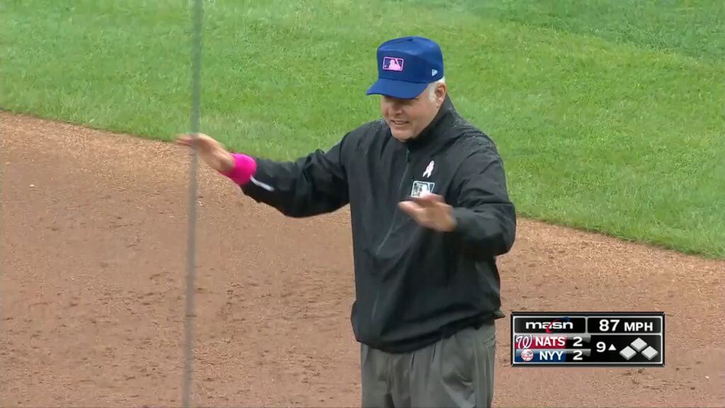
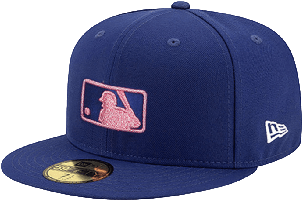
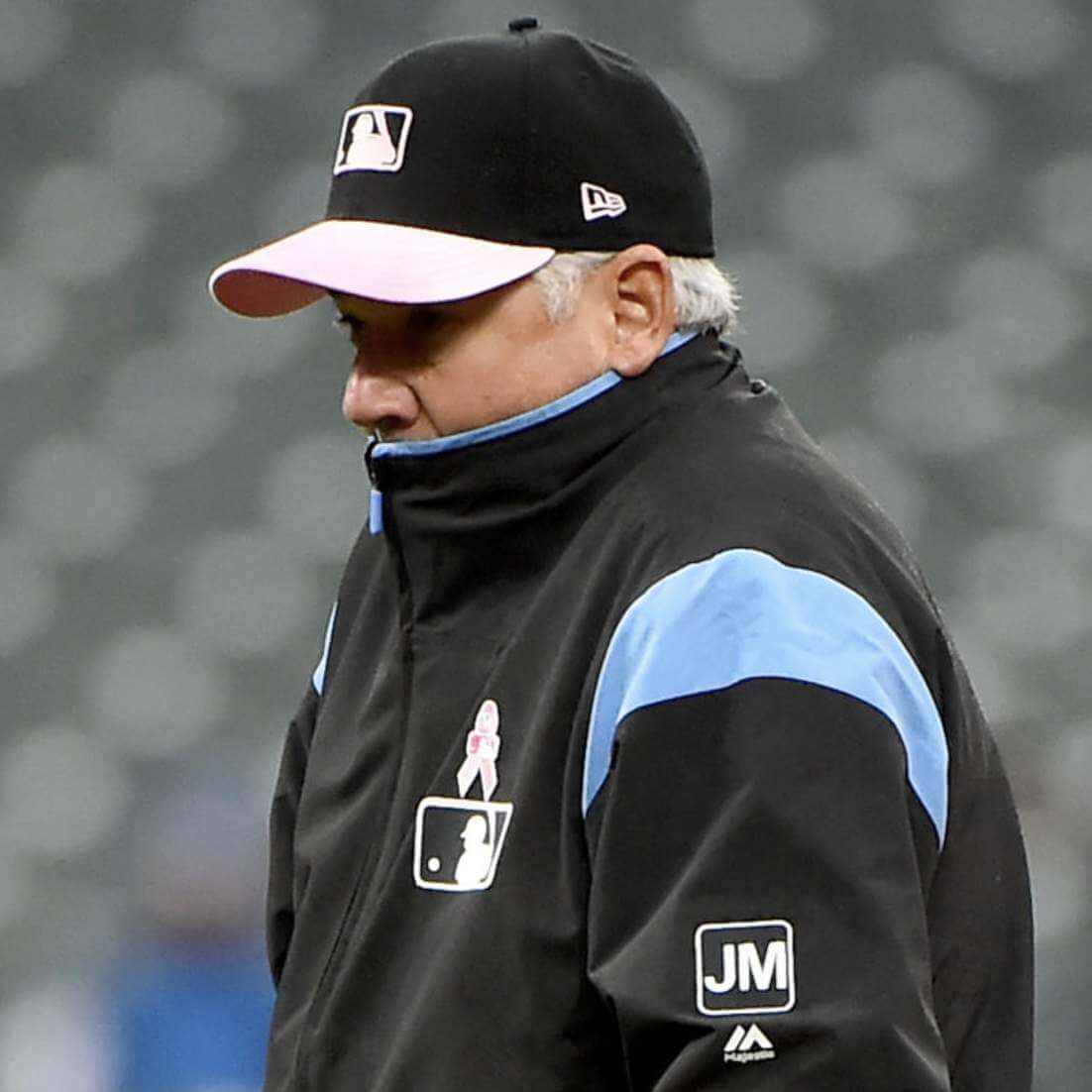
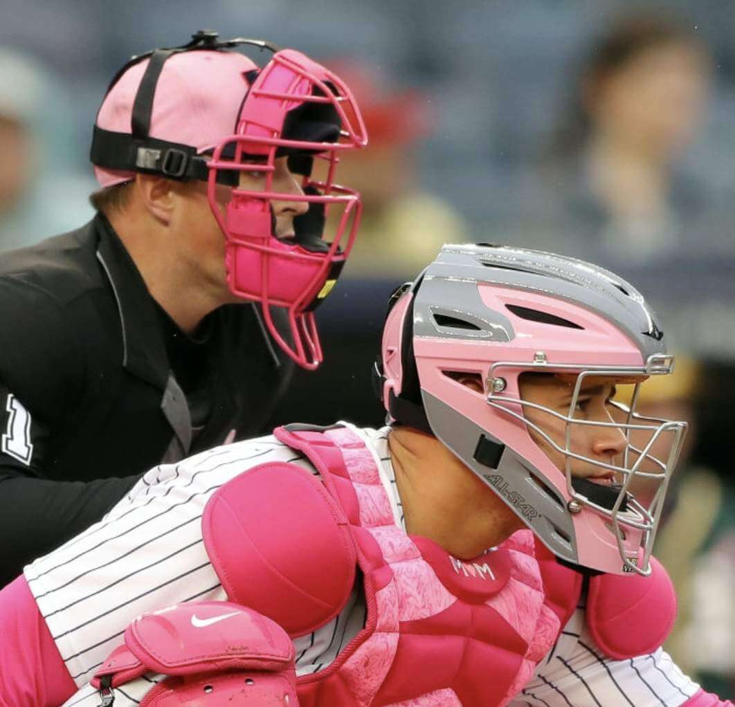
As you may be aware, yesterday was Mother’s Day. We already knew that the players would have pink-logo caps (and lots of other pink gear, which we’ll get to in a minute), but we didn’t know that the umps would be wearing royal blue caps with pink MLB logos.
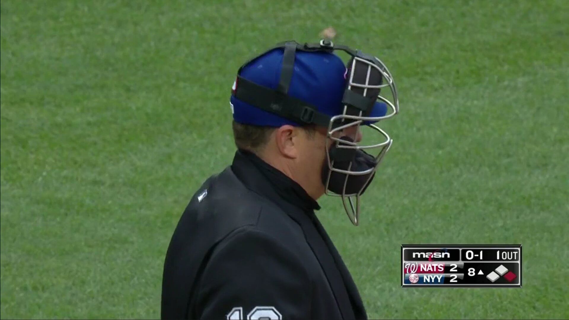
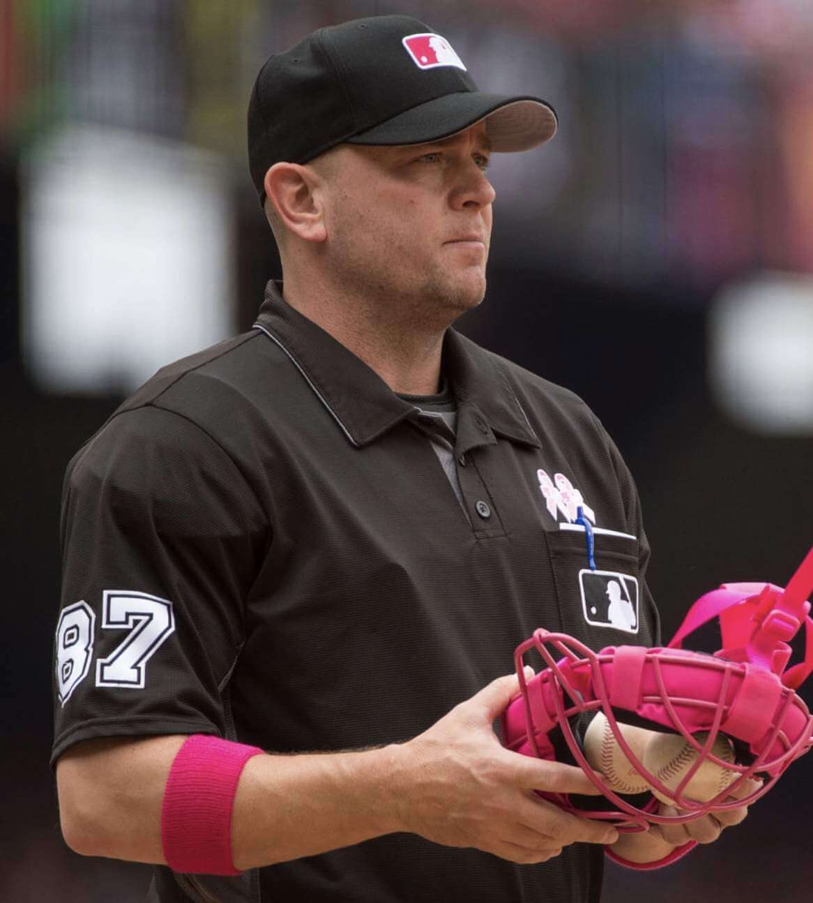
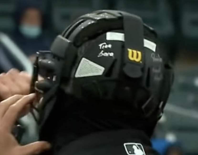
The blue caps were most apparent on the base umps, but they also stood out under the plate umps’ masks, as you can see here:
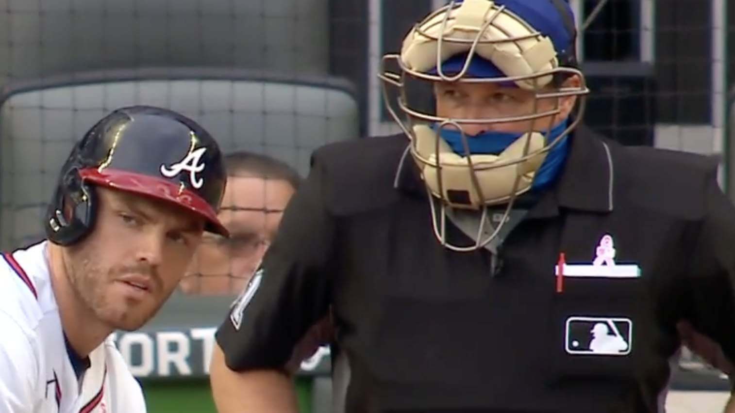
At least one ump — Marvin Hudson, who was working the plate for the Atlanta/Philly game — had a royal blue neck gaiter to match his blue cap:
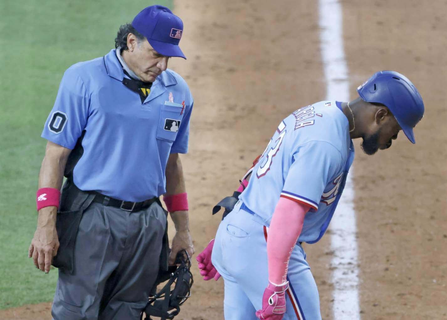
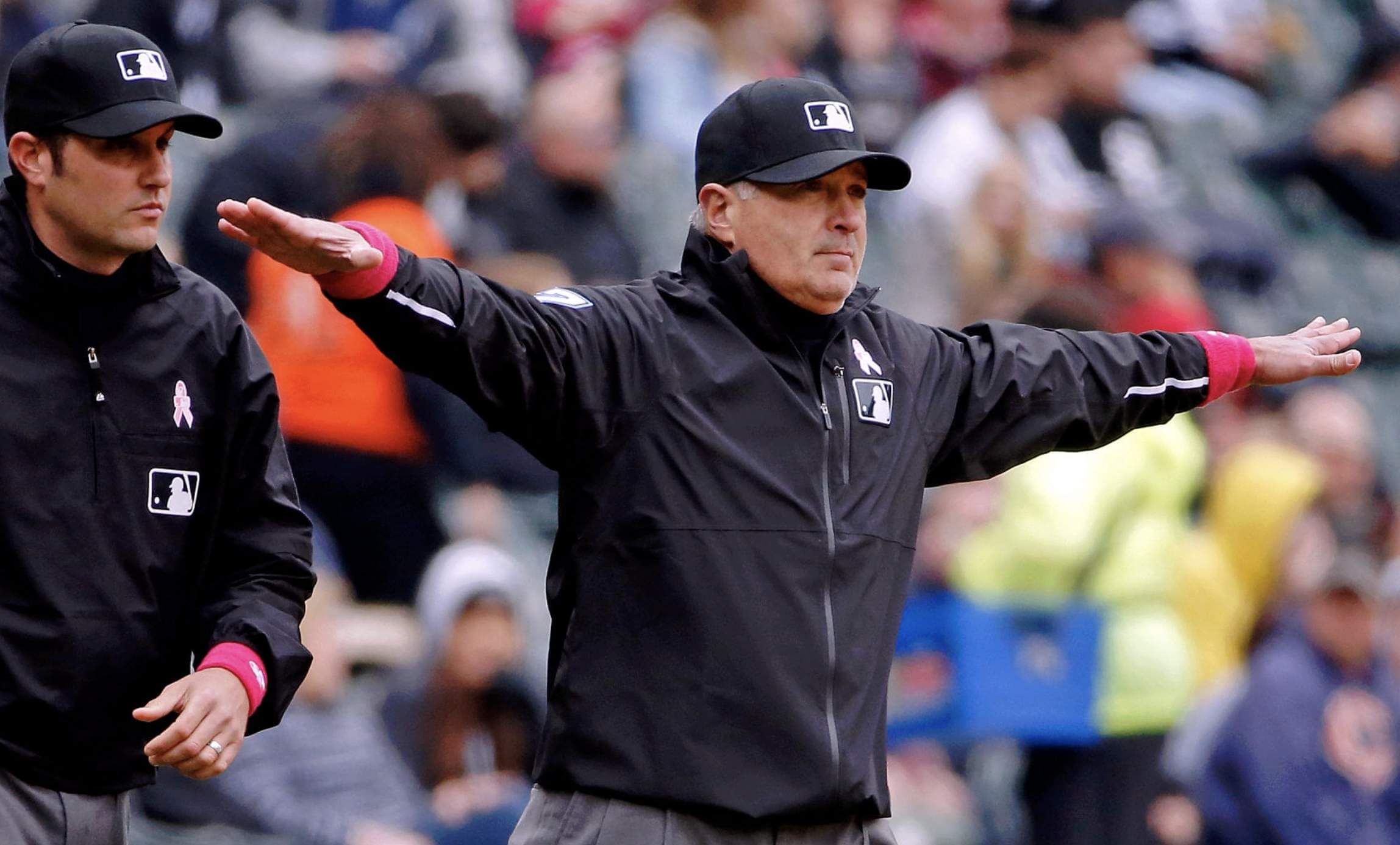
The blue caps were an odd match for the umps wearing black, but they worked well for umps wearing blue jerseys. That made for a strange situation in Texas, where the umps and the Rangers looked like they were on the same team, at least above the waist:
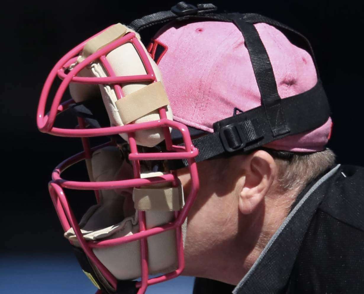
I couldn’t recall the umps wearing blue caps for previous Ma’s Days (or at any other time, for that matter), so I decided to do a little digging. Obviously, there were no Ma’s Day games last year because of the pandemic, but here are the caps that the umps wore for the five years before that:
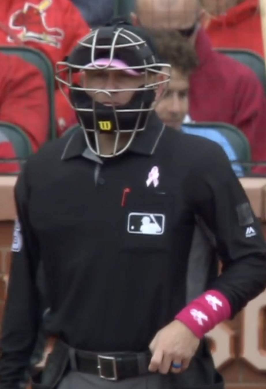
2019: Black crown, pink brim, pink MLB logo
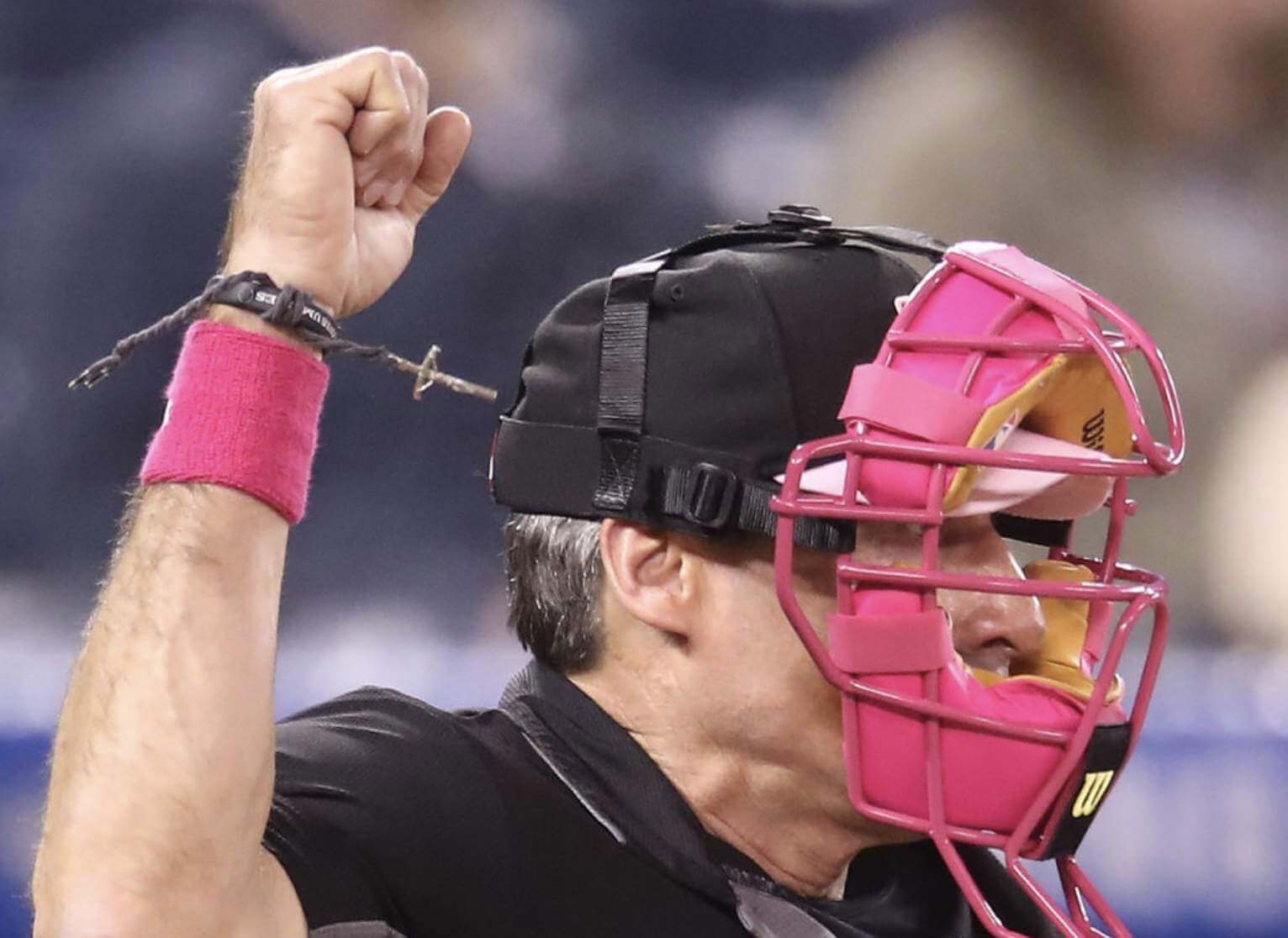
Also: Note the crucifix bracelet in that second shot! That’s Ángel Hernández, and he’s been wearing it for years. (Yes, we all know he’s a bad ump, so let’s please skip the obvious jokes. Thanks.)
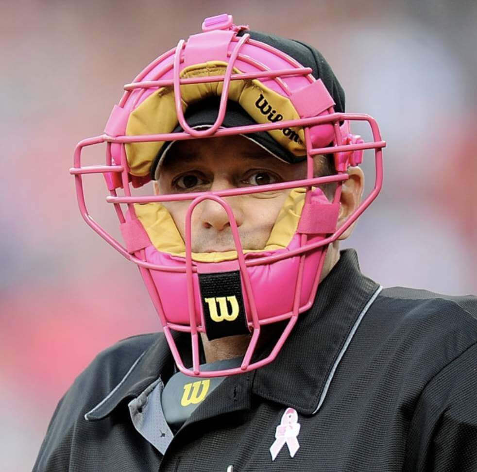
2018: Pink crown, black brim, red MLB logo
2017: Black crown and brim, pink MLB logo
2016: Same as 2017
2015: Standard ump caps
———
So yesterday marked the fifth consecutive time that the umps wore a commemorative hat design for Ma’s Day, but it was the first that the cap design was blue. Maybe they’ll use this same design for Pa’s Day next month..?
Now, we all know that MLB sells the Ma’s Day team caps. But can you also buy a Ma’s Day ump cap? Yes, apparently.
And we also know that MLB auctions off the game-used Ma’s Day gear. But does anyone really bid on game-used Ma’s Day ump caps? Yes, apparently.
As an aside: While researching the ump caps from previous years, I came across this shot from 2019, showing a plate ump (I didn’t note which game this was from, so I don’t know who the ump is, sorry) with black tape covering up a patch — probably a memorial patch, just like we saw a week ago:
Holiday gear overlapping with a patch cover-up — that’s some peak Ump Watch right there!
But wait, there’s more! Umpire Manny Gonzalez, who was working the plate in the D-backs/Mets game, had several things — presumably names — written on his mask’s backplate:
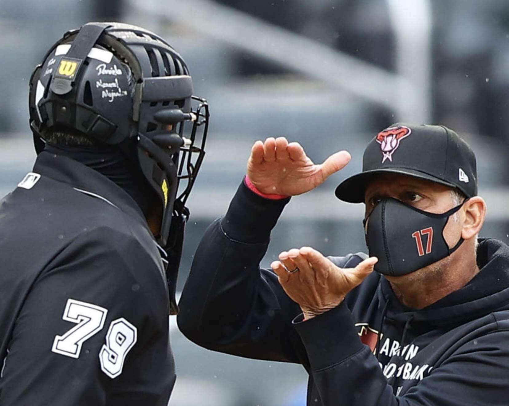
I can’t make out what those inscriptions say. Maybe the names of his mother and wife..?
Or maybe they have nothing to do with Ma’s Day. I couldn’t find any other rear-view shots of Gonzalez’s mask from this season, so we don’t know for sure when he added the inscriptions. But he definitely didn’t have them last September.
Meanwhile: It has come to Ump Watch’s attention that the umpires share the field with a bunch of insignificant also-rans called “players.” Apparently these “players” also wear uniforms, and these uniforms sometimes have interesting quirks of their own. Strange but true! For example:
• Cardinals catcher Yadier Molina wore a pink chest protector (so did lots of other catchers yesterday) and a pink mask, the latter of which suffered some damage when he took a foul ball off his forehead:
Yadi's mask before and after the foul tip. 🙁 #STLFLY pic.twitter.com/hvLFtMega4
— Bally Sports Midwest (@BallySportsMW) May 9, 2021
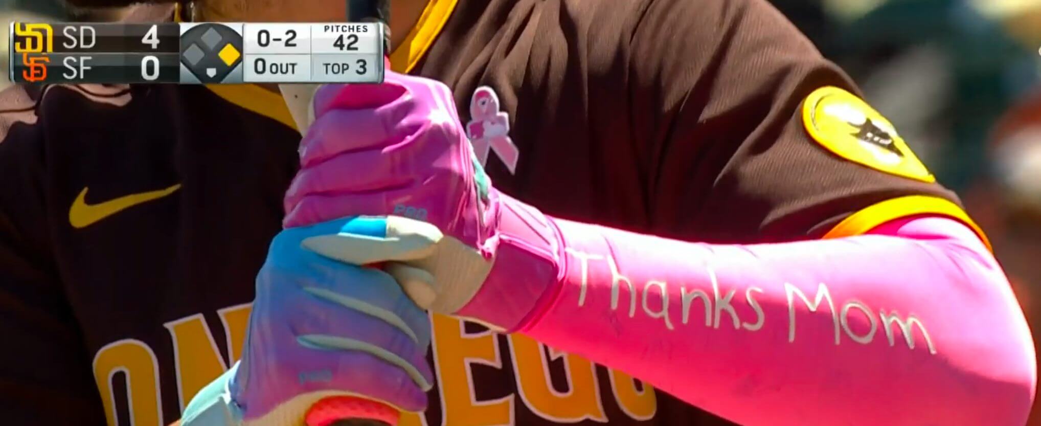
• Lots of players, including Padres first baseman Eric Hosmer, wore pink compression sleeves with “Thanks Mom” (missing the comma of address, tsk-tsk) printed on them:
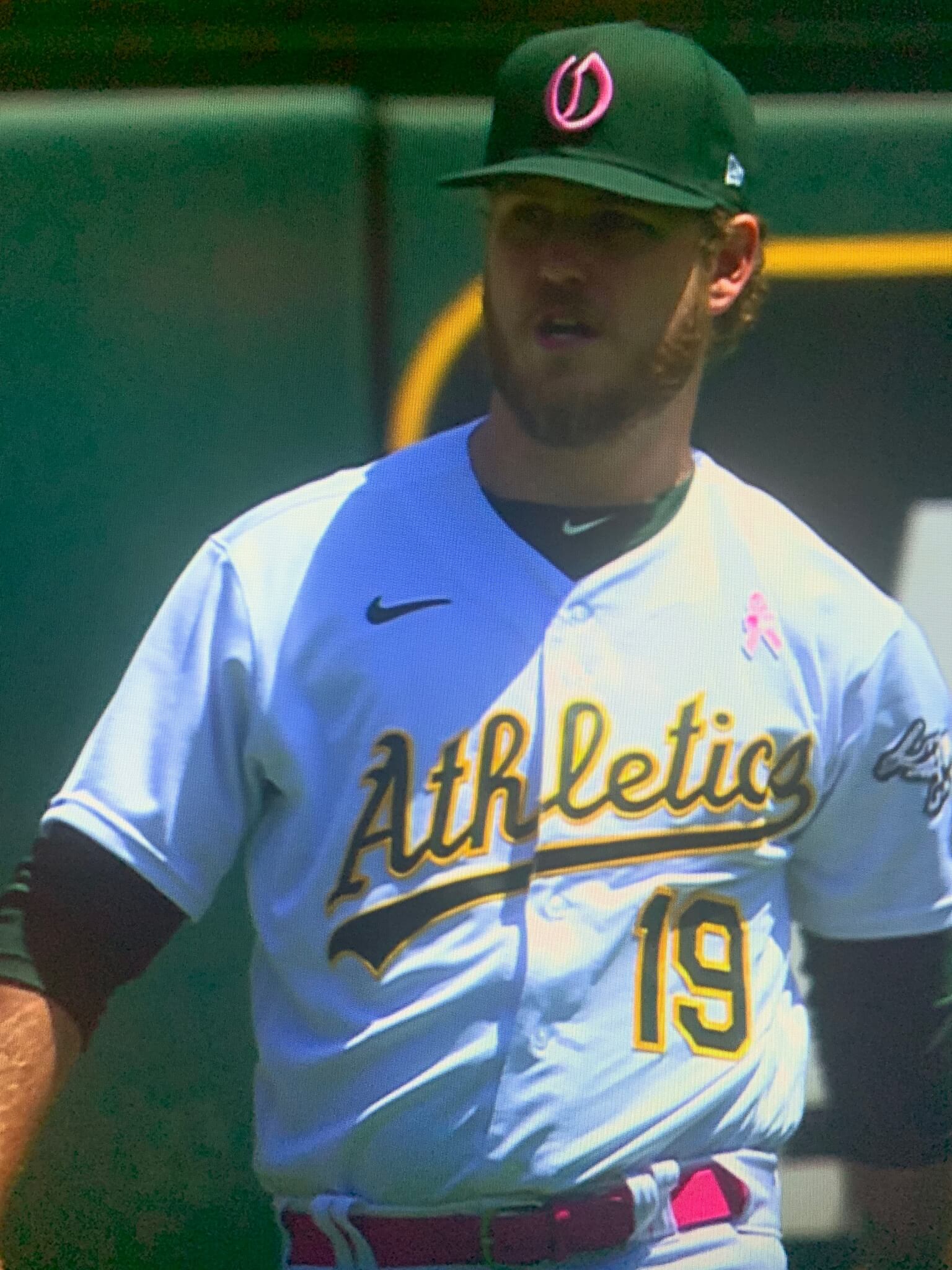
• The A’s debuted their “O” cap logo — the one that looks like labia when rendered in pink — and, as usual, looked even stupider than all the other pink-accented teams, because pink clashes with their magnificent color scheme:
That wraps up this edition of Ump Watch. Sorry to have gone slightly off-topic with the non-ump stuff!
(My thanks to all contributors, including Tim Akins, Steve Dodell, Elena Elms, Mike Nessen, @buckwildinsani1, and our own Brinke Guthrie.)
Click to enlarge
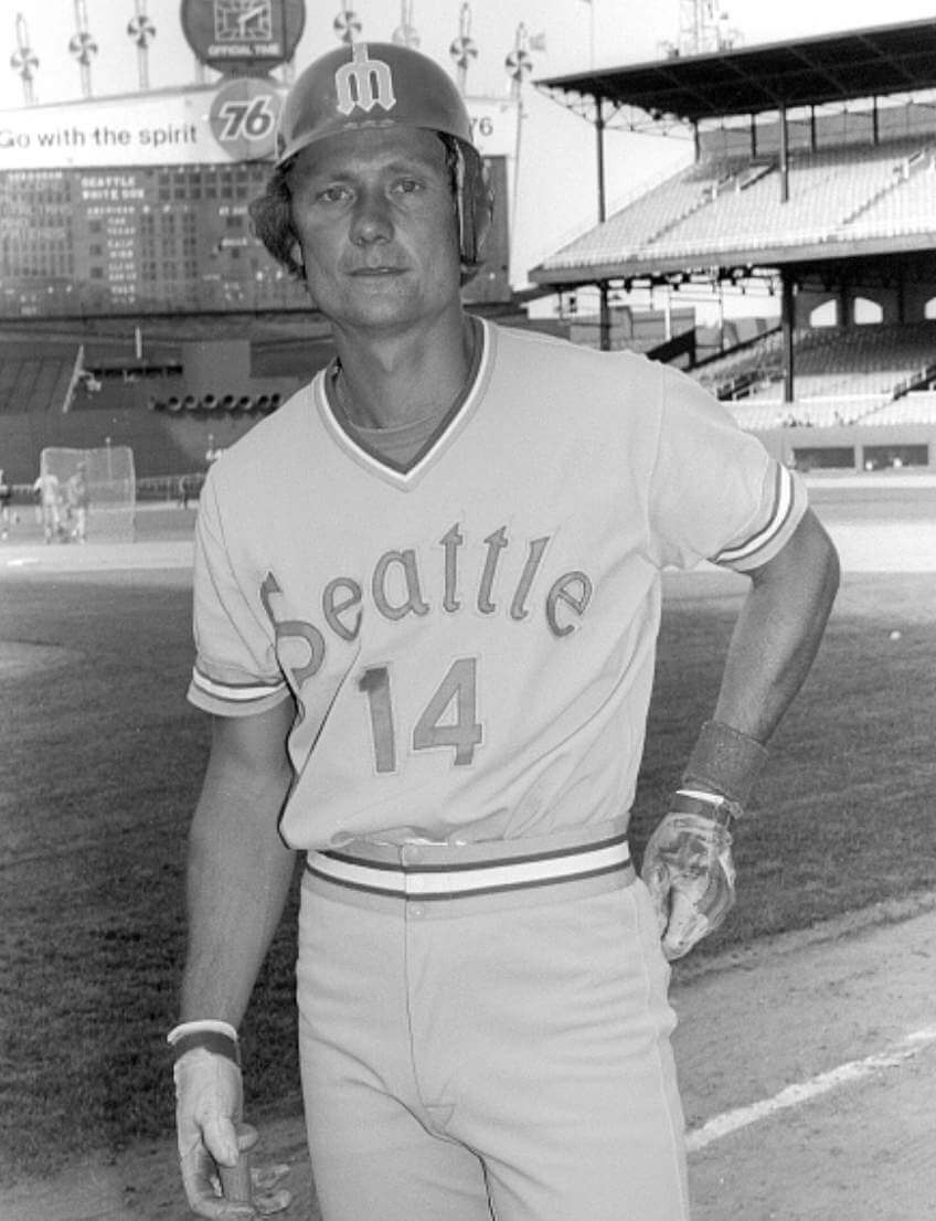
History mystery: I can’t recall if we’ve seen this photo before, but check out this shot of Mariners first baseman/outfielder Tom Paciorek, probably from 1978. What’s with the centered number? My first thought would be, “Must’ve been something they were experimenting with during spring training,” but the photo was clearly taken at Comiskey Park in Chicago. Hmmmm.
Anyone know more..?
(My thanks to Twitter-er @ianb78 for this one.)
Click to enlarge
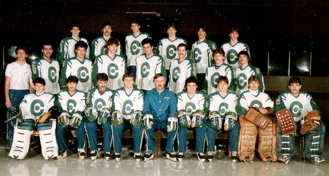
Too good for the Ticker: The Shawinigan Cataractes — a team in the Quebec Major Junior Hockey League — had some really unusual uniforms in the mid-1980s. For starters, there are the teal Cooperalls. Then there are the strange partial UCLA-style shoulder stripes. And then, most of all, there are the vertically stacked sleeve numbers! Never seen that before.
This uniform was worn in the 1985 Memorial Cup Final. In this video clip, you can see how the shoulder stripes actually extend down into full-fledged side panels. Also: It’s a Cooperalls-vs.-Cooperalls game! Check this out:
(Big thanks to Wade Heidt for this one.)
The Ticker
By Jamie Rathjen

Baseball News: By coincidence, two Astros/Blue Jays frankenjerseys appeared for Mother’s Day. One was worn by Patty Biggio, the mother of Toronto 2B Cavan and wife of former Houston 2B Craig (from Ignacio Salazar) and the other by Olga Gurriel, the mother of Houston 1B Yuli and Toronto LF Lourdes Jr. (from multiple readers). … A roofing company in Colorado uses a Rockies-like logo (from Perry Sailor). … Fashion designer Ralph Lauren is launching new baseball-themed apparel collections for the Cardinals, Cubs, Dodgers, and Yankees, with the Red Sox and some other teams to follow later this year (from Tom Turner).

Football News: Our hopes of the Patriots possibly adding silver pants this season, based on a mannequin that appeared at the recent NFL draft, have been quashed (from multiple readers). … The reason why officials wear black and white stripes is apparently thanks to an official at modern Eastern Michigan University in 1921 (from @Wilds_Lee). … This year is the 100th anniversary of the CFL’s Hamilton Tiger-Cats’ “Oskee Wee Wee” cheer, which started with one of the Ticats’ predecessors, the Hamilton Tigers. “For people who know the cheer and think it is nonsensical, the article somewhat explains it,” says Wade Heidt.

Hockey News: The Blackhawks wore city flag-themed pregame jerseys yesterday to benefit their charitable foundation (from multiple readers). … Two recent color-vs.-color games in the British Columbia Hockey League included the Penticton Vees (black) vs. the Trail Smoke Eaters (orange) and the Nanaimo Clippers (black) vs. the Cowichan Valley Capitals (red). Additionally, Cowichan’s red jerseys were worn with white helmets instead of blue. “A few major junior and junior A teams went with just one helmet this season rather than their usual two,” says Wade Heidt.

NBA News: The Nets apparently are in the market for both a possible new ad patch and a new arena name (from Tom Turner).

Soccer News: The crest for a rebrand of the Columbus Crew as Columbus SC appeared on social media yesterday. The Columbus Dispatch confirmed the crest is accurate and a rebrand is planned (from multiple readers). … The Portland Timbers and Seattle Sounders didn’t change against one another for the first time in at least the 17 meetings Getty has pictures of going back to 2010 (also from multiple readers). … Some clubs that have to wear league fonts like to wear proprietary fonts for domestic cup games, but it’s rare to see both used in the same tournament like Hibernian, who used a new font for the Scottish Cup semifinals. … Retiring Reading midfielder Fara Williams was given a shirt with her NOB and No. 4 by Chelsea, her opponents yesterday and one of her former clubs, and two Chelsea players also got framed shirts for appearance milestones. … New second shirt for the Netherlands’ Ajax. … The women’s soccer website The Equalizer has a paywalled article on the origin of the recently-retired Sky Blue FC name and logo. … The NWSL’s Challenge Cup got a new trophy, which unsurprisingly looks like the cup’s logo, for its second edition. … TCU wore black with purple numbers in the women’s NCAA tournament yesterday. I’m not usually one to complain that numbers are illegible or two teams look too similar, but that look is ill-advised — the game’s commentator couldn’t read them, and that after TCU wore white numbers on white in the previous round. … During a recent Scottish Women’s Premier League match between Hearts and Spartans, Hearts goalkeeper Charlotte Parker-Smith was sent off for a foul. With no substitute goalkeeper on the bench, Hearts had Lia Tweedie take over in goal, wearing an outfield shirt with an orange bib over the top to distinguish her from her teammates (from Graham Clayton).

Grab Bag: This article explores the occasionally bizarre Australian Football League color clash policy. Complicating factors include that clash guernseys only became common in the late ’90s, some teams held out without one for even longer, and changing to white shorts is often preferred instead (also from Kary Klismet). … The U.K.’s Netball Superleague’s Surrey Storm wore black armbands in memory of longtime Zimbabwean coach Ledwin Dondo, who led their national team at the sport’s last World Cup in 2019. … The next two are from Kary Klismet: Star Trek: The Next Generation’s Starfleet uniforms were redesigned after two seasons because they were uncomfortable. … Division II Indiana University of Pennsylvania has a new mural in its arena.

Regarding the Crew-local broadcast media were reporting this morning that club leadership has scheduled a meeting with the outraged response to the rebrand likely to be the topic. I suspect this may end up very similar to the 49’ers one day helmet logo change. Crew diehards are outraged over dropping the Crew nickname from it’s official branding and it’s generally not good business to alienate your best customers. Unless your Gary Bettman anyway :-).
knowing Jimmy and Dee Haslam…they’ll hear out the naysayers…but end up doing what they want to regardless
also would this be the first time a team won a championship and then the next year change their name?
Cleveland Rams won the NFL Title in 1945. In 1946 they became the Los Angeles Rams. Does that count?
If it counts, the 1984 USFL Champion Philadelphia Stars relocated to Baltimore for ‘85 and won it all again.
The WFL’s one championship trophy was won by the Birmingham Americans, though I think the Birmingham Vulcans were a new replacement franchise(not a re-brand) the next/partial/final season?
I’m Still Calling Them The Columbus Crew.
For the life of me, I did not expect to ever see a reference to labia on Uni-Watch. There you go.
I think the way they word the continued use of “the Crew” as a nickname is inaccurate. While it originated as a nickname in the vein of US pro sports, it’s synonymous with the team itself, just as much as the “United” in Manchester United. “Crew” represents community, and as much as the strategy behind removing it is due to globalization, it’s a missed opportunity to keep and further build an iconic brand instead of diluting the name. Really if globalization is the end goal, wouldn’t they change to Columbus FC? Regardless of it all, in the end it’s not my decision, and will still root for the team and be happy we kept them around.
Meant to reply to Doogie Stardust, but not mad that this went under the labia comment instead.
Odd way to get to an Oakland Oaks throwback hat, I agree…
I really hope the Brooklyn Nets arena gets a new name! Nothing against the financial services provider, but the MTA needs to be shamed for allowing a corporate advertisement in the name of a subway stop! Something on the level of “Mets-Willets Point” would be just fine, thanks
Barclays paid for that subway station name — it is literally paid advertising. So when the arena name goes, the station name will presumably go as well.
(Of course, I agree that the MTA should not have sold the name in the first place. Unfortunately, they’ll presumably just sell it to the next arena name advertiser.)
I believe Barclays paid for the station name change, and the reason the other stop isn’t called “Willets Point-CitiField” is because Citicorp didn’t want to shell out the cash.
That doesn’t make it any better, of course. It’s better than “We sold out for free,” which the MTA has done before.
That “Ast Jays” jersey almost sounds like something Tobias Funke would wear.
Those interesting uniforms from the Shawinigan Cataracts during their royal blue and green era were sandwiched by a couple of good looking uniform sets when they wore that colour scheme:
link
link
I wonder what the Cataractes look like today
(wanders off to google)
Oh no.
Yep – guessing we will probably see a logo change soon.
Speaking of hard to read soccer numbers, the Oakland Roots(USL) debuted their new away jerseys Saturday. Could find a good far away shot but based on the tweet below you can imagine how hard it was to read them
link
Watching The Pirates at Cubs yesterday, I thought it was one of those “did the umps lose some luggage and have to wear some of the home team’s gear?” situations.
I’m not usually one to complain that numbers are illegible or two teams look too similar…
I am.
…but that look is ill-advised — the game’s commentator couldn’t read them, and that after TCU wore white numbers on white in the previous round.
TCU should have lost by forfeit. I believe there are rules against this crap and the officials should have enforced them.
Yeah, the rules say numbers have to be “easily distinguishable from the predominant background color(s),” but that’s it.
It was legitimately farcical at times — the commentator spent a lot of time reading stats and facts from the game notes, completely random things like going over the UVa players to play on the USWNT, instead of talking about anything happening at all.
I feel for the guy.
I applied to be the play by play annoucer for an old indoor soccer team. For my audition I had to call an exhibition game and send them my tape. Just my luck…in the game they chose for me, neither team wore numbers – just warmup shirts. I sort of wish they would’ve sent me back my tape (no, I didn’t get the job), but another part of me doesn’t want to know how brutal that sounded.
The Mariners jersey Tom Paciorek was wearing is a gem. Resembles the Cubs 1972 road unis with the football number placement. But that was only a one year style. Looked toward Bill Henderson’s most excellent uniform guide for help. Couldn’t find it mentioned. Just my opinion, but Ump Watch is so good!
What an odd jersey.
Missing the sleeve patch as well.
The 1977 M’s road uniform was a one-year design. In 1978 the “Seattle” was made bigger, and the outlines were changed from white to yellow. Also, the stripes were changed from blue-yellow-white to yellow-white-yellow, separated by skinny blue outlines. Unlike the Cubs, the Mariners were not happy with the centered numeral treatment and sent them back to be aligned with the last “e” in “Seattle”.
The sleeve patch came in 1979, to correspond with the All-Star game.
Ump Watch is great, but is there really enough umpire-related uni news to cover on a daily blog? Actually, don’t answer that. ;-)
umps, referees, game officials…..proven fact they ‘manage games’, have personal beefs with teams, and are generally guilty of doochebaggery that taints all levels of sports….so why give them any time, space, coverage at all?
don’t watch for in game officials or their uni’s to any degree whatsoever
Proven fact? Really? How? Is there a study out there you can cite to? Documented research? If there is, great. I’d be interested to see it. But that’s a pretty broad allegation to level against all umpires, referees, game officials, etc.
It’s link, Kary.
Umpires/referees are always a fun topic!!! Heck…I created a website about them :>)
link
That hockey video includes a between-periods interview with a Cooper salesman talking up the Cooperalls and new gloves & shoulder pads starting about 59:40
Cooper was THE major sponsor for all three major junior leagues at the time (they wouldn’t fall under the CHL umbrella for a few years), and every team was outfitted in Cooperall leggings and XL7 or SK2000 helmets.
Many of the players refused to wear the shoulder pads they’re talking about, for the same reason the Cooperall girdles disappeared; the spandex material didn’t breathe and players would get overly warm during activity. The long pants that became synonymous with the Cooperall name was a shell that you pulled over the protective equipment. After realizing the problems with the long pants, Cooper began to offer a short leg version that mimicked the traditional hockey pants but fit the same as the long pants. Eventually they gave up on it in favor of the European style pants you see today.
I find Patty Biggio’s very interesting because both shoulders are from the Astros Jersey. Most frankenjerseys I have seen are normally split right down the middle like the one being worn by Olga Gurriel (or like this photo link). Biggio’s though looks like the Astros sleeve and split yoke was retained and just the front to the side was removed.
Even more confusing is the back (as seen in this photo link). From that photo it seems like for both Patty and Quinn (Craig and Patty’s daughter) they front and back are alternated so if you broke the jersey into quadrants (left front, left back, right back, right front) no two attached sides are from the same team (other than the sleeves).
Just kind of interesting.
For art’s sake (always an ominous modifier), I’d like to see piebald jerseys containing a piece of all mutations of the team’s presentation. For a while NFL jerseys were available in dark colors with only the front torso in white; I should have bought one. One of the joys of such an animal would be the bizarre word created by splitting the placket, like “NewNY”, or “MYork”.
“The A’s debuted their “O” cap logo — the one that looks like labia when rendered in pink…” Coffee-out-the-nose moment this morning. Thanks Paul!
Speaking of umpires uniforms and wearing blue, has there ever been an explanation is to why they switched from navy to black in the early 2000s?
BFBS!
I’m gonna guess that the unidentified 2019 umpire with the tape over the memorial patch is Mike Muchlinski #76 from Sunday, May 12, 2019, Pittsburgh @ St. Louis.
Some clues are:
– Umpire number seems to end in ‘6’
– Cardinals logo on the fan behind home plate
Only 4 umpires that season had numbers ending in 6, and Muchlinski was working the plate that game in St. Louis. A quick look at photos of Muchlinski seem to match the photo. A further look at some of the videos on MLB.com for the game show Muchlinski with the tape cover-up (particularly 2:12 in the Condensed Game video which I’ll try to link to: link)
As an aside, the Cardinals wore some interesting socks that day.
I’m all about the oxford comma but the comma of direct address can kick rocks. No one pauses between saying thank you and the name.
I disagree. I see it as akin to “Let’s eat, Grandma.” being different from “Let’s eat Grandma.” In this context, “Thanks, Mom.” addresses a maternal parent. But “Thanks Mom.” reads like an aside to the audience in the fashion of “(Understood subject) nods to Mom.” But, as the saying goes: “Standard American English” is neither standard, American nor English.
“The Portland Timbers and Seattle Sounders didn’t change against one another for the first time in at least the 17 meetings Getty has pictures of going back to 2010 (also from multiple readers).”
Not much of a soccer watcher, but confused as to “didn’t change against one another” refers to. Is there a word missing in that sentence? What didn’t change?
Not my first language, either, but I took it to mean there’s enough contrast between the two sides’ primaries, there was no need for one team to go to the clash kit.
Makes sense. Thanks!
pink for girls, baby blue for boys….
is this 1821 ffs MLB????
Back in that day, it was pink for boys, light blue for girls, actually.
link
“The A’s debuted their “O” cap logo — the one that looks like labia when rendered in pink…”
lol. thanks, paul. now i cannot unsee that.
Reply to Sandman: why today’s topic?
1 – because umpires wear uniforms. an appropriate topic, as the site’s name implies.
2 – because it was an interesting rabbit hole, with quirky detours, much like many other topics here.
3 – Although site features primarily sports uniform peculiarities, it is not restricted to sports. We’ve also read about police, fire, the US armed forces, etc…
4 – because Paul is a terrific writer, and makes all of these topics interesting. (I’m not a foodie, but I enjoy the detours discussing his previous night’s meal. BTW, No uniforms there, either)
5 – if today’s title turned you off, scroll down to the interesting stuff, or find another form of entertainment for today.
Paul, Thanks for the interesting topic today.
Thanks, Jerry. Glad you’re enjoying Ump Watch!
My only problem with Ump Watch is that it’s too seasonally limiting! Soccer, which doesn’t have “umpires” per se, is even more rife for attire/equipment observing, and of course we’ve already seen many a great gridiron football officiant piece hereabouts, few of which involve specifically the umpire on any given crew. Are there better category words for on-field game officiants than “referees”? “Official” is too easily confused with civil servants outside of sports. “Referee” strikes me as excluding game officiants with formal titles other than “referee.” Maybe the abbreviated “ref”? Like, if someone shouted “Pay attention, referee!” at a baseball game, I think I’d be confused at first. But “Pay attention, ref!” feels like it would almost make as much intuitive sense to me as the same exclamation but with “ump” or “blue.”
You should yell “PAY ATTENTION, REF!” at a ball game and see what kind of reaction it elicits from the fans around you. Would be a great social experiment.
Zebra Watch?
But that really only works for link and link. The other major sports (and soccer) have umpires/refs sans stripes. Even though “umpire” (or Ump Watch) is basically unique to baseball, at least that or “Ref Watch” (better, but not great) conveys — to me anyway — a more specific look at the uni minutiae of the official(s). I think it would work best if you keep it as UmpWatch for baseball and maybe go RefWatch for any other sports…
Just my $.02
“Can’t somebody score a point and end this game?!”
Actual thing I’ve heard shouted at a baseball game in extra innings. It took my entire reserve of personal discipline and restraint not to shout in response, “They’re _runs_ not points!”
Portland and Seattle didn’t change in 2019 either, also in Portland. So this would be at least the second time it’s happened in the past three years.
link
re: Yadi Molina’s mask –
He took a foul tip off the forehead which sent the logo and a shower of paint chips flying, which looked bizarre in slo-mo. Then when he came out the next inning, there was a new logo slapped on top of the bare spot. Total demolition derby repair – too cool.
Phil Hecken | May 10, 2021 at 3:28 pm
“Just my $.02”
Wouldn’t it be great to have the option to insert the cents symbol?
Totally!
I remember buying bubblegum at the corner store for two cents a piece and seeing the cents symbol, the good old days.
$.02 just looks meh.
Option-4.
Simple!
I think that works for a mac. If you’re using a PC, then it’s Alt 0162 (¢).
I just didn’t want to deal with the script when it’s milliseconds faster to type “$.02”
Kary’s about 30 years late on the TNG season 3 uniform redesign. Trekkies knew about it almost immediately; Gene loved the original spandex unitard look because he thought it looked cleaner and more futuristic but the actors hated them for multiple reasons including comfort so they got changed. The real gem of the initial uniform set was the unisex miniskirt option, but sadly those examples of Gene’s noble vision of equality only appeared in a very few first season episodes. Anyway, the new uniforms ended up looking a lot better on almost everyone and as a bonus we got “the Picard maneuver” of tugging the hem of the shirt back into alignment. Good times. Also, I am an old, old nerd.