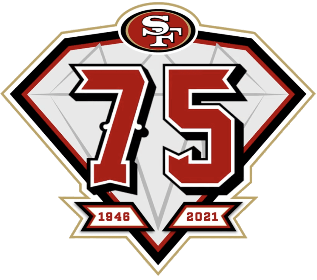
NFL teams usually make uni-related announcements during the run-up to the draft. We saw the start of that with last week’s Bengals uniform unveiling, and we have a bit more news this morning, as the 49ers have just released a new 75th-anniversary logo, which will be worn this season as a jersey patch.
Let’s shift into FAQ mode (for all subsequent images, you can click to enlarge):
Have we known that the 49ers would be doing this?
No, but we probably should have suspected it. The Niners’ history closely parallels that of the Browns (both teams began play in the All-America Football Conference in 1946 and were merged into the NFL in 1949), and we’ve know for a while now that the Browns will have a 75th-anniversary logo and throwback this season. So it makes sense that the Niners would celebrate their own 75th anniversary.
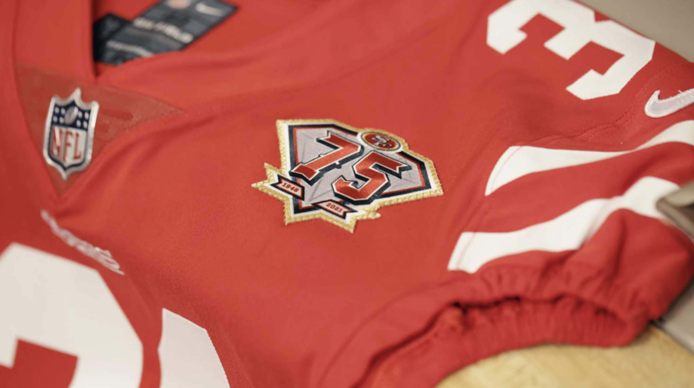
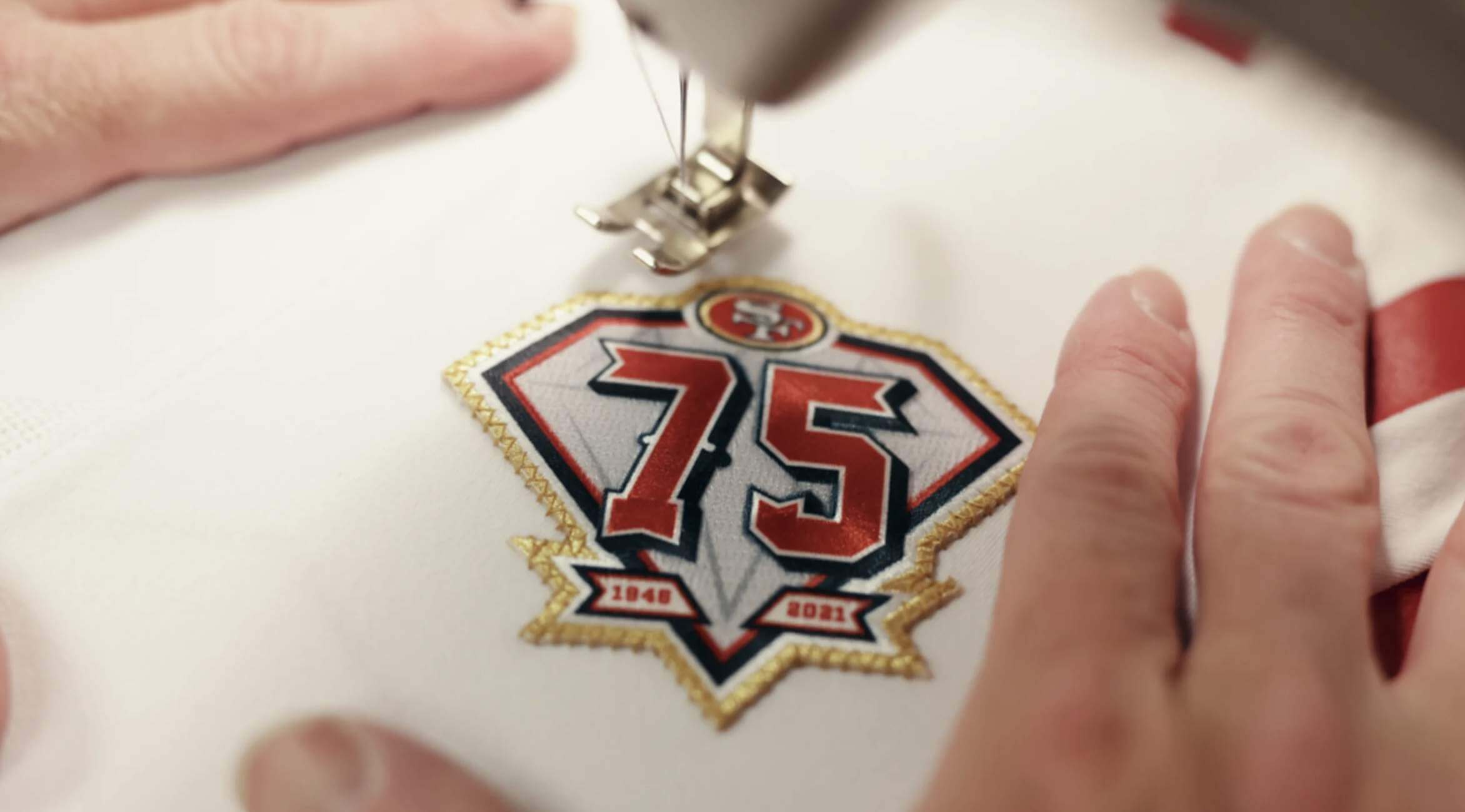
How will the patch look on the team’s jerseys?
At present, these are the best images available, but I’m sure we’ll be seeing more photos soon:
What’s with the diamond motif?
A 75th anniversary is typically referred to as the diamond anniversary. The NFL used a diamond shape for the league-wide 75th-anniversary patch in 1994 — an important year for the Niners, as they won the Super Bowl that season.
That’s a pretty funky number font.
It sure is. It’s a mix of the team’s traditional block numerals, throwback numbers, 2000s numbers, as well as the Niners’ saloon font (often used in the end zone). Here’s a look at the influences that led to the final product:

Honestly, I’m not in love with it. Feels like it’s trying to be too many things at once and ends up being a weird-looking hybrid.
The logo doesn’t say “Anniversary” or “Season” — it just has the number 75. Is it really an anniversary patch? I know there’s a difference, but I get mixed up sometimes.
This year will indeed mark the 49ers’ 75th anniversary (and 76th season), so this is a true anniversary patch, not an ordinal/season patch.
Don’t the 49ers have an odd history about the wording on their anniversary patches?
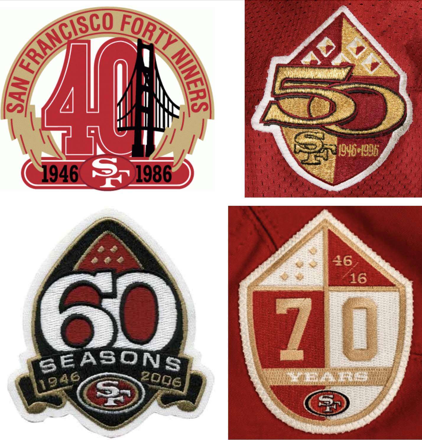
Yes. Over the past 35 years, the Niners have consistently done anniversary patches (not season/ordinal patches), but they have never used the word “anniversary” in any of those patch designs. Their 60th-anniversary patch confusingly included the word “Seasons” (giving the false impression that it was actually a 60th-season patch). Even more confusingly, their 70th-anniversary patch had the word “Years” — a word rarely if ever seen on commemorative patches:
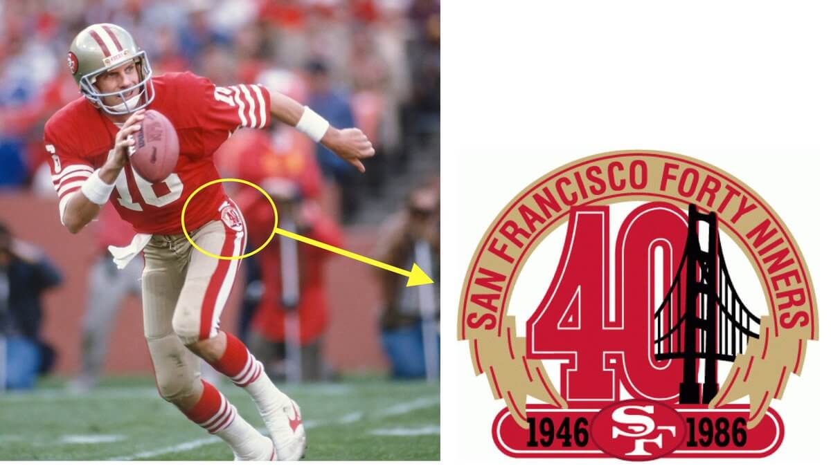
Didn’t they wear one of those patches in an unusual spot?
Yes. In 1986, the 40th-anniversary mark was worn on the left hip:
Seems like the Niners do a lot of anniversary patches.
They sure do. Doing patches for the 60th, 70th, and 75th anniversaries — three patches in a 15-year span — is a bit much. Here’s hoping they skip the 80th and 90th and have the patience to wait until their centennial for their next patch.
Okay, enough about patches. Wasn’t there also a leaked 49ers throwback floating around? Any updates on that?
Yes, a 49ers throwback jersey was leaked in March. No confirmation on that from the team, at least for now. But I suspect we may hear more about it between now and Thursday night, when the draft begins.
———
There’s a bit more to the story of this patch design. The Niners released this “Behind the Logo” video that tells a bit about how the design was created:
If you watch that video, you learn that the idea for the design came from a young 49ers staff designer named Brandon Tam, who developed the concept in 2019 as part of a class project when he was a student at Laguna College of Art and Design. According to the video, his professor liked the concept so much that he encouraged Tam to send it to the 49ers, which in turn led to him being hired by the team.
Frustratingly, the video doesn’t show Tam’s class project. I’ve asked the team if we could have a look at it — stay tuned.
Update: Reader MJ Kurs-Lasky has found what appears to be Tam’s class project. Look here.
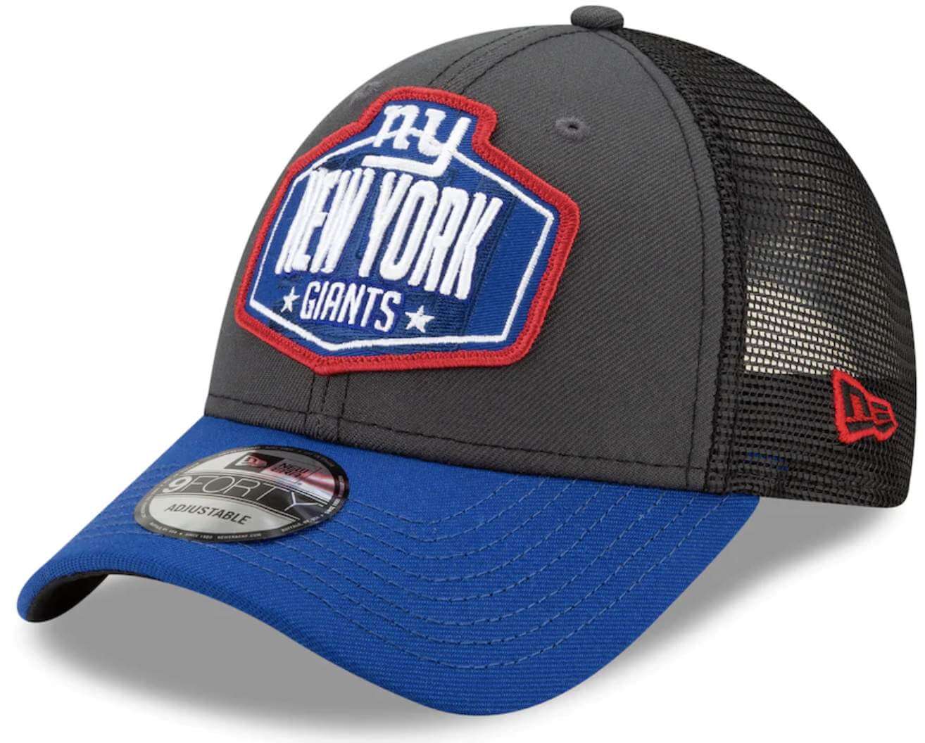
And speaking of the NFL draft…: I’m assuming some of you out there purchase and wear NFL draft caps. If that’s you, I’d like to hear from you. Here are some of the things I’m interested in:
- In general, what do you like about NFL draft caps as opposed to other NFL fashion/sideline caps?
- For how many years have you been buying/wearing NFL draft caps?
- Do you make a point of buying your favorite team’s draft cap every year, even if you don’t like that year’s design?
- Will you wear a given year’s draft cap only during that specific year? Or would you happily wear, say, a 2018 draft cap in 2021?
- Similarly, do you wear draft caps only around the time of the draft, or at any time of year?
- Do you keep your draft caps separate from other NFL caps, as a separate part of your collection?
- Anything else to add about NFL draft caps?
If you’d like to share your thoughts on these matters, fire away. Thanks in advance to any and all who respond.
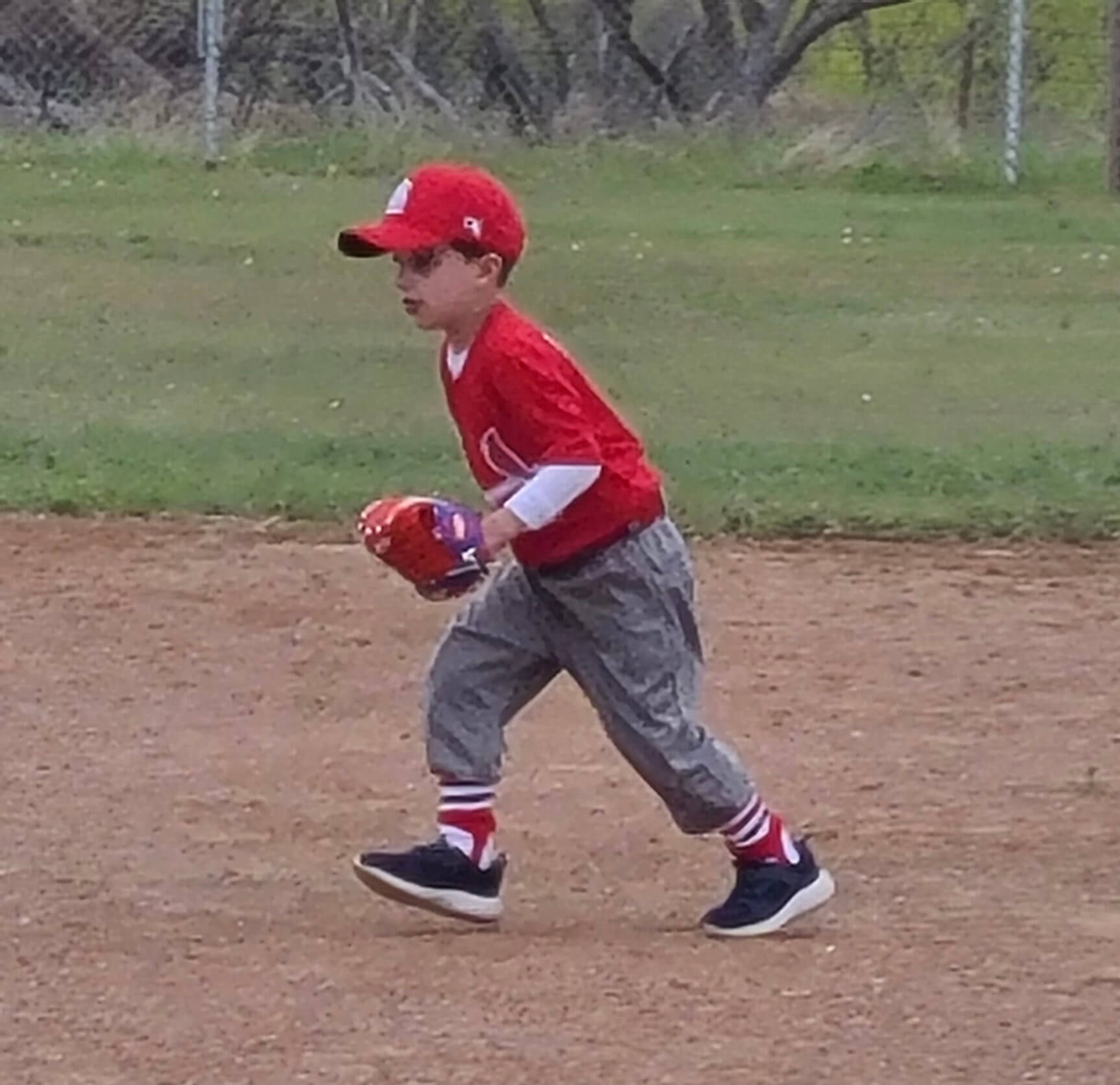
Too good for the Ticker: “My five-year-old is playing tee-ball for the first time and is on the Cardinals — my all-time favorite team!” says reader Vince Moore. “So I had to make sure his stockings were on-point. They may be baggy, but he Gets It™ !” Indeed.
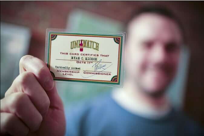

ITEM! A new membership raffle: Reader Doug Steffenson has generously donated funds for a membership card to be raffled off, so that’s what we’re going to do today.
This will be a one-day raffle. No entry restrictions. To enter, send an email to the raffle in-box by 8pm Eastern tonight. One entry per person. I’ll announce the winner tomorrow. Good luck!
LAST CALL for the coasters: I’m down to the last three two sets of Uni Watch coasters. Who wants ’em?
Click to enlarge
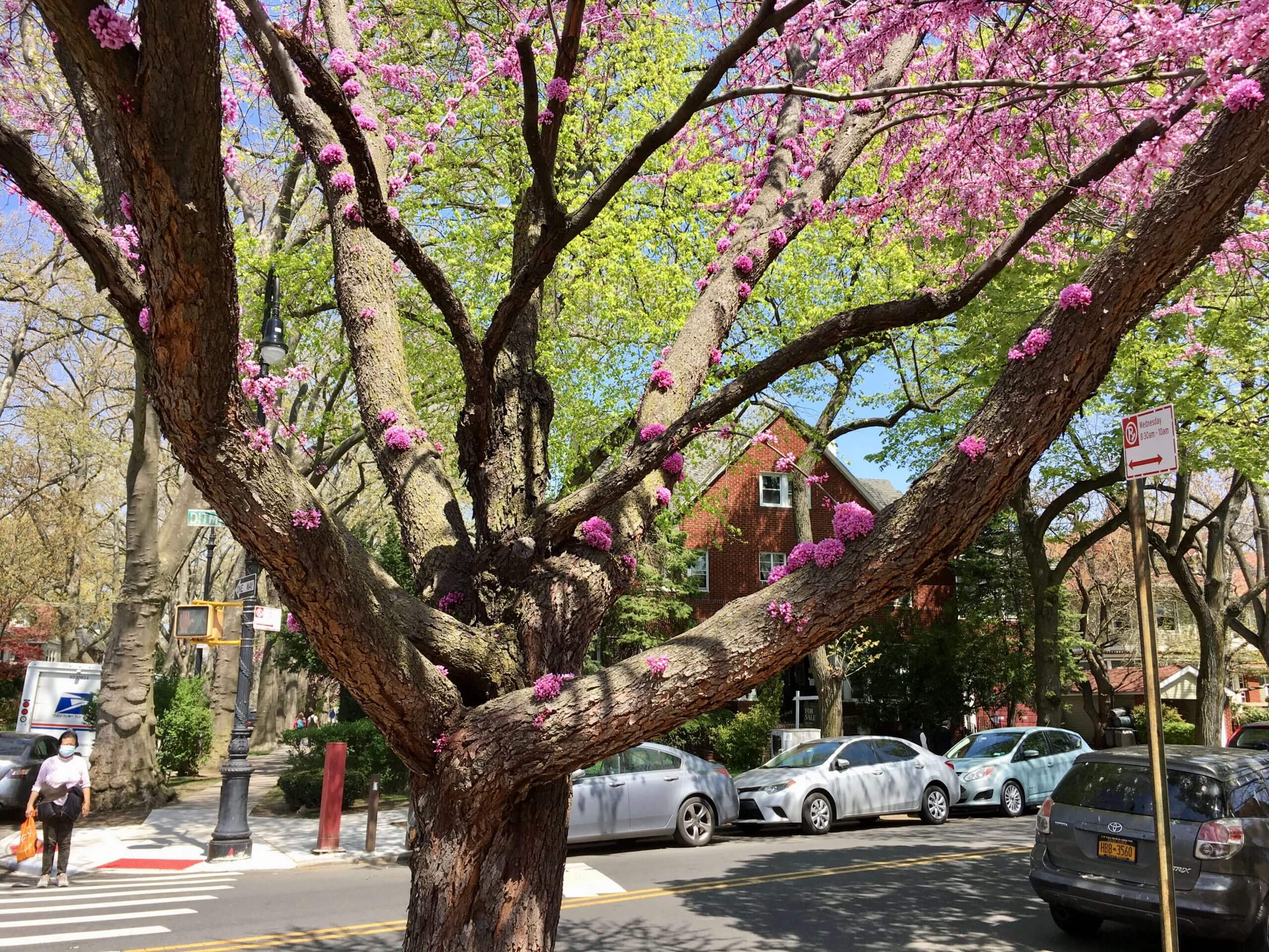
A tree grows, rather oddly, in Brooklyn: The tree shown above is located a few blocks from Uni Watch HQ. As you can see, it has flowers blossoming directly on its bark. Isn’t that weird? It’s like a moss, or even a fungus, except it’s flowers!
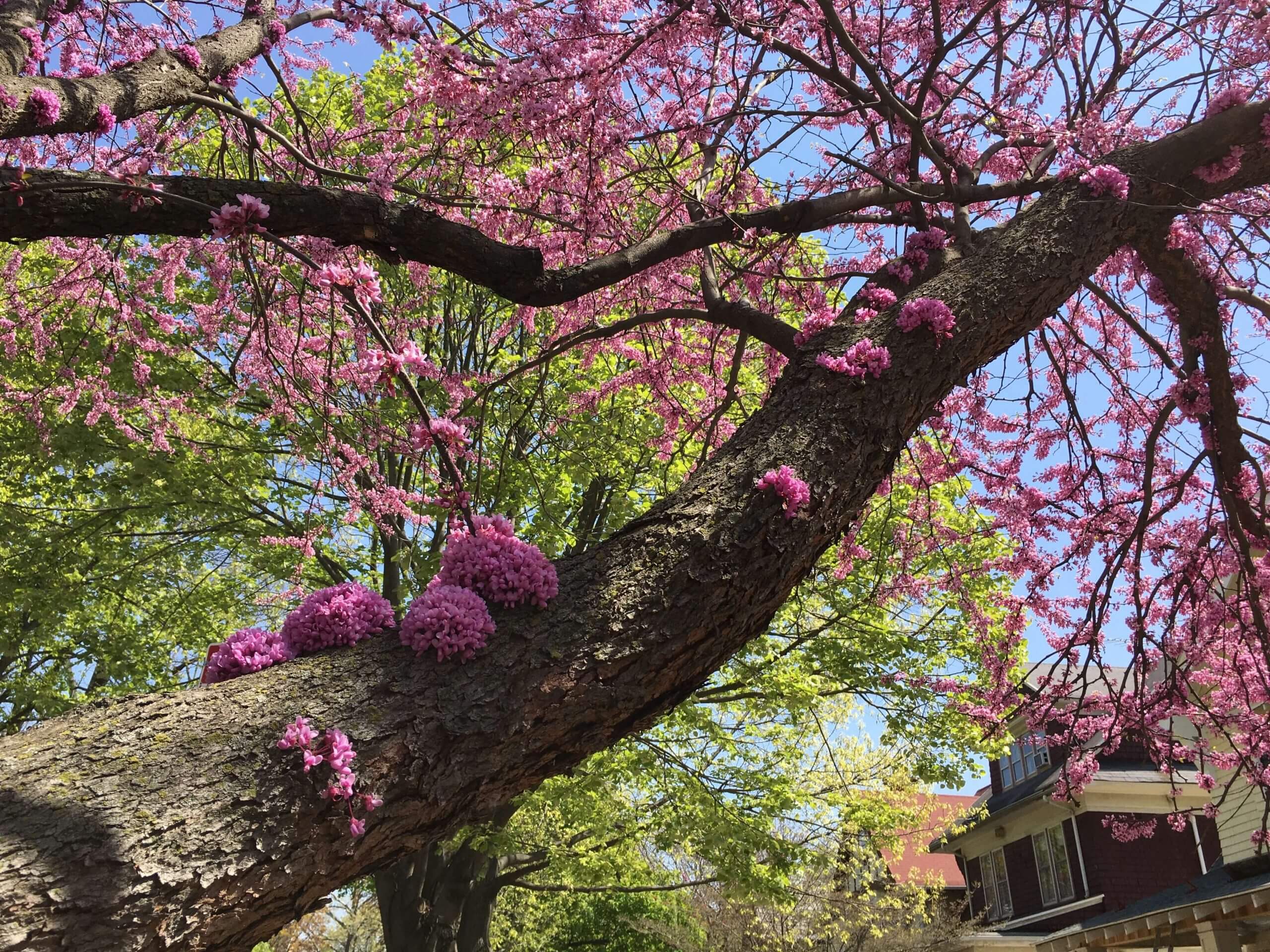
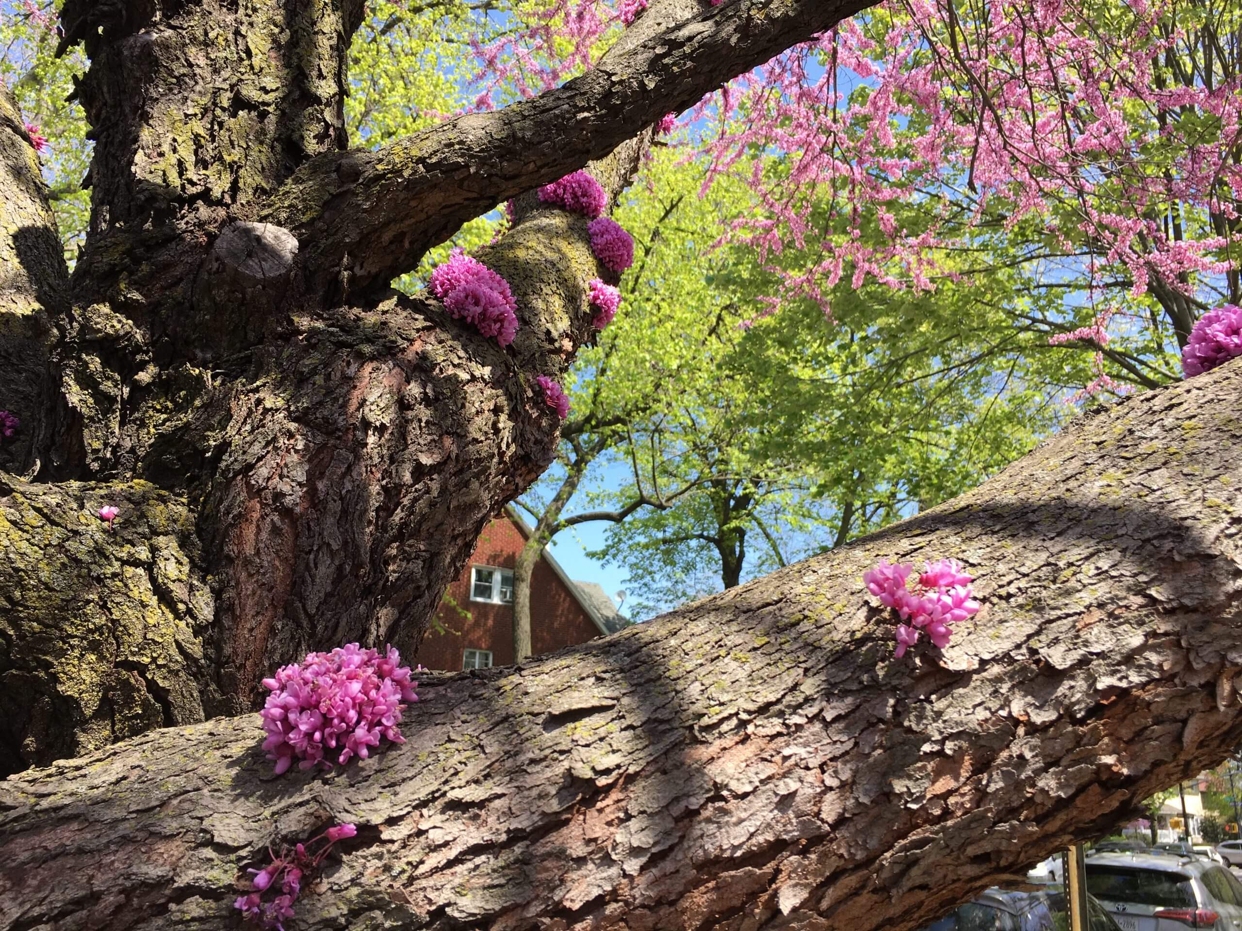
I don’t know jack about trees, but the Tugboat Captain says the tree is an Eastern Redbud, which routinely flowers this way. Fascinating! Here are a few more shots:
The Ticker
By Jamie Rathjen

Baseball News: Newly promoted Orioles P Zac Lowther is wearing No. 59 (from Andrew Cosentino). … Oklahoma State and Texas went orange vs. orange yesterday (from Tyler Ames and Cody Williams). … The Japanese Baseball Hall of Fame has an exhibit on the Kintetsu Buffaloes, one of the predecessors of the current Orix Buffaloes (from Jeremy Brahm). … Broadcaster Joe Buck’s twin boys just turned three years old, so Buck’s sister gave them a pair of tiny jerseys, complete with FIOBs and a memorial patch for their grandfather, Jack Buck (from @mrmichael21).

Hockey News: The AHL’s Henderson Silver Knights had their goalie coach, Fred Brathwaite, serve as the backup on Saturday. He had an Atlanta Thrashers mask, which is probably from when he played with the Chicago Wolves when they were the Thrashers’ AHL affiliate (from Wade Heidt). … Reader Mike Engle learned about a small change in the design of NHL pucks this season from a collectors’ group: Compared to last season, the little grey ring with text this season is closer to the edge, thinner, and the team logo inside is a little smaller. The Predators also appear to use pucks from neither season. … A women’s team in Nunavut managed to get funding for its uniforms from the Royal Canadian Mounted Police (from Kary Klismet).

Basketball News: New Pacers C Amida Brimah is to wear No. 37 (from Etienne Catalan). … Kings G Kyle Guy is the team’s only player with a seven in his number, meaning when the Kings wore their City Edition jersey for the first time he likely became the first NBA player to wear a crossed seven (from Jeremy Brahm). … UMBC’s arena got a naming-rights advertiser (from Andrew Cosentino). … The Nets’ Jean-Michel Basquiat-themed alternate uni is apparently a hit with the team’s players, who reportedly want a white version of the design for next season (from Adam Vitcavage).

Soccer News: Norwich City revealed a one-off shirt “dedicated to supporters” to be worn at their last English Championship home game next week (from @weirdsportsmerch and Kary Klismet). … Germany’s 2. Bundesliga’s Karlsruher SC wore a shirt honoring their stadium, Wildparkstadion, which is being rebuilt. … Also in Germany, SV Meppen’s teams in the 3. Liga and Frauen-Bundesliga wore shirts based on their district, Emsland. … Several sources, including the NBC announcers, thought that Everton midfielder Fabian Delph was wearing the wrong socks on Friday because they looked predominately white instead of blue. You can see in this picture that they seem like the right ones, but upside-down — the Hummel chevrons, which always point down, are correctly white but are facing the wrong way. Everton’s true white socks have blue chevrons (from Storm Desk). … Manchester United goalie Dean Henderson wore a cap again, but a different one from last week (thanks, Anthony). … The Premier League’s National Health Service patches from last season have been reappearing for English men’s cup finals this season and did again for yesterday’s League Cup final. … In the age of stadiums being used for both elections and Covid vaccination, the NWSL’s Racing Louisville’s game tonight is a mini vaccination clinic. … Louisville also hinted at a new signing, center-back Gemma Bonner, by posting a NNOB No. 4 shirt. … The Vancouver Whitecaps’ pre-match photo on Saturday featured a tribute to one of their kid captains who had cancer (from Wade Heidt). … Here are all 30 years of Gamba Osaka first shirts (from Jeremy Brahm). … The next two are from Kary Klismet: New first shirt for Brazil’s Atlético Mineiro. … The USL Championship’s Colorado Springs Switchbacks opened a new stadium. … The Ukrainian Premier League now has a betting ad in its name which appears on the league sleeve patch, but Shakhtar Donetsk have a different betting ad. They avoided wearing the league ad because they had the champions’ sleeve patch, but now they won’t, so we’ll have to see what happens (from Ed Żelaski).

Grab Bag: A lacrosse blog came up with four college men’s teams it thinks could improve their looks (from Kary Klismet). … Reader Josh Lookatch‘s senior thesis for a graphic design degree is the Euphoria Butterflies, a more inclusive team identity. … The Smithsonian has an online exhibit of shoes, a few of which are game- or race-worn from various sports (from Max Weintraub). … James Bond writer Ian Fleming used lots of product names in his books, but for the sake of detail instead of product placement (thanks, Brinke). … The English founder of the Apostrophe Protection Society, which promoted correct use of the apostrophe, recently passed away (WaPo linK) (from William F. Yurasko). …The Australian record label UNFD has a 10th-anniversary logo.

I’m happy to report that Patrick Hogan, Kyle Schuldt, and Johnny Woods are the three winners of the card pockets from last week’s membership drive. Congrats to them, and my repeated thanks to ace DIYer Wafflebored for providing the pockets.
Meanwhile, a longtime Uni Watch reader was dealing with some medical issues in early March and missed out on the March pin, which is now sold out. If you have an extra March pin that you’d be willing to sell or trade, give me a shout. Thanks.
And finally, a very happy birthday to longtime Uni Watch pal Comrade Robert Marshall. Enjoy your special day, buddy! — Paul
Redbud flowers are edible. It’s in the same family as peas and they taste like raw pea pods.
Columbus, WI does an entire celebration over the Red Bud tree. The tree is unique to Columbus, in Wisconsin.
Even though there’s a Red Bud Trail, miles long, in Michigan?
It’s Fred Brathwaite.
Fixed.
I have never seen as many redbud references in my DC area social feeds as this spring. Wisteria too.
I’m rather a fan of flowering trees.
Happy Birthday, Robert!
Didn’t they wear one of those patches in an unusual spot?
Yes. In 1986, the 40th-anniversary mark was worn on the left hip
Unusual but not unprecedented. Two years earlier the Raiders wore their 25th anniversary patch on the hip. I think there might have been another original AFL team that did that, but from memory the Raiders are the only one that comes to mind.
Norwich City revealed a one-off shirt “dedicated to supporters” to be worn at their last English Championship home game next week
You buried the lede…no advertising on the jersey!
After further review… the Raiders were the only one to wear the AFL 25th patch on the hip.
link
Deh Raidehs were never big on jersey patches, tributes, or memorials; indeed I don’t think the franchise has any retired numbers (other than Jim Otto’s #00 which they can’t issue anymore). In fact I don’t remember them ever wearing a jersey patch until 1994 (NFL-75). They didn’t wear helmet memorials for, e.g., Stacey Toran or John Matuszak, who both died in the summer of 1989, or Lyle Alzado, who died in May 1992. The only helmet additions I remember (other than the American flag) before, say, 2000 (not counting link), were the link, and some link in January 1991.
Raiders also wore patches in 2009, the team’s and AFL’s 50th anniversary
Thanks, 50+1. I wonder if those stirrups were my work, it’s a great pixture.
I do buy the draft caps each year, at least for the past 3-4 years. I actually just picked up this year’s Cowboys hat at Lids over the weekend. For me it’s just kind of a way to celebrate the one big football offseason event and I’d really have to hate the cap to not purchase it. I typically buy the draft hat and wear it for the draft and then will usually start the season wearing it on gameday. Sometimes I’ll pick a different hat if one better matches the jersey I’m wearing on gameday, or if I thought the hat has bad juju on it from a tough loss the prior week. I have jerseys hanging in my office and when I’m not wearing it I’ll hang the hats over the jerseys.
Yes, I’m knowingly buying into merchandising but I enjoy the product and look forward to the draft so I don’t really give a shit, lol. I usually also buy at least one jersey and a few t-shirts at the beginning of the season.
Happy birthday, Robert!
For whatever it’s worth, if the 49ers’ patch font were to be the new custom number font, I would dislike it because it would epitomize “trying too hard.” But just as the patch, it works well for being artful and conveying the celebration while evoking history. It gets a thumbs up from me!
Meanwhile as a follow-up to my Ticket post about pucks, while Nashville has apparently used very old pucks that are two design iterations old, some “small fat black ring” pucks from last year are also leaking into this year, not withstanding the design change. If you go to MeiGray’s Instagram story, you can see a February 2021 Columbus goal puck for auction, obviously of the old design. I have this screenshot. I’ll send it to Paul and he can either give it a Flickr link or update the Ticker or do whatever we wants
Happy Birthday, Robert!
I’m encouraged by Josh Lookatch’s Euphoria Butterflies because I’ve long rued the cliquishness of sports fans in relation to rock fans, bandroom fans, science club fans, frisbee fans, model congress fans and any other groups in middle/high school. Too often our cliques had unwritten rules about race/sex/sexual proclivity/perceived grey matter which stifled our freedom.
Gender dysphoria never became a topic in my school days; I wonder how many of my classmates suffered in silence.
I think Tam’s original project patch is FAR superior to the patch the 49ers designed. They should have just paid him for the patch he made.
Agreed. The class project patch is much cleaner. The patch to be used is too cluttered and the number font is atrocious.
I couldn’t disagree more – every detail of the original is close to 180 degrees wrong to me. A well presented, but deeply flawed first draft. But the proposed sublimated plaid uniform – that is amazing! Heck with the patch, I want the Niners to wear that. And not just for the 75 celebration, but full time.
Paul, you seemed to overlook that the top “serifs” of the 75 in the 49ers’ new patch looks like it is paralleling the >1946 2021< notched/cut ribbon element beneath it. That’s the only reason I can think of as to why they went with this “funky” number font (in addition to it combining elements of past jersey numerals).
Those notches are part of the saloon font, as you can see in the progression:
link
Oh okay. Just might be a serendipitous coincidence then (I zeroed in immediately that the top of the 7 and 5 paralleled the 1946-2021 year ribbon at the bottom of the diamond). I think it probably beachside I didn’t see that design progression at first, just the patch reveal so didn’t factor it was more derived from the saloon font. Come to think of it, that “saloon font” you mention in that number design progression is different from & doesn’t even look like the design older Niners fans like myself are familiar with from 80’s-90’s merch, endzone paint jobs, etc. (I think it’s popularly known as “Quentin Caps” from its supposed official font name).
I googled Quentin Caps and though the 7 and 5 in the progression diagram do seem consistent with the 7 and 5 in QuentinCaps, they are somewhat “thinner” looking than what I’m familiar with when I see that font (probably because I usually only see that font when it spells out “49ERS” and usually also in just one color—no black outlines/dropshadows) so it appears “thicker”.
I enjoy your pictures Paul. That does indeed look like a redbud. As I’ve mentioned before I’m in landscaping and those trees bud out here on Texas in February. We lost all of ours we were growing due to the freak winter storm we had here. It’s odd to see one blooming the last week of April. To me it is anyway.
About the hybrid created to make the number for the 49ers’ anniversary logo. I know they tried, but when I see the numbers it does not say 49ers to me. In fact, when I see that it really just reminds me of the numbers on an old Calgary Stampeders jersey.
link
Yeah, that’s my gripe with it — as a Niners fan, it doesn’t feel Niners-y. It may have lots of Niners-related elements, but they don’t cohere in a Niners-y way.
As a 49ers season ticket holder I like it. If they do the 94 home throwbacks I think it will be announced in June when they do the State of the Franchise like when they announced the 94 white throwbacks. I am a hat junkie, I admit it. Yes I buy Draft Day hat and wear it through preseason. Yes I also am a sucker and buy all the sideline hats every season too. It my one vice I can’t help it.
We had 3 eastern redbuds in our yard when we bought our home about a decade ago. All 3 have since succumbed to storm damage and/or disease. Beautiful trees, especially with the unusual shapes they can take, but fairly fragile compared to our maples & oak.
The number font on the 49ers’ patch makes me think that perhaps the graphic design world has reached a sort of “saturation” when it comes to number fonts. Meaning that there are only so many ways to depict numerals in a way that is both easy to read and aesthetically pleasing…so if a designer wants to come up with a font that it truly unique he’s going to have to add a bunch of random/weird elements to it that are going to be visually jarring to many of us.
Doesn’t the shape of the diamond itself looks goofy?
That Euphoria Butterflies page looks straight out of Geocities.
Paul, being a Niners fan I thought you would appreciate them always having these quirky patches every anniversary decade (and 75th kinda shouldn’t be skipped).
Gives you more work covering your favorite NFL team!