By Phil Hecken
Follow @PhilHecken
Good Saturday Morning! Hope everyone had a good week.
A couple weeks ago, I featured Part I of Jonny Rockford’s NHL Concepts (if you didn’t see that, or would just like a refresher, please click here). Today I’m back with Jonny for Part II, which is below. There’s a lot to get to, so let’s get started. Once again…
Heeeeeeerrrrrrreeeeeeeee’s Jonny…
NHL Jersey Redesigns
by Jonny Rockford
I am 27 Year Old Jonny Rockford, getting the name during my 5 seasons as the Multi-Media Assistant with the AHL’s Rockford IceHogs. I have always had a passion for uniform designs and am a proud Card Carrying Uni-Watch Member and Monthly Pin Collector. I started this project by designing the Montreal and Vegas jerseys for a contest by Post2Post Productions on YouTube. I could only enter one or the other unfortunately and chose Vegas, and I like to think I got 2nd Place although there were only honorable mentions and the winner. I also feel judging by the winner of the Montreal side of the contest I would have done well in that one but we’ll never know and that’s ok!
After designing those two I wanted to keep going, designed Chicago (my favorite team) and then another, and then another until I had a whole division. At some point I realized I wanted to keep going and have a Home & Away for each team and this is the result of almost an entire year of planning, executing, and finalizing 62 jersey ideas. If and when an updated SportsTemplates.com template is released with the full uniform I plan on coming back to these and create an entire identity.
Nashville:
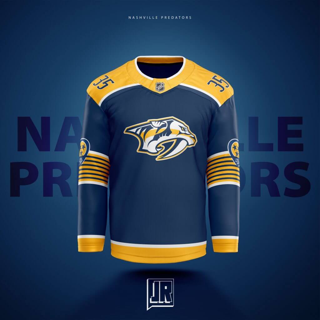
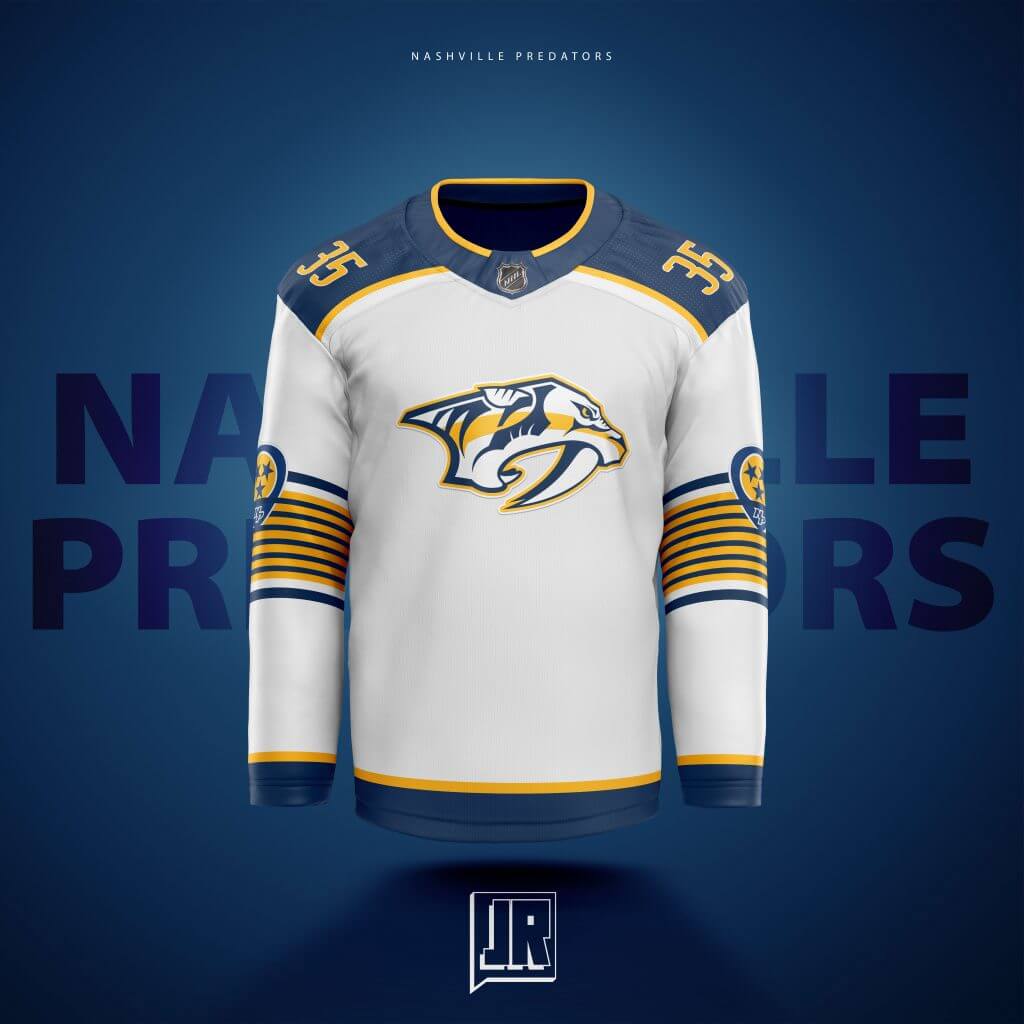
Its time for a Navy Alternate for the Preds. Too much yellow right now in their set. Love the guitar strings in the numbers so I wanted to bring out to the jersey itself on the sleeves. Originally had it on the torso as well but decided it didn’t need it. In a nice touch I hope some can see, I placed the sleeve patch in between a few “String stripes” giving the look of a pick sitting on a guitar waiting to be played. All that on the sleeves made me want to move the numbers, so they now sit on the shoulders i.e. the Panthers.
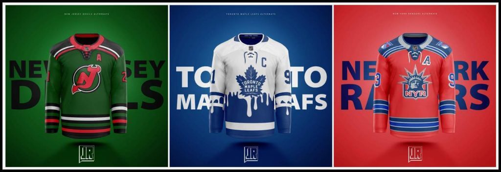
New Jersey:
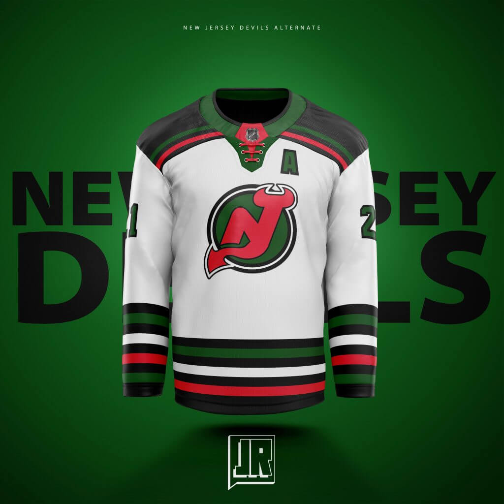
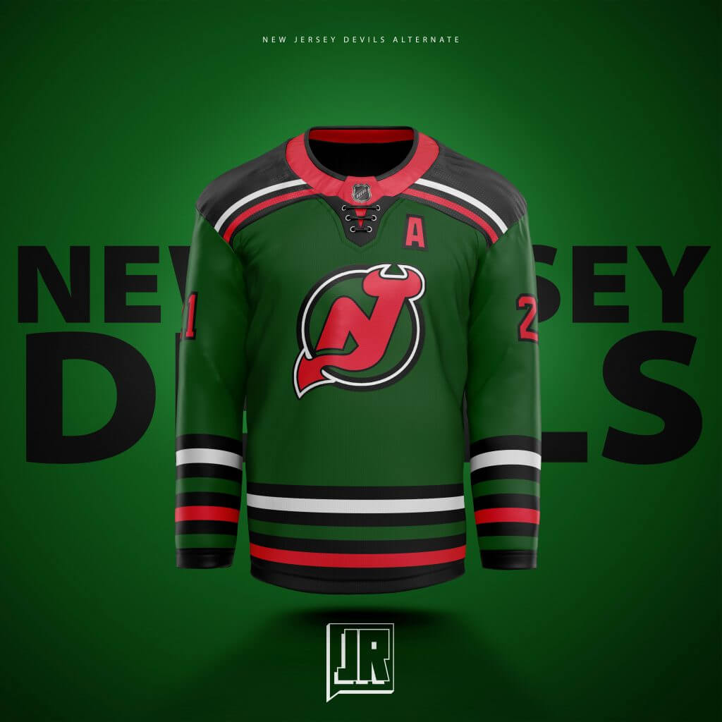
I want to say that the Devils nailed the green jersey for their reverse retro, and I designed these before that. I had Christmas on the brain the whole time and the abundance of stripes remind me (personally) of oddly colored candy canes. My thought for these in my head was that I wanted Minnesota and New Jersey to have a home and home set against each other around Christmas where they both wear these jerseys I designed as a full Christmas Celebration, of sorts. Never gonna happen but a man can dream.
New York Islanders:
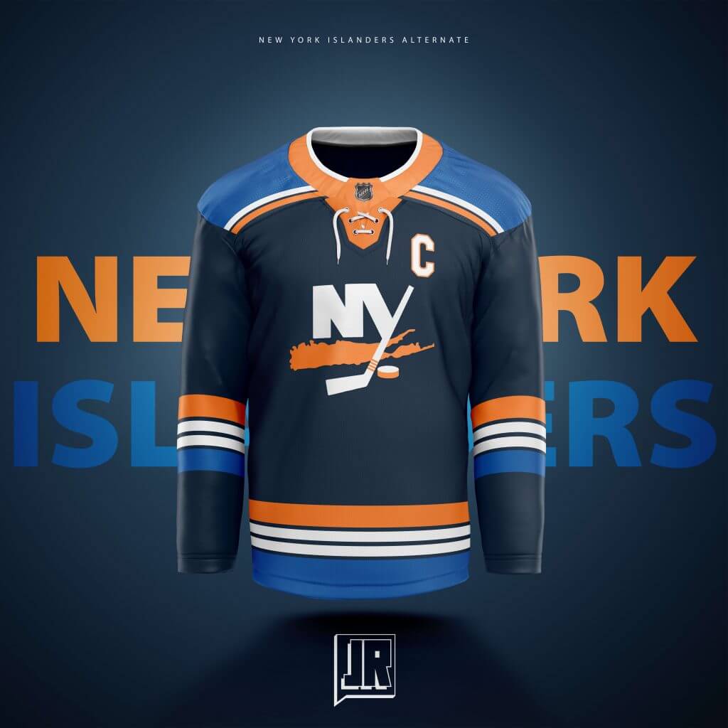
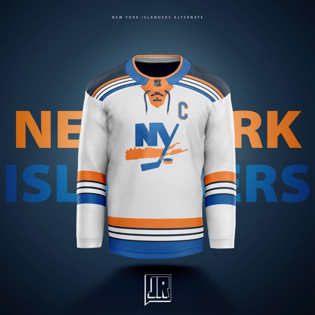
Another one of those “combining jersey designs” in a way… the Navy representing the Fisherman design (without the Fisherman logo) mixed with the current colors in the stripes. 4 Stripes representing, of course, the 4 Stanley Cups in a unique pattern I haven’t seen been used before. Took out the circle from the logo because I don’t think it needs it. There were at one time TOO MANY roundel logos. Let’s weed some out.
New York Rangers:
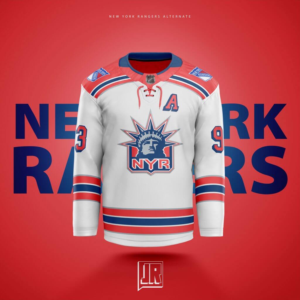
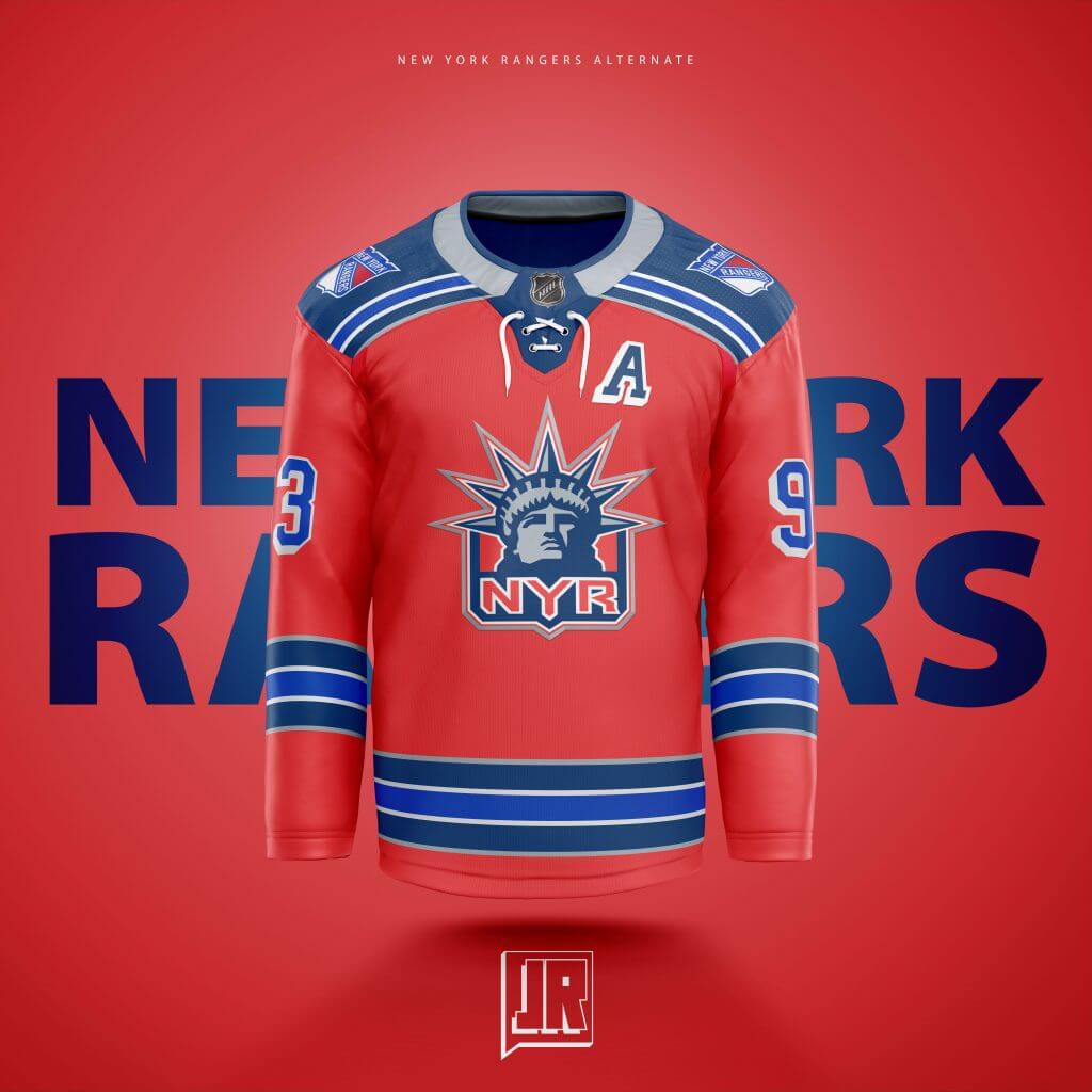
How could I make the most unique Rangers jersey concept ever? PUT EM IN RED. Taking a favorite logo design, the Liberty Head, and putting it on red made more sense than keeping the diagonal text down the front to me. I decided to use both shades of blue from both the Liberty and classic Rangers jerseys, and added some white and grey borders on the stripes to make them stand out from each other. Shoulders are reminiscent to their current away sweaters’. Is it bold? Yeah, and I think most Rangers fans may find them horrendous but I think it looks pretty clean.
Ottawa:
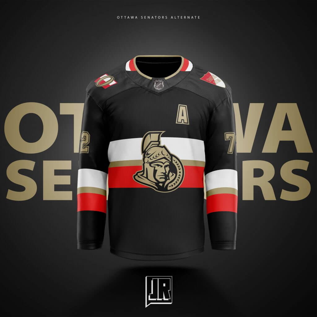
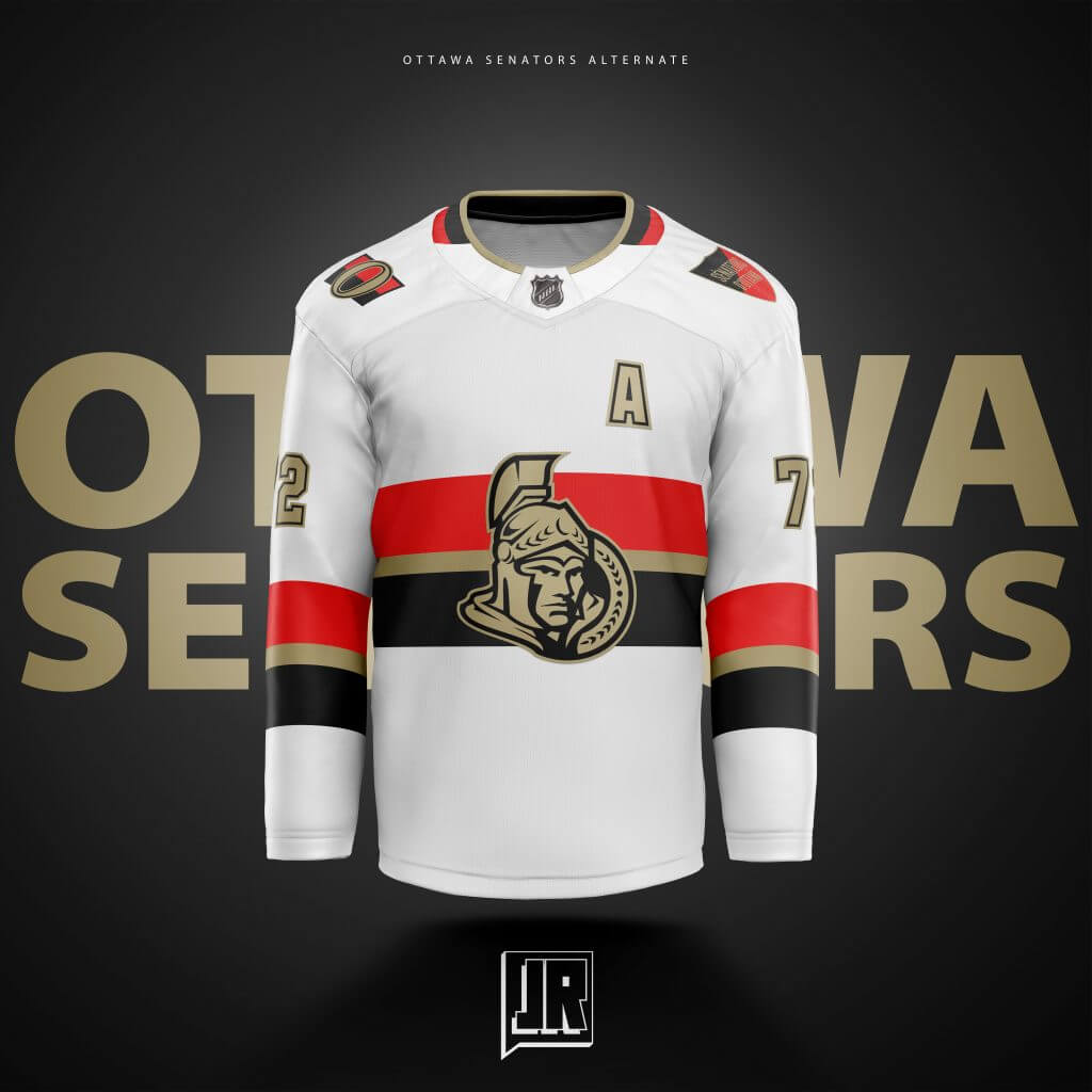
One of my favorite jersey designs ever is the NHL 100 Classic Ottawa jersey, and was one of the first jerseys I purchased that wasn’t a Maple Leafs or Blackhawks (I now have one from 21 teams). I wanted to design one that plays off of that, but with my own little twist. Instead of Centennial Silver, I went with gold, seeing as how its one of the colors in their logo (albeit it a more gold like shade). Made the logo two-toned (my favorite part) and switched to black as the main colors. I knew they Sens were moving back to a version of their original logo by this point, so I wanted to keep their now previous generation logo for this one instead of the “O”.
Philadelphia:
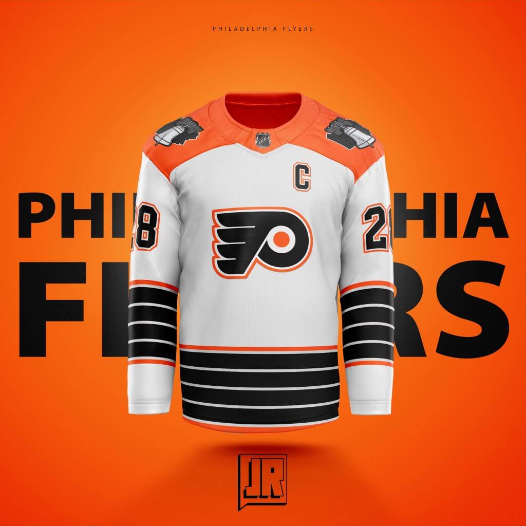
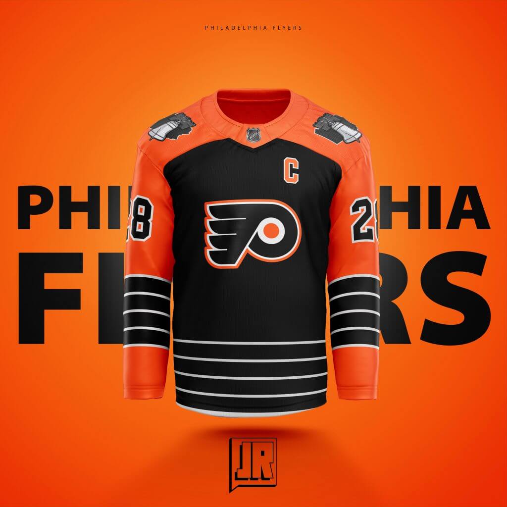
This went through the MOST amount of changes before I finally liked one. Originally a two-toned black and orange version of their current set, I pulled almost a full 180 for this. Thought about using the feather portion of their logo as stripes, added white back in, put an orange outline to the logo, and made the sleeves orange to have more color (and make sure its not identical to the Brooklyn Islanders jerseys from a few years back. Also wanted to add something to honor the city of “PHILA” with the Liberty Bell and put the Pennsylvania state behind that to give it a more local feel. Hard to see, but put a dot right where (at least close to where) Philadelphia is at on the map.
Pittsburgh:
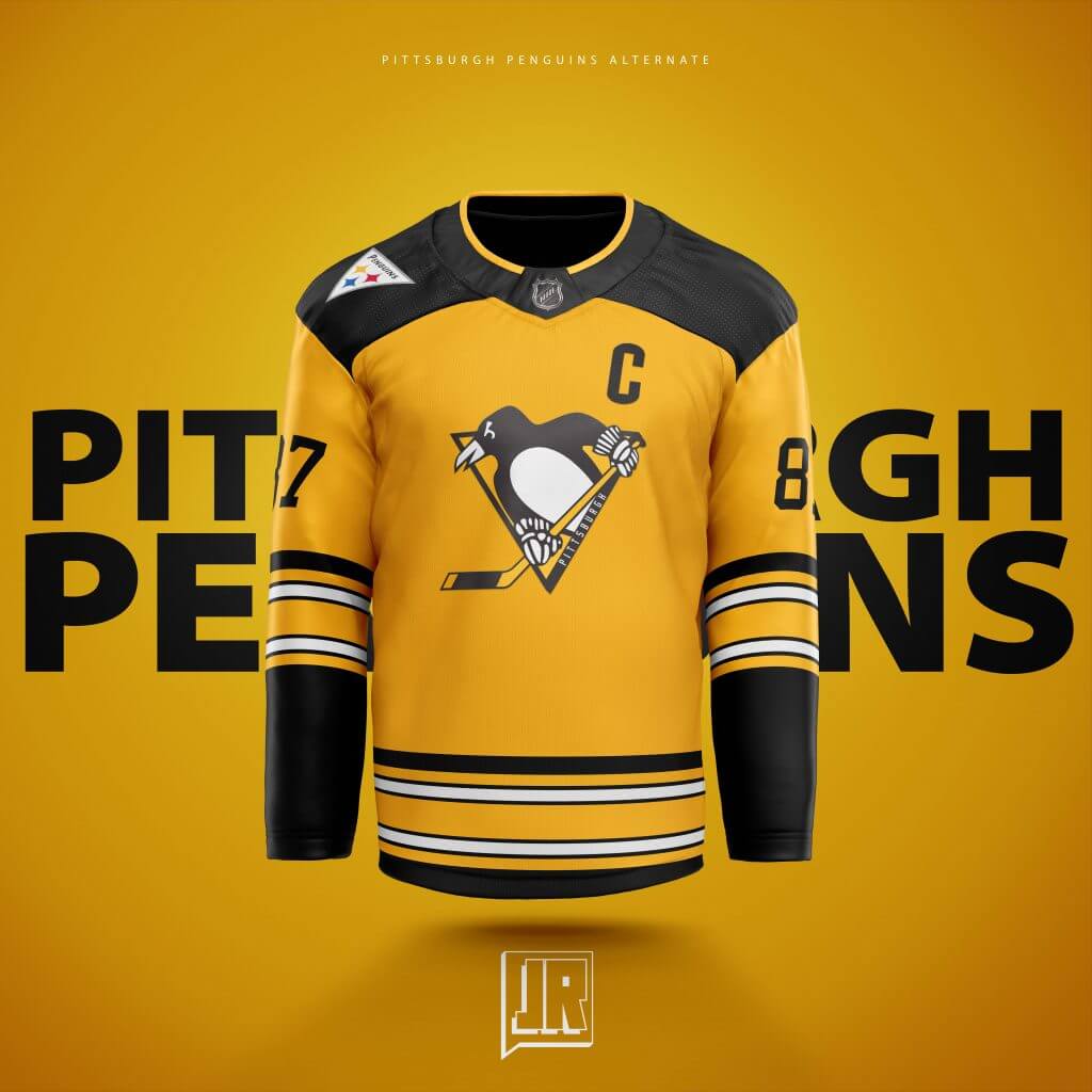
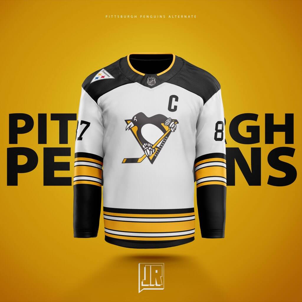
I thought back to the 2014 Stadium Series game and remembered one of the goalies (I’m pretty sure it was Fleury) had a Steelers helmet designed Goalie Mask and wanted to bring that entire idea to life. I’m thinking they wear these first at Heinz Field honoring the 6-Time Super Bowl Champions (being a Packers fan this hurt a bit). The shoulder logo is inspired by the Steeler helmet only having the logo on only one side of it, but in Penguin Triangle fashion.
San Jose:
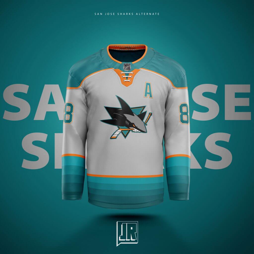
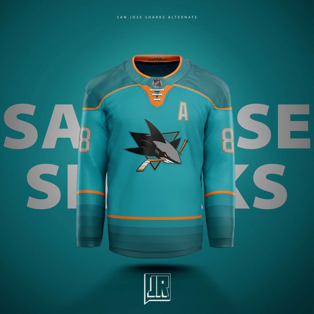
A Great White Shark is actually grey. And that’s what the inspiration was. I originally had the teeth that are featured in the back collar at the bottom of the jersey but realized that was childish and a bit too 90’s looking… So thinking on it, went to the staged gradient representing how the ocean only gets darker the more leagues you go down in the ocean. Wanted to add orange to separate the shark grey from the ocean teal (maybe thinking “can’t use red for blood, so let’s use the orange”. Honestly don’t remember but seems like something I could think up). Designed the grey first and just thought keeping with the deepening sea motif may work out for the “Home” jersey and absolutely made orange the right call.
St. Louis:
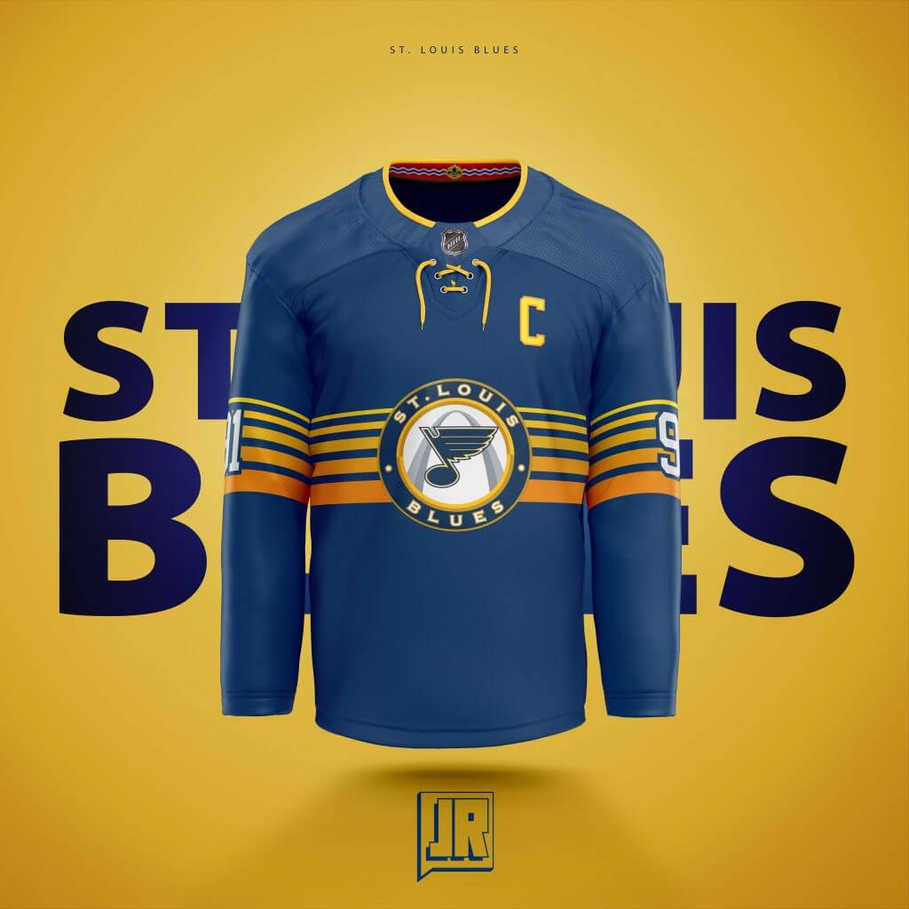
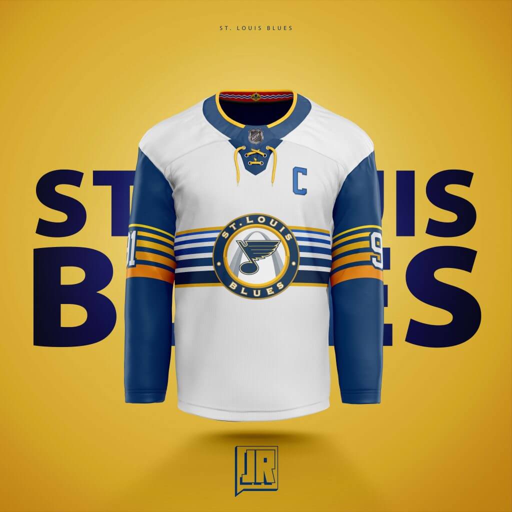
I believe this was actually the 4th jersey I designed before I decided to make this a series. I sure use staged gradients alot, but at least they all have different meanings. This I wanted to look like the sun is setting over the Blues Championship hopes with the almost 80’s vaporwave style gradient in the stripes. LOVE the Blues old 3rd logo so I brought it back for this. Originally had just an arch cutout on the torso as the logo, but it didn’t stand out enough.
Tampa Bay:
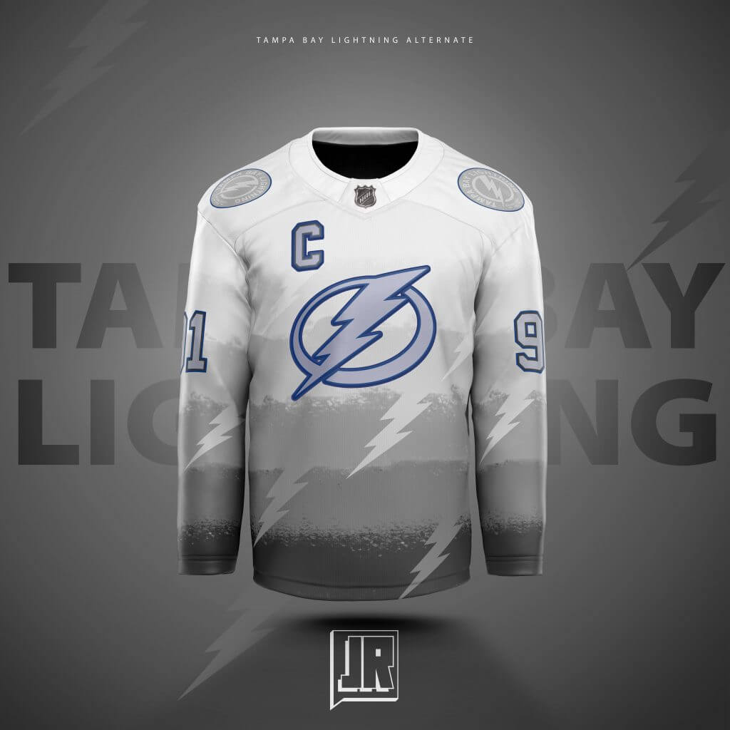
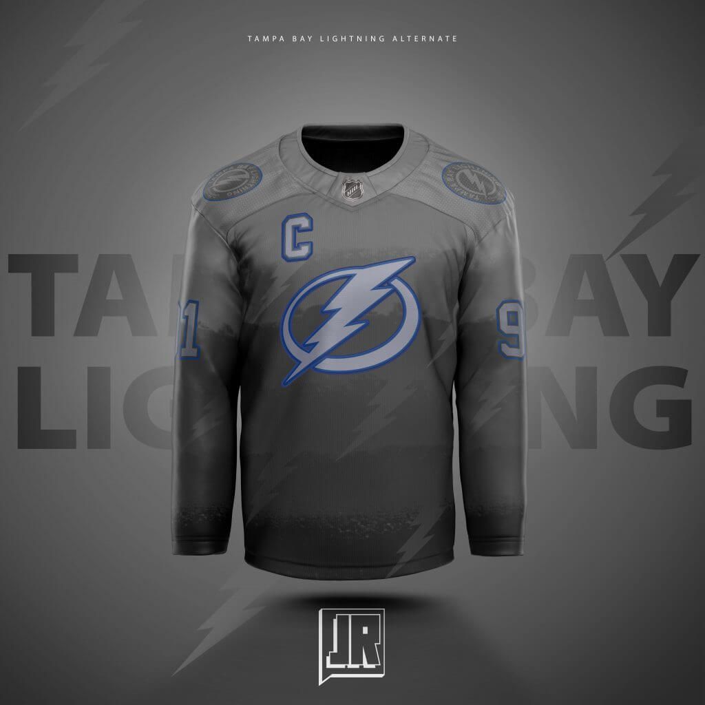
One of the more underrated jerseys I feel that I’ve designed. This idea doesn’t happen without their current “meh” black to grey jerseys, and I wanted to try my hand at it. When I think of lightning I think of a storm rolling into the area around the afternoon, the darker the clouds get, the closer the storm is. Designed the logos and numbers with a clear frosted glass type of plastic material used to try and give off a misty rain look, but added the blue outline to make sure its still read by announcers and fans.
Toronto:
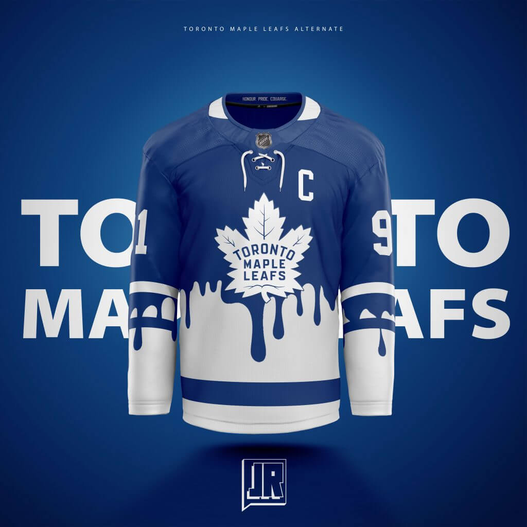
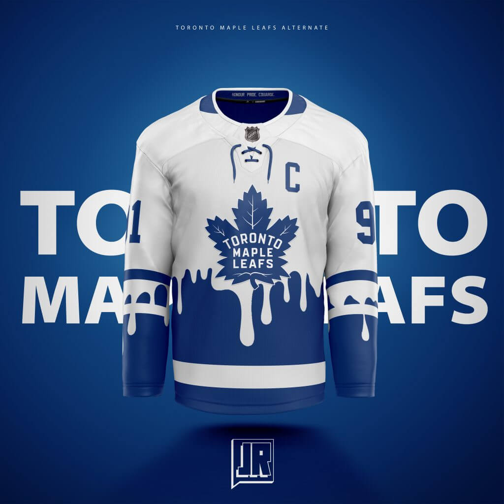
A “What if the NHL had a game on Nickelodeon like the NFL did” jersey. Originally billed as the “Canadian Pride” jersey, I originally had the current Leafs jersey look like Canadian Red paint was overtaking the Leafs like they were playing for all of Canada… BUT everyone thought it was the blood of Leafs fans so I swapped it to just Blue and White. I am not responsible for any other jokes being made at the Leafs expense with these jersey concepts as I call the Leafs my “East Team”…
Vancouver:
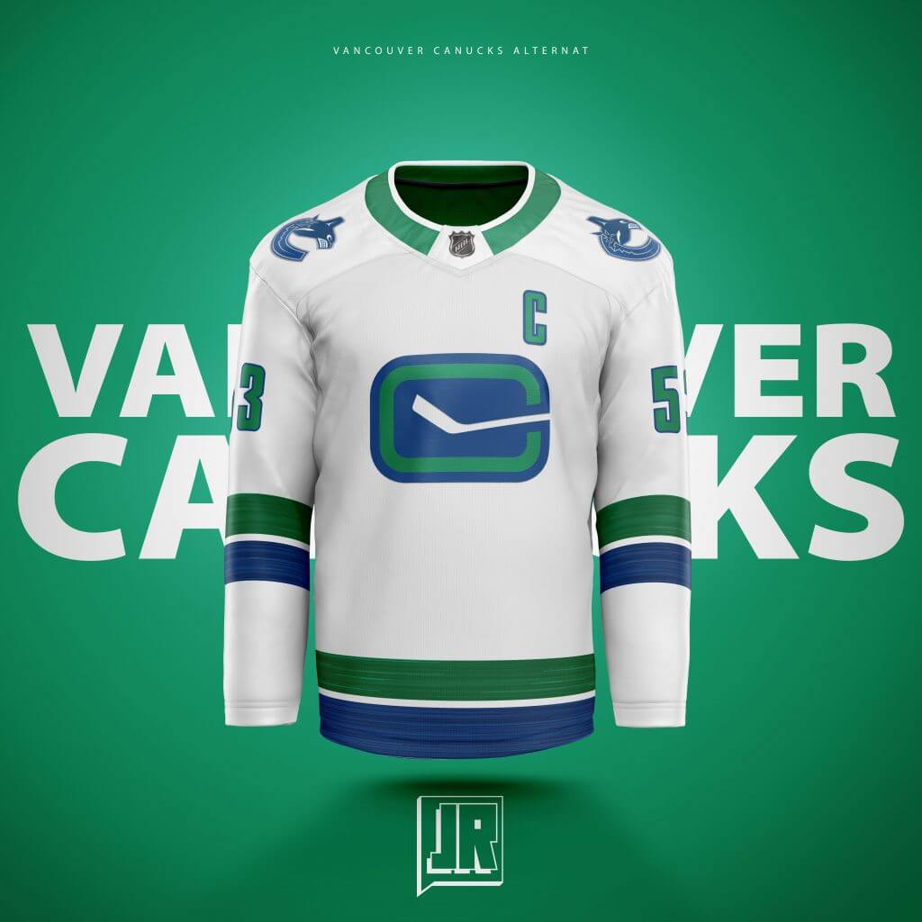
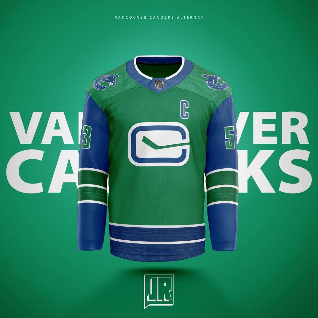
Another one I think is pretty underrated in terms of style. The swapped colored sleeves and heathered stripes I thought would be a popular look as I really like it but it seems most think its average. I’ve seen the Utica Comets green jerseys and I really feel Vancouver needs a green jersey… but with Dallas and Minnesota having green jerseys… thought Vancouver would look better with opposing sleeves.
Vegas:
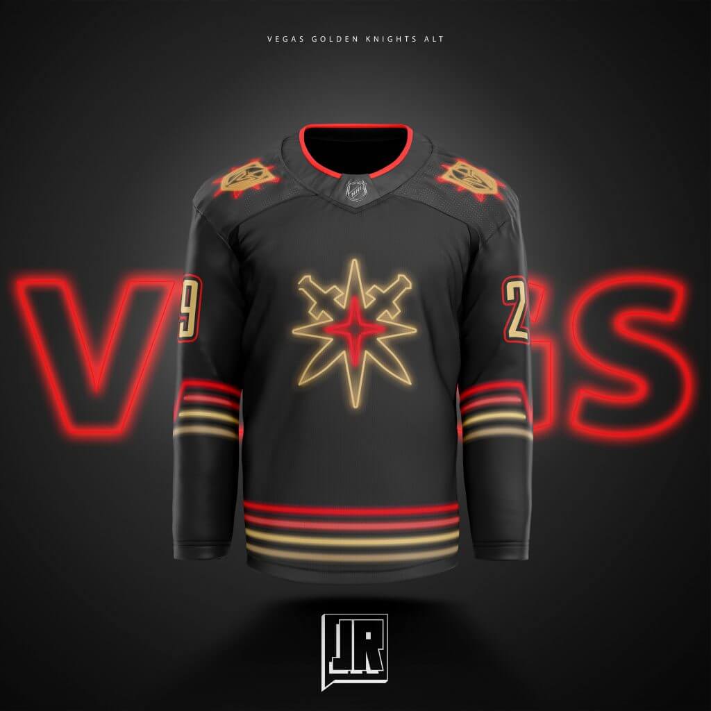
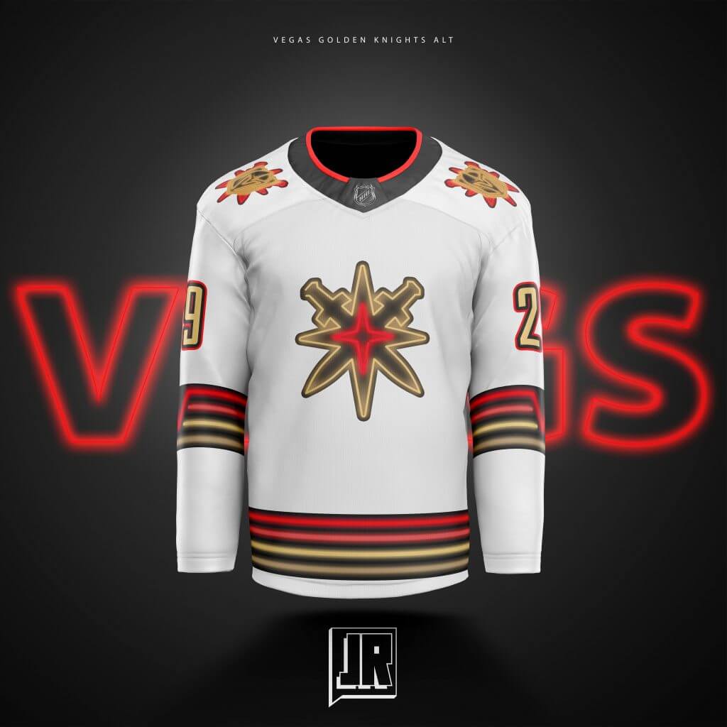
The one that got me 2nd place in the P2P Contest (and in touch with SportsTemplates on a professional level). I am not a gambler but would LOVE to see a night in Vegas with all the neon lights and signs… I had insider knowledge that Vegas was FOR SURE getting new gold jerseys about a year before they ever announced them (Thanks, Exclusive Pro Sports) so I made sure I went another direction. I had designed a “Night Time” jersey before these for the blues, but went full neon for Vegas. I originally tried to include “VEGAS” in neon on the torso stripes, but it was not coming out the way I liked, so I went with a simple “V” on the sleeve stripes. I think the shoulder logos could use some work but my deadline was coming up for that contest.
Washington:

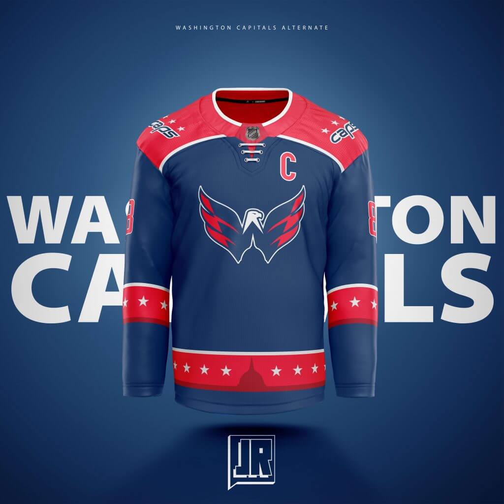
I had an entire new set of jerseys (Home, Away, and Alternate) back in 2017 when they unveiled their Stadium Series jersey, and I revisited it with this. The stripe design stayed almost the same but I added the darker shade stripe at the bottom, moved the stars I originally had on the sleeve Blue Jacket style to it, and but the silhouette of the Capital Building to the middle and I think its the most impactful edit I made as these went from average to one of my favorites. This was before the Caps unveiled their new Navy Alternates.
Winnipeg:
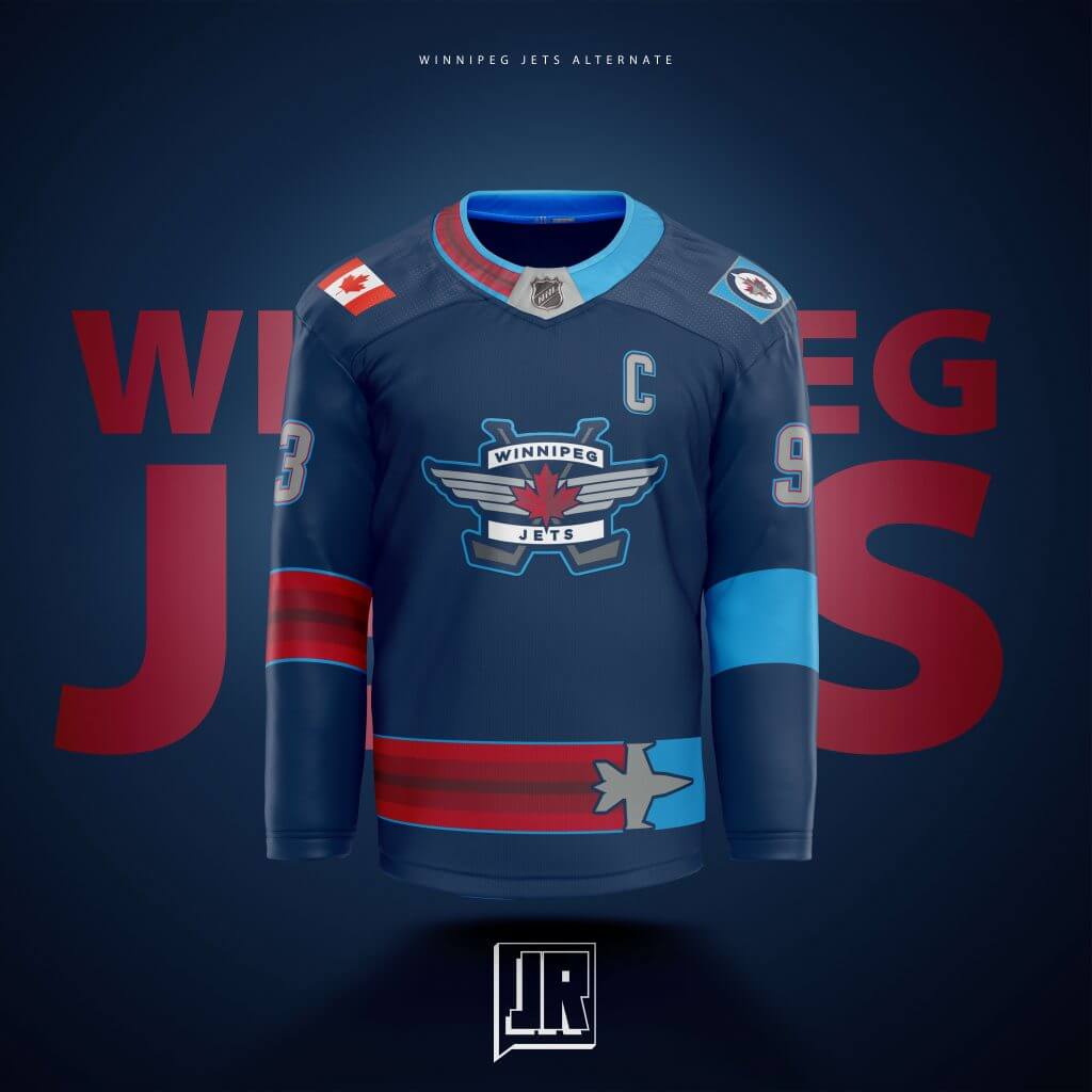
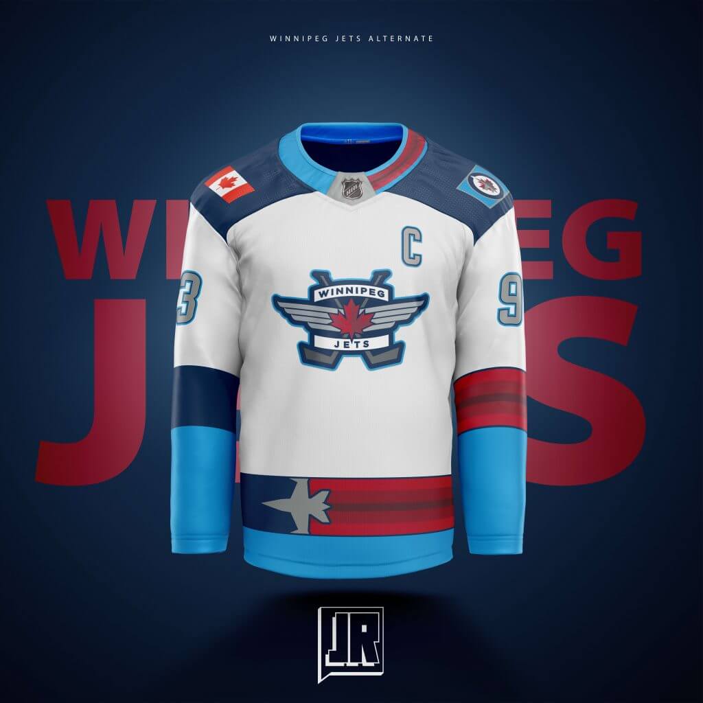
My most ambitious jersey. The odd sleeve stripes may be off putting at first, but I designed them like that to play off their old identity of the Atlanta Thrashers. The light blue is there to look like a bright cloudless day, the red behind the Jet is there to look like colored trails you may see at an airshow. No real inspiration this time other than I thought it would look cool.
That should do it! I have more work than this, including a bunch of jersey designs for my EA SPORTS NHL 21 EASHL team the Rockford Hockey Club, and football designs, and more! You can check those out on my Twitter @JonnyRockford!
Thanks, Jonny! Great stuff.
Readers? What do you think?

Rockies Unveil 2021 All-Star Game Logo
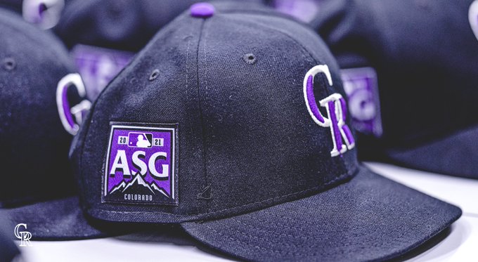
Yesterday evening, prior to their game, the Colorado Rockies unveiled their 2021 All-Star Game Logo on their scoreboard, which, as you can see above, features the unmistakable branding of a certain credit card company. Here’s another view:
Although not necessarily expected, the team also unveiled a different ASG logo as a patch on their caps and jerseys (and without the third party branding):
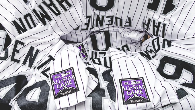
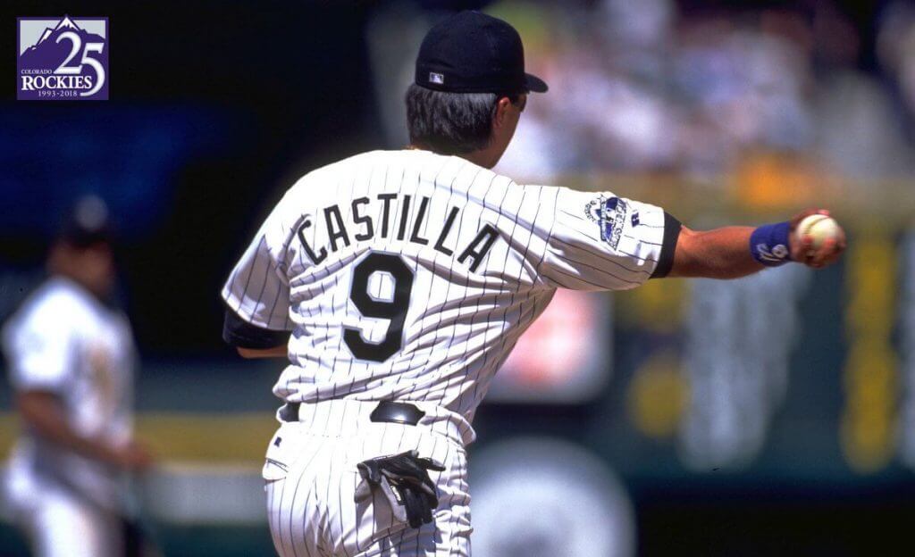
Here’s how it looks in action, as captured by Paul:
With All-Star Game having moved from Atlanta to Colorado, the Rockies are now (finally) wearing ASG patches on their sleeves and caps. (cc: @AnthonyEmerso14 @PhilHecken) pic.twitter.com/rwsF4caAg3
— Paul Lukas (@UniWatch) April 24, 2021
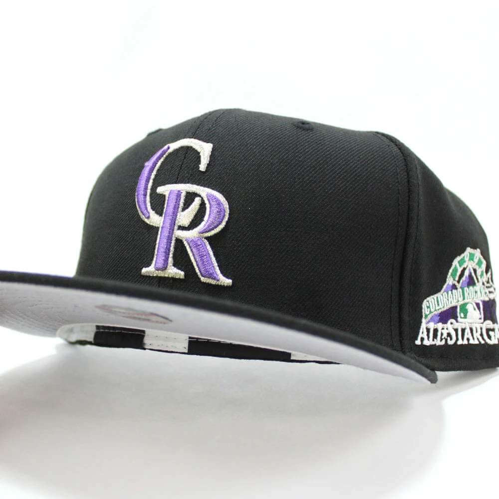
Given the short amount of time the Rockies had to prepare to design both logos, I like them, although the cap and jersey patch are rather stoic in comparison to the patch the team wore in 1998, which was the first (and only other) time the team has hosted the ASG:
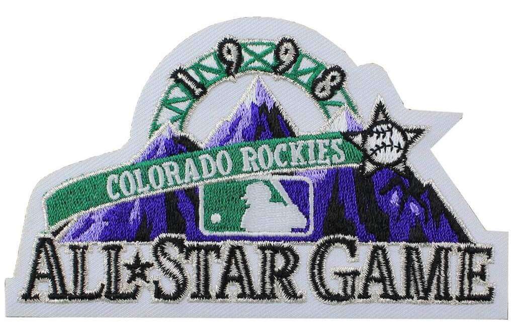
In 1998, the team wore that logo patch on their right sleeve, but not on the cap (as has been a more recent phenomenon)…
… although I have seen caps with the logo added.
One thing we’re still not sure about is what the BP jerseys will look like — as you know, teams wear their regular uniforms in-game, and in 2019, participants in the HR derby also wore their regular unis — although special jerseys (more like sleeveless vests) were provided for other activities. Will there be “Rockie-centric” jerseys produced (in time)? Will players wear whatever ASG jerseys had been planned for Atlanta? (A similar situation presented itself this past year, when the NBA All-Star Game was moved from Indianapolis to, somewhat ironically, Atlanta; for that game, teams wore Pacers-themed jerseys for the game itself.)
Here’s what the 1998 ASG jerseys looked like:
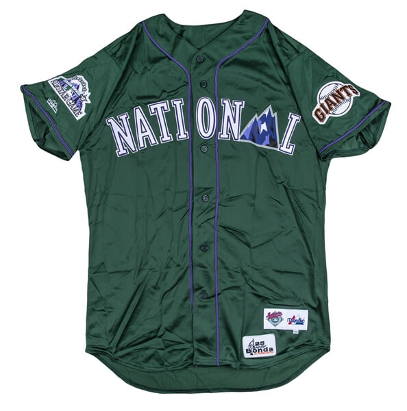
Obviously we can wait to see what MLB comes up with for the BP jerseys (because you know they’ll have them). One um, interesting suggestion came from Tim Kelly, who thought the ASG jerseys might be based on the 1999 TATC unis the Rockies wore. I’m not sure we’re ready for a reappearance of those, but for an ASG one-off, that won’t be worn during the actual game anyway, I might be persuaded…
With the All-Star Game in Colorado,it would be so cool if the All-Star Game jerseys paid homage to these classics. @PhilHecken @UniWatch pic.twitter.com/oiVLIDrMZl
— Tim Kelly (@TimKellySports) April 24, 2021
Your thoughts?

Guess The Game…
from the scoreboard
Today’s scoreboard comes from Jimmer Vilk.
The premise of the game (GTGFTS) is simple: I’ll post a scoreboard and you guys simply identify the game depicted. In the past, I don’t know if I’ve ever completely stumped you (some are easier than others).
Here’s the Scoreboard. In the comments below, try to identify the game (date & location, as well as final score). If anything noteworthy occurred during the game, please add that in (and if you were AT the game, well bonus points for you!):
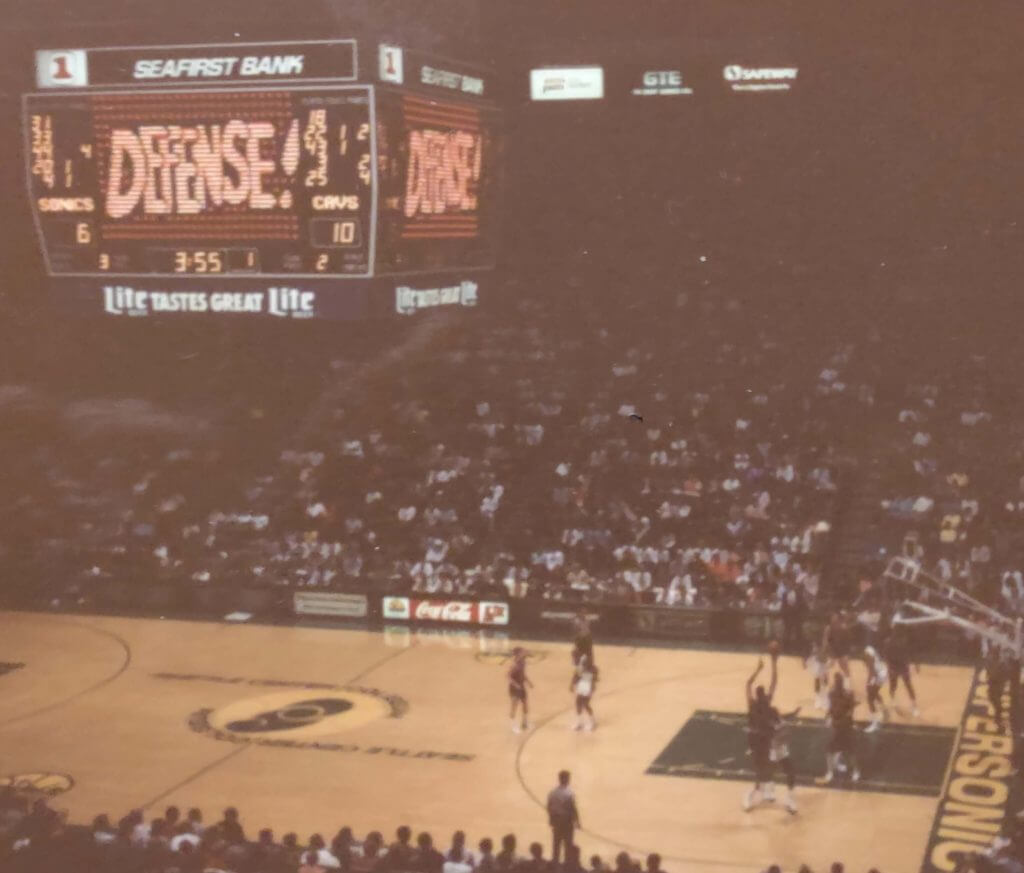
Please continue sending these in! You’re welcome to send me any scoreboard photos (with answers please), and I’ll keep running them.
The Ticker
By Anthony Emerson

Baseball News: Cal Ripken ranked his favorite MLB uniforms on his Twitter account (from multiple readers). … Chris Rocco came across some 1967 footage of the Kansas City Athletics players wearing white caps. “We all know that the coaches have worn them for years, but I had never seen any pictures or videos that showed the players donning them,” writes Chris. The caps are not featured on Marc Okkonen’s Dressed to the Nines Hall of Fame exhibit. Anyone have any more info? … Speaking of A’s lids, their base coaches last night wore kelly green helmets, instead of the usual darker green (from Richard Paloma). … MLB.com has an article on the history of the Astros’ Tequila Sunrise jerseys (from multiple readers). … The Astros have announced that rookie P Kent Emanuel will wear No. 0 (from Jared Colville and Ignacio Salazar). … The Mets and Nats both wore 42 last night to celebrate Jackie Robinson Day over a week late. This is because the Mets’ original Jackie Robinson Day game was rained out (from multiple readers).

NFL News: As part of the new NFL rules around uni numbers, players who wish to change their numbers will be required to buy-out existing inventory of their jerseys at full retail price (thanks, Phil). … Also from Phil: Pats coach Bill Belichick agrees with his former QB about the new uniform number rules.

Hockey News: The Lightning have revealed their Stanley Cup ring design (from Wade Heidt). … A Seattle punk rock bar, the Kraken Lounge, is suing the Kraken hockey team for $3.5 million alleging copyright infringement (from @MyBees). … Red Wings G Jonathan Bernier will wear a mask designed by a five-year-old (thanks, Phil).

Soccer News: Yesterday marked the 100th anniversary of Tottenham Hotspur first wearing a cockerel on their shirts. The club posted an article about it, and Tweeted a history of the symbol (from our own Jamie Rathjen). … USL Championship side Tampa Bay Rowdies have unveiled their three new kits and a new crest yesterday (from Kody Allenson). … The following are all from Kary Klismet: New away kits for the Colorado Springs of the USL Championship. … AC Milan, Juventus and Bayern Munich have all had their home kits leaked by FootyHeadlines. … Liga MX side Chivas has unveiled a 115th anniversary throwback kit.

Grab Bag: Ohio State and Marc Jacobs are fighting over who legally owns the trademark to the word “the”.
Uni Tweet of the Day
Family Day at Municipal Stadium. July 4, 1971. @Indians equipment Manager Cy Buynak pleads a call with guest umpire Washington Senators First Basemen Frank Howard during a softball game. Source: @Cleveland_PL in Memories of a Lifetime . @GCLESPORTSHOF pic.twitter.com/CBbQpOYHHt
— John Skrtic (@SkrticX) April 24, 2021
And finally… that will do it for this fine last Saturday in April. Big thanks (again) to Jonny Rockford for sharing his NHL concepts.
Everyone stay safe and healthy, and I’ll catch you guys tomorrow.
Peace,
PH
-Like the baseball All-Star Game logo. Neat design with the mountains at the bottom forming the edge of the star.
-Thumbs down to the new white kit for the Tampa Bay Rowdies. It is so plain. No stripes?
-Jonny, I like the Stick-in-Rink logo on the white jersey for your Vancouver Canucks concept. If the Canucks ever decided to put the modern Stick-in-Rink (version 3.0) on their regular jerseys for the main crest, your version works perfectly for the white jersey. A modern take on the logo when it has the white stick on the blue background.
I agree the white Canucks concept with that logo treatment looks really good.
GTGFTS: 3/6/90 – SuperSonics 95, Cavaliers 90.
Dang, you’re good.
As far as I know, there was one and only one clue to give this away. How did you come across the correct game?
Interesting. Did the floor design change with the rebrand in the mid-90’s? That floor looks like the original from 1969, I initially thought this was their first matchup in their inaugural seasons.
The floor design unfortunately changed with the unfortunate rebrand. They went with a big TV-centric Sonics logo vs. the symmetrical good-for-both-sides-of-the-arena logo you see here.
And since my first reply is still in limbo, Burgh Fan is correct. Curious as to how he came about the answer because I thought there was only one way to solve this.
Patches on the shoulder AND head might not get the point across. Why not pants, socks and shoes, MLB?
Agreed. What is with MLB’s obsession with patches??? It’s absolutely ridiculous.
Why not pants, socks and shoes, MLB?
Because those aren’t merchandized, duh.
I saw the Toronto concept and immediately thought it was maple syrup which I thought was a fun way to go about it.
Wonder how often the Kansas City A’s players wore white caps in games in 1967. Would be an interesting research project, and Paul broached the subject a decade ago about a game in which the white caps were worn against the Tigers:
link
The A’s 1968 Yearbook shows some photos of KC A’s players (from 1967?) wearing white caps
link
The corporate branding added to the Rockies’ ASG logo looks like a pair of truck nuts. I like the rest of the design, though.
The Tampa Bay Rowdies’ logo explainer mentions that the two stars atop the crest are for the club’s two “NASAL SOCCER BOWL CHAMPIONSHIPS”:
link
I didn’t realize nasal soccer was a thing, but it sounds painful!
“Yeah, and I think most Ranger fans may find them horrendous.” You are correct, sir.
I love the Ranger concept.. I would have the White uniforms with white pants and the Red uniforms with blue pants
I’ve always liked the way the Rangers’ colors are the same as the Habs’, flip-flopped. Swapping them provides a nice change-up of their current appearance. Maybe some red helmets, too.
With the was the golden knights in the NHL and the sliver knights in the AHL have there helmets I would love to see the Rangers have there helmets metallic blue or metallic red or a Tutone
Not a single one of these concepts would be an upgrade, and the designer doesn’t even show socks, pants or helmets. Why are they worthy of a lede item?
The template doesn’t have socks or pants or helmets otherwise I would have included them.
Also they are not exactly supposed to be an “upgrade” over their current uniforms, just a fun alternate project while I was in quarantine. Thank you for your constructive criticism.
I think the Nashville, Pittsburgh, and NY Rangers concepts look good. They look better than quite a few authentic 3rd jerseys.
Jonny, you shouldn’t have felt bound to use the inferior branding of the current Winnipeg Jets. The WHA iconography for the Prairie City team is better in every way.
The story involving the trademark infringement lawsuit in Seattle over the Kracken name is an interesting one. There are actually two points of contention: a “dive bar” called the Kracken Bar & Lounge filed the suit after learning that the hockey club plans to open a restaurant called the Kracken Bar & Grill. They also want the hockey team to stop using the name altogether.
Seems to me they have a case about the name of the restaurant, but not really one regarding the name of the NHL team.
•Kraken•
That, too. ;-)
Johnny has some fun designs among these sweaters. In particular, I like the Predators, Canucks, and Blues concepts.
I like almost everything about the Islanders’ concept except for the black. I like the way the simplified logo works as the chest insignia. I’m sure Isles fans would consider it blasphemous, but I think it works better than their current logo, which I find too busy and muddled. As for the Rangers? Too much red for my taste, but it might work by swapping the red and blue elements to make the blue more prominent.
The world is ready for a blue Rangers’ sweater with a red shoulder yoke; it would compliment the team’s blue helmets better.
The part of the Isles’ iconography most disposable is the team name written in the shape of a smile on the rondel. It hurts me to say this because I love vertically-arched lettering. But you’d be surprised how recognizable the Islanders’ crest is with only the circle, stick and puck! Something to keep the number company on the sleeves.
The Flyers logo isn’t a “feather” – it’s just a P that’s moving quickly. I don’t know what the word is called for lines in design that show speed, but that’s what is behind the P.
“Motion Lines”? plus he’s not using the current Flyers crest mark.
The Predators uni reminds me of the 1969 Seattle Pilots. The yellow stripes look more seafaring than guitar strings. I love Lady Liberty on the Rangers unis but would like to see it in patina color. Am I the only one who dislikes the stick-in-rink logo for Vancouver? I think it looks too generic. Just use the skating Johnny Canuck logo and be done with it.