By Phil Hecken
Follow @PhilHecken
Good Sunday Morning, Uni Watch land — as always I hope everyone is doing well and feeling better.
For today’s lede I have part one of a set of NHL alternate concepts from the pseudonymous Jonny Rockford (I have been receiving a lot of concepts from the readership lately — thanks!). Today we’ll look at the first half. Jonny did redesigns for all 31 teams, but we won’t be showing his concept for Chicago, as it is now Uni Watch policy not to run any concept uniforms featuring Native American iconography or logos. I asked Jonny to give us a brief introduction and inspiration for his intro and then we’ll look at the first 15 teams, listed alphabetically. For each team, Jonny has done both a light and dark concept. Unfortunately, he has only created jerseys (so no breezers, socks, helmets or gloves), but since many of them are similar in colors to what the teams currently wear, we can just imagine the jerseys swapped with one of their primaries. OK? OK.
And following Jonny’s concepts, the one and only Jimmer Vilk will be giving us a bit of show and tell for a collector’s item he won’t be donating to the annual (semi-annual) Vilkmas Raffle — it’s that good (either that or it simply means too much to him to part with). But first…
Heeeeeeerrrrrrreeeeeeeee’s Jonny…
NHL Jersey Redesigns
by Jonny Rockford
I am 27 Year Old Jonny Rockford, getting the name during my 5 seasons as the Multi-Media Assistant with the AHL’s Rockford IceHogs. I have always had a passion for uniform designs and am a proud Card Carrying Uni-Watch Member and Monthly Pin Collector. I started this project by designing the Montreal and Vegas jerseys for a contest by Post2Post Productions on YouTube. I could only enter one or the other unfortunately and chose Vegas, and I like to think I got 2nd Place although there were only honorable mentions and the winner. I also feel judging by the winner of the Montreal side of the contest I would have done well in that one but we’ll never know and that’s ok!
After designing those two I wanted to keep going, designed Chicago (my favorite team) and then another, and then another until I had a whole division. At some point I realized I wanted to keep going and have a Home & Away for each team and this is the result of almost an entire year of planning, executing, and finalizing 62 jersey ideas. If and when an updated SportsTemplates.com template is released with the full uniform I plan on coming back to these and create an entire identity.
Anaheim:
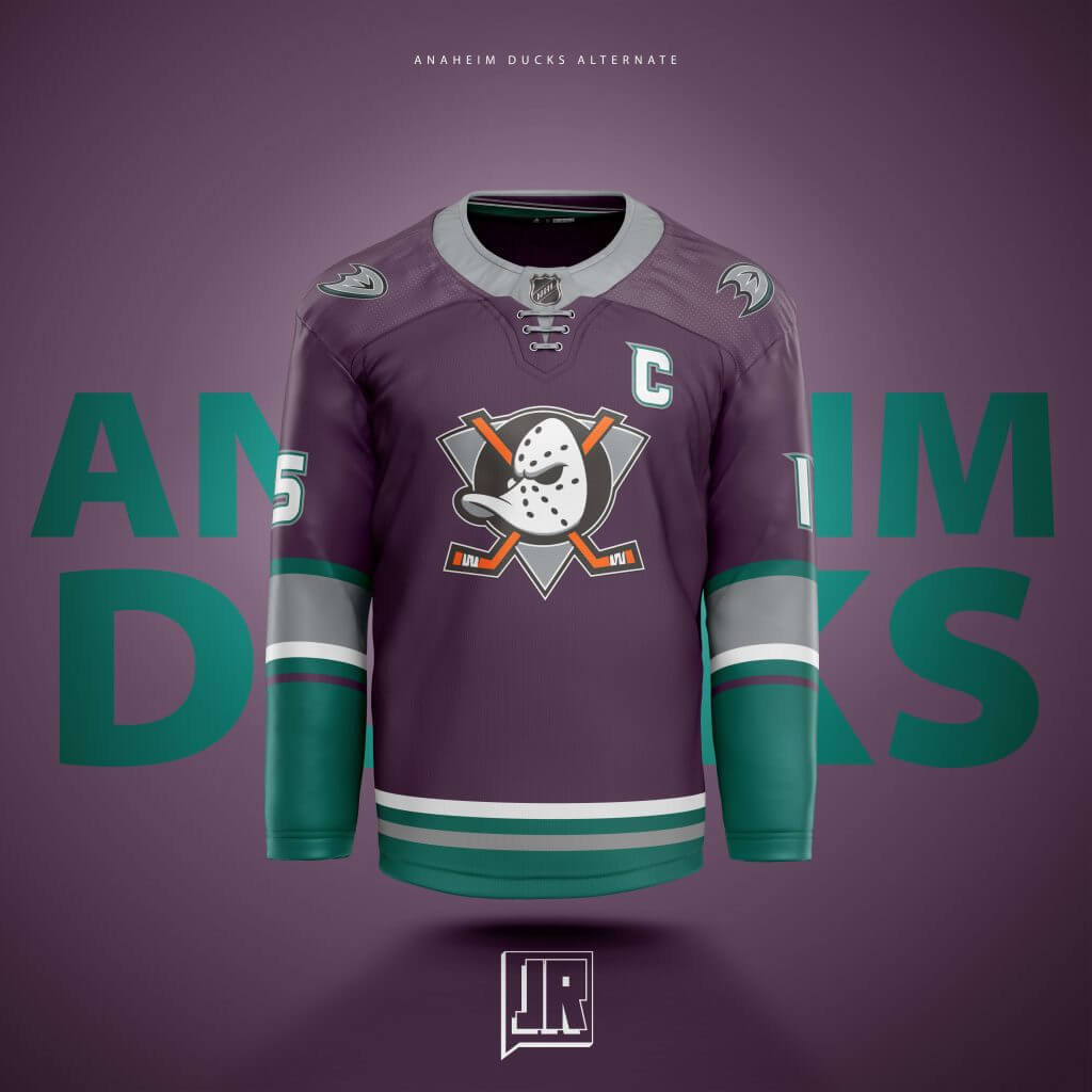
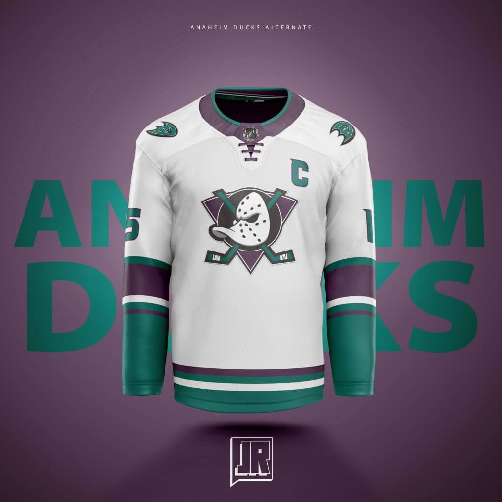
These were inspired by, in my opinion, the 2 best jerseys Anaheim has produced: Their current Orange Alternate, and their original identity jerseys. Using the Orange Alt as the base, I wanted to bring them back to their roots and put it in the Eggplant and Jade alot of NHL fans have been clamoring for the last few years.
Arizona:
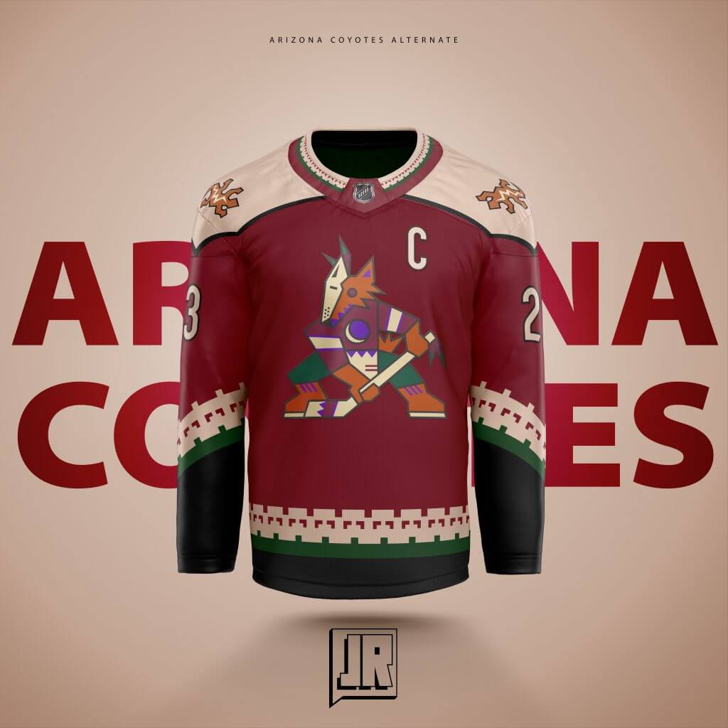
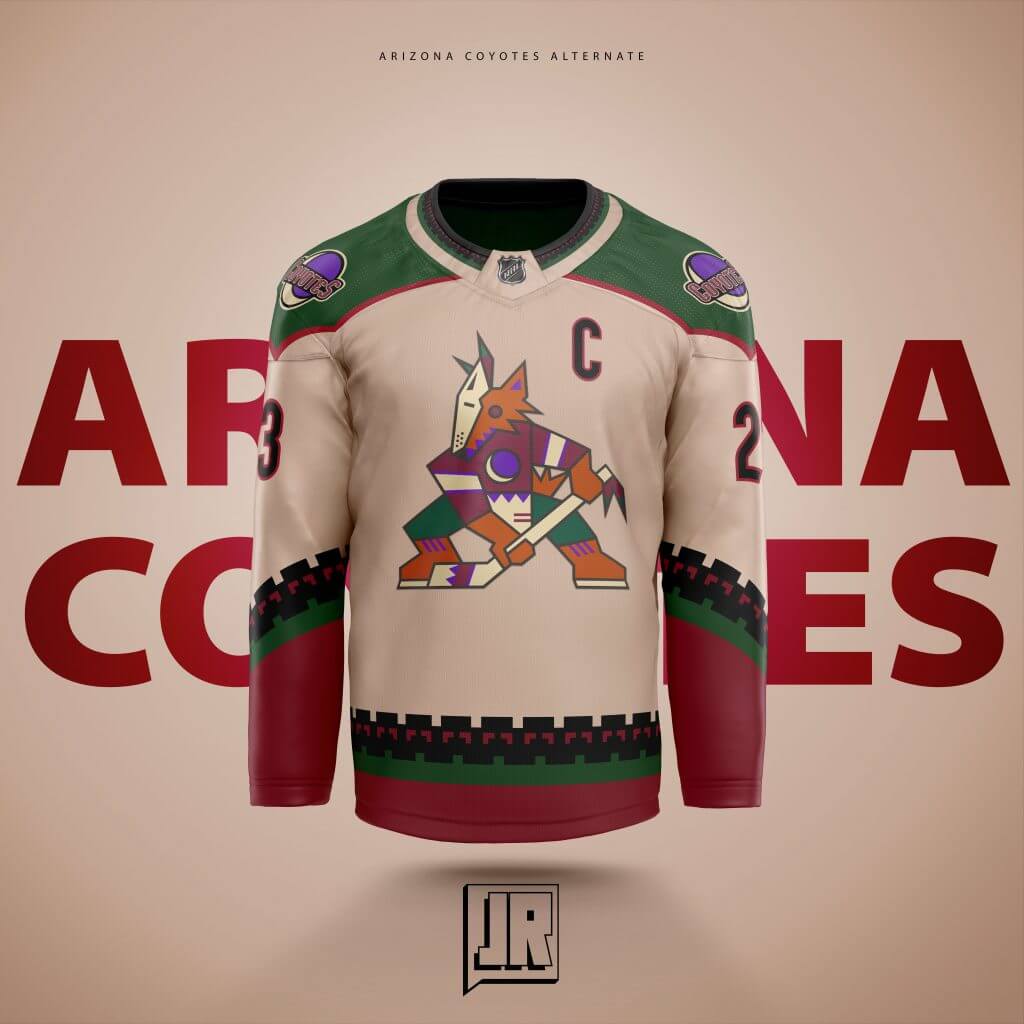
I created the “Sand” colored jersey last year as I am expecting the Kachina to make a full comeback in a few years for the Yotes, as they already made it their fulltime home uniform. So I reimagined what an away version would look like and thought the cream color on the black jersey would look better than white. The red version came about because I wanted to try and be at least a bit original with every uniform I’ve designed and thought, if they had a third and don’t keep the purple Reverse Retro, they could keep the red color but do it up Kachina Style.
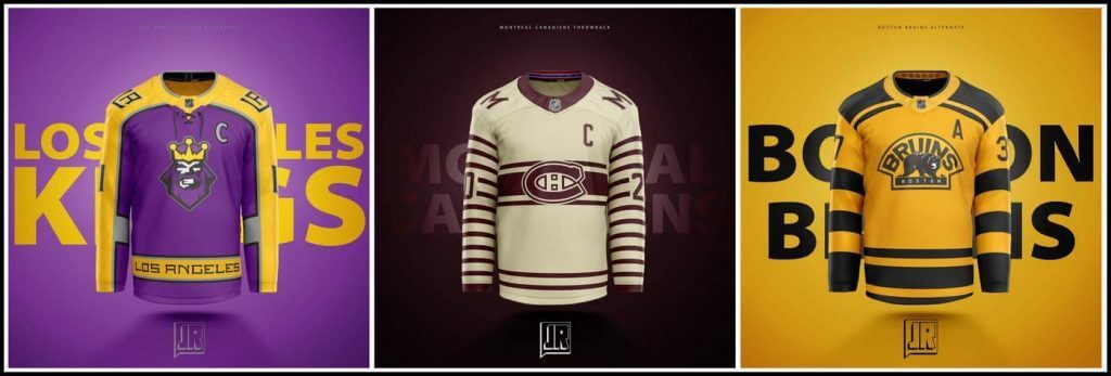
Boston:
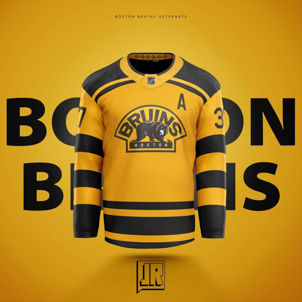
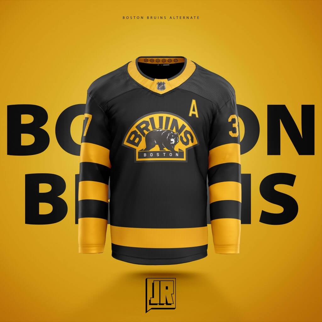
Their best uniform in my humble opinion was their Winter Classic from 2019 against my Blackhawks. I’m not a fan of Boston, far from it, but its a design so good I had to buy. So I thought, what if they had a black version? YES, they kinda did that with their Alts last season, but it didn’t seem enough like it, so I took a stab using their older 2nd logo. Added 6 spoked wheels with each of the years they won the Cup in the collar. The yellow came about because again, they already had the white one, and I know the Providence Bruins used to have yellow as their “light” jersey so I went with that.
Buffalo:
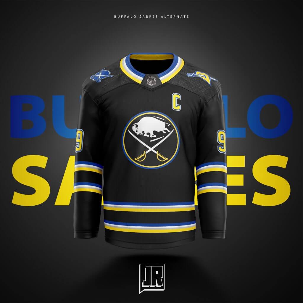
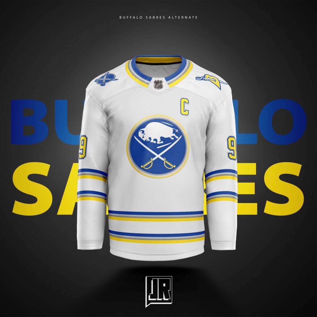
This one I struggled with for a LONG time. I initially went with a blue and yellow version of their black and red jersey (they took that idea themselves with the Reverse Retro) but I just didn’t like the way it looked. So I started from scratch, went back to black but kept the blue and yellow. Re-colored the current logo black, and went with a “sabre” stripe design for the waist and arms and I think it came out looking sharp. The Black logo however did not translate well to the white tho so went back to the blue.
Calgary:
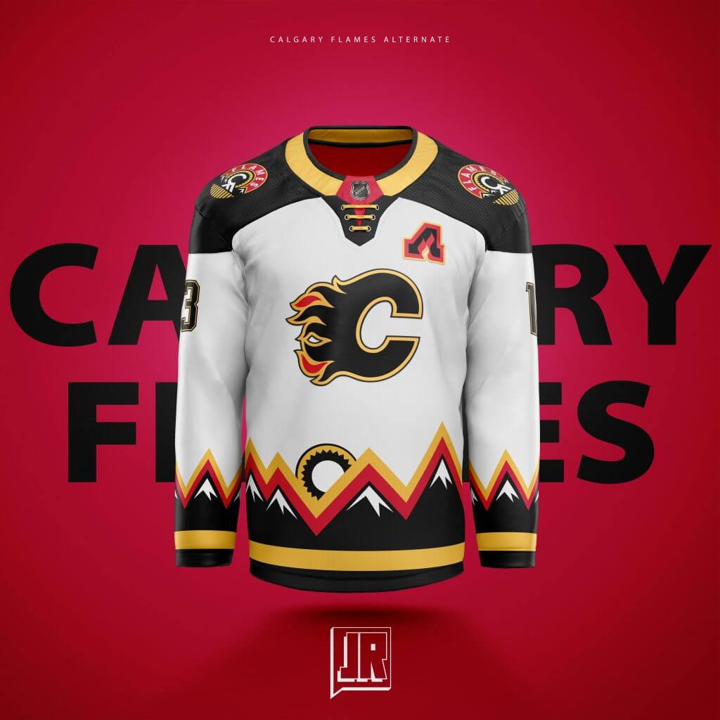
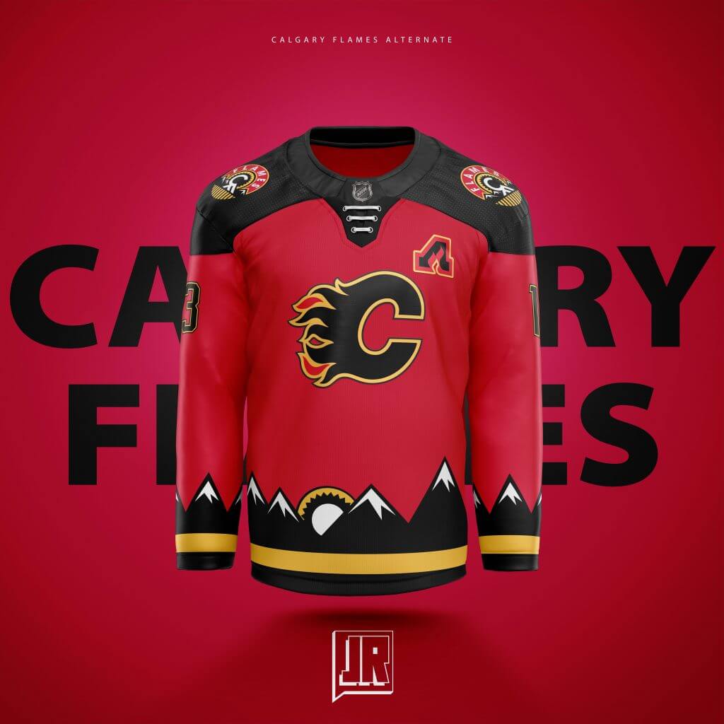
Based on an older logo I featured on the Shoulders, I wanted to look into that logo and see an entire scene. I re-created the mountains, edited the CF Logo to look more like a sun setting behind, merged the vertical lines into one long horizontal one, and I think it really pops. Alot seem to love this one for its boldness, but I’m sure it’ll be very polarizing on here. I added the color stripes above the mountains on the white to hopefully create more of a sunset feel.
Carolina:
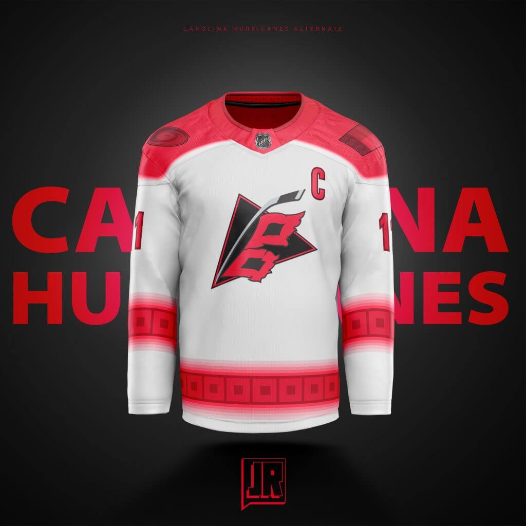
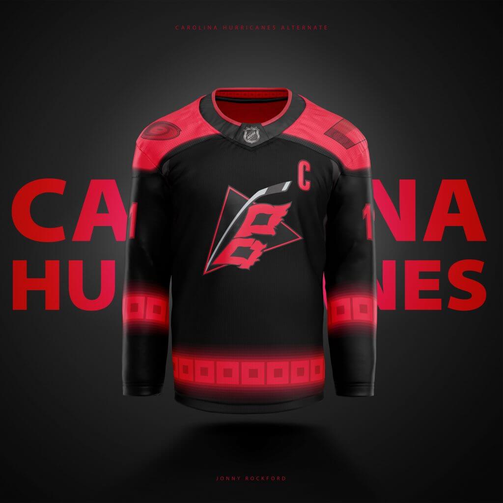
I originally had a dark grey design but it seemed off and basic. I started playing around with it and, perhaps I watched a bit too much Stranger Things last Fall, but went with this almost 80’s neon/haze type look. I tried it out and just liked the way it looked when compared to the older one I had. Perhaps I’ll go back to the drawing board again on this one. The red shoulders came about because I’m not the biggest fan of the grey shoulders on their current black unis and wanted to see how the red looked. I think its an improvement.
Colorado:
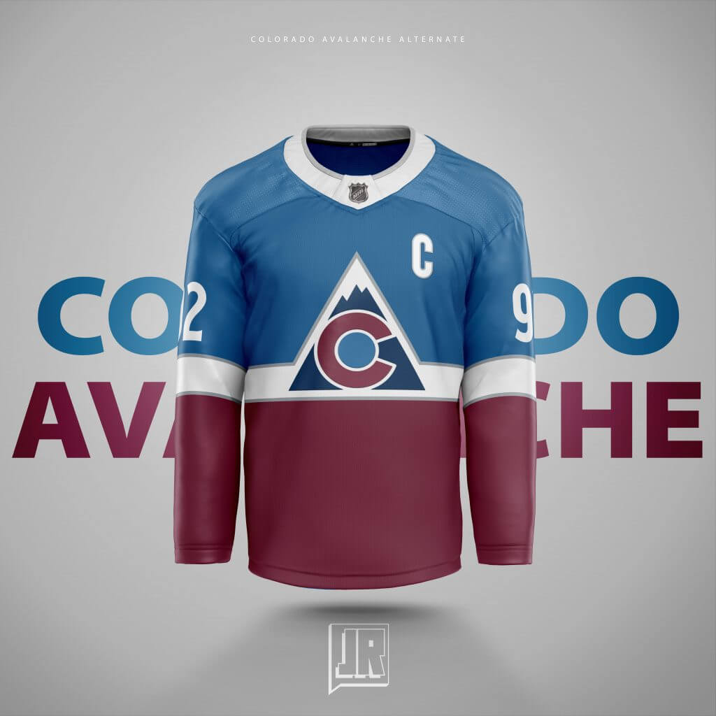
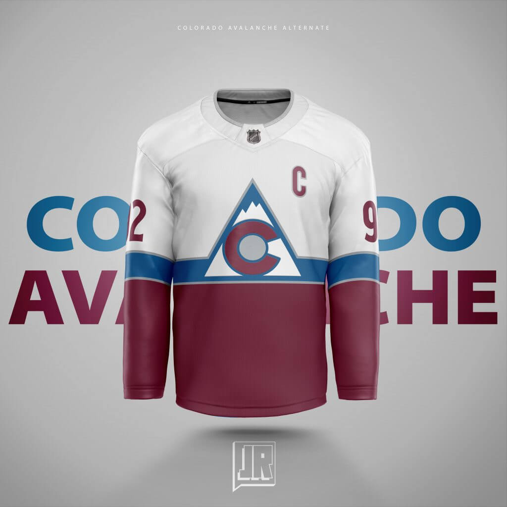
Another mix of their two best jersey designs, their Stadium Series from 2019 and their current alternate. The way they did the “patch” (if you can call it that) left a bad taste in my mouth despite being a pretty nice looking jersey as far as Stadium Series jerseys are concerned… So I really just wanted to fix that by adding their Alternate logo to it. Also added silver like they have on their current sets to bring it all together. I debated on “cheaping out” and just making the torso all white with the normal logo and keeping the sleeves but I wondered what re-coloring the logo would look like and I wound up just keeping it.
Columbus:
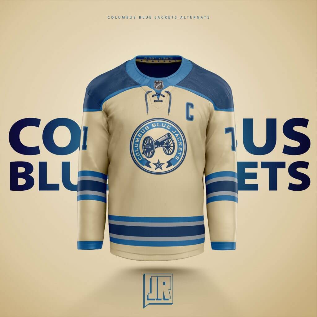
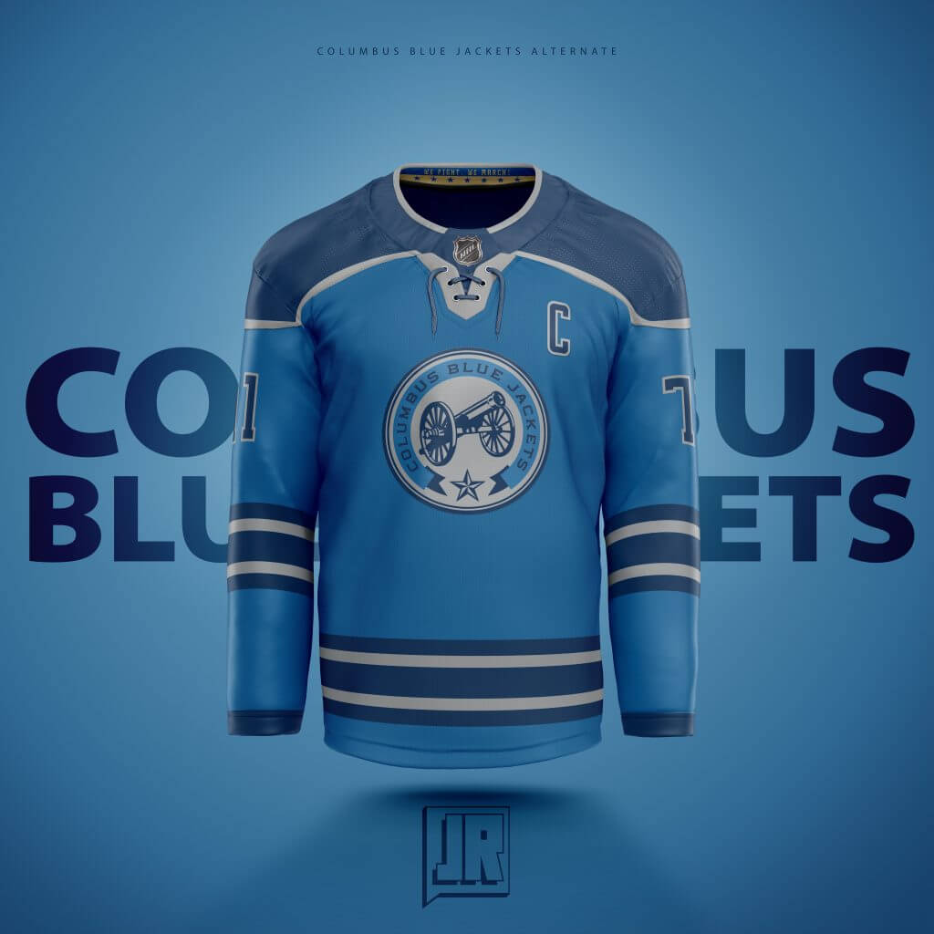
Another one where I designed the “Away” sweater first. Their current alternate is one of the nicest 3rds in the league and wanted to see what a road version would look like. Essentially just a color swap. Therefore the “Home” version I tried building from the ground up. In order to make it more unique I took the light blue from the striping, thought removing the cream totally would look more unique and just doubled up on the navy. Since I took out the off-white, I figured a logo re-coloring would look the best.
Dallas:
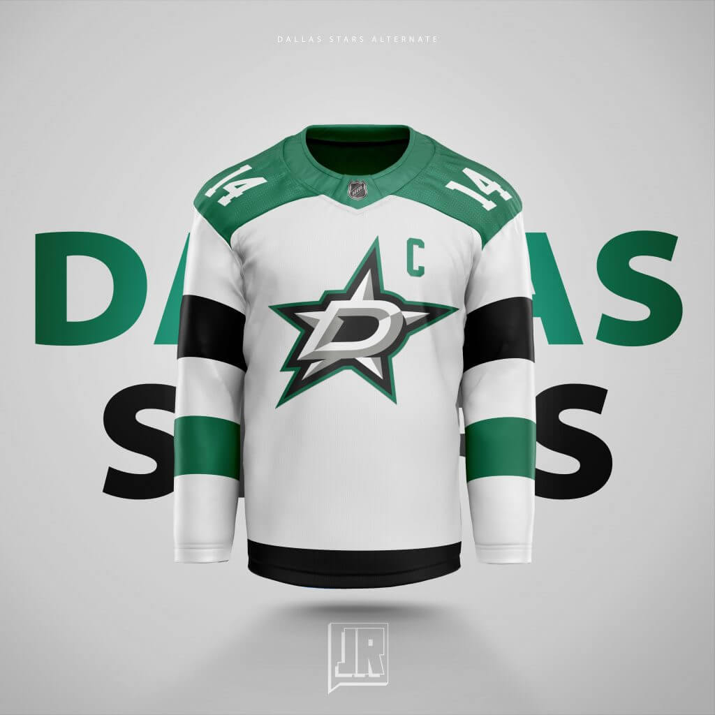
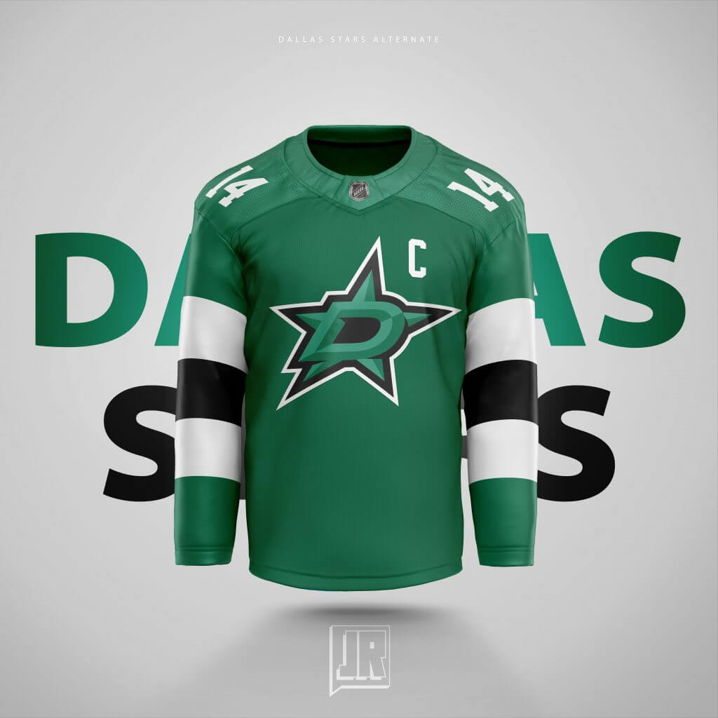
Again, another I designed the “Road” first. When Dallas first came out with the “Victory Green” identity they showcase now, I felt they just took the Blackhawks St. Patrick’s Day green jerseys and popped their new logo on there… So, if they’re going to steal the Blackhawks jerseys, might as well keep it going. I retooled the Hawks 2016 Stadium Series for Dallas since “Everything is Bigger in Texas”. Added the recolored logo for the “Home” jersey to at least show SOME originality, haha.
Detroit:
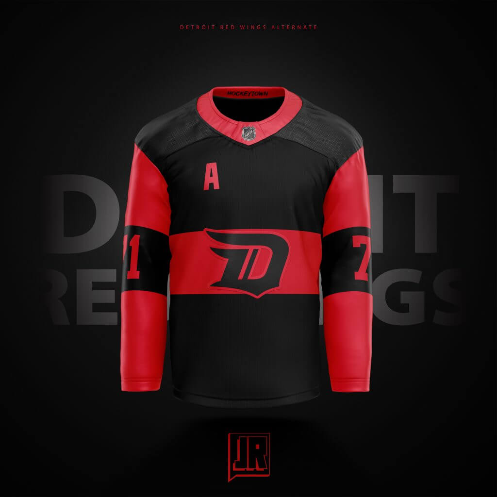
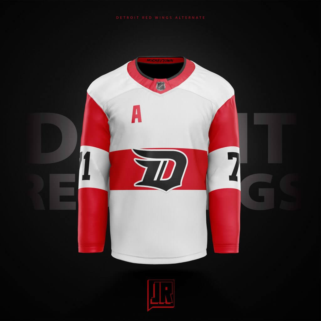
Another I struggled with for a while. How do you create an original design for a team that just doesn’t venture out from the norm too often? You add a new color, I guess. BFBS because they only have 2 colors in their scheme. We’ve seen the cream done, so I went black. Same idea with the red sleeves as their white jerseys, but went with the ’09 Winter Classic stripes, and the old Stadium Series logo from 2016. I’m not the biggest fan of black and white unis so I know I wanted color on the Away jersey, so I just kinda made the numbers and logo Black instead. I think its not too far outside the realm of possibility to see something like this on the ice at some point.
Edmonton:
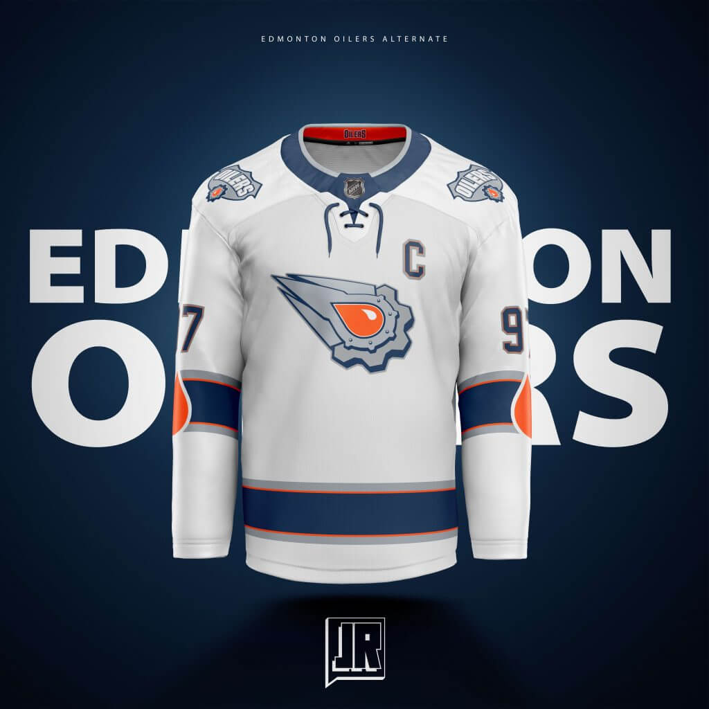
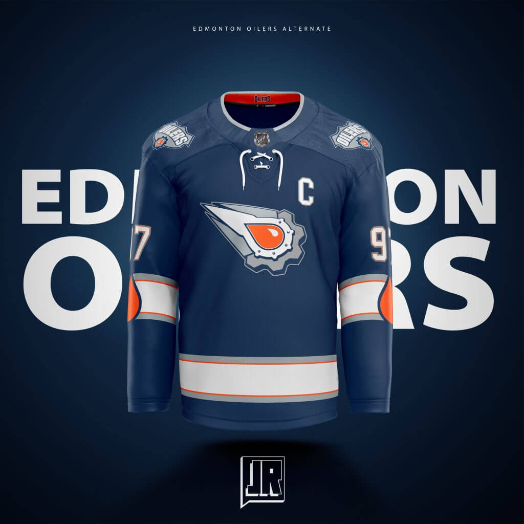
Time for the Comic Book logo to make a comeback, this time embracing the orange. Not too different from the original design, just slightly retooled logo, added the smallest bit of oranges to the striping pattern, and to add the Jonny Rockford flair, adding the oil drop from their normal logo to the sleeve stripes.
Florida:
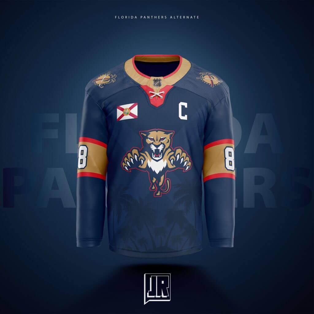
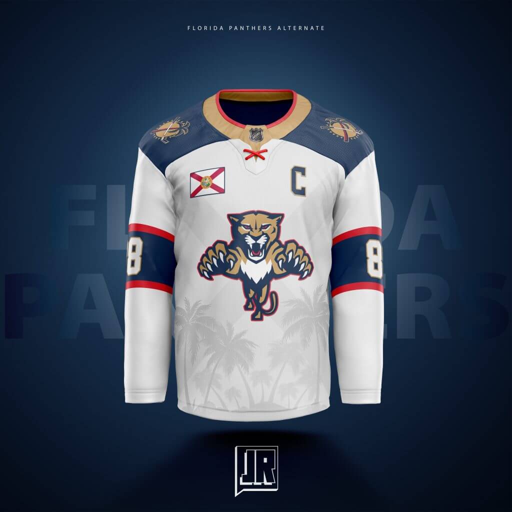
In my testing, this one seems to be a favorite with everyone. Subtle sublimated palm trees in the torso, nice thick gold stripes on the sleeves, the X laces, the Flag patch… This came together so well I’m incredibly happy with the look of both of these. The sublimation my be more subtle on the navy, but the white one is clean. I had a thought in my head that the more they played (and the more the players sweat, or have wet ice on them, the palm trees get more and more visible. I don’t know if that’s possible but it would be cool.)
Los Angeles:
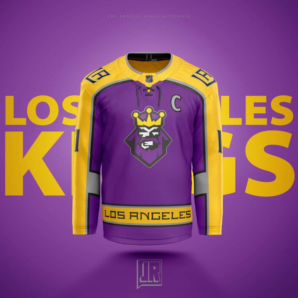
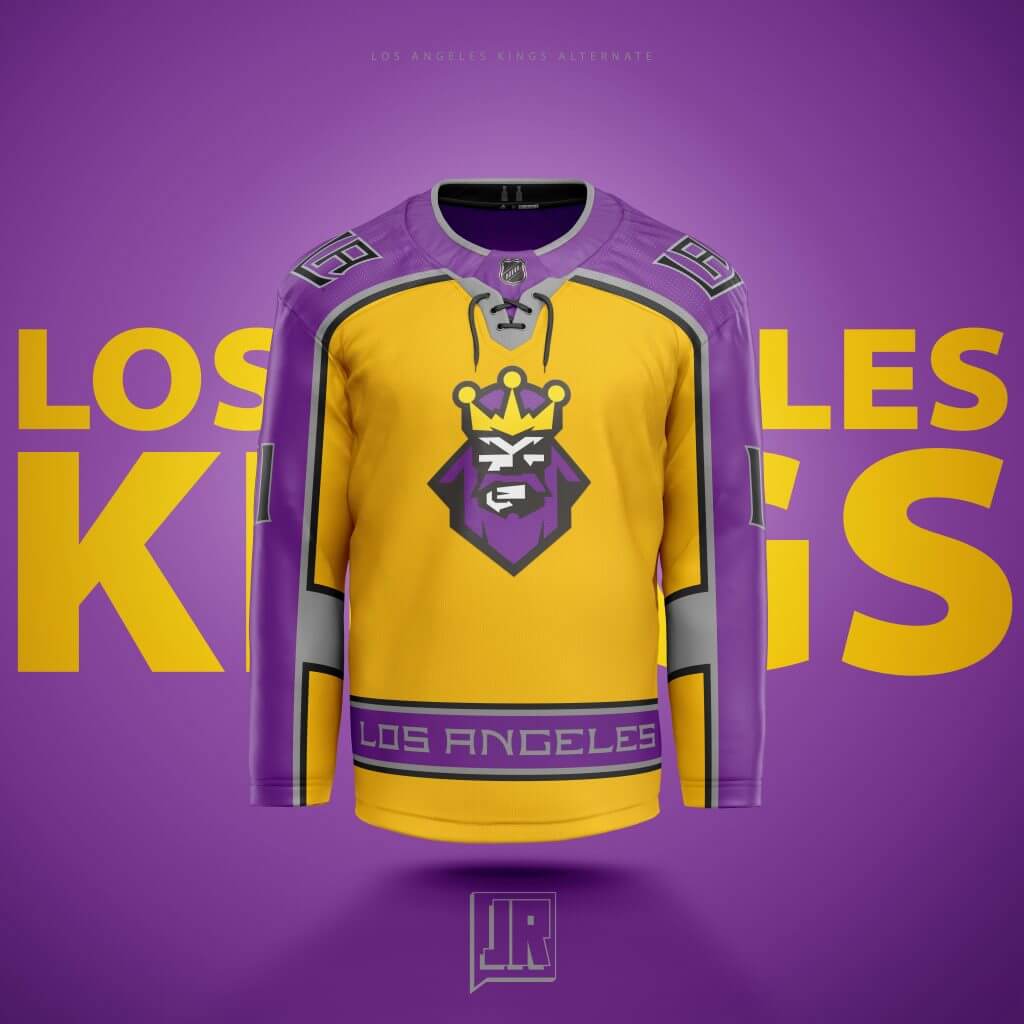
My goal was the combine almost every era of the LA Kings (who I hate but acknowledge have my favorite jersey history). The colors of Forum Blue and Merigold are obvious nods the original scheme, the stripe at the bottom with the “Los Angeles” text is a nod to their group of jerseys right before their current set, the silver and black showcase their current era… the inside horizontal sleeve stripes throwback to the Gretzky Era stripes, and of course… THE BURGER KING. Its a bit busy sure, but I feel I included as many elements from as many eras as possible without getting too overwhelmed.
Minnesota:
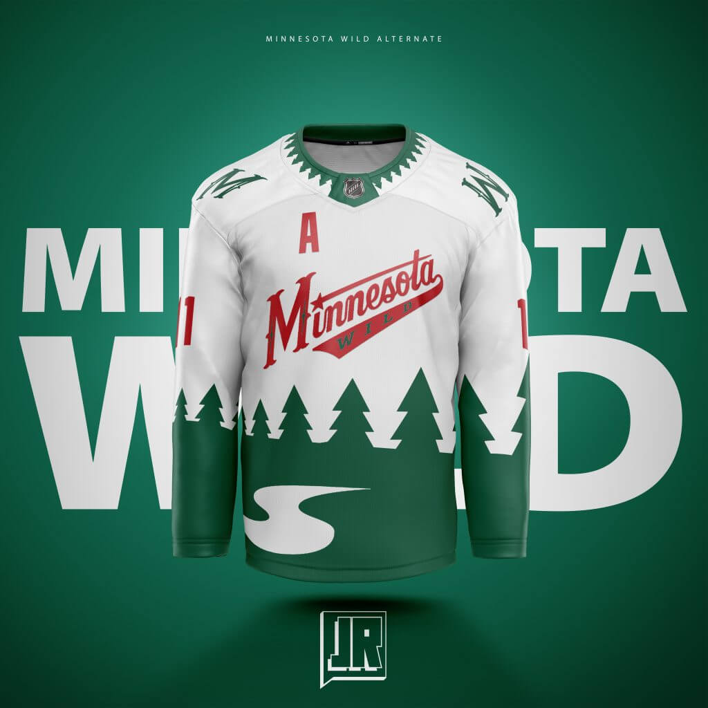
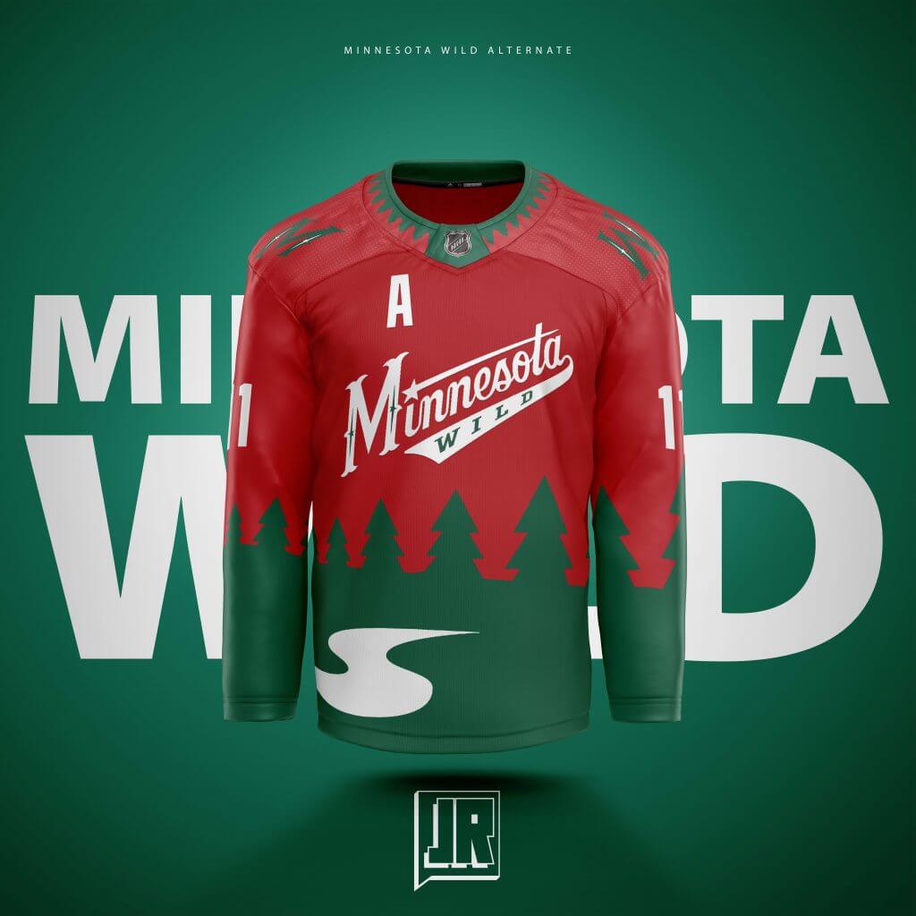
Remember what I said for Calgary and trying to expand a logo and spread it out over a jersey? This is how this started. I took their iconic current logo, trees, river, and even the sun-eye and all, and stretched it out over the jersey. After taking suggestions from the Sportslogos.net forums, decided to replace the top part of the logo with the old script logo and recolor it. That was absolutely the right call, so thank you to GriffinM6 over there for that suggestion!
Montreal:
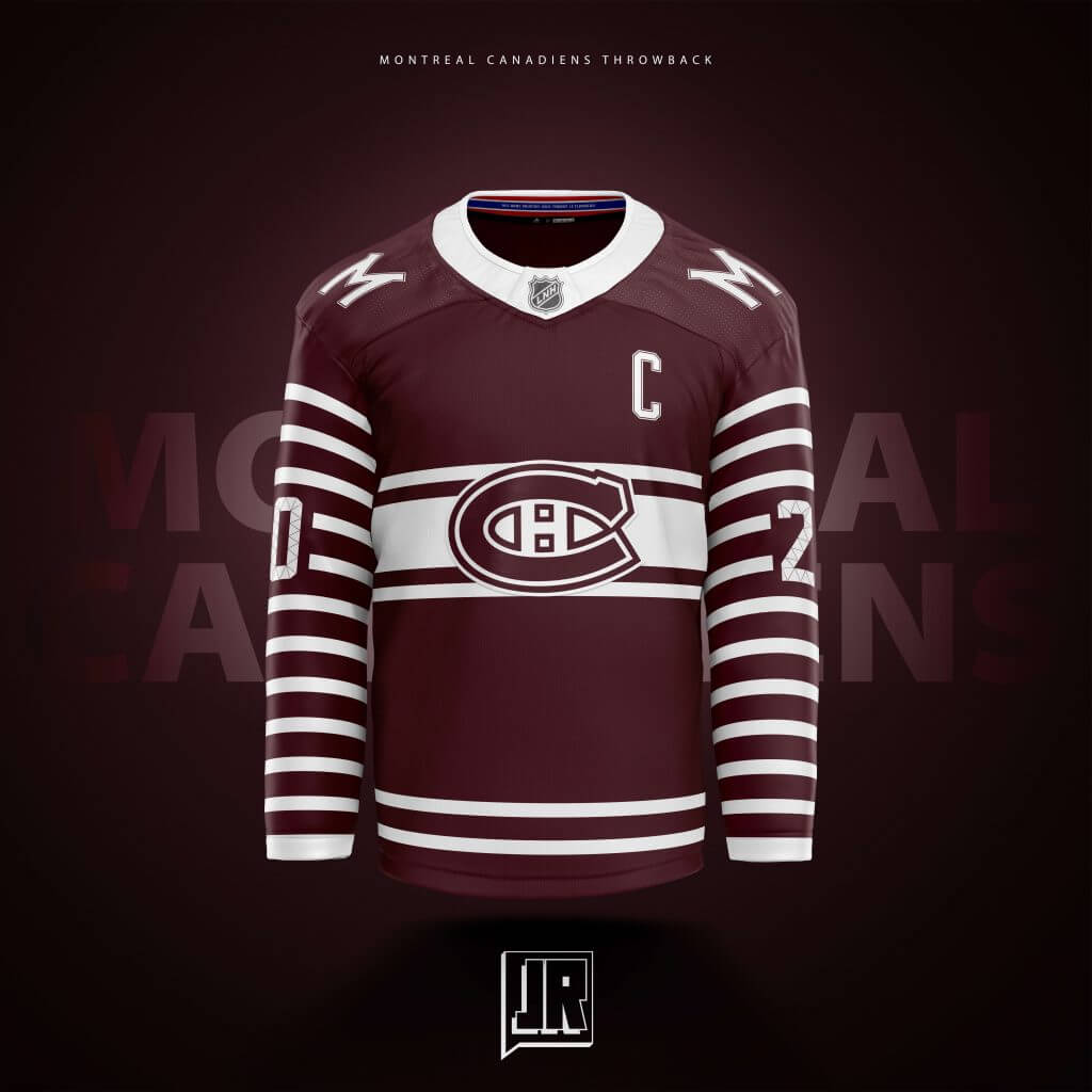
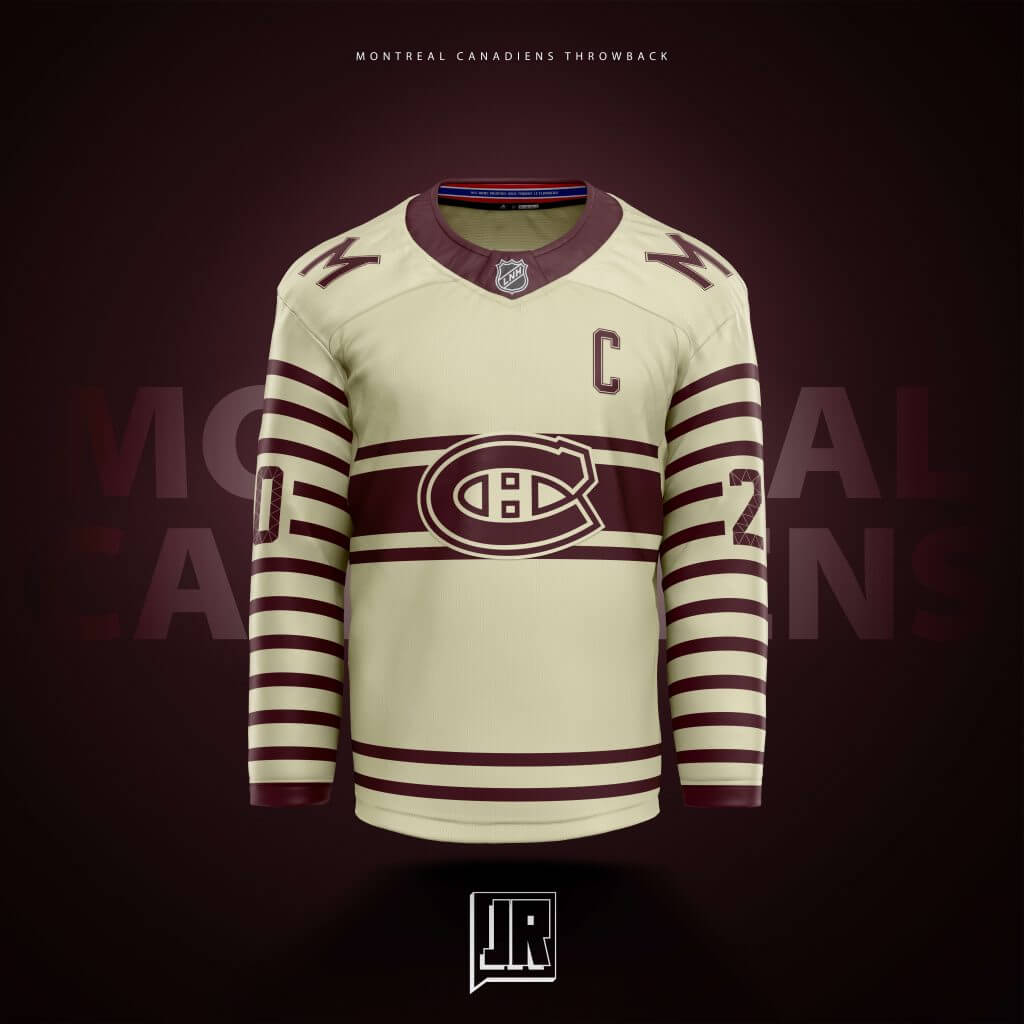
Here is what I feel could be my favorite design… My first in this series. A throwback to the Montreal Maroons. Obviously the color and the shoulder logos give that away. My proudest item of this jersey is the symbolism of the stripes. There are 12 white stripes on each sleeve representing the 24 Stanley Cups won by the Canadiens, the 2 thin at the bottom representing the 2 Cups won by the Maroons way back when… The old Maroons sweater stripes sit behind the main logo in true Canadiens fashion, and the inside collar holds their current jersey design and includes their motto “Nos bras meurtris vous tendent le flambeau”. I’m no french speaker but I think I got that right.
Thanks, Jonny! We’ll take a look at the remaining half of your concepts in a little while. Readers? What do you think?

Three Rivers, One Old Book
By Jimmer Vilk
Anything is possible, everyone has his price and I may not be on speaking terms with Manfred League Baseball these days, but it’s a *really* safe bet that you’ll never see today’s featured item on a Vilkmas list or on eBay. Since it was published 50 years ago, instead of you waiting to pry it from my cold dead fingers, I thought it would be a good time to share with you my (revised 1971 edition) Three Rivers Stadium souvenir book.
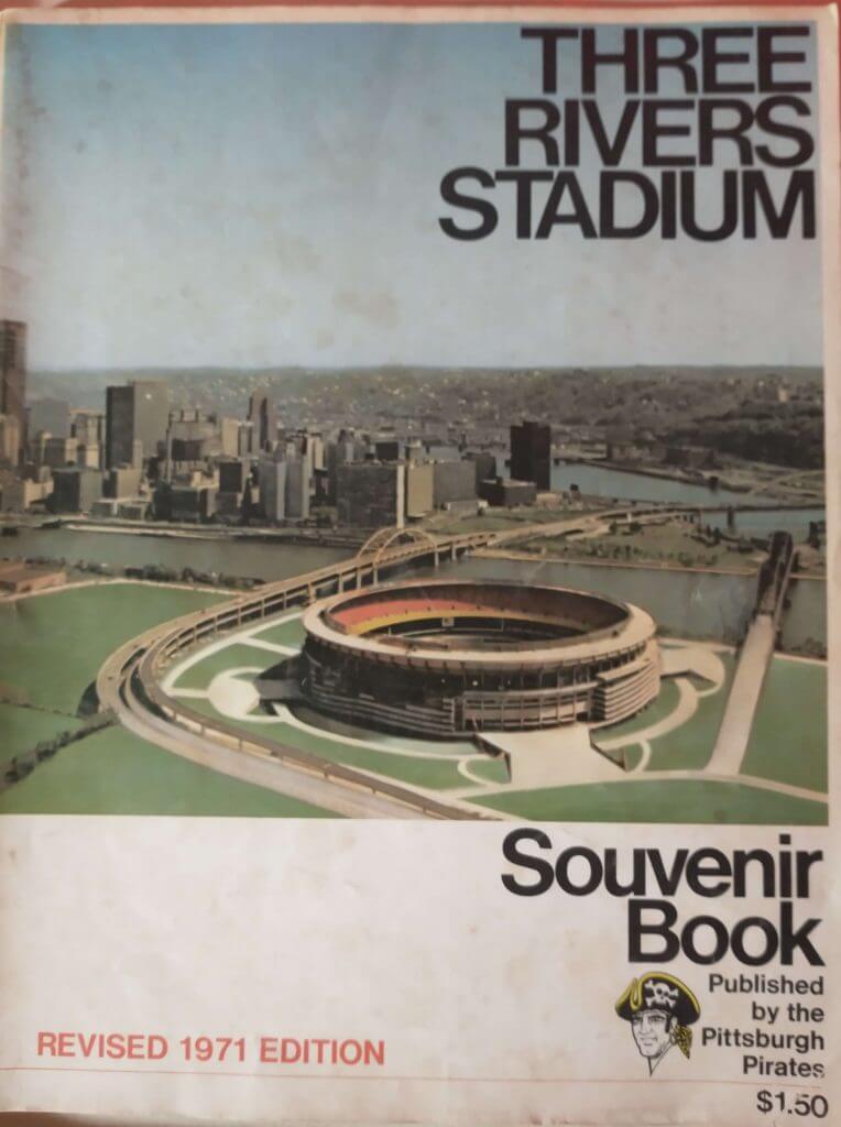
1971 was the first full year of this glorious so much better-than-the-Vet cookie-cutter stadium. So the Pirates organization thought it was good to keep celebrating the opening of this brand new multipurpose wonder. I wonder how much the original edition went for…even then, $1.50 for the ’71 edition seems like a real deal!
It doesn’t take long to find something noteworthy…
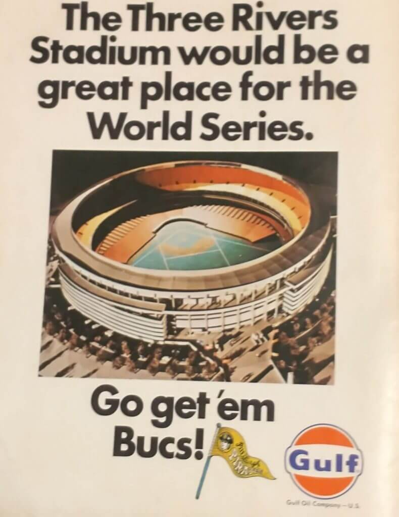
Open the book and the inside cover says, “The Three Rivers Stadium”?? I don’t think I’ve ever heard it referred to in that way since then.
Inside are lots of articles about the designing of the stadium, the seating, the scoreboard, the concessions, the lighting, etc., etc…but we’re here for the aesthetics, right? Let’s continue with just how many National League (the “senior circuit,” remember?) fields went along with the space-age multipurpose look.
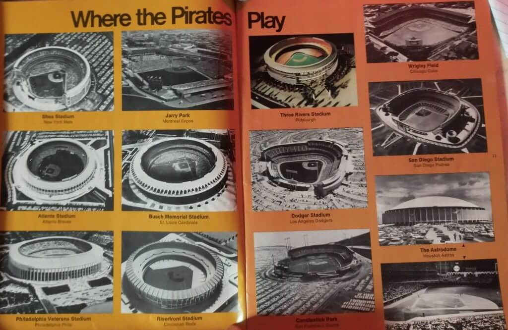
Seeing this spread makes me even more amazed that Wrigley Field (and heck, even Dodger Stadium) is still hanging in there.
I grew up in the era of artificial turf, so it’s not alien to me.
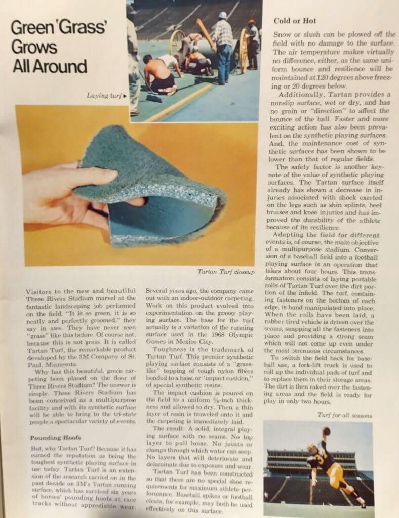
That being said, Tartan Turf does not look soft, comfortable or safe to me. looks like a combo of gravel and my parents’ living room carpet!
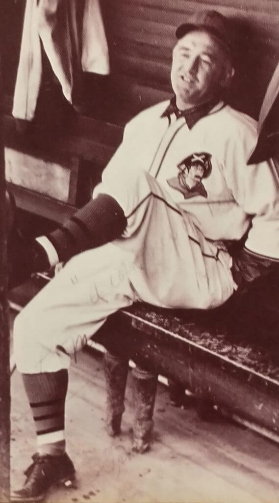
Since the Pirates’ best ever uni …
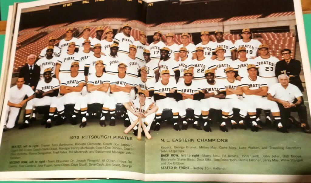
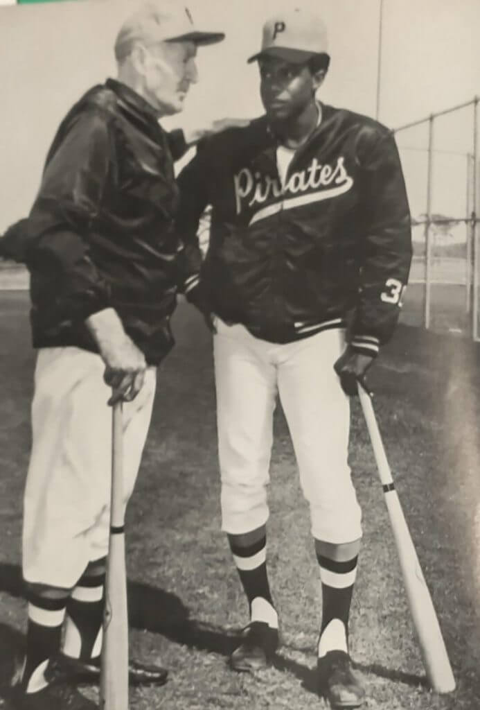
…wasn’t introduced until halfway through the 1970 season, it’s not surprising that this book is heavy on the ’60s vested look. It is surprising though, to see very-early-20th-century Pirates legend Pie Traynor in one of the few photos with the gold-capped polyester look.
Love those jackets!
This photo of the ’60s vested look in particular intrigues me.
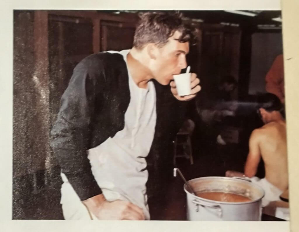
Get a load of Richie Hebner sipping from the Spring Training communal bucket of soup. I didn’t realize how much those undershirts went with the black. That’s not your standard raglan shirt!
Trivia buffs, memorize this photo and prepare to amaze your Yinzer friends!
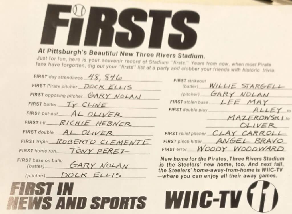
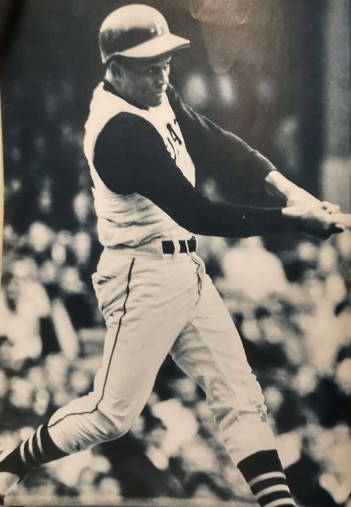
Ever see Roberto Clemente in short sleeves?
You have now!
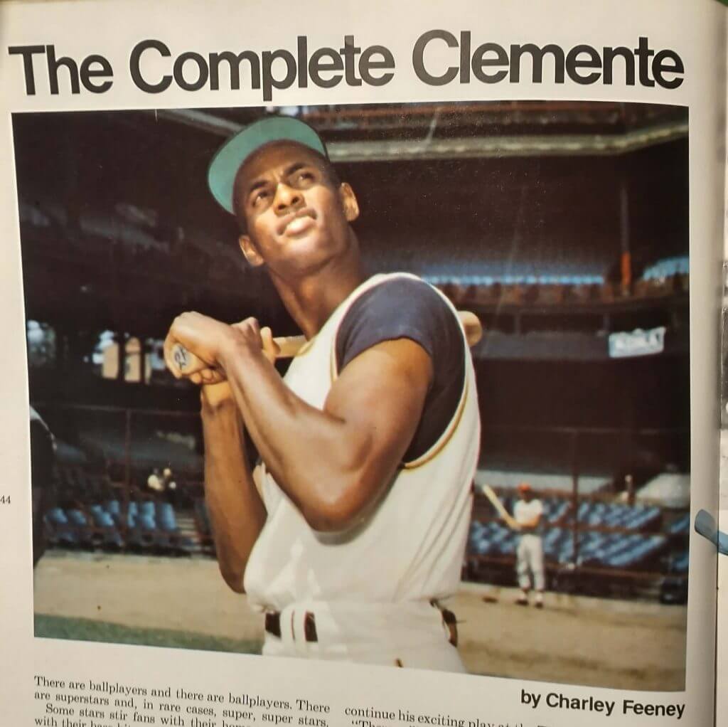
Turn the page, and you get a full-page photo of Roberto in his classic look.
I had to include this photo from the “I Remember The Pirates” section of the book.
Former manager Frankie Frisch looks very “I’d Wear That” in this photo of the early 40s look. Why hasn’t there been a throwback uni from this era??
Of course, when you look forward to a new stadium, you have to look back at the old one.
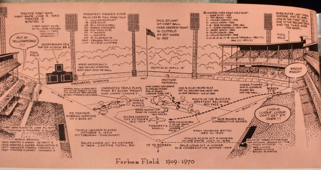
So enjoy this old-timey homage to Forbes Field.
Speaking of Forbes Field, I wasn’t too fond of these types of photos when I was growing up…
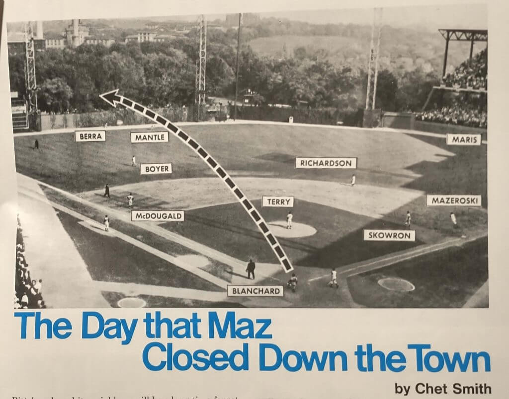
…but they do tell the story, and I actually think that would make a nice poster now.
Let’s wrap this up with a photo from the About Pittsburgh section of the book. It’s nice to see the Bucs give props to the other modern facility in town, the Civic Arena, with this rare open-roofed look.
I still say, rip out the turf and replace it with grass, take out a section of the seating the way the Reds did with Riverfront before they got rid of it, and this ballpark could still be in use today. Whether or not you agree with me, I hope you enjoyed this look back at a jewel in the ’70s renaissance of Pittsburgh.
Thanks, Jimmer! Great book — I can see why you don’t wish to part with it. Appreciate you sharing!

Guess The Game…
from the scoreboard
Today’s scoreboard comes from Wade Heidt.
The premise of the game (GTGFTS) is simple: I’ll post a scoreboard and you guys simply identify the game depicted. In the past, I don’t know if I’ve ever completely stumped you (some are easier than others).
Here’s the Scoreboard. In the comments below, try to identify the game (date & location, as well as final score). If anything noteworthy occurred during the game, please add that in (and if you were AT the game, well bonus points for you!):
Please continue sending these in! You’re welcome to send me any scoreboard photos (with answers please), and I’ll keep running them.

Podcast reminder: Paul here. For this week’s podcast episode, Chris Creamer and I talked about the Red Sox’s new yellow “City Connect” uniforms, plus we have the second and concluding part of our interview with Dodgers senior design director Ross Yoshida, who gave us a scoop about how the Dodgers almost ended up wearing purple in the late 1990s!
In addition, we discussed the situation regarding the 2021 MLB All-Star Game patch now that the game has been relocated from Atlanta to Colorado, plus the question of the week and more. It’s a really good episode!
As always, you can listen to us on Apple, Google, Stitcher, TuneIn, and Spotify, or just use the player below:
The show notes for this episode, which include photos of many of the things we discussed, are here. Those photos (and some additional ones) also appear in the video version of the episode, which you can see here:
Please consider supporting this episode’s advertisers, Streaker Sports (get 20% off any order with checkout code UNIFIED), Ebbets Field Flannels (10% off, except on NFL items, with checkout code UNIFIED), and Homefield Apparel (15% off with checkout code UNIFIED).
Enjoy the episode, and thanks for listening. Now back to Phil.
Uni Watch News Ticker
By Phil

Baseball News: I love this old photo of President John F. Kennedy throwing out the first ball (not pitch) to open the 1961 season at Griffith Stadium in Washington (from SABR BioProject). … Tweeter SurceaseSuccess notes, “pictures are from last year but just noticed it live (yester)day: Jose Marmolejos’ nameplate spacing looks really funky on the Mariners’ navy blues, but not the other jerseys. It’s almost like it’s saying Mar Molejos.” … Kentucky baseball has stickers for the players on the back of their helmets and it is the secondary logo that Kentucky has rolled out in recent years (from Griffin Smith). Christian Vazquez of the BoSox was missing the “B” on his helmet yesterday (from Todd Radom). … Here’s a cool story about the latest renovations to Dodger Stadium, including a new entrance paviliion, spearheaded by team executive and former Camden Yards architect Janet Marie Smith (from Kary Klismet). … New Yankee Rougned Odor was shown fully bearded and photoshopped into a Yankees uni — something that can’t happen due to the Yanks facial hair policy (from Reid Cure). Sure enough, here’s Odor with the Yanks, cleanly shaven (from Mike Parris). Odor is probably most famous for kicking the shit out of Joey Bats a few years back. … The Tampa Bay Rays unveiled their American League East Division and American League championship banners during their home opener on Friday night against the Yankees (from Kary Klismet).

Football News: After celebrating the life of the original QB1 yesterday morning, all of Troy Football players wore No. 12 on one side of their helmets in honor of Sim Byrd for T-Day (from Ben Whitehead). … Count Derrick Henry as among those who want to see the end of the one shell rule. … Former Jets QB Sam Darnold will keep his old number 14 with his new team, the Carolina Panthers. … UCF displayed social media-themed uniforms for their spring game yesterday. … The NFL is still discussing whether or not to reverse the one shell rule which would allow for, among other things, throwbacks. … Check out this deep dive Ben Whitehead did last year on the 1968 NAIA Champion Bowl between Troy & Willamette. … Here’s a great colorization of the Cleveland Browns wearing white helmets (from John Turney). … “It’s 2021 and Alabama A&M is still wearing the CFB 150th anniversary patch from 2019″ notes Brock Brames) … Delaware State also wore jerseys from the 2019 season with the College Football 150 patch (from Timmy Donahue). … This website asks the ever-important question: “What is the Falcons best throwback jersey? … It was only a spring game, but Michigan broke out blue pants for the first time since 2014 vs Penn State (from Brock Brames). … Our own Alex Hider writes, “From the IG of Browns RB Kareem Hunt — should the league approve new number assignments for skill position players, it looks like he’d entertain switching to No. 3. He wore that number in college at Toledo.” That is, if the number isn’t already taken (from Gino Radja). … “Nice looking color-vs.-color football game Saturday in Thibodaux, Louisiana, writes Chris Mykoskie “The River Bell Classic between Nicholls and Southeastern Louisiana. Great FCS rivalry.” He adds, “Noticed that most SLU players still have the College Football 150 logo on these uniforms (easier to see in the team picture with the River Bell trophy).” (Photo credits to Randy Bergeron.)

Hockey News: The Prince George Spruce Kings wore their alternate red uniform for the first time this season on Friday. They now have a pair of alternate red gloves that were worn with this uniform for the first time (from Wade Heidt). … Also from Wade: The Vegas Golden Knights went Reverse Retro on Friday night. Here is a look at the new cool Reverse Retro setup that G Robin Lehner has going on with this uniform. … And one more from Wade: The Tucson Roadrunners wore 5th Anniversary uniforms on Friday night. … Avalanche G Jonas Johansson, who was acquired from the Sabres 3/20 and recorded his 1st NHL shutout Friday night, doesn’t have new equipment yet. For now, he’s wearing his Rochester Americans (BUF-AHL) mask, which displays a number he no longer wears (from Benjamin Kassel). … Check out this gorgeous color vs. color matchup between the Kings and North Stars (from Angry Old Geezer). … ESPN has a great story about the old Cooper SK2000 goalie helmet, which was a fixture in the NHL in the ’80s and ’90s but hasn’t been in the league in ten years (from Kary Klismet.

NBA/Basketball News: Hmmmm. Turtleman 12347 saw this image on the Madison Square Garden scoreboard and notes, “Wonder if the Knicks hinting at bringing the black back. Notice the black under the letters like the 90’s.” … Check out this incredible photo from 1977 of UCLA vs. Cal St. Fullerton women’s hoops. Submitter Josh Claywell says, “so much to love in this pic for those who Get It.”

Soccer News: Inter Milan wanted to debut their new Nike 2020-2021 fourth kit in Sunday’s match against Cagliari. Now Italian media report that the Lega Serie A did not approve Inter’s request to wear the kit. … Cincinnati.com has some great sneak-peak photos of FC Cincinnati’s new West End Stadium (from Kary Klismet).

Grab Bag: PGA pros are just like us right? Here’s Billy Horschel slipping and falling down a slight hill on hole #13 at yesterday’s Masters. … I mean, professional wrestlers, they’re just like us right? … NASCAR Legend Jimmie Johnson has revealed his new helmet for the debut race in IndyCar Series 2021. … Timmy Donahue writes, “Just learned that bowlers on collegiate teams have numbers. Both Nebraska and Arkansas State with numbers on their right sleeves.” And the Captain(s) have a Captain “C” (from Ted Taylor). … Championship rings for golf? Sure, why not? Here are the fancy finger adornments awarded to the golf team at Chiles High School in Tallahassee, Florida, for winning back state titles (from Kary Klismet).
And finally…big thanks to Jonny & Jimmer for sharing their respective bits with us today.
That’ll do it for me for this week. I’ll catch you guys next weekend — everyone have a great upcoming week.
Ten years ago — Bryan Stow was attacked outside Dodger Stadium in LA — for wearing a SF Giants jersey.
It left him in a coma for nine months — and he had to learn how to walk again.
And he just threw the first pitch at the SF Giants' home opener…pic.twitter.com/YRsLXX3NB4
— Rex Chapman🏇🏼 (@RexChapman) April 10, 2021
Peace,
PH
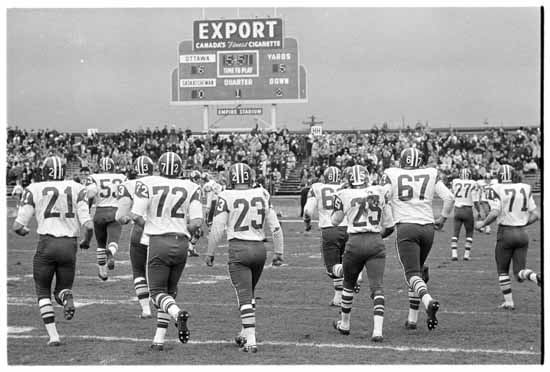
GTGFTS – That’s the 1966 Grey Cup at Vancouver’s Empire Stadium. The Saskatchewan Roughriders beat the Ottawa Rough Riders 29-14.
Game is significant as it is the first ever Grey Cup win for the Saskatchewan Roughriders. The team had a 56-year history at this point in 1966 and had lost the 8 previous Grey Cup games they played in.
GTGFTS: 11/26/66, Roughriders over Rough Riders, 29-14, to win the Grey Cup in Vancouver.
There are a few of those Three Rivers books on eBay, and the ones without 1971 stamps still have a cover price of $1.50. (I got mine at Forbes Field; it’s packed away somewhere.)
Thanks for the very interesting look at that Three Rivers souvenir book. It’s interesting to note that of the National League parks depicted in that two-page spread, only two remain in use today and they’re two of the oldest from the lineup of 50 years ago (though it looks like Jarry Park in Montreal and Candlestick in S.F. were a little older than Dodger Stadium). There’s certainly something to be said for the history of baseball’s old-time settings.
I think Mr. Rockford did a good Job with his Redesigns. I like almost all of them.
But Red Wings and Sabres in black is a no go. And as a Flames Fan myself, oh God please no. The current Uniform must stay for eternity.
This more or less covers my thoughts as well. More good than bad and working within the self-imposed constraints, they’re not bad. But the Flames, Sabres and Red Wings stood out as bad. I liked the Avalanche, Stars and Wild concepts.
Agree on this. Also, the Canadiens concept proceeds from a dubious premise. Why would the Canadiens wear the colors of a former rival? Would you suggest the Bears wear cardinal and white to hobble the legacy of the Chicago Cardinals?
To suggest the Canadiens wear Maroons colors is to not understand the history of the NHL. It’s not just that Montreal had two teams – it was a cultural divide. Francophone vs. anglophone, catholic vs. protestant; if you were an English-speaking family in Montreal during the days of the Maroons, you simply could not root for the Habs, period. When the Maroons dropped out of the NHL, I think more of their fans opted to follow the Leafs than the Canadiens.
The white Wild jersey…
I’d wear that!
Best of a very good bunch.
When you decide to take on the whole league, you commit to every team; even the ones you’d rather leave alone.
Nice to learn that the pitchers mound at Forbes Field was known as “Fogarty’s Knoll”.
I love the old appellations for ballpark geography, like Greenberg Gardens, Perini’s Pines and Tal’s Hill. Always thought there should be such a name for the point at which the outfield wall at Wrigley curves away from the bleachers and toward the foul pole, but they always just called it “the well”.
How about “Williams’ Well” for old #26?
Bryan Stow makes you want a better world.
Agreed! That’s why I included it at the end. I’m thinking of ending each weekend post with a *uni* related tweet — but this one might be tough to top.
That spread of all the 1971 stadiums in MLB reminded me that while it’s understandable why the circular multipurpose parks of the era were nicknamed “cookie cutters”…it seems to me that the same could be said of most of the parks following the “retro” trend started by Camden Yards. Many of them seem pretty indistinguishable aside from whatever quirks the designers added to the outfield walls. The new Braves park especially seems to me totally generic.
As an Orioles fan I couldn’t agree more. It’s like stadium design looked at the warehouse in Right field and said what can we do to top this with every new stadium. I actually appreciate the Nats for doing something totally different with their stadium (marble instead of brick and pretty symmetrical outfield dimensions).
I still like the QFQS ballparks. Quirks for quirks’ sake.
It’s an extreme example of how absolutely everything comes back in style, even when there’s no practical reason for it to.
Ballplayers didn’t need to start wearing belts on their uniforms circa 1987, but the pull of nostalgia brought them back. Same with interesting dimensions/features in ballpark design.
But as we’ve seen today, the pull of nostalgia even applies to the cookie-cutter stadia, and I’m of the age that I fondly remember “The” Three Rivers Stadium as well. I think I need to score a copy of that book.
What an absolute treasure that book is Vilk! I will be searching ebay and local flea markets to find a copy now!!! I agree with that 1940 and 1941 look (they were slightly different) and it’s crazy that haven’t done that in a throwback or fauxback/Reverse Retro in black and gold. It’s not a performance thing like the batman Steelers look as the Pirates finished over .500 both seasons.
Nice job, Johnny, on your NHL redesigns! There are lots of really nice concepts in there. I appreciate your preference for simplicity rather than overdesign – your LA Kings concept notwithstanding! ;-)
As a Dodgers fan, I am encouraged to see the progress that Bryan Stow has made since that awful attack 10 years ago. What happened to him will always break my heart.
The Blue Jackets treatment is my favorite, with the Bruins in a distant 2nd; if Jonny had stuck with brown it’d be the tops.
I find most of the concepts a tad busy, and the shoulder patches are too abundant (on the genuine articles and in these re-designs)…gives the sweaters a minor-league look.
God bless, Bryan Stow!!
Hey guys, Jonny Rockford here. If you would like to see my Blackhawks design since it is against Uni-Watch Policy, I have it on my Twitter @JonnyRockford! I understand why it was omitted but it is one of my favorite designs I have made so I would like you all to check it out if possible.
And thank you all for checking out my concepts!
Those are some pretty nice Chicago sweaters, my favorites of the bunch. But doesn’t the program allow you to do breezers, helmets, and stockings?
I’m not a Twitter user so is there a link to this?
link
Looks great. Sorry you didn’t get to share it on the blog.
If you told me a decade ago it would be the media leading the charge for sensorship, I wouldn’t have believed it. Yet, here we are.
Beautiful work across all of them.
Your Habs sweater concept is absolutely gorgeous! Overall a good effort with all of them. Just gave you a follow on the Twitters but don’t see your Blackhawks concept. Did it get cancelled on there too?
No, its on there. May have gotten lost in the thread. I’ll pin it.
Thanks for sharing that book with us, Jim!
The Vet (my hometown’s multi-purpose venue) was made better for the Pirate fan experience in one special way:
link
Speaking of The Vet, the photo from your book shows a version of the stadium that wasn’t exactly what Philadelphians got…the extra 700-level shade/rain cover would have been nice for the fans seated in ‘Economy Class’.
Cheers to them for adding the Stargell star!
I’ve never been to Pittsburgh. I’m not a Pirates fan. But that stroll through the ‘71 Three Rivers book was such a treat. I was born in the mid-1970s and anything from that era is pure gold to me. There is no drug like nostalgia.
As time goes on I’m dreading seeing NFL players adopt single digit numbers. I fear it will visually homogenize the two distinct games of college and pro football. Not that what I think matters in the grand scheme of things. But the visual uniqueness of each game gets muddled with such a move.
I was born just a few years before you, so I remember NFL WRs and RBs wearing single digits and teens. I welcome the opportunity to go back to that.
movi~
it was too late when i saw it, but yes, the dolphins should have a aqua shell as a second.
excellent share, and my favourite era of pirates texturally.and so many solid and fun players were passing through, or coming to age on those teams.
and you are dead right about three rivers being the best cookie; it’s a cutter with character, the snowman or bunny in the drawer. the vet was a lead paint spray-can that you used when you were drunk in college. it was round, neurological damage-shmamage, and you wanted to make cookies damn it.
in replaying the 1970 strat-o-matic season, the pirates were awesomely frustrating because you would have 3 players on the bench that you wanted to play; as opposed to the expansion padres where you were thanking corn for cito gaston, and dave campbell as a fun oddity to go with a batting practice pitching staff to get you through a series.
As long as your stratomatic outfield was Stargell, Oliver and Clemente you were good to go.
I wouldn’t dislike an aqua helmet, but the 60s/70s Dolphins look is so perfect (1972 pun intended). I’d leave it alone.
I’m thinking that Florida Panthers logo (which looks great) would look even better sans the rear legs and tail.
I know it’s supposed to be ‘leaping’, but what say you?
They’ve actually done that:
link
I think it looks fine, though I’m not sure how it would do on its own without the circle.
God, that’s just horrible. So overdone and superfluously detailed. Belongs in the margins of a middle-schooler’s notebook.
I always assumed that the Chicago NHL team existed outside the controversy since they are named after an actual specific person rather than a stereotype. A couple minutes on Wikipedia disabused me of that notion, but I have to say I don’t really understand it. What could possibly be insensitive or offensive about honoring a historical figure? Is it because it was initiated by white people? Are we only allowed to honor people of our own race?
I’m sure I’ll get accused of being mocking and insensitive myself, but I truly don’t understand this at all.
No, not at all. It’s a fair point.
The 86th Infantry Division, now known as the 86th Training Division of the US Army, was named after Chief Black Hawk. Frederic McLaughlin, the charter owner of the Chicago NHL franchise, named the team after his Army Unit, and indirectly, the Sauk Indian Chief. The tributes and commemorations made by our forebears are being viewed through a shifting lens. As more cultures take their place on the American landscape, we learn our “honors”, sincere though they might have been, had an unintended effect upon the honored. American Indians want to remind society at large the symbols and likenesses of their culture are *theirs* to use, and that appropriating them is theft of intellectual property.
I’ve read similar arguments pertaining to white musicians playing reggae music. People like what they like, be it Aboriginal artwork or Caribbean music. The touchy part comes when a patriarchal society begins to assume credit for these totems. With that credit, people will begin taking license with a tradition that might be sacred to its creators.
Makes me wonder if Black Hawk’s surviving family has weighed in on the issue. It seems like they would be the ones who truly have intellectual property rights over the use of his name, likeness, etc. I think it’s a bit of a stretch to suggest that all Native Americans have rights over the name of a specific individual just because they share the same ethnicity.
I’ve been a pretty loud voice on here in the past, suggesting that the voice of all Native Americans should be heard regarding the use of names like “Indians”, “Redskins”, and so forth because those are meant to be representative of the entire ethnicity. But the name of a specific individual seems to be an entirely different issue that should really only be relevant to that individual and his/her surviving family.
Based on the sox, that looks like the 1940’s Pirates uniform on Frankie Frisch.
link
If the rings received by the champion Chiles High School golf team are the real deal, I’m curious what the bill was and who paid it.
In the pic of the North stars and Kings game from way back…. is that a chain link fence in place of glass above the boards??? Wtf…?