For all images, click to enlarge
[Editor’s Note: Today we have a rare weekday appearance by weekend editor Phil Hecken, who has a great project that just couldn’t wait until Saturday. Enjoy. — PL]
By Phil Hecken and the Jersey Club
Follow @PhilHecken
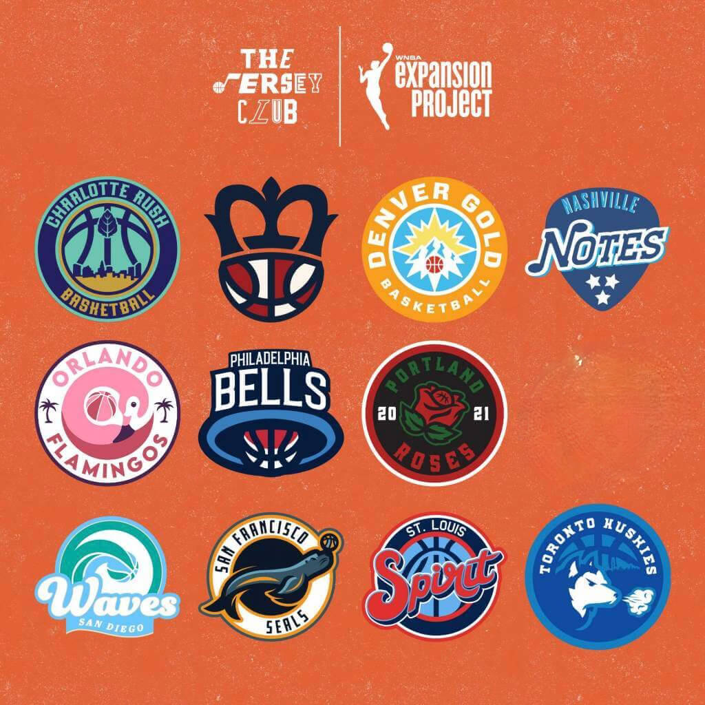
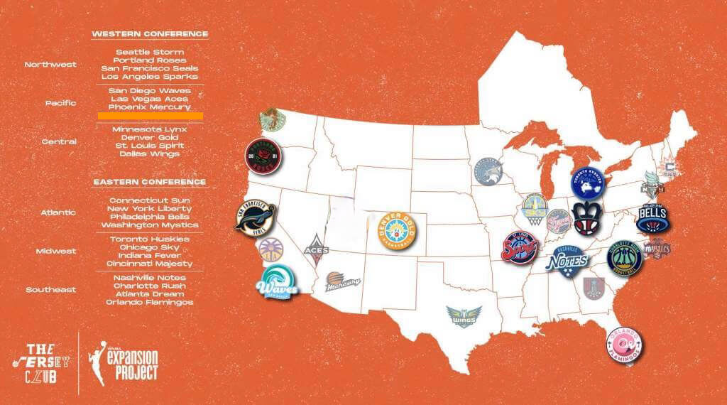
Good morning, Uni Watchers! As you may be aware, the WNBA recently released new uniforms for all 12 of its teams (and our own Jamie Rathjen gave us the rundown on those here). With the league marking its 25th season and really coming into its own, and with the league’s draft taking place tonight, a group of 15 designers known as the Jersey Club has devised what they call the WNBA Expansion Project, a reimagining of the WNBA from its current 12 teams to 23, with new franchises in Charlotte, Cincinnati, Denver, Nashville, Orlando, Philadelphia, Portland, San Diego, San Francisco, St. Louis, and Toronto.
And what would these new teams wear? I’ll hand the mic over to the Jersey Club and let them tell you.
The WNBA Expansion Project
By The Jersey Club
A while back we found ourselves brainstorming our next project. One of us said, “What about the WNBA?” and boom — we had lightning in a bottle. It was crazy and inspiring to see all the ideas start flowing. And then seeing them brought to life by this incredibly diverse talent pool just blew our collective minds.
Shortly after we got started, we were convinced that our group chat was being “listened to” because we started seeing fan suggestions, jersey leaks and all kinds of WNBA buzz on Twitter. It was eerie at times how things we talked about would pop up in our timelines, but ultimately it just pushed us to get everything done by the day of the draft. We’re incredibly proud of this project, and hope it inspires more people to support the league and its players.
Here are the teams we’ve come up with — enjoy!
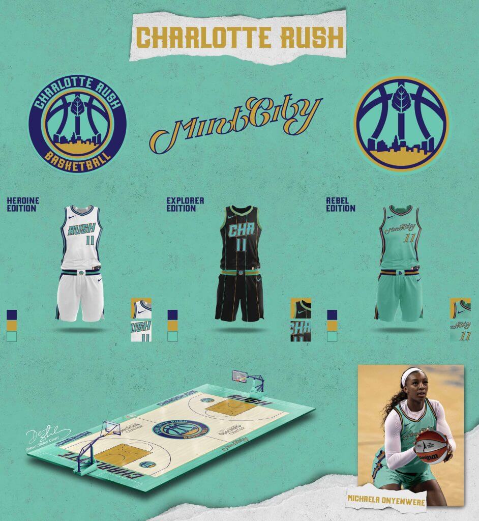
Charlotte Rush
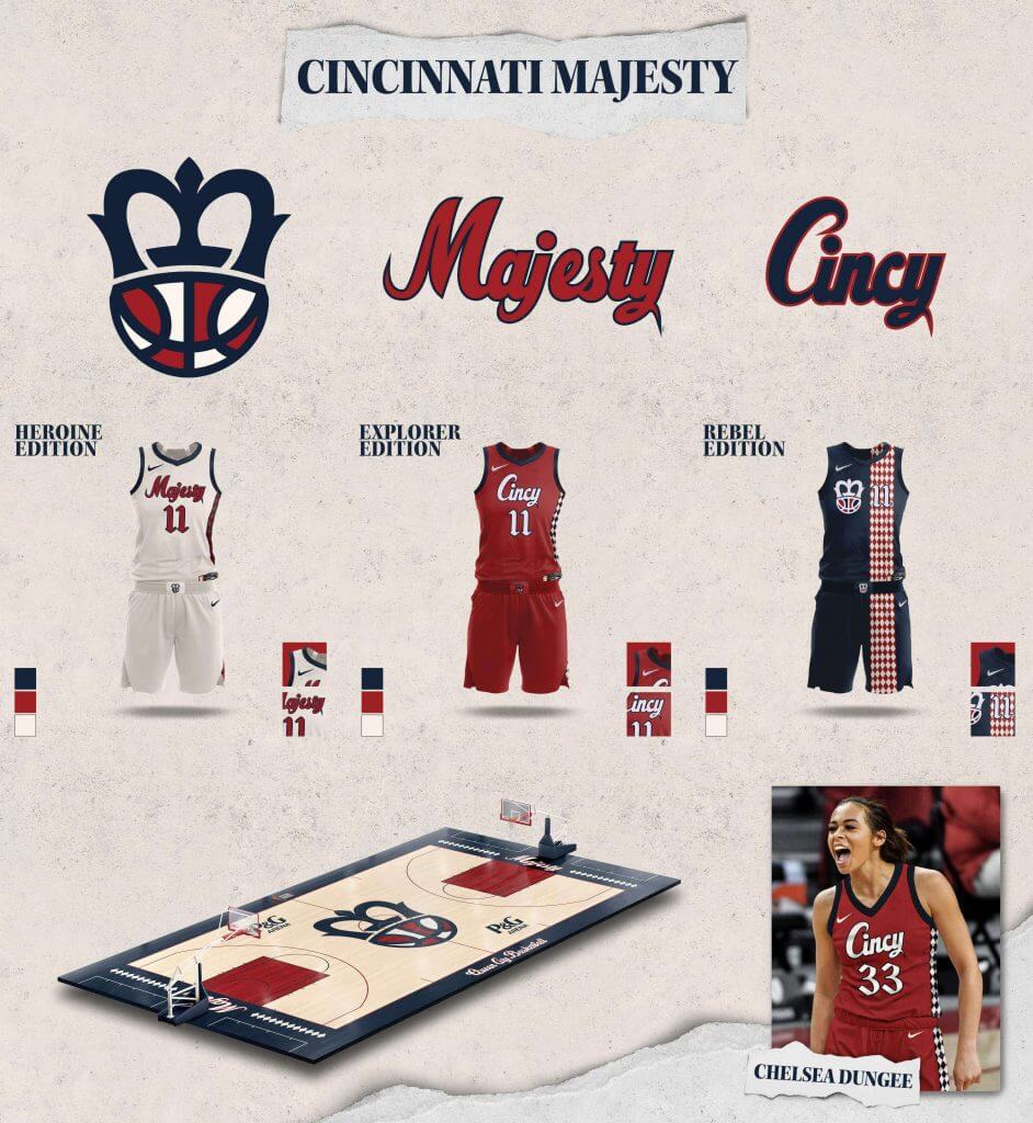
Cincinnati Majesty
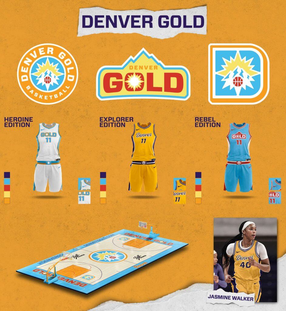
Denver Gold
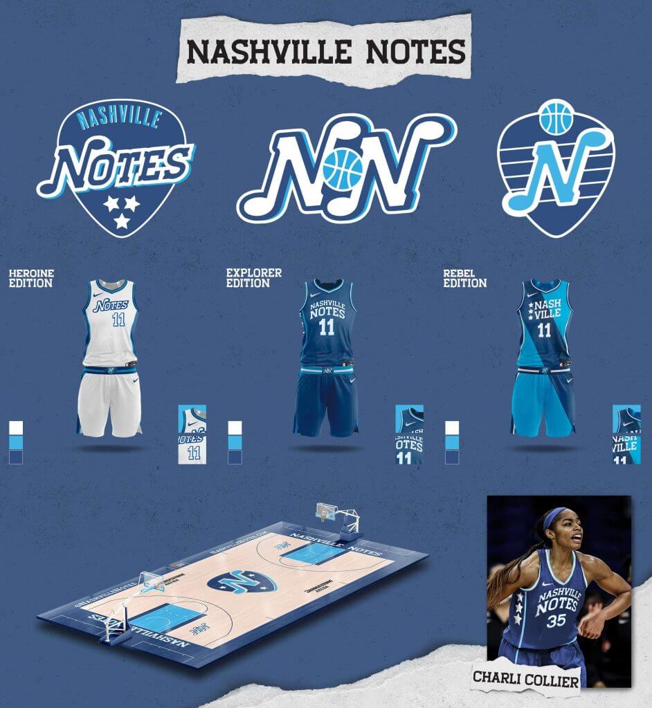
Nashville Notes
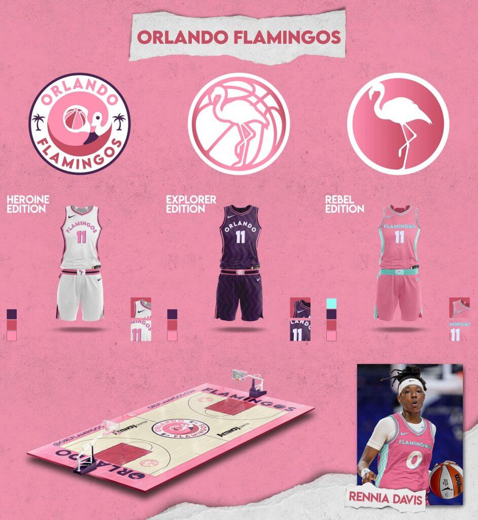
Orlando Flamingos
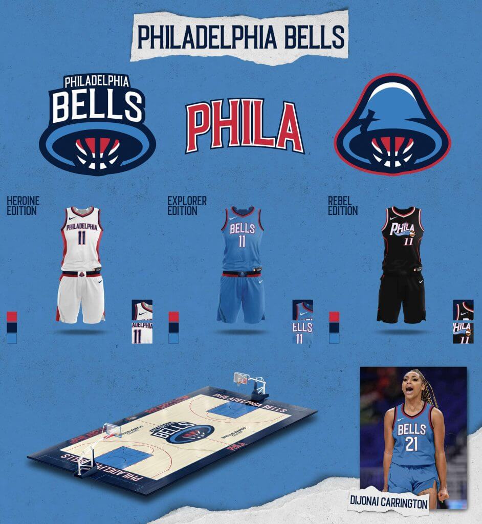
Philadelphia Bells
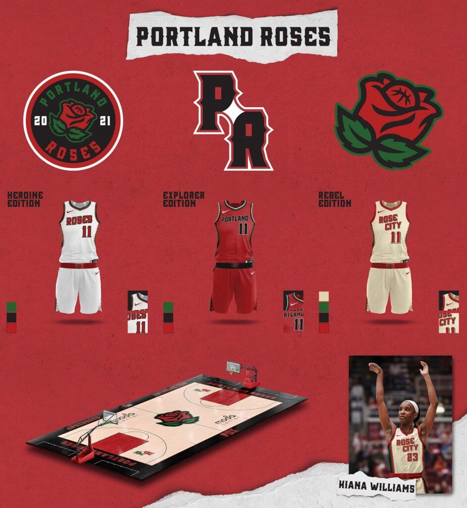
Portland Roses
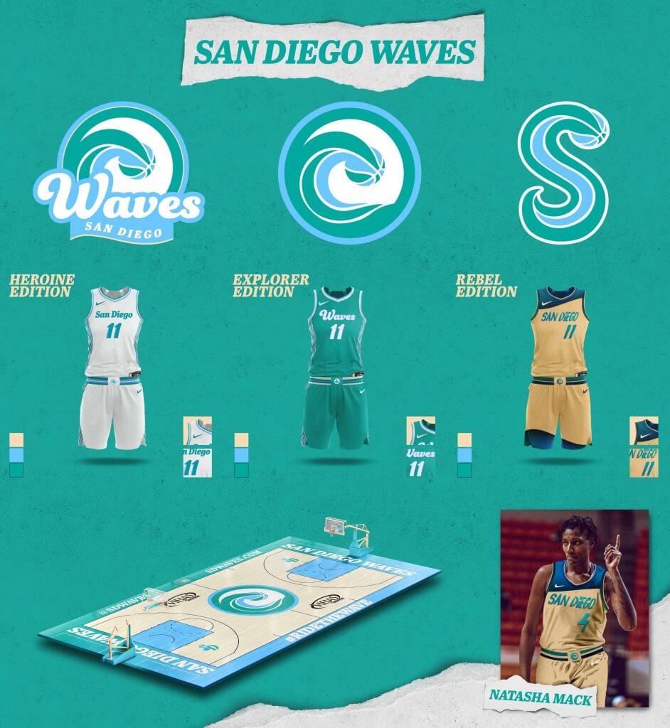
San Diego Waves
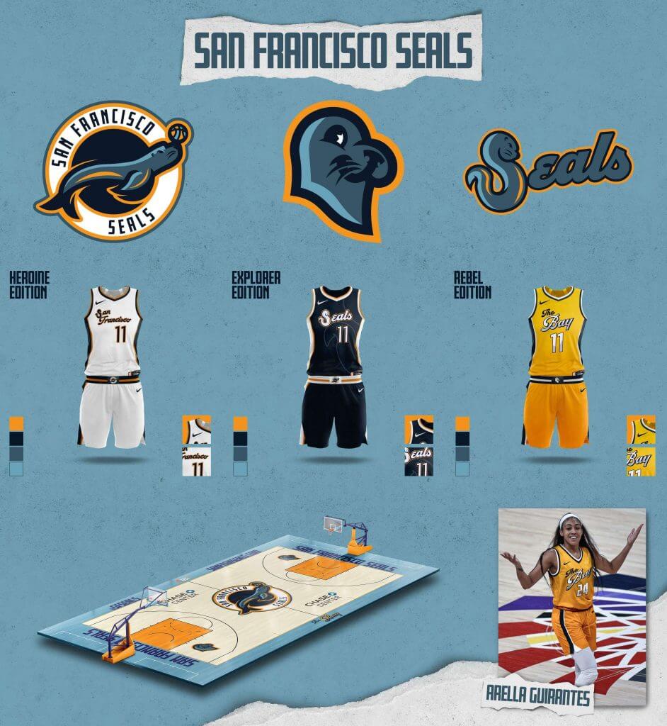
San Francisco Seals
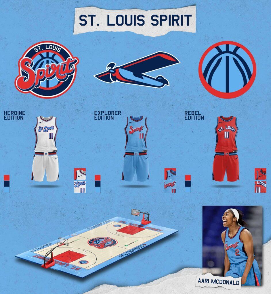
St. Louis Spirit
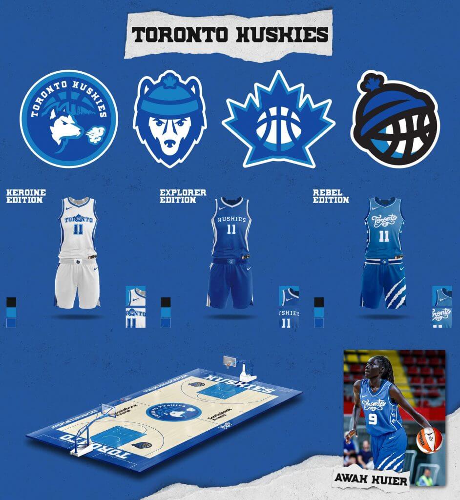
Toronto Huskies
Phil here. Thanks to the Jersey Club for sharing their work with us!
If you want to learn more about the Jersey Club, you can follow them on Twitter here. And if you’re wondering why I ran this content today instead of on the weekend, it’s in part because the WNBA draft is tonight, and also because I’ll have our big MLS Season Preview this weekend. Hope to see you back here in a couple of days for that.
Now back to Paul for the rest of today’s content.
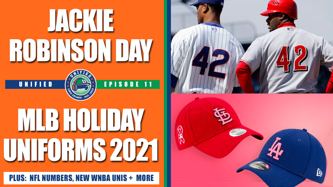
New podcast episode: Paul here. For this week’s episode, Chris Creamer and I discussed a bunch of things, including:
• MLB’s new holiday caps
• The history of Jackie Robinson Day, and how it should be handled going forward
• The proposed changes to the NFL’s uni number rules
• The new WNBA uniforms
• The ongoing saga of the Braves, the MLB All-Star Game, and all the related issues
• Our favorite uniforms from fictitious teams in movies
As always, you can listen to us on Apple, Google, TuneIn, and Spotify (the episode isn’t yet up on Stitcher, but it should be soon), or just use the player below:
The show notes for this episode, which include photos of many of the things we discussed, are available at the podcast’s newly redesigned website. Those photos (and some additional ones) also appear in the video version of the episode, which you can see here:
We have great deals from this episode’s advertisers: Streaker Sports (get 20% off any order with checkout code UNIFIED), Ebbets Field Flannels (10% off, except on NFL items, with checkout code UNIFIED), and Homefield Apparel (15% off with checkout code UNIFIED).
Enjoy the episode, and thanks for listening.
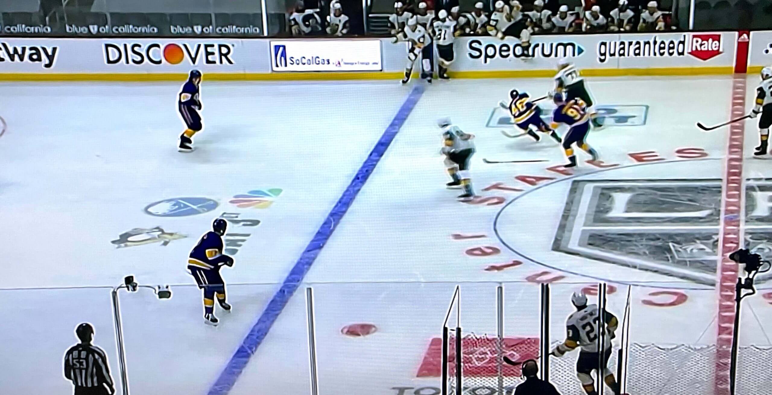
Who’s playing here anyway?: Weird case of logo creep in last night’s Golden Knights/Kings game in LA, as an ad for NBC’s broadcast of this Saturday’s Penguins/Sabres game appeared on the ice. Very strange to be watching two teams and then see the logos for two other teams appearing on the ice!
Or at least it seems strange to me. Is this something that’s been going on for a while and I just hadn’t noticed?
(My thanks to Ryan Farrar for this one.)
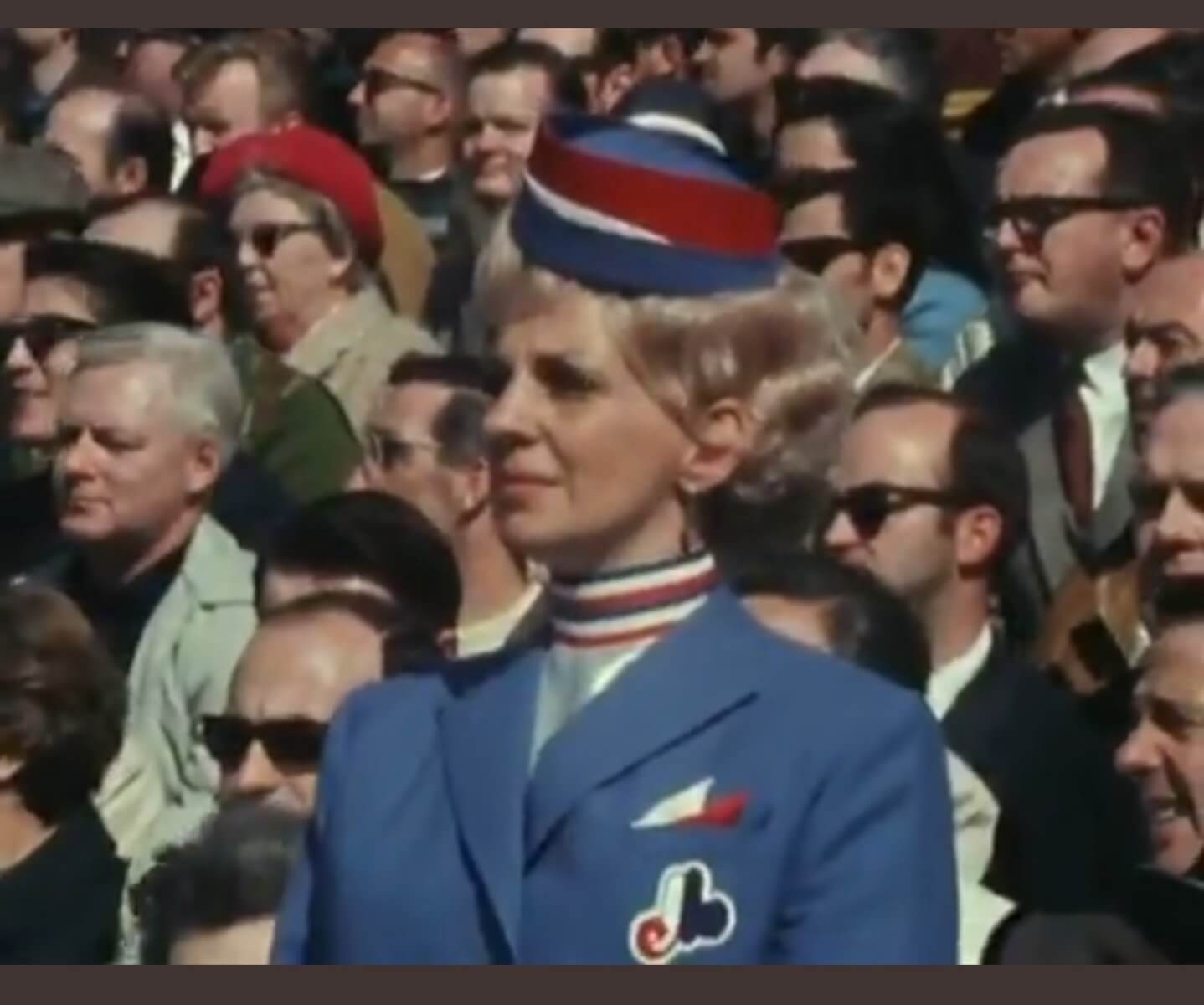
Too good for the Ticker: Yesterday was the anniversary of the Expos’ first home game — the first MLB game to take place outside the United States. The great BSmile posted some excellent video footage from the game, which includes a glimpse of the fantastically attired usher shown above. Now that’s a uniform!
(Big thanks to Tim Donovan for bringing the usher’s uni to my attention.)
The Ticker
By Paul

’Skins Watch: Washington is the latest state to ban Native-based iconography in its public schools (thanks, Phil). … The Massachusetts town of Wakefield is putting its high school’s Native American team identity and imagery to a vote (thanks to all who shared). … Nashoba High School in Massachusetts has changed its team name from “Chieftains” to “Wolves” (from Kary Klismet). … The Savannah, Mo., school board has voted to keep the local high school’s “Savages” team name but to phase out its associated Native American imagery (thanks to all who shared).

Baseball News: Today is Jackie Robinson Day. All uniformed MLB personnel will wear No. 42 and go NNOB. I look forward to reader/commenter Mark in Shiga’s annual critique of the all the 42s not being properly vertically centered on the back of the jerseys. … In a related item, Blackwing makes a set of Jackie-themed pencils, produced in collaboration with the Jackie Robinson Foundation (from James Spears). … New caps for the Coastal Plain League’s Spartanburgers. … A fan at Tuesday’s Mets/Phils doubleheader was wearing one of the original “I’m Calling It Shea” shirts from 2009 (from David Rakowski). … Here’s a close look at the green cleats that Mets P Marcus Stroman has been wearing (from Jakob Fox). … The Rays have received their American League championship rings (from Kary Klismet). … Also from Kary: The owner of the Twitter account Bandbox Ballparks, who digitally recreates defunct vintage Major League baseball stadiums, has put together this really cool virtual video tour of Cleveland’s old League Park. … Clemson softball debuted a new purple-over-orange combo the other day (from Josh Sinclair). … Here’s a weird one: The cover image for Atlanta’s Opening Day scorecard shows 2B Ozzie Albies using a bat made for Twins DH Nelson Cruz (good spot by Jake Tilley). … New caps for the Jersey Shore Blue Claws (from Jason Hillyer). … Due to pandemic-related border restrictions, the High-A Vancouver Canadians will start their season playing their home games at Ron Tonkin Field in Hillsboro, Ore., sharing the stadium with the Hillsboro Hops. “The C’s are making themselves at home by painting logos in the Hillsboro bullpen,” notes Wade Heidt. … Phillies OF Andrew McCutchen has been wearing stirrups lately. I don’t recall seeing him do that at any other point in his career. … Cleveland 3B José Ramírez has his personal logo on his headband (thanks to all who shared). … Fans of the High-A Beloit Snappers will have the opportunity to bid on the naming rights to the team’s stadium for every home game this season (from Timmy Donahue). … Check it out: Fenway Park in Lego (thanks, Brinke).

NFL News: The Bengals will reveal their new uniforms on Monday at 9am ET. The new set will reportedly include three jerseys and three pant options, making for a total of nine possible combos.

Hockey News: Kaid Oliver of the WHL’s Edmonton Oil Kings will pay tribute to his late grandfather and former Oil King Ace Bailey this Saturday by changing his uni number and NOB (from Wade Heidt). … Tuesday’s ticker mentioned that new Penguin Jeff Carter will wear No. 77, which was last worn for the Pens by Paul Coffey in 1992. “This Athletic story goes a little deeper (paywalled), including quotes from Coffey and a list of numbers that have been issued only once in Penguins history,” says Joe Werner. … The Kings have added another ЯR game, on April 26 (from Jakob Fox). … The Caps will mark C Nicklas Backstrom’s 1,000th game tonight by having all players wear his number and NOB during pregame activities. … New mask for Avs G Devan Dubnyk (from Wade Heidt). … John Muir notes that at Colorado College head coach Kris Mayotte’s introductory presser, he had a personalized jersey, a school color tie, a school lapel pin, and a school logo mask.

NBA News: In a recent podcast episode, former Sonics great Jack Sikma says that the team’s skyline logo was designed by his father-in-law (from @MrNursfen).

Soccer News: Chelsea midfielder Jorginho wore a different pair of socks than the rest of his team in Tuesday’s Champions League quarterfinal match against Porto. He’s at lower-right in that photo (good spot by Hunter Gingras). … A new 1990s-style Dortmund kit has apparently leaked (thanks, Phil). … Rochester’s new team, the Flower City Union, which will begin play next year, unveiled its primary logo (from D.J. Mitchell). … INAC Leonessa Kobe — a team in the new WE League, a women’s league set to debut in Japan later this year — has released its inaugural kits (from @smntcsilverfox and Jeremy Brahm).

Olympics News: Here are the Olympics and Paralympics uniforms for Croatia, South Korea, and Russia (thanks, Phil). … Meanwhile, here are Team USA’s closing ceremony uniforms. … Did you know that “sport climbing” is now an Olympic sport? Uniforms for the U.S., Japan, South Korea and Austria were unveiled yesterday (from Brian Kerhin and Phil). … New gear — looks mostly like retail merch — for Team Canada (from Wade Heidt). … Here are Japan’s wrestling uniforms (from Jeremy Brahm).

Grab Bag: Disney has revised its dress code for theme park workers. … Two lacrosse items from James Gilbert: Albany’s new NLL team is due to reveal its name and logo this afternoon, and new chrome helmets for UNC. … Also from James: The upcoming Goodyear 400 race at Darlington Raceway on May 9 will feature throwback tires and caps. … Here’s an in-depth article about this year’s EF-Nippo cycling jersey (from Bernie Langer). … Here’s the longest, most in-depth article you’re ever likely to see about the Mascot Hall of Fame (from Kary Klismet). … Also from Kary, and also mascot-related: Students on Prince Edward Island are welcome to submit mascot designs for the 2023 Canada Games, which will be held in the province. … One more from Kary: Oklahoma State has a new esports arena. … UPS drivers can now have visible tattoos (from Timmy Donahue). … Also from Timmy: British Royal Family members will not wear military uniforms to Prince Philip’s funeral. … The California city Placerville, once known as Hangtown, is removing the noose from its logo (from Max Weintraub). … AEW wrestler and former Olympian Anthony Ogogo has a variation of the Olympic rings logo on his trunks — and it spells out his name!

Ticker correction: In this instance, Savannah is in Missouri, not Georgia.
Thanks. Fixed.
The on-ice ads with other teams have been going on for awhile, but it’s worth mentioning that its superimposed by the broadcast in that particular spot on the ice, the fans in the stands for the actual game can’t see it. By extension, the ad changes/rotates between a few ads over the course of the game, so it’s not always showing an ad for an upcoming game.
I’ve been wondering all season since the ad is superimposed why they bother facing the ad towards center ice instead of towards the camera so it’s not on its side/the TV viewers can read it better.
And, of course, each local broadcast has its own advertisers, so there are two different virtual ads there at the same time.
“I’ve been wondering all season since the ad is superimposed why they bother facing the ad towards center ice instead of towards the camera so it’s not on its side/the TV viewers can read it better.”
I feel like to logo would be even more jarring if it were rotated to face the camera better. I’m used to seeing it there and the postseason logos are places there, so I can ignore it pretty well. If it were rotated, I think it would really stand out in a bad way for me.
*placed there…
It’s too early to proofread, apparently.
I’m not complaining that it’s on its side, mind you. But I’m guessing most people feel like you where it would be harder to ignore if it faced the camera, which is all the more reason why I would think advertisers would put it that way, and all the more puzzling why they don’t.
They’ve been superimposing ads behind the goalies for a few years now. At least I’ve seen that on the few Canucks broadcasts I’ve seen on CBC.
Regarding Savages: Savannah is in Missouri, not Georgia.
Fixed.
Those WNBA expansion concepts look great. However, nobody is going to name a team “Slopes” in these politically correct times.
I came here to say this. Even in an exercise undertaken just for fun and love of the game, that was pretty glaring.
Seconding this – “Slopes” is not going to get through any focus group in 2021, no matter how benign the intention was.
I liked the concepts, by and large, but there is a lot of repurposing team names, colors and concepts from other leagues (Denver Gold, Philadelphia Bell(s), St Louis Spirits).
The NHL ads are less jarring by being oriented as they are but they’re nothing new. They’re trying to blend in and stand out at the same time.
The Denver Gold are differently colored than the USFL team, though.
And, as someone who did a whole UW piece with Phil about repurposing the USFL names and logos, I say go for it.
I am kind of shocked the Slopes made it to the blog.
Certainly if it was a Native American slur it would have been deleted – at least I hope so.
Doesn’t even need to be “politically correct times.” That name is bad full stop.
My bad for not catching this when I edited this piece. That concept design has now been removed — not because of anything “politically correct” (a nonsense term that has no place on Uni Watch) but because it’s the right thing to do.
I’m almost afraid to ask, but can someone educate me on what the issue is with this term? I’m not familiar with any problematic usage, and all Google turns up for me are ski slopes and the geometric definition. I’d like to understand the situation here. Thanks.
I was in the same boat. You have to Google the term and “slur”.
Try googling it in conjunction with the word “slur.”
Thank you for that ^^.
This. Beat me to it. -C.
You learn something every day. I’m from Florida and have never heard the term. Had to Google it. You all are absolutely correct that it shouldn’t be a team name but my ignorance on the topic suggests maybe the slur has regional or temporal hotspots.
I suspect it’s temporal. I noted the same thing on Twitter yesterday when I first saw these and almost all the responses expressed puzzlement as to what I was talking about.
Term has its origins back to WWII (in the UK from what I can find) and the war with Japan.
Seems like an innocent mistake – the only time I’ve ever heard the term was when Christopher Walken’s character used it during the “Gold Watch” scene in Pulp Fiction.
I saw that, and recalled the Top Gear Burma special where they built a bridge, and Jeremy Clarkson used the term to describe the unevenness of the bridge they’d built, but in such a way that could also be interpreted to be referring to a local who just happened to be on the bridge a short distance away. The incident got Clarkson a “last warning” from the BBC before he was ultimately fired for a backstage incident.
So, yeah, that took me by surprise this morning.
The ironic thing in all of this is is I had no idea Salt Lake City had a high Asian population – certainly not large enough to inspire a team name.
I guess you do learn something every day.
I’m not sure if this comment is meant to be in jest, but I imagine the name was obviously chosen in reference to all the ski slopes near Salt Lake City (granted, I did not look at site today until the design was removed).
I just looked at the SLC Slopes mockup on another site, and I have to say it seems a little extreme to have (literally) whitewashed it from this site. Perhaps pilight is right (and justly so) that a name like that wouldn’t make it through focus grouping. A team may not want to tread into those waters. But the word “slopes” is widely and non-offensively used to discuss ski slopes, which are prevalent in the SLC area. The design was clearly based on skiing (there are skis in the logo).
Would a team maybe not adopt that name to avoid the issue/avoid offending? Possibly. But when the name is patently referring to skiing, I don’t think it’s necessary to hide it from our eyes.
That said, I also understand, “It’s your site” etc.
I don’t think it’s for anyone, including the designer, to say what “the name is patently referring to”. And I’m not sure it’s OK to use a racial slur as a brand just because the word has other meanings/usages. If the name brings to mind (or brings to enough minds) the racial-slur usage I think that’s enough. Indeed, when I saw the name and logo my first thought was of a Lisa Lampanelli joke that took advantage of the double entendre. And I’m a skier.
There are literally skis in the logo — I think it’s pretty clear what the name is referring to (unless it was a plot by the designer to sneak a racial slur into the project covertly, which seems…unlikely).
My point is that “slopes” is an extremely common word, primarily used in geometry and skiing. Again, I understand why a real team wouldn’t want to use a name like that – no one gets to dictate how someone else responds to a word, and enough people may respond to it in that way. But to whitewash it from this site, when the meaning in the context of the project was clear, seems a bit over the top.
FWIW, I’m an avid skier myself, and I think “Slopes” is a dumb team name. I’m not a fan of names after inanimate objects, and that one in particular seems like a weird thing to name yourself after.
But you don’t know that, do you? Even if the designer only meant to invoke or suggest skiing, not everyone who hears or reads the name without seeing the logo will make that connection, and the name won’t be accompanied by the logo every time it’s spoken or written.
And since the designer won’t be available to explain what the intention was (or wasn’t) every time someone hears or reads the name, people will tend to make up their own minds about that.
I also don’t think a word can be called “>i>extremely common” if its primary uses are “in geometry” which most people don’t encounter or think about before or after 10th grade, “and skiing” which most people have never done and will never do in their lifetime.
And, I think it’s the phrase “whitewash it from this site” that’s “over the top.” This site is over 20 years old and has thousands of entries featuring thousands of logo concepts; we’re talking about one thing that appeared one time for a couple of hours, maybe, and was removed. That’s not a “whitewashing” if that idiom is to have any meaning at all.
For the record, I did not ask or intend for the Salt Lake mockup to be removed from the site
I’m really excited for climbing to be at the Olympics, but I have to laugh at the notion of climbing team uniforms–usually rock climbers (myself included) show up to climb in whatever’s the least dirty.
As a fellow climber, I agree. I think being able to give distinctive patterns and colors to harnesses and ropes is an interesting new territory for the uni-verse. Hopefully, they can use the gear that is specific to the sport to make a statement.
What does the WNBA “really coming into its own” mean? Are ratings up? Has the league stopped losing money? What an odd intro for a fantasy expansion concept that will never happen because the league needs constant subsidies to survive and is a PR exercise for NBA owners. Pretending the league is a success as a theme of the piece undermines credibility with the reader.
Are ratings up? Yes.
Has the league stopped losing money? Who knows? Who cares? The NBA claims that 2/3 of its teams are losing money but nobody asks this. MLS loses money hand over fist and nobody asks this. E-Sports are a bottomless money pit and nobody asks this. Why is it only the WNBA that gets this scrutiny?
Right? For tax and labor-negotiations purposes, most leagues claim that most teams lose money year-to-year. Which obviously can’t be true, but since that’s the stance of the leagues, stated profitability cannot be a measure of a league’s success or status.
Actually, yes, ratings are up:
link
I was wondering about that too. The WNBA has never made a nickel of profit for the NBA. How would adding teams help?
Actually, it’s been nearly two decades now since the NBA owned the WNBA:
link.
Paul, as I’m sure you know, business relationships are complicated things. And while on paper, the NBA may not “own” the WNBA, the WNBA is far form a separate entity that can stand on its own. Three things make that “NBA does not own the WNBA” statement less than fully true:
1. Five of the twelve teams– almost HALF of the league– are owned by their same-city NBA owners.
2. The WNBA as a league annually operates at a loss, and the losses are subsidized by the NBA (according to past statements by Adam Silver, the losses are roughly $10 million dollars per year).
3. According to the NBA themselves, the TV deal THEY inked back in 2014 included an agreement to keep showing WNBA games on ESPN, ESPN2, and ABC through the 2025 season.
The WNBA “being on their own” is analogous to a young twenty-something living on their own outside of their parents’ house… with their parents either giving them a job, supplementing their income or paying some of their bills, or helping them get a good job based upon their OWN connection to their kids employers.
Thanks for clarifying, Bruce!
You forgot to show the San Diego Waves! (of course it can all be found on the twitter link you provided.)
“The Bengals will reveal their new uniforms on Monday at 9am ET. The new set will reportedly include three jerseys and three pant options, making for a total of nine possible combos.”
Has me dreading this unveiling a little more now. Anything more than two pants is excess, and just ends up with the mix and match game where you never have a definitive look for the team. Assuming they are keeping black as their primary jersey color the best case scenario here would be white pants to pair with the black jersey at home (and occasionally the white jersey), black pants to pair white jersey on the road (though not a good look), and some sort of god-awful mono-orange they’ll hopefully only wear once a year.
Me too. I can’t see how this one will be any better than the atrocity they were already wearing.
Orlando? They’ve got the Magic. Tampa is bigger than Orlando and St. Pete is about the same size as Orlando. They’re an hour and a half from each other. The expansion team should be Tampa Bay if the WNBA top brass are reading this uniform blog comment section. Neither place has native flamingos. We do have similarly pink Roseate Spoonbills and Pied-billed Grebes which are closely related to Flamingos.
This will sound petty and might not be in line with the majority, but the blue line ads imposed on the ice and the ads on the helmets and the ads on the glass above the boards all look awful. I tend to just listen to hockey on the radio now.
I think all the logos and unis are super creative, particularly the rebel additions for Cinncinatti and Denver, but I wish they hadn’t played into the Nike school of design so much. Nonsense scripts like CHA and PHILA are unappealing to me, and I can’t stand the silly nicknames no one actually uses like ROSE CITY and MINT CITY. Also, the basketball in the rose of the portland roses logo looks like a cat’s butthole and I can’t unsee it.
As a former resident of Portland, OR I can 100% tell you that Rose City is quite commonly used. Especially in sports. The Timbers’ rallying cry is RCTID – Rose City Til I Die.
Another ‘Skins Watch story: Apparently the Marion (IA) school board rejected a mascot change from “Indians” to “Mavricks” because of reported concerns about the origin of the word “Mavrick” coming from an 1800’s slave owner. The district will start over in looking to replace their mascot.
link
A quick Google search reveals the etymology of the word “Maverick”: Samuel A. Maverick, a Texas cattleman who did not brand his livestock.
Can we commit do a case-by-case study to discover who among our forebears are the good people who did bad things, and who are the bad people who did good things? And, from a definition point of view, can we assume “maverick” has descended far enough, with enough separation from its germination, that they are ultimately two different things.
On one hand I agree that the current definition of “Maverick” is probably far enough removed from it’s origin that it doesn’t seem like it would be an issue. However, I get where the school board is coming from, since even a few decades back very little though was given towards using “Indians” as a mascot. Since the school has committed to and is in the process of changing away from Indians, it makes sense to try to make one change that is more likely to stand the tests of time and to avoid something that seems benign now but has a chance to be problematic in the future.
Why not just go with an animal that names begins with an “M”? You can’t really go wrong. How about the Marion Mountain Lions?
SPLENDID suggestion! Of all the synonyms for Felis Concolor, this is certainly the least used. Perhaps potential users are put off by the venerability of the Nittany Lions, but I don’t see any cause for confusion.
I’m curious as to whether any of the Jersey Club designers are women. I can’t seem to find any information as to who the designers are, though admittedly I didn’t look too hard.
listen to Locked on Womens Basketball podcast, they interview the designers
I’m baffled as to why a town would want to celebrate the fact that many hangings took place there with a noose in their logo.
How else would visitors know that they take crime and punishment very serious there?
That first Expos game was an 11-10 victory by the Expos over the Cardinals. The video shows how bad a “stadium” Jarry Park truly was. And MLB let the Expos stay there 4 years longer than the original expansion agreement was set to allow. Even with how small the stadium was (less than 30K capacity), the Expos drew 1.2M fans in 1969 (average of 14.8K fans per game). Some teams today can’t draw flies…
No way this would have been allowed today.
Seals? That’ll forever be associated with the pre-MLB local baseball team in SF.
Should’ve been Amazons (female Warrior).
Golden State Amazons
Golden Gate Amazons
San Francisco Amazons
Those WNBA expansion wannabes are terrible. Where are the ads?
I wonder why Pittsburgh isn’t an option. It has a bigger population than, Vegas, Indianapolis, Cincinnati, Hartford, Nashville. 3 of the 5 have an existing WNBA team.
Think that 11-10 game in the Expos 1969 opener was against the Mets at Shea Stadium – the eighth consecutive opening loss for the Mets, who got over it by winning it all as the Miracle Mets. Expos first home game at Jarry Park was an 8-7:victory over St. Louis, perhaps a harbinger of the Cardinals unexpected fall from power in the NL that season.
You’re telling me that there is a high school in a place called Wakefield, Massachusetts, and the team name is not the “Tims”? For shame!
Maybe the Philadelphia Bells should be the Belles? There is a famous English women’s soccer team called the Doncaster Belles that has been around since 1969. link.
They were named after the Belle Vue ground where they all worked!
I think its kind of funny that this WNBA expansion project posits 11 new locations and identities for WNBA teams, when in reality the league has already ditched just as many:
1. Portland Fire
2. Sacramento Monarchs
3. Houston Comets
4. Detroit Shock
5. Tulsa Shock
6. Orlando Miracle
7. Miami Sol
8. Charlotte Sting
9. Cleveland Rockers
10. Utah Starzz
11. San Antonio Silver Stars/Stars
love the idea behind this.
I know huskies was the original name of the raptors, but siberian huskies are not a Canadian animal… Canadian Inuit Dogs are the native sled pullers.
That said Toronto Needs a WNBA team!
Kansas City needs a WNBA team!