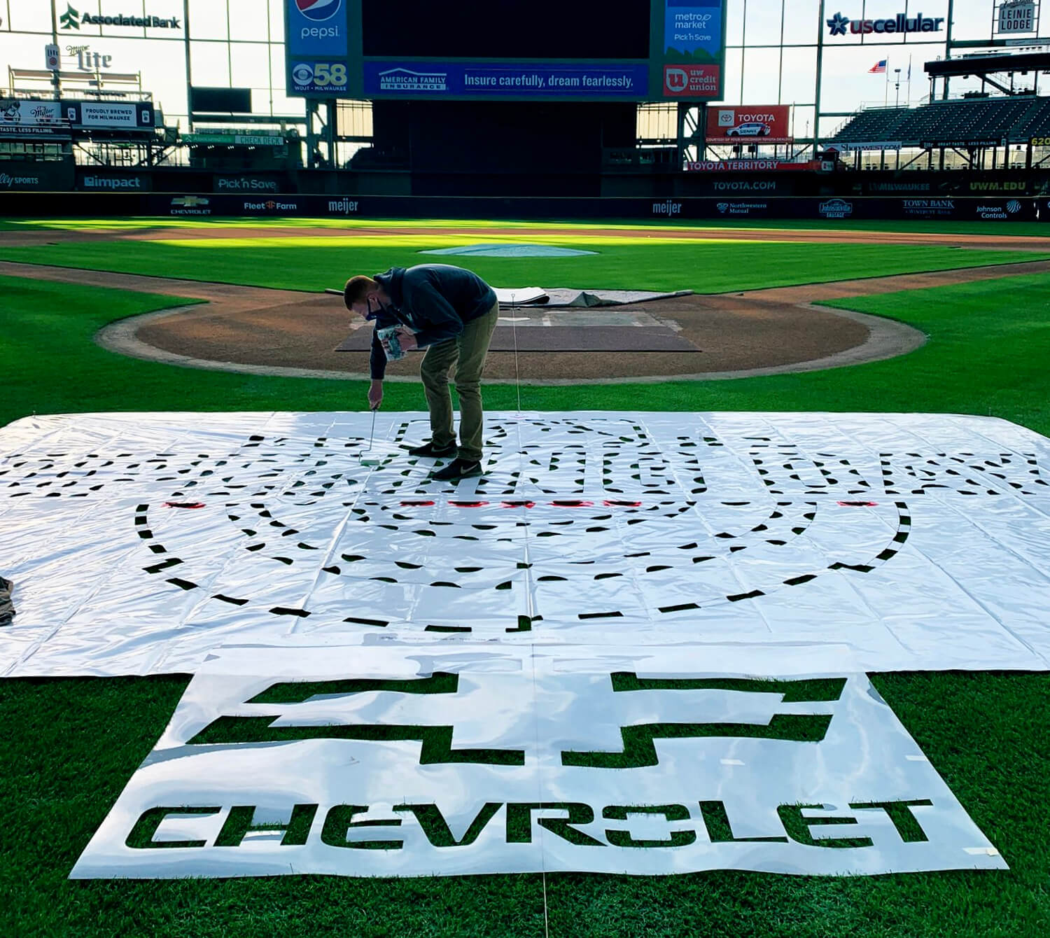
The photo shown above was tweeted yesterday morning by Ryan Woodley, head groundskeeper for the Brewers. As you can see, their “Opening Day” logo behind home plate will be supplemented by an ad. I’ve seen that same ad in the same spot on another field (sorry, can’t recall which one). Sigh.
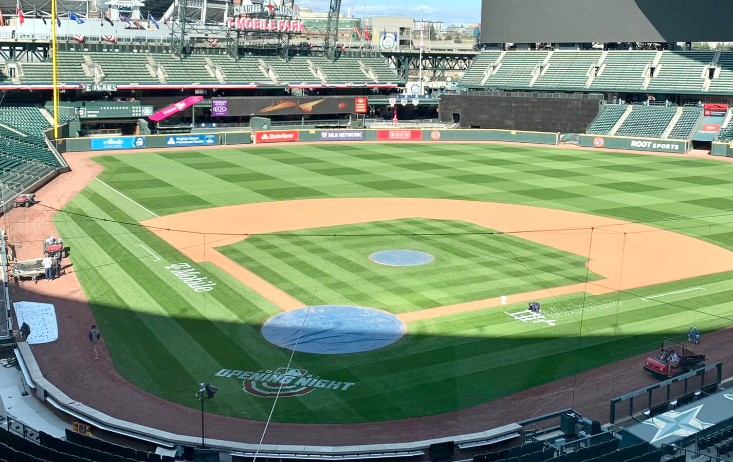
It’s not appearing on every field, however. In Seattle, for example, there’s no ad behind home plate — but there are ads along both of the baselines:
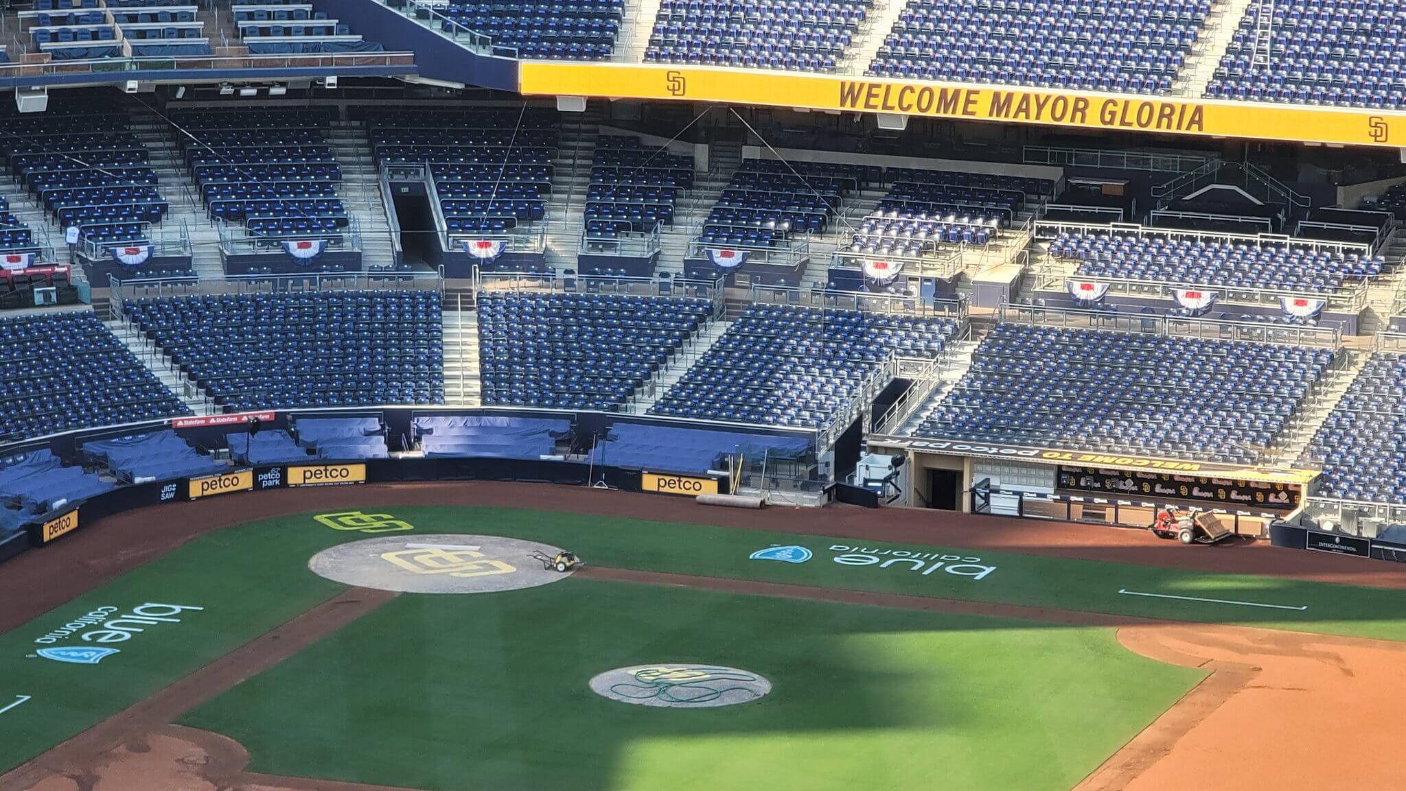
No ad behind the plate in San Diego — and no “Opening Day” logo either — but massive ads along the baselines:
Perhaps unsurprisingly, the Yankees appear to have no field ads at all, at least so far — not behind home plate, not along the baselines, not anywhere:
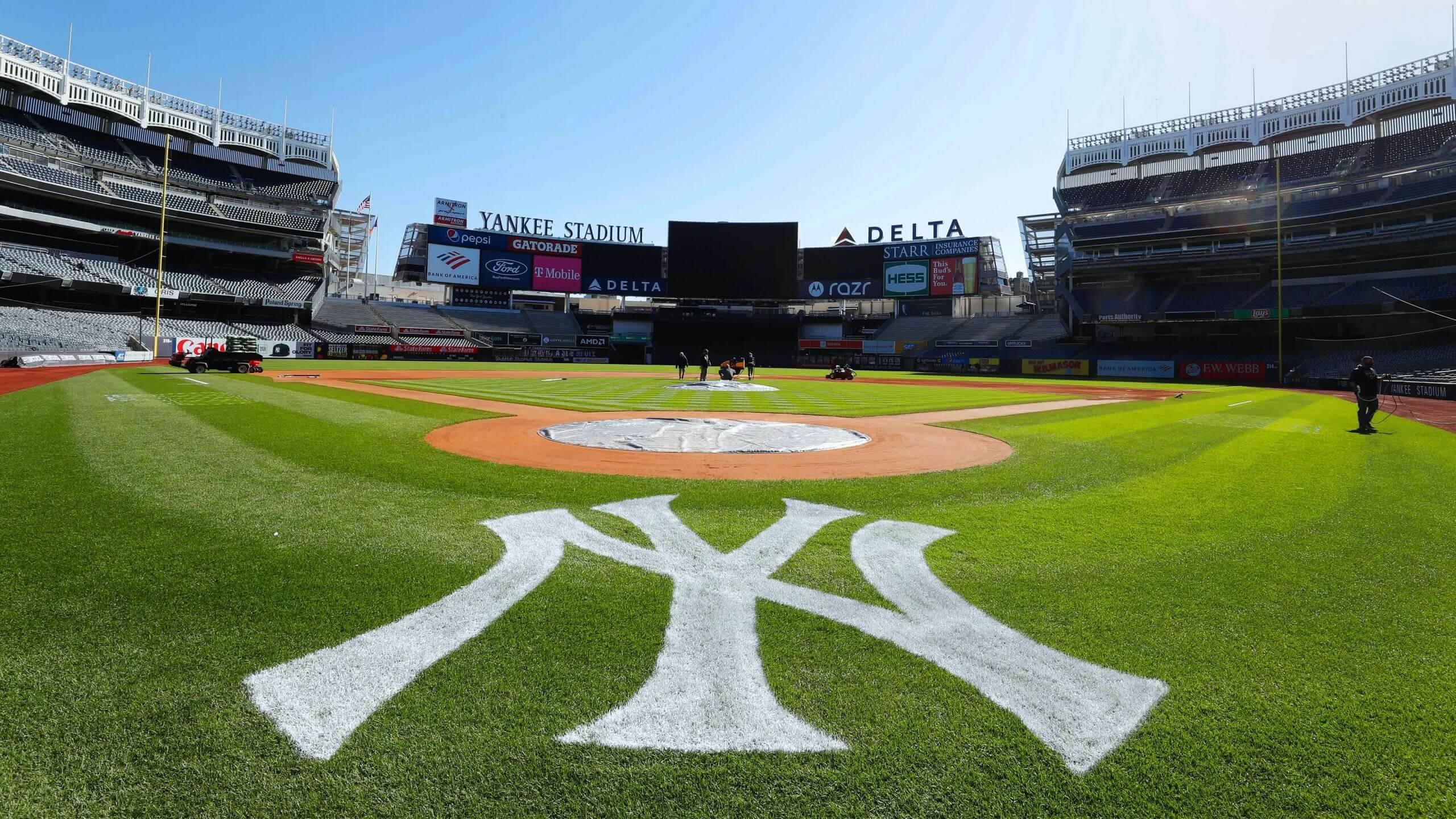
Check that — the Yankees have ads along the baselines:
Aaron Hicks in against Jordan Montgomery pic.twitter.com/ucHIMEh4Xu
— Brendan Kuty (@BrendanKutyNJ) March 31, 2021
I know, I know — pandemic, something-something, lost revenue, something, just for one (more) season, something-something.
Field ads or no field ads, these photos are all signs that Opening Day is fast upon us — and that means it’s time for the 23rd annual Uni Watch MLB Season Preview. You may be thinking, “Eh, there are barely any uni changes this year anyway” (which is true), but this year’s preview nonetheless runs over 3,000 words, and I found at least a little something to say about every single team. I know many of you look forward to this column all winter (so do I!), so go ahead and get your fix over on InsideHook, where the preview is now available for your enjoyment.
(My thanks to everyone who shared field pics with me yesterday, and especially to John Okray for the Brewers photo.)
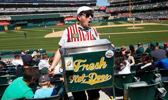
Meanwhile, out in Oakland…: What’s the latest from our friend Hal the Hot Dog Guy? As you may recall, last year he was raising money for his fellow unemployed vendors. But what about this year — will he be vending again?
Here’s what he told me last night:
I am very excited for Opening Day. My wife and I have tickets, which is maybe the first time we have gone to a game together, because I always work.
For the first half of the season, the team is only going to have app-based food sales. So vending is sort of possible, but we would really be more like restaurant runners. I might try it a couple of times, but mostly I am excited about July or so, when we are hoping to be back to normal.
Can’t wait for that. It’s been a long 100 years since the AL Wild Card game in 2019!
As we all know, the passion, spirit, and creativity that Hal brings to his work are very, very special. Here’s hoping he’s able to resume vending this summer.
Click to enlarge
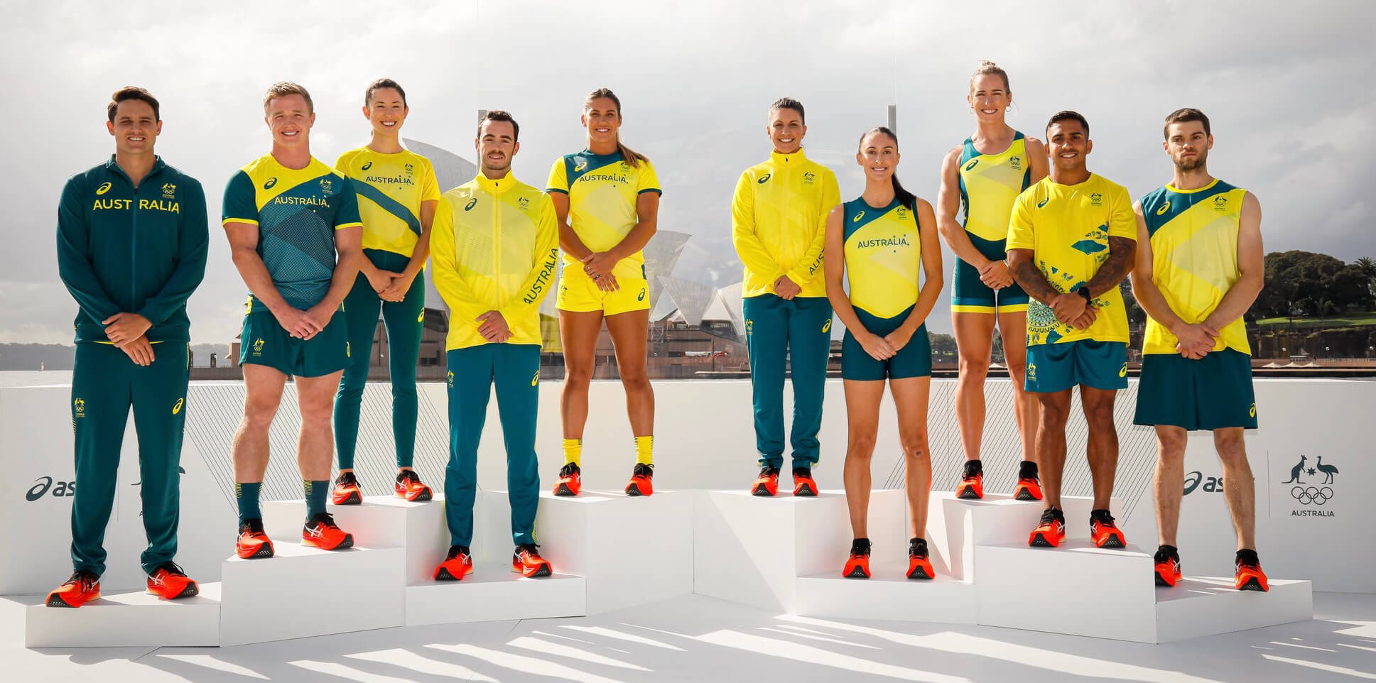
Tokyo preview: Don’t look now, but the 2020 2021 Summer Olympics in Tokyo are now less than four months away (or at least that’s the current plan), so countries are starting to unveil their togs for the games. Australia — always a Uni Watch favorite because of their green/yellow color scheme — revealed theirs yesterday. Not bad, right? Well done, mates!
(Thanks to Phil for this one.)
Click to enlarge
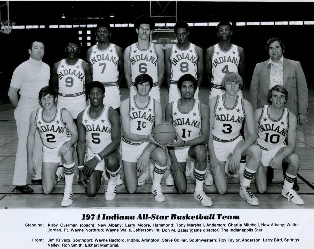
Too good for the Ticker: Check out this team portrait of the 1974 Indiana high school all-star hoops team. Yes, that’s a young Larry Bird in the front row, second from the right, but I’m more interested in the two guys to the left of him who are wearing Nos. 1T and 1C — never seen that before!
According to the caption, those two players are Steve Collier (No. 1C) and Roy Taylor (No. 1T), so the letters apparently referred to their last initials. I’m guessing that they both wore No. 1 with their respective high schools and this was a way to let them both keep that number. Weird!
Update: Several reader/commenters have provided the backstory here. As DanN explains: “Steve Collier and Roy Taylor tied for Mr. Basketball (top player in state). Mr. Basketball is given No. 1 on the roster. Since they tied, both got to wear No. 1, but with their initial added. The same thing happened in 1987 when Jay Edwards (1E) and Lyndon Jones (1J) tied.”
(Big thanks to Corey Burnett and Jeremy Snyder for additional assistance.)
Click to enlarge
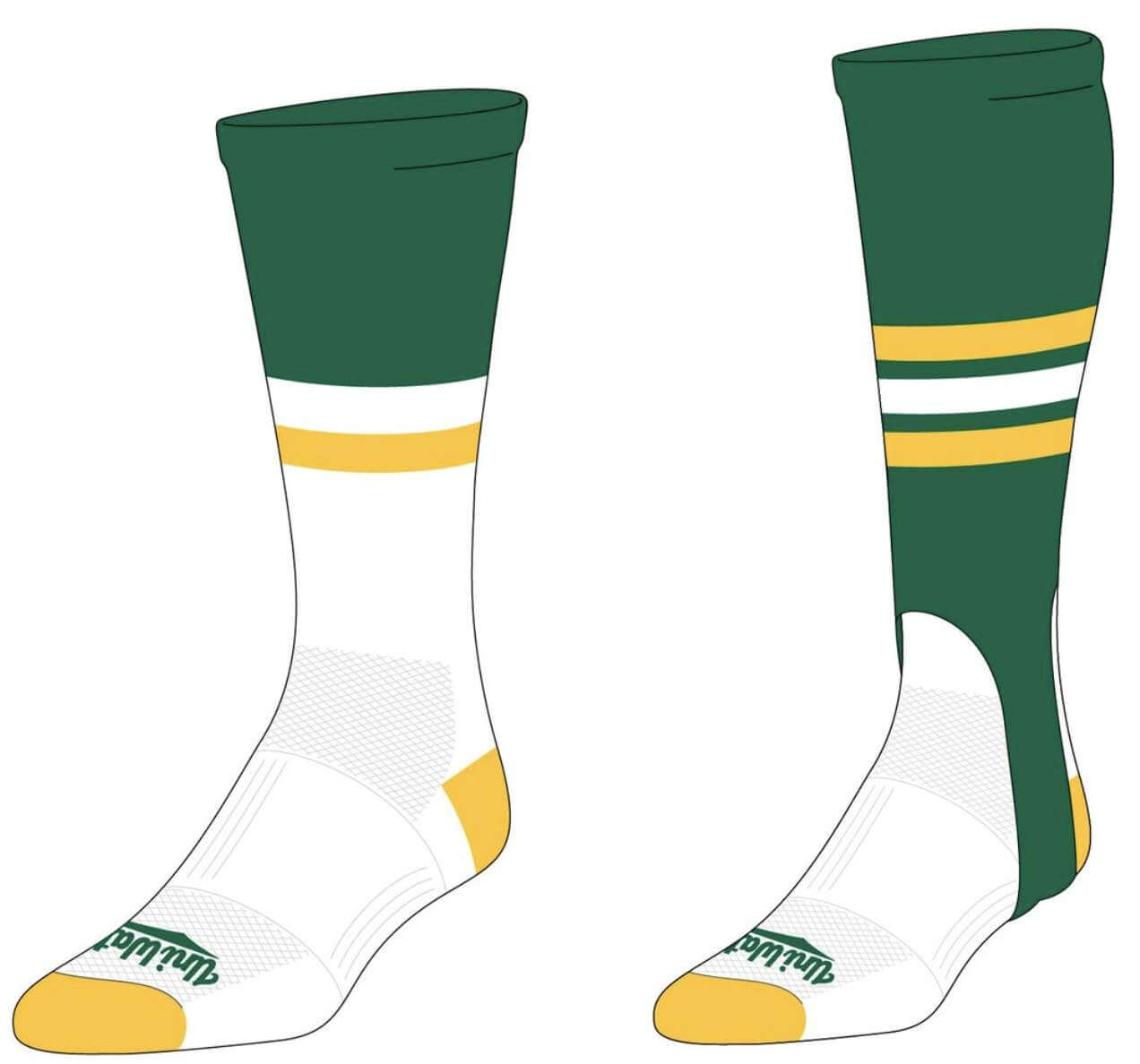
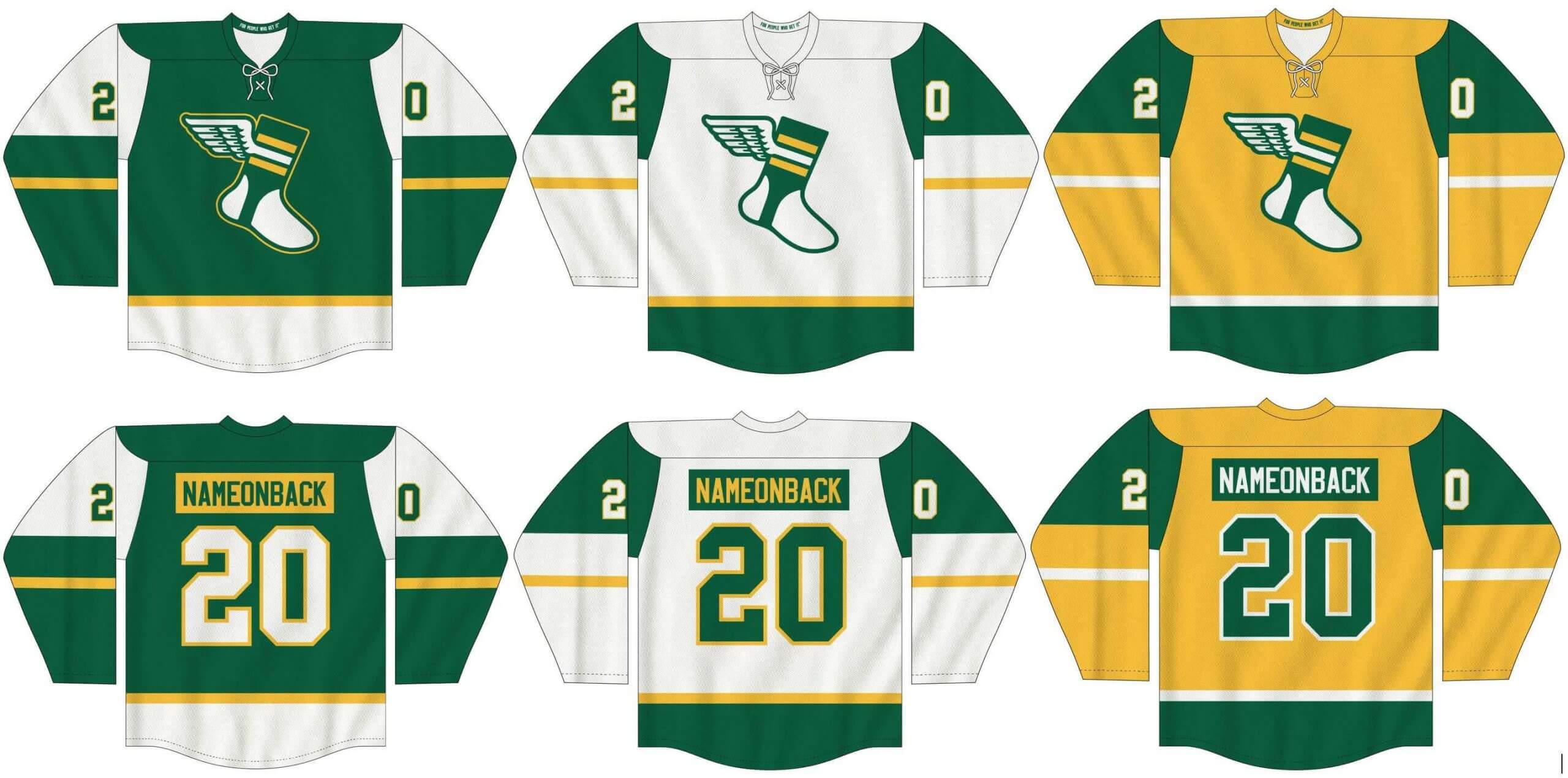
LAST CALL for the latest merch: Today is the final day for you to place your pre-orders for our new Uni Watch hockey jerseys (customizable with your choice of number and NOB, of course), socks, and stirrups.
In order to get in on these items, you must place your pre-order by today. You can do that here. We expect the finished product to ship out by the end of April.
My thanks, as always, for your consideration.
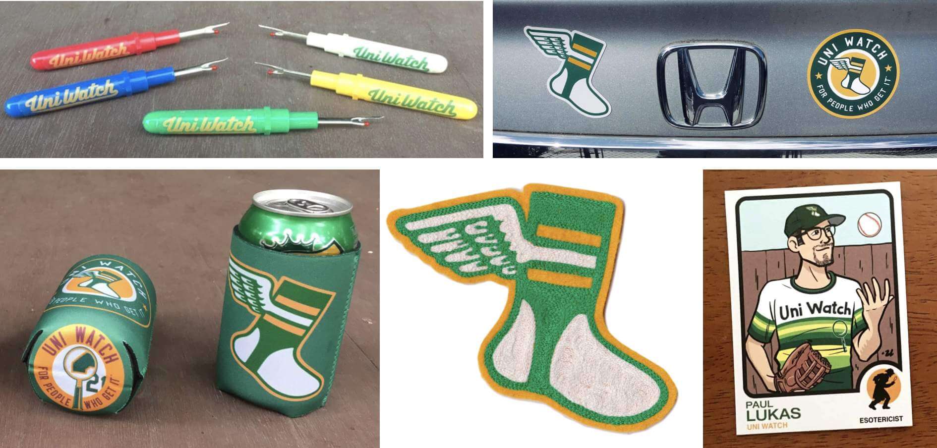

ITEM! Merch raffle: Reader Michael Brantner has generously donated $25 that a lucky reader can put toward any of the merchandise that ships out directly from Uni Watch HQ. That includes our seam rippers, koozies, magnets, chain-stitched patches, trading cards, and membership cards, and I’ll also allow this to be put toward a Uni Watch Classic Cap.
This will be a one-day raffle. No entry restrictions, but shipping to a non-USA address will likely eat up much of your prize credit. To enter, send an email to the raffle in-box by 8pm Eastern tonight. One entry per person. I’ll announce the winner tomorrow. Good luck!
Uni Watch Hit Parade: Bachelor, an indie-rock duo featuring Jay Som and Palehound frontwoman Ellen Kempner, have a new song called “Stay in the Car,” and it’s a monster. Completely Pixies-derivative, and I mean that as a compliment. Can’t stop playing it over and over. Gonna be the song of the spring, at least here at Uni Watch HQ. Enjoy.
The Ticker
By Lloyd Alaban

Baseball News: We’ll still call it Marlins Park. … Yesterday’s Twins/Pirates spring training found both teams wearing their road grey pants (from Ted Starkey). … Cardinals P Jack Flaherty wore cleats yesterday paying tribute to Cardinal greats Bob Gibson and Lou Brock (from Erik Spoonmore). … The Reds are pushing digital tickets, but you can still get a commemorative paper ticket for $5 plus shipping (from Patrick O’Neill). … New unis for SSG Landers of the Korean league (from our own Phil Hecken). … One more from Phil: Take a look at the Padres’ uniform history. … Wisconsin Gov. Tony Evers used a Topps baseball card-style graphic to explain his state’s broadband access plan (from @barrelman_mke). … The New York Post photoshopped two tickets on their latest cover — a Mets one from 2014 and a Yankees ticket circa 2011. Obviously, the Marlins logo shown on the ticket didn’t yet exist in 2014 and SS Francisco Lindor wasn’t yet a Met (from Ryan, who didn’t give his last name). … The Mariachis, a Mexican League expansion team, have revealed their new uniforms (from Hector Miramontes). … New alternate uniform for the Orix Buffaloes. It will be worn nine times this season (from Jeremy Brahm and @bigdaddy45_1969).

Football News: True to his word, Buccaneers head coach Bruce Arians went ahead and got the Super Bowl logo tattoo he promised he would get if the Bucs won the title (from @ScootersGhost).

Hockey News: LGBT-themed pregame sweaters for the Sharks tonight (from our own Phil Hecken). … Here are the logos for the next three World Junior Hockey Championships (from Wade Heidt). … Shameful: The name of the AHL’s Henderson Silver Knights’ new arena will be an ad for a predatory payday loan company.

Basketball News: Here’s our first look at the Final Floor (from Dave Ciskowski). … Good work by Austin Pendergist, who has come up with reimaginings of Clemson’s basketball uniform for each NBA Eastern Conference team. … Former Nuggets coach George Karl was spotted wearing a Shawn Kemp dunk hoodie (from Jorge Cruz). … Burger King is appealing to basketball fans in Spain by turning a court in the NBA 2K21 video game into a “menu” where they can score to win free food items. “Gives new meaning to the term ‘product placement,'” says Shawn Hairston.

Soccer News: The NWSL has a league-wide sleeve ad deal again. The previous one ended with the 2019 season (from our own Jamie Rathjen). … Also from Jamie: New shirts for Montserrat and Anguilla. About half of Montserrat is uninhabitable because of volcanic eruptions starting in 1995, hence the volcanoes in the design. … New crest for Inter (from Trent Lowe). … A sportswriter has ranked all of the Orlando Pride’s shirts (from our own Phil Hecken). … Also from Phil: New shirts for Celtic and also for Manchester United. … Leicester City’s new shirt has leaked. … MLS ranked its top 10 best-dressed coaches (from Wade Heidt).

Grab Bag: Australia’s Super Netball’s Adelaide Thunderbirds have a new kit (from our own Jamie Rathjen). … Fans have chosen the logo for the 2026 Winter Olympics, to be held in Milan, Italy (from Jeremy Brahm). … New logo for Black Hills State (from Dan Brookens). … New logo for MSNBC. … Gonzaga President Thayne McCulloh has a jacket with his office’s coat of arms on it (from Benjamin Thomas). … The U.S. Olympic and Paralympic Committee says that kneeling and raised fists during the national anthem will be permitted during Olympic trials.

Regarding the 1974 Indiana All Star Team, Steve Collier and Roy Taylor tied for Mr. Basketball (top player in state). Mr. Basketball is given number 1 on the roster. Since they tied, both got to wear #1, but with their initial added. The same thing happened in 1987 when Jay Edwards (1E) and Lyndon Jones (1J) tied – sorry no picture of that.
Thanks! Explainer now added.
So, Larry Bird was the fourth best basketball player in Indiana in 1974. That’s a hoot!
Here’s a picture of Edwards and Jones wearing 1E (somewhat obscured) and 1J – link
Thanks! Link added.
Hardly the most important thing, but I find it mildly interesting that they still gave the next player No. 2 when he should probably be No. 3 and Bird should be No. 4. As a result, the “top 10” is actually the top 11. Nice move for the 11th player, I guess.
Should do something on the Roller Durby from back in the day. New York Chiefs San Francisco Bay Bombers Philadelphia Warriors Los Angeles Thunderbirds
Looks like they had a tie for Indiana Mr. Basketball that year, and since Mr. Basketball gets to wear #1 for the All-Star games they play, they had to have two #1s for that year.
Regarding the Larry Bird picture, I think the numbers assigned were how you were “ranked”. Indiana names a “Mr Basketball” and they would be given a “1”. In ’74, I guess there were two “1”s awarded. Just a hunch of mine.
Great job on the MLB uni season preview. I’m afraid after two seasons of lost gate revenue coupled with a likely work stoppage next season that the owners will add ads to everything they can “After that Beer Company double Lindor finds himself standing on Henderson Pants 2nd base.” Just as gross with be Nike doing Nike things with the uniforms.
I guess from a strictly business perspective, there is no reason for team owners not to continue with “advertising creep” as long as fans continue to accept it.
I mean, it’s “easy” money with no real downside for the owners until they find that it is driving fans away. But they are probably finding that fans may offer a few complaints but we eventually start to get used to it as it is done in small increments.
From the perspective of the Uni-Watcher, it seems like an unsolvable problem.
I guess from a strictly business perspective, there is no reason for team owners not to continue with “advertising creep” as long as fans continue to accept it.
Except that the “strictly business perspective” is a bogus construct. Here’s why: link
In this case, however, I’m not using “it’s just business” as a justification for advertising creep in sports, I’m saying that the team owners (for the most part) are going to look at it from that perspective.
So I agree with your basic premise that “it’s just business” should not be a valid reason for a business to do something unethical or harmful to people.
Now, since you note that “Reasonable people can disagree about where those lines should be drawn…” I guess I am saying that there is no inherent reason that the line should be drawn in such a matter that a business can’t choose to sell advertising space inside their place of business. There is an aesthetic argument that I agree with, that being that games are more enjoyable to watch without a bunch of ads cluttering up things, but that is hardly a moral or ethical one.
I’m saying that the team owners (for the most part) are going to look at it from that perspective.
But it’s still a bogus construct. I didn’t say that you were the one invoking it — it’s still bogus even if a business invokes it, since it would imply that they have no interests other than mercenary/pecuniary interests, and also no societal obligations, both of which are false.
There is an aesthetic argument that I agree with, that being that games are more enjoyable to watch without a bunch of ads cluttering up things, but that is hardly a moral or ethical one.
Actually, the larger issue of advertising ever-encroaching spread across our landscape, and the resulting transformation of modern life from a market economy to a market society, is very much a moral and ethical issue. Again, reasonable people can debate the parameters of that issue, but the issue is a very real one, and it goes way beyond aesthetics.
But advertising and pro sports have gone hand-in-hand since the beginning of sports as an industry. The teams are going to sell ads up to the point that their customers decide that it’s too much and start to walk away. There is no moral/ethical issue at hand when it comes to how much space at a stadium can be sold to advertisers, it’s strictly a commercial issue.
You are assuming that all advertising (and, indeed, all commerce) is essentially equivalent. I strongly disagree.
I’m afraid we’ll have to leave it at that.
Another stellar MLB Preview (my favorite column of the year!). Looking ahead to Nike’s complete take/makeover I can only imagine what ’22 has in store. But let’s cross that bridge when we reach it.
Already don’t like the soft opening with that one tweet about the Royals in the article. The MLB patch on the back of the jersey looks ridiculous below the headspoon trim.
The MLB season preview references the ‘annual Field Of Dreams’ game, but it’s actually the FIRST ‘Field Of Dreams’ game, and as far as I know there’s been no expectation that it’ll be annual (since they’re building a special temporary stadium for it)
What’s sad is the Yankees acquire some air of being classic because they don’t have ads on the field, but the fact they have a big logo behind home plate is so ridiculous in the first place. If they were really high and mighty they wouldn’t have any of that silly stuff on the field in the first place!
I wish all of the fields were just plain grass like they should be.
It now turns out that they’ll actually have ads along the baselines:
Why is this any different than ads on the outfield wall or ice boards? Soon you will see digital field ads like on ice and soccer fields.
All the complaining regarding the ads gets nothing done, it’s rare to see anything constructive anymore on this board. It’s becoming redundant and almost predictable.
Let me get this straight: You don’t like all the “complaining” on this site — so you complain about it.
In other words, you think it’s OK for you voice objections to things you don’t like (and you’re right — it *is* OK for you to do that!), but you don’t think it’s OK for other people to do the same (that’s the part you’re wrong about).
Think harder, Peter.
No link included for Burger King/Spain/NBA2K story. But thanks for ruining my diet. lol
Link now added. Here it is:
link
Love the preview, it’s a spring tradition.
Will have to check out Bachelor, because I lived Pixies back in the day.
Love the ClemsoNBA but I only saw the Eastern Conference?
You’re right, just the East for now. Text now adjusted.
Two things I picked out re: the Season Preview – great job as always, of course, Paul!
1. My hometown Nats. Gosh, I WANT to like that blue jersey. We won the Series in it after all. But the verticality of the wordmark has driven me nuts since they first unveiled it. I assume you’re right, that it’s a concession to the standard Nats front jersey number style, but why are the front numbers even necessary on a wordmark jersey? They function to balance out a jersey with a chest logo. The proof is in their “new home” jerseys that they refuse to designate as home jerseys with the same wordmark, without the numbers, and it looks great.
Oh, and tangential to the point – this has been their primary wordmark for almost ten years now, and the huge “NATIONALS” sign hanging over the center field scoreboard at Nats park is still the older, radially arched design. Come on, Lerners! Every season I hope they’ll update it, and every season am left disappointed. For a team that has essentially eliminated their previous design from their history books, it just irks me to no end.
2. Bill Henderson ran a post on his blog indicating that there’s new fabrics, cuts, and subtle changes to the Nike-branded jerseys this year, after just slapping on their logo on Majestic jerseys last year. Any news on this front? Unfortunately I highly doubt I’ll get a chance to see them in-person anytime soon.
Thanks!
Bill was referring to those Royals spring training jerseys that I linked to late in today’s piece. That’s a hint of what’s come next season, not what we’ll be seeing this season.
What’s wrong with being a team with a more vertical slant than other teams?
As a fan you should celebrate any little way your team is unique. Don’t try to fit into some imagined correct template. That’s nowhere.
The Indians used to have my favorite uniforms, but the Nats do such a great job at imitating Cleveland, Washington have moved to the top.
Great breakdown on the MLB season as always Paul and your comments on the current field ads and the all but certain future uni ads are spot-on. “Experimental” or “pandemic fueled” advertisements anywhere are like putting toothpaste back in the tube, they’re here to stay…sadly.
Regarding your thoughts on the Oakland Coliseum, where you note, “The A’s new ballpark, which seems like it’s been in the works more or less forever, can’t get here soon enough.”
As an A’s fan, the Coliseum is just a place where you can go to a ballgame with your family and enjoy yourself. I dread the day when they’ve got a new stadium that has fewer seats at much higher prices where there’s no convenient public transit, and which I can no longer take my kids to on a regular basis. As far as I’m concerned, I hope the new stadium doesn’t open for more or less forever.
Paul, thanks for sharing the track by Bachelor. It’s a banger, as my kids would say.
Glad you like, Eric! Feels like a readymade, no? Like, how did that song not already exist? So good!
And let’s not forget the NASCAR unicentric bits… one band member is wearing a Danica Patrick GoDaddy jacket, the other a Lucky Charms Petty Motorsports jacket.
Also, yeah, thanks for the intro to this band. Been hunting all over the Youtubes all morning for more!
Which is ironic (is that what Bachelor was going for?) since a Patrick/Petty collaboration is probably never going to happen:
link
There was even talk that she took a “colorful” shot across his bow when she got a new ‘sponsor’:
link
I found the link of the Australia Olympic uniforms that labels what sports are represented.
Wow, the basketball uniform is a tight-fitting one piece instead of the traditional (slightly looser) tank top and shorts. See especially photo 5 of 6 in the slideshow at the link that Jamie shared above.
Yes it is unusual look for sure, but the Australian womens team has definitely worn the one piece before. I recall from previous Olympics, not sure of the exact years, but I know I have seen it at least twice.
Perhaps they are just listing the sport for each athlete as some are in warmups or opening/closing ceremony attire. The man listed as rugby in photo 1 is not in a rugby uniform, it appears another person is modeling the rugby uniform in the group shot (2nd from the left)?
You are right about the basketball unitards. Paul wrote about them here: link
Now I feel stupid.
The linked WaPO piece on ballpark traditions has two serious errors related to the Yankees…for the 7th inning stretch, “Take Me Out” is always also sung, right after God Bless America. And “New York, New York,” unfortunately is played after every game, not just wins. It would be much more meaningful for wins only. The tradition used to be Frank for wins and Liza for losses, which I liked. But that was perceived to be sexist and we lost Liza.
Thank you Paul. Of all the major American sports, baseball is my favorite “Opening” season. The NHL and NBA feel like they don’t get into full swing until January, nearly halfway through the season.
Enjoyed the Bachelor link but it made me think of the Breeders which is almost the same thing as the Pixies.
It was a great tune, lead singer does sound quite a bit like Kim Deal and the bass line and “quiet/loud/quiet” song structure certainly reminded one of both the Pixies and Breeders.
I was all ready to correct Paul’s spelling of “Skechers” to the proper “Sketchers”, but then I Googled it and it turns out the company is actually “Skechers”. I’m getting some seriously spooky Mandela Effect vibes right now.
I always thought it was the “Mandella Affect.” Whoa, this hurts my brain.
The ever-progressing death of the paper game ticket saddens me. Can’t we have leave something permanent and traditional anymore in sports without having fans be exploited and extorted? -C.
I know. Last time I went to a game (December 2019), I had an older phone with limited onboard storage, so I ended up having to delete some apps just to have the right apps to get the digital game and parking tickets on my phone. That alone was irritating (though as I’ve since upgraded my phone to a model with more onboard storage, that’s far less of an issue), but yeah, it would’ve been a much easier time with paper tix.
I used to save all my tickets as a kid. I continued into early adulthood, then the cool keepsakes slowly faded away to printouts covered with mostly garbage ads & eventually it was a screen shot on my phone of a barcode or QR code.
It is fun to look through the box and remember game details & good times w/ my dad or old friends. Pretty much gone now. Very sad
Just wondering if the NFL made Bruce Arians license the logo for the Big Game (sorry, I don’t have permission from the league to say “S*p3r B0wl”).
Once again in the baseball uniform preview article, an attack on the Rangers – “they can’t decide if they are are red team or a blue team.” I’m forced to list all the other teams with both red and blue. Blue Jays, Red Sox, Twins, Indians, Angels, Braves, Phillies, Nationals, Cubs, Cardinals, Dodgers and Diamondbacks (sort of). 12 teams! I like the Rangers using both colors – that is their thing and has been since day 1. Overall, however, way too many teams use blue. It is easier to name teams not using blue.
Literally not a single one of those teams tries to mix and match blue and red elements like the Rangers do (although Cleveland has sometimes come close — and I have called them out for it).
That’s not an “attack”; it’s simply a critique of something I find self-evidently absurd.
Your larger point about too many teams using blue and red is, of course, accurate.
I would argue that the Red Sox & Braves do
Do the Braves have a red hat that they mix and match with their various uniform combos? No.
Do the Red Sox have a red hat that they mix and match with their various uniform combos? No.
The end.
So it’s only bc the Rangers have an alternate red cap? That’s your arguement.
It’s not my *whole* argument (I could go on regarding undershirt colors, sock colors, etc.), but it’s a sufficient argument.
Like I said: The end.
Thanks for the tip on Bachelor – I hear the Pixies, but also Fountains of Wayne – perhaps because I’ve been revisiting their work to recognize the year anniversary of Adam Schlesinger’s passing… I always trust your music recs!
I lurrvvve this band!
Factual error that needs to be corrected in the Inside Hook MLB preview: the alternate O’s cap was introduced in 2005, not 2009… so 2021 will be the 17th season of apostrophe catastrophe.
link
link
well shoot. i came back to see if i could find out the mystery expos.(that’s weird, no mention thought bubble).
so i go scrolling back, nothing yesterday, and go back to the lede, and damned if it isn’t there, larry doby is a great guess based on the evidence, has to be him.
not shocking that i would stop when i saw the pixture, and try to figure it out without clues and miss your guess. i really thought i had something with a mack jones-aaron connection too. oh well, it was fun anyway.
You? You of all people didn’t read all the way thru?!
Enjoy the Holiest of Holies tomorrow!!
Seattle had the baseline ads last year. From the wonderful “smoke out” games last year
link
Oh, sure, all the teams had them last year. No fans, short season, pandemic, etc. The issue at hand is that they’re rolling them over for *this* year, which wasn’t clear until these field-prep photos started appearing as part of the run-up to Opening Day.
Well at least Seattle’s T-Mobile Park has T-Mobile on the baselines. Can’t understand the connection between Audi and Yankee Stadium (other than you need the price of an Audi to get a seat behind home plate). Or Petco Park and (absolutely massive) Blue Shield in San Diego (albeit Petco Park does have advertisements on the walls behind home plate).
Just got in from another planet. Square me away, please. Any info on what happens to all the cause-themed gear pro teams keep flaunting? (See Canucks today.) Sold to hobbyists? Auctioned somewhere? Donated to the relevant causes? Wondering. Don’t image this is a serious money-maker for the gear makers like all the military and responder specials.
Been following Uniwatch for several years.
My first serious concern was why the Cincinnati Reds back in the sleeveless and Red Machine days always seemed to have a low-height stirrup mandate. Maybe to insure maximum amount of “redleg” each player would display?
Auctioned, I think. But I don’t know for sure. The NHL is unusual in this regard because they wear this kind of stuff only for pregame — never for the game itself — which probably reduces its fan appeal. Anyone know more?
Those Montserrat jerseys are way awesome. They show off the shared sacrifice of Montserratians in what must be considered a very hostile environment.
With respect to the Mets shoulder patch honoring Tom Seaver, don’t you think at the very least, they could have lined up the pin striping on the patch with the pin striping on the sleeves of their jerseys?
That Padres’ retrospective isn’t a very deep dive. Didn’t they have ten different uniforms between 1970 and 1980?