
For all images, click to enlarge
Good morning and greetings from Uni Watch HQ, where all three inhabitants continue to be safe and well, and where one inhabitant reached the ripe old age of 57 yesterday.
Although my birthday was Sunday (thanks for all the kind tweets and emails!), we made a full weekend celebration of it, beginning with a Saturday trip to Manhattan, where we visited two museums. This felt like a big deal, because we’ve avoided museums, art galleries, and all similar places throughout the pandemic, but we decided that it was time to dip our toes back into that pool.
Our first stop was the Grolier Club, North America’s oldest club for bibliophiles. They currently have an exhibit on the history of American magazines dating back to the mid-1700s (there’s a good review of it here), which turned out to include a decent number of sports-related titles, including the September 1908 issue of The Baseball Magazine that’s shown above. The informational placard says:
First-class cover art had never been viewed as a necessary competitive edge for an all-sports publication until the advent of Baseball Magazine. Its writers would be the best the sport had to offer and the eye of appeal of its covers would compete on the newsstand with the best general interest publications. Through its first decade, Baseball Magazine proved an artistic and commercial success, reaching a six-figure circulation.
Interesting, right?
The exhibit also includes a May 1938 issue of the NAACP’s magazine, The Crisis, with Negro Leagues star Josh Gibson on the cover. According to the placard, it was the only time during his career that Gibson appeared on a magazine cover:

Speaking of Black publications and athletes, there’s also a rare copy of Our Sports (one of the two Black sports magazines that I wrote about back in December), plus Satchel Paige on the cover of Jet and Jackie Robinson on the cover of an early edition of TV Guide (described as “a highly unusual appearance for an African American on a magazine intended for a predominantly white readership”):

TV, sports, and magazines appear to have been heavily intertwined from the start. The cover illo for the debut issue of an early publication called All About Television — published way back in 1927! — showed a family watching a football game:

Similarly, the first issue of Television Forecast — described as a forerunner of TV Guide — featured baseball on the cover, and two primary headlines on the all-text debut cover of Local Televiser were “Winter Sports Schedule Announced by WCAU-TV” and “Four Major Sports on WFIL-TV This Week”:

The exhibit also included lots of non-sports magazines, including the debut issues of Time, Life, Popular Science, Esquire, National Geographic, and a lot more. You can see some additional photos here.
From there we walked over to the Museum of Modern Art, which has a completely mind-blowing exhibit of Soviet and European graphic design (mostly posters) from the 1920s and ’30s that I’d been wanting to see for months (here’s a really insightful review). Of the 300-plus pieces on display, a few were sports-themed, including these really excellent postcards that promoted a 1928 athletics exhibition (this one is definitely worth clicking to enlarge!):

There were also these, which promoted athleticism and physical fitness:


Also: Remember when I recently wrote about how the Belarusian soccer team FC Vitebsk released a kit based on the Russian designer El Lissitzky’s piece Beat the Whites With the Red Wedge? If you liked that, this exhibit has several El Lissitzky pieces, including these:

The rest of the pieces were not sports-related, but an astonishingly high percentage of them were really, really good — especially the ones by one of my heroes, the great Russian constructivist Aleksandr Rodchenko. Sometimes I hear a song that sounds perfect and I think, “There is no other music besides this music — what other music could there possibly be?” That’s how I feel about Rodchenko’s design work. It’s so good, so Just Right, that everything else just melts away and there’s nothing else, because what else could there possibly be? What need could we possibly have for any other type of design? These next images are all his:


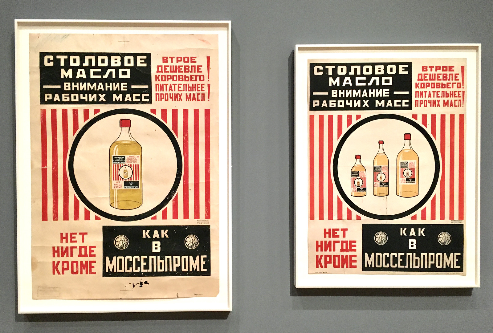

Oh, man — that stuff is so fucking good. At some point Mary sidled up to me and said, “You must be in heaven,” and it’s true — I was. You can see lots of additional pics from the exhibit here.
After marinating in that exhibit for a while, we checked out exhibits on Alexander Calder (another one of my heroes — really, really good) and Black architecture (also good, but more interactive and thus more mentally and emotionally demanding, and by that time we didn’t have the stamina for it, so we didn’t really get the most out of it — that’s on us).
Then we walked way across town to the Javits Center, where Mary got her first vaccination shot. Between that and the two museum visits, it was a very full day! And a really good one.
Yesterday was my birthday proper. Two things were very different from the norm: First, I’d normally have a big party, but of course that wasn’t possible this year. And second, as many of you know, the weather on my birthday is usually terrible (this dates back to one of my earliest childhood birthday parties, when we had some sort of outdoor activity planned but it got rained out, prompting my father to make up a very sweet on-the-spot lie — “Oh, don’t you know? Rain on your birthday is a sign of good luck in the year to come!” — and since then it has rained [and occasionally snowed, and on one occasion hailed] every single year, which has become a ritual that I enjoy and look forward to), but yesterday was spectacularly nice — sunny, about 60º.
At first I was bummed about this (I’ve become very emotionally invested in the rainy birthday thing over the years). But if I couldn’t have a party, it was nice to have a sunny day for a change! So we went for a nice riverside drive and then parked at a rest stop and went for a walk in the shadow of the Verrazzano-Narrows Bridge:
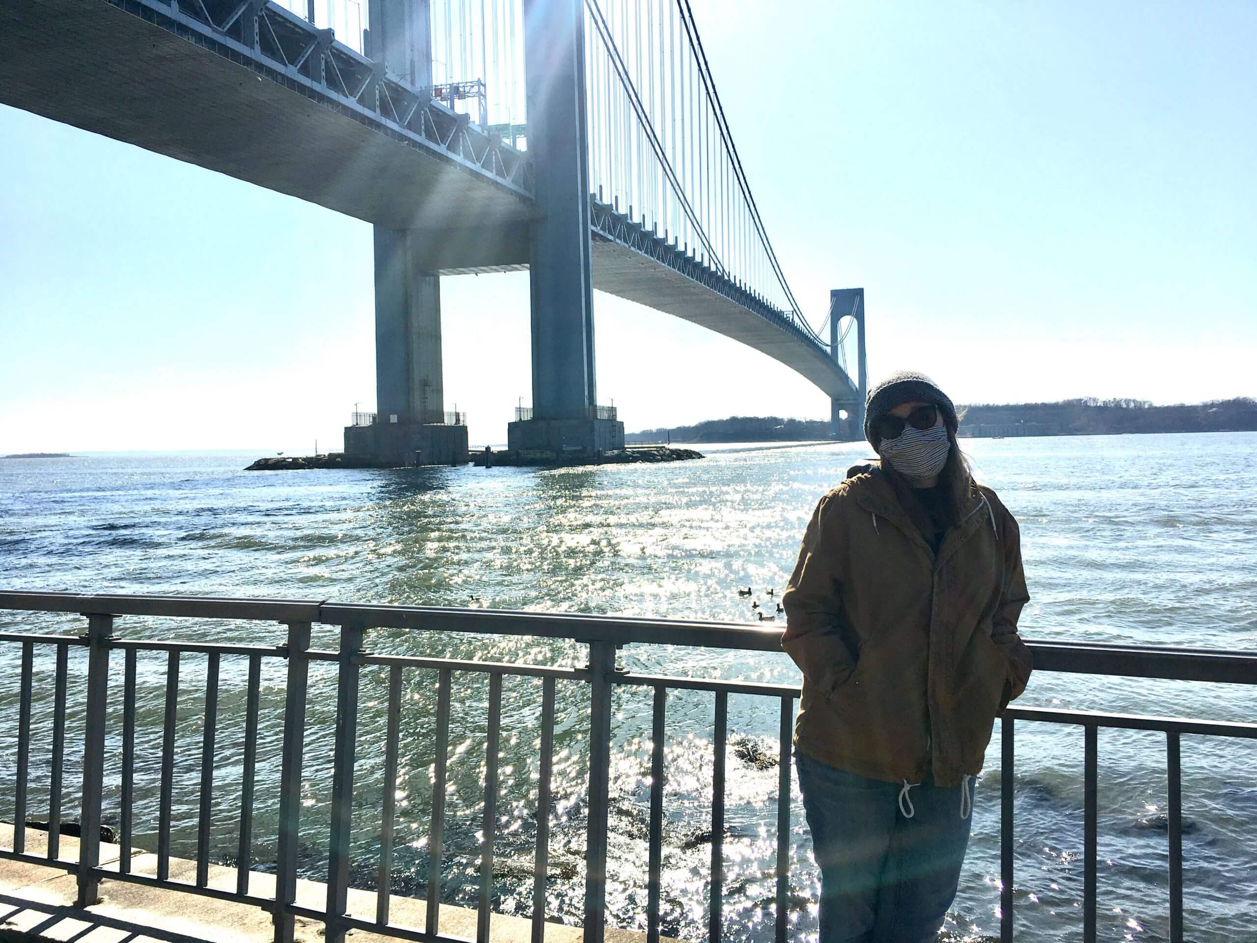
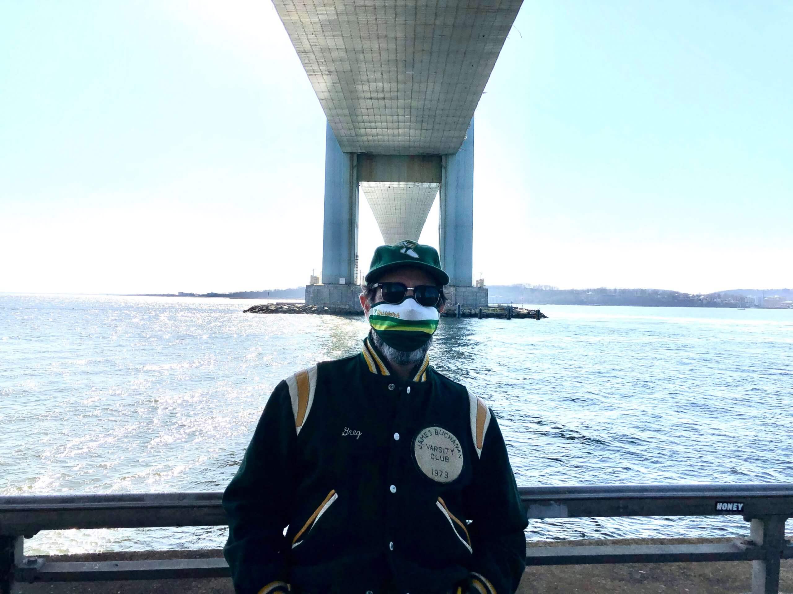
It was great to be out amongst so many other Brooklynites who were enjoying the start of spring. I can honestly say it was the nicest, sunniest, most pleasant birthday experience I’ve ever had. A good change of pace from the usual birthday monsoon!
After a bit of that, we returned home for cocktail hour (Champagne instead of beer, in light of the occasion), and then Mary whipped up a spectacular Chinese-style feast, followed by a birthday cake (mocha with mocha frosting):

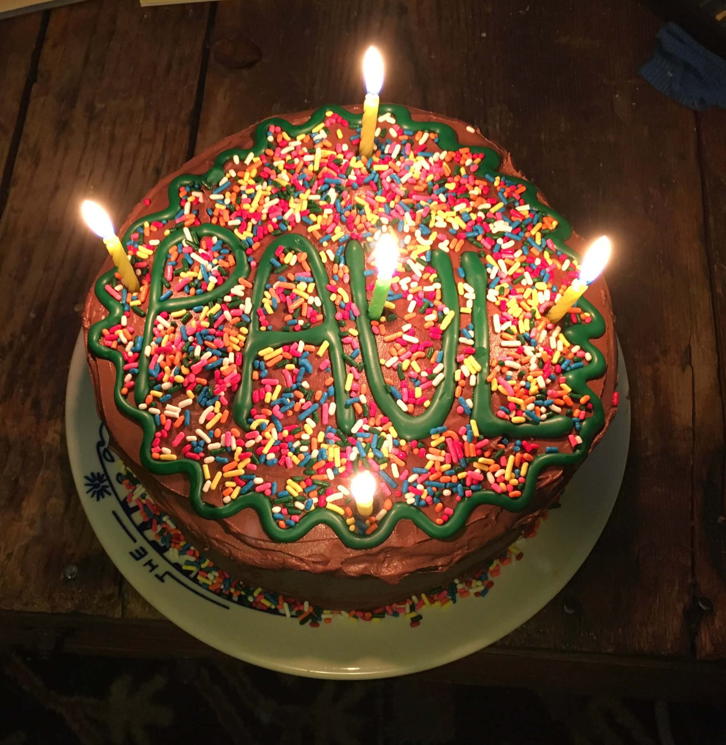
That, my friends, is one hell of a swell birthday weekend. Hope your weekend was festive in its own way, even if you had nothing in particular to celebrate!
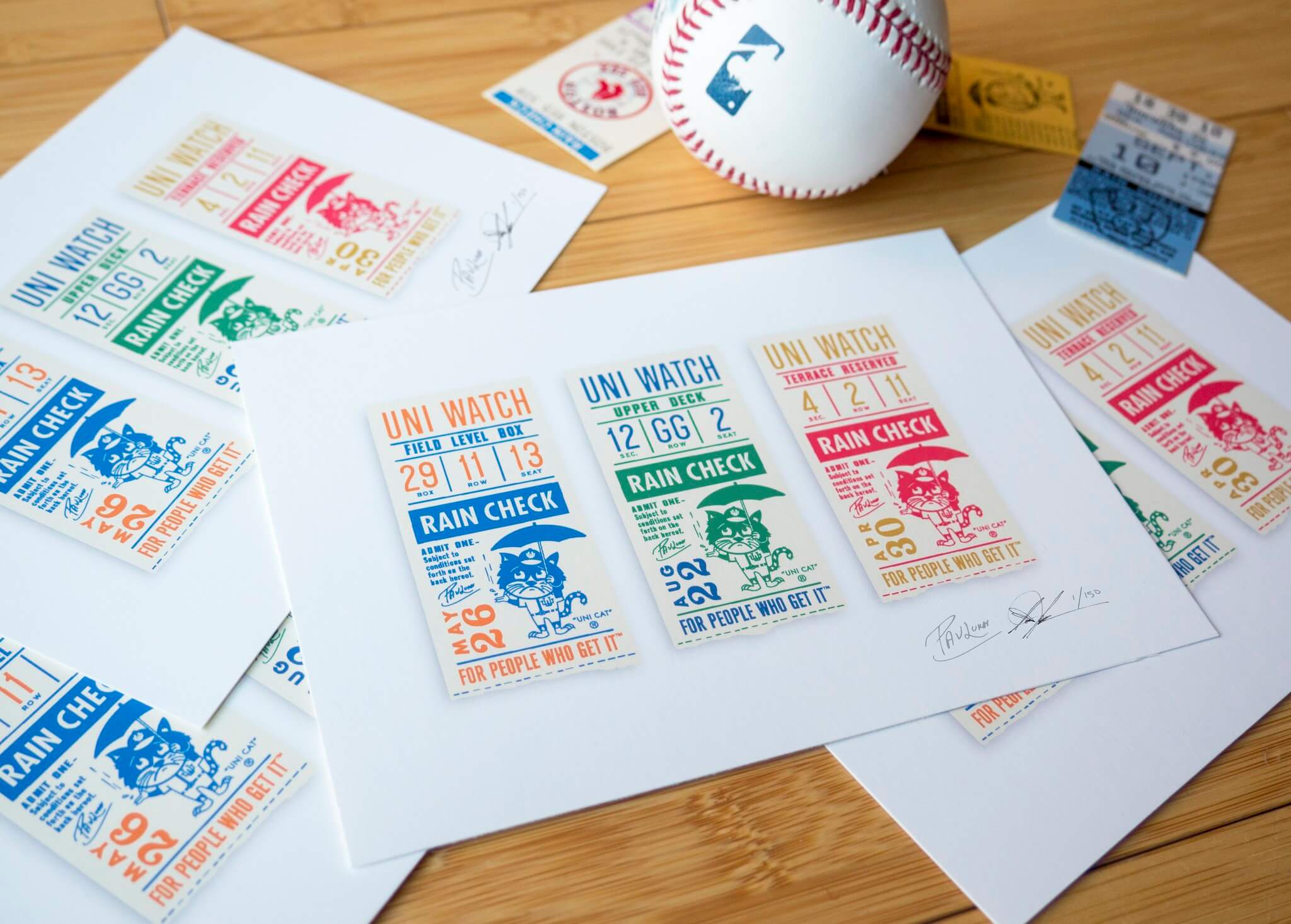
Click to enlarge
“Rain Check” reminder: I recently mentioned that Todd Radom and I had found a small stash of our limited-edition 2018 “Rain Check” print that we had set aside for promo purposes and then forgotten about. These are all signed by both Todd and myself. Available while supplies last on Todd’s website.
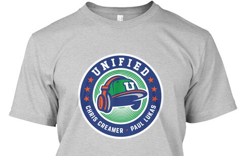
ITEM! Podcast T-shirt raffle: Reader Max Weintraub recently ended up with an extra grey Unified T-shirt, size 3XL, and has generously offered to send it to a lucky Uni Watch reader, so we’re going to raffle that off today.
This will be a one-day raffle. USA addresses only, sorry. To enter, send an email with your mailing address to the raffle in-box by 8pm Eastern tonight. One entry per person. I’ll announce the winner tomorrow. Big thanks to Max for sponsoring this one!
The Ticker
By Jamie Rathjen

Baseball News: The Dodgers wore a patch yesterday for Sudden Unexplained Death in Childhood Awareness Month (from Dave Sikula). … Phillies OF Bryce Harper showed up at a gas station in full uniform (thanks, Brinke).

Football News: Some new WFT acquisitions now have their uni numbers (from Dell Michaels). … New uni numbers for Alabama as well.

Hockey News: The first two items are from Wade Heidt: The WHL’s Brandon Wheat Kings have a new black alternate. … In the same league, the Portland Winterhawks and Seattle Thunderbirds usually go color-vs.-color at least once per season and did on Saturday. … Teams and players that wore mismatched socks for World Down Syndrome Day, which was yesterday, included the Senators in a practice (from Moe Khan), the AHL’s San Jose Barracuda and Henderson Silver Knights (from Ian Lee and @TimmyHowl), the WHL’s Prince Albert Raiders and Winnipeg Ice, along with other WHL teams (from Wade Heidt), and some Professional Women’s Hockey Players Association members.

Basketball News: This article from last week makes a great argument, using the NCAA’s practice of calling the basketball Final Fours “Final Four” and “Women’s Final Four” in their logos, for qualifying both men’s and women’s sports. That avoids making men’s sports the “default,” which is especially noticeable this time of year with the men’s tournament. … Another difference between the two tournaments is that only the men’s uses the March Madness logo — which makes no sense — so the specially-made women’s courts replace that with a generic “Women’s Basketball” logo in the style of every other NCAA sport (from Moe Khan). … However, the women’s venues in Texas don’t even all use that court, just the host teams’ normal ones (from Liam Smith). … Meanwhile, at the men’s tournament, the scorers’ table at Baylor/Wisconsin yesterday displayed the wrong teams (from Kyle Baker). … WaPo invites you to guess the men’s tournament teams from these illustrations (thanks, Phil). … Wizards SF Rui Hachimura now has cherry blossom-themed sneakers (from John Muir). … Several Rutgers men’s players have been wearing their headbands upside-down.

Soccer News: Scottish Premiership clubs Celtic and Rangers stood together as an anti-racism gesture before playing yesterday. Players and officials in England and Scotland have been kneeling for a few seconds before games all season, but some clubs have stopped doing that, usually saying that it’s become an empty gesture. … Also in the Scottish Premiership, St. Johnstone and Ross County played their second blue-vs.-blue matchup this season. … In the Bundesliga, Freiburg wore their yellow third kit, instead of the normal red, at home yesterday because an unnamed player is red/green color blind and opponents Augsburg wore green (from Cory Mizer). … Players and officials at the CONCACAF men’s Olympic qualifying tournament in Mexico are wearing CONCACAF 60th-anniversary patches and captains’ armbands. … Portuguese side SL Benfica replaced their usual NOBs with “Racismo Não” (No Racism) last night (from @mikeDfromCT). … The new Denmark kits feature a sound wave pattern based on a 2019 recording of fans singing the Danish national anthem (from Trevor Williams).

Grab Bag: The first two items are from Sy Hart: Major League Rugby’s San Diego Legion apparently got a white third shirt at short notice. … Romania’s men’s rugby union team wore a new flag-striped shirt best described as “multicolor” for the first time. … Stanford wrestler Shane Griffith competed at the Division I championships in a plain black singlet as a statement on Stanford ending its wrestling program (from Ross Bendik). … In Australia, a number of Victoria pro teams and sports governing bodies are involved with the state government’s campaign against sports teams accepting betting ads; however, the only team I’ve seen actually wearing the campaign’s logo is Melbourne’s AFLW team on their shorts. … Formula One twice held a race in the early ’80s in the parking lot of Caesars Palace in Las Vegas called the Caesars Palace Grand Prix. In 1981 the podium finishers received, instead of the usual laurel garlands, the garlands attached to caps, so they looked vaguely like wreaths (from Graham Clayton). … Reader Jason Hillyer had an Ohio University hoodie that was too small for him, so he and his wife Alison cut out the script and logo from the hoodie and re-sewed it onto this jacket. … Ryan Blaney, who won yesterday’s NASCAR Cup Series race at Atlanta Motor Speedway, had “2” and “24” inscribed on his cap, presumably for Gigi and Kobe Bryant (from @waynetm41).

Glad you had a wonderful birthday!
If you like Alexander Calder’s work, come visit Grand Rapids, Mich. where one of his fantastic and large works — La Grande Vitesse — has become a symbol of the city. You’ll see it represented in the city’s logo, which is everywhere, including every street sign. We are sometimes called “Calder City.”
link
There is another Calder, a painting, on the roof of the county building, which is right next to the sculpture on Calder Plaza.
link
I enjoy the podcast.
RE: WFT new members getting numbers. Fitzmagic is now with his 9th team and his 6th team wearing no. 14. What NFLer has worn the same number for the most teams. If the answer is anywhere it will be here at U-W, right!
Thanks.
Mitch Berger (#17) and Joe Nedney (#6) wore the same number for 7 different teams.
My Guess:
Steve DeBerg
link
IIRC, “March Madness” is a trademark co-owned by the NCAA and the Illinois High School Association. From the NCAA’s side, they can only use it in connection with the men’s tournament. Perhaps it’s time for the lawyers to tweak the agreement.
That’s not true anymore, the NCAA link. As I see it, there’s no excuse.
How come at times there is a 7 between “Uni” and “watch” and at other times there is a 15?
Long story that dates back to Uni Watch’s 15th anniversary in 2014. Tech glitch got introduced to the site. Decided to leave it there.
Paul, what do you think of Loyola Chicago’s uniforms—has any team featured a patch for it conference on the uniform’s shorts?
I like them, and they’ve been wearing the patch in that spot for several years now (which I also like).
I don’t like the fact that you can’t see their numbers unless CBS shows a closeup. From the usual wide shot it looks like five guys wearing blank maroon jerseys. Contrast, Nike…contrast!
Happy Belated Birthday, Paul!
I may be a day late, but in yesterday’s College Football ticker it’s supposed to be “Southeastern Conference”, not “South Eastern Conference”.
“Ryan Blaney,…,had “2” and “24” inscribed on his cap, presumably for Gigi and Kobe Bryant”
As cynical as this may sound, Blaney and the Bryant family are invested in that sports drink he was advertising yesterday, so I doubt he would he have done so if his racing deal was otherwise ‘sponsored’.
“Although I truly believe this encounter between us was consensual, I recognize now that she did not and does not view this incident the same way I did. After months of reviewing discovery, listening to her attorney, and even her testimony in person, I now understand how she feels that she did not consent to this encounter.”
-Kobe Bryant, September 1, 2004
Read that again…”I now understand how she feels that she did not consent to this encounter.” His words. Not mine.
Anybody that has paid any attention knows that that’s rape by any definition. And he admitted it publicly.
Yet somehow Kobe apologizers continue to treat this predator as a hero.
Take a long hard look at the people you consider heroes.
What a great day! Happy belated Paul. Hope the year ahead is your best ever!
A woman can play on a “men’s” team. That’s the difference. Its an open division, unlike the women’s side of the house.
Turner and CBS own the rights to the phrase “March Madness” and they’re airing the games. ESPN, which is airing the women’s tourney and NIT, does not.
No, link In any case, they’re not deciding what’s on the courts.
Key sentence, just above the paywall: “The NCAA confirmed that its broadcast agreements for the men’s tournament do not prohibit it from using the branding for the women’s tournament.”
That issue of TV Guide with Jackie Robinson on the cover was a “pre-national” issue – it was only distributed in the New York area (and only included local listings for New York channels).
The also-pictured Television Forecast was its equivalent in the Chicago area. In the late 1940s/early 1950s, similar magazines had sprung up in pretty much every metropolitan area that had multiple TV stations by that point. Eventually, Daily Racing Form publisher Walter Annenberg saw an opportunity, acquiring these magazines and combining them into one publication that would include a “national” section in addition to the local listings for each city, using the TV Guide name with a new logo — it famously debuted with the April 3, 1953, issue, with a picture of baby Desi Arnaz, Jr., on the cover.
In the early days, the TV listings pages in each local edition of the national TV Guide looked somewhat different from each other, because each one was still using the format of the local magazine where they’d originated, but they began conforming to a standard design within a couple of years.
With the Bundesliga CVD game, it reminded me of the Western Conference Semi-final in the MLS last season, when FC Dallas wore their home kits when they visited Seattle, so the game was pretty much unwatchable for me: link
It likely wouldn’t have been as bad if FCD continued the red blue pattern on the back or (to a far lesser extent) Seattle continued their sublimated green pattern.
I got 59 of 69 correct on that WaPo quiz.
Alexander Calder, Aleksandr Rodchenko, and El Lissitzky in one day?!? Man, that’s a triumvirate!!! Sounds like you had one of those birthdays I dream about.
Right? A bonanza of eye-poppingly good design!!
I’ve long hoped for a Constructivist revival, especially in sports apparel, since that is something the Russians were really interested in. Don’t know if Americans are all in, but it is truly excellent design, and that counts for something.
Extra points for spelling “Verrazzano” the newer and correct way!
I double-checked!!
Sounds like an amazing birthday celebration, Paul! Wishing you a wonderful year ahead…
For the WHL teams that wore mismatched socks yesterday. Mostly a team would wear 1 white sock and 1 colour sock. 2 teams decided to go different colour socks. 1 from primary uniform and 1 from alternate.
Red Deer Rebels 1 black and 1 red:
link
Spokane Chiefs 1 red and 1 blue:
link
Paul, I had a good time walking through your “virtual museum tours” (Flickr albums).
The comment about marinating in an exhibit is excellent. Once on a trip with my wife and friends, I dragged the group out to Akron, Ohio for an M.C. Escher exhibit at the Akron Art Museum. Escher’s works have always fascinated me and standing in the middle of so many pieces was intensely euphoric. It was as if his art had permeated into my being.
That being said, there was a point of time when my wife pointed out that the rest of the group had long ago lost interest in the exhibit. I owe them my gratitude, for I had forgotten they were there.
Ha! I can definitely relate, Joe. Glad you enjoyed the pics!