By Phil Hecken
Follow @PhilHecken
Good Sunday Morning, Uni Watchers. Our esteemed leader, the one and only Paul Lukas, celebrates another trip around the sun today (a bit more on that below)! Hope everyone is doing well and staying safe.
Now then. One of the things that differentiates Uni Watchers from sports fans in general — at least to me — is I believe we have a more refined sense of what makes a “good” or “bad” uniform. Not that we’re experts (and a LOT of it subjective anyway) per se, but I believe as a collective we’re perhaps more discerning than the general fan. By that I mean, we’re generally not as swayed by current fads (or even past, played-out ones like BFBS), and while I am sure there are many among us who will buy and wear just about any uniform worn by our favorite team(s), regardless of whether we like it, I still think we’re generally more astute than the average fan when it comes to the principles of good uniform design.
One thing that has always piqued my interest is how fans can “like” a certain uniform — one we might otherwise consider bad, or of poor design — based on how well a team does while wearing it. There are numerous examples (I’ll provide four below) of what I consider to be less-than-good to poor uniforms but are nevertheless beloved (and considered “good”) by fanbases due to the success (usually a title) of the team. Conversely some really beautiful uniforms have been otherwise dismissed by fans — two of which I elaborate on below — due to a team’s lack of success in them.
You may not agree with my examples, and that’s fine. But I think you will agree in principle that a team’s good (or bad) fortune in a specific uniform can certainly affect fans’ perceptions of the quality of said uni. Maybe not so much for us, but certainly for the sports fan in general. Let’s take a look at some of what I consider “bad” unis that are nevertheless beloved in many quarters, simply because those teams were successful while wearing them.
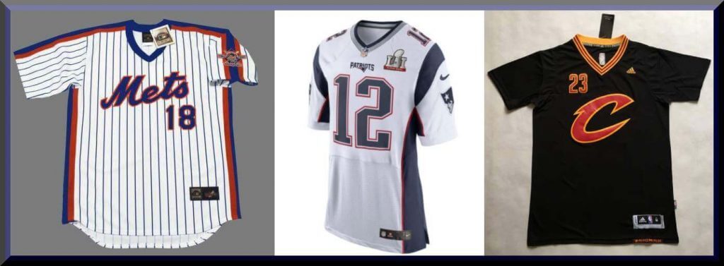
New York Mets: Racing Stripes on Pinstripes
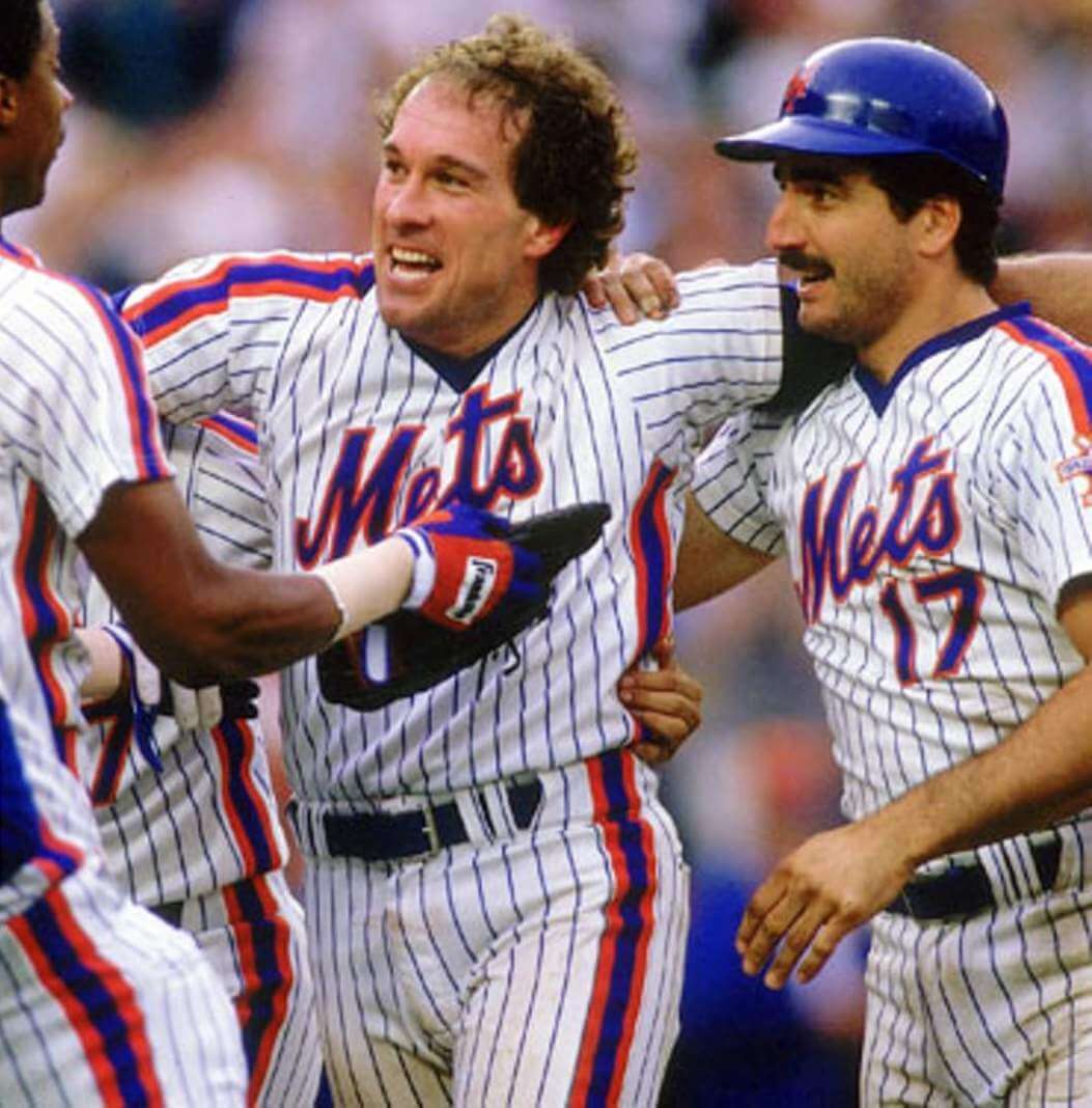
I am probably in the minority here, especially as a Mets fan, but I’ve always hated the uniforms worn by the Mets when they won their second, and most recent, World Series, way back in 1986. I’ve always thought it was a poor design — I’m fine with pins, and I’m fine with racing stripes — but having both on a uniform was overkill. Not only that, but somewhat inexplicably, the team chose to go with pullover jerseys but paired them with belted pants, a rather disjointed look. Yes, not every team that wore pullovers wore sansabelt pants (or vice versa), but these were exceptions rather than rules.
But because the team won the World Series in these uniforms, fans love them, and by extension, think they’re “good” uniforms. Not only was their stripe overkill, but frequently during play, the jerseys would shift, causing misaligned stripes (this is especially upsetting to those of us with OCD). I didn’t dislike the gray roadies as they didn’t have pinstripes. And I will always like the Expos racing stripes (especially since they wore button fronts and belts), but I never liked the stripes/pins look of the Mets, despite their success wearing them.
New England Patriots: Super Six
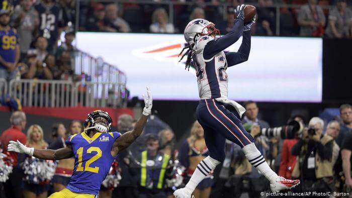
I’m not sure how many people love these uniforms, but it’s way more than it should be. Let’s face it — this turn-of-the-century design was probably dated before it ever took the field, and yet the Patriots wore it for 20 seasons (roughly corresponding to the tenure of a certain QB), and with it came unbelievable on-field success (Six Super Bowl wins in 9 appearances). That unparalleled success, at least in the NFL, makes this the uniform of champions, beloved by Patriots nation and a good chunk of the US of A. But it’s really not a good looking uni by any stretch of the imagination.
The not-quite-stripes/not-quite-loops on the shoulders, the way too fat side panels (which also often suffered from misalignment with the pants stripes, even the pants stripes themselves (I get they are trying to match the jersey side panel) just look a bit off. And the red/blue/red jersey panel doesn’t jibe with the white/red/blue/red/white pants stripe, which doesn’t mesh with the red/white/blue number treatment. Like the Mets, it’s not an awful uniform, but it’s not great either. But it’s viewed by many as a great uni due to the success the team had while wearing them.
Conversely, the team for decades had a gorgeous uniform, but because it was mostly associated with losing (even losing big on the biggest stage), many fans can’t seem to get behind it. It’s gotten more popular over the years, but once the team dumped it after the 1992 season, most football (and especially Patriots) fans were happy to be rid of it — solely due to the team’s lack of on field success. A similar situation exists with the Buccaneers creamsicle uniforms — almost as soon as they went to the pewter and red, and had success, fans deemed the far superior unis losers.
Cleveland Cavaliers: BFBS and Sleeves
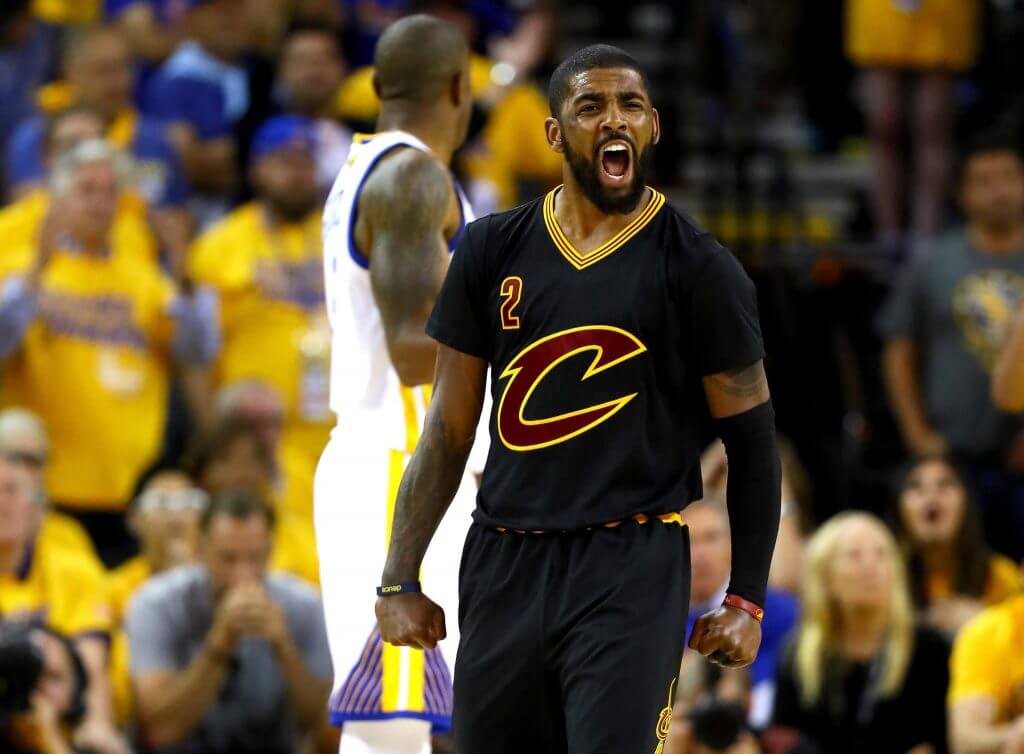
In this instance, I think most Uni Watchers will agree with me: this is a terrible uniform. But that’s certainly not the consensus of most sports fans. Sartorially, there’s nothing good about this uniform: it’s BFBS (about two decades after that was a thing), it’s got sleeves (did anyone ever think that was a good look for an NBA jersey), and the giant slashing “C” logo on the chest (with offset uni number to boot) isn’t really a wordmark nor a logo, at least not in the classic sense of the term. And yet, there is a significant population who love this uniform, and for one simple reason: it brought the NBA title to Cleveland for the first time ever.
In the months after the Cavs won the title, I did an informal survey among my sports (but not uni) friends. I’d ask them if they liked that Cavs jersey. Almost all of them did. And when I followed up my initial query with a simple “Why do you like it?”, their answers were always some form of this reply, “well, they won the NBA title in them.” Most of my more uni-attuned friends weren’t nearly as positive. Some of my younger sports fan friends (more than one, but not that many) even went so far as to say “I won’t wear a tank top, but I’d wear that sleeved shirt.” I’m sure that was probably the NBA’s (and adidas’s, who introduced the sleeves) intent too — produce a shitty looking jersey they know fans will buy. Which is yet another reason this uni (jersey) is so bad: it was designed purely for the retail aspect. I’d ask you guys to conduct a similar experiment among your non-uni friends: ask whether they like the LeBron/Cavs black jersey. I bet you’ll find a surprising number who do. Winning definitely elevated an otherwise putrid uniform for the sole reason that it brought with it a title.
Vancouver Canucks: Flying V
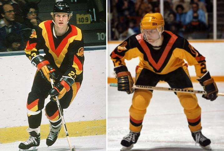
OK, this is a bad uni, but not in the way the other unis are bad: this is more of a so bad it’s GOOD type of uniform. It was certainly pretty radical when it was introduced, and it may be as popular today as it was back in the 1980s. But let’s face it — other than its uniqueness (and possibly color scheme), it was clearly a product of its time. I’m pretty sure no one ever tried to replicate this one (as many have done with the tequila sunrise look popularized by the Houston Astros). That’s because it’s not a particularly good design — no wordmark/logo (per se) on the front, uni numbers down by the wrists, odd “V” pants striping. Unique? Yes. Good? No.
But, despite all this, fans seem to love it. Can that all be attributed to the fact that the Canucks greatest NHL success (reaching the 1982 NHL finals) came in these unis. They also reached the 1994 Finals (losing to the Rangers) and 2011 Finals (losing to the Bruins) — and guess what, those are popular unis too, but they weren’t nearly as garish as the Flying V’s. I can only imagine how much more popular (and thus, viewed as “good”) those Flying V’s would be had they won that 1982 Final. Probably a lot.
What say you readers? Do you agree with my selections (it’s fine if you don’t — I realize my tastes aren’t necessarily the same as yours)? What other teams might also have worn otherwise “bad” uniforms that are loved by fans? Do you like a particular uniform you might not otherwise because your team has had success while sporting them? Love to hear your thoughts.


Guess The Game…
from the scoreboard
Today’s scoreboard comes from Craig Ehlo.
The premise of the game (GTGFTS) is simple: I’ll post a scoreboard and you guys simply identify the game depicted. In the past, I don’t know if I’ve ever completely stumped you (some are easier than others).
Here’s the Scoreboard. In the comments below, try to identify the game (date & location, as well as final score). If anything noteworthy occurred during the game, please add that in (and if you were AT the game, well bonus points for you!):
Please continue sending these in! You’re welcome to send me any scoreboard photos (with answers please), and I’ll keep running them.

Uni Concepts & Tweaks
Time for more Uni Tweaks from the UW readership.
I hope you guys like this feature and will want to continue to submit your concepts and tweaks to me. If you do, Shoot me an E-mail (Phil (dot) Hecken (at) gmail (dot) com).
Today’s concept comes from Alan Filipczak, for the Quad Cities River Bandits.
He writes…
Hi Phil,
Hope this finds you well. I have something for the weekend Uni Concepts section.
As part of the recent evisceration restructuring of the minor leagues, the Quad Cities River Bandits are now the High-A affiliate of the Kansas City Royals. The River Bandits have seemingly tweaked their color scheme to match their new parent club.
This change inspired me to carry on the age-old tradition of altering a major league logo to match a minor league affiliate. Using my Microsoft Paint “skills,” I changed KC to QC and swapped out the crown top for a crude rendering of the Rock Island Centennial Bridge, the iconic backdrop of Modern Woodmen Park in Davenport, Iowa.
Thank you and be well!
Al
And here is his design:

Thanks Alan!
OK readers (and concepters). If you have some tweaks or concepts, shoot ’em my way with a brief description of your creation and I’ll run ’em here.
And now a few words from Paul: Hi there. In case you missed it earlier this week, the latest episode of Unified is about collecting. Why are so many people who are into uniforms and logos also into collecting stuff? What’s the difference between collecting and hoarding? What did Chris Creamer and I collect when we were kids? What do we collect now? And what does all of this have to do with the 1987 movie Throw Momma From the Train? Chris and I discuss all of that in this episode, and a lot more.
As always, you can listen to us on Apple, Google, Stitcher, TuneIn, and Spotify, or just use the audio or video player below:
Please consider supporting this episode’s advertisers, Oxford Pennant (get 20% off any order with checkout code UNIFIED), Ebbets Field Flannels (10% off, except on NFL items, with checkout code UNIFIED), and Homefield Apparel (15% off with checkout code UNIFIED).
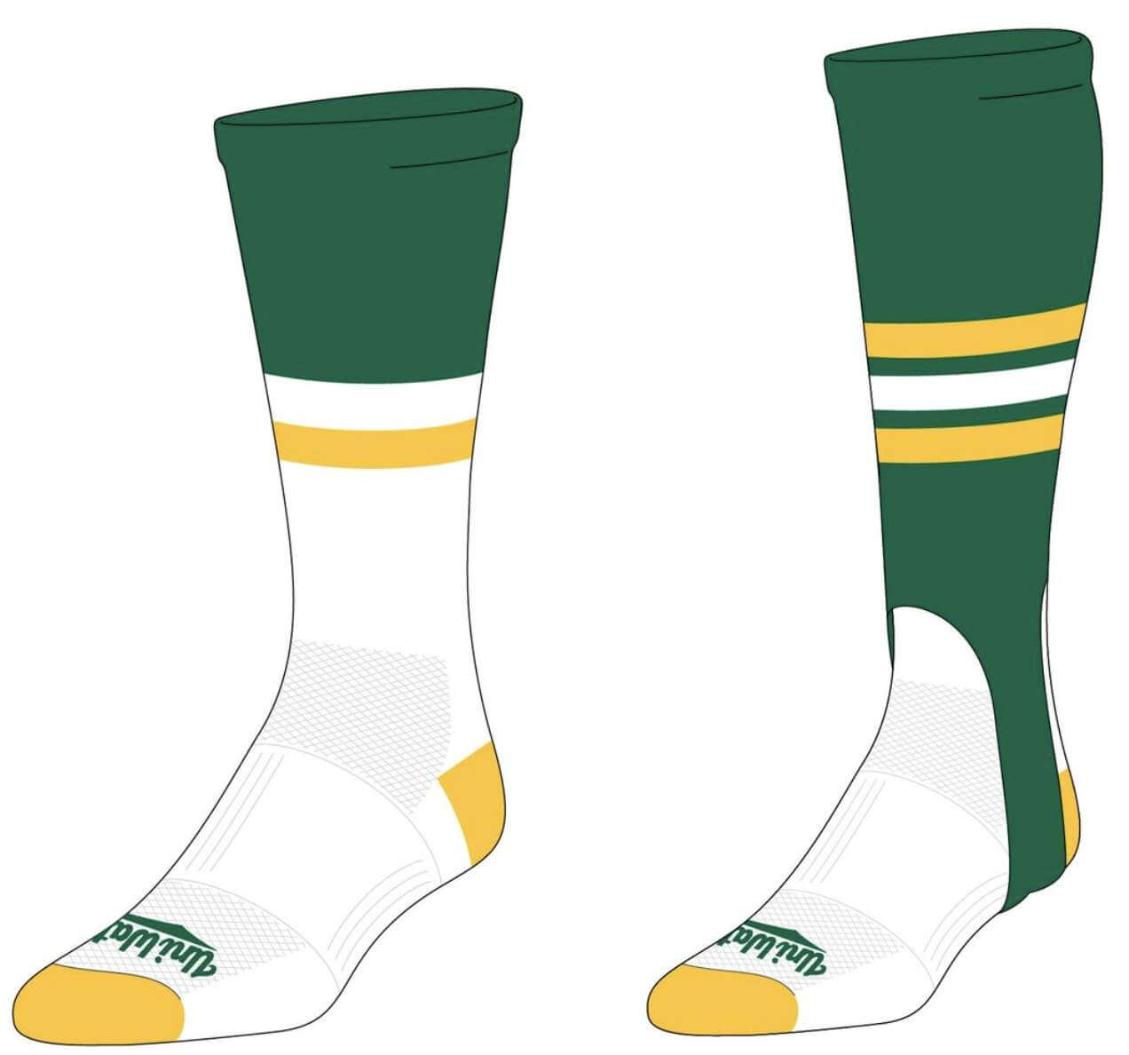
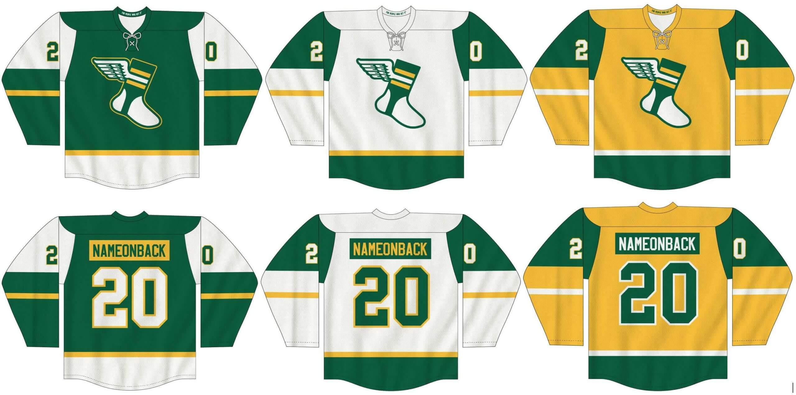
Meanwhile, I’ve teamed up once again with Adelph Wear — the brand run by longtime Uni Watch reader Nathan Haas — to create a new line of Uni Watch hockey jerseys (shown below), which are customizable with your choice of number and NOB, as well as new Uni Watch socks and stirrups (shown at right).
In order to get in on these items, you must place your pre-order by March 31. You can do that here. We expect the finished product to ship out by the end of April.
My thanks, as always, for your consideration.
Happy Birthday Paul!
As most of you are probably aware, today is the birthday of one of my best friends, and the guy who founded this place, brought together a “family,” and is just one of the best people there is in this (still) crazy, mixed-up world. That is of course, the one and only Paul Lukas.
Words alone cannot express how grateful I am to Paul for all his great friendship and support, and he’s particularly been our steady friend and spiritual guru since our mutual worlds were turned upside-down during this whole COVID-19 pandemic. I can’t believe this will be Paul’s second “COVID Birthday.” It’s just one of those quirks of the calendar, but let’s all hope we’re close to the end of social distancing, so everyone can celebrate their birthdays in right proper fashion, with parties, cakes and a return to normalcy. I mean, it’s not even gonna rain today (which means we’re still not quite back to normal yet).
So again, please join me in wishing Paul a most HAPPY BIRTHDAY!
Thanks, Paul. for everything.
On a side note, happy early birthday to UW stalwart Kenny Ocker, whose special day is tomorrow.
Uni Watch News Ticker
By Phil

Baseball News: “I know we’ve seen ballplayers appear on two different cards in a set in different uniforms” writes Lee Ursich. “Safe to say most of those photos are intentional cards that update the prior card in the set. How about when it happens unintentionally? Check out these two cards from 1970 topps. First ones is of Gene Brabender’s regular 1970 topps card #289. The second card is of Dick Hall #182. Both photos for the cards were taken in 1969. Brabender was traded to the Pilots on 3/31/1969.” … The University of North Carolina at Pembroke has long poached the P of the Pittsburgh Pirates, notes Gary Dincher. Here is an example on a wrestling singlet. And of the baseball team, which is more reasonable. … The Smithsonian Magazine recently released a very interesting article, “How the Baseball Cap Went From Athletic Gear to Fashion Statement.” Definitely worth the read (from William Yurasko). … Check out this really cool mural on the side of a downtown building in Sanford, NC (from Brian Weingartz). … Interesting cloud-shaped pendant on the Braves’ Michael Harris (from Michael Clair). … Russell HS in Kentucky with some nice pinstriped unis this year (from Josh Claywell).

NFL News: Here’s your first look at former Eagles QB Carson Wentz in an Indy Colts uniform. … Excellent pictures in this thread, and plenty of color on color matchups (from Old Time Football). … Tweeter Jeff Wilk notes that “now roster moves are sponsored. Disgusting.” Or would that be, “are advertised”? … Here’s a GREAT colorization of the 1937 Boston Shamrocks (from John Turney).
College Football News: Even though the FBS season is still months away, that didn’t stop Fansided from ranking the uniforms of the South Eastern Conference. And yeah, as you’d imagine, it’s pretty bad.

Hockey News: “Here is a new ranking of the dark OHL jerseys,” writes Wade Heidt. “This one from The Hockey Writers. There are some good-looking jerseys. I would have put the iconic barber pole jerseys for the Ottawa 67’s at number 1.”

NBA News: “Apparently random YouTube commenters agree that NBA uniforms have gotten out of control,” observes Dan Buckalew. “I thought the same thing last week when the pacers wore gold on the road at the Lakers (who wore black).” As pointed out in the comments, it was the HEAT, not Lakers — PH

College Hoops News: We’ve seen frankenjerseys before, but is this the new reverse retro? … Kevin Malarkey noticed that Eastern Washington uses a script font for their NOB. He’d never seen that NOB treatment before. … While praising Ohio University’s Ben Vander Plas in the Bobcats’ game against UVa, TruTV’s graphics folks misspelled his name (from Max Weintraub). … Oooohhh, check out this photo of Baseball legend Jackie Robinson during his days as a UCLA basketball star! (from Bruce Menard).

Soccer News: It looks as though LAFC has a new jersey advertiser, a German power tools company named “FLEX.” … Did you ever wonder why Manchester United are nicknamed “Red Devils”? Wonder no more. … Check out this custom frankenjersey for Chris Sutton, BBC Sports pundit (from Ed Żelaski). … Also from Ed: Raków Częstochowa wore some gorgeous throwbacks yesterday against Górnik Zabrze. The club is celebrating its centennial. … ICYMI: Arsenal’s 2021-22 away kit has been leaked. … A New England Revolution blog has an article selecting the best jersey uniform in club history (from Kary Klismet).

Grab Bag: Tweeter Benjamin Kassel thinks “this Brisbane Lions vs. Sydney Swans uniform matchup is GORGEOUS. I think the yokes are a big part of that.” … Among other things, “bored rich people” are buying things like Mickey Mantle rookie cards and rAir Jordans — NYT link (from Tom Turner). … Overseas spectators will be barred from attending the Tokyo Summer Olympics in an attempt to lessen pandemic risks, the Games’ organizing committee said Saturday WaPo link. … Horace Good Middle School in Garden City, Kansas, whose team name is the Hawks, is poaching a Southern Miss logo, which itself was discontinued after the University of Iowa successfully challenged the Golden Eagles’ trademark application for being too similar to the Hawkeyes’ iconic Tigerhawk logo. Submitter Kary Klismet asks, “So is double trademark infringement kind of like a double negative, where the two infringements cancel each other out and make it okay?” … Here’s a breakdown of Formula 1 drivers’ helmets designs for the 2021 season (from Kary Klismet). … Although the White House Easter Egg roll is canceled due to COVID, there are commemorative eggs — And the bunnies have masks! (from Timmy Donahue).
And finally… that’ll do it for me for the weekend. You guys continue to stay safe and healthy.
And HAPPY BIRTHDAY PAUL! Even if it doesn’t rain (or snow) today, I hope the day brings you luck, peace and joy. Cheers, buddy!
I’ll see you guys back here next weekend.
Peace,
PH
I agree on the Patriots uni – not terrible, but not great. Although a HUGE improvement over the original Flying Elvis soccer-striped monstrosities from the mid 90s. Also, I think there is a large portion of Pats fans who would love going back to the Pat Patriot unis despite the losing tradition the represent.
I actually like the original Flying Elvis unis. In fact I might say that was their best look. Sure, the red jersey era was gorgeous, but as others have pointed out, they’re Patriots, not Redcoats.
Mets: love that look.
Cavs: apologies if I’ve told this story before…for other reasons, I was in a very bad mood the night of Game Seven, 2016. I thought sitting down to watch the game would help, but no. Instead of wearing team colors for the chance to win Cleveland’s first major title since the 1999 NPSL’s Crunch, the Cavs came out in *those things*. I don’t really mind the sleeves, and I love V-necks, but everything else about that uniform took my mood from bad to worse. Then both teams proceeded to play…well, let’s just say it wasn’t good basketball. I had a scowl on my face until five seconds were left when I said, “Huh…they’re actually going to win.” And then I went to bed. Least enjoyable championship of any team I’ve ever rooted for in my life. I can’t stand that their first and only title will forever be associated with that mess.
Canucks: love the black uni. Really do not like the gold one.
One of Uni Watch’s “Gone Too Soon” uniforms were the Cavaliers’ wine and gold 1980-83 set. Is there a consensus about which are the best Cavalier suits?
Those were my favorites, but most fans associate them with the Stepien era. It’s a safe bet they’ll never be worn again.
I didn’t think there’s a real consensus. The blue and orange Lenny Wilkens era and the Bill Fitch wine and golds are probably tied amongst older fans. I won’t even venture a guess as to what the young’uns like best.
All of these are bad, you are right.
The Mets are frustrating because they got it right so quickly. Why ever change the uniform they were wearing in 1969?
I prefer the Patriots uniforms from the 70’s and 80’s too, but the one they wore during the Super Bowl run could have been easily fixed up to be an OK uniform. What they wore was bad though. The latest changes are not much better but could also be fixed easily.
I never understood why anyone liked those Canucks uniforms.
I’m a Mets fan and a Broncos fan, so I’m painfully familiar with the Great Team/Bad Uniform dilemma.
The Broncos’ Orange Crush uniforms were absolute perfection and the blue robo-pony uniforms are, scientifically speaking – Poop.
But when you watch your favorite athlete get destroyed in three Super Bowls in the good uniforms, then immediately win two in a row in the trash uniforms, what do you do?
You lost four in the good unis. 12, 21, 22 and 24.
And the reason you did is because in all four seasons, you settled for good unis instead of great because you didn’t have orange road pants. Had you kept that look, you would’ve been a dynasty. Prove me wrong.
Unfortunately, Jimmer, they didn’t have orange pants as an option during any of those Supes (though I agree that the orange jerseys, as beautiful as they are, are associated with “losing”). The current Broncos uni is another good example of a bad uni that people love, because it broke the “curse”. But I think most of us will agree almost all of the sets the Broncos wore prior to the current rebrand/redesign are far superior to what they now wear. That includes the brown/gold unis they were born in.
Unfortunately, Jimmer, they didn’t have orange pants as an option during any of those Supes
That’s what I meant. It should have been an option. And it would’ve vaulted SB 21 into Top Five contention, for sure. Instead, it was a rather meh matchup.
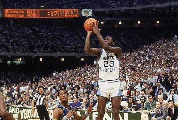
The scoreboard answer is: March 29,1982 in New Orleans. North Carolina defeats Georgetown 63-62 to win the NCAA title, Dean Smith’s first. Michael Jordan hits the game winning shot.
Sleepy Floyd with the big turnover late.
It was Fred Brown, not Sleepy Floynd
So…Craig Ehlo sent in a picture of Michael Jordan hitting a game winning jumper? That’s funny!
That was probably the least challenging GTGFTS ever, since the photo submitted is one of the most famous in sports history.
“I know we’ve seen ballplayers appear on two different cards in a set in different uniformsm” writes…
There is an extra m. Should be “uniforms.”
(Uni-Watch is the highlight of my morning. Thanks!)
I’m a big fan of the elegant Yankee pinstripes, but I also loved the Astros’ tequila sunrise. Go figure!
Two different rules seem to govern what constitutes a team’s best uniform. For fans at large, the rule is “What did they wear when they had their greatest success?” For Uni Watch readers, it’s “What uniform from the past are we now deprived of seeing?”
The Patriot’s red uniforms were beautiful, but one thing is always overlooked about them. The British wore red, and the colonists wore blue. The red jerseys celebrated the wrong side!
I’m in the minority, here, but I prefer the Steve Grogan/Sam Cunningham uniforms to the Doug Flutie/Irving Fryar suits. It has less to do with details than being of a certain age!
Couldn’t agree more about loving bad uniforms. I’m still amazed at the amount of love the Mets black jersey gets. Fans want these beer league softball jerseys back for odd reasons. Why? They were horrible in the 90’s and would still be horrible today.
Amen! I am with you 100% on the black jerseys. I really don’t understand why so many Mets fans love them (Black is NOT part of the team’s colors!)
As for the racing stripes, I thought they were fine: they used the correct colors and the correct “Mets” script (unlike those awful uni’s in ’92). If the names on back were sewn directly on instead of on a plain white strip, they would have been outstanding.
Couple of quick points:
1) The Mets began to wear the black in 1998 and had great success for the first few years of it, made the playoffs three times and went to the World Series in them. Since this scourge lasted over a decade, many youngsters from that era feel that black was a Met color and it is hard to argue the point.
2) I am one of the few met fans I have come across that LIKED the nameplates on the pinstripes. Perhaps one reason is that in 1987 they removed the nameplates and soon after started to use a really thin font that looked cheap.
link
3) As for the Met Script, I am going to post a comment below.
Love the Mets one, but agree its got a TON going on and is super busy. But they just have that perfect balance of 80s “Style” and uhh… something that I cant put into words. It just works for me.
The Patriots pants are awful in that uniform. Always hated them and it ruined the look for me even though I like the jersey/helmet combo of that era.
I hate that the uniform associated with Cavaliers success will forever be that sleeved monstrosity. It looked terrible then, looks terrible now, and I don’t know how kind time will be to it either.
I must be in the minority but I do not like the Canucks flying V look at all, not even a little bit. Nothing about it works. It looks like a fake team uniform made up for a bad 70s movie that has nothing to do with hockey and just sits in the background. Big oof from me on those unis.
Empirically, there were (at least) two big mistakes associated with the Flying-V uniforms: 1. The little sleeve emblems were too complex and hard to read. Good logo design requires the image to be understood at any size. 2. Numbers at the ends of the sleeves meant they would be crammed into the gloves and not be able to be read by anybody.
The Canucks did end up moving the sleeve numbers higher up before the Flying V jersey was retired.
link
Happy Birthday Paul ~ Cheers!!!
As a lifelong Pats fan, you’re spot-on, Phil. It’s hard to be objective about the old red unis because those teams were SO bad. But as time has passed I can see they are objectively a nice and more put together uniform. Also, I remember cheering for the initial uniform change in 1993 (the royal blue with red numbers) just because us was NOT the unis associated with losing. I now look at those one-year uniforms and see they weren’t all that great.
For me, an ugly uniform is an ugly uniform regardless of a team’s success while wearing it. The Patriots uniform Phil discussed looks like a jersey and a pair of pants that should have never met. I’ve always enjoyed the Canucks flying V the same way I enjoy the Astros Tequila Sunrise – bold colors and a surprising presentation. Sort of a ” Hmm, never seen anything like that before” feeling. The Cavs t-shirt’s a no-thank you, along with the Mets wearing ANY black. I like pinstripes on white jerseys only and the only grey (silver) basketball jersey worth its salt is the Spurs original ABA home jersey.
The Mets racing stripes are at least a good idea. In a vacuum, the original Mets uniforms are perfection. But the Mets don’t exist in a vacuum; they share a city with the most famously pinstriped team in global sports history. Having _lighter_ pinstripes than their crosstown rivals is weak sauce, and it amounts to a sartorial preemptive surrender. The Mets dress themselves like they intend to be New York’s second-class team; it’s no wonder that under successive ownerships and management regimes, the Mets also act like a second-class team. Adding the racing stripes set the Mets more clearly apart from the Yankees; the look transformed the Mets from the RC to the Pepsi of a market where the Yankees are Coca-Cola. And just down the coast, the Phillies spent more than a decade in pinstripes with racing stripes, though the Phillies had a simpler and therefore more effective racing stripe design. So the idea behind the racing stripes is sound, and I would argue among the smartest the team has ever tried to implement. As to implementation, I wouldn’t call those unis bad – sure, they’re busy, but so are the beloved home uniforms of the Yankees; pinstripes are an inherently busy pattern – but certainly they could have been better.
If I bought the Mets today, I would want to redesign the team’s branding to separate my Mets from the hapless regimes of old, from online graphics to on-field uniforms, and I would have two overarching principles: A three-color palette of blue, orange, and white; and Racing stripes. Everything else would be negotiable, but every decision about the team’s look would have to be driven by serving the two guiding principles. Pinstripes? Negotiable, as long as they reinforce the royal/orange scheme and make racing stripes look good.
AFAIAC, the only thing empirically bad about the Mets’ 1986 uniforms was using a pullover rather than a button-down jersey. A lot of teams from that era used team name on the road unis rather than the city name.
As a Met uniform savant, given my age, the Mets should take their 1969 home and road jerseys, take them to a forensic uniform designer (do they exist?) and copy them EXACTLY. That means the correct wordmark, correctly sized, with the correct front numbers, 1969 Wilson varsity road number font, blue squatchee and correct logo patch. I realize the 1969s were NNOB, but NOBs would not spoil the look for me.
The only way this happens is if Stevie Cohen loses his fortune in the next market crash and DStevie D buys the team.
The Quad Cities River Bandits have a special place in my heart, and I absolutely love Alan’s concept. That is exactly the lettering the team needs on a cap, and the use of the bridge in place of the crown is brilliant. Thanks for sharing that!
As someone who remembers the Quad-City Angels (and wishes that hat was available) playing at John O’Donnell Stadium, I love that concept for River Bandits. It is great and needs to be what the teams wears. I also love the bridge in place of the crown!
Happy Birthday Paul! It’s raining somewhere. Agree completely with PH….some unis are just destined to be remembered
As usual, The Onion was on top of this story years ago. Here’s their take on the Bengals’ unis from 2009! link
In the ticker item about NBA uniform complaints, it incorrectly says it was the gold-clad Pacers at the Lakers, but the game was against Miami, not LA
Thanks — I quoted the tweeter, but have now made an addendum to that item.
I’ve never liked the White Sox 83 beach blanket uniforms.
Despite the uniforms which before (the 76-8 untucked faux backs) and after (the 87-90 curlyque C) being far superior, fans go nuts for the 83 set.
My OCD goes nuts when I see that the sleeve stripes don’t have the same ratio as the chest stripes.
The modern version is better since it’s belted and doesn’t have the weird contrast between the solid blue waistband and the stripes across the chest.
Still, I’d rather see the Chicago American Giants or the all red 72 uniforms on Sundays.
Whaah?….the solid blue waistband was in *harmony* with the chest stripes. The BELT is completely in contrast with the rest of the uniform.
Matching that jersey with today’s baggy long pants is retro-nostalgic malpractice.
The 87-90 set was just wrong for the White Sox — Jerry Reinsdorf’s attempt to make the White Sox look like his beloved Brooklyn Dodgers. It took Rob Gallas and the marketing team to do the research and determine that the best design evoked the Go Go Sox of the 50s, with the then-cutting-edge-but-now-classic colors of black and silver
Same here, I didn’t much like the “beach blanket” White Sox uniforms but loved the 1970s Veeck-era unis and the late 1980s script uniforms. Their current set is (if you exclude the dreaded “softball tops”) one of my favorites as well, though I personally roll my eyes regarding the “silver-and-black” colors for a team that has six decades more tradition than the football team they’re imitating.
Happy Birthday Paul!
I’m guessing that the Eagles will stick with their dark green uniforms over switching back to the kelly green, since they won a Super Bowl with them. On the flip side, I wonder if the Rams would have gone forward with their awful new uniforms if they had won the Super Bowl a couple of years ago.
Long time reader, first time comment…I disagree with the Bucs’ creamsicle assessment. It was worn in Tampa to identify yourself as an original Bucs fan, instead of those who jumped on for the first Super Bowl in 2002. When the Bucs indicated they would redesign the alarm clock jerseys, a lot of fans wanted Bucco Bruce or at least an orange jersey. It’s been rumored that when the NFL drops the one-shell rule, the Bucs will bring back the original orange/white uniform as an alternate. It helps that the current team has signaled support including Tom Brady, Shaq Barrett wearing a Doug Williams jersey for the Super Bowl parade, and Byron Leftwich wearing a non-team issued black Bucco Bruce hat during Super Bowl week and the parade. That got those who were anti-creamsicle to support bring it back.
Happy birthday, Paul.
I never liked any of the sleeved NBA jerseys. But to me, they were more tolerable if it had the team or city name on the front like most jerseys rather than just a big logo. Can’t stand that look on tank jerseys either.
Happy birthday Paul!! Hope you have an excellent day. Thank you for all you’ve created and continue to do in our crazy athletic-aesthetic world.
Number 32 on Georgetown is Eric Smith, he was older than me so I didn’t go to school with him but we went to the same high school. After he didn’t make it in the NBA he would come over to our house and my father would lift weights with him and throw to him, but as good an athlete as he was he didn’t make it in the NFL.
PS I always liked the Eagles 1971 uniforms, I thought they were clean looking, but they lost in them and they were gone. Bob Colonna the Bell equipment manager was also the Eagles equipment manager back then. As a kid he told me he was the one that came up with the white helmet green wings design and didn’t get league approval first when he ordered them. I have no idea if it was true? I always enjoyed Bob’s stories while he yelled at me for folding the BELL t shirts wrong.
Eric Smith is a super guy from a great family. Know him, too, from the suburban Maryland era. No doubt he would have been in the expanded NBA of today…a Josh Hart-type of player that makes every team better.
My Father liked him, he thought he was a great athlete and said Eric was very coachable. My father tried to get him in the NFL and Eric got a tryout but to play no college football and make an NFL roster is very difficult.
My thoughts:
Cavs: just an awful concept all around, but as it goes, they caught fire and they became “lucky”. I was so mad going to a game and seeing them wearing those. I dont really think they were that popular with the team, remember LeBron ripping the sleeves? It was a perfectly fine compromise to transform it to a more traditional tank-based alt uni.
Pats: never liked ANYTHING post-Pat Patriot.
Mets: I get everything you are saying Phil, but I have always loved that Mets’ look, maybe it’s just being a child of the 80s and seeing more Mets’ games on WOR than my hometown Pirates! But I’d be lying if my young, uni watching eye would notice when the racing stripes would be misaligned!
Canucks: I’ve always been fascinated by this uniform. In that same way the Habs’ barberpole, the Steelers bumblebee throwback so I guess it’s a “so bad it’s good thing”. Major miss not working this into the Reverse Retro program.
Didn’t Paul run a column on this very subject a few weeks ago? The two top “So Bad It’s Good” uniforms were the Flying-V’s and the Tequila Sunrise.
It was a perfectly fine compromise to transform it to a more traditional tank-based alt uni.If it isn’t wine and gold, get it off my lawn.
The only racing stripe I ever liked was the 1970-whenever Phillies. Because it was thinner – more subtle – and, importantly, one color.
The Mets just copied the Expos.
Hey! It’s my birthday too! Happy Birthday, Paul! Thanks for all you do.
I guess the answer to Phil’s question is that beauty is in the eye of the beholder, and thus there is no such thing as an objectively “good” or “bad” design…just one that you like or one that you don’t.
Stating what is and is not a “good uniform” is like trying to know the ocean or to hold a rainbow. It’s always been my experience a good uniform is one that quickly and easily communicates information about the team and the player, can be “read” from quite a distance, yet reveals clever details from close in, and doesn’t look like all the other teams.
Loyola of Chicago is wearing a bad uniform right now. I can only see their numbers on an extreme closeup. When CBS goes wide angle, it looks as if they’re wearing blank maroon jerseys. I had to turn off the game…I may go back for the finish if it’s close but right now I’m too aggravated.
Contrast matters, Nike. Get it through your thick skulls.
You’re right, Jim. I can’t make out the numbers, either. I guess the closest thing we can agree on about what makes a uniform design objectively bad is when it fails one of its most basic functions like allowing observers to easily differentiate players by number.
1. I agree 100% with the piece today. Aesthetics are intertwined with fans’ association with winning or failure as much as the pure design. Great writing.
2. I am on both sides of this issue. As an Eagles fan, I find kelly green infinitely better than midnight green. Block Varsity numbers are better than overly cute bespoke numbers they wear now. Silver pants are better than white or midnight pants. But the Birds won their Super Bowl in midnight, so it will always have a place, even though it is inferior and clashes with kelly green.
2a. Since I was born, the Phillies wore maroon or red. They brought out beautiful blue caps in 1994. But because they lost most of the games where they wore them, the players stopped wearing them, and they didn’t try blue caps again for over 15 years.
3. Racing stripes were a fad and some teams tried to shoehorn them onto their traditional uniforms. Both the Mets and Phillies grafted them onto pinstripes. I like both teams in pinstripes and would rather that they kept the pins, but the racing stripes were awkward. Thank goodness it was just a phase and we have all moved on.
4. HBD Paul (again)!
“Submitter Kary Klismet asks, ‘So is double trademark infringement kind of like a double negative, where the two infringements cancel each other out and make it okay?'”
In this instance, at least from a practical standpoint, I’d say the answer is “yes.” Because Southern Miss lost their trademark registration application for that logo when Iowa successfully challenged it, they don’t have any federal trademark rights in that logo that they can protect against the middle school.
Southern Miss could potentially try to enforce common-law trademark rights (the kind you can claim by using a “TM” with a logo instead of the federally registered “®”) to get the middle school to stop using the logo. But because Southern Miss has discontinued using the logo themselves, their rights of enforcement would be significantly compromised.
Iowa could potentially bring an infringement action against the middle school because of the ruling that Southern Miss’ old logo was too similar to the Tigerhawk logo. But part of the key to that ruling was that the nearly identical color schemes (black and gold) between Southern Miss and Iowa’s logos was likely to contribute to the confusion. By switching the color scheme to blue, yellow, and white, the middle school has likely taken the teeth out of any claim that Iowa could bring against them.
All that to say, it’s probably not worth the time or the effort for anyone to come after the middle school for poaching that logo. So in this case, the “double infringement” probably is like double negative that turns into a positive.
Was watching Titus and Tate this morning and they talked a little bit about BYU’s NCAA logo placement. Get this- they placed it below and to the right of the Nike swoosh. I’ve never seen anything like it! Looks really disheveled when you pull up the photos taken last from night.
Happy Birthday Paul!
Hope you are having a wonderful day and thank you so much for keeping things somewhat normal for us during this past year with your daily insights and info!
The Patriots uniforms were/are SO ugly they prevented me from being able to enjoy TB12’s success. OK, sure, Belichick had something to do with that too. But I always hated seeing those unis in the playoffs. Sadly, the redesign wasn’t much better. Fixed the worst offenses but still a bad uniform.
Agree with the rest of your picks (can tolerate the Mets, those weren’t awful to me, just not good) and that the Canucks were so ugly they were cool. Look like TC’s chopper on Magnum P.I.
TC’s helicopter was the same color as the packaging of Reese’s Peanut Butter Cups, not to mention the 1980-84 San Diego Padres.
Why do so many Indians fans like the Caveman era unis? That was some of the worst baseball ever. Hopefully with the name finally changing we won’t see people trying to push that style logo.
Bad baseball, good uniform: Not the first time, probably won’t be the last.
Regarding the Canucks section, a few things need to be said:
– It should be “its” in this sentence: “other than it’s uniqueness”
– NEVER refer to the Stanley Cup Final as a ‘finals.’ This isn’t the NBA, which doesn’t understand that there can only be one FINAL. This is a hill I will die on. Do better.
Kevin Malarkey noticed that Eastern Washington uses a script font for their NOB. He’d never seen that NOB treatment before.
The ABA Memphis Sounds used script player names. No idea whether they were cut from tackle twill, ring spun, or silkscreened, though.
Canucks Flying V:
“I’m pretty sure no one ever tried to replicate this one…”
My high school’s hockey team did (splendidly, IMO!):
link
Love it!
Lots to love here. Flying V on a late 1980s jersey. A colour scheme not seen in hockey much. Appreciate you showing us that!
Re: Canucks flying V – I remember reading the colors were chosen for their psychological impact or something to that effect. Bold, vibrant, etc. They always reminded of the German National Flag. The “V” stood for Vancouver. I liked the black version better than the yellow
Re: Canucks flying V – I remember reading the colors were chosen for their psychological impact or something to that effect. Bold, vibrant, etc. They always reminded of the German National Flag. The “V” stood for Vancouver. I liked the black version better than the yellow.
The chevrons on the socks are a bonus.
The Flying V…soo outrageously bad it’s kind of good, at least dynamic …the French term “Jolie Laide” comes to mind (rendered sensibly in English as “Ugly-Pretty”).
Well, since I’m from Garden City, Kansas… yeah, all HGMS did was mess with the eye.
The irony is that both middle schools in Garden City once had original logos. The one that was Kenneth Henderson’s when I attended was made part of the brickwork at the front entrance and is still there even though I haven’t seen it used on any athletic gear in maybe 30 years.
The high school’s logo is a blend of the University of Colorado and Buffalo Bills’ logos: link
I’m surprised there isn’t more discussion of Tequila Sunrise. The year before the lockdown, somewhere between nine and 10 teams were using some version of that jersey.
I think it’s because, as core baseball fans trend older, there is nostalgia for the ’70s, which is why you see so many “retro” or “disco” nights in the minor leagues.
I do wonder whether the current state of minor-league baseball, with 40 fewer teams and realignment, will signal an era of austerity in the minors. I don’t see a lot of new “special” jerseys as part of 2021 minor-league promotions, and I also don’t see a lot of new special jerseys in the minor-league baseball store. Homes, roads, and Sundays, yes.
Happy Birthday Paul! Make it a great day. Thanks for everything your do!!!!
-S
I think you might be right about minor league promotional austerity. Between losses from Covid and the expensive new regulations from MLB, there will be belt-tightening for sure. It’s a catch-22, though. Promotions are the money-maker, so minor league teams need to pony up to have enough money to get by. But I think teams will have to more choosy and we’ll see less wackiness overall.
I’m all for the wackiness — Bung Hammers, Lolly Gaggers, Flying Squirrels, Garbage Plates, and, of course Jawn and the Syracuse Devices.
But the minors were all repeating each other after a while — a cancer night, an autism night, a Star Wars night, a superhero night, a local food delicacy night, a first responders night,
The minors have had new rebranding opportunities the last few years. Last year, a number of teams created a second identity (I seem to remember Tulsa, Kenosha, and Somerset being three of them) for split-squad games. The entire Appy League has gotten a makeover now that teams are picking their own nickhames.
I’d call this the “Cute Little Logo” era, but you could start back in the 1990s with the Hickory Crawdads as an example of a cartoonish logo in the style of, say, the Japanese Professional Baseball circuit.
Happy BD PL; a special shout-out just for you on the UW FB page.
I agree with Phil that Uni Watchers are more discerning than the general fan…and when one of us knows their favorite team, sometimes uber discerning.
The example I will give is that Mets racing stripe look. The 1986 uniform was made by Goodman and Son, vs. Rawlings who usually supplied the Mets home uniforms in that era. So what you might say…they were exactly the same. They weren’t, but you have to be really paying attention. For one the Mets script, was a bit “clunky”…not the usual smooth Rawlings version. The number 8s were almost always placed upside down. And I have no proof, but the blue looked slightly more navy than other years. These fact are actually useful for collectors, as unscrupulous sellers will try to pass off jerseys as authentic to the 1986 championship.
link
Another upside down 8
link
I’ll touch the 3rd rail…
My choice for a bad uniform(s) that I assume fans of the team consider good:
The ‘77-‘84 Pittsburgh Pirates
The pillboxes, the pinstripes..the whole damn thing.
By any objective metric, you are correct. The bumblebee Pirate uniforms were loud, clashing, overdone, and (worst of all) mismatched. C’mon, horizontal stripes on a hat with vertical stripes on the uniform breaks about three different fashion rules. And the pinstripes were *fat*, to boot.
But boy, were they fun!
Speaking of Pittsburgh, fans still seem to think that the Steelers’ poor design in somehow a classic. The logo only is only on one side of the helmet and the stripes on the helmet and pants and jersey are all mixed up. Red and blue appear on the helmet logo but nowhere else in the so-called uniform. Having the NOB in yellow on the white jersey makes it hard to read. It’s a disaster from any educated designer’s viewpoint.
Interesting thoughts, Phil. Two minor typo corrections–for the sentence “Can that all be attributed to the fact that the Canucks greatest NHL success (reaching the 1982 NHL finals) came in these unis.”, “Canucks” needs an apostrophe after the “s,’ and also I’m pretty sure you meant the sentence to end with a question mark.
The Pittsburgh Penguins are an interesting exception to this rule. Despite winning two Stanley Cups (2016 and 2017) in arguably one of the worst uniforms in NHL history, their fan base still, for the most part, hates those unis.
Regarding the Canucks, I think people like the Flying V just because it’s so darn weird. I don’t think anyone actually thinks it’s a good design, and I don’t think their marginal “success” while wearing it has much to do with it.
And finally, I would nominate the Detroit Red Wings’ classic red uniform to be on this list. People love it because it’s super old and traditional and the team won a lot of Cups in it, but it’s a really boring design. The jersey is a logo and three stripes. That’s it. And it’s not like there’s anything interesting going on with the pants/socks to counteract that eye-searing, barely interrupted sea of red up top.
Who doesn’t like the Pens uniforms? Except for the Robopenguin in the 90’s they’ve always looked sharp. To me, one of the top five logos in the league.
(First off, Happy Birthday to Paul, I’ve been a fan of the site for years.)
“Beloved Bad Uniform/Maligned Good Uniform” is an interesting topic because we have to ask ourselves what makes a good/bad uniform, and what non-design factors can make a uniform loved/hated.
I think success or folly may be the chief non-design factor that influences a uniform’s fate with a fanbase, but I think there are some others too, that may have more to do with the identity of the team, city, or fans.
One that comes to mind is how the uniform relates to a team’s visual identity on the scale of traditional-innovative. Fans of teams like the Yankees, NY Rangers, and Red Wings are likely to favor uniforms that reinforce the “history and tradition” theme. Fans of teams like the Canucks, Oregon Football, or the Anaheim Ducks are more likely to be receptive to (or even expect) more radical changes. Again, no doubt some of this is related to on-field success, but I think there are other factors at play, too.
I’m reminded of the almost identical uniforms shared by the late-70’s NY Rangers and the 1980’s Winnipeg Jets (which the GM brought with him from NY). They look fine as Jets uniforms, but awful as Rangers uniforms. I doubt they would be much better-regarded even if the Rangers had won in them. On the other hand, Rangers fans seem to have largely accepted the “Lady Liberty” alternate, but I suspect that has more to do with the pride of the iconic landmark featured prominently in the logo, which for many fans seems to override the traditional visual self-identity.
Teams that identify as traditional also seem more likely to fetishize certain uniform quirks that might otherwise be regarded as design flaws. The pants on the Dallas Cowboys home set comes to mind. It seems unlikely that a team nowadays would make a design decision like that, but it’s become part of the teams identity (in part because of on-field success). I guess the story is that the owner saw a car-interior upholstery that he liked, but even the idea of a car interior in that color seems pretty dated and tacky by today’s standards. Had I not grown up seeing them like that, those pants would probably look bad to me.
Speaking of Really Bad Uniforms:
A company called Ultras is manufacturing a replica of the Colorado Caribous, winner (loser?) of the Uni-Watch Worst Uniform Ever poll a few years ago.
link
Sorry, no fringe.
Ah, the Canucks’ Flying V. I think one of the reasons that people love it is that it is so wrong and so completely original. It has so much personality. It invokes memories of Tiger Williams riding his stick. It has orangey-red and orangey-yellow next to each other. It used orangey-yellow instead of white. It has that logo as a patch. Look at the sleeve numbers! So many things are wrong with it. I wonder what it would look like in blue and green? You have to think that idea is locked away in the vault somewhere; they’ve re-painted nearly every other uniform they’ve ever had. One day that one is due, as well as the 1994 Kirk McLean / Pavel Bure / Trevor Linden style. The Canucks have a long history of “almosts”, and that includes their uniforms. So many of them are “almost” good but mostly not. One day, if they ever win, they’ll probably be wearing ugly jerseys that we’ll be stuck with forever.
Cavs fan here; you just about hit the nail on the head, at least for me personally. I wasn’t really a fan of the sleeved black jerseys until they won the chip in them, but there’s something about victory (especially when it breaks a 52-year championship drought) that makes an objectively bad uniform palatable. For me, even if I know it’s a pretty ugly jersey, it’s a massive part of Cavs history now, and I’ll proudly wear mine until I die.
There is probably no argument that the Canucks V is a “good” uniform, but it’s definitely a “great” uniform.