By Phil Hecken, with Quinn Zielonko
Follow @PhilHecken
Good Sunday morning, Uni Watchers. Hope everyone is still doing well and you remembered to push your manual clocks ahead an hour — it’s Daylight Saving Time starting today.
You guys well know my enjoyment of alternate uniform design, and those designers who produce all those redesigns, rebrands and concepts, and today we’re going to meet a designer, Quinn Zielonko (who has had a few of his designs featured on here before), and who has been undertaking an amazing NHL uniform series. Those include both home and road jerseys, plus alternates, and most recently, he has begun work on what he calls the “ColorTown” set of hockey uniforms. We’ll get to know Quinn a bit more (I will have an interview with him at some point in the future), but first allow me to give you a quick bio before we take a look at his first 10 ColorTown unis.
Bio:
My name is Quinn Zielonko. I’m 31 years old, and I live just outside of St. Louis with my wife and daughter. I self-taught myself some basic photoshop skills around 10-12 years ago when I was in college, as I’ve always loved hockey aesthetics and jersey design and wanted to create some concepts of my own. But, I had largely put the hobby down as a young adult until coming across some great concepts on Twitter about a year and a half ago. That led me down the rabbit hole to discovering the amazing tools available from sites like UniMockups and SportsTemplates. I got reacquainted with the design process and posted my first NHL concepts on twitter right at the start of quarantine time in April of 2020, and I’ve completed a 160 jersey series for 40 NHL Teams (Current & Defunct) since!
You can follow Quinn on Twitter @Z89Design.
You’ll note below that Quinn talks about a number of his different designs for the team to which he’s giving the ColorTown treatment — I hope to feature some of these alternate designs down the line. The ColorTown series tries to go in a different direction from his other team concepts.
Now, let’s hear about what exactly the ColorTown series is all about. Here’s Quinn:
Z89Design ColorTown Concepts
by Quinn Zielonko
The #ColorTown series seen here is actually an expansion of my main 160 jersey series. After completing that in December, I felt like I wanted to round out each team’s set with a less traditional look, so I set two rules:
1. The primary color must be different than any used in my main series. (A big challenge!)
2. Each jersey must incorporate some design element that references the team’s locale.
The inspiration for #ColorTown is a combination between the NFL’s Color Rush series and the NBA’s City Jersey series. The NHL has kind of done Color Rush already with the Reverse Retros, but I’d love to see the City idea at some point too. This aims to combine both! Like my main series, this features all 32 NHL Teams (including Seattle) + 7 Defunct NHL Teams (includes all cities that had an NHL team, but no longer do) + the Houston Aeros, to make an even 40 teams. Here are the first 10:
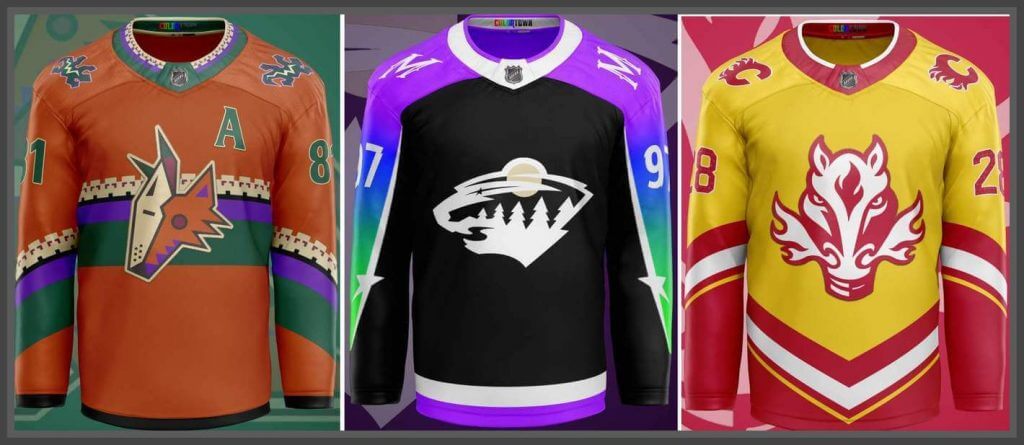
Arizona Coyotes
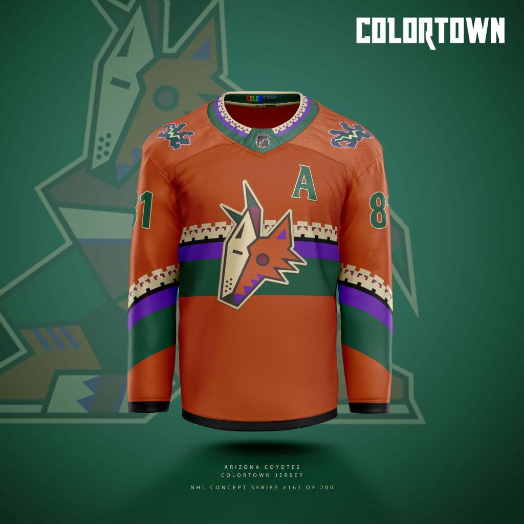
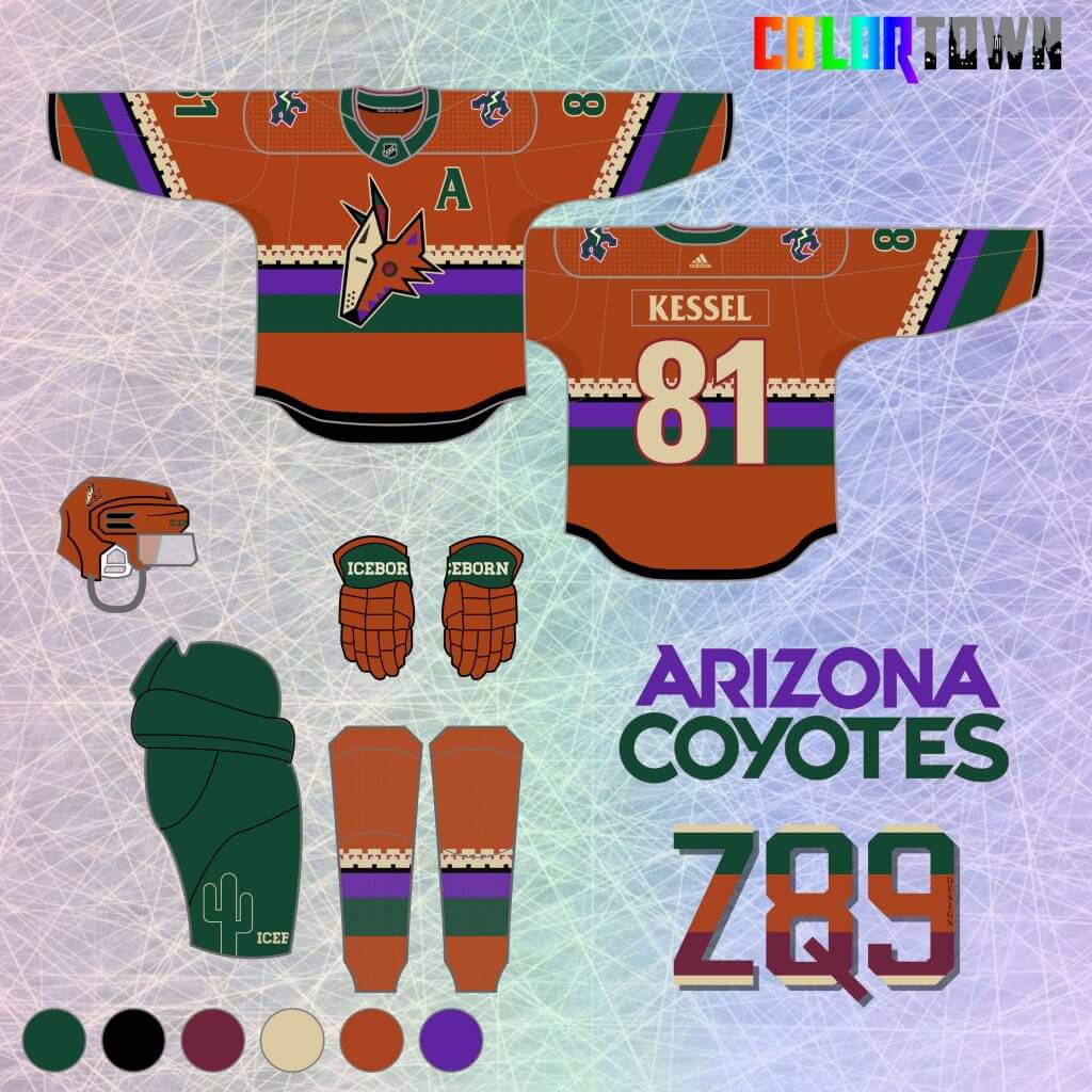
The Coyotes are the first team up, as I feel like their Kachina aesthetic is one of the best representations of locale combined with design in all of sports. I hadn’t yet used the burnt orange color in my core series, so it’s front and center here, along with a fun new distribution of the classic patterned stripes.
St. Louis Blues
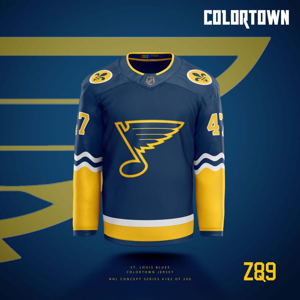
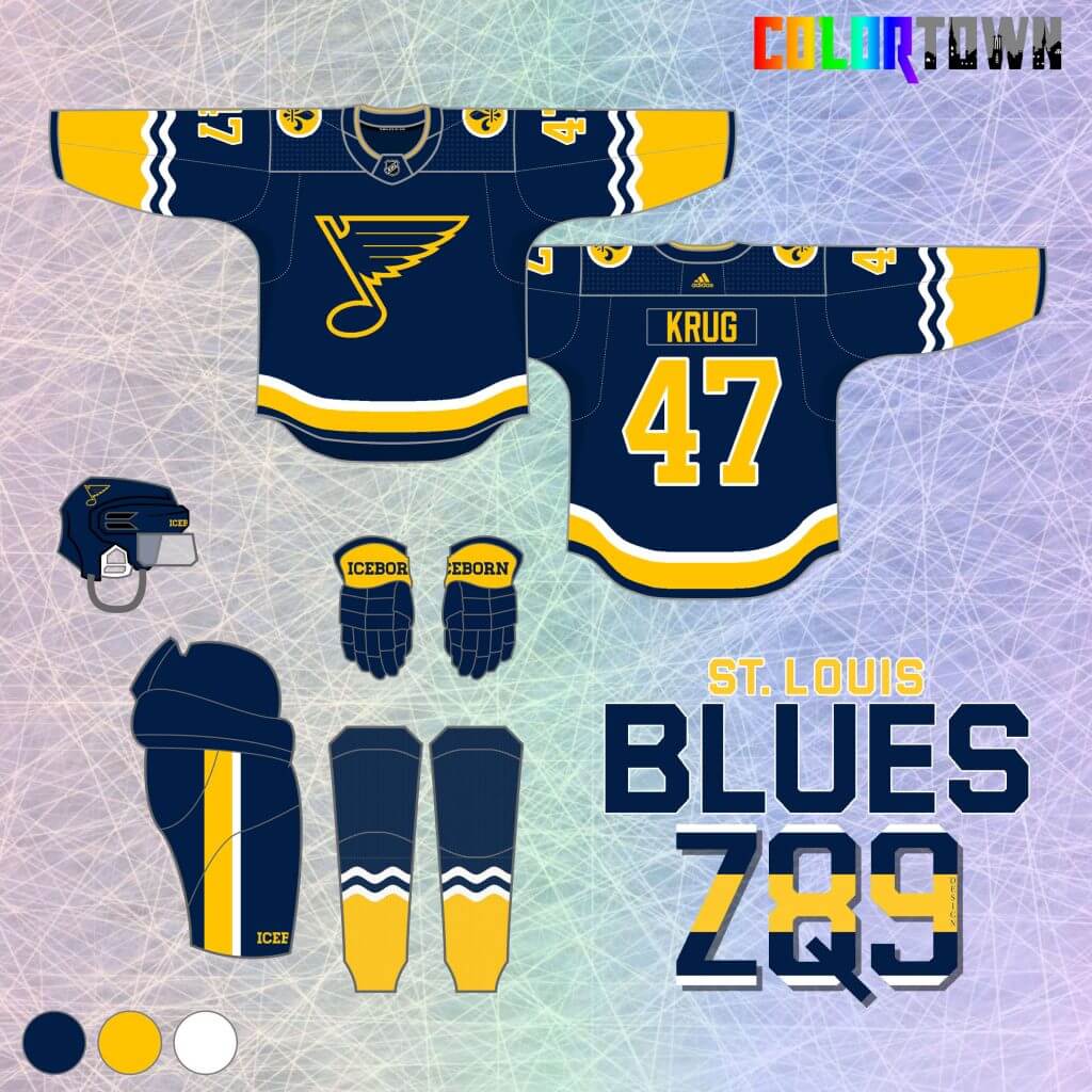
Next up are my hometown Blues! While I’m not typically a fan of navy in their color scheme (I much prefer royal/yellow only), this felt like a great application. The wavy stripes on the arms are straight from the St. Louis flag, and the fleur-de-lis patches extend that theme to the shoulders. Rivers, French heritage… all very St. Louis.
New Jersey Devils
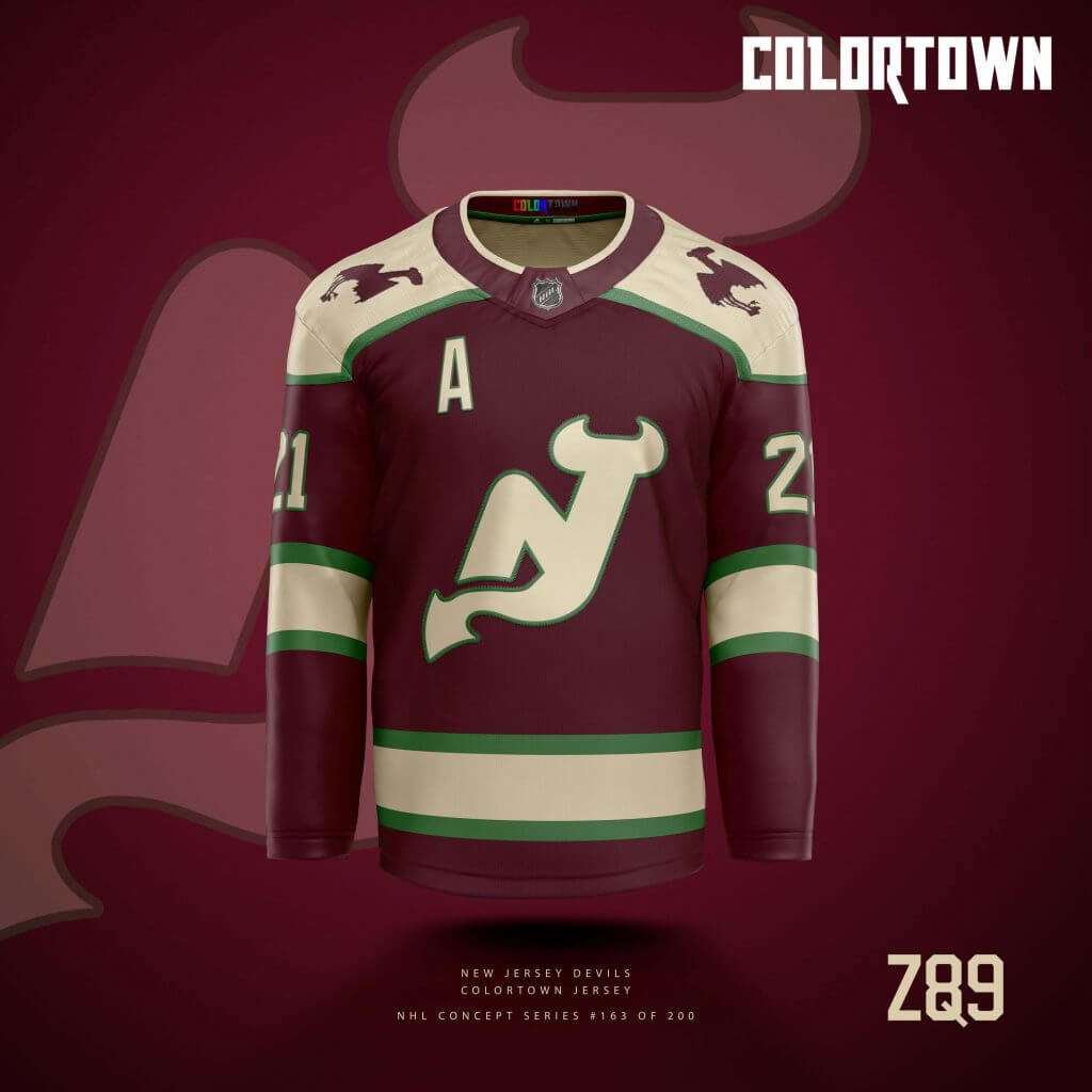
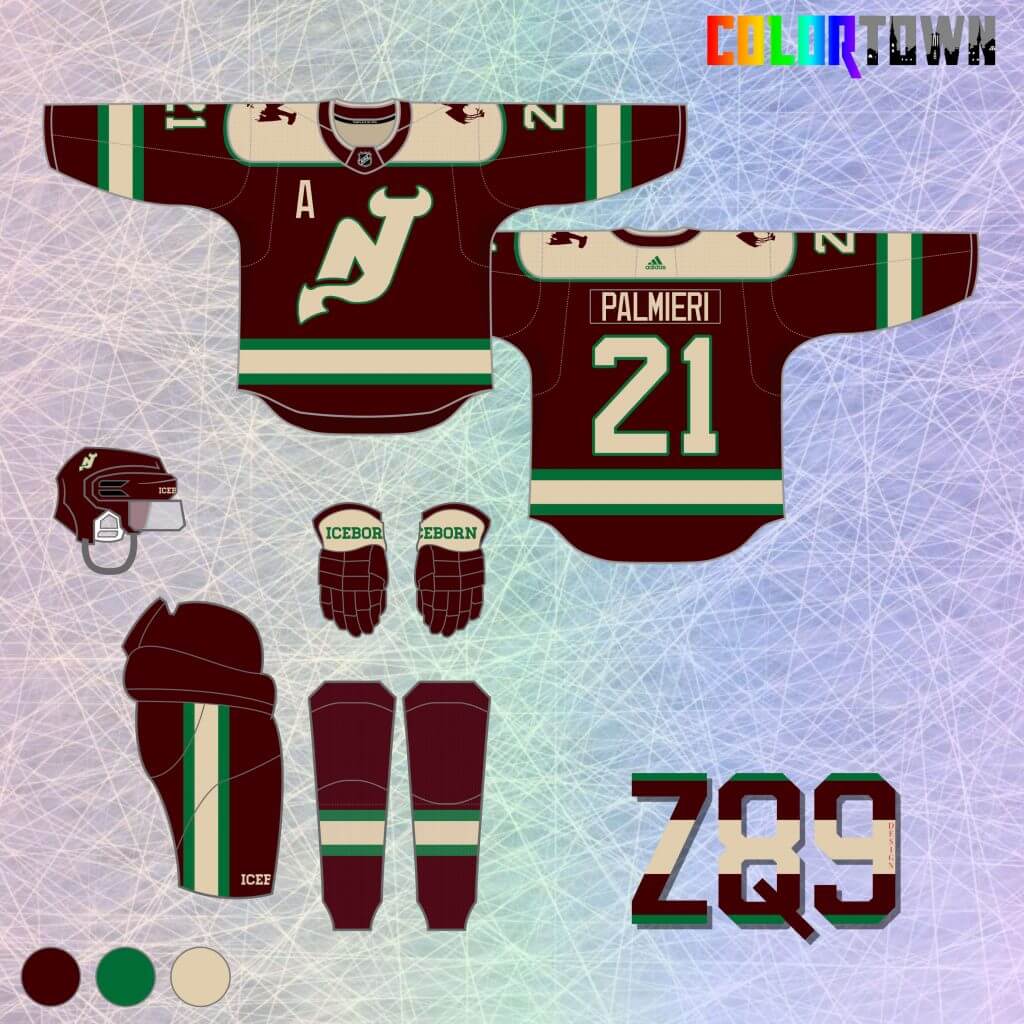
The Devils were a challenge, as I’d already used red, black and green in my core series. So, maroon was the pick. It’s an incredibly underused and underrated color in hockey. Green accents and a cream/vintage white really popped against that maroon background when I was experimenting, so I went with it! I also blew up the main logo a bit by removing the usual circular outline that surrounds the “NJ.” Lastly, the “town” element here is a silhouette of the original “Jersey Devil” illustration, placed as a patch on the shoulders.
Boston Bruins
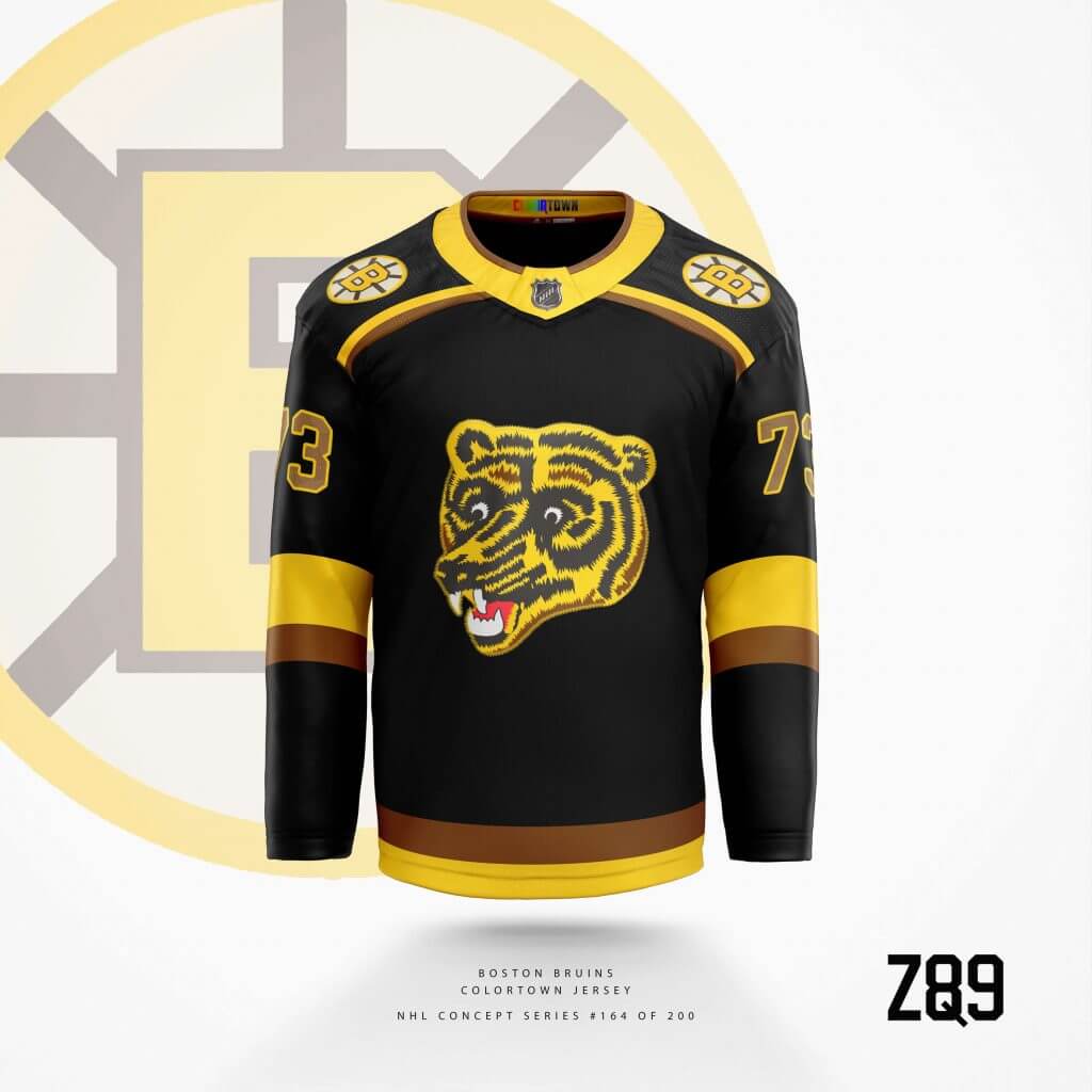
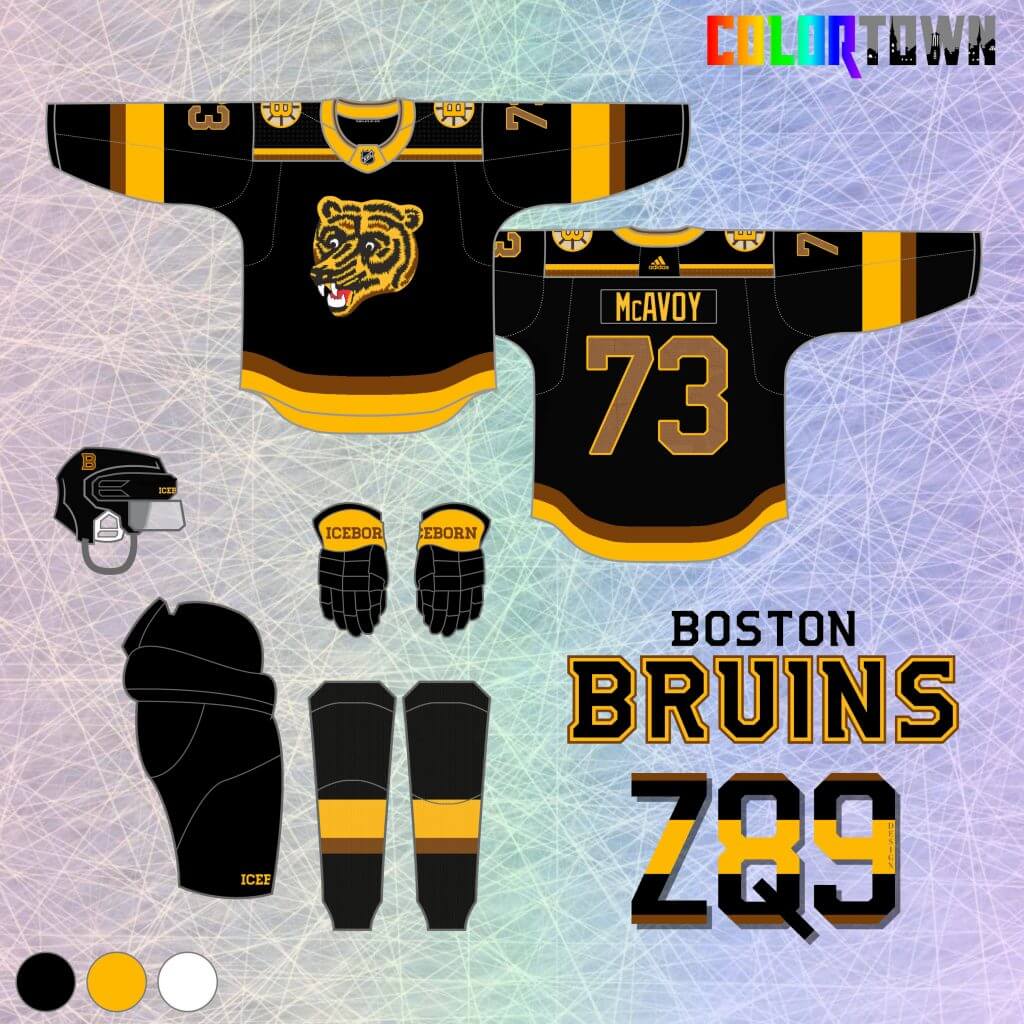
Boston in black? How is that different? Well, in my main series, I used brown as Boston’s primary color on their home and away sets. So, black actually rounds out their set nicely! The “Coke Bear” logo is goofy, but beloved amongst some fans.. and as a 5th jersey? Why not let him shine? The “town” element is subtle here, as the city grid is sublimated inside the numbers as a tribute to the Boston Marathon.
Colorado Avalanche
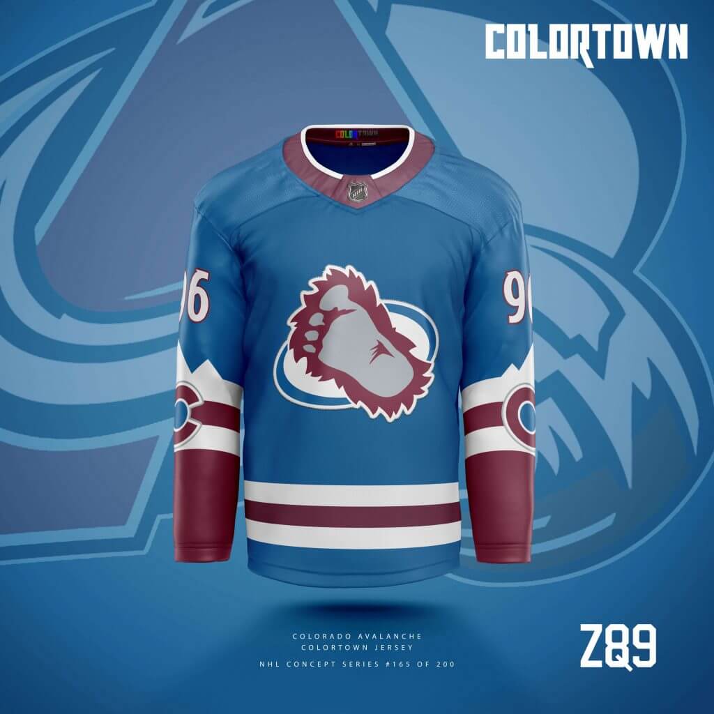
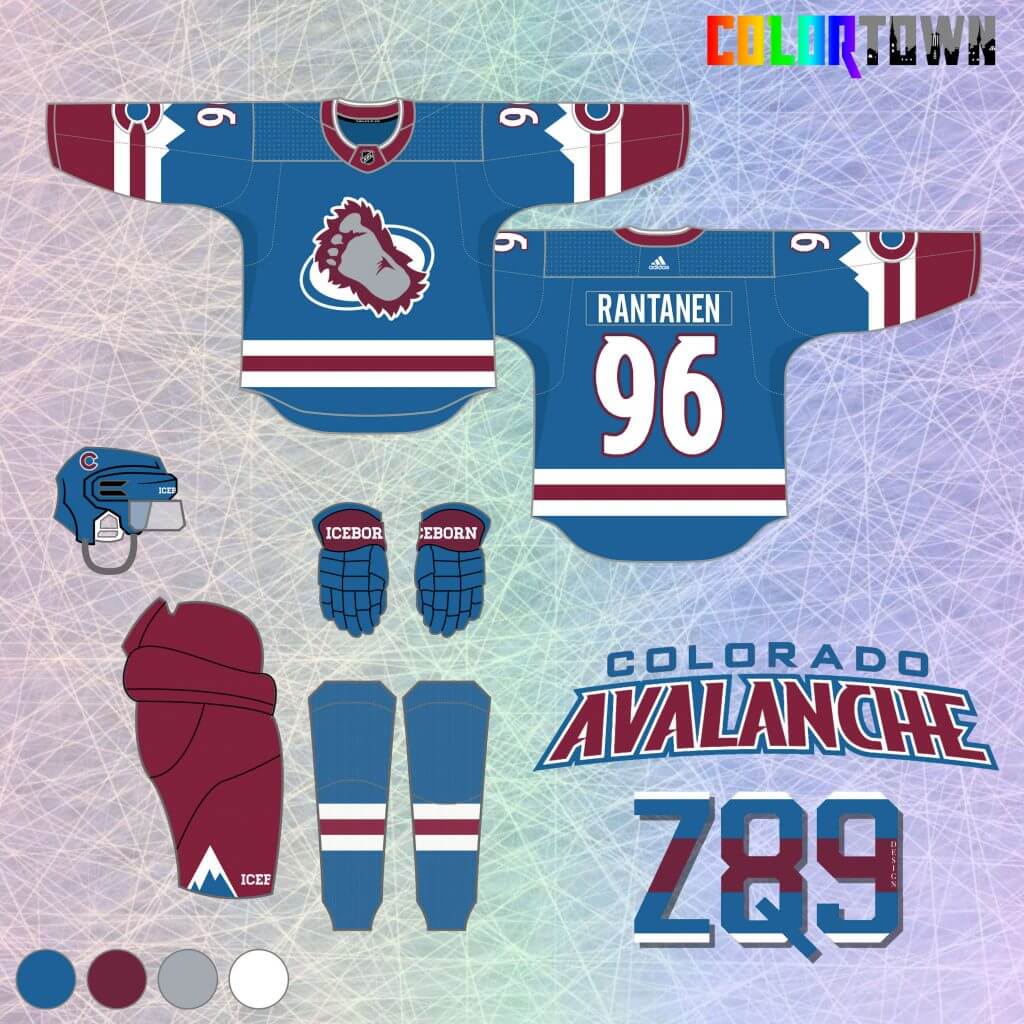
The Avalanche present so many fantastic opportunities for a series like this. I’m a 90’s kid, so I naturally love the yeti foot logo. It’s at the forefront here, along with the team’s traditional blue. A re-colored version of Colorado’s state flag and some mountains make up the arm stripes here to pull in the “town” element.
Seattle Kraken
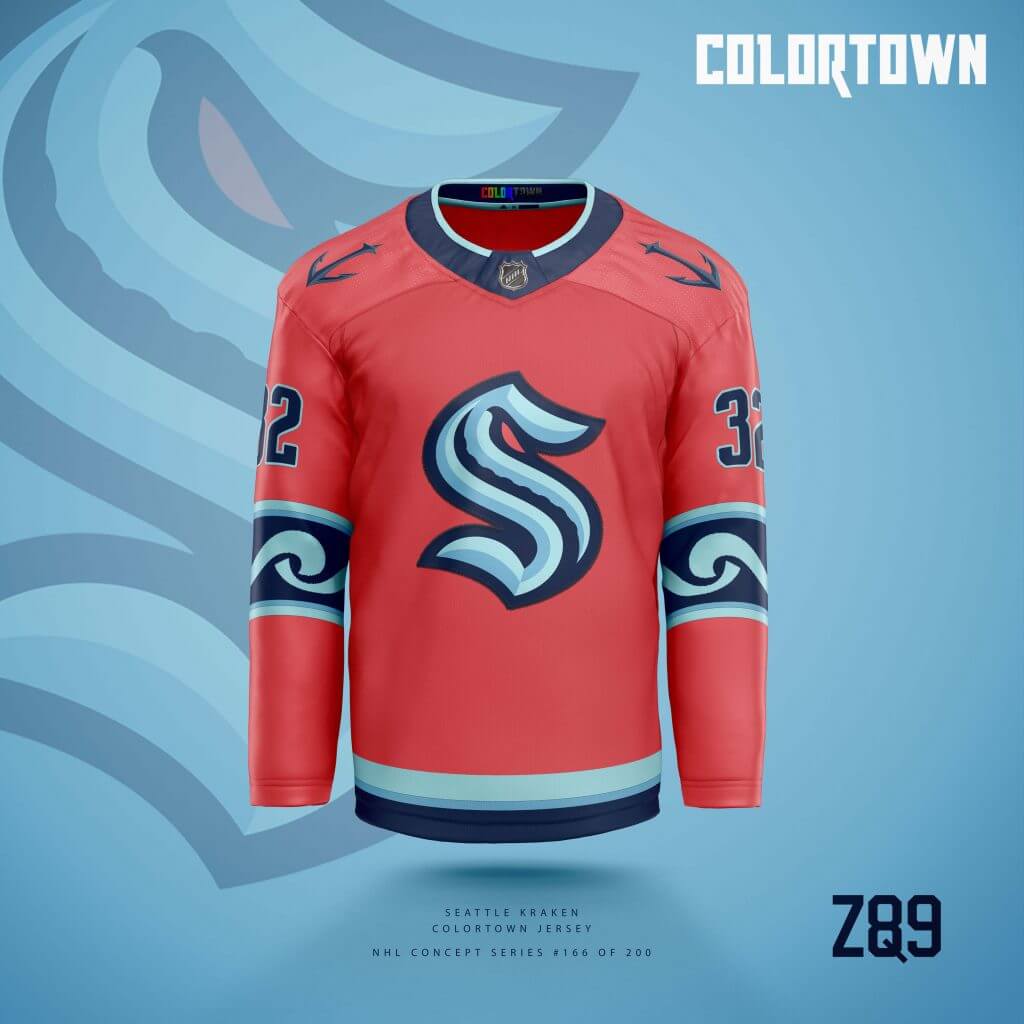
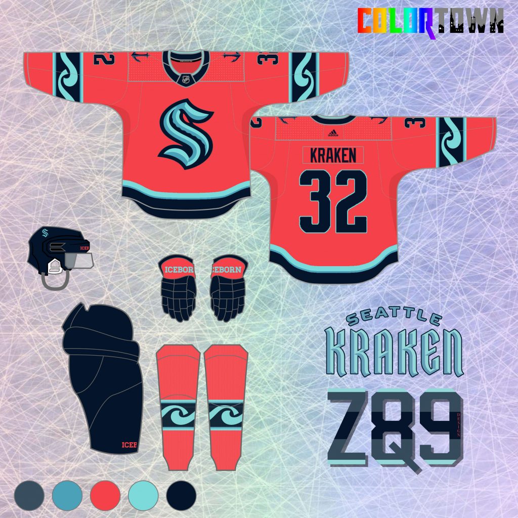
The new Seattle Kraken are up next. I love their new branding and color scheme. The one change I’d make? Keep that AMAZING coral color from the pre-unveil branding! I use it as the primary here, which makes for a totally unique NHL jersey color. Elements from the Seattle city flag are used in the arm stripes here to round out the series theme.
Minnesota Wild
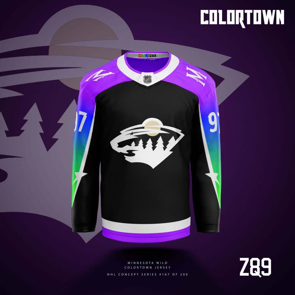
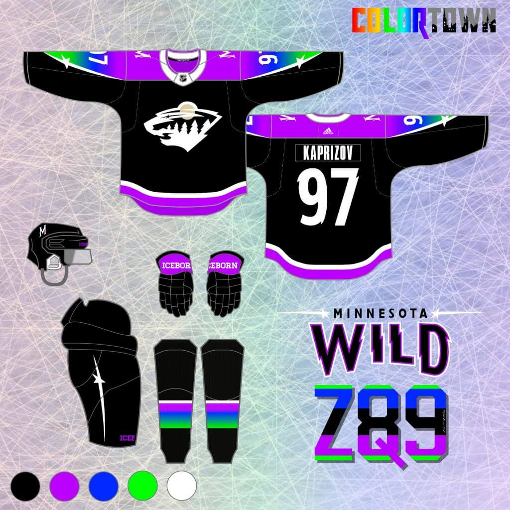
For the Wild, I drew inspiration from Seth Reese’s (@ninetyfourfeet on Twitter) Timberwolves concepts that incorporated colors from the aurora. I used a gradient on the arms and shoulders containing some vibrant neon colors. The “lights” are contained by a white stripe that if you look closely, you’ll realize is the “eye/shooting star” from the primary Wild crest. Black made sense as the background here to sharply contrast with the northern lights on the arms. Plus, it’s like a night sky… the logo switches the sun to the moon, and there’s stars. It’s a whole northern, nighttime landscape!
Pittsburgh Penguins
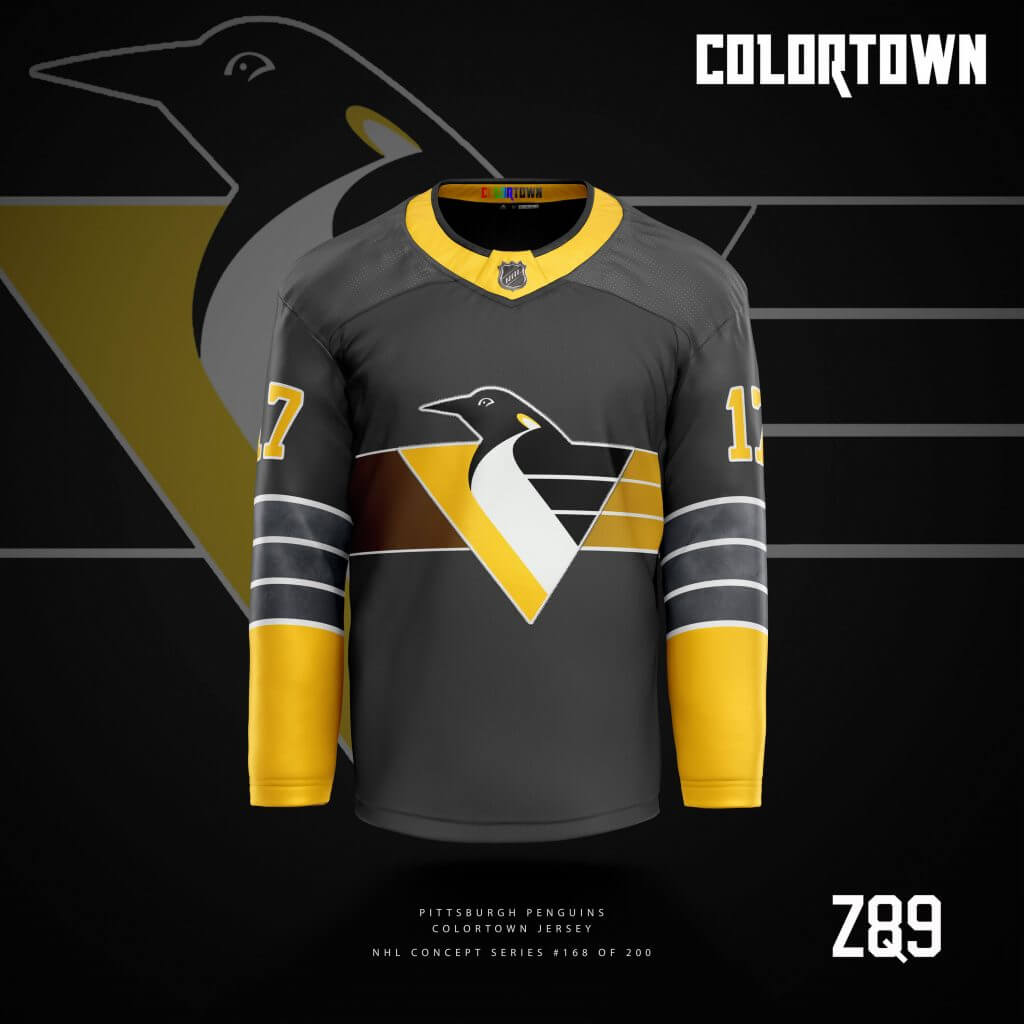
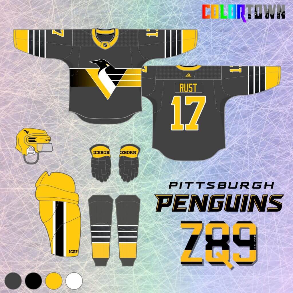
Pittsburgh goes gray in this concept as a tribute to the Steel City. There’s also a textured steel pattern inside the thin white arm stripes. I always thought Robopenguin was a great logo, and since I didn’t use him yet with my main Pens concepts, this felt like the perfect time. Also, if you look at the full gear, this jersey would be worn with yellow breezers, which I personally think would look amazing combined with the muted jersey.
Calgary Flames
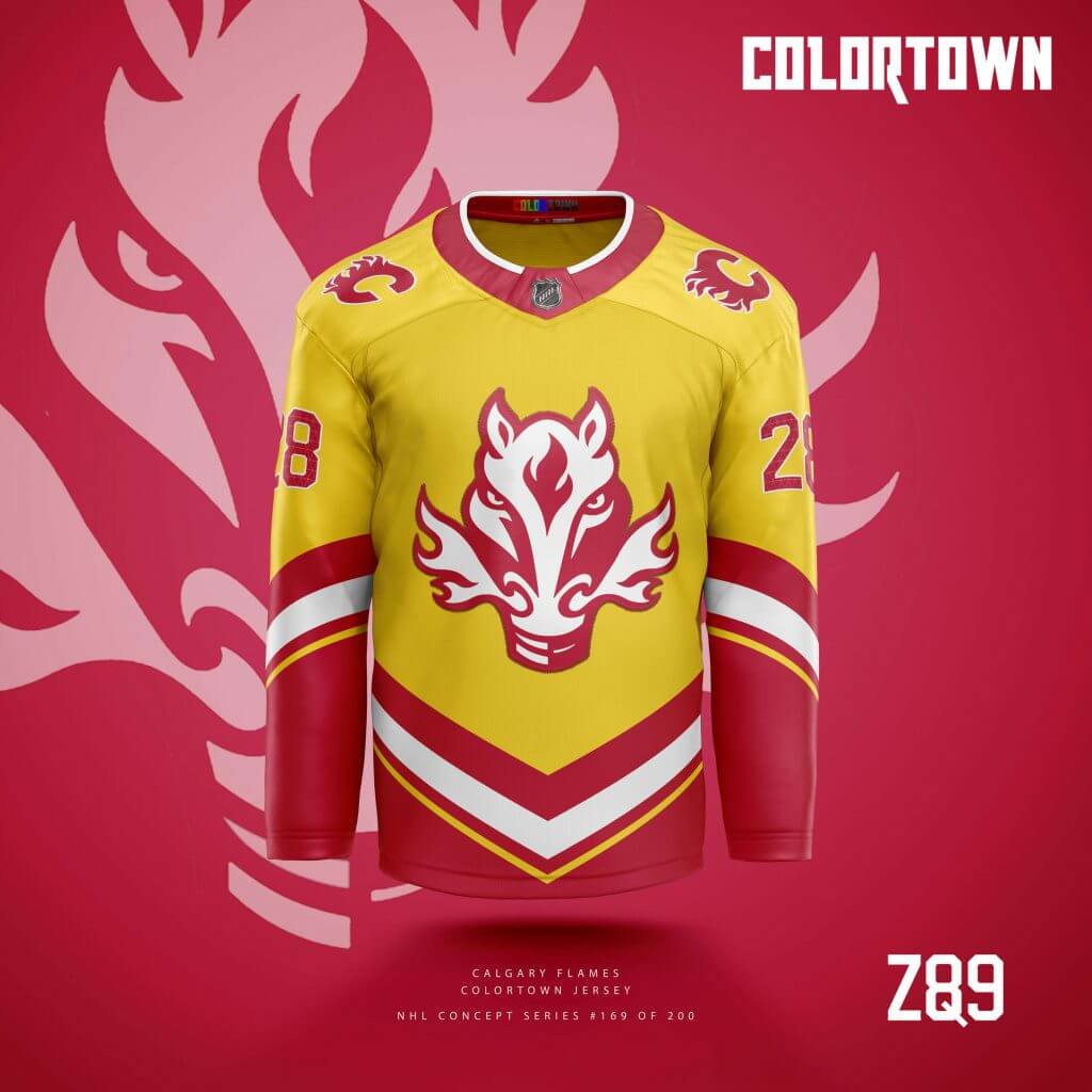
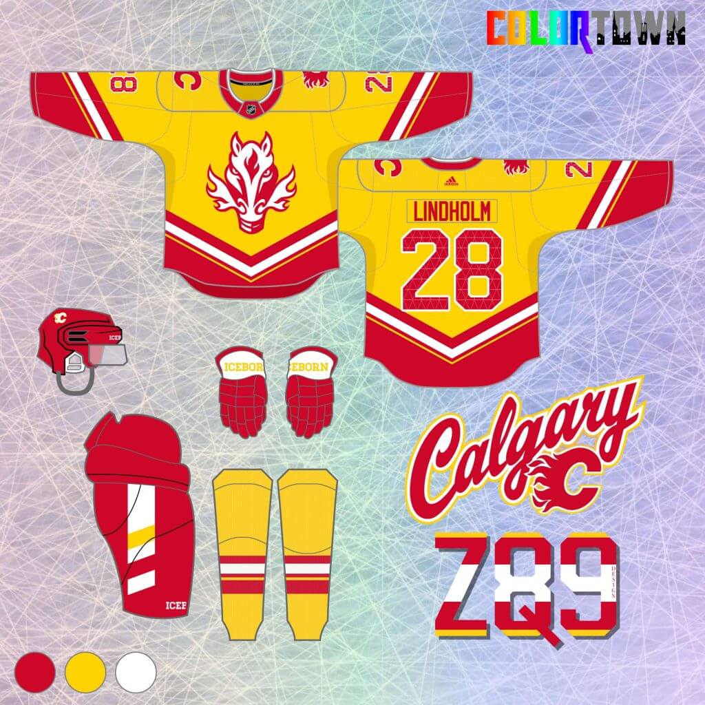
“Blasty” comes back in this Flames concept, although not in any way you may have seen him before. I used red, white, black and maroon as primary colors in my main Flames set, so the question became, how do I make them look good in yellow? The crest is simplified to be only red and white, while the stripes are a slight modification of those used on the original “Blasty” alternates from the early 2000’s. The city element is subtle again here, as the pattern from Calgary’s “The Bow” skyscraper is used inside the numbers.
Hartford Whalers
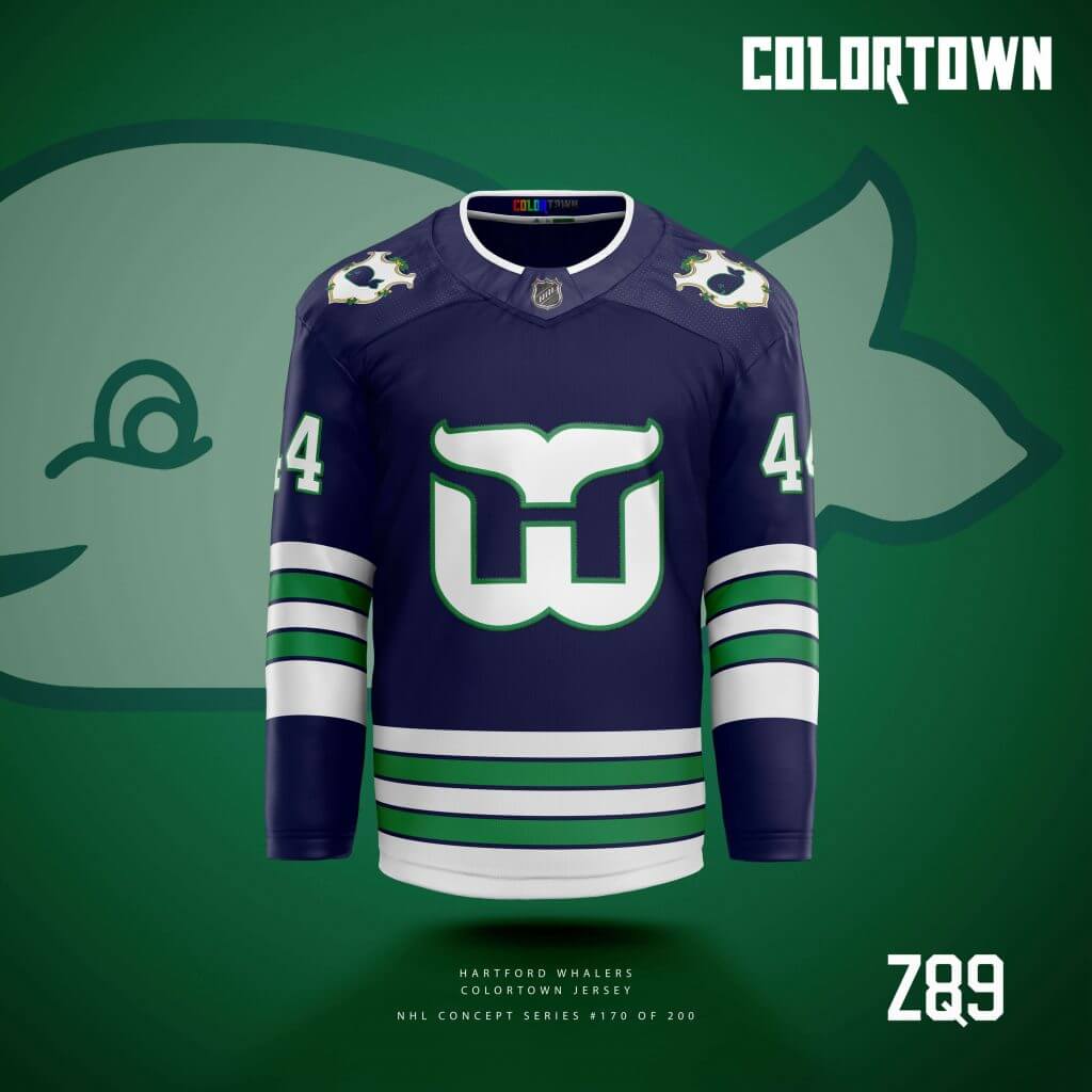
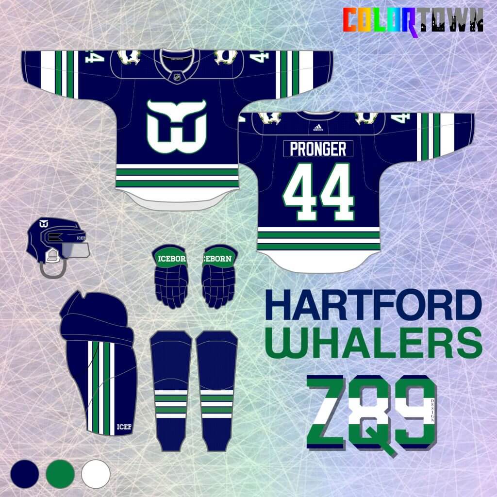
Rounding out the first 10 is my first #ColorTown concept for a defunct NHL team, the Hartford Whalers! My core series puts them in green, white, royal blue and vintage white primary jerseys, so navy was the last logical extension. I removed some of what is, in my opinion, extraneous gray from their 90’s sweaters and focused on only navy, green and white here. The “town” element is part of the crest from Connecticut’s state flag with “Pucky” in the middle! That crest also has some hints of gold, which is a nice throwback to the team’s original WHA color scheme.
Thanks, Quinn! Those first 10 CT unis span the gamut from modern classic to bodaciously bold! And everything in between. Can’t wait to show off more of this “set.”
Readers? What say you?


Guess The Game…
from the scoreboard
Today’s scoreboard comes from Steve Dodell.
The premise of the game (GTGFTS) is simple: I’ll post a scoreboard and you guys simply identify the game depicted. In the past, I don’t know if I’ve ever completely stumped you (some are easier than others).
Here’s the Scoreboard. In the comments below, try to identify the game (date & location, as well as final score). If anything noteworthy occurred during the game, please add that in (and if you were AT the game, well bonus points for you!):
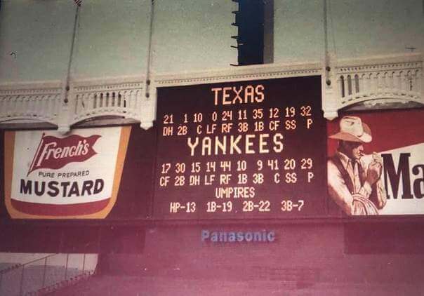
Please continue sending these in! You’re welcome to send me any scoreboard photos (with answers please), and I’ll keep running them.
The “BEST OF” Kreindler’s Korner
Hey guys & gals. You’ve enjoyed Kreindler’s Korner for several years now, mostly on the weekends, on Uni Watch, but with the recent coronavirus outbreak, Graig’s time is just too precious and he needs to tend to other things besides coming up with a new writeup each weekend.
So, going forward, for as long as the COVID-19 situation is bad in New York, I’m going to run a few “Best of’s” until Graig returns.
Here’s today’s offering:
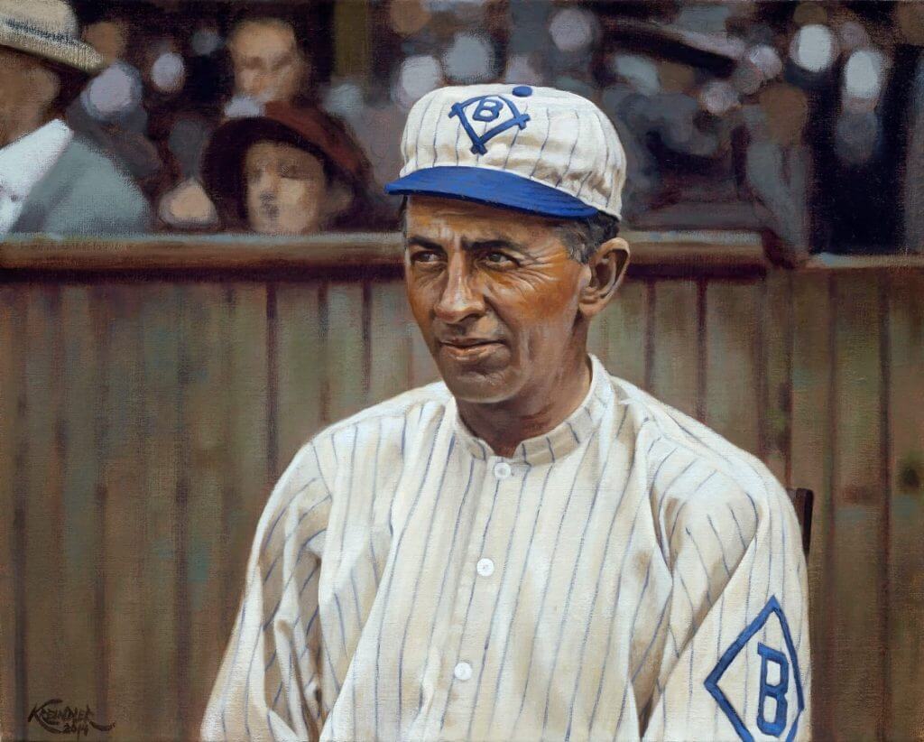
Title: “Reunited”
Subject: “Wee Willie” Keeler, 1912
Medium: Oil on linen
Size: 16″ x 20″The Baltimore Orioles of the 1890s were considered one of the premier dynasties of the 19th century, being almost solely responsible for the run-and-gun play that was the rage in the first twenty years of the 1900s. Place hitting, bunting and speed were paramount to their success, and players like Willie Keeler, John McGraw, Hughie Jennings, Joe Kelley and Wilbert Robinson were some of the ingredients that brought all of that together. In that time, the ballclub took three National League pennants and two Temple Cups (a prelude to the World Series). By the end of the century though, The owner of the ballclub, Henry Von der Horst, acquired controlling stock in the then-moribund Brooklyn Superbas, and as a result, sent many of his star players to the newly minted borough, among them, Keeler.
Willie was born and had grown up in Brooklyn’s Bedford (now Bed-Stuy) neighborhood and teamed up with former Baltimore teammates Kelley, Jennings and Bill Dahlen to lead the Superbas to the pennant in 1899 and 1900. And for the next decade and change, Keeler continued to hit. Staying with Brooklyn until the birth of the American League, he jumped to and played out the rest of his productive years with the New York Highlanders (who would officially become the Yankees in 1913). He went on to coach for John McGraw and the New York Giants in 1910, and after a short stint in the Eastern League, returned to Brooklyn in 1912, joining former teammate and now-manager, Bill Dahlen. The title of the painting, “Reunited”, refers to Keeler’s homecoming to the borough that year. By then, Keeler could look back on an almost-20-year career that saw him become one of the best hitters in the history of the game. To this day, he remains in the upper echelon of career batting averages: .341, good for 14th place all-time.
Thanks, Graig! You can (and should!) follow Graig on Twitter.
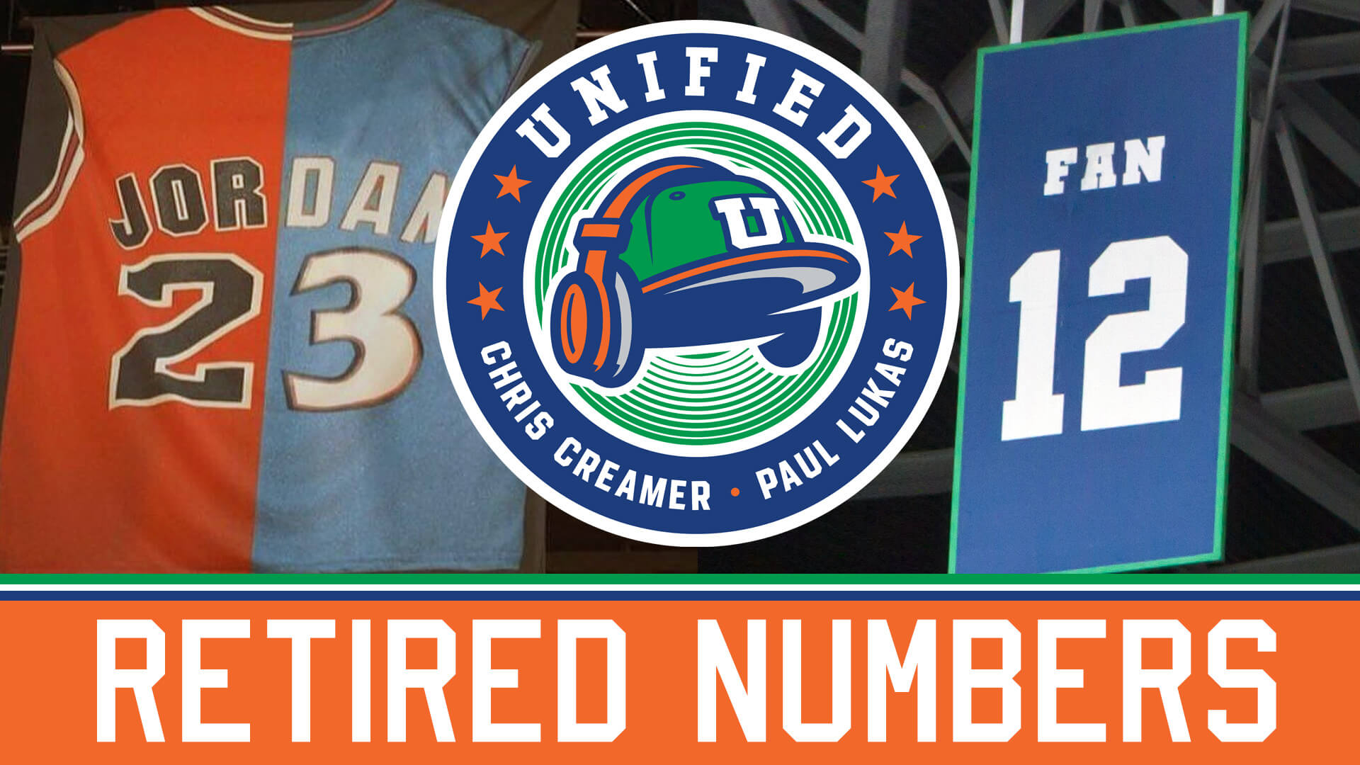
Podcast reminder: Paul here. For this week’s episode of Unified, Chris and I discuss the ins and outs of retired numbers, along with the recent NFL leaks, the NBA All-Star Game, MLB’s new Lou Gehrig Day, whether team success or failure should dictate uniform choices, and more.
Due to a microphone issue that we weren’t aware of until after we recorded, my voice sounds more echo-y on this episode. Sorry about that, and hope it’s not too distracting.
As always, you can listen to us on Apple, Google, Stitcher, TuneIn, and Spotify, or just use the player below:
The show notes from this episode, which include photos of many of the things we discussed, are here. Those photos (and some additional ones) also appear in the video version of the episode:
Please consider supporting this episode’s advertisers, all of which are offering great deals: Streaker Sports (20% off with checkout code UNIFIED), Homefield Apparel (15% off with checkout code UNIFIED), and Oxford Pennant (20% off with checkout code UNIFIED).
Enjoy the episode, and thanks for listening. Now back to Phil.
Uni Watch News Ticker
By Phil

Baseball News: Here’s a really cool look at how Nokona Baseball makes their gloves (from Griffin Smith). … We’ve all seen “bad” Topps airbrush jobs over the years, but this one is up there (from Jeremy Brahm). … A Cleveland sports fan applied for the trademark to Cleveland Spiders, yet insists it wasn’t about making money (NY Times link). … Shawn Hairston notes that LSU Softball feature a pretty huge logo on their helmets. … One of the umps in yesterday’s Phillies/Tigers game was wearing a black Phillies cap (from Frank McGuigan). … Of the Brewers Jackie Bradley, Jr., Dan Pfeifer writes, “It could just be the picture angle or the way his jersey is draped on his shoulders, but this radially arched NOB appears to have a somewhat variable radius.” … This (unidentified) pitcher for Stetson has what looks like an Italian flag either painted or stitched onto his glove (from Griffin Smith). Or perhaps it’s the Irish flag? (from Ed Hughes). Or maybe not. … Ole Miss is retiring former star player and MLB all-star Don Kessinger’s number (from Kary Klismet).

![]()
NFL & College Football News: Sign you’ve “made it”? Arizona Cardinals quarterback Kyler Murray now has his own logo (from Mike Joseph). … We know a good deal about the Bengals new uniforms, including the fact they won’t bring back the “Leaping Tiger”. … From Timmy Donahue: “Welcome to Gesa Field: Washington State University sells naming rights at Martin Stadium. On Friday, the school inked a deal a 10-year, $11 mil agreement with Gesa Credit Union. Gesa is designing WSU co-branded debit & credit cards.”

Hockey News: Prior to the start of this short season, the Brandon Wheat Kings had unveiled their new jerseys. However, there was no full uniform unveiling. Wade Heidt remarks, “We got the first sight of the full new uniform at their season opener on Friday. Sock striping matches the sleeves and no pant stripes anymore.” … Also from Wade: The Prince Albert Raiders are wearing their 50th season logo as a patch on both shoulders this season. … I’d never heard of the Michigan Stags until Keith Olbermann tweeted their 1974 logo. … And thanks to Todd Radom, here’s a look at their sweaters. And here’s a look at Gary Desjardins sporting the white sweater (from Doug Norris). … On Thursday, the Dallas Stars broke out St. Paddy’s jerseys for their warmups (according to Wade Heidt). … Those NHL helmet ads? Looks like they’re here to stay. Here’s a bit more on that. … The Florida Panthers celebrated Keith Yandle’s 1000th game last night. Guess what number players wore wore in warmups (from Wade Heidt). … Auburn University’s club hockey team has new jerseys, which it is also making available for sale to the public to raise funds (from Kary Klismet).

NBA News: *Sigh* — Cryptocurrency company FTX ‘getting closer’ to signing naming-rights deal for Miami Heat’s arena (from Timmy Donahue). Not that *any* naming rights deal is better or worse than another of course.

College Hoops News: From the “I shit you not” department: Utah State’s Marco Anthony says he chose the No. 44 jersey because of Wendy’s “4 for $4” deal (via Paul). … Tweeter Fraz thinks these blue Georgia Tech unis are “delicious. Simple and sharp.”

Soccer News: Arlo White, NBC Sports’ Premier League commentator, tweeted about his childhood obsession with drawing dividers for his football (soccer) program collections (from Jared Pike). … Here is the number unveiling for new Whitecaps midfielder Caio Alexandre. The Whitecaps have a new number 8. Going with Caio Alexandre on the nameplate similar to what her wore in Serie A in Brazil (from Wade Heidt). … San Carlos of the Costa Rican league is wore this jersey Friday night, apparently in all seriousness. Dan Bloom asks, “Have you ever seen more ads shoved onto a kit?” … The Dublin football club Bohemians have a new uniform, featuring lyrics from Grammy-nominated Irish rock band Fontaines DC (from Paul Dalton).

Grab Bag: This year marks the 100th anniversary of the New Jersey State Police. To celebrate the milestone, the force unveiled 10 new patrol vehicles on Friday and gave them a retro look. … Wade Heidt writes, “NLL anniversary. This may be harder than the recent NBA logo question on Jeopardy.” … East Carolina University has introduced a new mascot logo aimed at kids (from Kary Klismet). … Also from Kary: New helmet for driver Lewis Hamilton of Mercedes’ Formula One racing team.
And finally… big thanks to Quinn for sharing the first of his “ColorTown” NHL concepts.
That’ll do it for me for this weekend. You guys stay safe and well and I’ll catch you next Saturday.
Peace,
PH
Texas Rangers at New York Yankees
August 1, 1978
Can’t figure out significance of this game…
Not every game is “significant.” Some are just reader-submitted scoreboard shots. Those generally have a greater degree of difficulty.
The game is not significant, but the date is.
link
Very cool concept with Minnesota. Like Paul, I dislike purple. Like many Uni-Watchers, I’m tired of BFBS. I also hate gradient color treatment. But those unis pop and would look great on the ice. Impressive concept I like it!
Redesigning uniforms for a team that hasn’t even played yet?
Well, after 3 years, Vegas needed a Reverse Retro look, so might as well start now!
The Stetson tweets led me to their roster where I found Garner Špoljaric, son of former MLB pitcher Paul Spoljaric. Very interesting to see that he uses the diacritic over the ‘S’ in his name. I wonder why. He’s from Canada, as was his dad. I don’t think Stetson has NOBs so we don’t know if he’d wear it on his jersey.
Anybody know of any players in North American baseball who have used diacritics on their NOBs other than a tilde?
Arlo White link doesn’t work
Those Dallas Stars St Patrick’s Day warm-ups…is that the first case ever of a team wearing a special occasion warm-up jersey that fits their identity more than the uniform they actually wore in the game?
I love the Avs concept!
As bad as the Capitol One ads are on the helmets, look at the photo and count the number of times you see CCM, and look at the size of the logo on the gloves. Those are ads, too. Equipment manufacturers get a pass. But those are ads just as much as the new helmet stickers.
Technically, yes they are ads for the manufacturers. However …
To me, makers’ marks are ‘Venial Sins’…and what qualifies as “equipment” and “uniform” varies by sport(and by Uni Watcher?). I’m sure the leagues dictate their size/placement.
One could debate if they could/should be less noticeable, like how the Reds for years rendered shoe striping invisible with shoe polish or thread removers.
Those NHL helmets don’t leave the factory with banking/energy/healthcare branding, and to paraphrase Paul, I have nothing against advertising (generally) but I do have an issue(subjectively) when it’s placed where I think it doesn’t belong.
Yes, those are manufacturers’ ads, and yes, they do pay for those. There’s nothing wrong with the outfits that make the equipment getting the exposure. If I like the looks of a a set of gear, it doesn’t hurt to have the brand name listed — although it should be noted that any manufacturer can have their gear worn in the NHL, but only those that pay the fees can have a brand name on it.
By the same token, I don’t go to the hockey shop looking for a helmet bearing some unrelated brand name on it. That’s just rediculous.
Love the concepts. Something struck me for the fist time as I read this. I don’t know how I’ve missed it being from Arizona. How far does the Kachina logo for the Coyotes creep into the spectrum of Native imagery? And is it acceptable? Just an interesting question. I’m not necessarily against all use of imagery in the sense that some tribes endorse specific institutions. Or even a vague mascot such as “Warriors” do not necessarily point to native peoples. It just sort of occurred to me while looking at that wonderful rendering of the Coyotes logo it could be a possibility some may see the use of Kachina as potentially too far.
I would put it in the same category as the Seahawks or the Canucks… a logo inspired by local, indigenous styles, but not an unflattering caricature or stereotype of any group of people themselves. People can debate whether that makes it inappropriate, but it feels a step removed from Chief Wahoo and others.
It takes the curse off of the artwork if the league employs an indigenous artist to create the iconography. There might be some resentment if “some guy” designs professional uniforms based on Indian-themed stuff he saw in a book.
some of the best concepts I’ve seen on Uniwatch. Amazing job, and keep up the great work
I think this guy should keep designing uniforms and someone should pay attention in the NHL. I love his Blues jersey and the Kraken as well. He has some talent.
For years I’ve been hoping the Bruins would work brown into their team colors.
“Blasty” may have been the most inept crest to appear on an NHL sweater. The Flames should repurpose the Atlanta “A” for Alberta.
Loved the hockey Jerseys! Very cool!
Thanks to everyone for all of the great feedback on my concepts! Glad you enjoyed!